Transcripts
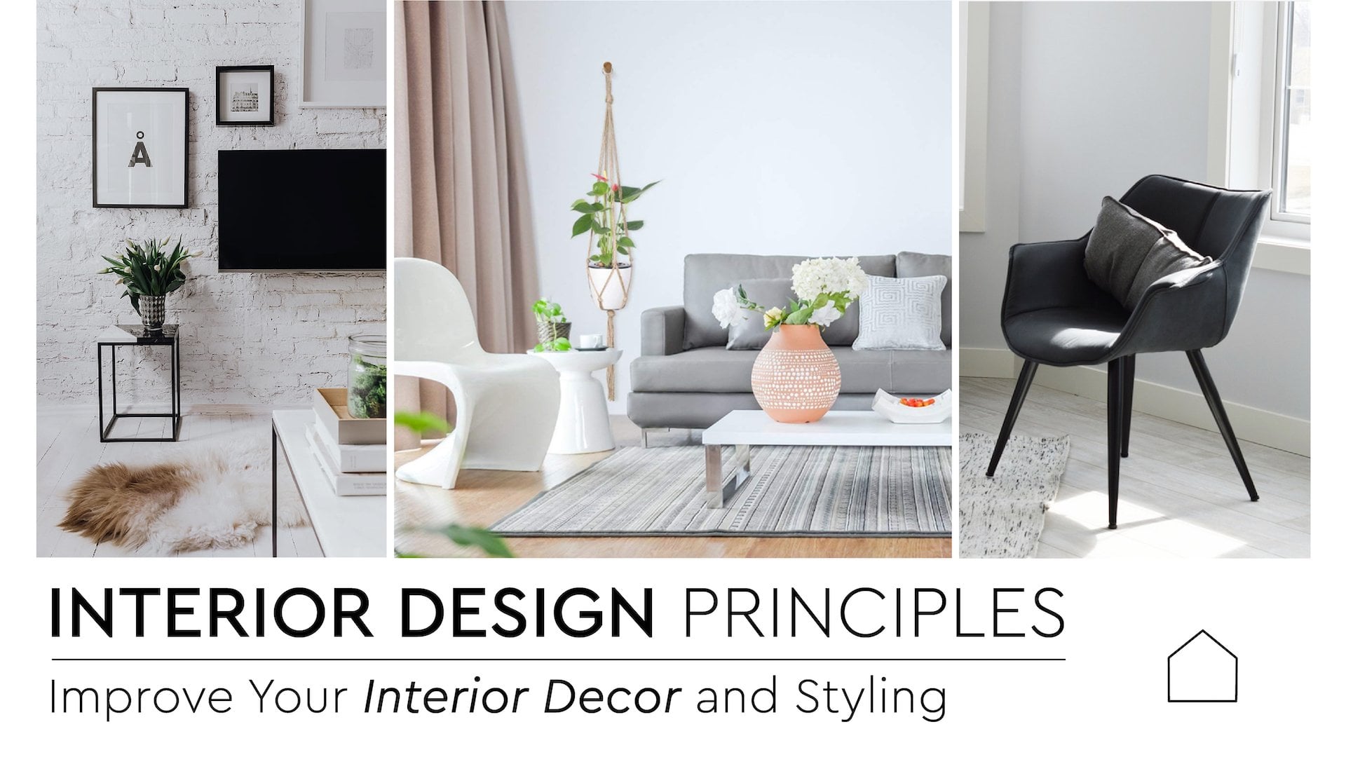
1. Trailer: Hi everyone. This is Arca Sabo. I hope you're doing well. Today's subject is about one of the most exciting elements
of design, which is pattern. I'm so thrilled to
share it with you guys because beautiful patterns
are just countless. Pattern is the repetition
of a shape on the surface. Sometimes it's obvious. Sometimes it's more
complicated and it's hard to tell where the
shape begins and ends. I'm sure you have
seen them everywhere. And all papper carpet, almost any type of fabrics, curtains and sofas In
different colors and styles, they can really lift your space and add visual comfort, energy. Personality. They can
also make visual error, direct or attract
your attention, create unity by connecting
different parts of the design. Transform an ordinary room to a memorable space and much more. But working with them may be
a little tricky sometimes. This class is here to
help you with that. After this class, you will
know how to choose patterns, how to mix and match them
when and where to put them, how to use different patterns in different interior design styles and understand if they are
necessary for some spaces. So please join me in this mini class to
enter the wonderful, colorful world of
patterns. Let's begin.
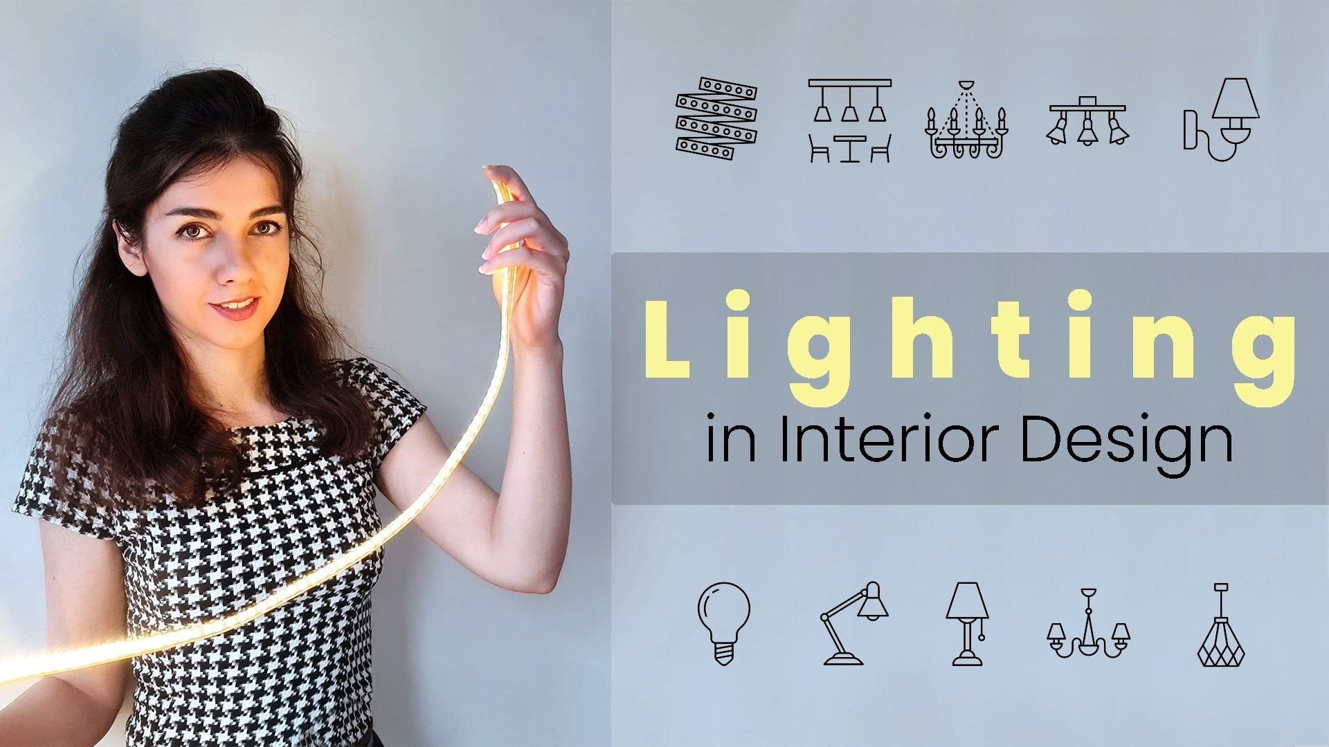
2. Texture and Color: There are two elements that have an essential role in how we see surfaces and pattern
surfaces, texture and color. The texture is the surface
quality of a material. It can be very smooth, soft, rough or bumpy. Don't underestimate the power
of textures in your home. Because firstly, we
can't touch textures, we can feel it with our hands, or sometimes we walk on them. Next, it defines
the reflection of lights from the surface
and how we can see it. Smooth surfaces
reflect more lights, and bumpy ones
absorb the lights. Whenever we needed
more light in a space, we can use smooth
meter materials on large surfaces like walls and floor to reflect
more lights. The next important
element is color. They are an essential
part of patterns. Patterns with high contrast
colors are so energetic, eye catching and busy. In contrast, patterns with close color values look calm
and restful for the eyes. Dark colors show objects smaller and bright ones recede towards us and
grab more attention. It's also helpful to know
about warm and cold colors. Their psychological
effects, color wheel, complimentary colors,
and basic color schemes.
3. How to Mix Patterns: There are four main things to consider when you're trying
to mix different patterns, starting with the
first one. The mood. Before doing any purchasing, you should define the
wipe or mood of the room. Pairing different patterns can really change the atmosphere. For example, stripes are
classic and sometimes formal. But mixing them with G geometric patterns
make them more modern. You can add
masculinity by adding simple geometric
abstract patterns in masculine colors like navy or gray and add feminity by adding care based delicate
floral patterns with feminine colors like pink. Also, sometimes
enlarging the scale of classic patterns like florals makes them more modern like this
scaled wallpaper. Proportion. Don't use
patterns on all surfaces. Leave 40 to 60% of the
room with solid colors. Our eyes need places to rest. Solid colors can be chosen from the
patterns color scheme, colors from the same tone or even their
complimentary colors. But again, keep the
color scheme limited. You don't want to
make a chaotic space. Working with limited colors and patterns is always easier. Repeat your solid
colors through a space, so the result be cohesive. Remember to conclude neutrals like black and whites
in the color scheme. For the pattern area, use three to five patterns. Use them in different proportions
like 60, 30, and 10%. Because for coming a space, we don't want patterns to
compete with each other. Scale. Generally, try to have three or two different
scales of patterns. One bigger scale,
one medium scale, and one or two small
scale patterns, and use them in different
proportions, as I said before, 60, 30, ten, or 60, 35, 5%. Use larger scale patterns
for the areas or furniture that you want to be the focal point and
get more attention. And use small patterns
when you want to hide something or make
them get less attention. Of course, you can break this rule for making
bold statements. But if the room is small, try not to use very big
scale patterns in it. Then you start to count
shapes on the wall, and also the room
feels much smaller. The best way to
choose patterns is by collecting samples
and swatches. Small scale patterns seem like solid colors or textured
surfaces from far distance. They can act as a base
or supporting patterns. Then you can add your special, beautiful pattern as
a star of the show, which attracts a
lot of attention. Dots, Dios, stripes, and ditz
are famous base patterns. Balance. I think
balance is the key to success in any part of our
life and interior design. If you're using patterns, you should consider balance too. Do not use all the
patterns in one spot. Patterns and colors should be spread through a space
to have visual balance. If you want to know more
about the balance principle, please check my other class. If you are beginner and
don't have any idea what to start with or
prefer simple designs, there are two simple ways
to mix and match patterns. The first one is to use patterns with the
same color scheme. The second one is
to use patterns from one family with
different scales.
4. Different Kinds of Pattern: There are millions of
patterns out there. Here, I just want to review the famous buns and their wives. Geometric motif, Dots, and DTC. Like I said in the
interior design class, our minds love
repetition because it's predictable and
makes us feel secure. That's why we love
geometric patterns. You can mix these patterns with care based patterns to make
your home more inviting. Vertical stripes. This famous practical
pattern can easily make visual error and add
height to a short room. It can be used in modern and also classic historic
styled rooms. Since you can find them in
different scales and colors, they can be matched easily. Horizontal stripes. This kind of stripes adds a
space and shoulder and wider. If you don't like
your high ceiling, you can use this one to
make it seem shorter. Animal prints. Although they come and go
from the fashion world, using one of them can really
bring your home to life. Since this type of pattern
is bold, don't overuse it. Just some small touches, but do not match them
with the next type of patterns, which is florals. Floral patterns are being
used for centuries. There are many types
of florals like minimal subtle florals for
minimal lovers, small scale, 1960 floral prints
for romantic people, and even florals from the
16th and 17th centuries. Florals work excellent
with stripes. Chevron. You can't use it wrongly. It's very easy to match and very easy to use almost
in any surface. It's a perfect choice
for teenage bedrooms. Complex. Busy patterns
with several colors, shapes and lines are complex. They're overwhelming
for small rooms, but they can look magnificent
in larger spaces. They have a tendency to come forward to the one
who is looking at it. These patterns are
a perfect choice for walls with surface
irregularities.
5. Patterns in Different Rooms: By touching and seeing
different materials, we can perceive
our surroundings. So it's crucial to use
textures and patterns, especially for our purposes
in different rooms. For example, intervase
should be welcoming, and using patterns is one of the best ways to
create this mode. Think about how you want to make your first impression
on your guests. You can use patterns
on the rock or a bold wallpaper or
maybe just try textures. In the living rooms, which are places for
interacting and communicating, use a collection of patterns to evoke an intermitting wipe. It's easier to choose basic and cheaper
patterns in backgrounds, and then Add bold and
more expensive patterns on decorative
pillows and throws. They can really
change the feeling. For rugs, remember that bright colors can
show the room larger, but they show dirt easily. Dark colors show
the room smaller, but they don't show dirt. Small to medium scale patterns
don't show their too. In kitchens, a
pattern backsplash can really make your
kitchen personalized. Bedrooms in the house can have their own identity in design. But they should
look cohesive when you go from one room
to another room. You can make this unity
by using the same colors, materials or style in big
items throughout the home. Also, bedroom as the most
private room at home, need to be personal and calming. So try comforting patterns that you love to
create the mood. To create calming spaces, textures can be really helpful. You can personalize
different bedrooms with accent colors
and accessories. Due to its size, it's
really cheaper to transform bathrooms with the right choice in
choosing patterns. If you want to use
bold patterns, use them in a subtle way. Also consider patterns
reflections in the mirror. In this space, we can generally think about tiles,
wallpaper, and paint. Or more simple easy
changes in details like the shower curtain,
rock and towel.
6. Patterns in Different Styles: This part of the
class about patterns and styles is very
general and brief. You can definitely add any patterns that you love
in any room you want. This is just a simple
basic guideline to use. For a minimal or
Scandinavian room, it's better to avoid
using patterns. Instead, make the space more welcoming by using
textures like woods. Maybe one delicate simple
pattern on the rug. For a mid century industrial
and contemporary style. It's better to use just one or two abstract
or geometric patterns. In coastal themed houses, you can use blue
and nav stripes, chevron and nautical patterns. For shabby chic, just go with pastel color florals and
other feminine patterns. In Boho style, you can
choose patterns from around the world like
tribal arabesque, Moroccan, cut, South Western, or even animal prints. Transitional style, stripes, ArabsqGreek,
and herringbone. Traditional style, plat,
toil, floral, Peasley. Farmhouse style,
stripes, chicks, floral, plaid tartan and chins.
 Arch Ba Saba, Interior designer