Transcripts
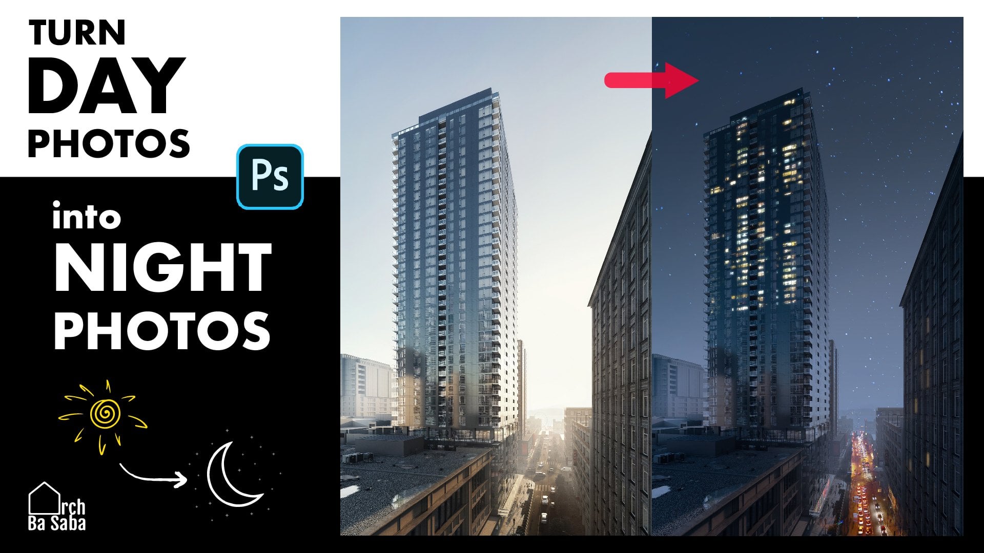
1. Trailer: Hello, everyone.
This is r Pa Sabo. I want to warmly welcome
you to this class about all the blending modes in photoshop and many of
their applications. It is one of the necessary
things you need to know to create beautiful,
creative images. At the end of this class, you will be able to add different
features to your image, like a flock of birds, snow, stars, even tattoos. Fire flames or sparkles
without any selection or cutting out in just 5
seconds, fast and easy. Also, you can add tons of magnificent color effects to make your scene more artistic. Or if you are a stage
artist, you can add dirt, cracks, textures, or even
your logo to your image. And make your renders more
realistic. There are a lot. I really can't tell
all of them now. Just stay with us
and see by yourself. For your assignments, I prepared about 100 cool photographs
so you can practice on them, mix them and blend them to
create creative fuzzers. Also, you can download the brief definitions of
the blending modes and the shortcuts used
in this class from the projects and resources
staff below this video. In the first step,
I want to tell you quickly about the general
basics of blending mode. I believe you should know them before beginning,
and after that, I'm going to show you all
the blending modes one by one and their applications
with really fun examples. Let's jump into it.
2. Introduction to Blending Modes: Introduction to blending modes. The first question
is, what is blending? I will try to tell you
as simple as possible. Blending is how the colors of two layers or to
be more accurate, the pixels of two layers can be seen together as
one result image. It's how we want to mix colors of the upper layer
with the base layer. There are 27 different
blending modes and they do different things. Sometimes we only want to see the bright colors of the above image or
darker colors of it. Or maybe we want to add
some contrast to our image. We can use blending modes
to do them and much more. But don't worry about the
giant scary number 27, because photoshop
has categorized the blending modes
into six groups. Just by looking at the list, you will find out what you need. Here are the blending modes. If you click on it,
you can see them. As you see, they
are divided into six groups by these thin lines. The six groups are normal, darken, lighten, contrast,
inversion, and components. With that said, let's start with the first and easiest
group, the normal group.
3. Normal Modes: In the normal group, the first
blending mode is normal. Actually, normal is the
default blending mode. It's obvious that we
usually use this one. The other one in this
group is dissolve. In contrast to normal, we don't use this one a lot, but I show you
quickly what it is. When I click on it,
nothing happens. It's a normal blending mode. But if I decrease the opacity, can you see some random pixels from the upper image are gone. The lower the opacity, the less pixels of our
image can be seen. But trust me, you will
not use this one, 99% of the times. But you can use it as a
blending mode for your brushes. Decrease the opacity
a little bit, and you can have some
cool effects like this. Then you can select the
layer, go to filters, blare and hit the Gaussian blare to have this dust like effect.
4. Darken Modes: The second and third
group which are so useful are
darken and lighten, which are exactly the
opposite of each other. The result in the darken
group is always darker. Whenever we use darken
blending mode for two layers, photoshop compares
two layers pixel by pixel and shows the darker
pixels as a result. Conversely, after comparing
lighting blending mode, show the brighter
pixels of both layers, and the result will always be a brighter image at the end. This is a picture that I'm going to explain blending modes on it. This is our base layer. For your better understanding, I prepared this gradient
from white to black. It's our blending layer
on top of our base. I'm going to try different
blending modes on this layer. 100% brightness is white, and 0% brightness is the lack of light,
which means black. The first one in
this group is darken and it does what all dark
and blending modes do. You can see here
that the whites are invisible in the results because they are brighter
than everything, and also the black
areas are shown without any changes because nothing
is darker than black. The next blending
mode is multiply, which is so popular. It's simply the stronger
version of darken. See, this area got
really darker. Again, the result is a darker
version of our base layer. The third one is the color burn. This one is darker than the previous one and
also more saturated, but this one doesn't affect
100% black or white areas. Can you see this red
roof here so saturated. It's similar to burn tool. The next one is linear burn, which is less saturated than color burn and darker
than multiply. The last one is darker. The difference between darken
and darker color is this. Darker color looks at the mixture of GB and
compares two layers, but darken looks at
them separately. It's harsher. Now, it's example time. Whenever you want to add
some silueds to your image and don't have time for extracting images and
cutting them out, you can easily use
these blending modes. Let's add some cracks
to this ball and maybe some dark to this one and a
flock of birds in the sky, like a piece of cake.
5. CG Art: We got this gorgeous
building here. I want to add some
stucco texture to this wall and some dirt
under this thin edge. I find this quality picture. I press Control A, Control C, and go
back to my scene. Control V to paste
it. Click Okay. Now, I hold shift to save the ratio while
making it smaller. Okay. Now, if you are still
on transformation mode, right click on the
image and choose the sort to fix the perspective. Okay. Now, change the
blending mode to darken. Or maybe multiply is a
better choice. Yes, it is. Now go to adjustment
layers and select curves because we want to
make some contrast here. Click this pattern to apply
curves just to this layer. Now, create an S shaped curve
to increase the contrast. It will darken the dark areas and lighten the lighter areas. Now, for this edge, I found a good
dirt picture here. Again, I copy and paste it on our scene by Control
C and Control. Just click Okay,
if you saw this. Like the stoco picture, change the size and position. You can zoom in and out by
holding alt and scrolling. Change the perspective with right clicking and choosing
the distort option. Press inter when you are done. Duplicate this layer by holding control alt and dragging
it by your mouse. Very good. Select the two layers, press control E to merge them. I don't like these
two white areas. I'm going to make them dry like other places with a
stamp tool right here. Hold alt and click on dirt. Be sure that your brush
has soft edges and paint the white areas easily,
and the other one. Now, don't worry
about its gray color. We will fix it. But first, change the blending
mode to darken. And again, go to adjustment layers and
add a curve adjustment. Click this button to apply the
effects only to one layer. Another way to do that
is to hold out and click on the line between the target layer and
the adjustment layer. There you go. Now increase the contrast just
like we did earlier. All right. So how about adding
some birds to the sky? This picture is perfect because it already has
a white background. So after moving and resizing it, just change the blending
mode to darken. To make it more
realistic and get rid of this rectangle
shape of birds, I add a mask layer and remove some of the birds
with a black brush. Much better. Let's see the before and after.
6. Tattoo (Example): One other cool thing
that you can do with the darken layer
is to add a tattoo. You need to find a picture
with a white background, copy and paste it by
control C and control. Change the blending
mode to multiply. Precise it, hot to
keep the ratio. A little bit of rotation. Okay, so nice. To make it more realistic and
more blended with the skin, right click on the tattoo layer
and select blend options. Or you can just double
click on the layer. Now, hold alt and move
this slider to the right. Again, for the other one, hold alt and move
it to the left, just like this and heat. Look at it, so nice and natural.
7. Make Up (Example): To improve make or add makeup to your portrats create a
new layer from down here, change the blending
mode to multiply. Let's start with Mascara. So choose black color. Select the brush, make sure the opacity is low and
paint under lashes. Make the brush
smaller and continue. Now, choose a natural pink. Make your brush bigger. Put the opacity on about 10%, there are some eye shadow here. Maybe some colors on the cheek. You can also make
the lips darker.
8. Lighten Modes: As I told you before, this group is exactly the
opposite of the darken. The result image is
always brighter. The first one is
lighten and compares layers and finally shows
brighter pixels as a result. As you see, this area
turned to white completely, but the area remained unchanged. The second one in this
group is a screen, which is a strong
version of lighten. Look, even 10% brightness
lighten this zone. The next one is color dodge. Color dodge lightens
the image and leaves the 100% black areas black and adds saturation
just like the dodge to. This area has become saturated, but still dark woods
have remained. However, if you
choose linear dodge, it brightens everything
even those woods here. Lighter color is the
same as lighten, but it looks at the GV
channel as a whole, and the result is
again so harsh.
9. Fire Sparkles (Example): This group of blending modes is incredible for adding lights, sparkles, candles, and so on. Also, it's my favorite one. Look at this beautiful
family picture. It's beautiful already, but
you can make it even better. I have a beautiful
image of fire here. I copy and paste it on my scene, move it and it. Change the blending mode to. Or a screen or color Dudge. Color Dudge looks cool
because it's saturated. But again, I'm
going with lighten. Can you see the sparkles? You can also add some
fireworks like this, but it doesn't make any sense.
10. Glittery Girl (Example): My favorite thing to do with light and blending
mode is to add glitter to everything like this girl's white tissue.
You know what to do. Bring the image and resize it. Remember, the sparkles
should be seen very small. Now, Dublicate the glitters
to cover her T shirt. Now, select all of the glitter layers and press
control E to merge them. Then change the blending mode
to light them or screen. And now add a mask layer and paint the extra glitter
with a black brush. You can change the brush
size by holding control alt and the right mouse button and moving the mouse
to left and right. Masking will take a while, but the result is totally worse.
11. Red Dress (Example): It's similar to
previous examples. I want to add some candles
and sparkles in her hands. I chose this picture. I copy and paste it.
Change the size. Press inter. Change the
blending mode to light them. Duplicate it by holding
control and dragging it. I want to mirror it. I press control T to turn on the transformation and
mirror it like this. Fix the position. Now, let's add some sparkles. This picture seems nice. Bring it on your scene and change the blending
mode to iden. I don't want this big shiny
circle in the center, so I will erase it
by clone stamp. Choose it. Hold out and
click somewhere with a good amount of sparkles and
now paint the shiny circle. Very nice. Now, I want to add some other
shiny thing to her hands. Maybe the round lights. Paste it, control
tea and rotate it. Make sure it's in a good size. Change the blending
mode to lighten. Rotate it a little more. I don't want to
see that line now. We can erase the light
that is on her hand, so it can seem like the
light is between her hands. Add a mess layer, take a tiny black brush and remove the lights
that are on her fingers. Zoom out by holding old and
scrolling down, so beautiful.
12. 5 Second Examples: Here are some five
second examples to show you the ability of
light and groups and also increase your creativity. Photo. About love. Both. Both
13. Contrast Modes: The next group is
the contrast group, which is a mixture of
lighten and darken groups. I mean, this group generally darkens the dark colors and
lightens the bright colors. They do not affect 50% grays, so actually they
increase the contrast. Let's look at our example
image one more time. I'm going to show you one of the useful contrast
blending modes, which is also the first
in this category overlay. Please pay attention
to the 50% gray area. It remained unchanged,
but the darker parts became darker and brighter
parts became brighter. A good place to use overlay
is applying it to levels or care adjustments to increase the contrast of a
photo like this. The next blending
mode is soft light, which is the weaker
version of overlay. It creates less contrast
comparing to overlay. Again, the third
one in this group, hard light is the fading
version of overlay. Linar lights and vivid
lights are the same. They both are combination of
linear dude and linear burn. As a result, they increase
the contrast and saturation. But vivid light doesn't affect black and white areas
while linear burn does. Again, the next one pin light is a combination of darker
color and lighter color. Hard mix is really intense because it reduces colors
to just eight colors. The resulting image
loses a lot of details and the colors
can only be black, white or any of the six
primary colors like red, green, blue, son,
magentle or yellow. Hard mix is one of the eight special
blending modes that act differently in case
of feel and opacity. In this case, if you
decrease the feel, you can have more than
eight colors in the end. To add colorful effects
to your images, you can create a new layer. Paint it with a gradient tool. Change the blending mode to
overlay and here you go.
14. Introduction to Colors: Let me tell you a little
about the language of colors in photoshop before
starting two other groups. As you may know, photoshop
works with the RGB system, red, green, and blue. By mixing all of them,
you will have white. Green and red create yellow. Green and blue creates cyan. Red and blue create magentle. Now, if you open color
picture in photoshop, you can see there are some
color characteristics. H is for hue, which is simply the
color that the color is. The unit is degree and you
can change the number 0-360. It's a degree because
it's taken from the RGB color heel and every degree shows
one specific color. For example, zero is for red, and if I type 180 here, you will have the
opposite color of red, which is son in color. The second one in the
color pure section is S, which is for saturation. It's a percentage 0-100, just like the third one,
which is brightness. By decreasing saturation, the color will
lose its pigments. By changing the saturation, you can make different tones of the color and zero
saturation is just gray, and increasing the
third one brightness is like mixing it with black
to make the colors shades. Zero brightness is black. Below these three important
characteristics of color, you will find RGB. All the colors can be made by mixing these three main colors. Their number can
be changed 0-255. For better understanding, let's look at red in the
color picture. H zero, which means red in the color wheel,
Brightness, 100%, saturation, 100%, R
255 G, zero, B, zero. Now, listen carefully. I want to change the
green number to 255. What do you think
the result will be a mixture of green and red. Yes, you nailed it
if you said yellow. You don't need to memorize it. You can quickly find
it out by photoshop. So that was all the
basic information you need to know
about colors for now. Let's start difference
blending modes.
15. Inversion Modes: This group of blending
modes is used for finding the difference between
the pixels of the layers. The first and the
most useful one in this category is difference. It's best use is for aligning
two similar pictures. For example, when you want to create an HDR photo manually. But now, let me show you the math behind it
with an example. I have two layers here. In one of them, I have a red
circle and on the other one, I have this purple circle. Look at RGB values of this
purple in color picture. R is 155 G is 100 and B is 200. Now, I put this circle above the red one and change the upper layers blending
mode two difference. Now, let's see what
happened with color pure. Pick this new blue color. R is 100, G is 100 and B is 200. What happened? This blending
mode finds the difference between color channels and
creates new pixels by them. You see, for the red channel, 255 -155 is 100 and the
difference between 100. Zero in the green channel is
100 and for blue channel, 200 minus zero is 200. It just finds the difference. We don't have any minus numbers in photoshop. I hope you get it. Whenever you duplicate
the image and change the upper one to
difference blending mode, it turns black because
there is no difference. If you move it, you can
see the difference. Let's check out our gradient. Color white inverts the color
because white is R G B 255. It's like when you try
control in one layer. Black is R G B zero, so it doesn't change anything. Other colors may
darken the result. Exclusion is very
similar to difference. I don't want to tell you
about the mass behind it, but remember, like
the previous one, white inverts the colors and black doesn't
change anything, but 50% gray will turn
the result to 50% gray. Subtract subtracts
the values of colors. If you pay attention to our two circles again,
we will find out. We have R 255 g0b0
in the first circle, top of it, we have this
purple circle with R 155 G 100 B 200. If I change the blending
mode to subtract, the result is this
dark red brown shape. Take the numbers,
255 -155 is 100, zero -100 is -100. We don't have negative numbers, so it's zero now. Zero -200 is -200. Again, zero. In general, black
has zero effect, and when the plan layers
brightness gets brighter, does the result get darker? The last one in this group, divide produces the opposite
effect of subtract. White has no effect. When the blend layers
brightness get darker, does the result get brighter? They can remove color casts
by this blending mode. For example, in this picture, everything has turned
a little brownish. This area should be white. Click to pick its
color and go to adjustment layers and
click on solid color. Click Okay. Now, change the layers blending
mode to divide. Look at the before and after. Extra brown color is gone.
16. Component Modes: In the last group, you can
see components of the colors. So by selecting them, you can choose which one
of the characteristics of the pixels you want to preserve
from your bland layer. They are color, saturation,
and luminacity. If I choose color, only and only the color will
be applied in the results, not the saturation
nor the luminacity. For example, in this picture, I will create another
blank layer on top of it. I change the blending
mode to saturation. Now I take a saturated
color like red. And paint on this new layer. You can see only the saturation will be applied to the result. In this group, color and he
are very useful to paint the monochrome images or sometimes change the
color of things. In this picture for now, let me change this
blue dome to red.
17. Special Ones and Popular Ones: These eight blending modes act differently with
feel and opacity. Don't forget to try them
when applying them. And these are the
famous ones that you use them way
more than others. These blending modes are
exactly opposite to each other.
18. Assignments: Congratulations on
finishing this class. You did a great job. As I told you earlier, I have prepared about 100
awesome pictures that you can blend together and
create fun creative posters. So check them out and
share the results with us. Ask me any questions you
have and I happily answer. See you in the next
class and buy for now.
 Arch Ba Saba, Interior designer