Transcripts
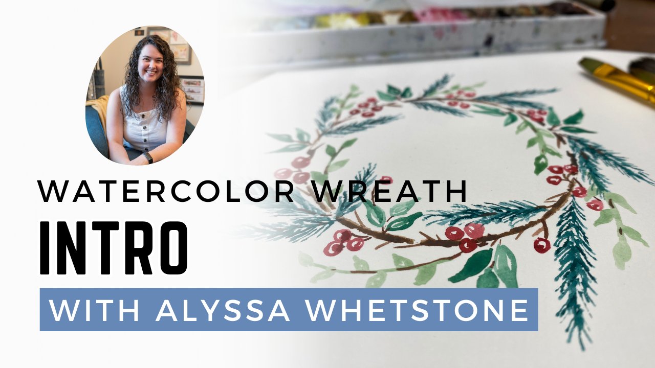
1. A Joyful Bookshelf Illustration: What to expect: Do little objects around
your home, bring you joy. Did you know that
if you incorporate those little random
objects into your art, they might bring you even more? Joy, Hi, Melissa Whetstone, curate your happy place with me as I lead you
through creating a, one of a kind illustration of a bookshelf full of
things that you like, finding inspiration for
our art can be as easy as looking across the room at what we've placed on the
nearest bookshelf. When I'm painting,
I find that if I'm looking at something
that brings me joy, then the painting process
will be even more enjoyable. Through this course,
you'll become familiar and confident with your supplies
such as watercolor and pen. We will learn to intentionally create a space
ready to create in, learn to find references
for our paintings, and practice essential
drawing and painting skills. I thrived in my undergrad years. When I was learning to
become an art teacher, half of my classes were
all about education, from pedagogy to psychology. The other half of my, or studio art classes,
and I loved them, I got to learn 2d3d printmaking, painting, drawing, and combine all of those
in my senior thesis. When I did a project drawing and painting objects
from art classrooms, I also had my student teaching, which meant I got to be in the classroom learning
how to teach. Because now I've spent
quite a few years in public education teaching
elementary art students. However, I love teaching all
ages and outside of schools, I teach classes in
my home studio as well as at places all around
the cities where I live. This class is valuable for beginners in both
drawing and watercolor, but will also include valuable
lessons for those looking to deepen their already developed skills
and understanding. Learning techniques
around color theory and composition are just two of the many far
reaching concepts we will apply in this lesson. While using a pen and
some watercolor to bring simple moments to life is a rewarding experience
all on its own. This class will loosen up your
art muscles and teach you important mindsets an artist
to utilize when creating. By the end of this
class, you'll walk away with a completed
illustration of a bookshelf with watercolor and pen full of things
that bring you joy. Whether you're taking
this class just for fun or to
further your career, you'll walk away
with vital skills to improving your drawing
and painting techniques. What you learn will improve your quality of art
and make sure that your artistic voice is
heard. Let's get started.
2. Introduction: An overview of the project: Hello, welcome to the class. I'm so excited to get
started with you. We've got a few things
in store ahead. We're going to talk
about how to find inspiration from
places around us. We're going to then think about how to get our supplies ready. Which supplies to choose? I'll show you what I'm using and how you can make sure
you have what you need, but it might not be
the same as mine. Then we'll start sketching, planning out,
composing our image, making sure that we have things
that are important to us, things that bring us joy, and maybe just some things that look nice when we put together. Then we'll start to paint.
We'll use our paint to insert our books and to add a few more things if we need
to fill some more ******. Always thinking about
composition and how our picture will look
once we start painting. We'll also think about
adding details in pen. Once we have our whole
picture together, you can share it
with other people in the class and then you can go look for ideas and
inspiration from them as well. I'm so excited to create a joyful illustration
with you today, as we practice so many important drawing
and painting skills together. Let's get started.
3. Finding Inspiration: Finding things to include in your painting: We all have some
shelves in our homes. You and I do right
here in my studio. Pardon the mess, or maybe don't, because looking on those shelves is going to be a
great place to find inspiration or objects that you think could be interesting
in your own painting. We don't have to stay with the shelves that are inside
our home to get inspiration. They're a great place to start and they're a fun place to find meaningful things that only you would know about and
want to use your art. But there are more
places to find inspiration outside
of your home too. A great place to
find inspiration is your favorite store somewhere that has interesting things
you would find on the shelf. I'm a Target lover, so I checked out their
spring decor with plants, flowers, and everything else
that would look beautiful. I'm looking for a
variety of things. I want to be inspired by
things of different shapes, different sizes,
different colors. I want to think of things I'll use and I'm
going to want to document those things so that I can refer
back to them later. Think of this like window
shopping with a purpose. You don't actually have
to buy anything you find and like. But
just document it. Take a picture or a
video to make sure you have evidence for how to include it in your
artwork later, think about what
things represent you or would make a
beautiful composition. Do you have something tall? Do you have something straight, curved round,
geometrical organic? What kinds of shapes and
designs are you drawn to? While shopping In person is fun. It might not be something you have time for or want to do. So I've got another
trick for you. Instead of going into the store, shop on your phone
or on a computer, pull up the website of
your favorite place, look through their
different things and save the pictures,
or take screenshots. This way you've
got the same idea, the same documentation of things you like and
could put together. Not to mention pinterest is a dangerous place to go down
a hole of fun decorations. Check out your Pinterest
boards if you've already got some for your future
home decoration desires. And use some of those objects or inspiration for your own art. What I like to do is
save all these pictures to a folder on my
phone and name it, maybe Skillshare or
painting a shelf. Now, when you're ready
to start your project, all those inspiration
pictures will be in one place ready to use. If you're still not sure where
to find some inspiration, I've included some
resources for you in the class. Check those out. Download some pictures and idealists to make
sure that you're ready to create a
beautiful arrangement of objects on a shelf. Maybe there are objects
that speak to who you are, Maybe it's just having fun. Either way is totally okay. Once you're ready
to be inspired, or you found that inspiration, head to the next video,
and let's keep going.
4. Preparing Supplies: What you'll need to be successful: For this activity,
we're going to want a variety of supplies. Now, the exact
supplies you choose, it just depends on what you
might already have at home. And I'll show you what
I prefer to use with a few things we'll want to
make sure of when we begin. We will want a
pencil and eraser. I tend to use mechanical, just personal preference and eraser because we're going
to make plenty of mistakes. But as I say, let's turn
mistakes into masterpieces. Once we have our
pencil and eraser, we will be wanting to
use a pen at some point. You may choose to do
this in the beginning, You may choose to
do this at the end. I tend to use these micron pens. They are archival, They're waterproof so I can
paint on top of them, and they will not
bleed or blend. When I use them, I tend
to have different sizes. Here I have a 03.0 103 is
bigger, 01 is smaller. And that way I can control how large or small the
size of my lines are. When we're drawing,
you may want to have some sort of straight edge. I like to use a triangle because
I can make sure my lines are parallel or perpendicular to the edge of the
paper I'm using. I also prefer to use things
that are clear like this, so that if I'm
covering something up, I can tell where my
line is next to it, even if it becomes or goes
underneath my straight edge. Just a personal preference here, But something to make
a nice straight edge could be handy today as well. When we actually
get to painting, you're going to want a
variety of sizes of brushes. Depending on what
size your paper is, I'll be using an
eight by ten paper, a little larger size to make sure you can see what I'm up to. I've got a larger round brush, this one is a size eight. I have a smaller detail
brush, this is a two, it's actually a flat, but
because it's so small, it can work as a
round brush as well. A tiny little detail brush, it says 18/0 I don't know
these sizes as well, but any small detail
brush will work. And then I have another
flat brush, this is a six. I like the flat brushes for this activity
because doing books, it's nice to be able
to have a brush that will paint a rectangle or paint a straight line as opposed to the round brushes
are really great, they're just comfortable
and easy to use. But they won't necessarily
paint a rectangle very easily since they happen to
be more round or pointy. But having a variety of sizes
will be handy just to make sure you can pick
which one works best for the part of
the project you are on. One more tool, more
optional, is a color wheel. I'll provide so color wheel
examples in our resources. So take a look at that if you don't have one
handy at home. I grabbed a set of these recently to have when
I teach lessons. It's just a very helpful
way to really break down the color wheel
and we'll want to think about the colors
we are choosing. So we'll talk more
about that when we actually get started in
our painting section. Last but not least, paint actually not last
paper two, but paint. This is the paint palette I use for most of my
personal projects. It already has watercolor
paint in it and I've let that paint dry
in these wells. I don't clean my paint palette because when I mix the color, it tends to be a color I enjoy and I'm going
to re use it later. So I leave that
there to be woken up with water and used
again at a later point. If you are just using your paint palette
for the first time. And you'll see the
one I actually use in our demonstration will be clean and you'll want to
prepare your paint palette. And it can be nice
when you're starting something new or
learning and following along to have something
that's a clean slate so that you are ready to
mix whatever colors we're practicing together. If you have water color that
is like this in these tubes, my brand is Windsor
Newton Cotton. Those are the ones
I tend to use. I prefer to squeeze them
out and let them dry. This is because
with watercolor we want to create layers
of transparency. And if we use them when the
paint is wet and we use it, then we are tempted to
use it kind of like acrylic or layer it in
a more opaque fashion. And we want it to
be transparent. So I tend to fill up my
tray and let it dry. That's the kind of paint I'll be using for my demonstration. You might have a paint set at
home that looks like this, where it already has
the dry paint in it. These are great as well. Really, you can use any
watercolors to find success in our activity
and our lesson. This project, whatever
ones you have on hand, doesn't matter what
they look like, we will use those and
make some masterpieces. Last actual, last
think is paper. I'm going to be using this Strathmore ready cut
watercolor paper. I will be using hot press. Because we're doing a drawing, it can be helpful to have a smooth paper so we can
create those details. If you use cold press, drawing can be a little bit more difficult
because your paper is rough and it's harder to
make those small details. If you have the option,
choose hot press. If you only have
cold press on hand, just be prepared to
draw more loosely or be okay with a more
varied line quality. I already like the ready cut, so I can just use
them and they're ready to go and we'll
be taping them down. The last thing you'll need
is some painter's tape. Any painter's tape, your
house painter's tape that you might use for your
walls works just fine then it helps to
have a paper towel or a tissue thing handy since we will be controlling
our amount of water, whether it's dry or wet. And of course, a cup of water to make sure you
get those supplies. You know, you're working. Keep in mind the
space you're at. Is this a space you can
leave everything set up and come back to it
if you get interrupted? Or is this an activity where
you need to set it up, knowing that if somebody else needs the space,
you have to clean it up. Pay attention to where you're setting things up.
Make it easy for you. The easier it is for you
to find your supplies, to have your supplies ready, the more likely
you are to create. Let's move on to the next step.
5. Sketching: Composing your image in pencil: Now that we have
done some planning, we've got our supplies ready, we've looked for inspiration, we've found some things
that bring us joy, maybe have memories attached. It's time to actually
sketch out our design. You will want to
decide if you are going to be doing one shelf, close up with items nice and
big that you can see them, or if you want to
do a few shelves. I think for this
practice I'm going to do two shelves wide across my paper so that they feel close and I can make
my details nice and big. If you wanted to
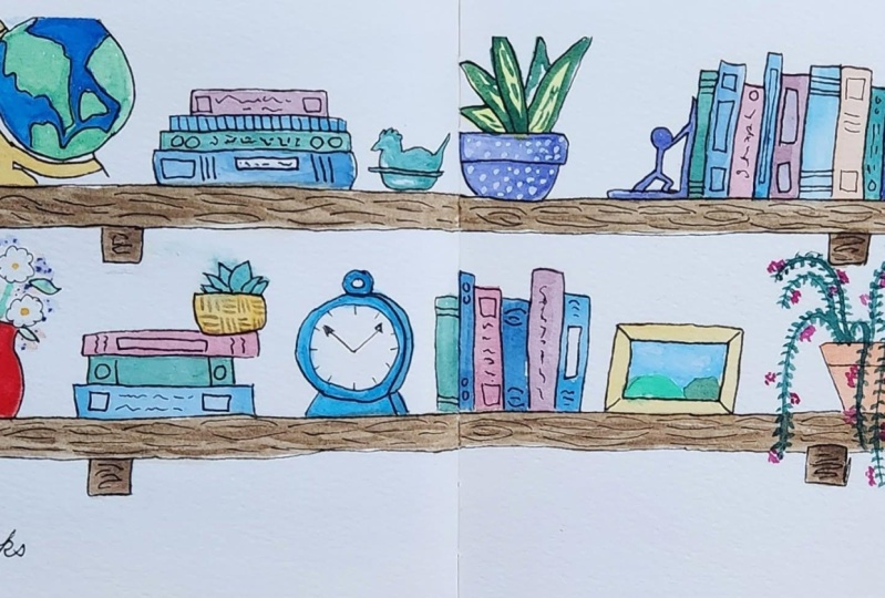
include many shelves. In this case, it's a painting
of all plants on a shelf, which you totally could do. My plan today is to have a
little more nuance or details, but what I wanted to
show you was the layout. You could do three shelves or shelves in the floor in a
vertical layout as well. Or you could do just one
shelf nice and close up. I'm going to use my
straight edge to make sure that my
shelves are not wonky. I like my triangle because I
can line it up with the side of my paper to make sure
that this is perpendicular. I'm going to make
sure my shelf has enough room above it for
objects to go on top. I don't want these two lines
to be perfectly centered, because I need to
have things above them and probably not
things underneath them. I'm going to go
ahead and make one shelf right around here, making a line most the
way across my paper. And then another one, this one
much closer to the bottom. Because again, I want
room for things on top of it knowing I won't have a
lot of things underneath it. Okay, Now I need to turn
these into rectangle, so I'm just going to give
them a parallel friend. I can make the sides
while I'm here. I do want them to be
about the same length, unless I'm going for a
more asymmetrical look. I think I'm going to go ahead and try to make sure
those ends are the same. By this time, I'm
going to line up my ruler with the
top of my paper. Figure out where I decided
to end that first one. Come down here and give an
end to my second shelf. And then I can use
my hand and eraser, of course, to get rid of that extra line
that was too long. I'm going to go
ahead and do that again for the other side. Figure out where, make sure I'm square here where
the end of my shelf is. Create the end at the bottom. Then I'm going to go
ahead and market. Now this is where I like
the see through because even though I'm putting
my triangle here, it is making sure that I can see where my
lines are underneath the triangle and then I'm going to erase my
extra little line. Okay, Now I'm pressing hard on mine because I want you
to make sure you can see it. If you are sketching yours, you do not have to press hard. We will do pen later. We could do at the
beginning. At the end, I'll show you those options. Otherwise, just knowing
this is a sketch, it's a light plan of
what you want to do. Now, I've lost some
of my inspiration. You might have some pictures
saved on your phone. At this point, maybe you have the physical object
in front of you. Either way is totally fine. I'm going to go ahead and
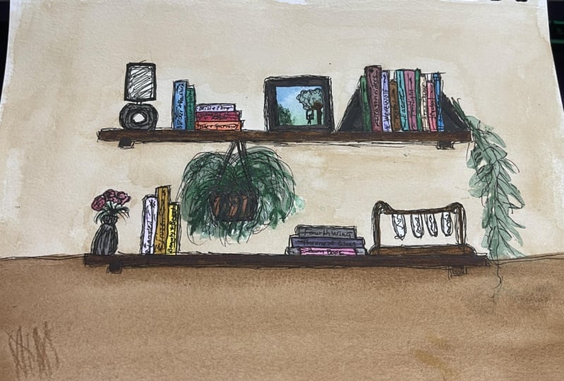
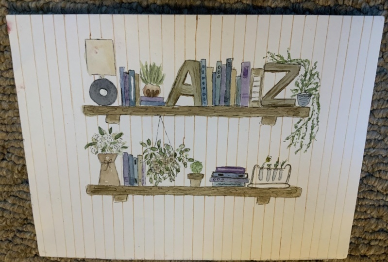
plan my objects first, and then I can go back in and add lots of different books. The books are fillers, the objects we want to focus on. I've found an
interesting lamp here. It's got this more circular base that looks fun and Art Deco E, and then it has a
cylinder lamp shade. Now, if I didn't have enough
room for the whole lamp, I could change the size or the proportions to
make sure it fits. Because this is my design. I'm taking these elements that I like and I'm putting
them all together. There's one thing I like, these funny little test tubes. I'm not a scientist, but I love that trend of like using things
for new purposes. I'm going to balance, I'm going to put something
over on this edge. Now as you're placing items, think about the space
that they take up, how tall they are,
how short they are, and what sort of space
you need to have for those items to make
your work feel balanced. Okay, I'm going to move
on to something else. I've found these
book ends, those. I think I'll leave some gaps in between to actually
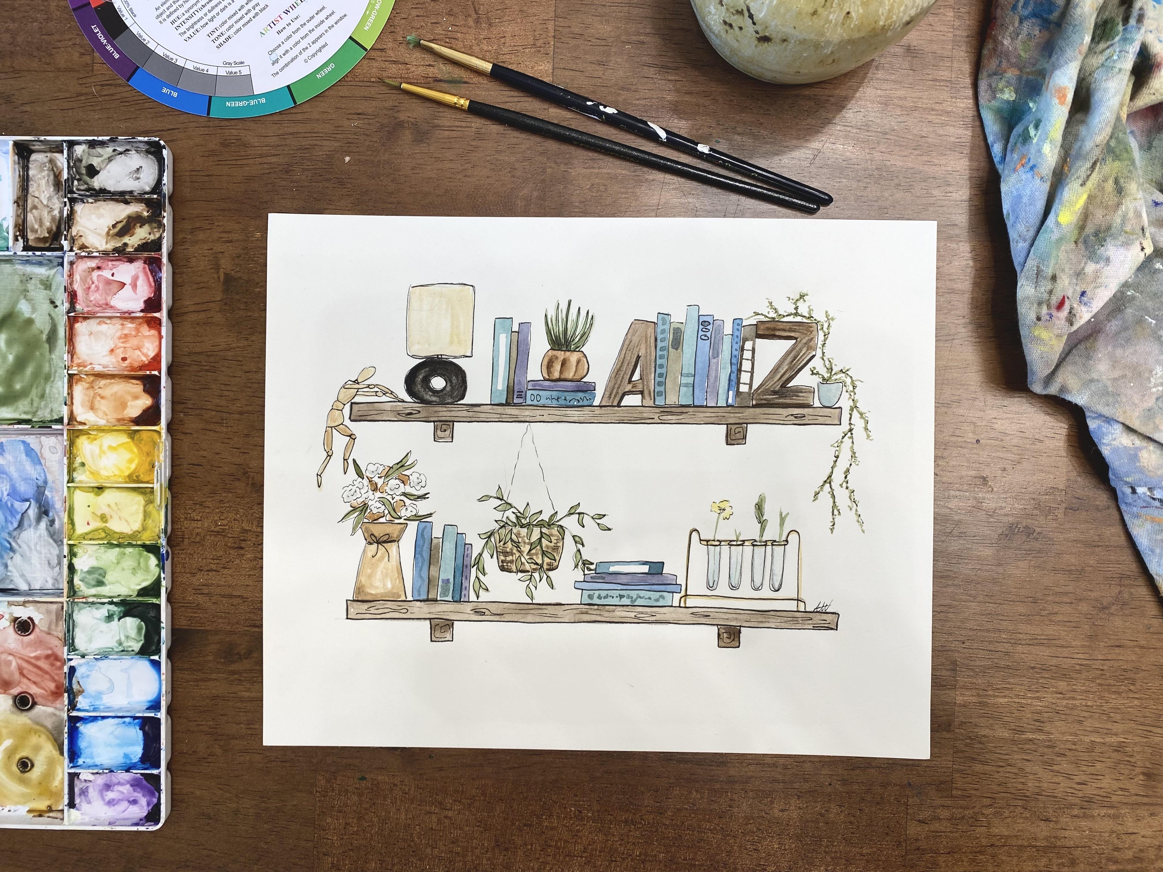
put the books. Just a fun side note, and the reason it chose these bookmarks is
my name is Alyssa, my husband's name is Zach, and our wedding was like
full of these As and Z's as this Z joke and theme. We have a bunch of As
and Z's in our home, even though this picture isn't the exact As and
Z's that we have. I can change the
color and stuff, but it's a fun memory for
me to have in my artwork. I love hanging plants and
that's going to create some visual interest if I have some things that will
look like it's tall. Because it's going to come
up to the second shelf. I'm going to hang it off
of that second shelf, but have it going,
like pretending it's on this bottom shelf. Again, this is just a sketch
of where I want it to be. I don't even think I'll
add the plant leaves. Maybe I'll just draw some
lines for where they're going to go to make sure I
have enough space for them, but that's about where
it's going to hang. I also love this
thing of flowers. I'm running out of room for my like, evenly
spaced things. I think I'm going to change what it looks like a
little bit because I want it to be narrow. But I think I'll
fit it down here. You'll notice I'm keeping gaps, but I'm trying not to make
the gaps perfectly the same. Because I do want
it to look varied, but I want it to
look random as well. I'm going to make this vase
much skinnier than it is in the picture because that
fits my composition better. Then I'll just generally plan where the flowers
are going to go. I've got this cool vase, I don't think I really
have a spot for it yet. As I add books, I could end up
having more spots. I'm going to check
out. This one has some pretty candlesticks
that could look really neat. Some things like these and that other vase I could
put on a stack of books. Once I start painting, I might actually
come back and add more drawings with the painting. I like to paint
the books instead of draw them because
it's easier to use my brush to make
the rectangle and then I can go on
top with my lines later if you have things in there right now that you
want to plant ahead of time. For example, I want to do more drawing for these
flowers before I paint, especially because they
have some white on them. I want to make sure
that that stays white. I'm actually going
to do a little bit of pen before I paint because then I can
erase my pencil lines. If I paint on top of my pencil
lines, there's no erasing. Oftentimes, the pencil lines will start to look
like a shadow. Since they're a gray, it's totally fine to
keep them in your art. But if you have something
where you want to make sure that you
don't see pencil lines, pen and erasing is a good idea before you
actually start painting. So I'm just going to
do those main flowers and then erase where
I sketch them in. But I'm going to
leave like the leaves and things for my paint because I can make
some really nice leaves just using the
shape of my paint brush. This is where it's up to your discretion of What do
you want to draw first? What do you want to use
pen for this thing? Just takes practice to
figure out which direction. Which order is easiest for me. One last thing we want
to decide is how are our shelves attached
to the wall? We could leave them like
this where they're floating. Oftentimes shelves have a
little bit of a bracket. I think what I'm going to add is just a little bit of a rectangle near the edges to show that they are
attached to the walls. I'm going to try to
evenly space those. You couldn't measure it out
if you're really picky. I like to eyeball things. I do that in my own home too when I'm hanging
art on the wall, which drives my
engineering husband a little crazy because
I just eyeball it, nail it in, and if it doesn't
work, I make a new hole. So that's my style. You would decide what yours is. Make sure you've got all
the different things, the big important things in place before we move
on to the next step, which will be painting. Painting will go back and forth with a little
bit of drawing, Depending on what you
want to add as we go, let's start painting.
6. Painting: Adding color and value: If you've painted with
water color before, you've probably seen artists tape down the edge
of their artwork. That's especially important
when you're going to do a wash or put a lot of water
and paint on your art. In our case, we're making lots of small areas of
different color. We don't actually need to
tape down all the edges. What I'm going to do
is I'm going to put a little bit of
tape on it just to keep it from moving
around on me. Maybe a piece or two on each edge just to make sure that when I'm
painting it stays put. If you feel more
comfortable going all the way around your art,
that is totally fine. Just make sure your
tape doesn't get in the way of what you
are actually painting. I'm going to be painting
my books first. Since those are an object, I need to decide where
they're going to go. I've got my paint palette here. I want to think about the
colors that I'm choosing. Thinking back to that color
wheel I mentioned earlier, I'm going to have that handy and I'm going to think about an
analogous group of colors. I'm going to pick
a group of colors that I think would
look nice together. I love blues. I think I definitely want
to choose some blues. I think maybe I'll do something
like this trying to stay within these blues and
purples. And then some greens. And I can, if I want
something to stand out, I can jump across
the color wheel and include some orange. Since it's the
opposite of blue and it will really create
high contrast. I'm going to start
with some blues. Because I like blues,
we'll keep that handy. My paint is all dry
in my paint palette. So what I like to do is wake
up each color a little bit. So I'm just going to drip
a little bit of water. And each well, you could also use a little
squirt bottle to wake up your colors whatever way you are most comfortable or whatever you've got handy. I forgot my squirt bottle
today, so here we are. That'll help them wake up in
advance of me needing them. Now, I don't like to use colors straight out
of the paint palette. I like to do some mixing. I'm going to get some of
a very pretty light blue. And then I'm going to mix
a little bit of green with it just to make it more teal. Then, depending on
your personality, you might like vibrant,
more saturated colors. Which would mean keeping them like this where
they're on the color wheel, I tend to like
more muted colors. And to mute my color, I want to make it
less saturated. I'm actually going
to get a tiny bit of brown and mix that tiny bit of brown with my blue
and green and it's just going dull
color a little bit. That's my preference. You can do what you
want for your Now, I've got that on my rectangle
brush and I'm going to just decide where do I want
books? I want a book here. I'm turning my brush
sideways and then I'm using it to make that big,
tall rectangle. Now one thing to play with books is this idea
of negative space. Look how I traced around and I left this space
white in the middle. We can use that white
of the paper as a color white because I'm going to
use this color a few places. I'm going to just jump around
while I have it created, while I have it mixed
up before it dries and create a few different
books in that same color. Some books, I want to be
laying on their sides. Some books, I want
to be standing up. Again, books are just our fill. Er, you can always
add more details, or titles, or things
to them later to make them more
important or visible. But it's helping us
balance our space and fill in those empty areas
between our objects. I'm going to make this book
really tall and skinny, trying to change the size or the dimensions of
each of my books. Maybe there'll be one
more in this books stack that has the same color. No, I'm going to
grab another color. I think I'll just add some
more blue to this mixture. Maybe a tiny bit of this other
blue blue is very strong. I'm going to water it
down a little bit so that it's less dark. To make it lighter, I'm
going to go back for me. I'm going to add a little
bit of my brown to it as a lot of brown there. That's feeling good. That's
a nice darker blue color. Now I have to to make
sure my books are dry. If the books are wet and
I put this next to it, they're going to touch
and they're going to blend and bleed together. Which if we want our books to
look like separate objects, we don't want them to bleed
together with other books. Try to pay attention
to which books are dry and start painting
next to those. If none of your books are dry, then keep gaps in
between them and you can always put a different color
in between them later. I know I don't want
all my books to go in a pattern to this time. I'm going to just
pretend there's a book underneath it that
I will add later. And I'm just going to put
this book floating for now, because I can fill that space in between them with a different
color a little bit later. Okay, I have added
most of my books. I could always go
back and add more, but I'm going to go ahead
now and start painting my objects and see once
I have those painted, how my balance is coming. Do I need to add another
jar on top of these books? Do I need something on
the edge of this shelf? I'll be able to see that once I start adding color to
the rest of the objects. Okay, I'm feeling pretty
good about where I am. So far I've been adding
different varieties. I tried to use the same
greens in the plants. I'm realizing I want
to plant up here, because I have some
plants down here. So I'm going to go ahead and put a little jar with a plant here, maybe even another one dripping down over the
edge, maybe over here. Because I feel like
this space is fairly empty and then I'm going to
be painting the shelves. As I'm working, I'm constantly
looking for empty spots, things that need more variety
or something else going on, and then I'm adding
that in as I go. Okay, I am very much struggling with this
spot over here because I want to do another
plant that comes down but that feels
too symmetrical. So I'm trying to think if
I can create figure that hangs its giver like a little
doll or something else. I'm going to look for
some more inspiration. And of course, it's
always okay to stop, walk away, and come back. Maybe while I think about that, I'm going to finish painting the shelves
and then that'll be my final addition
to this layout. Maybe something sitting
on these books here. It's nice when the
books are sideways like this to use that as
an opportunity for something on top. All right. I figured out I would do a
little drawing mannequin since that's my only thing that I've included
that's artistic. And I wanted this to be a
bit of a reflection of me. So I've got my little
drawing mannequin. I'm pretty happy with it. I think we're going to move on to adding our final details. Once you've got all
the base layers, you've got all the pieces,
they're pretty much painted, then go ahead and move on to the next video where we're
going to walk through finalizing different
designs and details and adding pen over top. Let's go.
7. Details: Finalizing paint and adding pen lines: This is the fun part.
We get to figure out our little details where
we want to add shadows, designs, and fun things. We're going to start with paint and then
we'll use some pen. I'm going to use probably
smaller brushes. I'll start with
not the smallest, because I can always go smaller. And I'm going to
look at my books, and I'm going to look at things
I want to add designs to. So I want to stay
in my color family, so I'm going to still use some
of these blues and greens, but I'm just going to add
stripes to some books, a long rectangle to another. I'm just going to start creating variations with repeating
shapes and lines. Here I've got a little row of squares jumping around
to different books. Maybe there's a title, but we can't quite read it. I'm just going to do a
little bit of a scribble. Scribble along the bottom there. Maybe there's a line there. Have fun thinking of shapes. Lines, designs, some can be
darker, some can be lighter. If you feel like
you're missing one of your colors in an area, think about how you
can use that to make a design or add details. If your book is too skinny,
then don't worry about it. If it's got a white rectangle, you could use that
space and make it into a new color since it won't mix with the color
that's already there. Or maybe just leave it
white for some balance. I'm going to add just
a few more details, but I don't want to
go too crazy either. I've got some book details. I'm going to go look at my
objects and look for places I can increase my
interest with shadow. I'm going to think maybe my A and Z over here could
use some wood grain. That's the direction I
decided to make them go. The Z's got more wood grain. That one worked out
well at the beginning. Maybe there's a shadow
on the letters. I'm going to make a darker brown and figure out
where the shadows would be next to create that more
three D shadow effect. If I'm going to do the shadows, I got to keep them
consistent with each letter for where I put
the shadows that works there. Maybe there's a shadow
on this clay pot. It's already got a
little bit of shadow. Maybe I add some brown
shadows to these leaves. I don't know why I love
using brown so much. I love neutrals and I really enjoy adding bits
of brown places. This basket that I was actually looking at was a woven basket. Now my leaves are in the
way to make it perfect, but I think I'll just do some crosshatching
generic lines. And that'll at
least suggest that this basket isn't flat so it's
just got a texture to it. Watercolors are great, you
can just do it loosely. Just suggest what's there and the viewer's eye will
fill in the rest. I'm going to add some
little plants sticking out of these guys because they seem empty and lonely and I've got a lot
of space above them. If I just have, There's some
things propagating in here. I don't understand
propagating very well. I would love to learn
how to do that. I love plants, but
I'm very new to the plant caretaking lifestyle. I don't know actually how
to do anything with them. Mainly some grassy things, but I'll add a flowery
thing to one of them and I can add some more detail with
pen on top of that later. Just a little yellow flower. It's maybe hard to
see in that one, but that's just, creates, fills that space a little more. I ended up not drawing
anything here I could, but if I put it in
the middle, it's getting really close
to these vines. I think that's why I was
staying away from it. I don't know. I could
always so he mine later. Next we're going to do some pen. If you have the micron pens, these work really well. I'm going to start with my 101 because I can always
make my line thicker, but it's harder to
make it thinner later. Now my goal is to look for
areas I want more definition. I tend to use a lot of pen. I love doing pen, but I also have been trying to figure out how to hold back. I'm going to go
ahead and just start tracing some of my pieces. Maybe these bookshelf letters,
we'll get some lines. I could even more define
where those shadows are. I'm going to definitely
outline some of my books, maybe all of them. I think I'll start with just every few and I'll
see what it looks like when it comes
to this plant. I'm not outlining it, but I'm just adding
more pokes and scribbles to suggest more of that wigginess that
I did with the paint. I'm using the paint
as a guide and I'm just dashing and
scribbling over top. Not fully because I
want to see the green. I don't want to
cover it in black. I'm just adding some contrast with the black lines already. You should be able to tell
that this is much more contrasted of an area compared to the rest
which is very soft, which is totally a fine look. I tend to lean towards the illustrative look where it has more of the sharp lines. Adds simplicity, but
also adds contrast. That's my personal preference. If you're here learning from me, maybe you like that style too. But as always with any
tutorial or lesson, you can change it and
make it your own. Also with these books, you can use your
pen to add details. Maybe I'm going to
do some stripes or designs to add to
what's going on. And again, it creates
more contrast. It just makes things a
little less wishy washy. When it comes to
these flower pots, I like to do kind of a loose
trace to kind of keep with the floral design of I don't know exactly where
each leaf thing is. So I'm just going to
follow the shapes that my paint made to create kind a variety of shapes
and keep it interesting. All right. I have
gone back over with my pen and I've added
my final details. Looking for edges of things. I ended up outlining
pretty much everything. And that, of course, that
choice is up to you. I love the look of the sharp, clean edges with all
the details on top. So I hope that you enjoyed collecting and putting
things together in yours. Let's chat about our
whole project and process in our last video
together. See you there.
8. Wrap Up: What did we learn?: What did we learn? What
are our takeaways? In today's lesson, we
learned how to choose the right watercolor
supplies for a successful and smooth
creative experience, as well as being mindful
of the space we create in. We learned fun and easy ways
to look for inspiration. Whether we're window shopping at our favorite store or
scrolling on line, we can document and plan a variety of objects to
compose our paintings. Once we started painting, we discussed how to use the color wheel to
plan our paintings. We reviewed how the
analogous colors can create harmony and unity, while popping in a
complementary color can create contrast to
make things stand out. When we broke out our paint, we learned to make
the paint light and transparent in order to use layers to create
beautiful effects like texture,
shadow, and variety. As we arranged our paintings, we thought about
variety in size, color, height, and more. So our art can draw in the viewer and keep
their interest. To finalize our masterpieces, we brought out our pens and
looked for opportunities to create contrast with
simple ink outlines. We use small black lines to
create additional details and allude to interesting textures across the composition. All of these skills
have led you to create a unique masterpiece unique
to what inspires you. And unique because your hand and the way you move
your paint brush, your art is valuable
because you created it, not because it's
correctly created. I hope this lesson
has left you with valuable and
applicable takeaways that will continue to impact your creative exploration
of watercolor. Find more from me on my
website, Alyssa Whetstone, Art.com Find me on
social media and check out my Youtube channel for some more things.
See you next time.
 Alyssa Whetstone, Pen and Watercolor Artist & Art Teacher