Transcripts
1. Impressionist Drawing Vol 3 Mastering Sunsets in France: Would you like to learn how
to draw the breath taking sunsets of Normandy in just
a short amount of time, create beautiful
detailed sunset drawings without spending endless
hours on intricate details. If so, this course is for you. I am Volo Vperez and I'm
excited to present to you volume three of my
Impressionist row and Series, where you will learn
to draw anything using graphite and take it to
a fully colored draw. With over 30 years of experience
in the best art schools, my mission is to guide you to elevate your skills
to the next level. In this volume,
you will discover a fast and effective technique
that will allow you to capture the stunning
hues and shades of a sunset while the sun
dips below the horizon. Using graphite, pastels,
Pagni and high quality paper, you will explore and
evolve your drawings from simple sketches into vibrant
emotive works of art. This course is set in the beautiful city of
Cavour in Normandy, where you will
immerse yourself in the artistic references of
great impressionist masters. You will explore how they capture the magic
of some sets of drawing inspiration from
their techniques and styles. On the other hand,
we will create two major projects a
sunset at the beach, where we will capture
the serene beauty of the sun setting over the waves and a sunset with
a typical Cavour house, where you will learn to portray the idyllic architecture
illuminated by the soft glow of twilight. Each lesson is
designed to provide you with a rich and
immersive experience, lending theory and practice in a relaxed and
creative environment. You will learn to
simplify complex scenes without sacrificing
beauty or expressiveness, discovering how
encapsulate the essence of a sunset in minimal time. This course is
designed to help you advance on your artistic skills, regardless of your
experience level. You won't be able to find a more comprehensive and exciting course
on this platform. My name is BaldloVbz and
this is my in Atelier, on impression rowing
volume free sunsets of normaly I see you
in the first lesson.
2. Learning to draw with sunsets: Hello, people. Welcome to volume three of our impressionist
drawing course. In these theoretical lessons, we will explore references about an essential skill learning how to capture
skies and sunsets. This approach allows us to connect with the essence
of impressionist, training our sensitivity to detect the subtle
nuances of light, the shifting of colors, and the movement
in the atmosphere. Drawing a sunset sky is not just a technical act
of representation. It's an effort to capture a unique moment that
once portrayed, becomes a living sin
pulling on the paper. Sunset teach us to observe how colors
dissolve into each other, creating gradings
that seems infinite, full of subtle hues. The play of light and shadows on the horizon is like a dance, teaching us to use warm and
cool tones to create depth. The light at the end
of the day transform into character on de sgn, casting long shadows,
creating reflections, and filling the
sky with mystery. This process is essential
to understanding the nature of atmosphere and light in
impressionist painting. To better understand
this visual richness, we will refer to three great
masters in different ways, capture skies and
atmospheres full of emotion. Theodor Roussea is Sac Levitan
and Eugene de la Croix. Theodore Rousseau
is, without a doubt, the central figure
of today's lesson. As one of the leaders
of the Barbizon school, Rousseau dedicated his life to exploring nature in its
purest and wildest form. Sunset skies are not
mere backgrounds. They are protagonists
that convey a sense of vastness and drama. Rosseau had a unique ability to work with dark
and deep tones, capturing a texture almost palpable in its
clouds and skies. By observing his works, we can see how he used
layers of dark tones and dense shadows to create sky filled with
atmosphere and width, making the viewer feel the
immensity of the landscape. Rousseau excelled at balancing the intensity of the sky with
the rest of the landscape. His sunsets tinged with
deep reds and purples, teaches not to fear to use of dark tones and a
strong contrast, essential elements to express emotion and character
of a scene. In his representations
of even skies, the clouds take a solid,
tangible presence. In each cloud, each
dark hue seems to have its own story,
its own identity. This approach allows him to communicate a sense
of calm melancholia, almost reverence towards nature. Learning from iso
means understanding how many details and control over tones
can build a dramatic, powerful, yet profoundly
intimate atmosphere. Incan dressed Issac Levitan offers us a more serene
and ethereal perspective. Known for his tranquil
and basful landscapes, Levitan blends it skies
naturally with the landscape, conveying a sense of
peace and harmony. Sanss don't seek the
drama of Rousseau. Instead, they are
characterized by a delicacy that invites us to look
calmly to pause in silence. Leviton employs soft
gradations and subtle play of colors to create a
continuous atmosphere between sky and land, making them breathe as one. This approach teaches us to work gently and precisely with gradients creating skies where color becomes an echo of Earth, enveloping the scene
in profound peace. Eugene de la Cra
although part of the Romantic movement was also a precursor in sky
representation. And some of his studies seem to foreshadow
impressionist techniques. Take, for instance, one
of his sky studies. Though filled with
energy and drama, we observe something
completely innovative and almost impressionist
in his execution. The blues and pinks of the
sky are synthesized in loose energetic
strokes that blend in dance of rich strokes
and vibrant colors. Delacroix shows us how the sky can convey
movement and vitality, as if the colors
themselves are dancing. This use of color, full
of emotion and energy, adds a sense of urgency
that teaches us to see the sky as a
vibrant living space, not merely a background. From Delacroix, we
learned to use Cutter, not only to capture
the appearance, but also the motion
of the moment. Throughout this volume,
the exercises will take place in the charming
town of Cabour Normandy, famous for its inspiring
sunsets in the first exercise, the goal will be to
learn how to detect the shapes of the
clouds with precision. In order to represent a sky that is bat ful and full of presence. We will begin
working in graphite to capture the form
and structure of the clouds in detail
and then transition to color ball techniques
to add the layers of light and shadow that
bring the sky to life. We will discuss
important references to understand how to structure the clouds and work
with tones and textures needed to give
them realism and drama. This exercise will be essential for capturing
the essence of the sky in the light
transformations during sunset. In the second exercise, we will work on a
typical rural landscape of Kabur featuring one of its traditional houses in the impact of the sunset
on the surroundings. This will allow us
to understand how sunset light interacts
with the landscape, how the colors of
the light change, and how they project onto
the elements of the scene. Learning to draw sunsets will be an essential step in
our artistic journey. It will allow us to master
the use of light, color, and emotion to create works that capture the
essence of the moment and connect with the viewer in a deep and lasting
way. Let's start then.
3. Sky First Approach Sketch: Hello, people. The
purpose of this sketch is to learn to understand the arrangement of clouds
and lights in the sky. The structure of these
clouds and the glare of the sun is almost
always irregular. So we must pay attention
to know how to interpret it in a creative
and appropriate way. So let's not worry about
achieving precision this time, but rather trying to understand
the essence of light in the composition and the
location of the clouds, the sea, and the coast
within the landscape. So let's start by
drawing the horizon in a slanted line to
represent the shoreline. This section of the
composition should divide the landscape
right in half, more or less like it's
in the reference image. Now, using an inclined
and consecutive hatching, we will try to represent the darkest and most
prominent clouds in the sky, as well as some areas
of the lower landscape. We will try to see
the dark areas of the entire reference
image as if they were spots that we must
represent with the hatching. Pay attention that
this is not about any kind of precision
at the beginning. In fact, this sketch is not
about achieving precision, but about understanding
the location of the most important
lighting elements and the division of the different
tones and shapes of the reference image that
could be in front of us. Once we have more or less
a general structure built, we can begin to
experiment with color. So to test how
sensitive we can be in differentiating the different
tones present in the sky, we will start by
representing the blue of the dark clouds that are
closer to the horizon. We are going to
use any blue color we think is most convenient, but we must put it in the
drawing in those places of the clouds where we feel
that color is present. That is very important. That is the exercise. We should try to do this with all the colors we detect
in the composition. If we happen to see
a specific color in some parts of the sky, we simply take the
color pastel bar and then we draw a spot there. Even if at first, it doesn't
seem to make much sense. We start applying the colors, we will notice the similarities. That is to say, for example, that same light gray
color that rooting on the clouds is also present in
the reflections of the sea. So as we add the first colors, our wrong language
will be built, and we will discover new colors within the composition
because our mind will see the colors
already applied as a reference points to build
the image on paper. Pay attention to how I now at the soccer yellow color to represent the sun
behind those clouds. Notice that once I apply it, the color of the paper
changes its meaning because, in fact, the color of the paper is the tone of the sun
on the beach itself. When adding this yellow tone, we must try to feel how far the sun's glow really
reaches between the clouds. Now look how I'm going to
use this lighter tone to represent that the sunlight
shines more above than below, since the clouds
are denser below, which prevents the light
from passing through to us. Pay attention to the edges
I'm creating on the clouds. Now, look how I use
this lighter shade of blue to represent the
atmosphere exposed in the sky. As I told you before, the balance between colors
is quite important. We already know that
the lightest shade of blue in the sky is that
of the atmosphere. Therefore, all the blues
that we apply to the clouds should be more intense and darker than that
of the atmosphere, as we see in the
reference image. Now I'm going to use
this pink in the sand to represent that there is a
light hating that sun as well. You can notice that it's not exactly the color in
the reference image, but within the language
of the drawing, it works. Now I'm going to apply
the reference colors for that area below. I mean the entire part of
the terrain in the hill. I'm not going to give as
many details as in the sky, reference colors to
complete the language. This is also very important because by properly
creating the cante, we can also make the
sky look better. Now I'm going to use the
graphite pencil again to mark the most
important contours. For example, some small
important elements on the beach, as well as the lines that divide the shore from the sand
and even the horizon. That is very
important when trying to read elements
in the distance. We can add some outlines to the clouds in
the sky, as well. Outline the edges of
the cloud can add a great deal of
three dimensionality to the volumes of the clouds. O If we see that we need more color
somewhere, we can edit. But remember that this
is just a sketch. We don't need to go
far with details. But now pay attention
to this final detail. We need to represent
that the light is really coming from that
side of the clouds. I mean that the sun is really
hidden behind those clouds. So we must represent its glow traveling and
spreading across the sky, even if it's not completely explained in the
reference image. I mean, we must
interpret it creatively. And that's it. Our sketch
of this sunset is complete. Pay close attention
to the arrangement of colors in relation to
the reference image. Even though it's not realistic, the colors and the light capture the core
essence of lighting. That is the secret of
impressionism when it comes to capturing
a sky in a sunset. But we will continue to go deeper into this in
the next lesson.
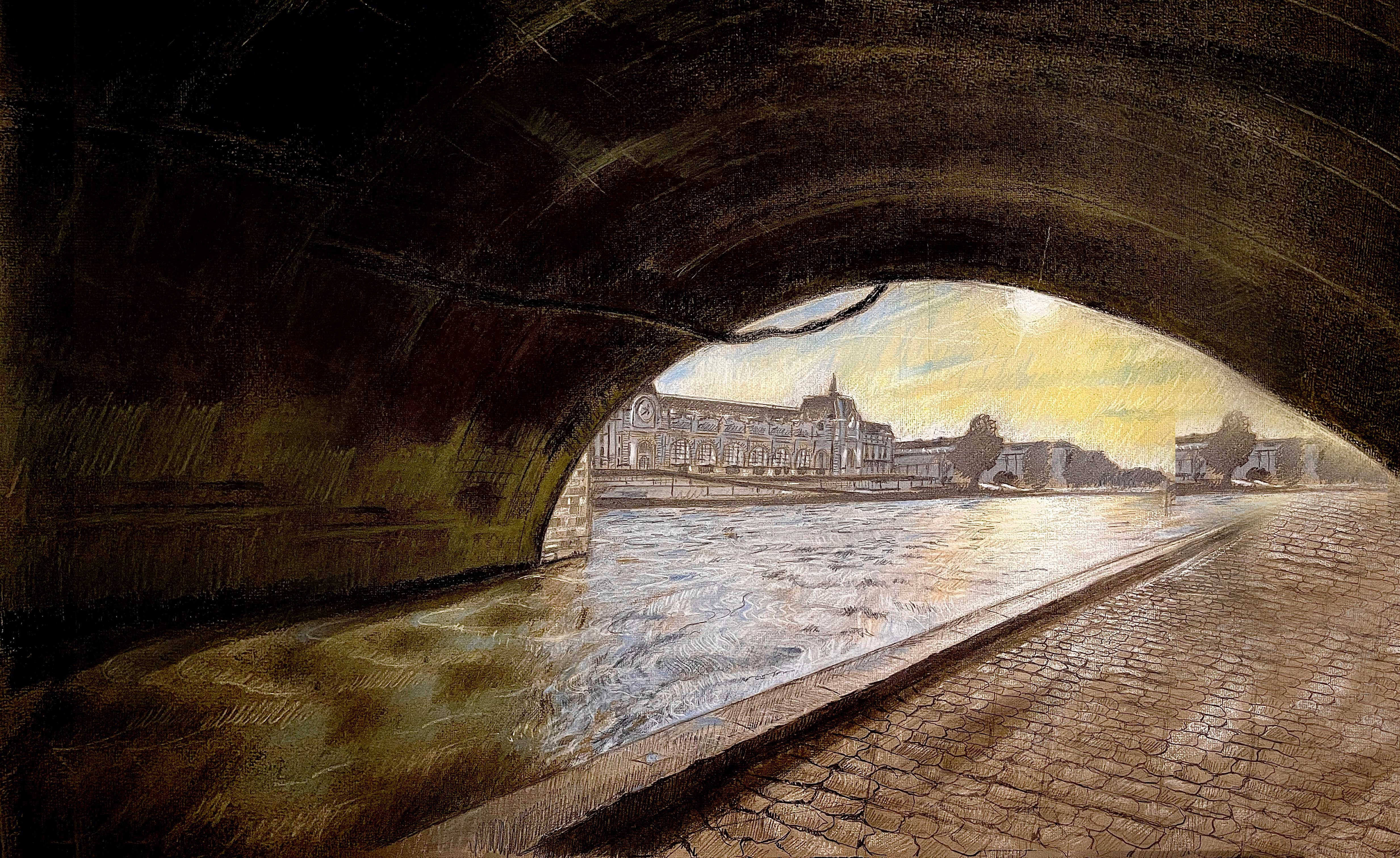
4. Sunset At Beach Theoretical Approach Artistic References: Before we begin to represent this beautiful sunset
over the beach in Kabor it's important to study significant references that
will help guide our approach. These references will
provide us with insight into how to capture the drama
and subtities of light, color, and the overall
composition of the scene. Our first reference is
the work of ArkiGunji, a Russian artist renowned for his groundbreaking use
of light and color. Gunj sunsets are more than just depictions of the sky
at a particular moment. They are expressions of the overwhelming power and
beauty of light in nature. One of the hallmarks
of his sunset is his ability to create
a sense of vastness. In several of his works, we see the sun positioned
centrally in the composition, often small but radiant, casting its light across
a broad and dramatic sky. Displacement of the sun
creates a focal point in the painting while also highlighting the immensity of
the surrounding landscape. The sky in the Kunji's work is almost like a living entity, pulsating with energy and light. He uses bald, saturated
colors, vibrant oranges, red, and yellows, blended
seamlessly with cooler tones like purples,
blues and greens. The effect is not just
a representation of a sunset but an
emotional experience that pulses us into the sin. What sets Kunji apart is how he treats light and its
reflection on the water. The water becomes a
mirror of the sky, magnifying the intensity
of the sunset's glow. The light which is projected
across the water transforms it into a vast
shimmering expanse that seems to radiate outward. Cong skies are never static. They pulse with life,
movement, and energy, and studying them will help us understand
how to use color and light to create depth and atmosphere in around
sunset scene. Our second reference
is Jan Constable, an English painter best known for his
landscape paintings, and particularly his ability
to capture the dynamic, ever changing nature of the sky. Well, Gunstable is more famous for his rural
English landscapes. His studies of the sky, especially at sunset, offer
a wealth of knowledge. Constables clouds, unlike
those of many artists, are not merely
decorative or fluffy. They are sculpted
with great care, and he gives them
with and definition. Making them a central
element of his compositions. The way Constable
represents the light at sunset is also crucial to
understanding his work. In many of his paintings, we can see the light
coming from below, as if the sun is just
dipping below the horizon. Casting warm golden rays
upward into the sky. This creates a striking contrast with the color tones
of the sky above, as the light from the sun illuminates the lower
part of the clouds, turning them into
glowing luminous forms. Constable was also known for painting rays of sunlight
breaking through the clouds, which gives the scenes a
sense of movement and energy. These rays travel
upwards into the sky, creating a radiant,
almost divine atmosphere. Through Constable's technique,
we can learn how to represent the
complex interaction between light from the
sun and the clouds, how to capture the transition
from warm to cool tones, and how to create a sky that feels both alive
and full of depth. In addition to their
technical skills, what both Kinsey and Constable offer us is a deeper
understanding of how to translate the light and
atmosphere of the sunset into a visual experience that goes beyond mere representation. They teach us to see the sky as an active
participant in the ne. Not just a backdrop, but a vital element
that shapes the mood, tone, and energy of
the entire landscape. Quint's use of dramatic
color contrasts and Constable's
delicate handling of light in the clouds will be key lessons for us as we work
to represent the dynamic, fleeting beauty of the
sunset on the beach. Now, as we approach
our exercise, we will focus on representing
the sunset over the beach in Kabur inspired by
these references. Our goal will be capture the interplay of
light in the sky, focusing especially on how the sun's rays illuminated the clouds and
reflects of the water. We will start by observing how the color shifts
during sunset, how the warm tones of the sky contrast with the color tones of
the ocean and sand. By studying the composition
of the kung and Constable, we will learn how to
structure the scene, how to position the sun, and how to convey the lights,
radiance, and reflections. In the next steps, we will use graphite to sketch the basic shapes
and structures of the scene and then move to pastel colors to
bring it all to life. By understanding the subtle
transitions of color, the movement of light, and the dramatic effects
that these artists achieved, we'll be able to create a
sunset scene that is not only beautiful but also
full of atmosphere, capturing the essence of that fleeting moment on the
beach. Let's start then.
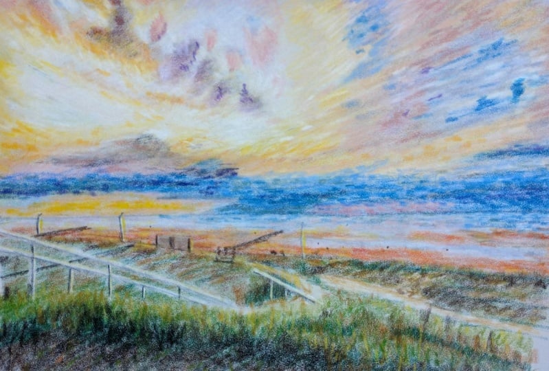
5. 1 General Structure Sunset in the Beach: Hello, people. Let's start building the structure
of this drawing. The first step is to
draw the horizon. And the reference image
is quite clear and it divides our canvas almost
completely in half. We must also place the sun, which is also the
center of the paper. When we get the sun,
we will try to make dismal triangle form by the most direct
sunlight on water. Do not rush with this. Take your time to
create this triangle. Now we're gonna
draw the shoreline. No, that is an inclined and line that touches the small
triangle we just made. Try to feel the angle formed by the line with
respect to the horizon. So we already have the space
that corresponds to the sea. Therefore, we already have a good reference point to
continue building the drawing. We are going to start
drawing the clouds. We must take into account the distance between
the lower edge of the clouds closest to the
horizon and the horizon itself. This distance varies
along the horizon. While we are drawing
this outline, we must take care
that this distance is respected as in the
reference image. Pay attention to how I draw this line. If you compare it with
the reference image, the outline doesn't really look exactly like
the reference image, but this line is located
appropriately in space. Once we have the lower edge, we can break down the whole
structure of a set of clouds into a general
regular shape that can enclose them all. But I would like to remark this, due to the regular
nature of these clouds, we should not worry
about it being perfect. As long as it is similar, it's more than enough to be
able to render this sunset. Once we have more or less made the outline
of the general structure, we can move on to some
internal details, not with the purpose of
building the clouds, but of locating the
general structure of these small internal clouds. After all, those inner clouds are just random
clusters in the sky. Oh. Now, let's move on to
the grass section. We are going to draw the
outline that divides the sand area from
the grass area. Look carefully that it's another inclined line
that forms an angle. As I always tell you in
all my drawing courses, the human eye is very
sensitive to angles, and we must take advantage
of that ability. But if you can see well
in the reference image, the grass area seems to have
three sections within it. The first one I make now is the first strip of grass
more exposed to the light. Remember that this
line that separates it from other stripes doesn't
have to be perfect. Just approximate. But
we must try to respect inclination of the line because the perspective depends
on that inclination. Now, we are going to draw
another line farther down to create the three stripes
corresponding to the grass. Pay attention to what
we are going to do now. We are going to apply a layer of different hatching for
each of the stripes. Ideally, this hatching should match the level of shadows
in each of the sections, but it's not completely
mandatory at this stage, because we are going
to add color later. What we need to do is to use this hatching to help us
see the difference between each of the sections
and even between the clouds in order to develop
the drawing appropriately. This hatching should serve as a map for the later details. So doing it well at this
time allows us to have more information to develop the drawing properly
in the later stages. Pay attention that in general terms, all the hatching goes
in the same direction, and only a cross
hatching has been applied in the sand
area to add density. In that area
corresponding to the C, we could try to represent the grading of the
sea using hatching. Look how I'm going to do it. We simply add several layers
of hatching that is one on top of the other to darken the tone in
the area we want. Now we are going to add a stronger hatching in
the grass section, since it's practically the
darkest area of the landscape. As we darken the grass, we will try to define the
clouds in the drawing in general more using hatching. We will darken with more details of those small areas that correspond to the small clouds
or some parts of the sea. We must do this
carefully and patiently. Pay attention to the
different nuances to represent the different
clouds with the hatching. But do not get stuck here, remember that we are not giving intricate details, just a guide. And there you are
the first stage of development of this beautiful beach in the north of France, the pure essence of Normandy in a single image that we are going to render from
this moment on, I see you in the next lesson.
6. 2 Creating grass in Graphite Sunset in the Beach: In this lesson, we
are going to create the details of the
grass area in graphite. So we are going
to focus first on the middle section,
the middle strip. We are going to
darken this section with a vertical hatching. It should be vertical to start representing the direction that the grass blades should have. If you can notice in
the reference image, they all points upwards. Additionally, as we
apply the hatching, we should try to represent
the perspective. This doesn't mean that we are making the grass
blades with hatching, but that the perspective should also be represented
through the shadows. Now, let's try to go deeper into more details
with the hatching. We are going to try to
represent the darker, smaller areas within the
same section of grass, those points where the light
reaches with less strength. Additionally, as we are
darkening the grass, we should also darken the sand so that everything
evolves at the same time. Once we have a general shading of the whole grass area, we will begin to represent the grass blades
in small groups. For example, in this far corner, we must break up
the grass blades with a very dark hatching, but paying attention to
the ages and above all, to make them pointy at the top. We must take great care of the contact area between the sand and that
part of the grass. Now, we will continue
creating more grass. Each blade of grass
should grow as we get closer to the
other side of this area. Pay attention to how I build the outline of this
more illuminated part. I have not made
blades of grass here, but the outline I have made creates the visual effect that the lighter part below is more illuminated
blades of grass. In the same part below, we can begin to
suggest the size of the blades of grass to
have it as a guide. Now we're going to
try to blur it a bit to add consistency to the
tone of the whole grass. You can do it with a
blending stem or a tissue. Pay close attention. Here you can see how the
blades of grass look up close. Pay attention to the regularity
and the fact that I'm not portraying exactly what I
see in the reference image, but making an
interpretation that can represent the essence
of this landscape. Look at the randomness of the
blades in the perspective. The ones that are farther
away are smarter. Now, let's start doing the same in the rest
of the grass area. Taking into account
that there are places where the
grass is denser and the light reaches with less strength forming those
shadows that you can see. It's not about doing
blade by blade. It's about understanding there are groups of them that can be represented both individually as well as using hatching. This specific area is a perfect example. I first add a layer
of strong hatching, and then I make small groups of individual blades of grass. Way Here you can see an example of
what I'm telling you. I'm darkening a
specific areas to generate volume in the general
appearance of the grass. Obviously, we must follow the reference image to guide us. I h. In this area, the detail of the perspective is
much more noticeable. The blades of grass
are significantly larger than on the other
side farther away. You must pay attention
to something important. The border that
divides the grass area from the sand cannot
be a clean line. It must be made up
of blades of grass. I mean, they must be
noticeable on that edge. Now, let's move on to the sand. We must try to represent the light shadows
that are in it, but also in some way
these small dark dots that are going to represent those small hills in the sand. Those spots must also
respect the perspective, and their function is to create an effect
in the distance. Although you should
make many black spots, this spots should
also be regular. I mean different sizes to give the consistency to the visual
effect in the distance. Try to be patient. We must make many so that the visual effects of
the scan can be felt. Now let's continue adding
details to the grass. As you advance, you should use darker graphite pencils to
make some areas stand out. Another important factor is to respect the randomness
of the grass. Even though we must follow
the reference image, it's necessary to experiment
from the reference image. In fact, it's very
useful because if we want to develop a completely
imaginative drawing later, we will already
have knowledge of the grass in order to
be able to portray it. At I h. Now, let's start on
this edge a little bit. As I told you, you
should feel like there is really grass there
in that contact area. And that's it. The
grass is ready. It looks magnificent,
even in black and white, but this is just the beginning. I see you in the next lesson.
7. 3 Creating Water in Graphite Sunset in the Beach: Hello, people. Now we're going
to do the water details. But it's important to
mention that all of these details will be
complemented when we add color. The first thing we're
going to do is create the lines of the waves
closest to the sand. We need to create these lines to represent the perspective
along the beach. Even though the
waves are moving in individual groups
towards the sand. There are also general
groups that move together. When we look at the
beach in the distance, these groups look
like long lines of waves that are moving
at the same time. For now, we just need to
draw these lines respecting the perspective as if they
were other inclined lines. Try to see here the subtlety
of this line that goes from the farthest parts of
the beach to the right side. They are in the same
strip of water. I mean, at the same
distance from the coast, only from a different
perspective. Now, let's start working
on this area near the sun. We are going to try to
darken it using lines that can represent the
waves in the distance. But we must be careful to
do as much as possible to leave light in the
small triangle that we made at the beginning, because we are going
to work on it later. As we go along, we should add details to the waves
closest to the sun. Every time we make a detail, we must see its value
in the distance to check how the visual effect
of the sea looks in general. Pay close attention to
this important detail. If you see at the edge of
the water on the sand, there is a very
contrasting line. You can see it very well
in the reference image, and we must represent
it to add volume to the water that is covering
the sand little by little. M Now we are going to make the gradient in the area far death from the sea. Notice how the edge
of contact with the sky is darker than
the rest of the sea. That must be represented as well as making the small
waves in the distance. Look here how I
make small waves. They are small,
irregular colle lines. The dark tone on that
side of the sea must be the product of a large number of these lines in the distance. You must be patient because this part is made up
of many small strokes. It's important to be patient
to achieve the final effect. Here you can see the pattern
in much more detail. Notice how the lines
are and how they are intermingled to create
effect of the water. They are very small strokes
that somehow overlap. On this section
close to the sand, we must make these
details much softer because the waves have
already broken on the coast. So we only see the pooled
water returning to the sea. Therefore, what we
are going to see is the reflection
effect of the water, and that is the reason
why that area is significantly lighter
than the rest of the sea. But pay attention. This doesn't mean that we are not going to make details of small waves in that area closest
to the sand, but they should be much more subtle than those
in the background. You must remember that this is an impressionist drawing course. Defect in the distance
is everything. Pay attention to the
different nuances in these waves near the shore. Notice that there are even
areas where I apply slanted hatching to create
the visual effect that there is one layer
covering another. Now, let's try to shade those parts that we feel
are not dark enough. I mean, when you feel that you should not make more waves, but you should continue
to darken the water, you can apply the
slight hatching. Look at this part where the
layers are seen more clearly. You can even add different
shades to each layer. Remember to represent
in the largest waves. They are those darker strokes that you see in the distance. It's very important that you
can render them currently. And there you are. The
first graphite stage of the sea is completed, and you are already starting to feel that this landscape
comes to life. I see you in the next lesson.
8. 4 Creating the Sky Sunset in the Beach: Hello, everyone. Now we're
going to do the sky details. But this time, we are only going to worry about
the lights and shadows. So let's try to create
the contours of those clouds to give them a more concrete
definition in space. You can see in the
reference image that there is a progression of shadows whose darkness
increases at the highest part. Obviously, this is
due to the fact that the sun is down almost
on the horizon. So we must try to represent this as we create the contours. I mean that those contours
and clouds that are closer to the sun must be lighter than
those that are far away. Shut We must also take care of the areas
close to the sun. In the case of this drawing is a work that will require color. In the lighter areas
close to the sun, such as this yellow
and orange area, we cannot add too much graphite, since that space will be
filled with color later. Pay attention to how important it is this
line here below, the bottom edge of
that cloud over there. Even though the final product of this lesson will look good, even if it's only with graphite, if the drawing were
only with graphite, then the technique should be different because we
should be able to represent that orange color with a different
tone of graphite. For now, we should just limit
ourselves to not darkening that area and leaving it clean to add the yellow
and orange color play. Here you can see up
close the value of hatching in the line when it comes to creating the
shapes of the clouds. Look how I use
hatching to create a contour between one
cloud and another. O. This strip near the Horizon is one of the
most important because it will have a
very intense color like in the reference image. So you can better define those clouds near the
horizon very well. And I remind you again, it doesn't matter if they
are not exactly the same. It's simply necessary that
they are in the right place. H. Now, I'm going to darken the upper
parts of the clouds more. Pay attention to the fact that not only the inner parts
of the clouds is darkened, but also the details contours. H. Now, let's blur the
graphite a little bit to add softness to those
clouds that really need it. For example, the large cumulus
clouds above and needed. On the other hand, it's not necessary to blur
all the hatching. Soften it. Leaving the hatching is something very
beautiful in a drawing. F. Now, with much more precision, we are going to define the
most intricate details. To achieve this, we must make much more delicate contours with much more thinner and
darker lines in some areas. A wonderful impressionist
artist known for painting skies and sunsets
is uji Budan Budan often called the Master of skies
had an incredible ability to depict vast cloud filled heavens with soft
luminous colors. His works, such as the beach
at Treble and sunset over the sea feature skies that seems to breathe with the
changing light of day. His delicate
brushstrokes capture the movement and mood of clouds, allowing them to drift
seamlessly across the canvas. Budan's skies inspire
us to embrace the fluidity of light and
color in our own work. O. For example, here, pay attention to how I trace
the age of this cloud. Look at the volume it acquires and how it stands out
from the background. H. These details can also be
crafted with eraser pencil. In those areas where you
have blue to graphite, you can use the
razor pencil to make those clouds that we see
very illuminated in pink. Obviously, we will add
that color later on. Pay attention to how important this cloud
in the center is. Although it's not exactly the same as the one in
the reference image, it occupies the right place. Pay attention to the
illuminated edges and the gradual gradient
towards the center. These clouds at the top of
the composition should also be detailed in all the
necessary tools used. The eraser pencil
is very useful when it comes to making
these saddle details. Two. The choice of the paper color in this drawing has been
important in order to reach lighter tones without having to apply too
much white shock. I think it's one of the few
drawings in these areas of impressionism that we will do with a very
light paper color, and we should take
advantage of that. And that's it. Look at how beautiful the
graphite drawing looks, and we haven't added
a hint of color. Look at how beautiful
the clouds are and the distribution of tones from the horizon to
the highest part. You can retake this lesson
several times if you feel you need it until
the next lesson. So.
9. 5 Color in the Sky Sunset in the Beach: Hello, people. In this lesson, we are going to cover
the color and the sky. Now, since we have
added quite a bit of h.
10. 6 Sky's Reflection in the Water Sunset in the Beach: Hello, people. Although
in this lesson, we are going to work on the
water in terms of color. It's actually going to be
an extension of the pre.
11. 7 Foliage Color & Final Finishing Sunset in the Beach: Hello, people. We have reached the last lesson
of this drawing. While I give these last
touches of blue to the water. I will explain what
we are going to do. The idea is to give
color to the grass. But first, we have
to understand what the color we see in the
reference image is made of. We could say that
the grass is green, but the color we see in the
image is sum of the green with the lighting
that the sky and the sun cast on the grass. I mean, there is automatically a yellow glaze on
that green grass. And the result is
that in many areas, this color will go
towards browns. So we are going to start
by adding some toaches of brown on the areas most
exposed to the beach. So let's get these touches simpler to find out if
it's the tone we need. On the other hand, it's
important to know that this brown is not exactly in direct contact
with the beach, but rather it's a
transition between the deepest area of the grass and that age
that faces the beach. And there we can see that
it looks pretty good. Now, let's apply this
dark green color to the darker areas
of the grass. Since this is a dark color, we must be aware that
we can mix it with a dark graphite to give
it density and depth. Oh. But pay attention to this. We must be aware of one detail. The grass is exposed to the
wind coming from the sea, and therefore, there are two factors that change
the color of the grass. The first is the sea wind
and the second is the light. This results in the areas most exposed to
these two factors, drying the grass in some areas, and that is the reason why you can notice that in some areas, the grass is drier and
therefore lighter. As a consequence, this
lighter color reflects more the light of the
sunset than the dark green. It's then necessary
to apply this particular light
green to those areas. This color will not only
be in the exposed areas, but mix in isolation
with the other areas. A Now let's add this dark brown color to compliment the dark green
that we had already added.
12. House With Sunset Theoretical Approach Artistic References: Hello, people. As we
begin this new exercise, our goal is not
only to represent a beautiful sunset over
the rural landscape of Kabor but also to focus on how the light interacts
with the entire zen. The key here is to capture the essence of the
light at sunset and how it brings a sense of warm and tranquility
to the setting, creating an intimate atmosphere. Sarsap's landscapes are often imbued with a deep
sense of serenity. Yet they carry an
emotional charge through his remarkable ability to
render the light in nature. In particular, his portrayal of the sky and how the
light interacts with the landscape is crucial to understanding how we will
approach this exercise. One of Sarsav's most
remarkable abilities lies in his talent for representing the
presence of the sun, even when it's not directly
visible in his works. In many of his paintings, the sun is not depicted at all, yet he masterfully captures his presence through the
play of light and color. The way he renders the light
hitting the landscape, especially during the
transition of day to night, allows us to feel the warm and the gentle radiance that the
sun imparts to the scene. The colors ranging
from soft oranges, warm pinks and golden
hues imbue the canvas with a sense of light that seems to emanate from the very ebb, even without the sun ever
making an appearance. Arasav's landscapes are deeply affected by the atmospheric
qualities of light. His clouds are not
just simple forms, but active participants in the motion or charge
of his works. The clouds are often painted
with a sense of fluidity using soft flowing strokes that suggest
movement in the sky. Yet they are grounded in a delicate balance
of light and shadow. The way Sarasav paints a cloud allows them
to capture the light, making them appear
to glow from within. This sense of light, even
in the absence of the sun, creates a powerful atmosphere, giving the viewer
a feeling of being enveloped by the warm and
beauty of the landscape. In particular, his
work on the Volga stands as a prime example
of how he represents light. The river is bathed in
soft golden reflections, and the sky above is filled
with hues of orange, purple and pink,
creating a peaceful, yet, emotionally charged scene. The clouds in his work
are dynamic yet soft, shaped by the light rather
than distinct from it. This technique of portraying
light without necessarily showing the zone is something we will focus on
in our exercise. Through color, the
subtle manipulation of shadows and highlights, we will aim to achieve the same atmospheric effect where the presence
of the sun is felt, even if it's not
directly depicted. For our exercise, we will focus on replicating
this interaction of light and landscape
using the sunset in the rural landscape
of Kabor with a traditional house
as our subject. To begin, we will work directly on dark
green luxury paper. And instead of starting
with graphite sketch, we will begin by applying
white basal to the vapor. This will help us create the base for the luminous
glow of the sky, and the house as the light from the sunset bathes
everything in warm tones. The process will
start by mapping out the structure of the house
and the distant landscape. By starting with white pastel and working with dark
green luxure paper, we are setting the
groundwork for the reflective light
of the sunset. This technique will
allow us to integrate the tones of the sky into
the landscape itself, as we gradually
introduce warm tones such as soft pinks,
oranges, and golds. The light will
define the shapes of the house and the
surrounding yard. The shadows will also be key to understanding the
time of the day. We will use cooler tones like soft blues and purples to
create depth and contrast, ensuring that the landscape is not only defined
by the light, but also by the subtle
interplay of shadow. Throughout this
exercise, the queue will be worked carefully
and gradually, leisuring the basal
colors to capture the natural flow of light as it moves
across the landscape. As Sarasov did, we will
pay special attention to how the light transformed the texture and mood
of the environment, enveloping everything
in a soft golden glow. The sunset is not
just a background. It's the central
character of the scene, shaping every detail of
the landscape around it. In the end, our goal is
not simply to reproduce a beautiful sunset but to convey the relationship
between light and landscape, capturing the emotional
resonance that comes from the transition
of the day into night. Just as Sabasev's
paintings invites us to pose and appreciate the
quiet beauty of nature, or drawing will seek to create a peaceful moment
suspended in time, illuminated by the fading light of sunset. Let's start then.
13. 1 General Structure with Pastel House & Sunset: Really really really. No, no, no, no, I all right. No no I may Eye maybe. I no
14. 2 First Graphite Layer Hourse & Sunset: Hello, people. In this lesson, we are going to start
using graphite. I think it's a very
nice feeling to apply it to this initial structure
made with basal white. So we are then going to apply
graphite so that all the shapes we have made so far at quite real volume they
should have in space. On the other hand, you will see that once we
start applying it, you will see how the
color of the paper will completely change its
meaning in the composition. Now, let's continue
applying graphite to all the dark areas of both
the house and the fence. The contours of the roofs, the shadows under them, those parts are quite easy once we have the initial
sketch in white. So it's right here when
we are going to define the real shape of
all those roofs and structures of the house. Now let's complete the
fence with graphite. Those spaces that are in green is where we are going
to build the wooden slats. We must define them very
well with graphite. This is the moment to
create the final shape. So if we have to put graphite on the white area to achieve
it, we can do it. It's important to remember
that creating a drawing on dark paper offers a
unique and powerful way to explore light and contrast. Starting with white
pastel to shape the form in scri
as it allows you to establish the
highlights and give the subject its volume and structure right
from the beginning. I mean, on dark paper, white pastel acts as
a source of light, and by leisuring it first, you are essentially carving
the forms out of shadow, making the drawing feel as though it's emerging
from the darkness. Once the highlights
are in place, adding graphite in other colors becomes a matter of
balancing light and shadow, allowing the darker
tones to deepen the contrast and the colors
to stand out more vivierntly. Pay attention to
this. Even though the horizontal slat I have created below is made
with white pastel, I am filling it with graphite because it's
actually a wooden strip. That is why I
mentioned to you that the initial sketch was not in the final form
of the drawing. It was the information we needed to create the final
shape and structure. Here's another example. Pay attention that the top
edge of the fence is white, but in reality, it's dark. We must fill it with graphite, even though we made
a sketch in white. Notice how I am retoching the spaces between
the wooden slats. It's a slow process
in which we can use the white pastel and
graphite at the same time. Remember that the boards on the right side are bigger
than those on the left. We must represent these
with graphite as well. Now let's go back to the roofs. We must concentrate,
as I told you, on the dark parts of the roofs. I really love the
effect that the drawing acquires as soon as I
darken those areas. It's like an instant
three dimensionality. So it's precisely this
transformation that we are going to use to develop the rest of the
details of the house. So let's focus on the
roofs and the dark parts. Look how beautiful the house begins to look
against the light. It seems to emerge
from the paper. The graphite color takes on a completely
different meaning. It's also important to
start defining the ages. For example, here
above the chimney, the ages of those
outlets must be clearly visible because they are an essential part of the
upper edge of the house. Now we can start to define some internal details
of the house. I mean the black and white
planks along all the walls. So we're going to build
them from the outside in. First, we are going
to concentrate on the more general structure. Try to don't despair with these internal
details of the walls. We will advance little by
little in their construction, and we must get closer each
time. That is the process. Et's create also this wall
down here next to the fence, and this fence is
actually a gate. Now we are going
to proceed to blur all the white basil that
we had put on the sky. Using a tissue, we're going to blur all the hatching
with intention. If you see that you need
to add more white pastel, we can do it in
blue again so that the sky is much more illuminated as in
the reference image. Remember to pay attention to that area around the
edges of the house. At the top of the house, you should feel
more light there. Now, let's add white pastel
to this area below near the entrance so that we can
work on details later on. And that's it. Now our house has a very solid voluming space. Notice how the green
color of the paper has acquired another
meaning in the composition, almost as if it
were a greenhouse. But let's keep working in it, and I see you in
the next lesson.
15. 3 House Intricate Details House & Sunset: Hello, people. In this lesson, we are going to do the
intricate details of the house. But this time, we are going to focus on all the
details of the walls. To achieve this, we
are going to use the white pastel and the black
graphite at the same time. We are going to start
with this area. In order to make it,
we should concentrate not on the exact size
of each wooden plank, but on the distribution of them. For example, here, you can
see that the white planks are not exactly the size of the
ones in the reference image. But I have drawn
four vertical planks in the two horizontal ones. So it's the structure of
that side of the house. Therefore, in the proportion of the drawing, it looks the same. In fact, you have to really stop and measure the
planks carefully to realize that they are not exactly the same size.
But pay attention. The importance of respecting
this will depend on the importance that the side of the house has with
respect to the viewer. That side is crucial. It's the only side that
is facing the viewer. To complete the
rest of the walls, we must set a thick
layer of pastel. It's recommended that you
use the pastel bar since it has more density and adheres
more easily to the paper. Now let's blend all
the white pastel because of the nature
of the walls here, it's necessary to use
the blending stump. It's the only way to
reach the corners. Since we are working on white, you should use the blending
stump only for the white. Now, let's do the same
process on the other wall. Try to soften the
white bastel quite a bit so that it's a
completely smooth surface, and the graphite details will then be seen with quite
a bit definition. Now, let's do those details
of the dark stripes. We're going to use
as a reference the lines that we made on
the front face of the house. We can start with the window and then do the details above. Remember that the size
is not what matters, but rather respecting the
sequence of wooden planks. Look how this line starts right here at the same height as the other line on
the opposite side. All of these are
reference points. You should try to be careful and do it with a
lot of patience, taking great care of the edges and the
straightness of the lines. All of these details
should look quite clean. The process of working on intricate repetitive details in a drawing can lead to
a sense of catharsis, as it allows the mind to focus deeply on the
acts of creation, as we immerse ourselves
in the tiny lines, textures and patterns,
the world outside fades, and we become fully
present in a moment. This careful attention to detail not only
enhances the artwork, but also serves as a
therapeutic release, helping us connect
more deeply with both the drawing and ourselves. Once we get to this wall
that is farther away, the accuracy and
the distribution of the wooden planks will
be less important. For example, here, I will make
the details very similar, but I will not respect the exact number of
inclined planks on the side because in terms of attention, it's not necessary. We only need to respect the general appearance
and the design. The distinctive black and
white striped houses in Gabor reflect the traditional
Norman architecture, known as a Norman half
timbered or Colm beech style. This style dates back to medieval times and
is characterized by exposed wooden beams
often painted black with white or light colored plaster filling the spaces between. The design is both
practical and aesthetic, offering a stored
structure while giving the buildings a unique
decorative appearance. When we get to this far wall,
we can do what we want, as long as the effect
in the distance represents the general
appearance of the house. You can experiment as long
as it looks convincing, that is a secret
of impressionism. Now, you are going to find
the horizon behind the house. Note that this is one of the most illuminated
areas of the sky, and there are also some
small trees in the distance. We can do this with a
white pastel pencil to get to the smallest details. Pay attention to
these light details on the edges of these roofs. Although we are not
working completely on the color of the
roof in this lesson, it's very important to
define these details. Look at this wonderful
detail under the small roof. It's not even that clear
in the reference image, but it looks magnificent. On the other hand, we must make the effort to define
the edges very well. We can do this by defining the sky or by using
graphite on the roof. This window must have
quite a bit of detail. It's also very
important to know that later on we will add
some color on it, but we must finish the color of the sky to define that
color well later. Now, let's fill the
chime with white bastil and then blend it so we
can make its details. This chime is another
of the elements of the house that most attracts
attention at first glance. So we must respect the sequence of bricks
that compose it. Try to follow it very well. You don't have to respect
the number of brick lines, but the sequence and the layout. There are bricks
that overlap others. Pay attention to how the bricks follow the sequence also
on the sides of the him. This is important so that it
has three dimensionality. Pay attention to how I
clean and define the edges. I do it with a white
pastel pencil. And that's it. Look how
beautiful the house looks. In the drawing, the chime is longer than in
the reference image, but it looks so
good that you can only see how beautiful
it rises above the roof. Although the drawing
is not an exact copy, it completely renders the house. I see you in the next lesson.
16. 4 Red Roof House & Sunset: Hello, people. What
we are going to do in this lesson is
add color to the roofs. Obviously, this process involves creating all the
intricate details. The first thing we are
going to do is create the clay colored tiles
that cover the roofs. To do this, let's create parallel lines with this
dark clay colored pastel. We are going to do them
slowly one next to the other until we
cover the entire roof. I am representing this
brick colored roof of a traditional house in Kabor where the characteristic
elongated tiles place one next to the other, create a rhythmic,
almost musical pattern. These roofs, with their
long overlapping plates, reflect the architectural
heritage of Normandy. The tiles are designed
to protect against the coastal weather with
their shape allowing rain to slide off easily and their warm earthy tones blending harmoniously with
the natural surroundings. Using a clay pastel pencil
to form these stripes captures the texture
and blade of light on the Terra cotta tiles, while the green paper beneath acts as a natural
division between them, forcelessly creating
the shadows and gaps. This method mirrors the
harmony between the human made in natural elements in
the cbwors architecture, where the roof almost seem to
grow out of the landscape. By We must try to do our best to respect
the base line on each roof. For example, here, the
roofs faces to the right. So we must respect
the direction of the base line while
we make the lines. We really As for the chimme, we must also add clay basil
to each of the dark bricks. Now I'm going to
try to represent the dust and light on the roof. For them, we are going
to use this blue cotter. I'm going to add blue strokes to some isolated clay stripes. We must use this color because part of the sky
will be that color. Even though the
roof is terracotta, the blue light of the sky can
subtly influence its color. As the sunlight
reflects off the roof, the cool blue tones from the sky blend with
the warm terracotta, softening its freebnt hues. This effect creates a
gentle shift in color, making the roof
appear slightly mute or cooler in areas touched
by the sky's reflection. Really, really, really, really being Now we need to create a
definition of the clay tiles. To achieve this, we
are going to use the graphi to draw each
of the parallel lines corresponding to
each of the plates in the same way as creating the lines with the clay bustle, we must respect the
direction of the baseline. In an impressionist drawing, capturing the essence
of a landscape is often more important than maintaining
precise proportions. When creating the roof of
the house, for example, the goal is not to render every tile
with exact precision, but to convey the
overall atmosphere and feeling of the scene by
focusing on the mood, the way the light hits the roof, how the colors interact with the sky and the sense
of the space around it, we invite the viewer to experience the
landscape emotionally, rather than through
strict realism. So I think this approach allows for greater
freedom and expression, where the character
of the roof and its place in the landscape come alive through loose
ferent strokes and the interplay of color. In this way, the essence
of the scene becomes more compelling than
any technical accuracy. B you must be aware about something. We are going to fill the spaces
between each of the roof tile with graphite to
a depth in darkness, enhancing the contrast with
the warm terracotta tones. However, we won't completely obscure the green
color of the paper. It will still peek
through the divisions, adding a natural earthy
tone to the scene. This blend of graphite
and the paper screen will give the roof a
dynamic ge quality where the interplay of light
and shadow highlights the roof structure while keeping the underlying
color alive, subtly influencing the
overall mood of the drawing. Maybe maybe maybe. Maybe maybe maybe maybe. Maybe. Now let's complete this brick
wall in the spar town here. We simply have to make a classic brick pattern
on this wall, of course, respecting
the sides of the wall. By baby. Baby. Maybe And as the last detail, we're going to use
the Pierre noi to darken this area
here in the house. It's a very dark place, and we must get a darker tone. That is what the
Pierre noi is for. And that's it. Now the house
has almost all its details. Little by little, we are
going to completely cover the landscape to later cover it with the beautiful
Normandy sunset.
17. 5 Foliage Details House & Sunset: Hello, people. In this lesson, we are going to portray the
two trees at the bottom, as well as the cobbled
stones of the entrance. So while I finish these
details of the house, I will explain more or less
what we are going to do here. We can take advantage of the irregularity of the trees
and the fact that they are in the main focus of the drawing to experiment
freely with their forms. Since these two trees stand on either side of the wooden
fence leading to the house, they frame the scene without demanding too much attention, making them perfect for
creative exploration. So by using white pastel to define their shapes
and contours, we can play with how the light
interacts with the trees, especially in the warm
glow of the cabar sunset. So the white will blend beautifully with the
green of the paper, softening the trees and giving them luminous ethereal quality. This allows the trees
to feel more like a natural extension
of the landscape, while the mix of white and green creates a subtle contrast, suggesting the fade and light of dusk without relying
on traditional colors. This approach gives
us the freedom to experiment with
textures and form, enhancing the atmosphere while keeping the focus on
the overall scene. You can see in the
reference image that this little bah has hide
contrast between its leaves. What we are going
to do is try to represent the light
projected on the laps above. We are going to
create branches that fulfill that particular
characteristic. Little by little, we will create this visual effect almost as if there was snow stuck
in the upper leaves. The most interesting
thing about this is that the green colour of the paper would still be part of the bosh, adding magic to its nature. Not only you should take care of the contours of the leaves
using the white pastel, but we should also
be able to create small leaves as if they were hanging from a small
curved branch. You should do this very slowly, paying attention
to the fact that many of the branches
overlap slightly. With this same color, we will try to represent the dry grass at the
bottom of the tree. This detail is also
very important. Pay close attention to
the blades pattern. Although it's not visible
in the reference image, we are going to add
graphite to this area to represent the street
before the entrance. This will help us
separate the entrance from the street and
give it more volume. We must mark the edge very well. The cobblestones will be in
that entire wet section. On the right side,
we are going to make a sort of sketch of the Bs. We didn't have to be
very precise because, in fact, it's like a sort
of vine around the wall. On the other hand,
you can see in the reference image
that there is a light green tone
in these bushes. We can try to experiment
with a color like that. We don't have to put it exactly where it is in the
reference image. We should simply try to create
branches of that color, especially in the
intermediate areas. In other words, not to represent the most
illuminated parts, but rather that midpoint
between light and shadow. Abstraction plays a key role
in the impressionist style, serving as a powerful
mechanism to capture the essence of the scene without
getting lost in details, rather than meticulously
rendering every element, abstraction allows
artists to suggest forms, movement in light through loose, expressive brush
strokes or marks. In this way, certain elements
like the shimmer of water, the glow of sunset, or the texture of
the trees can be represented through
simplified shapes and colors, letting the viewer fill in the gaps with their imagination. Now, let's add graphite details to highlight the
small branches more. We're gonna do this
in both bunches. Pay attention to these little green
touches at the top. Now we are going to create the same brick pattern
in this wall here. The wall on this side is darker, so we need to draw
that way, too. In the same way that we applied the light green
on the right side, we are going to do it
now in the left bosh. Look how I applied on the
base to grade the grass. Also in the intermediate
areas of the bosh. I don't tote the most
illuminated parts. Now, I'm going to try to define the branches of
this Bh even more. Note that it has its own nature, even though it's inspired
by the reference image, we must understand
its own nature to add the shadows
under the branches. Now we are going to make the cobbled stones at the entrance. This is going to be very simple
with a light pencil tone. So we are going to
create irregular stones. The only thing to
keep in mind is that as the stones get
closer to the fence, they should reduce
their size slightly. And that's it. Our house is
almost completely ready, and all the elements
around it are too. The effect of the
cobble stones in front of the fence
is very interesting. I think that just as
the drawing looks now, it looks like a snowy landscape
during the hot winter, but there is still more to come the sunset in Cabour
until the next lesson.
18. 6 Creating The sunset House & Sunset: I Hello, people. We have reached the most
awaited lesson of this drawing, the moment of
creating the sunset. So we're going to start directly applying this yellow
color near the horizon, and we are going to apply
it with basil yellow bar. We must try to fill the illuminated space
that we see there. So let's try to fill the
whole space smoothly, paying attention
to the fact that these yellow tones extend
in some way also upwards. Now with a pastel pencil
of the same tone, we are going to feel the ages. We must define them so
that the contact one of the sky with the house and
the horizon looks perfect. Now let's apply this light
orange tone near the horizon, just as I'm doing here. Pay attention that I
also use a tone between yellow and orange to create transition zones in the range. Now with this blue,
we are going to make all the details of those clouds that are near the horizon. We're not only going to use
blue but also light gray, those light shades of gray
close to the light blue. Now again, with the
yellow pastel pencil, you are going to
define the clouds by creating the visible
gaps between them. Pay attention to how these
clouds are practically made up of the white pastel color mixed with the green
colour of the paper. Of course, we must go on to wiching up the areas where more
light should go. We are going to do this at the same time with a
white pastel pencil. We must focus on the
shape of the clouds or at least understand their nature in order to represent
them appropriately. Now, with these two
shades of blue, we are going to create the
color of the atmosphere. This will be almost like revealing the
atmosphere in the sky. Pay attention that I first
added the light layer, and now I'm adding a
layer of deeper blue. On the other hand,
although I'm creating areas where the
atmosphere is uncovered, I am also trying to create a very subtle veil over
the nearby clouds. Now, we are going to
complement the same veil, but this time with
a yellow color. Simply slide the pastel bar subtly over the
areas that need it. These ves will transform into the natural colour
transitions of the sunset. Now let's continue making
the gaps between the clouds. But this time, we
will do it with a white color little by little. Look at the height where
we are making these gaps. Try to follow the range that
is changing as we go up. Now, let's use a blue
pastel pencil of the same shade of the most intense blue that
we used before, and we are going
to continue making gaps, but not only that, but also making the outline of that big cloud that
is in the center. If you see well, the
lower outline of that cloud ends in the orange
and yellow part of the sky, and the upper one is
in the bluer part. It's as if we were
erasing parts of the clouds with this blue
that looks wonderful. I think that pastels are an incredibly useful medium
for capturing the rich, vibrant tones of a sunset. Their soft or blend nature allows artists to lay your
colors as forces ling, creating the subtle
gradations of light and shadow that define the
magic of a sunset. I believe that with pastels, you can easily transition from the warm oranges and pinks near the horizon to the color blues and purples that
stretch across the sky. And actually, that
dusty texture of pastels also enhances the
softness of the colors, making it perfect
for representing the sky's changing hues and the gentle glow that
covers the landscape. Now we're going to add
this wonderful pink. Let's give these touches
to this big cloud here. Adding one more color, adds even more three
dimensionality to the sunset. But this sunset must
impact the house, as well. So we are going to add
a subtle yellow layer to that wall that is
exposed to the sunset. We must do it very subtly so that it goes unnoticed
yet present. Now, we are going to
add a light layer of blue to those spaces
between each fence board. We are actually adding that blue to the yard
behind the fence. Since the roof is blocking the light that should
hit the chimney, we need to darken
that chimey a bit. So we're gonna apply
graffiti very lightly, being very careful not to ruin
the details of the bricks. Oh If you look closely
at the reference image, there is a shadow of the
chimney projected on the roof. We need to make that shadow, as well as the correct
shading of the roof as well. If we need to improve other
roofs, we can do that, too. On the walls, we must
also make that saddle final shading to represent
all those shadows generated by the edges
of the roof and by the fact that some walls are less exposed to the
sun than others. Now we are going to add this light blue tone
to this window to represent that the sky is reflected just like in
the reference image. Now we can give the final
touches to the drawing. If we need to darken any roof
or corner, we can do so. And that's it. We have finished this beautiful rendering of
this sunset on Normandy. Look how beautiful
the blue color of the sky is in the drawing. Almost as if we could slide between those clouds
and travels towards it. Pay attention to
those pink details of the big cloud in the middle. There are a complete
transition between the yellow light and its progressive fade
out into the blue. Notice how the darker parts of the clouds are made by
the color of the paper, and the house is
there, covered in the light of that
sunset staring at it. I see you in the next lesson.
 Baudilio Perez, Take your ideas to the stars