Transcripts
1. Drawing and Sketching Vol 3 Capturing Ancient Urban Landscapes: Imagine being able to capture the history and character
of these ancient spaces, creating works that reflects their unique essence and the beauty of their
irregular surfaces. I am Badillo Ve Perez, and after 30 years
of dedication to drawing and learning in
the best art schools, I'm here to guide you through the third volume of my drawing and sketching
course series. This ongoing journey, each volume builds upon the fundamentals of
the previous one, leading you step by step
towards the mastery in drawing. In this volume, you
will learn to depict the charming street of the
Go quarter in Barcelona, where you will explore one
of the oldest streets with its cobbled stones in the
15th century buildings, as well as the beautiful typical
streets of the city with windows and facades that reflects the essence of
the catalan architecture. This course is
designed for those who wish to express their creativity intuitively and
effectively without relying on tedious rowing grids. During this volume,
we will focus on sketching and learning to
construct these type of spaces, concentrating on how to understand the nature
of these environments, to represent them intuitively
and artistically. Whether you are an
enthusiastic beginner or someone looking to
refine your skills, you will find the
necessary tools here to bring your
artistic dreams to life. Throughout this course,
we will also explore the theory that will support
our practical learning. We will delve into concepts such as composition, two
dimensionality, three dimensionality, and how to interpret the complexity
of forms in your drawings. We will immerse ourselves in the study of artists who have successfully
portrayed the beauty of ancient urban landscapes, many of whose works can
be found in museums. Additionally, we will work with high quality materials such
as graphite, white pasteles, luxury paper, allowing
you to express your creativity effectively
and achieve stunning works. So don't miss the
chance to embark yourself on this fascinating
artistic journey. This course has been
specially designed for you, adapting to your needs and pace. On this platform, you won't be able to find
a better course that offers such passionate
and accessible approach to learning how to draw. This is your chance to develop your artistic skills and discover the true
leisure upgrade. Welcome to my Bay Atllie in drawing and
sketching bottom free. Capturing ancient
urban landscapes. I see you in the first lesson.
2. Learning to draw ancient urban landscapes : Hello, people. In
this first lesson, we will explore
while learning to draw ancient urban landscapes is both a unique challenge and an invaluable tool
for developing observation and
perspective skills. Historical environments
are filled with complex details
and unique textures, but what truly makes them interesting is the
irregularity of their structures shaped by both time and the terrain
upon which they rest. Unlike modern cities where lines and surfaces tend to
be straight and uniform, Buildings and streets in an ancient scene
show inclinations, deformations, and worn surfaces. These urban landscapes
reflect the impact of the years within elements
like sunken streets, leaning walls, and
uneven textures playing a crucial role. The goal of this course is
to teach you to capture the irregularity and
the unique character of these ancient structures, learning to view perspective in a much more fluid
and organic way. In a modern in with new
structures and flat surfaces, traditional
perspective grids work well to organize proportions
and guide perspective. However, in an ancient
urban landscape, the irregular nature of the
terrain and the wear of the years make these conventional
guides less effective. One of the main factors is
that in these settings, streets can be sunken in some areas due to
the passage of time, and buildings may leaner
twist due to wear and tear. Additionally, many
of these places are built on hills or
a neven terrain, where streets and structures adapt to the natural
form of the ground. Following its slope and curves, a great example of how to represent and these
characteristics authentically and
expressively can be found in the works of
Johan Bar Hall Jan kind. Jan kind was a Dutch painter
and etcher known for his representation of urban
landscapes and rural scenes. Through his works, we see
a special sensitivity to historical settings
and the character that time imprints on them. Jenkin often depicts
dirt roads and uneven paths that contrast with the flat orderly surfaces
of modern cities. In many of his paintings
and water colors, we can observe how these
imperfect and time worn surfaces become an integral part
of the atmosphere. His urband landscapes are not governed by an
idealized perspective. Instead, they show a natural and authentic
arrangement of buildings, which often appear
mes alined or tilted, revealing the effects of the age and the nature of the terrain. Jan kind portrays streets and buildings that adjust
to the topography of the place without trying to impose a strict
artificial organization. This is particularly visible in these scenes of cities and towns where structures are not perfectly straight or
aligned in a rigid pattern. We can observe
John Kin's mastery in capturing the essence of these ancient settings by analyzing his sketches
in preparatory drawings. In these studies,
he clearly shows the inclination of buildings and variations in
the ground level, key aspects for
understanding how we want to approach
our own compositions. These sketches reveal a
deep understanding of irregularity of the surface and unique layout of
the construction. His process of observation
and attention to detail becomes a crucial
reference for us in this course, as it demonstrates
how to construct space without solidly relying
on a conventional grid. When drawing such a zen, the focus should be on the constant comparison
between each element, the angle of inclination of a building relative to
the surrounding street, the level of sunken sidewalk compared to the
height of a doorway, and how buildings conform
to the terrains relief. These visual relationships
become our main guide to constructing space and capturing the authenticity of
the urban landscape. Through this technique,
you will achieve an organic and realistic
representation that reflects how time and terrain have shaped
these structures. This method allows for an intuitive and authentic
depiction of the scene. Throughout the course,
you will learn to hone these observations
and use them as a primary tool for
composing your drones without solidly relying on traditional
perspective guides. In the following lessons, we will delve deeper into
these principles and put them into practice
with specific exercises. Get ready to view
ancient streets and buildings from
a new perspective that combines both technique and visual sensitivity
until the next lesson.
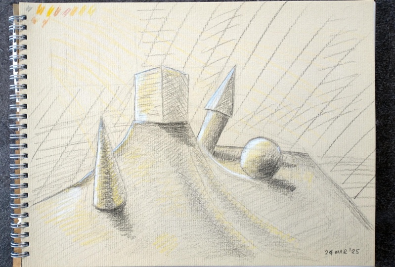
3. Irregular and Uneven Surfaces First Sketch: Hello, everyone. What
we are going to do in this lesson is to tackle the
first practical exercise to understand the conditions in which an old urban
landscape could be presented in which the surfaces are not
completely flat. So this sketch will not only be useful for urban landscapes, but for landscapes
in themselves. So I'm going to start by creating this completely
flat surface, not to create the objects in it, but so that you can see how I'm not going to create
the objects from it. So having these three lines that give me more or less the
structure of the table, we could draw some lines
on the surface that suggest the perspective
as if it were a grid. But as you can see in
the reference image, the objects don't
rest on the surface. They are on a kind of raised
cloth as if it were a hill. So I'm actually going to create a composition from
this main shape, this parallel pipet that rises here as if this were
a castle on hill. So as you can see,
I'm not guided by any grid or the perspective
lines of the table. I'm creating the geometric shape by relating the initial
edges of the table, which we are actually
going to modify later. So notice how I draw
these angled lines from the edges and corners of the table to build
this geometric shape. Now by attention to how I draw
crossed inclined lines to also construct one of the sides of the
ometc shape itself. I have also shown these inclined lines in
the reference image. But as I always tell you, the human eye is sensitive
to these inclined lines. You must imagine
them in the object. The reason why humans are
sensitive to these type of lines is due to an
evolutionary issue. We have developed this
way to walk, to run, to drive vehicles, to hunt, and to throw objects. Now look how I build the geometric shape
of the background. It's growing from the shape
that I have already created. It's not growing from its
position on the surface. Another important element to use as a reference is a
space between objects. This space is a two dimensional geometric
shape in itself. So we must take this into account to properly
construct the object. Having these three
shapes already built, it's much easier to
build the cone that is in the foreground,
because, for example, it cannot be higher than
the shape that is behind, and I can relate the
base of the shape behind with the position
where the cone should be. Now, it's even easier to create the lines that represent
the fabric on the table. Now I'm going to remove
some construction lines. Now that I have the
objects and the fabric, I can fix the table to adapt it to the layout of the object, and that is the proof that I have created the composition of the objects from the objects themselves and not
from the surface, just as we are going to do
in the following exercises. Now I'm going to start applying
hatching to the sketch, starting with the fabric. If you have already
taken the other volumes, you are familiar with this. If not, notice they are mostly
parallel lines going in one direction to represent a gradient of
surfaces and objects. But pay attention that these
parallel lines can also be curved when the surface
where they rest is curved. For example, in the cylinder, the cone and the sphere. Observation is too important. That is to say that stopping to observe the drawing
while we are doing it, it as unimportant as the moments
in which we are drawing. Look, for example, here
at the cone, first, I add a layer of inclined lines, and then I combine
it with curved lines to generate the rounded
volume of the cone. You have to add one layer upon another to add consistency
to the shading. We will see all of
this throughout the course in each of the
lessons in each assignment. But it's important to understand this process from a
fundamental basis. On the other hand, lines
counters are very important. The value of the gradients must be included in the line itself. Now I'm going to apply
this white pastel pencil to highlight the lights on the
objects and on the fabric. One of the most important things to understand when it comes to representing light is to detect the intensity of
the light and its tones. To help you understand
this better. I'm only going to use a beige pastel in this sketch
so that you can see that the light coming through
the window modifies the tonality of all the
objects in a particular way. And not only that, but within
the shadows themselves, they are also reflected light. Now, I'm going to add
some heat chin in the background to
create better space, and I'm also going to reinforce some lines on the objects. And that's it. Look how
nice our sketch looks like. It has grown without
any drawing grid. This is a very
useful strategy for you because it teaches
you to draw faster, more intuitively and
therefore improves your ability to observe balance and shapes in
everything around you. But this is just the beginning. I see you in the next lesson.
4. Calle Paradis Gothic Quarter Theoretical Approach Artistic References: Hello, people. Before we
dive into our next project, which involves rendering
career parodies in the Gothic quarter
of Barcelona, we need to examine some important references
that will help us better capture the essence of this ancient urban landscape. Studying these references will enhance our understanding
of how to approach irregular historical
settings where time has left its mark on both the structures
and the ground itself. So let's start by looking
at Cornelius Springer, a Dutch artist known
for his urban scenes. In many of his paintings, Springer does adhere to traditional perspective
roles as he focuses instead on capturing the natural irregularity of
the settings he portrays. His cityscapes show streets
and buildings that feel authentic with surfaces that have aged and shifted over time. Springer's work is a study in how the terrain and structures
adapt to each other, resulting in an imperfect yet harmonious composition that
fills alive with history. What sets Springer apart is
his ability to represent these elements with a sensitive
almost narrative quality. The buildings lean subtly
and the streets are uneven, reflecting the reality
of these places rather than an
idealized version. He was also an
excellent draftsman, and his drawings capture this
as an exceptionally well. His sketches often revealed
inclination of buildings, the unevenness of the streets, and the organic arrangement of elements within the urban space. So by analyzing his drawings, we gain insight
into how to convey the weight of history in
our round renderings. Another invaluable
reference is Edouard Manet. His paintings and sketches
of the Rue Msnier in Paris demonstrate a keen eye for age and irregular nature
of historical streets. L the highly structured avenues that would come with
later urban development, Minett'sRo Mosni is filled
with imperfections. The street itself has a
slightly uneven surface, and the buildings lack the perfect symmetry and alignment within
modern architecture. Through his careful
rendering of these details, Mantte emphasizes the
street's historic charm and the impact of
time on urban spaces. Manet's works reveal how even a quick sketch
can communicate a weight of years in the organic disorder that
defines ancient streets. Observing his brush
work and line work, we see how he uses
slight ships in angle, irregularities, and dexture to capture the character
of the place. His approach provides
a guide for us, showing how small details like
the tilt of a building or the unevenness of the
cobble Stone Street can bring authenticity to ASN. With these references in mind, we are now ready to take
counter round project, rendering Career
Paradise, one of the most emblematic streets
in Barcelona's goody quarter. This is one of the
city's oldest streets with a history that stretches
back to Roman times. Over the centuries,
Carrera Paradise has seen countless
transformations, but it has retained
its unique character, shaped by the natural aging of its structures and the
uneven ground beneath it. The gothic quarter itself is a maze of narrow winded streets filled with
architectural details that tell the story
of Barcelona's past. Career Paradise
stands out due to its charm and the visible
wear on its buildings. Over time, the buildings have developed
slight inclinations, and the ground has shifted, creating an iden surface that reflects the centuries
that have passed. Our goal is to capture
these details, focusing on the gobbled
stones in the walls, as well, rendering the streets
character and the relationship between the
buildings and the ground rather than relying on a
rigid due to the inclination of the buildings caused by age and the sinking
of the ground, we will not be using a
standard perspective grid to organize this drawing. Instead, we will rely on the relationship
between each element. Observe how one building
leans towards another, how the edges of the
street rise or dip, and how the facades
create a rhythm that is natural rather than
perfectly aligned. So by focusing on
these relationships, we will be able to capture the organic structure of the career parodies
authentically. This method allows us to
render the scene in a way that feels true to its
history and character, capturing the imperfections
that make it unique. Throughout this
exercise, remember that our goal is to represent
the streets warm, charm and timeless beauty, bringing the viewer into
an urban landscape that carries the traces of the century's past.
Let's start them.
5. General Structure Gothic Quarter Carrer Paradis: Hello, people. Let's
get started by tracing the tilt of the
outlines of the main buildings, specifically the
two on the left. This will give us
essential information to construct the space that
interacts with the sky. The relationship between
all the buildings depends on how accurately
we create this space. So we will aim to make it
as precise as possible. Take your time as you measure and draw these lines carefully. We need to pay
close attention to both our paper and the reference image to
achieve the right balance. Now that we have the
first vertical line corresponding to
the main building, we can move on to constructing
the second line and try to identify the
geometric shape that outlines the sky. This step is crucial because it helps frame the relationship between the buildings in the
negative space above them. Now, let's draw across
the angled line that will help us define the shape of the space within
the buildings. This line will act as
a guide to establish the relationship
between the structures and the open space. Once we have that,
we can begin to outline the visible part of
the building on the right. Remember to take your time
with the angle of the line, as it will determine
the accuracy of the spaces and the
overall composition. O. Now that we have the contour of
the right building, we can start describing
the proportions of the next building
further in the background, pay attention to its scale in relation to the
first structure. The outline of this building
is also important because it will help us further
define the space for the sky. And now we can try also
with the last building. Now, with this clear
approximation of the skis space, we can begin constructing
the inner buildings. Remember, everything
we are doing here are rough approximations that we will keep correcting as we go. The key to drawing and sketching is to constantly
refine your work. Keep drawing lines,
keep observing and don't be afraid to make
adjustments as you progress. Now, take a look at how
I'm drawing an angle to determine the height
of this building in relation to the other wing. We need to detect the exact proportion
through these angles. This method is much more
precise than relying on a grid, especially given the
regularity of the ground. So by carefully observing
and tracing these angles, you will be able to build a more accurate relationship
between the buildings. Mm. Now I'm going to try to place those
roofs over there. Try to not complicate
yourself by doing this. I mean, you are not
supposed to get yourself confused with these kind
of details at this stage. For the moment, you only
need to outline the roof of the tallest building that
is in contact with the sky. At this stage of a drawing, we can really take
the time to observe the contours in key
spaces carefully. Observation is the secret
ingredient in drawing. The more we truly look at our reference and understand
what we are seeing, the stronger our
drawing becomes. In the initial stages, it's all about laying
a solid foundation. Every line matters. You
are not just copying. You are translating what you see into your own artistic language. It's a bit like
solving a puzzle. Each contour reveals a new
piece of the composition. If we rush, we miss a chance to connect with the
essence of the subject. And that's it. The design
of composition is ready. We've laid the groundwork
to build the rest of the drawing with an not
fun and gradual strategy. It's so much easier to construct an entire urban landscape by
starting with a single line and applying angles
than by trying to break down the entire scene
into one general shape. This approach lets us be more flexible and creative
adjusting as we go. I hope you enjoy this method and I see you in
the next lesson.
6. Central Buildings Gothic Quarter Carrer Paradis: Hello, people. In this lesson, we're going to dive
into the details of the three central buildings, starting with the small
one on the right, and then moving on to the rest. These details will not only serve as additional
reference points, but will also begin to establish the unique visual
language of our drawing. Since these buildings are the farthest from the
viewer and the scene, their representation
needs to strike balance between clarity
and simplicity. This is where the art
of synthesizing shapes, textures, light and
shadow comes into play. So we will achieve this
through careful hatching, the contrast of
light and dark lines and smooth gradients that
suggest depth and distance. Pay attention to this
window over here. I'm trying to
create this window. Measuring the distance between that window and the edge of that building is a kind of strategy quite similar to
what we have done so far. Basically, it's the
same angle technique. As we progress, you will notice how this
language evolves. It will reflect not only the physical characteristics
of the buildings, but also the atmosphere
we are trying to capture. Every single line I'm doing
here is part of a language. Think about each line, each shadow as part of a conversation between the
subject and the paper, the material you use, the direction of your strokes, the pressure of your hand. All of these factors contribute
to this unique language. Let's move on to this building over here to add some hatching. We need to discover what is the possible tone
of that building. So applying several layers of hatching as we progress in the drawing is
a good strategy. Now I'm going to start
creating these little details, those windows on the upper
part of that building. When it comes to creating
these little details, the line is so important. It must not only
trace the contours, but also represent the
shadows themselves, and much more so than in any other closer object
in the composition. When rendering the
details of a building like this one that is
situated in the distance, several key elements should be considered to effectively
capture its essence. Try to use softer lines and lighter shading to convey
atmospheric perspective, allowing the building to recite visually while still
retaining its character. Texture plays a crucial role. Instead of meticulously
detailing every stone, try to use broader
strokes or hatching that suggests texture in age without
overwhelming the viewer. After all, in the
reference image, you are not able to detect intricate details
from that distance. Notice how I am representing the windows
with square shadows. If we got close enough
to those windows, there would be
many more details. But when contemplating the
image from a distance, we are supposed
to use a language that work from that distance. I'm going to draw this line here to divide the space
of the building. At the same time,
I'm also going to improve the contours of
that building behind. On the edges of that buildings, there are typical
ornaments of that age. From a distance, it's
enough to just draw darker parallel lines to
represent those ornaments. Now, I have enough
reference points to build these
windows over here. We should try to measure how many windows would
fit between each window, and then we can know where
they are positioned exactly. Another way to
know where they go is to draw an angle to
the edge of the building. For this type of more complex windows, you can start by drawing
the urinal figure and then draw the dark shadows that represent the openings directly. You can see that
already at this stage, we can notice the
importance of representing the Kiaroscuro directly
through the line. We have not done any shading, but we can already feel the
volume of the buildings. Now I'm going to
try to represent the arch of that building
on the background. It's the entrance of a chapel, and we can barely see in the
distance, but it's there. Mm. Pay attention to how I create the ornaments
over there and how I have drawn parallel lines to create the brick
pattern on the wall. Later on, you won't be
able to see those lines, only the concrete bricks. Now I'm going to darken
all these buildings to get closer to the Kyoto oscuro
value of the material. There should be a substantial
difference between the tone of the sky and
that of the buildings. Now, feel free to experiment
to create the texture. You can use cross hatching, several strokes to represent
the bricks on the surface. Pay attention to the language I use. It's a combination of parallel
lines, also small bricks. All of that in the distance will create the texture
of the building. Although you should
look closely at the lines you make
and the ones I make, the most important thing is the fact that can be seen from a distance with the sum of
all those small details. Remember that these
buildings are almost the third plane
of the composition. Notice, I'm creating
parallel lines over here also to
create the bricks. A Remember that these textures are the same as those
of the castles, so we must do our best
to give each brick a unique tone. And that's it. As we move forward, we will continue to refine
and add more details, enhancing the depth and
character of this scene, but that will be
in another lesson.
7. Side Buildings Gothic Quarter Side Buildings: Hello, people. In this lesson, we will delve into
the details of the buildings that
are closest to us, particularly the
two on the left. As I begin constructing this
window with these iron bars, you will notice
that the language I employ for these buildings is significantly different from what we used for the
distant destructors. This is a whole new
level of detail. We are closer to the viewer, so the features must be more
pronounced and refined. The language of nearby
elements is crucial, as it will guide
our understanding and perception of the
entire composition. Pay close attention to how we construct the edges
of each element, as this will
significantly impact the overall depth and
character of our drawing. To a correctly position
the windows and balconies, we must use everything
around us cleverly, measuring the
potential distances between the elements we wish to draw and those already
present on paper. This meticulous
observation will ensure the relationships between forms are coherent and harmonious, enhancing the drawings overall
realism and visual appeal. And remember, every detail adds to the narrative
of the scene, creating a richer and more engaging experience
for the viewer. Pay attention to
this balcony here. Look at its relation to
the distant building. That building is a
good reference point to place it appropriately. But don't stress yourself out. There is a margin of error in which you could
be not completely precise and still the drawing and landscape would
look perfect. What I mean is that simply if we were located slightly
to the left or right, that perception of where the balcony is would
change as well. So this doesn't change the beauty of the
drawing too much. However, you should use these strategies to develop
the elements in the drawing. See how I made the ornaments
under the balcony. We are close, and I must get closer to the
original shape. Look how I created the structure of the
bricks on the wall. There are parallel
lines in which I'm going to create
the concrete bricks, but there are also mini bricks. That is the language of
the wall that I must understand in order to be
able to experiment on it. These bricks have
irregular sizes, which helps us
experiment even more. Every single time we
do repetitive details, I will remind you to be patient. There is no quick magic way
to do these types of details. Now that the balcony is ready, you can see the
relationship between the balcony and the
buildings in the background. This is very interesting. It helps us a lot to
use this strategy. On the other hand, pay attention to the value of the line. The amount of
information it gives us about the shadow and the
volume is significant. Do Look at the angle I'm going to draw to know where
that window is higher up. I'm doing it above
the balcony door. You can see how
everything is angles. Pay attention to
these subtle detail that is very important. I am reinforcing the
outline of the wall that is closer and I'm
making the appearance of the edge with well
defined bricks to know where the bricks are at that height of that building. Now I'm going to create all
the bricks on the wall, the same process I
apply to the low. You must be aware
that as we go up, the bricks must
decrease in size. The perspective is also upwards. Therefore, we must
respect that proportion. H. On the wooden roof, for now, it's enough to
apply the hatching to darken it and bring it to the tone
of the reference image. Now we are going to move on to the nearest building,
the nearest wall. What we need to
do here is render the structure and arrangement
of the bricks in the wall. Fortunately for us, they
are irregular stones, typical of a castle. We don't have to make
them exactly the same as the ones in
the reference image. But we can guide ourselves
quite a bit by the image, since it is a nearby element, and it is actually easier to
follow the image after all. For now, we are just going to concentrate on the shapes of
the stones on the pattern, arrangement, and perspective of these stones as we go up
to the top of the wall. An important advice. We must draw the street
sign as if it were a window relating the elements that are in the building behind. How far is that street sign
from the door, for example. And as a final detail, we are going to draw
some guidelines on the floor that
is already built. This will simply work as a sort of drawing
grid for later. And that's it. We had made a lot of progress on the
details of the buildings, and there is still
a lot left to do. See you in the next lesson.
8. Intricate Details Qothic Quarter Carrer Paradis: Hello, people. In this lesson, we're going to add shading and intricate details
to the drawing. We will begin by working
from left to right, starting with the texture
of the stone wall. First of all, I'm going to apply a great deal of graphite using a single direction
hatching technique with a darker pencil. Notice how I apply the
hatching stone by stone. I'm not shading the entire
wall in a generated way, but rather focusing on
each individual stone. It's very important to
apply several layers of hatching in order to create
consistency in the tone. On the other hand, be mindful of how I adjust the pressure
and direction of the hatching to reflect the natural irregularities
and shadows of the stones. Now I'm going to
apply a second layer. Notice the difference it makes. This allows me to fill in those empty spaces where
the paper is still visible. By adding this second layer, we are achieving a richer
texture and deeper shading, which helps to unify the surface and give it a more
solid coescive look. Now let's plant the graphite
across the entire wall to fill in those spaces where
the paper is still showing. By softly smatching
the graphite, we can smooth out the
transitions between hatching and make the
surface look more unified. Now that we have
darkened this wall, the entire drawing has a
broader range of dark tones. So before continuing
with this stone wall, I'm going to darken
the key elements of the other buildings. This step ensures we maintain balance throughout
the composition. Always remember that the
drawing should progress in a unified way to control the contrast
between light and shadow. Now, I'm going to start creating the final texture
of the stone wall. The first step is to reinforce the lines
between the stones. These lines don't just represent the separation
between them, but also give the sense
of depth and relief. It's crucial to follow the
reference image closely, paying attention to
every detail because each stone has its own
unique tone and texture. On the other hand,
when necessary, we will adjust the
shading to reflect the subtle differences
between stones, enhancing the sense of realism. As I refine the metallic
details of this window, take a moment to truly
contemplate the reference image, focusing on understanding
the pattern to follow on the
cobbled stone wall. You don't need to
replicate it exactly. Actually, I'm not
doing that either, but there is a
discernible pattern in the edges of the stones. Similarly, observe
the wall's edges where the stone
structure is evident. So let your intuition
guide you as you translate what you see into
your own interpretation, capturing the
essence of the scene while embracing
your unique style. As you progress
through the details, there will come a
stage where it might feel like what you are
doing doesn't make sense. This is completely normal,
and you should keep going. Remember, the drawing
is not finished yet, so it's natural to
feel uncertain. Just continue working, following the reference image as
closely as possible, especially since this wall is
quite close to the viewer. Remember to pay close
attention to the edges, the edges of the stones, the edges of the wall, especially where it connects with the neighboring building, and the edges of the
street sign also. These small details are
crucial for defining the structure and giving your drawing a
sense of solidity. Look at the incredible
relief on the wall. It looks magnificent. Now that we have darkened
the wall even more, we need to go back and retouch
the rest of the buildings. Let's start with this nearby
building from the top. We will reinforce the edges and significantly darken
the shadowed areas. This step is crucial for maintaining balance across
the entire composition. This door is a visual
important element, not only because
it's close to us, but because when you look at it, it's inevitable your eyes are drawn to the
surrounding buildings. So it's crucial to
give it the respect it deserves by adding enough
detail, the texture, shadows, and even the
small imperfections must be carefully rendered to
emphasize its presence. Pay attention to how crucial it is to
match the dark tones. Look at the reference image. The underside of
the balcony shares the same dark tone as the roof in the
background buildings. So these two areas should
have equal darkness. We can notice that the tones in the background buildings are not quite dark enough yet
and need to be adjusted. As for the windows,
it's the same story. And we are supposed to create the contour of this
building on the right. Remember that there
is one more lesson left for this drawing. I'm going to retouch the
shading of this building. It's important to contemplate the buildings from the distance. It's the only way
to do a kind of comparison between every
single tone in the drawing. Now I will apply
the light layer of shading to represent the
graces of the clouds. By using gentle strokes and varying the
pressure on my pencil, I can achieve a soft
grading that mimics the natural transitions
found in cloud formations. Well, this concludes our lesson. I'm sure you all love how
the drawing looks so far. But remember, it's
not finished yet. We still have exciting
details to add and techniques to explore
in the next lesson.
9. Pastel Chalk & Final Finish Gothic Quarter Carrer Paradis: In this final lesson
of our drawing, we will apply the white pastel throughout the composition, starting directly with the sky. Using a pastel stick
or pastel bar, we are going to fill
in the entire sky, beginning at the
edges and generating more intensity where the
sky emits the buildings. Be cautious not to
smdch the buildings. I highly recommend you keeping a safe distance from
them at this stage. Once the sky is filled, we can refine the
edges later with a pastel pencil for
a cleaner finish. On the other hand, we
must also try to see the most illuminated
areas of the sky. Try to notice that
there are part of the clouds that are
more illuminated. Now I'm going to blend
this white pastel so that it looks consistent
across the entire sky. Try to do this very carefully. You can notice that
I have also applied pastel on the floor in the
direction of the lines, and we need to
blend that as well. Now, very carefully,
we are going to use the white pastel pencil to reinforce the edges in the sky. Not only we are going
to reinforce the edges, but we are going to
try to put more pastel in the most illuminated
parts of the sky. I Now we're going to use a very light
graphite pencil to add very subtle gray
tones to the clouds. As we have applied this puzzle, it's also necessary to tow the areas close to the
clouds in the buildings. Now, we are going
to start applying the white pastel
on the buildings. We are going to
start applying it on the street sign that
is on the wall. We are going to use
the white pastel stick or white pastel bar, and then we will blend it
gently taking care of the ages. What we really need to do
with the white pastel is to reinforce some of the building
light areas like this one. But especially, we are
going to texture the walls by adding a special tone
to the stone bricks. Here, we can be
creative, experiment, and take into account where
the tones on the walls are lighter and where
the darker ones are, but making a general reading of the tones in all the
buildings together. White pastel is an
excellent choice for creating the textures
of the cobble stones in these buildings
because it allows for a soft luminous quality that can enhance the visual
richness of the stones. When applied delicately,
the pastel can capture the sitle variations
in light and shadow, simulating the roughness and irregularities of
the stone surfaces. That creamy texture of the patel glides
smoothly over the paper, enabling the artist to
blend and layer tones. Additionally, the bright
white can provide a striking highlights
that mimics the way light reflects off the
surfaces of the stones, making them appear more
lifelike and three dimensional. You need to have
a lot of patience during this process
because it's slow, especially since there are many bricks or
stones to work with. It's crucial to take
your time to observe each piece and how it interacts
with the light around it. Additionally, using
graphite allows you to alter the tone of the texture and experiment with different
depth and contrast. Over the years, this street
has become a hub for artists, musicians and performers who often gather to
showcase their talents. This lively scene adds a unique
character to the street, making it a popular spot for
both locals and tourists. The nearby cafes and shops
further enhanced experience, allowing visitors to soak in the rich cultural tapestry
of the neighborhood. As you stroll along
the Carre Del Paradis, you can feel the history
surrounding you while also witnessing the
contemporary vibrancy that defines modern Barcelona. I'm going to retouch
the white pastel over here on the sky. You should know that
the stick pastel is easier to fall off the paper. And also depending on the
quality of the pastel, the cheap ones tend to fall faster because they
don't have binder. Pay attention to how well
all the bricks look like. The drawing has acquired another level of
three dimensionality. Now I'm going to try to finish drawing this wall on
this building over here. Although it's not in
the reference image, we can more or less
imagine what it could be like following everything we
have already built so far. Uh huh. Uh huh. Now I'm going to add
a personal touch. Adding this stroke with
a white pastel bar, I'm going to represent
and the light entering through this place and projecting
between the buildings. This is not in the
reference image, but is a personal touch. Now I'm going to write
the name of the street, Carre del Paradiz on the
street sign with a great care. The handwriting doesn't
have to be perfect. You can even experiment
with this as well. Care del Paradiz is a very special street in the
Gated quarter of Barcelona, known for its charming
atmosphere and rich history. This narrow wind passage
is a remarkable example of the medieval architecture
that identifies the area with buildings that
tell stories of the past. The proximity of these buildings adds a unique appeal
to the street, each contributing to
the dtintip character of the gothic quarter. This is the final
touch of drawing. A And that's it. Look at the beauty of
this drawing, the light, the texture, and the
interesting appearance of the closest covalstone wall. The most important aspect of this drawing is
experimentation. By rendering an urban
landscape like this, we can add personal touches that create a unique and
different perspective. I hope you have
enjoyed this drawing, and I look forward to seeing
you in the next time. So.
10. Sketching Building in the corner: Hello, people. In this lesson, we're going to make a
sketch of this building to understand a principle that I mentioned in a
previous lesson. What I want you to see is how from the general
structure of the building, which we can see that
is made up of angles, we can create a
kind of drone grid. The very basis of this
urban landscape is a grid. And it's important
to mention that the selection of this urban
setting has to do with the fact that the building is on a surface that we
assume is quite flat. Quite different from the
place in the Gothic quarter, where the ground was uneven. For example, if
we draw two lines that intersect from the
lower edges of the building, we could already
have a grid that choses the flat structure
of the surface. But we are going to
continue building the details of
this building now. Note that the building
has several floors. One floor at the street level, which is quite high, and
then another three floors. You can see also
that I drew a lot of angled lines to try to get the
exact level of each floor. Some lines were for research, and others were more definitive, but all were necessary
to get the final ones. That is the very
center of a sketch. As I already have the
height of the street level, I can start building the arches, following
the perspective. That is the arches must become smaller following the line
that goes to the background. Now I'm going to apply
the same process with the windows on
the first floor, which need to be made smaller as they go to the background. We also have the guidelines,
but not only that, we have the size of the
arches on the lower level as a reference point to know if the size of the
windows is correct. And now, you're going to do the same with the second floor. Remember that this
sketch should take approximately 30
minutes to complete. This lesson is doubled in a
speed, so it takes less time. But you should complete
it in 30 minutes maximum. Now that we have the structure, we can start to do the shading
first through the line. I mean applying the chiaro oscuro directly with the lines. You're supposed to apply it in the most important elements
of the composition. If you need to apply
some hatching like here on the arches,
you can do that also. Now we are going to try to shape the right side of the
building a little more. We're going to add a lighter
layer of graphite and then reinforced even more
the dark tones of the shadows in the elements
on that side of the building. It's important to do it progressively and not
exaggerate for the moment. Now I'm going to create
this building on this side. As we already have the
guidelines on the ground, it shouldn't be a
problem to build it. Now we are going to clean
up the paper a little bit because we are using
a fairly white paper. H Now we're going to add a special element. I'm going to use
this sepia chalk on the dark areas on the
left side of the building. The result is wonderful. It's a sketching technique that you should always
be able to use. H Now, with a pastel of
this same color, I will create a
light sepia layer that illuminates that
side of the building. Now I'm going to use
a black chalk to highlight the darker points on the right side
of the building. These are isolated points, so be careful with this. You have to understand
that even though I used one color for each side, there are small
touches that I make on both sides with
the two colors. I mean, not everything is
completely one color because there must be a complete
language for the entire drawing. Look at this gray color to make the shadow of the building. And I'm gonna apply also
this blue color to the sky. By making this drawing,
you realize that with some basic main colors
mixed with graphite, you can achieve a very
attractive color sketch. Obviously, it's not
a color drawing. When you work
completely in color, it's another technique, even
with these same materials. Actually, something
that we work on in my other impressionist
drawing courses, but making types of sketches with some color is
quite interesting. Sketch like this can
be done anytime, anywhere, just in a sketchbook. Of course, I highly
recommend doing more detailed drawings before
and applying two things. First, reduce the
time you spend doing detailed drawings and do
lots of detailed drawings. Drawing a lot will automatically make you reduce the time. And that's it. Our
sketch is finished. You can try to do the same
thing with the other images. But obviously, the more
irregular landscape you're going to portray is, the more time it will take. I see you next time.
11. Narrow Street with alley Gothic Quarter Theoretical Approach Artistic References Copy : In the next exercise, we will embark on the
task of portraying a typical street in the
gothic quarter of Barcelona, focusing on one of its narrow
and picturesque lanes. This space characterized by the authenticity
of the buildings that rise on either side, creates a cozy atmosphere
filled with history. At the end of this street, a charming passage
beckons exploration, promising secrets and stories that resonate within
its ancient walls. Before we dive into wrong interpretation of
this urban landscape, it's essential to study
some references that will help us capture the essence
of these unique spaces. By analyzing works by artists who have masterfully
depicted similar streets, we can gain a better
understanding of how to approach architectural
details and the interplay of
light and shadow. Fabio Fab, an Italian painter
from the 19th century, is known for his
vivid representations to urban life in
everyday scenes. Masteralize in his ability to capture not just the
architecture of buildings, but also the envience
that surrounds them. Fabi infuses his works
with a narrative quality, inviting the viewer to imagine the stories that have
unfolded in those spaces. Through his use of light, we see how it filters through passages and reflects
on Buildings facades, creating a play of
shadow than light that adds depth and drama
to his compositions. By studying his works, we will learn to integrate
the textures of age stones in the everyday life that gives character to
a historic Street. Another key artist in our
study is San Dilo Bacaro, a 19th century Italian
painter whose works focus on the representation of light in urban environments. Particular, one
of his paintings, depicted in a narrow street showcases how the
illumination generated by the buildings on either side creates a warm and
inviting atmosphere. The way Bacalario uses
light to highlight the textures of the stones
in architectural details, provides invaluable
guidance for our own work. In his piece, we can observe
a passage in the background, similar to the one we will encounter in our
camposition in Barcelona, allowing us to explore how natural light interacts
with these enclosed spaces, creating countess that will help us bring our own images to life. Finally, we must mention
Richard Parks Wanington, a prominent British painter
from the 19th century, who left an indelible mark
on the art of watercolor. His works often depicting
urban landscapes, excel in capturing
light and atmosphere. Bunnington is particularly
known for his landscapes where streets are embraced by buildings casting soft shadows, creating a dramatic
and poetic effect. His focus on subtle details such as the reflection
of sunlight on stone surfaces and the color of nuances that enliven facades, provides invaluable guidance for understanding how light can transform an everyday space
into something enchanting. Through his paintings,
we can learn to capture the essence of
the Gur environment, showcasing the
history and wear that these streets have
experienced over time. With these references in mind, we are now ready to embark
on our own project of portraying this narrow street
in the guided quarter. As we proceed, we will
pay special attention to the knowns of
light and texture, allowing the story of the streets to shine
through our work. Our goal is to capture the essence of this
urban landscape, as well as the rich
narrative it carries using techniques and approaches
of the artists we have studied.
Let's start then.
12. Construction Ancient Alley : Hello, people. Let's begin this lesson by laying the
foundation of our drawing, starting with the ground in a doorway we see in
this mysterious street. It's the typical alley from the Barcelona
Scothic quarter, with its ancient facades, hidden charming bars,
and artist living in special places that you would not even imagine exist
behind those windows. But observe how I use angles to construct
this small tunnel. This element is one of the most important parts
of the composition. As it not only
supports the building, but also sets the proportion
of the entire drawing. Take your time and be precise with these
foundational lines. No. The reason I have chosen this charming spot is because if you look
at the reference image, the color of the
building's wall is almost identical to the
color of the paper. This means we won't need to add color for our drawing
to resemble the image. So by the end of this drawing, you will see just how
beautiful it will look. For now, notice how everything
depends on the angles. In all my drawing courses,
I emphasize this. It may seem difficult at first, but the real challenge we
imagine is just in our minds. It feels strange to think we can construct everything
from those angles. But once you start, it
becomes second nature. Pay close attention to
this important detail. Due to the point of view we
had in the reference image, there is a slight
upward perspective. This means that even on
the wall above the tunnel, there is a subtle
upward distortion. If you observe the
two parallel lines that make up that section, you will notice they very
gently converge as they arise, creating that
perspective effect. It's a visual stoning
elements, though quite subtle, and we must develop
the sensitivity to detect these kind of details. Pay attention to the manner I'm relating all these
shapes to create next one. For example, this
door over here. Every single detail
I'm creating, it's a potential
reference point. Remember, you should allow the drawing to grow
proportionally rather than finishing one section completely during
the construction phase of the structure. This approach helps maintain balance in harmony
throughout the composition. If you focus too much on
one single area early on, there is a risk that other
parts of the drawing may not align correctly or could
become disproportionate. By gradually building up
each section together, you ensure that all elements evolve in relation
to one another, making adjustments easier
as the drawing develops. Try to think about it
like a waving tapestry, where each thread plays a
role in a larger picture. There is an interesting bit of history tied to this
charming street. Just a few meters
away from this spot, Pablo Picasso once had
one of his workshops. The atmosphere of this area, rich in history and
artistic energy, must have served as a great
inspiration for the artist. Even today, the legacy
of his presence remains viferent as there is a museum dedicated
to Picasso nearby. Mm. When it comes to representing
perspective in a drawing, we have certain creative
liberties to distort the space. What do I mean by this? It means that the
deformation of the space doesn't have to be exactly as we see it in the
reference image. But it must maintain
a sense of coherence. For example, you look
at the left wall, there is a horizontal
line dividing it. In the reference image, this line is more
pronounced upwards. But from my perspective, I choose to lower it to enhance
the drawings composition. I'm not destroying the realism, but improving the balance of
the work I want to create. This way, the two
parts divided by the line appear more
proportional and harmonious. In the final result, you won't even notice that this
adjustment was made. The intention is always
artistic to create a composition that feels both visual engagement
and balance. Personally, this detail of the lantern is marvelous to me. I can't help but wonder how many years that
lantern has been there, silently observing the changes
in this charming street. It carries a sense of history, a connection to the past that adds so much character
to this scene. An important way to check if the windows on the yellow
wall are constructed correctly is by ensuring they follow the subtle deformation
I mentioned earlier. If you look closely, you will notice
that the lines of the windows gradually
converge as they arise. It's a very subtle effect, but we need to represent it. In fact, we should exaggerate
it to make it noticeable. When we exaggerate, we are often not doing so
as much as we think. Remember, when people observe
the world around them, they are not consciously
aware of this distortion. They perceive those walls
as perfectly rectangular. So breaking that
mental expectation to represent the windows in a two dimensional space is a skill that
requires practice. It's about training the eye to see beyond what we
assume is reality. I'm adding this
light hatching to indicate areas that
will be darker, and I will reinforce
the regions with the deepest shadows
in the composition. It's a sale, but essential step that lays the groundwork for the next stages. And that's it. The structure of our
drawing is complete. You see, it wasn't
that difficult at all, but this drawing is going
to turn out beautifully. And the best part is that we
have created this together. Remember, every step we take brings us closer to
the final masterpiece, and I can't wait to continue this journey with you
until the next lesson.
13. First Details Ancient Alley: Hello, people. In this lesson, we're going to make our first
approach into the details, focusing on the
smarter elements of the composition that hold
significant importance. This stage is crucial, as it allows us to map
out the Karo Scuro that interplay of
light and shadow across the entire drawing
through line work. So by carefully
delineating these details, we set a strong foundation for the textures and deeper
layers later on. This process not only enhances the visual interest
of our piece, but also aids in developing a sense of depth and dimension. Each line contributes to the overall narrative
as a drawing, guiding the viewers
eyes and creating focal points that draw
attention to key elements. Moreover, establishing these
details early on helps us visualize how the final
composition will come together. It's important to emphasize
that we should not rely solely on lines to
establish chiaroscuro. Detailed hatching plays a crucial role in
this process as well. Hatching consisting of
slightly thicker lines or stripes filled with graphite. This kind of hatching
allows us to reinforce the darker areas of our
drawing effectively. For instance, take a look at the inner edges of the windows, not only on the yellow wall, but also in the left side. Here, applying a strong
hatching technique can significantly amplify the shadows and create a more three
dimensional appearance. Although we are not focused on creating the texture
of the wall just yet, we must add some
layers of hatching to establish a foundation for
building the texture later on. If you pay attention to
the reference image, you will notice that the wall has various sounds and reliefs. So we can combine
different types of hatching to create
this base effectively. For instance, we can cross an inclined hatching
with vertical lines that follow the
walls perspective by varying the
density of the lines, darkening in some areas
more than others, we will enhance the overall
appearance of the foundation. Now, pay attention to how I approach the bars of
the window railings. I'm carefully rendering
each individual bar. Assigning the
appropriate tone value. In this case, these
bars are quite dark, making them some of
the darkest areas within the overall composition. Remember, every small
detail matters when it comes to building a cohesive
and harmonious composition. A Remember to frequently step back from your drawing to ensure that the line
values are correct, and most importantly,
that the details are creating the desired
effect from a distance. For example, this
area where the tunnel is located is
particularly crucial. Our gaze naturally
concentrates there, as well as on the yellow wall. Therefore, we must dedicate true artistic value
to that section. It's crucial to respect the
dark tone of the tunnel. Notice how in both the reference
image and the drawing, nothing is darker
than that tunnel. It serves as a significant
point of reference for achieving the upper PA values
throughout the composition. So by anchoring our darkest
tones to the tunnel, we establish a scale of values that will allow
the other elements to shine and resonate effectively within the overall
structure of the drawing. Pay attention to how I am constructing a small grid from the man home J I drew. This grid will help create a sense of surface
and perspective, and it will also serve
as a guide for adding details to that entire
area of the composition. Pay attention to the manner I'm creating this hatching over here to create a texture
of the wall later on. This is actually a
vertical hatching that follows perspective. M. A Remember to render the inner
shadows of the windows. If we don't create a depth
of the windows properly, we will not create a
sensation that there is really an internal space
behind those windows. Remember that at this stage, for the areas with
more delicate shading, we can leave the empty space, such as that towel
that is hanging from that railing and
the window panes. Look how good the composition
is starting to look now. We have darkened the
left wall much more. A sensation of depth
is starting to form, and the light is really
hitting the place partially. But remark my words. This is just a beginning. I see you in the next lesson.
14. Intricate Datails & Shading Ancient Alley: Let's start once for all with the intricate details
of the drawing. We will start with
this window over here. We will trace the divisions between the glass
panes of the window, and you can add something
creative to this. I mean, you didn't
have to be precise in the area where the
division goes through, but it's important
to respect the depth of not only the window
but the others as well. All of these is part of
the texture of this wall. Additionally, I recommend using a two B pencil to
do these details. It's soft enough to darken a lot and still
make small details. These edges I'm darkening at this moment are
very important. In fact, if in the
drawing you are making, the shape of the window is
not the most appropriate, you can use these edges to correct the shape
of the window. Look how interesting
this window is. Pay attention to how it
looks now and look at the difference after darkening
the top corner to a depth. It's just a couple of lines that change this
element completely. Pay attention to what I'm doing with these
concrete bricks. If you took the first volume of this course where
we made a castle, this should bring back memories. I'm applying different shades
to each of the bricks. This effect is great. The effect in the
distance is excellent. Look how the color of the
paper starts to come to life. It starts to look
like the wall itself. The value of the line in
these windows is everything. It does all the language of
the volume of the window. Pay attention to the
fact that there are slight gradients in the
color of the yellow wall. We must try to make them
as subtle as possible. Even if it seems
that the changes are not noticeable, they
are over there. On this section, we will visually reinforce
the contrast between the light on the upper half of the wall and the lower half. As we progress with the
details of the windows, we should start to significantly
darken the lower half. So it's important that
this area conveys a sense of density in the
graphite applied to the wall. Even though this
wall has textures, it was originally
finished smoothly, meaning that the areas
where the concrete is preserved have
a flat surface. To achieve that, we need
to blend the graphite enough so that the
particles coalesced more. We can use a blending stump. But if you have a
tissue or toilet paper, that works perfectly, too. The tissue is ideal for this because it's
soft and inexpensive. When you use it, gently rub over the areas when you
want to create a smoother transition
between tones. This technique will
help you to soften any harsh lines and give the wall a more
realistic appearance, emphasizing the contrast between the smoother and texture areas. Now, we're going to
do the details of the background on the
other side of the tunnel. It doesn't matter if you don't understand
exactly what is there, but we must represent
that this is another street with life
just like this one. It's important to retouch the lines over and
over again as you go. Look how well the volumes
look on the left wall, and look how the volume improves when I reinforce
the lines and edges. Although the details
of the world on the right may not seem
to be so important, not only because our gaze
is not focused there, but also because of the angle, we must make that wall have the same tone as the
one on the left. This will create an effect
of isolation of the place, leading our attention even more on the center of the town, the yellow wall
with the windows. And that's all, we had made even more progress
in the drawing, showing the richness of tones that each of
the walls have. I see you in the next lesson.
15. Left Wall Texture Ancient Alley: Hello, people. In this lesson, we will work on the final
textures of this wall. This process requires a slow detailed work
and is essential to cultivate patience when it comes to creating
textures in a drawing. Many issues in drawing
arise from not having enough patients to handle the
small repetitive details, and this is something
we need to overcome. First of all, we
must break the myth that these details are
not worth the time. In ancient times, creating a
great painting took months precisely because of
the dedication to the small intricate
parts of the artwork. So while it won't take us
that long in this case, we still need to approach
it with patience. U Look at this area over here, where the concrete is torn. We need to find a
way to represent the essence of what is
happening in the surface. To achieve this, we must first understand
what is going on. There are small elevations and perforations
in the concrete, and keeping that in mind is crucial for accurately
representing it. It's not just about
adding random marks, but about understanding what
those marks are portraying. Of course, the line is
fundamental in this process. Just as a line can add
volume to a window, it can also bring depth to a crack or intundation
in the wall. Each mark should
serve a purpose, capturing the texture and underlying structure
of the concrete. So it's this mindful
observation and intention that will
make your drawing feel more real and detailed. Try to understand and observe the patient with which
I'm adding these details. Actually, I believe that of all the elements
in the drawing, these are the
slowest to develop. They are not the most complex, but they require time. There is no way to
create these textures other than by adding
each crack one by one. Pay close attention
to the pressure and strength of the
line in each mark. Now I need to work on the
textures of that fabric. You should pay close
attention to the folds. This is the most
important aspect when representing fabric. Even from a distance,
the way the fabric bends and crises will give it
life and make it feel real. This shadow over here
is also very important. It's a shadow that represents the separation between the
fabric and the window. This shadow creates a great
volume in the whole part. No Now I'm going to slowly darken
the whole bottom half step by step creating
texture elements, cracks, and marks randomly. You should apply
various shades on the concrete as well to
enhance the texture. The other important factor
is that you don't need to make all the marks
to represent the wall. Just making enough to represent the essence of the wall
is more than enough. Drawing an old worn
concrete wall is an excellent way to develop our sensitivity to
textures and details. These irregular surfaces with their cracks,
stains and reliefs, force us to observe
closely and understand how light interacts with
complex, uneven forms. It also teaches us patients as each crack and mark adds to the visual narrative
of the surface. Vigo Velasquez and Johanne
Spermer also depicted walls and architectural elements with attention to
textures and web. Though their focus was often on the interplay
of light and shadow. Regardless of the desired
level of darkness, adding multiple layers of
hatching is essential for achieving consistent and
rich shading in any drawing. This process allows for more controlled and gradle
build up of tones, which is crucial for
capturing depth and texture and form accurately. Each layer adds subtle
variations in value, ensuring that the
shading appears smooth, cive rather than
rushed and patchy. And that's all. Look how
beautiful the wall looks now. It doesn't even
have all the marks, and yet it still portrays the same appearance
of the original wall. Try to review the lesson
again if you have any doubts, and I see you in
the next lesson.
16. White Pastel & Final Finishing Ancient Alley: Well, we have reached the
final lesson on this drawing, and we are ready to
apply the white basil. I'm going to apply it
right here on this window, since it's the brightest
spot on the entire drawing. But pay close attention
to what I'm doing. You can see in the
reference image that what is being reflected
in the window is the sky. And in fact, there
are some clouds that are more illuminated
than others in that sky. So we are supposed to portray that visual effect as
similarly as possible. And to do so, we are going to illuminate each frame of
that window differently. We are going to apply
more white pastel on the left glass, especially the upper left one. But within those same glasses, we must illuminate the
left side more as well. We can use the same
white pastel to enhance the textures of the
concrete bricks on the wall. Note that in the
reference image, the color of the bricks is quite different from
the yellow wall, and this white pastel will help differentiate those
tones even more. This other element
is very important. We need to make it feel
like the street in the background is really
exposed to the sun. So this time, you're
going to apply both the pastel bar
and the pastel pencil. Now, we are going to apply
white pastel on the floor. The floor is also an area where light is
projected quite a bit. We must portray that, especially define the areas of
contact with the walls. Now, we are going to
apply the white pastel on this towel over
here, the fabric. We just need to color
the brighter sounds. This step is super important. We are going to apply
the white pastel to the internal areas of the
windows on this wall. This will add tremendous volume to the entire composition. The result is instantaneous. To help differentiate the amount of light that the upper
half of the wall has. With the lower half, we can
add white bastel in this way, and this will help a lot. Now, pay attention to
this magnificent detail. I'm going to add
white pastel here to represent the relief
that the wall has. Look how it looks combined
with the graphite. Now, we need to look at
the whole drawing and start to refine the details
with the pastel pencil. We need to refine
the smallest details throughout the drawing. A. Now we're going to
do the same process with the graphite pencil. Remember that as we
add white pastel, graphite lines tend
to get stained and simply blurred due to
the contact with the hands. O That street in the background also
needs white pastel because there is a lot of
light in that whole area. Note that on the right wall, even though it has details, it's almost a semi
abstract composition that is representing a wall. It's almost like an
impressionistic technique. This strategy is
important when we want to speed up the process of
constructing a drawing. Of course, if we do this, we must ensure that other parts of the drawing are
more realistic, such as yellow wall
with windows. Mm hmm. M. Look, here, how I'm adding the ray of light that
hits that window. I do it with the pastel bar. Now I'm going to improve
this window a lot more. I'm going to add more
graphite, definition, and details to the lines and
structure of the window. Now I'm going to add some
light to the window panes, but I'm not going to overdo it. It's just a touch of light. Now, we are in the
final details. And that's it. Our drawing of the old alley
is now complete. Look at how
beautifully the light and color of the central
wall come together. We could have darkened
the walls even more, but the way it looks
now is stunning. The effect on the upper window
is what I love the most, along with the hanging
fabric on the left wall. There's so much to learn of the construction
of this roll, which is why it's essential to go over each of the
lessons carefully. I'll see you in the next time.
 Baudilio Perez, Take your ideas to the stars