Transcripts
1. Impressionist Drawing Vol 2 Water in Paris: Have you ever dreamed
about capturing the serenity and movement of a river's water surrounded by the world's most
iconic architecture? I am Balvi Ve Perez, and I'm thrilled to
introduce you to volume two of my series of impressionist
drawing courses, where you will learn to
draw anything starting with graphite and evolving your
work into full color drawings. With over 30 years of experience in the
world's top art schools, my mission is to guide you in taking your skills
to the next level. In this volume, you
will learn to draw the water of the iconic
St. River in Paris, exploring how natural light and movement transform its surface. For this course, you will
master the representation of water on the different lighting
and movement conditions, learning how to capture its beauty from
various perspectives. I have designed this
course for you to create unforgettable views
of the St. River, accompanied by its
beautiful bridges and pods and architecture. You will not only learn
how to depict water, but also how to
handle perspective as you represent the structure
surrounding the river. Together, we will explore
how sunlight reflects on the water surface from different angles in
times of the day. Additionally, we will delve into the theorical aspects needed to support the
practical lessons, covering specific techniques
for representing water, concrete and perspective
in your compositions. We will draw inspiration from the impressionist
masters like Monet and Zoroya whose works have masterfully captured the
essence of water and light. We will work with top
quality materials like graphite, Pieroi, re pastels in both
bars and pencils, along with the luxurious papers that will allow you to bring your creations to life in a
unique and expressive way. This course is
designed for help you progress on your
artistic journey. No matter your experience level, you won't be able to find a more comprehensive and
exciting course on displacement. Welcome to my Bay Atiler in Impressions
drawing volume two. Water and light in Paris. I see you in the first lesson.
2. Importance of Rendering Water Theoretical Approach: Hello, everyone. I hope
you are all doing well. Today we are diving
into an exciting topic, the depiction of
water in drawing, particularly from an
impressionist perspective. The portrayal of water has
been a central theme in art, especially within the
impressionist movement, which sought to capture the transient effect of
light, color, and movement. So understanding
how to represent water is essential
for any artist. As involves various techniques
and concepts that are crucial for achieving realism
and dynamism in our drones. Throughout this
course, one artist in particular will serve as our primary source
of inspiration. Fritz Follow, known for his stunning and serene
depictions of river, streams, and channels, F had an extraordinary
ability to capture the reflective flowing
qualities of water. His works are an
excellent example of how an artist can merge technical precision with poetic, almost magical atmosphere. Tolo's water scenes are remarkable for their
subtle shapes in color and the way he meticulously portrayed
reflections and ripples, giving each painting a sense
of fluidity and depth. In Tolo's paintings, we see how water transformed
the landscape, guiding the viewers eyes along its currents
and reflections. His use of light and color was subtle but incredibly effective, and that is what made
his work stand out. Unlike many of his
impressionist contemporaries, T often focused on quieter
more turn kilocenes capturing the gentle
flow of water as it meandered through
towns or the countryside. These works remind
us of the beauty of simplicity and the importance
of careful observation. A skill that we will strive
to develop in this course. Although we will explore various techniques
inspired by other artists, it's essential to keep
Talo's approach in mind as our guiding light
throughout the lessons. From a technical perspective, depicting water
involves illustrating both movement and stillness, as well as the intricate
play of light and shadow. Fritz followed excel at this. His paintings often
feature short, delicate strokes to depict
smooth surface of water interspersed with
small texture marks that suggest ripples
and subtle waves. This approach allowed
him to convey motion and stillness
simultaneously, creating a realistic yet
impressionistic effect. As we work with
graft and pastils, we can use varying
line weights and color intensities to mimic the reflections and ripples
that characterize water. Just as T did. When portraying water,
it's crucial to pay attention to the way light
plays across the surface. Thol's work teaches how to
capture this by observing the subtle countries
and ships in tone that give water its
depth in dynamism. By emulating his approach, we can learn to appreciate
the nuances of water, enhancing our ability to depict it with
accuracy and emotion. However, we will
stop with Tallow. As we progress,
we will also draw inspiration from other
masters such as Claude Monet. We approach water with a more
vibrant expressive style. Monet's paintings
of water lilies and his depictions of the scene offer a sense of
movement and fluidity, achieved through bold,
colorful strokes, we will explore how his
approach can help us understand the effects of
light on water surfaces, teaching us to see
a mer reflections and capture the dens
of color on water. Another essential figure in our studies will be JMW Turner, who depicted water as a dynamic, sometimes tempestuous
force of nature. His paintings are full
of energy, movement, and dramatic lighting, showing us how to express the
power and motion of water. By studying his techniques, we will learn how to
depict water and motion, whether it be the crashing of waves or the serene
flow of a river. Finally, we will also
touch on Joaquin Saroa whose bright sunlit depiction of Mediterranean beaches
highlighted the play of light on shallow waters. Saroya's use of color and light provide lessons in creating
atmosphere and mood, demonstrating how to
book the feeling in warm and reflection that
water often conveys. On the other hand,
studying water in art opens doors to broader
concepts such as light theory, color blending, and
atmospheric perspective. Impressionists
including Tolo Monet, Turner and Saroya we're pioneers in breaking away
from traditional methods, focusing and capturing
the essence of a moment. Water with its ability
to reflect and refract light is pivotal
in this exploration. By learning to depict water, we can deepen our understanding
of these principles, applying them to
various subjects. This journey also
allows us to learn about perspective and
architectural elements, especially when depicting
the interaction between water and
its surroundings, like the inner part of a bridge
or the edge of a channel. The interplay of light and
shadow on both the water and nearby structures enhances
the overall composition, making the artwork feel more
integrated and lifelike. We can see this throughout
Talo's paintings, where he masterfully used
reflections of buildings and foliage to create
harmony between different elements
of his compositions. In conclusion,
mastering the portrayal of water in drawing, particularly from an
impressionist viewpoint, is a fundamental
skill for artists. It enriches our technical skills and enhances our
creative expression. Our aim on this course
is to represent water quickly and impressionistically using graphite and pastels. This approach enable
us to express ourselves freely while ensuring that our presentations are practical and useful in
our artistic endeavors. Well, we will explore techniques inspired by Monette
Turner and Seroja. It's Fred's fellow who will
serve as our touchstone. His meticulous
attention to detail, coupled with his ability
to convey the calm, flowing beauty of water, makes him an essential
reference for our studies. By learning from his works, we can unlock new
dimensions in our artwork. Making the representation of water a rewarding and
essential pursuit. And it's important to mention that exploring water
through the lens of impressionism and De
tholos incredible works invites us to
appreciate its beauty, complexity, and the
transformative power of light elements that are critical
on our artistic journey. We will draw inspiration
from these techniques and attempt to understand his
delicate yet dynamic touch. Thank you for joining me today, and I look forward to exploring this beautiful subject together.
3. Water First Approach Sketch: Hello, everyone. In this lesson, we are going to
make a first sketch to approach the
representation of water. This strategy is essential
when it comes to drawing elements with
reflection such as water. Sketches are very important because they allow us
to understand which are the most relevant
visual elements that our mind is able to detect. Let's start by creating
the umetc shape that represents the river
moving into the distance. We don't need it to be precise, but believe me, these are angled lines that we can
get pretty close to. In a way, it's like a triangle. Now we are going
to try to freely represent the most prominent shadows that we
see in the water. Note that in the water, there are both shadows
and strong lights. Let's concentrate for the moment on the prominent shadows. Let's try to feel
their shapes and the position they occupy
in the space as a whole. We can use all kinds
of lines as long as we take into account
that in a certain way, the darkest part is on the left, because the building
in the background cast shadow and also the reflection of the sun is on the right. If you are using a white
paper, it's the same. Just skip tracing the
prominent shadows, understanding that
the whole water is becoming more illuminated
towards the right. Pay attention that I not
only use strong lines, but also a tin to represent
some waves in the water. Pay attention to this
part on the right. I'm leaving the space where the sun's reflection
goes to create it later. If you feel like you are a
loss doing this exercise, don't worry because it's just to help you relax and losen up. Just try to follow
what I'm doing. In the rest of the exercises, we are going to
draw this in and it surrounds step by step, creating everything, especially the
architectural elements that surround the river. Notice how I tried to suggest the saddle
waves in the water, creating the crest
with curved lines, as well as the saddle hills
that form on the surface. It's important to mention that I'm using a three B
pencil this time. Depending on the
paper you are using, you may want to use a darker
one for your sketches. But I generally recommend
a two B pencil if you are just starting out because if
you want to raise something, you will just remove the gravite without marking the
paper too much. On the other hand, try to observe the way I
hold the pencil. My whole arm moves
at the same time. I'm not saying that the
wrist doesn't move, but it's the whole arm that
does most of the work. It's important to see these
details as we create. A specific lesson to
analyze hand movement doesn't make sense because there are so many
possible movements, and even your own arm has a
comfortable way of moving, and you have to find
that way yourself. That is the movement that allows you to have
the most precision. The same goes for the
way you hold a pencil. As for that building
in the background, just try to represent it
in a very general way. In this sketch, that
building is not important. Now the fun part begins. We are going to find
a light yellow pastel that is as close as the
sunlight as possible, and we are going to
start to represent the sunlight reflections
in that space we left. Pay close attention
to the way I do it. We must understand that
the color of the water is always an implicit
representation of the color of the sky, meaning that there is a very strong connection
between the two. If we manage to represent
the water well, it's because we are
representing the sky well. Now, pay attention to how I add this more intense
shade of yellow. It's slightly darker
because as I move away from the strongest light reflection,
this color changes. So we must represent
that transition as well, taking into account
that there are also orange or pink tones when
we move farther away. And this is where interesting
things start to happen. You can see that the atmosphere
in the sky looks blue. But there are parts filtered by the clouds that change
that blue tone. But when we see the
reflection in the water, that color also mixes with
the green of the seaweed, and it actually turns
into a gray tone. Look how the gray looks on
the water right at this part. Notice how I'm using this
gray basil to fill in the empty spaces where the
exposed color of the paper is. The truth is that
the green color of the paper is mixing
with the gray, too. Now, look how interesting
this tail is. I'm going to add some
white pastel strokes to the sun's reflections
on the water. Once the yellow is added, this white color will
blend with the base and look great as if it
were real glitter. Since we used gray
for this darker area, we can choose
another darker gray for the more shaded areas. We can also combine this with a completely black puzzle to draw some
completely dark lines, especially on that building in the background and
the contours also. Now, following more or
less the same pattern of colors that we
added to the water, we are going to
complete the sky with the only difference
that we should not make random strokes
like in the water, the sky is continuous. It has no waves. I was mentioned to you that the color of the shaded part of the river was a mixture of the blue of the sky and
the green of the river. Well, now we are going
to add a light blue or a light gray tone that
represents the color of the sky. Now look how good it looks. In fact, we are
also going to add this color to the water in some of the contours
of the waves. Mm. We can even suggest the light projected on the walkway
with these yellow lines. Look how interesting it is. Now, since this landscape
is practically back lit, we must darken the building
and all its elements even more to truly create that visual effect
in the composition. We are going to use
different types of hatching to fill the
building with graphite, and especially the trees that are in that area
of the building, pay attention to how I do it. Now, as a final touch, we are going to
make some sun rays, the glare of the sun to unite the sky with the water
in a creative way. In fact, we can see the glare in the reference image.
And that's it. I must tell you that this sketch surprised me quite a bit. The reflection of the
sun looks pretty good. And I think it's
a great source of inspiration for everything
that comes from now on, because this is
just the beginning. I see you in the next lesson.
4. Calm Water and Distance Artistic References Theoretical Approach: Hello, everyone.
Before we dive into the exercise of the
victim calms waters, it's essential to explore some invaluable references
with a solid foundation. One of the most iconic
works we will study is the pond Argentle by
Claude de Monet a treasure housed in the Muse Dorsa This masterpiece
captures the serenity of water and the play of light in Acne where the
bridge stands as a symbol of connection between natural
world and human intervention. Monette with his characteristic lose and vibrant brush strokes, evokes the calmness of the river in a palate that
dances between blues, greens, and golden reflections. The water appears to come alive, showcasing its ever
changing character, while being affected by the sunlight that plays
upon its gentle waves. The atmosphere of peace and tranquility that
emanates from this peace invites us to
observe closely how the shadow of the bridge
reflects upon the water, creating an almost
ethereal effect that captures the
essence of the moment. Another fundamental reference is sunset on the St. At Lava Court, also by Monet, where the golden
light of the sun at dusk, delicately glides over
the surface of the water. In this painting,
Monette not only captures a specific
moment of the day, but also conveys a deep emotion
through light and color. The interplay of sunlight in the gentle waves of
the scene creates a visual spectacle where every glimmer and
reflection tells a story. This work offers
invaluable lessons on how to represent light and
atmosphere in our own creations, reminding us that the water is not merely an element
of the landscape, but a mirror that reflects our surroundings
and our emotions. On the other hand, we will
consider the grand canon. Where the Monet
showcases its mastery in using color and light
to represent water. In this painting, the
interplay of light and shadow on the water
surface teaches us to observe how
architectural elements in nature interwind
within the composition. Monte provides us with a
view of how light transforms the landscape and how water acts as a
receptor of that light, capturing its beauty
in gstant flocks. This work invites us to contemplate the relationship
between water and the surrounding
environment and how this relationship can influence our perception of the landscape. While our focus will
primarily be on Monet, it's interesting to explore other approaches that can
complement our understanding. Works such as the
bridge over the sein at Asners by Vincent Van Gogh, which showcases a more
expressionistic approach, teaches to see water from a different perspective with bolder strokes and
vibrant pallet. On the other hand, view of
the sine in the pavilion by Johan Bar hold captures
the essence of the scene, offering another vision of the
interaction between light, water, and the architecture
that surrounds it. In our exercise, we will use
as a reference a view of the pont de La Concot
view from an inner arch, where we observe the
calm waters of the sein. In this scene, the water
takes on a green hue as the bridge casts its
shadow over the surface. In the background, the use
des another welding loom, with a yellow sound gently
reflecting of the water, creating a fascinating
contrast between the architectural structure
and the natural environment. We will begin our
drawing using graphite to establish the composition
and basic forms, ensuring that we capture
the essence of the scene. Then to breathe life and
color into our artwork, we will apply basil emphasizing their interplay of light and shadow that we have
learned to observe. It's important to
highlight that we will be using paper
of a tone that will serve as a color of the concrete elements within the architectural composition. Allowing us to create an
attractive and dynamic contrast in our final artwork. So let us draw inspiration
from the references we have explored and reflect on how these masters capture light
and water in their works. Remember that the essence of impressionist paintings lies in the experience and
experimentation. Don't hesitate to play with
colors and techniques. Let your creativity
flow and allow the process to lead you to
unexpected discoveries. Every stroke and shadow
you apply will be an integral part of your
artistic expression. And in the end, the most
important things will be that you enjoy the creative journey
until the next lesson.
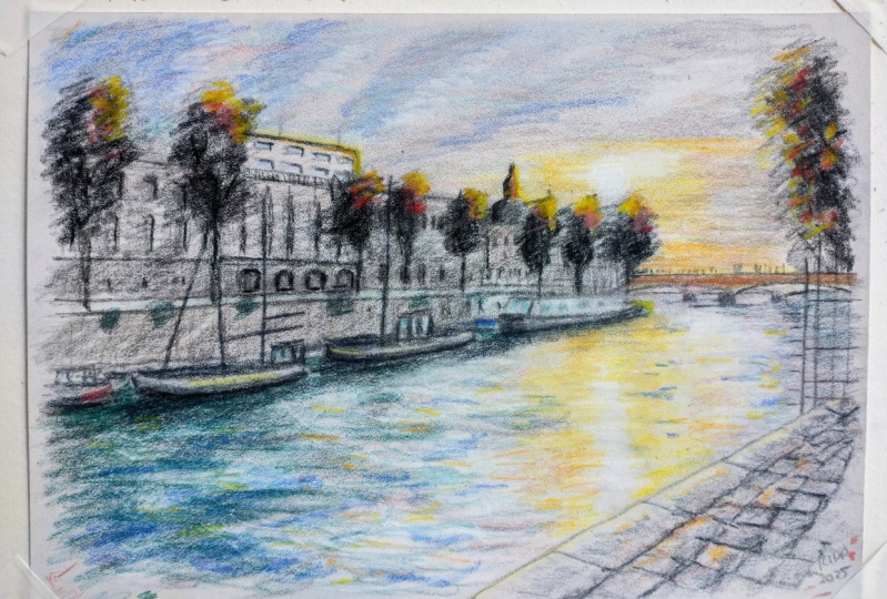
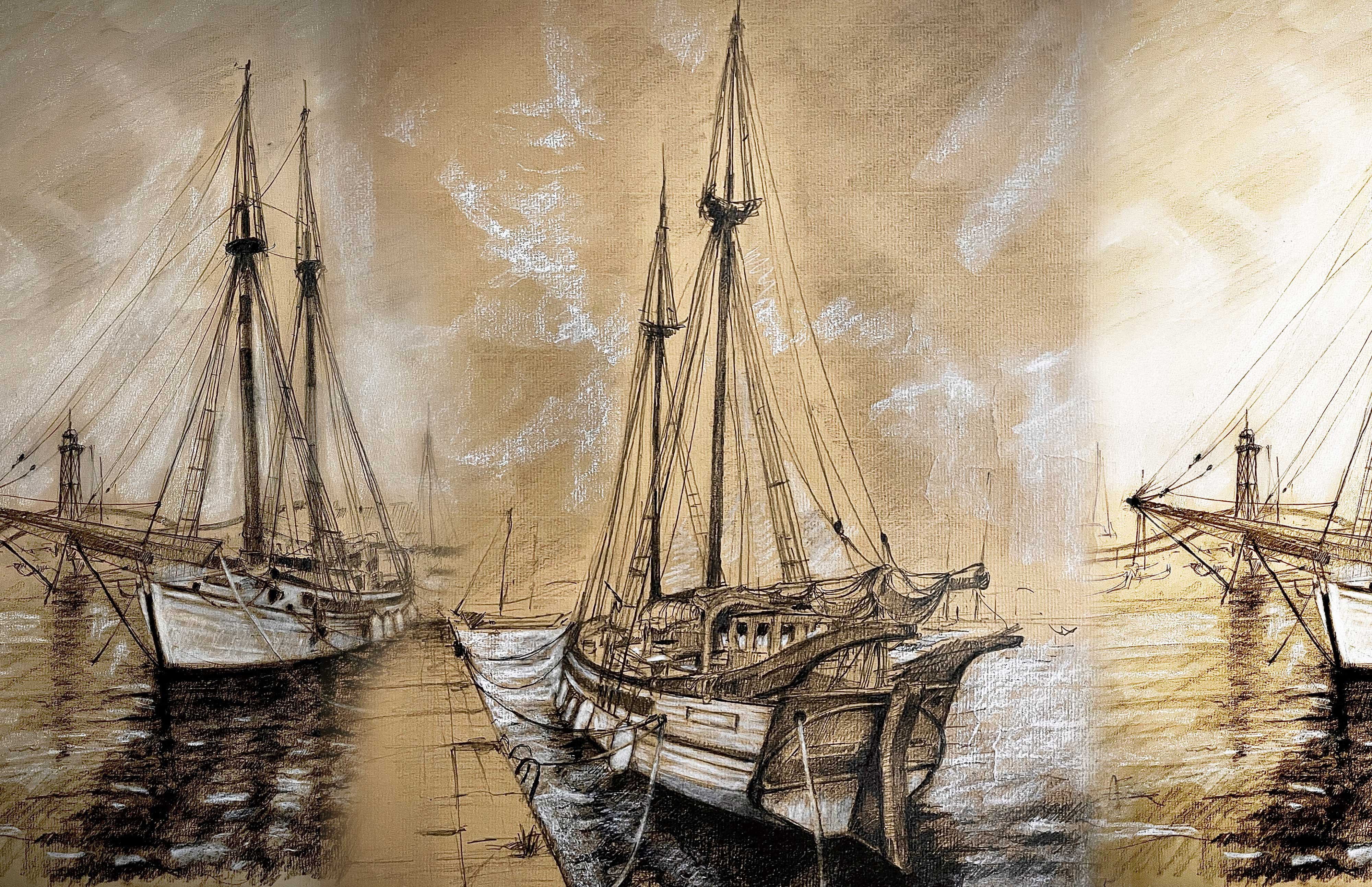
5. Drawing Layout Calm River and Walkway: Hello, people. We are ready to render this beautiful
landscape in Paris. First of all, we
have to break down the most prominent
shape on the picture, and that is the bi
dimensional shape created by the river
in perspective. That is the very center
of the composition. As I mentioned in my
other drawing courses, human sight is very
sensitive to angles. So striving to find the exact proportions of
that river is senseless. Conversely, try to find the exact angle produced
by those lines. It's a far more
appropriate strategy. As you can see,
this inclined line represents the edge of the road, and this vertical line, the shadow projected
on the river. Now I'm going to
trace the horizon. In my hand movement, you can notice I rehorse the line before engaging
the pencil on the paper. I suppose you have seen so
many painters doing this. We don't want to mislead
the pencil on paper. Now we have an scaling triangle, and that triangle is the dimensional
representation of the river. What do you think
about that landscape? What is your take on? Would you take your lover to
a place like that? I would. What we are going to do now is that internal part
of the bridge. And you can notice also that there is an inclined line, too. And now I'm going to do
another inclined line. But this time is an imaging one. I'm going to do a line
that grows right from this point to the
middle of the walkway. And what is the
purpose of this line? Well, behold what
we are doing now. I'm going to trace a
line that grows from the walkway to the very ceiling. Now I have an approximation
of the tunnel angle with a line that
grows right from this point to the top
of the vertical line. I Wala, we had the
tunnel outline created. Now that we already have the tunnel outline
and even the horizon, we can start creating that
building on the background. And I should stress
that that building is, in fact, not a building. It's the most beautiful museum
in Paris, the Orsa Museum. From my point of view,
it's the place in the world where the most
beautiful paintings known in the history of art are found from all over
around the world, from different periods,
but precisely from that period when there
was a transition between figurative
painting and abstraction. For now, let's concentrate on Cantor's
that building outline. We are supposed to use
everything as a reference point. The tunnel outline, the walkway, and the river itself. Et's complete some general
details on that building. For example, this walk away
over here is very important. We are supposed to follow
perspective across the entire building and pay close attention that
there is a downward path. Young people used to go down
through there to hang out. They used to get together in those places to chill with
their friends and lovers. Let's pay attention
now to that roof. I'm just going to shade
that section for now. Now that we already
have the build counter, we can trace that
cable on the ceiling. Try to trace that cable intuitively because due to the fact that we have already
created the surroundings, that cable is properly located. So its position is more
important than the shape itself. Additionally, we didn't have any idea about the
purpose of that cable. I mean, we are not
drawing a phase. It's a random cable
on the ceiling. Try not to get stuck
with this car. For now, it's just
an approximation. I mean, if we need to fix
it later on, we can do it. Now I'm going to do this
kind of hatching right here to represent this shadow. Pay attention to these
lines over here. Their function is to
represent perspective. So the separation between them, the gap between them is supposed to be
narrow by the edge. Now I'm going to do
this arc over here to follow the perspective in
a tunnel on this section. You can notice it's
not that complicated. I'm just following
the first arc. I'm going to do also a
second line over here. And now I'm going to trace some general shadows over here. This one is very,
very important. You must pay attention
that the lines themselves are supposed to
contain shading in themselves. Now I'm going to map the
shadow projected on the river. This first sketch is the drawing spine. Its function is provide enough information to
develop the drawing. I highly recommend you
not doing the first stage of a drawing with a very
light graphite pencil. I mean, don't use it
while working with expensive paper because you will have to push the
pencil against the paper, thereby creating
unnecessary groups. Try to use an HB pencil. Now, I'm going to indicate which are those sums that are shaded. For example, this building
over here and also right here. Now I'm going to do
the sound outline. And there you are. This is the first stage of our drawing. As I mentioned, is a kind of
map to develop to drawing. Let's move on to the
next lesson where we are going to address
the general details.
6. First Details Calm River and Walkway: On this lesson, we're
going to address the walkaway and those
building details. It's very important
to get used to it because they are the farthest elements on the composition. And even though this is a drawing focus on
water and light, this is an impressionist
drawing course, and water is not
always isolated. You are likely to
portray ports, rivers, seas, et cetera, and there are always buildings
and ships around. If you have already taken
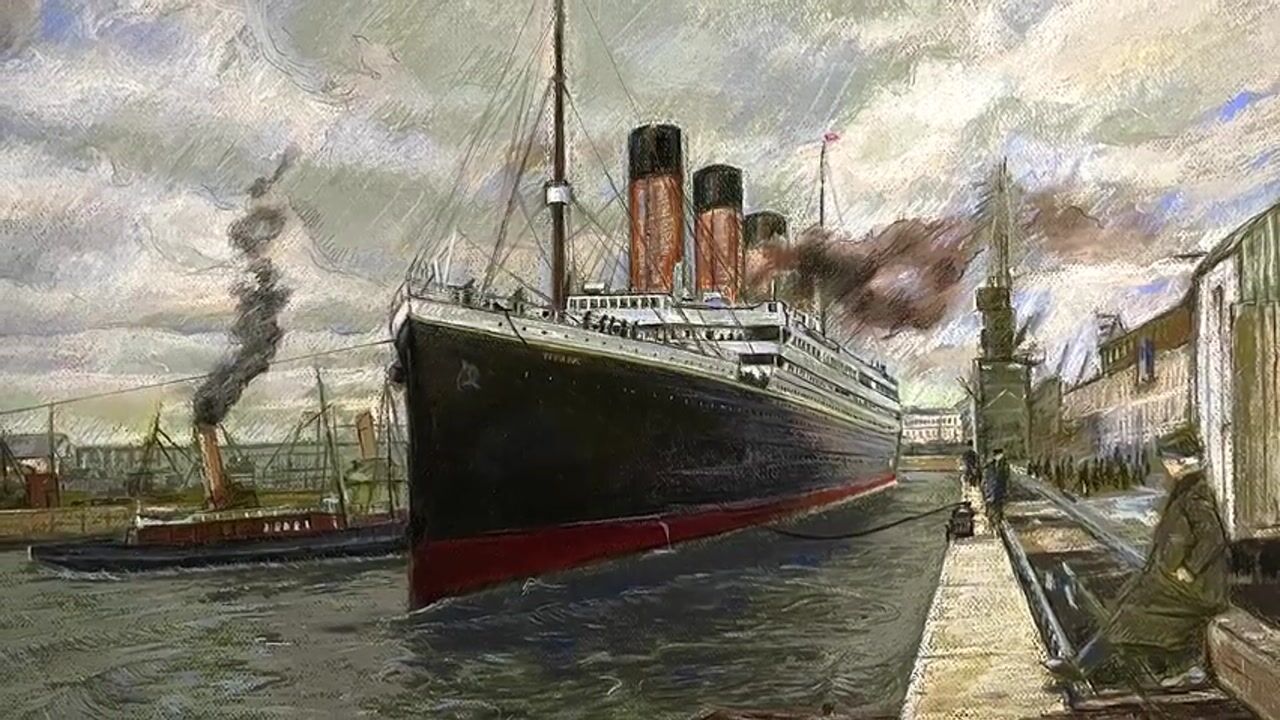
the titanic course, you may notice that
this building is quite similar to that from
the Titanic picture. That building on the background. So we must apply the same
strategy to make it. We are going to
focus on the most notable details from distance. For example, that
clock over there, that clock stands out among
the building features. You are given the reference
pictures to follow the drone, but I highly recommend you not to watch the
picture from close. Try to pay attention to the most notable elements
from the distance. Do not waste your time
rendering senseless details. If you watch the
picture right at close, you can notice there are many elements that
are necessary. I would dare to say that the most important
elements are those that depict the building in
the most fundamental nature. As you can see, I'm creating
the general structure. I have drawn the clock because it is an
important feature. Here, there is an
important issue. You may think that those
arcs are supposed to follow perspective because some of
them are closer than others. I mean close to
our point of view. But the truth is that
from that distance, the perspective effect
is not that significant. So the fact that some of them are larger than others is not going to change the
viewers perception dramatically. And I remark this. The most important thing is that they are placed properly. But hey, do not
misunderstand me. There should be a difference
in terms of perspective. I mean, the first one is
larger than the last one. This and other part
is very important. You can barely notice those
ornaments over there. I mean, from that distance, it's impossible to
understand their complexity. So we must try to understand
the general structure of every single ornament and try to do an irregular
shape that matches it. For example, those pointed
structures are important. What about the music? You
want me to change the music. You are listening to this
spectacular Jan air soundtrack. Pay attention to how I'm determining the width
of the ornament, by the width of the arches. I highly recommend
you start with the outer structure and then move on to the
inner structure. Another smart strategy
is to break down shades. I mean, for example,
here, this tree. You can break it down
into one single shadow. The reason why I am creating all these details
with graphite pencil is because that building is not the darkest element
in the drawing. Even though it is back lit, the building is not
under the bridge. If you feel you have advanced
enough on that building, you can complete
other details with a darker tone of
graphite pencil. For example, this section over here is a kind of dark stripe. You must remember the
further the elements are, the more misty they can
be in the composition. In reality, this technique is not exclusive to impressionism. Even in the Baroque age, it was also done, but not in such a
deliberate way. On the other hand, in
impressionism, this fleeting, moving aesthetic with
few details did have a direct purpose that affected all the
elements of the work. We have almost finished that building at least
in a first stage. We must try not to complete
one single element on the composition at first because once you
advance on the drawing, you are likely to find out new approaches to
this very element. So I'm going to move on
to this wall over here. I'm going to do these
bricks on the wall. I'm going to try to render different brick tones to add
depth to the wall texture. Now, pay close attention
what I'm going to do. I'm going to create a
kind of drawing grid to complete all these
walkaway. Pay attention. I'm creating a parallel
line alongside the car. I'm going to draw a cross line that comes from that
square that was formed by the first
construction lines that we made in the last lesson. And I'm going to do
this other cross line. Now I'm going to do another parallel line right
in the middle. That line is supposed
to cross the center. Now, pay attention, creating another cross
line from above. And that line hints
me the position in which the next parallel
line should be. Now I'm going to follow all this process
over and over again. And that is drawing grid. I don't think you need
a specific course focused on drawing grid. I think it's something you are supposed to learn over time. Additionally, drawing grid
is not always useful. For example, in
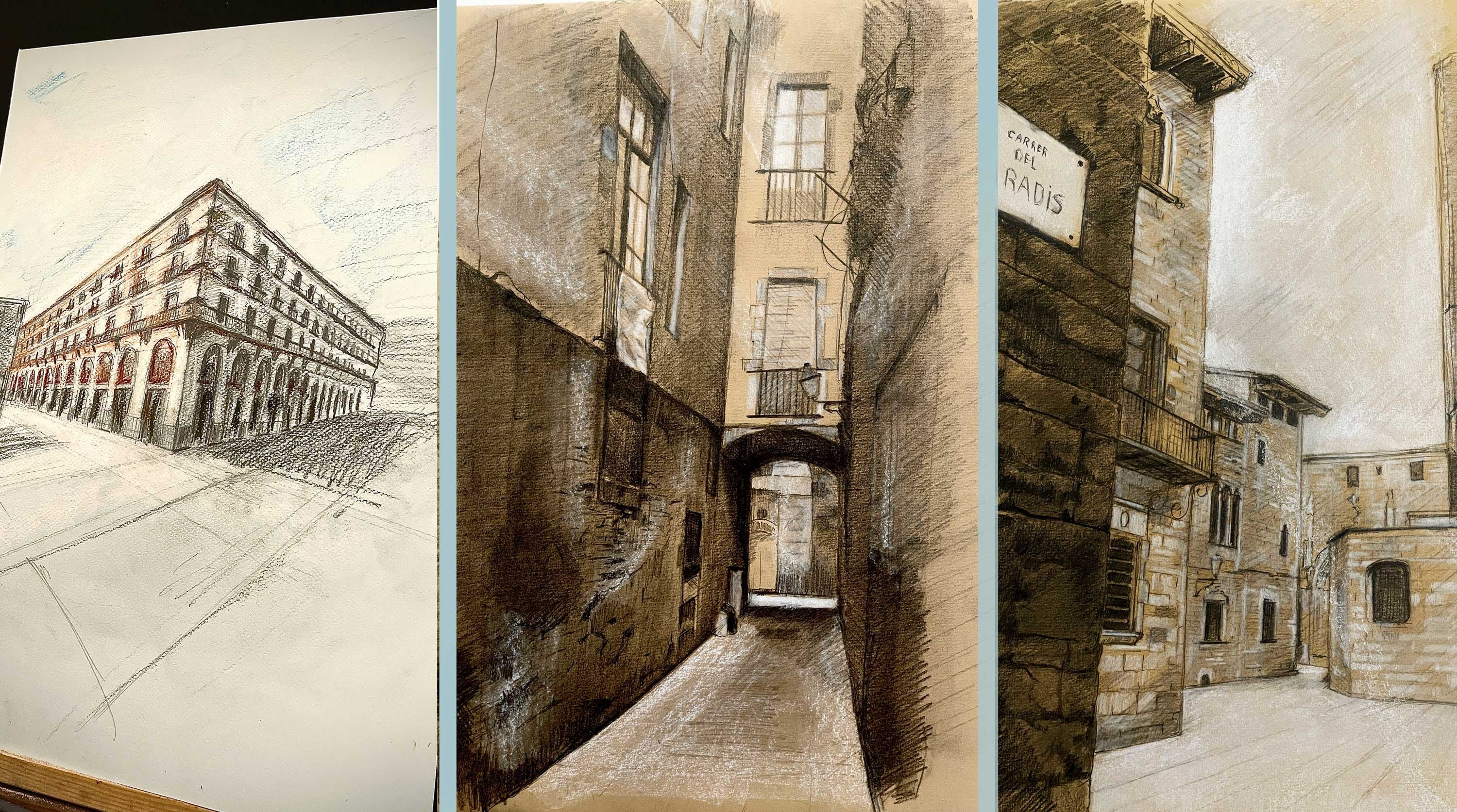
irregular surfaces, it's not useful at all. I have another drawing
course focus on it. Because, for example, if the surface you are
drawing is of an old town, it's likely that the
street will have sunken or slightly raised parts
in a chaotic manner. The drawing grid loses
all meaning depth. The coursing which I explained this was developed
in the Gate quarter of Barra Slona and is also
available on this platform. Now that I have finished
this drawing grid, I'm going to create the
cobblestones of the street. And this is easier
than you think. Because if you pay
close attention to the reference image, the rocks are irregular. They are not of the same size. So literally, you are able to create your round
cobblestones pattern. You just try to follow
that drawing grid. I think the only detail
you have to follow is that the stones have to become
smaller as we move away, but they don't have to be the
same size among themselves. Just try to follow me and be patient because there are so
many stones on the walkway. I'm trying to go through the whole process with
you so that you can see and understand
that you can do it yourself step by step. It's useless to skip steps and make you feel
that I did it easily. I think that nowadays there is a bad habit with social
networks and social media. Everyone says that
everything is easy, that everything is
possible quickly. But I think you have
to practice a lot. Sometimes not even
about practicing, but being aware that
everything takes time. Grating these stones, each one of them takes some
time as you can see. I personally find the process of creating cobblestone
streets relaxing. It's like a mandala. The most interesting thing is the wonderful result afterwards. All this we are
doing for persons mentally to tackle water and
light in the next lessons. I love the effect
of the walkway. What do you think?
It's great, isn't it? I'm going to sharp all this
shaded zone over here. I'm going to highlight all
these sections over here. I need to map all
that sky over there. There are clouds
with yellow light. It's necessary that this
sketch is useful later on. Perfect. We have reached
the end of this lesson. We already have the map
out of this drawing. Prepare your dry pastel for the next lesson where we are
going to dress the water.
7. Water & Sky Color Calm River and Walkway: Perfect. We are here again. Let's start by filling this entire river
with white pastel. But let's focus on the
illuminated area on it. The strategy is to
create a kind of base color that serves as a foundation of
this composition. Once we get this finished, you will be able to realize that the paper color is going to represent the walk away color. We must also fill the entire
sky with this white pastel. Pay attention that I'm going
to leave some pastd shreds over here to represent
that shreds of light. And also some pastel over here to represent this
light over the core. Now I'm going to use
the white pastel pencil to feel the edges, all the building outline. We're going to add some
pastel over here with this very pencil to
clean the edges. Now, with some paper, I'm going to diffuse
all the material. The idea is to spread it
out across the paper. Now, with this green
colored pastel, I'm going to create
all the shadow projected on the river. This is not gonna
be the final color. This is a base color, too. Now I'm going to add
this special green tone. Try to see this color on water. Pay close attention to
the reference image. You are not able to
see it at first sight. They are actually gray shreds of light projected on the water. Now I'm going to apply
this dark green tone to create the darkest
zones on the water. I must try to fill the
entire space with color. Let's start touching the sky
at once with this yellow. The reason why you are supposed
to start with the sky at the same time is because that light is also
projected on the river. Now I'm going to fill
the entire ceiling with this dark green. The final finishing
on the river is the byproduct of
all those textures projected on the water. So we are supposed to have
enough information in our surroundings to render
the reflection properly. Pay attention to this
blue color on the sky. Now, pay attention
what I do now. I start adding this very
color to the river. Now, very carefully, you must
blend all these material. We must do it also in the sky. Now, with this white pastel, I'm going to create the
sunlight reflection. And right at this point, we're going to start
creating small details. The main idea is to create a colmer representation
of this water. Using this dark gray, I'm going to create
all those forms that you can see on
the reference image. I highly recommend you do not get too close to
the reference image, as this will confuse
you even more. Try to draw what you
see from a distance. In the same way you were patient
with the cobbled stones, you should be
patient with water. Since graphite is also gray, we are going to use it
to create the shadows and waves in the part
under the bridge. Now I'm gonna retouch everything
with this light gray. Now I'm going to use this
white pastel to continue creating curves in
representing the little waves. You can already feel the
river coming to life. At least that is how I feel. Look how important this blue is, the same one we put in the sky. Now, I'm going to fill
the sky with more blue so you can feel the connection between the sky and the river. You have to make sure it's
exactly the same shade of blue or at least
very close to it. Now I'm going to use
this ochre color to represent the reflection of
the paper color on the water, since the paper colour is rendering the concrete
color around. Now, with much more care, we will try to make
even more details with the graphite as if it were a
higher level of resolution. This stage is quite slow. Try to relax and follow the
shapes little by little, even make spots you see, even if they don't make sense to you because when they
are all together, they will make sense. We are going to try to mix this process with white pastel, always using it with pencils,
white pastel pencil. Okay. Remember that the closer
we get to the sunlight, the more details there should
be with the white pastel. Oh Now, you can feel the movement of the water much better, right? Once you have drawn
water many times, you will begin to understand its behavior and
irregular patterns, then you can experiment and creatively interpret
what you are seeing. You didn't have to copy
exactly what you seen. Just understand what you are seeing in order
to represent it. Notice how this
entire middle section seems to be shaded
with the blue light, and it looks wonderful. Try to spot the key
areas that make water look compelling and beautiful.
This is one of them. Now, we must try to
follow the same pattern, but with much more white basil, so that there is much
more light in this area. Now I'm going to cover
the whole ceiling with pastel to
darken it even more. It's necessary to do
this whole process before continuing
with the water. The reason why this
ceiling has to be completed before
we move on to the water is because
the final color of this ceiling has to be
reflected in the water. Only in that way, we will find out what a part of the water under the bridge
should finally look like. I'm going to put a little more white pastel on the walkway. This is the end of this lesson, and we will continue
to delve deeper into the effect of water
in the following ones.
8. Bridge Cealing Details Calm River and Walkway: Hello, people. Let's
start by addressing this seal that bridge
section above. As I mentioned in
the previous lesson, it's crucial to
finish the sealing before engaging in the
rest of the river, especially that part that
is under the bridge. This sealing is not as easy as it seems because it's shaded. I mean, you have to tieve a shade that also
contains texture. When it comes to dry pasts, dark tones are more difficult because papers are
always much lighter. So more pigment is required. Try to pay close attention to the different range of greens
that I'm going to use here. Those colour layers
that are overlapped superimposed one on top of the other to get
the final color. You have to understand that drawing and painting
are a language. And as a language, there are
things that acquire meaning, not by their nature in itself, but by the place that they
occupy in the composition. This is the case
of this ceiling. Doing this ceiling well changes the meaning of what we are going to see below in the water. It makes it look
more interesting. So working this ceiling well is indirectly working
the water well. As I mentioned before, even if you notice that
I'm doing a texture I mean a green texture
is a basement, a foundation to create a
properly visual effect later on. Remember that when working with graphite and pastols
at the same time, we must be careful because the pastel slides
on the graphite. If we apply a lot of graphite, we will completely fill all
the groups in the paper. Graphite is quite hard, so the pastel piment will not find a way to
adhere to the paper. The tip of the pastel
pencil will just slide. No, I'm gonna darken
the whole thing. We must try to spread the dark pastel respecting the details that we
have already made. They are like our map out. It's the information
we are going to use to continue making new details. Notice that now that I had
already created details, what I do is follow those details with this
brown pastel pencil. Texture effects also take time to do. In the case of this drawing, we are not breaking down that ceiling into a
simple, flat, dark shadow. While that might be a clever
technique, in this case, it's not interesting
because the sunlight is too strong to not also
illuminate the ceiling. I mean, this ceiling should
be partially illuminated, even if it's dark because
the light from the sky reflected in the river also illuminates the
ceiling in some way. Look how it starts to
look more interesting. The dark ceiling gives more value to the
light from the water. How useful is this
tool, the Pierre noi? If you really like to draw, you cannot miss the pencil. Even if you are only
using graphite, the tones you get with
the Pierre noi are an intense black but
has no comparison. Now I'm going to complete
this section of the river. What I'm going to do is
match it with the tone of the ceiling so that it feels
reflected in the water. I'm using this shade
of green to get closer to that color
on the ceiling. Of course, small details are important to give it
volume and consistency. I'm going to use this white
pastel pencil to make them. You have to be aware
that even though you are using a
white pastel pencil, you are not exactly painting white because there is
already pigment and paper. This is the very pastel nature that makes it very
similar to oil painting, which makes this technique very useful when it
comes to colors. Pay close attention to this. In order to render those
gentle waves properly, it's necessary to understand their shape in a coherent way. Those little shadows
you see over there are little
hills in the water. That shadow is there because the elevation of the
water blocks out a bit of the sunlight and therefore
produces that dark area there. So all the dark zones or
dark spots you see in the water are the byproduct
of a little elevation. Now I'm going to
use the same green that I used on the ceiling to enhance the color of the shadow here on the cobblestone path. Because if the shadow on
the ceiling is that color, the shadow on the
cobblestone path should also be
close to that tone. After all, both the ceiling and the bath are made with
the same material. Look how beautiful
everything starts to look. Even though it's not
a realistic drawing, there's so much reality in the light that it makes
it very attractive. That is the very core
of impressionism. Look how important this detail is on the edge of the carb. I'm making irregularities in
the carb so that it feels like the concrete
has come loose a little and looks more real. Pay attention to as
this path looks better, the water itself looks better. It's incredible that
this is the case. It's like you have
some isolated words, and then when you
put them together, they take on another
meaning in a point. And the same words become more beautiful than
they were initially. Look at this detail and adding
shadow to the cracks in the cobblestone to represent the light and shadows much
better along the path. You can already see that the paving part
always takes time, so we have to be patient. This part is important when
it comes to cobbled stones. A slight particles collide on each of the stones
and must be captured. Now I'm using the
pure graphite pencil to get the most
graphite in this area. Look how good the water
looks at this stage. Pay attention to the
light, the volumes, and the shadows, but we will continue moving forward
to the next lesson.
9. Distant Building Details River in the distance and Walkway: Hello again. In this final
stage of this drawing, we are going to add the range of colors that we had used
throughout the process in that building behind and also in the sky in the same way as
it happened with the bridge, this will make the water
look even better because all the elements will be more integrated into the composition. You can see that in
the reference image, there is a soft light illuminating the building
in the shaded part. So we need to represent that the concrete is lit in that way. So I'm going to add
these gray tones and blue to achieve that. The purpose is for
that building to have a color tone quite similar to the blue that I
applied to the sky. This gray, although not blue
is close to light blue. Grays are close to blue. When we work with color, we begin to realize the
true nature of colors. As I mentioned, graphite
is a gray color in orange, so we are going to
apply it to the roof to create the darkest
tomb of this building. I'm using a very dark
shade of graphite. Pay attention to
how cool this is. I'm creating the
windows details, and since a large part of
the building is grayed out, the windows have a lighter tone. In fact, the lighter tone is the reflection of the
water in the windows, and this happens both in the drawing and in
the reference image. In distant objects, it's always important to
give as much detail as possible because the size of the pencils will
always be a limitation. I mean due to the
nature of the pencils, we will not be able to
make all the details. This has happened to all realistic painters
throughout the history, and it's from there that
impressionist movement comes. That is why most of the
impressionist works in the history of art
are small informat. Pay attention to how those lines are represented in the sky. Those crossed clouds are
very important in the sky. Look at this detail. The light not only spreads
in the point of light, but seems to adhere to
the edge of the bridge. So I'm adding white bastal
that stands along the edge. M. Look at those blue parts in the sky. It's like an opening
between the clouds that lets you see the blue
sky in the background. As I always tell you, drawing and painting have
nothing to do with the pencil. It's actually the ability
to see the tails. Things are not simple. They are full of details. Pay attention to this wall over here. I'm doing these white traces
to portray the bricks. You must try to do
on those elements, a next level of details. I'm doing bricks over here and also sharpening this
edge on the river. H. Pay attention to this detail. Even though it's not in
the reference image, this detail seems
to describe that the sunlight is
impacting that surface. Now, I'm adding more
white pastel here so that the reflection of the river and the windows is even
more noticeable. We're going to focus now on those builds on
the background. We must try to portray the most noticeable
details from the distance. We can use imagination
also to do it. I mean, try not to render
the reference image, but to interpret the
reference image instead. Now, behold, how beautiful
this building looks like. Impressionism is all about
details in the distance. It's important to
see good references. Look at how the building
looks already at this stage. It's something that, as I said, improves the language
apply to water. I personally find
impressionism magnificent. Impressionism was created
after photography when it was no longer necessary to completely imitate
reality through painting. The aim of impressionism is
to interpret reality from a creative point of view
regarding colors and details. Y. I think these are the final *******
on this building. And there you are. You have a beautiful rendering of the Seine River in Paris. Observe the magic
of the color of the water in the shaded
part of the river. It is a language of color that portrays the essence of
the beauty of Paris. I hope you have enjoyed
doing this drawing. Four.
10. Theoretical Approach Artistic References Water with Bright Sunlight: Hello, people. Before we begin our exercise from
the Pont de La Cite, where we will capture
the same river from a close perspective, illuminated by the
bright afternoon sun, it's essential to explore
some references that will inspire us in
this creative process. This will not only reach
our vision but also provide us with valuable
lessons on how to use lines, colors, and shapes to
represent water and light. Midday at the beach
of Valencia by Joaquin Zoroya is
a splendid example of how sunlight transform Asin. In this work, Saroya immerses in a vibrant atmosphere where
the waves shining intensely, reflecting the light as if
they were made of crystal. His technique of
quick brush strokes and his ability to capture the movement of the water reveal the magic of the sun
reflecting on its surface. The second work, the
Little boat features a small boat anchored
in a resplendent sea. Here, sunlight reflects
off the water, generating a blade
of light and shadow. Seroya achieves this effect through masterful use
of color and texture. For our exercise, we
could begin by outlining reflections in the water with rafte later on when
applying basil. We would use bright
colors and sodded radiations to achieve
the same luminosity, highlighting the sparkles
with yellow and white, while the shadows would be represented with deeper
greens and blues. Finally, Calla de San
Vicente in Majorca offers a coastal view where water and
light interwind magically. Zeroja captures the clarity of the water and the glow
of the sun in this is. To imitate his technique, we might use graphite to create lines that suggest the
texture of the water. With pastel, we would
apply layers of color reflecting the play
of light on the surface. We would start with a base color and then overlay lighter tones, allowing each layer
to contribute to depth and vitality
to our presentation. Now when we observe
the works of Turner, we encounter it
exceptional ability to depict sunlight, water. In regulars, the radiant light
and effects of the water reflecting the sun creates a vibrant and
dramatic atmosphere. Turner used intense
contrasting color to achieve a luminous how that
envelops the scene, inviting us to feel
the warm of the light. In his piece, Kilman heaven
caused by moonlight. Although it's suggested
to be a nighttime scene, the illumination is so powerful that it seems to
emanate from the sun. Creating an effect
that will evoke the luminous halo we
will seek in our work. Turner's technique
centered around the fission of color and light, an aspect we can apply to fight and basil in our exercise. As we focus on the
pont de la Cite, we envision the arch of the
bridge framing our view. The sun's light intense and golden filters over the water, creating a vibrant reflections that capture the
essence of Berries. Will use pencil for
the initial counter followed by balls to evoke the light and
color of the water. Additionally, we will choose
paper with a tone that simulates the concrete of
the architectural elements, which will help anchor our
work in the Parisian context. So as we explore
these references, let us remember that each
stroke and color choice is an opportunity to experiment and develop a run
autistic voice. Creation is a personal journey, and each work should resonate
with our individuality. Let us draw inspiration
from Zeroya and Turner and their mastery in
capturing light and water. Allowing our works to
become a celebration of the beauty that surround
us until the next lesson.
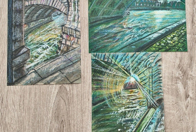
11. General Structure Water with Direct Sunlight: Hello, people. In
this first lesson, we're going to build the
overall design of the drain by focusing on the structure of the bridge and the pathway. It's essential that we construct these elements accurately as they will help define space for both the
river and the sun. We are going to start with a
visible part of the pathway, which can be seen as a
slanted line to the right, beginning from the horizontal
base of our paper. This angle is quite prominent. From there, we will begin constructing the
arch of the bridge, which is a key feature
in this drawing. Right from this point, try
to watch how I trace out an angle to determine
the dimension of the arch in relation
to the pathway. We are drawing one of
the historic bridges around the Isle de La Cite, home to the Notre Dame Cathedral
in the heart of Paris. Many of these
bridges date back to the 16th and 17th centuries, and they are integral to the city's architectural
and artistic heritage. These bridges are important because they symbolize
the connection between the old and new parts
of the city and offer stunning views
that have inspired countless artists
throughout history. Here you can clearly
see the angle. It's almost 45 degrees. It's essential that you visualize this in
the reference image. This angle will allow me
to construct the arch. From this arch,
we can then build the exit of the tunnel
visible in the background, as well as the interior
of the tunnel. As a result, we will have the entire space for the river
already set on the paper. But on the other hand, it's not just this angle
that is important. You can also start
building lines that are close to the ones
already on the paper. For example, this bar
led line allows us to begin seeing the structure of the walkway more clearly. The initial stages of a drawing are slow and require
a lot of observation. It's necessary to be patient because we are making the
backbone of a drawing. This doesn't mean that the steps we are taking must be perfect. Remember that we can
always correct them. What I'm trying to say
is that you should reflect a lot on the
composition of the landscape. You should try to observe
that logic behind the architectural elements
of what we are seeing that, in this case, is a bridge. Now we are ready to create
the background of the tunnel, as well as the background of the landscape beyond the tunnel. We have enough information
with this main arc, and we must take
this important step to create the structure
of the composition. Pay attention to how this
small angle allows me to know if the position of the internal structure of
the tunnel is correct. From here, I can create the arch in the
background as well. Remember that it doesn't
matter if the proportions are not exactly the same
as our reference image. The important thing is that
the structure makes sense. I mean that it feels
like a bridge is real, that its shape makes
sense in perspective. The whole thing is
that we are going to portray the bridge and
it should look real. It's more important that
its structure looks real than we fight to make it look the same as the
reference image. Remember that our technique
is impressionistic. As this part of the
walkway is closed, it's advisable to start
drawing its details. Each of the squares
and lines that make up its architectural structure are reference points that we can use to build the rest
of the composition. Pay attention to the
fact that I'm creating an interpretation of the
cobble stones on the floor. In fact, I'm going
to modify it later, but it allows me to
complete parts of the landscape to have
more reference point. As you know, I have
the proportions of the two main arches, and I have the
information to build the structure of
this bridge column, due to the amount of light
it's barely visible. But if we look closely, we realize that its structure is there and we
must represent it. As the structure of the
column is barely visible, we can experiment
with its nature, for example, with the number of elongated blocks on the side. We don't need to count
how many there are. Simply depicting them is enough to capture the
essence of the bridge. That is part of
the impressionism. The same goes for
the elongated blocks that are bordering the arch. The most important thing is
their essence, the concept. I mean, no one is going
to count those blocks. So unless there is a really significant detail in
one of the blocks, it's not necessary to do
exactly the same number. The only important and
very subtle details is that as these blocks move
away towards the left side, they should reduce
in size very subtly. But that is something
that we can correct even later stages. Pay attention to how with this very general
structure of the drawing, we can already feel the
depth of the space. I mean, we don't need to add
shadows or gradients for A space to be well
constructed in proportions. It's careful observation that will allow us to create
depth and balance. Now I'm going to add
a light hat chin on the drawing to represent
the most important shadows, especially on the inside of the bridge and
the water also. Hat chin is a crucial technique in impressionistic drawing. As it allows artists
to create texture, depth, and movement
through simple lines, unlike traditional
high detailed shading, hatinimpressionism captures
the fleeting quality of light and shadow with
quick expressive strokes. This method helps to convey the atmosphere and
emotional impact of asine. Even though this will
be a color drawing, we must map out its entire
construction in graphite, not only because the graphite
will be part of the color, but because it's a solid
base that will give us the appropriate Kiaro scoto for the entire range of
colors that we will use. And that's it. We now have the general structure
of our drawing. You can see that it even
seems like we are seeing the bridge from farther away
from our point of view. And it's very interesting because it gives us
a better sense of space in the entire composition
until the next lesson.
12. Color Base Calm Water with Direct Sunlight: Hello, everyone. In this lesson, we are going to add the
base colors of our drawing. But where do we start? We must understand
that the selection of colors in the initial
stages of a drawing, even in oil painting, always goes from the
lightest fundamental tone to the darkest tones. For example, I'm going
to start by adding this light brown
color on the paper. A lighter base. And then I will add
a military green that will represent the
darker tones of the river. But pay close attention to this. This doesn't mean that this
will be the final colors, but the base from which we will grow the color
of the river. The reason why this should be
so is because we are going to use the base color as if it were the
color of the paper, and on it, we are going to draw the shadows and the rest of the volumes that will represent the final color of the water. Note, I'm applying
the light brown tone first to represent the shadow of the bridge over
the river and pay attention that I'm doing it
gradually and carefully, and above all, trying
to fill the space consistently is not necessary
to blur the Bkment for now. But let's try to draw the shadow of that
bridge a little bit. Pay attention to what I'm doing right now. If you can look closely, the water seems to move slightly in this area from
the left to right. So I'm trying to
place the color in that direction as
if it were a wave. Now I'm going to start
applying the dark green tone. Try to pay attention to
the reference image. Notice how I apply it in the darker areas of the
shadow progressively. I'm not trying to make
too many details, but spreading the pigment over those fundamentally dark areas. Now I'm going to use this
color between gray and blue to represent this
illuminated area of the river. In the same way as
in the other area, we are just going
to add the color progressively as a base
that we will later modify. The blue and gray colors are closer than you might imagine. See how apply the color
in the regular waves that join the illuminated part with the shaded
part of the river. Now I will use this light
gray color to represent the base color of the walk away and the concrete
of the bridge. Notice how this color actually matches the lighter parts
visible in the concrete. Right here, you can better understand what I'm
trying to tell you. I mean, later on, I will add all those texture details that create the relief and
volume of the structure. Now I'm going to do the same for the ceiling
under the bridge. Try to feel this
subtle yellow color that is the product of the sun, of the color of the concrete in that yellow color of the sunset. Since this gray color is
a kind of white color, it practically
works as if it were a white surface that absorbs the color of
the sun at the moment. But the color of the sun is not the only one hitting
that ceiling. The color of the water is also
reflecting on the ceiling. Therefore, we must add this sidle layer of brown
to the ceiling as well, so that it blends in
with the composition. Brown and green are
also very close colors. Now we'll use this green tone also for the darker
parts of the ceiling. What we are going to
do now is to blur all the color that we have
applied to the drawing, but sadly, to make the gaps between the
strokes disappear, we're going to do it gently. It doesn't matter if
we break the hatching. I'm going to continue adding this very spatial gray over the entire external
structure of the bridge. Notice how I do it respecting each block
of the structure. And, of course, we are
going to blend here, too to make the cracks between
the pigment disappear. I'm going to add
white pastel right here where the sun is to clean up that area and mark the most illuminated
point of the composition. As we have added the color, some fundamental lines of the structure of the
drawing will be lost. So now we must retouch
them so that they can still be seen even
though they have the color. So progressively, we will
try to highlight and reinforce important lines
under the bridge, for example, on the horizon in
the background and also in the blocks of
the bridge structure, even in the walkaway,
if necessary. We are going to use a very light graphite pencil to highlight the most important lines in the light areas in a very
dark one for dark areas. In the case of the darker areas, I highly recommend you
a Pierre noi pencil. Pay attention how
important it is to leave those lines on the
ceiling of the bridge. These lines help us to represent
the perspective inside the bridge. And that's it. We have the color
base for our drawing. It's an excellent start, then I'm sure you will
be excited to see the final result later on
until the next lesson.
13. Water First Details Water with Direct Sunlight: Hello again. In this lesson, we're going to do
the first approach to the water details. We are going to start by
adding this black color to a dark pigment to
the color of water. We are going to add it in the
most pronounced shadows in those places where we feel that the water reaches a
very dark green tone. Once we add that color, we are going to use the
same military green, and we are going
to apply it over everything we had done to
fill the entire space, the entire shaded part. That will be the main color that will predominate in the water. Pay attention that even though I'm filling the entire
space with shadow, I do so with a
certain coherence, seeing the shadows,
trying to follow the saddle wave that
rises slightly. That is something that
we will refine later on. But it's important to
be aware that there is a movement and volume in the
shaded parts of the water. Try to be very careful with
the edge of the shadow. You must try to follow the
spots formed in the water. Try to follow the sequence that you see at the
edge of the shadow. Remember that all those
irregular shadows are part of the
movement of the water, and we must represent it. Pay attention to
what I'm doing now. In the illuminated
parts of the river, there are also shadows of the same color as the large
shadow under the bridge. These shadows are the result of the waves blocking
the sun as they move. The small wave moves, and at the angle it rises, it slightly blocks the sun. That is very important
to know in order to understand why
shadows are made. The small waves are like
little hills on the water. With a lot of patients, you will make spot after
spot shadow after shadow. Even if you feel that what
you are doing doesn't make sense or you feel that it's
not turning out as it is, try to make all those spots
that you see in the water, understanding the principle
that I mentioned. Once you understand
the principle of the little hills
on the water, you will be able to
experiment on the water. In fact, that is a bit of
the idea of this drawing, but we will see that later. One of the great
impressionist painters who capture the
essence of water, especially in rivers
is Alfred Sicily. His mastery in depicting
the shimmering reflections, gentle ripples, and the movement
of water is remarkable. Cisi's work often features the serene rivers of
the French countryside, such as the Seine
and the Themes, where he skillfully
rendered the way light danced on the
surface of the water. Brush strokes were
delicate yet deliberate, allowing viewers to almost
feel the flow of the river, the soft breeze, and the changing sky reflected
on the water surface. In some paintings, Sicily embraced the flitting
quality of light and shadow, evoking both the calm
and subtle dynamism of the river's presence. His use of soft blues, greens and earth tones created
an atmospheric quality, making the water an essential character in his landscapes, alive with movement
in natural beauty. All these drawings
we had made about Sena in this course are
inspired by his work. Now we're going to start
to give life to the water. We are going to use the
white pastel pencil or a small sharp piece
of white pastel. We are going to use
this to draw each of those reflections of light
that we see on the water. In the same way as we
made in the shadows, we will make these
reflections progressively one by one following the
progressive movement that we see in the water. Observe the small waves. Every single spot has a
sequence that we must follow. We must draw slowly
and very carefully. We must take advantage
at the moment and trace the direct reflection of the sun on the river
near the horizon. Observe how slow the process is, observe the chaos
of the reflections. The process is slow, requires observation,
but more than that, you will truly feel the
movement of the water as if the shadow itself were gently pushing the water
towards the light. Now we're going to start
applying some touches of yellow. It's a very bright
and clear yellow. But when it is applied over this range of greens and grays, it will then dilute. What we are going to see
on the paper will be the byproduct of that mixture. Now pay attention at
these touches of gray. It's a slightly denser gray. Every time I add a
color with intention, I'm adding resolution to the reflection. This
is very important. Now we are going to repeat the process we did
at the beginning, but in a darker shade, we are going to
apply the dark green to the entire shadow
projected on the water, and then we are going to
apply the black color again on the most shaded areas. As the color combination grows, we will feel the need to continue retouching
the other areas, and we should not
stop doing so because that means that our
observation is improving, and we are noticing many
more things than before. That is we are more aware
of reflections and details. Now look at how I'm blending the black hatching that I
applied over the dark green. Try to see the soft
shadows in the water. They are very subtle. The slightly darker part
is because there is a slight elevation in that area that is
slightly blocking light. Remember that your fingers are the best tool to blend
the pastel accurately. Now with a Pierre noi pencil, I'm going to make dark
details on the water. Generally, these details are close to the random reflections. Now, pay attention to how
beautiful this detail is. These small white
spots in the water. It is fun when the water that being white reflects
more sunlight. And that's it. These are the
first details of the water, which is going very well, but this is just the beginning. I'll see you in the next lesson.
14. Bridge First Details Water with Direct Sunlight: Hello, people. In this lesson, you're going to cover
the first details of the bridge and the walkaway. The idea is to store
from the area closest to the water and work our way
to the rest of the bridge. Pay attention to what
I'm doing right now. I'm going to mark
all these lines that you see in the
reference image. They are quite contrastint
near the water. I'm going to use a dark
gray in the Pierren. It's important to mention
that it is actually a coincidence that the concrete in this image looks
gray in particular. It's not common.
However, the color of things is the result of light
projected on the material. This walk away in other lighting conditions could look completely different. In fact, in the other drawings, the color changes quite a bit. Now pay attention to how interesting is
what I'm going to do. This part of the wall is
almost facing the sun. I mean, the sun hats
that area quite a bit, but not only that, but the sun projected on the water
also hits the wall. Consequently, the
light projected on the wall will not only
be yellow but green. So now I will add a light layer of light green
to create that effect. Now, we'll add that dark gray that predominates on the wall. But obviously, it will be
mixed with that green, looking just like in
the reference image. Now, using the same gray, I will begin to add the
marks that belongs to the textures of the cobbled
stones of the road. We can combine shades of gray. For example, here in
the reference image, you can see that there
are darker areas. This is very
important because it means that they
are deeper areas. They are deeper cracks. You should try to be sensitive
to the small details. For example, here on the edge, you can see that there
is a light stripe. It's quite a bit lighter than
the gray and green tones, and in fact, we can even play with the color of the
paper in that part. But it's important to draw a border so that lighter
stripe on the edge is noticeable because it creates a very interesting and realistic
visual effect on volume. For all these gray tones, even to add density and
darkness to some colors, we can use graphite directly. In this case, I'm using
pencil to create a texture, the smallest details of
each concrete square, to create irregularities in the small random cracks
in the concrete. Now we're going
to start creating the color of the inner
part of the bridge. This array is a bit
complex because it has several layers,
so pay attention. I'm going to add a first
layer of dark yellow tone. This will be the
outline base color. We're going to
apply it respecting the direction of the lines. Now, we are going to add
another layer of dark green, the same military
green as the water. We're going to make
a hat chin to cover everything while also respecting the direction of the lines. The perspective lines
should continue to be seen regardless of the
color we are applying. Look how it take more and
more care of the details. As we get closer to
the final color, we will take care
of the details. This is the process of
creating a texture. Now we're going to try
to see on the top of the wall a kind of brown color. We should represent
a darker brown that is projected
for some reason. Pay attention to the ceiling
where the lights are. Around there is a brown
color, and we should add it. Now we are going to
retouch the tails with the Pierreni in the color
within appropriate. But above all, the Piergnoi
to improve the area of the wall in contact with the water in the upper
edge of the tunnel. We will achieve the color of this part of the tunnel
little by little. I not only this,
but you must take into account the halo of sunlight that is substantially modifying the color of
everything around it. Now I'm going to use
this bluish gray to represent the parts of the
bridge that are back lit. If you look at the
reference image, the area we work on a few minutes ago is
exposed to the sun. So this shade of gray
should be different. It's important for you to know that you can
experiment with this. That is what impressionism
is all about. But what is essential
is that the shade be different because what is happening with the light
there is different. It's basically the low gray in the shadow mixed
with the glare. So I'm going to apply this
gray on each block so that the color of the paper becomes part of the texture of
the concrete as well. The color of the paper
is part of the drawing. Notice that now three colors
are in play light gray, blue gray, and the
color of the paper. That is the magic
of impressionism. I'm going to tote up these
very important parts of the wall down here
with the same color. It's one of my personal
favorite parts. And that's it. We have taken
a big step in this drawing. This beautiful view of Paris
is starting to come to life, but there is still more, much more until the next lesson.
15. Sunlight & Water Reflection Calm Water with Direct Sunlight: Hello, people. In this lesson, we're going to go into more detail throughout the throwing. We are going to give more
details to the water. We are going to
create the sunlight, and we are going to retouch
much more the whole bridge. So we're going to
start by giving more details and
resolution to the water. I'm creating more
reflections and light. Remember that this
process is slow. The water already
looks pretty good, but we must continue advancing. Remember that as we go into
the details of a drawing, the decisions we make about
color and details are much more thoughtful decisions.
They are not random. The process of
observation is slow. There are even scenes in movies that portray
these processes, like in that scene
of the Danish Girl, where the young painter Einar spends hours making the
details of the swamp. He reflects on which is the most appropriate color
to portray that place. I think it's a very
good representation of the life of a painter. The purpose of this
drawing is to create an impressionistic
interpretation of a slight movement of water. This area that you see here
is key to achieve this, but you won't be able to see the final result until
the last lesson. Now I'm going to
add dark details to the inside of the tunnel. See how I follow the
perspective lines. It's very important to do this. It's no use trying to get the
color and blur everything. The lines are creating
the texture and perspective of this
part of the tunnel. Now I'm going to
create the sunlight. Using the white pastel bar, I'm going to trace the most
prominent rays of the sun. I must stain whatever is
necessary with this white ray. For example, here in this part of the bridge, on
the other hand, it's advisable to use the white pastel bar because
it has more intensity. Additionally, pay attention
to the fact that the ray is downwards and upwards at more or less the
same inclination. Now, using the same method
that is stain and everything, we are going to make
the first hallows. There are several hollows. Some are white, and
others are yellow, but we are going to start
with the white ones. So from inside out, we're going to draw some
hallows over here. It's important to
mention that the circle produced by the halo
is almost perfect. Now we are going to combine this white color with
bright and yellow. If you can see, there
is a circular area fairly close to the sun, where there is a yellow
light that we must portray even in a
partially circular way. I mean, following the
shape of the hallow. We must make this hollow
little by little, making its diameter grow
slowly and creating by modifying the color of all
the surfaces it touches, the water, the bridge, the inner wall of the bridge. This detail is so important. The glare is so strong that it creates luminous
deformations, points of strong backlight, colliding with the background. We can represent
this phenomenon by adding dark areas
within the glare. We must also improve the
consistency of this backlight. We can do this with
graphite so that it reaches a very intense dark gray without reaching a
completely black tone. This back light cannot reach complete black because there is too much light in that area. I'm going to add more touches of yellow pastel with this
beautiful and bright shade. Look how beautiful the sun is already starting to
look in the distance. Now, pay attention to this. If you have looked carefully
at the reference image, in reality in the sunlight, all the colors are there. Now I'm going to add
this beautiful blue to the sunlight to add
magic to that globe. Look how good this looks. This is the very center of
an impressionist technique. Now I'm going to tow the whole
area of the bridge so that the contact of the
light with that part of the concrete surface
is better felt. I need to darken
even more the parts where the light doesn't
reach as strongly. And there you are.
The sun itself has risen to illuminate
the entire drawing, and nothing in this setting has escaped its beautiful glow. I see you in the next lesson.
16. Intricate Details & Final Finishing Calm Water with Direct Sunlight: And. Hello, people. This is the last lesson
of this drawing. Here we are going to work on the more intricate details of
the outside of the bridge. We are going to do
all of its texture. So since we already
have the sunlight, we need to intensify the
tones of the concrete, the texture of each
concrete square as well as the light
effects on the surface. On the other hand,
it's important to mention that we will also add some details the small grass that grows among
the cobble stones. We are going to start by adding more texture
to the concrete, using the pencil to get
to the smaller details, especially in this wider
section of the walkaway. For example, we can focus on some details to
faithfully represent them and then make an
interpretation that can complete the full
texture of each section. As I continue to advance
on the cobbled stones, are you paying attention to how beautiful the water looks? Look at the movement of that little wave
that seems to have bounced off the wall and then tried to return
to the sunlight. Look at the curvature of the
lines that make it rise. It was actually a personal
touch because I slightly exaggerated the movement of the water that you see
in the reference image. But I think it's beautiful. I'm going to add this layer of dark gray pastel to
darken all this texture. In these cases, we can blend it and continue making details. Remember what I always tell you, patience is almost eight dimension when it
comes to drawing. Try to pay attention to
the speed at which I move. It's slow. Therefore, seeing results will also
be a slow process. I mean, these details I'm
adding now are very subtle. They require a real
understanding of what is happening
visually in the pavement. You have to observe a lot to be able to follow
the patterns. One of the most
important lessons when it comes to
drawing is to know that the visual effect of one element can vary by enhancing
another element. This is because
drawing is a language. And in that language, there are signs and symbols
like in any other. Therefore, depending on the different symbols
in the painting, and how they vary, we can interpret a drawing
or painting differently. But what do I mean by this? I'm going to give
you an example. Let's imagine a drawing
completely made of graphite. In that case, even
the darkest points of the drawing will be with the darkest possible
tone in graphite. It turns out that if I add a single line to that
drawing with Pierre noi, the language changes
because I'm reaching a tone of black that is impossible to reach
with graphite. And secondly, I'm telling the viewer that even
the darkest tone of graphite expressed on paper is not the darkest tone
of the composition. Therefore, even in the
darkest areas of the drawing, that place is not
so dark after all. I mean, I would be
telling people that the landscape is not
completely dark, so the message is
changing completely. Now, look how I'm adding
the blades of grass between the cobbled stones
with this green pastel bar. It's a very interesting
detail that enriches the whole
area of the bridge. I'm doing it with the pastel bar because its color
is quite beautiful. Now look at these little touches of yellow on the concrete. Look how the subtlety of these details noticeably
improves the lighting. I'm going to add now
some small white details to the cobbled stones texture. These white details are going to add much more resolution. Pay attention to how much the appearance of the
cobble stone has improved. I love the texture achieved, but I really can't
stop seeing that little wave moving in the
water in the background. It's just beautiful. Now, I'm going to finish
making the blocks at the edge of the bridge,
the bridge lintel. That is the correct term. I'm going to focus on divting
lines between each block. So I'm going to do it carefully, paying attention to perspective. Remember that as the blocks move away, their thickness decreases. Now, look how I'm going to add irregularity to the
tones of the blocks. I'm doing it all with a pencil because it's
a ton close to gray. Now I'm going to give
the final details. I'm going to retouch
the sunlight here by adding more yellow
color to the main halo. Look at the beauty of that little blue
detail near the sun. It's simply beautiful. Look at the reflection of the sunlight on the
water in the distance. Impressionism is a great chance to express ourselves
through drawing. I mean, it's precisely the
license to experiment with textures that allows
expression to manifest itself. In reality, that
way of representing the sun is not going to be
the same for each one of us. In fact, it's the point of
view of each one of us. But of course, it's wonderful to have the basic foundations to be able to start this path
of impressionist language. Look at this pink detail
in the light on the stone. And that's it. Look how
beautiful our representation is. Look at the inner
part of the bridge, the beautiful hollow of the sun, the details of the concrete. And the most wonderful thing is the movement of the water, returning after hitting
the edge of the bridge. It has been a pleasure to
accompany you on this journey. I see you in the next lesson.
17. Water in Motion Theretical Approach Artistic References: Turner and mastering the
representation of water. Provide us with valuable
lessons through his works. In the wreck of transport sheep, Turner not only depicts
a turbulent sea, but also illustrates
how the small hills form by the waves
and merge and shift. It's important to observe how these hills often have
foam in their peaks, suggesting the
movement of the water. This foam by blocking the light, creates a contrast that highlights the
volume of each hill. As we approach our drawing, we will start by constructing
the space and the bridge, using architectural lines to define their shapes
and structure. Then we will apply
close attention to the details of the water, focusing on those hills and
their interaction with light. In Dutch boats in a gale, the water is shown in
constant motion with waves displaying small crest that are fundamental for bringing
the scene to life. Turner applies
different tones to illustrate how light interacts with the hills of the water, creating shadows
that suggest depth. On the other hand,
shipwreck offers a powerful representation
of water and motion. The waves, which
seems to come alive, teaches us to capture
the energy of the sea through loose
and expressive strokes. As in the other works, we must notice how the heels
of water present shadows on their undersides in bright light at the peaks of the foam. This will help us create a sense of volume
in our drawing. Lastly, in beach at
Valencia, the morning light. By Joaquin Saroya, the treatment of water
is equally revealing. Saroya masterfully handles light to show how the sun
reflects on the waves. The small hills in his paintings have a special glow at the top, which we can represent
in our work by applying light tones in the
illuminated areas and darker tones
for the shadows. As we begin our drawing, we will first create
the structure of the bridge in the
surrounding space, ensuring that each architectural
element is well defined. Only after establishing
the base will we focus on capturing the
movement of the water? Will observe the hills
formed by the waves and how light plays on
the foam and shadows, blocking light in ways that help us shape the volume
of each hill. It's essential to
consider this work not just as an exploration
of moving water, but also as an opportunity
to learn about perspective and
the architectural elements present in the scene. When depicting the interior
of the bridge over the water, we should observe how
light and shadow erct in the space projecting
onto the water's surface. The beauty of the bridge
is just as important as the water in achieving a
realistic feeling in our work. Let us leverage these references to experiment with our
strokes and colors, allowing every
detail in the water to speak to our connection
with the scene. With each stroke,
let us celebrate the beauty of moving water in our artistic interpretation. Always keeping in mind the architectural
context surrounding our work until the
next lesson. A
18. General Structure Moving Water Under the Bridge: Hello people. Let's start immediately with
this other bridge. It's another point of
view of the water. Quite interesting
because you can see that the water is quite moving. And that is exactly the visual
effect we want to capture. But not only that, but it's the same concrete of the bridge, but under other
lighting conditions. So let's start to trace this part of the walkaway
that as you can see, is partially under the shade. I'm going to use the angle formed between the
edge of the walk away and this prominent column
that rises to the left. As you can see in
the reference image, the column has a
prominent structure. This structure is
very important for this drawing because
it helps us to draw lines that indicate the position of other
elements in the composition, such as the part
of the bridge on the right side and also the
exact place where the arch, the lintel of the bridge
over the river should be. Look how I draw this line
from the column structure to determine the position
and dimensions of the parts of the bridge
visible on the right. That space is a very
valuable geometric shape for this stage of the drawing. Now I'm going to create the same structure of
the other column right now in this column because I already know the position
it has in space. Look at all this starting
from the first column. Now, from this new column, I'm going to try to
locate the point from where the arch of
the bridge is born. I'm going to draw an
angle from the each of the other column to create
its exact dimensions. Of all the drawings
in this course, this is the easiest
to build in terms of structure because we have enough reference
points to develop it. Now, from this side of the arch, we are going to draw
the upper edge of the bridge, the roadway part. In this part, the
inclination of the line is fundamental because it will represent the perspective
of the bridge. It's possible that we
failed in the inclination, but we can correct it as
we advance in the drawing. That doesn't matter
at this moment. We can clean up the
construction lines a bit, and we will proceed to build the most distant
elements of this view. The arch on the other side of the bridge with the
horizon in the distance, which is nothing more than the other side of
the Sena River. Pay attention to how
important the structure of the column is to
build that horizon. We simply have to relate all that space to this
element of the column. I mean how far apart are
the lines of the column, the angles, the place where the column touches the
horizon, et cetera. M. This part of the inner wall
of the bridge is important. We must follow the perspective
of that structure. Note that it's
kind of rectangle, but wider on the left side
due to the perspective. This bridge is significantly
wider than the others. So the space is larger. So this perspective can
be seen in its shape. These arch lines are
extremely important. They allows us to build the volume and shape
of the ceiling. To draw these lines, simply try to see where
they start and where each of the lines ends in
both sides of the bridge. Now that we have the
general structure built, we're going to start giving
some general details to the whole bridge. Let's start by
building the blocks and bricks of the
bridge structure here. This is very important
because it allows us to give consistency to
the structure we create and above all to get ahead with the work on
the texture of the walls. When creating these blocks, it's more important
to be precise with the horizontally
aligned blocks than with the blocks that
directly border the lintel. With regard to the elongated
blocks of the intel, you don't have to make
exactly the same number of blocks, represent them. No one is going to
count those blocks. We just need the visual
effect in perspective. Pay attention to how good this general structure of the drawing is starting to look. It's very interesting
when a drawing starts off very well
from the very beginning. But be careful. This is not
guarantee of a good result. It's like a movie script. A good script can make a
good movie, a normal movie, and a very bad movie, but a bad script will
never make a good movie. Now we're going to
proceed to make this group of blocks
in the column, which are easier
because they are regular and follow
specific lines. Here we can count and create each of the levels
along the column. We are going to do the
same thing at the bottom. We just have to count
the number of lines of blocks and represent
the blocks one by one. These details are quite close, so we must try to
render them very well. Mm. Of course, a walk away
is also very important, and you can see there
are rectangular shapes on each surface. Therefore, we can make these crossed lines to
know the angles of that geometric shape and thus
represent it appropriately. Going to clean up those
construction lines a bit now to finish
our first sketch. And that's it. The
general structure of our drawing is ready. It's a very good sketch
and drawing design. We haven't even represented
the shadows through the line, but the depth in the
space is already very well felt due to
the good construction, but this is just the beginning. I see you in the next lesson.
19. First Shading Approach Moving Water Under the Bridge: Hello, people. In this lesson, we're going to do
the first approach to the shading of the drawing. We are going to go step by step applying hatching on each
section of the drawing. But at the same time,
in some specific zones, we will give some details. The reason why in some places we will give details is because those specific details reveal information about the
lighting of the space. First of all, I'm going
to start by completing these parts of the wall
here that is visible. Pay attention to
the fact that it's not easy to see because
due to the humidity, it's full of moss and water. So it's dark almost the
color of the water. A now applying a hat chin in the same direction, we will represent the
different values of light and dark of each of
the elements of the drawing. For example, the
column on the left, the inner parts of the breach, the most prominent shadows
of the water, and, of course, the entire right side of the bridge
and the walkaway. So beyond the color of
each of the elements, let's try to see the amount of light there is
on the surface. And above of all, we must take into account that
in this drawing, we are going to use the color
of the paper to represent the color of the breach
material exposed to the light. You can clearly see
that is quite similar. A Notice the way I'm mapping all the shaded
areas of the water. Although I am applying a very
subtle and fine hatching, I'm indicating with lines the structure of the
shadow on the water. This process is crucial
to succeed at shading, most of all, in the first
stages of a drawing. I'm going to darken
this column on the left in the upper part
of the bridge a little more. While we observe in detail the internal part of the
bridge, the ceiling. Looking closely at this area, we are going to use dark
lines to give strength to its shadows without
altering the hatching. Now we're going to continue darkening the
column on the left. As we shade the drawing, this column should give us the darkest point
of the composition, so nothing can be
darker than the column, so we must continue
darkening it. Et's go for the next step. I'm going to add these
details to the wall. We're going to
reinforce these lines that are part of the
structure of the bridge, and we're going to darken
this internal part even more. Now, I will define
the space even more. The drawing must
evolve as a whole. So let's try to see in
the reference image, which are the divisions
between the blocks that catch our attention the
most. We must darken those. Now we're going to
darken the walkaway. Notice that in the
reference image, it's much darker than the rest of the
parts of the bridge, those ones that are
exposed to the light. And of course, we are
going to give more density to the dark tone of this
column on the left. By using a kind of tissue, I'm going to blur
it, and I'm going to add more graphite
when necessary. Now let's give more
details to this column. This section over here is of utmost importance that
is rendered as well as possible because it's very close to the viewer and because its dark color is quite representative in
the composition. This column means next to us. Is shadow seems to protect us, and that same shadow
seems to become an accomplice and witness
to our contemplation. This detail over here
is quite important. Notice that the surface
of the concrete is so polished that it practically
reflects the light. It's very common
for artists to pay less attention to the dark
areas of a composition and break down all those areas
to a tone dark enough to completely hide the details of that section of the drawing. Although in certain
occasions, this can work, I highly recommend
you giving details to the areas of maximum
darkness in a drawing. The human eye is
detecting everything, and even when it's a dark area, the volumes and textures represented are crucial
for the whole composition. Now we're going to
continue giving density to all the dark areas of the
rest of the composition. Try to vary the hatching
as you advance. While in the first hatching, we can keep a single direction. As we add the following ones, it's better to vary
the direction to get closer to the texture of
the surface or object. Now, let's try to make the general outline of the most prominent
shadows of the water. So we'll try not to
complicate things too much. We'll just treat the water as if it were another object
for the moment, and we will add some shading to identify those shaded areas. As a final detail, let's represent in this small
group of clouds here, we can actually concentrate on the visible part of the sky, the blue part. And that's it. We have the first shading
design for our drawing, which is going pretty well. The left column
should be darker, but I didn't darken it enough to go give in detail
as we go along. And as it's a color drawing, that column will
have dark pastel. So if I applied a big
layer of graphite, it will cost me a lot to make the dark pastel
stick to the paper. But this is still the beginning. I see you in the next lesson.
20. Color Base Moving Water Under the Bridge: Hello, people. In this lesson, we're going to add the base
colors of our composition. We're going to choose the
most prominent color of each section of the drawing and we will add it in
the important areas. We are going to start with
the water, the river. We are going to choose
this military green, and we are going to look at
the areas of the river where the color of the water is
closest to this color. It's not necessary to
keep a hatching in the same direction.
You can vary it. The most important thing
is that you recognize the sections in the water that
have the same color tone. This will give us information about the different
shades within the same water and the range of colors
that we will add later. I will also add these
darker tones with black in the darkest
points of the river, like it is one, for example. Now we are going to
do the same process in the left column. Look at what I told you
in the last lesson. Look how far this
black tone reaches. It's much higher than the
darkest tone of the graphite. Now we are going to add this
gray color to the walkaway. We are going to add
the pigment as if it were a material that we
are going to use later on. Now, the attention over
here look how it's exactly the same tone as the
walkaway, a little darker. I'm going to add the same color to the edge of the bridge. This process is important. I'm going to spread the pigment a little more on the walkaway, and in the areas of
the drawing where I feel this color
is also present. Now we're going to tackle this part of the
bridge, the inner side. This area is more delicate. In a city is also
a shade of gray, but a different one,
you're going to use the graphite to add
its base color. But this time, you're
going to try to respect in some way the details that
we have toned so far. Try to notice that unlike the rest of the parts of the
drawing, in this section, I'm giving some details on the edges and internal
lines of the ceiling because they actually have a crucial importance from the initial stages
of the drawing. Now we are going to move on to a more detailed
level in the water. We're going to add
more base colors. Look at the importance
of these white tails. In the water, there
are white reflections of light that are
very important, but not only that, pay close attention to the kind of hatching I made
with the green. If you notice, there are some curved lines
that are trying to represent the hell shape that those little waves near
the walkaway have. Now, pay attention to
this yellow color to give the base to the illuminated
areas of the water, that part where the warm
light of the sun reaches. Now, look at these
little details of blue. But why do I put this blue? Because in reality, we
must understand that the areas of the water that are white are reflecting the sky. Therefore, if we are going
to add blue to the sky, this blue could perfectly
be in the water. On the other hand, the blue
color is close to gray. It's not random to add it
as part of the gray ranges. Now I'm going to blur
all the dark pigment that we added in
the left column. Let's try to spread it softly over the entire
surface of the column. Of course, try to respect
the edges and the details, especially of this
structure down here. Now we're going to
add the blue color of the sky in the areas where
we can see the atmosphere. After all, that is the color
we just added to the water. Notice that it's not exactly the same blue color that
we put on the water. This one is more intense. The blue of the water
is a lighter color because it's mixed with the reflection of
the white clouds. I'm going to add these little white pigment shreds over here. As for the inner part of the bridge, pay
attention to this. I'm going to add these
green details here under the bridge and pay attention to how the sunlight
hits the water. That is producing the
water becomes bright, and that brightness hits the wall with that
intense green. As a result, these
details on the wall that are actually dark
become a dark green. Now we're going to go over
the concrete of the bridge, those parts where we are using the color of the paper as
a part of the texture. We are going to
play with gray and white to represent the texture. Try to see those areas
of the concrete more illuminated to represent
them with white color. And the wet areas can be represented with
gray and also white. On the other hand,
pay attention to all the salt and solidified
mold on the wall. As we are giving details, we can add details to the rest of the elements of
the composition. Let's try to see colors
in each element. The more colors we see,
the more resolution the drawing will
acquire in the sky, in the water, in the farthest point of the
drawing after the bridge. Everything has many tones. Oh And that's it. Our first approach
to color is ready, and everything is going
excellently well. Try to notice the
contrast between the left column and the rest
of the areas in the drawing. This is a proper color scheme. I see you in the next lesson.
21. First Details Approach Moving Water Under The Bridge: Hello, people. In this lesson, we're going to cover
the first approach to the details of the texture
of the entire bridge. We are going to start
with the left column. I'm going to use the shade of brown very close to
black to represent those stones in the
reference image that create the texture of the
concrete under the shade. Next, we are going
to start to blur the pigment we put
on the walkaway. And then using the
graphite pencil, we are going to start
to give the details. You have to try to see them all. The edges of each
section on the floor, the edges of the step, and the subtle cracks
on the concrete. Little by little, we are
creating the texture. The subtlety of gratings
is very important, but we should not
obsess over this. There is a problem with
many drawings in which there are only gratings
but not texture lines. This creates a rather commercial and amateris result
in a drawing. When the drawing has not
texture through the line, it doesn't look artistic. I mean, you can even
achieve the right tones, but the drawing will
lack the precision of the texture and
the artistic value of presenting a realistic image through a language that
is not photographic. That is part of the
secret of impressionism. We are not taking a photograph. We are representing
reality from a language that approaches it through
its own point of view. Pay attention to the value
of the line over here. The darkness of the
line represents how deep the cracks are in
each part of the concrete. The process of creating
textures is slow. And the most
important thing about this approach with color
is that we are getting a browser concept about
drawing that will help us even to have a
better drawing in graphite, because all this that we
are doing helps us to better observe the color tones
of the things around us. Although we are in a
course of impressionism, this phenomenon of
visual sensitivity is clearly present in the
mind of Michelangelo. He was a great sculptor, but as he was very sensitive
to forms and visual tones, he was also a great painter. So you don't become a great visual artist because you know how to
handle a language, but rather you truly
understand what you are seeing in front of you in an
artistically sensitive way. I'm going to use the
white color to represent in the most illuminated
areas of the concrete. Pay attention to the manner. I'm using the eraser pencil to clean all the
edges over here. I'm going to start adding
these gray tones over here. Those areas of humidity are very important. For example, down here, there is a mold, and we must represent its dark color well. Now I'm going to start giving details to those walls
exposed to the light. I'm going to do the same
process as in the walkaway. I'm going to use the
graphite pencil to draw each detail
little by little. The lines between the blocks, the edges of the concrete, as well as the texture and
darkness of the wet areas. A white color is crucial in
this section of the wall. It will allow us to
represent the lime from below to the highest
part of the entire wall. We must manage to represent
the filtration in the wall. This wall really shows the effect of the passage
of water over it. And look how the white color is representing the solid
white lime on the wall. Now I'm going to work on
this part of the bridge. We must define all the lines and the upper part so that the perspective is
felt along the edge. We must also define
the divisions between the bricks and blocks of
this part of the bridge. It's necessary that they are visible even
in the distance. We must pay close attention
to these details. Not only must we add the tone
of the mold and the leaks, but also the limit the
edge of each stained part. The line is critical
in this process. Pay attention to the manner I'm using the eraser pencil to create these lines on
this part of the bridge. I'm removing the pigment as
if I were painting the lines, and this automatically
improves the texture. Now, using the graphite, we must take advantage
to tow cha each flock or brick to add realism to the
random tones of the wall. Look at the importance of the
line here to create depth. It allows us to clean
up the edges and also improve the depth of the divisions
between the blocks, just like we did
in the walkaway. As a last detail,
you're going to touch up all the lines of the
ceiling under the bridge. This area is very
important for the drawing. We must not lose
the curved lines that suggest its shape
in the distance. And that's it. Now the
drawing is coming to life. Look at the beautiful tones and colors that are starting
to appear in the paper. I see you in the next lesson.
22. Water Details Moving Water Under The Bridge: Hello, people. In this lesson, we're going to cover
the waters details. But before we do that, we need to complete and
correct something important. We are going to touch
on the section under the bridge and also the sky. But let's start with the sky. We need to complete the
color of the sky or at least get close
to the final value. The reason is that
the sky is one of the main generators of the illuminated
areas of the water. In that sense, we need to be clear about what its tones are in order to be able to approach the reflections of the
water appropriately. So by using the white bustle, let's define the clouds. Let's add the amount
of white pastel needed to represent
all their shades. Now, let's clean up a little bit in this area after the breach. Now we're going to fix
something important. Actually, looking at the
drawing from a distance, we realize that this
area under the bridge, the ceiling is not dark enough. So we're going to try
to blur the pigment that is in it to
add consistency, and then redo the details
with more strength later. But to pay close attention, it's important not to eliminate
them completely to have a reference point later on
to represent those details. And I As we are giving more details, we can take advantage and place this bridge
sign over here. Perfect. Now we are going to
tackle the water details. We're going to start adding with much more precision this military green
that we were using. We are going to polish the
spaces where the color of the paper is still
visible and above all, we are going to
improve the gradient of those green tones
mixing with the yellow. This part is very important. Let's use the white puzzle to build the movement of
the water in this part. Try to see these small
hills on the water. The white strokes should
represent the light of the sky, and we are supposed to make the strokes respecting the
direction of the hill. We are not only
going to use white, but also gray to improve the
curved shape of the waves. You can notice not
only the importance of this gray color
that I'm adding now, but also how I am applying it to represent different waves. The ones that are close to it and those ones that
are farther away. As I told you, it's
a game of building small hills that are bucking the light in
different directions. But the most important
thing is to represent the arch shape that the water
takes after the movement. And not only that,
but at the top of the small hills are always
the most illuminated areas. Learning to observe this is very important when it
comes to representing water because it even
allows us to create small waves that were not initially in the
reference image. The et's continue adding white lines to finish the final, the shape of the
waves very well. Pay attention to the manner. I use blue again to give touches of blue
light in some areas. This color will gain meaning when we see the
river in the distance. Look how wonderful it is as the light begins to be
reflected in the small waves. It's like a magic that is transmitted through
the white dry. Additionally, pay attention to the importance of
the curved line in the volume that the water requires when combining
all the colors. As we are already achieving
the color of the water, we can use the graphite to improve the shadows
of each wave. Remember that the small
waves block the sunlight. Graphite always adapts very well to light colors when it
comes to darkening them. Now, pay attention to how I use the white pastel to represent
the foam in the distance. Remember that the foam reflects the sunlight because
it's obviously whiter. Of all the stages
of this drawing, this is the one that requires the most concentration
and observation, although it's an
impressionist drawing. We must always choose a part of our drawing that will
carry more details. And in this case, it's water, since it's the main
theme of this volume. Pay attention to how important every single white
line is in the water. Once they are on the paper, it feels as if they were
always needed to be there. On the other hand, it's really wonderful how the yellow
color in the part where the sunlight
hits the water really seems to warm
that part of the river. And that's it. I dares that
the water in the drawing is more interesting and turbulent than the water in
the reference image. And that is the most
wonderful thing about drawing in art. Our representation speaks of our deep way of feeling
things until the next lesson.
23. Intricate Details Moving Water Under The Bridge: Hello, people. We have reached the last lesson
of this drawing, and we are going to focus on
the most intricate details, especially those of the
bridge and the ceiling. So we're going to start with the inner part of the bridge. We are going to
define step by step, each one of the lines that form the texture
of that ceiling. We must take great care of those arch lines of the ceiling. Remember that the
separation between any line is important
to chief perspective. Remember, as I always tell you, in the final stages of a drawing is where you should observe
more and draw less. It's necessary that
the decisions you make on paper are with
absolute intention. Now look how important these horizontal lines are for the texture of the ceiling. The sequence of lines one
on top of the other makes the dimensions of the
ceilings as well as the realism for its
structure fill. Now, taking into account
all the lines we made, we are going to use
the white color to add the texture of each line. Pay attention to the lime adieu to the certain
parts of the ceiling. All of this is part of the irregularity of
the ceiling leaks. We are supposed to use all
the tools available to represent them graphite
and white basil. Pay attention that I'm not doing exactly what is in
the reference image. This is an
impressionist drawing, so we must make an artistic
interpretation that brings us close enough to the reality presented in the
reference image. Look how this same pattern appears on the wall
near the water. The leaks and lime spread
over the entire surface. Remember to toe up the
edges and all the details of the lines that should be clearly visible from a distance. That ceiling is very important, because it's right in the
visual center of the viewer. The viewer cannot
avoid seeing it. If you look closely at
the reference image, that part of the
ceiling in the wall have quite dark
contrasting lines. If we compare them with the darkness of the
column on the left, we could easily say that they
are quite similar in tone. In this sense, we must
darken some lines even more, and I'm going to
do it with Pierno, which allows us to reach a
stronger shade of black. Now I'm going to touch up
the background over there. You can see the deck
of a couple of boats. Now we are going to move
on towards the sky. We are going to add
more blue colour to improve the tone
of the atmosphere, and then we are going to create a more realistic visual
effect of the white clouds. Pay attention to the
manner I created clouds. Notice the transparency
of some parts, the irregularity
of their shapes, and also the areas where you can see the blue of the atmosphere. Everything is bailed between
the density of the clouds. M. There are some details of the clouds that must be toned directly with the
white pastel bar because they are a type of intense white color that should not be mixed
with anything. So if you need to make stripes or expose that are very white, try to use directly the white pastel bar and
not the pastel pencil. A Now we're going to add the red detail of
that sign on the bridge. We're going to do it
very carefully so as not to stain
anything around it. Now, we must clean the
edge of the bridge very well with a white pastel so
that it is well defined. I highly recommend you using
the pastel pencil to do it. You see that I'm not using it. But in reality, I'm using the tip of the
pencil that broke. Now we're going to
give more details to the entire exposed
area of the bridge. We're going to add more
texture with a white basil. We must observe the reference
image very carefully. Now, using the
Pierre noi pencil, we are going to refine
the details and texture of this
column on the left. The idea is to trace all the dividing lines
with the darkest tone possible and add all
the irregularities and spots as well. For example, these
lines over here. And also right here, Remember to add random spokes to create a realistic effect
on the surface. And that's it. We have
finished our drawing, a beautiful rendering of the senna from this
beautiful bridge. Look at the beauty
of the movement as a water and the reflection of the sunlight in
the background. The very core of impressionism is capturing those
details of light. It has been a pleasure to
get this far with you, and I hope you can
continue to love drawing in this way
until the next time.
 Baudilio Perez, Take your ideas to the stars