Transcripts
1. Impressionist Drawing Vol 1 Fundamentals: Have you ever dreamed
about capturing the essence of sine in a vibrant and expressive
way from graphite to color? I am Badillo Bey Vz and I'm
honored to present to you the first volume of my impressionist drawing
course and series. For 30 years, I have traveled
through the best articles, and now I'm here to guide you on this exciting
artistic journey. I have designed a series of impressions courses so
that you can learn to draw by creating your
drawings in graph fight and completely transforming
them into color. Using a technique that allows
you to capture anything, the sky, bridges, buildings, people, rivers, sunsets, everything in front of
you in an artistic, expressive way with
realistic expectations. In this first volume,
you will learn all the basic fundamentals
of impressionist drawing. Imagine drawing from
the charming streets of Paris and the evil tower itself to immortalizing
the majestic titanic on its made voyage. Here you will develop
your skills to represent nearby objects and those in the distance without spending hours
perfecting every detail, allowing you to create
impactful works that wildly capture light and movement in an expressive
and realistic way. That is what impressionism
is all about. As a final project, you will render the
magical moment. Titanic was about to depart, it will apply everything you have learned, the
water, the sky, every part of the ship in the
atmosphere at the moment, using the beautiful
impressionist technique. Obviously we will explore the theory behind
a practical work, discussing the color,
the representation, developments in distance, the synthesis of real
updates into simple strokes, color within light,
and much more. Drawing inspiration from
the best collection of works in the Museum
or S in Paris, where impressionist
paintings comes to life. We will work with high
quality materials, rap fit, dry pastels, piquin and the luxury papers that will allow you to
unleash your creativity. So D miss the chance to become that artist you have
always dreamed of being, mastering the art of drawing. You won't be able to find a more complete and exciting
course on this platform. Welcome to my Bay Atalie on Impressions
Towing Volume one, fundamentals for all levels. I look forward to seeing
you in the first lesson.
2. What is impressionism? Importance: Hello, everyone. Welcome to this first lesson
of this course. Today, we are going to
explore impressionism, an artistic movement that revolutionized how art is
perceived and created. So to understand impressionism, we must first consider the
context in which it emerged. The invention of the
camera in the mith of the 19th century has a
significant impact on art. Before photography,
artists focused on detail and precise
representation of reality. However, the camera offered a new way to capture
what they saw, leading artists to
rethink their purpose. Instead of trying to
replicate photography, impressionists began
exploring how they could express their personal and emotional vision
of the world. Photography allowed for the
capture of fleeting moments, which influenced
impressionists who sought to represent the lighting
atmosphere at a specific moment. This quest is reflected in these rapid brcon strokes and attention to changing
light in their works. But now let's look
at how drawing evolved from the trends
leading up to impressionism. For this movement, Art was dominated by an academic
approach where technique, precision, and detail
were paramount. With the advent of
impressionists, the technique of drawing underwent a radical
transformation. Claude Monet, in
his famous series of paintings of Rome Cathedral, not only uses vibrant colors to reflect the changes in
light and atmosphere, but also employs
strokes and dabs to capture the essence of
elements in the distance. See how Monette synthesizes architectural details such
as windows and reliefs of the cathedral with
loose brush strokes allowing the viewer to complete
the image in their mind. This technique not only
provides a sense of depth, but also conveys the
changing atmosphere and evolving light
in the environment. Impressionism is marked
by its spontaneity, making it an exceptional
technique for sketching. Instead of spending hours
seeking perfection, impressionists like Edgar de Gas in his depiction of dancers capture the movement and energy of their subjects with
speed and freshness. His work on the dance class
is a great example of how the dynamism of ASN can be conveyed without the need
for precise details. The importance of
this approach lies in its encouragement of
active observation. By drawing in a freer
and looser style, we train our ability to detect balance
between what we see, the color around us, and how light
affects everything. We learn to perceive how
objects interwind in space and how shadows and highlights transform
their shape. In this sense, impressionism teaches us to be more
aware of our surroundings. It invites us to capture not
just what is in front of us, but also the feeling and
atmosphere surrounding us. By doing so, we become better artists as we
train our ability to observe and represent reality more expressively and effective. In summary, impressionism not only changed how
painting was done, but it also offers valuable
lessons for drawing. Spontaneity, speed, and
emotional connection to what we are drawing are
essential in our practice. So as we progress
through this course, we will remember the
importance of actively observing and capturing the
essence of what we see, using techniques inspired by the impressionist to enhance
our artistic skills. I see you in the next lesson.
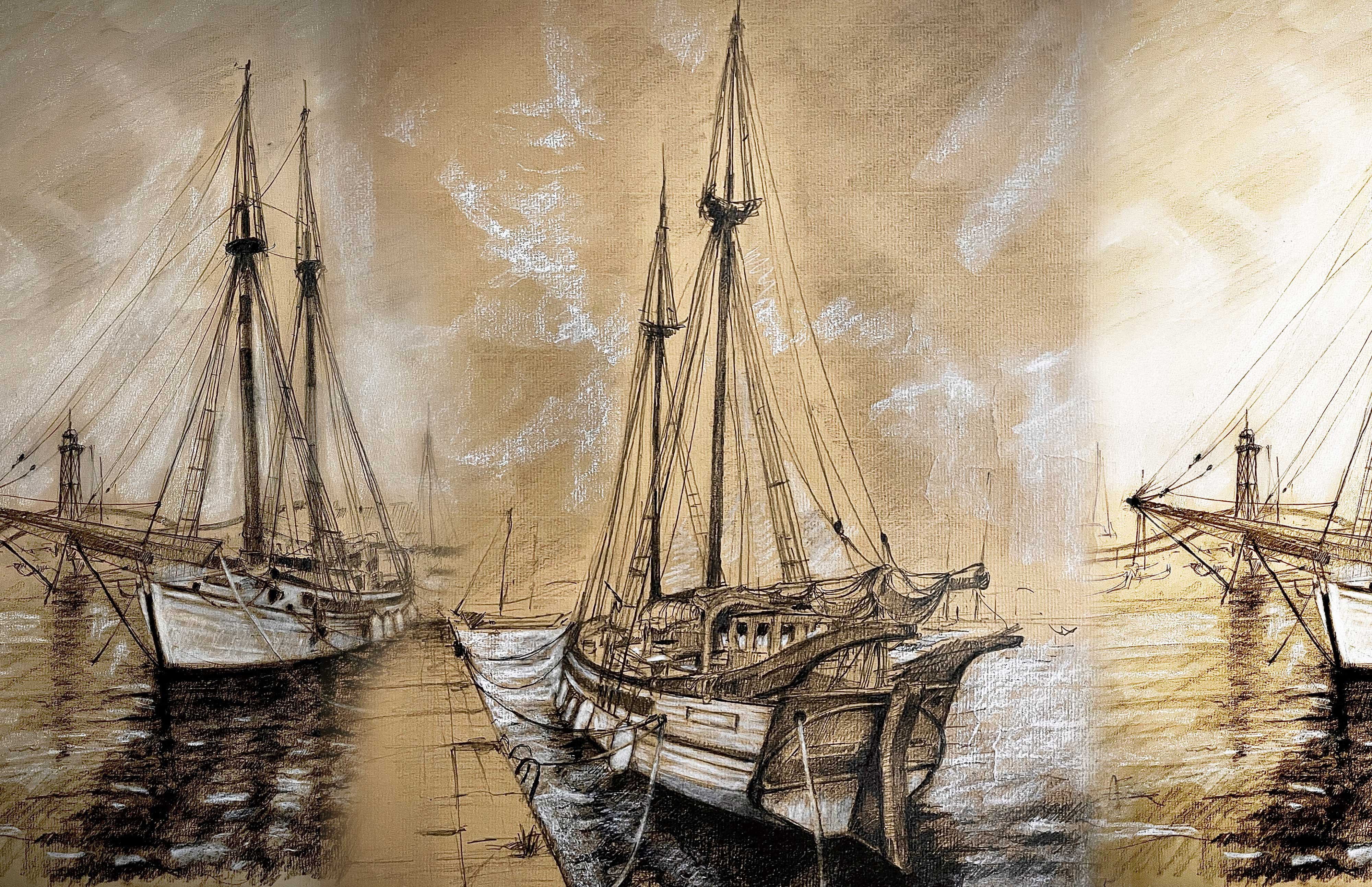
3. Beautiful Papers Impressionist Drawing Vol 1: Hello, people. Welcome
to this lesson. Today, we will be talking
about the different types of papers we will be
using in this course. In fact, we will
explore papers of all colors throughout
our time together. But I highly recommend you experimenting with papers
of various colors, this will help you
bring out the best in your materials and
achieve unique effects. We will be discussing
the different types of papers in this lesson, and throughout the course, you will see how various coolors can change the mood
and depth work. By choosing a color
that contras with your drawing can enhance the vibrancy of your
pastils and pencils. So don't worry about
buying expensive papers. Even a simple color paper
will give you a great start. If you already seen the
drawing and sketching course, you may recognize some
of this content in this lesson as we are
discussing the same materials. But it's important to
refresh this knowledge, as these are the same
drawing materials we will use in both courses. So let's get started. Let's go with the first paper. Schooler shammer is high
quality drawing paper with a pear white finish that stands out for its very
fine grain texture. This type of paper is
ideal for detail work as its smooth surface allows for sharp and precise lines without the pencil, catchin or dragon. Thanks to its delicate grain, it's perfect for graphite, colored pencils
and ink techniques where cleanliness and
clarity are essential. It also works well
for saddle shading, allowing smooth
transitions between tones. It's especially useful
for portraits and technical drawings that
require clear uniform lines. On this course, we
will use this paper to create this beautiful
drawing of the E fol Tower. This is a great drawing paper. Pay close attention
to the grain. Let's move on to the next one. The honey Mill ingress
is a high quality paper, specially designed for graphite
and pastel techniques. Its unique texture and
versatility make it ideal for capturing fine details and applying rich shading, which is why it will be the main paper used
in this course. One of its most notable
features is its rough green, which makes it more
challenging to chip precise details right away. However, this is actually an advantage when
learning to draw. We need to make better
thought outlines of higher quality to achieve
more effective results, especially in the distance. The rough grains resist
precision a bit more, forcing us to be more
conscious of every stroke, which is essential in the
Earls stages of learning. Moreover, the final
result is always more beautiful with a more
dynamic and deeper finish, giving the drawing a
richer, more complex feel. This particular
Hamel ingress has a texture with tying
fibers on the surface, giving it a unique,
almosantque look. This texture not only gives
it a vintage appearance, but also makes it especially
beautiful and attractive. It's one of the most beautiful
drawing papers available. Additionally, the hail ingress
comes in various stones, such as socra and earthy shades. Each color has its
own unique texture, allowing you to experiment
with different effects and find the one that best
suits your drawing style. The variety of colors offers a range of possibilities
to enhance your work with
interesting backgrounds and create more
dynamic contrasts. The other hand, the paper has two different textures
on each side. One side is smoother, ideal for details and
soft transitions, while the other side
is more textured, perfect for creating
richer effects with pastel or techniques that
require more pressure. This Hale ingress will be the main paper used
in this course, allowing you to explore creativity with a
texture foundation that helps develop the
necessary skills for drawing with more
precision and quality. But let's move on
to the next one. The Canson My taints is
an exceptional paper, especially designed
for pastels and offers even richer textures
than the Hale ingress. It's one of the
primary papers used in my impressionist
drawing course series, known for its strength
and versatility. This paper is perfect
for pastel techniques as its rich texture allows for excellent layering
and blending. It holds the pigment
beautifully, providing vibrant
color and depth. Additionally, the
canson Mittenss is more resistant
than other papers, making it ideal for
multiple layers without compromising
the paper's integrity. It's also made with a slight
percentage of cotton. Giving it a natural
softness that enhances the texture and
durability of paper. Like the ham mill ingress, this paper has two distinct
textures on each side. One side is smoother for
delicate details and blending. While the other side has a
more pronounced texture, perfect for adding more
texture and bold effects. The Kansan may tenses also comes in a wide
range of colors, allowing for greater
creative flexibility. The colors are incredibly rich, and the texture surface catches and holds pigment beautifully. This paper will help
you create a dynamic, multiple layered pastel
drawings that are rich, durable, and full of life. Now, let's talk about the papers from the Claire fontaine brand, especially those found
in the block paintn. A high quality block
that offers a variety of papers perfect for
different artistic techniques. The block painton is an excellent choice
for its versatility, as it contains
various papers that adapt well to both
wet and dry media. This block includes papers
with rich textures, allowing you to experiment with different techniques
from watercolor to pencil, ink and basil. Each sheet has a texture that adds a unique dimension
to your work, making every piece more
dynamic and expressive. One of the most
notable features of this block is the wide
range of colors available. The papers come in both
natural and vibrant tones, giving the artists
the freedom to choose the perfect background
for their artwork, whether they seek
something soft and warm or something more
dramatic and colorful. It's important to mention
that most of the sketches in both the drawing
and sketching and impressionist drawing
course series use papers from this blog. Its versatility, range
of colors and textures make it an excellent choice for the lessons and exercises
we'll be doing. This block is perfect for both beginners and
experienced artists, as each variety of papers
allows you to explore different styles and
effects in one purchase, while the papers high
quality ensures that your work will remain intact
and vibrant over time. So feel free to choose
the paper you like. After all, learning to draw
doesn't depend on the paper, but on your creativity
until the next lesson.
4. Pencils, pastels and other Materials Impressionist Drawing: Hello, people. In this lesson, we will dive into the pencils, pastels and other
materials we will be using for our
impressionist drawings. While we will explore
different types of pencils and pasils, I want you to emphasize something important
regarding pastels. I highly recommend you starting
with Rembrandt vassals. And Brun seal designed pencils. There are other more
expensive brands of pastels, like Senior and Smiki which
are absolutely beautiful. And offer incredible results. However, for pastel work, whether you're learning or
working professionally, I find that Rembrandt offers the best
quality for the price. In this lesson, I will show you why I recommend this Brand. RembrandPass provide
fantastic colors payoff, and are a great tool for
developing your skills. So while we will look at
a variety of materials, when it comes to Bass, Rembrand is my top
recommendation. If you've already seen the
drawing and sketching course, some of the content in
this lesson will feel familiar as we are reviewing
the same materials. It's a good idea to
refresh this knowledge, since we will be using these drawing materials
in both courses. So let's get started. Perfect. Let's start with this sample of the
pencils and pastels. As you can see, we
are going to work on the amalEgres collection papers. We are going to start
with the graphite, then with the penis,
then the pastels. The idea is to see also how
each pencil and pigment behaves with these papers that will be present
in all the courses. So let's start with this
two H graphite pencil, which comes from the
Benzel design set. Try to see the
amount of graphite that remains stack to
each of the papers. On the other hand,
there is something very important to
take into account. I'm going to apply the same
amount of force on the paper, so you can see that by
applying the same force, I obtain different tones. Let's continue with this to B T time I'm using an extender. It's a very useful
tool to be able to use the pencils
until the end. So by connecting this extender, you can use any pencil until it really wears
out completely. Notice how in those
sepia toned papers which are the hand mill papers, the graphite manages to adhere
even more to the paper. I mean, it looks darker. This is particularly
important for these papers. I'm going to try now
with the seven B pencil. Pay attention to the fact that the darker tones of the
graphite pencils are, the more subtle the
differences between them are. The other hand, pay attention
to how the graphite behaves on different
textures of each paper. Now look at the pure graphite from this favor castle brand. It's even darker than the darkest of traditional
graphite pencils. It's important to
mention that you can also find the pure
liquid graphite, but it's quite expensive, so I do not recommend
it as much. The quality of graphite is generally not related to
how the graphite looks, but to the durability
of the pencil. How easily the graphite
pencil breaks, most of all, when it comes to sharpening it, no matter who you may use
the sharpener or the cutter. Here, you can notice the
difference between them. It's quite clear. But now let's move on to
the Pierre noir pencil. Pergnoi like a dry basil, but with a little oil. This is from the
conte apari brand. This pencil allows us to achieve a much darker tone
than with graphite. But we have to be
careful with this because there is a
noticeable difference. Piegnoi like pastos
doesn't reflect light, whereas graphite is shining. So we must take this
into account when we draw because when the
light hits the drawing, the difference will
be noticeable. Look at the difference between this HB shade of Pernoi
and the pure graphite. Now I'm going to apply
this darker shade of Piernoi Is a two B. It's important to mention
that drawings and pencil tones should be
tested in natural light. Not with artificial
light hit in the paper. Even in museums, the lighting is always inspired
by natural tones. But in any case,
this Piegnoi is very useful for those very dark
details in a drawing. Now let's start
with the pastels. This example is very important because you will be able
to see the difference between a soft pastel of good quality and one of
not so good quality. I'm going to start with
the Rembrandt soft pastel. I'm going to use this
royal blue and try to see the intensity of the color and how it make thin
and white lines, and I can also mix the color. This is a soft pastel
of good quality. The thin is that this basil has a bit of binder
and oil in it, which allows the pegament to be slightly pasty and
stick to the paper. Now I'm going to try this
other soft dry pastel. It's from the fiber
castle brand. And although the price
is not very different, it's not as good quality, and you will see why. Pay attention here, I'm applying the colors
with the other basil. But notice what
happens when I try to fill the paper enough
with the pigment. All the pigment
particles fall off the paper because it
doesn't have enough bender. So when the paper has
textures like this, it's automatically like
sand in the pastel bar. When you are doing
important work with lots of colors and tones, this can really
mess up your work. Look what happens when I try to remove the pigment. It stains. You could erase it, but
what would happen if these particles
were on something we already drawn
with many details? I think the only
positive point of fiber castle pastels is
their variety of colors. Now we are going to continue
with the hard dry pastels. These are from the
Rembrandt brand. We can also draw with this. I don't usually use them too much because they
are really hard. They are for making sketches, a specific lines encounters
that require strength. In fact, I have to press
quite a bit towards the paper to mark the paper
because of how hard they are. The good thing about
these pastels is that since they are
squared in shape, we will always have a sharp side with which to make fine lines, and they come in earthy colors that are very rich in tones. Now let's move on to
the pastel pencils. This could be a middle ground between a hard and soft pastel. They are perfect,
soft enough to blend and hard enough to be able
to sharpen the pencils. Of course, you have
to be very careful, but pay attention
to how precise I can make the hatching
with this pastel pencil. These are the Bun seal
designed basil pencils. This brand has a
wonderful set of 48 basil pencils that
are really worth it. I'm going to try
another color to show you how wonderful they are. For example, this light
blue is quite beautiful. On the other hand, see how well the colors blend with
the tones of the papers. Now I'm going to do a
test with a white pastel, so you can see more or less the difference
in tone that you can chip with a hard
pastel and a soft one. I'm going to try the
soft one up here first. I'm trying it out because
we are going to use the color white a lot in
both series of courses, both impressionist and
drawing and sketching. Pay attention to the
tone with a soft pastel. With a soft puzzle, we achieve an intense
and strong white tone. Now I'm going to try
the hard pastel bar, also from the same
brand reembnd. I'm applying the same amount
of force against the paper. And now, look, with the
white pastel pencil, I'm going to try it too so
you can see the difference. The tone of the hard
pastel is less intense, so you should take this into
account when using them. This is one of the
most important things. Here, from a distance, you can see the
difference in tones. It's important to get
used to the materials in order to use them as a
language while we draw. I will tell you
something important regarding the prices
of these materials. First of all, don't worry
about graphite pencils. You don't need a complete set, and there is no
difference in terms of quality compared to how
they look on paper. It's simply a matter of the durability of
the pencil itself. A tip brand will tend to
break the pencil tip and even cause the graphite to completely come out
of the wooden tube. But the appearance on
paper is the same. But even though I highly
recommend you to get a complete set of Bunsil
design graphite pencils, Pick no apenzils are
exclusive to Conte parE. They are a little bit expensive, but you don't need to
buy the complete set because they are generally
for some details. For pastels, I highly recommend
you the Rembrandt brand. It's affordable and
of great quality. There are more luxurious brands, but they are actually
more expensive. Of course, they have
more vivid colors, but I really tell you that
from my point of view, the difference is not
in line with the price. In other words, reembrands are
quite good and affordable. On the other hand, I
also recommend you the pastel pencil set
from Brun seal design. So D miss the chance to experiment with these
beautiful pastels. Welcome to this course.
5. Rendering from the distance Theoretical Approach: In this lesson, we're
going to dive deeper into an important technique
in impressionist art. How to suggest elements in the distance using
loose strokes and dabs. This technique is not
just about painting, it's about seeing the
word in a different way, translating that
perception into paper. To illustrate this,
we will reference to impressionist works that
depict urban scenes in Paris, the Rue Montre well in
Paris by Claude Monet, and the Boulevard Mont Matre
Spring by Camille Bizarro. Both of these paintings capture the lively atmosphere
of Parisian streets, but they do so with unique approaches to light,
movement, and depth. Let's start with the
Monet's real Mntorwel. In this piece, we
see how Monette uses quick bold strokes to convey the hustle and bustle
of the lively street. The flags fluttering and
the buildings receding into the distance create a sense
of movement and energy. Notice how the details are transformed into
depths of color, which suggests shapes
rather than define them. This technique helps to
create a vibrant atmosphere, drawing the viewer
into the scene. Monette is a master at
capturing the essence of a moment rather than
the precise details. As we observe the painting, we realize that Monett's
choice of colors and the way he applies them directly influence our
perception of depth. The colors become lighter and softer as they move
towards horizon. Creating an illusion
of space and distance. This is quite similar to
how rise percipiality. As subjective sit, they often appear less
defined and more mute. By embracing this idea, we can achieve a similar
effect in our drawings, letting go of the
need for precision in favor of capturing
the overall impression. Now let's move on
to the Camille's Pizarro Boule Bartman
matri spring. Pizaro represents a bustling
street scene as well, but with a slightly
different approach. Here, the shapes
are still loose, but a bit more defined
compared to Monette. The buildings and vehicles in the distance become
less distinct. Their detailed simplified
into color blocks and dabs. Each stroke has a
clear intention, guiding the viewers eyes
towards the vanishing point. Pizarro also uses light
effectively in this painting. The plade of sunlight
on the street with shadow failing in
different direction, adds a dynam quality
to the scene. You can feel the energy
of this spring day, bustling with people
and activity. Pizarro's approach
demonstrates that even in a more figurative style, we can suggest
distance and depth by strategically
simplifying details. Both Monet and Pizarro demonstrate the power of
light in their works. Light creates
atmosphere and mood, and it's essential
to understand how elements recede
into the distance. As you work on your drawings, keep in mind the
importance of camposition. Blazing your elements correctly is key to making
depth feel natural. Think about it this way. When you observe a strip from a distance, what stands out? Is the intricate details of
every window and door or it's the overall atmosphere created by the combination
of light and form. So by focusing on this, you will find that your
drawings can achieve a sense of realism without the need
for perfect accuracy. In conclusion, remember
that the key to depict ten elements in the distance
lies not in mini details, but in capturing the
essence of Acine. Monette and Pizarro both
convey the feeling of their Parisian street through thoughtful arrangements
of color and light. Monette didn't
paint every window or flag in the room Montrell, but we feel their presence through his loose brush strokes. Similarly, Pizarro
simplifies forms in Boulevard Mont Matre to maintain a lively and
believable scene. As you work on your drawings, focus on placing the buildings accurrectly and allowing the
light to guide your strokes. This will help you create a
scene that feels coherent and engaging without having to
fixate on every tiny detail. Next time you see a street
receding into the distance, take a moment to notice how form simplified and try to reflect
that in your own work. So embrace the
impressionist spirit and let your unique
vision shine.
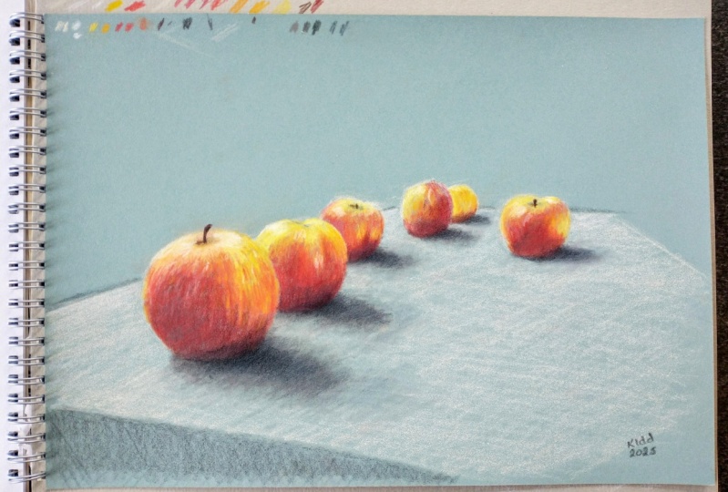
6. Apples receding into the distance Sketch Exercise: Hello, people. In this lesson, we are going to take our
first practical approach to understand how to render optics in the distance using an impressionist
technique. We will do this by making a beautiful sketch of
this group of apples. So the first step
is try to create a surface in which
these apples rest. So using this white
pastel pencil and also this
beautiful green paper, we are going to start creating
the top of the table. Pay attention to these angle
lines that will allow me to discover what are the real
dimensions of this table. Once we get an initial
approximation of the table, we can start creating
the first apple. We must try to break down the apple's shape into a circle. But this circle is kind of flat on the top and
also on the bottom. But the most important
thing is that we are rendering the apple in
the entire composition, representing the most
illuminated areas on the reference image. That means that we are supposed to leave some spaces in blank because the paper
color is going to represent some shadows
on the composition. So putting in the way
I'm using the hatching, I kind of cross
hatching and curved lines to represent the
volume of that apple. In this initial stage
of this sketch, we had to focus
only on shapes and, of course, the proportions
between one apple and another. So we must try to
outline the shadow of every single apple on the
fabric on the top of the table. In order to represent
these shadows properly, we must try to
imagine one line that crosses from the foreground
to the background, touching the edge of
every single shadow. It may happen to you that once you get all the apples finished, you may discover that the
table was not accurate enough, so we can leverage this to
fix the table's dimensions. You may notice that although the light is hitting the
fabric of the table, the color of the
fabric is still dark. So we must represent
that tone with a pastel gray that is a
tone that is not white. And as I told you before, we must leave the space for every single shadow
the apple shadows. From a distance,
you can see that the most prominent color
of the apples is red. But within that red, there are also shades
of orange and yellow. So we are going to
use those shades to make the combination, starting with orange
and then red. The idea of this sketch
is for you to see how the intricate details
of the apples will fade away as the apples
get farther away. You should try to feel the
color from a distance. See where I put
the deep red color in where I leave
the orange color. And most of all, pay
attention to the way I place the red tone in
the rest of the apples. See how I leave
free space to add the yellow tone that
the apples have above. We must always try to
give importance to the closest element that is
repeated in the distance. That is, we give enough
details to that first object, which in this case, is an apple. Then we will interpret the
rest of the apples with the visual information that we capture from the first apple. So in that sense,
I'm going to use two lighter shapes of orange to make the transition
areas between the red color and the more
yellow tone in the apples. Pay attention to the
details of the first apple. I'm trying to represent
all the textures and variations of the apple
peel using color directly. Now I'm going to start repeating the same pattern on
the other apples, but pay close attention to how I reduce the amount of detail by summarizing larger sections
within one single stroke. Now I'm going to
apply this dark brown to represent the darker
shadows on the apples. The most interesting
thing about using pastels is that the pigment
mixes as if it were oil, meaning that even though I'm
applying this dark tone, it will also mix with the red, which is completely
suitable and favorable. Now I'm going to use a
fairly dark graphite pencil, A five B to reinforce the
shadows on the fabric and improve the contours of the apples as well as
more intricate tails. You should pay attention
to the contours of the apples that make contact
with the dark background. These are the contours
that we must reinforce. On the other hand, we
must add some cross hatching to the fabric to
represent its different shades. Here you can see
that the color of the graphite is a kind of grade that is close to the
military green of the paper. Oh. Now I'm going to use the white pastel
to represent and enhance the more illuminated
areas of the apples. I'm using a white pastel stick because the pigment sticks
more easily to the paper. Pay attention to the details
I give to the first apple, and then what I
do with the rest. That difference is the most important thing
in this lesson. Now I'm going to apply my
favorite pencil Pierre noi. I'm going to use it
because I need to get a tone even blacker
than the graphite. Pier Koi always sticks
easily to the paper. Therefore, I'm gonna
apply it on the shadows of the apples projected
on the fabric. And that's it. See how
interesting this sketch is. Feel the difference
between the details on each apple as you move away. This is a central concept
of impressionism, creating this visual
effect of an impression of light in the distance
until the next lesson.
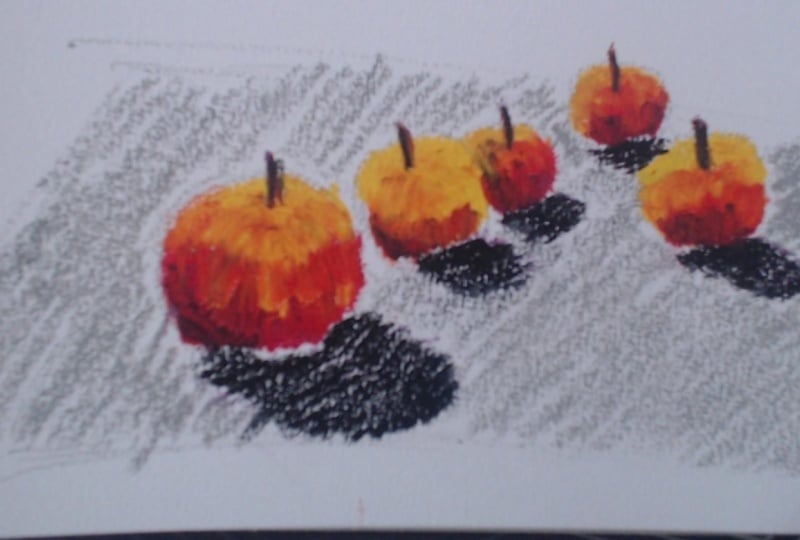
7. Color Exercise Apples on the table Sketch: Hello, people. In this lesson, we are going to put into
practice the use of color again. We are going to use
these three apples on this small round table. The purpose is simply to
get you to experiment quickly with these fruits
so that you can relax. Of course, each of these
sketches is to make you feel comfortable before tackling the main exercises
of this course. So let's start quickly by creating the surface on
which the fruits rest, which in this case,
is a round table. Obviously, from
our point of view, the table looks oval, so it's an oval in two
dimensional language. So we can create a cross
in the center to measure the width angle and get closer
to the reference image. Once we have the
tabletop finished, we can concentrate on the edges, the contours of the fabric
falling to the sides. Now we are going to start
creating the apples. To know the approximate
height of the apples, we can draw an angled line from the edge of the table to
the top of the apples. As I always tell
you in my courses, the human eye is very
sensitive to angles, so angles will be our best
friends while we draw. At this stage, we just need
to focus on the outlines of the three apples in some
important small details. For example, the small shadows projected on the fabric
are quite important. Now I'm going to use the
eraser pencil to clean up all the construction lines
left inside the apples. Now I'm going to add
a slanted hatching of parallel lines to
represent some faults in the fabric that although
they are not clearly visible in the reference
image, they are there. Now, let's start
applying the color in a very simple way and with
a very simple resolution. We don't need it to
look realistic for now. We are just going to place
the color intuitively. We are going to
use the red color for the darker
areas of the apple, the redder and darker areas, and we will leave the
yellow for the top part. We can use the orange to make the transition,
but pay attention. Do not stress about making
it realistic or perfect. This is just an exercise. Pay attention to the fact that the yellow color
is not only lighter, but it reacts
differently to light. Additionally, it's
the yellow part that is most exposed to light. So these are two
important factors when representing the apple. Now that we have more or less the basic colors
of the apples, we can choose a light gray color to represent the
color of the fabric. It's important to represent
it in a creative way, pay attention to
the combination of basic colors that I
make on the fabric. In fact, this color
is representing the parts of the fabric that
are exposed to the light. Now I'm going to
apply a darker gray for the shadows
projected on the fabric. I'm going to use a
dark green colour to try to enter the range of grays of the fabric from
a creative point of view. I'm going to mix this base
color with a darker tone later on so that it looks more
interesting and shaded. Look, I'm just going to do
hatching with this color. Now comes one of the
most important parts. I'm going to use a dark
graphite pencil to try to unite all the colors
in a single language. I will create the
gradients of the table, the fruits and also
the contours to unite all the colors
in an organic way. Look at the way the graphite mixes with the colors we
added at the beginning. Now I'm going to use
the white pastel to create the highlights
on the apples. This same pastel chalk will allow me to
improve the texture of the table fabric. Pay attention. I'm not just adding highlights, but I'm also trying to improve the rounded appearance
of the apples. Look how good the white chalk
looks on the table now. Try to pay attention
to how it tells us about the way light is
falling on objects. Now I'm going to add some
finishing toaches with red. And that's it. We have
finished this sketch. Pay attention that even though
it doesn't look realistic, its colors look so interesting
and impressionistic. I hope you really feel
more comfortable now, and I think you are
ready to tackle our first major project step by step until the next lesson. M
8. Parisian Street Artistic References Theoretical Approach: Hello, people. Before we
begin the first exercise, let's imagine walking through
the streets of Paris at the end of the 19th century when impressionist artists
began to capture urban life in a
completely new way. We can see how Gustave Kevo, in his painting Paris
Street, Rainy Day, manages to represent the
width of the Parisien Avenue, filling the space with movement,
light, and atmosphere. What is interesting is how he uses perspective to give
depth guiding our gaze towards the center of
the street without needing to detail every
couple of stones or building. The painting conveys
the essence of the place, the
scattered figures, the umbrellas blending
with the gray sky, and the reflections on
the wet street that seems to vibrate under the soft
light of the rainy day. One remarkable aspect
of this work is the way that Kelbot represents the windows of the buildings. It doesn't paint them
with exact precision, but uses gentle brush
strokes to suggest them, allowing some to fade into the light while others
are slightly more defined as we wrap into the
moisture of the Paris CNN. This technique allows
the windows to become part of the building's structure without distracting the viewer. At in depth and realsen
without overwhelming detail. Another example we
can draw from is the Rue de Paris Stems de
blue by Eduard Leon Cortes. In this place, Cortes also
captures Parisian urban life, but through more
gestural breaststroks, where the warm light
from the lamps gently illuminates the
sidewalks and buildings. The details of the windows
and doors are simplified. Just a few lines and spots of color suggest their presence. This technique
creates a sense of visual rhythm and lets the viewer's imagination
complete the scene, giving rise to a more intimate
and nostalgic atmosphere, characteristic of the
impressionist style. Lastly, we can look at the boulevard de capuchins
by Claude Monet. Here Monette plays with
an aerial perspective, placing himself on a balcony and showing the
street from above. This scene is full of movement. The quick, loose brush strokes capture the vibrant life of the city with carriages and figures that seem to move
through the mist of light. The buildings in the
background are barely defined, but the patches of color lets us see where
the windows are, the roof lines, and the
architectural details. Monette doesn't worry
about precision. Instead, he seeks to convey the strict strategy and how
light interacts with objects, leaving an impression
that is almost ethereal. What we can learn from these
paintings is how artists choose what to emphasize and what to live
in the background. Perspective help us
establish structure. But then the technique
of softening details, simplifying forms
strategically is what allows us to capture
the essence of the scene. So when we work on our
own Parisian street, we will be inspired by this
freedom to express atmosphere and urban rhythm through
loose strokes, soft shadows, and the color we will add
later to accentuate the light, warmth or coolness of the scene, just as these impressionist
masters would. Let's look closely at
the reference image and try to represent its details
with an artistic gaze. The first thing that stands
out is the serenity of the empty street as if it's
waiting to be traversed. The perspective gently guides
towards the background, where the street narrows and
fades into the distance. On both sides, the party sees
buildings rise elegantly. Their facades bathed in sunlight that highlights the
details of the moldings, brought iron railings
and windows. Pay attention to
how soft shadows fall across the
sidewalk and buildings, creating delicate countries
between light and shade. The lines of the
sidewalk and road help structure the perspective, leading us towards the horizon. Additionally, let's
observe the textures, the smooth stones
of the sidewalk, and the uneven coupled
stones at the edge, each offering a different
pattern to enrich the drawing. The balconies and windows
have fine details, but they can be
simplified to suggest their presence without getting lost in excessive precision. Let this scene inspire us not just to draw
Parisian street, but to capture the atmosphere of tranquility and light
that invites us to imagine a story among
these elegant facades. Or
9. General Structure Parisian Street: Hello, everyone. We
are ready to start the rendering of this
beautiful street in Paris. The first thing we
are going to do is to break down the perspective
of our composition. To do this, we must locate and place the vanishing
point of this drawing. So let's draw the horizon. That horizontal line
where the street, the sidewalks, the
buildings, everything meet. From there, we must build the angles corresponding
to those lines. If you can clearly see
the reference image, all the elements become practically triangles
to these lines, and the human eye is very
sensitive to angles. So we are going to try to
draw all those lines to have a general perspective
scheme on our paper. The purpose of this drawing
is that we can practice one of the most important elements
of impressionist drawing, the synthesized
representation of any element in the distance. And since these are the
same buildings that get smothers they go
towards the background, towards that vanishing point, we are going to have
a different way of representing
the same windows, the same street, the same
texture of the walls, at different distance levels. It's important to know that these lines are not definitive. That is, they will
not coincide with the real angle of the buildings
in the first attempt, but these lines will be the
reference point to construct the correct angle that the buildings have
in their distance. On the other hand,
seeking perfection is a very bad strategy when
it comes to drawing. That perfection
could leads us to frustration and not achieve
any realism with the drawing. We will learn that as we
advance in the course. Now, the next step is to start tracing the outline of the
buildings on the right side. We are going to start from the background to the foreground. So let's start to trace
this outline intuitively above the line corresponding to that site, just like I'm doing. Our reference point should
be that angle line. And from there,
we should roughly measure where each
building begins and ends. And, of course, being aware
that at least a third of that entire triangle is occupied by the building
closest to the right. Now that we have
a closer outline of the actual dimension of
the buildings on the right, we can raise the first
construction line. Now, we're going to
draw an angled line corresponding to the first
level of the buildings. It's not exactly the first
level, because, in fact, the line crosses above
the first floor, keeping in mind that
the first floor is the first one
going up the stairs. But if you look closely at
the buildings on the right, they all respect this
architectural element. Now I'm going to draw another small cross line to determine the angle that corresponds to the bottom of the first
building on the right. Remember that it's
always an approximation. So we can apply
the same method to discover where the second
building is positioned. It's important to
mention that if, for example, after
doing this bottom part, the buildings turn
out to be very low, we can always correct them
above to make them taller. So our strategy when drawing
should always be based on that possible correction
as we advance building in the general
scheme of drawing. Now you can see the proportion of each building
in the distance. We have made in by calculating the geometric shapes of each building and the separation
between each building. This is the reason
why angles are so important because each
geometric shape has a crossed line with a specific angle that we can
see in the reference image, or at least get quite close. Now that we have a
clearer approximation to the position
of the buildings, we can extend the vertical
line of the buildings. Try to follow me focused and try to carefully look at
the reference image and understand how
everything becomes a reference point to build
the entire urban landscape. Now notice how as we
create these buildings, we realize that we
only know the size of the first two floors and the
third and fourth floors, taking into account that
they are divided by Now, from the corner of
this second building, we can start to draw
the horizontal line of the pedestrian crossing. And obviously, this
is across the street. Therefore, the building
on the other side of the street must be on that
same horizontal line. And so we must follow the marks. The corner of this
first building will also tell me where
the other building begins on the other side. The most interesting thing about this process is that as
you continue to build it, relating the shapes, the lines, the spaces between the lines, then almost automatically, you will begin to see
the size of the rest of the elements because
the brain will begin to analyze the
space automatically. Now we can start to draw an approximate line of the sidewalk of the
buildings on the right. It doesn't matter if
it's not the final one, because we can
always correct it. For example, if it needs
to be wider or narrower, just draw a parallel
line inside or out. Now, we can try to build the volume of the building
right on the corner. Note that the building has a polygonal area on the corner. This type of configuration
is made so that a pedestrian can always see the cars coming from the
other street in time. Important European
cities such as Paris and Barcelona have this feature
in their buildings. Since we already have
the corner structure, we're going to try to
create the outline of the building on the
other side of the street. We are going to create an
approximation to that outline. Look how I draw this
horizontal line that reaches the other side of the street to know the height of this
building on the left, which looks taller in
the reference image. And that is how we
should draw it. Now that we have a more or
less height of that building, we can try to draw
the outline of the other building
that is closest to us. So we must continue to relate the elements that are closest. A drawing grows like a tree, and all its shapes
must evolve at the same time. That
is very important. In the reference image, we can see that the building has four well defined floors, so we can draw them at once by tracing the
dividing lines. We can also add lines
that try to define the most prominent structures
of the closest building. Actually, everything we feel
we can draw because we have enough reference points
around us, we can do it. Notice how I added this
section of the attic. The building was
supposed to be taller, so the attic had to be above of the height with the
termin at the beginning. Now that we have a more or less elaborate structure
of some buildings, we can begin to develop the
internal configuration of the facades by drawing the lines that define
the old structures, such as these
edges, for example. We can also draw the line that divide the first floor
from the second. I'm going to draw this
traffic sign here, but not as a final detail, but to define its position on the sidewalk and make it
a good reference point. This element can
help us later on to draw the bicycles and
the pedestrian crossing. Now I'm going to start creating these important details
of this building. I mean, those kind of windows. For sure from this
point of view, we can only see the openings. It's important to draw
the elements that are consecutive on
several floors. In this case, there
are three windows that are repeated on the
first and second floors. I Now, I'm going to make these
reference lines here, which are not definitive at all, but they will help me to build the openings and the windows in this part of the building. We must try to
guide ourselves as always by everything
that is already built. M. Now I'm going to create the
lower part of this balcony. I know it's an element that I
shouldn't do at this stage, but I'm going to draw it
simply to position it. In fact, later on, I will change its shape
to a more precise one. You can try to locate
the balcony, as well. Don't worry about the precision of your shapes at this point. And now, as we did with the
attic in the other building, we will try to complete the height of this
building, as well. This another detail is very important. I'm going to draw some
reference lines to locate the vertical where the windows of
this building are. And as a final detail, I'm going to draw this
structure on the street, which is assigned for
parking bicycles and motorcycles. And that's it. We have the first step in our drawing of this
beautiful street in Paris. We already have the general
structure of the buildings, but this is just the beginning. I see you in the next lesson.
10. Foreground Buildings' Details Parisian Street: Mm. Hello, people.
In this lesson, we're going to give
the details to the closest buildings
in our composition. We will start directly with
the building on the left. But before we
start, I'm going to show you how many
of the things we do on the drawing in the initial stages
are an approximation. If you pay close attention to that detail of the parking
area on the street, I had made a mistake
when positioning. I drew it too far away. So when I make the
relationship between another nearby element that is on the same horizontal line, I realized that it
was too far away. So I had to fix it. So this
is the right position. So these elements must be
on the same horizontal line as this small dark area
that I'm remarking now. From here, I'm going to make all the buildings
details grow up. You may remember in
the last lesson that I simply made some horizontal
lines in this section. And the idea of
those lines was to represent the horizontal lines of the texture of the wall. If we draw an imaginary
line that follows those little lines in the concrete all the way to
the edge of the building, we can have a great
reference point for building a lot of things. After all, these
horizontal lines in the concrete of the building stay the same height all along the facade in this
section of the building. So it makes for a
great reference point. Now, we're going to try to draw the vertical lines of the
openings in the building. When I say openings, I mean the windows that are
seen from this point of view, because there is
also an entrance. You can see that we can extend the vertical lines upwards
without any problem. In almost all of
these buildings, the windows remain on
the same vertical line. Therefore, these lines
will give us the position where the windows of the first
and second floors will be. We're going to try to use as a reference point the dar mark that we used to know where the small structure in
the parking area was. That small mark in
the reference image will tell us where the
entrance and the windows are. For example, just above the
mark, there is a window. So it's very important
to follow it. Since we already have these horizontal and vertical lines, we can try to build the windows based on the size
of the balconies. You can see that the balconies
are almost two rows high. Therefore, you can use these horizontal lines to find out their proportion
in the window. Now we can give more details to the windows of the other
building next to this one. Notice how the line above
these windows almost coincides with the line above the windows of
the other building. It's slightly higher up. And in this same way, we can
advance to the third floor, knowing that from a two
dimensional point of view, this third floor
should coincide with the height of the building on the other side of the street. In reality, the other
building is taller. It has four floors, but from our point of view, even though it's farther away, they are the same size. Now, I'm going to try to
shade this lower part of the balcony just to have a visual reference
of that dark area. After all, I didn't fail so badly by positioning
that protruding balcony. Now, we're going to quickly move on to the
building on the right. Let's start by drawing the imaginary line that divides the first
floor from the second. Now we're going to try to draw the vertical strip where
the windows are positioned. The most interesting thing is that if we manage to
make the ones below, we automatically
have the ones above. We have them built because they are on the same vertical line. To know where the
windows are exactly, we must try to measure the
parallel piped formed by the wall between the windows
and the windows themselves. When you sum those two spaces, you get a larger
geometric shape that has angles like any other geometric shape we have made so far. Look at the lines
on the concrete. They are the same lines as the building we
made on the right. You can experiment
with these lines. I mean, you don't need to count how many lines there are.
Nobody is going to do that. We should simply try to measure the proportion
of the space between one line and the other one and try to draw the
lines intuitively. Of course, you must take into account they must
follow the perspective. That is both the base of the building and the line that
divides the building into. Those lines are inclined lines
that follow a perspective. Therefore, those lines
on the concrete as well. All those details
that I do now must be thought about for later
stages of the drawing. For example, in this drawing, we are going to use the color of the paper as the color
of the buildings itself. So these details are
important because they will prevail throughout the
development of the drawing. Mm. Mm. From this stage and on, we can start to give
the value to the line. The shading of a drawing doesn't depend only
on the gradients, but also on the depth we give
to the lines in particular. Although we are not at that
stage, in a certain way, we can darken the lines that are more important
for the structure. For example, these lines of the sidewalk and the line that also divides the
building in half, that line that separates the structure of the
building from the attic, and you can see that they
are important lines, and therefore they
should be darker. Most of the problems
when it comes to building the details
and structure of a drawing are not related to the construction of
the details themselves, but to correctly locating
where they go in space. That is a problem even
when making portraits. It's more important that the windows and elements
of the building are in the right position than the shape of
the windows itself. In fact, when we are making the details of the buildings
that are farther away, I'm going to prove it to you because in reality,
in the distance, the windows and doors will be nothing more than
strokes and spots, but it's the position
that these spots have in space that turns them
into windows and doors. Look, as I mentioned, I have the vertical position
of the windows below, and now what we do is
build the ones above. In fact, you can notice that the section of the two
floors above is higher. I suppose the ceiling of
the apartments is higher. I should mention that they
are very luxurious buildings. It's one of the richest
areas of the city of Paris. And Horizontal lines are also important to know where the windows are on the same
level of the building. In the same way, it gives us a reference point because simply by drawing and
incline the line across it, we know the progression
of size in terms of perspective in
each of the windows. There is something important
to take into account. When you draw using a photograph that you took yourself
as a reference, you had to be very
careful about one thing. It's something very subtle, but it can affect your drawing. In this case, we had built the urban landscape from
lines and perspective, and everything is
going quite well. But if you pay close attention
to the reference image, due to the nature
of the camera lens, the building seems to bend slightly towards the
centers as they go up. It's something very subtle, but it's an effect of lens. All camera lenses,
smartphone lenses, et cetera, distort the
image, all of them. And if we don't pay
close attention to that, our drawing will also
have that distortion, which is not necessarily bad, but it reveals that we had used the image from a
camera as a reference. In this part of the
penthouse railing, we're going to try not
to complicate things too much because we can develop
that detail later on. We just need to have the
most general aspect. The same goes for the
details of the window panes. We will discuss
them in more detail later because most
of them have color, so those details
will be modified. And that's it. We
already have progress in the details of these
nearby buildings. The most important thing
is how the buildings have grown upwards to adapt
to the real size, and everything has been in a progressive
construction process. I see you in the next lesson. So
11. Background Buildings' Details Parisian Street: Hello, people. In this lesson, we are going to
cover the details of the buildings
in the background, and we are going to start with
this building on the left. I told you in the last lesson that you had to start shading the drawing through the line, which we did lightly in
the closest buildings. On this occasion, we
are going to apply this technique with
more intensity. But why? Because since these
buildings are farther away, each line and detail we
make is more important. For example, in these details that I'm doing now
in this building, if you are going to
draw a window frame, we won't be able to shade
too much inside the frame. Therefore, it's the line itself that must contain the
shading in some way. This is a fundamental
principle of impressionism. The stain, the stroke, and the line are
extremely important, especially in a small format, because if we were talking about a large format of
several matters, then we would have space
to do those details. But most of the greatest
impressionist paintings are small or medium sized in order to achieve
precisely that effect. Following this
important insight, we must then try
to look closely at the reference image to observe
which are those lines and contours that stand out
in the distance and whose gradient is crucial for the texture and appearance
of the building. For example, these lines that separate one
level from another, and it's also important
to represent with less force the horizontal
lines of the concrete, as well as the contours of the windows and the railings
of the small balconies. Please note that from
this point of view, although we cannot
see the windows of the building on the side
facing the main street, we can see how the balconies
protrude, and in fact, we can see the lower parts of the balconies on the
first and second floors. So these details are very
important for this building. M We must take great care with this building because even though it's
not in the foreground, from our point of view,
it's closer to us than the other building on
the other side of the street. So the progression
of the tails on the buildings must coincide with the progression in the distance between the buildings
and the viewer. Now, we're going to continue with this building on the right. I'm going to start by
drawing this first window together with the lines that make up the texture of the wall. I'm going to do it because
it's a great reference point. You can see that it's
dark and light stripes are present on both
sides of the building, as well as it helps me to build the windows on
the upper floors. So you're supposed to
be smart by selecting the most important elements on the buildings to make the
drawing grows properly. Now, I'm going to proceed to build the windows
on the street side. We must apply the same strategy as in the nearest building, using the vertical
lines to position the windows both
below and above. Oh. Pay attention to the
line value here. The window frame is made
with lighter lines, but the top frame is a darker
line because we need to represent that prominent shadow of the windows at the top. Actually, these
windows will give us the height of the
rest of the windows, even on the side
that is facing us. This is the most
interesting part of growing and
drawing step by step. Pay attention to
how I synthesize the entire window with
a few simple strokes. I simply make a
vertical line that represents the
window opening and a darker mark at
the top of the line that represents the upper
frame of the window. That is enough to represent those windows in the distance. The balconies also stand
out in the distance, so we must also highlight
them with great care. Look at all the details of
these columns on the facade. We must pay attention to the quality of the
gray on the wall. Remember that if you
need to zoom in on the image to see it
carefully, you can do so. You have it available
in the course. Look at these details
of the attic. These details are also lined with the vertical
lines of the windows. So we must be guided
to build them. Actually, this is a proof of what I mentioned
at the beginning. Even though these details are some small rooms at
the top of the attic, as they get farther
away in the distance, these rooms become a
simple graphite mark. At this distance, almost
everything is marks. So lighters and others darker. There's no way to see details. We must make an
interpretation of what we see using the lines to represent that building in the distance, pay close attention to
what I do on the paper. Pay attention to the fact that as the buildings
get farther away, this representation seems to be more abstract, but
in fact, it's not. It's simply the distant
impression of the building. Look now at what I'm doing at the farthest point
of the composition. I'm not even
representing what I see, but rather interpreting with the spot what it's
supposed to be there. Some buildings are
supposed to be there, but the truth is
that we don't even understand in the reference
image what is really there, but we must understand the language we have
applied until now to represent with lines and strokes a possible background on that
very small binian point. And that's it. We already have the main details of
almost all the buildings, or drawing begins to
represent the reality, but there is still a
lot of work ahead. I see you in the next lesson.
12. Sidewalk & Street Details Parisian Street: Hello, people. Let's start
with the sidewalk details. I'm going to start directly
with these bicycles. In fact, in order to represent this urban landscape in
an impressionistic way, we don't really need to
render them as they are. It would be enough to suggest that there are some
bicycles there. So let's focus on creating them to represent and that
these elements are there. You can see that in order to determine where
the bikes are, I have drawn a line
from the wall of the building to the possible place where
the bike should be. This is a good strategy. Here I'm going to
draw the first one, which is actually
a kind of scooter. In reality, for this exercise, it doesn't matter, but it's important that it is
in the right place. You must be careful
when representing these bicycles because
they are overlapped. So we must respect
the perspective and draw the visible part
of those behind. There is a good reference
to resort when it comes to representing objects in the
distance, Camille Pizarro. Au had a remarkable
ability to depict distant objects with
an incredible balance of clarity and suggestion. Is landscapes where
small figures, trees, or even cards in the
far distance are painted with just enough
detail to be recognizable, but without overdfining them. So he understood that as subjects move farther
away from the viewer, they lose sharpness and blend
more into the atmosphere. So when we apply these
to our own work, we want to consider
the same principles. The further something
is from us, and the more we rely on
suggestion rather than precision. So I think it this technique
is essential in creating a believable sense of distance in atmospheric
perspective. We must take into account
the metal structures to tie the cycles
and motorcycles. There are also good
reference points. It's important to mention that this way to approach
small objects is a very good strategy
when it comes to representing small
objects in the distance. And it is above all, a great learning
experience to approach in a more appropriate way the more complex
drawings that we will see later on
on this course. Now, let's move on directly
with the sidewalk. Let's start with the
curve of the sidewalk. Pay attention to
these dividing lines. We must respect the perspective and the distance
between each line. I think this is fundamental that distance is more
important than anything else. I highly recommend you to
use as a reference point how many lines there are in the space that corresponds
to the buy cycles, and from there count
how many there are farther ahead towards
where we are. Each of these lines
will help us represent these horizontal lines
that I'm making now, whose function is to
guide the perspective of the regular cobbled
stones of the sidewalk. You didn't have to go overboard
with the perfection of these horizontal
lines because you know that the size of
the stone is irregular. So even though they should
get smaller in distance, it doesn't have to be
perfect like a drawing grid. The next step is to make the
pedestrian crossing at once. We will simply be guided by the position of the traffic
signs of the sidewalk. From there, we can
draw its strip of the pedestrian
crossing following the perspective line
of the sidewalks. These details of the street should be done with
a light pencil. And above all, you
should take into account that if you are
going to make black stripes, that will be the
color of the street. So try to create them
keeping that in mind. I'm going to apply the light
hatching to the rest of the street so that it acquires the correct
ranges of the composition. Of course, this entire street
will be completely dark, but we will do that later. Now we are going to start making the coval stones
on the sidewalk. From the height
where the structure of the bicycle parking is, we're going to start making
irregularly shaped stones, but trying to follow the size of the stripes formed by the
lines we've made previously. It's important to observe the coble stones in the
reference image very carefully, especially the divisions
between 1 stone and another. You can see that due
to the projection of light and the nature
of the material, some divisions look dark. We can do those with propte, but there are other ones
that are much lighter. In those cases, we can simply leave the
color of the paper. So we must play with that to create the randomness
of the stones. On the other hand, it's important to take
into account that all these cobbled stones will be improved with a
white dried pastle. So we didn't have
to focus on giving all the details because
when we were at that stage, we will also be able
to add more details. M Now we're going to
move forward to the farthest cable stones. Pay attention to what happens in the area closest
to the building. If you see the two buildings
generate a shadow on the ground that is clearly
visible on the sidewalk. We must try to represent
this with a texture. In that part of the sidewalk
closest to the building, we can notice this
notable shadow that we must make with graphite. Of course, modifying the
tone stone by stone. Pay attention to
the fact that as the sidewalk recedes
into the distance, the cobble stones
practically become lines. This is part of the
impressionist technique, which allows us to
represent even through the line that there are stones in the distance
on the sidewalk. Mm Now we are going to try to represent these cobbled stones
hidden under the asphalt. This is a bit strange. I supposed it was necessary
to put asphalt on the street, but surely 100 years ago, there were stones, and
with the passage of time, the asphalt has worn away. Notice how the cobbled stones also appear on this
edge of the street. I suppose the parked cars also contribute to the wear
and tear of the asphalt. And that's it. We have the most important details of the street and the sidewalk. This drawing is already
starting to look pretty good. Look at the perspective
in the distance, but we are only halfway there. I see you in the next lesson.
13. Sky & Street Color Parisian Street: Hello, people. In this lesson, we're going to start applying
the color in the drawing, starting directly from the sky. So the first thing I'm going to do is break it down the sky into five main colors to create a gradient rich enough
to create this sky. I think that compared to what we have done so far,
it's quite easy. On the other hand, there
are many academics who choose three colors
or eight colors, and that doesn't matter
because in reality, there could be 100 colors. The secret is that
the material we are using is rich enough to
make very good gradients, even using few colors, and that would be exactly the
same with oil or acrylic. So we are going to
apply these five colors using strong hatching. It's not necessarily
completely filled space because we will
blur it later on. So for now, we will
try to spread it out quite a bit along
the entire sky. Now, we are going to
move on to the street. We are going to start by adding a layer of this dark blue to the street because if you can
see in the reference image, the color of the asphalt contains the color of
the skies as well. Then we are going to
add the lighter layers of color with two types of blue, and then we will add
a little black bustle to darken the entire space. Now we are going to proceed
to blur all this pastel. Since the tone that
remains is a kind of gray, we're going to use
the graphite to fill all the visible edges. It's not exactly gray. Try to see a kind of blue
veil on the asphalt. And that is quite
interesting because we are getting closer to
the reference image. Remember that impressionism
is all about color. Pay attention that in this area, we are covering all the
details of the cobble stones, but that doesn't matter. We are going to cover it anyway. The guide marks that we will
use later on will still remain because we are going to make them appear using
the eraser pencil. Now let's blend the
color in the sky. We are going to spread
everything out. Remember that the
best material to blend is toilet paper or tissue. Now, you're going to
use this intense blue to reinforce the
color of the sky. It's important to mention that I'm using this
shade of blue, but the reference image
shows a lighter color. But this is my personal touch because I really love
this shade of blue. But you can choose the one
that you like the most. That is the idea. Once you
apply the darker shade, you're going to
blend from top to bottom to give consistency
to the gradient. A personal tos that I give to places where I have
supplied a lot of color, like in disguise, is to use
hatching in one direction. I mean, even though
we blue ridge later, there will always
be some lines of hatching that look
very interesting. But this is a personal tos. You could use hatching in
several directions in the sky, and it would look perfect. Now we are going to
clean up the edges. Using a pastel pencil with a range close to
that of the sky. We are going to highlight
the edges so that they fit perfectly in the
silhouette of the buildings. It's important to mention
that we can also improve the consistency of the color by using pastel pencil
within the sky. Obviously, since they
have a smaller tip, we can feel smaller
spaces and grooves. On the other hand, we can add irregularity to
the range of the sky, and that is quite interesting
and more artistic. Pay attention that as I go down towards the horizon, I'm tracing the silhouette of the buildings with a
different shade of blue. I say that adapts more to the tone of the
sky in that part. Even though in the
reference image, the skies is completely clear and a perfect
gradient can be seen. It's important to get used to create irregularities in tones. At least in the
impressionist style, it's much more interesting. And above of all,
because when we had to represent the
skies with clouds, as we will do in other
exercises later on, believe me, we are
going to need to master the irregularities
of tones in the clouds. Now, as a final detail, we are going to
highlight the bicycles since we darkened the street. Now the bicycles
should be darker. But we can correct this
as we advance into tromin. And that's it. Our first colored
element is present. And the most interesting
thing is that now the color of the paper starts to look like the color
of the buildings, and this is magnificent
because it has completely changed
its meaning within the artistic language
of the drawing. I see you in the next lesson.
14. Sidewalk Color Parisian Street: Goo. Hello, people.
You're here again. Now we're going to start adding the color of the sidewalk. We're going to start
adding this light blue. I'm going to lightly cover the most illuminated areas
of the cobblestones. Notice how once I applied it, it automatically turns gray. This happens for
two main reasons. The first is that in reality, the color we see on the sidewalk
is not completely gray, but has a great
reflection of the sky. So it's the usual proof
that the color we see are more complex than they
appear to the naked eye. Now with a graphite pencil, we are going to start giving texture to each of the stones. We must try to follow
the reference image, pay attention to which are
the darkest stones and above of all take into account the shadows projected
on the sidewalk. In my series of drawing
and sketching courses, we cover the construction of the cobblestones in
an entire castle. The effect is very beautiful. In that course, I'm not
applying the color like here, but it's quite
interesting to see how different approaches to cobblestone in the
structure of a castle are, and those kind of
castles were made with these kind of
architectural elements. Now we are going to add
a few more touches of blue to improve the regular
appearance of the stones. We must do this carefully
and above of all, taking care of the edges with the street, the carb sidewalk. Now, with a white pastel pencil, we are going to draw the light, the most prominent reflections
of light on the stones, and the reference image is
quite clear where they are, for example, on this side
closest to the street. It's important to mention
that you must be very careful when using white bastil pencil because if you look closely, the divisions between the
stones are also white. So you can experiment with
this color in those areas. Pay attention to how I
apply the white pastel. Sometimes they are
horizontal lines. Sometimes they are short
strokes on some stones. All of that is part of the regular nature of
this visual effect. Now, we are going to start with a more intricate level of
detail in the cobbled stones. With the graphite pencil, we are going to add the internal
textures of the stones. Notice that there is
an internal gradient. This is completely irregular because the stones are
of different tones, regardless of the light or
shadow projecting on them. Once you add more details
with the graphite, you will realize how well the divisions look with the
color of the paper itself. If you look at the
reference image, those divisions are practically the same color as the buildings. So it's a good choice to
leave them like that. Now we're going to move on to the sidewalks on the right side. We are going to fill
them first with a white puzzle and then
progressively add the graphite. Look how in the distance all this cobblestone work is summarized in a simple
white line in the distance. Now we are going to make the
white lines of the street. Since they are worn out, let's try not to press the white pencil to
match against the paper. On the other hand, see how
I use the eraser pencil to add spots and lines of
another color on the street. After all, beneath the
asphalt is the old paving. Here on the screen, you
are not able to see it, but even though we covered all the pedestrian crossing
with the pastel, there are still traces of the pedestrian crossing
we made previously. So I'm using those traces
as a guide to remove the graphite and then highlight the pedestrian crossing
with white pastel. Now, I'm going to
do the same thing, but more towards the back. Try to be very careful with
this pedestrian crossing in the distance because its lines must respect the perspective
and surface of the street. I'm also going to
clean up the edges here a bit with graphite. Notice how good everything
is starting to look now. O. Now I'm going to add some white details to the scooter here and the bikes. The next step, I'm going to remove a bit of
the graphite and the pastel in this
area to highlight the cobble stones we
had made in this area. First, we remove the graphite, and then we add white pastel
to add irregular tones. As a final detail, I'm going to add some
traces of intense blue to the street to represent
the reflection of the sky. And that's it. Our drawing
is coming to life. Look how beautiful the paving stones on
the sidewalk look, and especially the
perspective of the street in the distance with all the
details of the color. But there is still
much more to do. I see you in the next lesson.
15. Right Buildings' Intricate Details Parisian Street: Hello, people. Now
we're going to tackle the intricate details of all
the buildings on the right. We are going to
start by rendering the sunlight projected on
the top of the buildings. I'm going to use this
yellow as a base color. So I'm going to fill in step by step the specific areas
where the sunlight hits. At this stage, we're going
to try not to damage the lines we already made
because in this case, remember that the
color of the paper is the color of the concrete
on the buildings. Now, we are going
to start applying the white puzzle with
the puzzle pencil. We must observe the
reference image from a distance and try
to detect which are the most relevant
tones that stand out the most for their
clarity in the distance. Those are the tones
that we are going to represent with
the white puzzle. For example, observe
the door frames, the horizontal lines of the
walls of the buildings, observe the lower edge
of the buildings also. The idea is to generate a gradient between the
color of the paper and the white color that
becomes the nature itself of that material
on the buildings. We are going to do this
process little by little, first applying the white color. Now we're going to
do the same process on the buildings
in the background. Even though in this lesson, we are focusing on the
buildings on the right, we are going to field these
buildings on the left with white pastel so that the
drawing evolves as a whole. It's necessary to do
this in this way so as not to lose the continuity
of the ranges and tones. Pay close attention
here to how I am completely guided by
the reference image to add the white pastel
to the edges in the windows frames and in
the most illuminated areas. M Once we have applied the first
layer of white pastel, we will begin to give
the final value and texture to the lines that
make up the details. We will do this with graphite. We will use a dark pencil. I highly recommend not
using the darkest one, but any tone above three B is possible in the same way as
we did at the beginning, we will reinforce as much as possible the darkest lines of these buildings on the right. Do not sum in on the
reference image. Try to see the lines in the
distance so that you can have a general perspective
of all the shapes and lines. On the other hand,
it's necessary to represent the gradients through
the lines and above all, start to fill with graphite those parts of the windows
panes that look darker. Pay attention here to the dark and lighter lines of the lower parts
of the building. This is a very noticeable characteristic feature
in the distance, and we need to
render it very well. Pay attention to these window
frames in the distance. I love this visual effect. They are just black dots, and only their position makes
them look like windows. Pay attention that despite the details, we can add a very
subtle light hatching, especially to shade the entire
areas of the buildings. If we are going to do that,
we must try to do it very carefully and with a much
lighter pencil tone. Notice this detail that
seems imperceptible. I'm adding a subtle stripe
of blue on this edge of the building in
the same way that the blue of the sky
hits the asphalt. It also hits all the buildings. Try to behold the importance of the details on this
side of the building. The building has been
completely transformed. It has much more volume. The window frames, those
dark and white stripes look wonderful from a distance. And above of all, the fact that the lower part of the building is more shaded than
the upper part. Since the blue color of the
sky invec the buildings, we can use the pastel gray color to make some textures
around the lines. This will save us work and
give more depth to the walls. Now let's complete
the volcanisRlins. You can notice
that some railings have ornaments,
almost all of them. So the only thing we need to do is their visual effect
in the distance. Let's not try to render
their exact details. That doesn't make sense. Just the visual effect in the distance just
like I do here. O. Now, look at these
important details in these closer windows. We are going to render the
color of the sky on them. Obviously, we are
exaggerating a bit, but the truth is
that the color of the sky is projected
on the window panes. Additionally, it's plausible, so it's a very
interesting detail. In the same way, we
must add the details on those windows whose frames
must be made of wood, so they are painted white, and that detail must
also be visible. Now, we're going to
proceed to give details to the farthest point
of the composition. Pay attention that I'm
focusing on the outlines, the darkest spots
on the windows, and I'm going to create also
the outline of some cars. There's even a tree over
there, but in the end, they are just shadows and spots that are representing
that in the distance. So let's try to concentrate on the visual effect in
the distance always. Now, let's complete
some details up here. Notice the importance of the
dark part under the balcony. But there is even a window that projects the color of the sky, too, and we can see it even through the
bars of the balcony. And that's it. Look how beautiful this street
is looking now. I really love this drawing, especially that detail of the sky reflected
in the windows. But there is still more to come. I see you in the next lesson.
16. Left Buildings' Intricate Details Parisian Street: Hello, everybody. Let's start directly with the
intricate details of this building on the left. We're going to start by using two predominant colors
in this building. They are going to
be dark gray pastel and also the dark
graphite pencil. We are going to
apply the dark gray for all the intermediate tones. Look carefully at
the reference image. There are dark lines, which are all
construction lines that we are going to reinforce
later on even more. There are the parts with
the white basil that represent the lights in the lighter areas
on the concrete, but pay attention to
those inner parts of the openings and the windows. There is a dark gray tone there, and we must represent
those details. Now I'm going to render the color of the sky
in the windows of the building in the background in the same way as in
the other buildings. We must exaggerate
it because this will add depth in dynamic
range to the composition. Once we have completed this, we must begin to reinforce
the dark details, starting with the
part closest to us. We are going to simply
highlight all the lines again. We don't have to
invent anything, highlight them one by one to get to a darker tone
than the one before. In fact, it should be one
of the darkest tones in the composition because that is how it looks in
the reference image. For example, the bottom part of the balcony
in the building. I would say this is
the darkest area in the whole picture. When you go to complete that
part under the balcony, do not fill everything
uniformly with graphite. Even in the dark part, there
are gradients and textures that seem from a distance create that realistic
visual effect. As we advance, we can add white pastel again where
we think it's necessary. Et's go for the railings, pay attention to the visual
effect in the distance. That is the most
important thing. As you can see,
this building has quite a few details because it's the closest point to the
viewer in the composition. I think it's as important as the cobbled stones
on the sidewalk. So from the aesthetic
reading of this building, we are going to
interpret the rest of the composition and especially the elements
in the distance. Pay attention to this
combination of light and dark. The most illuminated parts under the balcony are the ornaments, but they are actually dark gray. This is very important
to recognize. It makes no sense to
have painted them white, for example, or to have left
them the color of the paper. So the dark gray is close to the real value in
the reference image. Note the value of the line in these balconies that are
practically invisible. It's almost a lateral
suggestion of the balcony, which is very necessary
on the facade. Now I'm going to try to complete the tone of the windows of that building in the background,
obviously with graphite. While we add this
layer of graphite, it will still retain the
blue tone in some way. In impressionist
drawings and paintings, we must always choose
certain parts where we must do everything possible to
create a realistic effect. Even when these elements
are in the distance, this specific building is
very important because the direction of
the viewer's gaze goes towards it as well. We are going to work now on defining the elements
on the street, starting with the bicycles. We are very clear about the fact that the asphalt is quite dark. We must achieve an
even dark tone. So for that, we are going to
use the Pierre noi pencil. This will allow us to reinforce the dark elements
even on the asphalt, because we will be able
to reach a stronger tone. Now we are going to use the
Pierni and dark api tone to reinforce all those
lines on the dark street. For example, here in
the sidewalk carb, Now, let's work on this part
of the sky in the distance. The idea is to
render those clouds that are seen almost at
the vanishing point. We are going to use the white pastel pencil
to achieve this. We must be saddled with this
since the grating that we applied already helps us a lot in that
section of the sky. Now, you're going to
add a layer of pink to the light that was projected
on the top of the buildings. We must achieve a tone kind of close to pink in that light. We must touch up this. We will reinforce
the tones of the sky to add richness to the
gradient with strokes. You must take into
account that in those areas where you
applied a lot of basil, you must always touch up until the moment in which you
apply the fixative. Remember that depending on
the quality of the dry basil, it will tend to
fall off the paper. Now I'm going to add these
little pink touches. If you look closely at
the reference image, the roofs have details
of that color. It's more like a
clay color tone. And that's it. Look at how beautiful
the drawing is. The effect of the buildings
in the distance is beautiful. I hope you have learned a lot with this first drawing
of this course. Remember that being aware of the details in
the distance and perspective is the most powerful insight
in this exercise. I see you in the next lesson.
17. The Eiffel Tower Theoretical Approach Artistic References: Hello, people. Before we begin our exercise on representing
the E fel Tower, it's essential that we discuss some artistic references
that can enhance our understanding
of how to approach this iconic structure in the
urban landscape of Paris. A prominent artist in this
context is Claude Monet, whose works provide
valuable lessons on light perception, atmosphere,
and architecture. In Waterloo Bridge, Monette captures the
interaction between instructors and
their surroundings in a way that
invites reflection. Well, our focus will
be on the EFL tower, Monet's treatment of details in atmosphere teaches
us to consider how light and
perspective affects the representation of
buildings in the distance. In this work, we can
see how Monette uses loose brushstrokes to create a vibrant atmosphere
surrounding the bridge, almost dissolving the outlines and allowing the colors
to blend subtly. This not only brings
a sense of movement, but also lets the viewer
feel the light reflecting of the water and how it affects the perception of the
architectural structure. Monette is especially skillful
in representing water, suggesting its visual effect without going into much detail. This is important
because similar to our representation
of the evil tower, we can capture the
essence of water in the distance through simplification
of shapes and colors. This technique allows water, although not detail to act as an enriching element
in the composition, providing a context that emphasize the majesty
of the main object. Mil Pizarro is another
fundamental reference in the representation
of urban landscapes. His paintings of the
seine show the city of Paris alongside the Louvre
and other buildings, teaching us to observe the interaction between
architecture and nature. Pizarro manages to capture the essence of the
Parisian landscape, where trees in the river become visual elements
that contextualize the surrounding architecture. Pizarro is known for his ability
to balance the detail of the main elements
with a background that complements
without overhelming. In this sense, we can learn from his approach for our
composition of the IL tower. Just like in his works, the tower's
environment should be an essential part
of the composition, but without overshadowing
the structure itself, the way Pizaro depicts light filtering through
three leaps or how the river reflects the sky reminds
us of the importance of atmosphere in
artistic representation. As we approach our exercise, it's crucial that
we consider how the EFL tower fits into
the landscape around. Paying attention to the
surrounding greenery. The background should have less detail than
the tower itself, allowing the ladder to be central focus of
our composition. By observing how
light interacts with the structure and the role of the trees and other
background elements, we can create a sense of depth and context that
enriches our work. With this inspiring
reference in mind, let's begin our exercise
of representing the Evil tower and its
natural surroundings. As we work on our composition, let's remember
these insights from Monette and Pizaro about light, atmosphere, and the relationship between architecture
and natural landscape. Let's use these
influences to bring artistic interpretation of this emblematic
monument to life.
18. General Structure Eiffel Tower: Hello, people. We
are here again. But this time, you're
going to render this beautiful view,
the EFL Tower. We are going to start
tracing this line over here, and that line is going to be
the backbone of the tower. The next step is to break down the tower into that geometric
shape that composes it, and it's basically a pyramid. The most important thing about this exercise is that as many of you are
starting to draw, creating triangular shapes is the best way when it comes
to learning how to draw. So this is quite suitable. So let's try to see the
angles of this pyramid well and compare them
with the shape of the tower in the
reference image. Now we are going to move on to another important line for the construction of
this composition, the line that will represent
the edge of the Sina. This line would be an
approximation to build the entire park in the
walkaways around the tower. From here, we can start to
build the elements that are to the
right of the tower. We can start with the visible part of the tree on the right, which from a two
dimensional point of view, is very close to the tower. From there, we can start
to relate the shape of the branches with the whole part to the right of the tower, that part of the
groove and the bridge. But pay attention. Let's not complicate ourselves too much. It's a kind of initial sketch
in which we only have to draw lines that guide us to continue developing
the drawing. Look how I'm going to
draw this incline line, more or less where the cloud is, which will allow me to know
where that tree that is back lit is positioned
two dimensionally. The Now, I'm going to draw
these few lines to locate where the
branches below are. Now we are ready to move on
to more refined details. We are going to proceed to
build the tower structure. Let's try to represent the
three sections of the tower. We can clearly see
that near its base, there are two main levels. These floors, which are
actually viewing platforms will serve as a reference
point for us to trace the arch
outline of the tower. Actually, you can see that the tower is not a
perfect pyramid, but its sides are
slightly arched. To do this, we simply have
to try to see the arch between the edge of the pyramid and the structure of the tower. Once the bottom
structure is ready, it's easier to confirm if the top part has the
correct dimensions. Since in the reference image, we can clearly see
that the top part is longer than the
first two levels. Therefore, we can finish tracing the outline
of the tower, following the same principle
of the arch sides. Now, let's draw the outline of these trees at the
base of the tower. These outlines are very
important because they give us reference points
to create those areas where the sky is visible
and above All to create the back part of the tower
that can be partially seen. Now, let's complete
some general details of this second level, just to have more solid
general structure. Actually, we can even draw this third viewing
point up here, simply making its
position along the tower. The next step is to draw these
trees in the park better. We can even add a slight
hatching to indicate in a general way the darkest space in that area of the composition. Now I'm going to highlight
the general details of the tower that we
think are important. But let's not complicate things too much at this
stage with details. We are simply making lines
that indicate where we should go later on in the following
stages of construction. From my point of view, what we should take
into account from the very beginning is to start giving value to
the line in some way. Although we are in
the initial stages, we can darken lines and
points that we feel are strategic for the volume of the elements in the space, like the outline of the park and the walkways
along the Senna. And above all, look
at the details of the bridge there
in the background. Is arches are very well
defined with dark lines. Now, let's continue tracing the outline of the nearby
tree on the right. We must pay close
attention to the space of the sky between the tree and
the rest of the composition. It's an important
irregular shape that if we try to understand it
and detect it on its own, it will help us to better
locate the tree with respect to the rest of the
elements in the drawing. Now, we are going to
finish creating the rest of the structure of this
walkaway with the groove, which is going to
be very important in the later stages
of the drawing. Let's pay close attention
to the progression of this inclined line at
the edge of the Zena. It's our guideline to
build the walkaway. Mm. Now, we are gonna create the general structure
of this nearby tree. That will be very important
in our composition. So we just need to place a trunk in its most prominent branches. Now it's time to go back to the tower and give a little
more detail to the base. First, we're going
to try to represent the thickness of the structure
of the viewing platform, as well as the more general
metal stripes of the base. You On the other hand, we must try to see
the details on that side of the base
that is not facing us. We can partially see
the lower arches of the tower in the background. The idea is to
visually represent the three dimensionality
of the tower, even at this early stage
of its construction. Okay. Now we are simply
going to touch up the general hatching that we added to all the areas
around the tower. And that's it. We already have the general
structure of our throne, and we can almost feel that
we are in the presence of the most important monument
in Paris, the EFL Tower. I see you in the next lesson.
19. Tower Details Eiffel Tower: Hello, people. On this lesson, we are going to create
the details of the tower. We are going to clean up a bit the construction lines that we have made so far well explained. This lesson is very important because the tower
is in the distance. And one of the purposes
of this course is to learn how to make small
details in the distance, which is typical
of impressionism. We are going to start
building the details of the structure of the tower
from its metal beams. And what we are
going to do is build the most general
structures and then divide those structures between the small beams that support
each part of the tower. For example, if you
pay close attention, the tower has about four
main columns in each corner. These arch columns
support the tower, and you can notice that
they are very well defined. So we must start building
those columns and then start drawing the horizontal beams
that join those columns. When we have built these horizontal beams on
one side of the tower, we simply have to draw the
other beams on the other side, following the respective
height of each beam. Try to follow the pattern. When you have already
drawn those lines, kind of cubes will automatically be created in each
corner of the tower. Pay attention that there are
four cubes in each corner, one on top of the other. Now, we simply draw an X on the outer sides
of those cubes. Once we have these details, we can proceed to look
at the elements of the tower that are seen
in the background. I mean, try to draw the beams that are on the other
side of the tower. We must start with the
most important ones. We have enough
reference points to know where those lines
go and draw them. Now, by using the
graphite pencil, we are going to fill
the internal base of the second viewing platform. This will automatically create a three dimensional appearance
of this part of the tower. Now we're going to move on
to the upper structure. We are going to draw
two arched lines on both sides of the
spine of the tower. These lines must follow the contour of the
tower up to the top. Additionally, we must
fill with graphite the base of this third
viewing platform. This small detail is crucial
to a three dimensionality. Once we have done this, we
are going to start drawing the horizontal beams of the
structure of this upper part. We must follow the perspective and proportion of
the reference image. I personally don't recommend
counting these beams. We are just going to
understand the pattern and the approximate distance
between one beam and the other to draw as many
as we think necessary. We are going to do this up
to the top of the tower. Remember to respect the respective
progression of the tower. I mean, the distance
between Beam and Bam gets smarter as we
get closer to the top. And that is not only
due to the perspective, but to the design of
the tower itself. Now, we are going
to start drawing Xs in the visible squares on
each side of the tower. Try to see very well
what I'm doing. These are two stripes with squares on each
side of the tower. If you pay close attention, the same stripes seems
to be continuation of the main columns that come
from the base of the tower. However, as we get closer
to the top of the tower, these squares become one. So there will come
a point where we won't have to draw
two Xs on each side, but only one on each side. Mm. Now let's complete the same procedure on the
lower legs of the tower. We are going to do the
excess of the squares. No We must pay close attention here. You can see the bag
of the base structure is made up of a kind
of metal grating. In reality, they
are large beams, only that from our
point of view, it looks like a grating. So we must try to make a
kind of very detailed mesh that represents the structure of that grating in the distance, just like I'm doing here. Note the small details of
the arches in the tower. In this part, we must pay close attention to
the background. Amongst the beams, we can see quite a few dark areas because the internal and rear beams of the tower block the
light from the sky. Therefore, we must represent all that shadow between the beams to create
three dimensionality. Additionally, we must highlight those parts of the tower
that are in the background. I mean, on the faces that
are not in our side. Now we are going to reinforce
the darker parts of the tower with a fairly
dark graphite pencil. All the internal areas
of the tower must be quite dark because the
light reaches much less, and effect in the distance
is very good as well. I'm going to add more
graphite and shadow to the base of the second
viewing point of the tower. Look at the three dimensionality the tower will have
just by doing this. But The next step is to create the details of the windows of the
first viewing point. Let's try to represent only
the windows that are darker. The rest will be
well represented for the moment with the
color of the paper. Now we are going to
highlight in a very dark way the spine of the tower along
the entire tower to the top. We must also reinforce the internal parts of the viewing point at the
top of the tower. As I mentioned, these internal
parts are essential to add to three dimensionality throughout the entire structure. And that's it. Look how well the tower looks
in the distance. We are in the initial
stages of this drawing, and you can already see the magnificent tower standing proudly near the river Sena. I see you in the next lesson.
20. First Shading Approach Eiffel Tower: Hello, people. In this lesson, we're going to focus on adding a further level of shading to all the elements
of the landscape. We are not going to add anything else to the
tower for the moment. We are just going to touch the landscape in
a particular way. So I'm going to reinforce
the shading of the elements through the line in
some isolated details. The idea is to break down
the more general details of the landscape into shadows and shapes constructed
with hatching. So I'm going to
start by creating some small details on the
bridge and the walkaways. The purpose of doing these details is not to
build them completely, but to establish the position that they will have in space. From there, I can evaluate
in a more objective way the value of the shadows and lines that will
be in that place. Example, if you pay attention
to the reference image, there are two factors
that can help us understand the value of the
line in the composition. First, the point of
view of the landscape. The viewer is in a place
partially under the shade. So both the nearest
trees and branches below concentrate the
darkest value of shadows. This means that nothing in
the background can be darker. And second, due to the
distance between the point of view of the image and the
place where the tower is, that park will never
reach the levels of darkness that the nearby blaze
has for the simple reason, that is completely
exposed to sunlight. Obviously, if we were
close to the tower, these conditions would change. On the other hand, the details I'm doing
now along the walkaway, which are not too many are also created for the simple
reason that is in those details where the value of the Kiaroscuro in the
park are projected. So it's impossible to
represent the volume, light and shadow
of the entire park without doing those details. However, you can see that as
I move towards larger areas, such as the one with trees, all of that is summarized
in a white hatching that allows me to create
a structure of the trees in a general
way through the shadow. So let's try to represent every single section of this groove with a
different tone of hatching. On the other hand, you must
pay close attention to the reference image and try to trace some lines
when necessary, like this one, that is supposed to represent those
walls on the park. Note that although it's not explicitly visible in
the reference image, there is that wall behind
those small trees. So in impressionist terms, that wall must be there. Now, we are going to reinforce the contours of the inner
parts of the bridge. These are just a few strokes, but they are important enough to represent those
shadows in the water. So we must make sure they are in the same
direction as the bridge. In the same way, we
are going to trace the contour of those boats that are at the
edge of the river. We must give them volume, and only this line will create a floating
effect on the water. Now, I'm going to add some
close details to this boat. We must follow the perspective
lines, and from there, we are going to build the more general details of the windows. Try to pay attention that we are making an interpretation
of what we are seeing. Always remember that. It's an impressionist
approximation. Now, we are going to complete
these branches below. You didn't have to
make the branches exactly as they look in
the reference image. Let's say that we are
going to represent them with 80% accuracy. That is more than enough for the landscape to look
attractive enough. So let's try to use
two tone values. The tone of the leaves that
are against the light that is the inner part of the leaves that hang down in
the upper tone, that part of the leaves that is partially exposed
to the light. The idea is to add
an initial tone that can be modified
later on with color. Now I'm going to try to
do the same on this side. Pay attention that it's only
the upper branches that is part of the point of view we are going to capture
from this drawing. In all the elements
that are back lit, we must give more importance
to the contour than to the internal part because generally they will not have
a great internal gradient. So the contour will
make the whole shape. The next step is to draw the most general
shadows on the river. I'm going to start by limiting the part of this boat at
this visible down here. This is a boat quite similar to those on the other
side of the river. But I think that this one below is one of those
boats used to take tourists on a ride
up to the river so they can see the
city along the sein. Perfect. Let's try to
indicate with the light hatching the areas of the
river that are darker. For example, the slight shadow of the tower that
can be seen over there, as well as some shadows generated by the waves
in the distance. Now, let's do the same with
this trunk on the right. Even though it's very backlit, its details can hardly be seen. We must represent them, so we have to create
the textures, contours and groups that are
in the bark of the tree. Don't use the pencil
to heart on the paper, since we are going to add a
color later in a vowel wall, try to understand the
regular shapes in it. The next step is to do a
general hatching on the sky. To do this, we are going
to use a light hatching to mark the most important
shadows on the clouds. Pay close attention to the
fact that as we go up, the sky gets brighter and
the shadows less pronounced. Now, let's begin to make some details of the
nearby tree on the right. Note how I'm making some
leaps in the contours, but I'm only going
to make them in the contour of the
foliage for the moment. We must give importance
to this element. We are going to sketch
the branches on the tree. Although they are not clearly visible in the reference image, we must try to imagine
why these branches expand within the volage
that we will make later. In the same way, we must
feel the inner parts of the branches and the trunk
with a strong hatching, since it's one of
the elements that is mod back lit in the
entire composition. And Try to compare what I'm doing with what you are seeing in the
reference image. So you can see how I make an interpretation of
the branch from inside. I'm not seeing the branch, but I'm imagining how it could
extend through the leaps. We can use a light
hatching to fill the spaces where the leaves
are supposed to be later on. Now, using a light hatching, we will also make the outline
of the lower branches. Pay attention that in this part, I will not make details
of the leaves in the outline because this tree is farther in the background. Therefore, within the
impressionist visual composition, it should have less detail than the other tree that
is in the foreground. And that's it. We have a very good sketch
of our composition. This stage has left a very good mapping of light
and shadows of our drawing. I see you in the next lesson. And
21. Grove in the Distance with Color Eiffel Tower: Hello, people. In this lesson, we are going to make our
first approach to color, and I'm going to start applying this beautiful blue
color on the sky. So taking into account those shaded areas we
have made in the sky, I'm going to use a light
hatching to add this blue color but later on we will softly blue to fill the space
with the pigment. But while I do this, I will explain what we are going
to do in this lesson. This time, we are going to focus on that growth
in the background. In order to build its trees, we are going to make the close
up details on the growth. And we're going to add
this beautiful green color as a base to achieve it. However, since the drawing
must evolve as a whole, we are going to add
a base color of all the elements in
the composition. We can experiment a
little bit with this. In fact, I'm going to do it. For example, to the
tree on the left, I'm going to apply
this dark green, which later on, I
will mix with black. I'm gonna use the same dark green on the
tree on the right. Let's apply it for now on the trunk and the main branches. So as for the river, I'm going to add
this light gray. The reason is that our rainy
landscape is quite cloudy, and we need to represent
that in our final finish. So the gray reflection in the water is crucial
to achieve it. Additionally, I'm going
to add a bit of blue, the same blue as the sky. But on the windows of
these boats on the shore, this detail is
important for later. Now let's go back to the sky. I'm going to add a bit
of white pastel in the illuminated areas of the clouds so that
when I blend later, both the blue and the
white will blend. I'm going to add a bit of black to these
branches down here. There are just a few touches. And finally, we need to
add this light brown as a base to generate the color
of the foliage on the trees. Now it's time to blend
all the added pigment. We must blend until we almost completely
eliminate hatching. Remember that this
is the base color. So there will be several
layers of other tones, including graphite, so we are
going to blend everything. On the other hand,
although it seems obvious, use different tissues to blend. Do not stem the colors
with the same blender. Now, let's tackle the
details of the grove. Using a graphite
pencil at least two B, we are going to
start to represent the darkest shadows
on the trees. Notice the details that the most prominent shadows are in the lower
parts of the grove. We must try to see the
saddle gradients between the most exposed parts of the foliage and the inner
part towards the roots. Now, we are going
to try to clean the each of those
outlines on the trees. But not only we'll do that, but we are going to remove
the green bustle to make those spots where we can see
the light amongst the trees. This visual effect
is very important. So pay close attention
to how I do it. We must use the razor pencil, not only to do this effect, but also to clean all
the areas that are not sufficiently clean up
for a fight on the walkaway. Remember that everything gets
stained with your hands. I'm going to give some details to this area of the walkway. Look at this. I'm going to reinforce the contours
of the tree tops, as well as the
details of the wall. Pay attention that I'm not representing all
the elements there, only the most representative of that area of the landscape. This detail is very important. I'm going to highlight in dark the contact area between
the trees and the wall. That place is very
important to give volume. Now, I'm going to proceed to add the real color of the trees. Let's apply this green
in the middle areas of the trees that is in the area between the crown of the
trees and the roots. Pay attention to the fact that the three dimensional effect is practically instantaneous
as soon as I apply it. This is a typical impressionist
effect on a grove. In the same way, I'm going to add some light gray touches, which will represent
the reflection of the sky on the
crown of the trees. Pay close attention to
these idle touches. Now, with a very dark
graphite pencil, we are going to make the
trunks and branches. But pay attention. I'm not going to look at the
reference image. We are simply going
to intuitively create roots that go from the bottom to the foliage in some trees, especially those where there is supposed to be more light. No, I'm gonna shade
the walk away down here a little
bit with graphite. And now I'm going to
define the details on this side of the
road in the distance. I'm going to do the details of the wall as well as the fence that separates the walkaway from the interior park
where the trees are. Now, let's leverage the moment, and let's make the
divisions on the windows, the windows of this ship. Look how good the growth looks. Defect in the distance
is beautiful. These kind of things are
what I like most about impressionism until
the next lesson.
22. Nearby Trees in Color Eiffel Tower: Hello, people. In this lesson, we are going to cover the
details of the trees. As I mentioned, in
a previous lesson, we are going to leave the
smaller details for the ages. So while I do these
details here, I will explain why. The reason is that from
a visual point of view, if you see the reference
image, in reality, if it were not for the ages, you would not be able to understand that what you
are seeing are leaves. For example, look very carefully at the
inside of the foliage. The only way to see details
of the leaves is at the edges or those inner places where the light is speaking
through the leaves, thereby revealing the outline. But let's start by
applying the main layer of color that this foliage
will have this green. The function of this green
is to represent that part of the foliage that is not
in contact with the edges, but also not with
the darker areas. So as the darker part can be completed later on
with another color, we are simply going to
apply it to all the foliage without staining the edges where the details
of the leaves are. And let's apply this green in both on the main tree above and on the tree that is lower down that we know is more
towards the background. Now, let's apply
this lighter and more vivid green tone to represent the areas of the foliage where the leaves
look more illuminated. I suppose that the sun
reaches them more directly, but we can apply it in both
trees if it's necessary. Now, let's continue to give some details to these
branches above. And also, let's darken a
little the areas inside the foliage where we see
there are darker shadows, but we are going
to do it for now with a dark graphite pencil. Additionally, let's try to highlight some important
branches as well. Mm Now I'm going to apply this dark green to the rest of the dark
areas along the foliage. But pay attention.
You must leave the first green we applied
at the beginning visible. Do not cover it at all. On the other hand,
you must not blur it. Note that the hatching
applied is not blurred. It has a function which is to create textures and contours. So try to be very
careful by doing this. You are going to
do this process on this tree and as well
as the one below. Now with a dark graphite pencil, we are going to
complete those edges and corners that we could not reach since we apply the
green with a pastel stick. We can combine this
part with dark brown or dark green
pastel pencil. Now I'm going to
add some touches of the more classic
and bright green. Pay close attention to
what I'm doing now. I'm going to use the eraser
pencil to create gaps between the foliage to represent those areas where the light
filters through the leaves. You are able to
experiment with this. I mean, you didn't have to do it exactly like in the
reference image. Just know that this exist and try to represent
it properly. I'm going to enhance these
edges a little bit with graphite to improve the
details of the leaves. The next step is to add white bustle in the
gaps we just made. This is crucial because
the sky is quite clear, and you should feel like
those white details are really the light from the
sky filtering through. H Now I'm going to do leaf details in
this part below, also. We must try to
respect perspective. I mean, those leaves
right here are supposed to be larger since
they are closer to us. Now, let's do these leaf
details in this part below. Let's use graphite pencil, or you are able to use also
a brown pastel pencil. Now I'm going to use
the Pierre noi to create the farthest layer
of this tree below. Look at how I make
this outline to differentiate these
two groups of leaves. The darkest one is
towards the bottom, and the lightest one
is the closest to us. Now I'm going to
apply this blue color to represent the
light on the leaves. This blue color is
important because it represents the light from the sky projected on the leaves. It's exactly the same
shade of blue with the only difference that since it's applied on a green shade, it takes on another color
as a result of the mixture. Now we're going to move on to these small branches down here. The only thing we're
going to do is add this dark magenta color on
the most prominent leaves. Now, let's move on
to the details of this tree against the
light, the left one. My idea is to give
it more details than those that are visible
in the reference image. We are going to try to follow the most prominent
grooves on the bark, and we are going to represent their pattern with
this deep brown color. This is the first
layer of details. So let's introduce the
groups little by little, following the reference image where they can barely be seen. Now, with this same color, we are going to shade
the darker parts. We can apply a hatching in
the areas that look darker. For example, the whole
area on the left. We can also combine this brown with Pierni
or black pastel, for example, especially
in the darker areas. Mm On the other hand, we can add a lighter shade
of green in some points to represent some lights in the
lighter areas of the bark. Now we must darken the
left area of this trunk. Let's do it with
more Pierre noi. We can use a long
hatching downwards, even a curved one to represent the rounded
volume of the trunk. And there you are. Look how beautiful the right tree
is on the distance. Notice the different layers of foliage in that tree below. That is my favorite part. Likewise, the trunk on the
left is very interesting. So let's continue moving
forward in this drawing. I see you in the next lesson. Oh.
23. Senna Details with Color Eiffel Tower: Hello, people. In this lesson, we're going to give
an approximation to the color of the river. So let's start by applying
this blue green color to the river to represent the
most important shadows, such as those of the tower and some generated by the
boats and the bridge. So we will do this while I
explain something to you. The purpose of this
specific lesson is to give you an initial approximation
to the subject of water. Obviously, when we
are approaching the drawing of the Titanic, we will do it in
much more depth. But if you want to go deeper
into how to represent the water with this
language of impressionism, I highly recommend you volume two of this series of
impressionist courses. Now we are going to proceed to apply this slightly
darker grade. This color is a shade close to the one we
have already applied. So we are going to try
to create a transition between the shadow in
the lighter parts. So we're going to create
small marks and strokes around the shadows to
create that transition. Now, progressively,
we are going to fill the lighter parts
with a gray that can represent the cloudy
tone of the sky. We are not going to use white. It has to be a light gray, so this color is going to be the final tone of
the transition. Try to see how I do it. It's important that the river evolves all at the same time. So since we have already
applied the three colors, you must then
combine the strokes. In the reference image, you can see that even though
there are some main shadows in the river that are
not that strong at all, you must create
those random shadows that represent the soft
waves on the river. So you must represent
them using three colors, the darkest green tone
for the waves shadows and the other two colors to create the reflection of the sky
in the water as well. See how there are random
marks all over the river. M You can also use this white pastel
pencil as I do now to create more
illuminated points, but you cannot stop combining it with the
rest of three colors. You have to see the three
colors as a single range. From an impressionist
point of view, when it comes to
representing these type of tones in water that
are quite light, it's advisable to
exaggerate the ranges. So you can see how I'm exaggerating the colors
so that the shadows and volume of the water are more noticeable within the color
language of the drawing. Now I'm going to add
some blue touches with the same shade of blue that
is present in the sky. Two I think the river
looks pretty good. Now we're going to
create the details of this boat here below. Let's finish building the
railings of the upper platform. To know if the lines of
the railings are correct, we must try to imagine an imaginary line that
goes to the side of the bridge as if we were drawing the sidewalk
of a big street. I mean, let's imagine that
the river is a street, and this boat is
part of a sidewalk, just like we did in the drawing
of the street in Paris. Now, look at this
interesting detail. I'm going to draw the
bridge of the ship. If you can see in
the reference image, the windows of that
cabin are kind of blue. So when they mix with the color of the river in the background, they look even bluer, we should try to represent that interesting visual effect. Look closely at these details, observe the value of
the stains and strokes. Observe each line
of the railing. None of these lines are
precise or perfect, but they are well placed enough so that when viewed
from a distance, they perfectly represent
the landscape. Additionally, it's important
to know that it's not necessary to make
the exact number of bars on the railing, nor will anyone count them. It's a detail that must
be felt in the distance. Additionally, it's
important to know that this is not the main
elements of the drawing. The protagonist is
the E field tower. In this case, we respect
the original shape and structure much more because it's the central
theme of the drawing. Mm. Now, let's add some shadows to these internal
parts of the boat. These details are
simply to create an internal structure
that feels like a place where the
light is hidden. I mean, because it's an internal
compartment of the boat. That is the only objective
of these specific details. Now, you're gonna add
this special touch the red color of the life ring. Obviously, this will be
seen in the distance. And that's it. I think it's a good approach to the
water of the river. Of course, the water in the titanic drawing will be much more advanced
and realistic. But it's necessary to
start from the most basic. But this river looks
beautiful, I think. I see you in the next lesson.
24. Sky Details in Color Eiffel Tower: Hello, people. Let's
tackle the sky then. We will start by applying
the same shade of grade, a grade quite similar to the
one we used in the river. Only this one is a little
darker, but only a little. The idea is to fill all the darker areas of
the clouds with a pigment. We will do it little by little. Even though we are going
to blow it afterwards, let's try to do it in the same direction because
even if you don't believe it, there are always some
marked strokes left, not only from the shock, but also on the paper. So it's advisable
to do the hatching in the same direction unless it's strictly
necessary to change direction to create
a specific shape. H. Remember that the sky is
all over the drawing. The sky is also
behind the trees, and we must respect the
continuity of the clouds. We must put great
pastel there, too. Now, we are going to
blend in the big man softly trying to create the
gradient of the clouds. Remember to do it with a tissue or a blend in a stump
if you can't afford it. Now we're going to add
this beautiful blue color in the darkest areas. But at the same time, we're
going to put graphite on top. We're going to blend with the
finger when necessary and mark the contours of those clouds with
the pencil as well. The trick is to find the
appropriate tone gradients with this technique
little by little. You can see in the
reference image that the clouds are
not blue at all, but it's the mixture with
the grade and the graphite what is going to provide the
final touch to that blue. Pay attention to the way
I hold the pencil so that the application of graphite
is as subtle as possible. This is a very good
quality paper. So any pigment adheres
quite strongly. In fact, you don't need
a very strong shade of graphite pencil
to stain the paper. On the other hand, try
to note the contours. Try to understand
that during the day, the upper parts of the cloud
is always illuminated. This is so for most of the day, it only changes at dusk. For now, try to fill the
gradients in each cloud cluster. Look how important these little
doches of white are here. I'm creating the
outlines of some clouds. Notice the visual effect after adding these
textured lines. No, I'm going to
add some gray to all these areas where the
clouds contrast with others. Pay attention to this
because there are quite a few contours that you must define little by little. But Try to remember that it's always very
important to step away from the drawing from time to time to observe it
and contemplate it. We must move away from it to see the defect
in the distance and not to saturate our vision and judgment
on what we are doing. F With this same gray pastel, we are going to
field with pigment the contact areas between
the tower and the sky. This is also quite interesting. Now, with this blue
pastel pencil, we are going to add color to
the areas inside the tower, where the light from the sky is supposed to filter through. This blue color should be
seen between the beams. We can play with a white
pastel there, too. Now, let's continue in details with the grab
fight on the top. Remember that it should
be very sidle on the top. The shadows soften as we go up. Those blue details are
quite beautiful in the sky because gray
is very close to blue. Now, let's add
more blue color to all the shadows so that the
clouds look more intense. Pay attention. In the more illuminated
parts of the clouds, we can directly apply the white pastel bar to
generate better spots of light. We are going to continue giving more blue details on the top of the tower so that the sky can really be
seen through the beams. Oh And that's it. I think you can now see
the connection between the sky and the
river. How beautiful. That effect on the sky is
completely impressionistic. So much reality and beauty
is hidden behind each tone. I see you in the next lesson.
25. Final Finishing Eiffel Tower: Hello, people. We are in the
last lesson of this drawing. Let's give more details to the background and
also over here, and we will work on the
final color of the tower. But let's begin with the
background behind the bridge. Pay attention to
how I'm going to make the structure
of this building. I'm going to break it down into three levels near the top. We must do this very
carefully because that area of the bridge is very important in
our composition. That position of the bridge is practically the perspective
spot of the river. And the spectator,
when looking at the work cannot help
but look at it, especially because the bridge can be seen in the background. On the other hand, we must
treat these details very carefully because they give professionalism to the drawing, so pay attention to those
beautiful nuances on the lines. Additionally, in the same way
as we did with the grove, we must work well on these
elements in the distance so that it can make a beautiful representation of
this landscape. Now look at these
details of the bridge. See how the shadow
of the ceiling under the bridge is
improved noticeably. This shadow must be good
enough to give volume to the bridge and feel that there are really openings
in that space. Those shadows on the
river are also important. Now pay close attention
to this detail. Guided by the lines of
the levels we made, we are going to make
these windows one by one. It's not about counting the windows in the
reference image, simply understanding that
there are many of them, and that we must represent them. Actually, I have no idea
how many there are. I'm only doing what is
seen in the distance. Now we're going to
work on this boat. We are going to highlight the most notable lines of the boat, all the edges that
give it shape. At the same time,
we are going to add the same blue we
have used in the sky. We have to paint the
windows with that blue, especially the upper ones. A great example of an
impressionist artist who painted the IfelTower is George Zarat known for his
pointism technique. Eat captured the
iconic structure in his artwork, the EfulTower. Actually, his use of a small, distinct dots of color created a luminous
and viernt effect, offering a unique
interpretation of the tower. Even though we are not
using his technique, Seat's work is an excellent
source of inspiration for rendering the EfelTower in
an impressionist style, focusing on light and atmosphere to bring
the structure to life. Now you can see how
I apply the blue. Pay attention to this detail that looks very good
from a distance. I'm going to add
this pink tone to the bridge in the parts
most exposed to the sun. Actually, I will also
add it to the walkaways and we can also add this color to the buildings
in the background. Now, we're going to
continue giving details to these walkaways and even
to these boats here. Pay attention to
how these lines are allowing me to separate
the boat from the road. Um Try to notice that everything we
are doing here is a creative representation
of what we are seeing. Look at this detail of the boat. I don't really know
what I'm doing. It's supposed to be some
structure on top of one of those boats where people
eat along the river Senna. In the reference image, it seems to be
something like that, but it's not exactly like that. What I'm drawing is a representation of what
is supposed to be there, but it is coherent. Now let's move on to the tower. We are going to try to better
highlight some beams at the base of the tower to
really improve its structure. Now, what we are
going to do is add this sokre color to the most illuminated areas of the tower. We must do this
very carefully so as not to spoil the
details of the bins. I mean, we cannot press the pastel pencil to
hard against the paper. It's a light layer
of Acer pastel. While adding the ochre color, we must reinforce the
most important bins because the p el will
spill over the graphite. The Ethel tower appears
somewhat brown when seen up close due to the
protective paint used on its metal structure. The tower is painted in a specific shade
called IflTwer Brown, which is a mix of earthy tones. This color is chosen
to blend with the parison skyline and to provide a structure
with natural warm look, especially when
viewed from nearby. The brownish hue also
helps to protect the iron from rust
and withering as the tower undergoes a
fresh coat of paint every seven years to maintain its appearance and
prevent the corrosion. Now I'm going to add some more touches of
white basil to the sky. On this right side, we are going to improve
the appearance of the sky by adding more blue and graphite to create volume
in the clouds here. Oh. This part of the tree is not originally
in the reference image, but we can add blue so that the sky has continuity
there as well. Now, with the Pierre noi pencil, we are going to give
the darkest details of the foliage of the tree. This detail is very important. Look what I'm doing
with this pencil. I'm drawing some
crossed branches, even giving volume
to the branches that connect with the
crown of the tree. These details must be more
thought out and well located. And there it is a
beautiful representation of one of the most famous
towers in the world. Look at that beautiful sky, the depth generated by the details of the building
behind the bridge, the shadow of the
tower on the water, the details of the grove. But I think that the
way that the tree on the right looks is
still my favorite. It really looks like an
impressionist style. It has been a pleasure
to have you here, and I hope to see you
in the next lesson. H.
26. The Titanic Artistic References Theoretical Approach: Hello, people. Before
diving into the task of capturing the iconic moment
of the Titanic setting sail, it's important to observe how other great artists have portrayed ships and their
surroundings on the water. Two key references
for our exercise are Alfred Sisley
and Joaquin Soya. Their techniques will guide us in balancing the majesty of the Titanic with the atmosphere and details of the
port around it. Alfred Sis shows a great ability to represent and the sky, a key element that complements the scene of the
barges and the water. Through soft gradations of tone and careful
selection of values, Sicily creates a sky that
seems to stretch infinitely, filled with subtlety
and movement. The clouds appear to dissolve, creating an atmosphere that
conveys both calm and depth. For our drawing of the titanic, we will adopt this approach
to capturing the sky in a way that helps establish the overall atmosphere
of the scene. Our focus will be similar. Without over detailing,
we will aim to create a background that complements
the figure of the titanic. The sky will be essential in conveying the sense that
the ship is in motion, and we will use the
smooth gradations to achieve this visual effect, taking advantage of
the dark paper color to hide light the lighter
tones we will add. Now turning to Joaquin Zaroya, we will reference this
work a Degada dela Sarcas. In this painting,
Zaroya manages to capture the energy and
movements of the sea, as well as the interaction between human figures
and the boat. While the boat in this piece are smaller than the titanic, there are elements we can
adapt to our exercise. Yes is known for his ability to integrate shadows and
reflections in the water, giving his scenes a
realistic and dynamic touch. In this painting,
ajegada de Las Barcas, the way the water
reflects the shadows of the boat and human
figures is remarkable. Dark tones blend with
lighter strokes, creating a sense of movement. When drawing the titanic, we aim to replicate the same
sense of life on the water, using the dark color
of the paper to make the reflections
appear deep and vibrant. On the other hand, we
will also note how the human figures are strategically placed to
add context and scale. Similarly, in our
exercise figures on the right dog will help highlight the enormity
of the titanic, while their silhouettes will
be simple yet effective, ensuring they don't distract
from the main subject. Additionally, Saroya
uses a range of tones from deep dogs
to bright lights, representing the
movements of the waves. In our case, drawing
on dark green paper, we will play with
the contrast to bring the dog and sea to life, following the Saroyas
idea of using shadows and light to create a vivid
and dynamic atmosphere. So with these examples in
mind, it's time to begin. A key aspect of
this exercise is to see the titanic not
just as a ship, but as a massive
floating building. This means that all
the techniques and learnings we have applied
in previous exercise, especially in the
representation of buildings, columns, and structures
will be essential here. We need to capture its solidity, its immense volume, and its imposing presence
in the port. We will start by sketching
the structure of the titanic using a
white pastel pencil. This choice is deliberate. The dark paper will allow us to play with contrast from
the very beginning, highlighting the main
forms of the sheep as if we were building the
structure of a large building. We will first draw
the urinal lines to ensure the proportions and
perspective are accurate, conveying the size and shape
of the titanic precisely. Next, we will focus on
shadows and reflections, letting the dark color
of the paper play a crucial role in creating the atmosphere of the
water around the sheep. We will observe how the
ship's shadows project onto the water and add small human
figures and dock elements, applying the techniques
we have seen in orot's work to ensure everything looks
integrated and realistic. The presence of human
figures must give the real and human parts of
the moment that is happening. So the position
that each of them will have must be
crucial in the drawing. So this exercise is not
just a technical challenge, but an opportunity to learn to capture the
interaction of light, shadow and structure,
as these masters did in the run representation
of boats and ports. So let's get started.
27. General Structure Drawing Layout TITANIC: Et's start by representing
the horizon on the canvas. As you can see in the
reference pecture, the half part above is larger
than the other one below, but do not mind too
much about this because you are likely not to match the horizon in the
first attempt. What I'm trying to
say is that you may feel free to trace as many
horizons as you want. The final task is figure out what is the more suitable
for the composition. On the screen, you
can see that the more suitable is the
second one below. You can leave the other line
on the paper if you want, because we can use that line as a reference point to create a steamer in the middle
of the composition. The second step is to trace a vertical line that
matches the first chimney, and then we are going
to trace another line, letting it grow from
some point above to the exact point where the
sheep touches the horizon. Since we are more sensitive to angles than other
kind of shapes, this strategy allows us to match the exact measurements
of the bow. Every single shape in our surroundings is
made up of angles. So this special steamer
won't be an exception. We already have this
guideline of the steamer bow. It's a great reference point to make the drawing grow
from that point. Pay attention to this and other transverse
of line that it's supposed to extend
from the tip of the bow to the Capts bridge. Now, let's start creating
the capt deck right here. And now we can
figure out what is the relationship between
the top Jimmy and the mast, especially when the crow's
nest is positioned. Right at this point, you can find meaning
in what we are doing. We must pay close
attention to this part. We are going to build
the ship's bow. As a first step, we can
actually break it down into a simple straight line
that grows from the tip bow to the side viewpoint of
the ship in the right side. But the problem is
that the ship's bow is not exactly a triangle. So when doing this line, we must try to feel this curved
nature of the ship's bow. Now we can start creating the different decks on the ship. You must pay close
attention that my lines are not
completely precise. They are basically sketching lines that later on are going to give me enough information
to create the final touch. On the other hand,
these sketching lines allows you to make mistakes. Don't be afraid to make them. Every single line you trace on paper is a reference
point later on. Once we have these
frontal decks, we can figure out the
complete ship's measurements. Pay attention to
m tracing lines, inclined lines with angles to create every single
part of the ship. Do not assertinate
your imagination when applying this process. This is an
impressionist drawing, so you can modify the ship's structure as
many times as you want. To figure out the
length of the boat, we try to measure the frontal deck in a
bi dimensional way and try to compare that measure with the length of the ship
in the perspective. M Try to always remember that it's more important that your
drawing looks attractive, compelling, and beautiful
than to match perfection. When approaching little details, try to pay close attention to those ones noticeable
from the distance. That is the secret
of impressionism. Now, it's time to clean a
little bit our drawing. We're going to clear
those construction lines that are not longer necessary. At the same time,
we're going to sharp other lines that are
suitable for the drawing. Let's continue completely in the chimes and giving details
to the ship's structure. Time to time, we must
try to stop drawing, the touch from the
drawing to be halted. It's important to contemplate
what we are doing. This observation process is
critical to excel at drawing. Now that we already have the general structure
of Titanic, we can move on to one of
the dogs, the left one. Since we already have
the Titanic's structure, we can relate her proportions to create this dog
on the left side. Pay attention that
when drawing this, I'm not very worried
about deep details. More important than accuracy
when creating these details, is try to place them in the right position because when matching the
right position, you are going to create the
right perspective effect. Additionally, you must
remember that even contemplating this
picture in real life, you are not able to notice those little
details on the distance. But despite that,
you are completely aware that there are
real objects over there. As long as you advance
on the drawing, it will be easier for you to
finish it because you will have more reference point to
create one single detail. At this stage, the most
important thing of this dog is try to indicate the lights and
shadows on the drawing, as well as the cranes that
make contact with the sky. We already have the left
dock and the titanic. But up to this point,
something has happened. If we pay close attention
to this angle here, we can notice that the
perspective effect is not accurate enough. I mean, this part of the ship is larger than the
reference image. This is likely to happen to you when creating a drawing
of this nature. So I'm going to
proceed to stress the perspective effect
shortening the back of the ship. That is the reason
why I remark this. Don't be afraid to
make mistakes because you are able to fix
them whenever you want. So we can recheck the
angles and proportions to create this part of
the ship accurately. And By following this process, you can notice that we
are getting closer and closer to the final
proportions of the ship. The most interesting thing is that we don't need to create a complete three
dimensional structure of titanic to excel
at this drawing. Now, let's move on
to the right dock. And let's start by creating the edge of the pair over here. You can notice that is
a kind of sidewalk, and you can break it down
into Icels triangle. We can create this
wooden structure also floating on the water. And now let's move on to these
cranes on the background. Pay attention that
I'm going to use the Titanic's height to figure out the
cran's height also. Now I'm going to trace
these tables on the pier. Those tables are
going to give me information about the position of the people on the docks. Now we can move on to
the buildings around. The Titanic's height is an important reference point
to create these buildings. Pay attention to this detail. You have no idea
how important it is that building
on the background. It's important to be precise
by portraying that building. As we did in the left dock, we're going to indicate the
brighter part of the picture. Lighting is the most
important thing when it comes to impressionism. You can notice that
there is a kind of rail. I imagine that
there was a kind of freight train that carried
cargo to the ships. Now we can trace those
lights on the sky, the brightest part of the sky touching the Titanic and docks. We have completed the first
lesson of this raining, the Titanic living
on amazing voyage of no return until the next lesson.
28. Steamer General Details in Color TITANIC: On this lesson,
we're going to focus on the general steamer details, but we are going to focus
on this section over here. In general terms,
when it comes to impressionist
paintings or drawings, we must choose a
specific section on the drawing that are going to convey realism to the viewer, the main deck on the titanic, and also the docks
are very important. But we must pay close
attention to that building on the background because
this is actually the farthest element
in the composition. And despite the fact
we are going to portray people in
the right dock, it's not necessary to portray them to perfection
to convey realism. What I mean is that we don't
need to convey realism in the whole picture to create
a spectacular visual effect. Let's start by the main deck. Let's start by darkening the shade parts
on the main deck. I'm using the Pierre noi and
graphite pencil to make it. The reason why I'm using the Pirenoi is that since we are using
a dark green paper, the graphite pencil is not dark enough to be noticeable
easily on the drawing. So in general terms, I'm using the
graphite pencil to do those dark sections that
are not completely black. On the other hand,
it's very important to sharpen the tip of the pencils when
creating these details. Remember that the
pencil sharpener is only useful to
gravit pencils. To the Pierre noi, white chalk, the cutter
is more suitable. If we want to fill
a larger space, we can use a pastel
bark in this way. Try to be sensitive to the brighter sounds on the titanic. As long as we advance
on the drawing, you will be able to notice that those white parts on the
deck are not actually white. All the colors we are
able to see around are the byproduct of light
projected on surfaces. Don't worry if you ill trace
some lines on the paper. You can use the raise pencil
to remove the bastil shak, the Pernoi and
also the graphite. Actually, from my point of view, you must use the raise
pencil as a pencil itself. On the other hand,
you must remember that this is not
the final finish. These are the general
details on the titanic, and you will be able to
notice this later on. Pay attention over here. I'm using the green
colored paper as if it were the shadow itself. Now it's time to create
this railing over here. Try to follow the bows shape. I do. Let's have a look at this example
with a raised pencil. I'm removing the bustle
shock with the as pencil to create
these precise lines. Even the people leaning out on the deck is created
with the ray pencil. Now pay attention
to the distance between every single
bar on the ilm. The difference between
those distances are going to provide
information about perspective. I'm creating these other people over here with the s pencil. And now I'm gonna use the graphite pencil to create the horizontal
bars on the railing. As you may notice in
the reference image, the sky is behind the titanic, so we can add some
pastle shock to the background to create those details in
contact with the sky. You can see now the
graphite is more noticeable since we added that pastel shock
to the background. Oh. Now, I'm going to use the Pierre noir to
stress the people body. Now I'm going to add another white pastel layer to create those details in
contact with the sky. Now we're ready to
apply the first color. I'm going to use the
orange pastel to approach the chimes color,
but pay attention. I'm going to use another
orange color, a darker one, a kind of clay color to complete the darker
sounds on the chimneys. Let's continue with the
pastel shock to create this another device over
here on the capt stack. I think it's an air duct. In order to be accurate enough
when creating the mask, we must complete the
background on white shock. Now, we are able to use the graphite pencil to
create a mask shape. Once we draw, the mask, it's time to apply color, and we can use this
dark brown plaster. In this case, I'm going to use
two different brown tones. Now let's move on to
the ship windows. We must pay close
attention to this. The distance between
one window and the next one is supposed
to follow perspective, but it turns out that they have a kind of irregular
disposition at the bol. This is due to the
fact that there are irregular
compartments below. So we don't need to
follow a kind of perspective sequence
when creating those distances between
every single window. Now we can use the Perni to
remark people over there. Pay attention that I'm
using a dark brown color to represent this wooden
top on the cap times deck. Actually, I think the technical
term is cap times breech. I insist with this, even though we are
creating small details, these are general details, and you're going to
figure out that later on. Now we are going to fill the entire ship structure
with this black color. I'm going to use a
black pastel bar. I'm going to start dividing the ship structure
to create a hole. If you need to engage the lines, you can use the Pierre
noi to make it. Now, you can use
paper or your fingers themselves to spread the
pastel across the structure. Remember that depending
on the quality pastel, some brands tend to remain
stick on paper than others. You will be able to
remove pastel every time, but the best brands have
resistance to the environment. Now, I'm going to smooth all
the pastel chalk over here. Now I'm going to
apply this red colour to portray the queue. You can notice that
since I'm applying this red colour
over a black color, the byproduct is
a dark red tone. From my point of view,
the best blenders for pastels are the
fingers themselves. Fingerprints help a lot to spread the pastel
across the paper. So far, so good. Let's move on to the
next lesson to address the docks in their
first details.
29. Creating Docks TITANIC: Before addressing
the doc's details, we must color the
background with the pastel shock,
the white chalk. Pay attention to the
direction and hatching. I'm trying to do it in
the same direction. It's very important to do it properly because in this case, we are using a special paper. Actually, you can see how the grooves begin to
appear in the paper. They need to be
filled completely. Since this is a large space, we need to be patient. We must take care of the edges, for example, here
on the chimneys. We must take care also of
this part close to the mast. Now we can use a paper or a cotton to spread all the
pastel across the paper. We need to blamed all the
pigment on the paper. You must be aware that as long
as you spread the pastel, a significant percentage of the pigment will
fall off the paper, so you may need to apply another
extra white shalk layer. Now we are ready to
start with ducks. Let's start with the left one. I'm going to use
this green pasto. It's a kind of base to create
that tone on the distance. The farthest buildings
on the composition. Pay attention that even though there is a
kind of gray color or blue color in that part
of the composition, I'm applying this
green color instead. And the reason is that this
is not the final finish. This is a base color to create the final
touch on the drum. Now I'm going to use this clay
color to create the wall. Even though this color is closer to that of the reference point, it's a base color too. We can use this clay color
also to create those Timis. Now I'm going to use
this brown color to create that deck
on the took boat. Every single color
I'm choosing right now is a base color
for the drawing. This is the right
way to apply color, not only in a drone, but
also in oil painting. Now it's time to use this
beautiful blue color. We need to complete the entire hall with
this color first. On this blue layer, I'm going to apply a darker
layer using this black ast. We can touch another
sections on the docks. Those when we think
the black is suitable. Now I'm going to apply
this darker green. We need to apply
this color to create that plain surface
upon the duck. Pay attention that I'm using the same color to
create some details, but they are not
deep details at all. I'm just indicating when
they are positionated. This exercise is very important
when it comes to drawing because we must
become sensitive to those differences
in terms of color. I mean, if this drawing
wasn't in color, for example, only
in graphite pencil, you are supposed to
portray those colors as well with different tones
created with only graphite. Look how interesting this part of the drawing is
starting to look. Let's move on to the left doc. I'm going to do
the same process. I'm going to use
this clay tone to portray those brighter zones
of the reference image. If you pay attention to
the reference picture, the color of this building is actually a kind of light pink. But it doesn't matter. I'm going to use this clayton
to portray that part. And the reason why I'm using
this is because we are creating a kind of unique
language for this artwork. So experimentation is very important to take your
drawing to the next level. So I'm modifying the
color of that building, but I'm not modifying the
amount of light on it. Now, I'm going to do a
kind of mixture with this beautiful yellow and
another layer of light pink. This exercise is a proof that you don't need an
entire set with 100 pastel bars with
different colors to portray this
spectacular titanic. What I mean by this is that even if it were
an oil painting, you don't need 100
different pigments. Look how interesting
this mixture is. I'm adding an extra
layer of another pastel. It's a kind of beige pastel. Pay attention that the lines themselves are a medium
to portray lighting. Even though we are not
addressing the sea, I'm going to add this
green layer on the water, and I'm doing this to use that color as a reference point. This green color
on the water works to indicate the amount
of light on water. It's very important lighting
when it comes to drawing. We need to constantly measure the amount of light
throughout the drawing. I'm going to use this darker green to create the
rest of the dark. Basically, I'm using this
to create the darker ones. I'm going to engage
this character here, this old man contemplating
the Titanic. I suppose that gentleman
had no idea the titanic would sink
on its first voyage. I'm going to create a kind of silhouette of these
people over here. Pay attention that I'm
using the same color. And now, I'm going to use this dark brown to complete this wooden
device on the sea. Try to notice I'm leaving
room to other colors. I'm not filling the
entire device with brown. And I'm going to use this black to portray the shadows
on the device. Using the same black, I'm going to add some details to the gentleman's clothing. We are able to retouch with the same color the other
people on the docks. And Now, I'm going to add an extra detail to those buildings
on the background. You may notice that there are buildings behind the main crane, so those buildings
are supposed to be brighter than
the crane itself. So far, so good. Let's move on to the
next lesson where we are going to do the
first sky approach.
30. Sky First Approach TITANIC: Hello again. It's time
to address the sky. Pay attention to the way I'm engaging the bustle
bar at this time. I'm trying to render the
brightest parts of the sky. In general terms, when
rendering clouds like this, sunlight is always hitting
from above because there is a huge amount of light and
energy across the atmosphere. But there is one
exception when it comes to rendering skies. If we were talking about sunset, this condition
changes dramatically. The direction of sunlight is the other way around
from bottom to top. But even in this case, there remains a portion
of light reflected in the upper porch of the clouds
produced by the atmosphere. Obviously, in this case, the Titanic maiden voyage
was not at sunset. Right now I'm using a light gray tone bass tone to render those middle
tones on the clouds. Pay attention to the way I'm
applying the pastel shock. I'm doing it in the
same direction. Additionally, I'm applying
a personal hatching to it. The fact that I am
rendering the clouds in this way doesn't mean that
I'm not experimenting. Later on, you will be
able to see that I will use another color to portray
this interesting sky. There is an interesting
anecdote about clouds. In the movie girl
with a pearl earring, the painter asks the girl what color she sees
the clouds in the sky. At first, she answers white. But after thinking deeply, she begins to name all the
colors she sees in them. This is a powerful insight when it comes to
drawing and painting. Pay attention to this
painting by Bonet. Look at the amount of
colors in those clouds. In the final lesson
about the sky, you will understand
why I show you this. Now I'm going to
use fingerprints to spread the pastel shock
across the paper. Of course, I'm going to
diffuse the hatching. Even though the hatching won't be easily noticeable anymore. The grooves created by
the contact between the pastel bar and the paper will remain in the
same direction. When rendering, if
you need to apply more pastel, you
can do it as well. You need to be patient
when it comes to rendering skies because this implies
to use a great deal of past. If this were an oil painting, we could use painting knives, and it would be faster. But I think every
single technique has its own advantages. Anyway, oil painting
takes much longer. Mm. Now I'm going to apply a special
touch to this sky. I'm going to apply
yellow and pink pastel to render the light
upon the horizon. This is not in the
reference picture, but that clouds over there
hint me such colors. Now I will make the smoke
from the chimney with a black color the
black pastel shack. Please note that I'm now using dark brown to
make this other smoke. It's obvious that this
comes from another chin, perhaps from another chip. If we need to create effect of light peaking
through the smoke, we can apply shot over the smoke to create
three dimensionality. Pay great attention to
the edges of objects. The outline of distant
objects is very important to create a suitable
impressionistic effect. Remember that I
used poor white on this occasion because
in our reference image, the greatest amount of
light is in the clouds. A The clouds can be irregular, but most of them
are cattle like, so we can use our fingers in a circular motion to
plant the pastel. Observe these pink
dots that I apply under the clouds to
represent the sunlight, which although it mostly
comes from above, there are also flashes of
light that come from below. Although this is not in
the reference image, we can experiment with
this and imagine it. I recommend seeing many images of sunset or simply sitting outdoors one afternoon
to contemplate them and learn
directly from nature. Pay close attention to
these yellow touches. Now it's time to apply blue, my all time favorite color. Look now at the
volume the clouds acquire with this other color. I will use this specific
color blue to represent gaps between the clouds that allows us to see the
atmosphere itself. Pay attention to how beautiful the sky is
starting to look. This effect is almost like oil on an impressiveness
painting. And the most interesting
thing is that we are not copying the
reference image, just being inspired by it. Now I'm gonna apply a
darker shade of gray to represent these clouds
are full of water. It's partially cloudy. This first approach to the sky is finished. We're going to move forward now with another beautiful
part of the story. See you in the next lesson.
31. Right Dock First details TITANIC: Now we're going to tackle the first details of
the dog on the right. They won't be the deep details, but they will allow us to find wonderful
things in this room. I'm going to start by
improving and creating the main wooden elements
in the composition, the wood in the water, as well as the wooden slats on the dock. Pay attention to how important Pierre Renoir has
been for this work. H. If we pay close
attention to the nature of the elements shown
in the reference image, as well as their
arrangement in the image, we will be able
to experiment and change things for
aesthetic purposes. That is the most valuable
part of this exercise. I don't want you to learn how to make boring copy of a photo. Pay attention to this
giant wooden beam, and not even depicting
its correct proportions, and it's still going to
look great in the drawing. The secret is that
although it doesn't have the exact proportion or perspective, it's
located appropriately. Please note that my
representation is as if it were beholding the
same image but from above. I insist Pierre
noi is beautiful, because it has a
little oil in it, although it can be easily
remote if we make a mistake. The most important thing to portray this character
is the outline. Let's pay attention to the areas where the
clothes are folded. This is the most
important element. Even if the bad under
the slot is confusing, let's not be afraid
to represent it. Let's simply continue placing the Pierre noi where the
reference image indicates. Even if we don't understand
what we are watching, it's very similar to
the Big ten cloud. Always remember that
the pencil tip needs to be sharpened to create
these small elements. On the other hand, notice how I respect perspective by
creating these tables. We don't need any drawing grid. We already did the perspective
with the ISA CLS triangle. Additionally, we have
enough information in the drawing to not
need a drawing grid. I think at this stage of drawing is when you really start
to love the process. When everything you have
been creating so far, little by little begins to
come to life, each line, each shadow, each stain that transform into
something with meaning. Look how easy it is to draw these lines because we have already done
the initial work. Now, what we do is increase the resolution of
this landscape. You have to pay close
attention to the screen. It's an element that draws a lot of attention
in the composition. It's interesting,
so that the viewer will focus his gaze
on that element. I'm adding a little bit of blue for those little windows to represent the reflection of
the sky and light the glass. The details of this
anger are important, but not too much because
even though it's close, it's not a striking element
in the composition, the viewer doesn't
focus his gaze on it. M now I'm gonna approximate the color of
the gentleman's clothes. Note, I'm applying lighter
tones than the one used in the contour lines. Please pay attention. I'm just going to
make a pink stain to represent his face. I don't need to create
his face at all, and the final result will
still be quite realistic. I'm going to do the same with
the person in the distance, a pink dot to
represent his face, because in the
end, in real life, from that distance, we
only see a pink dot. Mm. I'm gonna apply this
color to create volume and texture
on the wooden beam, but I'm also going to
blend the pastel on the edge of the duck
for a better finish. Look how these horizontal lines help create the effect
of perspective. Now I'm going to
apply this layer of this light grad to create
volume and texture. Pay attention to how I create the points of light from the
wood that is on the water. This is really wonderful. And with this same pastel, I'm going to draw a
line that will leave a wonderful result on
the edge of the dock. Now, look how I add little blue touches
to imply that the light in the place
is partially blue. In fact, in the
reference image, it is. These blue touches will be wonderful in the entire drawing. Now, pay attention to what
I do with this deep blue, adding more resolution
to the characters. I think that our drawing is
starting to come to life. I'll wait for you
in the next lesson where we will address the
wonderful color of water.
32. Creating Water Real Effect TITANIC: Et's start creating the
visual effect of water. Of all parts of this drawing, this will be the most creative. In this part, we will see the very heart of impressionism. Look how starting
from this deep bloom, we will craft an effect
of moving water that is much more attractive than the one shown in the
reference image. We must learn a lot from
Zaroya, the Spanish painter. This great artist is
a great reference when it comes to portraying
water and moving moments. On this occasion, I was
inspired by his technique to recreate the water of the port from which the
Titanic sets sail. Pay attention to how I covered the deep blue with
this dark gray. This whole mixture in turns, mixes with the green color
of the paper itself. The shadow doesn't
necessarily have to respect the shape of the object
that produces the shadow. The water is in motion, so there will be points of light that mix with the shadow. And of course, we are not
talking about a mirror. It's moving water that
reflects an object. On the other hand,
it's important to take into account that what is reflected in water
must be a mixture of the color of the object with the color of the water itself. The water imports is
green and dark because of the amount of seaweed and
also because of pollution. But how do you know
where to draw? If you pay attention to
the reference image, there are certain shadows in the water that are more
striking distance than others, but such detailed precision has a somewhat
subjective component. Much more when we know
water is in motion. The reason why there are
blue tones mixing with dark color is because there are obviously blue
colors in our sky. So even if this water is going towards the
dark green tones, there should still be
blue details in it. Pay attention to this
color over here. This time, this gray color
matches the sky itself. Pay attention how I'm
representing waves and currents with certain curve
sequenced lines in the water. I would dare to say that
this gray color is one of the most important parts
of the whole drawing. Just in this section, the water seems
to be calmer than the other areas enough to
better reflect the sky, almost like a mirror representing
the rainy clouds above. Note that even though the water is calm in the reference image, I have made some small hills in some areas near
the wood below. These hills create the
effect of moving water, but it's not just hill. There are dark traces and light colors to make
it look like water, and even the paper colour
helps it look like water. Notice how there is a serpentine movement
in the arrangement of the grade to represent areas of moving water, mini currents. Pay close attention
to the process of how I'm creating these
mini waves here. Pay attention to
the wave sequence, as well as their
arrangement in perspective. They are also min hills. If we were doing a boring, completely realistic drawing, we wouldn't be learning
how to do this. Impressionism is one of the most wonderful
currents of painting. It's so extraordinary and
human that it is actually very difficult to imitate it with artificial intelligence. Even in the movie Titanic, there is talk about
impressionism directly and indirectly. The director's
cinematic approach in terms of lighting is a homage to presenism especially
in the scenes where the afternoon is depicted inside and outside
in the ship decks. Look how I'm representing the water foam with
these great toaches. Now look how with this blue, I make the most illuminated
areas of the water. I mean, those points where the lightest blue of
the sky is reflected. This torch is simply fantastic. And there you are. We already
have the water practically ready because the paper color helps us a lot to achieve it. Look how beautiful
it looks like. See you in the next lesson.
33. Left Dock Deep Details TITANIC: Now, I'm going to go into the deeper details of this area. In the Cam position, Titanic
is traveling to the left. The ship bow is
going to the left. So this section of
the Cam position is very important
to give details to. The first thing you're
going to do is to get the final color of the
took bot fuselage. I'm going to use this gray
for the lighter part. Pay attention to
the blue touches that this area also has. Since details are important, I will use Pierre
noi to highlight the most important
dark details that are clearly
noticeable from afar. Remember the
importance of having a sharp pencil teeth and
having a lot of patience. Pay attention to
my hand movement. I barely move my fingers. It's the whole wrist. Developing the ability
to spot details is what will help you become a
better artist in any field. This exercise is much
deeper than it seems to. By the time of the
titanic, it was too big. In fact, there was not enough motor technology for the ship to be
truly maneuverable, and that is the reason why several tugboats were needed
to get it out of the part. Pay attention to the way I use two brown shades to
represent the ship deck. Although I'm not doing
all the details, the fact that the two colors exist gives depth and
texture to the ship. As we move forward in details, the touches of color that we add must be more
delicate and precise. It's no longer the time
to fill large spaces. We must concentrate on
the smallest points. Et's move on to
the dock section. We are going to do
exactly the same. Let's try to use the language
applied to the tug boat, but take into account that the background is farther away. And in our reference image, there seems to be a mist that lightens up the whole
landscape a bit. To portray this, we must avoid representing
the darkest parts of that area with black color
and simply use a gray tone. In the same way, we can
continue using Pierre noi, but this time
applying less force. Remember to try to follow the
lines and shapes, you see. Even if you don't understand
exactly what you're seeing, remember that we
are at a distance. Even in real life, we couldn't know exactly
what is there. We know there are
cranes and artifacts, but they are blurred
in the distance. These light tones
that I'm adding are going to create
volume in the space. Even though they are not
in the reference image, they create three
dimensionality. Another important aspect
is that since we should not get very dark lines in this section of
the background, we can use the graphite
pencil to make details, since in this language, graphite is like a
dark gray color. Pay attention to these
slight hints of yellow to suggest that there is that kind of light
near the horizon. Each line, each shadow is a human decision behind
an artistic work. That is why this artistic
movement is so valuable. Each one of you will
see different details that can be represented
with this technique. What an incredible
journey of life. I guess the people who were
working on those tugboats were thinking about
how lucky those who were traveling
on the Titanic were. The lucky ones were actually
those on the tugboat. When it comes to depicting
smoke or clouds, the edges are important because these clouds have a shape that must be noticeable
from a distance, and bustle shock alone doesn't achieve those lines
when applied directly. Those lines must be drawn. Observe the great
resolution that this whole area has acquired
after all these details. It looks magnificent. The smoke coming out of the
tugboat is very important. It should not resemble the rest of the smoke
in the composition. It should be special to keep a unique touch to this element. It Note and retouching the color of the sky itself
to make the smoke stand out. I'm going to tow
chop the water here. It's important that as we
move forward in the drawing, we feel the need to
tow chop other parts. That is why even though
we can follow an order, there is a kind of chaos
in the process that we must be open to taking
advantage of and enjoying. We already have the duck on
the left, practically ready. And we can almost
hear the horn of the titanic which
is about to leave. Let's continue with
this beautiful work in the next lesson.
34. Rght Dock Intricate Details TITANIC: I Perfect. We are already quite
advanced in our drawing, but there are still quite
a few details missing. So let's concentrate
on the dock on the left in that building
in the background. Let's start with that building. This element in the distance is important so that we can feel the perspective
in the drawing. If we are able to
understand that this is a building
with small windows, then we will really feel
the ship is very long. First, we create this
base color to represent the soft light of the sun is being projected directly
on the building. Now, pay attention to
how I use the pencil to give details without
getting a very dark tone. We cannot reach a very dark tone because that building
is very far away. And there is some ****
in the environment. Look how I don't need to
make the windows exact. Just by suggesting
these strokes, I'maldy telling the viewer that there are some
windows there. This is impressing
as at its best. Another of the
wonderful things about impressionism is the speed at which work can be completed. Even oil painting
doesn't take that long. It's a technique that should be able to be
completed in hours. A Baroque realist painting
can take months to complete. The speed of
impressionism gives you the chance to feel much more
while you draw or paint, and this experience
is simply wonderful. Absurd the way I add these little blue
and gray touches to represent shadows and
lights on that building. Remember that from time to time, you should step away from your work to contemplate
what you are doing. You can spend several minutes contemplating and then continue. Now, I'm gonna continue
with the edge of the pip. I'm going to do the
smallest details with the graphite pencil. You had to be careful
and detailed to highlight the most
important details. Oh Look how I'm using this dark blue color to represent this
shadow on the dk. It's not easy at all to see that there is blue
in that shadow. But in fact, there
is a lot of it. And it's important
because up to that point, the light from the sky can also reach and modify the color. I'm going to use this
dark brown to create the beams and all
the elements nearby. Even if we don't understand
well what is that, we must continue to represent
the shapes and shadows. Oh. I guess you notice I added a personal
touch to this section. The character is not on the wooden bins, but
in front of them. This was also to give
it a personal touch. Oh Now, with the Pierre noi, we'll highlight
the darker spots, and I will highlight the
outline on the objects, especially the recognizable
pieces in this section. Looking at all these pieces
and thinking about the time, I mean, the beginning
of the 20th century, I guess it must have been a great sadness for everyone
when this ship sunk, not only because of the
number of people who died, but because it was a sheet practically handmade by
thousands of people. There were not many machines or computers to
facilitate the work, only leverage tools
to complete it. I keep thinking about the
value of human labor. There are so many ships that
had been made until now, much larger and more luxurious. The titanic continues
to be a masterpiece. Pay attention to how useful graphite and Pierre noi are at
this stage of drawing. All the textures and deeper details are made
with these two elements. Areas like this
one, where we don't understand exactly what
he said because of the shadows are a
great opportunity to enrich with colors
with abstraction, an abstraction that gives
value to the drawing, and that tells us that there are elements that are part
of the landscape. Now, with Pierre noir, I'm gonna make some
cracks in the widen beam. Now I'm gonna clean up
these edges and draw all those little
details in the distance that are in direct
contact with the sky. In the case of the upper
part of the crane, it's necessary to
create a sensation that it's really behind the
smoke of the titanic. So the visible parts
behind the smoke must be diffuse
and not very dark. These blue touches are
important to make it feel like the sky itself is
behind all these elements. Now we'll do the last
light blue touches on the dock. Mm hm. So far so good. Let's move on to completing
the sky in the next lesson.
35. Sky General Details TITANIC: Now we are going to
work more on the sky. What we are going to do mainly
is to highlight the clouds outline and improve the color to add depth and
realism to the sky. Even though it's an
impressionist drawing, it's necessary for
it to have realism. Pay close attention
to how I will very delicately use blue and
white pastel pencils to highlight the contours of the clouds so that their shape can be
understood in distance. If the colors that should be in the clouds are
white and blue, those are the tones that we
should use for the lines. Remember that the rendering of the sky is also an
opportunity to experiment. The reason is that
clouds and light in the sky are
generally irregular. So modifying them doesn't take away the sense of the
landscape we are depicting. Remember that in the
case of this landscape, the light comes
mostly from above, but also from the left side. So there must be those pink
rays under the clouds. There is an important
detail to keep in mind when using
pastel like this. You can actually use pastels
of different qualities. In reality, the difference doesn't lie in the
color quality, but in the resistance you may have after finishing
the drawing. Both the sky and the water are difficult
things to portray. It takes a lot of work, and it's a shame that
after working for a long time on the
sky or the water, you then apply the fixative, and the fixative ruins the work. Therefore, I suggest
investing in good pasts. Dry pastels are not
that expensive, unlike oil painting,
they are much cheaper. Therefore, it's worth
investing in them. But I will tell you secret. If there is a color
where the quality of the pastels is
noticeable, it's in blue. But I think it's
because I'm very sensitive to that
specific color. Pay attention that this time, I'm using the graphite pencil, but it's because this
cloud is darker and grey, so it's necessary to
sharp that contour. Sometimes you can try
to add the or randomly, and the result of this
can be surprising. The colors produced
in the sky are always a great inspiration for painters because they are
wonderfully random. Although in this course and in the other volumes of this series of
impressionist drawing, I tell you that there are certain patterns in the
behavior of light in the sky. The truth is that its
colors and shapes can be surprisingly regular
and unexpected. The most important thing
is that it looks true. This section over here is
very important because it's exactly in this area
where the clouds filled with water
are represented. So the gray that is
here must be similar to the gray reflected in
some areas of the water. Another important aspect that
makes the skies look great is the interaction between the objects in contact
with the sky and light. In this case, the main
mast crosses the sky, but it's something that we will work on until the
end of the toy. These clouds here are the most
illuminated in the drone. So we must work on some
of their areas with pure white basal to achieve
the maximum level of light. You had to be very
patient with the sky, but I assure you the patience
will be well worth it. It's important to define an outline titanic smoke
so that the viewer clearly understands that it's smoke from the ship and
not part of the sky, and above of all,
so that the viewer understands the smoke
is alongside the ship. Another accommodation
I can give you is to buy a complete dry bustle set. I mean, not just 10 bars. The more colors you may have, the better because you will find original and special shades for every detail like
this beautiful blue. Even though I'm
using a 30 bar set, a 60 bar set would
be even better. I can assume that there were
artists on the Titanic. Some of the richest people
in the world died there, but I suppose there were wonderful stories behind
each of those songs. Even romantic stories fel developed in second
class and steering. There were many
more people there, many more possibilities
for incredible stories. On the other hand, most
of artists of that time, even well known ones, could not afford to
travel in first class. Now we are going to
work on this smoke. We need to darken it enough so that there is no doubt
that it's smoke. We can understand that it's
smoke from the Titanic, but actually feeling that it's smoke is something
quite different. We must supply the same process with this smoke coming
from the tu boots. Perfect. Now this sky has
more depth and looks better. Let's continue working on
it in the next lesson.
36. Sky Deep Details TITANIC: What are we going to do on this stage of crafting the sky? The main idea of this
drawing is to represent a partially cloud
environment in which the clouds seems to give partial signals
that it may rain. The reflection in the water indicates that the
clouds are like that, so we have to add more
rain clouds to the sky. That is exactly what
we are going to do. On the other hand,
we need to create more lines in certain parts of the clouds so that the
clouds don't look all the same. In other words, they don't
look like cotton wool. As a first step, I
will further define the clouds shapes with this
color that is close to white. Pay attention to how
the gray I'm adding now starts to match with
the color of the water. That is so important. It's even more important than the shape of the
clouds themselves. Oh Although experimentation can be important in a drawing
or painting of this nature, that experimentation must
have a certain logic, a certain sense and structure that it can become
your wrong language. If your experiment doesn't
work as a language, it's not working well. Even in an abstract painting, there is a language of an artson which can
lie in the colors, quality, in the balance, in the combination of forms, and all of that is a language. Pay attention to how the clouds have much more volume because I'm making
deeper details. Another recommendation is
to try not to despair. You can always correct things. It's never too late. There is always a way to
solve everything in drawing, much more when it comes
to grafte and pastel. Pay close attention to
what I'm doing now. Look how I'm making
curve strokes to make the shape of the
clouds stand out even more, making it look more real. These stronger lines
will help us to separate different cloud
layers in perspective, defining which ones are farther ahead and which ones are
farther back in the distance. But you always have
to be careful. I'm not trying to
say that you have to define the entire
outline of the clouds. Simply outline in some parts is more than enough
to give it volume. Look how I'm cleaning
and improving the contact areas
with the main mast. And on the other hand, this
cloud cluster looks rainier, just like the reflection
in the water. Although to feel a large
area with a color, I recommend doing it in one direction and with
an attractive hatching. For the final doches that
represent the clouds, you can change the
direction so that it shapes the clouds you
want to represent. Observe how beautiful that
accommodation of clouds looks. It almost looks like oil. Pay attention to how close
the colors gray and blue are. Remember that when
selecting the paper, you should always focus on
what you want to portray best. In this case, it was water. That is why the
paper is dark green. That is the reason
why portraying the sky has been more
difficult because the color of the
sky is much more farther away from the
initial color of the paper. This is a powerful
insight for oil painting. Nova's painters usually paint directly on the white
surface of the canvas. The more experienced add one or two base
colors to the canvas from which the entire
composition will be worn. I remark this in all the volumes of the
impressionist drawing. Now I'm adding a light layer of blue to the clouds very sadly. You have to understand that
as you advance in a drawing, regardless of that technique, the process becomes slower. These little touches
of blue on top of that gray will make the clouds retain an overall blue lighting. Another important detail about the clouds is that
as you can see, it's a long cloud that
extends behind the titanic. So you have to know how
to follow that sequence. The viewers should
feel that it's really just one
cloud that is behind the titanic or that there are several clouds that
extend across the sky. Pay attention to
how I'm going to draw thicker and curved lines directly with the bars to
highlight the edges of clouds. It doesn't matter if the
hatchins goes in one direction. You can do these contours anyway to give a
movement to the clouds. Look here how the lines
are much more noticeable, giving movement to those clouds. That white cloud
cluster looks like it's moving as dust smoke. An important detail
regarding atmosphere color is that the farther away we move from the sunlight in
the cam position, that blue color and the atmosphere should
be more intense. I think the reasons are obvious, the sun radically changes
the color of the sky. And there you are. The
sky is almost ready. When the rest of the Titanic
details are also finished, the sky itself will
look much better. See you in the next lesson.
37. Steamer Details TITANIC: It's time to move on to
the titanic details, but those corresponding to the decks and the
ll of the ship, we are not going to touch on
the cables in this lesson. That is the last
detail we will do. We are going to focus on how to represent all those details
of the ship in the distance. Pay attention how I start
with this important detail. This yellow stripe on the bow. As we drew in black on the bow, it's necessary to
remove the pigment with the eraser pencil so that
yellow pastel pencil, which is actually
a kind of ochrey or dark yellow can
adhere to the paper. This detail is very important and it's not easy to notice it. These areas of the sheep are supposed to be white,
but in reality, we cannot use white to represent that part because it's shaded. So it's not longer white. The only part close
to white would be the part closest to
the tip of the sheep, but the rest of that strip
that is actually white on the shep should be represented
with gray or light blue. And why is it gray
or light blue? Can you find out?
Exactly, because the sky has that nature
in terms of color. This gray color should also
be used on the rest of the ship's decks throughout
its entire length. This should be the base color on which we will build details. Now pay attention
to the color of the illuminated part of the ship's hull. This
is very striking. Can you ever imagine
that there is magenta in that
color combination? I'm going to apply a base
of gray and dark brown, but look what I do next. Pay attention to
this magenta color is like a light purple. Why is that color there? Because the smoke above is
brown and contains red. When you add that
color to the blue of the environment
and the lighting, as well as the dark brown
colors of the ship's hull, we get that magenta. On the other hand,
that magenta is a color close to the
blue that we are using. So it wears as if it
were the result of the projection of that same
blue but on another material. Betting now adding brown to the ship's hull
to create texture. Let's move on to the chimneys. Here, the most important
thing is the edges, the canter and those
points of light on them. Look at this blue here. Even in the reference image, you can see that blue. As for the time structure, at this time, we only
concentrate on the dexter. It's necessary to achieve the right effect
in the distance. Pay attention to how important
are outlines over here. Now look at how I'm
adding the light blue to create the light from the
sky projected on the decks. Obviously, now I'm
using bastel pencils because they are thinner
lines, smaller details. But we can continue combining the bars to achieve
a realistic effect. This color that you see on
the screen is not white. It's a color close to white, a more beige tone. Now, pay attention how I make the lower edges of the
windows very carefully. The Pierre noi pencil
tip must be quite sharp. You can notice that on screen, I move closer and farther
away from the drawing because the visual effect
in the distance is much more important when
it comes to impressionism. You should pay attention to the curvature of this
line along the deck. Titanic was very long and heavy, so it benced in the middle slightly causing this curvature. Pay attention. I'm adding this white
in the lines right in the most illuminated bars of
that section of the ship. Look at the little
windows on the ship. They are just dots. What makes them windows is
everything around them. The same thing happens
with these longer windows. It's as if they were
simple small stripes. Again, the contours
issue stands out. The outline is very important because it's in
contact with the sky. Additionally, there are important deck elements
in that section. Now we're going to
improve the main mast. The crow's nest is white, so the blue light must
also be projected on it. In fact, in the reference
image, it looks like that. Again, the same
issue about windows, but this time directly
on the ship's hull, windows can hardly be seen, but they are very important. Now, let's move on to
the name of the ship. Look how I'm going to make
a mistake writing the name, and I'm not going to fix it, because even if we
make a mistake, it still looks good. Why does it happen? Because you are not
supposed to really see the name of the ship
clearly at that distance. All of you know that
it's called Titanic, and the name is dead, but you cannot really detect the letters at that distance. But it looks real because
they are in the right place. They have the right color, and the rest of the elements on the drawing around
it are well created. The same thing happens
with the anchor. In fact, I had to
increase exposure in the reference image so that
the anchor could be seen. Now, we'll use this white to create these windows in
the all of the ship. Look how beautiful the titanic
looks now in the distance, and Net still lacks the
details of the cables. But we will do that
in the next lesson.
38. Steamer Cables & Final Details TITANIC: Well, we have reached the
last step of this drawing. But this time, you're going to focus on this section over here. All those cables
around the main mast. Those cables over there
and right here also. You didn't have an idea about how important are those tails, and you will be able to
notice how amazing the titanic will look like
once they get finished. So grab your pencils and
bastils and let's start. Let's start by highlighting
these devices over here. They are kind of beams where
these cables are connected. By the time Titanic was built, metallurgy was not as
developed as it is today, and that is the reason why all those masts and
even the chimneys are secured with those
cables so that they don't fall down
when they hit the wind. This is something
inconceivable today, but it was quite
typical at that time. These ships were practically
sailing ships without sails. As we already know the
value in terms of color and light of the darkest
points of our drone, we can understand that to draw these distant and small details, we cannot use black. That is why I now use
the graphite pencil, which will never reach
the maximum shade of black that we have used
so far with the Pierno. We must be very
careful with this. Right at this stage, I don't recommend
leaning on the paper. We will ruin everything. We must keep the arm in
the air while we draw. Actually, we can
help ourselves by using a stick a ten toe. It's a kind of wooden
stick which we support in some area to
rest our hand on it, while we draw a line
or make some details. You can also use it
as a ruler since it's difficult to get straight
lines at this stage. This is the reason why in all drawing courses,
all of them, I insist that drawing
straight lines without a roller is a very
important skill when it comes to drawing, because if you are making
a drawing or painting in which you cannot support a roller due to the
nature of the material, then you have to do
it using your hand. Please note that this cable
here is not actually a cable. It's a typical ship's ladder. In fact, from my point of view, it's just an armament. I doubt anyone would
ever ride on it, but they were often
used on sailboats. Other important aspect
when drawing these cables is that you don't make a line whose intensity is
constant all the time. It's important that it's lighter in some
parts and darker in other ones so that it feels
like there is a kind of mist, light affecting its nature. Pay attention here. I'm going to use the tint
as if it were a ruler. On the other hand,
in some parts, I'm going to use the
Pierre noir slightly to get a darker tone on
this specific cable. Look here how I created the
cables that hold the times. They are quite a few. Those
times were very heavy. Pay attention to the
team in details. There is also a metal staircase there, and we have to make it. It's incredible how
many risky things there were on that ship
with that technology, I mean, that staircase,
for example, those cables, the material of the ship was not
really resistant. That curvature that you see on the ship on the
hull of the ship, today, it's almost
imperceptible. It's imperceptible, even on
ships larger than the titan. Here you can see I'm drawing
cables with the Pierre noi, and it's evident that
this section is darker. So in order for the cables
to be truly noticeable, it's clearly necessary
to use a darker tone. Look at these dark details. I didn't have the slightest
idea what is that. But you have to do those details because that is how they
look from a distance. And that is the secret
of impressionism, doing what you see
from a distance. Look at this flag. It's just
a little red and white spot. There is something that happens with drawings and paintings. The part of the brain that imagines is the same
part that remembers. So in a certain way when
we remember something that we like and it's
actually something memorable, we are creating a part of that memory from
our point of view. Each memory is an act
of creation in itself. Each drawing or painting
is an imagined memory, a point of view, and that is
what makes it extraordinary. Memory can only be
contemplated, not experienced. So in art, there is always
an implicit contemplation, and that is wonderful. Look at this table here. Here I apply what I mentioned. I'm going to darken some part
to make it look more real. Pay attention to this last cable, which I will make in a lighter brown color than the black of
the Titanic's Hull. I will use the brown color up to this point and then
the Pierre none. And this is the last detail, this little stream of water
coming out of the Titanic. From my point of view,
it's a wonderful detail. It gives so much realism and
seriousness to the work. And there you are. This
drawing is finished. It's a wonderful
rendering of the titanic about to set
out on its only voyage. Behold that reflection
in the water, almost as if it were
an oil painting. Look at the foam
that comes out of the contact of the ship's
hub with the water. Look at all that blue atmosphere that is in the whole drawing. Those clouds details
above the crane, the whole sky, in that beautiful pink light that hits the last building
on the background. I hope you enjoyed
creating this drawing. Do not let technology
make you lose the magic of creating
things with your own hands. How many stories can be behind
the line a color, a shape. And above all, behind all the creativity that you had left in your own work of art.
 Baudilio Perez, Take your ideas to the stars