Transcripts
1. Drawing and Sketching Vol 1 Fundamentals: Have you ever dreamed
about drawing with precision and passion without getting stuck in complex techniques and
endless processes? I am BabgoVPz and
after 30 years of dedication to drawing and learning at the
finest art schools, I have developed a
technique that will allow you to render any landscape
or object you desire, enjoying every moment
of the process. I have designed a
series of drawing and sketching courses to
guide you step by step, volume by volume on your journey to
becoming a true artist. Imagine being able to
bring your ideas to paper, creating works that reflect your unique vision of the world. Whether you are an
enthusiastic beginner or someone looking to
refresh your skills, here you will find the
tools and confidence needed to bring your
artistic dreams to life. In this first volume, you will explore the essential fundamentals of this technique. You will learn to
attentively observe objects around you
to utilize angles and best shading
techniques that will allow you to capture the
essence of everything you see. You will start with
simple still life, where you will focus on
composition and lighting, learning to effectively render textures, reflections,
and shadows. Then you will advance
to the complexity of trees with intricate
shapes and details. Finally, you will culminate your artistic ney by
rendering both inside and out one of the most
beautiful castles in Barcelona, Catalonia, Spana. Applying all the techniques
learned to capture this architectural grandeur and the details that make it unique. Throughout this course,
we will address a theory that will support
our practical learning. We will explore composition, two dimensionality, three dimensionality,
and perspective. On the other hand,
we will immerse ourselves in the study
of notable artist, admiring their
techniques and works, many of which you can find
in museums, actually. Additionally, we will delve into the knowledge of materials. So you can select the
best profide pencils, patels, luxury
papers, et cetera. Choosing the right tools is crucial for achieving
the results you want. So do not miss the chance to embark yourself in
this artistic journey. This course has been
completely designed for you, adapting to your needs and pace. On this platform,
you won't be able to find a course that
offers such passionate, elegant, and accessible approach
to learning how to draw. Welcome to my Ater and drawing
in sketching bottom one. Fundamentals for all levels. I see you in the first lesson.
2. Importance of Active Observation: Hello, everyone. Today we will discuss a crucial aspect of drawing that many courses emphasize the use
of the grid method. It's important to
clarify that I'm not referring to the
perspective grid, that grid where the lines
converge at a vanishing point. Instead, I'm talking
about the grid that divides a sheet into
several squares. While I understand that many art courses teach students
to use this kind of grid, this technique because
it guarantees precision, it often reflects a lack of spontaneous drawing
skills among instructors. In our course, however, we won't be relying
on this method. Instead, we aim to develop a natural expressive way of
drawing that allows you to capture a scenes as if
you were present in the moment without the
constraints of grid. Historically, artists
of the renaissance, such as Mikan tedo demonstrated remarkable observational
skills that set them apart from
many artists today. Although Michelangelo is
primarily known as a sculptor, he was also an
exceptional draftsman. For example, his
drawings reflect a deep understanding of human
anatomy, light and shadow. He observed the world
around him meticulously, allowing him to translate those observations into
both sculpture and drawing. But this level of skill was not developed through
grid techniques, but through dedicated practice
and a keen eye for detail. If we were to compare
contemporary artists who rely heavily on writs to renaissance masters
like Michelangelo, it's clear that the
latter would likely outperform the former in
life or creative drawing. Michelangelo's ability to
capture the human form in dynamic buses is a testament to his observational prowess. He didn't just
reproduce what he saw. He interpreted it, transforming his understanding of three dimensional forms
into his drawing. While contemporary artists may achieve impressive
realism through grit, their ability to
translate that skill into a spontaneous drawing
or capturing life on the spot is
significantly limited. One of the problems
with relying on grit is that artists
can become so focused on copying that they may reproduce photograph
lacking in balance, composition, or
interesting lighting. The act of copying
becomes an end in itself, detracting from the
artist's visual skills. This is where the essence of observational training
comes into play. Artists like Michel Anglo train their eyes to see just
shapes and lines, but the relationship between objects effects of
light and shadow, and the subtleties of color. By honing these skills, they could create drawings that resonate with emotion and depth, engaging viewers on a level that mere Capes
could not achieve. Many participants in this course are designers, tattoo artists, drawing enthusiasts, and even filmmakers who want to enhance their
visual abilities. By learning to
draw spontaneously without the use of a grid, you will become better artist
in your respective fields. It's essential to cultivate
your observational skills, as this will allow you to detect equilibrium
in what you see, recognize colors, and ultimately create more
dynamic and engaging art. Additionally, relying
too heavily on a grid can lead to a lack of personal
expression in your work. Copy photograph, you may
miss opportunities to inject your unique perspective and
creativity into your art. Observational drawing
encourages you to interpret the
world around you, to capture your
fel and insights, and to express them
in your own style. As we move forward
in this course, I encourage you to embrace spontaneity and the
power of observation. Allow yourself to
explore the world visually and respond to it in a way that
feels natural to you. Remember, drawing is not just about replicating
what you see. It's about interpreting and expressing your unique
view of the world. So the purpose of
this course is to develop a technique
that allows us to train ourselves to master a style
of throwing that without excessive detail can provide a significant degree of realism. This way, it becomes a useful
and enjoyable skill for any artistic goal you may set for yourself until
the next lesson.
3. Beautiful Papers Drawing and Sketching: Hello, everyone, and
welcome to this lesson. Today we will talking about different types of paper we will use throughout
the course. I want to make it clear that we will explore several options, you didn't need
to worry too much about the materials at first. A traditional white
paper is more than enough to tackle the
exercises in this course. The most important
thing is to focus on learning how to draw and developing your own
technique because great drawing doesn't
depend on the material. It depends on the skills
we will build in together. Now, throughout the course
and on this lesson, we will explore a selection
of high quality papers. It's important for you to know these options
because many of you may have never worked with anything other
than plain white paper. So these papers offer different
textures and finishes, and while they are
not essential, knowing about them
will help you expand your perspective and make better choices for
future products. So feel free to use
what you have on hand, but make sure to pay attention
to these alternatives. So let's get started. Let's go with first paper. Schooler shammer is high
quality drawing paper with a pear white finish that stands out for its very
fine green texture. This type of paper is
ideal for detail work, as its smooth surface allows for sharp and precise lines without the pencil, catchin or dragon. Thanks to its delicate grain, it's perfect for graphite, colored pencils and
ink techniques, where cleanliness and
clarity are essential. It also works well
for sidle shading, allowing smooth
transitions between tones. It's especially useful
for portraits and technical drawings that
require clear uniform lines. In this particular course, we will not use this
because we are going to use papers of almost the
same color and tone, but with a much more entertaining
and attractive texture. But without a doubt,
the sculler hammer is a great drawing paper. Let's move on to the next one. The honey Mill ingress
is a high quality paper, specially designed for graphite
and pastel techniques. Its unique texture and
versatility make it ideal for capturing fine details and applying rich shading, which is why it will be the main paper used
in this course. One of its most notable
features is its rough green, which makes it more
challenging to chief precise
details right away. However, this is actually an advantage when
learning to draw. We need to make better
thought outlines of higher quality to achieve
more effective results, especially in the distance. The rough grains resist
precision a bit more, forcing us to be more
conscious of every stroke, which is essential in the
Earl stages of learning. Moreover, the final
result is always more beautiful with a more
dynamic and deeper finish, giving the drawing a
richer, more complex field. This particular
Hamel ingress has a texture with tying
fibers on the surface, giving it a unique,
almosantiq look. This texture not only gives
it a vintage appearance, but also makes it especially
beautiful and attractive. It's one of the most beautiful
drawing papers available. Additionally, the Hamel ingress
comes in various stones, such as socra and earthy shades. Each color has its
own unique texture, allowing you to experiment
with different effects and find the one that best
suits your drawing style. The variety of colors offers a range of possibilities
to enhance your work with
interesting backgrounds and create more
dynamic contrasts. On the other hand, the paper has two different textures
on each side. One side is smoother, ideal for details and
soft transitions, while the other side
is more textured, perfect for creating
richer effects with pastel or techniques that
require more pressure. This hail ingress will be the main paper used
in this course, allowing you to explore creativity with a
texture foundation that helps develop the
necessary skills for drawing with more
precision and quality. But let's move on
to the next one. The Canson Mitaints is
an exceptional paper, especially designed
for pastels and offers even richer textures
than the Hale ingress. It's one of the
primary papers used in my impressionist
drawing course series, known for its strength
and versatility. This paper is perfect
for pastel techniques, as its rich texture allows for excellent layering
and blending. It holds the pigment
beautifully, providing vibrant
color and depth. Additionally, the canson M tints is more resistant
than other papers, making it ideal for
multiple layers without compromising
the paper's integrity. It's also made with a slight
percentage of cotton. Giving it a natural
softness that enhances the texture and
durability of the paper. Like the ham mill ingress, this paper has two distinct
textures on each side. One side is smoother for
delicate details and blending. While the other side has a
more pronounced texture, perfect for adding more
texture and bold effects. The Kansan may tents also comes in a wide
range of colors, allowing for greater
creative flexibility. The colors are incredibly rich, and the texture surface catches and holds pigment beautifully. This paper will help you create a dynamic multiple layer
pastel drawings that are rich, durable, and full of life. Now, let's talk about the papers from the Claire fontaine brand, especially those found
in the block paintm. A high quality block
that offers a variety of papers perfect for
different artistic techniques. The block painton is an excellent choice
for its versatility, as it contains
various papers that adapt well to both
wet and dry media. This block includes papers
with rich textures, allowing you to experiment with different techniques
from watercolor to pencil, ink, and basil. Each sheet has a texture that adds a unique dimension
to your work, making every piece more
dynamic and expressive. One of the most
notable features of this blog is the wide
range of colors available. The papers come in both
natural and vibrant tones, giving the artists
the freedom to choose the perfect background
for their artwork, whether they seek
something soft and warm or something more
dramatic and colorful. It's important to mention
that most of the sketches in both the drawing and sketching and impressionist
drawing course series use papers from this blog. Its versatility, range
of colors and textures make it an excellent choice for the lessons and exercises
we'll be doing. This block is perfect for both beginners and
experienced artists, as its variety of papers
allows you to explore different styles and
effects in one purchase, while the papers high
quality ensures that your work will remain intact
and vibrant over time. So feel free to choose
the paper you like. After all, learning to draw
doesn't depend on the paper, but on your creativity
until the next lesson.
4. Pencils , Pastels and other materials Drawing and Sketching: Hello again. In this lesson, we are going to
talk about pencils, bails, and other materials we will explore
during the course. I want to be clear
from the start. Learn how to draw,
all you really need is a graphite pencil
and an eraser. These two elements
are a foundation of any drawing and will be enough for you to develop
your core skills. That said, I also want
to encourage you to go beyond graphite and get
to know some other tools. In this lesson, we will look at different pencils with varying
hardnesses associate at color and textures and
other materials that while not essential can
enrich your drawings. I know that many of you have only worked with
graphite until now. So this will be a great
opportunity to discover new possibilities and
think about how to incorporate these tools
in your future projects. Remember that the goal of this lesson is to
broaden your knowledge, not to overwhelm you. Drawing always starts
with the basics. Little by little,
you will decide which complimentary materials
you want to explore. So let's dive into this lesson. Perfect. Let's start with this sample of the
pencils and pastels. As you can see, we
are going to work on the Hammill grease
collection papers. We are going to start
with the graphite, then with the Pierre
noi, then the pastels. The idea is to see also how
each pencil and pigment behaves with these papers that will be present
in all the courses. So let's start with this
two H graphite pencil, which comes from the
Benzel design set. Try to see the
amount of graphite that remains stuck to
each of the papers. On the other hand,
there is something very important to
take into account. I'm going to apply the same
amount of force on the paper, so you can see that by
applying the same force, I obtain different tones. Let's continue with this to B. This time I'm using an extender. It's a very useful
tool to be able to use the pencils
until the end. So by connecting this extender, you can use any pencil until it really wears
out completely. Notice how in those
sepia toned papers which are the hand mill papers, the graphite manages to adhere
even more to the paper. I mean, it looks darker. This is particularly
important for these papers. I'm going to try now
with the seven B pencil. Pay attention to the fact that the darker tones of the
graphite pencils are, the more subtle the
differences between them are. On the other hand, pay
attention to how the graphite behaves on different
textures of each paper. Now look at the pure graphite from this favor castle brand. It's even darker than the darkest of traditional
graphite pencils. It's important to
mention that you can also find the pure
liquid graphite, but it's quite expensive, so I do not recommend
it as much. The quality of graphite is generally not related to
how the graphite looks, but to the durability
of the pencil. How easily the graphite
pencil breaks, most of all, when it comes to sharpening it, no matter who you may use
the sharpener or the cutter. Here, you can notice the
difference between them. It's quite clear. But now let's move on to
the Pierre noir pencil. Pergnoi like a dry basil, but with a little oil. This is from the
conte apari brand. This pencil allows us to achieve a much darker tone
than with graphite. But we have to be
careful with this because there is a
noticeable difference. Piegnoi like pastels,
doesn't reflect light, whereas, graphite is shining. So we must take this
into account when we draw because when the
light hits the drawing, the difference will
be noticeable. Look at the difference between this HB shade of Piernoi
and the pure graphite. Now I'm going to apply
this darker shade of Pierni Is a two B. It's important to mention
that drawings and benzyl tones should be
tested in natural light. Not with artificial
light hit in the paper. Even in museums, the lighting is always inspired
by natural tones. But in any case,
this Piernoi is very useful for those very dark
details in a drawing. Now let's start with the pastel. This example is very important because you will be able
to see the difference between a soft pastel of good quality and one of
not so good quality. I'm going to start with
the Rembrandt soft pastel. I'm going to use this
royal blue and try to see the intensity of the color and how it make thin
and white lines, and I can also mix the color. This is a soft pastel
of good quality. The thin is that this basil has a bit of binder
and oil in it, which allows the pegament to be slightly pasty and
stick to the paper. Now I'm going to try this
other soft dry pastel. It's from the faber
castle brand. And although the price
is not very different, it's not as good quality, and you will see why. Pay attention here, I'm applying the colours
with the other basil. But notice what
happens when I try to fill the paper enough
with the pigment. All the pigment
particles fall off the paper because it
doesn't have enough bender. So when the paper has
textures like this, it's automatically like
sand in the pastel bar. When you are doing
important work with lots of colors and tones, this can really
mess up your work. Look what happens when I try to remove the pigment. It stains. You could erase it, but
what would happen if these particles were on something already drawn
with many details? I think the only
positive point of fiber castle pastels is
their variety of colors. Now we are going to continue
with the hard dry pastels. These are from the
Rembrandt brand. We can also draw with this. I don't usually use them too much because they
are really hard. They are for making sketches, a specific lines, encounters
that require strength. In fact, I have to press
quite a bit towards the paper to mark the paper
because of how hard they are. The good thing about
these pastels is that since they are
squared in shape, we will always have a sharp side with which to make fine lines, and they come in earthy colors that are very rich in tones. Now let's move on to
the pastel pencils. This could be a middle ground between a hard and soft pastel. They are perfect,
soft enough to blend and hard enough to be able
to sharpen the pencils. Of course, you have
to be very careful, but pay attention
to how precise I can make the hatching
with this basil pencil. These are the bronze seal
designed basil pencils. This brand has a
wonderful set of 48 basil pencils that
are really worth it. I'm going to try
another color to show you how wonderful they are. For example, this light
blue is quite beautiful. On the other hand, see how well the colors blend with
the tones of the papers. Now I'm going to do a
test with a white pastel, so you can see more or less the difference
in tone that you can chip with a hard
pastel and a soft one. I'm going to try the
soft one up here first. I'm trying it out because
we are going to use the color white a lot in
both series of courses, both impressionist and
drawing and sketching. Pay attention to the
tone with a soft pastel. With the soft puzzle, we achieve an intense
and strong white tone. Now I'm going to try
the hard pastel bar, also from the same
brand reembnd. I'm applying the same amount
of force against the paper. And now, look, with the
white pastel pencil, I'm going to try it, too, so you can see the difference. The tone of the hard
puzzle is less intense, so you should take this into
account when using them. This is one of the
most important things. Here, from a distance, you can see the
difference in tones. It's important to get
used to the materials in order to use them as a
language while we draw. I will tell you
something important regarding the prices
of these materials. First of all, don't worry
about graphite pencils. You don't need a complete set, and there is no
difference in terms of quality compared to how
they look on paper. It's simply a matter of the durability of
the pencil itself. A chip brand will tend to
break the pencil tip and even cause the graphite to completely come out
of the wooden tube. But the appearance on
paper is the same. But even though I highly
recommend you to get a complete set of Bunsil
design graphite pencils, Pick no pencils are
exclusive to Conte parE. They are a little bit expensive, but you don't need to
buy the complete set because they are generally
for some details. For pastels, I highly recommend
you the Rembrandt brand. It's affordable and
of great quality. There are more luxurious brands, but they are actually
more expensive. Of course, they have
more vivid colors, but I really tell you that
from my point of view, the difference is not
in line with the price. In other words, reembrands are
quite good and affordable. On the other hand, I
also recommend you the pastel pencil set
from Brun seal design. So try to free your
imagination and feel free to experiment with these materials
and my recommendations. Welcome to this course.
5. Hatching and Lighting Sphere Exercise: Hello, everyone. We're
gonna start by learning the most basic elements
of drawing, the hatching. A tool that we are going to use to build absolutely everything. Pay attention how easy it is. Actually, there are
different types of hatching. Here, you can see some of the
most basic and main ones. The letter A, the
consecutive parallel lines that can be used with
different strength. The second one, these
curved lines can also be used with different
strength and above all, with different distances
between each line. The letter C is connected in consecutive lines to
fill large spaces. This is one of the
most important because it allows us
to create shadows, and we can also vary the
intensity when necessary. And finally, the letter D with consecutive and
connected lines, but in a vertical
direction because we are going to have to
use this type of hatching in several directions. Now I'm going to try
to make a sphere here intuitively
so you can see how I mix all these types of hatchins in this sphere
to creates shadows. It's a sketch style sphere. Try to pay close attention to how I blend the
different types of hatching over each other to create consistency in the
shadows and gradients. Pay close attention because
we are going to use it a lot in the exercise
of this lesson. A close attention
that I'm not using any reference image is just a
sphere from my imagination. Try to see how I use the curved hatching to create
the volume of the sphere, how I reinforce the
edges of the sphere, and all the details that make the spherical volume be created. Pay attention to how I also
try hatching at the base of the sphere to create a possible shadow that this sphere could
have on a surface. It's important to mention that
you can use hatching with different graphite pencils
of different shades. There is no secret behind this, except that with darker pencils, we will add more graphite to the paper without
leaving any marks on it. It's a soft graphite. On the other hand, when
we use lighter pencils, there are harder graphites
that we need to press harder against the paper to
be able to reach a dark tone. Therefore, we will
mark the paper more. And since we are going to use this pastel pencil as a
complement in this lesson, I'm going to also apply it with the same hatching
to add some light. Now we are ready to apply all
these to a real exercise. Let's render this sphere. As you can see, this sphere
has a particular lighting. It's the typical lighting used by art masters from
the Baroque to the impressionism to represent portraits and scenes
in interior spaces. This lighting can be done with natural light source
from one of the sites, but we are able to also complement this with
another light source. Here you can see how
another dim light on the right
complements the sphere. You can play with this. There's
no single way to do it. You can simply
play, for example, with that second
light to reinforce some section of the
object you are drawing. But now let's render this sphere with this
kind of lighting, a traditional and
classical lighting. So the purpose of this
exercise is to put into practice the hatching we already saw at the beginning
of the lesson. We are going to start by
tracing this cross over here, and this cross will allow you to discover what are the
table dimensions. Actually, each line
of the cross is kind of the diameter
from this point of view. It's a round table, but
from this point of view, it is a kind of oval. We can also mark the
edges of the table. I mean, the edges of that
fabric on the table. Now, since we are
talking about a sphere, a completely spherical object in shape from the two dimensional
perspective is a circle. So we just have to
create the circle and start tracing the hatching
on the lighter tones. If you are working with
a lighter paper tone, you can use the hatching
with the dark tones. I mean to create the shading. But my idea is to make this
drawing more interesting. And that is the reason why
I'm using this tone of paper. Is a green tone,
a military green. So I'm creating the drawing with this white pastel pencil. But anyway, I'm applying the
hatching in the same way. I'm creating every single
illuminated area with the hatching with
different kind of hatchings in
different directions. All those types of hatching we see at the beginning
of the lesson. As I told you before, the more used kind of hatching is the connected and
consecutive lines. That is the hatching
I'm using right now. I'm overlapping
every single layer using that kind of hatching. The idea of this exercise is not to learn anything
related to shape. We are going to learn this
throughout the course. We simply have to use
this exercise to loosen the hand and start using
hatching on real objects. Now, pay attention
to I'm going to use the graphite pencil to
reinforce the darker areas. Since I have used the
white pencil now, the graphite will be
much more noticeable. I'm using a dark tone of graphite because I want to
get a fairly dark tone. Pay attention that I'm using the same types of hat chin that I showed you
at the beginning, but in a loose way to
represent that spare. One of the most
important elements to take into account in this exercise is to try
to match the dark areas. For example, all
the shaded areas of the round table
on the fabric, and in the shadow of
the sphere projected on the base are
practically the same tone. So it's an important hint
to achieve the right tones. On the other hand, pay
attention to the edges. In sketches, edges
are important. Above of all, we must mark those edges where there
is a strong contrast. For example, the edges of the sphere in contact
with the dark background. As I'm almost finished
with this sketch, I'm going to raise
some lines here and there in some parts, and I'm using an eraser pencil. It's a useful tool to
erase in a precise way. And there you are the first
sketch of our course. It's important to practice this exercise a lot to
get used to hatching. But this class is not over yet. We are going to use slightly
different lighting, and we are also going to work with an even darker
ton of paper. Told you, you are able
to change the lighting. You can combine this light
with another light source, one that comes from the right. The idea is to enhance the three dimensionality
of the subject. Remember that that object can be a person or a seal alife
or an animal, anything. But we are going
to work with this. This has another light
source from the right. It's subtle. So I'm going to
start with the same process. I'm going to create the
top of the round table. But this time, I'm not going to use the
cross in the center. I'm going to try to create
this oval intuitively. Now I'm going to try
to mark the edges of those folds on the
fabric on the table. And as we did before, I'm going to trace the circle. Pay attention to how I am filling in the spare with
this white pastel pencil. I'm using this cross hatching with the connected and
consecutive lines. And since I'm using the paper color as a
signifier of this drawing, I'm leaving the color exposed on that shadow because the color is going to be the
shadow itself. Pay attention that I'm not
blending the hatching. I'm using the hatching
directly on the paper. Pay attention to the edges. The edges are so important
when it comes to shading. On the other hand,
try to be aware that the light source is coming
from the left to right. I mean the main light source. And that is the reason
why I'm reinforcing those left areas on the table
as in the sphere as well. Now I'm going to use
the graphite pencil to create a kind of mid tone between the color of the paper and the
white pastel pencil. Pay attention to the
way I'm applying those graphite layers
on those mid zones. Actually, you can ask yourself, what is the brightest one
on the reference image? From my point of
view is that face of the sphere that is exposed
to the light source. So I'm trying to darken the
top of the round table with this graphite pencil
because the table is not supposed to reach the tone of the brightest
areas of the sphere. Now I'm going to use my
favorite tool, Pierre noi, which is a pencil made with very dark pigments that allows us to achieve
completely black tones. And that's it. Another example of the same exercise with Spa, which is, from my point of
view, much more interesting. You can practice it with a
white paper if you want. It's exactly the same. I see you in the next lesson.
6. Discovering Reference Lines Bottle Sketch: Hello, people. Now
we are going to do the first approach to
the angle technique. The purpose of this lesson is
try to use the measurements of your composition to discover and create
an entire drawing. So I'm going to start by
sketching the top of the table. This is a kind of
rectangular table. I'm trying to create
this base intuitively. Ater on, we are going to do a more intricate
exercise where we are going to learn
to discover what are the measurements
of the table itself. But I'm tracing the
table this time intuitively because we need to learn more fundamental
subjects before. So let's suppose that we already have this
table over here, and we need to discover the exact place where the
battle is positioned. So there will be important
lines to take into account. For example, this one,
I'm going to name it A and this another B, and this is another one C. There are lines that come from
the corners to the center. We must try to see those lines on the reference image using our imagination because we
need to discover this and other kind of lines that
are the angled lines. I'm going to name
it the human eye, the human side, is quite
sensitive to angles. So we are supposed to use those angled lines to discover
the height of that bottle. In this case, the
subject is a bottle, but it could be anything else. So pay attention the way I'm
storing those informations. Those measurements
are tools to create the rest of the objects
on the cam position. Attention to the
******* on the table. For example, the
distance between this ***** and the
bottle is important. I'm going to name it E. But there are other
******* over here. So we must try to discover
some guidelines that will help me to discover what is
the position of this *****, the outer ***** over here. I'm going to name this line
H. I'm not following the ABC. It's just to identify the lines. So we are supposed to store those measurements in
our mind while drawing. And this, in turn, is
going to help us to discover the position of the
new objects on the table. Now I'm going to raise
some construction lines over here, most of all, in the intersection of the
bottle. And right here also. Now, since we have to put into practice everything we
had learned so far, I'm going to use the
crossed hatching to fill in the bottle
with graphite. The idea is to represent those dark sections
on the bottle. Pay attention that at
this stage of the course, I'm not blending the hatching. I'm not blending
anything at all. All of these initial
sketches are to make you confident by using hatching and losing your
hand on the paper. However, it's important
to pay attention to those angle lines and the
reference lines, the A, the D, the B, the C, which are useful
tools to discover the exact position of the
elements on the table. Now pay close attention to this. I'm going to measure
the distance between this H and the bottle. And this distance, I'm
going to name it E. And now you can notice that I did something wrong right here. Actually, this side of
the table is larger, and having measured the
other side of the table allow me to discover the real
measurements of the table. I mean, although from
this perspective, that side of the table is
supposed to look shorter. It was too short with
respect to the other side. So I have expanded the
table to the right side. These kind of things are
supposed to happen when drawing, and that is the reason why
we are supposed to use as many reference lines as possible to create the
entire composition. On the other hand,
pay attention the way and overlapping
hatching ledgers. That is very important
when it comes to shading. Now I'm going to use
the Pierre noir to reinforce the darker
areas of the composition. For example, the bottle, which is the most important
subject of this composition, and I'm going to darken those
shaded areas on the table, the shadows projected on
the fabric on the table. Now I'm going to fill in these objects with another
graph vital layer. Try not to force yourself
to get it perfect. Just try to loosen your hand so you can apply the
hatching freely. Now I'm going to use
this white pastel pencil to create the brightest
zones on the objects. Most of all the
reflections on the bottle. Pay attention that this time
I'm using a pastel bar. Basically, the difference
between a pastel bar and a pastel pencil is just that in the case
of this specific stick, this specific pastel bar, the pigman sticks to
the paper faster. In the case of pastel pencils, they tend to be harder, so you have to press
harder for it to stick. That is why it makes a little noise when I
use the pastel pencil. And there you are. We had
finished this bottle sketch. Remember that it's simply an exercise to
continue to loosen your hand and observe the reference lines to
create a composition. I see you in the next lesson.
7. Discovering Agled Lines Tomato Sketch: Now it's time to put into
practice the angled lines. So this time you're going to try to make a similar sketch. I'm going to trace the
table first by using angled lines to discover the measurements of
the top of the table. Pay attention to how I'm stretching lines
from one corner to another to figure out the exact
dimensions of this table. On the other hand, it's
important to take into account that it's always
an approximation. Even though I'm applying the proper process to create
the top of the table, it's always an
approximation that we can fix during the process
of crafting the drawing. So this time, I'm going to
do this sketch quickly. So now we have a
clear idea about the position where this
tomato is supposed to be. So I'm going to start creating the contour of this tomato. It's important to pay
close attention that you are supposed to
use all the drawing, all the dimension
of the table as a reference subject
to create a tomato. For example, the table ages
are very important when it comes to creating the
beaches and the tomato itself. And once we have the
outline of these fruits, we can start applying
the hatching. Remember that you can apply different kind of hatching
in different directions. That is supposed to be the
fingerprint of your drawing. As we move forward
on the course, we are supposed to pay more attention to the
intricate details. For example, those subtleties
on the fabric on the table. Now, I'm going to raise these
construction lines here and over there to continue
applying hatching. From now on, we must
pay attention to the relationship between the different tones
on the fruits. For example, you can notice
that that beach over there is the darker fruit
on the composition, and we must use that tone as a reference to create the
other tones on the fruit. It's important to remember
that you are not supposed to over use the hatching to
create a proper shading. The idea is to excel in the
precision of the shades. I mean to stress the most important shadows and lines on every single fruit. This ability to
sketch properly is a quite useful
tool when it comes to drawing and when it
comes to painting also. For example, as for painters, they are supposed
to create studies, prior studies before
engage the final work. Pay attention here to the
weight and representing the fulg of that fabric
by using hatching, continuous and consecutive
hatching lines. Now I'm going to use the
white pastel pencil to create the brightest
spots on the composition, the lighter areas on the fruits, for example, and the fruits faces that are
exposed to the light. And that's it. This is another quick sketch,
a very useful one. You have learned how to use hangled lines to create
the top of the table, but this is just the
beginning of the course. I see you in the next lesson.
8. Theoretical Approach Still Life Indoor: Hello, people.
Before we dive into our first still life exercise
with indoor lighting, let's explore how
different artists have approached similar
subjects in their works. We will study Edward Hopper, or Class, and Edward Mante. Three masters who offer a distinct perspective
on the use of light, textures,
and composition. These references will help us understand how to
capture the essence of objects and the atmosphere of an indoor scene
in various ways. Edward Hopper, while primarily known for his urban scenes, also created still
lives that showcase his unique ability to suggest
atmosphere through light. One clear example of this is he still life with wine
bottle and metal bowl. In this painting, Hopper uses loose strokes and
simplified forms to suggest the presence of light without relying on
excessive detail. The wine bottle
and metal bowl are not rendered with
photographic precision, but they still convey a sense of solidity and the quality
of the light around them. Hopper strategically uses
areas of shadow and light, allowing the objects to breathe
within the composition. This shows that his skill as a draftsman enables him to capture the mood
and blade of light. Resulting in a compelling
and attractive image without needing to replicate
every small detail. Another excellent example is still life with citrus fruits, where Hopper paints a simple
arrangement of fruits. The light seems to gently glide over the surface
of the oranges, eating at their textures without needing to
paint every pre. This approach demonstrates that through his skill
as a draftsman, Hopper can capture
the essence of objects with an
economy of detail. In both cases, the emphasis is on how light
interacts with surfaces, an aspect we will also
explore in our exercise. On the other hand,
Peter class offers a different approach with a
focus on meticulous realism. In his still life with wine
glass and silver wall, Class showcases an
impressive mastery of depicting shiny and
transparent surfaces. The glass and metal in this painting not
only reflects light, but also shows subtle glints and reflections of
surrounding objects, adding depth and
realism to the scene. Each surface seems to
have its own life due to the clash skill in capturing light and its
complex interactions. Cash precisely observes how light refracts through the
glass of the wine glass, creating distortions
and shadows that make the object feel
tangible and real. The reflections on
the metallic bowl, on the other hand, not only
provide additional details, but also help to anchor
the objects in space, creating a sense of
three dimensionality. This level of detail and observation will be
crucial for our exercise, especially when working
with objects that reflect or refract
light in complex ways. Garmont provides a looser, more expressive
approach to still life. I still life with white peonies. In other flowers, Monette
uses free brush strokes and strong contrast to capture the light and life
of the flowers. The painting doesn't aim to replicate every petal precisely. Rather, it captures the vitality and dynamism of the scene. The brush stroke seems to
move and shift with light, creating a sense
of freshness and spontaneity that brings still
life to the real world. This more expressive technique
allows the elements in the painting to
stand out without getting lost in
unnecessary details. T uses countries to highlight
textures and forms, giving his still lives a vibrant and almost
tangible quality. This approach can
inspire us to be more creative and bold when applying our shadows and reflections, letting our drawings have a
sense of movement in life. Now that we have seen how these three artists approach
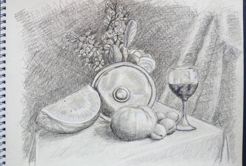
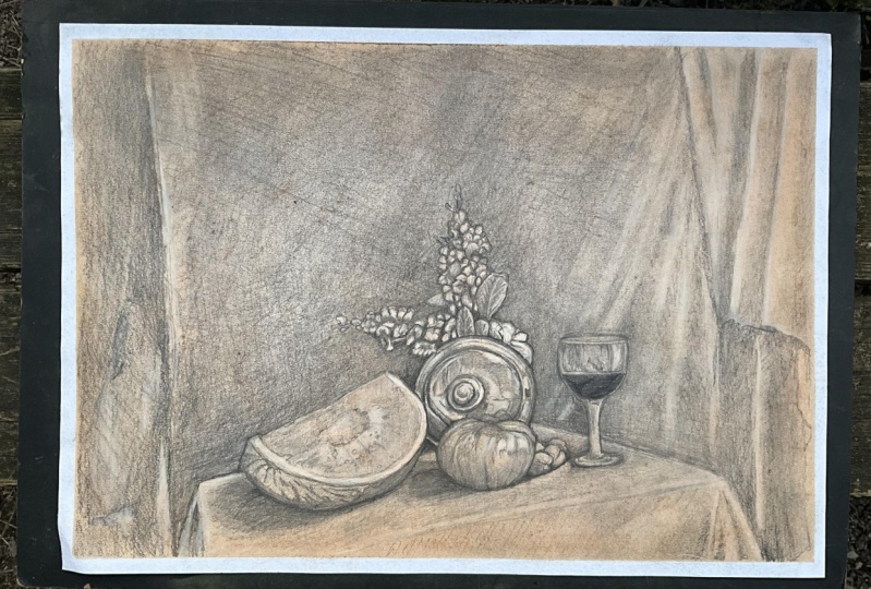
light and become position, we are ready to apply some of these ideas to our own work. Our exercise will be to draw a still life on a table
covered with velvet cloth. This scene includes
a metallic plate in the center with
flowers above, a slight water
mellon to the left, a large tomato
next to the plate, some pitches near the tomato, and a wine glass to the right. During this exercise,
we will pay special attention to how light interacts with
different surfaces. Inspired by Hopper and mainnet, we can allow ourselves to be
looser in certain areas to suggest light without
depending on extreme realism. From class, we will
take precision in depicting reflections
and transparency, and from net we will learn
to use the vibrant contrast to bring life to our
composition. Let's start then.
9. General Structure Indoor Still Life: On this lesson, we are
all on the foundation for our still life by focusing on the structure
of the composition. As we begin, I'm
carefully tracing the base lines that will guide the placement of each object. The goal here is to establish a strong framework before
diving into details. I'm starting with
a table drawing its rectangular surface with
light, confident strokes. This will anchor the
scene and provide context for the arrangement
of the objects. It's always easier
for the eye to see angles that determine
the shape of an object. So it's easier to try to
discover the shape of the table by drawing this
crossed line on the surface. Even though the objects
are in the table, we must try to imagine the table without
the objects on it in order to establish the exact surface where
the objects rest. That crossed line
is very important. By drawing these crossed lines, we can correct in
time the surface on which the objects will be. And this will help you a lot. Now, we are going to
focus on building the general aspects of
all the objects at once. I will start by
selecting the glass as a reference line
using its height to determine the angle
formed between the top of the glass and the position
of the watermelon. This angle will guide me to
the correct placement of the watermelon and help
establish its proper height. From here, I can start building
the wine glass itself, starting from the top
to know its width. Since I already have
two reference points, I'm going to draw a
possible structure of the plate right
in the middle, guided by the angles. It doesn't have to be perfect. It has to look convincing.
This is very important. Now I'm going to start tracing those flowers on
top of the plate. I already have the general
structure of those branches, and I can use this
very structure to finish building
the composition, for example, the watermelon. Pay attention that
I am not creating a complete overall structure
of the entire composition, as many academics do, what I'm doing was
taught to me by my Bulgarian drawing
teacher at the university. And it was their strategy
that is taught to a beginner. I was very young in those days. So this angle technique
is about growing an entire drawing from
an initial shape. Now that we have
several elements, it's easier to draw the tomato. It's a giant tomato, actually. Using all the elements
already built as a reference, we can complete those pictures that rest next to the tomato. I think it's not that
complicated to follow the lines. We must be aware about the B dimensional
nature of the paper. We are trying to render three dimensional objects using
a B dimensional language. But pay attention to
what happens here. This is normal while you draw and you have
to get used to it. The most important thing
is to notice the mistakes. When drawing this angle, we realize that the wine
glass is not tall enough, but we are still in time
and we can correct it. In fact, if we draw a horizontal line from the top of the wine
glass to the plate, we realize that they
are the same height. And since we already have the
glass in the right place, we can also correct the
size of the table a little. It's important to
understand that the initial structures are
always an approximation. They are never definitive lines. As we advance, we perfect them even in more advanced
stages of the drawing. Now we're going to finish
the watermelon structure. I'm going to draw the
center of this plate, but it's just an approximation. All these shapes will
change a little as we move forward and build the
shadows, and that is normal. That is the idea of the drawing. Another important details are the shadows projected
on the table. They are also reference
points to create the drawing. It's very important to be
precise on tracing them. Remember that you
are able to use hatching to trace those shadows. But try not to push the pencil too hard against the paper. We don't want to spoil
the paper too early. Now we're going to move on to these branches and leaves here. They are too important. But the fun thing about flowers and branches is that we can make an interpretation of them because they are full
of irregular shapes. Look how I always try to set the size of the element
I'm drawing with an angle that is always relating
the angle that is produced when comparing
it with another object. As for flowers and branches, important thing is to know
the general structure and its position in the
composition for the moment. The folded fabric in
the background is also an important element because it adds depth to the drawing. The fabric separates
the table layer from the background
in the composition. Now, I'm going to draw
some reference points, some details on the branches
to guide me later on. And that's it. We already have
the first step completed, the structure and design of our composition on the table
until the next lesson.
10. First Details and Shading Aproximation Indoor Still Life: Hello, people. In this lesson, we are focusing on applying
general shading throughout the composition without getting too detail with
branches or flowers. I'm going to use hatching
technique to build up all the broad shadows ensuring the drawing gains
depth and dimension. By layering parallel lines, I can gradually develop
the darker areas while maintaining a sense of
lightness where necessary. This approach helps to create a cohesive field across
the composition, allowing us to define the
form and structure of each object before diving into more intricate details later. So the key here is consistency, ensuring that shading flows naturally from one area to the next while respecting
the light source and maintain balance
across the scene. As I apply the
shadow on the plate, I focus on matching the to mato shadow projected
on the table. Relating shadows is very important when it
comes to drawing. And you must remember that by keeping the shading
smooth and gravel, you will be able to create unified tone that connects
two objects naturally. For the branches,
I apply shading that matches the tone
of the watermelon. Using light hatching,
I carefully shade areas of the branches
that fall into shadow, ensuring they blend seamlessly with the darker parts
of the watermelon. This creates a
consistent balance of light and shadow
across both elements, making them feel naturally connected within
the composition. It's crucial to respect the differences
between shadows in areas with no light and those
i partially lit places. Shadow and darker areas should be deeper
and more defined, while shadows and lighted areas should be softer and more saub. This contrast is key to creating depth and realism
in the composition. Now it's time to start filling
in the background with graphite to create depth and separate the main elements
from the background. By adding gradual shading
behind the objects, we can enhance the sense
of distance and make the key components
of the composition stand out more clearly. It's important to respect the folds of the fabric
in the background, giving each one its
appropriate tone. By carefully shading
the curves increases, we can capture the texture
and movement of the fabric, making sure the light and shadow follow the natural
flow of the material. Adding multiple layers of graphite and hatching
progressively, it's essential for building depth and richness
in the shading. Each layer helps to
gradually darken the tones and create smoother transitions
between light and shadow, giving the composition more
dimension and realism. By shading the background, you will be able to better define the contours
of your objects. These contours will help the shapes stand
out more clearly, allowing each element
to find its place in the composition and
try to remember with a bit of patience
and gentle shading, your objects will
start to come to life and feel more
integrated into the scene. Enjoy the process.
It's a reward and step in bringing your
drawing together. By using different layers of shading and varying hatching techniques in the background, you will create a
beautiful sense of depth and consistency. Adding layers of
graphite gradually builds up the shadows
while experimenting with different
hatching styles like cross hatching or parallel lines gives the background
a richer texture. This thoughtful approach helps the background blend smoothly
with the main elements, making your entire drawing field more unified and polished. Try to play with
these techniques to find the perfect balance. To enhance the
shadows on the table, take into account the
subtle light shadows cast by the fabric
dropped over it. This attention to detail
will add realism and depth, making the table and
its covering appear more naturally integrated
into the scene. Now, I'll be shading the
wine in the glass to its darkest tone as a reference for the darkest
values in the composition. By fully developing
this rich, deep shadow, we can establish a benchmark
for the darkest areas, ensuring consistency and depth throughout the entire drawing. This will help guide
the shading of the other elements and create a more cohesive and
realistic piece. Now that we have established the darkest point with the wind, we can use it as a reference to refine the other shadows
in the composition. With the darkest tone set. It's easier to adjust and enhance the more
hidden shadows, ensuring they blend seamlessly and adept to the entire drawing. I mean, it's a great way
to make every shadow work together and bring
your art work to life. To create a realistic shine
on the plate is essential to reinforce the strong shadows caused by the reflections
on the material. By deepening these shadows, you enhance the contrast
between light and dark, making the reflective
surface appear more luminous and giving the plate a convincing three
dimensional quality. This attention to the
shadows will help bring out the brightness and
detail in the plates shine. Anyway, we'll be working on the plates shine
until the very end of the drawing lessons
as it's one of the most detailed and
time consuming aspects of this artwork. Keep adding graphite to the background to
further highlight the elements of the composition
and refine the details. You must remember that gradually deepening the shadows will
make the main objects and stand out more prominently and enhance the overall
depth on your drawing. Try to remember that
you must ensure that each element feels integrated and balanced within the scene. With careful attention
to these details, you will create a more
polished cuestt composition. To define the outline
of the branches, start by gently sketching their contour with light,
deliberate strokes. Focus on capturing the natural
curves and irregularities, which will give the branches a more realistic and
organic appearance. By refining these outlines, you set the stage for adding detailed shading and
texture later on, ensuring that the branches stand out clearly within
the composition. After adding another layer of
graphite to the background, I will begin incorporating
some hatching on the glass to map out where
the shine will be later. This will help establish areas where the
light will reflect, setting the stage for adding those final doses of brightness. I think this step is crucial
for ensuring that the glass shine looks natural and well defined in the
finished drawing. We have reached the
end of the lesson. If you need to review
anything, feel free to do so. I look forward to seeing
you in the next lesson.
11. Plate's First Approach & Leaves Outline Indoor Still Life: Hello again. In this step, we embark on a delicate journey to bring the branches
and flowers to life by tracing the integrate
outlines of each tiny leaf. Picture each leaf as a small, graceful whisper in nature's
runs into the round, soft and full of gentle curves. As you trace these
delicate forms, let your pencil glide lightly, capturing the subtle
variations in shape and zies that
make each leaf unique. Take a moment to appreciate how these little leaves
interwave and overlap like a dance of shadows and light on
the serene afternoon. By carefully defining
the contours, you are not just drawing but waving a tapestry of
nature's elegance. Allow yourselves to
relax into the process, enjoying the rhythm of
each stroke as you reveal the beauty of every
leaf one at a time. So this meditative practice will bring a calming soothing
flow to your drawing, making each leaf a part of a harmonious and
tranquil composition. As you immerse yourself in
the details of your drawing. Let the calming music and
the gentle sound of rain create a soften atmosphere
that enhances your focus. The soft melodies
and rhythmic pattern of raindrops provide
a serene backdrop, allowing your mind to settle and your creativity to flow freely. This tranquil ambience helps
to clear away distractions, enabling you to concentrate fully on each delicated
detail of your work. Embrace this
peaceful environment as a source of inspiration. As you work on the
details of the leaves, remember that those
situated lower or hidden beneath should be shaded darker than the
more exposed ones. This principle not only adds depth and realism
to your drawing, but also helps to
distinguish the leaves that are closer from those
that are farther away. Even in the contour lines, this gradation of darkness emphasizes the
layers in its dimon. This technique is reminiscent of the work of the Renaissance
master Leonardo Da vici, who skillfully used shading
to create depth and volume in strnes such as studies of
plant life and anatomy. So by applying
similar principles, you can achieve announced and lifelike representation that captures the delicate interplay of light and shadow
in your own artwork. H. Understanding the structure and positioning of the leaves is crucial for capturing
their essence, even in areas where
the details might not be fully clear in
your reference image. When you encounter
these ambiguous spots, use your imagination
to fill in the gaps, relying on your knowledge of leaf structure and how they
naturally arrange themselves. Remember, in live
drawing situations, your reference might be distance
or not entirely visible, making it challenging
to discern every tail. Trust in your
ability to infer and visualize how the leaps
interact and overlap. Applying logical
assumptions based on their known characteristics. This creative approach
allows you to maintain consistency and
harmony your drawing, ensuring that even the
less visible parts align seamlessly with
the overall composition. Highlighting the delicate twigs
that supports the lips is essential for giving structure and authenticity to the bouquet. By carefully drawing
these tin stems, you create a sense of connection and support
within the composition. Well defined stems not
only anchor the lips, but also add depth and
realism to the bouquet. When these tiny details
are carefully rendered, they enhance the
overall structure, making the arrangement appear more cohesive and
naturally balanced. Paying attention to these
sidle elements helps to convey intricate relationships
between the lips and their supporting branches, bringing a refined sense of realism and elegance
to your drawing. Reinforcing the background right behind the bouquet
is crucial for making the details
of the lips and branches stand out more vividly. By dipping in the shading and adding texture
to the background, you create a stronger
countras that highlights the intricate
details of the foliage. This enhanced backdrop helps to bring the bouquet
into sharper focus, making each leaf and twig
more distinct and pronounced. As you work on
this, remember that well developed background
not only frames the bouquet, but also accentuates its beauty, allowing the finer details
to shine through and creating a more dynamic and visually engaging
composition. Now we will focus on enhancing
the shine of the plate. We're going to start
by emphasizing the separation between the
plate and the flowers, even though they may
be in close contact. By carefully shading
and highlighting the areas where the
plate meets the flowers, you will create a
clear distinction that enhances the three dimensional
quality of both elements. This approach ensures that the
plate's reflective surface stands out while the flowers maintain their own
distinct presence, adding depth and clarity
to the composition. Now we will refine and enhance the metallic appearance of the plate to bring
out its shine. We must keep carefully blending the darkest and
lightest tones to create a realistic effect of light reflecting
off the surface. As you work on this, remember to follow the rounded
shape of the plate, as the light and shadow will naturally conform
to its curvature. This will help you to achieve a convincing metallic shine, capturing the way
light interacts with the plate surface
and highlighting its three dimensional form. Mm When refining the shine of the blade, patient is essential. Try to lay your grafte gradually to achieve the
desired metallic effect. And I should remind you that due to the coarse texture
of the paper, achieving a smooth, reflective surface can
be more challenging, but don't let that
discourage you. With careful attention and
persistence and layering, you can still create a striking and convincing
shine on the plate. I mean, the paper's texture will add a unique
quality to your work, making the final effect both
distinct and captivating. Remember to use the razor pencil to enhance the metallic shine of the round blade as an effective technique for achieving a realistic
and striking effect. I mean by gently lifting
graphite in specific areas, you can create the illusion of light reflecting off
the curved surface, emphasizing the plate's
metallic quality. This technique allows
you to highlight the brightest spots
in that contrast, making the shine appear more dynamic and three dimensional. So careful use of
the eraser pencil will help you refine
the reflective details, bringing out the
plates shine and adding a touch of
realism to your artwork. Stepping back time to time from your drawing is crucial for gaining a fresh perspective in assessing your work
more effectively. By distancing yourself,
you can better contemplate the overall composition and see how all the
elements come together. This moment of reflection
allows you to identify areas that may need
adjustment or correction, ensuring that each detail aligns with your
artistic vision. Regularly taking a step back helps you to make
informed decisions, improve your drawing
and advance with a clearer understanding of
how your work is progressing. We have reached the
end of this lesson. The plate looks much improved. There is still quite a bit of work ahead to achieve
the final effect, but you're making
great progress. See you in the next lesson. Oh
12. Fruits Details & Wine Glass Indoor Still Life: Hello, people. Now, let's dive into the vibrant
world of textures, starting with our
watermelon slice. Remember, we are working with just a quarter of
this juice fruit, which gives us a wonderful
view on its deep red interior. The contrast between the rich, fleshy tones and
smooth glosy seeds adds so much character. Try to focus on capturing
that bright, inviting red, but using graphite, but
don't forget the darker, warm mysterious tones of
the seed nestled within. First of all, I'm going to apply a first graphite layer to
reach that general tone. When working with graphite, it's essential to be
delicate to truly capture the soft juicy textures of
the watermelons interior. Use gentle sweeping strokes
to lay down the base tones, allowing natural red juice to come through
with light shading. The idea is to avoid
pressing to heart. You want the graphite to
almost glide over the paper, creating a saddle velvet defect. For the darker areas like
the spaces around the seeds, layer the strokes gradually, building up the depth
while still maintaining that soft transition
between light and shadow. This way, you are going
to preserve the fruit's tender, almost
translucent quality. Pay close attention
to the background as you shape the edge
of the watermelon. The rhin's texture is
slightly irregular, and this can be
emphasized by how it contrasts with the
surface behind it. Use the surrounding tones to supply define those
knitting edges, making sure the transition
from the rind to the background feels
natural yet distinct. This attention to detail
will help enhance the realistic texture
of the watermelon, showing its organic
and perfect shape. The seeds are small, but important details that bring
the watermelon to life. Each one should be carefully
placed with a smooth, rounded shape in a slight shine that suggest their
glosy surface. Try to use darker, more defined strokes to contrast with the soft
flesh around them, but keep them subto. Remember, they should feel like they belong
within the fruit, not separate from it. Now let's focus on the watermelons rind and its
characteristic markings. These dark river like patterns flow down
towards the base, where the fruit
connects to the stem. Notice how this line
seems to travel curving gently as they follow the natural contours
of the watermelon. Keep in mind that this
lower part should be shaded darker as it less
exposed to light. By carefully layering
your graphite here, you can create a sense
of depth and roundness, emphasizing the saddle ships
and light as they move from the top of the rind
down to its shaded base. It's important to
differentiate between the two types of shadows
the watermelon creates. First, there is a
complete shadow at the point where the
watermelon touches the table. This is the darkest, most solid. Then there is a softer
more diffused shadow that the watermelon
cast across the table, known as the projected shadow. This shadow gradually fades as it extends away
from the fruit, creating a smooth transition. When working with graphite, use heavier pressure for
the contact shadow and gradually lighten your strokes as you create the projection, allowing for that natural
shift between the two shadows. Take a closer look at
how the eraser pencil has helped create the light
edge of the watermelon, which is produced by the
thickness of the rind. By gently lifting the
graphite in gradle strokes, I have revealed the
sidle highlight. It's a delicate process removing just enough
graphite to show the thickness of the
rind without losing the smooth transition
from light to shadow. I always remind you
stepping back and viewing your drawing
from a distance can be incredibly helpful, especially when evaluating
the quality of your shadows. From afar, you will be able
to see how well the shadows blend and how natural the transition between
light and dark appears. This perspective helps
you assess whether the shadows are too
harsh or too soft, if they accurrectly
convey depth and form. As we deepen the
textures of the shadows, it's essential to make the
hatching more delicate. The closer we get to
the darker areas, the strokes should become
finer and more controlled. This rattle layering allows
the shadows to build naturally without appearing
too harsh or abrupt. Now, let's apply the same shading and texturing
process to the tomato. Focus on the areas
of light and dark, using a delicate approach to capture the fruit's
roundness and texture. As with the watermelon, remember that the white
chalk we will use later on will be crucial in adding the
final highlights and shine. So do not worry if you cannot
see the brightness yet yet. Our goal now is to build a solid foundation with
our shadows and textures, leaving room for the chalk to enhance the final brilliance. Pay special attention
to the shadows cast by the tomato and the plate onto
the velvet covered table. The shadows will have
instinct characteristics due to the textures
of the fabric. The tomato shadows will be slightly softer
and more diffused, blending gently into the
rich texture of the velvet. In contrast, the plate's shadow may be more defined and darker, creating a sharper outline
against the fabric. Observe how the velvets textures interacts with the shadow, creating subtle variations
in darkness and softness. Capturing these nuances will add depth and realism
to the scene. Pay attention to the
reference image. Notice how the velvet fabric is slightly lifted in
front of the tomato. This saddle elevation affects how the shadow is
cast on the table, creating a gentle
and niven transition between the shadow
and the fabric. Let's apply the same
shading and texturing techniques we used for the
tomato to the small pitches. Focus on capturing the saddle variations
in light and dark, considering each ***** brown
shape and fuzzy texture. The shadows should
be self ignosed reflecting the gentle curves
and surface of the fruit. Pay attention to how light
interacts with the pitches, creating both height
lights and deeper shadows. Remember, the further a
pitches from the light source, the slightly darker issued let's move on to the wine glass. Let's begin by focusing
on the area where the wine glass touches the
velvet fabric on the table. This point of
contact will create a subtle shadow on the fabric. So use a gentle shading
to tip a smooth, soft transition where the
glass meets the table. Observe how the glass might press slightly
into the fabric, potentially causing
faint impression or distortion in the velvet. Accurately capturing these
details will enhance the realism of how the glass
interacts with the fabric, adding a depth to your drawing. Remember that the
glass of wine creates strong shadows and abrupt transitions between
light and dark. Focus on capturing
these dramatic shifts, especially where
the light reflects off the glass and
where shadows are cast both on the glass itself and on the
velvet fabric below. The interplay of light
on the glass surface can create sharp contrast
and intense highlight. So use precise varied
shading techniques to reflect these
dynamic changes. The top of the wine glass is an excellent example of how to handle light and
shadow on glass. Through the
transparent material, you can observe the
colors of the background, subtly blending with
the reflections. At the same time,
pay attention to the dramatic light and
shadow transitions that are characteristic
of glass. The rim and surface
of the glass can show intense ight lights
and sharp shadows. So carefully adjust
your shading to capture these countries and the way the background colors
filters through the glass. Mm. Now it's time to add another
layer of graphite to the background to enhance the prominence of
the wine glass. By deepening in the
background shadows, you will create a
stronger contrast that will make the glass
stand out even more. Ensure that the new
layer of graphite is smoothly blended to
avoid harsh lines, allowing the glass
to appear more distinct against the
darker backdrop. This final adjustment
will help emphasize the delicate details
of the glass and bring more focus
to your drawing. As I finish up, the background, take a moment to
appreciate how well the reflections on the handle of the glass are
coming together. And that wraps up
our lesson for now. Take a moment to admire how the drawing is
coming together. It's looking great so far. See you in the next lesson.
13. Flower & Leaves Details Indoor Still Life: Hello, people. I hope
you are doing well. Before we dive into the details of the
floral arrangement, I will first apply another layer of graphite
to the background. This will enhance the
background's depth and contrast. Making the flowers and
branches stand out even more. Remember that as you continue
with your own draws, feel free to check
in and see how the background deepen and affects the overall composition. But let's move on to
the flowers details. For the moment, we
will concentrate on the closed up details of
the floral arrangement. With the general structure and shapes of each leaf
already in place, our next step is to apply the appropriate
shadows and textures. These elements are crucial
for adding a sense of three dimensionality to both
the leaves and the flowers. So by carefully
shading and texturing, we will enhance the realism
of the arrangement, making each detail stand
out with depth and form. Pay close attention
as I use the color of the paper to represent
the color of the leaves. Instead of shading the
more illuminated leaves, I will focus on those that are overlap by the leaps
in the foreground. This technique will help me create different
layers of leaves, adding depth and dimension
to the overall branch. By concentrating on
the overlapping areas, we can achieve a more dynamic
and realistic arrangement. The value of the line is
crucial in our drawing. A dark line can effectively separate a shaded leaf
from the highlighted one, creating clear distinctions
between different elements. Additionally, the
background itself can help define the age of a highlighted leaf without
the need of separate line. By using the background's
value and shading, we can naturally outline
the illuminated leaves and enhance the overall depth and realism of the arrangement. Embrace patience
and delicacy as you immerse yourself in this
stage of the drawing. Let the music be your guide, gently carrying
your thoughts away, allowing your mind to wander through the shapes and
shadows with ease. Each stroke becomes
a dance as you lose yourself in the
serene rhythm of creation. Try to feel the harmony between your hand and the paper and let the tranquil flow of
your focus bring forth the subtle beauty hidden
between each leaf and bloom. Practicing the delicate
process of observing each leaf is crucial for creating a compelling
visual effect. And it's a skill
that will benefit you across all areas
of visual art. The challenge for artists
often lies in the details. I mean being the atom
to these subtleties requires immense
attention in practice. Focusing on such details
in your drawings is a powerful way to
develop this sensitivity, hunting your ability to capture the intricate announces that
bring your art to life. M Pay attention to this. It's important to remember
that the area closest to the stem of each leaf
tends to be darker. This small yet
significant detail adds volume and
depth to the leaf, enhancing a three
dimensionality. By carefully observing and
shading this darker region, you can create a subtle but
impactful sense of form, giving each leaf a more realistic and
lifelike appearance. Try to recognize
that you are not drawing the flowers
exactly as you see them. Instead, your
drawing is a result of understanding the
arrangement of the leaves. So what you are
creating is actually a close interpretation of
the visual complexity, as these small irregular
leaves can be quite confusing. Embrace the nature of their
complexity and focus on capturing their essence rather than striving for
perfect accuracy. This approach allows you to
convey the true character of the arrangement while
navigating its intricate forms. Observe how as I progress, I need to reinforce
the background to bring the branch
into sharper relief. By deepening in the background, the foreground elements like the branch will stand
out more prominently, enhancing their three
dimensional appearance. This contrast not only highlights the details
in the branch but also creates a more dynamic
and realistic depth in the overall composition. We must be mindful of the whitest points
in the composition. For example, in the
floral arrangement, there are some white
leaves near the plate, which should be the lightest
areas in your drawing. Take these highlights
into account when working on the gradient
in the darker leaves. By accurately representing
these bright spots in their contrast with
the darker regions, you will create a more cohesive and visual compelling piece. Now, I will focus on completing the fabric
on the right side of the composition to ensure the wine glass stands
out prominently. It's crucial to pay attention to the folds increases
in the fabric, as these details will enhance the depth and texture
of the background. By carefully shading
these folds, we can create a
clearer separation between the background
and the glass, allowing the glass of wine to merge vividly in the foreground. Um Often, we might overlook
the background, but it's just as crucial as the main elements
in a composition. I mean, the background
provides context and depth, shaping how we perceive
the foreground elements. I mean, a well
executed background not only supports
the main subject, but also enhances their
presence and impact. So by giving due attention
to the background, we ensure a balanced and
harmonious composition that brings the
entire scene to life. Look how well our drawing
is coming along so far. The progress we have
made is impressive. Let's appreciate the work we
have done up to this point. I look forward to seeing
you in the next lesson.
14. Shine & Reflection Indoor Still Life: Hello, people. In this lesson, we will concentrate on the
metallic shine of the plate, pushing our work closer
to the final look. It's crucial that as
we enhance the plate, we also refine the
elements around it, including the wine glass. Paying attention to
these details will bring out the full depth and
realism of the composition, setting the stage for a polished and cohesive
final piece. I'm going to start
with a complex part of the reflection representing
the projection of objects onto the plate. Both the flowers
and the watermelon, particularly watermelon are
reflected on the plate. And it's essential to capture these reflections accurately. This is challenging
because it involves the pectin colors projected onto the metal using graphite. This is the reason
why the white shak will be so crucial later on. A set will help to enhance the highlights and bring
these reflections to life. L As I work on refining the toe mato, pay close attention to how the shadow of the watermelon
appears on the plate. Observe the interplay
between the shadow and how they interact within
the metallic surface. The way the watermelon's reflection distorts
and blends with the plate's surface is crucial for adding
depth and realism. This careful observation
will help in creating a more accurate
and compelling reflection. That texture of the
tomato is crucial because it's the second element we notice after looking
at the plate. If the tomato is not well executed in terms
of volume and form, the plate itself will not
appear as attractive. So achieving accurate
texture and detail in the tomato enhances
its presence, which in turn elevates the overall visual appeal
of the entire composition. I will render a tomato adds depth and
complements the plate, making the whole seem more
cohesive and engaging. You might now notice the reflection of the tomato
on the plate, as well. This subtle detail adds another layer of realism
to our composition. Try to pay attention to
how the tomato shape and texture are mirrored
on the metal surface, contributing to
the overall depth and complexity of the scene. Capturing this
reflection accurately will enhance the integration of the elements and
bring the drawing closer to its final
polished look. Pay attention to how
the plate looks now. It's the improvement of all the surrounding
elements that helps enhance the
plate's appearance. As I refine the stronger
shadows on the plate, notice how the adjustment contribute at its
overall realism. The careful detailing of the surrounding objects also elevates the plate's presence, creating a more cohesive and visually appealing
composition. Considering that there are some green leaves standing
out on the blade, we will now focus on enhancing
their color and texture. By refining these leaps, we will differentiate their tone from the rest of the
floral elements. This will not only make the
green leaves more distinct, but also create a more dynamic contrast
against the blade, adding depth and clarity to
the overall composition. Notice that due to the
nature of the main leaf, one half is more exposed to the light while the other
half is more shaded. Additionally, you can
see those kind of veins that transport chlorophyll
throughout the leaf. It's important to capture
all those details. Accurately depicting the
light and shadow on the leaf, as well as the intricated
veins patterns will enhance the realism
and depth of your drawing, making the leaf appear more lifelike and integrated
into the composition. Just as we paid attention to the reflections on the plate, it's now time to
focus on the glass. So we will turn our attention to adding all the luminous
details of the glass. Carefully observe and
depict the highlights, reflections, and
transparency that make the glass appear realistic. These details will enhance the glass' brilliance and
bring it into sharper focus, contributing to the overall refinement of the composition. Let's return to the plate to continue improving
its darker areas. Focusing on these shadow
regions will deepen the overall contrast and enhance the plate's
metallic quality. Pay attention over here to
the subtle variations in darkness and refine these areas to add more depth and dimension. The circular shadow along the edge of the
plate is crucial. This shadow adds depth and helps define the plate's shape, making it appear more
three dimensional. Now that we had made progress
with the main elements, we can focus on enhancing
the appearance of all the fabrics on the table
and in the background. Pay attention to the textures, faults, increases
in each fabric. Refining these details will add richness and realism
to the scene, ensuring that the fabrics complement the main
elements effectively. As I continue to add
graphite to the background, pay close attention to the illuminated edge of
the wine inside the glass. This detail is crucial for representing the contact
between the wind and the glass, as well as its reflection. Capturing this illuminated
edge accurately will enhance the realism of the glass
in the liquid it contains, creating a more convincing
and dynamic effect. Our drawing now includes nearly
all the graphite details, and it's looking fantastic. However, there is still
one final touch left, adding the white pastel
and the final details. This will enhance the
highlights and bring out the finishing touches that will elevate the drawing
to its final form. But we will cover that
in the next lesson.
15. Pastel Chalk & Final Finish Indoor Still Life: Hello, people. We have reached the final lesson
for this drawing, where we will focus on using white pastel to enhance the
highlights and reflections. We will apply it step by step
across the entire drawing ensuring that every light and reflective detail
is brought to life. Remember, as we
apply the pastel, we may also need to
add more qufied in certain areas to refine
the overall effect. This final touch will elevate the drawing and bring it
to its complete form. Let's begin by applying the
white pastel to the plate, focusing on the most
illuminated areas to enhance the reflections. With all the elements
on the composition, the plate will require the most white pastel to
achieve the desired effect. So carefully apply the
pastel to highlight the brightest spots and
refine the reflections, which will help to bring
out metallic quality of the plate and make it down
out in the composition. Notice how this process
suggests that I need to darken the shadow on the plate
cast by the flowers above. Such adjustment often arise
as we advance in a drawing, especially in the final stages. It's common to refine
shadows and highlights to ensure that all the
elements harmonize perfectly. This ongoing refinement
helps to achieve a more realistic and
cohesive final result. Observe the saddled
nuances on the plate, where the reflection
of the flowers and watermelon dance
across its surface. Although these
reflections may not capture the exact shape
of the original elements, their presence is unmistakable through their color
and intensity. The plate becomes a canvas
for this mirror to use, where the flowers and watermelon leave their referent imprints. As we apply the white paston, we will enhance
these reflections, bringing out the delicate
interplay of light and shadow. So use graphite to refine
and define these areas, ensuring that the
reflections are visible and not a
layer of depth. As we use the white
pastel pencil, you will notice
that it blends with the graphite because the
pastel pencil is harder. This interaction is
quite interesting as it creates various
shades of gray, adding depth and
texture to our drawing. In contrast, if we were
using a soft pastel bar, the white would tend to
overpower the graphite, covering it much
more completely. So this blending of hard pastel
with graphite allows for a more nuanced range of tones
and a more refined effect. Observe how I'm
using the pastel to represent the lightest
areas of the watermelon, given that its color is very light and its surface
is well illuminated, the pastel is perfect for highlighting these bright spots. By carefully applying the
pastel to these areas, we enhance the light reflections and bring out the
subtle textures. The secret of this
lesson with a white pastel lies not just
in its application, but in the opportunity
it provides for the contemplation and overall
refinement of our drawing. So as we progress, the process shifts
from active drawing to careful observation
and adjustment. The more we advance, the
more we focus on refining details and enhancing
the overall composition, spending less time on
drawing and more on ensuring every element contributes to the complete and
harmonious final piece. As you apply the
pastel to the plate, it's crucial to follow the circular form
of the reflections, aligning your struck with
the shape of the plate. This technique is necessary to accurately represent
the material. I mean the metal material and
its reflective properties. By adding to the
plates curvature, you will enhance the
realism of the reflections. As we advance in this stage, we will also apply
the white pastel to the leaves but with a
different approach. Like the plate where the
pastel is used extensively, the little leaves in
the reference image don't reach such high
level of illumination. Therefore, we will use the white pastel sparing
gly on the leaves, focusing on isolated
points of light. The primary color
for the leaves will remain the paper
itself with the pastel highlighting only the
most luminous spots to subtly enhance
their appearance. Observe how I am applying the white pastel bar to cover
more areas on the plate. Using the bar allows for a broader application
of the pastel, effectively covering
larger sections and enhancing the intensity
of the reflections. This method is
particularly useful for achieving a more pronounced inconsistent brightness
on the plate. Look at how fantastic the wine glass looks with the application of white pastel. The reflections now appear
simply magnificent, capturing the delicate
interplay of light and glass. I mean, the pastel brings out the brilliance and
clarity of the glass, enhancing its transparency and making the reflective
details truly stand out. As we apply the pastel
to the main elements, we must also address
the background to ensure it complements
the overall composition. Applying the white
pastel to the background will help create an
enveloping effect, blending seamlessly with
the rest of the drawing. Now, let's focus on
refining the branch and leaps further by enhancing
the darker areas. Pay special attention
to the edges and the corners where the darkness adds dimensionality
to the branch. Strengthening these
shadows will give a greater sense of
depth and structure. Additionally, we will apply more wet bastel to highlight
the lighter parts, creating a contras that
will make the branch and leaps appear more different
and three dimensional. Pay attention to how interesting the background cross
hatching appears. Since it's not fully blended, it displays a unique texture and character to the
overall drawing. This technique creates
striking contrast between sketchy and preliminary fiel in a more detailed
finished piece, blending elements of both styles into a compelling visual effect. Let's add the final
touches to our plate, which already looks magnificent. By carefully
refining the details and enhancing the highlights, we will elevate the realism
and brilliance of the plate. This last adjustment will perfect the reflections
and shadows, ensuring that the
plate stands out beautifully as a focal
point in our composition. Now we're going to
use a special tool, the Pierre Renoir to chiep a particularly dark
tone in the wine. This intense black pencil
will help us reach the depth and richness required for the
wine's darkest areas. We must apply the Pierre reni with great
care and attention, as this tool produces an
exceptionally deep black. The reason the Pierre Noir
is so dark is due to eat high concentration of graphite and the density of
the material itself, which allows it to create
intense and rich tones. This depth of black is
essential for capturing the profound shadows and
subtle nuances in our drawing. And here we are at the
culmination of our journey. Look at how beautifully the
composition has come to life, each element harmonizing
with the others, forming a complete and
captivating scene. The watermelon, with its carefully shaded
interior and texture rend, it stands out with
intercratd tails that capture its form
without ding color. The tomatoes and pitches are shaped with
depth and precision. The volumes clear through the interplay of
light and shadow. The plate now refined with delicate highlights
of white pastel, gleams with metallic elegance, reflecting the
surrounds elements, the flowers, the watermelon, the tomato, just enough to give a sense of their presence
without needing vivid hues. This is more than a drawing. It's a tatement to the beauty of observation and the quiet
power of black and white. I see you in the next drawing.
16. Theoretical Approach Gustave Courbet Outdoor Still Lifemp4: Before we begin our exercise, it's essential to discuss an important reference that
can enhance our practice. Gustave Corvette and his
painting still life with apples. This work is not only a brilliant example
of jalism but also captures the essence of everyday objects in an authentic
and captivating manner. In still life with apples, Corbett organizes the
fruits in a balanced way, making the apples the
focal point of the piece. This aspect is crucial for us to consider as we
plan our own drawing. The visual hierarchy
established by Corbett allows each element to complement one another and contribute to
the overall composition. The apples with their detailed
textures and luminosity, immediately capture
the viewers attention, while other elements
such as the surface and the background are more
subtle in comparison. Attention to detail he
employs in representing the fruit highlights their
freshness and texture. Notice how each apple exhibits variations in
color and tone that reflects light and
natural contributing to the illusion of
freedom mention of it. This is an aspect we can
apply in our drawing, capturing how light
interacts with the surfaces of the fruit
to bring them to life. Kurbt's skills in emphasizing
the details of the apples invites us to observe carefully and replicate the same
observation in our work. Another vital aspect of
Corbett's paintings is the relationship between the objects and
their surroundings. In his piece, the
background elements, such as the trees
and sub landscape adapt in context to the Zena. However, it's
essential to note that this background is rendered with less detail than
the main objects. This compositional
choice directs attention towards the apples. Well, the background becomes a supportive context that frames and enhances the
importance of the fruits. Just like Corvette, we should consider this strategy
in our exercise, ensuring that the background serves as a context that doesn't compete with the central
elements of our still life. The way Corbett handles
tones is also crucial. He uses natural light to highlight the various
textures of the apples. As we progress in our drawing, it will be essential to pay attention to how light
falls on each fruit. In still life with apples, the tones and variations in light help to bring
the objects to life, an approach we should apply
in our representation. Now that we have established the significance of
the Corbett's work, let's move on to our exercise. We will create Ale still live outdoors that includes
three fruits, a pineapple in the center, bunch of bananas to the right, and a large tomato to the left. All of these will
rest on the grass with trees and branches
visible in the background, creating a second plane that
will enrich our composition. In this exercise, let's
remember to apply the principles we have discussed regarding Corbett's work, focus and relationship between the fruits and
their surroundings, the effect of natural light on each object in
capturing textures. So this exercise will not only allow us to practice
observation. But also foster our creativity
as we interpret the zine. It's also vital that the
background is depicted more diffusely with less detail to emphasize the
importance of the fruits. With this preparation in mind, let's start our exercise
and apply everything we have learned to create
our own outdoor still life.
17. Construction Angle Technique Outdoor Still Life: Let's begin this
outdoor still life. I'm starting with quick
intuitive measurements. First, focusing on the height of the pineapple as the
largest element. Now, as I continue drawing, I imagine the angles
and proportions, moving to the tomato next to it and the hand of
bananas on the right. This composition brings
a deeper complexity with nature as a backdrop, blending the lush green grass and distant three
branches into the scene. The balance of the fruits, each with their own unique
shapes and textures, creates a vivid dynamic that
we will refine as we go. Pay attention to
how and building the fruits based only on the
height of the pineapple, which I haven't even
fully drawn yet. The idea behind this
exercise is to encourage the use of the imagination to visualize the angles
in our minds, even before we
actually draw them. We have already drawn this to match in the previous exercise, so we have a good idea
of how to approach it. Now, it's time to sketch the approximate shape of
that bunch of bananas. Don't worry if we make mistakes. We will keep adjusting and
refining as we go along. To discover the exact
shape of the bananas, start by observing
the relationship between the tomato
and the pineapple. Imagine lines extending from both fruits to create
a visual guide, helping you estimate the
space the bananas occupy. You can also try visualizing how the curve of each banana flows in relation to the roundness of the tomato and the
angles of the pineapple. Be patient, this is a process that requires observation
and refinement, and it's completely normal to
make adjustments as you go. Each stroke brings you closer
to understanding the shape. A Now that I have the general structure of
the bananas and the tomato, I'm going to focus on
discovering the body of the pineapple by measuring the overall height
of the composition. The pineapple is the
largest element, so it will serve as
a key anchor point. By visualizing its height in relation to the other fruits, I can begin shaping its form and ensuring that everything
stays in proportion. This step is crucial for establishing the balance
in the composition. Now we need to construct the general structure of the
top part of the pine apple. The spike lips that cron it. We don't need to
worry about getting every detail right
at this stage. The goal is to establish
the overall shape and flow. Imagine how the leaps
find out from the center. Given the pineapple,
it's iconic silhouette. Now I'm going to sketch the horizon line
of the landscape behind the main elements. This will help me create
additional points of reference, allowing for more precision
as we move forward. The horizon acts as
a grounding element, giving a sense of space and
depth to the composition. It helps us visualize the relationship between the
fruits and the background, guiding our placement of objects more accurately as we
continue building the scene. The three branches
in the background are also essential
to our composition. We don't need to draw them
with precise detail right now. What is more important is
understanding where they belong within the scene and the space
they occupy on the paper. Think about them as soft
gestures that frame the fruits, adding balance and depth to the overall composition without overpowering the main elements. Let's begin constructing
the bananas, starting with the one
closest to the tomato. The one that is slightly totint. This first banana will
serve as our guide, helping us anchor the
rest of the bunch. Pay close attention to
the way its curve forms. It's not a perfect arc, but rather an organic flung line that bends in subtle ways. Right from this point, we can slowly build out the rest of the
bananas one by one, allowing each one to connect
naturally to the first. Notice how their position
slightly overlap, creating a cascade of shapes that flow
together in harmony. As you work on each banana, observe how they taper
at both ends and how the gentle curves follow a similar but slightly
varied pattern. I think that the
key is patience. Take your time to observe the direction and spacing
between each one. Some will curve
more dramatically. Others might appear
more straight, but all of them should feel connected as part
of a cessive bunch. Try to remember that with
every new banana added, you will start to see the
overall shape emerge, and soon the entire
hand of bananas will form naturally as part
of the composition. There's absolutely no
problem with making mistakes in the yields
stages of a drawing. This is actually where
mistakes are most welcome. In fact, this phase is all about exploration
and correction. There's no moral or
technical rule that dictates how many times you
are allowed to make an error. Each mistake is simply another opportunity to refine your understanding of the form, to adjust your angles, and to find the proportions
that fill right. I'm going to apply the light hatching around
the main elements to isolate them and observe
their shapes more clearly. This technique helps create
a subtle separation, allowing each form to stand
out against the background. At this point, it's important
to proceed slowly and with intention observing how the lines enhance the shapes. Take your time. This
gradual pace will give us better control and a
deeper connection with the forms as they
evolve on the paper. To Now I'm going to map out the textures
of the pineapple skin, a general sketch of the characteristic diamond
shaped pattern on its surface. This initial layout doesn't
need to be perfect, but is essential to capture the rhythm and flow
of these shapes. On the reference image, notice how the diamonds
create a sense of depth and movement wrapping
around the fruit surface. As we proceed, we will
refine the details. But for now, focus on
establishing a foundation for the intricate texture that defines the pineapple exterior. Perhaps the most important
aspect of this stage is to represent the same number of diamond shapes on
the pineapples skin, as you see in your reference. Well, it's not
strictly necessary. I do recommend it
for this exercise. By doing so, you will practice
observation and precision, which will enhance
your ability to capture complex
textures and patterns. But remember, this is still part of the initial
sketching phase. After removing some of
the construction lines, we will move on to add
on light general shadows and reinforcing a few lines
to indicate darker areas. These darker areas
could be due to shadows or the natural
color of the object itself. The goal here is to
begin giving form and dimension to the fruits
and surrounding elements. By applying gentle shading, they start to establish the
play of light and shadow, which will make the objects feel more grounded
and realistic. Now I'm going to darken
the entire background, focusing on the grass, the area behind it to
isolate the main elements, the fruits, and begin to see them as the true center
of our composition. This step is crucial as it allows the fruit to
stand out more clearly, bringing our attention
to the central focus. As I deepen the shadows
in the background, notice how the fruits start
to merge with more contrast, giving us a clearer
perspective of their forms and their importance in the overall composition. And there you are.
Our general sketch of the composition is ready. The main elements
are constructed and their relationship with the surrounding landscape
is established. We have set the foundation for detail and dynamic drawing. And from here, we can build on this solid base to refine and enhance our artwork later
on until the next lesson.
18. First details Outdoor Still Life: Hello, people. In this lesson, we will delve into
the first set of details for all the
elements in our drawing, placing a special
emphasis on the fruits. Our focus will be
on gently shading the fruits to bring out their
dimensionality and texture. Achieve this, we will use a light cross hatching technique to softly build up the shadows, allowing the fruits to gradually
emerge from the paper. This approach will
help in defining the subtle variations
in light and shadow, creating a sense of
depth and realism. As we progress, we will
pay close attention to how these shadows interact with
the surfaces they rest on, ensuring that each fruit is rendered with care
and precision. The initial shadows serve as a foundational guide for developing deeper
details later on. These preliminary shadows
lay the groundwork for understanding how light
interacts with each element, allowing us to build
upon them with more intricate details
as we progress. By establishing
these early shadows, we set a clear path for
refining textures and enhancing the overall realism of our
drawing in subsequent stages. Now, as we closely examine
the reference image, we will begin crafting the
crown of the pineapple. Approach this step slowly, paying meticulous
attention to each leaf. Despite their variety, the
lips are well defined, and it's crucial to approximate the original shape as
closely as possible. This careful observation
will allow us to capture the very
structure of each leaf, contributing to the
overall authenticity and detail of the
pineapples crown. There is an important detail to highlight in this exercise, and it's a nouns that is not often addressed in
drawing exercises. In this image, the light source
comes from right to left. But it does so very subtly. While the direction of
light is indeed present, it's gentle and soft in its
projection over the forms. As you can see the
crown of the pineapple, you will notice that the
area near the base of the crown is darker due
to the lack of light, while the right side of the
crown is more illuminated. This phenomenon
occurs consistently across each leaf or
blade of the crown. It's essential to represent the subtle interplay
of light and shadow to capture the delicate nonces of light and its effect on
the pine apple's crown. Remember to be patient and avoid using over
led strong lines. If you prefer to use darker pencils up for
the darkest ones, but avoid pressing too
hard on the paper, it's better to create Smtches than to leave indentations
on the paper, especially with high
quality paper like this. Gentle, careful application
will help maintain the paper's texture and
ensure a more refined result. Pay attention to how I'm starting with the
leaves at the base and gradually building up the crown as the leaves
overlap each other. This layering is crucial as each leaf influences
the next one above it. Additionally, I'm
using each leaf as a reference to draw the next, ensuring consistency
and accuracy in the overall
structure of the crown. This methodical approach
allows us to capture the natural progression in depth on the pineapples foliage. Notice the saddle downward curve at the tips of the leaves. This is a characteristic feature
of the pineapples crown. It's essential to capture
this detail as it adds to the realistic texture
and depth to the folige. By paying attention to these small but
significant features, you will bring more
authenticity to your drawing. The larger upper leaves
are often the easiest to draw because they are more prominent and
simpler in shape. Once you have
established the base, which includes the
more intricate and overlapping lower leaves, you will find that
constructing the larger, more straightforward leaves
becomes significantly easier. This approach will
help you build the crowns structure
more effectively. If you want to experiment
and try different shapes, I recommend doing so
with the upper leaves. These are the more superficial
and larger in shape, making improvisation more accessible and less challenging. I Once we have established the general
details of the crown, we will move on to
creating the spine of each diamond on the
pine apple's skin. It's not necessary to
add too many details. Focus on placing each spine carefully within
its diamond shape. This step requires precision to ensure that each spine is
accurretly positioned, enhancing the texture
of the pineapple. Now, let's refine the edges of each diamond shape
on the pineapple. Pay close attention to
match the contours with the amount of light and shadow
present in each section. This step will enhance
the texture and bring more depth to
the pineapple surface, making each diamond appear
more defined and realistic. Notice the thickness and irregularity of
the edges and how the diamonds on the left now appear slightly darker compared
to those on the right. This subtle variation
in darkness helps in creating a more natural and
three dimensional effect, enhancing the overall realism
of the pineapples texture. Now, I'm going to sketch
some blades of grass, especially those in contact with the tomato and the bananas. This step is crucial for the
composition as it helps to integrate the fruits into their setting and adds
depth to the overall scene. Now, using a light cross
hatching technique, I will shade the left side on the entire pineapple to align with the
lighting of the space. This will help in creating
a more coercive look and enhance the three
dimensionality of the pineapple. Now I will add some
details to the bananas, focusing especially on the areas where the bananas join together. This will help in defining their shape in creating a
more realistic depiction. Now, I will gradually add layers of graphite
to shade the tomato. Ian to find the perfect
value to build its volume. I will apply the same technique to the body of the pineapple, working slowly to achieve the well defined and realistic
look for both fruits. Now, let's apply a strong
cross hatching technique to darken the entire grass area, ensuring that the shading
is consistent and firm. This step is crucial
as it will help create a stark contrast between the lush green grass
and the fruits, emphasizing their prominence
in the composition. As we work on this shading, pay special attention to
the ages of the fruits. By enhancing the countries
around these edges, we will make the fruits stand out more vividly
against the background. This contrast is
essential for drawing the viewers eyes towards the focal points of
the composition, creating a sense of
depth and separation. The consistent and dark
cross action will also contribute a more cohesive
and polished overall look. Tying together the elements
of the drawing and ensuring that each part of
the scene is well integrated. For example, notice how
the bananas improve when I enhance the edge that separates them from
the background. By intensifying the
contrast along the edge, the bananas gain more definition and clarity in the composition. Try using a dark tone
pencil for this. Pay attention to how well the fruits are starting
to stand out in space. Even though I haven't started
on the blades of grass yet, you can already feel
that the fruits are immersed in the
middle of a garden. I'm going to add some
shading to the upper part to indicate where the
three branches in the background are located. This will help to integrate the elements and enhance
the depth of the scene. As we progress, let us immerse ourselves in the intricate
dense of shading. I'm going to employ a refined
cross hatching technique to build a robust and
texture foundation. This method, though
seemingly simple, allows us to create
a profound depth and richness in the graphite. So by layering the strokes, we can bring forth a vivid tapestry that
captures the sense of the lush grass and the saddled presence
of the distant trees. So I think this cross
hatch space not only enhances the contrast between the fruits and
their environment, but also paves the way for more intricated hills
in the upcoming stages. A delicate interplay
of light and shadow becomes a
symphony on paper, elevating our composition
from the mare sketch to a vibrant depiction
of the nature's beauty. Um, And there you are. The initial detail
of this out or still life has begun
to take shape. Our composition is starting
to reveal its true form, but there is still
much work ahead. You are just at the beginning
of this creative journey. I see you in the next lesson.
19. Grass Details Outdoor Still Life: Hello, people. In this lesson, we will focus on creating
the grass around the fruits. Remember that the fruits are the main subject of
this still life. I will be adding more
graphite to the grass in the background as I explain
what we are going to do. Guided by the reference image, we will create an
interpretation of what we see using two approaches
for the blades of grass. The first method involves drawing the blades
directly with graphite. While the second method
is about removing graphite to create
another kind of blade. This will allow us to create
two distinct effects, darker blades where
the shadows dominate, and lighter ones where
the light touches. First, I'm going to start by tracing the darker
blades of grass. This is not an exact copy
of the reference image. What I'm doing is simply an interpretation based
on what I observe. It's important to
understand that the blades overlap intersect, and they come in various
inclinations and sizes, all while reflecting
different degrees of light. By keeping this in mind, we will give our drawing a
sense of natural randomness, capturing the
complexity of the grass and how it interacts
with light and shadows. A smart way to create the more illuminated blades of grass is by first outlining them with graphite over
the hatching and then gently removing
the graphite from the interior with
the eraser pencil. This technique allows
us to preserve the sidle highlights without
overworking the paper. By using this method, we create a soft contrast that mirrors the delicate blade of
light on the grass. Pay attention to how I'm
removing the graphite, not only creating
blades of grass, but also random scattered leaps. This approach brings a sense of natural randomness and
texture to the scene. This process of creating illuminated blades can
also work in reverse. In this case, you can use the razor pencil just
like a regular pencil. First, draw the blade of
grass with the razor and then use the graphite pencil to refine the
contour of each one. The result is a delicate balance of light and shadow where each blade emerges
from the background with a soft, almost
glowing appearance. Building elements like
grass, tree leaves, or the texture of
a cove stone on a wall demands a
lot of patience. Often people like the patience
required to truly capture the intricate details that make these elements
come to life on paper. I think that there is a common misconception that these textures will take
too long to create. Leading many to rush
through the process, producing results that don't reflect the intended realism. But the truth is that it usually takes less time
than anticipated. But the key is persistence. I mean drawing a
single blade of grass, one leaf at a time, or carving out each stone
in the wall through careful strokes is a
continuous process. It's through this steady
accumulation of small, thoughtfully crafted
details that the true depth and complexity
of these textures emerge. So try to embrace the
slow deliberate rhythm of building one
element after another. When creating these
blades of grass, it's equally important
to respect perspective, while each blade may have its
own unique size and shape. In general, their
sizes should be consistent with the space they
occupy in the composition. So the blades that are
farther away should appear smaller to maintain
the sense of depth. Remember, that is a
subtle yet crucial aspect that helps your throwing
feel grounded in reality. Pay attention to how beautifully the grass begins to
take shape here. The effect of having some of
the blades of grass crossing over and partially covering the fruits is simply wonderful. It creates a sense
of harmony between the natural environment
and the objects in the foreground,
blending them seamlessly. This overlap in detail gives
the composition more depth, making the fruits feel like
they are truly immersed in the scene. Mm. When you are working
on the blades of grass that are closest
to the fruits, it's important to
take this opportunity to clean up the
contour of the fruit. Try to use hatching to fill
in those small spaces, darkening the tiny corners in areas where the fruit
touches the ground, or where the blades
connect with the earth. This not only sharpens the boundaries between
the fruit and the grass, but also enhances the
depth of the composition. In the right side
of the composition, we can supply enhance
the effect of light hitting the grass
more prominently, as the light comes
from right to left. This effect should
be gentle announced ached primarily by adding more illuminated
blades of grass. By using the razor pencil to
create these lighter blades, we can effortlessly
suggest the presence of light without
overpowering the scene. On this side, the
grass appears to have more intricate
details up close, giving us the opportunity
to capture the richness. So try to carefully observe the subtle variations in
textures and density here. Some blades might bend
towards the light, catching its glow, while
others remain in shadow, creating a delicate interplay. Combination of lighter and
darker blades is essential to invoke the complexity and differency of the
natural setting. Remember, these
small differences contribute to a more grounded
lifelike atmosphere. Notice how I'm
creating the blades of grass that are closer
to the background. They are simply
consecutive strokes as these blades are meant to appear very small
in the distance. By using these
minimal fine lines, we achieve a sense of
depth and distance. This technique helps to
maintain illusion of a vast, expensive lon ensuring that
the foreground elements, like the fruits, remain the focal point of
the composition. As a bonus, I will
enhance the shading of the pineapple crown by deepening the shadows in areas
that receive less light, both on the crown and the
body of the pineapple. So by darkening these
less illuminated parts, we will create a
richer contrast and a more pronounced
sense of depth. His subtle refinement
not only adds dimension, but also highlights the texture and intricate details
of the pineapple. Look at how beautifully the fruits are starting
to come together now. The bananas are amazing. They have gained a significant three dimensionality thanks to the effect of the grass. I think the pineapple
also looks great. Everything is progressing
well up to this point, but we will continue to
advance in the next lesson.
20. Background Details Outdoor Still Life : Hello, people. In this lesson, we will focus on constructing the elements of the background, especially the distant trees. While I continue refining the shadows and details
of the pineapple, I will explain the
process in more detail. We'll be putting into
practice techniques similar to what we used
in the tree exercise. This involves creating
small leaves and branches to shape the
trees in the background. Establishing a clear
background is crucial for achieving a sense of three
dimensionality in the drawing. This distant tree play a significant role
in this process, helping to enhance the depth and context of our composition. If you observe distant trees
in the reference image, you will notice that they
appear out of focus. These effects mimics what the
human eye does naturally, and both painting and drawing can capture this
visual phenomenon. Impressionism is a prime example of how this effect is
represented in painted. But in the context
of this drawing and this particular lesson, our goal is to depict the most important
branches with a pattern of leaf construction that allows us to fill the
space effectively. So try to feel free to
embrace this approach. We are going to
capture the sense of the background without
overwhelming detail, creating a sense of depth and distance that enriches
the overall composition. On the other hand, you
may notice that due to the intricate texture
of the pineapple, I'm dedicating a great deal of time to its details
in each lesson. Another crucial aspect to
highlight is the importance of progressing slowly with
the pineapples details. As we advance through the
other elements of the drawing, we gather better information and establish more
reference points that are essential for capturing the
pineapples complexity. What I mean is that working
methodically allows us to refine our understanding
of its texture and form, which in turn enhances the accuracy and depth
of our depiction. By focusing on the
surrounding atoms first, we build a more complete
and curent backdrop, providing a clearer
context for the pineapple. This incremental
approach ensures that when we return
to the pineapple, we have a more solid foundation
and a better sense of how its intricated tails fit within the
overall composition. Now, we'll move on directly
to the background. Beginning with the areas where the tree branches are located, we will start by
applying a layer of hatching to fill these
zones with graphite. This initial layer is crucial as it establishes
a foundation of tunnel values that will enhance our ability to work on
finer details later. So by covering these
areas with hatching, we create a consistent
base that helps in visualizing the
overall structure and depth of the
background elements. Additionally, this
approach provides us with opportunity to craft leaves
and branches by both, adding details with graphite and removing graphite
with eraser pencil. Now, let's gently outline the contours of the different
clusters of leaves. This step requires a
gentle dot to ensure that the boundaries between
various groups of foliage are subtly defined. It's important to be
subtle in this process to maintain the natural flow
and texture of the leaves. Now, we are going
to use hatching to shade areas we have outlined. This shading will
help in developing a more cohesive and
realistic backdrop. You are able to use as many layers of
hatching you may need. Once we have added hatching, we can start introducing leaps with scattered,
small branches. Our focus should be mainly on the leaps along the outer
edges of the counter, as this will help
create illusion that they belong
to a larger tree. We have the freedom to draw
as many leaves as we like, even extending branches and leaps across the
entire shaded area. However, as I mentioned, it's not necessary to
fill the entire space. Simply focusing on
the edges is enough, as the dark shading represents
a dense cluster of leaves. Mm. This section of the
tree and branches located directly behind the
pineapple is crucial because it helps separate
the primary elements of the composition
from the background. This distinction adds
depth to the scene, emphasizing the
main subjects while subtly pushing the background
into the second layer. Since we are touching
the pineapples crown, we can take this opportunity to add more details to
the april leaves, especially those that come into contact with
the background. This will help blend
the crm subtle with environment while
still maintaining its prominence in
the composition. Let's repeat the process on
this side of the background. We will start by adding a layer of shading
using hatching, and once that foundation is set, we can begin
incorporating details. Since this part
of the background is in contact with the grass, we can also take
the chance to add extra details to the
grass if necessary. Try to be patient and don't get stuck in trying to tip
perfection in the background. Remember that the background
is in the second layer, and most of the
attention and details should be focused on the
fruits in the foreground. Pay attention to how the crown
of the pineapple appears more three dimensional with the left side shaded
more than the right. We have been building
this effect gradually as we progress through the
other areas of the drawing. This step by step approach allows us to extend the
observation process, which is crucial to achieving
a strong visual impact. We can add scatter the layers of shading
in the background simply to create a texture that complements
the composition. Even if these shadows don't
represent anything specific, the human eye will
associate them with possible elements
in the landscape, like a distant hills
or cluster of trees. And that's it. Our
background is now complete. Pay close attention to all
the small leaves on the tree. Even from a distance,
they look fantastic. The saddle details we have added really contribute to the
overall composition, but we will keep advancing
in the next lesson.
21. Fine Details Outdoor Still Life : In this lesson, we are going to focus on the deeper
detail of the drawing, especially the main
elements, the fruits. As we had mentioned before, the pace of progress should slow down at this stage because
the details are smaller, more delicate and require much more observation
before each stroke. We will begin with a tomato. Giving it details also means paying attention to the
grass surrounding it. Many blades of grass crossed
in front of the tomato. So it's important to
refine those details to create a realistic
and high quality effect. Remember also that you can
retouch all elements of the composition as you advance
in a specific element. If you look closely at
the center of De tomato, you will notice a cluster
of irregular shadows. At first glance, drawing
them might seem nonsensical, almost abstract, but it's crucial to follow
them faithfully. Even though they
may appear random, it's by carefully rendering
these shapes that we begin to uncover the depth
and texture that give the tomato its
realistic form. Trust the process and let these special chaotic shadows guide you to the result
we are riming for. While drawing, we must
try to be patient. During the renaissance, creating a realistic painting often took months or even
years to complete. Artists like Leonardo Da Vinci, Michelangelo and Raphael would work on every detail
layer by layer, adjusting shadows, textures and colors
with extreme precision. The process of
building depth and realism required countless
hours of observation, refining each element until
it mirrored life itself. This dedication to
the tail, patient, and mastery of their craft
was essential to achieve the lifelike quality that
still mesmerizes us today. As we work or drawing, we must embrace a
similar mindset, allowing ourselves the time to observe and refine every stroke. Um, To better enhance the texture of Detomto, we need to focus on
subtle variations in toming and shading. Start by observing the way the light interacts
with the surface. Notice that the
skin of Detomo has smooth transitions between
the darker and lighter areas. We work gently with hatching, later in different levels of pressure to create
these gradients. When working on the
texture of the bananas, one of the most important
aspects to consider is not just their
naturally light tone, but also the presence of spots
and markings on the peel. These imperfections add
character to the fruit, but they can easily
be mistaken for shadows if not
handled carefully. The key here is creating a strong contrast between the natural shadows
on the bananas curved surface and
the distinct spots that are part of the
bananas unique texture. So to achieve this,
begin by then defining where the shadows
naturally fall on the banana. Usually along the curves, where the fruit turns away
from the light source. We will use a smooth
subtle hatching to emphasize these areas, ensuring that they
appear soft and blend naturally into the
lighter parts of the peel. Once the shadows
are established, we can focus on
adding the spots. Pay close attention to
this important detail. As I refine the areas
where the bananas touch the tomato and interact
with the blades of grass, all these elements create a deep dark shadow in that zone, which significantly enhances the overall depth
of the composition. Notice how the first banana
gains more volume and three dimensionality
as emphasize the darker shadows right at the point where it
meets the ground. This careful attention to the shadows and the
way they interact with the surrounding subject is what really brings
lives to the scene, making each element stand out more prominently
in the composition. These dark spots are not only found where the banana
meets the ground, but also where the tomato
makes contact with it. The shadow beneath
the tomato is just crucial in creating a sense
of weight and realism. The contact areas between
the fruit and the ground are just as important as the edges between the
fruits and the background. These saddle variations,
these saddle transitions, whether between the objects
or their surroundings, create visual separation that gives depth to the composition. Um, there is an important detail to keep in mind
with the bananas. They are not simple cylinders. Their shape appears
more polygonal, meaning they have defined slightly flat surfaces where light projects
differently on each side. This saddle structure
gives the bananas a unique texture as each phase of the polygon reflects
light at different angle, creating a variation in tone. When shading them,
it's essential to capture these shapes
in light and shadow, as this will enhance the
realism and bring out the characteristic form of the bananas in your composition. Let's continue
refining the texture of the pine apples
diamond shapes. If you pay close attention
to the diamonds, you will notice subtle shadows and textures within each one. There is a pattern we need to recognize and replicate to
accurrectly depict them. Observe how each diamond has its unique shading with some areas darker
and other lighters, reflecting the way
light interacts with the pine apple surface. So try to identify and mimic
these small variations. Let's now focus on enhancing the contrast in the
pineapples crown. We need to reinforce the
left edges of the leaves to effectively convey that the light is coming
from the right side. This will help in emphasizing
the three dimensionality of the leaves and making the light source more
apparent in the drawing. Pay attention to how I'm
working on this leaf by leaf, carefully adjusting
the line value and paying close
attention to each leaf, no matter how small, especially focusing on those at the bottom in contact with
the body of the pineapple, as these details are crucial for enhancing the realistic
depiction of the crown. Uh Uh Look how well the bananas
are toning out now. The polygonal sites are
much more noticeable. Each side has different tone, which adds depth and
dimension to the fruit. This detail makes the bananas look more realistic
and visual engaging, as the variant tones highlight the shape and texture
of each segment. Observe how amusing
the eraser pencil to brighten the more illuminated
sides of the bananas, making the bananas appear more three dimensional and realistic. And there you are. Our fruits now boast much more
texture and volume. We are moving on to
the final stage, where we will add white pastel to elevate the drawing
to the next level. See you in the next lesson.
22. White Pastel & Final Finish Outdoor Still Life : Now it's time to add
the white pastel. We will use the white
bustle to highlight the most illuminated
areas of the composition. The background in particular, stands out due to each slide. We will start by applying the
white bustle to this area, carefully observing
the reference image to guide our application. It's important to highlight
that the technique we are applying here also
has an artistic purpose. Many people taking this
course are looking for that. It's not just about creating a photographic replica of the reference image.
Cameras can do that. What we are aiming for
is to offer something more to provide a
personal perspective on what we are seeing, even while creating a
representation of a still life. This is about infusing the artwork with your
unique vision and touch, elevating the piece
beyond mere replication. Let's begin to add
light to the fruits, starting with the crown
of the pineapple. We need to identify the
most prominent highlights and apply the white
pastel properly. It's crucial to do
this softly and without exaggeration to
achieve a convincing volume. Notice how the light enhances even the diamonds
on the pineapple, giving depth and
dimension to each. This step will bring a refined
luminosity to our drawing, accentuating the textures and contours we had worked
on so carefully. Pay attention to this detail
in the pineapples diamonds. The spines of each
diamond are highlighted. This is an important
detail to represent. It's important to mention that not only the spines
are highlighted, but also there are areas within each diamond that are more
illuminated than others. Now, let's start applying
the white pastel to the most prominent blades of grass across the entire grass. We should consider
the direction of the light as well as the
thickness of each blade. This detail is magnificent. Once we have to adding it, you will notice a
significant increase in the three dimensionality
of the space. After all, the grass is the surface on which
the composition rests, and highlighting it properly, we will enhance the
depth and realism of the drone taking it
to the next level. An important advice for
applying the white pastel to the grass is to use it on different areas of
the same blade. For example, you
might apply it at the base of a blade
or on a fold. This technique represents how light partially projects onto that specific blade depending
on its position and angle. Notice how interesting
the drawing begins to look with
these details. An excellent example of an
impressionistic painter who beautifully captured
the texture and vibrancy of grass
is Claude Monet. In his areas of
paintings such grain stack and the cliff
walk at the purview. Monette expertly
rendered the play of light and shadow
on the grass, creating a vivid and realistic portrayal
while maintaining a signature loose brushwork
and vivrnt color palette. Even though these are not
black and white examples, observing how Monette uses color and brush strokes
to depict grass can inspire how you apply
your round shading and texturing techniques in
black and white drawings. Um Uh Now, take a look at how incredible the white pastel
looks on the bananas. I'm applying it to
the polygonal sites where the light hits the most. This addition
significantly enhances the three dimensionality
of the bananas, making them appear more
lifelike and vivierent. The white pastel
accentuates the highlights and brings out the subtle
contours of the bananas. I think that this
detail not only enhances the three
dimensionality of the fruit, but is also especially notable because the
white pastel creates a subtle yet effective contrast against the yellow
of the bananas. The yellow color closely
matches that of the paper, further emphasizing the light
and volume in the drawing. Among all the details
in this drawing, the touch of white pastel on
the bananas is my favorite. M Now, sir, how amusing the
white pastel bar to brighten up this area, especially to create a contrast between the crown of the
pineapple and the background. Since it's a drive
soft pastel stick, its pigment adheres to
the paper more easily, allowing me to achieve a more intense and precise
illumination. And Um, Now I'm going to use the
wonderful Pierre noi to reinforce the darkest
areas on the entire drawing. This involves focusing on
isolated and specific points, such as the contact area between the banana
and the ground, the crown of the pineapple, and some select
spots in the grad. The Pierni will adapt intensity
to these dark regions, enhancing the overall contrast and bringing a more
dramatic effect. And that's it. Our
drawing is complete. It's almost like
an impressionistic representation of reality, where it's not about
replicating reality exactly, but creating an artistic
viewpoint that throws us deeper into our imagination.
See you next time.
23. Theoretical Approach Corridor Valparadis Castle: Hi, everybody. Before we
embark on the exercise of depicting the interior halfway of the Val paradise castle, it's essential to
draw inspiration from the works of Giovanni
Paolo Panini. Panini, an 18th century
Italian painter and etchers renowned for its detailed
architectural scenes that often blend
reality with fantasy. His works are a
treasure trove of insights into capturing
space and light, making them ideal
references for our project. Panini's mastery of perspective is evident in his compositions, where he effectively
creates depth and space. For instance, in his painting, the interior of St. Peters, the use of converging lines leads the viewers eyes
towards the vanishing point, giving a sense of grandiosity
and expansiveness. When approaching your drawing
of the Valpards castle, focus on establishing
a strong perspective. Try to identify your
vanishing points and employ orthogonal lines to guide the viewer
through the hallway. This technique will not only
provide a sense of depth, but will also enhance the three dimensionality
of your drawing. Panini's ability to
capture the effects of light is particularly
noteworthy. He often depicted rooms where light stream through
arches or openings, illuminating
specific areas while casting other into shadow. This interplay creates
a dynamic atmosphere that draws the viewer in. As you sketch the hallway, think about where your
light source is positioned, most of all, from those
arches on the right. Use shading techniques such as hatching and cross hatching to model the form of the walls
in architectural details. Mimicking the way light
interact with the surfaces. The variety in line
quality within panini's drawings is another
aspect worth emulating. He skillfully used both fine, delicate lines for
intricate details and bolder strokes or
more pronounced elements. This variation helps convey textures and depth, for example, the smoothness of
polished marble columns, contrast with the rough
textures of stone walls. Your drawing, experiment with different pencil
braids or techniques. Use a softer pencil for darker, thicker lines, and a harder
pencil for finer details. This approach will
add richness to your illustration and help
distinguish various materials. Pay close attention to the architectural details
that define Benin's work. He frequently included
o made columns, elaborate moldings and
decorative elements that enhance grandeur of spaces. In our representation
of the Valparts castle, consider how you can
incorporate similar features. Look for unique architectural
motifs in the castle, such as decorative presses, arches, or even pons
in the flooring. Including these details will enrich your drawing and provide a connection to the historical
context of the castle. Panini was also skilled
in arranging elements within the composition to guide the viewers eyes
and create balance. Observe how he placed figures in architectural features to
create a harmonious scene. In your drawing, think about
the placement of doors, windows, or any
decorative element. Ensure that these
components work together to lead the viewer's
gaze through the hallway, creating a flow that enhances
the overall composition. In summary, as we
prepare to illustrate the interior hallway
of the albatz castle, we can take valuable lessons from Giovanni Paolo
Panini's work. By understanding and practicing his techniques such
as perspective, light and shadow, line quality, architectural detail,
and composition, we can create a drawing that is not only visually engaging, but also rich in context. Remember, the goal is not to
replicate Panini's style, but to learn from his
approach and apply these principles to our
unique representation of this beautiful castle. This practice will help you appreciate the
intricate beauty of the Castilo de Val
Paradis enabling you to convey its grandeur and historical significance
through your drawing. So this exercise will be
an opportunity to put into practice everything we have learned so far.
Let's start then.
24. Construction Castle Corridor: In this drawing, as we approach the depiction
of this castle corridor, we are working with a
classic perspective example. Let's start by tracing
these angles over here. They are not exactly
a vanishing point, but a kind of sketch of the central axis
of this corridor, which will guide
the placement of architectural elements like
columns, arches, and windows. Pay attention to the
triangle formed when breaking down the corridor
into a two dimensional shape. Since the two dimensional
figure is a triangle, we can identify its angles, and our perception is highly
sensitive to these angles. By extending angles from the end of the corridor
towards the ceiling, we can determine the height of the ceiling along
the entire corridor. Since we already have the
location of that arch, all we need to do is draw the corresponding
angles for the lines that vanish from the arch towards the rest
of the corridor. These lines will guide
us in constructing the depth and perspective
of this corridor, creating a sense of realism as they converge towards
the vanishing point. There is an important
detail to note. You may observe a slight tilt in the bottom line of our drawing
towards the left side. The reason for this is that
from our point of view, we are positioned closer to the wall than to the
side with the arches. This causes the perspective to behav in a distorted manner. Even though this might seem
like a perfect example of completely regular
perspective, it's not. The subtle distortion adds
complexity and realism, reminding us that perspective is not always perfectly
symmetrical. Notice that I have
drawn a line down the center of the corridor
along its length. This line helps me determine the position of the lights
projected on the floor. These lights are
crucial to the drawing, not only for their
visual quality, but also because their
shape will assist us in constructing many other
elements in the composition. Notice now by constructing
lines that form angles, I'm trying to
uncover the shape of the first area of
projected light. Now, I'm building the
first part of the wall. Look carefully at how I
trace the angle formed at the junction to determine the
height of the wall's base. Everything depends
on these angles. They help us not only
define the structure, but also guide us in maintaining accurate proportions in perspective
throughout the drawing. There is an important
point to understand here. From the perspective we
are viewing the corridor, the windows appear taller and more elongated than
they actually are. This is the result
of the perspective, which distorts their
true proportions. It's crucial to recognize this effect so that
when drawing them, we can accurately capture how they appear from
our point of view, even though the real
dimensions might differ. It's important to learn
how to guide ourselves, especially by observing and relating the windows to all
the elements around it. The base of the wall, the
arch above, the ceiling, all of these should
serve as a reference points to uncover the
windows through shape. On that side of the corridor, there are five arches that form five windows or
sources of light. Due to the perspective, only two of those
windows take up more space on that side of the
wall than the other three. This is a fundamental
observation. Almost two thirds of the
halfway is occupied by the first two windows from the perspective
we are viewing them. So understanding this
relationship is crucial to accurately portraying depth and structure of the corridor
and the drawing. Try to observe the process in
each stroke more than once. The construction stage is
the backbone of our drawing. I mean, it's during this phase that we lay down the
essential framework, setting the stage for
everything else that follows. When we feel confident about a part, we have a ready room. We can start adding details. For instance here, I'm working on the inner part
of the windows. The reason for this is that I believe the windows turned out better than even
the initial lines representing the
lights on the floor. This allows me to go back
and adjust those lines on the floor so that they align
perfectly with the windows, as they now serve as a
solid point of reference. Now I'm going to
work on constructing the columns that
support the arches. It's important to
understand that these columns are cylindrical. To draw them, we first
create a sort of vertical parallel pipet that contains the cylinder within it. This step will help
us better determine the precise position and
proportions of the column. These are Corinthian columns, typical of the medieval era, especially from a
14th century castle. The design of these columns is inspired by ancient Greece, which is evident in the
capitals of the columns. Now that we have the arches
and windows constructed, we can proceed to complete
everything next to it. I mean that part of the drawing, such as the background in the other corridor
of the castle. What I mean is that we
have enough information from the columns to accurately
create the background. For example, we have
the exact position where the background
corridor touches the column, which is a valuable information. This precise alignment helps ensure the background elements are accurately placed in relation to the
columns and arches. Remember, in general,
drawings and sketches don't need to
be completely precise. Nowadays, there is a kind
of ecocentric tendency in realistic drawing to
imitate photographs exactly. This approach doesn't
always make sense. I'm based in Barcelona. I live actually between
Barcelona and Paris, and in neither place, do
galleries value such works. High quality art
consumers are more interested in the
essence and creativity behind the way
something is portrayed rather than a fateful
reproduction of a photograph. This doesn't mean we shouldn't
capture reality as it is. But the process of
copying a photograph exactly is more
scientific than artistic. We can also use
lines to indicate the amount of light and
shadow present in the space. For example, in the inner
parts of the arches, we might darken these
lines to suggest that shading should be
applied there later on. This will help guide the shading process and
ensure that the light and shadow are represented accurately throughout
the drawing. Now, we need to proceed with creating light
projection on the floor. We should follow the
shape of the shadows as if they were
objects themselves. Of course, we must adhere to
the lines of the windows, which will indicate where
each shadow originates from. If you pay attention to the floor in the
light projection, it's easier to count the number of windows
and observe how they change in size along the corridor due to
the perspective. You can see the
all five windows. Notice that due to the
angle we are viewing, the light projection
corresponding to the last window
appears partially. We can fill all
the space outside light projection with
graphite using hatching. This will help us
guide the shading of the drawing and achieve
a more cohesive look. Now it's time to
render the ceiling. We will construct
it using the beams that supports the roof
as our reference. To create these beams, we need to observe
where they originate, particularly near the windows. This key point will help us draw the complete line that
supports the ceiling. Notice that there
is a pattern to follow when continuing
the sequence of beams. One beam starts just above the window while another is positioned
between the windows. We need to follow
this pattern all the way to the end
of the corridor. Now, to complete the
corridor structure, we need to build
this corner over here in the main column also. Just as we created an
inclined line from the base to construct the
base where the windows rest, we now have the initial point to create this corner over here. In reality, this entire process
is simpler than it seems. We don't draw with our hands. We draw with our eyes. All drawing challenges are related to how we
perceive things. Our minds can help but view
objects in three dimensions. So we need to understand
that we are capturing a three dimensional space within a two dimensional
language like paper. And that's it. We now
have the design of this beautiful corridor from
the castle of Val Paradis. Try to practice this entire
construction process, and I'll see you in
the next lesson.
25. First Details Castle Corridor: In this lesson, we will begin adding the first details
to the corridor. Let's start by positioning this fall door on the left
wall, while I explain. This lesson will focus
mainly on constructing the ceiling and adding some texture details to the wall with the
windows and arches. Let's begin with the ceiling. If you look at the
reference image, the ceiling has several
layers of detail. The first layer consists of
the main horizontal beams, and we need to render them
exactly as they appear because they are the most distinctive feature
of the ceiling. However, above these beams, there is a long set of wooden planks that make up
the structure of the ceiling. Although there is
a specific number of planks between each beam, it's not necessary to
follow the exact number. As long as there
are enough planks to convey the essence
of the ceiling, that will be enough
to portray it. The most important thing is to recognize the pattern to
follow and, of course, to draw the main elements well, which in this case,
are the larger beams. The first thing
you're going to do is create a parallel line. Next to each line we have
ready drawn for the beams. Simply by doing
this, we immediately give the beams a sense
of thickness and depth. We are going to repeat
this process for each beam until we
reach the last one. Keep in mind that as the beams
recede into the distance, their thickness should
gradually decrease. Actually, you can guide
yourself by the distance between the beams and the
arches of the windows. This space must remain proportional across
all the windows. Pay attention to the detail
that as the beams recede, the wooden slats on the ceiling gradually disappear
from the view. And this is due to
the angle of vision. This kind of details
may seem obvious, but it's crucial
to be truly aware of them, to draw accurretly. The shading on the
beams is crucial. We will address them from this stage due to
their importance. Notice that the underside of the beams is more illuminated. So we can apply hatching
along the sides to create the visible effect
seen in the reference image. This will help accentuate the contrast between
light and shadow, thereby giving depth to the ceiling structure and
making the beams stand out. Pay attention to the
fact that I'm adding graphite to the
edge of the beams. So we must try to complete
also this corner over here, and we are going to
move on to the arch. You can notice that the arch themselves are
made up of stones. So we must try to draw them, paying attention to
those lines that represent the joint points
between each stone. Once we have finished
those arches, we can go back to the beams. While we draw, it's important to progress everything
simultaneously. We can focus on one
part at a time, but if we can
advance other areas, it's crucial to do so. This helps us improve the
entire drawing progressively. So by working this way, we observe the areas we
are currently working on imposed to see how
everything is coming together. So what I mean is that balancing multiple sections allows us
to refine details and sync, helping the overall composition evolve more naturally
and cohesively. But Now, let's move on to the upper
planks of the ceiling. I will start by drawing the one closest to the right wall, as this will serve as a guide to continue
adding the others. As I mentioned before, it's not crucial to count exactly how many planks
there should be, as long as the drawing looks
realistic and convincing, that is more than enough. In reality, the number
of planks could vary. I mean, from an
architectural perspective, there could be more
or fewer planks. But matter here is following
the progressive sequence, ensuring the perspective
remains accurate and maintaining a consistent
distance between each plank. Pay attention here.
I'm going to save a distance to draw the next one. All these wooden planks
can indeed vary. I mean, even though on the wall, it might appear as one long continuous plank
stretching across. They are actually composed of many smaller sections
joined together. You can notice this
because if you look closely at the
reference image, the position of one plank doesn't align perfectly
with the next section. This slide variation is
crucial to capture as it adds authenticity to the texture and construction of the ceiling. On the other hand, it also
reflects the nature of older architectural
designs where materials were pieced together rather than being
one solid element. I highly recommend you take
your time with the ceiling. It requires a bit of patience, but I assure you
that it will be one of the most captivating
elements in the entire drawing. Focus on each section
as you go and let the process be as
important as the final result. This kind of detail,
although time consuming, is what brings a
drawing to life. Now, as I work on adding some details to this
column in the corner, take a moment to step back and observe the progress
on the ceiling. As I've mentioned, it's
crucial to develop multiple sections of the
drawing simultaneously. This approach allows
you to step back and assess the overall
composition with clarity, with peace of mind, giving you a better perspective on how all the
elements fit together. So from a distance,
it's clear that the wooden planks need to be
darker to stand out more. So let's go ahead and I'm
going to darken them. I'm going to make sure to apply consistent shading
across the surface. Now I'm going to shade the lines of the corridor to
better highlight the depth and dimension of the wall as city recedes
into the distance. So by strengthening these lines, we can guide the
viewer's eye down the corridor and enhance
the perspective effect. Now let's shift our
focus to this wall. We will begin by drawing the large stone blocks
that compose it. It's actually easier
than it seems because these blocks
are massive stones. But take note, they aren't
small cobbled stones, but rather substantial
irregularly shaped blocks. This gives us the chance to experiment with different
sizes and shapes, allowing us to create a
visually compelling effect. To achieve this, focus on capturing the variation
in the stones. Some may be long
and rectangular, while others could be
shorter and more square. This irregularity
is what will give the world its authentic
historical feel. And as we move from
one glock to the next, keep in mind the slight
texture variation and small imperfections
that come with age. And pay close attention
to what I'm doing. I'm not doing what I see
in the reference image. I'm doing a kind
of interpretation about what I see in
the reference image. This is an important distinction
in the art of drawing, capturing the essence of
a structure rather than becoming overly concerned
with perfect accuracy. As you progress to the
bottom of the corridor, the task becomes easier because you will have more
freedom to experiment. You won't need to follow the
reference image as closely. Now let's move to
the other wall, and I'm going to take the
first step in constructing the stonework that we will fully address
in the next lesson. I mean the cobbled stone. What we are going to
do is create bands in perspective from the far end of the corridor to the
section closest to us. These bands don't need
to be perfect uniform, meaning they shouldn't maintain the exact same thickness
between each one. And why? Because the stone
walls are composed of many irregularly
shaped stones. While they follow the
rules of perspective, don't adhere to a perfectly
consistent pattern. So our goal here is to establish a foundational structure that hints at the irregularity
of the stonework. So the stones will still respect the overall depth and
direction of the perspective. But the saddle
variations will add to the authenticity and
character of the wall. Now I'm going to do
this quick detail. I'm going to focus on
representing the texture of the wall at the far
end of the corridor. I'm going to add another details over here in this fall store. And there you are. We have made significant progress in
this important lesson. You can always go back
and review the content, especially the section
of the ceiling, as it requires patience and
careful attention to detail. Take your time with it and
don't rush the process. I see you in the next lesson.
26. The Wall Castle Corridor : Hello, people. In this lesson, we will focus on creating
the stonework on the wall. Much like we did with the
blocks on the other wall, this time we'll be doing an
interpretation of that wall, understanding that while
stones are irregular in shape, they still follow a perspective, as you can see in
the reference image. So this will take some time because each individual
stone must be drawn. But the guidelines we created
in the previous lesson will help us place the stones
correctly on the wall. So you can notice it, how the stones differ
in size and form, and yet still adhere to the overall structure
of the perspective. If you're observing the
reference image closely, you can even notice
some elongated stones. Regardless of the stone's shape, we are going to focus on
outlining their contours. The texture of the stone is
not important at this stage. Our priority is the outline in the way the stones are
arranged on the wall. Each stone has its
own unique form, and by focusing on
just the contour, we ensure that the
overall structure of the wall remains intact. M You may notice that I'm generally drawing the stones larger than those
in the reference image. There are two main
reasons for this. First, to finish the
process more quickly. And second, because
the effect it will create on the perspective
will be better. The larger the stones in the foreground and the smaller they become
towards the background, the more pronounced the sense of depth in the corridor will be Stonework has a rich history dating back to ancient
civilizations, where it was revered not
only for its durability, but also for its
symbolic strength. Think about the
pyramids of Egypt, the temples of Greece or the fortresses of
medieval Europe, each built stone by stone, with each block
holding centuries of stories within its cracks. In medieval times, stone became the material of choice for
Castle of St. Cathedrals, not just for its resilence
against time and invaders, but because its solidity
conveyed power and permanence. There's something
poetic about stonework. It's a process of piecing
together fragments of nature, shaping them to arches, baths, almost as if
time in nature itself. While the work was labors, the result was always
worth the effort, standing as a testament to the creativity and
endurance of the builders. So as you draw each stone, imagine yourself as one of
these ancient craftsmen, shaping a timeless
legacy stone by stone. Stonework has always played an important role
in the construction of fortresses and castles, providing strength, resilence
and a timeless aesthetic. The castle of Val Paradise, which we are bringing to life
through our drawing today, stands as a beautiful
example of this art. Located in Terraza, Catalunya. This medieval fortress dates
back to the 12th century. Though its origins stretch
farther into the mist history. Initially built as a
grand manor house, it became a castle in the
14th century when it was fortified to withstand the tumultuous political
climate of the time. Bulpur these stone walls have
seen centuries of change, transitioning from
noble residence to Agarthusian monastery. Each stone holds a source
of knights, monks, and rulers who passed
through its holes. So my take on is that by
drawing its arches and stones, you are not just
rendering a building. You are channeling centuries
of Catalonian history, filled with moments of triumph, faith, and transformation. Pay close attention to
this part right here. You can really see how I follow the lines, crafting
irregular stones. This is the beauty of
drawing stonework. Its realism doesn't fade
through imperfection. In fact, the irregularities
bring the beast to life. Each stone feels unique as
if it holds its own story. You can notice something characteristic of this
type of stone wall. If you observe closely, the stones near the
ceiling are smoter and more elongated compared
to those at the bottom. There are two main
reasons for this. Firstly, many of
these smo stones are supporting the
ones above them. And secondly, it's
simply more difficult to carry large stones
up to higher levels. The labor was often grilling and this kind of stonework was
practically done by hand. The fatigue of the workers is subtly reflected in the
construction itself. As they naturally uptet for smaller stones as they reach
higher parts of the wall, it's a detail that adds an unspoken human element
to the art of masonry. Now that the stones on
our wall are in place, let's focus on shading the floor with the
appropriate tone. We will use cross hatching to consistently fill the
floor with graphite, ensuring that the
shadow integrates seamlessly with the rest
of the composition. This technique will help create a genuine
impression of light. Even though the shading
covers the entire floor, we must respect the detail that the shadow closest
to the right wall, where the windows are located is darker than the
rest of the shadow. This is due to the
fact that the wall blocks much more light in
that area of the floor. So accurately reflecting
this variation in shading will help enhance the realism of our
drawing and obviously convey the true plate of light and shadow
within the space. Now, let's refine
some details and add more shading to the upper part of the wall we had
been working on. This additional
shading will help us get closer to the
reference image. And importantly,
allows us to better organize the shadows
throughout the drawing. I'm going to shade also
this background over here, and it will be the last
detail of this lesson. And there you are. Or drawing is starting to come to life. We have added a lot of
details and achieved a very good approximation
of the general shading. Keep observing and
practicing these techniques, and you will see even more
progress in your work. See you in the next lesson.
27. Sharpening the shadows Castle Corridor: This lesson will be
refining the shading of all the elements in the drawing and adding deeper details. We will start by
enhancing the shading of the ceiling and texture
and tones of the beams. It's essential that certain
areas are consistent, meaning that the genuinely
dark areas should receive enough graphite to
truly reflect their darkness. Sometimes we might leave spaces uncovered revealing the
color of the paper. This can change the
tone and texture of the surface we are creating,
altering its nature. So we must be careful
to avoid this and ensure that every detail
is accurately represented. In the same way, we will improve the shading and
lines of the floor. For example, those
lines in the distance, especially at the far
end of the corridor, need to be more precise to truly convey the
appropriate perspective. As we darken elements
like the ceiling, we must be aware that the overall tone of the
drawing changes. This means we will likely
need to darken other areas of the drawing to match the darker tone of the ceiling
in our reference image. This ensures a harmonious and consistent visual language
throughout the piece. For example, at the
end of the corridor, the line becomes
significantly important. By applying a gradient
along this line, we can effectively create a crucial shadow
for the background. Notice that the tone of
the ceiling is similar to the tone at the lower
edge of the right wall. This kind of
consistency in shading helps unify the
elements of a drawing. Although we won't
be able to clean the detailed cobble
stone on the floor yet, it's important to achieve the right range of grays
and shadows at this stage. This step is crucial at this point because
in the final lesson, we'll be adding the cobblestone details using white basil. Therefore, it's
essential to ensure that the darker tones are
correctly established now. Now let's move on to
shading the right wall. If you look at the
reference image, you will notice that each
tone is darker because light is projected more
directly onto the left wall. We should add shading using very light hatching to
avoid overdoing it. Apply it subtly
and progressively. Always step back to view the overall effect and make
adjustments as needed. Additionally, we can refine and enhance the
details of the wall, including the
polygonal edges and corners which have
specific shading tones. These details, for
example, are important. Here you can see
how to highlight the three dimensional
structure of the wall. The wall has polygonal details that need to be emphasized. Now, let's add another detail. We need to create effect
that the blocks on this wall have their
own distinct tones. We can achieve this by
varying the shading randomly. Even if it's not shown
in the reference image, we will also darken the
arches and the rocks that compose them to give more three dimensionality
to the world. Now I'm going to blend
all the graphite covering the floor to
create a smoother tone. This will help achieve a more uniform and
refined appearance, ensuring that the shading
on the floor integrates seamlessly with the rest
of the composition. Et's continue
enhancing the ceiling. Notice that every time I
adjust a shadow in one area, it provides us with information to further
refine the ceiling. This next detail is crucial. I'm going to shade the
columns to represent that the light source is
coming from right side. Consequently, the
columns need to be slightly darker
on the left side. We can use line work as a
tool to create this effect, subtly transitioning
the shading to enhance the three dimensional
appearance of the columns. Now, let's go back again to the ceiling and also the
end of the corridor, refining both repeatedly until we achieve the desired tone. This is how we perfect
the drawing by continuously improving all
aspects simultaneously, especially in the advanced
stages of the artwork. The ability to detect a
wide range of grace when it comes to drawing is crucial
to achieve a good result. That is something that
my drawing teachers would always mention. As long as we detect a great
deal of tones in a shade, we will be able to create a
more sophisticated drawing. Notice that on the inner wall, there are also variant tones that transition from the area closest to the ceiling to
the far end of the corridor. This makes the wall
appear more realistic. Pay attention to how I meticulously tend to the
contours of the beams, particularly where
they meet the wall. Each line and space between the stones is crafted with care, aching to a delicate carass
upon a shared surface. This attention to detail is
not merely about precision. It's a dance of
shadows and textures, a gentle embrace
of form and light. By refining these
contours and textures, we wave a narrative in
depth and dimension into the drawing as if tracing the very essence
of the structure. So this meticulous
process transforms the drawing from a mere
representation into a living breathing entity
where each line and shadow contributes to a
symphony of visual poetry. Now I'm going to give the
last touches to the ceiling. As we prepare to move forward, take pride in the progress
made in the skills honed. Let this lesson be a reminder of the power of patience
and precision. Keep your vision expansive
and your spirit resilent. The true beauty of your art lies not only in
the finished piece, but in the journey
of creation itself. I see you in the next lesson.
28. Final Details and Chalk Castle Corridor: In this final lesson, we will apply the white
pastel to the drawing. The goal here is to capture the light in a way that allows the natural color
of the paper to represent the color
of the castle stones. This effect is truly beautiful, as it keeps artwork
subtle brilliance that transforms the
entire composition. We will begin by filling in the most illuminated areas
of our reference image. In this case, the
light projection on the corridor floor
will be our focus. Watch as the white pastel delicately brings this part
of the drawing to life, creating a striking contrast
between light and shadow. Notice how I use the pastel stick to fill the interior of the
illuminated area, spreading it evenly across the surface to enhance
the brightness. Then I switch to the pastel
pencil for the contours, ensuring that the edges
are sharp and precise. This combination of
techniques allows us to create a clear distinction
between light and shadow. Remember that you should spread the pastel evenly
across the surface, allowing the pigment to
truly adhere to the paper. You can use your fingers
to gently blend it in, making sure the texture
is smooth and consistent. Look how beautifully
the light projections are starting to take shape. Now, using the white
pastel as well, let's feel the areas
on the right wall where the light hits directly. We can also fill
in the sky visible through the windows at the
back with the white pastel, as these are brightly
illuminated areas, this will enhance the sense
of depth and open space, creating a strong
contrast between the interior shadows and the soft glowing
light from outside. Additionally, we can also use the white pastel pencil to add volume to certain elements. Notice how I'm adding
white pastel to the edge of the left wall
to make it stand out more. And the same is to
the false door. Try to see the
difference it makes. This subtle addition of light brings more depth and realism. And, of course, we must
not forget the ceiling, which also has its
own bright spots. We can play with the
white pastel pencil to enhance those illuminated
areas as well. Now we move on to the most important element
of this lesson, creating the cobbled stone on the floor, using
white pastel. First, we will attempt to draw crossed lines to represent the stones laid
across the ground. Fortunately, these
stones are irregular, but they tend to follow
a rectangular pattern. So we should try to
follow that structure. If you observe the
reference image, you will notice
that in some areas, the divisions between
stones have a darker tone, while in others,
they appear lighter. This is an effect of light
in the material itself. Something we can attempt
to capture using both white pastel and
graphite simultaneously. When it comes to doing
these kind of cobblestones, it's important to consider that, in some cases, the white of the lines comes from the
material of the stone itself. While in other instances, it's the result of light
interacting with the surface. Notice how I'm creating the rectangles by leaving the
graphite we need exposed, allowing the effect of dividing lines between the stones
to emerge naturally. The key is letting those dark
lines between them speak to the division and
irregularity that makes the stone work
so fascinating. Mm. Additionally, we don't need to create the entire carb stones across
the whole floor. Simply focusing on the section
closest to us is enough. Since the background
is too far away to notice the intricate
details of the stones, it's not necessary to
depict them there. This not only saves time but
also adds to the realism as details naturally fade in distant areas of
the composition. Personally, I find
that rendering the floor in this manner
is profoundly artistic, aching to an
impressionist painting. Notice how even the
white color captures the particles of stone from the walls scattered
across the floor. This detail visible in the reference image enhances
the realism of our drawing. But I should say
that what is truly remarkable is how the light
now permeates the scene, creating a vivid sense of strong illumination
within the space. Pay close attention to
something important. Observe how I'm adding texture to the stones
in the cobal zone. But more importantly,
notice the pace at which the details
or changes are added. See how slow these
adjustments are. It's essential to develop the skill of making
subtle changes that are immediately visible and refining the lens
between the stones, the texture of the stones
themselves and their edges in such a delicate manner
that you need to watch for several seconds to truly
perceive the transformation. For example, notice here, even with the white pastel, I'm shaping the stones, including those ones in
the illuminated area. The pastel not only brings
light into the composition, but it also allows me to
define the texture and shape of the stones within
the bright sections. Now, I'm gonna apply
white pastel to the rest of the areas around
the window that need it. For example, here in
the inner part of the arches and along the
right edge of the columns, where the light
directly touches. Now, let's work on the
texture of the stone wall. What does that mean? We're going to add white
basal to some of the stones, following two main principles. The first is that the light hits the wall much more
in the lower half. So the rocks are more
illuminated there. The second factor is that the stone have
different surfaces. So their texture
is random causing the light to reflect
differently on each of them. The next detail will
be a personal touch to create an enhanced sense of light streaming
through the window. We're going to gently match the area from the
window's edge to the edge of the
light projection on the floor with a thin
layer of white basal, as if a delicate thread
connects the two elements. It must be toned subtly. To create that effect, we
sometimes see in the air when dust particles make light beams visible
in the scene. This will add a magical, almost ethereal atmosphere to the drawing as if the light itself is
alive within the space. And there you are.
We have completed our beautiful drawing of this enhanced corridor from
the Bulbur at this castle. Observe how the dialogue
between the pastel and graphite has rendered this astunning spot
within the castle. The sensation of light
is truly magnificent, touching every corner
of the hallway and making us feel as though we
could step right into it. I hope this journey
through shadows, textures, and light has enrich
your appreciation for the art of drawing
until the next time.
29. Construction The Tree: Perfect. We are ready to start drawing this
fascinating tree. First of all, we are
going to identify a two dimensional
geometric figure to help us break down the tree's
more general structure. In this case, a
triangle is ideal. The triangle is composed of angles that are easily
detectable to the human eye, allowing us to relate
the farthest points of the branches in the trunk. It's important to
emphasize that this is not the only way to
approach the drawing of a tree or anything else. What I mean is, it
will not always be necessary to discompose the
shape into geometric figures. Throughout the
course, we will see other techniques and approaches, but this is an
excellent way to start. As you can see, this is a scalene triangle with
all its different sides. And I have also made a sort of cross that determines
the height at which the most prominent branches are and also the
midpoint of the paper. Now, let's focus on how this triangle and the
intersecting lines of our cross serve as a guiding compass to determine the placement
of the main trunk. Pay attention to how
I begin to construct the trunk knowing its position relative to the
center of the canvas. This foundational
step is crucial. It's not about finding the perfect shape of
the tree just yet, but rather placing it in
the correct position. The guiding lines,
the triangle and the cross serve as our compass, ensuring that our tree stands tall and proud in
the right context. Now I'm going to move
on to the right branch. By using the horizontal line
of the cross as a reference, I can determine how
much of the branch extends above and
below this line. This helps me position
the branch accurately, ensuring it complements the overall structure
of the tree. But remember that
this is not about achieving perfection
at this stage. So let's repeat the same
process with the left branch. As you can see in this
kind of position, there is not a pronounced
perspective in this tree. We are just starting out. However, we should
still attempt to represent the elements
with some perspective. Notice that as the
branches extend towards the background,
they become smaller. This is an important detail to observe and depict
in this example. It serves as an excellent
visual training, helping you develop a keen
eye for scale and depth. Now, I'm currently
drawing the extension of this same branch that
leads into the background, becoming smaller as it recedes. This gradual change in size is essential for creating a sense
of depth in your drawing. So try not to get
stuck in details, try to follow the lines, and feel free to create your
own version of this tree. What I mean is that
you don't need to draw exactly what you see
in the reference image, since the tree shape is
a kind of irregular. But nevertheless, you must
follow the pattern that exists in the reference
image, related to the fact, the branches that go to the
background are smaller, and the ones that are in
the foreground are bigger. If you simply follow that, the tree will look good. Another important
detail to tackle at this stage is the fact that some songs on the tree on the tree trunk are more
shaded than others. So you are supposed to follow that pattern by
creating darker lines. If you do that,
you will start to represent the lights and
shadows through the line. And that is a very
important step in drawing the importance of
the value of the line. Now that we have the
structure of the trunk and branches, let's
practice hatching. Using this technique, we will fill in the areas
where the leaves of the tree are as if the graphite itself
represents the leaves. Pay attention to
the darker areas. This will receive more graphite while the lighter areas
will require less. Feel free to experiment with
different hatch patterns, whether cross hatching or
single direction strokes. The key here is to
effectively represent the contrast between the
darkest and lightest sections. Let's embrace our creativity. As I mentioned, this
drawing is about finding our way into the art
of sketching and drawing. Precision is not our goal here. Rather, we want to loosen up and let our hands flow freely. Fill the spade with
Wrapit following the dark and light areas
without overthinking it. Allow your instincts to guide
you and enjoy the process of bringing this tree to
life with your unique style. A helpful tip for representing
the darker areas of this tree foliage
is to remember that the darkest sections
tend to be farther back. This understanding
will guide you in layering your
graphite effectively. Keep this in mind as you work. The purpose of this
exercise is to start training our two
dimensional perspective. I mean, we are used to perceiving the world
in three dimensions. So learning to understand the two dimensional distances between objects is essential. In this case, even though the tree's foliage appears
close to the main trunk, those dark leaves in the background are actually
several meters away. For example, notice
how the branch on the right seems to sit
right next to the trunk. While in reality, it's at least two or 3
meters farther back. This distinction will help
you capture the depth and relationships between
elements in your drawings. Now that we have the
hatching over the foliage, let's move on to
the trunk details. We will start with a characteristic
detail at the bottom. It doesn't have to be perfect. Just an approximation will do. Next, we will work on
the general shading of the trunk and branches. Using gentle hatching,
we will begin to represent the shadows that give the trunk its three
dimensionality. Typically, this
involves darkening one side of the trunk to
create the desired effect. This is the first approach
to saddle details. That is the task here, finding and carefully placing those delicate shadow lines that give depth and
shape to the tree. This initial shading
is key to making the trunk and branches feel
more natural and grounded. Now we're going to start
doing exactly the same, but over here on this
part of the tree, right here, try to
feel that there is an opening in the
bark of the tree. So it doesn't matter
if you are not able to match exactly
the same shape, but try to do the visual effect
that there is an opening. Let's also try to reinforce the contours of the
trunk with graphite. If you look closely at
the reference image, there is a subtle dark
line along the edges. This gives the trunk a more
definition and strength. H Let's continue to rough out the necessary edges of some branches and add the
shading to create volume. One of the most
important things about this lesson and
especially this drawing, is that it will help you to train hatching for
further drawings. I mean, more
complicated drawings. I mean, since you are not rendering a pronounced
perspective on the distance, you are going to get familiar with shading using hatching. Pay attention, for example, to this spot over here. I'm using a cross hatching
to dark this area. Pay attention to these
lines over here. Those are lines that follow
the curvature of the tree, the rounded volume of the tree. This is also hatching
because in the distance, it will only be seen as the
natural shadow of the trunk. You should pay
attention to the rhythm in the drawing.
It's like a dance. As we get to details, the rhythm will be slower. The details are not
supposed to be fast. And Pay attention to how I am applying the hatching to fill
this part with graphite, but in a lighter way because the leaves in
this section are closer, more exposed to the sun, and therefore more illuminated. So the base tone
should be lighter. Even when it's a thick
hatching, it's less dark. Now, look at how I
use the eraser pencil to remove the graphite and
create these branches. I'm literally drawing
with the eraser. This is a very useful tool
when it comes to creating details over spaces
filled with graphite. After using the razor pencil, it's important to
highlight the edges with the graphite to preserve the
structure we are creating. Remember that even though the graphite adheres
quite well to the paper, it's possible that
it may fall off at the edges, leaving
them imprecise. So we must reinforce
these details. Remember that this
tree exercise is all about building confidence and control with your hand movement. As we move forward, you will notice how these skills become second nature and help bring
life to every drawing. So keep practicing, stay
patient, and enjoy the process. I see you in the next lesson.
30. First Details The Tree : In this lesson, we are diving into something quite simple, yet the result is
truly beautiful. We are going to create the
texture of the tree bark. It's actually very easy. You will be throwing
tiny U shapes, almost like writing the
letter U repeatedly. One right next to the other
slightly overlapping. The key is that since you have already shaded the
trunk and branches, you just have to press your pencil harder
in the darker areas, making the U shapes darker, where the shadows falls. Always follow the direction of the tree when drawing the use. This technique is really
effective because it mimics the natural patterns and rough texture seen
on the real trees. And the most important thing
about this technique is that this method is also
flexible and forgiving, making it a great
way to introduce texture without
overcomplicating your drawing. Artists like Gustave Klemt and Caspar David Friedrich
are known for their ability to
portray trees with intricated details and powerful presence in
their landscapes. Clemt in particular, often
used repetitive patterns, similar to this technique to depict natural
elements in this work. Student their approach can provide further inspiration for drawing trees with both
texture and emotional depth. You need to have
patience with this part, as you will be making
many small shapes. Try to enjoy this music and atmosphere and
follow the direction of the trunk and branches, exactly like I'm
doing in the example. This process is meant
to be meditative, allowing you to connect with
the rhythm of your throwing. The key is to stay focused, but also let your hand move naturally flowing with the
curves and lines of the tree. It's important to highlight that even though
these are shapes, I make them irregular to create a more realistic
sense of texture. On the other hand, I
also add small lines in certain areas to create a more
random and natural effect. For the moment, try to follow
along with what I'm doing. These irregularities
give the vark its unique character and prevent the texture from
looking too mechanical. Remember that the key
is to be intuitive, adding variation where needed to capture the natural complexity
of the tree's surface. Look at this example,
how the direction of the U shapes follows
the contour of the branch. As the branch stands
to the right, the use also move in
that same direction. It's essential to maintain
this directional consistency to accurately represent the
natural form of the branch. Keep this in mind as you
continue adding your use. It's important not to use a very dark graphite
pencil for this technique, as it will be harder to
create a lighter U shapes. A darker pencil
could also damage the work we have done
with the prior hatching. I think that using an
HB pencil is highly recommended as it strikes a good balance between
softness and control, allowing you to add texture without overwhelming
your previous shading. D Now that we have made significant
progress with the texture, we can take a chance to complete the shading of
the funeral branches. Keeping in mind
the tones we have established for the trunk
and larger branches. We can darken these smaller
branches accordingly. This will create a cohesive look and emphasize the depth of the tree and enhancing the overall three
dimensional effect. As the branches narrow, we can blend the U shapes
with hatching techniques. This combination will create
a smoother transition in shading in a more
refined ingradient for the tree's texture. Actually, this is
the visual language we are applying on this rowing. When the branches are
deep in the background, simply darken them completely. This helps to push them further
back in the composition, emphasizing depth
without worrying about textures in those areas. It's a great way to create
a sense of distance. Remember, not every detail
needs to be intricated. Sometimes simplicity is key
to effective composition. All the dark areas we are
filling with hatching could technically be smatch with your fingers to spread the
graphite across the paper. However, the goal of
this exercise is to train your hand in creating
shadows through hatching, using lines to build
depth and darkness. So it's all about developing control and understanding
how to manipulate pressure and direction to bring life to the shadows without
relying on smudching. So let those lines do the work. I am Here is another example of how
branches that are farther in the background can
be represented simply by darkening them. It's important to know that
you don't need to worry too much about adding texture
to these distant branches. Pay attention that what
matters most is capturing their overall shape and ensuring they blend into the
background convincingly. Here's another interesting
example, pay attention. I'm adding hatching to a branch
that I had already drawn. This creates a
consistent cluster of graphite with texture. And for those details, I will have the option for either adding
more graphite with my pencil or removing
some with the eraser. So it's a perfect
way to make it. At this stage, I
would say the drawing already looks like a
solid tree sketch. Notice how even without
the detail leaves, the hatching gives
the impression of foliage from the distance. This is because
we have carefully developed the
distribution of light and shadow in the tree canopy with our hatching technique. But we will continue crafting this drawing on the next lesson.
31. Intricate Details The Tree: Hello, people. In this lesson, we will focus on the
finer details of foliage, concentrating on the edges of the areas we have
created with hedging. Instead of drawing
individual leaves, we'll be crafting
a subtle texture that suggests their presence. Basing is key here. Just as we took time to develop
the details of the trunk. This process will also
require a careful approach. It's essential to relax and embrace the
journey of creation. From my point of view, many
drawing challenges stem from the impatience and
the misconception that results should
be immediate. So let's take our time and allow the artwork to unfold naturally. Ly Look at the edges. I'm adding almost imperceptible
leaps along the edges. When viewed from a distance, these details come together
to create a cohesive whole. It's a reminder that
sometimes less is more. Small touches can
convey a rich sense of folage without overwhelming
the composition. I As we explore the ages, we can also add subtle
details within the foliage. Just like we did
with the borders, we will incorporate some gentle
crossed lines to suggest overlapping branches and even
a few laps peaking through. Remember, these details don't need to be overly intricate. A few irregularities
in tongue can work wonders to suggest
the presence of lips. This is all about
capturing the essence of the foliage rather than
getting lost on details. I You can create also the effect of ring and densities of leaps
within the same branch. So by adding more graphite
in certain areas, you can effectively suggest
that some parts are fader and more leaf
covered than others. D This is a perfect example about overlapping
branches in the foliage. I mean, I'm doing
criss crossed lines, allowing the color of the
paper to peek through. And later on, I'm going to add white pastel on those gaps. Now, pay attention to how I'm
using the eraser pencil to create the groups of slips that are illuminated
by the sunlight. By removing some
of the hatching, I'm allowing the
color of the paper to act as a significant
element in the drawing. The illuminated lips
take on the paper's hue, giving them a natural glow. Notice how I erase in
a circular motion, which helps create
a softer transition and a more organic
look to the foliage. Now let's turn our attention
to enhancing the ages of the clusters of leaves in
the inner foliage as well. It's essential to differentiate between the leaves that bask in sunlight and those that weld
deeper within the shadow. I mean, in this case,
you need to create precise borders because you can effectively
convey this contrast, allowing the viewer to perceive the layers and dimensions
of the foliage. Um, As we refine these elements, don't forget to embrace the
organic flog of the foliage. I mean, nature is not
perfect at all, chaotic, and capturing its quirks will add a delightful
charm to your work. Let your pencil dance
across the paper, responding to the rhythms
of the leaves and branches and try to enjoy
the process anyway. I mean, when you grasp
its structure and logic, you cannot imaginative details
that enhance the drawing. For example, if you are
working on a cluster of leaps, those leaps must be
convincingly connected to branches to give the composition a sense of volume and realism. Otherwise, it might come
across as abstract. That is where proper use of
light and shadow comes in. So notice how in this drawing the branches are
convincingly linked, creating a cohesive and
believable structure. Here, there is another spot
with crossed branches. Another example to pay
close attention to. Look at the lines and how random and spontaneous
strokes are. These irregularities
and imperfections are what keep the throw in its
natural organic field. These random lines are the key to creating believable foliage. An important aspect
of drawing branches properly is that they give movement and
direction to the tree, branches bend in the
direction of the wind. So the entire structure
tells us how the wind interacts with the tree and how the tree moves in response. This is why understanding and depicting the branches
accurately is crucial. It's not just about
they are chevy, but about capturing the
natural forces acting on them. So when done right, the
tree becomes a more dynamic and a live
element in your drawing. And there you are.
The foliage is ready. Look at the visual effect
it creates from a distance. Personally, I love
this technique, but you cannot imagine
how amazing it's gonna look once we apply the white
pastel in the next lesson.
32. White Pastel & Final Details The Tree: Hello, people. We
are here again. In this lesson, we're going to create effect of the leaves. You must pay close attention
to how I draw the leaves, as this technique
will be crucial for the upcoming drawing
of the castle facade. So the skills you develop
here will help you perfect the details will apply
to that future drawing. Let's start by applying
the white pastel pencil. We are going to clean
all the edges of those branches because shortly after we are going to
apply the pastel bar. You must try to apply
it very carefully. Try not to stain the graphite. And then this is what
you are supposed to do. You're going to fill in this entire space with a pastel bar. In fact, you can fill this background with
the white pastel bar, and then you can refine those
edges on the tree branches. Now, you are going to blend all the white pigment
using a tissue. I highly recommend you these
methods because otherwise, you would constantly need to buy different blending stamps, which wouldn't make
much sense, you know? You can also use your fingers. Your fingers will
allow you to press the pigment more
firmly into the paper. Of course, you will need
to clean your hands afterward to avoid smudging
other areas of your throwing. Honestly, when it comes to
graphite and basil techniques, I can say the best blending
tool is your finger. As the riches of
your fingerprints act like a teeny sponge. There are sponges made
specifically for blending. But again, once
they get stained, you are not able to use
them on another color. With your fingers,
you can always wash them and start fresh. Let's focus on this detail. I'm doing a kind of gaps
among the branches, among the leaves to represent that the light
picks among the branches. This is a quite saddle detail, but it's going to take your
branches to the next level. Do you notice how the paper itself is now transformed
in the drawing? The color of the paper
almost becomes the color of the lips in the tree because we have added
white to the background. This is one of the most
incredible visual phenomena in both drawing and painting. The paper colour takes on a whole new meaning and becomes an essential
part of the composition. It's fascinating
how something so simple can evoke such a
rich texture and depth, making the tree feel
alive and real. Now, I will continue
creating gaps within the tree foliage to enhance the effect of light passing
through the branches. Something important
to notice is that I'm not actually drawing
individual leaps. The effect of the
trees volage is created by the way
I build the edges, which gives the appearance of lips without drawing
them directly. This is crucial
because although I will add a few isolated lips, it's the construction of
these edges that visually suggest the presence of
laps in the tree canopy. This technique is particularly important when drawing
trees that are not the main focus on
the composition or when you are working
on a time constraint. So instead of meticulously
detailing every leaf, we simplify or summarize the tres form through
these visual cues. Now, let's add some
highlights to the trunk. I mean, in the areas
where the light hits the bark more directly, we can apply the white basil. This not only enhances
the lighting effect, but also helps to bring out
the texture of the bark. Adding these bright spots will create more contrast and depth. When applying these
light details, especially on areas like
the bark of the trunk, it's crucial to step back and view the drawing
from a distance. This perspective allows
you to better understand how the highlights interact
with the overall composition. Sometimes when we view
a drawing up close, we can lose sight of the overall message conveyed
by the graphite and pasto. In the end, these
are just lines and marks representing something
within a visual language. Stepping back allows
us to appreciate how these elements come together to create
depth, texture, and light, transforming
mirror strokes into a cohesive image that
tells about something. And in the same way,
observe how this cluster of leaps is formed entirely
by the color of the paper. The idea here is that what filters through
the leaps will be that darker background created by the areas where
light doesn't reach. We will represent
both the itches of the foliage with graphite
in those shadowed areas, enhancing the overall depth and richness of the
tree's appearance. And there you are. Our
tree drawing is complete. I think it resembles a little bit a
Japanese illustration, as it doesn't really on
a strong perspective. Pay attention to how fascinating
the texture of the bark looks and how the light interacts with the
trunk and branches. It's a beautiful dialogue
between graphite and the vapor. Actually, I think
this drawing strikes a balance between a finished
piece and a sketch. Try to pay attention again to
the edges of the branches. Notice how the lines suggest leaps without being
exact representation. You are going to save a
lot of time by doing this. Well, so far so good, you are able to review again these lessons if you
have any doubts, and I see you in
the next lesson.
33. Theoretical Approach Facade Valparadis Castle: Hello, people. Before we begin the exercise
of representing the Castillo de Valparadis
Valparadis castle, the most beautiful
castle in Barcelona, dating back to the 12th century, I want to take a moment to
analyze some key references, particularly the drawings and
sketches of Edward Hopper. Hopper is renowned for this mastery of space and
light representation. And his approach to
drawing offers us valuable lessons on capturing
the essence of Aisin. Hopper's drawings are essential for understanding his
creative process. In these sketches, we can see how he outlines
his initial ideas, capturing the atmosphere and emotion before moving
on to painting. The sketches often reveal his focus on
composition and light, providing a glimpse into how he interprets the
world around him. Hopper employs a
variety of lines in his drawings that convey
different sensations. The straight, firm lines he
uses to outline the buildings and structures impart a sense
of stability and order. In contrast, the
soft curved lines he often uses to represent the vegetation and
natural elements add a sense of
fluidity and movement. It's important to
notice how Hopper uses these lines to create contrast
within the composition, balancing the rigidity of architecture with the organic
nature of the environment. The direction of the strokes in Hopper drones is
also fundamental. He often uses horizontal
and vertical strokes to emphasize the
structure of buildings, while diagonal strokes can suggest movement or transition. By observing these sketches, we see that the
direction of strokes can dramatically affect the
perception of space. For instance, when drawing
a bridge of A Street, diagonal strokes can create a sense of depth
and perspective, guiding the viewers eyes
towards the focal point. Of the most effective
techniques Hopper employs in his drawings
is cross hatching. This method allows for creating varying intensities of
shadows and textures. Hopper often use cross hatching
to define darker areas, giving a sense of volume
and three dimensionality. Notice how he layers lines in different
directions to build up darkness in a corner or to highlight the
shape of an object. By applying this technique in our representation of
the Val paradise castle, we can enrich our work
with nounced shadows and textures in both the stone
and surrounding vegetation. As we prepare to
start our exercise, let's remember that
we can take Hopper as a reference to understand
how to approach around work. This deliberate use of
lines, stroke directions, and application
of cross hatching are tools we can
adapt to our names. The facade of the
Valparadis castle includes elements of vegetation that frame and complement
the structure. So the way we draw these trees
and plants should reflect the organic nature and dynamism that Hooper
achieves in his work. Additionally, perspective plays a crucial role
in or composition. It's essential that
we accurately capture the depth and relationship between the castle
and its surroundings. Finally, by applying the
texturing techniques we have learned so far, we can embrace our artwork with details that bring it to
life and add realism. This exercise will not only serve as a technical practice, but also as an opportunity to combine all the elements
we have studied so far. Let's immerse
ourselves in creating a run interpretation of
the Val paradise castle, learning from the techniques of Edward Hopper. Let's start then.
34. Construction Castle Facade: Contrary to what
many people think, trying to break down the
elements of a composition into few simple shapes
is harder than it seems. At least you were an
experienced draftsman, it won't be an easy job. What we are going
to do now is make this composition grow out
of these simple angles. For now, let's focus
on that vertical line, right where the bridge grows. Try to pay attention what I do so you can
repeat the process. Just from that vertical line, I'm trying to trace
the bridge edge. You can do this inclined
line intuitively, trying to lead the line
slightly downwards. Now let's try to
find an angle that grows from that lowest point of the first vertical line until we find the possible initial
width of the bridge. Finding the right angle for this little element is
easier than you think. Now we are going to grow a
line parallel to the bridge, trying to make it separate from the other line as it
extends across the paper. A sure clue to know if we are
doing it right is to try to imagine an invisible horizontal
line above these lines. The lines of the bridge
should always be inclined downwards from that
invisible horizontal line. Now notice how I'm drawing these angles to find
the windows high, as well as the
height of the tower. The innermost side of the tower is very important
in this composition. Pay attention to how I trace
this angle all the way to the top of the tower to find the full height
of the castle. Don't worry if you don't
exactly match the final shape. We just need a good
approximation. Now we're going to repeat the
same process in this part. We draw an angle to find
the dimensions of the tower closest to us. Okay. Now that we have the
location of the two towers, we can determine where
the bridge ends, so we can draw the arch below. Even though part of the arch
is covered by branches, try to draw it completely. We can make this second line
on the arch as a detail and even on the edge of the bridge to find the
width of the edges. The farther we go
with the drawing, the easier the rest of
the elements will be. We are now going to
draw the castle door, which have to guide ourselves by lines that we
have a ready draw. And We're going to move on to this
window over here. We already have
enough information to find where this
window is positiond. As we already have the
height that window, we can try to draw another
window on the other side. Wow. Try to follow the bottom line of the castle to build the inner
part of the bridge. You can already feel
the perspective, so it's easier to
follow the process now. Now we're going to outline
all the vegetation around. We just need to roughly locate where the
trees are positioned. As I mentioned before, don't worry too much if not all parts of the
castle are perfect. We will correct them
as we go along. Remember that in the
initial stages of a drone, the line itself must contain
the value of the shadow, so we can already indicate in some points dark
parts in the line. Now, we can start
using hatching in the drawing to indicate the general shadows
of the castle. All this hatching is a guideline to develop
shadows later on. Try to do it in a
harmonious way. It doesn't have
to be necessarily in the same direction always, but in a way that
seems like a language. There is an important detail
to take into account. You can see that the
tower closest to us seems to match the roof
of the castle at the top, but it's not, so the
tower is higher, but it's hidden by the trees. For now there are only
construction lines at the top. We're gonna continue giving more dark tones to the
most important lines. Try to see the
reference image from afar to notice the
most important parts. It's important from
time to time to detach ourselves from the work we
are doing to contemplate it. Only then we will
be able to know if we are going in
the right direction. So far so good, we have the first stage of this drawing a guide sketch
to develop this work. See you in the next lesson.
35. General Hatching & Shading Castle Facade: Hello again. Now,
in this lesson, we are gonna apply
hatching across the entire throwing,
so pay attention. By watching the reference
image from distance, we are going to do a map out of all the shadows set
on the picture. You can do hatching in
one single direction, but I prefer to use a kind
of mix hatching using crossed lines and trying
to follow surfaces nature. Remember that later on, not every single hatching on the drawing will
be noticeable. I mean, you're going to blend
and diffuse quite a few. Not to mention that we're
going to do a kind of cobblestone details
on the castle walls. So the hatching is going to
be hidden because of it. But anyway, we must try to do hatching aesthetically
and creatively. So pay close attention
to my hands movement. This technique doesn't
lie in the fingers, but rather that is an arm's movement
projected on the hand. Here you can notice
a perfect example of crossed hatching. I'm applying different
hatching ledgers to add consistency to that zone. Even though we can do
the crossed hatching, even mixing different lines
in different directions, you better choose
those directions based on the shape you
are going to portray. For example, this vertical
hatching here in perspective. But we are able to
combine these lines. For example, these
inclined lines. After all, lines both vertical and inclined
will be noticeable. Another important
clue would be that the darker or more
consistent the shadow is, the more we could apply
the cross hatching. As I always tell you, it's important to
have a complete set of pencils to do this. Not only because you will
wear out your pencil soon, but because if you try to fill a dark area with a pencil
that is not dark enough, you will damage the
paper even more. Remember that when it
comes to graphite pencils, the graphite is always the same. It's the same color. The difference lies
in the ability of that graphite to come off
and stay on the paper. The harder the graphite, the less pigment will
remain on paper. Therefore, the line we
draw will be lighter. That doesn't mean that we cannot get a dark tone
with that pencil. But to achieve this, we will have to press harder
on the paper, leaving grooves in it. But this way, if you draw a very dark line
with a light pencil, all the graphite will be
embedded in the paper. So it's harder to remove. And if you are working with a sophisticated paper like this, you'll actually notice
the damaged parts. Pay attention to the reference
image for a moment. And notice that the bridge area is darker than the
rest of the castle. I mean, the area
leads to the door. I'm trying to represent
that with hatching. And In those large dark areas, it's important to use a lot of graphite with a soft pencil. I mean, dark tones, so we can blend softly
later on and above all, make details in that
area just removing the graphite with eraser
pencil as if we were drawing. Look how the whole castle starts to have better
volume due to the shading. I'm going to give you
an interesting approach to using hatching
in your artwork. Think about hatching as a way
to guide the viewer's eye. Instead of just shading, use it to create a sense of movement and rhythm
across the composition. I mean, by varying
the direction, density, and thickness
of the lines, you can convey energy, tension, or even galans in different
areas of your piece. It's almost like writing
with your pencil, where each stroke adds a layer of storytelling
to the drawing, making the subject feel
alive and dynamic. Another creative way to apply
the hatching is to think of it as texture rather
than just shading. For example, when
drawing something organic like a
tree or an animal, experiment with curving
your hatching lines to mimic the natural forms, plowing with the
bark of a tree or following the contour
of an animal's far. This not only adds depth but also a tactile quality
to your drawing, inviting the viewers
to fill the surface. The interplay of light and shadow through
hatching can transform flat surfaces into
a rigid texture, three dimensional forms. To improve your shading, always start by identifying the direction and intensity
of your light source. This will guide where you
place shadows and highlights, ensuring your drawing feels
cohesive and realistic. Always focus on creating a
full range of values from the darkest darks to the lightest lights to give your subject
depth and dimension. Use softer strokes for smooth transitions
between shadows and highlights and experiment with different pressures to control the intensity of your shading. Remember, shading is not
just about feeling in areas. It's about sculpting form
with light and shadow. Pay attention now that after adding the first graphite layer, I'm adapting the
hatching to the shadows generated by the different
branches of the tree. As you can see, the pencil I'm using is a pure graphite pencil. It's the darkest
shade of graphite. One of the key
advantages of using pure graphite pencils
is their versatility. They allow for a wide
range of tones from delicate light grays
to deep rich blacks, all depending on the
pressure applied. This makes them ideal for both fine details and
bold, expressive shading. Pure graphite pencils also
glide smoothly on vapor, which is great for creating soft textures or achieving
a polished, finished look. Additionally, since they didn't have the wood casing of
traditional pencils, pure graphite offers more
surface area for drawing. Allowing for broad
sweeping strokes as well as precise lines. I'm going to do some
details right here on this window and on
the top of the castle. You realize how beautiful
everything is starting to look. You saw that the tower on the left is completely
behind the tree. Another important detail is
that hatching can also be used to create optical effects such as gradients and depth. By gradually increasing and decreasing the density
of your lines, you can transition
smoothly from dark to light without
needing to blend. This can be specially effective when you are looking to create subtle shapes in tone or simulate atmospheric
perspective, where objects fade
into the distance. Hatching in this way
can give your drawings a more dynamic and
dimensional quality. I'm gonna apply the same
strategy over here. I'm going to fill the
entire space with graphite to later on remove
it, throwing details. To drawing a castle
like it is one can be particularly important for
learning to draw because it offers a variety of architectural elements
and textures to practice. Castles feature
complex structure like towers, battlements, and walls, which help you develop skills in perspective,
proportion, and detail. Additionally, the variety
surfaces of a castle, such as the stone
walls, turrets, and windows provide
excellent opportunities to practice differentiating
techniques and textures. We're going to discover these
in each of the lessons. And there you are. We now have all the hatching
across the entire drawing. Of course, our drawing will
have much more detail, not only the hatching, but it's a very
rich foundation on which to work until
the next lesson.
36. Walls' Details Castle Facade: Let's start crafting all
the stones for the wall. I warn you that
it takes a lot of patience to achieve this,
but it's not difficult. There are two basic principles. The first is that in this case, the stones are irregular. I mean, they don't all
have to be the same size. So respecting the
perspective and progression of the
stones is not so strict. The other principle is lines. The lines that separate
1 stone from another. This line must follow the tone of the hat
chain applied below. If we are making stones
in a shaded area, the lines must be darker. In the illuminated areas, we can use lighter
ones in general, but also dark ones. It's important to note that the tone of each stone
is also irregular. Try to lightly draw
the individual stones, varying their sizes
and shapes to create a natural,
irregular pattern. Once the stones are in place, begin shading to give the
wall texture and depth. Try to use a combination
of hatching and stippling to add shadows and highlight
the contours of the stones. Pay attention to the light
source and apply darker shading in areas where stones
overlap or cast shadows. Okay. I will tell you
something important. In order to nail this, it's important to resort
to good references. Several painters have depicted
castles and their work, providing valuable references for understanding the portrayal of Colville Stones walls
in architectural details. For example, Caspar
David Friedrich, His romantic landscapes often
feature castles and ruins showcasing the interplay between light and shadow on
stone structures. Friedrich's work can help
you understand how to create mood and atmosphere with
architectural elements. Another important painter is
sef Mallo William Turner. He is known for his dramatic
and atmospheric landscapes. Turner's depictions of castles
often include details, textures, and dynamic lighting, and his paintings can offer insights into
capturing the zense of stone walls and their
interactions with natural light. Pay attention to the detail
that in the arch of the door, there are also stones, and it's something that we had practiced in the other
drawing of this course. Paper selection is very important when it
comes to drawing. I generally never recommend
using white paper. You can actually make
amassing drawings on completely white paper. But if we are going to use white chalk, like in this case, it doesn't make sense
because the idea is to use the tone of the paper
to generate texture. And at the end of this drawing, you will notice how the color of the paper will be part of
the textures of the stones, like in the other
drawings in this course. Look how interesting
the whole world is already starting to look. All the irregular details are a beautiful pattern that
describe the castle wall. I would like to remark this. Incorporating detailed
elements like cobblestones, walls into your drawings can significantly enhance
patients in relaxation. The meticulous process of
rendering each stone and perfecting the texture requires focus and attention to detail, which fosters a
meditative state of mind. As you gradually build up the intricate
patterns and shading, the repetitive and
deliberate nature of this work serves as
a calming ritual, allowing you to wind and
escape from daily stresses. Engaging deeply with
such detailed task helps cultivate patience
and persistence as you learn to appreciate
the gradual progress and satisfaction that comes from completing complex
and rewarding elements in your artwork. Pay attention that
there are some areas where I do not
create old stones, but some randomly to represent that there is a lighter
group of stones. Later, with the pastil chalk, we will improve that effect. Now to create better texture, I'm going to make
some clear lines to suggest that some stones place at the same level despite
being irregular in shape. Pay attention to this
intersection of the tower. How this part is a
perfect example of how the darkest areas
must make the stones darker so that they better
represent the shadow. I assume that if you have
done all the exercises, I mean, all the drones so far, you are ready, well trained. We have practiced
everything textures, perspective, and in reality, in this example of the castle, I wanted to give you something more relaxing and
fun and didactic. Of course, applying everything
we have learned so far. We already have all the
central coupled stones ready, and also in the right
tower of the castle. See the reference
image and the drawing. I think it looks very good. Let's move on to the next
tower, the left one. You're going to apply
the same process. Sorry. Now, we are going to do the
same thing on the bridge. Here, we are going to start
with the stone railings. On the edge is not
very complicated. We simply have to make
the stones irregular. And as we get closer
to the right side, that is to say the bag of the bridge that
is closest to us, we must progressively increase
the size of the stones. We must do it progressively even when the stones
are irregular. So, here you can already notice how the
stones have become larger and also those right on
the edge are darker. Pay attention to how I adjust the dark strip at
the edge of the railing. Those stones are significantly darker and should be
portrayed that way. Now I'm going to make the stones in the darker areas
of the bridge. Look how well they
look along the bridge. Look here on the
outside of the bridge, I have created some
parallel lines that open up slightly in perspective to guide the progressive
size of the ones, which must increase as I
move to the right side. You can also see that I am adapting to the reference image. Right in that part, there is a kind of light in the stones. So the stones should
be lighter there. Now, I'm going to add
some final details to the soar to complete
the entire cobblestone. In Voila, our castle is already starting to take
a very attractive shape, and there is still a lot to do. For now sharpen the
tip of your pencils because we will continue
in the next lesson.
37. Trees & Branches Castle Facade: Perfect. In this lesson, you're going to
address these elements of the nature, trees, branches. The main thing is
try to rehearse over here what we did with
the tree exercise. But not only that, but also with the outdoor still life exercise. Let's start by focusing on
the edges of the trees. As you can see, is
at the edges where we can really detect
the nature of a tree. This is because the image
is somewhat backlit, but also because the color
of the trees is almost always dark green or dark brown. So that large accumulation of leaves and branches intermingles forming a large body whose shape is visible mostly at edges. In most drawings and sketches, the trees are not
the main element. They are usually part
of the environment that surrounds the main
elements, the main subject. So there must be strategies
that allow us to render that environment appropriately and
quickly as well. So the methods I have
applied to render the trees point in
that direction. So as you can see on the screen, I'm trying to do a kind of interpretation to
render those branches. I mean, I'm not able to detect every single
leaf on the tree, but to some extent,
I have to do them. So in order to make it, I have to use imagination. But what I can do with the reference image is detect the general design of the tree. I mean, I can detect where
the main branches are. So by using this technique
to create leaves, I can approximate the
real shape of the tree. As we have already seen in the other lessons
about branches, we must understand that each
group of laps that hangs on the contours of the trees is
held by a small thin trunk. Although in the reference image, this is not always visible. I highly recommend you to do so and then create
the lips on it. In that way, you will have the
appropriate visual effect. But pay attention to the fact that once the
branches are drawn, all I have left to do is
darken the rest of the space, but do not misunderstand me. I don't mean to
say that we cannot portray the tree with
much more detail. But this is a technique
to do it quickly. It's a kind of
sketching technique. It's important to
understand that even if the whole area is dark, there must be lighter and
darker parts to create volume, since there are branches that are closer to us than others. There are also branches that are more exposed to
light than others. I'm trying always to remark the trees have an organic,
irregular structure, use shorter and quicker strokes to outline the main branches and begin suggesting the foliage
with small neitle marks. This will help the trees appear more natural and less rigid. Let's move on to the other side. Here we are supposed
to repeat the process. But with the difference that this side is more
backlit than the other, the light comes mostly
from this side. As we did with the prior tree, start by sketching
the basic shapes of the trees using light strokes
with graphite pencil. Focus on the overall structure. That is very important,
the trunk and the foliage. And always remember that
even when the trunks are not clearly visible
in the reference image, they are there and
should be there. I think you can notice
something important. If you pay attention to
the reference image, you can notice that
the appearance of this tree is affected
by the constant wind. It's as if it had
spent a lot of time being hit by the wind
from the same side. From this point of view
from left to right, that is a detail that we
can render in this tree. That is why I'm using
a kind of hatching that goes in that direction
in a certain way. I'm going to start creating these branches and flowers
below at the same time. Notice that there
is a dark layer on which I'm creating
these branches. And try to remember that
when working on the foliage, do not aim for
extreme precision. Use loose rapid motions with the graphite pencils to capture the irregularity of the leaves. Trees then have clearly
defined shapes, so focus on capturing the overall essence rather
than drawing a re leaf. You may notice that I'm not creating exactly these branches. I'm creating a kind
of interpretation. My few of these branches. There are three ways to make
leaves in this section. The first is to directly draw the branch with the
leaves with graphite. The second one is to create the outline of a
branch or a leaf, and the branch will have
the color of the paper. And that is something
that you could do also if you applied a lot of graphite first and then draw the branch or leaf with
the eraser pencil. And the third way is to draw the branch or leaf with
a white basil chalk. We will see this last one in the last lesson of this drawing. It's important not to lose patience when making
branches and leaves. You have to make as
many as possible. It takes some time, but
the result is great. You can see that
these details I'm adding are not actually
in the reference image, but it's something plausible. So it looks great.
So let's not be afraid to add valuable
things to our composition, even if they are not in
the reference image. Et's go back to the
tree. On the right. I continue creating branches and mini trunks and adding density
to the tree's foliage. As I always tell you, this process takes time. Try to relax and
follow my pencil. The movement has to be done
little by little so that the graphite can be consistent and have the exact
ranges that you need. On the other hand, remember
that you have to leave lighter spaces to represent
the passage of light. Just relax and follow me. Mmm. Pay attention to how
good it looks like. The consistency of
the tree is achieved. Now we'll proceed with the
details of the leaves. Now look how I'm removing
the graphite with the eraser pencil to create
leaves. This looks great. Look how the group of
branches looks now. It now has great
bowling and latness. And we can apply the same
strategy to this tree. So far so good. The drawing looks great. Let's move on to the next
lesson of this work.
38. Final Details & Pastel Chalk Castle Facade: Hello, people. We have reached the last
lesson on this rowing, and I'm going to start by adding this pastel shock over here. I'm going to apply the
white pastel right on the edges to cover
those important spaces. For example, over here, remember that the light
picks through the trees. And now I'm going to
apply some graphite over here to create a kind of gradient between that dark
tone and the pastel chunk. You may use the pastel
pencil to fill those gaps. The idea is to create
the main light source. And now that we already
have that light source, we can start adding the projection of that
light on the objects. For example, here on top
of the bridge railings. Look at the volume
that appears on the bridge just by
adding that detail. But since we want
to create volume throughout the entire
surface of the castle, we must apply the
white pastel across the entire coval stones so that we achieve
that objective. Pay attention that is not about coloring the castle white, but rather doing it carefully, adding precise details
to each of the stones. What we want is to
create a texture. Now I'm trying to diffuse this white pastel to
create a gradient. If you pay attention to
the reference image, you will notice that there are some bricks and stones
that are lighter. We can follow this pattern when applying the white pastel. It's also important to identify the most
illuminated areas. Now, pay attention
to how just by highlighting even more that white color at
the edge of the sky, the castle looks
with more volume. It seems to really detach
itself from the sky. Look now how I create these
white leaves on that tree. They are not in the
reference image, but they look great. We can continue to refine
details with the graphite. Here I am blending the
graphite in these shadows, and I'm using a blending stump. The castle already has
enough white pastel. Now look at what
I'm going to do. I'm creating the spaces where the light peeks through
between the trees. I'm just adding white pastel where the light comes through. Look at the details
on the bridge, pay attention to the
different shades of white on the stones.
That is very important. At this stage of the drawing, you can continue adding as much graphite as
you feel you need. It's important that
the chalk doesn't look forced the
surface of the walls, but rather that it
looks like a texture. Then if you need
more graphite to create that visual effect,
you should add it. I think that using
white shock alongside graphite in a drawing can significantly
enhance the depth, contrast, and overall
impact of the artwork. I meanwhile graphite
excels in creating a wide range of shades
from light to dark, it lacks the pure
brightness needed to feel the capture highlights or the intensity of
light in a zing. White chalk, on the other hand, provides the perfect
complimentary tool to provide, allowing artists to
emphasize brightest areas, whether it's the
reflection of light on a surface or the shimmering
of a distant highlights. The mixture of these
two mediums not only enhances the dynamic
range of the piece, but only brings a new dimension to the texture and realism. By carefully blending
the shock into graphite, artists can achieve
smoother transitions between shadows and lights, giving the drawing a
more lifelike quality. Additionally, the
contrast between soft ty finish of
gravite and the bright, almost luminous quality of white chalk adds an extra
layer of visual interest, making the drawing more
engaging to the viewer. This combination
encourages the artists to think critically about how
light interacts with form, helping them to develop a deeper understanding
of shading and value, which are crucial in creating a compelling and
balanced piece of art. I'm gonna put the finishing
******* on the street. I'm gonna make as
many laps as I can. What I like most about this tree is that it looks like
a weeping willow, a typical royal tree. It's not the one in
the reference image, but very convenient
because it's a castle. My take on about drawing is that learning to draw is not just
about mastering techniques. It's about discovering a
new way to see the world. Each stroke you make, each
shade you blend brings you closer to expressing your unique vision
and creativity. I mean, drawing teaches patience perseverance
and the joy of progress, no matter how small it is. Every time you pick up a pencil, you are improving whether
you notice or not. So embrace the progress,
enjoy the journey, and remember that every artist
started where you are now. With dedication and practice, you will be amazed at
how far you can go. Keep pushing forward and let your passion for
drawing guide you.
 Baudilio Perez, Take your ideas to the stars