Transcripts
1. Introduction: Hi there creative. I'm Shannon, a hand lettering artist
who loves to turn bold ideas into even
bolder letter forms. Whether it's playful
or representational, I'm always looking for ways to make my letters look
like what they say. And in this class, we're doing
just that but with fruit. If you've taken my previous
lettering classes, this is the perfect next
step because we're building on those same bush pen
techniques and blending skills, but adding a fun, creative twist through illustration
and concept based design. In this class, we'll explore
how to turn the colors, shapes and textures of everyday fruits into
juicy e caching letters. I'll show you how to break
down reference images, sketch unique letter forms, and add color and
texture with brush pens. Plus, you'll get
some tips on how to keep your letters
creative and cohesive. I'll be showing
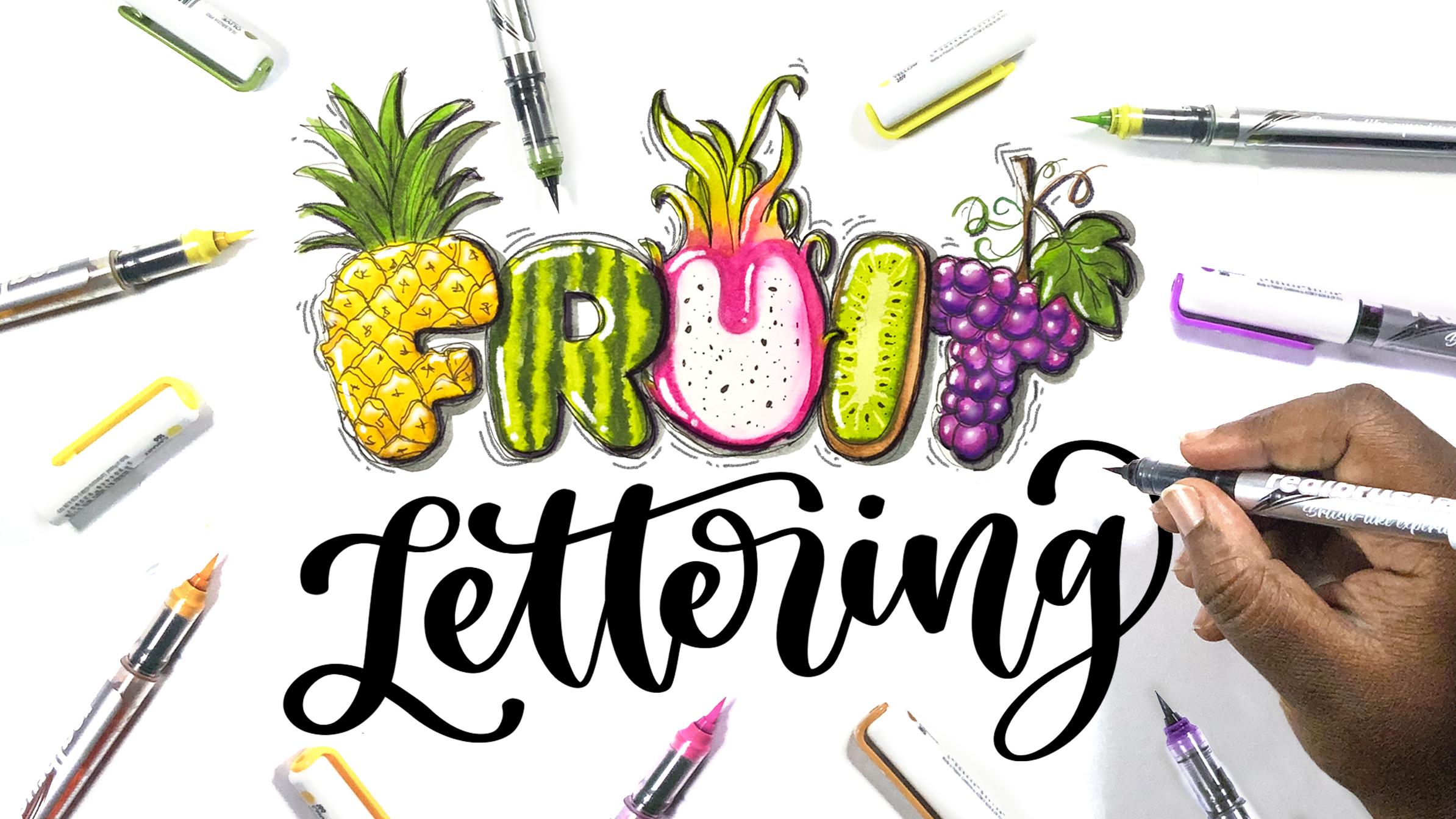
you how to create two sets of lettering inspired
by two different fruits, a watermelon and a dragon fruit, but you're free to experiment with another fruit
if you'd prefer. Class is for all skill levels. If you're a beginner, you
can follow along and create a single letter inspired by one of the fruits
that we explore. If you're more advanced, you can challenge
yourself by creating a whole set of letters or
even an entire alphabet. By the end of this
class, you'll have your own set of fruit
inspired lettering that's bursling with color
and creativity and the skills to create even more illustrative
lettering on your own. So grab your brush pens, and let's start lettering.
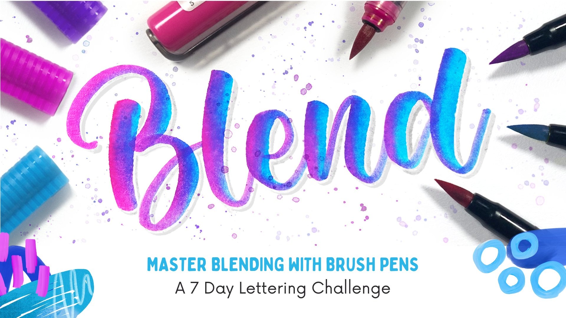
2. Class Supplies: For this class, you will need your basic lettering supplies, so a pencil, eraser, and paper to sketch your
letters and test out ideas. Then you'll need paper
for your class project. I suggest watercolor,
mixed media or Bristol paper if you
want to do any blending. If not, then marker
paper works as well. You will also need brush pens or markers to add your color. You are free to also experiment with watercolor or other medium. But I'll be using brush
pens in this class. If you want to add
details like shadows, highlights, and outlines, then you can grab
supplies for those. You can find the exact sketches of what I'll be doing today in the project section if you want to use them for
your class project.
3. 3 Ways Fruits Can Influence Your Letters: There are three main
ways that a fruit can influence the
design of our letters. That is its shape, its color, and its texture. The shape of a fruit can determine the
shape of your letters. For example, will
they need to be tall, wide, rounded, or angular? For a fruit like a cucumber, which is skinny and oblong, you can make your letters
skinny and oblong, as well. Pumpkins are large and have
a round or oval shape, so you can use larger bubble letters in
order to mimic that. If the fruit is too uniform
or lacks a unique shape, it may not work well. Like with grapes
or certain berries which are small and round, you would likely need to use
a cluster of these to get the desired effect instead of
using the individual fruit. The color of your fruit will provide the color palette
for your letters. Think about whether the
fruit has a range of bright bold colors or
if it's monochromatic. A mango has a vibrant palette with yellow, orange and green. So each of your letters can have a different combination
of these colors, making them more interesting. Some fruits like a lemon
or a banana that has a single yellow
tone may start to feel a little boring
if you try to use just one color for your entire
alphabet or a long phrase. The final thing that can influence your
letter is texture. This is how the surface of
the fruit feels or looks. Is it smooth, bumpy,
spiky, or fuzzy? Textures add depth and
interest to your letter forms. So you want to
choose a fruit that offers a variety of
textures to explore. For instance, a kiwi has a fuzzy exterior and
a speckled interior, which are really great
details that you can include. Strawberries are also a great
choice because they have a slightly bumpy texture with tiny sees embedded
on the surface. On the other hand, blueberries are smooth and lack texture, making it challenging to incorporate that visual
element into your letters. In this class, I'll
show you how to create two different sets of letters inspired by
two different fruits, a watermelon, which is super
easy and a dragon fruit, which will be a
bit more complex. Now that you know a little bit about how to use
fruits as inspiration, I'll see you in the
next lesson where we look for some
reference images.
4. Finding Reference Images: Before we can actually start
designing our letters, we need to get some
good reference images. Even if you can picture a
fruit clearly in your mind, it's easy to overlook some of the details that can make
your design stand out. So having a visual reference
in front of you helps you capture all the little details that make each fruit unique. You can find reference images
in a variety of places. Websites like Google Images or Pinteress are
excellent resources. Just type in the name of
your fruit and scroll until you find clear,
well lit images. You can also use clip art and illustrations for
inspiration as well. I prefer using Pintrest
because it allows me to create boards and save
my images for later. Another great option is
to take your own photos, especially if you have a
fruit in front of you. You can capture it
from different angles, zoom in on textures, and even experiment with different lighting conditions to see how the colors
change or look. Once you have your images, make sure you have them
easily accessible, whether it's on your iPad, on your computer or even
printed out so that you can refer back to them at
anytime when you're designing. As you are looking for
your reference images, you need to ask yourself, what are the main features? Are there any patterns or
textures that this fruit has? Watermelon has wavy
stripes on the outside, so that could make an awesome
pattern for the letters. You also need to ask what
colors really stand out. Dragon fruits have a bright pink outside with some green spikes, and on the inside, it has
white flesh with black seeds. So using a palette of those
four colors would make your letters instantly
recognizable as dragon fruit letters. Now that you know a little bit about what to look for in
your reference images, take a moment to find some that speak to you
and I'll see you in the next lesson where
we talk about how to simplify them for the next step.
5. Simplifying Images: Another important part of
the process is simplifying your reference images
because you don't want to include every single
detail that you see. Instead, you'll
need to decide on the features to
highlight what to omit, and how to make your design
look clean and effective. For instance, the seeds on the strawberry can be
reduced to just simple, evenly spaced dots well, with the watermelon brine, instead of trying to
capture the wavy lines, you can also simplify them into smoother, more
regular curves. And you can also use a
minimal amount of details. For example, if you're designing a latter
inspired by a pineapple, you can simplify that
complex spiky texture into a few diamond shapes rather than drawing
every single spike. Sometimes it helps to test out different levels of details
to find the right balance. So you can do one version with a lot of detail
and see how it looks. You can simplify it further by removing or reducing
some of those details. And then you can also
find a middle ground in between those and keeping
the most important elements. But before we jump straight into design
and custom letters, we need to understand
the three main things that make a letter
recognizable and readable. First is the overall shape. This is the big picture
outline of the letter. If it's a P, it still
needs to look like a P, even if you add details to it. You also need to think
about the structure. This is how the lines of the
letter are put together. For a letter like A, the structure is two
legs and a crossbar. Each letter has its own structure
that gives it its form, and you really need
to keep that in mind when you are creating
your custom letters. And finally, the balance. This is how the elements of the letters are spaced and size. With the letter E, the
crossbar is the same length or shorter than the other
horizontal lines on the letter. So even when you add
decorative details, you want to keep that
balance in mind so that your letter doesn't
feel off kilter or too busy. So now you have a basic
idea of what to look for. I'll see you in the next
step where we can now start designing our
letters from scratch.
6. Designing Letters from Scratch: Now we're going to design
our letters from scratch. So the design of each letter
is going to be a little different since each letter
has a different structure. Some are angular
like the letters A, E and H, and some are round
like the letters C, G, and O. So if I need to design longer words or an
entire alphabet, I group similar letters together and work on
them in the same way. For this lesson, I'm
going to demonstrate using two letters of
the alphabet, A and B. Whenever I'm starting my
letters from scratch, I like to start with
a basic block letter as the base of my design. This is a simple, easy to read
form of a letter that has enough room to add
personality and details in the next step. Once you have that
basic block letter, we can begin step two, which is adding key features
from our chosen fruit. So right away, you can see that a letter A is shaped
like a triangle. And even though
watermelons are round, a melon slice can have
a triangle shape. So I'm going to use that as
inspiration for this letter, and then just round
off the edges to keep with the rounded
shape of our watermelon. Then for the details, I'll add a line
separating the rind from the flesh and some
dots for the seeds. For the letter B, I'm making the overall
shape a bit more rounded like a large
bubble letter, and then I'm going to add
the watermelon rind pattern with a few vertical wavy lines. This is a more detailed design. But like I mentioned
earlier in the class, you can simplify this
even more by using simple vertical lines to
represent the stripes. At this stage, you can play around with different
ideas until you come up with one that you want to use for
your final design. Once you have your basic
outline for your letters, you can sketch the design onto your watercolor or
mixed media paper. I'm going to be illustrating
the word watermelon. You can work on this exact
same design if you want, or you can stick to
one or two letters, which is a lot easier. Then I'll see you
in the next lesson where we start adding
color and texture.
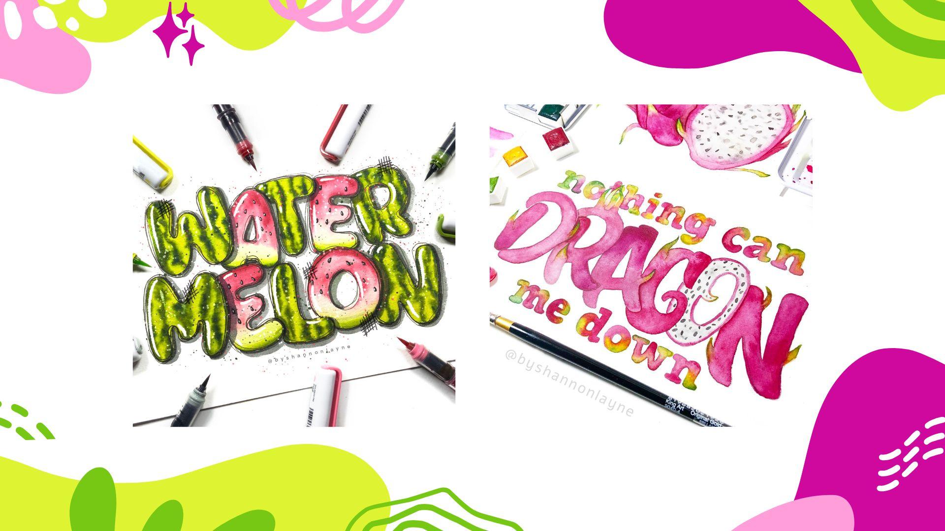
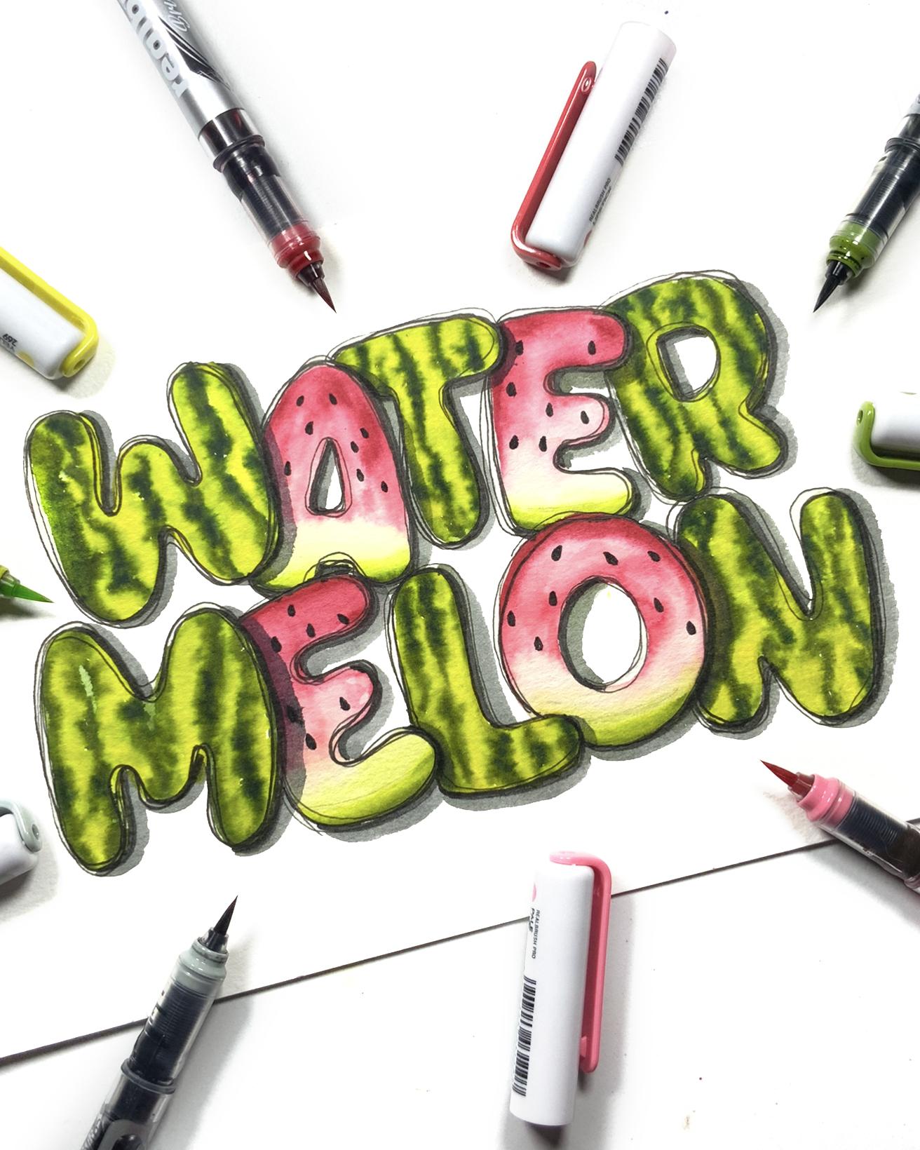
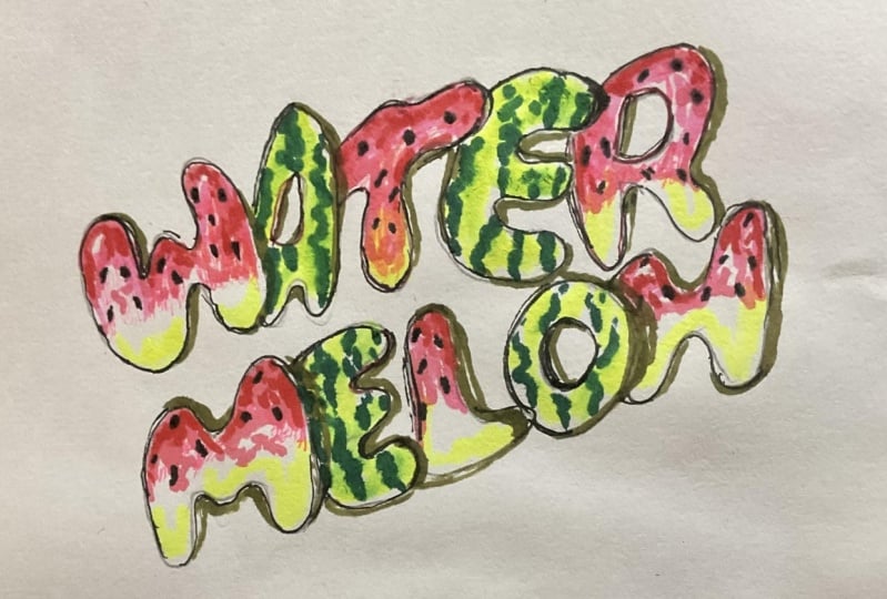
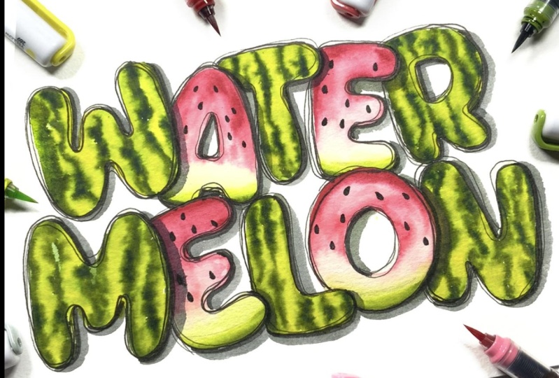
7. Class Project pt 1: Watermelon Letters: Now we're going to start adding color to our watermelon letters. So starting with our
light green first, you're going to add it to the letter for the part where you're creating
the rain texture, and you want to add this in
sort of a jagged uneven line. You don't want any smooth edges. You want it to
look very natural. So just take your time
and add your color. I am using a brush pen that has a bristle similar to
a real paint brush. So if needed, you can
definitely try this with watercolors as well
and use a paint brush. If you want to get a
similar line variation and you don't have
this style brush pen. Once you're finished
adding this lighter color, you're then going to get
your dark green marker, and you're going
to add that color in the remaining white spaces. I am also going to just leave
a little bit of some of those white spaces
in the parts where I feel like the darker color may overpower the letter too much. Once you're finished
adding that darker color, you're then going to
get your blender brush, or you're going to
use a paint brush and some water and then lightly blend the lighter
color into the darker one. So continue to add your
colors and then blend them together to create
the rest of this pattern. Then for the letters
that are going to be inspired by the
slice of watermelon, I'm going to start with my
light pink color first, and I'm also going to add these in some short, choppy strokes, and I'm going to
leave quite a bit of white space just so I can
have some color variation. Then I'm going to go in with my dark red and add
it to a few places. Then I'm going to use my blender brush to just
blend everything together. For the bottom part
of this letter, I'm going to start with
my dark green and add a thin line of color Uh, then I'm going to use
the blender brush to blend out the inner part of that line and then add some
of my lighter green to it. So the lighter green should
naturally blend into the darker one without you needing
to use your brush pen. You may need to use your
brush pen, however, to blend the light
green into the red. You have to be very careful
because you don't want these two colors to meet
because they may become brown. So you're going to have to clean your brush pen when
you find that you've picked up some of
that green just to make this a little
bit easier to blend. To complete this design, you can use a black
brush fan to add in your watermelon seeds on
the watermelon slices. And also you can add
some outlines and some shadows and just really have fun and bring
these letters to life. So we've just created
our first set of fruit inspired
lettering from scratch. I'll see you in the next
sesson where we look at how to design our letters
from a pre existing font.
8. Designing Letters Using a Font: Once your watermelon
letters are complete, I want to briefly show
you how you can do this with a fruit that is a bit more complex
like a dragon fruit. And rather than
starting from scratch, like I did with the
watermelon letters, I'll be showing you how
to use a preexisting font as the foundation for your
dragon fruit alphabet. This is a fantastic
approach because it gives you a structured
starting point while allowing you to add your unique twist based on
the fruit's characteristics. So let's talk about what you
need to look for in a font. First, it basic structure. Choose a font that
has a structure compatible with the design
that you have in mind. For the dragon fruit letters, you might want something
bold and rounded as it will complement
the fruit's curves and allow you to add the spikes. You also need to look
for its readability. So avoid overly ornate
or complicated fonts that can make your final
design hard to read. Since we're customizing
these letters, starting with a clear, simple font allows us to get creative without
sacrificing readability. You'll also need
to look for a font that offers a good weight
and something that feels substantial enough to hold all the decorative
elements that you'll be adding without feeling
too overwhelming. And finally, you want to pay attention to the
proportions of the letters. If they're too tall, narrow or wide, it might not translate well
to your fruit design. Ideally, look for a font where the letters
are well balanced, which can help maintain consistency when you start
to add decorative elements. The font I'm using as the base for my lettering is
called Osaka chips. It is bold and playful, and some of the letters
have spikes already added to them that resemble
the spikes on a dragon fruit. One thing that is
very important, before you start using a font, you want to make
sure that you have the appropriate
license to use it. I'm pretty happy with the
overall shape of this letter. So I'm simply going
to outline it and add a few of the dragon
fruit spikes as I go. Then at the top of the A, I'll mimic the top
of a dragon fruit. This way, the letter
still resembles an A, but it also reflects the
essence of a dragon fruit. Another recognizable aspect of the dragon fruit is
the inside of it, and those rounded letters like CO and Q would be a great
choice to represent this. So I'll use the
negative space on the inside as the white flash
of the fruit and the seeds. So as you go, take your time and experiment
with the features, try to strike a balance between inspiration from the fruit and maintaining the legibility. For my dragon fruit letters, I'll be illustrating
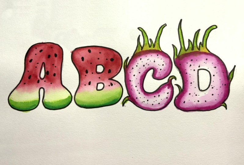
the four letters A, B, C and O. So when you're finished
experimenting, you can transfer your
design onto your paper, and in the next lesson, we're going to add color and
texture to these letters.
9. Class Project pt 2: Dragon Fruit Letters: Now it's time to add some color to our
dragon fruit letters. So I'm going to start with pink, and I'm going to use that to
colour the entire letter, but I'm going to leave out a
few white spaces as well as some spaces at the top of the spikes where I'll add
my color in the next step. When you're finished
adding your pink, you can then use a blender
brush or a pat brush and some water to just blend some of the color
into the white spaces. And you'll see that you'll have sort of a gradient
effect where you have some areas are lighter
and some are darker. This gives the design a little bit more depth and
even adds some texture to it. When you're finished
blending those colors, you can then grab your green and add it to the top of the spikes. Then lightly blend that
color into the pink, and you should get a really
nice brown transition color that mimics the real
color of a dragon fruit. Then for our next letter, we're going to add our
pink on the outside. Then use your blending brush
or your paint brush and water to lightly fade the
inner part of that line so that we are getting
that nice transition from pink to the white flesh of the dragon fruit. Oh. Then again, you're going to take your green and add it to
the top of the spikes. Using the blending brush, you're going to wet the inside
of the letter and then use a gray marker to add a few dots to represent
some of the seeds. While the letters are drying, use that same gray marker to
add a shadow to each one. I'm adding mine on the right and the bottom
side of each letter. Once your letters are dry, you can then use a
black file liner to add some more dots to the inside of letters that represent
the slice of fruit, and then an outline
and some highlights to all of the other
letters to complete them. And once your dragon fruit
letters are complete, I'll see you in the next lesson
with some tips on how to keep your letters cohesive
as we wrap up this class.
10. Final Thoughts & Wrap up: One of the challenges in
designing a full set of letters is ensuring that they all feel like they
belong together, while keeping each one unique. So before we wrap up, I want to share some tips
that you need to keep in mind to make sure that your
letters look cohesive. So even though each letter might be a different shape and
have different details, using a consistent color palette throughout will immediately
tie them together. If you're working with your watermelon
letters, for example, color all the letters using the same shades of
green, pink, and black. Another way to ensure
consistency is by repeating certain elements
across your letters. This could be a particular
shape, texture, or pattern. That you use in every letter. It's important that these
repeated features don't take over but instead act as a subtle link
between the letters. For instance, with my
dragon fruit, letters, I've added spikes
to both the letters depicting the inside and
the outside of the fruit. You'll also want to stick to the same level of
detail for all letters. So avoid having
one that's highly detailed and the others
being simplified. Try to keep that same level of complexity relatively constant
across all the letters. You'll also want to keep your letters roughly
the same size and thickness if one is too thin and tall while the others are
maybe shorter and whiter, it might start to look like they belong to
different alphabets. And finally, if your letters
feature brown soft corners, keep that smoothness
throughout the alphabet. Alternatively, if your letters
are inspired by sharper, more angular forms,
make sure that those are present in
each letter as well. So we've made it to the end of this class and I
hope you enjoyed learning about how to use fruits as inspiration for
your lettering. What we've covered in this class does not only work with fruits. You can use these
techniques to create illustrative hand lettering
inspired by anything. I'd love to know what you
think about this class, please remember to leave a review and don't
forget to share your class project
because I'm really excited to see how your
fruit lettering turned out. Thank you so much
for joining me. I'll see you soon.
 Shannon Layne, Lettering, Procreate & Art