Transcripts
1. Introduction: To some people, new projects
can feel pretty daunting. And to my biggest regret, I am one of those people. Where do I start? What will it look like? Oh, what about colors? And we all know overthinking
will only make things worse. I'm, I'm anymore Belle
shovel, a graphic designer, illustrator, and artist living in the beautiful
province of giving. I'm a multi interests
person with way too many
projects on my mind. And I like to say that I'm not working in the creative
field because it's easy, but because it's fulfilling. I have to say, I haven't always been a
persevering person. I am way more inclined to
give up the first obstacle. However, I find that perseverance pays a lot
in self-confidence. And this is why I'm here. Sure this class
is about creating a simple illustration with watercolor and colored pencils. But this class is
especially about the method I use to get
to the end of a project. This class is for you, if you are a beginner in the creative field and
don't know where to start. This class is also
for you if you feel intimidated by watercolor
as an illustration tool. But this class is
especially for you. If you would like to
pick up illustration. But feel like stuffing
before you've even started because
you feel overwhelmed. The project for this
class is a small, simple illustration of an animal with an element of
its environment. We'll start with the
brainstorming technique and then we'll go over
to thumbnail sketches. Next, we'll play with colors, experiment a few watercolor and colored pencil
techniques and draw the final sketch before creating
the final illustration, you will need materials
for sketching watercolors, colored pencils, brushes,
and watercolor paper. This class is a
simplified cheat sheet to artwork creation, meaning that even though our
process is small and simple, you can then take
it and apply it to bigger, more complex projects. In other words, it's a solid base on which
to build ready. Let's do this.
2. Your Class Project: Today we are going to work
on a small illustration representing an animal with an element of its environment. I'll show you my own process
for creating this and I encourage you to try it and
see how it works for you. You will need paper and pencils or an iPad for brainstorming
and sketching. If you watercolors with
pans and a water container, colored pencils, brushes,
watercolor paper. And if you'd like
some sort of board to tape or a stretch
your watercolor paper. We'll start with a simple
brainstorming technique to get us going and
start brewing ideas. Once we have decided what the subject of the
illustration will be, we will start sketching
thumbnails for composition. When this is done, we'll
make a Pinterest board for color inspiration
will then go into technical practice
to learn how to apply color in a simple
and effective way. Starting with watercolor
and then deepening the colors and contrasts
with colored pencils. The next step will be to create the final sketch and transfer
it to the watercolor paper. And lastly, we'll go into the final coloring
of the illustration. Voila, to set yourself
up for success. I suggest starting small, let's say in a four by 6 " size so as not to get overwhelmed by
the size of the project. The reason we're
working on this project today is that by starting small, we are making sure to build on solid foundations for bigger
projects in the future. The steps don't change that much once you move into bigger
illustration projects. And I strongly feel
about dividing projects into
smaller steps so as not to get overwhelmed
when you tackle on bigger, more
complex illustrations. The last thing I would
like to mention is this. Please don't be hard on yourself
when you try new things. I speak from experience
when I say that being hard on yourself will
only kill creativity. We are here to
practice and learn. And it's completely
normal not to feel completely satisfied
on your first try. So please, please
try to have fun and not only value
the final result. With this being
said, let's do this. Up next. Let's brainstorm.
3. Brainstorming With Mindmaps: Hey guys, thanks for
joining me today. I'm super excited that you decided to join me
for this class. The first thing we're
going to do today is a bit of brainstorming
with mindmaps. Now you may ask yourself, why should I brainstorm? I get all of my
ideas when I wake up and I never have to
think twice about it. If that's your case.
Well, good for you. But I, as a simple mortal, sometimes have to
deliver projects in their relatively short amount of time and have no
clue where to start. Now, if that is your case, I can show you the
brainstorming method I use not only to get ideas, but also to choose what ideas to include or not in a project. All sarcasm, left aside, mind maps are great, intuitive way to
get ideas on paper. I also find that they
helped me make connections. And while doing them, I often get interesting
or surprising ideas that I really would
not get elsewhere. The idea behind a mind map is to start from a central
concept and then you branch out two related concepts and
branch out again and so on. The final result is
some kind of spider web that you can then
observe and choose from. I would like to add that for me. It's very helpful not
to censor myself. This is the best way to get surprising and
interesting ideas. You can make choices later. But during the brainstorm, if an idea pops into your
head, just write it down. This method is simple,
easy, and unrestricted. It's like a word
association game. Mindmaps are also very flexible in the sense
that you could start with a very general concept or you could start with
something more specific. Once my mind map is done, what I do is I look at it and see what speaks
to me the most. I asked myself Which
elements inspire me? And if I'm stuck,
I may just choose random elements and
see how it goes. Alright, Enough with the theory. Now it's time to
show you what I mean with a practical example. My starting point for today's brainstorm
is the word there. I already know I
want to illustrate a bear and we have
to start somewhere. So that's it. I branch out to mood
and environment, adding words as
they come to mind. See how I move from one area of my
brainstorm to the other. This is fine. That's okay. In the name of non censorship, you can move wherever you like and you just add
ideas as they come. You think about it. You added somewhere. Sure. My bear could be in the water, in a river or in a lake. 0 accessories,
that's a good one. Scarf, iPad. Oh, cup of tea. Not sure a friend
is an accessory, But I said no censorship. So I'm going to leave it there. I could put the bear and
forest full of trees or on a rock
surrounded by ferns. Your brainstorm does
not have to be long. See, I already have a few elements that speak
to me a lot in this one, I seem to be leaning towards
Xen mood and their habit, I think are all be doing a bear sitting on Iraq
drinking a cup of tea. There you go. All decided. In conclusion, the main
reasons I brainstorm with mindmaps are to get ideas
on paper in a simple, intuitive way to
get interesting, surprising ideas and connections and also to help me
choose in the end. Now it's your turn
to try it out. And please share the
steps that you take in the projects gallery so we
can learn from each other. Up next for the
sketching in thumbnails. See you there.
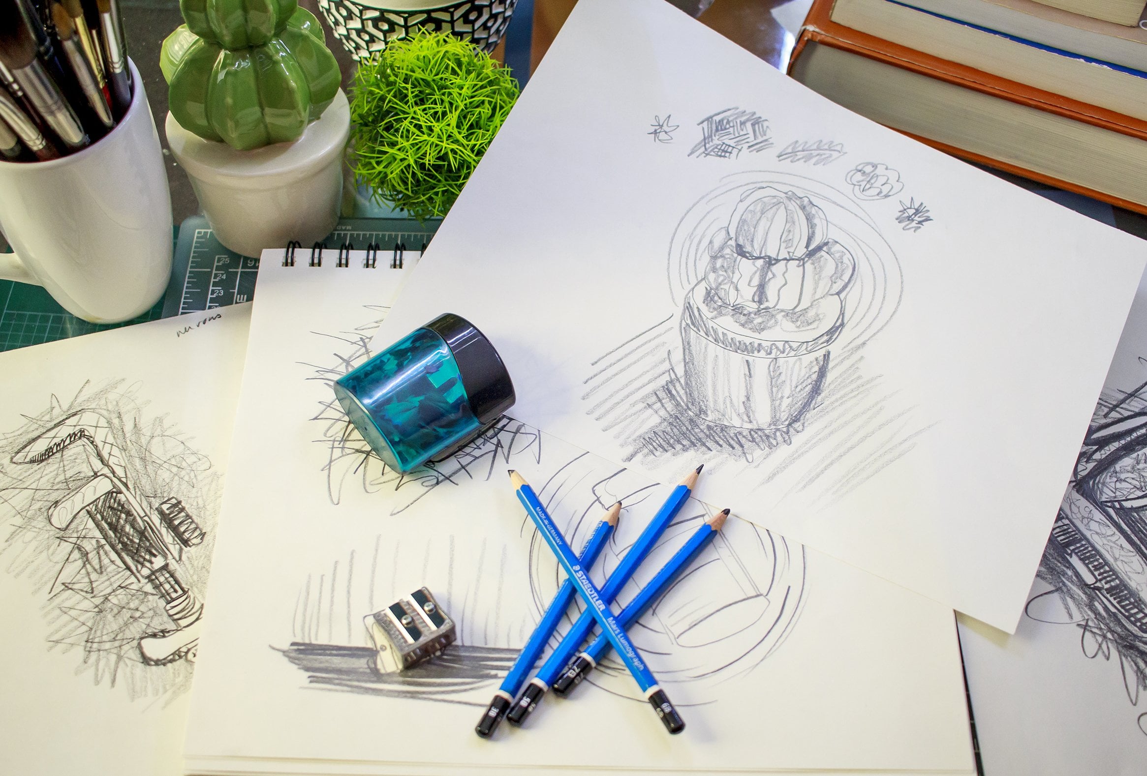
4. Sketching It Out In Thumbnails: Now that we have chosen a subject for today's
illustration, it's time to start sketching. In pretty much
every project I do, either in illustration
or in graphic design. And even maybe
when I'm painting, I always start by sketching in a small-scale in what
is called thumbnails. The reason I do this is
to help me make decisions more effectively when
sketching out in thumbnails. You don't have to be precise. And you can sketch out a
number of compositions in a short amount of
time before going full-scale and
your final sketch. Still, you will see
a number of things in a thumbnail sketch
such as balance, emphasis, the proportions, and the movement of
your compositions. We are not going over composition extensively
in this class. But let's see what
we can try out in thumbnails before
going full scale. You can definitely test out the orientation
of the support. So either going vertical or
horizontal with your format, or if you prefer
working in the shape, instead of filling
out the whole sheet. You can test that out
to like I'm doing here. You can also test out
the point of view. The first I am trying out
here is a bird's eye view. Of course, it's a thumbnail, so you may have a bit of
trouble seeing the details. But here's my bear lying down on the ground with a cup
of tea next to it. You could have the viewer
be at a high angle. So looking from a
higher point in space, like I'm trying out here. Or maybe this is my
favorite drink these days. Maybe the foreground
is per minute. So you can see elements a bit unfocused in the foreground. As if the viewer, we're hiding in the bushes
somewhere in his spine. A bit creepy when
said like this. But it's a neat trick
that can drive your eye to the main subject
of the illustration. Is it a very close-up
shot like I'm doing here, where we can see my
little bear from up-close holding onto its
cup of tea very dearly. See here, I cheated and drew the framing around
the artwork at the end. It's a trickier can use. If you're not sure how
to frame your subject, you draw more general
shot and kind of zoom in on the
interesting part. As you can see here, these two sketches
look alike a lot. But the first one
is very symmetric, while the second
one is off-center, giving it a different vibe. Also, keep in mind
the rule of thirds, which is a proven way to
keep things interesting. By placing the
important elements along the lines of the grid, you are more likely to achieve a balanced and
dynamic composition. Of course, you can
break away from these rules and explore, but this is a good
starting point. In conclusion, starting with thumbnail
sketches is a good way to test out compositions and make decisions rapidly
and effectively. It's not all set in stone
and it can still change. You have a good foundation to build on for your final sketch. I encourage you to go ahead
and try it out for yourself, and I will see you
in the next lesson. Up next, we'll play with
color. See you there.
5. Playing With Color: It's time for me to be
vulnerable with you guys. For some, color matching
comes naturally. For others. It takes work and a lot of color
theory instruction. But at some point they get it. For me. Things are different. I'm still waiting for that
moment where my brain will go. I finally get it. I used to be ashamed of it. But now I realize that we all have our strengths
and weaknesses. And that if I keep working, maybe someday I
will get it or not. Anyway. I still need help picking out
my colors and that's fine. Today. We'll keep things simple and find
colors intuitively. Let's find 23 colors
for our illustration. And then we can
decide where they go. That's fine. Illustrations that you like and thin them on a
Pinterest board. It should give you an idea of the colors that speak
to you the most. Then you can pick
two or three colors in these illustrations. And then you can get
your color wheel or your watercolor to find the closest colors
that you can match. Do the same with your
colored pencils, but I suggest that you go a few shades darker
to create that. Let me show you how I do this and you will see if it
makes sense for you. This is my Pinterest homepage, and there's already lots
of cute stuff in there. This image right here hits
home for me on the colors. So I'll pin it in a newborn that I will
call their inspiration. Now that this is done, I am going to search for more inspiration because
this is just the homepage. And even though it is
filled with cute stuff, it's not specifically related
to what I'm looking for. Let's search for
color inspiration. I'm getting warm fall vibes. It's fall right now and I'm getting all the
vibes right here. This image right
here is soft green. It's closer to what
I'm looking for. I think I wanna go with
forest greenery vibes. Let's spin it and go
on with the search. This one right here
has soft green too, but a pink punch of color. I like that. And maybe that one too. And more earthy tones. Let's continue
looking in this page. Not specific enough yet. Again, I'm ready to zoom in
on the green forest t colors. That search again for, Let's say forest
illustration inspiration. This should do the trick. I think we're getting there. Look at all those trees. This illustration right
there, I love it. Let's spin it. This one's a bit dark. That one though, loved the vibe. And this one too.
As you can see, I'm really starting to
zoom in on what I like. And I will continue
looking to make sure, oh, that one here is really
great, loved the lighting. And I think I have
enough for now. Let's look at the whole
board to get an idea. Yeah, that looks pretty good. I could have gone on forever, but I have all I need here. That one right here. I really like the mix
of the dark and pale green along with the
brown and the orange. And I will go with this one
for my official inspiration. Let's jump to my
color wheel to match the colors that I own
as closely as possible. I made this one a while ago
as a way to know exactly how the colors in my watercolor
kit will appear on paper. It's not only very useful, but it also looks very
pretty on my wall. Just kidding, but
really as a tool, it's super useful. For my illustration. I am choosing this
permanent green that I can use in layers or in
gradient from light to dark. I will pair it with the
sepia tone seems to match the colors that I chose
earlier for the orange. Well, this is simple. I'll go with orange. Okay, Now on a piece
of scrap paper, I'll match the colored pencils and I'm going to be using to darken or deepen the watercolors
for this sepia tone, I have two pencils in mind. The second one is
a perfect match, but I actually want a color that will differentiate
from the watercolor, and this one won't do it. So I'll go with the first benzyl and let's do a swatch
on the paper here. I'll do this to check out
all of my colors together in the end to make sure I liked the result of the
colors I'm matching. I like to check now, so I don't have a big, unpleasant surprise on
my final illustration. Let's go in for the green now. Note that for the green, I'm choosing two greens, one for the pale green and
one for the darker green. I chose only one watercolor and colored pencils
with differentiate between the pale and
dark green alone. Let's fast forward for
the orange because the principle remains the same and I'm certain that
you all got it. Now, last thing I'll add is a pale shade of all of my colors to check out
the possibilities. And that's it. I encourage you to go
ahead and try this method, especially if you don't know
where to start with colors. For today, we can
keep things simple, but this also works for
more complex projects. Don't be afraid to
show screenshots of your Pinterest boards
in the project gallery. I would love to see
what you come up with and how this is
working out for you. Up next, we'll be experimenting
with cool techniques. See you there.
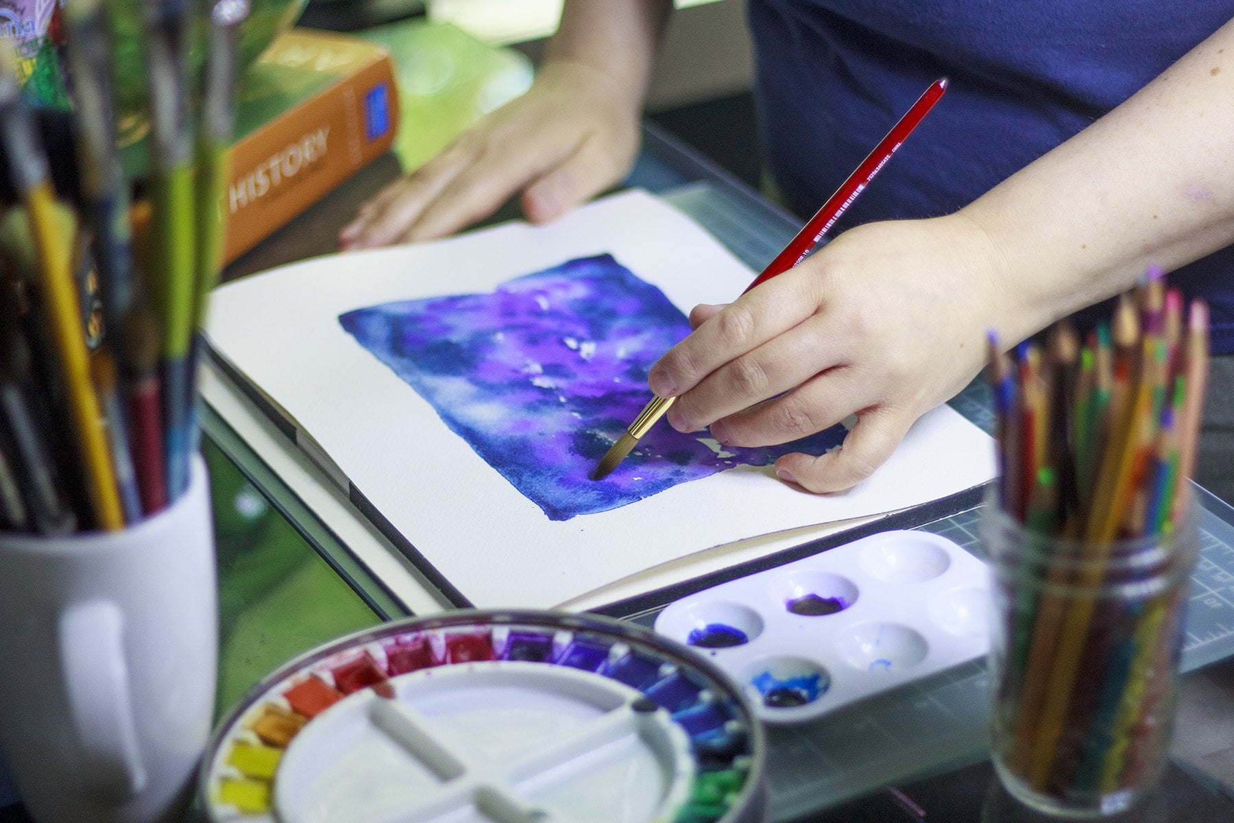
6. Experimenting With These Cool Techniques: Hey back everybody. So glad you're still with
me for today's project. We are at this very
exciting point in our project where we can finally get our brushes and pencils out and try out a
few techniques. This is a very
technical lesson and we'll mostly be a demonstration. But here's the list of
things we are going to go over with watercolor. I'm going to show you how I lift pigment to
fade colors in. I will also show you how I lay your colors for shading and
to add volume to shapes. And lastly, I'll show
you how I sometimes add an unfounded line to
add shadows and depth. Then over the watercolor
swatches I just created, I will show you how I use colored pencils to add an outline to some
shapes to give them even more depth and
definition and shade very delicately for the same reasons until I am satisfied
with the result. If you're ready, let's go
into demonstration mode. First thing I like to do
is drop a bit of water and my pigments and wait for a
moment to let it sink in. I kind of forgot which
one is the right brown. So I'll look with my color
wheel. There you go. Here's a very short note on the brushes I use when
creating illustrations. I like to use synthetic brushes
because I find that they absorb less water and it gives me more control
over the result. And my fine arts practice, I use natural bristles
for watercolors, because on the contrary, they absorb more water and the pigment spreads more freely. For today, I'm using
my Princeton brushes, my favorite for
that kind of work. It's really a trial
and error thing, finding your favorite brushes. Now that my pigments
have absorbed water, I'll transfer them
to a small pylab. Simply because I prefer
working this way. I'll keep my pigment pans close by in case
I need to refill. First thing I'll do is
the lifting technique. To do so, I'll apply a watercolor wash and right
away with a clean wet brush, I'll go over the
edge of the swatch and this brush will
absorb some of the color, creating a blending effect. This technique takes
a lot of practice. You will see that
the more I do it, the better it gets. I seem to be a little
rusty, but that's fine. Plus there's no water on my paper and it's a
bit harder to do. I'll do it on wet paper so
you can see the difference. Much better. Next thing I'll be doing is combining payer layers with lifting
pigments to create volume. Let's apply layers
and let dry a little. I'll also paint my brown layers for the third
technique right now. This way they'll
have time to dry. It's dry enough that I can go
in and add an orange layer. And once again, come
in right now with a clean brush to lift pigments and create
a blending effect. It makes a very smooth
gradient and creates volume. On the third one, I'm
just going to show you what adding a layer
without blending does. It can be very interesting
for lighting effects. Last technique I'll
show you is just adding a non faded line to
your watercolors swatches. It can create an
interesting shadow, a bit more punchy, more illustrative, cartoony, also super interesting to
try in your illustrations. Now add some random
washes and let them dry. So we have a few washes to work on for the colored
pencil techniques. Note that when you
have a wet wash, you can add some
pigment to it to intensify it or
to add volume to. The pigment will travel on
its own in the wet wash. This is called wet
on wet technique. It's fun to do and I
encourage you to try it even though it's not in
our official program. Once your washes a dry, it's time to get your
colored pencils out. First, I'll add a
very fine line to the green washes to add
a little definition, depending on the
pressure I apply, it can be very subtle. On the stronger washes, I'll apply more pressure
to give it more power. I also have my forest
green pencil here, and I can use it for
even more definition. The other thing I want to
show you is how to add depth shading very
delicately in your washes. You will have to experiment
to get the effect you want. But this is a very
fun effect to do. It gives contrast depending on the strength of the
shading you apply. I start with the line, then I go in and shade
a little if I want to. You don't have to add shading, but sometimes it's fun. You can also add texture
with the pencils, such as for fur or for
details like eyes and lashes. Let's do it with
the orange washes, line, shading and texture. And on the brown washes. To recap what we've done now, we've looked at lifting
pigments to fade colors. We've also combined layering
and lifting and learn to apply an unfettered line
for a more cartoony effect. Then with the colored pencils, you can add subtle
lines for definition. Add shading for depth
and texture for a little interests.
There you go. A few fun techniques to try out and to include in
your final project. It's now your turn to try
these cool simple techniques. Don't forget that it's
very normal not to get the perfect result
the first time. Especially with watercolor, it's a medium that can be quite
unpredictable at times. But it's the whole beauty
of it. To be honest. It's the whole reason I use watercolor because I'm
such a control freak, get hard and it
forces me to let go. To conclude this lesson. I encourage you to practice
these techniques as much as you can before going
into the final artwork. Up next, we're up for
the final sketch. See you there.
7. Drawing The Final sketch: Now that we have brainstorm, sketched in a small format, experimented with
colors and technique. It's finally time to
draw our final sketch. I'm sure it's pretty
tempting to skip this step, especially if you're eager
to see the final result. But bear with me, there is real purpose to this. All start the
demonstration right now and I will
explain as I draw, I start by choosing my
favorite thumbnail sketch. If I haven't already, draw my frame at
the right size with a very pale grid of thirds to
help me guide composition. And now I start
sketching full scale. Up until now, my sketches
have always been in a smaller format than what the final
illustration will be. This is the first reason I
want to do a final sketch. I want to establish the
illustration in its final size. It will also help me get
rid of any doubt I may have about where to place the main elements
in my composition, such as the bear itself and
the cup of tea in my case. Keep in mind that you are
the one deciding the level of precision you are going
to achieve at this stage. Personally, I like
to be quite precise, except when it comes
to the background. I like to leave some
elements to inspiration. I do it in my digital paintings, but even more with watercolor, because I like to be
surprised by the medium. In this illustration. The background is
very simple and there isn't much to be left
to interpretation. But still, I won't be as
precise in the background is I will be with the main
subject of the illustration. Don't be afraid to take
your time when you draw. I know social media
surrounds us with the idea that artists are working
at supersonic speeds. Hello reals. But it's really okay to take your time to correct
anything you're not satisfied with and to really just enjoy what you're
doing at the moment. I honestly just refuse to pressure myself
into working fast. I opted out of this
kind of thinking once I realised it actually was not helping me working faster to put that pressure on myself. I strongly believe that
planning and giving myself space helped me more
than pressuring myself. As you can see, I like to erase the lines from
the grid at the end. This is just a better way for me to assess the
composition as a whole. Without lines cutting in. You certainly don't have
to draw these lines in the beginning and don't
have to erase them either. It's just something
that works best for me. Adding the last details, making sure my lines are contrasted enough
for the next step. And voila, once you're done
with your final sketch, I suggest that you choose
where to apply your colors. If you would like to
skip this and prefer to leave this to a spur of the
moment inspiration thing. You can. I simply prefer
not having to take that kind of decision
in the final piece. Because then I can concentrate on the
technical side of things. And there you have
it. It's your turn to go ahead and try. And please don't be shy and share your sketches in
the project gallery. As I said before, the purpose of the final
sketch for me is to take away the guessing of
the final illustration. The majority of decisions
will be made in advance. So I can focus on the
technical aspect. In the end, I take my time, enjoy the process, tweaking until I'm
satisfied with the result. I don't always use
the same degree of precision and
the final sketch, but I make sure I
know where to place the main elements and also have a general idea of where
the colors will go. In the next lesson, we are creating the
final illustration. See you there.
8. Putting It All Together: Our Final Illustration!: Well, this is it. Final illustration, guys. Here are the steps I'm going
to take to achieve this. First, I need to transfer my final sketch to
my watercolor paper. Then I'm going to
start applying colors. Starting in light
watercolor layers. I will gently add watercolor
layers to add volume. And then I'll go in with
the colored pencils to add even more volume,
depth and definition. Ready? Let's do it. Okay, I'm ready to transfer my final sketch to the
watercolor paper of my choosing. Most professional
watercolor artists will stretch their paper
before starting to paint. And I sometimes do it, especially if I'm working
on a work of art. But this is a whole
different game. And for today, this is
not where I'm going. Watercolor paper
comes in many shapes and sizes and in
different grains. You can buy them in big single sheets that can be cut to the size
of your choosing. You can also buy
them in huge rolls and pads in tablets or n blocks. The only thing I recommend for today is that you work
on a sheet of paper that has a heavy enough
weight so as not to buckle as much underwater because this can get
very frustrating. The reason I
mentioned a sheet of paper is for
transferring reasons. If you are working on a block, you will not be able to
transfer using a light table. Don't get me wrong. This can be fun. But for today, I would like
my illustration to look as close as possible to the
final sketch that I have. The paper that I have
today is 300 pounds. I think it should
not buckle too much. I've also chosen a
cold press paper with fine-grain to get better details
with my colored pencils. I started by tracing a
rectangle to determine my final format and make sure it's in the center
of my sheet of paper. Now I can place my final
sketch underneath with my watercolor paper
on it and tape both in place to have a
stable surface to work on. I can start tracing now, very likely not to
damage the paper. As you can see, my paper is quite thick and this
is side tracking me a little because I
don't see the sketch as much as I'd like. It's okay. I'll just make sure my
transfer is up to my standards by lifting the sheet to check the precision
from time-to-time. Note that your pencil
lines will show through the light
watercolor layers. So think about
this when tracing. I for one, don't really mind seeing graphite lines in my art. But if it's going to bug, you consider tracing
very, very lightly. Let's turn off the
light table and add a few details to make
this to my taste. Careful not to damage the
paper when you erase. A few adjustments here, a few details there. Alright, this is done. By the way. It also works in a window if you don't
have a light table. Let's start by
applying pale layers of watercolor all
over the artwork. Don't forget that it's
very difficult to go back in time if
you've applied color, but men to leave
this area white. This is a good reason
to take your time. Also, note that you
might not see it because I fast forward
through this demonstration. But I often let the color dry before painting adjacent colors, because if the first
zone is still wet, the new color will
bleed into it. It makes for a cool effort. But only if that's
what you want. I can see that the
rock will have no definition from
the bear whatsoever. And I sort of knew
that from the sketch, but left it as is. I will come up with a
solution while I paint. I'll start adding
shadows in a moment. Layering on top of
the first washes. You can see that I use all of the techniques we've
checked out earlier. But I mixed them up
because my painting has become a very
organic process. You can also know that while I demonstrated the lifting
technique with two brushes, I sometimes get tired of alternating the brushes
and do it with the same. It means you have to wash
your brush quickly to lift pigment and dip it in the pigment every time
you want to add color. I'm not really sure
why I prefer this way, as it seems more complicated
and less intuitive. But all I can say is that it
comes to me more naturally. Here you can see me apply an unfiltered line to
the side of the bear. I really like to do this on
the side of cute animals. I think it makes them
even more adorable. Okay, sorry about the 180
degree rotation here. But because I'm right-handed, this side is always
harder to bite. So bear with me. Adding some shadows
and details here. Since watercolor is more unpredictable than
other mediums, I suggest you
practice, practice, and practice again until you
feel you have more control. About the rock. I've had an idea to
differentiate it from the bear, but I'll try it on the testing paper first
in case it doesn't work, I'll add a layer of green on top of the brown and
see how it looks. Oh, interesting. It makes them glow. I'll do it on the illustration. It's super subtle, but it's just enough to contrast
the two elements. Before going in with
the colored pencils, we need to let the paper dry. Alright, let's start with the bear adding contour
lines and for texture. I love this step. It makes everything
come together nicely. Mouth, nose, eyes, and eyebrows. So q. Now, let's shade in some shadows to create
contrast and depth. Time for a little bit of orange. I was eager to define this
cup of tea a little more. I thought it looked
like nothing before. I think the colored pencil
defines it really good. Little flowers here and there with some shading
to make them pop. With the green. I'll take time
to add some grass blades. And with the darker green, I'll add even more shadows and a bit of texture and the grass. For the rock. I'll start with
the sepia tone and pencil, but switch between this
one and the green one. For a softer look, I'll add shading for shadows and a cross hatching texture to differentiate the pair
from the rock even more. To finish up, I'll come
back to watercolor. Yes, yes, you're
allowed to do that. But beware of
overworking your piece. I'll add details and a little bit more shadows on the bear to complete the look. And I'll finish this here because I really have
a tendency to overwork my illustrations
and I prefer having a light feeling of being
not completely finished. Then going too far and not
being able to go back. And voila, now it's
your turn to try. Don't forget to take your time. Work in light layers and deepen the color is using the colored pencils
to your satisfaction. And please, please
share your work in the project gallery so we
can learn from one another. I'm so curious to see
what you come up with. Up next, a bit of a conclusion.
9. Conclusion: We're all done. Great job guys. I'm so glad you decided to spend a bit of time
with me today. We have gone from
brainstorming to find a subject to sketch in
thumbnails for composition. Then we have gone on to find
some color inspiration and to test out a few watercolor and colored pencil techniques. In the end, we have
created a final sketch, transferred it to
watercolor paper to create the final
illustration. What a journey. I really hope you've picked up a few technical
tricks along the way, but I mostly hope
you remember that by breaking down
projects into steps, you can tackle on anything
without the overwhelm. Once again, please
don't be afraid to share your project
in the gallery. I love a good conversation
and I will give feedback, do not hesitate to reach out. It will be my pleasure
to connect with you all. Thank you so much again
for taking the time. And I hope to see you
in another class.
 Amélie-Maude Bergeron, Graphic designer | Artist | Illustrator