Transcripts
1. Introduction: Hello, I'm Jennifer Nichols. I'm an artist, a teacher, and a fabric Designer. Today we're going to have fun with a loose and highly textured style of illustrating using the free-hand selection tool in procreate. If texture is not your thing, you can turn down the texture and still have a lot of fun with this class. I'll teach you some tips and tricks on how to get a really cute animal look to any animal you want to create. This class is not about how to draw animals. So I'm going to provide you with a few sketches to get started so you can jump right in. For anyone who's curious about how to sketch out a cute little elephant. I did include that lesson as well. I've also included 18 brand new texture brushes. I'm really excited about these pressures and I can't wait to see what you create with them. I'll see you in class.
2. Downloads, Brushes, and Canvas Set-Up: All right, this is actually from a different class. But just to show you how to get to download. So you go to the class, you go to this projects and resources tab. And then over here are the downloads and you'll probably need to tap seed more and then more will pop up. So from there you'll have brush sets. The swatches are the pallets. Then there's jpegs, dot procreate files. All of these things will, when you tap them, you can opt to download. And then if you watch up here, and this is Safari, and you need to be in a browser, not in the sculpture app. And you need to be in this landscape mode. So tapped download. And you can see up here this little arrow to still little bounce. And you can download everything and then go to here. And it will bring you right to it in your files tab. So that looks like this. And if you have a lot of stuff there, you can just go to recent and it should be the very first few things. And for brush set, you would just tap on it now. And it would go right into procreate. It will be at the very top of your brush sets. For jpegs, they'll go into your camera roll if you want them to. You can keep them here as well. And for the swatches, you can tap on them from here and they'll go to the very bottom of your list of procreate pellets. So any procreate file we'll go to the very first. So, right, not in a stack. So right here in your gallery, the very first spot, if you download a procreate file, let's go ahead and start a canvas as well. So tap this plus sign. And if you don't already have a good size canvas, it doesn't really matter what size you use here. I'm gonna go with a ten by ten. So I do have it in my list, but I'll show you how to make that. So tap that plus sign. I go to inches and ten by ten. And I always do 300 DPI. And then I always stay on this color profile here. The very first one under p3. P3 is not super compatible with other apps yet. So if you ever bounce around between apps, the colors will be slightly different, which is not ideal. So I just stick with this. It's great. First spoon flour and things like that as well. And tap create. Alright, your brush set is called selection tool class. And this very first one is pulpy paper. This one you see on my list is the 6B pencil. But it is just from the basic procreate sketching. So you can just go grab it right out of there. It looks like you're pulling it out, but you're actually but just pulling out a duplicate and go right up to where you want it and then drop it in. So you can see if you come back down. It's still there. It didn't disappear like it looked like it was going to. So I'm gonna delete that. So this is now a duplicate. All right, you should have two swatches. If you go over here to this palates. Thus, watches will be at the very bottom of your list and you can, you can grab those. Let's see, this, hold onto it and you can move it around and reorganize. So I'm gonna have my near the top. I have one called Elephant and this one called 20-20 when palette be cool and warm. This is a palette I keep using because it's a really great pallet. So if you have it from a different class, like my character design class, it will be a little bit different. It has these three added right here. So we're going to first come to this palette and go to this tan color here. On the pulpy paper brush. This pulpy paper brushes a tiny bit different. I did make some adjustments. If you have this from my, either my typography class or my character design class. Go ahead and grab it again. Maybe you delete the other ones. I just made it so that the pope size can be changed as well. So we're just going to go over that in one stroke. Fill the whole page before you lift your pencil up. And sorry, I'm at about 25%. It's not too big of a deal what percentage are at, it just changes the size of that mesh here. And then I'm going to rotate my canvas just to get a different texture with my next layer. So go to a new layer and then go to that. Oops, where's my palette? Go to the gray color on palate, this gray right here. And we're going to do the same thing all in one stroke. Cover the whole page. Alright, that gray layer is going to get set to colorbar. And this tan layer is going to set to multiply. I'm going to add another layer and just drag it down below those and group my two texture layers together. I'm also, I personally want to change my background color just a little bit creamy, so I'm gonna tap on the background. Go back to that same color palette. I should have just selected default and go to this creamy color right here. You can test out some colors on, we're going to be drawing on layers underneath these two texture layers. And you can test out some colors with some random brushes and see if you get a good color for what the little color indicator shows it should be. If it's too dark, he might want to lower the opacity on one or both of your texture layers. So you can play around with those to your preference. And as you can see, you can see the cool pulpy paper texture through everything that we do now. So I love that and that's just my preference. You can just simply go without it for this whole class. So I'm not going to spend a bunch of time going through all of these brushes. Most of these are brand new brushes. If you've taken a lot of my classes, I know sometimes I duplicate like Gems, 6B pencil and things like that. And the size of this pulpy paper brush. All of these are brand new. So go through and play around and see what they can do. Add pressure, lightness, do all sorts of things, and find some favorites. You have a JPEG that has this little indicator, just to show you what some of the brushes can do. I also encourage you to go through all of the native procreate brushes and find some really fun textures. I provided this JPEG for you with the specific names of some, and they're all in kind of various categories. I really love artist CRAN and Nico rule. Those are some go-to brushes for me. But these are all some really great textures. And I chose textures that were sort of dry so that they're not smudging paint around there, just kind of adding texture. So that's something to think about. So I'm not getting like the oil paint brush and turpentine and stuff like that. The other thing you can do when you're playing with brushes is set that size to the maximum size. It stamp it, and see what you can get out of a stamp. So these are some of my brushes I provided for you and some at the stamp looks that they give. After you're done playing with all these brushes, come back for some pros and cons on the, using the selection tool and all the different things that we can do with it. And then we're going to illustrate this super cute elephant.
3. Selection Tool Basics: First thing I want to show you is when you have something selected. So you've used this ribbon tool on free hand or any other, any other thing? When you select something and you tap that little circle, that completes your selection. The lines around your selection is called the mask. The mask, the mask visibility is adjustable. If you go to the wrench tool, go to prefs, and then right here, selection mask visibility. So I guess that's called the selection mask, not just mask. And you can turn it way high or low. So there's going to be times where you want to be able to see really clearly. Maybe you have some release small selections. And then there's going to be times when you want to turn it down because you need to see a sketch layer under there. So you can adjust this while you have an active selection. So that's a pretty important feature. We're gonna be using free hand. We're going to be drying a cute animal. And so you select something and close it. You tap the finished dot where you started and that can have seals it up. But if you forgot something, say you want to say this was a face of an animal and you wanted symbol spiky for up here. As long as you're on ad, you can add some more. So maybe I want to do that and then come over here and close that shape. And now I have this little spiky area selected as well. Maybe I goofed and I wanted to finish that circle a little bit nicer. It can come around like this. If I want to remove a section, if I came down to low right here, I can make sure we move is selected. And that just removed that little section down there. Maybe I want to remove a doughnut shape in the middle. So just make sure you're on ad if you need to be on add, we're going to mostly be on add. Invert is just going to make this shape the masked, the selection mask. So right now we can color. If we just choose a brush. See helps us go to the right precious. So I'm on my flat streaky paintbrush. This has kind of a flat paintbrush edge. So right now we're just coloring the selection that we made. I'm going to two-finger tap to undo, to get all the way back to here. If I invert, then when I color and coloring everything but the selection, that comes in really handy, copy and paste will copy it onto a new layer. And we're not using that today. And feather feathers the edges so you can tap it and it feathers the edges so that when your selection is colored, you don't have that super crisp line. That comes in handy for a lot of things, not today though. So I'm gonna tap the ribbon tool to get out of this election and minister again. And this time I'm going to tap color fill. If you use color fill, remember to turn it off next time you use selection and you don't necessarily need Colour Fill. It will remain on until you turn it off. So colored Phil is going to do any complete selection, is going to fill in whatever color I have selected. So the cool part about that is if I want to just do some tiny shapes all around, I could do that. And you can see how they're still all highlighted. And that is really cool because I can actually change the color of all of them all at once. And when I deselect, they're just filled in on a layer. Whatever layer you were actually on could've been right on top of some other stuff. So the downside to color fill is say aye, when it's some hearts and oh, I didn't want that colors, but that's cool. I can change the color now. I'm gonna change it to something else. This is all great, great, great. You don't have to be super picky about the color you start out with because you can change it. At this point. I could even go back and alpha lock this layer and change it entirely after the fact as well. But that's all I can do. So I can't now go to another layer and add some texture on top. So soon as I tap Layers, my selections gonna go away. So it's gone. When I do this without color fill on and I just make a heart shape, I can do all sorts of things. This selection is going to stay on. I can come over to my brush, I can fill it. I can drag and drop and fill it. That's going to be a pain if I have a whole bunch of little things. But I can fill it. I can go to a new layer, change my brash, change my color, tabs, some little things here and there. I can do all sorts of things, even come to yet another layer, changed my mind entirely about what I'm going to do. So the selection is staying there. Compared to the color fill 1s. I even opened that layer menu, it went away. The selection went away. So this isn't a class on clipping mask, symbol and modes. But I wanted to show you really quick if we have a nice color loops or our heart here, let's drag and drop. If I am, for example, short on layers, I might want to just add my texture to this same layer right now as we're going along so I can keep changing my brush. And that's not a very pretty color. And, and adding all sorts of colors and textures right onto this heart. All in the same layer. If I have plenty of layers to work with, I am more likely to come to a new layer. I can either keep the selection on and do all the things that I just did all on the other example of doing it all on the same layer. I can do it all in with a selection on, or I can simply turn the selection off, go to that new layer and top clipping mask. And then it's doing the same thing. And it's only showing up on the heart because it's a clipping mask. The benefit to doing the clipping mask is if you come back and decide when that hurt shape is kinda funny over there. I wanna go back to that layer and go back to that color. I'm not sure what color that was. Maybe this one and change maybe even just he's the selection tool and fill that Hardin right there, the clipping mask of purple is appearing on top of that new little added part of the heart as well. So that's kinda nice to be able to change the shape of that base layer a little bit and have the purple still showing up. The other benefit is I can also change the blend mode of what ever I have above it on a clipping mask. So I left blend modes. So this is my preferred way of doing things. If you don't have a lot of layers, you're probably going to want to either just have your shape, fill it, and then do your things all on one layer while it's selected or take the selection off. And alpha lock the layer and do all the things you want to do on that same layer with alpha lock, that's all in one layer. That means you can't choose the color except for maybe hue saturation, brightness. And you can't change the blend mode of the purple. But those are two perfectly fine options and everybody just needs to find the best way that works for them. We're gonna be doing a little bit of everything. This is another thing to think about when your using a base layer, like I said, with the heart and then the clipping masks. This has a base layer that's actually the same as the background color of a leaf. And then the texture is on a separate layer above it. It is completely opaque. You can't see the blue background. This is just the selection. So for example, well, I'll overlap the blue a little bit. If I just have a selection, go to a brush and I'm just doing my selection without dragging and dropping and filling with a color first. It's a really great look. It's transparent and you can see through it and sometimes sugar to really want that Look. That's kind of a cool thing to have and be able to see lots of different things going on in behind your work. So these are two ways to think about how you want to go about your, your illustration. We're going to be doing a little bit about how we're gonna do the elephant with this background layer so you can't see through him. And then we're going to be doing some floor roles that you can see through a little bit. All right, and then down here is an example. Each of these layers has a base layer with the textures on top. And each of these layers are identical, but without a base layer. So here you can really see, you can't see this stem at all when it goes behind this leaf. And here you can see the stem the whole, entire way, even when it's behind this leaf right here. And you can see the stem through here. You can see the blue sky behind those petals. So it's all about your own preference. Alright, next step is sketching our cute little elephant.
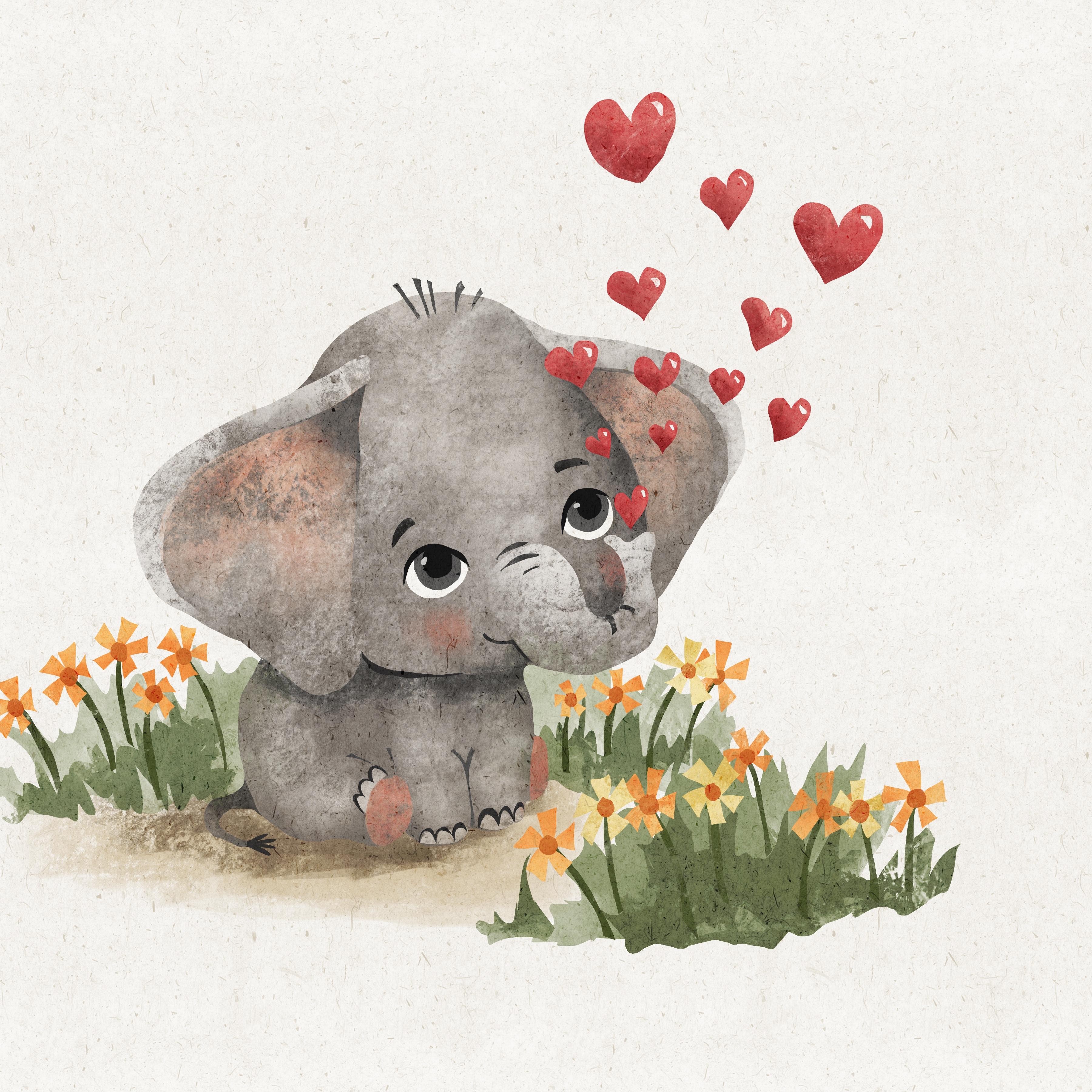
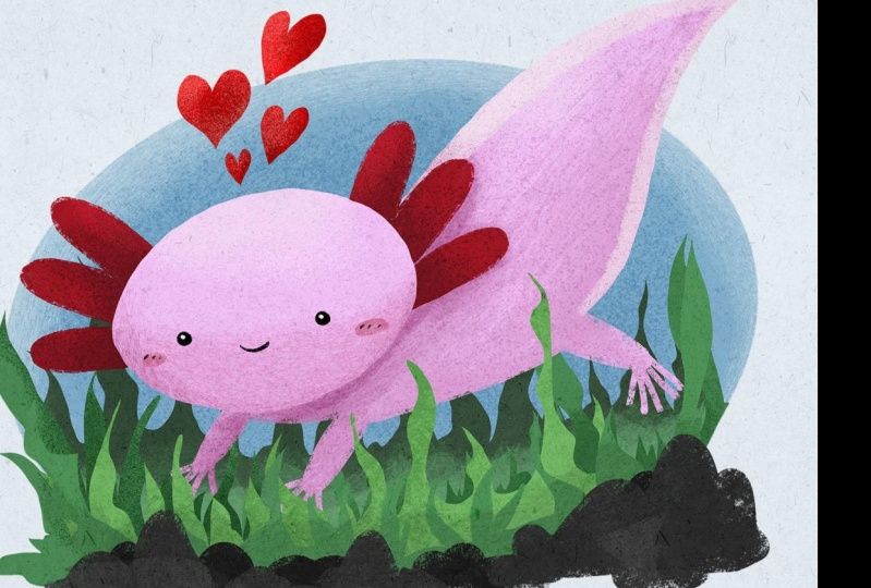
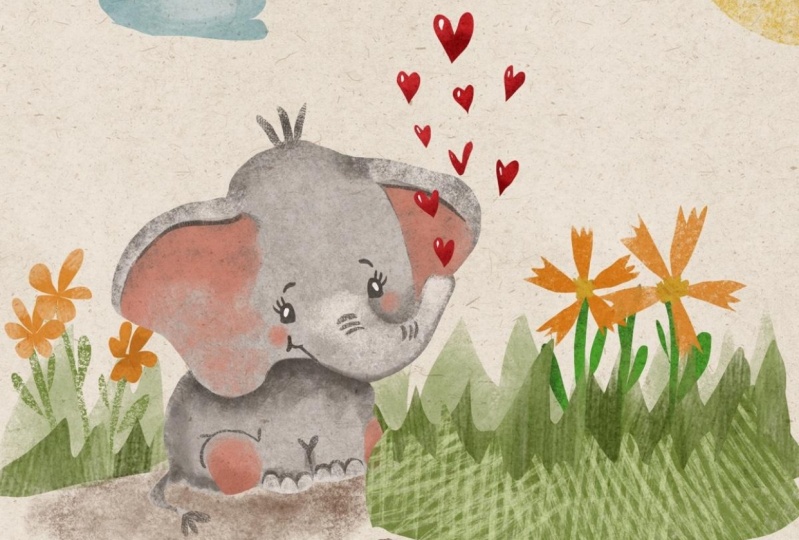
4. Composition, Cuteness & Sketch: For composition. I'm going to put him down here in the corner. And if you have ever heard of the rule of thirds, if you take any Canvas and you divide it into thirds, these intersections of the lions are kind of, you know, where you put your big deal things. So I tend to put everything in the center. So when I, when I was growing up and drawing, I just put everything in the center of the page. So this is very interesting to me when I learned about this. And so put in your kind of focal features in places along these lines or near these intersections, especially is a way to get a nice composition for your piece. So I'm placing him pretty high. But the reason for that is because along this bottom line, I'm going to put some flowers. And then at here, I need to put those hearts. So that'll kind of go along that line. And this'll go along that line and he's going on the other line. And it'll just be a nice, cute, simple illustration that sort of follows the rule of thirds and providing this JPEG for you to copy. So you can trace any of these and get started with the Illustrating without having to worry about drawing the animal's yourself. Okay, so that's there for you. And then I wanted to show you really quickly. And some examples of some really simple small eyes. And making cute animals is larger heads, smaller bodies, wider eyes further apart, and facial features really download on the face. I also like pink cheeks, but that's just my preference. Big eyes are justice cute. A little more complicated to draw that then you can get some color in there. So that's kinda fun. And a couple shapes here. So those are there for you as well. And you can play around with any style of AI you like. As you can see, they're all super cute. Alright, I'm going to quickly sketch out this elephant. If you don't want to learn how to sketch the elephant, you can skip this because I'm going to provide some sketches for you to trace. Because the focus of this class is not learning how to draw it the elephant. So I do want to show it to you really quick, and it might be too quick. But for those of you who are interested, go ahead and keep watching. So I'm on a new layer. I have the 6B pencil just for sketching and I've just got him up in the corner for reference. And I'm just going to start with a pear shaped head. So if you start with an ellipse in, then these cheeks on the sides, that's your pair for Q and a. Clean that up a little bit. You can. And then take about half of that height and make a little line down here. So it's kind of in thirds. Now write when 23. So we're gonna do a tiny body down here. But we have this angle here. So we need an angle. And that's just going to help us make it look like it's facing this way. So I'm going to draw a little box down here and it is much more narrow them the head. And that's going to be its front 250t. So we'll have a little divider there between the front 250t And the little v at the top is a cute little way to show that chest area and the kind of armpits there and just little cup shapes here for the bottom of those feet. And I'm kind of focusing on this angled line. And we'll have the chest come out here live just a little bit. I can exaggerate that a little. And then we don't really need this line. So that's our front feet. You can do those little toenails, super cute. The back foot over here is kinda small in hiding, so just make a little half circle over there. And this back foot on this front end is I'm going to overlap the leg, the front leg a little bit. And that's going to be probably the biggest foot because it's the closest to us and it's backlit. And then we just need a little c start from down here on the lower part of the head somewhere and end down here on the bottom of the split. So just make a little rump. Super cute. You can make a little line here at the top to show that that leg is coming out. And maybe show a little bit more of that far side of this front leg as well. The tail would be kind of back here. So when it comes around the front, it's going to be coming from up here more. And I just make a little c And then little hairs. You might want to lower that later. And then the, the head, the rest of the head, we're gonna take this angled line. We're going to put it in to more places. When is just below the top of the head here. And one is really down low. Remember we talked about the facial features being really low for a cute animal. And another thing you can do, so this is going to be where the eyes are. Another thing you could do is tilt the head. So before you draw those two lines, you can select just the head and just give it a little tilt. So I'm gonna draw those lines back. And that's going to be where our ears go. So this one on this far side is going to be a little smaller, just do a little loop, little swoop. And this one's going to be bigger. It's closer to us. And I'm gonna start further in on the head and do a little swoop. And the bottom can just be a littles, little curvy curve in. It really doesn't matter. Because there's several ways to draw cute little elephants. And then I'm going to draw the little lobe. I'm cartilage. I don't know whether that would be called erase this part here. And I'm going to erase this whole side of the head over here where the IRR is because that elephants kinda looking this way so we don't have that hard edge of the face that we're gonna be looking at. Eyes. The eyes can come this first. I can come really close to the bottom of the ear here. And this one can get pretty close to the edge of the face over here. And they'll eyebrows. In writing between you can do two or three little wrinkles for the indicating that top of the trunk there. And then the the size of the trunk. We're just going to put some guidelines there. It's the widest part. We're going to be erasing that. And then figure out where you want the end of the trunk TB. And I'm gonna put that down first before I draw the rest of the trunk. So I'm going to be later making like little bubble hearts coming up. So I don't want the trunk to be pointing out this way when it to be up. So I'm going to put it up here somewhere. I'm gonna do like a a three, kind of like a heart, like the top part of a hurt. So this is the most narrow part of the trunk. And we're going to connect with a little loop like that. And connect with another little loop like that. And erase all these inner parts of the sketch that we don't need any more. Cute. I'm also going to go ahead and erase that. There's too little marks we had at the very beginning. And just kinda give this one a little bit of a curve that way to show that that trunk is kind of and they curve that way. Erase this one a little bit more down there and put a little mouth. There is kind of a cute way to make a little elephant mouth. And then of course there's lots of different ways to do the eyes, but this is going to be your basic elephant sketch. You can put a little wrinkles there if you want. And I recommend going ahead and reducing the opacity on this, adding another layer and doing a much more finished looking sketch so that you have a nice clean sketch to start with. When you start illustrating.
5. Coloring Ellie the Elephant: The first thing I'm gonna do is put him up on a higher layer and turn the opacity down. You can turn it to multiply and do. A lot of people do. I don't really notice a difference. Also made him a little bigger. So decide how big you want him to be. So the first thing we're gonna do with the elephant is we're going to select the entire elephant, not that little hairs, but the whole main elephant. So we're on freehand. Minutes zoom in. And remember that if you tap, it's going to make a straight line from one spot to the next. So we don't want that. So anytime you pick up your pencil, you're going to want to try to go back to right where you left off. And I am tracing if you want, you can keep going around the main part and then come back and use that add to add the tail. Submit, keep coming around, keep coming around. My palm just made it go way over here. So I'm gonna two-finger untap undo to get that up. Oops, I just goofed up there. I'm gonna rotate so I can get a better angle on this. I'm not sure how well you can see what I'm doing with the video. So hopefully you're just watching here and then the little grey dots right here, if I tap it, it closes the shape. You can see my mask here. I'm gonna come back down and add the tail. Close the shape. I'm not going to add the little hairs yet. We can do that later. And there's our shape going into the light gray and I'm going to drag and drop that color to my elephant. Alright, now I can see him better. I have my mask visibility turned down pretty low so I can see the sketch pretty well. I can see where I maybe goofed a little bit, but I like those GFS, so that's OK. And once you're happy with it, you can turn that off. So it just so happens that that gray is very similar to the grey in these windows. So you can't see it very well. But my l, if it is right there, I'm gonna go ahead and alpha lock that layer so you can two-finger swipe to the right. And that helps me kind of remember that there's something on that layer. I could label it too, but I just don't do that. And I mean, they go to the layer above it, tap on it and turn it into a clipping mask. And then this is where all of your fun that you had with textures comes into play. So you didn't have find a texture brush that you like and go to a darker gray. So maybe go to this one that probably isn't going to be dark enough. It's not that dark. But we could put that layer on multiply. And that's nice. So my purpose right now is to get some texture. I just let some overall uneven, blotchy, blobby texture. This is personal preference. You can add as much texture as you like, and we're going to be adding more later as well. But I'm kidding. I'm having that super light gray underneath and I'm having a darker texture on top so that grey, the light greys coming through underneath so you can see those two tones. And let's go to another layer above it, clipping mask. And now I'm going to go to a darker gray, maybe a new texture, scratchy paint hutch. And I went to select some areas that I want shadows. So I might have a shadow in this neck of the ear here. So I'm making a big selection for that whole inner ear, but I'm going to shadow this area up here. But I'm going to add another shadow over here. And I'm going to add some shadowing. Oh, I just got a blue dot. I'm not sure what that means. So I'd always two-finger undo here. I'm gonna shadow underneath that neck here. Select a big area. I'll show you why in a second. And I'm going to shadow on the inner part of the trunk. Alright, that's good for now. And I'm on that scratchy paint hatch. So if I just pulled down or in this case I'm pulling down because I want the concentrated shadows to be up here. And then I want him to dissipate down here. This pressure isn't doing a lot of dissipating. Maybe I'll just tap it. Yeah, that's much better. I might turn this layer to multiply as well. So then I have that whole selection then, but I, I was able to get very precise sup here, same with this part. I want that corner to be precise, but I don't want their tibia a hard line down here, so I'm not going all the way to the edge down here. So even though I selected this big area, I am only going up in here. They selected this big area, antimony shadowing up in here. And then the same with this little snout area. Right? And without a selection, I'm just gonna put a couple dark areas down here. It's very imprecise. Maybe a couple more on the side of the face over here. Alright, and now I went a layer above that clipping mask. Select, I want some highlights. So now I'm going to select this lobe area of the ear because it's a clipping mask. I can go off the edge. I'm going to select the whole trunk. So even though we didn't draw a full line around this edge of the trunk up here. I'm selecting all of the trunk. Tapping it. And then I am also selecting the toenails. And then I'm going to this light gray, but I think I'm going to bump it up closer to white. And I'm just gonna play around with another brush. Gosh, this is a hard decision. I loved texture so much. I don't know which one to use. Let's see. Not charcoal. You know what, I'm gonna go back down to this crazy messy. I would actually go over to artists cram right now. But I'm trying to stick with these brushes. And then I'm going to tap and just get some fun texture where we have that selection. This is a time when you might want to increase your mask visibility because it might be hard to remember where you selected. And if you had these lines be a much stronger Look, you would easily be able to see the selections. Saying a little bit careful on the trunk. I don't want to highlight the entire trunk and I'm gonna go even lighter with a white double-tap up there to get white, come down in size, maybe get more white down here on those toenails too. I want to highlight the top of the Trump, Top of the little snip, whatever that's called, snout. And then the top of this curve, the whole thing got highlighted with that lighter gray. But now with I'm white, I'm just adding a little bit more highlights. Alright, and on top of the dark layer, but under the highlight layer symbol in down a layer. And I'm going to add a layer and it automatically as a clipping mask. I'm going to select my pink areas. So selection. And then coming up almost wanna do this entire inner ear. For this side, I need to carefully go around the trunk. So I'm gonna go up and around. So now you might want to turn your mask visibility back down again so you can see that better. And I'm gonna do his back feet, the pads of his feet. Pink. Misuse this pink right here. And let's go back to a hatchet brush, scratchy paint hatch. And see you barely have to touch. I want some of that grey coming through, so I'm not filling it in. Maybe go to the lighter when it gets some lighter on their lighter down here. Maybe go back to the darker, but go even darker, gets darker down here. It's a great time just to add a whole bunch of variety while the selection is still active. And you still have that dark gray shining through a little bit, not too much. And when I think I'm happy with that and I can turn the selection off. I might be covering up that gray entirely, but that's okay, too. Super cute. Alright, I'm gonna go to a layer on top of everything. And it's not a clipping mask because I'm going to select something like the little hairs on the tail end up here. And we're going to start adding some details like the eyes and everything. And it doesn't necessarily need to be on a clipping mask. In fact, if this was not a clipping mask, we wouldn't be able to get it to go above the head there. So let's do nice little cute, fun cutout looking hairs. They can see the tip of the tail right here. So I'm gonna just do cute little hairs there. And I'm thinking about black, really dark. I wanna do a dark section under here, under the neck. I'm gonna do a little v here. And the little line down. I went to do the toenails does kind of have a little fun cut out looking area there. And of course the face. So also these little wrinkles on the nose here. The eyes. I just made that too big. The eyebrows. I might do a little bit of that leg there and I might even come back and do a little rim on, just do it now. Kind of just a really faint little rim around the foot there. And then finally, I like to do a little dark stripe at the top of this pink area right under that lobe. It kind of gives a look of having this shadowing the inner ear a little bit. Alright, if you forgot an area, you can always come back and add it later. So now I'm going to just go to this super darker gray right here. I never really go to black. I might go a little darker. And I'm going to choose this, lets choose this sketchy hatch marks. Turn the opacity up 7%, so it's pretty small. And I really want texture here, and this is going to have a bit of a transparent look. So you're going to be able to see unless you keep filling it in and go through and get all of those selections. Fill-in. Like gosh, he's so cute when we forgot his mouth. So now we can add another selection for his little mouth. And a guy might go down that shrunk a little ways. I might change that later. So I made it darker here and I kind of fade going that way. So cute. Maybe add a couple little wrinkles here. And let's turn the sketch layer off and see how it is. I'm gonna go ahead and add pupils on this same layer. You can see my little circles weren't perfectly complete. And I, I like that look. So it doesn't bother me at all. You can cut this little jagged part off if you don't like that. But for tiny circles, I definitely like to zoom way in. I find that the selection tool kind of loops, may poem. The selection tool sort of. Isn't that great when you're zoomed in for the tiny little selections like that and I'm on white. Pretty much solid. I could've used color film for that. Super cute. I made it come back. I'm going to give him a little of my poem. Did a thing here again. I'm gonna give him a little bit of a kinda upper eyelid or something, whatever that is called. I keep forgetting to go to the actual brush. So cute is just adorable. Alright, so I am going to spend some more time just kind of getting some shadows here and there and a little more contrast. So I have a little bit more darks and lights, so he's not so flat. But I do like a sort of flat look with this style of illustration. So you make it how you think you like yours to look. And then come back and join me for the next lesson where we're going to add some beautiful flowers and some really pretty little hearts up here. I forgot to add his cheeks. So I'm going on this layer that has all of our black details. And I think it's safe to go ahead and add the cheeks to that layer. You could add another layer, and then you have flexibility with that layer. I'm gonna choose that pink, that middle pink. And this, let's go to rough pencil. And the cool part about this is you can change the location of these facial features. So when I zoom out, I see that this eyebrow and I and cheek would probably be a little lower. And there, there we go. And the other thing I want to show you really quick is if you have a little gap like this and you're already done with that selection. You can go to the layer. So for me I can either move the dark layer that way or move the pink layer that way. So I just came to the pink layer. I'm going to select this pink layer, tap the arrow, and go to warp. So I can do this. This isn't super accurate for teeny tiny spaces. Or I can just simply go to liquefy, push on the small size and just push that a little bit. But I like the look of, you know, having them not all perfect. So I don't really go around and do that, so I don't I'm not going to come around here and hide the pink line that's exposed above this dark line. I like the rough look that this style has.
6. Super Loose Florals: For this guy, we're going to go underneath our elephant. I'm going to do that free hand select and just do spiky, spiky, bump, Bouncy, Bouncy, spiky, spiky behind the elephant doesn't really matter what it's doing because it won't be seen. And spiky, spiky Bouncy, Bouncy, spiky, spiky. Come back around here, do something down here, and complete the shape. All right, and then you can pick your favorite texture brush. I'm gonna go to this really pale green and might even go even more pale. And have fun. Doing green with the gray is kinda tricky because they're sort of the same gray tone. If you were to turn them both into gray. So you want them to stand out. So just getting some fan textures on these. And I'm gonna go to a layer above the elephant and get one down here as well. Spiky, spiky, Bouncy, Bouncy. Oops, we don't like that one. Spiky, spiky, Bouncy, Bouncy, spiky, spiky. And then down here. And I'm going to do this same thing down here. Although I've already switched brushes. That's okay. I do want those colors to be a little different. And now I'm going to do this again. So I'm gonna go, go ahead and turn this one off. I'm gonna go down here. I'm gonna go to a layer in front of it. And I'm gonna do it darker green when. And it's just going to be smaller and just kind of and sporadic. Not that the other wasn't sporadic, but right, I'm gonna choose this dark green here. What brush and my on these days. And be a good time for some stamp Ian's damping. You can decide how transparent you want that to be. I have this section here. I don't want somebody to cut that out. Slide it right off. Going to turn on this layer that we have up here in the front of the elephant. And I'm gonna do one more of a darker one here up here as well on a new layer. And then make this one pretty small. I'm intentionally not really talking about which brushes I'm using because I really want you to find the favorite textures that you like. This is almost look like shark fins. And then in-between there, I'm just find some good layers. Let's turn these front winds off. I'm gonna go in between and do some little flowers. So I'm just gonna do a couple of flowers as an example. I'm gonna do a stem. This is where you might want to turn your mask visibility apples, you can really see what you're doing. And I'm gonna do some leads attached to those stems. So I have two stems in two sets of leaves in case you can't see those. I went to go to a really different shade of green. So I'm gonna go towards blue a little bit and go pretty dark. Almost grass green. Just so they don't blend in so much with what's there already. That already don't like that green, but I can change it with hue, saturation, brightness. I'm gonna go to the rough pencil stripes here. Just get some scratchy textures on there. And then on a new layer selection, I'm going to draw some very simple flowers. So I'm gonna do almost like five triangles coming out from the center. 12. This is where I had my yellows. In the the reason I had my yellows there, I'm going to color them pretty solid just to make them opaque. You can go to a new layer or just stay on that layer and keep adding some more texture. However you want your texture. And not going for realism. So don't spend a lot of time on that. Oh, yep, I'm on a new layer, so that's good because I wanted to change that green there. And then just do a little zig and zag, any little Center on both of those. Decide if you want to be on a new layer or that same layer. Maybe go to dark center. I'll just do the charcoal. All right, let's go to that layer with the leaves. The leaves and stems into SKU to hue saturation brightness. And let's find a better color for that. Maybe a little darker, maybe a different shade of green goo. That surprising the teal, looks really cute and like that. I would never have chosen that. So you're gonna do those all over the place. And if you have them overlapping a little bit, you can do flowers on a couple different layers, or you can just keep them on the same layer. It doesn't really matter. Now we need a layer under the elephant. We need a little bit of shadowing down here and let's pick this. You know what? Let's go to our other pallet and let's pick this Brown. And I'm on soft to Turkle, I'm just going to get some brown. I don't like that either. I need it to be a little bit more Gray. I don't want it to be the same color as the elephant though. Maybe turn the layer to multiply. I'm going to do hue saturation. Brightness is just a matter of playing around until you figure out what you like. So turns out darker brown. I like better. I'm gonna go to some texture brushes for erasing some of this though. So it's not just a solid thing here. So it kinda looks like there's some dirt and some flowers around him. Really keynote. Alright, and lastly, we're going to use the color fill option to do belittle hearts up here. So spend a bunch of time adding tons of flowers as many followers as you want and they can be tall and short and lots of different styles. I'm just gonna go to a layer above everything else. Turn on selection into non-color fill. This is something that will stay on next time you use selection until you turn it off. So that is something that kind of makes things not work the way you think they're supposed to work. And then he got color fill is on. So make sure you always check Colour Fill and is going to choose this pink right here. Color fill is on. Let's start with the first hurt coming right up out of his nostrils there. There's a few ways to do the hearts. You could start in like this or start at the bottom and go up and around. I really like the rough look of these using the selection tool. So it's really fun. Here's one of the differences. With the selection tool and color fill being on. It's filling it with whatever color you selected, but you can see they're all still highlighted. So if you didn't like what you got there, you can change it and it's going to change all of them. So that's great. The downside is once I leave and try to go to a new layer, this is all de-selected. So find the nice base color that you want them to be. I'm going to go a little bit light and then go to a new layer. Or you can alpha lock this layer and stay on that layer. I'm just gonna go ahead and go to a new layer and go to a clipping mask, and go to a darker color. You can go to that one right there. I'm on soft Turkle, Hindu. All sorts of different textures just like this whole class has been. And get some fun texture on those. That's it. You can kind of go to white to get a little highlights on those. Or you can even select Color philistine one. Select some little cute little sections for highlights.
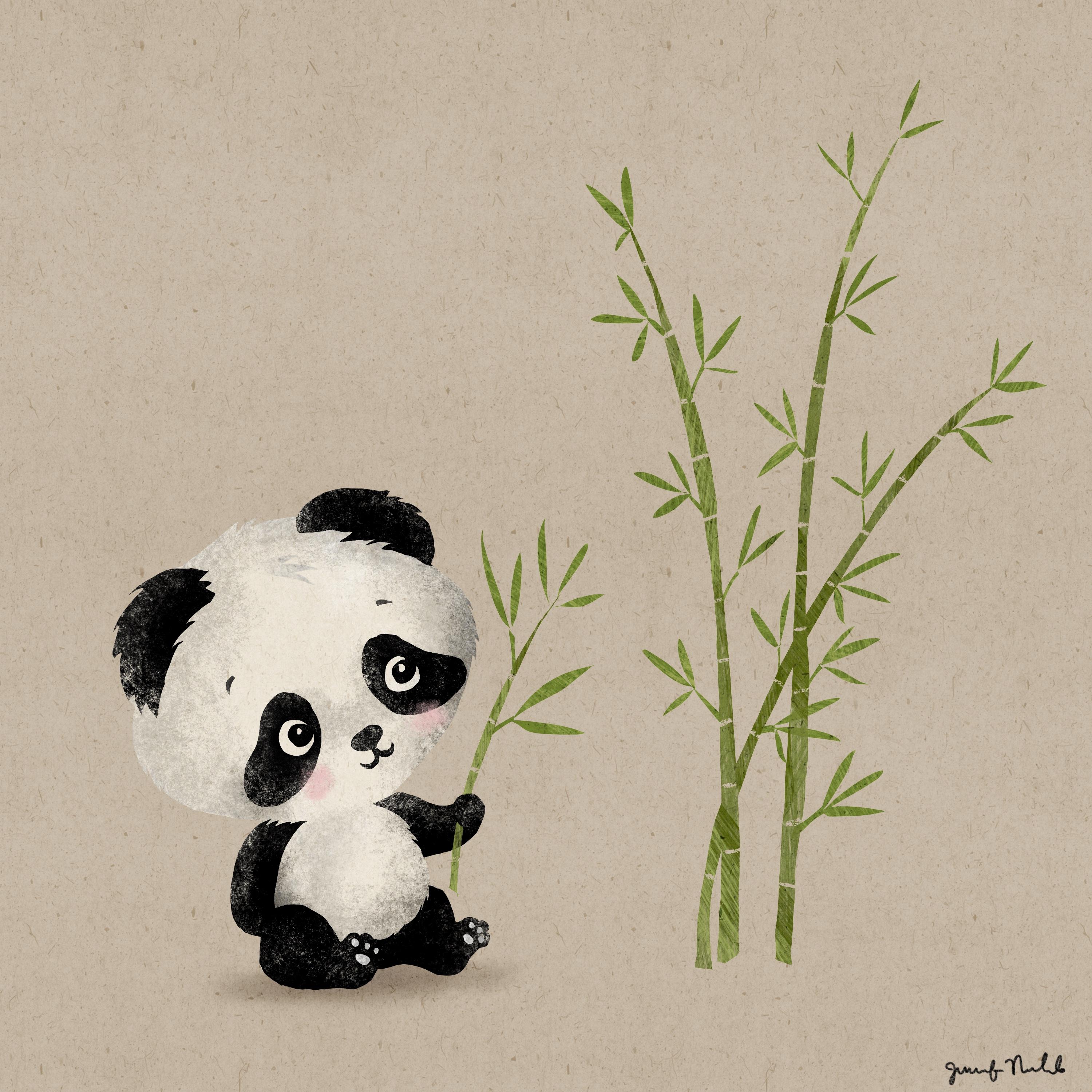
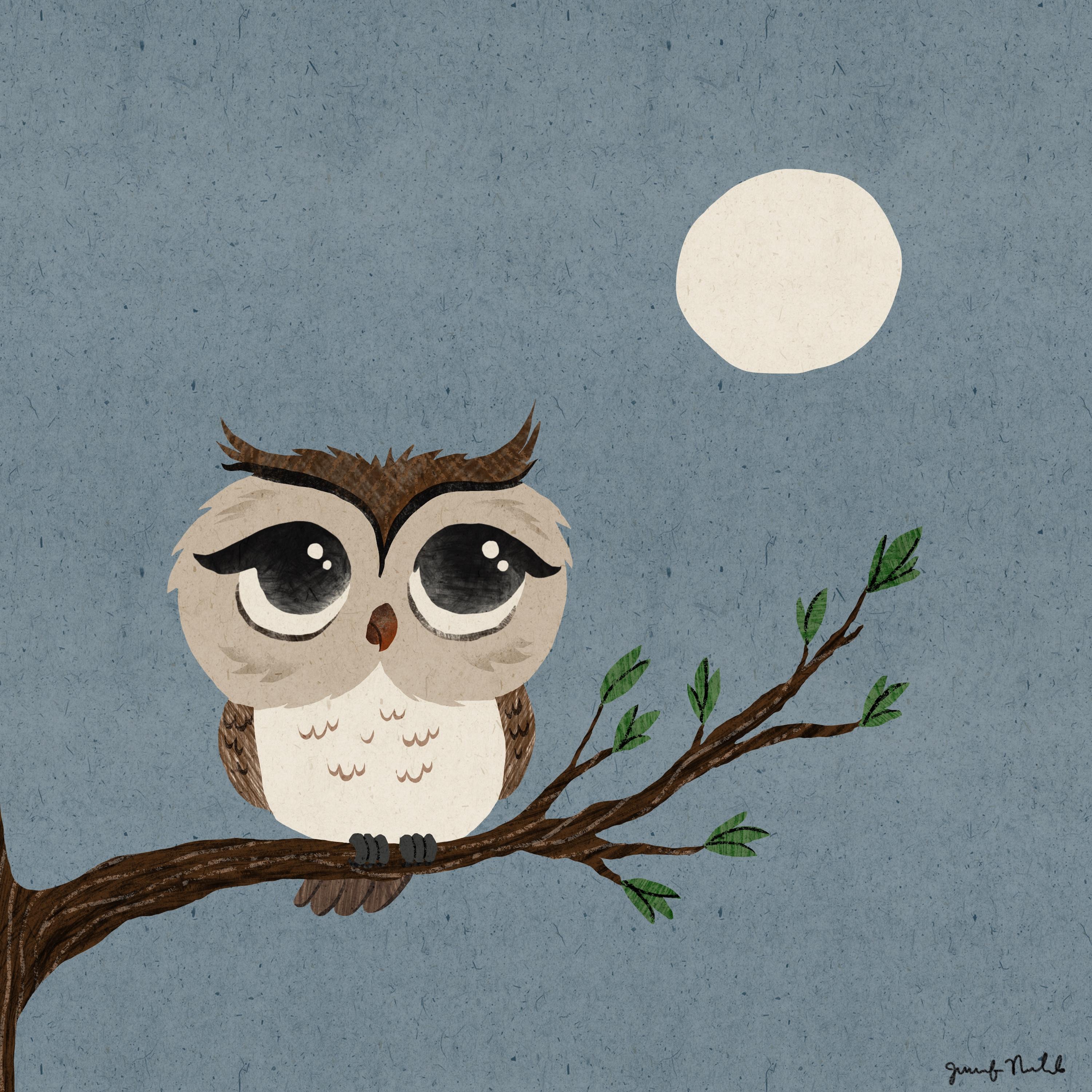
7. More Examples & Class Project: Okay, I wanted to show you a couple of other animals that I did in this same technique. But first showing you this elephant with the big guys, so cute and this owl. You can see, I did the same thing I did on the elephant hose for these feathers. But you could also draw in some details. I drew some details like these lighter lines on the tree with the rough pencil, the monoline were textured when? For this Panda, I did all of the stocks in one layer, all of the leaves in another layer. And then I erased some sections to give that segmented bamboo look. Super cute little cheeks for the cat. I haven't quite finished this that I thought I'd show you any ways with the butterfly. Some more detailed flowers, some over here as well. And then I'm just adding some details like that on the head. I thought I'd add some more stripes on the side. So be a little orange tabby. And I haven't done anything that I was gonna do more butterflies up here. So your class project is to do one complete illustration. I really hope you enjoy using all of these brushes and playing with texture and using the free-hand selection tool to get really fun collage, loose looking illustrations. Be sure to hop over to my skill share profile. And there's links to my art Facebook group that's four procreate artists. And it's a very friendly group, so it's a safe place to share your art. And my Instagram and all sorts of links are over on my profile. See you next time.
 Jennifer Nichols, Artist & Teacher, Procreate