Transcripts
1. Class Trailer: Illustrating
characters is one of the standout parts of my job
as a designer for animation. [MUSIC] Well often essential for storytelling and
demonstration purposes, characters can also add a ton
of charm to an animation. As illustrators, we have the unique ability to
invent quirky fact stories, push body proportions,
or even concoct a character out of a rotten
apple or a disembodied tooth. Hey, you. I'm Sarah Beth, and I'm an animation director,
illustrator, and designer. I've directed animated
commercials for companies like Bath and Body
Works and Facebook, and I recently even directed my own animation shot to premiere at film
festivals worldwide. I love to infuse unique
abstract proportions and unexpected personality
traits to my characters. From working at motion
studios like Scholar and Oddfellows to now
directing with Hornet, I've especially had the
wonderful opportunity to explore designing characters. Well, I don't personally
animate on projects myself, I'm constantly leading large
teams of designers and animators who bring still
illustrations to life. I primarily design style webs in Photoshop at the
beginning of projects, and then I pass off
my illustration files to talented animators. But in order to pass off
these designs with ease, it's always best to consider
the full animation process. In this class, we'll be exclusively going over the pre-motion process of designing characters
for animation. I'll first introduce you to the world of
characters in motion, highlighting cell
animated characters as well as rigged characters. We'll discuss how
characters can be used to support animated
storytelling. I'll also begin to
walk you through the multiple stages of building your own two-dimensional
character in Photoshop from backstory to
sketch to full-on design. I'll walk you
through proportion, posing, and more. The best part is, we'll hear from a
talented animator, my husband, Tyler
[LAUGHTER] who will provide some tips and
tricks along the way. So cool. Well, without further ado, let's make a character together, but hopefully not this one. [MUSIC]
2. Class Project + Materials: [MUSIC] In this class, we'll be working
together on a project, designing our own unique
character vignette. This will be just the design and we'll be approaching
this project as if we had an animator to pass
it off to like most character designers do in the professional
motion industry. The way that I've
always approached projects is with
a studio mindset. I always feel like it prepares
me for the real world, real clients, real
paid projects. Even if I'm working
on a passion project, I tend to set up my projects
in the same manner as my professional ones because honestly it just
keeps me organized. With that being said,
today we'll be diving into a fictionalized client brief
to structure this class. Our client is an IRL gift
shop called The Gift Stop. They're looking to you and several other artists to create square social media
posts showcasing their amazing customers
and products. They also mentioned
that they'll pass off your design to a
character animator, how convenient, so your design needs to
be setup for that. Don't worry, we'll go into
what the brief actually says in more detail
a little bit later. Now, in order to
address this brief, we'll obviously be creating
a character from scratch. I'll walk you through
my process of creating my own character and you can follow along with me
and create your own. In the end, we'll
both have a fun, unique character to use
in our portfolios or on social media or wherever
you want to put it. Over the entire class, we'll go over concepting,
sketching, posing, taking a reference photo, adding color in detail, and especially how to set up your character
for animation. If you're having
trouble coming up with your own character, I've also provided this
handy-dandy prompt list which you can find in the
downloadable class booklet, which is in the project
resources below. This class booklet also
includes an overview of the class and has
additional tips and tricks. If you're planning on following
along with the project, make sure to open up
Photoshop and get ready. I personally use a
Wacom Cintiq to draw, but a tablet will also work. [MUSIC] You're also more than welcome to use
Illustrator or Procreate. But I won't be going
over any specific tips for those particular programs because I will be
using Photoshop. You could also potentially
sketch on paper and then take a photo of your sketch and finish it off in Photoshop. So there are plenty of options. Don't be too worried if you have different tools than I do, it'll all end up the same. On that note, I know a lot of animators prefer
Illustrator files and you might be confused as
to why I'm using Photoshop. I personally find
that as a designer, Photoshop is a lot
more freeing for sketches and adding textures. I also personally just
learned Photoshop first, so that's what my
expertise is in and that's what I feel the most comfortable sharing with you. Everyone works
differently and I'm just sharing my own process. Finally, if you want to get
the most out of this class, I'd encourage you to
get involved with other students and the
community here on Skillshare. You can invite your friends
to take it with you, ask each other questions, collaborate, maybe
you could comment on other students projects to help improve each other's work. As always, [MUSIC]
please post in the discussions tab
below if you have any questions for me as you're
going through the class. I'm pretty active
here on Skillshare, so I will likely answer quickly. [MUSIC]
3. Introduction to Characters in Motion: [MUSIC] In this video, we'll dive into the basic conceptual and technical aspects of designing characters
for promotion. I'll be helping to
answer questions like, what does a character
contribute to a narrative? Or how do I set up my character design file
for the animation process? A lot of the knowledge about characters I've collected has been on the job at
Motion Studios. There is no one correct way to start designing a character. There are endless possibilities. While many other
animators and designers may do things in a certain way, I'll walk you through my personal character
design process. We'll be focusing on the actual designing of
characters from scratch. This involves a lot of things, including the groundwork of concepting and
character backstory. You won't be making
anything yourself in this particular intro video, but feel free to take notes or leave questions in
the Discussions tab. This is important
stuff to know before we get started with sketches. I'll be introducing you to the fundamentals of
character design for motion, laying the groundwork
for our client project. I'll first introduce you to
different ways you can use characters to support
animated storytelling, looking over examples of
different types of characters. We'll talk about using
After Effects versus cel, concepting, taking your
own reference photos, sketching and abstracting. At the end of the video, I'll even open up some of my own organized character
files for you to see. But before we get into the
nitty-gritty of characters, which is why you're
all here for, I want to dive into
a little bit of my own backstory to
give you some context, what experience
do I have and why am I qualified to
teach this class. Well, I've always been
interested in drawing people. It started with this and then
manga and anime characters when I was in elementary school and slowly progressed
from there. After I graduated from the Savannah College
of Art and Design with a degree in
Motion Media Design, I began my first job out of Motion Studio called
Scholar in Los Angeles. It was there that I
really began to move into my own with
character design. In fact, here you
can see some of my first ever character
designs created at Scholar. I was so frustrated
when I drew this. I was really struggling so much with proportion
and lighting, etc., just everything, but I pushed through. Towards the end of
my time at Scholar, I was getting a better grip on proportion and creating
charming character designs. Here's one from a
series of spots I art directed for Nexium
before I left. This one was animated
by Chris Anderson. I need to caveat here that I don't animate my own characters. I understand the processes
of After Effects and cel animation at
a professional level, but I leave it up to
the animation team to bring my designs to life. So everything that you see in this presentation has been animated by another team member. You'll actually see all these credits
throughout the video. After Scholar, I moved onto my time at the Motion
Studio Oddfellows, where my design and
directing skills progressed. I had the opportunity to work
on tons of different styles and character variety
for clients like Adobe, Google, Airbnb,
Capital One and more. Here's some of my
collective work today as a freelance
director and illustrator. I've designed in a broad range
of styles as you can see. Process-wise, I primarily
work in Photoshop and pass off my Photoshop
files to animators. I'm aware After
Effects animators sometimes prefer
Illustrator files, but I personally
have never run into an issue with this
in my process. I believe the most
important thing we can do here as designers promotion, is to create purposeful
and intriguing characters that answer a client
or narratives ask. While I always emphasize
the importance of clean functional files to
hand off to the animator, my job is less about appeasing
the animator and more about getting the
characters look right for the
project and client. Keep this in mind while you're
working on your character. Now that we've gotten to know
each other a little bit, let's get started on the
stuff you're all here for. Now, what exactly
is a character? As cheesy as it may be, let's see what the classic dictionary.com definition
of a character is. The aggregate of
features and traits that form the individual nature
of some person or thing. I got to say dictionary.com
is not wrong, but this definition is the most basic definition
and it doesn't pertain to any
specific situation. It's really just a little
bit difficult to read. I had a hard time trying
to grasp what it meant. Let's try in some different
words, my own words. In the context of motion, I personally say
that a character is a living or animated
personality that is created to evoke a
meaningful message. A character could be a
disheveled human dad rushing to an elementary school to pick his daughter up in a
car rental commercial. On the contrary, a
character could also be a depressed bag of chips
with a face on it, sitting alone in
the kitchen pantry. [LAUGHTER] The real question is, what does a character
bring to a piece? In animation, brands use
characters for a purpose, to bring their mission
statement to life. They use them to
humanize and ground their product or
other objective. Characters add relatability, people like to see themselves in commercials or short films, they add engaging and endearing
meaning to a narrative. check out this
piece by Oddfellows where they literally take a real testimonial from a customer and bring her words to life through
a goofy character. America loves Prego, but don't take our word
for it, take Treyes3s. It's literally the
best sauce ever. I would drink it if it
was socially acceptable. Go with a sauce America
loves, go Prego. As you can see, the
character really brings a lot to
the literal table. She makes Prego seem
fun and enticing, even though they literally
just sell basic tomato sauces. We see characters use
time and time again to reinforce brands and
bring them to life. A popular form of this
is actually taking the brand and turning it
into a character itself. That brand becomes indistinguishable
from a personality like the GEICO Gecko
or your classic M&M's. Most people entirely associate
Geico with a gecko now. Sometimes they even
imagine eating M&M's with little faces on them, which is actually
quite disturbing. Think about it.
Before the gecko, there wasn't really
anything exciting out there about insurance companies.
They were boring. The gecko character
brought the complicated, boring idea of
insurance back down to Earth and made viewers want
to interact with the brand. Geico became very memorable. In addition to brands
actually becoming characters, there's the more common use of characters as reinforcement. These figures don't actually embody the brands qualities, they just help to
tell a story or convey about the
brand's mission, like what we saw on that Prego advertisement a couple
of minutes ago. Here's another one
that gets that point across pretty well for Etsy. These silly characters are
reinforcing the message of creating and buying on
Etsy for Valentine's Day. [MUSIC] Now, I know not everything
is about advertising, so if you were to apply these two different types of
characters to storytelling, you can say a character actually embodies the overall
concept of your narrative, or the characters are supporting elements that help
portray that narrative. As you can see in a few of
the examples I've shown, not all characters have to be human or involve
human-like proportions, so, when and how do you decide to use a
non-human character? Just as with all the
questions I propose here, my answer is simple. Do it when it
conceptually makes sense. It all really depends on you
or the client's objective. This first little animation
on the left was a character I created to embody the
emotion of creative anxiety. It made conceptual sense for
me to create a scribbly, wobbly, yet neutral
character for this. If I had used a human
character here, I don't think it
would really read as the emotion of anxiety per se. The character on
the right is from Buck's Seed Matters
animation campaign. The non-profit's goal is
to increase the yield and variety of organic
seeds on farms. Naturally, it made sense to have an actual organic seed telling the viewer the tail
from his perspective. This helped to commemorate
an engaging story that the viewer would remember. I could talk about the
conceptual purpose of characters all day. I could even go into character development for
written narrative, TV, short films and so on. But you're here now because you have some interest in characters for animation and motion. Since I specialized in
commercial animation, I'm going to speak to my own
experience in that avenue. The most important
distinction in 2D character animation in my experience has
been between After Effects and cel or
frame-by-frame animation. There are also 3D
animated characters, but that's totally
out of my warehouse, so I'm going to pretend that
those don't exist for now. Animating characters
in After Effects is drastically different than
cel animated characters. I'll explain the difference now. After Effects characters are typically rigged for animation, as you can see here
in these examples. If you're not sure
what rigging is, don't worry, you're not alone. It's pretty technical. It essentially means
you're setting up a working armature or skeleton to animate the
character's design. The animator has to
take your design, break it apart limb by limb, even joint by joint, and then connect it
or pairing all of those pieces together so that they react to each
other's movement. This setup takes some time, but it gives the
animator full control of the character once the
rig is setup properly. The downside to
rigging characters and After Effects is that
there's less fluid movement. You technically
wouldn't be able to fully turn a character around using a rig as it still
living in a 2D plane. You wouldn't be able to have
a character swoop in and do a big perspective shift or
drive a transition, etc. I would say After Effects
character animation is more accessible to
the masses though, as frame by frame animation requires a lot of
drawing and training. After Effects animation
on the flip side, doesn't necessarily
require the animator to be good at drawing. Frame by frame animation
is called cel-animation, because traditional animators
used to have to draw every frame on a transparent
sheet of celluloid. Cel is basically
just a shorthand for hand drawn animation. It takes a lot of practice
and many art schools have degrees in traditional
2D animation that you can partake in. It's as crazy as it
sounds literally. Essentially the cel
animator will take your character design
and literally draw every version of
every frame you see on screen reposing as they go. There are programs used
today like TVPaint and Adobe Animate that
ease this process. But it still
typically takes much longer and is more painstaking. It also may be harder to address client feedback as you'll
have to redraw everything. The upside is the results
can be absolutely stunning. If you or someone on your
team is a great cel animator, you really have
limitless possibilities. The only constraint is your
hand and the client's needs. As you can probably
tell from all of this information is that, the way something is
to be animated may actually affect the way
you design quite a bit. If you were to
design a character for rigging and After Effects, you'd have to be a lot more
technical with how you're breaking apart your character
and labeling your layers. You'd want to make
sure that things like the upper arm and forearm are on different labeled layers, you'd probably need to include rounded joints to make the
rig look less obvious. You may need to create
different versions of the character
for different rigs. Your job as a designer for cel-animation might be
to sketch a character in different poses or create a character turnaround
sheet so that the animator understands all of its proportions and angles. You may also need to illustrate different key poses
in the animation, so the animator
knows how to draw the character for different
actions or perspectives. Here's a list of the
things that you would do to make your file ready for After Effects
in cel-animation. Now I will be going over
this a lot more in detail in the end of the
class after we've actually finished up
our character design. But here's a little cheat sheet for you to look at in advance. Here's an example of what a character turnaround
might look like. This is a very flattened, very basic character turnaround
that I did for a project. As you can see, I
also have her in a different outfit
because that might affect the way that she moves. But if you're working on a more traditional cel
animated character or a narrative film, you might be asked for something more detailed like this, where you can see more
angles of the character, you can see more of the volume, more of the shading
and lighting. All of this to say, this is why I always emphasize communicate with your
animator from the start. Addressing all of
these concerns may not always be possible if the animation team starts after the design team for
a specific project. But there are ways to figure
this out from the beginning, talk to your producer or art director and ask
if you need to set up the character for rigging
or if you need to design the character turnaround
for the cel animator. It doesn't hurt to ask questions and it will save the team a lot of time and effort later
on in the animation phase. Obviously if you're the animator and you're animating
your own design, you should probably think
about your technique before you design
your character. Make sure that you have
the capabilities in order to animate your
character the way you want. That said, I don't want to get too into the weeds of how to actually apply these edits
until later on in the class. But I want you to be aware
of them from the beginning. Now it's time to
actually get out of this presentation
for a hot second and open up Photoshop and dive into some of my character files. This first one
we're going to look at is a cel animated character. [MUSIC] That was animated
by Tyler Morgan, who we're going to be
talking to in a few minutes, and designed by myself, also animated by some
other amazing people at Oddfellows like Josh
Parker and Kavan Magsoodi. But what I wanted to
show you here is that there's just so many
different poses that we see that character in. Since everything is
so quick and fast, it would maybe be a headache to try to rig every single pose. Which basically just
means you'd have to set them all up, limb by limb and animate
them like a puppet, so we decided to do this
one in cel-animation. I have a few different
example files here of the character. I just wanted to show you real quick how that would be set up. I always separate the head
and the arms and all that, just so that the animator
has that to work with. While they may not
necessarily use it, it'll be really helpful
if they have to go in later and add
texture and stuff. For example, all
of this texture, probably not labeled
a 100 percent, the way I would like it to be. This is an old file. I always like to keep these
texture layers separate. All the details and everything in case
the animator needs to come in and grab that texture
to map onto the character. Then because we
have this character and a bunch of different poses, it's going to be a different
head for each character, a different arm, a different angle, a
different perspective. Everything's broken
up differently. Then the other important thing I wanted to show you here was, as you can see in the
video at the end we see the character go through all these different
perspectives and poses when she's flying
through this field of paper. In order for the
character animator to actually bring that
to life through cel, they need to see all
the different poses. So we have our main
character here, but then there's all these different
poses that were drawn out in order to show how the character will be moving throughout
the animation. We have all of those in here so the animator can draw them
successfully while moving on. Now this is actually probably more work than
you would have to do. A lot of times the
character animator will figure this out themselves. But if you want your character
to stay really precise, you're going to want to actually draw the poses for them, because you don't
want them to get the proportions wrong
or anything like that. The second one I wanted
to show you was an After Effects
character animation. [MUSIC] What is heartburn? Heartburn is an uncomfortable
burning sensation in your chest or throat. It occurs when
stomach acid rises up out of the stomach and
irritates the esophagus. This can be as irritating
as fingers down a chalkboard where those
fingers are on fire, and the chalkboard is
actually your esophagus. Frequent heartburn is heartburn that occurs more than twice a week or more than four times in a fortnight
if you're British. Learn more about heartburn at the Nexium 24HR YouTube page. As you can see, there are different poses for
this character, but there are a lot more
minimal and the character herself is more
robotic, I would say. After Effects
character animation doesn't always equal robotic. But you can tell the feet are
off angle with the pants, and I think this one was
animated a little quicker, so it wasn't as refined. But you can see
everything's done more with key frames rather
than drawn frame by frame. What I mean by that is
After Effects rigging, which is a very useful tool. We had basically two
poses for this character. We had the walking
pose in the beginning and the push-in pose where
we look at her esophagus, where the camera zooms into her. You can see all of this, the character has
textures and everything. But because I know that
this was going to be broken up joint by joint, I needed to make sure that
the forearm was separated from the elbow and
the top part of the arm was behind the shirt
and maybe the bangs are even separate so
that the animator can animate her
hair moving around. There's just a lot of elements. Then another thing that
you would want to keep in mind is if they're doing
a walk cycle like this, you would want to separate the legs so that when you
turn off the front leg, you can still see the back leg. You don't want to
just draw it so that it's not there behind it. But that's pretty much
how you would set up your character for After
Effects animation. You'd want to be really precise in naming every single layer, which is what I've done here, as opposed with
the cel-animation I didn't actually
get too precise with all of my layer naming
because the animator probably won't use
my file as much. They'll just be tracing it. But here we want
the eyebrows to be labeled and the eyes and the
different parts of the head. The same goes for this
other version of the girl. Everything is labeled correctly, has clipping masked textures. The textures are all separate, so if the animator wants to take the texture off and redraw themselves or animate
it themselves, they have the
capability to do that. Basically, you just
want them to be able to break apart
anything they need and use it to
their advantage. Now that I've shown off how my own character
files are setup and you have a working knowledge
of character fundamentals. Let's have a chat with
a professional animator about their own process too. [MUSIC]
4. Tips from an Animator, Part 1: [MUSIC] Our special animator guest is none other than Tyler
Morgan [LAUGHTER]. You may think that
I'm just talking about because he's my husband, but no, seriously, he's
incredible at what he does. Character animation is just
one of his many expertise. Primarily, he does the cell
animation and Photoshop using a Wacom Cintiq tablet
which is what I use as well. He also knows how to animate
characters after effects. What better person to chat about all your burning character
animation questions. [MUSIC]. Hi, what's your name? [LAUGHTER]. [inaudible] [LAUGHTER] so
cool. I'm an animator, so come in as Tyler under the project after being
onboarded by director and I typically take assets
from the designers and I will make them move to turn the original design
and boards into video. I typically animate and sell
animation or frame by frame. If necessary, I do after effects
character animation too. With sell, you're
literally drawing every frame typically
looks more natural. It's much more time-consuming and that's where after-effects
character animation shines is for budget
timelines with all things with after effects character
animation that you can't but I do prefer
frame-by-frame, personally. [MUSIC] I may largely depends
on the projects, studio everywhere has
a different process. Sometimes you brought in earlier own project
to help board in which case you would have moral relationship
with the designers as things are created. Sometimes you're brought
on when the design is completely done
and you won't even be talking to designers. You'll just be
handed the files and told to make it move this way. If I have the opportunity
to communicate with the designer as the
design is happening, that's the best-case
scenario because then I can ask for a specifics. Relaying my own preferences when it comes to file handoff, suggesting poses or
compositions to create dynamic animation or create easier animation depending
on the timeline. What does the client want? What are our limitations? This is what I can do in animation and that can
help inform design. Maybe there's a bush in
front of a character, hence, since the designer
was in a hurry, that character doesn't have legs if I turn the
bush layer off. Maybe the character and the
design is looking at camera, but I needs to turn
around and walkaway or grab something
off of a shelf. I don't necessarily know what that information looks like. Ideally, there is a designer who created a turnaround or
drew an extra asset, it's in a separate file of like, "Oh, well, this is what
the hand looks like?" Even though it's off
frame right now, but we'll need it to
come into frame [MUSIC]. File wise and structure, I would say, no. Ideally, the file is organized with different folder
structures, with the layers. Everything is named,
nothing is flattened, whether it's textures,
line work to fills all on different layers
and labeled if possible. Sometimes there's not really time for that when it's
getting handed off, but then it just comes down to making more
work for the animator. In either case for
sell or after effects, it will come more down to composition and
design in that sense, where if you're animating a
character and after effects, there's certain things
you can do to the design to make it much easier
on the animator. Whereas with sell,
since the animator will be drawing the character, again, essentially, there's a little bit
less limitations to how you design the
character [MUSIC]. A lot of times when you're creating different assets for the limbs or body parts, they're all going to be split up and somewhat parented
to each other. If they don't come to a joint
that's a perfect circle, as soon as you see the
arm starts to rotate, some of the layer might
start breaking out of the elbow [MUSIC]. Number 1 important
thing is communication. You can leave notes in
a file if you want. You can hide a layer and
write out a little note. You can go ahead and create the turnarounds on the
assets and hide them in the corner or send a separate file along
with your final design. Otherwise, organize your file and don't flatten anything. That's the biggest
handoff to do. [LAUGHTER] [MUSIC] Now it's time to actually make some new
characters together. Move on to the next
video to check out the project brief
and get started with ideas for your sketch. [MUSIC]
5. Break Down the Brief: [MUSIC] Get your pen and
paper or tablet ready because we're about
to dig into it. In this video we'll be
working together to analyze the client brief I provided
for you from the gifts stop. What's the client asking for? How should we interpret
it for animation? What characters will meet
the brief stipulations? Our fake client brief is
obviously from the gift stop. I keep saying that,
but it's super pare down for what a real
client brief would be like since I don't want too much focus on the
business aspect of things, we don't want to talk
about budget and stuff. We're here for the characters. But it is great practice
to try and concept around a topic rather than starting
completely from scratch. Imagine this company
has reached out to you with this information via email. Let's read through it
together carefully. What is the gift stop? The gift stop is
your one-stop shop for all your gifting needs. Whether it be a birthday, mother's day, or a pride
party we've got it all. Everything sold in each
location is local, organic, or handmade.
The assignment. We plan to release a series of square social media
posts showcasing the variety and diversity
of our customers. From a single dads to drag
queens, to dog walkers, to construction
workers, to artists and more, we welcome everybody. For this project, we have contacted a handful
of character designers like you to illustrate a
customer of their choice. Our only requirement
is that you include some gift or product
in your design. Perhaps someone who's
grabbing a book off of a shelf or checking
out at the register. We could even envision
someone walking away from the gift stop with their
purchase, happy as a clam. Once you've completed the
design and we'll pass it off to our in-house animator
to bring it to life. That's the gifts stop. As I began diving into the
character design for this, I'll be ideating and
sketching live on my screen here so you
can follow along. You'll also get a chance to conceptualize and sketch
your own character. Feel free to follow along
with exactly what I'm doing or come up
with your own ideas. It's always fun
to see new stuff. I would love to see
what you come up with. I obviously brought this into Photoshop because I want
to break it down manually. What I mean by that
is just visually underlining and
highlighting things that I think are
important to the brief. I do this with all of
my client projects. Characters or not and besides making our character
of fun and unique, we need to make sure
we're staying on track with the client's goals. Before sketching, ask
yourself, "Who's the audience? What's the mood?" Start with
that as a launching point. Who is our audience?
Let's start there. We definitely want it
to be on social media, so we've got that
as our audience. We're going to be
showcasing it to like minded people based on an
algorithm, stuff like that. We also want to target all of our customers by showing
all this diversity. We want to make sure it's inclusive and
everyone feel seen. Obviously, that's
going to be done over a collection of
different characters. But for our character, let's just try to make
them fun and unique. Then what's the mood? Mood wise we definitely want
to make sure that the person who's shopping at the gift
stop is happy as a clam. We've got happy, they need to be holding a product
or their purchase. We also know that it needs to be animated and this is
not really the mood. I'm really bought him this up
here, but you get the idea. It's not really the mood,
but we need to make sure our file is setup for animation. Conceptually, we know our character needs to
be unique in some way, showcasing their
diverse clientele. We know for technical purposes that this needs to be square, and it's through social media, which is a digital platform. That means we'll need to work
in 72 DPI with RGB color. Let's go ahead and
make a composition. I'm going to start
by just saying 2,000 pixels by 2,000 pixels, because that's what I do with my compositions when I'm making
them for my social media, but you're welcome to
go bigger or smaller. I would also say that let's keep our resolution at 72 DPI. I know if you're
a print designer, your inclination is
to work in 300 DPI, especially if you want to print your illustration down the line. But for animation, it's
best to keep it to 272 DPI to reduce your
file size digitally. If you're going to go
with the 300 DPI route, which I sometimes do, let's just make sure we reduce that resolution later after
we're done in Photoshop. I tend to use through to DPI for my own work
sometimes because I can scale up an animation more with that
greater resolution, or I can convert it to
a print file if I need. I always, always go back into the file at the end
when I make a copy of it and create a 72 DPI
version for the animator. Definitely want to make sure
that we're using RGB color, which is for digital screens. 8-bits should be enough
unless you really feel like using a
lot of gradients. If you're using a
lot of gradients, I would say go with 16 bits, and that's pretty much it. I would just go ahead
and press "Create". Now we've got our file setup, so I would just make sure to go ahead and save that
wherever you feel is best on your own computer
just because we want to be able to press "Command
S" as we're working, so I'll just name this
gift stop character 01. We've got our file ready, [MUSIC] we've got our
brief broken down. [MUSIC] We know what
we need to do here, so let's go ahead and get into the concepting phase
in the next video. [MUSIC]
6. Quick Concepting: [MUSIC] We've got our Canvas already. Now we'll dive into a bit of conceptualization
about our characters. Since this class is
less about concepting and more about the technical
details, I'll make it quick. Feel free to vulge
on this aspect on your own while working on your assignment
between sessions. I also have this handy-dandy
character trait list in the downloadable
class booklet that you can use to
kick-start some ideas. Be careful, they're
pretty goofy. I think it'd be fun to see maybe link a princess with
a ball of lint. Because I have that on
there, fuzzy piece of lint. I don't know why I did that. But anyways, just check it out and hopefully it'll
help you with some ideas. If I'm starting
completely from scratch, I always begin with a backstory. You need some sort frame of reference to start
creating your character. If the client hasn't provided it to you with any of
their information, you might want to consider
creating your own backstory. This will add depth
and personality to your character design and it can make it pretty
fun and quirky too. What has your character
gone through in life? What's their situation?
What's their job? Are they successful? Are they stressed?
Are they depressed? And the most important question, how does your character fit
into your story and what is their role or purpose in the story or in this
case, the client brief? This will help
define what outfit your character is wearing? What their idiosyncrasies are or how they will react to
certain situations? This obviously
gives you a lot of contexts for what you could be adding to your character to make their
design more unique. Here's the downloadable booklet. We've got the title page, a little class blurb, and then the prompt, and then also this prompt list and some additional tips and tricks which we
can get into later. I just had a lot of fun making
this and it's so stupid. I really think you might enjoy making some characters
out of this, like maybe there's a
cottage core cutie eating cereal only forever. She has a tiny baby sheep by her side or perhaps
we've got a witch who likes collecting mushrooms
and she plays basketball. [LAUGHTER] I don't know,
they're all so dumb, but I think you
could use this to mix and match,
create some ideas. But I'm going to
start completely from scratch here because I just have an idea and I want
to rule out with it and I want to see what
I can do with it. I think in this situation
we can keep it simple. I'm just going to start
brainstorming with a mind map. Sometimes I just write things out as I'm thinking about them. Let's just change
our font up here a little bit so it's
not as hard to read. Then I'm just going to
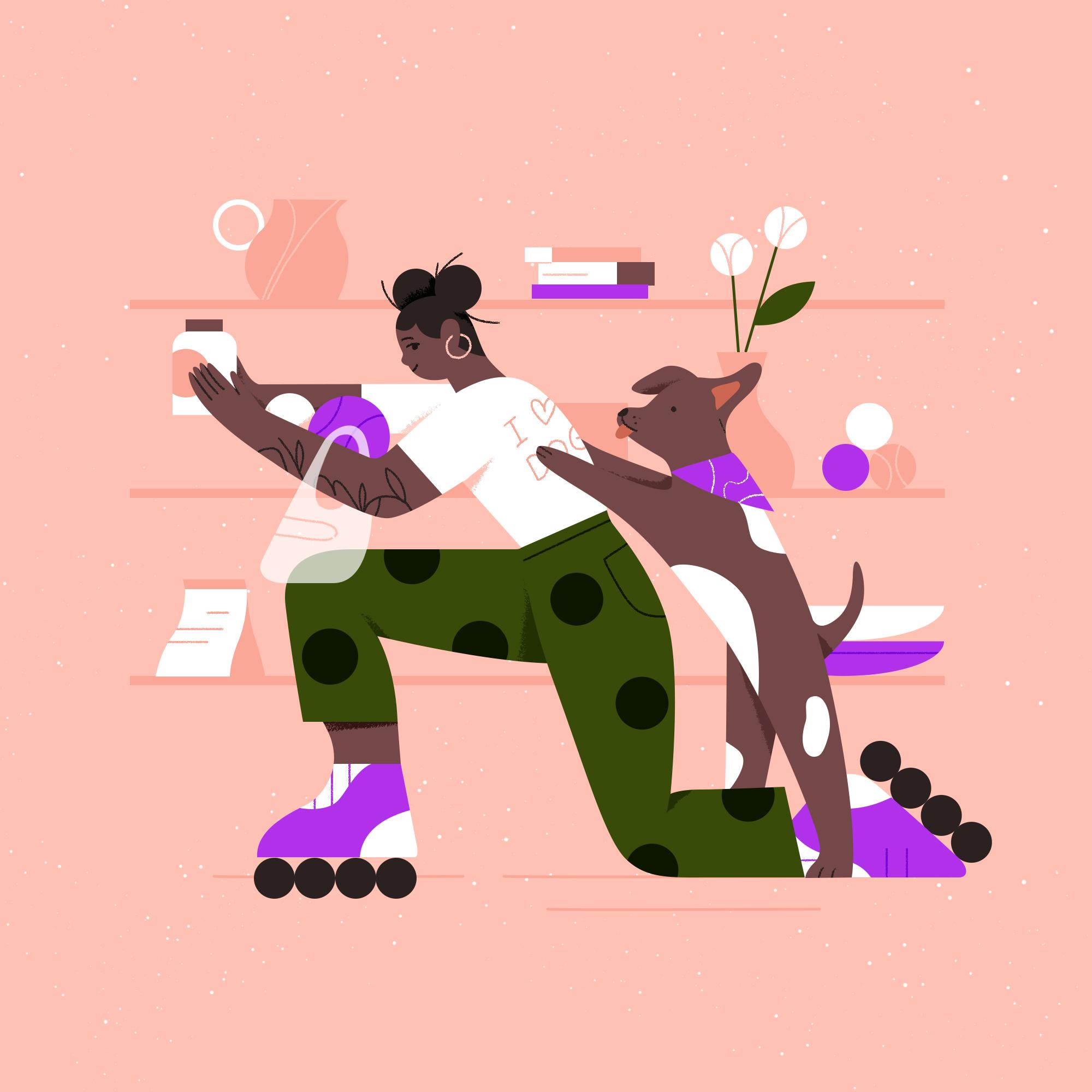
start writing things down. My idea is that I personally am a crazy dog lady and I'm
obsessed with my dog. I'll bring a bit of my own personality
into her backstory. If you're at a loss for
where to even start, I always say like
make it personal. Art is always better when
you're drawing from the truth, when you're using
real life experiences to add intricacies and detail. That applies to
characters here too. Use a part of your own story
as a jumping off point for your character's
backstory and ref from there. Like I said, I want
to do a dog lady, so when we were just getting our puppy bandage
about four years ago. I always wanted to
dress him him bandanas. I'm always buying him
way too many toys. Let's just start there,
making it personal. Love when my fonts do this. Making a personal crazy
dog lady, dog bandana. Having the dog with her bandanna and maybe
she's a little crazy. This affects how
my character is. Whatever arms are piled high with toys and
they're falling all over the place and her
puppy has a little bandana, is happily sniffing the toys. I'm just trying to imagine what this scene would look like. Maybe she's a little disheveled, grabbing an arm full of toys. Dog is cute and sniffing. This can sound as dumb
as you want it to you right now because
this is just for you. You don't have to share this. In addition, I'd also
love to give her a little something
more unique since I feel like this is
basic and I don't want the character
to only be me. I want to add a
little bit more shine to her. I guess you could say. I think it'd be fun to add
to her chaotic clumsiness by adding a pair of roller skates or a skate
board or something. Maybe her hair is
like a bit disheveled too because you can
tell she's in a rush. I'll just say
rollerblades in a rush. If I'm going off of me, I guess I'm not probably a great representation of
the diverse clientele. Maybe I'll switch her up a
little bit as I'm working. Maybe she has a
cooler hairstyle than me or she has more
tattoos and piercings. Something that makes her feel a little bit more interesting
to the common eye. If I look at this list
I made and you can make a mind map like I said or
whatever you want to do. But I really just like
writing things out. If we look at this list, this feeds back to the client's boxes they
wanted to check off. She is interesting, nuance. She has more to her story than just a random
woman looking at a shelf and the more
backstory you add, the more clever idiosyncrasies and thoughtful details you can add in which will shine
through in your designs. I'm not going to
start sketching just yet because I want
to go a little bit into character proportion and how we'll actually create
those gestural sketches first. But it's always good to have your intention in mind
before getting started. Let's kick that off
in the next video. [MUSIC]
7. Theory: Character Proportions: [MUSIC] Proportion is key to
making a character unique. You always have the option
to go more realistic with your proportions and making your design or
animation true to life. Oftentimes, more
corporate commercials would like these
types of characters, the ones that feel more
realistic like real humans. But if you're looking for
something fun and quirky, we'll move on to
abstracting, distorting, and stretching
your characters in these next couple of videos. Just keep that in mind
as you're working here and creating your characters
to the best of your ability. Here, we'll stay semi-realistic
with our characters, keeping them human
and proportional. We'll get into more stylization in the next couple of lessons. Before we start drawing a human character or any
character for that matter, we need to understand
the basics of anatomy and the proportions
of the human body. I found this beautiful stock
image and it does the job. It's not the most ideal
thing to teach with. For the sake of time, and because this is
not an anatomy class, I'm not going to go
too far into detail. But this is basically how
the human form is broken up. The human form is typically
seven and a half heads. Obviously, I'm not
doing this 100 percent accurately because the head
shape is a little off, but you can see it's about
seven and a half heads. This is for an adult form and that applies for
both male and female. But as you can see with a kid, the head is a little
out of proportion with the body because you're still
growing into your form. Usually, children
have bigger heads. In this class, we're
trying to stay semi-realistic with
our characters. I'm not going to go
into really as much of the non-human characters because I think this is a
great starting point. We'll keep them more
human and proportional, and we'll get into
stylization later on. It's always good to
keep something like this handy as you're drawing. I honestly just
search for these on Google Images and
then just drop one into my file so I
have it on hand. For typical proportions
for humans, for men, the shoulders are wide and the hips are usually more
flush with the torso, and the pelvis gets smaller. Typically with men, we have more of an upside-down
triangle shape, and then with women, it's actually the
opposite or more square. The hips typically jut
out from a smaller waist. Actually, that's where you
get your hourglass shape. Like I said, if
you're drawing a kid, a lot of times they'll see their heads enlarged
compared to adults. Because of that, if
you want something to feel more playful or childlike, just try enlarging the head. Even if I enlarge
this head right here, you can see it already is
becoming more like a cartoon. It feels more playful
and childlike, even though this is
already a child, but you get where
I'm coming from. I also wanted to
share this website I found with you because I
think it's super helpful. Its anatomy4sculptors.com. If you want to get really realistic with your
human proportions, they have this human
proportions calculator. You can choose male or female. In addition to that, you can also choose what part of the body
we're looking at, the head, or the foot, or anything like that. Then you can also
choose the age. You'll see how they
progress as they get older. These are some very
flattering images, but I think it's super
helpful and you can even type in proportions if
you want to get it right. In addition to this, also on their website, if you go to the article page, they have some really
helpful information. They have this 3D anatomy model that you can use to turn
around on their website. If you go to this
tab right here, you can actually see the human form from
different angles. Unfortunately, I
think they only have this one sculpted part. But you can do heads and ears, and different parts of the body. If you wanted to draw something from an interesting angle, you'd actually be able to
use something like this to figure out what those proportions look
like in that perspective. But back to my document here, I just want to overview and say that creating a
character like this in a standing front arm pose is best for the
animators' purposes, especially if you're
doing cell animations so they can see those different
parts of the body clearly. But sometimes I like to start by putting my character in a
certain pose because it helps me get excited about
the character and helps me imagine the character
in a situation. Honestly, sometimes
you only need to see that character
in that one pose. For example, if we go to my website and we
check out my film, here, we'll just watch a
little bit of the teaser. For example, in this
shot write here, we're only ever
going to need to see this character from the side, and we're only going to need to see the character
from the back here. Obviously, I had to
do a little bit of a character turnaround
at some point to show off what this character looks like
from different angles. But the animator is only going to be animating one
child at a time. You don't always,
necessarily need to see all parts of the
body all the time. It's not always
practical to design your character and
oppose or turnaround, especially if the character
won't be seen more than once. Maybe we only see a character from the side for one moment. We don't need to draw them from all these different angles. But even if you're wanting to pose your character
from the start, let's at least try to keep it in flat perspective
while sketching and not worry too much
about how we'll see the character from a
low or high angle, so seeing them more from the straight-on pose like we see here with these characters. If we go back to my website, we can just look
at a few of those. When I say straight-on pose, I mean something like this, or these characters walking, more of like a flat
graphic perspective. That's just my quick overview
of character proportions. I think that it
will be helpful to actually take a
figure drawing class or do more online research into how character
proportions work. But because I'm doing
this for animation and for a more stylized
look and feel, I think that this is a
really great small overview for what character
proportions are like. From here, I'm going
to just go onto sketching gestures
in the next video. [MUSIC] We'll get more into detail on how to make
your characters feel more realistic with reference
photos in a few videos.
8. Sketching Gestures: Here it comes apart
you've all been waiting for, sketching. [LAUGHTER] Feel free to follow along with me
here or just watch. In this stage, you don't
really need to worry too much about
animation just yet. These are just the
groundwork lines. We're getting to work
on our rough pose and basic idea and we won't actually be using these lines
for the animator. I'm excited to
start getting into some thumbnail
sketches with you. The only thing you might want
to consider beforehand is, are you designing for
a cell animation or an after effects animation
character that will be rigged? Like we said in a
previous video, those are going to be
setup differently. Just keep that in mind
as you're working. I mean, I think for this one, since the character
probably will only be in one pose considering the client brief and
what they mentioned about having it be a
simple Instagram post, I don't think we need to
worry about that too much. But this is a class to learn about how animation
interacts with your illustrations
so it's really good to keep thinking about
this as you're working. Obviously, if you don't know for sure how it's going
to be animated, don't worry about it quite yet. If this was a real
client project, you would probably
want to know more. But I'm not too worried
about it at this moment. Especially when we're
just sketching gestures, it's not a huge deal yet. I personally, I'm
going to assume that my character is going to be more dynamic and have
more flexibility. I'm going to just
assume that it will be cell animated frame
by frame by hand, which gives you a
lot more flexibility to do whatever you
want with the pose. If you want to create
something that will be animated directly
in After Effects, you may want to consider drawing a character like
in a walking pose or a more of a stiff pose with clear joints that can
be easily rigged. I have my ideas here, my silhouette and
everything and I'm going to get started on making a
couple of gestural sketches. In this phase, don't worry
if it looks super rough, our next step will bring
out a lot of refinement. Keep it simple while
you start drawing here and think about the silhouette. The technical proper
way to start designing a character is to create
a clear silhouette. Let's look at a couple
of examples here. We've got our
character proportions, which I talked about
in the last video. But the silhouette of
a character is what the eye immediately recognizes when looking at a character. You'll probably want to start by making sure the limbs are separated and away from the body so you can
define those shapes. Figuring out the silhouette
will also help you with posing and
gesturing later on. I just wanted to show you
some examples of silhouettes. Like I said earlier, a human male character will
have a more broad shoulder. If you want to make your
character look even stronger, you'll give them a giant
shoulder and a tiny waist. That's what this person did
with the silhouette here. With this one, we have very
nice separation of the limbs. We can see the two arms
working separately, and all of these
are very stylized. When I talk about stylized, that means really going
in to the silhouette and shrinking the head down or elongating
the legs or whatever. That will come a
little bit after we've done our gestures. But these are fun
examples to keep in mind. As you can see, on this one, we have some separation between
the waists and the arms. Lots of really nice poses
with negative space in them so that you can see the clear silhouette
of the figure. All of these are very different, but you can really tell that the silhouette has been
taken into account. Even here we can see a fun
variety of silhouettes, and like I said, characters with bigger
heads look more childish. By childish, I don't
mean immature, but I mean more innocent
and more infantile. I think that this example
really shows that. Smaller heads obviously look a little bit more
adult, in my opinion. We'll just keep that in mind, having a clear silhouette
as we're drawing here. Since we're starting
with the overall shape, don't get too caught
up in the details now, experiment, don't fall in love with any one
character just yet. You have to be willing
to throw out a design if it doesn't serve the
story's purpose well enough. Try not to get too frustrated. I'm just going to use a fun
color to start sketching here using my thin
inkblot brush, but you can use
whatever you want here. I like using Kyle
Webster's brushes as I'm always saying
and all of my classes. I'm just going to start by using really basic
shapes for the head, so like a circle for
the head is always standard when I'm just doing these really abstract
loose gestures. I know that I want this to
have a woman on roller skates. Maybe she's disheveled,
grabbing an arm full of toys. There's a dog. Let's just keep all that in
mind as we're sketching here. She's also supposed to
be picking something off of a shelf or something
up from the shops. I'm just going to loosely
guess how that would look. Maybe she's reaching up and she is on a pair
of rollerblades. Obviously this is super
out of proportion but maybe her leg is kicking
up for a little bit of fun. Perhaps her arms are reaching
for something on a shelf. You've got this light
shelf behind her. In this flat perspective, maybe she's got her
dog looking up at her, wanting to get the toy
that she's reaching for. Maybe she's reaching for a bowl of dog bones
or something. [LAUGHTER] I don't even know
what that is, dog treats. As you can see, this
is super rough. Spend 1-2 minutes on each sketch and don't
get attached to it. Maybe perhaps she's on
the ground bending over, in a squatting position, which in my opinion
would probably be really hard to do on roller blades, but let's just see. Maybe she's bending down to grab something off of a
shelf that we see the side of. Obviously, I would need to figure out how to actually
create these poses. But I think we're
off to something. We're off to a good start here. Maybe here's the dog reaching on the other side of that shelf. I also really want to point out here that when you're
thinking about silhouettes, think about a line of action. This is animations so
we're going to be thinking about how the character moves. When I say line of action, think about just
one gestural line that will carry through
the whole character. We've got maybe this line here, and for this one we've
got a curved line here. If I do a third sketch, maybe I want it
to be this curve. You can always draw the
line of action first. Maybe she's reaching onto the ground to grab a ball
for her dog or something. We've got the legs
here stabilizing her. I don't know whether that
leaves room for the dog. Maybe the dog is
sitting on her back. But I really like using
this line of action because it shows the animator potentially how the
character will be moving. For this one, maybe
the character's swooping in like this and we're using that line of action to create that movement. It's just really nice to have this clear visual line to create some dynamic
interest to the eye. These are super rough sketches. I need to make sure that
besides the character, I'm also taking into
consideration the shop around it because if we look
back at the client brief, we really want to make sure
the character is happy. We want to make sure that if it's in a square
social media post, we want to make sure that
we see the character holding the product and everything because it
is for the gift stops. Maybe I take that into
consideration a little bit more. We'll get into
more detail later, but maybe she's
holding a bag here, maybe there's a
bunch of stuff piled up in a grocery
then on the ground, or perhaps in this one she's got more things piled into her arms. Maybe one of the arms
is actually down. Maybe it's this one, maybe this arm's
down and she's got a pile of toys in there and the dog is
trying to reach them. I think that there's a
lot of things we can do. This is super rough, but you can see what
I mean when I say, this really does not
have to be perfect. This is just for you. This is just for you to
get those ideas out and then you actually will
pick one of them, create a reference photo, and create a more refined
sketch from there. I think this is a great
starting off point. Just make sure to try and infuse life into
your character in these beginning stages with quick strokes and
energetic lines. Don't worry too much about unnecessary accessories
or details. Try to keep it
simple and stick to the basics. Now it's your turn. Take 5-10 minutes
to roughly sketch really quick gestural
compositions and shapes for your character. These should just be
basic thumbnails, don't get too
detailed or worried about how they're
looking quite yet. This is really just laying the groundwork for
you, like I said earlier. Go ahead and do that and I'll
meet you in the next video.
9. Take Your Own Reference Photo: [MUSIC] This next tip is my absolute favorite tip for illustrating
human characters. Take your own reference photos using photo booth or your phone. I mean, who knew it
can be so simple? I usually take reference
photos after sketching out my loose idea or character so I know what pose I
need to take a photo of. When I first started
drawing characters for motion design
for personal work, I really, really struggled. For one, I was not great at
perspective to begin with. So seeing my character from
a weird angle or something other than front-facing was
almost impossible to imagine. Two, I just had trouble
drawing characters in general and making the
proportions look correct. I started taking
photos of myself or Tyler or even my co-workers
or my dog to get it right. Taking my own photos especially help with hands because
hands are probably the most complex
part of the body to draw and a ton of people
struggle with hands. Just know you're
not alone there. I 100 percent still take my own reference photos all of the time to get more
interesting poses. These are poses that
I would not have been able to come up with
without a photo. Not something I
could just search on Google and instantly find. I think this will be
really helpful for you. Like I said, I love taking
my own reference photos. I do this all the time, especially even for animals. I'll take pictures of my dog, etc and I have a few
examples of that here. This is going to go
backwards a little bit but I wanted to illustrate a fox for this takeover I
was doing for Panimation. I didn't really know how to
get a unique pose for a fox because if you search like
fox pose or something, there's some really
cool pictures and stuff but I wanted something
a little different. I actually took a photo of my dog and you can
see the process here. Just a picture of my dog bended [LAUGHTER] playing with his toy. But I thought it was
a fun line of action. Like we talked about
in the last video, there's this nice
curve in his body. I actually use it
to sketch my fox. Then I played with
proportion a little bit, added some wings and created this fairy
tale version of him. A couple of other
examples I have are I did this exercise where I wanted to do warm-ups
and I only gave myself like 20 minutes
to finish them. I took some [LAUGHTER]
awkward photos of me and used them as reference. In this case I
didn't actually like trace over anything
because I wanted to play more with abstraction
and drawing from my vision. But I had fun doing two different versions of it and they became really abstracted
and fun which I loved. My final example of this was this illustration that
I had about anxiety. I had this idea in mind which I actually sketched out
really, really basic. Like you would call this
my gestural sketch that I illustrated in my little
[LAUGHTER] bedside notebook. Just an idea that
had come to me. Then I was like, well, I know I want someone in that
pose so I had my husband take a photo of me with the scissors and the brush
[LAUGHTER] which became a mirror and scissors. I went from there, and
you can see I start with the long hair but I
wanted to make the character different so I played around
with different sketch and proportion ideas
as I went changing everything to feel a
little bit more playful, less realistic, more stylized. You can see that's how
my sketch turned out. Then I actually went
to Procreate and added like the lighting
and stuff which definitely was not in my
original reference photo but having it there as a
base was super informative. As you can see, I love
using reference photos. For this one I
obviously was like, let's make it a crazy dog
lady who is on roller blades. I was like, you know what? Why don't I just try using actual roller blades to do these poses to see
if they're accurate. Mind you, I am not a
great rollerblader. [LAUGHTER] I actually just got these roller
blades recently. But I was like, you know what? Why the heck not
embarrass myself? I took some video of
myself rollerblading, two screenshots and poses. [MUSIC] Here I am being extremely
bad at rollerblading. [LAUGHTER] I'm practicing,
I'm going to get better. But I played with some
poses so I'm just going to screenshot ones that I think
could potentially work. Obviously I'm basing all of these poses off of the gestural
sketches I already did. It was really good to have that foundation of what
I wanted with my line of action and then I
could actually try to emulate that in my poses. Trying a couple of
different things here. Obviously not too great at doing this on the roller blades. Let's see where we end up. There's some more
over here I promise. [LAUGHTER] This was me trying to do the
kneeling pose but it was actually way harder
than it looked because I'm not stable enough
on my roller blades yet. Very nice poses here. I actually got a second video. Let me try to find
something in here. Here's the leaning over one. Wow, what a beautiful
line of action. Love that, 90 degree
waist bend right there. [LAUGHTER] I also
wanted to get one of them from the back so I was
reaching with my front arm. Here I got some more pictures. Gosh, the most flattering
thing I've ever seen. I've got a few there. But I also just
want to emphasize that you don't have to
be as awkward as me. You can just go onto photo
booth and take still photos. These are also semi awkward but I was like if
I'm going to try it without the roller
blade I might as well try out a couple
of different things. [LAUGHTER] Posing from the back. Obviously I do a lot
of the type of posing. [LAUGHTER] Now I have a
lot of things I can use, so I'm going to just
drag them all in. Boy, I'm making a folder called reference photos
and I put all of my old concepting stuff in
that concepting folder. I really like to stay
organized as I'm working because things can get really messy in Photoshop.
I'm sure you know. I've got some nice
reference poses there. I've got the roller blades
too which is super-helpful. Then also I'm going
to grab a couple of these photo booth photos too because I think they might be fun to
play with and maybe a little bit easier to read. Let's see. This one could be fun or maybe this one. Remember I want to have
the disheveled hair, I want to have my character
with her dog too, and also thinking
about the shelf and where everything
is placed so take all these things
into consideration. I also have a video that I
shot with my dog just playing. I'm going to get into this
a little bit later in a bonus video but I wanted to make sure I got some footage of him moving around
so I could use it. I don't know if I have
the right footage because he wasn't
very cooperative. But this is just
something to keep in mind while I move forward. [LAUGHTER] He's basically
just standing and, look at that little [inaudible]. I just got to put that in there. This is just something good to have as I'm moving forward. Now that I have all
of these poses I'm going to look at
them objectively in relation to the poses I sketched and see which one might be
the best line of action. If you're really concerned
about the motion I would go through and illustrate that out where is that line of action and which one might be the most successful? Looking at this, I
feel like the most fun one just without even the
line of action might be one of these sitting ones because I think the pose
is just actually really interesting and it'll actually take up the square
frame really well. If I'm thinking
about how this is a social media post and how
I actually want to take up the majority of the square frame and make
sure it fits accurately, I'm probably going
to go with one of these sitting poses so I can turn off the standing ones. I think this one is still
interesting but it's awkward. Like who pulls something
from a shelf like that? Obviously not me. Let's just
use one of these three. Because I really want to include the rollerblading in there, I think it'd be best to use one of the ones with
the rollerblade. I'm going to stick
with this one for now. As you're sketching
that might change, you might choose a
different photo, you might abstract a
lot from your photo so your illustration
might not actually end up looking like
that at the end. But now that I've chosen this one I can move on to
sketching it in the next video. Now that I've completely embarrassed myself
in front of you, you can embarrass yourself too. [LAUGHTER] Though it's nice
that you don't have to share your poses with the world like I do so that's a plus I guess. Open up photo booth
or your phone, take your photo and begin
illustrating over that, breaking the image down
section by section. Not everyone is comfortable
with taking their own photos so you could ask for a
family member or a friend to do this or you could
try using Unsplash for reference photos though
I wouldn't say it's as easy to resource images online. Taking your own photo is always preferable and much quicker. [MUSIC] Choose your
favorite photos and drop those into your
Photoshop file for the next lesson where we'll begin creating those characters.
10. Sketching Your Reference: [MUSIC] Now we're going to use our reference
photos to really get into the nitty-gritty of
posing our character. We will break down your photo into basic geometric shapes. You can use the shape tool or
you can draw them by hand. I usually use both honestly. A lot of the times I will
trace the photo more proportionally and then
begin abstracting as I go. I like to use an even
balance of curves and straights to make my character
feel more geometric. I actually have a whole class based on breaking down photos, still lives, into
geometric shapes. It's called Playing with
Shapes in Procreate. It might be useful to take that class as well
to learn a bit more. But I'll show you
here what I mean. In this video, I'm
going to actually start doing a rough sketch
of my reference. You can follow along
with this too, make sure to pull up your reference photo
that you're going to be using and bring it
into Photoshop. I usually make a folder
called rough sketch. What I do is I turn it onto a low opacity and
begin sketching. One of the tips that
I love to start with, because starting a sketch
can be super daunting, is I try to break down the photo into basic
geometric shapes. You could either do this using the shape tool or you
can draw them yourself. A lot of times I'll
trace the photo more proportionally and then
begin abstracting as I go. I'm going to change
the color here. Maybe I'll just make a circle
for the head and we've got two rectangles
[LAUGHTER] for the arm. You just want to
break them down into the most basic shapes. That helps you
simplify everything. I also want to have that
line of action in there. [LAUGHTER] That's like a broken down abstract version
of my character. That's one way you can go
about it and then you could turn that onto low opacity. Turn it around or perhaps
you duplicate it, press Command E to flatten it. Then you're like, you know what, I want her to be bending over more so I'm going to
have it like this. You can just play around with the arrangement
of everything. Personally, I use this tip. Sometimes it's nice
to be able to see, maybe the arm could just
be straight instead of having this elbow curve in it. Or maybe the legs are very distinctly square
at a 90 degree angle. But I personally, [LAUGHTER] I like
to do a combination of tracing and abstracting. I do love those straight arms. Maybe I'll start by just
tracing my face loosely. I just want to disclaim
that tracing should never happen if you're not using your own reference photo. I full-heartedly believe
that we should not be copying anyone's work, even if it's a photograph or
someone else's illustration, you definitely do not
want to be tracing that, but because this is a
photo you took yourself, there's no harm in using it as a tracing reference because this is technically your work. This is you [LAUGHTER] or a
photo of someone you took, so there's no harm in that. That being said, I just
go right in there. I want to have a more curved
look to this character. Make her a little bit
more organic, less rigid. I'm going to add a little bit more curve
in there as I'm working, add a little bit more angle. But you can already
tell that I'm thinking of this
thigh as a rectangle. Then this part of the leg
would be another rectangle. Then we have the shoe
coming down at an angle. Then if we're trying to
keep everything more flat, maybe I'm thinking
about the wheels from a front perspective
instead of in this angled perspective
that they are here. I'll just add them in like this. They can be really simplified. Then maybe for this leg, I'm also doing two rectangles. Sometimes it's fun to
just press Shift and make a straight line and
see where that takes you. It makes this very wide foot, but I like it. Then I'm going to add those
three wheels in again, and perhaps I could
do the straight arms, so would feel very
rigid like this. I could also exaggerate
the curve of my arm and make it go a little lower and
then keep this one straight. There's a nice mix of abstract
and organic in their. Hands are always the
hardest thing to do, so I'm going to
ignore those for now. But if I turn off my reference, you can see I already have something nice shaping up here, a little bit more
refined [LAUGHTER] than those gestures I had earlier. But I also want to explain another way that
I like to go about things. This is actually something
that I have in one of my other Skillshare classes, it's called Playing
with Shapes in Procreate: Illustrate
a Graphic Still Life. I know this is
done in Procreate, but it uses a lot of the
same basic principles. What I love doing is taking
that reference photo, obviously, never trace a copy
from someone else's photo. But taking that and then breaking it down into
those simple shapes, so you can see here,
I'm using ellipses, rectangles, and triangles
to create those shapes. I even have this lesson called the curve
to straight trick, which I highly encourage
you to check out. We'll go over it a
little bit here, but I don't
necessarily want to go fully into that because there's already a class
out there for it. But something I like
to do is to have an even balance of
curves and straights. Like it says here, straight lines feel
more angular and create more of a dramatic
or angry feel, and then organic curved lines feel more soft and friendly. Keep that in mind
as you're creating your character
because we want to create a neutral feel for
this or even a happier one. We might want to go a
little bit more curved because even just
looking at this, this character feels
like a robot which makes me think of
cold and harsh. I definitely don't want that. That's why I'm starting to add some of these curves in here. But like I said,
an even balance of curves and straights
which I have going here, I've got this curve, I've got the knee curve that
meets the straight curve. One classic example of a curve
to straight that I really like is just a basic human leg. [LAUGHTER] We've got a
straight and then we've got the thigh and the
calf and then that just makes a leg immediately, but it's very simplified. You've got the straight on one side and the
curve on the other. It just creates this cool
abstract geometric look and feel without
actually feeling too geometric like this. [LAUGHTER] If I wanted
to do that here, I could even make the whole top side of
this character's leg curved and then have the
bottom part be straight or I could have these two
straights meet a point, and then have them be
curved underneath. Obviously, I feel like anything that has a sharp corner
is going to feel a little bit too intense [LAUGHTER] for
what I'm looking for here. But that's your basic rule
for curves and straights. I'm going over this
a couple of times, I would highly recommend
you do this yourself. Start with your
basic abstracting of shapes and then bring
in your trace sketch. From there you could
even push it further. Maybe I'll just do a second
one where I'm going even more curved because in
the client brief, they say, we want it
to be happy as a clam, so maybe making it even
more friendly looking. Maybe we see more
of a waist here and got more voluptuous
curves happening here. If you want to create that more geometric feel like having a flat foot or something that meets a flat plane actually will be really nice and help make it feel more flat. We could even take this knee right here and make that flat. This creates more of
a geometric feel. We could have the foot being straight and maybe a curved leg, but then perhaps even
the roller blade is straight on the ground, which doesn't make
any sense really. But you could potentially
have it like that. Obviously, it doesn't
have to be realistic. If your pose that you did is not working and
you don't love it, feel free to riff
off of it here. I'm just going to continue on. Maybe we define
the shoulder a bit more and make it
more curvy that way. The great thing about
reference photos is they really show you how to overlap your limbs and stuff. Because sometimes
I'm like, wait, will the line be going this way or will it
be going this way? [LAUGHTER] So having that
there as a reference, you can see the sleeve of my
outfit, that really helps. I'm going to keep the
straight arm back here too and have them meet up. We'll just have some
glove hands for now. But I'm really liking
how this is shaping up. If we go back to our
gestural sketches, we have that nice line of
action appearing here. It's not necessarily your
basic line of action, but maybe it's a
little swoopy swoop. [LAUGHTER] I feel like it
has a nice composition. If we take that rough sketch
and we make it bigger, does it fit in the frame? Well, maybe potentially, this is where the dog would be later on when we go over that, so takes up more of the frame. Maybe the dog is grabbing the booty as
dogs do. Just kidding. I don't know why I said that. [LAUGHTER] But we can keep
that in. Yes. Obviously, I'm great at just sketching
dogs roughly. You know that. It looks perfect already, so no more work needed there. [LAUGHTER] But if
we're also thinking about the aspect
of it that I had, if we go back to our concepting, grabbing an arm full
of toys, in a rush, disheveled, has all
these extra details. That's something we'll
continue adding. But I want to make a little
bit of room for it here. Maybe the dog's leash is in her arm and it's
wrapping back to the dog, and maybe she has her bag or purse or
grocery shopping bag, whatever it is hanging off of her arm and maybe
there's a ball down here and she's just
surrounded by toys and stuff. Then maybe if we make her
a little bit smaller, we can add a shelf behind her. Maybe it's more of
a flattened shelf. Well, I don't want to
just see the side of it because I think that's boring and it wouldn't be
as exciting for the client to see
their products. Maybe there's this
shelf that takes up half the frame and we
see some items on it. Maybe she's reaching for the dog biscuits
like I said earlier. [LAUGHTER] It's just a super
rough version of the sketch, but I'm keeping everything
on separate layers. If I want to go
back in and adjust things or abstract the character like we'll do in
the next lesson, I have that capability there. I think we're off
to a great start. I would encourage you to go ahead and try out a
few different ways of sketching your character and then we'll get into the
more refined details. [MUSIC] Using your
favorite reference photo, create 1-2 quick sketches. We'll be refining them
in the next video. I honestly can't wait to
see what you come up with. Have a blast and
I'll meet you there. [MUSIC]
11. Theory: Abstraction + Exaggeration: [MUSIC] In this theory video, I'm going to dive into the ways that you can make your character designs more unique by
pushing proportion. We'll use abstraction,
exaggeration, and distortion to convey
different things. For example, if we want a character to come
across super-strong, you might want to give them unrealistically wide shoulders, or a trick I always like to use is making the head and eyes much bigger than
they should be to create a more youthful
or innocent feel. You can even get crazy
and make something that just doesn't even
come across as human. This is a super fun part of the character design
process for me, and I think you'll enjoy it too. Obviously, changing
all these proportions will also affect the way
characters are animated. If something has huge feet, their biodynamics and walk
cycle are going to be very differently weighted
than a normal one. This is definitely something
to consider as you abstract your own sketch
in the next lesson. If you're working with a
super experienced animator, you may be comfortable going
crazy with proportions. But if you're not sure, it's always good to get the
benefit of the doubt and not go too hard with
the abstraction. We're at this point
in our illustration, which is write out the
rough sketch phase. This is where we want
to get, a little bit more unique with our characters. Obviously, I've
already implemented some abstraction by
doing that curve to straight trick and by doing some geometric shapes and
flattening everything out. But there's still a lot
of stuff we can do. I'm going to show you
some of that now. I love using abstraction,
exaggeration, pushing proportion to make
my characters more unique, and not just my characters, but my designs in general. For example, if we were to look at these glasses right here, a real pair of glasses, the perspective wouldn't look like that and it wouldn't be so perfectly straight and
at flat angle like that. But I really wanted to make them geometric and simplified, so I literally just did a
couple of straight lines, a curve and two circles, and it becomes
really abstracted. We can apply those same
principles to characters. For example, here, with
the arm down here, I created two straight lines, connecting them with
a curve and created more of 90 degree
angles everywhere. You can actually start to see
some of that abstraction, and the distortion
and exaggeration. What I mean by that is
the feet are really tiny compared to the legs, or up here, the character's head is very small
compared to the body. It's really just taking
those elements of the body, making them bigger or smaller, distorting them a bit, maybe slanting them, and coming up with some different ways of
visualizing these characters. If we go through my Pinterest, which is always my
favorite place to go, feel free to follow
along in there because I do love painting all the time. But you can see a lot of
the characters that I have saved on here
are exaggerated. This character's feet are 50
times bigger than her head. That's an exaggeration,
but you know what I mean. It makes it more
playful and fun. These characters have some really interesting
flattened perspective, and their heads are really tiny, but their hands are huge. For this one, for example, it's like a flattened
perspective where we see the hand is in the foreground, but it just looks giant in comparison to the body
because it's flattened. Something that I'll say is that using abstraction
and exaggeration and pushing that proportion can create a different type
of mood for your character. As I said earlier, children tend to have really
big heads in illustrations. Even if we look at the suggested
illustrations done here, you can see that
these characters are kids and they look
like kids because their heads are massive
compared to their bodies. Even here, for example, this is a project
that I art directed, Odd Fellows, and
we see this more sophisticated, realistic
female character. She's definitely
abstracted a bit, but she has more realistic
human proportions, and so does her family. In the development
phase of this, you can actually see
different iterations of that. This character, down
here in the middle left is much more
realistic looking. Her head is more in
proportion with her body, same with this other
one on the bottom left. But then this one down
here that I drew, and these ones in the middle where we
actually made it out, have slightly smaller heads
and elongated arms and legs. Even though they're
not a 100 percent realistic human proportions, you can still identify
them as human. They have a lot more
personality in court to them. Now I'm not saying
that you shouldn't use realistic human
proportions because that's a look. That's a vibe. [LAUGHTER] Some people
want to go with stuff that looks more realistic and sometimes your client
will ask for that. But this class is
about simplifying for animation and creating
a stylized character. If we go look at this
3D animation from book, it's super cute, but you can tell
they're trying to be more playful because the characters have huge
heads and huge eyes. They almost feel like toys. Changing the proportions
and everything can really give your illustration
a totally different mood. In addition to that, changing the proportions
is going to affect the way that your
characters are animated. For example, like this
dinosaur character has small legs and small arms and the way that it's animated is reacting to the
way it's shaped. I guess that's probably
the best way to say it. It's taking into account the
weight of the character. This may be not 100
percent accurate, but I like to think
that the legs are long and the neck is
a little bit too long, so it feels really off-balance, and so this drop is
just tumbling around. Then this character feels
a lot more true to life. We've got more of that
realistic movement happening, very stylized wind
and everything. But you can really
see that there's a lot of weight put
into the character. I liked this one
as an example too, because the dog's head is huge, so it definitely feels a bit off balance when it's running. This one is just dumb. It doesn't make sense. I love Charles Huettner and I don't even know if
that's how you say it. If not, sorry, Charles. But I just loved [LAUGHTER] how the head looks heavier
with the upturned butt. The proportions really affect everything and you have to keep that in mind as you're drawing because your character
will be animated. Now that we've actually looked at some examples of abstraction, thinking a little bit about all the different
proportions of characters, how we can change those up
and then also taking into consideration the
animation aspect of it, I would love to dive
into our own design in the next lesson and apply some of these
characteristics to that. [MUSIC]
12. Abstract Your Sketch: Let's put those
proportion pointers we just learned into action. I've got my character pose and sketch that I'm really liking. She's still basic, so I haven't actually gotten to attach
to anything just yet. This part is really fun for me. We've already talked about what real human proportions
look like. I want to take
those techniques to the next level by
messing with proportion, and scale and distortion
using the transform tool. Because we're using
illustration here, we have the license to stretch
the boundaries of reality. You can use scale and shape contrast add stylization
to your work. In a lot of cases, depending on how you're
using these techniques, exaggerated proportions
can make your characters feel more relatable or unique. That being said, let's look at a couple of
ways that we could technically exaggerate
our character. I'm going to turn off these extra layers and
just use this main one. I'm just going to
duplicate it and turn off my sketch layer for now. What I'd like to do a lot
of the times is just make a smaller version of my
character and create iterations. Obviously this is just
shapes right now. But I'm going to
go in and be like, what if she had a
really big head? That feels more
childish to me and not necessarily always the
only way to go quirky. You could also give
her a tiny head. That might feel more playful in a way because it's
out of balance. Maybe the feet are massive. That one illustration
I was looking at earlier had really big feet and I liked how it felt
more fun and playful. I'm going to make
that aversion and I'm going to iterate from there. Perhaps another thing we
can do is you can select your character and then
you can right-click it, and you have all these
tools like distort, perspective, scale, rotate. I like to use the
distort tool sometimes, and I'll just drag corners
around and just be like, maybe I want her line of
action to be stronger, so I'm pushing her more towards the left because she's
leaning towards the left. It makes it a little
bit more interesting and draws your eye
to the other side of the frame because she's
pointing towards it. I'm liking how that's feeling. Maybe her legs are
even more elongated, so I'll just select one
of the legs at a time and drag them and
fill in the blanks. Maybe this one is
longer this way. You're going to have to
make adjustments as you go. But it starts to become something a little bit more unique and interesting. Already if you look above the sketch that I'm working on now and see the original one, it feels like it has
more motion to it. It feels more animated already. The more animated we
can make our characters before they even are
brought into motion, the more visual momentum
they're going to have. I personally like this one, but let's see some other ways we could just distort things. If we took that
original one again, if we want her to
appear really strong, we could exaggerate and
distort the shoulders. Like I said, having those massive shoulders is
going to make her look more buff, more macho. Maybe she's got a little hat on. Her waste is smaller, so it feels more like
the male proportion. Perhaps we have a male
character here or a non-binary or
genderless character. You can also make the legs super tiny and lean into
that a bit more. I think that looks really silly, but if we could do some
adjustments, it might work. Perhaps the legs
go out this way. I mean this is just ridiculous. I probably want to go
with this and the end, but I have my own style and you probably have your own style
and they're not the same. I encourage you to play around with what the proportions of
your character looks like. I think it's really important
to abstract and see different iterations as you
go to make sure that you're comfortable with the
character design that you end up coloring in. After I've finished abstracting, I want to take this
next little bit of time to actually refine our
sketch a little bit more. We're going to be
going into faces soon and adding color
in details, etc. But before we get there, obviously we need to have
a more refined sketch. I'm going to choose the
sketch that I liked the best, which was this one, and I'm going to take some
time to bring it to life. I'll just make this folder
called refined sketch. Start with this. This
is my rough sketch. I can name that layer. These layers won't yet be
used for the animator. Don't worry too much about
organizing your layers. But it is always good to see semi-organized because
then you have something to look at easily and you can close folders and you can look
back at your progress. I really encourage you to stay at least
semi-organized here. That doesn't mean naming
every layer necessarily, but staying more organized in general has always helped me. Now that I'm looking at this, I'm realizing our character
might actually be a little too long for the frame
because we see it's square, but we still want to have
this other stuff around her. Say there's just like
this rectangular shelf. Then potentially, we want
to have the dog here. We have all this extra space
at the top and the bottom, and I'm trying to fit
it more proportionally because the client
has specifically said that they want it to be
a square social media posts. It won't be really used
in any other context. I think it's okay to lean
into that square shape. I'm just going to
play around again with that abstraction and just try to bring her
in a little bit more. Maybe she's not as elongated
as I had her before. Maybe her head is a little bit bigger so that she takes
up more space on the top. Maybe that makes her appear
a little bit more friendly. Perhaps her forearms
aren't as long and perhaps she's not as bent
over as she was before. That's a very slight difference, but I think it's going to help. In addition, we could make
the bottom part of the leg a little bit shorter and even make her foot taller and bigger. But sometimes it's
just fun to add a little bit of
extra personality to your character. There she is. She's taking up
most of the frame. I want to have this shelf thing, but maybe I will give it a little bit
more breathing room. It's like framing our character, which compositionally
feels really nice. Then when we get to
the dog part later on, I just want to have
a little bit of a blob shape here to give me some idea of where
that dog is going to be. Dog, maybe that's it's nose, and he's got some little legs. That definitely
looks wrong foot. That is something
we can work on. Since she is leaning
to the left, it feels very left-heavy. I'm just going to pull
her over slightly. If she's not
technically centered, she can still be
visually centered. That's what I really
want to focus on. Maybe I'll give this
a couple of shelves. Make sure to delete the pieces that you don't
really want overlapping. I'm going to do a
little time-lapse here of me refining this character. What I mean by refining, is going over creating
clean lines and clean shapes that I
can trace over in my color blocking
phase so that I have a more geometric and clean
silhouette to work off of. There's not too much to this. It's really just
about adding details, making sure we're getting
those very straight lines. It's not as sketchy anymore. Making sure we're adding in the things that are
on the shelves, adding in that disheveled hair to the character and everything. I think it'll be
really helpful to just watch how I'm doing this. Then when we get into the
color blocking phase, we can talk more
about those details and how they add to the concept. The way I do that typically is I'll just take the entire folder and press Command E and that will put everything on one layer because it's easier to just keep my sketches
on one layer. Typically, we don't want to
flatten stuff in animation, but we're not quite there yet. I'm going to turn
the opacity down. I'm going to create
another folder. I'm just going to start
diving into this. One tip to keep in
mind if you're using Photoshop and
especially Procreate, this actually works
on Procreate too, is to keep this
smoothing tool in mind. If you want to get
those more clean lines and make your lines less wobbly, I typically put my
smoothing to 15-20%. With smoothing, it just automatically makes
everything look really nice. Then if I turn off
the smoothing, it's more jagged. I highly recommend
using smoothing. It's really good for
sketching and making things that look a
little bit more refined. Here's where I ended it out
with my refined sketch. I did a lot of things to it. I made sure that the curves and straights felt more
clean on our character. I went back and I looked
at our concepting, this looks insane right now, but I'm just looking at
this list right here. We really wanted to have
her being disheveled, rollerblades, in a rush. I actually did forget to
add in her bag and stuff, so let me do that right now. I definitely wanted
her to feel more like she was disheveled. Maybe she's got some more toys
tucked into her arm here. Maybe there's a little
ball on the ground or a little block or something. Another way that I really wanted to bring her personalized life was potentially through adding
patterns to her clothing. Think of your rough sketch
as your basic figure sketch. Imagine you haven't
attached clothes to it yet, it's more of just
a plastic model. Then in this section
when we're refining, I'm going in and adding a little bit more
interest and detail. That's why I added the
pant leg jutting out. It would feel a
little more rigid if everything was exactly
to the line of the body, everything would be skin tight and that's not really realistic. Not everyone dresses that way. I just wanted to add a
little bit more flair and personality to her. Maybe even as I go
into color later, she can have a little tattoo
on her arm or cool earrings. There's an endless
amount of possibilities of what we can add
to our characters. The more you add, the more unique this
person is going to be. That's where I'm headed with it. I left this spot to her
right to put the dog in. I really want to go over that a little bit later
because I want to talk to you a bit about
non-human characters and animals and stuff like that. Then that will also give
us a little refresher for how we did this
first character. I'm feeling pretty good
about this refined sketch. I made sure to use my curved, straight trick, my abstraction. I stayed true to my silhouette. So we see a lot
of negative space between all of the
pieces of our character. She's very clear
and easy to read. That makes me feel like
I'm pretty much ready to move on to the next lesson, in which we'll talk
a little bit about faces and facial expressions.
13. Faces + Emotion: [MUSIC] Oftentimes you may not need very detailed facial expressions for your characters. Sometimes they
might not even need faces at all, but
on the flip side, you may want emotion to be the driving factor
for your character. I don't know where I
heard this exactly, but I know that humans
are scientifically inclined to spot faces
and emotions in people. Pets, animals, and even nature, that's probably why I always see a creepy ghost face
when I look too closely at my
wooden floorboards. But emotion has a ton of
relatability and interest to a character and can intrigue viewers to look at your
work more carefully, perhaps even give
it a second glance. Like I said, I love to
talk a bit more about emotion and character facial
expressions and everything. If we obviously look
back at the brief, they want this
person to be happy. Everyone knows how to
draw a smiley face. I think we could literally just have a smile on this character and she would feel complete. Sometimes we don't need
to show those faces to get across the emotion
that we're feeling. If we wanted to
exaggerate that more, she could have her
little upturned eye or she could just have
a little circle eye, she could even have
a sly side smile and everything like that. But in order to get these
basic facial expressions down, it's always good to look at real-life reference in order to know exactly
what we're doing. I thought it would be nice to look at some of these
facial expressions. I just grabbed these
off of Google. I'm unfortunately not sure
where exactly they came from, but I think looking at a real face is
going to help a lot. One thing that's very helpful to notice as we're looking
at these characters and people in real-life is eyebrows
add a lot of expression. The eye width and
anxiety, anger, and fear is like almost
exactly the same, but the eyebrows are doing
totally different things. You can really see
that come across more in illustrated characters, like when they're exaggerated, because for animation
especially, the animator is going
to be exaggerating these facial expressions to make them feel more
noticeable in animation. They use these techniques
called stretch and squash, which help exaggerate
those emotions depending on which emotion you're
trying to portray. That's why some of these
look a lot more exaggerated than your typical human face. I think this is a
really cute example of how the eyes get
smaller per expression. It's really good to
keep that in mind. But when you get down to it and you really want to
simplify things, all you really need is honestly, you don't even need a nose. All you really need is eyes, a mouth, and eyebrows. Sometimes you can even just
have eyes and a mouth, like I was showing
you a little bit ago. But eyebrows are a huge help
to portray that emotion. This is actually from
a project that I art directed at Odd
Fellows for Google and it was really fun to devise these characters
from scratch. We worked with some
amazing designers, Odds really was pretty much
the one to design the system. But as you can see, we
went through a lot of simplified and more
realistic iterations of the characters. Then from there we got to design walk cycles and turnarounds
and all of that. This is just a nice little simplified character
expression sheet. Then if you go down on
the page on my website, we've got hair examples of
different types of people, races, nationalities,
all of that. In addition to that, we also have this
expression sheet, which is what I have on
the screen behind me here. But as you can see, putting the eyebrows
down is going to look more angry or irritated. If you put the eyebrows up, it's going to look more
joyful or surprised. If you have upturned eyebrows, it'll feel more sad or anxious. I can show you
instantly how that would look on this
character here. If we wanted her to
feel just happy, it's going to be hard to get
this right from this angle, but she's got raised eyes there, maybe she even has a
big smile on her face. But instantly, if I do this, she's going to look angry because her eyebrows
are downturned. Or if we do this, she's like, I'm a little worried, maybe
she's got a little sweat, tear going on there. Like I said, you could just
use a mouth if you wanted. I wouldn't say it's
a cop out because I definitely think that there's some beauty to the
simplicity of it. But I always like to
add a little bit more. For her, I can have both of her eyes
so we're seeing it on the edge and maybe she's got that little
surprise look on her face. [LAUGHTER] She could be turning towards
camera a little bit. You could also take
that expression and move it around on the face and see how it feels different. Even if you cut that out and
then maybe you want to add a nose and the character starts feeling a little bit
different with the nose, so you want to play around
with the facial expression. There are so many possibilities
and it really just takes the swipe of one line to make it look different
because as humans, we try to find emotion and facial expressions
in everything. Even just adding a
little line randomly, like even if you
put her mouth over here and you put
her eyebrows down, she would look frustrated. Or if you put her eyebrows up, she's like more slightly and
curious or almost worried. Maybe she has a downturned
expression and she's worried or she's
absolutely surprised. My God, look at this
dog food, it's insane. I love this so much. [LAUGHTER] There is a lot of ways you can go with
your facial expression, but I encourage you
to play around and just have fun with it. I think personally,
I'm just going to go for a simple soft smile. Maybe she's got a
little eyebrow in there and I really do like
having the nose on there because I think it gives
her face more definition. You can even play around
with what the nose looks like or how much it
changes the face. Maybe it's just a
little button nose or maybe it's a big nose that has more personality to it or maybe we've got a
little rounded nose. You can also go back
into the sketch and delete the extra line so
that it looks more finished. But I like this little pointy
nose that I had earlier. I don't want her to look
too worried though, so let's make her
eyebrows more happy. You could add a real eye
in there if you wanted to. It just gives it a totally
different look and feel. But I would highly suggest maybe trying out different
things that you see on Pinterest or going to
a character board and just seeing what types of
different faces are out there. We've got some more
realistic looking eyes, we've got some more dot eyes, we've got these big,
round, googly eyes. I wouldn't say necessarily take exactly what someone else has and do that for the full face, but take bits and pieces of that and apply that to how you're
drawing your characters. Maybe I want the eyes to be more half realistic, like those. Maybe we've got that top line and looks a little sneaky and she's looking
back at her dog. I like how that turned out. I'm going to actually
leave that one. Once we add the dog in there, it'll have a bit more
interaction, I think. Either way, this
is something you can easily play with
because it's so small and interchangeable
and it changes the entire direction
of your illustration. Make sure to take some
time to actually get in there and play around with
those facial expressions. [MUSIC]
14. Tips from an Animator, Part 2: [MUSIC] After
finalizing our sketch, we're going to be laying
down the layers that the animator will actually
be using to animate with. I think it's important
that we revisit the animation process with
our guest animator, Tyler. I'll have him break down
one of his animations for you to give you a
better idea of what you'll be needing to
pay attention to while adding color,
texture, and details. You'll also need to
pay close attention to how you're organizing
your layers and not flattening
things [LAUGHTER] of course so he'll go
over that a bit too. It's me, Tyler. Now that you've
sketched out what your character and your
file is going to look like, it's important to keep in
mind how you'll structure the fills and shapes for when you refine it into
the final design. There's some important
things that you need to keep in mind when
you're doing so. [MUSIC] This is an animation
that Sara and I did. This is the file
that she gave me. It's mostly great and I'll go through some of
the reasons why it worked out well for me
and then there were a few things that were
missing that in the end, I, as an animator, had to just make those
decisions because she didn't have time to create
extra assets for me. I personally use Photoshop
to animate anyways so using PSDs directly from designers tends to be a pretty
easy hand-off. It's definitely not
the traditional, popular way to do cell or
frame-by-frame animation, but it's just how I learned it and that's what I still do. Starting out, immediately
I'm going to go directly to the layers panel and just see what's going on over here. Typically, I'll assume that most layers that are
turned off are probably not going to be important
so I'll just start out clearing out the file for
simplicity sake for me, I don't need the sketch, I need the fills. This is the final design. Curious what's
underneath the fills, that's another sketch.
I don't need that. That's another sketch
element and since the background is built
into this fills folder, I don't need this layer either. Go ahead and just ungroup this personally to make it
easier for me to see. Snow falling, that's
pretty clear. With the snow it'll probably
just be like building on and then going down and
disappearing again. With that kind of movement, be tedious to do that and so for every single one when I could do it much easier
in After Effects. I'll just turn that off for
now and think about it later. Going through. These are all pretty clear. For this stuff, I'll probably just flatten this. Again, I'm the animator
in this situation and it is very useful for me to have
both those layers possibly. Maybe there would be a
situation where I need these snow piles to be separate, but in my mind I
don't need them to be so I'll just go and
flatten that for myself. Opening up these
smaller mushrooms. I'm still having to go
through and turn on and off. You can tell what this is by looking at
the thumbnail here. But I'm still checking
to see what is what. Whereas if this was mushroom red pattern or even if these weren't
just numbers. This was front, center, mushroom, top, back, mushroom. Right, small mushroom. This way this isn't much more descriptive and maybe
a bit excessive. But if you have the time, it saves brainpower [LAUGHTER]. When I get a file that's
complex like this, where this mouse is going to be doing something
jumping up and going behind and this
end it's going to do something so as
this one and this one and this mouse is going
to be turning around and smiling at us. There's just a lot of things
to think about and to remove that step of having to go
through and organize things. It is going to make the animator like you much more and went to work with you again and recommend to you and
all those happy things. Here's a good example of
designing behind layers. Both of these mice
will be moving. Say you had your sketch built
out the mouse sleeve and it's on the cheese. You go to fill it
in and then you just fill in this brown
shape for the mouse. You go back and you only draw this green shape behind
the mouse just like this. Ugly, wonky thing back there. When the mouse moves, then I wouldn't have
that information behind all of this that
was behind the mouse. If you didn't fill it in, then I would just have to
guess and redesign and possibly create the
wrong looking thing hence maybe it'll
get the animation back later and the
mouse jumped away and there's some goofy leaf pattern that doesn't match up and
the animator was confused. It's not quite right. In many cases, the
general ask of the animation is for a
character to move away, then the animator
is going to need that information for what's behind the pieces
and move around. This animation, I had the idea that this bottom left mouse here would be bouncing up and down and we
see this ant here. He's probably crawling this way. But this mouse loves his cheese. He's going to slap the ant as soon as it gets
to around here. He would shoot over here and hit this little snow back
because that's goofy. There's a lot involved
in that because it'll be fun to see the mouse's face. Luckily, I have another mouse at the angle that
the face would be. I did see if Sara
had any preference on what this bottom left mouse should look like when he turns and slaps and does
all his silly things. But she didn't have time
to draw those poses out. I just referenced the face
of this one over here. I grabbed generally what this guy looks like from
this profile and then I flipped it and it worked. Then when I animated
in-between and posts him to be looking down at the ant and then he has this little arm over here
and he slaps the ant. But a lot of times the
animator is not going to unnecessarily have the
information such as another mouse that's
posed how you would want, you might have to provide
that information, especially say there was only
one mouse in this anyway. Then the animator is like, the mouse needs to
look at the camera. Then that's a lot
of information for the animator to just
come up with themselves. Like what does the
eye look like? The animator might
give them like a little goofy eyes
that aren't early as cute and then just looks like a creepy little
small eye mouse now. Sometimes you don't want
that. Maybe you want it. But again, that's guesswork
for the animator. I just wanted to show you
what my file ended up looking like and what the final
animation looked like. It's not quite real
time right now. Here's the final animation. This was all done in Photoshop over a
decent amount of time. There's a lot of
textures, animating, and the character animation
wasn't the simplest. But I can go into some of
what these layers look like. But it might be a lot
of information to take in with the
Photoshop timeline, which you probably will not be looking at much in this class. This timeline down here is
a different way to look at the layers that are also
arranged over here. I'll do linework first before
going in and doing fills. But if we go look at the
texture on this mouse, you can see how I
redrew the texture every three frames and the
decision that I made with Sara actually was to not have the texture on the tail of this mouse
because it wasn't on this one and it made my life a little bit easier
to have one less thing to draw over and cut the design a little bit consistent
and that's it. Maybe one day, it won't be a
Photoshop animation course. But it is not today. [MUSIC]
15. Color Blocking: This is where we, as designers really need
to start being conscious of the animation process as
we just learned from Tyler. Filling in colors, this is how I actually begin blocking out my designs for animation
after I'm done with the sketch phase.
Let's dig into it. Before jumping right back into color blocking and our
actual Photoshop file. I'm just going to
walk through a couple of rules to keep in mind as you're creating these
files for animation. I always like to keep these
three cardinal rules in mind for bringing your
design into any animation ready state and I'd love
for you to keep these in mind as you're working on adding color and texture
to your design. Number 1 is label
everything clearly. If you have Photoshop,
if you have Procreate, if you have Illustrator, make sure you are labeling
every layer or every object, whatever you're working with. It doesn't matter where, just make sure you
are labeling that. Number 2 is never ever flatten. When I say flatten, if you haven't used Photoshop
or Procreate much before, this is basically
just means taking those individual layers
and squishing them down into one layer so
that you can no longer edit each of
those individual layers. I'll walk through that
as I'm designing. But the third one is
to delete hidden, empty or unnecessary layers. This is something you
can do at the end. But I always like to just delete my empty
layers as I go because it just gets really
annoying to have to go through at the end and just
delete a bunch of stuff. Either way, you have time to do that before you pass it
off to the animator. Some other things
to keep in mind while you're adding color here, After Effects only works
with 72 DPI resolution. But like I said earlier, if you want to use 300 DPI to
have a print illustration, you can also convert the resolution after
the design is done. Make sure to work in
RGB color eight bits, 16 bits if you want
to use gradients. Don't flatten your
layers and don't crop any of your
elements out of frame. Say we have a character that's behind a desk or something, and you just don't draw the part of the character that's
behind the desk, when the animator
turns the desk off or if the characteristic
move anywhere, there's going to be a piece
missing of the character. We want to make sure
that everything is there to use an animation. Now it's time to design. Let's get back to the
design process and integrate those ideas as we go. I will also go further into
breaking down your file for animation after we've finished
with color in detail. I just wanted to show
you what I meant by, say there's a desk in front
of our character here. It doesn't really matter
what color it is. But say as the Illustrator, this desk was part of the illustration
and I was like, oh, I don't need, perhaps
you turn the desk off and there's no information there for the animator to you. What if the character
has to get up or she's like sliding around and
you're like, wait a second. I don't have a leg there.
What am I going to do? That's why you want
to make sure to have all that extra information there for the animator when
you pass it off. Like for example, in
this illustration, we have a couple of squares and objects behind
our character. We want to make sure
that those objects are fully illustrated out. When our character
is moving around. There's not just like weirdly missing pieces of the shelves. Hopefully that helps a bit
as you're working here. I always start by laying
all the main colors out and then I add textures
and details afterward, which we're going to do
in a separate video. A key thing to keep in
mind is organization. An animator or you
as the animator, is going to have a lot of
trouble sifting through a file and after effects if
everything is named Layer 5, layer 253 and so on. As I'm working, I like to make sure everything
stays pretty organized from the start
so that I don't have to go back in and do guesswork later. Name everything as you go. Don't flatten things. Obviously we'll delete
those unnecessary layers as we move on. However, there are some tools
we need to get started, as with every illustration. We have our sketch, which
is the most important part that actually is probably the phase that takes
me the longest. The coloring part
is just really fun. In the class booklet
that I have for you, I also have these pages with limited color
palettes for you to use and suggested brushes. Brushes, I like
to sometimes have a textured edge to some
of my brushes so that my character has a little
bit of texture and organic field to the
character and here's some limited color palettes from my color palette class
and I don't want to keep plugging my class
all day, every day. But if you take my playing with shapes
and procreate class, there's actually a
downloadable resource in here called playing with shapes, color palettes, and that's
what I included for you here. The same color palettes. For this illustration, I'm going to be using a
limited color palette, which has six colors or less. These are great for
graphic illustrations and they force you to
simplify your range, make everything
appear more flat. I would just suggest
if you're not sure of where to go with
your color palette, just grab one of these like screenshot it
or whatever you want to do and pull it into
your illustration. I'm going to grab this second color palette
and just drop it in here. I like to put my
color palettes at the top and just keep them there, name them color palette, so that it's obviously separated and the animator
doesn't have to animate it. I personally am going
to just be using a ballpoint pen brush
here because it's clean, it's easy to read and
I'm not worrying about texture or organic look
and feel for this one. In addition, I also
really like to make use of shape layers. They look cleaner, but they won't necessarily
translate as editable and After Effects like mostly if you have
an Illustrator file, they might, but with
Photoshop here, let me show you what a
file would look like. Here's just an empty PSD with an actual ellipse layer and
hand-drawn textured layer. That's just one
basic raster layer. If I bring that
into After Effects, you're going to be
able to see that this texture layer is
just a little object. You can move around. You can't make it any bigger. It'll start to get blurrier. A shape layer and
after-effects looks like this. Shape layer and then you grab the shape tool and
draw on there. You actually have an
ellipse with its path, its stroke, it's fill in everything that the
animator can work with. But the ellipse layer from
my Photoshop document is actually just a layer
with a mask on it. Basically it's just
a giant black screen like this with a
circle mask on it. It is a little bit different. It's still more editable than using just a
hand-drawn shape, but it won't always
work for the animator. I just wanted to give you
a little bit of insight into how that works. However, like I said, I'm going to teach
you what I know. I typically work
with raster layers. Sometimes my layers aren't going to be editable
by the animator. However, like Tyler
and I both always say, communicate with your animator. If you're on a really
tight timeline and you need everything
in shape layers, your animator is probably
going to ask you to work in vector to make sure that you're actually fulfilling those needs
from the get-go, instead of having
the animator convert your illustration into
vector themselves. But our job is also to just make a really charming and
fun character without worrying too much
about the limitations. I just want you to have
fun with this here. Definitely stay organized. But if you're worried about
shape layers at this point, you're not going to have as much fun creating your characters. I would say just get
your colors ready, get your sketch ready, get your brushes ready. Let's just dive into
designing this character. What I'm going do is
I'm going to turn down the opacity on my
refined sketch layer. I usually turn that to
about 10 percent or so. Then I will create a folder that says Color or something
along those lines. Then I'll create a
background color. Maybe I want this pink as my background color
to start with. I usually like to start
with a background color so that I can add
colors as I go. This won't end up necessarily being the colors
I use in the end, but it's fun for me to see
how it evolves as I work. Definitely want to
rename that background. Get rid of that extra layer
and the reference folder and start working perhaps on
our character's body first. I'm just going to make a
group called Character. Then within that
group I'm going to make a layer called Head. This is how I work
throughout the whole, entire process, I make sure
to stay organized as I go. I don't really have
a great skin color to choose from here. I'm just going to make one up to go along
with this palette. By doing that, I just chose a variation of the
background color. Another thing I
really love you to keep in mind while
you're creating skin colors and
working with colors here is to just think a
little bit about diversity. We want to be inclusive, as inclusive as we can. Adding in people have
different skin color, as people have
different body shapes, people have different hair types is a really important thing to be conscious of these days. Not just making a person blue because you want them
to be representative of all different skin colors
and races and cultures. Actually intentionally thinking about the
characters background, if you're changing
their skin color, also think about how
their features might be different and how their
hair might be different. Don't just slap a color on them. Be a little bit more intentional about what you're creating, who your audiences and just being more
inclusive in general. I'm just going to start by
creating this character's head in shape layers because I think it's going to look
a lot nicer and cleaner. The way I like to add color through most of
my illustrations, especially to characters, is by using clipping masks
over the base shapes. Using the silhouette of the
character and then applying color or shape over top of that and clipping
it to the base layer. We create a more slick design. But basically the mask
is making it so that I can use that shape
of the head and then just put details within the head shape without having to worry about
these outer points. Because if I ungroup it, it just looks like a
weird rectangle shape, but we've got the head there, so it helps map that
up for us a bit. I'm just going to
show you a little bit of what I'm doing and
then I'm going to into a time-lapse so that you can see how I'm
working and when we're done, I'll go over all
the little things that I kept in mind
as I was working, things that potentially
could help you. But for color blocking, we really just want to
add these main shapes. Don't worry too much about details like these extra hairs. Don't worry about the eyes and designs on the shirt
and stuff like that. Just make sure you start putting everything
where it needs to be. For example, this shoulder
overlaps the head, so I made sure to keep
the neck longer than the shoulder so that when I
drop the shoulder over it, we have a complete illustration. I'm going to remove the stroke and hopefully that
won't be there. Obviously. Got some awkward fingers
here which I can go in and play with and mess with myself and make it
look a little better. But we're not going
to worry about adding all the details like the lines between the
fingers and stuff. Right now we're just getting
everything in order. Say I want her
shirt to be white. I can clipping mask it to her top and then it'll
just fit right in there. I'll make sure to
label everything. Front arm torso, shirt, torso. Then within there
behind the front arm, I'll put the back arm. Because I was trying to be
really geometric with it, I've got basically just a
rectangle arm back here, which I can create by actually illustrating the back of the hand here. We want to make sure
that the hand is actually still there for when the animator turns
this front layer off. If the character isn't
grabbing this jar just yet, you're going to want to
see at least the palm of their hands for when
they're animating. We can put these two
layers together, rectangle 7 and shape 3. If you press Command E, they
will become the same shape. They're connected now. We can call that back arm. Then between the back
arm and the front arm, we can put this jar. Now I like the jar a little bit bigger
so you can actually see a distinct separation
between the hands. Actually, I'm realizing I need
to relay or things. This back arm is
going to have to go behind the head
because right now you can see it's overlapping with the head and we
don't want to see that. Let's put it behind the head, name it back arm. Then this torso can be
separate from the jar. Now we have all these really easy, nicely separated layers. That's how I would
encourage you to work. Make sure everything is labeled. The jar isn't quite labeled yet. I'm going to make sure
to add that in there. Add those little bits of detail. Make sure you're grabbing from your color palette by
using the eyedropper tool. As you can see, that's
how I'm going to go about creating
the whole thing. Once you're done, you'll have
a really nice shaped out, layered out character that'll
be really easy to navigate. Also, I just want to
point out that you don't have to do the exact
same process as me. If you want to draw your layers instead of using the
shape layer like I am, feel free because
like I said earlier, they are the same thing when you import them into After Effects, they're both raster layers. I just prefer to use
the Shape Layer tool because I like how
those clean edges look, but that's just my preference. If you want to add
some texture to your character by using a
textured brush to draw. You should go ahead and do that. There's endless possibilities
of how to set this up. At this point you
might be, Sarah, why are you drawing
everything and shape layers, if it doesn't translate into
After Effects as vector. Well, that's a great point. I am doing that because
I like the look of it. I also am not as
good at Illustrator. That's where I'm coming
from with all of this. But I love the way
that I can combine clean lines using my
Photoshop shape tool. Then I can also grab a really fun texture
and apply that with a clipping mask
to my characters here. That's something
that you can really do as well in Illustrator. That's the reason I really
like using Photoshop. I'm going to just do
a little time-lapse now of me working
and we'll look at it together once I'm
done Surprise there. I didn't think you'd
hear me talking over the time-lapse,
well, here I am. This is future Sarah
speaking here. I just wanted to
point out some of the things I did
as I was working, there's lots of things I
would go back and reorder. I made sure to turn off my sketch layer
every now and then to just make sure
everything was looking good and clean without
that layer over it. I also messed up numerous times and had
to move things around. Then especially when I was working on the shelves
in the background, one thing I really
tried to focus on was making sure all the
colors fit together, but they weren't too
distracting from our character. As you can see, I use a shaded version of
the background color and made the shelves out of those so they
felt a little bit faded and they weren't too intrusive with our composition. This vase is pretty dark. At the end I went back through
and I made it a bit more. I basically tried to
keep these shapes more pushed into the background. One thing that I also was thinking about as I
was working was we are still planning on adding
a little doug in there. I wanted to make sure that those shapes weren't too crazy
complex behind the doug. There might actually be things that I have to go in and delete later on as I'm working
with that doug composition. But for right now, I felt this was in a pretty good spot
and I was blocking in all the colors
that I felt looked good with how the
composition is right now. This is wearing it out, and I'm really excited to talk more about textures in
details in the next lessons. Now I'd like you to go
into your file and begin adding color to your character
and overall illustration. Make sure to keep those
three cardinal rules in mind as you work. Label everything clearly, never flattened and lead hidden, empty or unnecessary
layers as you go.
16. Adding Texture + Details: [MUSIC] For details, let's add a couple of
things in that might add to our character's
backstory. Perhaps a pattern would help define our dog
lovers' interests. Maybe she has a Paul pattern
on her sweater or something. Textures are one of the
biggest roadblocks for animators though and they
can be a real hustle, so be conscious of this
when either diving into After Effects yourself or handing over your file
to another animator. In this texturing
and detailing phase, I want to take a quick
second to just make sure that we're staying on track and we take a look
back at our brief. This is just for fun, it
doesn't matter as much. But I just want to
make sure that you're continuously looking
back at the brief so that you make sure that you're following along
with your original intention. I think we are. If we look
back at our concepting phase, we're going to add
these details of her being disheveled, we're going to make
her a dog lady. One thing I didn't add right away looking at this is
the arm full of toys. I wanted her to have
a little bit more of a frantic look and
feel so I'm going to include the arm of toys in my color in detailing phase. I'm just going to turn
this refined sketch back on so that we can see
those little details. But I also want to talk
to you a bit about textures in terms of animation, I actually used this for an Adobe presentation a while back, but I thought it would
be really useful here. There's different types
of textures in animation. These are some examples here, textures that move with the emotion of the
animated object, it's as if the texture is
actually glued to the surface. If we have cloth that
has a pattern on it or a shadow that
grows with the object, obviously connected textures
is just something I made up, but I think it's a good way to describe
this type of texture. Then we also have
independent textures. These are textures
that either A, don't move with an object, or B, move independent
of an object. The object will move
while the texture stays in place behind
it or vice versa. As you can see with
this fish here, the fish is just flowing
over top of this texture so it has this
semblance of moving, the same thing with the eye. Then finally we have
moving textures. These are the textures that are actually animated themselves. They're not just moving with
the motion of the object, they're animated separately
from the objects. These could be either
connected or independent. In most cases, you're probably
just going to assume that everything is that
connected texture so if we draw this pattern on
her pants or something, you're going to just have the animator probably assume that it's going to
be moving with her. Texture in addition can be defined as any of the following: lighting you add to shapes, shading you add, rough texture overall,
or background textures. I thought this would
be a good example of a textured piece I did. Clearly, this one was not
set up for animation, and so that's why everything has bad layer names and the
shadows are separate. You could say that this layer
right here was a texture, say we were just looking at
her helmet or something. You would think of that top
left texture as shading. Underneath that, we have shadows like this that are connected
to the legs per se. If we turn those
off, you can see that definition
between the shapes. Then there's also details such as the linework on the
shoes and I would almost call this a texture
in and of itself because it's going
to be moving with the object like that
connection texture. One more thing is you would
never really want to flatten your textures to your
object and I know I just said never
flatten as a rule, essentially a flattened texture. This layer 110 is a texture
and then layer 95 is her leg. Obviously, those
would be labeled. But when I say flattened, I mean everything is selected within the leg range and
then you press Command E, and that just means
it's one object now. If we wanted her shadow
on her leg to move around as if she was moving
her leg back and forth, you wouldn't be
able to do that in After Effects because it would
be connected to the shape. You wouldn't be able to
isolate it and move it around. You definitely
want to be able to have those textures separated, especially for the
animators' purposes. Let's apply some of that
to my illustration here. Make sure to keep those layers separated from the base layer. Say, for example, here
we have the pant leg. I'm going to press Option click to add that clipping
mask and I'm going to write pant leg texture. From there, I'm going to
choose a texture I like. I like to divide all of my
brushes up in fun ways. Perhaps we use, let's see. This is large charcoal
square work for the texture. I've already got
the wrong pant leg, so let's go back and put it
on the back pant leg [NOISE]. Does that look nice? Yeah, I think that's
a fun texture brush. I think this is one of Kyle
Webster's dry media brushes. I took the background color and put it on multiply to create that texture and that creates some nice separation
between the legs too. There, I'm going to turn down the opacity so it's
not as strong, and then just to make sure
everything's looking good. I'm going to turn that
refined sketch off. We've got our first piece
of texture on there. Texture can define
your illustration. But I can also just be like
a big painterly texture, say you wanted her pants to have this cool pattern on them. Maybe you just add
some fun patterns, that can be a texture as well. Obviously, probably do that with the circles you see
on her pants here. You always want to make
sure those layers are named obviously because the animator is
not going to know what it is if it's just a
little raster layer popping into After Effects. Saying pant texture or pant lighting will actually really help a lot
with the process. Then the other thing
I really wanted to show you is with patterns. Say you've created a polka
dot pattern or something, it's best not to
fully clip them. What I mean when I say
that is basically, say you have a circle
pattern and you want it to be only half showing on
the pants and you're like, "That looks fine when I
clip it to the pant leg." But in reality,
we're going to want to have the whole
circle there and then clip it to the pant
leg so that the animator can actually go in so that
when they have the file, they can move things around and there will still be a
full texture there. So definitely make
sure to complete those textures and patterns
while you're working. Potentially, you could just make a giant pattern for
the animator to use. In this case, I'm
probably just going to make a bunch of circles, add the ellipse tool and
put them in their spots, and remember each
leg is going to have a different texture on it because it's the
separated element. For this front leg, I'm going to put pattern
[NOISE] and do the same thing. If you wanted to, you could just make a
giant repeat pattern so maybe you just
have a bunch of polka dots everywhere
and then you turn that into a pattern so it could
potentially move around a lot. I don't know why you'd want
to do that with these pants [LAUGHTER] but you never know. Maybe there's some really fun, chaotic animation that the
animator can do with it. I'm going to go ahead
and I'm going to add those little details
like linework and facial expressions that we had already and all the textures
and I'm definitely want to make sure that I'm adding all those extra elements
into her arm like we have in the sketch because
I totally forgot to do that in the last video. The detailed phase is a
great place to add that in. [MUSIC] I'm feeling pretty good
on the detailing phase. One thing I was just thinking about and trying
to keep in mind while I was working here was to
keep it pretty simple. You don't have to go too
hardcore in all the details, you can keep some pieces with negative space
like this vase. I liked that it didn't actually have anything on it and some of the objects like this white ball have no extra texture
on them at all. I definitely think that's
something to keep in mind, being intentional
with your textures and with your details
because they are going to mean something to the animator and
they are going to be a little bit difficult
for them to use, so use them sparsely if you can. Obviously, if the
project calls for more textures, use
more textures. But if we can be sparse
and intentional, I think that also
will really help with that process [MUSIC].
17. Bonus: Draw an Animal: Who doesn't love a pet? Honestly, no one. Now that we've learned
all the skills needed to design a character, I'm going to quickly
recap everything by designing a pet
for our character, from quick sketch, to reference, to
full-blown color design. Like I said, we're
going to go ahead and design the dog that I've been planning to have in this frame. If we go back to
the refined sketch, and the earlier sketch phase, I had this little indicator
here of including the dog, so I know where I
want the dog to go, so I can turn that
refined sketch off. Then if we look
back at concepting, we can see that we
wanted the dog bandana, we wanted her to be
a crazy dog lady, so I think having this dog in here is really going to
add some more personality, and backstory to our character, so I'm going to
go ahead and just illustrate a dog from
beginning to end. Obviously, we had our
quick sketch already, we look at the concepting, we have some examples of what these gestural
sketches will look like, I can just quickly
rough that out inside of my color illustration. I've actually made a
folder called dog, and I'm just going to quickly rough out what
I want the pose to be. I want the dog to be curious about what the
character is grabbing, and you can see she's
got a little side eye, she's interacting with her dog, she knows her dog's there, so I'm going to grab just
my thin sketch brush, and do a little pose. I was thinking the dog could be reaching onto her. I don't know exactly
how that looks, so that's where a reference
photo is going to come in, but imagine something like this, and you can see how
rough my sketches are. Obviously that's not exactly what I want it to look like, but perhaps that's a
good starting off point, and because I knew I
was going to go here, I went ahead and looked for some reference photos of my dog Badnit, and mind you, the video I took earlier that
I showed you didn't really have any good examples of
him stretching up like that, but I did find this
ridiculous photo of him. Come on, that is so
stupid and cute, so I'm going to use that. Then you can't really see the side view of his head here, so I found another adorable
picture by the way, of the side of his head, and so I'm going to
match these two photos together as if I took these
for my reference photo today. There we go, it's a
cute little Badnit. Then obviously he's not in
the exact correct pose, but I think this will
do us some good. I'm just going to flip
him horizontally, increase the size a bit, and put him in context. I'm just going to combine
these two layers, by pressing "Command E", so we've got one easy
image to work off of, and then lowering
the opacity here. Now obviously, this just looks like
he's grabbing her butt, so I'm going to probably make the arms go
up a little bit, but I think this is a
good starting off point. What I can do is,
what we did earlier, which was the rough
sketch where we just go over the photo with
the basic proportions, so I'm just going to
trace like I did before, and this will give me a good idea of where to
go with my abstraction next. He is such a long boy, I feel like this is going
to look really weird, so I'm going to have to play with the
proportions a little bit. Look how long he is, oh my god. That looks insane. Does a real dog look like that? Apparently so, but I don't think people are
going to fall for it. I'm going to play around a
little bit with proportions, so this is more of
the abstracting, and distortion phase that we went over in
the class already. First of all, I want
to fix the pose to be more like my sketch, so perhaps we take the head, and we tilt it up a little bit. Then I did want those
arms to be facing up, so let's see what happens when I just command X, cut these out, paste them in, and
rotate them upwards. I think that will actually work. However, I want this back arm to be on the other
side of our character, so there's more layering, it looks a little
bit more realistic, and I think there's
going to have to be some work done here
to make it look real. I think the legs
are a little long, or the torso is a little long, so I'm going to move
that up a little bit, obviously my dog doesn't
really have a tail, but I'm going to add one, make him a little
happy tail wag. Also as I'm drawing here, I just want to point out that, drawing a human and
animating a human, is going to be a
little bit easier, than animating a quadruped, AKA any animal that
has four legs to walk. In a walk cycle, instead of animating two legs like you would with a human, you'd have to animate
all four legs, and it's a little
bit more complex, it gives the animator
a lot more work, so be mindful of that as you're
drawing your characters. If there doesn't
need to be a dog, and you're on a tight timeline, probably don't add that dog in. But for this class's sake, I wanted you to play
around with an animal, or some other character that maybe has
different proportions, so it's okay to add it in here. Plus this dog is going to be in a fix pose if we animate it, they might not have
to be moving much more than just standing there. I think I've decided I want the dog's legs to
be behind the character, so we might not even
have to see those feet, unless it looks weird
when we're drawing it. I've gone ahead and added
more curves to straights, more straight lines
by themselves. I've worked on shortening the body to look better
in the illustration, we can go even further with abstraction by maybe making this back leg
completely straight, maybe it's higher up so it
looks a little less awkward. Obviously this dog is
way bigger than my dog, but it doesn't
have to be my dog. I also logged in my little
example right here, that the ears were pointing up, so I'm going to to
play around with that, maybe it feels a little bit
more playful in my opinion. Then from here we can go into
the refined sketch phase. I'm going to turn
that on low opacity, and create a cleaner sketch. That includes details like
the facial expression, perhaps some spots on the dog, or something of the sort. I'll just do a little
time-lapse here as I add those details. I think my refined sketch
is in a good place. Now, I'm going to go ahead
and do that color blocking. To do that, I'm going to make
sure my labels are layered. This is going to be dog sketch. This is going to be
my reference photo. I'm just going to
group all of these together as dog sketch and then I'll put it above my color section so that the animator doesn't
have to use it. Then this is where
I will actually add the color blocking. I'm going to just make
the front of this dog all one shape because I did say this would
probably be sell animated. However, you could
probably keyframe, that's an after effects as well. But because I have these
clean lines everywhere else, I also want to use
the Bezier tool here. That might be a little
easier to work with an After Effects. I wouldn't say. It's always ideal to put the whole front of a person or silhouette of a
person on one layer. But I have this experience
that if someone's animating a dog or a quadrupeds, as I said before, typically they're going
to use cell animation. But in this case, let's just say they use After Effects
and the dog is literally standing in place and just wagging his tail and
panting or something. In that case, you would
just need to separate the tail and the tongue or
the tail in the back ear. That's what I'm
going to do here. Perhaps the legs are staying in place and the arms are staying in place or
I guess front legs, whatever you would
call them on a dog. Then we have a
separate layer for the tail and the
back leg as well. You always want to
separate those layers of, especially if
they're overlapping. Even in this case, we might have to put a layer
behind this character. Maybe we have dog front and then behind our main character
we have dog back. It'll be straddling
our character, in which case you make sure
to separate all those pieces. Like I said, you never want to just have a leg
that doesn't have shape or definition
behind other objects. I'm making sure to
include the whole leg there in case the
character moves somehow so it's easier to do that if
you just turn your layers off and you can see where
everything's lining up. Now we've got that layer it out. Then I'm going to
put dog back leg, make sure to label
things as you go. Dog front silhouette. Then on this dog back layer, I'm also going to
add the tail so that maybe the animator just wants to move the
tail separately. Having that separate it out for them already will
be really helpful. I'm also going to put the back here on this
layer or in this group, perhaps, making sure everything looks good without the sketch. Also put the back arm, back, front leg, but I'm just
going to call it an arm, that it's behind
our character here. We want to make sure
it's complete as well. When we turn off our character, you can still see it. Just in case you never know. That's like our main
color blocking. Also wanted to add
some spots to the dog. As you can see I've
drawn in here, so I'm just going to go ahead and add those with
a clipping mask. Like I said, remember to not use a
clipping mask on a group, but you can use it on a shape
layer or regular layer. It should still translate
into After Effects. I'm going to add in a
little bit of color for the inner ear
and the tongue. I think I'm just going
to use this color, stay within our color
palette and use this peach color that we
have in the background. The ear color is looking a little
light for me, so I'm going to just
use a shaded version of that color and also use the
same color for the tongue. If we're going in the process that we drew this character in, now would be the time to add details and textures and
shading and all of that. I'm going to go ahead and
add that in here as well. I think the best way
to do that is to use the same brushes we
used on this character. For my back leg shading, I'm going to use that same
brush and put it on multiply. Turn down the opacity a bit like we did
with the character, same with the tail and the back ear. Remember to label these
shading or texture. Now I'm going to add in those really small
facial details as well, using this darker color that
we used on our character. We've got the little nose
and the little mouth, as well as some whisker spots. I also had a line for the ear to create some more separation. Also like to add a little bit of details with
the feet as well. Maybe just a little Paul lines can add those on here as well. Then in addition, I'd
also like to turn my character off and add those lines to the
back legs two, don't want to forget those
just in case they're needed. It's always better
to not have to have the animator come back
to you and ask for that. If it's already in the file,
it's going to help a lot. I've obviously done
the dog, but then, go back to our concepting and we had talked about there being a bandanna on this dog. I'm just going to go ahead
and add that real quick. I think we'll be in a good place with our papa dog. Actually just came back from the groomer like an hour ago. He has a little bandana on and there's the cutest
thing I've ever seen. We want to make sure we get
that little bandana on there. Maybe add a little pattern. Just some squiggles. I'm feeling like that's
in a good place. In addition to having the dog layered on with
our character here, adding more personality
to the scene. We also made it so that they fit well
into the composition. If you turn the dog off, dog front and dog back off, there's obviously still
stuff behind the dog, but it's not intersecting too
much with the composition. We still get a nice
flow of everything. I think that actually wraps
up our design for this phase. In the next couple of videos, I'm going to be going into
preparing your file for animation and going over what
those stages of premolars.
18. Theory: The 3 Tiers of Prep: [MUSIC] In addition to the three cardinal
rules we went over, there are a lot of other
things we can do as character designers to
help out the animator. Characters are a lot
more complex than a regular shape-based
design for After Effects. I wanted to share a couple of
different options with you. As I always say, I would
make sure to run these ideas by the animator to see if
they're actually necessary. Sometimes the
animator may actually prefer doing some of these
things on their own. I've divided these ideas into three tiers of animation preps, so you can customize the
experience to your own file. Obviously, there's
no one way to set up your Photoshop
file for animation. People have different
processes and you might be using Illustrator or
whatever you ended up using. But for me, I've come up
with these seven steps to an animation-friendly PSD and I'm just going to go ahead
and read these to you here, talk a little bit about them. In the next video,
I'll actually apply these to my illustration
that I just finished. I always say to save your
file and create a duplicate labeled filename or whatever
your file's name is, underscore animation dot PSD. If you have a separate file, that means that you'll have
your original sketches and everything still included
in your illustration file, but your animation
file will be cleaner and have less extra stuff
in it for the animator. I also recommend deleting that sketch color
palette mood board, or empty layer that
you have in there. For number 3, I would ungroup unnecessary
folders in groups and then get rid of any
nonessential masks. If you have something
clipping mask to a folder, you definitely want to
figure out how to get rid of that and we'll go over
that in a little bit. But you also want to check
for animation roadblocks, which would be
something like maybe your character's leg isn't
finished behind something or maybe the pattern isn't fully completed inside of your character's
sweatshirt or something. In addition, you'd
also want to make sure you're checking
your resolution and color space to be 72
DPI and RGB color. Finally, number 7, save your project
file and get ready to animate or pass your file
off to the animator. In addition to this basic After Effects file prep
from the previous slide, there are a lot more
things we can do as character designers to
help out the animator. Characters are a lot
more complex than a regular shape-based
design for After Effects. I've come up with these
three tiers of prep, these are just my tiers, things that I came up
with different levels of ways you can prep
your file for animation. But I feel like this is
a helpful way to divide it up so you know
what you need to do. For tier 1, this would be basic
After Effects animation. You can see in the
examples on the right, there are characters
in these animations, but they're not really moving much there's no walk cycle, they're just either
sliding across the frame or the head's
bobbing up and down. It doesn't necessarily require any cell animation or
anything complicated. This would be your basic
After Effects animation. It doesn't actually need
rigging or anything, all you would need
to do would be to delete unnecessary layers. Don't flatten anything
labeled all of your layers and
apply layer masks. When I say Apply
layer masks, I mean, if you mask something out using just a regular layer mask, you're going to
want to get rid of that layer mask so that it doesn't mess up when you
import it into After Effects. I'll show you why that doesn't
work in a second here. But tier 2, I'd say is more
like cel animation, you would do everything that I had you do on the last slide, but then you would
also maybe include some character turnarounds or
alternate character poses. You can see examples of
that on the right here. If you're only going to
be seeing your character from weird or awkward angles, you might not want
to show them flat on like in the
first illustration, but you might need to see them from a top-down
view or something. That's when you would include those alternate character poses. Tier 3 After Effects rigging, I would say this is the most animation prep that
you'll have to do. You would make sure to do all
of tier 1 and tier 2 tasks. But then you would also want to do things like making sure your patterns are big enough
to work with animation. Also makes sure that your
textures are separated and organized and potentially bigger than they need to be so the animator can move them around. You also will want to separate
the limbs and appendages. If you look at this illustration animated on the bottom
by Robin Davey, you can see that the
characters are rigged, meaning they have
their armature setup to where the forearm connects
to the top part of the arm, which connects to the shoulder that's something
the animator will set up in After Effects. But they have to have the
file set up in a certain way, you want to make sure
that all those appendages are put on separate layers, labeled, potentially even made into a vector file
because you never know sometimes the
after-effects animator might ask for that if they have a
shorter animation timeline. But like I say, always
communicate with your animator. This one depends. I also put a little star
asterisk here that says, you may not always need
those turnarounds and poses like you would in tier 2. In tier 3 you might just
be seeing someone like in these Robin Davey
characters just from the side and that's the only
time you'll ever see them, so you wouldn't necessarily
need to see the back of them or the profile
version of them. I have this nice little
handy cheat sheet here, which is also in the
downloadable class booklet. This is just a comparison of what all these different
tiers of prep are. We've got basic AE cel
animation and AE rigging. This is something to
reference back to whenever you're
not sure what you should do for your file prep. This is a very basic overview of how we'd set up our files, but we need to
actually put that into action and I'm going to be applying some of these tools here in my file in
the next video. I'll meet you over
there. [MUSIC]
19. Prep Your Design for Animation: Earlier I was working in a
typical design friendly way, by grouping everything
and adding masks. But it'll be better for the animator and that
process if we remove some unnecessary elements
after you finish your design. This will make it much
easier on you if you're animating or for whoever else
that's animating your work. Here's the best way
to achieve that. I've got my file setup here, and I've internally made some
adjustments just to give you some examples of how
I'm going to change things. But my first rule, as always
as I said in the last video, was to actually first
before anything else, create a copy of your file
and make adjustments. I'm going to do Command
Shift S to save as. I'm just going to call it
GiftStop character animation. Next, you want to make sure that your file is
in the right resolution. For the purposes of this video, I have made my file 300 DPI, but I really need
it to be 72 DPIS. I'm going to resample
to 72 pixels and inch, and that is at my original
size of 200 by 200 pixels. Sometimes if you don't
let it re-sample, it gets really wonky
with everything. You want to make sure that
you go into image size. Don't unclick "Resample", and let it go from there. Make sure the automatic
resampling is on. It might take a few seconds
to adjust your image size, but it should come
out looking just as crisp as it originally did, just at the pixel size that you need and the
resolution you need. Don't be alarmed if it
zooms out like that, it's still going to
be full resolution. Then you also want
to make sure that your image mode is
set to RGB color, and eight bits per channel. So if it's not, make sure to adjust what you need right here. Like I said, if you're
using something with more colors and gradients, perhaps you might want to
use 16 bits a channel, but it's really not necessary if you're doing something
graphic like I am. Like I've said a few times
already, in this class, you don't want to clip
something to a group. I'm going to show you why now, I'm going to bring
this file into After Effects and just show
you what happens to it. I'm going to drag it in,
and most importantly, when you're dragging a Photoshop
file into After Effects, you want to make sure that it's a composition that
retain layer sizes, and you want to make sure the
layer styles are editable. Meaning that they're
actual separated, they're not just like one layer. Because this merged
layer styles into footage basically means
it'll flatten everything. You just want to press "Okay". We brought our
file into here and I had added a clipping
mask to my dog, and since this clipping
mask was done on a group and not just over
an individual layer, it actually doesn't work. If you go to the color folder, which is where I have
all of my information, the clipping mask just
completely disappeared. There's no longer
this squiggly line that I had clipped to it, so it's just completely gone. If you want that
information to be there, you're going to have
to do something else different with it. Either get rid of it completely, or apply the clipping mask directly to the
thing you want to clip it to, not just the group. Perhaps this would be applied
to the dog's silhouette, instead of the whole group. Don't use clipping
masks on groups, they will not appear. In addition, you're also
going to want to make sure your masks are flattened. I said never flatten, but this is one exception. You're going to want to make
sure that these layer masks are applied to the
actual shapes. That just means hide
that masked out portion to the
actual raster shape, and it should import correctly
into After Effects now because it's just a raster shape and it doesn't
have a mask on it. But [NOISE] there's another
easy way to do that, so if you have a bunch
of layer mask like this and you don't want to go
through and do all of them, which could take a lot of time, there's actually a
little script for this. If you go to file, scripts and then you
click flatten all masks, it'll go through your
file and do that to every single layer mask
you have in there, and it will still keep
the clipping masks, because when it says masks, it just means layer masks, not necessarily clipping masks. Just keep that in mind. It went through and
did all that for me, which saved me so much work. Obviously, there's
a lot of extra crap in here that I [LAUGHTER]
don't need to use. We don't need the
animator to have. I'm going to just go ahead and delete all of those because we're now in our
character animation file. We can just delete all
these extra groups. I don't even need that
background anymore, I don't need this mask. I don't need a lot of stuff
that's in here already. I just need the
basics and in fact, I don't even need this
to be within a group. If we go back to the
After Effects file, you'll see every time
there's a group, it creates a new composition
in After Effects. A composition is
essentially like a nested layer within a
layer within a layer. [LAUGHTER] The more
groups you have, the more complicated it's going to be for your animator to actually go into each one and animate each
individual thing. Sometimes it's a lot easier to not have as many
groups in there. I'm just going to
ungroup this main one, and then within each
of these groups, like say that your animator still wanted the dog front and the character and
all that to be in its own group or composition
in After Effects, you can leave those as it is. But you might want
to go into say the character and ungroup
the torso section, and ungroup the arm section, and the jar and all
that so that you can easily see all of the elements of this
character in one composition, instead of having to go into
groups and animate them, and I move out back to
the group and all that. I'm just going to do that
for all of these here. It might look crazy
to you in Photoshop, but it actually might help out the animation process a lot. In addition, you
don't want to have any hidden or unnecessary
empty layers. Another way that you
can just get rid of any empty layers that have
nothing in them at all, is by going to file, scripts and then delete
all empty layers, and that will just get
rid of any empty layers that you have in your
Photoshop composition. There's a lot of
little nifty scripts that you can use in here. I pretty much just used
the flattened all masks, delete all empty layers and sometimes I'll use
the layer effects. But often I don't add
any layer effects, and what I mean by
layer effects is just when you create
layer styles and you add like inner shadows or strokes that would be
called a layer effect. If we bring this new
version into After Effects, you'll see that we don't have all these extra reference
dog sketch color, proportion things
in there anymore. We just have the things separated that need
to be animated, and then if you go into
the character file instead of having
everything broken up, like we did here. Here's what it
looked like before. It was torso, jar,
head, back arm. All that maybe the
animator wants to be able to see all of
those in one place. It's not even showing
up on my old version, but in the new version you have the front arm and torso together and you can see all
these individual pieces, and it might be easier
to animate this way. Like I said, always communicate
with your animator. They might find this jarring, but this is typically what I
will do to set up my file. This file is looking and
feeling pretty good. If I go back to this
list that I had, I was basically doing this basic After Effects animation setup because I deleted any
unnecessary layers. I didn't flatten anything. I labeled all of my layers, and I applied all
those layer masks. In addition, I renamed my file, I deleted the extra layers
that weren't necessary. I ungrouped things, I got
rid of non-essential masks, checked for animation
roadblocks, checked the resolution
and color space, and I'm ready to animate now. So I'd pass this off to an animator who's ready to
use my file at this point, or I would animate
it myself. [NOISE] I'm back and I'm here
to judge Sarah's file. Opening up Sarah is file here, decently named so far. I'm just going to do my same old turn-off each thing to see
what we're looking at. See how the names correspond. It's all right that these
aren't in some sort of say group for bandana. Since as eclipse layer, when I import this
into After Effects, this pattern layer
and this bandana will immediately just be
shoved into a pre-comp, and it will be essentially
grouped for me. That's all right to look
at it like this and not have absolutely
everything grouped. I personally wouldn't
approach this with a seal mindset because immediately this dog is begging to have some attention
from this girl, and I'd say the girl
definitely needs to do a full turn to, I don't know, pat his belly as he rolls on
the ground or something. But that doesn't mean
that you couldn't do something with this
file in After Effects. But looking at how
things are built, there would be some
work for the animator, but it won't be the
end of the world. For example, this
front arm torso layer wouldn't need to
be multiple layers for After Effects
with little joints set and separate
pieces like this arm. This would be a forearm layer. This will be a hand layer. Being upper arm, all on
top of a separate torso. But yeah, it looks
pretty good overall. I don't have any
horrible things to say. Everything's labeled, and
everything is separate. It's not anything crazy maths
that I have to worry about. I think that this file
itself [MUSIC] would be very easy to jump into and just
getting animating immediately. [MUSIC]
20. Theory: Communicating with Animators: I know we've already
done a lot of discussing of how to pass our
designs off to animators, and we've even spoken to Tyler, who had a lot of great
pieces of advice. In all confidence, I believe that if you've
made it this far, you likely already know what you need to do to pass
off your file. But I also want to briefly recap what we've learned as a
soft reminder of what to expect when you're
on a project with a full team of designers
and animators. Every project, studio, client, etc., is going to be different. Sometimes the timeline may have an overlap between
designers and animators, and sometimes you may
never even get to discuss things with
the animator at all. In fact, you may not
even know who's going to be animating your
character design. What I always say is, just do your best. If you don't know
who's going to be working on your project, just keep your character
file as clean as possible. Make sure to pay attention to those three cardinal rules and the three tiers
of animation prep. If you can figure out if a seller after effects
animator will be bringing your character to life and base your file
structure off of that. The most common thing that
I've heard when discussing this topic with any animator is, a clean design file is
always appreciated. However, if you do have time
to chat with the animator, it's just best to
show them your file and let them know how
you have it setup. You can even ask them
how they want it set up, but you won't always have
time to get this right. Timelines can be super tight. It's a 100 percent okay if
your file isn't perfect, the animator will figure it out. But to make the whole process easier, communication is key. Creating an animator
friendly file is a wonderful asset to
have as a designer. It could potentially
give you a leg up over other freelancers and
secure jobs for you. Just keep all of
this in mind while you're working on
client projects, and best of luck to you. [MUSIC]
21. Celebrate + Pass Off Your File!: [MUSIC] You've made it so far. Seriously, it's time to
celebrate your character. [MUSIC] You got to print
your character out, put her on a wall, make your character into a pin, the tail on the donkey game, scribble all over your character until they disappear forever. But if you're working
on a project at an animation studio right now, you'd be in a phase
where you'd pass your file over to the animation
team to bring it to life. But, we're not really in an
animation studio, are we? Perhaps you're just
doing this for fun and animating your
character yourself, or maybe you're collaborating with a friend who
wants to animate it. You don't always have to be so formal with
finalizing your file. There's a time and
a place for it, but at least you now know
exactly what you need to do if you're ever a
character designer on a motion or animation project. At this point, it would
be lovely for you to post your character
to the project gallery, share your process,
your reference photo, your gestural sketches, whatever you feel
comfortable with. I can't wait to see
your characters. If you have any
questions at all, please leave them in
the discussions tab and I'll respond ASAP. [MUSIC]
22. Thank You!: [MUSIC] Once again, thank
you for taking this class. It's been a real pleasure sharing my character
knowledge with you. I may not design characters
the same way as other folks, but these tips have helped
me so much over the years. I've grown so much
as a designer while learning to design characters
and I know you will too. Don't forget to check
out the Resources tab below to download the
handbook for this class, which includes the outline, prompts, and tips and tricks. If you have time, I love for you to share this
class with your friends, or you could even
take another one of my classes here on Skillshare. I've got a few that
will probably work really well in tandem
with this class, like my color palette
class or my shape class. Thanks again for
making it this far. I'm super proud of you. See you soon. [MUSIC]
23. Bloopers :): I'll go over why patterns can be such a hassle. Don't
use the last line. [MUSIC] Make the bottom part of the leg a little
bit shorter and even make her foot
taller and bigger. She has [LAUGHTER] massive
feet. But you know what? Some people have massive feet, and it's fine and it's great. [MUSIC] How would you
go and animate those? [MUSIC] I want to
animate a character. [MUSIC] Naturally, it made sense to
have an actual organic seed. But these learned tips
have, oh learned. Is an IRL shop called the
gift stop. The gift stop. [NOISE] Sorry. [NOISE] At this point, you might be like, "Sarah, why are you using Beziers if you couldn't just put
it into Illustrator?" That's a great question. We're going to get
to that in a minute. But essentially,
before you get mad at me [LAUGHTER] or
whatever happens, who doesn't love a pet? [LAUGHTER] Now that we've all. [LAUGHTER] I think I had put
a dog in here, did I not? [MUSIC] If I didn't, which it seems I didn't, I can just quickly
rough that out inside. This is Video 22 and
there's a loud truck. Fortunately, I'm right
next to a police station, so that's always good. [MUSIC] You want it to be like. [MUSIC]