Transcripts
1. Welcome! Introduction to Butterfly Sketchbook: Hi, Let's fill a sketchbook. I mean, really fill a
sketchbook with butterflies. All butterflies, all
kinds of butterflies, painted butterflies drawn
butterfly sketch butterflies, watercolor, wash, Ink. Let's just really have
some fun with butter. Jessica Sanders and
welcome to my class. I'm a watercolor enthusiast, art lover, and I also
love mixed media art. I've been teaching art classes
for a little while now. And what I really enjoy is
just the process of painting and having fun and
enjoying painting. Because, why else are we
painting if we don't enjoy it? My goal with all
of my classes is for me and my students to relax, have fun, enjoy painting. Almost like magic. Our skills, our
painting skills are watercolor skills are
sketching and drawing skills. They'll start improving
because the more we play in, the more we practice, the better we get. And I really truly believe that. Hope you'll join me for
this class. In this course. We will be filling a watercolor journal or
sketchbook with butterflies. We're using this
wonderful butterfly thing to explore, play, a practice, all kinds of beautiful art techniques
and supplies. Watercolors, ink,
colored pencil, maybe even some
gouache to create some really lovely paintings
and sketches and drawings. So please be aware, this course is not a course in realism. It's not a course
where we're focused on staying in the lines
are for the person who longs to create true to life drawings,
paintings, and journals. The concept of this course is that it's designed
to be a home-base, if you will, for fulfilling
your butterfly journals. We're starting with
a few lessons, but I'll be adding lessons
as I fill my journal. I don't have a
specific time schedule or for adding the lessons. I will add them as
I fill my pages. In this way, we can grow
together over time. And don't worry,
I'll let you know each time I add a lesson. You might think this course
is about butterflies. And it is sort of. But in reality, this
course is about art, play, exploration and discovery. It's about choosing
a simple subject of feeling an art journal to
the brim with drawings, paintings, sketching,
and writing. It's about spilling
your thoughts and inspiration onto the page. It's about creating fun art. It's about being
authentic to ourselves. It's about taking the risk
of making ugly art and then turning the page to take
that risk all over again. It's about growing as an artist, as a creative and as a person. Were you in butterflies
to do all of that? Amazing. When you come to class, will you bring your willingness
to play, take risks, and have fun when you bring
it open heart and mind, the possibilities are endless. Let's fill a sketchbook
with beautiful butterfly.
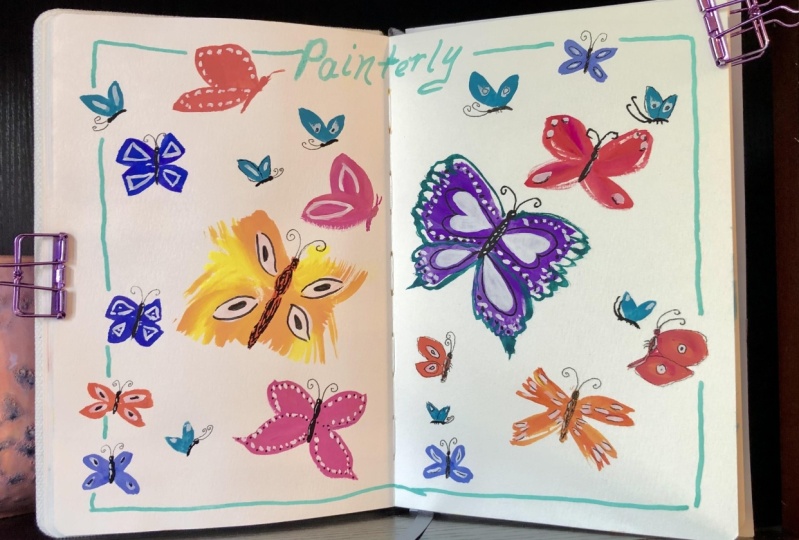
2. Project Chat: So what I would love to see is for you to take
photos of your pages as you go and then put them
in the project section. After you get your initial
projects set up and going, then you can just add to
it by updating as you go. And so I'm really excited
because we will get to go back and look at your projects
and discuss them again. Talk about what's going
on and adding to it. And when you get finished, you're going to have this
beautiful sketchbook full of your own personal art. That's going to start
letting your creative, artistic soul shine through. And then you'll have
your project page, which is going to
showcase all of that, including some of
your thoughts and questions and all of
that kind of thing. So it's really going to
be fun and exciting.
3. Butterfly Inspiration: When you're doing a deep
dive into a certain subject, you really want to get
your eyes on that subject. You can even pause and sketch or pause it and
paint as you watch, or even do a screenshot so that you can trace these images. So sit back and relax and
drink in the beautiful colors, patterns, and textures of
these lovely butterflies. And come back to this video whenever you need
more inspiration. And I'll see you in
the next lesson.
4. Supply Suggestions: Let's chat a little
bit about supplies. Keep in mind you don't have
to have all of the supplies. Really just use what you have. That's the main thing
I want to tell you, but I'll just show you some of the main things
I will be using. So I'll definitely
be using watercolor. So I have a variety of
watercolor paints you can use your Mission Gold
said if you'd like to or any set you might have. I'll also be using Dr. Ph. Martin's bleed proof white, which all it really is
is white watercolor in a jar and it stays kind of
mushy, kinda the gel-like. And so it's easy to wet and get a nice thick
consistency of white with this particular product. But you can use white
watercolor from your palette. You can use other
kinds of white pins or acrylic ink or whatever it is that you have
other kinds of winding. I just happen to like this bleed proof white for
white watercolor, you'll need normal
watercolor supplies like jars for water, you need a cloth for
drawing off your brushes. And you'll need a variety of brushes depending on
what you enjoy using. I have a big mop brush. I haven't Obama was smaller
brush that holds less water, a flat brush, a rigger brush. So these are ones I use a lot. Then we will also be using
a chopstick with ink. For the ink, I have this platinum carbon black
ink and it's just nice, solid black and it's waterproof when you're
finished, so it's fun to use. And you can use it
with your chopstick, or you could use
it with a dip pen or a sick or whatever kind of interesting
writing tool you may have. So we're going to have some
fun with chopsticks and IQ. So that's pretty much all
of the watercolor supplies. You might want some
metallic watercolors, some metallic ink,
play and have fun, that's the main thing. Also need a selection
of pens and pencils. You can use colored
pencils or you could use what I like to use
is the magic pencil. Now, the reason I
use this pencil, well, first off, I liked it. It's multicolored so you
don't get a perfect, solid one color line. And I like that about it. And it works well
with using it to, with watercolor and it creates a little interests in your
drawing and sketching. The other thing is,
is when I use this, I do not erase. That's to help me learn
to accept my lines and accept mistakes and try to work with them instead of
being upset by them. So that's why I use
the magic pencil. I'll be using this for
loosened sketchy effects for, for drawing of different kinds. And it's just really fun
to use the magic pencil. But you can use colored
pencil instead. That's just a fun exercise
we can do in our drawing and sketching and creating that pushes our limits and
pushes our boundary. I have a variety of white pen. This one is a fine
point ballpoint pen, and these are acrylic
paint markers. So having some white
available is nice. I also have a black acrylic
paint markers, lecture, the pens and pencils, which these are just your
personal preference. So I just have a selection. Oh, and erasers. These erasers are great. So I just have a selection
because so as you can see, sometimes I will be erasing, but if I'm using this pencil,
I will not be erased. I also have gouache. This is up to you whether
you want to use this. I'm playing in some of the
pages of the sketchbook. I'm going to be
playing with opacity, so watercolor is transparent
and you can see through it. And gouache is not transparent, it's opaque and you
can't see through it. So there's a push and
pull when you put them together and that I
think is really interesting. Now these are just inexpensive
chalk cola gouache paints. You don't have to
have this mini. These just all came in a set and were sent to me as a gift. I'm enjoying using them and I will be using them
some in this class. So again, this is class
that's not just watercolor, it's a mixed media class, so everything pretty
much is water-based. So I have watercolor, I have gouache, I have ink. I do have pens and pencils and all those kinds of like
sort of normal supplies. And then a few push your
boundaries, kinda supplies. So just so you know, those are the things that
I'll be using and you can search through your supplies. C, When you have and what
you want to use when you see the exercise or the page that we're doing
in our sketchbook. So PS, I also got a
little excited and decided to get some washy
stickers and some washi tape, butterfly themed washi tapes. So yeah, it's a
little over-the-top, but just for fun and I want
to fill this sketch book so, you know, I think
it'll be worth it.
5. Sketchbook Selection: Let's chat about
sketchbooks for a moment. So you can see I have
a big stack here of sketchbooks are a lot of
different kinds of sketchbooks, sizes, types of paper
and all of that. And I've used quite
a few sketchbooks in my art and painting
field artist's brand, but these are just ways
you can play around. But all of my sketchbooks
are just random, right? So there's no rhyme or reason to what's painted in
these sketchbooks except Hey, I want to try this. And that's a great way
to use a sketchbook. But for this class, we're going to get really
focused and use a theme. So you can just decide
what size sketchbooks. So you see we have all
of these different ones, different sizes,
different kinds of paper. This is by Hong paper. I love this, but I don t
think it's going to work that great for me for this sketchbook
because I want to use, I want to use different
kinds of media. And this is beautiful paper, but it's not what I want for this sketch book,
for this project, I guess you could call this is a pentelic one that I have
that it's all filled up. Some of the pages
have even fallen out. I've had it for awhile. So you can see,
again, it's just, it's got random paintings in here testing out
and trying things, exploring and doing
different things. This is one of my favorite
page layouts in this book. It's abstract. So you can see if you
choose something like this, It's got a really long landscape to fill with your butterflies. So it would work. And then I have a
square, our Tesla. And this has two types
of paper, really. It has textured paper. And then in-between
the texture paper, it has a hot press. So it's like texture hot press. This is a nice page. I like it for me. I haven't used these really
smooth pages a lot in here, but I've used all of
the textured ones. So you can see that I
love texture, right? But it's a personal
choice so you decide how much texture
you want in your sketch. Now, I also got this little tiny stolen in Burns sketchbook, which I just started using C, only have a few pages done. And I love this little
thing more than I expected. But again, this one
I'm using is random, just testing and trying things. But the great thing about this size is it's
a small projects, so that means I can get it here, make some art and get out. And I haven't spent
a lot of time, but I have had some time to relax and
focus and play with art. Every bit counts whether
it's a small amount of time or a large amount
of time, it all counts. And so I've been having
fun with this little book. Now, we're going to
do a similar page to this in our butterfly
sketchbook, but this is not a
butterfly sketchbook. I have some text in here. I have some architecture, more butterfly practicing
and different things. So some of these ideas I'm going to take
and we're going to use them in our
other sketch book. But I just wanted to
show you this small one. Pages are stiff and
they're nice and thick. They're not they're not
to Codename. That's okay. There's still archival,
they're really nice. They're very smooth. This is called the beta series, so it has nice thick paper. You can see I'm having a
lot of fun with this one, really to my surprise, because I thought
it was too small. But it turns out
when you open it up, more space than you might think. But I'm not doing like
journaling in this one either. While I did a little journaling
on this little page, we are still going to do this in one of the pages
that are sketchbook. This was, this was so much fun. You're gonna be surprised. I was surprised at least
this is an option. And I use these
clips to make mine more flat because it's
staying open right now. So I'm just training if you want to call
it that to be flat. So there's the small one. That's an option. And what I decided to
use for the class is this at your sketchbook. Me get the box. So this
edge or lab sketchbook, it is cold press, heavy-duty
watercolor paper. It is 100% cotton, but it doesn't have
a ton of texture, it just has a little texture. But because I love cotton paper, that was one of the
main deciding factors for me for choosing this. Now, I also, I can just show you I have skipped the
first pages in this class. We're skipping live
very first pages of our sketchbook and we'll
come back to them later. You can see that there's a
light texture on this page. I hope that you can see that. It's really nice. So when we're painting, it really works nice
with watercolor. And these are two of the
lessons that we're gonna get started with this
lesson first and then I'll be adding this
one really soon. So this is loosened sketchy. See, I've used my
magic pencil there. So anyway, the reason I
chose this was because of a cotton paper and also
I like the size of it. And I liked the orientation that it's portrait
and landscape. But when I open it up, it's almost a square, which I also love about it. So this is the one I've chosen, but you choose the one that
you think will work for you. It's beautiful. I do
think it's white cover. I am concerned that it's
going to be a little grungy before we get finished. And I may painted that, did a little test
watercolor paint there. It's Canvas so I could
actually paint with acrylic. But I don't know yet. I haven't decided so I'm
just leaving it for now. So this is a sketch
book I've chosen. It's the Etch-a-Sketch book that is cold press and cotton paper. And it is an A5 size
or 5.9 by 8.3 ". And for those of you who
love the metric system, this is 15 by 21 cm. It has 52 pages. And it's just really nice. This is the one
I've chosen to use. You choose the one that you
think you'll enjoy most, and that's it for supplies. Let's move on to some lessons.
6. Butterfly Garden - Ink & Chopsticks: Let's get loose and sketchy
with ink and chopsticks. This is absolutely one of my favorite techniques
for loosening up. So you can see I have a
variety of options here. You don't have to
use a chopstick, but it's just a lot
of fun trying to use something you
don't usually use. Maybe it's a stick from outside or just some unusual
drawing tool. So the whole focus for
this page layout is to just do imaginary butterflies
in a loosened, sketchy way. I've dipped my chopstick into the ink and I'm just drawing
the idea of butterfly. So I did like an outline
and now I'm doing a little patterns
inside the wings. Now, these are obviously
not realistic. Remember I told you at the
beginning of this course, this is not a course on realism. Filling our journals
is about playing, exploring and discovering
things that we love, trying new things,
making mistakes. And maybe we like what
happens on the page. It maybe we don't with them. We get to turn the
page and try again. Now, if you haven't tried
this technique before, just keep in mind to hold
your writing utensil loosely, to hold it far away from the tip so that it is able
to move freely. And just remember to just play, sketch the idea of butterflies in different poses and shapes. So some maybe are flying away, some are you can see
both of the wings. It's just a chance to explore
the idea of butterflies without getting too caught up in making it super realistic. One of the keys to
this kind of drawing is to just go over the
lines over and over again. And you're going
exactly over the lines, but you're reshaping and reforming the idea
of say in this case, the wings over and over again. And you have to go back and
dip your chopstick and you're going to get some
unexpected marks. And lines are going to get thickness and thinness
in different places. So you're not gonna get a consistent line like
you would with say, a fine line pen. You're gonna get some
really interesting shapes and different weights
of line, if you will. And it's just so much fun. And guess what? You can even
splatter with a chopstick. So I'm hovering over the page
trying to decide what to do and I decided to change
the grip on my chopstick. Holding your pens, pencils, chopsticks in different ways. We'll give you a
different kind of mark and a different
kind of feeling. So it also just let you learn new ways to use all
of your art tool. So it's so much fun. So that's what I did. I changed the way I was
holding the stick so that I can just draw in
a little different way. This little drawing
that I wanted to just take the butterfly off
the edge of the page. Actually gotten a little out of hand and I was trying to
decide what to do with it. And I decided it looked more like a flower
than a butterfly. So I just wanted to go with it because there
are no rules here. Not everything has
to be a butterfly. It's the idea of butterflies and all kinds of
butterflies and where they live and their poses and all these interesting
things about butterflies. And I thought, well, flowers
are perfect for butterflies. Butterflies love flowers. So I just decided
to go with that and I headed flowers to my page. I even added an
upside down flower. Who knew flowers could
grow from the sky. One of the things
I want to do in this journal is to
leave whitespace. I want to leave
it for journaling and I wanted to leave it for the sake of having an
open, airy feeling. So with that in mind, I decided that I had
enough big shapes on this page and I wanted to
add a few small butterflies. And that would complete the
idea of the butterflies. But it doesn't quite
wrap up the page. So after playing around with a few more splatters and adding a few more little butterflies. I decided I wanted
to add some golden. Now most of my black ink is dry, but I'm okay if it
mixes with the gold. So it's up to you how
you want to do it. If you don't want that black to mix them with the
goal to be sure and let your ink fully dry before
you continue on adding gold. Now I'm using gold
ink and a stick, but you could just as easily use gold watercolor
and a fine brush. Or. A dip pen or any kind of tool you could continue with
the chopstick if you wanted to draw or draw
butterflies here, I just want to add some
lines, some pattern, just some little gold
accents to just add a touch of punch to this page. Once I've added those gold
touches and I've let that dry, I decided that all that my page needed was a title
or some writing. Now I just chose to put
a title in this case. But of course you could write
whatever you like to write. You can journal, you can
write your thoughts, your feelings, your emotions. You could even
write poetry here, it's totally up to you. This is your sketchbook. It's your space for playing and for enjoying
and for exploring. I'm just using my
own handwriting. I'm going back over those
letters to make them heavier. It's kinda messy, but that's
the way my handwriting is. But I also did a mix of, of print and cursive, and I drew a little butterfly
by the side just for fun. Now you'll see in a second, I'm also going to get out my chopsticks and add a little
bit more weight to the B in butterfly just
because I felt like it needed a little bit more
presence on my page. I also wanted this
page to have a border. I just felt like I needed it. And I wanted parts of my drawing to go off the page
and outside the borders, so I fit that border
inside some of the edges when are just skipped where the
little butterflies were, aware of the part
of the flower was. And like everything
else on this page, I kept it really consistent
with my art style, with this style of work. By going back over it
again with more lines. I'm reinforcing the lines. I'm reshaping my border where
it went a little crazy. I've got heavy lines, light lines, and that's all
part of using the chopsticks. And I'm also going to
add a few dots just for some finishing touches
because that's something that I enjoy. I encourage you to
do that kind of thing with your
border on your page. If you choose to add one, just go a little crazy and
explore and say, What? Do it until it makes you happy? Like, what? What about this will
make you happy and do that thing because that's
what art really is all about. It's about exploring that
process of enjoyment. And just it just
something that makes your heart happy about doing art and that's what
I love about it, and that's what I want
to encourage you to do in this sketch book.
7. Loose & Sketchy Butterfly Part 1: Loose and sketchy. Now I also want to
think about my design because I do think I want
to add some text here. And I want to go across
the middle of the page on this one and make it a
two-page kind of thing. I think I'm just going to put, say the body of the butterfly. I think I'm just going to put, say the body of the butterfly, just a line and then
I'm just making a giant butterfly if
it goes off the page, I think I'm okay with that. I can adjust it
later if I want to. So there's our butterfly body
and even some little things and some legs I think is really interesting,
these butterfly legs. So I'm just keeping my pencil
lights sketchy movie and just doing the idea of what
butterfly wings look like. I'm going all the way to the
edge here with my sketch. As you can see. I think I just like doing these little sideways
butterflies. And then think about
inside the wings, they have these
nice little shapes. I'm going to do some
nice little shapes. And from those shapes, they have lines that go out. So butterflies are soft. Their wings or soft if
you've ever picked up one, you'll know their
wings are very soft and they're very
interesting to touch. But of course, it's better
not to touch their wings. But I think as kids, a lot of us have
done that before. I'm just making some loose
shapes for different colors. And again, putting in a
little bit of the veins, really one nice and
light and loose. So it may go a vein
from this kind of shape out and then from the
vein you can go out again. This really interesting
kind of veining shapes. And then I did some oval shapes, which I think I'll
add some more. Now. This is just my sketch. And when I go to paint, I really don't know what
I'm going to do yet. So just playing,
just playing and my butterflies flying them
make some little wavy lines. I didn't know to me
that says motion. And then I'll reserve
over here for some words or some text or anything I don't
want to write. So I have my butterfly
and then I'll have space for other things. Okay, so that's my loose
and sketchy drawing. As you see, it didn't
take me very long and it's very loose
and very sketchy. Okay, so now I just want to move on and add a little
bit of color to this.
8. Painting Wet in Wet - Touches - Loose & Sketchy Butterfly Part 2: Since I have such
a big butterfly and I want to create
a soft appearance, I've decided to go with a
wet and wet wash to start. So I'm wetting my butterfly
with a very big brush. This brush holds a lot of water, but I don't want to
get any puddles, especially there in the groove. Once I've covered
both of my wings with a nice coat of water and I may have to go over
them once or twice. I let it soak in a tiny bit and then it's time
to add some color. I hope you'll feel
free to really choose any color that you
enjoy, any colors. Now, I'm using a
complimentary color scheme I like to use that. You'll see that often
in my paintings. But it's totally up to you. And butterflies come in
a wide array of color. So feel free to choose something that you really love and enjoy. Now as I'm painting, you can see I'm getting
a really soft affect. The pain is moving
through the water. And that's because we're using
the wet on wet technique. Now, I don't often
paint wet and wet, so this is a little bit
of a stretch for me. But I really wanted to achieve that softness, that nice feel. I'm switching colors now. I started with a cobalt teal and now I'm using a cadmium orange. I'll call it cat
orange for short. This is the complement. Almost near compliments
is what it's technically called to each
other on the color wheel. And the reason why I
wanted to do that as well. Orange butterflies
look cool, right? I like that other color as well. Now I'm still getting the soft effects of the wet and wet. My paper is still quite wet. Keep in mind, your
paper may drive through the process
and if it does, once it's completely dry, then you can re-wet
it and do this again. So if you're struggling
with that a little bit, That's just a quick tip for you. Wait until it's completely
dry and then re-wet it with a light wash of water. And you can go again
with more wet and wet. If you decide you want those colors to move
and blend even more, you can always pick up
your sketchbook and tilt it in various
different directions. So now I want to pick up a
little bit of that color that kinda gotten the shapes
that I drew on there. Because I want them
to have white, at least at this point.
That's what I want. I've cleaned my brush
and I've squeezed out the water so that
it's drying thirsty. And then I'm using
it to lift out those little bits of paint
where I have my shapes drawn. Then I decided I would soften the edges of some
of the butterfly wings. So I'm just getting a lightly
damped brush and going over the line on this edge just to soften
it up just a little bit. I'm adding a little more color here at the body still doing, working back and forth between lifting and adding in color. So that's the process of
working wet and wet and manipulating your paint and kinda putting it where you want it to go even though that
whole section is wet. Next, I'm adding a strong
mixture of our cad Orange. I decided I wanted that
butterfly wing at the top to be bright orange all
over and not just light. Everything is still wet, the paint is still
moving and it will still create soft edges with
that cobalt turquoise. To keep in mind when
you're doing wet and wet, the colors are going to try even lighter than
they normally do. So watercolor normally dries
lighter than when it's wet, but it'll dry even more light because there's more
water on the page. After continuing to play with lifting and
adding more paint, I decided I wanted
to add some dots. So I mix up a really strong
mix of the cobalt turquoise, you see it doesn't move much. That's a very thick mixture. So I'm putting it
on little dots on my edge of my butterfly wings. And I really just love
that little touch. I think it is so fun and
it was just fun to do. At this point, I decided to
add more of that cobalt, turquoise into the wings. And to be honest, I feel like I overdid it a little bit here. So I wouldn't suggest doing that because I lost the light
of the paper in doing so. Now it's time for the rigor, One of my favorite brushes, and I'm just using water
and picking up paint from those little sections to put veins on the butterfly wings. So you can see it's
still going to be soft, it's still wet. My paper actually stayed wet for quite a long time
while I was painting. I'm just adding in all of those little veins
and fun touches. I want to add a little
color to the body. So I'm still using my rigor
and I'm using that orange. I'm using the
scumbling technique, which is just like wiggling
my brush on the page so that I leave some little
gaps and still get the idea of the
butterfly body. Next I'm adding my
favorite splatters. Now you may want to wait
till the end because of it splashes into
your wet and wet wash, it is going to leave marks. So you decide what you wanna do. I just enjoy going
ahead and adding some. And the reason I do this is to add to the overall composition.
9. Adding Darks - Loose & Sketchy Butterfly Part 3: Now that my first layer is dry, I want to add in some darks, and I've chosen to use
Payne's blue-gray for me. Black is just too flat. I'm adding a black edge
to these butterfly wings. Now I want the
edge to be kind of a broken edge and I want
some of it to be soft and some of it to be hard edges parting off
by dabbing my brush around the edge of the butterfly wing and
sort of a random pattern. And I don't want those
solid edges and I'm leaving space for those other
colors to show through. I'm using a thick mixture
of pains, blue-gray, and I'm also using a brush
that holds a lot of water, so it is going to stay wet
for just a little while. And I want a mix of
hard and soft edges. So that's what I'm doing now, just like earlier with
a lightly damped brush, I'm going in touching those edges of that
paint, softening it up. It's a gentle touch and
the brush is lightly wet. So you don't want a brush
that's full of water. That's why you see
my towel in my hand. I just want a little bit of water in there so
that I can touch those edges and make them
really nice and soft. Now some of that color does
come out onto the wing. And I actually like
that I think is creating the look of
a butterfly wing. And that's what we're going for. So I do want a mix of
those hard and soft edges. So I've kept some that are hard and some that are softened. I'm changing of the shape, a little bit of that
butterfly wing. You can see I'm going right over that lighter color of paint. And guess what? You can
do that because I'm using a dark color and
this is watercolor. Now, I'll just repeat
the same process that I did on the top
wing for the bottom wing. Now that we've finished
adding dark to the edges, Let's add a little more shadow
to the wings themselves. Please notice I'm not
covering up all of the white, but I'm creating sort of subtle
patterns within the wing. Whenever that pains, blue-gray
looks a little too dark. I don't leave it. I just lifted right out again. And for the top wing, I just want to add in a little more shadow and
tone it down a little bit so it's going to go into the background behind
that front wing. I want it to appear
like it's behind, like it's a little further away. So that's why I'm adding more of the Payne's gray over that area. Last but not least, let's don't forget that
body of the butterfly. Add a little bit
of dark to that.
10. Adding Finishing Touches - Loose & Sketchy Butterfly Part 4: Every time I come back
to this butterfly, I see something that I want to make a little bit different. And there's nothing
wrong with that. This is part of the
painting process. So I did adjust the
wing a little bit more. I added more black to that top edge and just reshape it even a
little bit more. Now wrap up the painting part
of this sketch book page. I'm adding white
to my butterfly. I'm adding some highlights
to the veining. I'm adding some white
to that back wing, and I'm adding
some white texture to different areas of the wing, especially along the
edge where the black is. It's really going to make things pop and stand out when
I add that block, that white to that, what looks like black, but it's actually Payne's
gray, if you remember. So what you'd really
have fun adding some finishing touches
to your butterfly. You can do veins, you can add y, you can add some highlights here and there. Accentuate the things that you want to accentuate
about your butterfly. I'm adding some highlights
to the top of the wing, to the body of the butterfly
and things like that. Remember, don't
cover everything. Let other colors show
through and keep loose and take a deep breath if you need to, and have some fun. I did decide to go back and
add a little more orange to that bottom wing just to kind of tie the wings together, make them like they're
the same kind of wing. It doesn't really
have to be that way, but it's just something
that I wanted today. Once we're finished with this, we're going to add some
writing to our sketchbook.
11. Add Text - Loose & Sketchy Butterfly Part 5: Last but not least, we'll add some text to our page. Now I'm just using a
straight edge to draw some lines because I think
that'll work best for me. You don't have to draw
lines unless you want to. I left a larger
space at the top. And then I put closer lines
closer together because I'm going to add a title and below that I'll do
some journaling. For my title. I want to continue with our
wet and wet theme. And I'm just using a wet brush. It's pretty small one. And I'm putting down water for a nice Just a cursive
L that I like to do. And I'm going to
use the same colors that we use for the painting, which is that cad
Orange and that teal. So I'll just use that brush, pick up the paint
and drop it into that wet wash that I
have on the paper. I'm going to put the
orange on the top of the letters and the
teal at the bottom. And I'm using a fairly thick
mixture of the watercolor. It's still moves in the palate, but it's pretty thick and solid. It is going to dry, lighter, so don't
forget about that. I have quite a bit
of water in this L, and I like these colors when
they blend together too. So it's gonna be a
really pretty title and it's just going to say
loose and sketchy. Once I have the l done, I'll go ahead and add the water for the rest of the
letters that say loose. So I have L 0, S, E to spell loose. And then I'm adding in those colors just
like I did for the L. I'll add into the
rest of the letters. I wanted those colors
to blend a little bit. So I did tip and move my
sketch book as I went. And then the last step
there was to just add a little water
to connect letters. Next, I'm going
to write the word sketchy with my magic pencil. Now you don't have
to use this as a title or right,
when I'm writing, it's completely up
to you what you write in your butterfly journal, you may feel like writing
something different. Right underneath, which
is something that came to me while I was painting. And it was just this question, why do butterflies fly? Like why do butterflies fly? And I even made a mistake
when I was writing, but you'll see that
I fix it as I go. Remember this is not
about perfection, but it's about exploration,
discovery, and fun. So I wrote this little poem, YoY, do butterflies fly. And that's what I chose to
write in my sketch book. So remember that little
mistake I made by leaving off the word fly
and I had to correct it. Well, it bade that word stand
out more in my journaling. So in order to just
tie it all together, I decided I would
do it again because that's a thing with
art, repetition. And I'll bring your
journal together. So that's just a little
tip there for you. So that completes my
loose and sketchy page. I cannot wait to see yours.
12. Bonus: How to Sketch from Reference Photo: I decided to include a
sketching lesson in this course because some of what we'll be doing is drawing from reference. Now, for this course, you don't have to
draw from reference, but I just wanted to
make this available to you in case you were interested
and you wanted to try it. As you can see, I made
myself comfortable. I've got all my
supplies and nearby. I also have my reference
photo ready to go. In this lesson, you'll see me working in my practice journal. This is not required
for this class, but if this was preparation
for me to teach this class and I needed to
sketch a lot of butterflies. So you can use your
butterfly journal. But in this case, I was not. For me. Sketching for reference
starts out as a slow process and doing a
very light pencil sketch. I'm looking at my
reference photo a lot. I'm thinking about the angles of the drawing of the sketch and the butterfly
wings at this point. So when you're drawing
from a reference, your brain is engaged in
a little different way. We need to stop
thinking in terms of, I'm drawing this
butterfly wing or I'm drawing this specific thing. Instead, we need
to think in terms of which directions
the lines go. How are they curved or straight? What angle is this
line and how does it compare to the other
lines in this image? A lot of people use the idea
of the degrees in a circle. So e.g. straight-up
is 90 degrees. And so the line of the wing is a little bit past 90 degrees and that's how I would draw it. I'm laying my pencil
on that image so that I can get an idea of which
direction the lines go. So you see I had it at 90 and
then I turned it the angle. So I have a feeling at an
idea of how the lines of the wings go even compared all the way across our
butterfly to one another. Remember, this does
take practice. Don't put too much
pressure on yourself. I'm still practicing and
learning and growing as well. This is I've been working
on it for awhile, but I still have
a long way to go. So don't expect your
drawings to be perfect, but I just wanted to share
with you some ideas to get you started with
sketching and drawing. If you want to include this
in your butterfly Journal. Of course, you can always trace. Tracing is a very valid way to get your image on the page. That's fine. And also we're going
to be exploring other ways of drawing and sketching besides this
very meticulous way of drawing from a reference. Now that you've seen the
real speed of this process, I'm going to speed up this video to make it
easier for you to watch. It won't take so
much time for you. But just be aware, this is a rather slow process because of the measuring
and the thinking. But as I went in drawing and
sketching this butterfly, while I was very meticulous
about the outer shapes and trying to get the
angles in lines just right. I did loosen up as I went. So when I get to the interior part of
the butterfly wings, I'm really just at that
point doing an impression. I'm drawing an impression
of what it looks like. It's not exact at all. It's just oh, okay. There's this shape here
and that shape there. And so I just kind of
transitioned really naturally for me because I don't like to include every detail
of everything. I want my art to be
impressionistic and stylistic. So for me, I just naturally started loosening
up as I went and being less meticulous
and not including every detail of all
the shapes and lines. If you decide to try
sketching from reference, just remember you can
change anything you want within your drawing
because you're the artist. You're drawing from a photo, but it, or from even real life. But you have the
artistic license to change things as you want. So you can change
how much pattern you include or how many
lines you include. Even things like how
dark the lines are, how light the lines are, the colors and all those kind
of things that background, all those things are up
to you as the artist. Mind when you're drawing,
sketching or painting. This is my second page of drawing butterflies
from reference. And so I'm getting a
little bit better, a little more skilled. Now still I don't
have perfect drawing, but I'm okay with that because
this is for one thing. It's my sketchbook, right? It's for me, it's
for practicing, is for learning and growing. And of course, I'm
sharing this with you, but you may not want to share with other people
and that's okay. As I continued to sketch, I added in little
details of the wings and lines and I started to
darken up the lines as well. So the shapes became a
little bit more defined. And I just really had a lot of fun actually sketching
really got into that zone of thinking about the angles and the lines
and the shapes and what I wanted to add and loosening
up then a little bit toward the end of it and just adding the impression
of certain things. I also did use an eraser sometimes I know
some of my classes, what I really want you to do is draw without using an eraser, and that is very, very helpful and learning
to accept your lines. So you can also do this with
a pen if that works for you. One thing about drawing from a reference is that you will
notice as you practice it, you'll notice some
things that you didn't notice when you
first looked at it. E.g. look at this butterfly
in the tiny antennas. Actually didn't even
realize I had drawn the tiny antennas until I
looked back at the image. So there's just this place that you can get into
when you're sketching, drawing from reference
at even getting in that create a flow where you're just going with the art and you're
just enjoying the process. And that's really what I
desire for all of my students, is for you to be able to just kinda switch
into that mode, turn off everything
else, and just create. Please enjoy continuing to watch this sketch come to life. And I encourage you to try
some drawing from reference, sketching from reference in
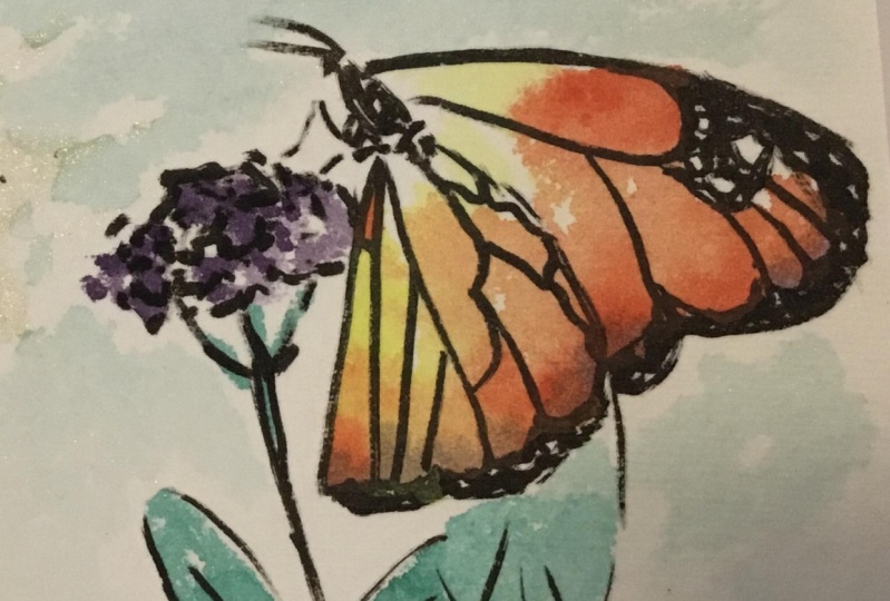
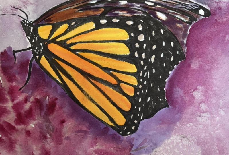
your butterfly journals.
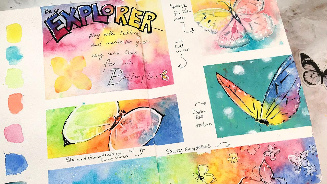
13. Explore Texture Page Spread - Taping & Supplies: Hey my friends, I'm back with our next section of our
sketchbook lessons. So we are going to explore
texture in this section. Take a look. A lot of Rainbow
Butterflies here, right? And they're all painted a
little bit differently, and they're all using
different textures. For this section of lessons, it is going to take you probably more than
one painting session. But you can always, you can mix and match. You can just choose
one or the other or make it fit your schedule
in your life, of course, but if you do a page spread
that is similar to this one, it's going to take a few
sessions for painting, for letting the paint
dry and sitting down and just exploring those textures and having
fun with them. So I can't wait to see your exploration of textures and our butterfly sketchbook. Let's go. Up until now. Our page spreads have
taken up the whole page. And well, this one does, but it's not going to
be just one butterfly. I thought it would be
fun to experiment. Know me, you know how
I love to experiment. So let's try some things. I have clean wrap,
I have cotton. Now I've never really
tried this before, but I want to try it. I have salt and salt water. So these are all
things that I'll add to the pain and let it dry. So this is more than
a one-step process for each of these little
sections and will probably be divided up into a few lessons depending
on how it goes. We're going to paint
some backgrounds and do some experimenting
with the textures. And then we'll come back
and put our butterflies.
14. Explore Texture - Salt Water Background: This little section here I have just for my colors
that I'm going to use. So let me just lay those out. I have M Graham, shades of Somerset, which some of you have gotten
dot cards for that. So I'm going to be using
colors from there. I have bismuth, yellow, cobalt. Till I get there, I'm going to use
the light green. I'm not going to
use the dark green, so I have sap green. I have scarlet parallel. I've been calling
this cad orange, but it is Scarlett chiral. I have also added quin rose
because I wanted a pink. And it's a really
pretty pink mix, a little stronger there. Okay? And then I have in
my palette of blues, I have a selection of blues. But let's go with this. This is called blues
cobalt, cobalt blue. There we go. And it's likely that I'm
going to add in a dark, but I'm not doing that yet. So I have a variety of colors. As you can see, it's a rainbow palette. We've got red, orange,
yellow, green, blue. There's no purple here, but if I mix these two, I can get a nice purple. So I'm not worried about that. You can pretty much mix
any colors from this. But I'm not really color mixing in my pan or on my palette. I'm really just putting
paint on the surface. So I'm just going
to put paint on the surface and put my texture, very interesting textures
and things in there. And then let it dry. And then we'll come back and
we'll find some butterflies. So that should be fun process. And I just wanted to have, yeah, I just want to play
a little bit with different textures
and just see how it will work with our
motif of butterfly. So I have this blue
on my brush already, so I'll just start with that. I do have a watery mix, so this is not a
strong mix of blue. I can just put
here. My will be a little bit contaminated with what's on my palette.
That's okay. You can use them. Clean, fresh pallet. Look that nice, watery. I'm using light colors here. That's kinda my goal to use the lightest light
versions of the colors. So nice, watery, moving,
beautiful watercolor paint. There. There we go. I'm just going to start dabbing it in here
in this big square. Now, use washi tape to
tape off the areas. This washi is not perfectly, these lungs may not be perfect. So I'm not going to
worry about that. Okay. So I've got
that color dad in their kindness some
more, some less. It's nice and wet and places. I want it to be
wet because well, why do you think I
want it to be wet? Want it to be wet? Because I want the
textures right? Going for the textures.
Oh, look at that wash, just, oh, look at that wash. Why do I love that? Oh, this goes all
the way to here. Almost stop there at the scene. I did stop at the same. Okay. So nice and wet. Didn't know I need to take that all the way across but I did. So there we go, nice and wet. Now I'm going to clean
my brush really well. I'm going to go for that yellow. And that's really strong, so I'll just add water. No big deal. Now your sketchbook may take less or more
water than this one. So you have to judge see how I have it getting in this
crease right here. I'm just going to use a
thirsty brush and pick that write-up so I don't
have it going through to the other pages, but I am using a very big brush
that holds lots of water. Alright, so there we go. Now we have a mix that's
all going together. This one, it's kind of a
big one, a big section. This section I will just use just get some
interesting pattern. I'm going to use saltwater. Now I don't know how
this is going to look, what effect it's
really going to have. But salt pushes
the paint around. This is saltwater, so it's definitely going to move
the paint around a bit. I'm just going to
sprinkle it on. And it's going to be
doing its work and magic while we are
painting, right? So that's very wet and watery. You can see the colors are mixing beautifully.
Look at that. I love it. I can see here how
that's pushing, pushing that paint around. Let's look. That's just really going
to push the paint. I'm just going to sprinkle
a lot. There we go. We'll just see what happens. I am leaving that alone now. That's all I wanted to
do with that section.
15. Explore Texture - Water Drops, Cotton, Salt, and Cling Wrap Backgrounds: So in the next section, I'm not going to fill
in the whole area. I'm just going to
put in some pink. Let it mix and mingle
and see what happens. I would kinda already
looks like a butterfly that wasn't intentional.
Seminar, mess it up. Me go with this. I'm just picking colors
that I know when they mix. They're not going
to be too weird. They're going to be nice. They play nicely together. And that's it. I'm just leaving that maybe
drop a lot of water in there then I'll make some
texture and just let it dry. Okay, So this one has saltwater. Saltwater, and this is
just water and pigment. Now we have salts, cotton and plastic wrap left to do to create
some textures. Let's go for this
scarlet pie roll. Again. I'm just making an
abstract background. Just, just for fun. Letting the colors play
and mix on the paper. This is wet on dry, this is not wet on wet. Okay, so that's
important to remember. The colors, laundry dry,
nice and vibrantly. So that's good. Plenty of water,
plenty of wetness, and maybe even just some water and let it run right there. Okay. So let's do the cotton. I've just taken a cotton
ball and stretched it out. People do this with gauze
and different things. And I mean, a gauze would be fine but I'm just
going to use cotton. I'm going to press it
down a little bit, even in this area here. And it's going to absorb some of that water and let's just
let it dry just like that. I'm not going to cover
up the entire area, although I covered
up most of it. Press it down a bit. Okay. There we go now
and let that dry. And then I don't even
know it may stick to the paint because this
is honeybees paint. So we may have some Cotonou
texture left on there. I'm kind of okay with that
because I think that'll be interesting and
fun and different. Okay, so now here let's
do the pasta graph. Again. I'm just going to
put down paints, gorgeous colors,
score, just paint. It may go under the
edge of the tape. That's okay. Do
this a little bit. Almost a rainbow order here. These are pretty dark. Aren't they? Add a little more water here? I forgot to do my little
bit of mixing on that. And then remember, if you have puddles of water, you'll get blooms and things. And that's, I mean, that's something that I
love about watercolor. Get those beautiful balloons. This is the cobalt, turquoise. What tool rather, I'm putting all the colors
actually in this one. Because I can, It's
got a nice long space. Right? But those in
the wrong order, but that's okay if I would
do rainbow effects, right. Put in some way, it's
already starting to dry. That's one thing
about the sketchbook. It does drive pretty fast. Let's stretch this
out and bunch it up and let it make
interesting textures. So smashing it down. And then I'll let
it do its thing. So you can see they're interesting
shapes and things that are going to be in
this wash from that. Now, this will be our salt wash. Let's start with the blue. Take. My tape is not staying down. That's okay. Filling this all in. Then I'll go to the teal
and I am working quickly. I'm working quite
quickly because I want to get it all on there. I guess this one
is in the green. Mixing it in with
each other a little bit because it's cleaning my brush really
well to try and get some fairly clean yellow, which I promptly
dipped into the brain. Yellow is so easy to
contaminate with. Contaminate with
the other colors. So next would be orange. Firewall in this case.
Then is our greenhouse. And then we'd come back to our balloon. Let's look at that. Lovely, perfect. Well, get a little bit more
clear blue to put here. Now, different colors even react with salt in
different ways. So this is just going
to be interesting. I'm just going to
sprinkle salt throughout. More wet it is. The more it reacts. I don't know how this
works with butterfly. The butterfly thing
we've got going on, but I guess we're
going to find out because this is what
we're doing on this page. Now, one of these
boxes may become a place to write
or to put texts. I don't know, but I also
do have the stripes from the washi tape that will
create space for that as well. So we will have whitespace on this page if I remove
the washi tape. So I'm going to let this
dry naturally because what Gill Drive they
effects will work better if you let it dry
naturally and I'll come back. And then we'll work on each little section and
paint some butterflies.
16. Explore Texture - Backgrounds Results Chat: I'm a little impatient, so this may not be
completely dried, but let's just see
what we have here, okay, First I'm going
to get the salt off. I think the salt is
actually completely dry. I just needed to
get on something. So I just have this
scrap piece of paper and I'm just brushing
it off with my fingers. You can use another brush
depending on your preference. Some people don't like to put their hands on their
artwork that personally, I don't I don't mind. I don't mind it. Thinking about using kosher salt that's
kinda give chunks. So it's kind of interesting. So let me just show
you the texture. This area was much wetter
and so it has more of the texture effects than this area though it still
has some in this area. So now the cling wrap. So some interesting
texture there. Some of these pigments
are granulating. So you can see that how
it picked up the sort of granulation there
in that section. I think that could be interesting texture
for butterfly wings. That's one of the reasons
why I wanted to test this. Because like what can we
use to make our butterflies and just seeing more
watercolor effects? I just love watercolor. Let's see here. This may, like I said, it may stick
because of the honey. Honey. I feel like many of you, I don't know what this is
going to look like. It may not look like
much of anything. You may not have done much. But let's just see. It is
sticking just a little bit. That's okay. So I'm thinking that
depending on your paint, it's going to have
a different effect. And it's taking quite a
bit here in this area. I think I can just
pull it up though. So it looks like there may be some cotton fibers and lift
on here when I'm done, I could do that intentionally. Sounds neat when you pull it up. Fun. Okay, so it does
have a little bit of a layer of that cotton. And I think that is specifically
because of the honey, but you may have the same effect with other
types of watercolor. I would love to
hear if you try it and what your results
were when you tried it. Okay, So this one
has just water drops in it and you can see
the bloom effects from that pushed out paint edges
the right in these areas. So that looks pretty nice. This one has saltwater. The only thing I can
really see what's different is if
you've noticed like some of these areas
like this have really, the pigment is pushed
out from it, is not, it has flowed out in this way, but because there was
a lot of saltwater, so it has affected
it a little bit, but I'm not sure that the saltwater makes
a huge difference or not, but it was worth trying. It's definitely a
different effect than just putting regular water, because we can see the
effects from regular water. Here are these blooms, but we didn't really
get that much. Here. The edges are
quite different. So there's more of a soft
effect I feel like interesting, it's very interesting,
I think so now the next step would be to go back and to put some
butterflies on you.
17. Explore Texture - Trace on Water Drops Background - Panel 1: So everything is dry. I still have my tape
on and I got out my butterfly reference sketches in the project section
so you can print yours. This is my original and
it's on some tracing paper. You could printers on a transparency or you can
print it on white paper. But if you put it on something
you can see through, then you can play
around with it, with your fun, play
time with texture. I see like almost like
wing shapes like this, kinda like that, just worked
out that way, which is fun. And so this
particular butterfly, I may not do the patterns, but it fits here. So I'm kind of
looking at it gone. Maybe I'll just trace
this one onto here. And then I'll do a little more painting
and jazz it up a bit. And that sounds like
that would be fun. So I'm going to grab my carbon paper and we'll
get started with that. First off, I'm
going to tape this with my washy tape so
that it doesn't move. And I can just put
my tracing paper underneath it already know
that I have it where I wanted, so I don't want it to move. My wing goes off a
bit and guess what? I'm okay with that. I just have some carbon paper and I'm just going to
do light pressure. And you put this, this dark side down because this is the part that
makes the lines. And we put this shiny part up. So be sure and follow the directions on whatever
carbon paper that you have. Just like that. Now,
I can just lightly, not too lightly,
but lightly sketch over this butterfly line. And I can modify it a little
bit as I go if I want to. Now this is from a
drawing that I did. From a reference. You could draw from a reference
here if you wanted to. But I drew this, this was my very first one when I was getting
ready for this class. It is an impressionistic
style drawing. As you can see,
it's not realistic. Remember, generally
in my classes, I'm not going for realistic. It's just not my style. But you could do real
estate, you still can. And so just keep that in mind. Now I can check my
drawing them and I don't have to worry because
I have this taped. So I can just check it
and see how it looks. And it's a nice light sketch. Now, I can just go back to painting. However, what I mean.
18. Explore Texture - Painting Panel 1: Now I can just go
back to painting. However I want to paint, I want to emphasize the
butterfly colors. And so I'm thinking, let me just start by
adding a little bit of a dark color to the
outline of the butterfly. That's what I'll do, is I
have a small cosmic topspin, a small brush that doesn't
hold a ton of water. Okay. This is a gray or
pains blue-gray. Maybe I'll enhance it a
little bit with this. I want to use some color
that I already have in here. We've got enhance it with
of course, the teal. Here's this color mix
that I just made. This would be my dark. This is Payne's
blue-gray plus that. And then later I can
go back and put it in a little text of
plus so I know how I mix that color and that
way when I come back later on, it's lovely. So I'm going to just paint in
some of these little dots. And I'm just turning my brush to fit what I'm trying to do. And now do also some
this edge here. And that I'm using a
lot of water actually. So that means it's not
going to try too fast. Not really making a
completely solid line as I go because I mean a
butterflies flying. So it's not necessarily
a solid line. I'll just drag this over here. It's kind of blend in. Now I could just use any colors, could use colors that
are already used. And I kind of did because I included this turquoise into the pains blue-gray to
make that nice mix. So let's do this
here on the edge, which I wanted to just soften
that up really nicely. I went outside, guess
what? That's okay. Just soften that up
a little bit and just kinda carry it around. It's a little bit
like a shadow there and that's picking up. Now I'm lifting, lifting a
little bit because I don't want it to be nice and soft. I don't want that color
to take over there. And notice it's really light. It's got a lot of water in it. So go back and lift
here a little bit. I don't want that
to be a solid line. So I have a thirsty brush and pushing into
the paint to live. Now this may look a little
green on this side. Look at that. That's a little bit more. There we go. And then again,
soft and softened with just a lightly damped
brush to soften that edge. It drove some of that color
out of that pickup backup. I don't mind that either. Just trying to
prevent a hard line there because I don't
want a hard one. And then the body
of the butterfly, I'm going to leave
this little line here. I'll just make the body
that Payne's gray. Now that may not be the
color it is in real life. It's okay. I can stop
there if I wanted, but it's more fun to keep going.
19. Explore Texture - Continue Painting Panel 1: I can stop there if I wanted, but it's more fun to keep going. At least to me it is. So I want to color
in these shapes, but I'm going to use the
same colors that are there. That yellow was only
really this one, yellow color in that
shape really strongly. And I'll put a few
yellow dots here around. Kinda emphasize the
yellowness of this wing. So this is pink and orange. So let me make it a little
mix here. It's like a melon. I could mix, let
it mix on there. But now it's just
a personal choice. Like to do both ways. Now I am using hard
lines in this case, because not softening those mix of hard and soft
lines is pretty cool. I think I'll blend that pink into the air
a little bit also. Alright, and then I'll
repeat what I did on this wing only with
the different color. And I'm just going to
make some dots around. Kinda make quite a few here
and just wet this area. So that's pretty nice, I think. Now I have pink. Go for that pink. Nice and strong. And I'll do these little curls with the pink
because that's fun. And then I'll go to
my Melanie color and put that over here. And do the little. Just repeat it almost winning
wanted it on the other one. Works out pretty well. Now it seems like
I really only have the little veins left to do and get out my recur
and I'll use this dark. The middle water. Don't want them to be too dark. V8 some lines here. Just the idea. And it doesn't have
to be all of them. I like doing idea of it and
not doing every single line. I think that is more fun. More fun. And I'm also not being very
precise, as you can see. And that one touched
into that pink, which is actually pretty,
pretty, pretty perfect. So I'm just drop a little bit
of that in there as well. So that's kinda fun. Okay, so I think that is a lot of fun now I just
wanted to get out. I think I'll get out my
white continued my recur. Some white. Add a little highlight. Can even do like a little
highlight for those. And I know you've
already seen me doing the highlights
on the wings. Just making it stand out. Now it's kind of
illustrative style, right? It's not realistic. But some dots, white even here. That's kinda fun
because it's dark and light mix together. And maybe even like
fun patterns here. I think it'll be fun
to put some white, nice white dots on
the weightings here. Make the ring stand out a little crazy. That is pretty fun. I like how it looks right now, but the background
is not dark enough.
20. Explore Texture - Glaze Background - Panel 1: I like how it looks right now, but the background
is not dark enough. So just go in with the same colors I have
in the background. Not super crazy with it, but just a little darker. To really bring out that I may leave a little
edge there, right? So that leaving
that space there, he's just adding to the
butterfly wing, right? It's adding a
little bit of light in-between the background
and the butterfly. We'll finish this,
soften that out. Now I'm going to
switch to that pinky, peachy color that we have. And continue just right around. Now this is a very
pointed brush. So that helps. Okay, So if your point
on your brush is very nice or you can use a
very tiny brush, in this case. That would be cool also. You don't have to do every part of the wing, but it's pretty, it's actually pretty
fun to do just going around and make that butterfly
MS stands out quite a bit, but let me just add a
little bit of pink here. There we go. Soften, soften. I like the softness of that. So I like how this has white, so I'm leaving them white. I'm just going to go
here with this yellow. But I feel like that's too
much yellow in one spot. So I'm going to
just take my pink and go right over it as a glaze. That's why I call this an intermediate class because we're doing some watercolor
techniques like glazing. And you may or may
not be familiar. So I wanted to make
sure that people understood, students
understood that, hey, you need to know some
basic watercolor techniques. So let's just use some water and pulled that out there
and make it nice and soft. Now that butterfly really
stands out on that. And I just let it soften
that a little bit. You don't have to
soften all the edges. I just kind of enjoy that. I have hard edges on my butterfly and some soft
edges, so many other. I'm going to go back and
do this a little darker, I think with this, again, this kinda, this is the
pink and orange mixture. Just a little bit in
here, darken enough. Maybe even get a little
bit stronger. My palette. This is a beautiful
color that's wet, so I'm just dropping in a bit and providing more contrasts. So it's the rule of darker, darks and lighter lights, right? It's more contrast. Suppose pretty fun. I'm going to add a
little bit more dark, a little bit more, just a
little bit more contrast. And I'll just add
some on touches. Not the whole thing. Just a few little
touches here and there. I mean, tapping
them a little bit and that makes them a
little bit lighter. And then little bit
on the antenna. Super light touch with
the brush is barely touching the paper. Okay. So just some tiny touches there. So what do you think? That's cute butterfly,
if you asked me, it stands out really nicely
from the background. We've used our color splashes. So we did negative shape
painting around the edges here. And we did painting
within our butterfly. So it looks pretty cool. Alright, I hope you
enjoyed painting that one. I'll be back and
we'll do some more.
21. Explore Texture - Trace & Paint Butterfly on Cotton - Panel 2: For our cotton square, I had been debating on
whether I want to do this butterfly or
whether I want to use the same one but flip
it and put it in there. I think either one will
work for homepage, but I think I'll
just do this one. So I'm going to do the tracing again and then I'll be
back with the painting. So when I found was that
my cotton texture didn't work very well with this paper. So I had to press a little bit harder on the paper
to get my butterfly. Okay, so now the question
is just like before, how do we want to bring
our butterfly out? How do we want to wet this one? I just enhance the
color a little bit and I made the background
a little bit darker. Let's try putting gouache in the background and then bringing the butterfly
out that way. So I want a solid
background color with GAO, I can mix a color, or I can pick a color, or I can use the colors
straight from the tube. I can make it. What if we took, admit it like a
light and bright? Like a white? You could do a white or
we can make it darker. But do you think
would look good? What do you think
would look good? We could do the green turquoise. Let's do the turquoise because, you know, it's me. I have peach and turquoise out. Let's try the turquoise. Maybe mix some white
in the turquoise. Instead of using white, I'll use a little
bit this peach and that's going to
neutralize it a bit. I think. See it's a creamy,
just like this. Peach is a creamy white. So let's do that together. Really have some water, Let's use a flat brush. You can, if you don't have a flat brush, you can certainly, you certainly can
use different brush. Can certainly use a round
brush if you want to. Mute that down a little bit. It's not quite as
bright and stand out as much. And it
kind of like that. Maybe a little darker. I'm going to mix
it all together. How about that is be bold, be bold and very courageous. It's a nice color right? Now. If I have some leftover, I can come back
and use it later. Maybe somewhere on
this page. Okay. So let's just go for it. I'm just gonna go right edge and drag this paintbrush
weight down there. Now this has the cotton texture. So I'm just painting
it's solid right over it and I can see the fibers and stuff and that's
that's pretty cool. So it's gonna go base and
then I don't want to get it onto This is watching
out for that as I go. It's a little water,
doesn't it? I forgot. How can I forget? I
did forget though. Okay. So it's easy to do. There we go. That helps. And because gouache is opaque, It's just covering up
that background color. Carefully go around the wings. Hope I cut off the corner. Let me round that a
little bit. There we go. Down here on the side. I'm going to turn the book
here to make it easier. Now if I go over the intent,
I'm not worried about that. I can always look at
my sketch reference. And if I want to make
it look the same. So we're just trying some
different techniques here. Also not worried
about those legs. Butterfly, I will, can
add those back later. If there's a little
yellow in the body, well, that's actually perfect because I really hadn't thought
about it before. But once I started painting
these butterflies, I realize not all of
the butterfly bodies are leaving a little edge
there from my sketch. A little curvy edge and
gone right over that. A little bit of that color
is popping through there. That's okay. It's actually kinda cool. So it is showing and
you can see some of those fibers from the
cotton has also kinda neat if you asked me because part of the point
is the texture, right? I was trying to get
the texture to be on the butterfly here. Oops. There we go. Now we have the
background painted, then we can play
with the butterfly. Continue use the same colors
so the gouache isn't dry. I'm just keeping that in
mind as I'm painting here. I think I'll add some yellow to this wing that has
pretty much only blue. Let's switch to a round brush. You can use the same one we were using earlier. If you want. Watery mix of yellow, even some in there, right over the top. I just want to pop
these colors at more. They're just not
bright enough for me. So let's just add in. Then soften. So damp brush to
soften those colors. And then I'm gonna go get
my blue, cobalt blue. And go look at that. Now the texture is
really shown up. Now I'm really not
sure how I feel about that. To be honest. It's kinda weird because I still have cotton
texture on there. Nevertheless, it's interesting
to learn and to know. So keep in mind that even if you don't like
the result of something, you still learn something
about that thing. We learned something about
this more pink here. Ones can be the result of
sunlight hitting that wing. Right? Again, I'm not too sure
about that texture of it. But we learned,
that's the point. The point is that we learned. Alright, there we go. So this is a strange
little butterfly. What I wanted the colors
to be more saturated, so I'm just getting
more of that. Cobalt blue. I want it to
be strong. I just decided. I just decided I wanted
it to look that way. See, that's the thing about
this book about your art. You get to decide
you're the artist. You get to decide, Hey, I want this
to have more blue. Is it in that way in real life? Well, it doesn't really matter. Might matter to somebody, but it only matters if it
matters to you as the artist. So that's just something
to keep in mind. Now I'll go ahead and let this pink be strong and
lead into that blue. Now, I'm like, oh, I like this colors. This makes me happy even
though that texture, I'm not so sure
about that texture. Go back into this yellow
is very strong, right? It's going to bleed together
and I'm liking that. Okay, So I also just want to drop in
some water just to get some other texture
effects besides just the, this is from the cotton. And guess what? If you
do this on the gouache, you may have done this before. Then carefully lifted. You'll get some really
interesting little light effects. If you let it sit
there for a minute. Oh, actually let me do this. Well, may get some
splatters up there. I'm okay with
splatters up there. So we let it sit
there for a minute. You're going to get an,
even more of an effect. Okay? So now I need to let this dry. I keep messing with it now, the colors just going to
be moving everywhere. I know it looks pretty messy, but I need to let this dry and then we'll come back and
work on it some more. And I think we might
even use black in this black pen maybe to emphasize those lines because now the colors are
nice and dark. Okay, so let's let this
dry and we'll come back.
22. Explore Texture - Final Details on Cotton - Panel 2: I'm using a really
light stroke though. I want to fix up some of that cotton texture, so
that's good to know. And bleeds into that cotton
texture. Also good to know. Just adding a few little lines, bringing out the butterfly, making that body
a little darker. And again, I'm just using
a really light touch, fairly stylized
butterfly anyway. That's pretty cool, right? I'm not happy with
this background now, I can tell you that
just going to use my round brush and make some little bokeh shapes. They may not look like
bokeh yet, but okay, shapes are really
pretty easy to make. Now. Very gently with a damp
brush to soften those edges. That's all you
have to do is make a white dot and
soften the edges. Can be a different color dot, but softening the edges will give you that
sort of bokeh effect. So not too much water. The more water, the more it's
going to flow out, right? So just keep that in mind. That gouache may re
wet and blend in, but that's actually pretty perfect if it does because
then it just wounds even more. I'm just going to use them. Basically it's the wetness. Make a few little
dots here and there. Some will show up
more than others. Let's take our pen. I think it's dry enough. So this is an evolving project. Obviously, I can come back
and work on it later. I can just keep going, but I'm sort of in a, in the mode here. And so I'm just
going to see this. Here we go.
23. Explore Texture - Butterflies on Salt - Panel 3: This is drying. I decided that I worked on this little section
at the bottom. So this one has this really
interesting salt texture. As you can see, it's
especially on this side, it has salt texture and
not as much over here. I just see in here
some tiny butterflies. So that's what I'm gonna do. I'm just going to sketch some loosened sketchy
butterflies with my pen, a very fine point pen. And just go around some of that. Maybe even just keep kitchen, kitchen, making some
little loose butterflies. It's kind of cute, right? And here's where my hair. I just think they're
kinda fun to do. Yeah, I really dislike like
double marking the lines, making them even more. I don't know. I just
think it's fun. You sketch the way
you like to sketch. Okay, here's one. I don't know if I
can make a matching. I can't. It's okay though. I can add it back in. Make that body kind of sketchy. Big or closer, right? These are further away,
this one's closer. That's kinda fun. So just like we did with our
loosened sketchy, with the chopsticks, you just kinda keep making more marks. And it can get kinda the way
you want it to be or not. So there we go. Some little dots here. Because that's fun. Now I may come back and
add something to this. I don't know yet, but
they're kinda fun to just sketch out the
patterns in the paint. Like this could be
a little flower. Here's a little flower. They don't have to have skin. You'd just be floating. Here's a nice butterfly. Squiggle for its body. And those legs are really interesting
on the third day. Why I actually like having all this open
areas that I don't even think I will
continue with that. I'll stop with that right there. Here's a little flower. You can dress them up a little bit more even
if you want to. I'm just having fun with it. Let's make a bigger flower here. Similar to the
butterfly wings, right? That's fine. Okay, Now I'm just going to make this up and put
another flower right here. Because, well, I can, because it kinda, kinda balances out the sketch a
little bit to have that. And then put some little dots, dots here and there. Just for fun. So remember why
we're doing this journal. This journal is for fun and
for exploring our painting. So let's have fun. Let's loosen up and play a bit. And don't get too
caught up in details of how you want
things to look, okay? To just keep that in mind, It's very important
to get this white. And actually it will be fun to just kinda double
stroke with some white. If you don't know what I
mean by double stroke, That's basically going
over the lines again, which is pretty fun to do. If you asked me, so put some little dots
in-between the black dots. Obviously these white ones
are a little bit bigger. Put a little highlight
on the body. Not everything is
perfectly symmetrical. That's okay. That's kinda fun. And then tiny, tiny dots. Let's do the sum here. It's easy for me to,
easier for me to draw on the right than
it is on the left. You could make it
all white butterfly. That can be kind of fun. So now I'm just enhancing
that a little bit, right? It's makes it stand
out a bit more. Seems fun to put some
white dots on the flowers. You could even use other
colored paint pins. So keep that in mind. I just like little dots,
so that's one dude, dots, maybe even dots here. A few little dots
here and there. Just to make that
more interesting, I may write over here or
may not leave it because I, it just like the way
it looks right now. So I kinda like, Oh, there's this you're looking, looking and then it
has these butterflies. Yeah. So that's a lot of fun.
24. Explore Texture - Cling Wrap Butterfly - Panel 4: Let's go ahead and continue
with our white pen. Now I'm a little bit of
a roll and I go, Okay, I'm having fun with
these butterflies and I really got started now. So now this has some interesting
shapes and textures. So look, right, there is
the body of a butterfly. And we can just add ahead. And then let's just
add some wings and include texture in the wings. So there we go. Two wings for the butterflies. This, these markers, sometimes it's just
fun to use markers. I can use this big
fat mark or not. We use it to enhance ring. Right there. Just made it curved
a little bit. This one is quite stylized. Okay, so see how I
have these shapes. So let's just add in a
little bit of white. I want to reflect
that on this wing. These are the most dominant to me compared to over
here. Very nice. Just going to take my black and go along the
outside of this white. This wing goes off, right? This one does it. So I think I can just add
to it there because it's been a little bit of this. What do you think? I mean, I think
that's pretty fun.
25. Explore Texture - Glazing Panels 3 & 4: I think for this one, I'll just darken up
like I did here. Melanie color. Melanie. Melanie.
26. Explore Texture - Add Text to Page: So as we've mentioned, this page is about
exploring texture. So I did a little bit of
brainstorming on the side to decide kind of what I wanted to write and how to write it. And ultimately, I didn't like
these designs necessarily, but I like what I wrote. So I'm going to stick with this. I'm going to say, not look like this, but
I'm going to say, be an explorer, experiment
with textures and watercolor. Your way into some
fun with butterflies. Experiment your way into
some fun with butterfly. I just thought that was fun. I want to put it in this
section and I want this word Explorer to be the title. And see how I do have
open letters here. I'm gonna go for open
letters there also. So the color on the page, just like we did with
some of the butterflies, the color and the page
is what stands through. Then I'll just do writing. It's all in my own handwriting. You could do your style of
handwriting or nor lettering. However you choose to do it. Again, this is a sketchbook. I'm not promising that
it's going to be perfect. I'm just going to
go for it, right? So I want this word
Explorer to just, I just wanted to
go across the top. So I'm just going to put the focus on that
word, draw a line. And then I'm going to make
just some boxy letters. You see sometimes it's
kinda hard to do that. So I'm using all caps. I think here we go. So let's do I can erase and I can go lightly
and then go a little darker. If you wanted to,
you could do this on tracing paper and then trace it. So just keep that
in mind as well. Kind of boxy. And I don't even know if
this is going to fit. I'm going to try and make it fit like this really
chunky looking L. That was fun. So it's actually kinda
bigger and I can adjust my letters even more. I'm not doing very wonky, but then I do this and I'm like, oh, I like that line. I'm gonna put this up here, just above that, kind
of fits it together. And here we go with an R. Again, I can adjust
this as I go. So keep that in mind. Kinda wonky right now. Not in a good way to explore. Or so my ie is this gonna
go right across here? Actually, I want
it to be closer so you can get a little
more sketchy and a little less perfection. I'm being a little perfectionist and I don't want to do that. Let me put that E
go below that line. There we go. Explorer. Do that with that
R2, I liked it. Okay, so now I'm just
gonna get more sketchy, little more creative and
just kinda loosen up. I'm, I'm not very loose
up here at the beginning, so let's just
loosen up a bit and just double sketch those lines. Make them go how you want. Let's make it even bigger,
bigger, bigger there. So I'm just working
with what I have, making it a little more
what I want it to be there. When I first started
a little more chunky, I want it to be chunky. Okay, So what that
X there to run into that e at the bottom. Now we'll have to do some
erasing because that's just what do you want your ex to go down flat or you
wanted to have that? I don't know. Maybe one on each side. So little chunkier P. Make that line a
little bit more curvy. Because now everything
is based off this L. Because I really liked
the L when I drew it. This is drawing, not
writing at this point. This is drawing and
sketching and I'm not writing anymore and
drawing and sketching. I like that e and 0
combo right there. So that's cool. I'm going to keep this are smaller than the other
one. I don't know why. I just like it that way. And then a big chunky All right, there. It goes below the line. And I'm just going to let this r also be bigger, chunkier. And go over the line. There we go. Okay, Now I'm
going to erase a little bit. And I have this really nice
white dust free eraser erasing lightly. I don't want to affect
the watercolor too much. I re-sing and maybe
leave that line. Don't know yet. My original plan
may change as I go. Okay. Kinda like that line that
goes behind the letters. So stick with that. Over. Now I have some options. I'm going to do that journaling underneath
here and maybe I'll just do I think I'm just going to
freehand some lungs here. I'm going to write b and
really small up here, and then Explorer, and then I'll write the rest of my time. Let me read it again. Experiment with textures
and watercolor your way. Okay, I know I'm
emphasizing it wrong. Here's what I was thinking.
It should have a comma. Experiment with
textures and watercolor your way into some
fun with butterflies. So that's, that's what
I was trying to say. Experiment with textures. And I'll just probably
write that with pin, this fine tip marker b. And then now I'm really
going for my sketch here. Just taking my sketch
to the next flip, making expressive
lines and marks. It's okay if they're
not perfect. And then I'll do
this the long run, because I like this
line right here. Here we go. Be an explorer. Now I'm just going to
write in handwriting. Be an explorer, play with
textures and watercolor your way into some fun
with butterflies. So there we go. I like that. I think I like it a lot. I wanted to just
decorate this up a bit. But what I wanna do first
is make that watercolor that's in their standard
cobalt blue. This is here. Here we go. This is where I was
doing it, right? It's got a little green in
it, but I don't really care. I usually keep my
palette pretty, pretty messy because I like how the colors look when
they mixed together. I think this is
such a pale wash of watercolor that I
want to go into the letter instead
of on the outside. So let's just do that. Hi, Let's just paint this
little butterfly wings yellow while we're at it. Because that'll be fun. Oh yes. Let's just go round.
And also, this is just, I'm just playing, okay, that's most of the points in
this journal is deployed. So now I need to let this dry. That means it's a good time to just write my labels, right?
27. Explore Texture - Final Details: Now I need to let this dry. That means it's a good time to just write my labels, right? So this butterfly was done
with splashes of water. I'm just going to write in the margins and draw
a little arrow. I'm going to put
splashy fun with water. Then this one was actually
made with saltwater. So I'm just going to put with saltwater and draw
another arrow. Those are both splashy fun ones with water was with saltwater. Then this was cotton boll. Cotton ball texture. Arrows are flying to. This is just D goodness. So you can get fun
with your labels. It doesn't have to
be all exactly. Does this salt, this
is a cotton ball. Okay. You can have fun with it, and that's what
I'm trying to do. Now this reminds me
of stained glass. I'm going to call this
stained glass texture with, and I'm going to
slash instead of cling wrap this way when
I looked back at it, I will know how I achieved
that lovely texture. That's the point of
putting these labels. So I can say IG this
texture with this. When I look back at this
and I enjoyed that, I can do that again. Later on in our journal, we made like pick one of
these textures and make the whole the whole page spread, be that or something like that. Who knows what else? I don't know yet because
I haven't done one yet. But it'll be fun. I really love this texture. This cotton ball does
give a nice soft look, so it's pretty interesting how it looks a little different. The watercolor looks a
little different on there. This just a lovely pastel. It just turned out to be
just a really pretty pastel. And there's not a lot
of obvious texture from splashing in the water
in there, I don't think. Nevertheless, it turned
out to be really pretty. These little noodles
on the salt are cute. Cute. All right,
I'm gonna decorate, decorate my letters
a little bit. It just like the effect
we get with these. So just going to
redraw my letters. So I sketch them
with the pencil, I drew them with a pen. Now I'm redrawing
them with the posca. If they're a little gaps, I'm okay with that. I'm paying attention
to where I've chosen to overlap things. So this p is in front of the x and the E
is also in front of the x. So my overlap stroke, it's kinda go over that. Kind of like the way that looks with the top the
top view and thick, but I'll still go
ahead and do it because these just joined. But I feel like that l love
that l for some reasons. Just love it. So even though it kinda
double stroke this, oh, that's not really
showing how is it. It's okay. Change up
what you're doing. It's okay. If you
change it as you go. That is what happens
when you create art. You respond to what's
happening on the page. At least when you're
focused on process, you do that r goes there. How will travel with
that r, but that's okay. Be an explorer. White. It looks like my posca is done. So now I'm just going
to add some white. And I'm being very precise. I'm just making some
RD strokes here, which is just adding some
highlights to my letters. That's really all I'm doing. All these things are
kind of optional. They're just things
that I want to do. Go back and look at it. You can think about
what you enjoyed, how you felt when you were going through the
process of painting? I'm letting the paint dry
and I'm talking and thinking through what I've already
done in this page. So anyway, a lot of fun. I, I almost call this page Rainbow
Butterflies because everything is rainbow thing. And that's kinda the colors I used and the way I
put them together, they all just turned
into a lovely rainbow. And so I enjoy that. I almost called this
Rainbow Butterflies.
28. Painterly Gouache Butterflies: Let's continue in our sketchbook with painterly
gouache butterflies. Now, I've assembled
a rainbow array of garage here and a
variety of brushes. This example from
my sketchbook is kind of what we're going
for with this page. Although not exactly,
we're going to take some butterfly shape
and inspiration from the handout that I've given you take some shapes from
there and we're going to use that to inspire our
painterly butterflies. And I'm not even
going to draw first. Now, I have chosen this
shape of the butterfly and I want to leave off the black
edge when I start painting. That's the first
thing I'm thinking about when I'm getting
ready to paint. Next, I'm choosing my colors. I wanted to go with a
violet or purple color, but I want to mix in some white. I'm using a palette
knife so that I don't contaminate my
white from the center, which is what I'm taking
to mix with the colors. And then I did not completely
mix the paint on my brush. As you can see, there's a
mix of purple and white. Now there is water in the paint, but it's not so watery
that you see through it, but it is definitely moving. Remember this is gouache, so it's more opaque
than watercolor. And I'm just using the properties of this
oval brush to explore the butterfly shapes
and pressing down and wiggling and moving the brush
to get those wing shapes. And I'm getting a mix of
colors in the process. As I say, this is
so much fun to me, I really enjoying it. Now for the bottom of the wings, I actually even add a little bit more water and
let the gouache run into it. So I have the heavier, more opaque colors at the top of my butterfly wings and the
watery colors at the bottom. And that was just
a personal choice. Now using this oval MOP is so fun because it creates
these interesting shapes, but you can do this
same shape by making us Gallup motion
with a round brush. So keep that in mind. Just this oval shape makes it
a little bit easier to do. And also notice that I left some white spaces around
the edge of the wings. I'm using and taking
advantage of the white of the paper to play
with my butterfly. Now let's add some
small butterflies to the page like I did
in my practice. For this one, I'll just
use a round brush. I have my cosmic topspin. It's kinda stiff and it
doesn't hold a ton of water. And I'm mixing blue, turquoise and white and a
touch of blue together. Again, the multicolored
on my brush. This butterfly is made with
just a simple two strokes, one for each wing. And all you do is make
sure first of all, if you have enough water
there and then you press your brush down and
make a little stroke, and then you make a
connecting stroke. They can go in a variety of different directions and you can put these all
over your page. Next, I want to
explore the fan brush, so I'm wetting my brush and
getting two different colors. I'm getting orange and yellow. I'm going to mix them in
the middle here so that I don't contaminate my orange
with yellow and vice versa. Now, right now
they're pretty dry. And in fact, I
didn't, once again, did not get enough water on my brush as you'll see
this very dry stroke. Yep, That's a dry stroke. So all I have to do is
add some more water, mixing my paints a little bit more and then go back and you can see now that it's
flowing on the page. So gouache, like watercolor, needs the right amount
of water to work. And the thicker it is, the more like oil paints it is. And you can work
with it very thick, which I did in my example page. And this is a little
bit more thin. On this page. I'm trying out brushes. I like to try them
in different ways. So I decided, Hey, what happens if I use the fan brush on its side
and give it a twist. And I ended up with some interesting shapes
right there, a little bit, wild shapes or butterflies, but I still think It works. Don't be afraid to try your
brushes in different ways. It's a great way to explore and you're expanding your
skills as you go. Next, I'm trying out
my dagger brush. Now this brush has a very
long loose bristles. So it should be fun to play
with with butterflies. However, I don t know what
the effect I'm going to get because they haven't tried this before. You're
watching this. The first go. As you can see, I'm trying
out more colors also. I have a bright pink and red. And I have multiple colors not
fully mixed in that brush. Now I'm literally just smashing down that brush and I
ended up with a bird, but I thought I would adjust
it a little bit and add some lines to turn
it into a butterfly. That's one way to fix
my mistakes, right? Well, anyway, I continued
and worked on just wiggling, moving and smashing
the brush down, making those wings a
little bit bigger. Yes, I did overlap
the purple butterfly. Now, to be perfectly honest, I was not really
happy about that, but I just went with it. I didn't try and
remove it or anything like that. It's okay. It just going to add some
depth to this painting. Then I tried again and
added another butterfly. This time, it's a
butterfly side view. My pink, red and Whitehead
all mixed together, but that doesn't matter. This was wet enough that all had to do was pick
up some more color and just drop it right in there
to create some interests. I also did the thing
where I'm leaving a little whitespace of the
paper that is so important. More small butterflies this
time with a flat brush, just using one stroke
for each wing, this time, four wings. Now let's add some
details with some white getting it nice and juicy
and using a round brush. And I'm just dotting it on
wherever I feel like it. Or you just really
think this part of the process is just so much fun. And you can make little circles, little dots, and different
kinds of strokes. Now let's do the same
thing with the black. This is a great opportunity to leave some more
white of the paper. Now let's add butterfly bodies, which is just really
a simple stroke, a little bit of an oval. And at some places I
just added a little dot. There. Not always obvious,
sometimes they're black, sometimes though the
colors of the butterflies. But that's up to you to decide. And I couldn't help but add
a few little black touches to this orange butterfly. Just seemed like it
would work perfectly. The last but not least, let's add a little bit of texts. I'm just going to
use my handwriting and write the word painterly. And then I'll add a little
border to this page. And then maybe add any other little texts and notes that you want
to add to your own and just really make it
your own lovely journal page. And don't forget your
fun little antenna. I almost forgot them. Here they are. For painting along with me. I can't wait to see your pages. This was a whole lot of fun. I'm so excited.
29. Thank you! Outro: So thank you so much for
joining me for this class. I really appreciate you. I know you have lots of ways
you can spend your time. And so I really hope that you
got something valuable from this class and that you
enjoyed the process as well. Keep coming back and
looking at these lessons and letting them inspire
your own painting, drawing, journaling,
sketching in your sketchbook. And I really look forward
to seeing your work. That would be fabulous if
you would share it with me, you can share it with
me on Instagram at Jessica Sanders are or you can share it with
me, Jessica sanders. That art. I'm just
super excited. Like I said, this has been
a really fun class for me and I'm enjoying
adding to it as we go. So keep coming back and checking
for those new lessons to be added to fill our
sketch with butterflies. If you've enjoyed this class and please be sure to
leave a review. It helps me and they
helped other students to know whether this
class is for them or not. You can share what
you liked about it, even what you didn't
like about it. Your honest opinion
is very valuable. So thank you for that
in advance. Okay. Thank you again. I'll
see you very soon. Bye.
 Jessica Sanders, Artist | Designer