Transcripts
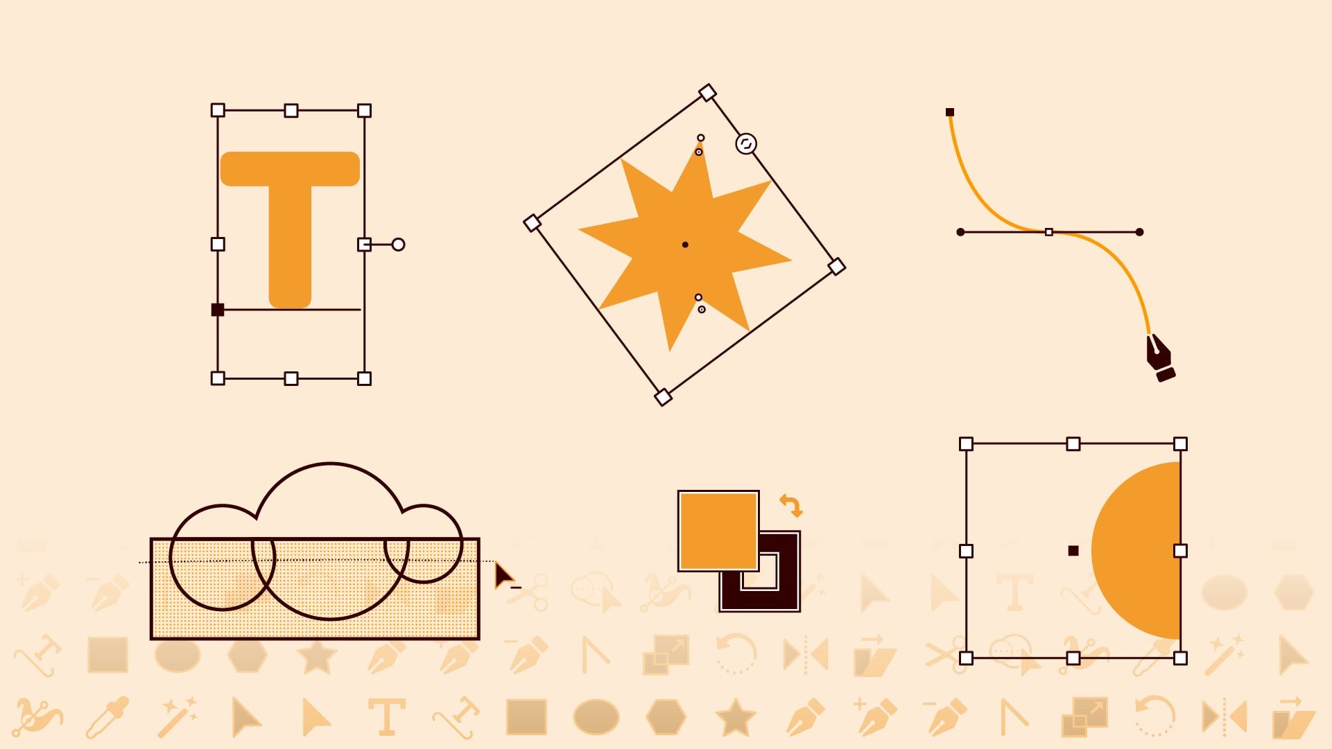
1. Welcome: You don't need to
be able to draw, to be able to illustrate
an Adobe Illustrator. In this class, you'll
learn how to combine basic shapes to create more
complex illustrations. No drawing skills required. I'll demonstrate
how I illustrated these icons by building
with basic shapes. So you can either
recreate them or use the techniques that you learn to create your own set of icons. If you're brand new
to Illustrator, I'd recommend checking out my Adobe Illustrator
Essentials class first. This class covers all the
basics with the focus on the essential skills
motion designers need to know to create
illustrations to animate. Then once you've
illustrated a set of icons, you can watch this class next to learn how to animate them
in Adobe After effects. So if you're ready
to learn how to illustrate by
building with shapes, then let's get started.
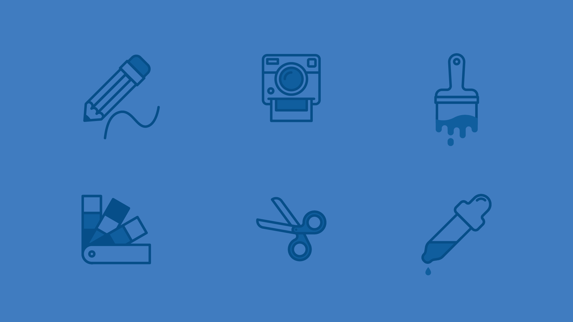
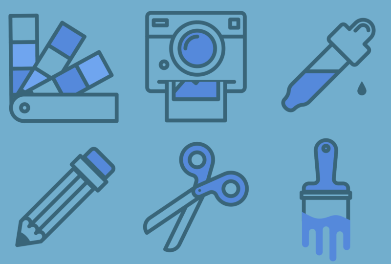
2. Class Project: The class project is to
illustrate a set of icons. I did six icons, but your
set could have more or less. As you watch, it
might be helpful to follow along by
recreating my icons. It's okay to recreate
my icons exactly for learning purposes and post
this as your class project. But for your own sake,
please don't post or present the work as your
own outside of Skillshare. Once you've gotten
that practice, you could use the
techniques that you learn to create your
own set of icons. Try to make the icons
recognizable as a set that goes together by making
sure that they have a consistent theme
and design style. The first step is
to choose a theme. Be sure to choose
things that you can represent clearly in
the form of an icon. Icon should be recognizable
at a small size. Then come up with
a design style. Here are some things to
think about to make sure that your icons all
have a consistent look. First, all icons should
appear about the same size. My paintbrush icon
is long and narrow, so I made it a little bit
bigger vertically to make it look about the same size
as the rest of the icons. The design style, I chose to
go with monochrome line art, but there are many
alternative styles you could come up with. I use shades of blue with only a few parts of each icon
having a filled in color. Whatever design
style you go with, just make sure that you're being consistent across
all your icons. This includes picking
a color palette and sticking with it. If you use lines
within your icons, making sure that the
stroke weight is consistent will help your icons look like
they go together. Also, think about the shapes
across your set of icons. I chose to use a combo of rounded corners and
pointy corners with a round join and each icon has at least one round corner
and one pointed corner. Another way to make your
icons go together is by illustrating them in the same
perspective or orientation. For example, these icons
are all isometric, and these are all
cross sections. Sometimes you may need to make exceptions so that the
icon is recognizable. Here, the doughnut and the
pizza are shown as a top view, whereas the others
are all in side view. The doughnut and pizza would be hard to recognize
from a side view, so this is a good design choice. Make sure that the
level of detail in your icons is similar across
all the icons in the set. If you plan to
animate your icons by watching this class next, you'll want your icons to have
enough details to animate. If you go too detailed, then it's not really
an icon anymore. So with those best practices of icon design in mind,
let's get started.
3. Set Up: Let's create a new
file. I'm going to design all of my icons in one file so that I can make sure that they
all look consistent. If you plan on
taking my next class and animating your icons, you'll need to
separate out each icon into its own file with
just one artboard. But I'll show you how to do
that when the time comes. So for now, I'm going to set the dimensions to 500 by 500. Since Illustrator is a
vector based program, you can always
scale your graphics up or down without
losing quality. But if you make your
graphics too small, they'll look pixelated in after effects when you're
trying to animate them. Make sure the units
are set to pixels. I'm also going to
set the number of artboards to six,
one for each icon. The color mode should be set to RGB because this is for digital. CMYK is meant for print and will cause the colors
of your icons to look messed up if you bring
them into after effects to animate and then
just hit Create. The first thing that I'm
going to do is create a background color
for all of my icons. I'm going to use
the rectangle tool and just draw out a square you can go to the Transform
panel to make sure that it's the exact size and in the
center of your artboard. And then I'm going to go
over to the color panel and turn off the stroke and
then click into the fill, and I've copied a hex code for the color that I
know that I want to use. But you could also
use the color picker to choose the color
and then hit Okay. And I want to copy this
onto every single artboard. So a trick to do that
is to Command C to copy and then command Shift Option V to paste on all artboards. I've actually pasted a second
one on this first artboard, so I'll just delete one copy. Then I'm going to go over
to the Layers panel. And if you don't see any of
the panels that I'm using, then go to Window, and you can find them in here. I'm also using a workspace that's similar to
Essentials classic, but I've customized
it a little bit, so you can watch my Illustrator Essential series to
learn more about that. So in the layers panel, I'm just going to name this layer, BG for background,
and then I'm going to lock it so that I don't accidentally move things around. And then let's create
a new layer to start designing the icons on. I know what colors I
want my icons to be, so I'm going to set
up some swatches so it's easy to
use those colors. Since I already have
one of my colors here, I can just hit the
plus button to create a new swatch and then hit Okay. I'll add another swatch. And I know the hex codes
that I want to use, so I'm just going
to type them in. And one more. So now I have the three colors
that I want to use. If you don't know
what colors you want to use yet,
that's totally fine. You can always change
the colors later.
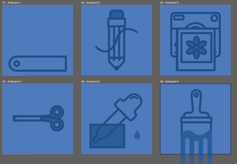
4. Color Swatches Icon: Let's zoom into
the first artboard and start designing
the first icon. You can tell that this artboard is
selected because it has a black outline versus these ones that are not
selected with a gray outline. So I'm going to zoom into this artboard with the
keyboard shortcut, which is Command zero. To create the cover page of
the color swatches booklet, I'm going to use
the rectangle tool, and then I'm just going to
click with this tool so that I can type in the exact
dimensions that I want. I'm doing it this way because
I know that I want to divide the booklet into
four equal swatches. So by using nice numbers like
this, it'll make it easier. And then let's just
move this into place and center it
on the artboard. I want this to be a
stroke with no fill, so I'm going to
switch this and then increase the stroke
weight to 14. I also want the
corners to be rounded. Then with the shape selected, I'm going to select this
corner and then this one and round it so that this gives it a rounded
edge over here. Then I'm going to grab
the Ellipse tool, which is underneath the
rectangle tool and then draw out a little circle right
here that's kind of like the binding
of this booklet. And then I'll move
this into place. If you have smart
guides turned on, it will help you center things. You can turn that on underneath view and then Smart Guides. For the pages of the booklet, you might think about doing
this by copying and pasting this shape and then using
lines to divide it up. But the problem
with doing it that way is that it's
going to be hard to color in this area because
it's not a closed in shape. So let me show you how I'm
going to do this instead. I'm going to use
the rectangle tool, so the keyboard ricot is M,
and then I'm going to click. Let's make the
dimensions 100 by 100. Move this over and line it up, and then let's create
four more of these. I'm going to hold down
option and drag it over and then repeat that
to create four copies. On this last one, we need
to round these corners, so I'll select
them and round it. Now I can recolor these
squares by making sure that the fill color is on top
and then using my swatches. So this one, I'll just color
the same as the background, and then the middle
blue and the dark blue. Then I'm just going to
click and drag over this whole page and hold
down option to duplicate it, and then I'll recolor this
one a little differently. And let's repeat
that one more time. Now that I have all the pages, you might think
that the next step is to arrange them behind this front page and rotate them so they're flipped
out from the front page. But actually, it's
going to be better if I leave them not rotated so that I can add the rotation and
animate them in after effixs. Instead, what I'm
going to do is just select each page to group them and then I'm going to drag each one
behind the main page. I have smart guides turned on, so these are snapping
pretty nicely, but you could also use
the align tools here. Next, I'm going to go
into the layers panel and toggle up in this
layer and just move the front page and
the binding up to the top by cooking them and
dragging them to the top. Then this front page needs a fill color, so I'll add that. Now all of those other layers
are behind the front page. To animate this, I'll
need to separate the different pieces that I want to animate into
their own layers, but I'm going to do that
step at the very end. For now, I'm just going to close this up and
we can move on.
5. Pencil Icon: When you're
illustrating something that's rotated like this pencil, it's easier to illustrate it either vertically
or horizontally. And then when you're done,
you can easily rotate the whole thing either
illustrator or after effects. The pencil icon is made up of a bunch of
different rectangles. So I'm going to grab the
rectangle tool with M on the keyboard and then draw
out a shape for the eraser, and then another one for
the little metal piece that goes right
below the eraser. And then I want
to make sure that these two shapes are aligned. So I'm going to click and
drag to select both of them, and then use the align tools. Or if you don't see the align
tools in your top toolbar, you can find the align panel, or if you don't see that, you can find it underneath window. I also want to round the top
two corners on the eraser, so I'm going to
select this shape, click the first round
corner icon and then hold Shift and select the second one, and
then drag these in. For the main part of the pencil, I'm going to create it
with three rectangles. I'm going to grab
the rectangle tool again and then draw
out a long rectangle. Then I'm going to go over
to the Transform panel and make sure that
this is a nice number. That way, it'll be easier to work with when I'm
trying to cut out a circle to make those ridges
on the bottom of a pencil, when you sharpen it, how
the bottom is not straight. In the transform panel,
I'll make sure that constrained proportions
is not locked, and then I'll change the
width to a whole number. Let's do 36. And because I have
scale corners and scale strokes and effects
turned off unchecked, that means that the stroke
weight is going to be the same even if I change
the size of the shape. So that's what I
want in this case. So make sure that yours are also turned off or just
go back in and adjust the stroke weight to be consistent with all of
your other artwork. Next, I'm going to create
a circle to cut out the bottom of the shape
to create an arc here. So I'll hit L on the keyboard to bring up the
ellipse tool and then just click so I can type in
the exact dimensions. And that's going to be 36 because that's the width
of this rectangle. And then I'm going to
move this into place, making sure that
it's center aligned. And then I'm going
to select both of these shapes and go over to the Pathfinder panel
and select minus front. I know that the front shape is a circle because
I made it second, so it's going to
automatically be on top, so I can just hit minus front, and that's going to
cut out this circle from this rectangle to
create that little ridge. Also, in the stroke panel,
notice that I already have round corners turned on from
the last shape that I made, and that's how I
want this to be. From here, I can
duplicate this shape, so I'm going to hold down option and drag out and make sure that these align on this line here and then do
that one more time. And then let's make
sure that these are centered with these
other two shapes. I'm going to select all
of these rectangles, hit Command G to group them, and then select all of the shapes and
horizontally align them. Next, let's create a triangle
for the tip of the pencil. So I'm going to grab
the polygon tool, which is underneath the
ellipse or the rectangle, and then I'll just click to
create a three sided polygon, and then I'll rotate
this by holding Shift to make sure that it snaps
to 45 degree increments. And then let's just
move this into place. And scale it so that it
fits the right size. I'm just going to
drag this down, and we need to get
rid of this top line. So I'm going to switch
over to the scissor tool. So that's going to
be C on the keyboard and just click
these anchor points here at the top to cut off
this segment of the line. Then I'm going to select
this line and hit Delete. If you use the direct
selection tool to select this, that's fine, but you're going to have
to hit Delete twice because you can see when
you just do it once, there's these two little
dots that are leftover. So if you just hit Delete
again, those go away too. From here, you could fit the triangle onto the
end of the pencil. But if this feels a
little bit too squish, what you can do is actually
add to this triangle. What I'm going to do is
go to the pent tool, which is P on the keyboard, and then I'm going to hover over this
point and you'll see a little slash icon next to the Pentool to know that
you're adding onto a path. I'm going to click this
point to add and then go up and then click to
add another point. Then from here, hit Return
or Enter to end that path, and I'll do the same
thing on the other side. Then I'm just going to
drag this a little bit higher, maybe
something like that. I'm also going to give
this a fill color just because I'm going to have a line drawing in in after effects. And if this pencil shape overlaps with that
line drawing in, I don't want the line
to show up behind it, so I'll fill this in with
the background color. And then I need to
move it to the back because obviously it's cutting
off these shapes here. So I'm going to use
the keyboard shortcut, which is command shift, and left bracket to move that
all the way to the back. I'm also going to
adjust the pointiness of this triangle by going to
the direct selection tool. A on the keyboard, selecting this point and then just
dragging it up a bit. I'm holding down Shift to maintain the
horizontal position. So something like that
looks pretty good. Then let's add the actual
writing tip of this. So I'm going to grab an
ellipse and draw out a circle, and then let's fill this
in with the darkest color, and we don't actually
need a stroke on this. And then I'm just going
to drag this over to line it up where it should be for the
tip of this pencil. You could also use
the align tools to make sure that
these are aligned. So if you select both
of these shapes, then select this one again
because we don't want this one to move because it's already lined
up with the pencil. So this is going to align
to this key object. Then to crop this circle, so it's just within this
pointy part of the pencil, I'm going to copy this shape, so command C, and then I'm going to paste it in the
exact position that it's in. So Command Shift V.
Then I'm going to take this selected top copy
and then hold down Shift and select the circle and then go over to the Pathfinder
panel and then crop this so that the
circle is only visible where it overlaps with this
pointy part of the pencil. So to do that, you can
use the intersect option. So hopefully, you can see how by duplicating that pointy part, I keep a copy to use as the
pointy part of the pencil, and then I use the copy to use the Pathfinder panel
and create this shape. Now I just need to
recolor this so that it has a dark fill and no stroke. The last thing to do here
is to color the eraser, so the fill color of the
eraser with the medium blue. I'm also going to create a line. The pencil icon is going to
draw in in my animation. So to do that, I'm going
to use the Pen tool, which is P on the keyboard, and then I'm going to click
and drag to draw a line with handles because this is
going to be a curved line. Then I'm going to
click and drag again to create more handles
on this point, and then I'm going
to do that one more time to create another point. To end the line, you can
hit Enter or Return. From here, I'm going to switch
over to the selection tool and just get rid of the
fill color on this line. And if you don't like the
way that the line looks, you can go to the
direct selection tool or A on the keyboard, and you can click on the points and click and drag to
adjust the handles. So you can move
the actual points or you can move the handles. I'm not really going to
worry about how the icon and the line are arranged because I know that I'm going
to animate this. But if you want to, you could
select the entire pencil minus the line and then
group it and then rotate it. But I find it easier
to start with zero rotation being vertical in after effects so I'm
going to leave it like that. I'm just going to center
in the artboard just to be picky and call that done.
6. Camera Icon: To create the camera icon, I'm going to start
out with a rectangle. I like to design things centered in my artboard, so I'm
just going to center this. I also want around the corners. And then I'm going to
grab the Ellipse tool to create a circle for the lens. And let's just align this. You can either use
Smart Guides to snap it or you can select
both of these shapes. And if you want to align it to this key object that's the
square part of the camera, you can just select that
again to make it bold and the key object and then
hit the align tools. I think I want this lens
to be a little bit bigger, so I'm going to make sure
that in the Transform panel, scale strokes and
effects is unchecked. Then I'm going to hold down
Shift to make sure that it stays circle option to make sure that it stays centered so it'll change shape
from the center of the shape and then I'll click and drag to make this
slightly bigger. Then I'm going to use
the rectangle tool to create a few more
details on the camera. And then I'll do
a little ellipse for a little detail over here. Now let's create that
inner circle for the lens. I'm going to select this circle, hit Command C to copy, and command Shift V
to paste it in place. Now there's two copies
of this circle. Then I'm going to
hold down Shift and option to make this smaller, but scale it from the center and make sure it stays circle. So something like that. To make the little glare on the
lens, I can repeat that. Command C to copy this circle, Command Shift V to
paste it in place, and then let's make that
a little bit smaller. So the glare should be
maybe about that size. Now that I have this
circle, I'm going to use the scissors
tool to cut it, so I'm just going to
cut here and here, and then I'm going to use
the selection tool to select this part of the line and
hit delete to get rid of it. Let's color this part of the lens and maybe even make this circle
a tiny bit bigger. Let's create the little slot
that the photo comes out of. I'm going to do this
with a pen tool, and then I just need
a stroke but no fill, and then I'm going to
click to create a point and then hold down shift to
make it a straight line, and then click to
create another point. Then I'm just going
to move this line into place and make sure
that it's centered. Let's create one more line for another detail
on the camera, so I'm going to use the pen tool again and draw a line from here across and hold down shift to make
it a straight line. Then I need to bring
this shape to the back. I'm going to use the
keyboard shortcut, which is command shift,
and left bracket. I also need to add a fill color to this circle so that I
don't see the line behind it. To create the photo,
I'm going to use the rectangle tool and just draw out a shape that's
going to be the photo. And I'm creating the full photo because I know that I'm
going to animate this, even though in my
final icon design, you can just see the photo
coming out of the camera. So it'll be something like that. And let's actually
design this over here just for a little
bit more space. And then let's add
the photo area. Make sure these are centered, and maybe this should
be a little bit longer. For this photo, I'm just
going to draw some mountains. I'm going to use the
pen tool to just draw some straight lines that
are going to be mountains. And then I'm going to
kind of trace this photo just to make this
able to be filled in, and I'll fill it with
the medium blue. And then let's add a
little circle for the sun. And this can have the fill be the dark blue with no stroke. I'm going to
duplicate this photo. So I'll just select
it, hold down option, and then drag out a copy. And then let's delete the
mountains and the sun. And let's create a
flower for this one. So I'm going to use an
ellipse and create an oval. And let's make this have
a stroke, but no fill. A quick way to do that
would just be to use the eyedropper tool and sample something that has
a stroke, but no fill. Then let's center this ellipse. Now I want to repeat it to
create the rest of the petals. To do this, I'm going
to go up to object. Then repeat and then radio. From here, you can either
adjust using these controllers, or in the properties panel, you can go over and choose how many repeats you
want. I just want five. Now I want to push
these petals together, so you can use this
controller to do that. Now, I'm just going to center this and shrink it
down a little bit. I'm also going to rotate it. And then let's create a
circle for the center. Make sure that your circle has a fill that's the same
color as the background. And then I'm also going to color these flower petals with a
fill that's this medium blue. Last, I'm going to select the
entire photo and group it, same for this other photo. Then if you wanted to have the photo coming
out of the camera, what you could do is
just drag the photo over and then to crop so that just part
of this is visible, the part that's
out of the camera. What you could do is
create a rectangle. I'm going to draw where I want this photo layer to be visible. Then with this
rectangle selected, I'm going to hold down
Shift to also select the photo and then
I'm going to use the keyboard shortcut to
create a clipping mask. That's Command or Control seven. So you can see how
now the photo is only visible inside of that now invisible
rectangle that I drew. If you want to edit how much
of this photo is visible, you can double click on the
photo and that'll enter into isolation mode and you can just adjust the
position of this. And then to get out of
isolation mode, click this bar. So if you were just
designing this as a static icon and not
planning to animate it, this is how you'd create
that clipping mask. But I plan on
animating this icon. So I don't want to create the
mask here in Illustrator. I want to actually create
it in after effects. So what I'm going to do is
just select this, right click, release the clipping mask, and then I can delete
this rectangle that was serving as the mask. Because I'm going
to animate this, I'm just going to
leave this photo here on top of the camera, and I'll center it
in the artboard and then bring this photo
in and center it, too.
7. Scissors Icon: For the scissors icon, I'm going to combine a rectangle and a circle to create the part that your fingers use
on the scissors. First, let's create
that rectangle and then let's
create the circle. I'm going to make sure
that they're lined up. And maybe this needs to
be a little bit longer. Then I'm going to
select the circle, hit Command C to copy it, and then Command Shift B
to past stay in place. Then I'm going to hold Shift and option to take this
circle that's on top and make it into
a smaller circle while keeping these aligned. Then I'll grab the
direct selection tool, which is A on the
keyboard and take this rectangle and
grab this point here and just drag it
over a little bit so that when I
merge these shapes, it's not getting cut into
the middle of this circle. I'm going to select the
rectangle and this outer circle, go into the Pathfinder
panel and merge them. From here, if I color this shape and give
it a fill color, you can see that this
circle is not cut out. So what I need to do is
select both of these, and you can either
do this by creating a compound path by using the keyboard Jarcut
controller command eight. I'm going to undo that and show you that another way
to do that is to have both shapes selected
and then use the minus front in
the Pathfinder panel. Either way, this creates
a compound path. Compound paths are where two different paths are joined together to
create a unique shape. And this is great for cutting
things out just like this. From here, I'm
going to select the shape and then switch over to the direct selection tool
to see the rounded corners. When you have a unique shape, you need to be on the
direct selection tool in order to see the
round corners icons. If you have a simple
shape like a rectangle, then you can see the
round corners icons with the regular selection tool. But you need the
direct selection tool if you have a unique
shape like this. Then from here, I'm
going to select these two corners and then round them and then click back on on this point
to round this corner. I'm going to make this
a little bit bigger, and then let's make
the scissor blades. To do this, I'm going
to use a rectangle and I need to make this
a little bit taller. And let's color this with the background
color and then move it behind this piece of the scissors with
the keyboard shortcut. Then I'm going to select
the shape and select this round corner and
drag it in to round it. Next, I'm going to select both of these shapes and group them, and then I'm going
to hold down option and drag to create a duplicate. To flip this over, I'm going
to use the reflect tool, which is O on the keyboard
and then drag vertically from top to bottom holding shift
to flip this 180 degrees. Then I can drag this into place. Let's create a little circle for the binding or the hinge
of these scissors. I'm going to use L
for the ellipse tool. I don't want this
to have a stroke, but I do want it to have a fill. I'm just going to
zoom in and make it a little bit bigger and
move it into place. If you're just creating
a static illustration, then you probably want
to rotate the scissors. I'm going to select
the top shape and hit R on the keyboard to
bring up the rotation tool. I'm going to rotate the
shape from this point here. I'll click with
the rotation tool to move the reference
point here, and then I can click and drag
to rotate from that point. If you're going to
animate your icons, you can leave them unotated and then add the rotation
and after effects. There's one thing that I've noticed that I now want to fix. When the scissors are closed, the handles overlap a
little bit too much. So with this top half of
the scissors selected, I'm going to double
click into it to enter into isolation mode to edit
the objects within the group. So from here, I'm just
going to rotate this handle outwards a little bit so that it looks more natural when
the scissors are closed. And I'm going to use
the rotation tool, which is R on the keyboard, and then I want to move
this reference point to about here where
the hinge would be. Then still with
the rotation tool, I'm going to option
or Alt click on this reference point
and that'll bring up the rotation box
where I can type in the exact angle that I want
this to be rotated by. Let's try negative ten and
then I'm going to hit tab. And since I have
preview checked, it'll show me what
that looks like. I think that looks pretty good, so I'm going to hit
Okay, and then I'm going to switch back over
to the selection tool. Now this shape is shown right here where I
don't want it to be, so I'm just going to
drag it to resize it. To get out of isolation
mode, click this bar. You could either
repeat the same steps on this half of the
scissors or if you want to make sure that
the two halves of the scissors are
completely identical, you could just delete this
and then take this one, make another copy, use
the reflection tool to flip it over and then
move it back into place. Then let's move this layer
behind the other one with the keyboard shortcut of
command shift and left bracket. I think that looks better
when the scissors are closed, and it will also still look
good when the scissors are rotated when I do
this in the animation. For now, I'm just going
to leave this like this.
8. Eyedropper Icon: To create the eyedropper icon, I'm going to start
with some rectangles. Then I'm going to
select all of them and make sure that they're
center aligned. Let's also just align
them to the artboard. I'm going to make this shape
just a little bit wider. So I'm going to drag
horizontally and hold down option so it
changes from the center. And then I'm going
to select these top two that make up the cap and go into the Pathfinder
panel and then unite them. I'm going to switch over to the direct selection tool so I can see the rounded corners. And I want to round the top
two corners all the way, and then these two corners
just a little bit. And then I'm going
to round these four corners a little bit more. So maybe something like that. But actually, I
feel like this part is a little bit too wide now. So with the direct
selection tool, I'm going to click and
drag over these points. So make sure the selection includes this point,
but not this point. And then I'm going
to use the arrow key to nudge it over a little bit. But I'm going to count
one, two, three, four taps of the arrow key so that I can do the
same thing over here. One, two, three, four. And then I also want this part
to be a little bit taller, so I'm going to select those points and
just nudge them up. Now let's work on
the bottom part. I want this to narrow
at the bottom here. So what I'm going
to do is switch over to the Pen tool and add two points on this side
and two points on this side. Now, these aren't
perfectly aligned, and I like to keep
things symmetrical. So what I'm going to do is go to the direct selection
tool and select these top two points and then go to the align tools and
align them vertically. For some reason, it
put them way up here. But since they're both selected, I can just hold
down Shift and drag them down where I want them. And then I'll do the same
thing with these points, select them and vertically
align and move them down. Now I'm going to select
the bottom four points. So these two that are already selected and then
the bottom corners. I'm going to use the scale tool, which is S on the keyboard. And with this tool,
I'm going to drag horizontally to bring
these points in. Then I'm going to switch over to the direct selection tool
and round these corners. And then I'll round
these corners even more. I'm going to select the bottom
piece and just make it a little bit bigger by holding shift and dragging
from the bottom. To create the little
glare on the top, I'm going to duplicate this
shape to make sure that it's exactly the same
curve as this shape. So I'm going to copy
and then paste in place Command Shift V. And then
instead of just scaling this, which is not going to
maintain a parallel curve, what I'm going to do
instead is I'm going to go to the properties panel
and then do offset path. You can also find
this underneath object path, offset path. When you click this
button, you'll have the option of how much you
want to offset the path by. So since I want to offset
this inside of the shape, I'm going to do a
negative number. So let's try negative 20. And then if you hit Tab,
it'll move to the next box. You can preview what this looks like as long as you
have preview turned on. So I think that
looks pretty good, and I'm going to hit Okay. Now I'm going to switch over
to the scissors tool and just cut here and here, and then just delete
this part of the line. To create that little glare. Next, I'm going to
click and drag over the entire icon to select it, and then hold down Shift
and rotate it 45 degrees. The reason I'm rotating
this now instead of an after effect is because I know that I want it
to always be rotated. I'm not going to
animate the rotation, so I can rotate it
now with no problems. Now let's create the fluid
inside the eyedropper. So I'm just going to
create a rectangle. Let's give this a fill color. Then I only want this rectangle, which is going to
be the fluid to be visible inside of this
eyedropper shape. I'm going to hit Command C
on this shape to copy it, Command Shift V to
paste it in place, and then I'm going to select the rectangle and
create a clipping mask. The keyboard shortcut is
Command or Control seven. Then I want to move this behind the original shape of the eyedropper so that
that stroke is on top. I'm going to use the keyboard
shortcut to move it behind, which is command shift,
and left bracket. So that's how you would
do this if you're just creating a static graphic. But since I'm going
to animate this, I actually don't want to create the clipping mask
here in Illustrator. I want to create it
in after effects. So I'm going to select
this clipping group and then right click and choose
Release Clipping mask. And then I know I have an extra copy of the eyedropper shape, so I'm going to go
into the layers panel just to make sure that
I delete the right one. So it's going to
be this path right here that's right
above this rectangle. So I'll delete that
because I don't need it. And I'll set this up using
a mat in after effects. We need one more
thing for this icon, which is a little fluid drop that's going to come
out of the icon. To create that, I'm going
to start with an ellipse. Let's just give
this a fill color. Then I'm going to switch over to the direct selection
tool and grab this top point and
just drag it up while holding shift to maintain
its horizontal position. I want this top point to be
pointy instead of curve. With this selected,
I'm going to go up to convert and then just convert
it to pointy corners.
9. Paintbrush Icon: For the pain press, let's
start with the handle, which is going to
be a rectangle. I want the bottom
of the handle to be narrowed and I want
the top to be rounded. Generally, when you want
to manipulate a shape, you want to do any rounding
of corners as the last step. I'll show you why that is. If I were to round these corners, and then take these two corners and use the scale tool to
drag them in and narrow them. Now I've lost the ability
to round these corners. This is a new corner.
Like, it doesn't round where it was
rounding before. So I'm just going to
undo all of that. And first, I'm going to select
these two bottom corners, switch over to the scale tool, which is S on the keyboard. Then I'm going to
drag horizontally to bring these two points
closer together. Then from here, I
can switch over to the direct selection
tool and then click these two top corners to see the round corners icon and then select them and
drag all the way. Then I'm going to create
another rectangle for the base of this handle. And let's make sure
these two shapes are lined up using the align tools. I want to give these
rounded corners, so I'll select that
in the stroke panel. Then I'm going to select
both of these shapes and go into the pathfinder
panel and unite them. Then with the direct
selection tool, I'm going to select these
two corners and round them, and then these two
corners and round those. There's the handle and we can
also add a little ellipse for the hole in the top of the handle so you could
hang this paintbrush up. Then you can either align
them if you have Smart Guides or you can make sure that they're aligned with
the align tools. Then let's create
another rectangle that's that little metal part that holds the bristles
onto the handle. Again, let's align
all of these shapes. Then let's create one more
rectangle for the bristles. And again, align this. To create the paint on the paintbrush, you could try to draw
out a zigzag line, but let me show
you an easier way. I'm going to use
the pen tool and making sure that this
shape is not selected, I'm going to hover over it so I can make sure
it's the right size, and then make sure that you
see this little start icon next to the pentol
so you know that you're creating a
new path and not adding a point to
this existing path. I'm going to click
to create a point and then click again to
create another point, and I'm just going to
create straight lines. Then for the bottom,
I'm just going to trace the shape so that
I have a closed shape. From here, you could
switch over to the direct selection tool and adjust any of these
points if you want to. Then I'm going to
select this point and this point and round the corners all
the way to create a nice smooth curved line. Then I'm going to
select this shape just with the regular
selection tool and I'm going to give it a
fill color and no stroke. That's the reason
why I connected this bottom part of the path so that I could
fill in this shape. Now I need to
resize this so that it reaches the edge
of the bristles. I'm just going to zoom
in to do this and hold down Shift and just
drag to resize. And then also move
it down like that. Next, let's create
the paint drips. To do this, I'm just
going to use lines, and this will make it so that
they're easy to animate. So I'm going to
use the pen tool, and then I'm just
going to create a line that's straight
by holding shift. And then let's give
this a stroke color, and let's give it a
width of, like, 32. I also want to give
it round caps. I'm just going to select
this and nudge it over with the arrow key so that it lines up with the edge of my brush. It might help to zoom
in and align this. Okay. If you're having trouble perfectly
aligning it like I am, it might be useful to turn off
Smart Guides for a second. The keyboard shortcut
is command or control, and then you can keep
trying to adjust. Now that that's lined up, I'm going to turn back
on Smart Guides. Next, I'm going to
hold down option and drag out to duplicate this line. I want to put it right
next to the original, so it's just barely touching. From here, I can use
the keyboard shortcut Command D to duplicate that
shape and that action. I'll move it over and
duplicate the shape. I'm going to do
that until I have seven copies of this line. Then I'm going to
color every other one. These are going to be the gaps. I'm just going to color
them any other random color just so I can see
what I'm doing here. Obviously, my paint is extending
beyond the paint brush. What I'm going to do is go
into the Transform panel, make sure that scale corners and scale strokes and
effects are turned off. Then I'm going to make my paintbrush bigger by
selecting this whole thing. Make sure you get the paint
curved line at the bottom, and then I'm just going to drag this to make it line up
with the paint drips. Some of these lines
are extending above the curve paint line, so I'm just going to select
them all and drag them down. Now, these three lines
that I've colored a different color are going to be used for creating the gap. If I just move them down, you can see that right now there's pointy corners in
between each of these paint drips, which
doesn't look very good. So I'm going to use
this shape to cut out a shape from here
to create that gap. But first, I need to extend
this shape a little bit, so I'm going to select both of these bottom corners with
the direct selection tool, hold down shift, and
then pull them down. Then I'm going to move
these three lines that I'm using for the
gap back into place. I'm also going to vary the
vertical positioning of these lines to make it look a little bit more
realistically drippy. You just need to make
sure that they're still overlapping with
this paint shape. Then once you get the
positioning of these, how you like them, you want
to select all of them, and we want to cut these lines out from this shape. But
these are just lines. If you were to do this now by using the minus front of
the Pathfinder panel, you'll see that nothing actually happens because it
was just the line and not a shape that would cut something out of this shape. Instead of doing that,
what you need to do first is select these lines, then go up to object expand. These settings are
fine, so press Okay. Now these are solid
shapes with a fill color that you can use to cut
out from this paint shape. Hold shift to select the
paint shape and then use minus front from the Pathfinder panel to cut out these shapes. You can see the brush of the paintbrush
behind this paint, so I'm going to move
this paint shape down. If you're just creating
a static illustration, you might want to
vary the lengths of these lines to make it look a little bit more
realistic and more interesting. But since I'm going
to be animating these lines, dripping, I'm just going to
leave them all the same and I'll adjust
while I'm animating. We'll call this done
for the paint brush.
10. What's Next: Thanks for watching.
Whether you re created my icons or
created your own, please post them as
a class project. To learn how to animate your
icons and after effects, check out this class next. If you got something
out of this class, it would help me out a lot
if you left to review. Make sure you're following
me on Skillshare or sign up for my email newsletter to hear when I have a
new class for you. Until next time,
Happy Illustrating.
 Megan Friesth, Motion Designer