Transcripts
1. Introduction: Hi, everyone. In this class, I'm going to guide you through the process of illustrating your very own custom calendar based on a theme of your choice. We're going to begin by
brainstorming ideas, choosing a theme and
creating some thumbnails. We'll explore composition and color studies to help you
decide on your final palette. You'll discover more about your artistic style
while learning simple organizational
hacks to help you stay on track and
speed up your workflow. This class is perfect for
anyone who's looking to build a collection of work and improve their illustration skills. Your calendar can
be for friends or family to sell
online or in shops. This is a great way to
connect with your audience as your artwork will be seen
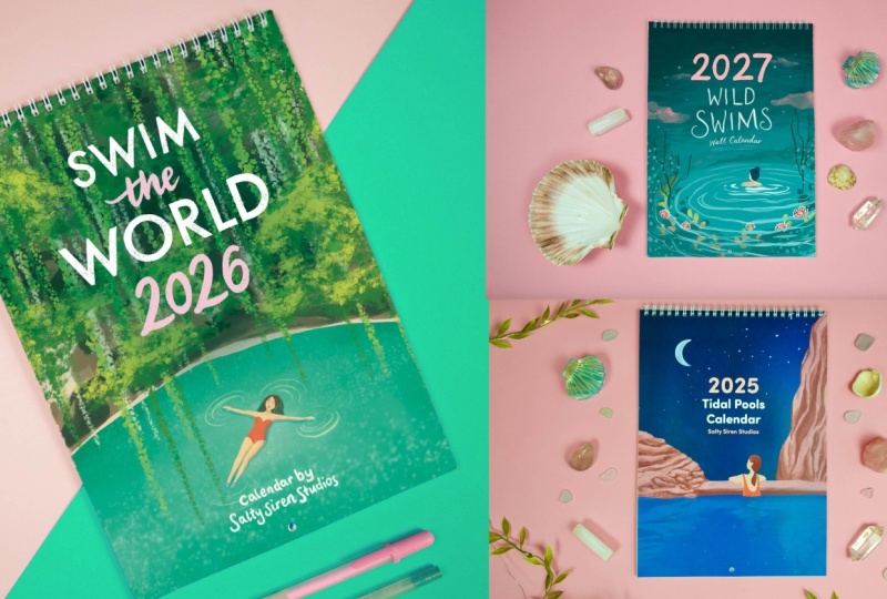
every day in people's homes. This will help leave the lasting impression with your artwork. My name is Charlotte
Scarr and I'm a freelance graphic
designer and illustrator. I studied graphic design at Falmouth University and have worked with many
local companies, as well as big brands like Sperry and artists
such as Emily Pell. Color is a huge part of my life, and I love living in
Cormall by the sea. It offers so much inspiration and influences the
type of artist I am. During this class, I'm
going to be encouraging you to connect with your
environment and your hobbies, showing how they can influence your own style and
build up an audience. You love illustration and
have some experience already, this is perfect for
you, as we'll be creating our 12
illustrations in Procore. You can also use Illustrator or Photoshop or even
Analog, if you prefer. But don't worry if you're
new to illustration, as you can make your
illustrations really simple and they don't
have to fill a full page. So go at your own pace and follow what's relevant
to your level. Calendar itself, I'll
be showing you how to put the whole document
together in in design, and I'll also be providing some Canva template and navigating through
the process there. This is going to make the
process a lot quicker and intuitive if you're new to
the design side of things. I'll share some
easy ways to design a simple yet
beautiful layout for your collection that
can be used for many different
formats and styles. So if you'd like to build a new portfolio of work that you can repurpose into prints
and other home decor items, this will be a great class view, and you'll be able to
create lasting value from your artwork
again and again, not just for the calendar year. I'm so excited to begin
this journey with you, so grab your
sketchbook or iPad and let's get started bringing
your ideas to life.
2. Class Project : So for your project, you're
going to be creating a 12 month illustrated
wall calendar, either using digital
tools like Procreate, Illustrator or Photoshop or any traditional mediums
that you prefer. I've broken the class into manageable chunks
for you to follow. First, we'll start
with our theme, draw up some ideas
for inspiration and see what interests
us by identifying the type of stars that
we like to work in and any work that we see
that influences us. This on artists we admire, subject matter that we collect and anything around our
hobbies and interests. We can begin by doing
some market research. If you'd like to
market your calendar. This can be a really
helpful tool. So gathering inspiration
will help us create some mood boards where we can
pull our favorite images, any photos that we've taken, anything that we see in books,
and really tune into that. Inspiration is everywhere. We just need to be alert for it. If you need to illustration, I recommend keeping your
designs quite simple, as these pieces
really don't have to be very detailed in
order to stand out. While this class won't
be a whole class dedicated to color theory, I'll teach you what makes
certain colors pair well together and what to look out for when deciding on
your own palette. The idea of a limited color
palette sounds limiting. I promise that carefully
selecting your colors will make your work look much more
professional and recognizable. As well as the illustrations
for the calendar, you also have the option
to design a front cover. We'll explore
different lettering styles as well as where to print your work with some
additional tips on how you can
pitch to retailers. Even if you don't intend
to sell your work, it's a great exercise to help you start
thinking commercially, if this is something
that you'd be interested in later
down the line. There are so many ways to
design a calendar from a folded desk calendar,
a list former, a family planner, and even
a way to create a calendar that never expires in the
form of a perpetual calendar. Tutorial, I'll guide you
through creating a simple yet effective Monday to
Sunday monthly calendar. This is my personal favorite, as it's really quick
and intuitive to make. I'll also include a perpetual
template in the class. This one isn't dated,
so you can use it for any calendar year regardless
of when you're watching. Going for this option can
certainly save you money rather than sit on old dated stock that you're struggling to shift. What's missing from a perpetual calendar is the
days of the week. You can always add
these in if you decide when you want
to use the calendar. If you're one of those
people who's gifted about five different
calendars for Christmas, the perpetual calendar
will never be wasted, as you can always use
it next year instead. This could also give
you an advantage if you're pitching to
retailers as well. As we go through the project, showing your highs and lows
is a great way to inspire others and just be really authentic when going
through the project. We're all still
learning, and it'll be great if you encourage
others as well. Now, let's dive in.
Grab your tools, and we'll start brainstorming
your unique ideas.
3. Choosing a Theme: So now you have an idea of
what we'll be covering. We can begin to brainstorm
in order to find our theme. To get some ideas, I want you guys to make a list of
your favorite things. This could be activities such as hiking, gardening, reading. The world is your oyster. Get as many ideas
down as you can without worrying about the
final outcome just yet. If you're stuck and nothing
immediately springs to mind, could you perhaps look over
some of your past work and pick out any recurring themes and things that you
like to illustrate? If you don't have
a wide collection of work just yet, don't worry, as you can look around
your house and get some ideas of themes
based on your taste. What kind of colors do you wear? What artwork do you
have around you? For me, I have a lot
of swimming artwork, anything to do with the water. Blue is certainly
my favorite color as most things I own are blue. Okay, so let's begin at
generating some ideas. So I already know that
I love the coast. So beach, sea, walking,
sometimes camping. I also love swimming. So we've got tidal paws, which I'm obsessed with. Mm. I'm really drawn to
water for my theme, but I do want to narrow
it down a bit more. I want to think about what
I like to do buy the water. What are my hobbies? What kind of things do I collect there? Beach combing. So I like the idea of having
some seashells. Seaweed. I love seaweed. It's
super colorful, very different in all the shapes and
textures that you get. And I want to have a look
through some books that I have. This one here has loads of different seaweeds
on the front cover, which will create quite a lot of ideas. Just have
a look through. Any of the pages. See
if anything stands out. There's a lot of poems in here. Don't underestimate
the power of words. Although this is
a visual project. Definitely read anything about your topic and just
get some ideas. Often, it's the power of your imagination that will really help you get
some unique ideas. There are even
recipes for seaweed, so that's definitely
something I could include and go down a
slightly different tangent. Here, I'm seeing loads of
really cool compositions with the frame of the
seaweed, how it's mounted. And last but not
least is see pools. This is an absolutely
beautiful book that has so many different tidal
pools from across the world. A lot of these tidal pools
are in my local area, so I could see this rock
from my window at home. And so I have a lot of
happy memories here, and I really love this
composition that I've seen and a few other drone
photographs, as well. You could also choose base
your theme around a charity, to help fundraise, and raise awareness for an
important issue. Marine litter, as well. Unfortunately, plastic is a
big problem where I live, so highlighting this
issue could even be an avenue that I go
down in terms of fundraising and raising
money for charity. I love to dive. So
mainly free diving, but sometimes scuba. So I've got my fins, mask. Snorkel. And I actually really like diving
in fun outfits. So like dresses
and like sequins. This could be a
really cool avenue to go down more of a
fashion kind of route. And obviously, mermaiding, which is kind of
associated with that one. And the community, there
are quite a lot of us in Corma in terms of diving, I think this would be
really cool to kind of explore some
different locations. So like 12 best dive spots. And another thing to
think is how people are going to feel when they're interacting with your calendar. For me, I love the idea of encouraging people to
go out and explore. So your calendar can act as a visual reminder
to do something, and it can alter people's moods
in a really positive way. I'm quite drawn to
combining a few of these, given that they're
quite similar. With the coast path, it's
very much exploring for me, going on adventures, and, like, finding new
spots with the diving. But I love swimming
and tidal pools. I think a lot of these
go hand in hand. So I feel like this would be a really great
one to focus on. I think I'm going to
focus on this one here. So setting strict to brief
parameters will help us create a more memorable
and relatable series of work. Rather than just selecting hiking as a theme, for example, you could focus on specific
mountain peak or even niche down creating a series based on hikes in
your local area. Don't be afraid to niche down. As this going to actually
help you find your audience. And during the class overview, I talked about the
different formats that we can make our calendars. So choosing your theme might
help you decide whether to go for a landscape or
portrait orientation. Picked a theme of classic
cards, for example, given that your subject
matter is already landscape, this might be quite a good
option for you to pick. So let's head to the next class in order to decide how calendar.
4. Layout : Now we have our theme in mind. I want to show you some existing calendars to help
you think about layout as this is going to inform the size of
your artwork later. So this one here,
Chris's calendar is much smaller and comes in a list
format rather than a grid. This will be great for
most people's homes as they don't have to find
a big wall to put it on. So this is an A five calendar, which is half the
size of an A four. This one is in a list format. So this can be quite handy if you want to make a
perpetual calendar. If you did want to
do that, you just get rid of all of the
days of the week, and that way, you can
just use it every year. I really like how he's
interlacing more imagery. They're all really different, so that might give you an idea about how to format this one. So we have a regular
wall calendar here. This is A four size and
offers you enough space in each box to write your
to dos and reminders. This is two of an A five. And you can actually
encourage people to cut these out and
use them as prints if you want to encourage sustainability and create a
more eco friendly product. I got this A three to have
an even bigger artwork, but it's actually
got a smaller grid. Perhaps a work around
this would be to make your picture a little bit smaller and have
your grid larger. Most places don't
actually print out fold out A threes as
they'd just be too big. This one is designed to have quite a large image here and then have the
grid underneath. I love how this
artist Hebe Studio has done lots of
different colored pages. I think it creates
a lot of interest. And although she uses
a lot of colors, I think her work has a really
nice cohesive feel to it. So this is an A three, which is two A four. I 485. So now is a great time to think about how much you want your
artwork to cover. Does it want to fill the whole
page just above the grid? This is going to help you decide on your ratios for
your thumbnails. You could do a bit of market research and ask people around you on social media what they personally look
for in a calendar. Do they value space to write in over a whole cover
image or vice versa? Market research
can be invaluable, especially if you're creating
your calendars to markets. This is something
really important and you wouldn't want
to skip this stage. You won't be able to do
something that pleases everyone. So if you get lots of
different answers, go with what feels best
and most intuitive to you as your art is a
reflection of yourself, and you need to be
able to enjoy making it and feel confident
with your choices. I'm going to work in a four with a separate image to my grid
page. I really like this. It's a very simple
and sleek layout, and it just gives me a bit of separation between the
grid and the artwork. I'll be including
the same format I've used in the
class resources, and you can also make a
perpetual calendar layout, so you can follow along
regardless of what year it is.
5. Finding Inspiration: So I'm going to look
on Pinterest and start some image searching by
creating a mood board. I'll take a look
through any books in my personal collection, and you can even visit
the library as well. Perhaps there's an exhibition going on in your town or city. Doing activities like this
will help get you out of your comfort zone and really deepen your
connection with the project. This is a fantastic
way to discover things that we might not be looking
for and just stumble across. Keep your eye out for any
interesting compositions, as you want your work
to be part of a set, also with enough difference and variation between
the drawings. Now we want to
collect our images and put them into a mood board. You can use Google or Pinterest. For the purpose of the video, I'm going to use Unsplash
and pexels because these are all copyright free
images that I can easily share with
you on screen. Wow. This one is beautiful. I love the ripples in here. This is really psychedelic. I'm thinking about
kaleidoscope colors, and you've got all the pink
in the clouds as well, so this could be quite
a nice one to use. Ah. This looks like my hometown. So this is St. Michael's Mount. So this is actually
where I live. Although I don't know of any
tidal pools around here. There are plenty of
rock pools at low tide. I'm just going to
screenshot some of these and put them into
a folder on my desktop. This has given me some nice
ideas to have a split shot. So often if I'm going
underwater with my GP, I can create some
really nice images looking above and
below the water. This is just a really
interesting view that not many people
actually see, so allow your viewers to just delve into a world that they might not
have seen before. This is a stunning
image as well. You've got the lacy sea,
the bird's eye view. The frame of this
is super lovely. And again, I'm just
going to narrow it down and put cormor and just see what comes up that I might be
able to connect with here. Seagulls, especially
having some flowers in the foreground can be a really nice way to create some work, maybe more for spring or summer. This is a really nice dynamic
pose of people jumping in. I spent many happy years cliff jumping when I was a student, happy image that I could
maybe use for one of my summer scenes or even to brighten up quite a
dreary winter scene. This is beud. This is the
biggest tidal pool in Cornwall. I like the depiction of the people lining the
edge of the pool. Because this one's
so big, I think it really gives a sense
of scale as well, and there are some really
iconic beach huts that I'm thinking would be quite a nice thing to put in as well. So I'm just going to type in, Bod a sea pool and see what
comes up for that one. Okay, these aren't quite
what I was thinking, but I really like this image of the person lying on their
back with all of the ripples. This is a beautiful
thing about research. Often when you're trying to
find something specific, you'll find many
other things that you can use as well
for your inspiration. Maybe want to type in
beach huts because I know the specific beach
has a lot of beach huts, and immediately when I think about this specific location, that's what pops into my mind. So I could get creative, although I don't want
to get too crazy, as this is quite a
recognizable beach, so I do want to convey that. If you want to go more
quacky and abstract, you can definitely make it your own and just take inspiration from all these sources and put your own kind
of spin on things. Know the ones in Bud are blue, and I really like the paneling
on these specific huts. So that could be nice
incorporating some lines. And even these patterns
and the rocks, they're quite abstract,
all the dots. I think they would
look really cool. So even if I'm not
going for photorealism, I could potentially
incorporate some texture and pattern with any pattern
brushes that I use in poker. Alright, so now we have
found another website. This is called Unsplash. Again, you can find lots of
royalty free images here. I love this. I think this is
a really beautiful image. It's obviously quite abstract, but it really shows the types
of reflections that I'll see on the surface of
the water in rock pools, and I've got all these beautiful
colors mixing together. First hand research is another really great
way that you can stay more in control of the types of things that you'll be
studying and drawing from. Creating first hand research, you don't have to
worry about copyright. You can get really creative
with your photography. So maybe plan a day out, think of all the places
that you want to go to, and just take some
reference images for yourself to put on
your mood board later. Are all my own
photographs that I took of my friends
and I at the beach. This particular beach is known
for its seven tidal pools, dubbed the mermoiPools
hidden along the coastline. It was a great opportunity to meet up with friends
again and get some behind the scenes of me taking the photos and also some
visuals of the beach itself. I wanted to do some filming, as well as this would really help when it came
to advertising. When I released the calendar, I envisaged having my
sketching process, being on location as well
as the final pieces. Having all of these things will really help build
a picture up for your audience and perfectly illustrate what goes into
the creation of a project. It's really nice scene as well, because we've got real people in the water interacting
with their natural world, which is exactly the kind
of scene that I want to create when I publish all
of these finish works. And I also love this
reflection here, the fact that you can see the
sky mirrored in the water, I think that will
be a really nice thing to get creative with. This is another really nice one if someone just
relaxing on their back. I think this perfectly sums up what it feels like
to me when I swim. You just feel so weightless
and supported by the water. This is another
really nice angle, the fact that you're
walking over the ridge of the tidal pool and you have the calm water on this side and the waves on the other side. I think that could be a really nice composition
to play with. Oh, and this is so nice. This is a really unusual image. I absolutely love this. You can see the people from a bird's eye view just completely dotted
around the scene. I think this is
really wonderful, and I could definitely
take something from this. I like this wave
crashing, as well. Oftentimes, I've
been in tidal pools as the tide is coming in, and it's almost like you lose all sense of where
the boundaries are. I think this is a
very dynamic image. It certainly shows a lot of the movement of the waves
and the wildness of the sea. These ripples can be really good for me to draw from later on, as they kind of mimic how the water would
behave in real life, and this is something to have in mind if you're hoping
for more realistic look, I can definitely exaggerate these by bringing more
colors into them. And again, I'm looking
at the figures and how they're navigating
into the water. This is all going to really play into the whole scene and
create some movement. Now I'm going to
drop my ideas into 12 different folders and
separate them for each month. Can be helpful to
know roughly what season each will be
basing your images on, but it's not essential just yet. Some may typically associate outdoor swimming with
just the summer, but this isn't the case where I live and for my local community. Now let's take the
inspiration you've gathered and take
into the next class.
6. Thumbnails: Let's look over our inspiration
that we've gathered, pick out some elements
from our moodboard and start sketching
our images from them. It can be helpful to print these out if you want
to look at them. I've just got a second screen, which I find quite helpful. If you're working on an iPad, you can actually drag
up your photos app, put it on the side,
and you've got some split shots of
what you're looking at, so you can swipe
through these and use any reference images that
you may these sketches don't have to be good or even
in proportion as they're a reference to help you refine
and build upon an idea. Thumbnail sketching,
it's all about quickly exploring
different visual ideas. The goal here is not perfection. For your thumbnails, you
want to generate lots of different concepts so you have more options to
choose from later on. I often just draw
simple stick figures if I'm drawing characters here. We just want to capture
the essence of a scene. You're going to add any
notes to yourself here, too? Sometimes my drawings
can be a bit messy, so it's helpful to
go and annotate. So I recommend to fill a
whole page per drawing of your ideas and then star
your favorites to work from. For me, when I start
my thumbnails, I put the most important thing
in first, and for my work, this is going to be the tidal pool shape as it's the biggest, and it's going to be
the most iconic thing. It's what my whole
theme is based around. So I want to get that in first so people know
exactly what it is. Okay, so I have my basic
thumbnail grades here, put in some of the
basic rock formations, have lots of different
textures in here, maybe put someone kind of
walking in the water, perhaps. Maybe next. I have the
same kind of angle, but a little bit deeper. So I'm showing how
long the pool is. This particular pool
is about 30 meters, so I really want to get a sense of the length of this place. And for this to be dynamic, I kind of want someone
breaking into the water, so there's someone
kind of diving in. Maybe they're playing ball or catch or something like that, half in and out of the water. If you're going to
include characters, think about why they're there. Me, my style is really flat, so I want to add a
bit more interest, and I think adding
people just help create much more of a scene
and a sense of place. Well, this isn't
an anatomy class, focus on what you're
comfortable with. If the idea of people is
really overwhelming to draw, maybe focus more on abstract
or landscapes to begin with. Everyone's got different styles, and there's no wrong
way to approach this. The beauty of
illustration is showing the world what the world
looks like through your eyes. Maybe we want to
put some people who are a little bit scared
to go in the water. They're just kind of waiting dipping their toes and perhaps
three friends on a rock. I won't have someone
jumping off the edge. I think that could
be really cool. So here you want to be thinking about how big
your elements are, what your eye is
going to be drawn to. So for me, I'm already imagining this whole collection as
being very people based, imagining what these
characters are doing and why they're
here in the first place. I've got my mood board
in front of me with all the photographs I've taken for this
specific location. Feel free to use your
own reference image or a blend of things
that you found online. So I'm going to start by sketching out the
rock formation, and I took loads of photos here, so I've got a lot to work from. Here, this is a
really nice image as I've got my two friends
swimming towards each other. But this one, as I want them
to be the central point, I'm going to start by blocking in the
shapes of my people. And lots of ripples coming from the points where
they're breaking the water. Same rocks. I'm going
to twist them slightly, so I'm looking straight on
instead of from the side. Don't worry about making
them perfect at the moment. It's just so you've got an idea of where things will be placed. So I'm going to start
these ones here. If you want, you
can take a yellow, and I like going to
the highlight of. This is under luminance. You can use a light pen, and you can draw around
your favorite one. I just make it really easy for you to see when you
come back to your work, which ones are your favorites. And you can take these to refine your final sketches afterwards
and discount the others. Analyze your sketches. Decide which ones
you like and don't. Think about compositions
and make sure there's enough variety between
each of your 12 designs. I'm going to be thinking
of different angles. Do I want stuff from the
side, a bird's eye view, maybe even a split shot half
in the water and half above. Now we have our thumbnails, we can begin taking
them to the next class in order to refine for
our final sketches. I'd love to see what
you've done so far, so do feel free to share your
sketches with the class. And the next class, we're
going to talk about how to stay motivated and block
out our time effectively.
7. Time Management : So tackling 12 illustrations
is no easy feat. It's a really big creative
commitment to yourself. So in order to keep motivated
and not feel overwhelmed, it's important that you manage
your time effectively and set yourself up for success.
I love batch working. This means I will sketch all
of my sketches together, color all of my
illustrations in one go. And often I'll do this
by laying flat color over each of the works before
I go on to add the detail. This can help keep you on
the flow and add a level of consistency as you'll remember more from your ways of working. So step one, we're going to sketch all of our 12
thumbnails together, refine the linework for
then we're going to lay down flat colors on every
piece before adding detail. Step four, finalize the
illustrations one by one. You could choose one
illustration and time yourself in the thumbnail
stage to completion. Then you can take that time
and use it as your baseline. For example, if one piece
takes about 30 minutes, you'll know that
you'll need roughly 6 hours to complete
the whole project. Creating a weekly schedule
based on the estimate, breaking it down into
manageable chunks will be a really good way for you to keep focused and
not be overwhelmed. So once you know
how long it will take you to do
each illustration, you can create a weekly schedule
based on that estimate. So you want to reward yourself after you complete each task. Regular breaks will help, this will help you
stay motivated and you can monitor
your progress. Oftentimes, especially if you're stuck with an illustration, going for a walk or just having a five minute break and you come back to something and
see it with fresh eyes, you can notice a lot more, and you can easily see what
you were stuck with before. I've included this
weekly planner to help you jot down
other commitments. Feel free to plan
your timeout so it best suits you and
your existing schedule. You can either print
this out and put it on your rule or use it digitally
to plan your project. Another way we can start
planning a whole project if you prefer to do things
digitally is using notion. So this is a free software that you can make todo spreadsheets. It's super versatile. So we are going to
go into our notion. This is a project planner page that will appear as
a default in notion. Got our empty project
planner here. I want to type out all the different stages of the project. So the first thing
I'm going to do is call the project calendar. If you click the drop down, you can add multiple
different tabs to track your progress and see how well
you're doing and set yourself personal
deadlines if you want to. So we've done our
idea generation. You can also add the
things that we've already done if you
think this would be good just to
give you an idea of how much rough time
that you've spent on it so far. Color blocking. And adding detail. So here you can write a
deadline for yourselves. You can also remind yourself here of when to start
doing your work. So if you'd like a
little bit of a prompt, if you're likely
to forget things, this can be really handy. You can set up notifications
to your phone or iPad. There's a handy tab
on the side where you can mark whether you've
completed the project. It's in progress or not started. As we've already done
our idea generation, I'll just mark this as done. My thumbnails are done, and my final sketches will be in progress as I'm
starting these next. Also ways that you can
make notes under here. So say if you've already
done your thumbnails, you know that that's
taken you maybe an hour. You can just write
that in brackets for yourself so you know if you
work well under pressure, maybe you can set
yourself a timer to see how much you can
get done in either ten, 20 or 30 minutes. We all go at our own pace, so take your time,
be kind to yourself. And a promise is much
more motivating. The constantly worrying that
you're not fast enough. Good work takes time, and we are all at different
stages of our journeys. Well done for tubing,
all we have done so far. So let's keep going and
make our final sketches.
8. Final Sketches: So from here, I can
flesh out my characters from simple stick figures
to recognizable people. This is a great time to add any personality through
hairstyles and accessories. You want your lines to
be quite clean here, so don't worry if
you make a mistake, as often it can take me a few attempts to get
to my final stage. So do use some more
layers if you need to. If you're going for more
of an abstract style, I'd encourage you to spend less time here looking
at your references, so more of your creative
voice comes through. Okay, so I selected
my favorite from Nil, and now I'm going
to take that into a new document and make
my final sketch from it. Go to this button here, highlights the
drawing within it. Just gonna copy that, and now take that and put it
into a whole new document. So let's go to an A four, that's the size that
I'll be working with swipe down and paste. Now, I'll just increase
the size of this so it's at the correct
size to work from. Okay, so what I'm
going to do now is reduce the
opacity of this one. This is going to
be my trace layer. I don't want it to
be too dominant. Just enough so I can
see what I'm doing. I want my horizon line
to be straight just to ground the image and make
it look more realistic. I'm going to go and turn
on my drawing guides, press drawing guide,
edit drawing guide. I can increase
this if I want to. And this is already where I
want my horizon line to be. Now I'm going to turn
on drawing assist after tapping on the thumbnail
of this layer. Ready. I'm going to draw
out the C here. And now I don't really feel like I need the drawing
assistant anymore. It's just to help
me with the line. Another way that you can
do this is drag from any point and keep your pen on the iPad
until it goes straight. And now you have
a straight line. So I want to build
up the wall here, but I want this at
a slight angle. And then in terms
of the perspective, the wall is going to be coming
out of the field of view. Looking at my reference
image here just to have a little
bit more of an idea about how this building is
going to look because this is a really iconic landmark
for this particular beach. So I want to make sure all
the details are right here. So I'm going to add
the door in here. And here you can add a little bit of shading
if you want to, because this will
certainly help when it comes to the coloring stage. I really want to
create some movement. So I'm going to have a
cloud kind of swooping in from the side and then one
just above the structure here. Then have the wave curl
over into the wall. And again, I'm just going
to do a light bit of shading here because I know the sea is going to
be a bit darker. I'm actually going
to turn off my grid here because I feel like
I don't need it anymore. I'm going to add a few more
lines to mimic the brickwork. Again, I'm going to think
of the perspective, create some parallel lines
from the top and the bottom. That looks a bit squish, so I'm just going to go
back and redo some of them. Okay, I'm pretty happy with the way that the lines
are looking in this now. Just going to add a few more
bricks to mimic the detail. And because of the
perspective on this piece, I'm going to have the gaps a lot bigger towards the side
as that's nearest to you. Here is quite a good
place to add some shadow. And if you're worried about
messing this part up, I definitely recommend
going onto a new layer. That way you can easily remove things if you make a mistake. So let's make a new
layer for our shadows. There's a lot we can do with some texture brushes when
we go into the color stage. So here is just a guide. I'm just kind of blocking in where I think I want
my overall shadow to be and just to create a little bit more interest
within the scene. So I'm going to go to one of the basic procurate
pencil brushes, and this one's just
a little bit softer, so I don't think it's going to look as harsh with my linework. So I really like little pine. This is a nice one to just add a bit more shadow and have
it seem a little softer. And you can also bring
your opacity down as well for any midtones
that you want to include. H Now I want to focus on my people. I might do a new layer for this as well just to keep
things separate. So I like this character, but she's a bit
wonky at the moment, so I'm just gonna flesh her out. Stop by joining the head, shoulders, and just make
this a little neater. I want to think about
where she's looking, and as she's got more
people in the water, this is my opportunity to tell a story and create
more of a scene. I'm thinking this might be quite a good one
to do for winter, so I'm gonna make everyone
have a bobbly hat. Might take you a few times
to get the faces right, but that's totally
fine, as that's going to be such an important
part of your scene. So when I draw faces, I like to draw a simple
curve down the middle. This will represent the
symmetry line of the face. And then I do a horizontal line, which goes just roughly
about where the eyes sit. If you're interested in
learning how to draw people, I definitely recommend checking
out some anatomy classes, as this is just a quick run through of how I like
to draw my people. So the nose is going to be
in the middle of the face. The eyes sit kind of three
quarters up from the chin. And then the lips
just below the nose. Not going to worry too much
about my color just yet. All this shading that
I'm doing is going to represent different colors
that I'll put down, so it can be helpful
to pop it in now. I'm pretty happy with
that as a final sketch, and I can turn off
my thumbnail now just to see what it will
look like as a whole piece. I save this as a PNG with a transparent background
because this is going to make the coloring
process super easy. When we put it into
the next document, you'll easily be able to overlay colors underneath without having to go over the here
are my other final sketches. As you can see, I've made sure to create a lot of
interest within the scenes from the unique rock compositions to the
people swimming. I've included some man
made objects such as these beach huts to some more
wild and tranquil scenes. I experimented here
when it came to setting my scenes to people, adding
multiple characters, and then changing the final sketch if I thought it looked a bit too busy and scattered
the overval composition. I made sure to include
all of my shadows in these drawings to help me in the next stage when
it comes to coloring. As these will act as my
guides and take a lot of the decision making out of where I want to lay
down color next. Often, I isolated my figure, so it wouldn't distract
from the background, and I could easily work on the finer details and move
certain things around like arms and twist my figure just to help it
fit better within my scene. I had a lot of fun making these characters and even
knew some images of me diving underwater to help me decide on the orientation
of my final figure. And there you have
it a clean detail, final skirt, ready for the next stage where I
will explore colour.
9. Colour Palette: Now that you've got all
your final sketches, this is a really great
time to play with color. Choosing colors, it's super fun, but it can quickly
feel overwhelming if you're anything like me
and love all the colors. As much as it can feel liberating,
not having a set plan. I found when I started to
use limited color palette, it really sped up my
workflow and made my artwork much more recognizable
and cohesive as a set. Doing the groundwork now will
really save you a lot of time and helping your decision
making process later on. Inspiration is
absolutely everywhere in order to help you find
your perfect colors. So you can make another
mood board here of different color
combinations that you find. Color Palette generators are a really good tool to utilize. I'll walk you through some here. So we are going to go to
color palette generator. We load of different ones
that you can find on Google, so I recommend just
playing around with a few different websites and seeing which ones
look best for you. So there's one called coolers. You can also explore
any trending palette. So this can be really helpful if you're going to
lean into trends, especially if you want to forecast any potential
trends for next year. This could be really good to
base your calendar around. But do be mindful of trends. Make sure you're using them because you like them as well. I'm seeing quite a lot
of saturated colors in the trending section here. And if you like any
of these palettes, like this one here is jumping out to me. You can
heart this one. If you make an account,
you can save them. Simply screenshot them if you want to have a reference
for them later. So let's go back to the main page and we can
start our color generation. So this allows you to generate any random kind of color palette just by
pressing the space bar. It will generate a whole new palette for you to choose from. If you like any of the
colors that it shows, you can simply press
this toggle button here to lock that color in. And then press the space bar again to generate
some new colors. I might have some kind of
variation of black and white, maybe like a dark navy,
based on this one here. Red is a bit intense, so I can view some different
shades here and actually select some tints with
some added white in. One works quite well, maybe
a little bit brighter, but the muted color tones
it down a little bit. Screenshot the
colors that you do like and then
experiment yourself by dragging these into Procreate or whatever other
app you're using. And just add some other swatches yourself alongside of them to
build up your own palette. So these are a
great tool to use. You don't have to rely on them. Do use them more as
a tool rather than feeling like you
have to have the whole palette
already worked out. This is fun to have
a play and just have some ideas to build on and see where
experimenting takes you. Now we're going to find some
colors on Adobe colors. Analog colors are neighboring on the wheel like blue,
teal and green. These will create
a very calming and harmonious effect and
a much more subtle. Next, I want to see what some triadic
colors will look like. So these will be in a
triangle across the wheel. A classic combination
you'll all be familiar with is red,
yellow, and blue. These colors create a
balanced yet vibrant look. I can create some lighter
kind of pastoral tints as I go closer to the middle where all of my colors are
going to get more white. Inversely, if I go
right to the edge, I'll see these are like
peak saturated colors, so I can't get any
brighter than this. You can also drag
these in the middle here just to change how each
individual color looks. You have complimentary colors which are opposite
on the color wheel. Pairing these together
creates bold contrast. I personally love working
with complimentary colors. If you want some additional
information here, I suggest looking up the
fauvism art movement to get some inspiration. Complimentary colors
can be quite intense, so definitely play around
with different shades. I know the phrase red and green should never be seen
springs to mind here, even though they're
complimentary colors. They definitely have more of
a festive kind of palette. So if something
immediately strikes you as very Christmasy and that's not the vibe
you're going for, definitely be aware
of that association as something that others might
immediately think of as. We have square colors which are at different quarters
along the color wheel. Compound gives you the
option to choose your own. These are complementary with an analogous color next to them. In the custom color wheel, you can have as many markers
as you want and really experiment with these colors without being confined
to any rules. For me, I love lots of bright, saturated colors, as I find neutrals don't quite
excite me as much. It is important, though, when you are choosing
your palette to have a bit of a balance. As much as I don't
like lots of neutrals, I definitely feel like they
add adhesion to my work as having just too many
saturated colors will make it look very
intense and overwhelming. I recommend using
about three to five colors when choosing
your palette. If you need to, we
can add a few more. So we want to take
those cool colors that we've got and create some lighter and
darker tones from them to help add shadows
and highlights. Color choices play a huge
part in setting the mood, tone and overall feel
of your artwork. But don't worry. You
don't need to be a color theory expert to
create beautiful palette. For me, the most important
thing I actually look for when choosing color is found and what the colors look like
tonally black and white. You have some suggested
colors that you think you'd like to work
with? We can test them out. Here I started with
quite a large palette. I thought this was
important as I was still unsure about which
colors I wanted to go for. This allowed me to sample a few colors out of the
whole rainbow here, and then I was able to reduce
them down even further. I decided I didn't
really like the beige, so I swapped that
for a bright pink, which I felt made my work much more modern and very cohesive. Okay, so I'm pretty
set with these colors. I like the balance. We've got some blues, some cool tones, some warm. They're all very bright
and happy and saturated, which is what I'm going
for for my overall theme. I want to create a sense of
joy, fun, and excitement. So you want to experiment with different color placements, although you've got
your set palette now, don't be afraid to go for some more quirky
kind of placements. Maybe water doesn't
have to be blue. Maybe it could be
pink or yellow. Obviously, this will depend on your subject
matter and how you want things may find that your colors
aren't quite working, so do feel free to tweak them
slightly if you need to. Spend some time getting
them just right as this is the best stage to experiment before we go into
our final pieces. So we're going to change our
saturation here to zero, so you'll easily be able
to see your values. If any of these
colors you've chosen look identical when
in black and white, they won't look so good paired together because you
don't have any contrast between let's test our colors out now and see what
they look like together. So if you're printing your work, you'll probably want to set your document for
printing colors, which is CMYK, Sion
Magentic yellow Anki. RGB is typically seen on
screen only monitors, such as laptops, iPads,
and phone screens. Although some printers will actually print from
RGB these days, you can always convert
them to CMYK later on. Now might be a good
time to quickly skip ahead if you're still not sure if you want
to print or not, and just identify
some websites that I list in the latter stage
under the printing. This can help you know what
you're working towards and can also give you an
idea of size and scale. Okay, so I have my
final sketch here. I did a few more tweaks, added some shadow, and refine
my people a little bit. So I'm quite happy
with this one. And now I want to play
around with some color. So under inking, I can see I've got this
brush called mercury. So it's given a really nice
grainy texture, actually. It's quite scratchy,
which I like. We've also got Baskerville, which is a lot smoother. So this could be good for any fine details that you're doing, any facial features that
you want a pencil in. So I'm going to add my PNG and start playing around
with color a little bit. And I'm actually going to
work behind the PNG layer. And that way, I'm
still going to get all the definition
of my drawing, so I know what things
are going to look like. I'm just going to
zoom in and just add some color. It
can be kind of messy. It doesn't have to be
neat at this stage. Gonna select my
color and drag it down and then hob over
the outline of the shape. Generally, I go
just before 100%, and I find that gets
rid of any white lines. So this is quite nice.
It's a little dark. Maybe I want to experiment with a slightly lighter
color. This could work. Actually, I think this could
work better for the pool, so I'm just going to change
that one and then have the see a darker color in the background to see what
that would look like. I'll keep the wave white, so I'll just kind of leave
that in this negative space. And for my rocks,
I'm thinking Brown, kind of color or
potentially even orange. So I can definitely mix that up. And it's helpful here to work on separate layers for
each of your colors. And that way, if you really like how some colors
look together, but you just want to
change one of them, this can be an easy way to do things rather than having to
redo your thumbnails again. Okay, so I'm going to make
all of my rocks brown. Just getting the
general kind of form of things and then
filling in my shape. Okay. I think for this one, I might end up doing
a lot of shadows in orange and then maybe doing
the wall in orange as well. Okay. Already, this
is looking really good because I think if I had the rocks and the
wall all the same color, they would just
get lost together. So this creates a lot of
contrast between the two. For my sky, I can try a blue just to see
what that looks like, maybe have more of a
daylight kind of scene. Again, I'm just going to
keep these clouds white. At the moment, I'm just looking
from a distance just to see the overall effect of my drawing and the colors
that I've made so far. I'm going to go on
to the next one, and I'm actually just going to group all these colors
together that I've done by swiping to
the right and group, and then I'll just call that Layer war colors. I do want to try
and see what things will look like with
a pink sky here. So I'm going to take my brush and roughly go
around the clouds, making sure to leave them white. Feel like I do want to keep the rocks and the
wall orange and brown, but I'm going to
try it a different way and see what the wall
looks like in brown. I just want to try
out my colors, as I'm not sure if this
pale pink works that well, with the orange
so, just go to go on a new layer just
to check my values. So I've got a pink swatch
here and my orange, so I'm just going to
overlap them slightly. What I'll do is create
a new layer on the top, fill that with then go right
to the bottom under color. There's a definite
difference between the two colors when I change my color space to monochrome, so I wouldn't have
too much hesitancies about pairing these
colors together. So if something doesn't
look quite right, it's always good to check. I like where I've gotten
with some of these. At the moment, I like
number one and two, the best, so I'm thinking I
might merge these together. This is a little bit
dark in the foreground, but I feel like once we start to add some shadows and
some highlights, it might change the overall
look of the composition. Add a bit of a rough kind of pattern here just to represent
some of the highlights. And the same again on the orange, just to see
how that would look. Slightly dark you see
in the background here. This is also something
that I can add as shadow here in the
bottom of the picture. I'm really liking
how this is working. So let's just experiment with some of the skin tones
from my characters. I'm going to be drawing
from my palette already. So I'm thinking a tanned
orange for someone's skin, maybe a light and a
mid pink and a brown. For any accessories that
they're going to be wearing, I'll be dipping into
my color palette as well just to keep things
that can really consistent. Color blocking
helps you visualize overall composition before
diving into the details. While working on a
set of illustrations, I like to do this
in bulk for each of my drawings as it really
helps speed up my workflow. But you can do them
individually if you prefer. The key here is to cover your canvas so you're not
staring at blank space. Many painters will begin
painting their canvases with warm color to soften the empty space and add
extra depth to their work, which is partly what
we're going to do here. I'm really excited to see where your color
journey has taken you. So feel free to share your palettes in the
class resources and show any experimentations
that you've made and how you got
to your chosen colors. And that's it. With
colour blocking done, your illustrations will already feel more polished and
less overwhelming. This step gives you a soft base to build upon when adding shape, texture, and all those
lovely details later on. I'll see you in the next class as we begin to add details.
10. Adding Details : So now we've laid down
our blocks of color, it's time for the magic
and adding the details. This is where you'll see your
illustration really come to life as you're going to add
all your flair and style. So here, I'm going to
start delving more into texture and leaning
into different brushes. There is a lot you can do with the basic procreate brushes, so don't feel like
you need to go out and find lots of new ones. You are looking to
experiment with new brushes, I'd recommend downloading
just a small amount to begin with and explore
them all properly. This way, you can tailor your choices to the
project you're working on. Don't make the same
mistake that I did and download so many brushes and just feel
really overwhelmed. You can never get around
to using all of them properly if you download
heaps in one go. We have all of these
shadows roughly added in, but they're quite
stark as they are. So I'm going to take
my smudge tool. So I'm just going to
blend a little bit from the bottom just to make
the edge a lot less harsh. And this is going to
give a little bit of a watercolor effect and
give some nice tones. So if I want a little
bit more depth, I can drag up from the bottom and just go back and add any
more if I need to, as well. Okay, so for the highlights, I'm going to add some yellow. So again, I'm going
to do a clipping mask and do it over the shadow layer. As this is quite
similar to the orange, it's gonna serve really
well as a highlight. It's gonna look a
bit weird at first, but once we blend it down, it will blend nice and smoothly. As I'm gonna blend out
the yellow quite a lot, it is going to leave quite
a subtle impression, but that's exactly
what I'm after. Now I'm going to add some
more detail to my characters. So let's start building up their faces and any
accessories on them. I'm going to use quite
a thin line of brush here just to get the
details nice and crisp. And as this person's quite pale, I'm just going to
add a little bit of pink as a drop shadow
beneath her chin. Again, I think it would
be quite nice to add a little bit of
blush to her cheeks. This is something that can
smudge out really easily. I think this goes
quite a subtle effect without being too overpowering. For the other lady, I'm going to add some colour to her hat as it's a little
bit boring at the moment. So I'm thinking, as I
liked my teal combination, I'm just going to add a
bit of pink to the rim, and I think the bobble
would look nice, as well. So I've created some shadows alongside the pool in
the dark teal color. And it also came across
a ripples brush, which speeded things up a lot. As this was going to be
a really subtle texture, it definitely helped
save me some time. I added a slight bit of
orange and yellow to the sky to help create
a lovely sunset effect. I might come back to the clouds, so if things aren't
working for you, don't be afraid to walk away
from them and just come back later with some
fresh eyes as often, it can be really frustrating. And if you feel like you're
not making any progress, then just move on to a different part of
your illustration or even flip between different illustrations
that you're working on. And that way, you'll stay in the zone and not
lose your sanity. I like to pick a slightly
darker version of the base color and use a soft kind of warm hue
for some highlights. Take your time, as it's all about creating visual interest, and this as we'll be
building up lots of layers. So you can look at
your work overall and see if there's
anything missing. Do you think you could add any extra textures
or brushstrokes? Is there any flat areas that are just looking a bit
neglected at the moment, or perhaps some areas which are a bit too busy have
been overworked. This illustration, I really
struggled getting the color, right, despite doing
some initial thumbnails. I came back to this quite a few times and tweaked many
different colors. I initially wanted to go
for more of a sunset scene, and I just felt
like the warm and the cool colors weren't really working for this
particular composition. I also experimented with some
pattern brushes I found, as I thought they
would make a really nice texture for the seawall. In the end, I decided there
was way too much going on, so I re evaluated and decided
to go for quite a cool, early morning scene, which
ended up being much more harmonious and conveyed a
very peaceful, serene scene. Had fun adding some
warmer colors like the reds and the yellows
and the final details. Once I had my main
structures color blocked, I found it much easier to tweak some more of
the little details, which are a lot
easier to refine and change your mind on than
large chos of color. Matching stripy swim towels and some bags in the foreground, just helping tell a
bit more of a story. We have another pool
which I'd already blocked out in my
color blocking stage. I'm just going in and
adding some shading here. I really like the effect of
having a plain background, although it's much more
of an abstract piece. The focal point really is on the tidal pool and the
characters having fun inside it. It gave a very
unique perspective and appeared quite surreal, almost like it was
floating in the air. I'm adding some seaweed to
the edge of the pool to get those little details
and just add a bit more color by bringing
in some of the green here. I tried to add some blue shadows here, which didn't
really work out. I wanted it to, so I just
decided to go for brown. I went quite detailed
with this piece. Given that it's a bird's e view, I really wanted to capture
those little details that you wouldn't normally see from
this general perspective. Tracing over the ombre
look of the waves, adding some lacy details
from the dark of the sea, where it's deeper to the
lighter bits of the waves, where it's breaking
on the shore. I also added a little
bit of shadow beneath the sand where the sea
meets to create a wet look. I layered up, changing the opacity of some
of my base layers, and then adding more of a block white for the breaking waves. The solitary figure in
the pool really set this on off as it just created
a very wonderful, serene scene that almost seems like a very
secret kind of place. I really enjoy trying out
some orange with the pink, adding some subtle highlights and the whitewashed
edge to the scene. I got a little bit stuck
with the rock here. I think I was bringing in
a few too many colors. So I went back to the drawing
board and tried again. I really got into
the ripples and the kaleidoscope
effects of the rock. Once I started to
focus on the water, I also experimented with
screening and changing the layer styles of some of my colors just to get more
of a psychedelic effect. This one really came
together in the end and ended up being one
of my favorite pieces out of the whole set. For highlights, I'll use
a lighter tone or even a subtle off white to catch
the light on raised areas. The key here is to think about where your light
source is coming from. This will guide where you place your shadows and highlights. Again, this doesn't really
have to be perfect, but anything that looks
natural to your eye. So for this one, I
wanted to create some kind of background
that works with the pink, as I really like this color
combination and the teal. I had a feeling I wanted this
to be quite a wintry scene. So I experimented
with some clouds and having the
rain come in here. It didn't quite look as good, so I tried again and added
some more subtle textures and mimic snow snow really well in the background
with a nice wintry glow around the
edge of the scene. I wanted this to be
quite a busy scene with lots of people in the pool. So I got really creative with
adding some seaweeds and changing the translucency of some of my layers to
create some depth. So this one, I had a
sunset scene in mind, so I wanted to bring some
oranges and pinks into the sky and just have a very
unconventional scene and take some of the local
mermaid pools in my area and literally have a
mermaid sitting in the pool. I brought some pink
into the waves here, and it created a really
nice purple effect, blending in with the teal
with the opacity levels. So this ended up being another really
unique piece for me. Experimenting with
different opacities within your colors can actually help enhance your palette, creating some really
unique colors that you might not have
realized were possible. I found some seaweed brushes, which I use, and again, it just helped speed up
some of the process here. I added some highlights to
mirror the sun coming through the surface of the water and also added some
little bubbles. Was definitely one
of the most unique compositions out of my set as I got to depict
what the landscape looked above and
below the water. This one I definitely picture
being quite a wintry scene. I wanted to see if I could put the aurora borealis in here, as we have had sightings
in Cornwall recently. So with that in
mind, I wanted to completely mirror
the sky and the sea. As you can see, I
duplicated my rocks and the person and then flipped them so they'd
appear in the water. And then I went in
with my smudge brush, making sure to
blend harsh lines, making them seem like disturbed
ripples on the water. Experimented a few times
with the pose here, and in the end, I decided I really like this one, as well. So I had this in mind to create a slightly darker version
of my front cover. Next, we'll take
our illustrations and place them into
our calendar document.
11. Making the Calendar Document: Now that we finish
our illustrations, it's time to build the
calendar document. I'm going to do
this in in design, and this is where everything
will come together. I'll also be showing you how
to do it in Canva, as well. I'm gonna walk you
through setting up the document,
creating the grid, formatting the dates, making sure everything's
super organized, accurate, and ready for print. There's so many templates
online to choose from and the option to easily
craft your own if you can't quite find
what you're looking for. We are on the Canva
homepage at the moment, where you can browse lots of templates and even
make your own. There are lots of
premade designs that you can choose
from if you want to focus more on
the illustrations and leave the design
to somebody else. Here, it's really easy
to change the type. You can browse lots of fonts, increase the size, change
the color and the weight. Again, you can swap any of these illustrations
for your own, change the style, the color
scheme, and the fonts. The Canva interface is really
intuitive and easy to use, as you can see from the
toolbar on the left, everything that you need
is visible at a glance. Here we have Glato. As I found on Canva, I only have the option to
print landscape calendar. Whereas my personal needs
are for a portrait calendar. Although I've not
personally used it, it's really popular with lots of illustrators and designers. Paper sizes vary depending on where you are in the country. For me, living in England, I often use A four
for my calendar. And again, you can see you
can swap all of the grids and layouts and customize exactly
to your specifications. You don't have to order
large quantities here. So if you just want one for personal use or even a couple more for
friends and family, all of these templates
are a great option as they're already pre designed. So most of the time,
all you need to do is drag and drop your images
that you've already made. This takes out a lot of the decision making in
terms of the design, if that's the side of things
you're not as interested. Okay, so we have In Design open. I know that I would like to
create an A four document. I'm going to choose 13 pages because I know that I'm going to have my calendar image back to back with the
grid for the next month, and the cover and the back
will count as an extra page. I'll have 13 in total. A selected portrait orientation. We don't want facing pages, as this would be more of an
open book kind of format. And I'm happy with
the margins here 12.7 a three mil bleed. A bleed here or three
mill is pretty good, as that's the standard
for most printers. Just make sure you're setting your color for CMYK if printing. So we can create
this document now, and you'll see that the bleed is highlighted in a red box, and the general margin of
the page is pink and purple. Bleed essentially just means that any image that you have, which is full bleed, so it fills the
whole of the page. You want to place this, so it actually hangs
over the page. And this means that
when your work is getting cropped
at the printers, you're not going to be
left with any kind of stray white marks around the edge where the
paper comes through. Now we can see on our Pages tab here that we
have all of our 13 pages, and you have what's called
an Amster or an A parent. So this is essentially where we're going
to create our grid. And this will mean that the
grid transfers to each page. So if we click on
this one and then go to table create table. We're going to want five
body rows and seven columns. So the seven columns will represent all seven
days of the week, an additional extra week
for the four usual weeks. For example, the
start of the month begins on a Sunday
and ends on a Monday. We have quite a lot
of space leftover. You can include a
header row if you like. This can be an extra row just to highlight which
day of the week it is. So I'm going to click Create here and you'll see
the cursor is loaded. So I'm going to leave a little
space here for my month. I'm just going to go to
the edge of the page, drag out to match my margin. And you'll see here
that we have a grid. If you hover your
mouse over the table, you'll see it starts to move. This can be Fridays of the week. You can write the full
days if you want. I think it looks neat and even
only having three lattice. And I quite like
the front avenue, so I'm going to type that in. Quite a bold one, maybe bump
up the text a little bit, have that aligned in the center. Now I'm going to window
styles and table styles. I want to create a
new table style. It's popped up here, so let's
call that calendar style. Here, you can set up lots of different things like
the weight of the grid, any colors that you like. So here you can see, because
my preview is ticked here that changing this bumps
up the weight of the table. You go to stick to the standard. Again, if your design allows, you can get quite creative
and change the color here. And there's also the option to go in and change the
row and the columns. Let's just keep
everything normal. You can also have
a cell style here. So this can be for the individual
cells within the table. So if I want to create
a new one of these, I'll just put
calendar cell style. And here I can change the text. And in graphics,
strokes and fills, let's say, I want
to make this blue. You can actually
preview this here. So I quite like this just
to be black and plain, and I'm thinking I don't really
like this box at the top, so I'm going to get rid of that. So I'm going to go
into my style again. Go to sell Stroke. And just change this to zero. So as you'll see, my box
has now disappeared. It's showing very faintly blue because we have
table selected. You can also press W. This actually gets rid of any grids and bounding
boxes that you have. So this can be a good way to preview how your work
will look like printed. As you can see here,
and now I'm missing the top of the table,
which I don't want. What I can do is draw a line, the line tool, holding down
shift to keep it straight. Making sure that my
line actually matches. So I'm going to bring
this down a touch. No, we have a perfect box. So in order to get the dates, we want to double
click the first cell in our calendar where we
want the date to begin. So this should select the type
tool as well as the cell, and we're going to go to type bullet numbers and lists
and apply the numbers. Nothing will have happened here, but when you press
the space bar, you'll see the number
one with a dot after it. So we don't want the dot. In order to remove the dot, we go to windows and properties if yours
isn't already showing. Mine is here that I can see. And under the bullets and
numbering section here, I'm just going to go to options. And this button here under number is the code for what's
happening in our cell. So we only want the first two characters
that are listed here. You can chick your
preview button, and you can see that the
full stop has been removed. Okay, so I'm happy with that, so I'm going to go
and press Okay. Then we're going to
highlight the first cell. So now we have our
box highlighted. I could go to copy, and we're going to paste
all of the numbers by dragging a mouse across all of the cells
within the table. Next, we can go to
edit and then paste. Now you can see all the numbers
have populated the table. Here, you can always
change your font, as well. So I'm going to have this to match my days
of the week heading. As you'll notice, we
have a few extra days here, which we can delete. But we'll use this as
a template for all of our pages and delete
each day accordingly. So if we go to our second page, say, for example, the
first begins on a Friday. We would highlight the days
prior that we don't need. And then press Shift command
or Shift Control on a PC, and then simply hit Backspace. This will delete everything, but keep the first day on the Friday, which
is where we want. And so this is February. We know that February
generally has 28 days. So again, we're
going to highlight these Shift command
or shift control, and then hit backspace. Now we have a perfectly
formatted calendar that can be changed accordingly depending
on the day of the month without losing our
overall grid structure. Here, we can add the
title for the month. You can use a font or even
your own hand lettering here. Calligraphy is a really
good group to go down. If you do decide to print
your month in a color, do be aware that even if it's only a small
amount of color, this will still be classed
as a full page color, so you will be charged
for one of those. Like to save money and
keep things simple, a black and white pad
will do just fine. We'll be delving into
typography in the next class. You can always go back and change these headers
later if you like, and decide if you'd like to
hand letter or use a font. Okay, so I'm going to go
back into the Amster now, and I'm going to have a head up. So let's call this January. And again, we can change
all of our text up here, bring this to the
size that we want, bring it into the center. You should see the lines here. Remember to leave a
little bit of a gap here, and this will help when
you're hanging your calendar. So already I'm thinking I might want to shift
this down a little bit, given that this will be where
the fold is on my calendar. So visually, I'd like to create
a little bit more space. So I'm going to also
move my grid down a little bit further until I'm
happy with how that looks. I really like how
this is looking, and you'll see from
our February document here that all we need to do again is hold down shift and command in
order to make changes. I'm just going to extend the
box a little bit for this. You can decide whether you want to add a bit
more color here. You can add some more
decorations to your grid. For me, I wanted to have my days of the month
in my brand color, which is this lovely blue. It can be cheaper if you just
want to go black and white, but sometimes a bit
of color is nice. So carry on making sure
to double check that you have the correct
days of the week corresponding with the
days of the month. As this is something
that will be really annoying if you
model up any days. So check your Google calendar
or any calendar online. Just making sure that you've triple checked all
the days and numbers. Decide based on your
own desired format, the canvasige you'll be working
for your illustrations, and if your artwork
is going to take up the whole page or
half or just the top. Now we'll add our cover
to finalize the project.
12. Lettering Styles & Front Page: Now we have a full body of work. We can create a
striking cupboard that ties the whole
collection together. This will give your viewers
a glimpse of what's inside. You can use an existing image that you've created already
from one of your months. Or you can maybe adapt one or even blend elements from
certain designs, if you like. I really like this image here, as it's going to give
me plenty of space to include a title and all the
information that I need. However, I do really like
the idea of this being slightly darker to create more
of a whimsical atmosphere. I thinking of my front cover, it'll look best
without a border. I want this to be a
full bleed artwork. I want you to describe your collection and write
down some adjectives. Is your work quite feminine, playful, soft or bold? From doing this mind
map and thinking about associated words that I
have about my collection, it showed me that I
want to be appealing to a feminine market
who love a touch of whimsy and going
on adventures. From my highlighted key words, I know I want to be looking for a soft rounded typeface that'll match my
illustration really well. Sera fonts are very
classic and elegant, whereas San seraph are
more modern and graphic. As you can see from
these examples, Serafonts have
decorative strokes at the end of the letter forms, whereas San seraph, Sands, meaning without in French, lack these strokes, giving them a cleaner,
more modern look. You will typically see Serafonts
in print for books and often used for more
traditional logos for upmarket businesses, giving them a very
timeless feel. San sera fonts are
used mainly for modern logos and
digital applications. Avenir is one of
my favorite fonts as I love its rounded
friendly look. Future is a really
great striking font that's often used on posters. You can't go too
wrong with a lot of these classic fonts
as they've been used for years and
stand the test of time. Basic fonts are
there for a reason as they're timeless
and work really well. Although I really like Future as a font and have used it many times in previous projects such as these travel
posters on the right, I'm thinking it's a
bit too angular to go alongside this particular
set of illustrations, it's much more graphic and bold. Avenir is a good match, especially for the
lower case letters. But I think I can find something even better suited to my work, as this one is still a little bit angular for what I'm after. Came across this lovely
typeface called Sofia, which I was pretty set on, and then I found that it also
came in a rounded style, which was perfect
for my artwork. This font offered a friendly, approachable look without
coming across as too childlike. Think of lettering like a person and use this to match your work. If your work is very abstract, you might want to use
a quirky font or even consider lettering your own
title to reflect your images. Safont is a great resource, as you can download
fonts for free. If you plan to reproduce your work and make
multiple calendars, you'll probably need to pay for a commercial license in
order to use the font. So do be mindful and check all the licensing
information before you. Obi Type care already comes with many fonts that you can use for personal and commercial use. Save your favorite fonts and write down why you like them. The most important
thing here to think about in terms of the front
cover is the hierarchy. What do you want
to be seen first? You need your font to
be clear and legible, especially from a distance. Imagine if your thumbnail is seen on a webpage really small. You want your audience to be
able to know what your theme is and be able to read what
your item is all about. Cover sets the tone, so have fun experimenting with layout
until it feels just right. If you've gone for smaller
spot illustrations, similar to this Canva
template example, you could add a selection of your illustrations
around the cover, almost making a repeat
pattern on the front. This will instantly
allow people to get a quick insight into
your collection and make for a more
striking cover. So I really like this image. I think this has a lot of potential to become
my front cover. I found that when I changed
my night sky to be more of an inky blue and changed the way my character was
looking up and the hair color, it really brought
my image to life. Now we go. I'm really happy
with this as a front cover, and it's really
going to allow me to use some light
colors for my title, which really stand out on
the inky black background. I chose to have 2025 at
the top of my calendar, given that this was the
most important indicator. Underneath, I'd have the title. I'm also going to put my brand
and my logo on the back. So even though it's small, I feel like I have more
opportunity to present who I am. Although I chose
this illustration because of the vast
space of sky within it, I knew that would be
perfect to However, I did want to have all of
my words quite compact so they didn't distract too much from the overall
illustration. To do this, I wanted
to experiment, so I thought changing the colors would be a really good idea. I only chose to have two colors, the off pink and the white
because I knew that I would be off to put one of
them in the middle and perfectly break
up the hierarchy. As you can see, I
also spent some time experimenting within
the font family using the different weights. The thin fonts, I didn't
think they would stand out, which is why I ended up growing for quite a bold
font in the end. I thought this would
work really well than any photography
that I put online. Next, we'll add all
of our images to the back page to give customers an insight into
your whole collection.
13. Back Page : Now you have the
whole document ready. Let's add your artwork to the back page to let
people see what's inside. I'm going to print mine out, but you can do this
digitally as well. I just found if I print all of my final pieces
and cut them out, I can just move them
around super easily. Okay, so here is a nice
way that we can just quickly move our
little thumbnails around to see how they
interact with each other. I already know that
I'm going to keep this for my first image. This one has snow in it as well, so this is going to be
quite a wintry image. I might do that for February. For my last image, these guys
are wearing winter hats, so I think that can
definitely be December. I think these make
a really nice set, so I've decided on that layout for my final
calendar back page. Now, I've decided on my
artwork for each month, let's populate the pages. Let's repeat the title
again on the back, but a little bit smaller, as we want the
focus here to be on the thumbnails of
our final designs. To make a grid, I think four columns and three rows will be a great place to start. Now I'm going to add my images. I'm going to select the
rectangle throwing tool here, and using the edge of my margin, going to drag out
roughly about there. I just want to leave a little
bit of a gap for my logo. So without releasing your mouse, you want to press
up with the rake. That will create your rows. I'd like about three rows here. Now I am going to
press my right rake. That will give me my columns. So there looks
about right to me. If you want to create gaps, hold down command
on a mac or control on a PC and hit
your arrow again. This will create
some margins here. It can be helpful if
you want to make it really precise to count how
many gaps you're doing, just to make them uniform. Looks about right to me. So you can see that it's
populated with the grid here. So you can go and populate
these all in one go. So if we go to file then place, I actually have a folder with all of my
illustrations here. So I'm going to select these
in chronological order. So hopefully they'll populate
in the correct order. Press open and wait for my cursor to load. Might
take a little while. Now you can see
that I have all of my images loaded. So,
I'll press this one. But as you can see, it hasn't actually
done it in order, which is a little bit annoying, but it's okay because
I refer back to my thumbnails to make sure I
got them in the right place. I'm gonna select all of them and then hit fit frame
proportionally. This is also a great place
to add your website. You can add a brief
sentence or two about why you created the
work and what inspired it. Telling a brand story will help your viewers
connect and be more interested in the calendar as a whole if they know
who's made it and why. Now, we've got our
front cover above. So now we're going to populate
these with our images. As you can see below, we've
got January for our group. So I'm going to make sure I
fill most of the page here, but making sure I don't
go out of the margin. So I'm going to
go to File Place, take my first image and
leave a little bit of a gap. As you can see, I do want
this to be in proportion, so I don't need to
go right to the end. Going to zoom in here. Make
sure I take it all the way to the bounding box and then press fill frame proportionally. This is going to leave
a bit of a gap here for the whole if it's going
to be put on a wall. This will also be where
your spiral goes. So having a bit of a gap
here will be helpful. Now we have our whole
document ready to print. So what we need to do now
is outline all of our text. So before we do this, going to duplicate our works. I'm just going to save of this. So original calendar document. You can haul it
whatever you like. And next we are going to go
to type, create outlines. As you can see, this is
vectorized our text. This means that if I'd sent this to the printers
without doing this, my font might have been
subbed for something else. Outlining your text is going
to make sure it's really crisp when it comes to printing and all of your
lines are smooth. This is all done. Let's package our document ready for print. Make sure all your
links can be found. It's a really good
idea to say copy here just in case you need to
make any changes afterwards, because once you've
outlined your type, you won't be able to
go back and change it. Next, we're going to
check our links and make sure the computer knows
where all of our links are. This one is missing.
So once I zoom in, I realize that this
is really blurry. So I'm going to hit
the question mark and that'll enable me to relink
it. I can find it here. Now I press open, and my lines are back to
being crisp and sharp, and you can see all this
lovely detail and texture. I'm really happy
with how this looks. I'm going to go to
file and then package. Packaging just means
that everything will be put together in a neat
package for the printers. This includes all of your
fonts, links and images. This is why it's
very helpful to have all of your images
in one folder. So I'm going to call this
one calendar to print. I design is just reminding
me that I need to have licenses to do double check your own fonts to
make sure you can use them. Now this is packaged and
exported to my desktop. I've got this handy
folder here with all of my links,
fonts and documents. We'll make sure the printer
has everything they need. You can have a
quick look through your PDF to make sure
everything's how you want it. These front and back pages are so important as most of the time people will only
view these two pages before deciding to
buy your calendar. So you really want the viewer to quickly see what's inside. Think of these as
your selling pages. Have you hooked
your viewer in with an eye catching design with bold lettering that's legible? Do they know what your theme is and what year the
calendar is for? I'll see you in our final
class where we will discuss printing and
marketing your calendar.
14. Printing & Marketing: Well done. You made it till
the end of the project, so you've done all
the hard work, and now it's time to print off our work and enjoy
our achievements. If you'd like to print locally, this is a great way
to see the colors in person before you print
out multiple copies. I went to my local printers as I contacted them to see if
they offered samples. For me, it was
really important to check the kind of printers
that this business work. They were really committed
to sustainability, offering recycled paper, which is something that
I wanted to go for. It can be handy to
check the weight of the paper that you'd
like to print in person. This makes the whole process
much less abstract and you can physically feel the paper stock that
you'll be choosing. So here I have the grids. And as this is an A four, the printers actually print it on A three and
then trim it down. So you can see all
the crop marks on the side of the sheets. And giving me this
proof is just going to allow me to check the
texture of the paper, and I can sample writing
on it just to see what that looks like and
whether my ink smudges. As I chose uncoated paper, there's no danger of this happening as it's going
to be super smooth, easy to write on, and the paper will absorb a lot of the ink. I can see the colours, how
they're going to turn out here on my various
different pages. And I can see at the top, all my text is
outlined properly, and it's in CMYK colors. 250 GSM is a great
starting point. As I found, it was
weighty without being overly thick and it
didn't crumple easily, which is not what you
want for your calendar. I wanted a heavy paper with a premium feel and choosing
something of lasting quality. You can also print on print on demand sites. You
can print in Canva. Oftentimes, the more calendars you order, the
cheaper it will be. In order to picture work, you can approach local shops, either in person or via email. The season seems to come
earlier and earlier every year, so don't be afraid to reach
out even if it's in summer, as many retailers
will like to be organized and get seasonal
stock in well in advance. Sra fairs are a fantastic
way to connect with your local area as well
as meet other creatives. And this is something that I did before my calendars
actually arrived. I took this to one
of my markets, and I actually sold
a few before I'd even got all my
calendars as a preorder. So this can be a good
way to pit your work, even if you're a
bit short of time. Sharing the journeys all part
of the story is marketing. Me, it was really important that I kept the momentum going, and I didn't just make one
post about my calendar. I decided to do a bit
of adventure campaign, so I went to each of
my 12 Idle pools. I filmed a short video
of where they were and my experience in them
with some underwater footage. And my audience really
connected with these, and it got people talking
about my product. Another way to get your work seen by more people
is to approach any local brands or influences that you think would align
well with your own brand. I approached Polly in
Paradise as she also lives in Cormall and does a lot of traveling and swimming. So I knew there'd
be a big crossover within both of our audience, and that my work would most likely appeal to hers as well. I offered her a free
calendar in return for her creating a post
featuring my product. Today I received a
parcel inside was a beautiful 2025
tidal pool calendar. This calendar features 12 of the amazing tidal pools found
around the Cornish Cast, including my favorite
Atman Gisle. It makes for the perfect gift, and 5% of sales goes towards the lifeboats
and surfers against. Forget to take
photos of your work. I bought a large
sheet of pink card that matched my color palette
from my local craft shop, and just use my desk lamp to help brighten
these photographs. So you don't need
any fancy equipment. As a phone camera will do nicely if you don't
have a digital camera. I use some C glass, shells, and crystals as a flat lay
to stylize my calendar. I utilize some
hanging plants and fairy lights when I took the photos of my
calendar hanging up. I thought this would really set the product into a more homely environ as my final
illustrations can also work as
standalone prints, I decided to order
some of these as well. Show your customers that if
they like one piece of work, they may want to consider getting some more
to hang as a set. Now that you have
your 12 new works, you can experiment with
multiple different products, as well as your calendar. Be proud of your
work and showcase your project to those around you and share in the success.
15. Well Done & Thank You!: You did it well done. We reaching the
end of the class. This was a really big
project to undertake, so I'm super proud of you for sticking with me
until the very end. You have a whole new collection of artwork to share and make even more products
from and the skills to take with you into
future projects. Share your work with the class and let's celebrate our success. You can also tag me on Instagram at Saltysirn
Studios and see more of my work on my website at saltsirentudios.co dot K.
Thanks so much, everyone. I'm truly grateful
for you choosing to spend your time
with me in this class. I hope it's been helpful and
provided you with the skills and determination to push your
creativity to new limits. See you again soon
and keep on creating.
 Charlotte Skerratt, Illustrator, Designer & Teacher