Transcripts
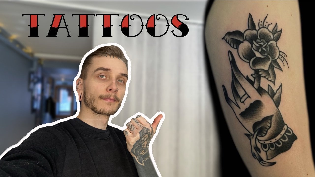
1. Intro: Hello, my name is Tessie, an amateur, two artists
here in Omaha, Finland, where I own my own
studio sometime ago, my client gave me a
very interesting task. When she sent me a picture of
a drawing her God's son had drawn and sea ice
that she wants to get that drawing
tattooed on her. But there is a very
great misunderstanding. And that is that
good drawing doesn't automatically mean that it
is a good time to decide. So during this course I will
be taking you along as I transform that drawing step
by step into a tattoo design. And at the end I will show
you the finished product as a proof that it will work
as a traditional tattoo. So grab your paper, grab your paints, and
let's get into it.
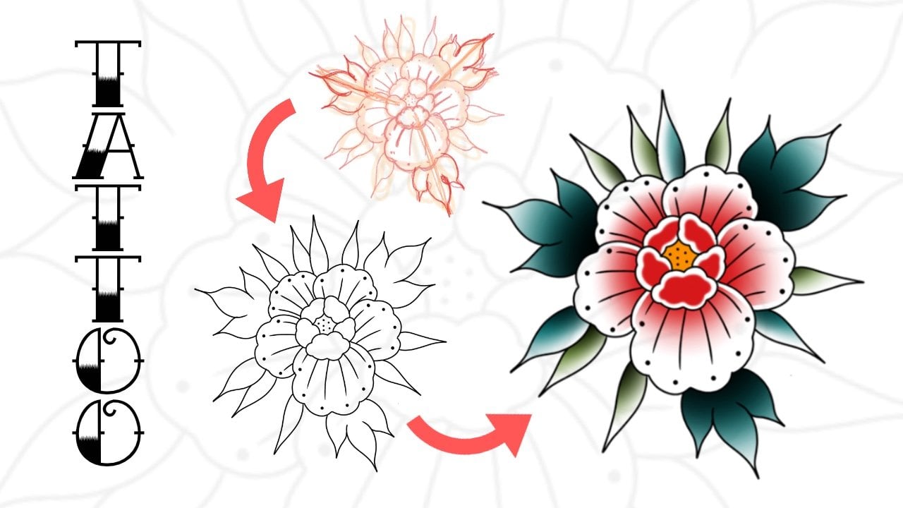
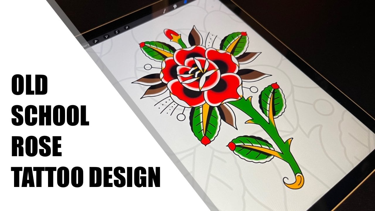
2. The Plan: Alright, so let's begun. Mike Lyons sent me this photo of a dinosaur with
these very crazy colors. And she said that the
final tattoo needs to be as close to this
image as possible. Again, it's assaults drawing
until alright, drawing. But this as a tattoo design
doesn't work at all. And we will begin
with talking about what we have to change in
order to make this work. First of all, the leaves, I'm thinking about
doing more like this traditional
style when there is a clear black line in the middle and the boy has drawn
these lines there. So I'm thinking maybe do dislike very traditional jet to leave
style with the lines going. Something like this and
not this many of them. That's the number one thing. And then the second is the deed. Of course, they
need to be changed because she said that this
statue needs to be like, what's it like seven
inches by seven inches. So these are way too small. So I'm thinking doing
more like this, very traditional,
clean, sharp teeth. And it's clear that the
dinosaur has red eyes. But one of the very
important things about tattoos is that they
need room to breathe. And like you can see here, wherever you look,
whether it's a dinosaur, it's armed the eye, the leaves. There is no like white adult. So if you apply this much scholar
without room to breathe, it's not going to look
good. Asset statue. So there needs to be like, imagine this white, I'm about
to do is like skin color. So there needs to be white there in the AI
at the Edge sister, why some there so it
has room to breathe. Finally, we have
to fix this part. This is too messy for
a tattoo, and also, I'm thinking about
removing the other nostril because this is pretty
much a side view. And then when it
comes to the colors, I think it's pretty good. Two greens leaves that skewed. Then we're going to use
pink and then purple. There's an unwritten rule
in traditional tattooing is that when you use one color, you have to use it in
three different places. So I'm thinking about
removing T's color completely and then
taking the red from here and in the eye and then
put it there and there. There is more than three. And then also removing
this sort of light purple and replacing it
with this dark purple. So it's there, there, there. And of course there. And then I'm thinking
about because I'm going to make it red in
the eye, smaller. So put yellow there and
then this one here, also yellow and maybe the
clause yellow as well. And I think that is
a very good plan. And the number one thing
first is the outlines, and we'll start with that.
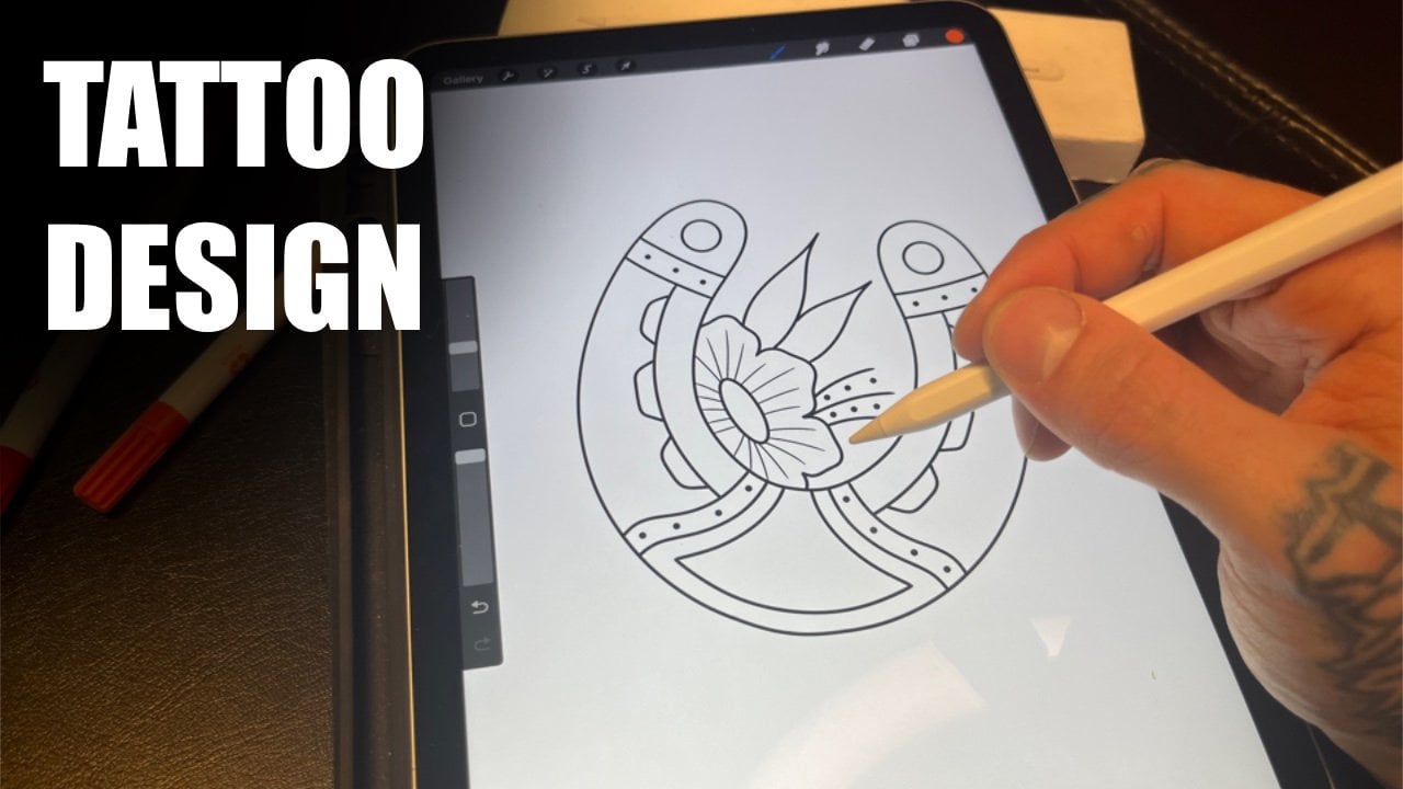
3. Outlines: Alright, so let's
take another layer. Let's take the dark red, the opacity of this lower. And then let's take the studio pen and make
it the way smaller. Also, when I'm drawing this, I have to think about
the needle size. And I, I think this
is pretty good. And I think I'll start
with them with the leaves. So let's do this there. And then I'm in the middle. And then I'm thinking like maybe doing only the other side. So it doesn't get too crowded in the area to have the other
one completely open. And then the other one
with the, with the lines. I love these ideas
of people getting their kids drawings tattooed. Of course. Like I
always say that it's not about if
something can be done, It's all about how
something can be done. And I also want this line
here to connect smoothly. So it creates this
nice line there. And then throw them. Let's take it out. Like so. Now, Let's add these lines
to give it some texture. And also, this is
my first dinosaur. It's set to also, you can always say
couch going to look. I don't think that's too crowded at all when you
just add the color. But imagine if you have the
line going like they're two, it would get really,
really like missing. So next up, let's do the law. I want to make the
nails tiny bit bigger. And then add some, some wave, some note to make the
lines so straight. But still, again, my goal
is to try to keep this as close as two T original GAN. So now let's tackle t I. And then I'm thinking like this and like this and
have this part to read. And then this part yellow. I think that'll work. Then. How would I do this? I don't know. Let's let's try something like this to
make it very simple and clear. I think that's pretty good. And then connect these lines. So, and then like I said, the nostril only have one. And then take the milestone that I will also post the finished result
of this tattoo at the end. So you can really see,
like in practice, what I mean with
everything I teach. Now. I think I also
want to extend the parts right there and then the very simple and clean like so. Now I think I'll actually go down one
more line there. Now. I think that
is our outline. So when you compare it to the image right
there, you know, it's it's different, but still
it's very, very similar. And I think this is
what we'll go with. The next step is the shading. So let's get right into it.
4. Black Shadows: So one of the big differences
that I will be making to the tattoo design compared to the original drawing is black shading because like
you can see in the drawing, there is no black except
for the outlines. It has only pink. It has purple, red, greens and all that. But in tattoos,
black outlines and black shading is the most important
thing about the tattoo. So we need to add those. First. Let's go with the I'm actually
missing a one-line though. I need to add that. I'm missing De Tong right there. Now let's get shading. I will start with the ones
that will be completely black. And I think in this
one it's only two. Like so. And maybe we're going
to start with the leaves. Normally. My tattoos are very dark and very
heavy in black. But again, she wanted
designed to be as close to the original
drawing as it possibly can. So I will not go as heavy on the black
assign normally would. But like I said, the black is very, very important part
of the tattoo. So I will need to add the black. Some extent. Not much but some. So Tara, the leavers. And now I'm thinking some black from there. Let's take it away from there. So then a little plaque there, not much TO and
then little there. Some black tiny bit
of black there. And then I don't know
if I should add more. Maybe I will though. There may be some there. Keep it very simple,
very light though. Yeah. I think I think like I said, normally I would add a way more black in the
design like this one, but we want to keep it
close to the original. So I think I will actually
leave it right there. And then we can get to
coloring this thing. So let's hop into that.
5. Colors: First up, let's pick the colors. We want the dark green. We want the light green. We want the dark purple. We want red. I'm going to actually use
this red and ten we want the pink and then also yellow. And this is our palettes
for this design. Let's began with leaves. I always start with
the darker one. Then we have the light green. I'm really liking how
this is turning out. Clearly a tattoo design, traditional tattoo design,
but very loyal to duty. Original drawing and of
course the original hardest. And my philosophy always
into chewing is two. Start with the dark colors and then go lighter from there. I actually might say in
this one just a tiny bit. I feel like this is to I don't
know how to say too muddy. I don't know. Let's
go with this one. So we want this
purple to go there. Like so. This will
act like SD line. You can see on the
arm right there. And then Bob, I. So let's do that. We will add the purple chair. Like so. Then that line will continue to like from
there to cherish. It will go like so. And then I will take
off from there. Of course, there might
be some changes in the final I mean, the result of the tattoo. But, you know, I will never make my drawing some plants
like rock solid, that I will follow
a 100 per cent. Because if I feel
like some change is necessary in the final product, then that is a change
that I will do. Because things vary. Some color. I have some ink I have might be some different shade or it
might be the skin, whatever. I will never make this like a 100% and give them
some room to breathe. Now, let's add,
let's add the red. I want the red right there. And then red right there. Like so. And then also the eye. And then the thing the
dinosaur has on its head. So let's do it. So then
this away, like so. And then add the second
layer right there. Make it lighter so I
know which one is which. Erase from the tear? From their wrist red. And now we add the pink. When I add the pink, you can
really start to see what I mean with the room to breathe thing because I
want to have skin tones also. In the, in the final product. Again, this needs room breed. So and then we will do the yeah, I will have some breathing room. They're like so. And then we'll do the shore. And then so then we do some lines to make it so dark. Then also, I'm thinking
having like skin colored line also in the between
the purple and pink. Then we just erase it. From here. Also, we forgot
to put some red tongue. Let's do that. Like so. And then finally add the yellow. Like so. There is our design. Once again. It's clearly a two
design here on the left. And this is clearly a drawing that is not
attached to design, but still when you look
at the image on the left, it is very loyal to
the original one.
6. Finished Product + Comparison: Alright, and finally,
here you can see the final tab to some
things are different. But like you can clearly see, it is functioning tattoo
design that works as a tattoo. Whereas this drawing here, if you made it sound like this, it will have not
looked as great. So here is the drawing. And my job was to keep this tattoo as close
to this as possible. Here is my drawing with
some slight changes. Some colors added, some
colors taken away, some lines, added some
lines taken away. And of course giving the, the sort of breathing
room that you will see again here in the chat too. You can see it there, there, there and the jaw. And also theories of one line, which is different in
theta2 and it is here. And now also the purple has
a breathing room there. And also right there. There is the tattoo,
there is the drawing, and there is the
original drawing. And this is how I added
also also actually Teresa, another change that I made. I added black right
there on the fingers, and that was not on this design. And also here is white, which isn't in detachable. So like I said in
the previous one, I always give myself
permission to change these designs
while I'm tattooing. If I feel like
there is something, some things that work better. And the black hair is one
of those things that I feel like was needed
in the final product. And also the yellow isn't completely from top to
bottom without shading. And in the final
product there is, it goes from dark
yellow to white, so it has some saving. And same goes also with
the, with the mouth. But yeah, There you have it. From original drawing
to tattoo design to finish tattoo on her arm.
7. Outro: Thank you so much for
checking out this course. I hope you learned a
thing or two from it. And now I have some
work to do for you. Grab your paper,
scrap your pens, and take out the Projects tab, where I will give you a task, where you have to
find an old drawing. Maybe it, the drawing is yours. Maybe it's your father's, maybe it's your little brothers. And your job is to
turn that drawing into a functioning good tattoo design and then share it
with the world. Remember, glean out lines, black shadows, and of course, some room to breathe. Thank you so much for
watching this class if you enjoy tattoo related
contents, take out my Bates. I also have some great drawing
classes there as well, and give me a follow. I'll see you in the next one. Thank you.
 Jesse Edvin, Artist