Transcripts
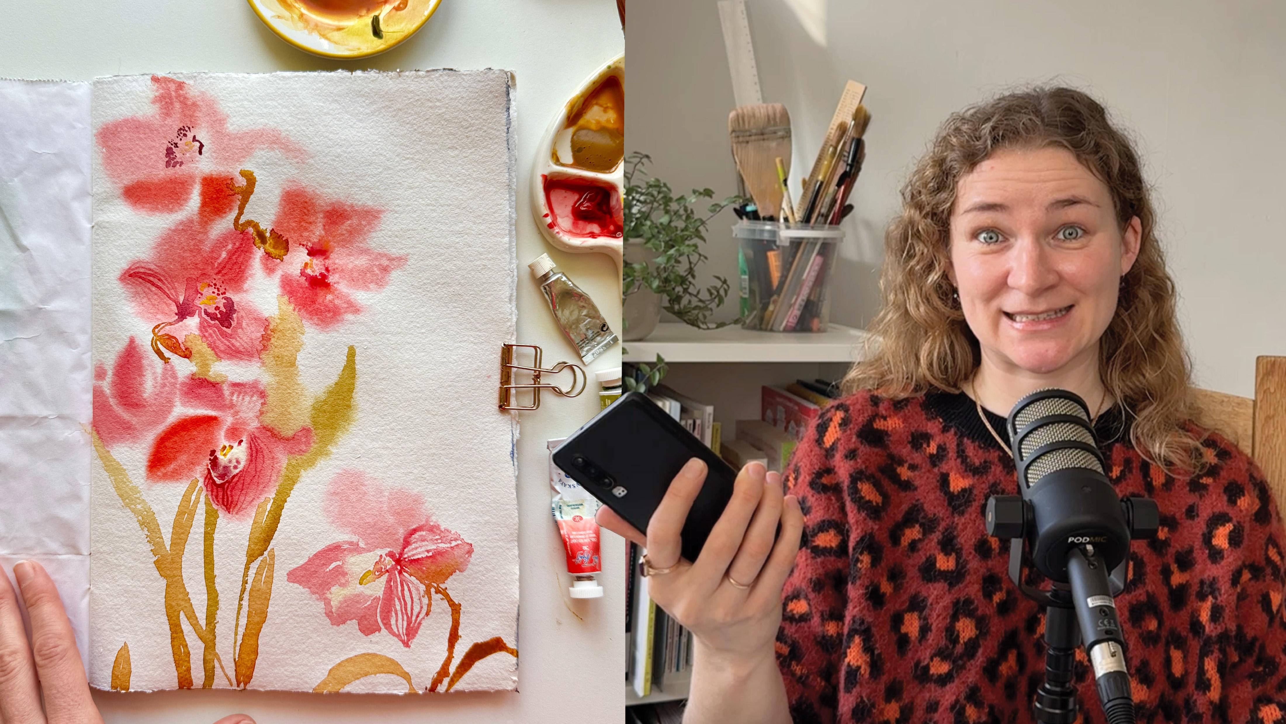
1. Intro: Every week, I come across beautiful artworks
from my students, and sometimes one little
thing breaks my heart when I see an amazing work that
has been photographed poorly. The same happens on social
media from time to time, and it really feels like
missed opportunity. Your art deserves to
be presented clearly and beautifully so other
people can connect with it. And appreciate it. That's why I decided to
make this short class and show how to photograph
your illustrations, drawing, paintings,
sketchbook spreads, whatever. And the thing is, it is
really easy to learn skill. You don't need any special
equipment or spent hours learning photography to improve how your work look in photos. You'll see six simple tips to take better photos that
really represent your work. We'll talk about lighting, how to hold your phone, how to choose the
right background and surroundings that enhale
your artwork and make it look its best and how to photograph just the artwork
itself with no props. And at the end, I show you
my color correction process, which is very, very basic. Most of the examples
you'll see in this class were taken
with these two phons. This one is 6-years-old and still does its
work perfectly. So it really doesn't matter
what model you have. The tips are universal. And just to be clear, I'm not a content creator. No, and this class
is not about it. I am an artist, but I
do want my work and your work to be shown in the most attractive and
professional way possible. So let's get started.
2. Tip 1: Find the Best Available Light: First and probably the
most important advice is find the best
available light. The best light is
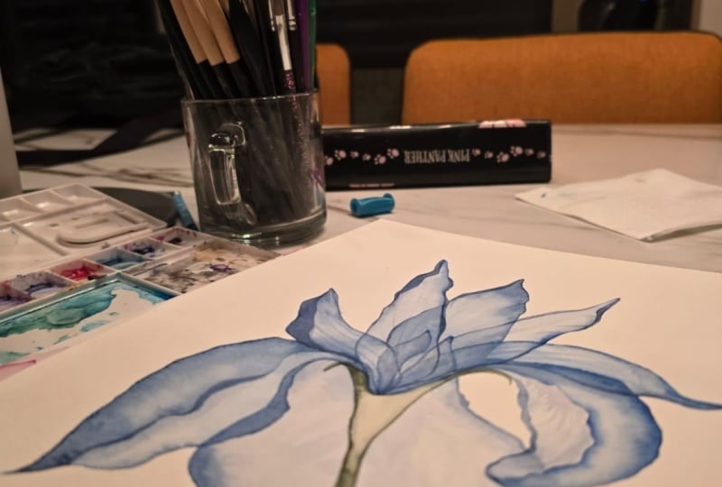
natural daylight. Here is my painting, and before taking a photo, I'm opening the curtains to let in as much
light as possible. In good lighting conditions, almost any camera or phone will give you a photo
of a decent quality. I also remove any objects that might cast a shadow
on the artwork. For example, this spray
bottle creates a shadow, so I simply move it away. Ideal weather for taking a picture is when
it's mostly sunny, but the sun is behind a cloud. In this case, you get
a soft diffused light. But what if the sun is very bright and
there are no clouds? Well, it depends. Bright light can look beautiful. I like how this photo looks. Just make sure the shadows don't fall across important
parts of your picture. Or sometimes it might be
better to close the curtains a bit or move back into the room
away from direct sunlight. In my case, it looks like this, and both options are good, so it's absolutely up to you to choose what
photo to pick. Here is another example. It's a video, but the
idea is exactly the same. Both clips were shot in the
same place on a sunny day. But on the left one, I closed the curtain to block the sun and on the right one, I left it open. Notice the right one has a window frame shadow on the
sides of the greeting cards, but it doesn't cover
the main object. I like both options. In fact, when I posted
it in my Insta, I chose a sunny one
just because it matched my mood at the
time, and that's all. And what if it is
too gloomy and dark? Well, it is obviously
more challenging. I used to live in
St. Petersburg, where there is almost no
sun for half of the year, and my workspace often
looked like this. And my personal rule
is never photograph an artwork artificial
light if you can avoid it. If it's too dark
indoors, go outside. If you create at night, wait until tomorrow or the
weekend to take the photo. As you'll see
throughout this class, I often take photos outdoors. Another option is to use your window sill as
a mini photo studio. In short, just place
your artwork where it catches the best natural
light you can find. In the next video,
we'll see how to position your camera
for the best results.
3. Tip 2: Keep Your Phone Parallel to the Paper: The second thing to
remember is to keep your phone parallel to
the surface of the paper. There are two main ways
to do it from above, when your artwork lies
flat on a desk, floor, or any other surface or from the side when it's
hanging on the wall, or you hold it in your hand. In both cases, your phone should stay parallel
to your artwork. This helps to evade
perspective distortion so the artwork stays rectangular
and doesn't look skewed. Let's see what this
looks like in real life. Because this artwork
is quite large, I need to climb onto a
chair and shoot from above. Otherwise, if I hold
the phone like this, I can't clearly see what's
happening on the screen, what exactly I'm capturing. So I'm standing on the chair and take
the photo from above, holding the phone parallel to the table surface where
the painting is lining. In this setup, the
edges of the paper are parallel to the edges
of the phone screen. You can zoom in it if you want, but keep checking that the sides stay parallel so you
don't get distortion. Mm hmm. If I shoot in a horizontal
format, it looks like this. Again, I check that
the paper edges stay parallel to the
edges of the screen. From here, you can move
closer or further away. Just keep watching those edges. And if they are not parallel, make sure you clearly
understand why. Sometimes, not very
often, but it happens, you might find
meaningful to rotate your artwork for a more
interesting composition. But even then the phone itself should still stay parallel
to the plane of the paper. You can check this by
the way the paper, you just stay parallel
to each other. Later in this class
we'll look at more examples, but for now, just trust me, this is a situation you
really should avoid. Alright. In the next video, we'll talk about backgrounds. Would backgrounds work best for photographing your artwork.
4. Tip 3: Choose a Good Background: Tip number three is always pay attention to the background
when taking a photo. This video has lots of examples. Of course, the most
obvious option is to photograph
your work as it is. You've seen some examples
in the previous videos, and there are a couple more. This is what a sketchbook
spread might look like on my desk
and for the puta, I usually rearrange
my art supplies a bit to make the work and all my
stuff look more appealing. We'll talk about what to keep in the frame and what to
remove in the next video, but right now, focus
on the background. In this case, for this
sketchbook spread and lighting the white table surface turned
out to be a great option. Here is another very
similar example. But what if the
weather is cloudy, the light is poor, and the artwork looks so
against the table background. In that case, I decided
to find a spot with more light and a background that would make the
illustration look better. This photo was taken near a window with a Christmas
tree on the background. And look how different the
same illustration appears. Both photos have no
color correction, just short as it is. The other greeting cards looked
great in this spot, too. Here is another example. This greeting card
was sent to me by my dear friend and an amazing watercolor
artist Nuria Rierra. I took a photo to
post on Instagram, tag here and say, thank you. It turned out pretty good. But then I noticed
some light glare on the wall and took another
photo against that wall, and it turned out to have much more depth and
look more interesting. Well, here is yet
another example. Once we lived in an apartment where my desk had
this nuts good for photos color and was
positioned in a way lighting that very rarely gave
good photos like this one. So back then, I often
photographed my sketches outside. It definitely gave
better results. Here is the full
sketchbook spread. While taking this photo, I happened to notice
the combination of a wall drawing and green grass, which became a
perfect background. Look, how the blue background supports the stormy
blue sky in the sketch, and the green grass supports
the painted greenery. Hm. Or here, the gray blue background suits the illustration's color palette much better than
the neutral one. This was a painted
old wooden fence. And this is another sketch
against the same fence. And here the background
works because the colors are
complimentary, not similar. This bright pink sketch really benefits from this
greenish bluish background. Sometimes you can even use
yourself as the background, but I would recommend doing
only for an extra photo. Speaking of colors,
look how in this case, the bright yellow autumn leaves haze the yellow
touches in the sketch. But in this one, the busy background distracts from
the sketches themselves, even though it's used
them by color palette. It's because the
sketchbook spread is already very
saturated with details. So here, a Calm
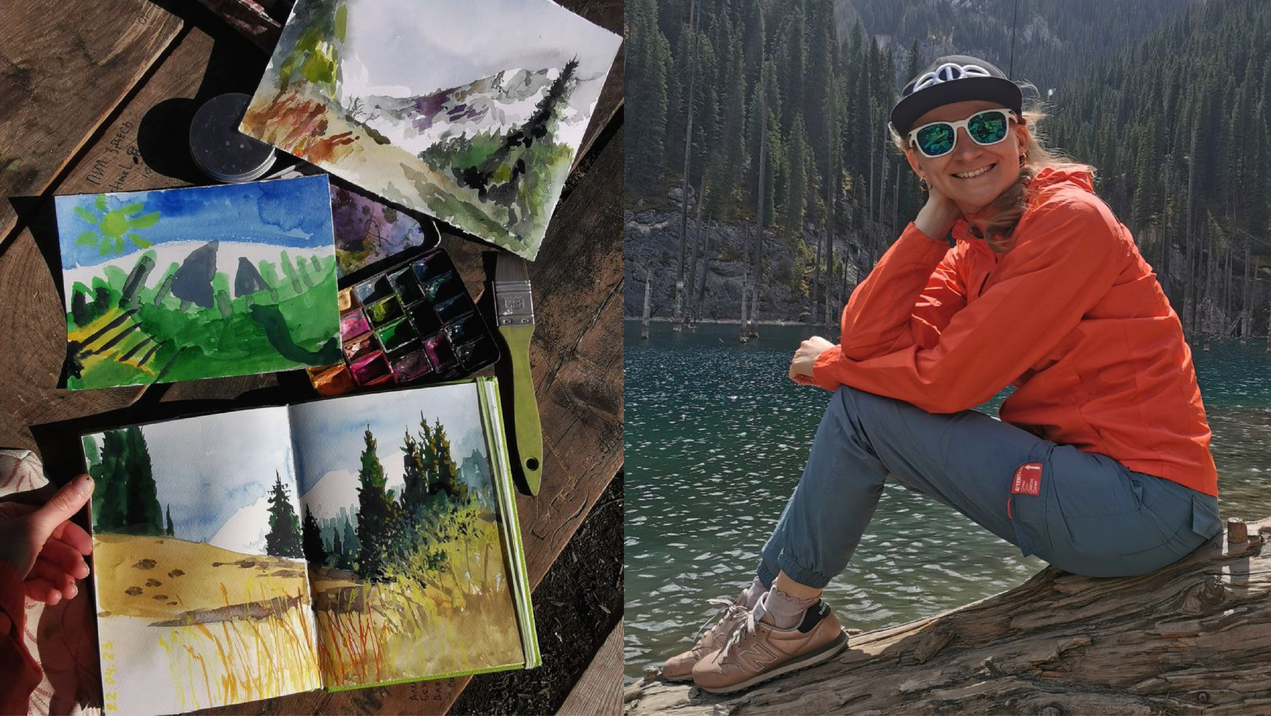
background works better. Overall, outdoors almost
always gives great photos. You just need to try different backgrounds
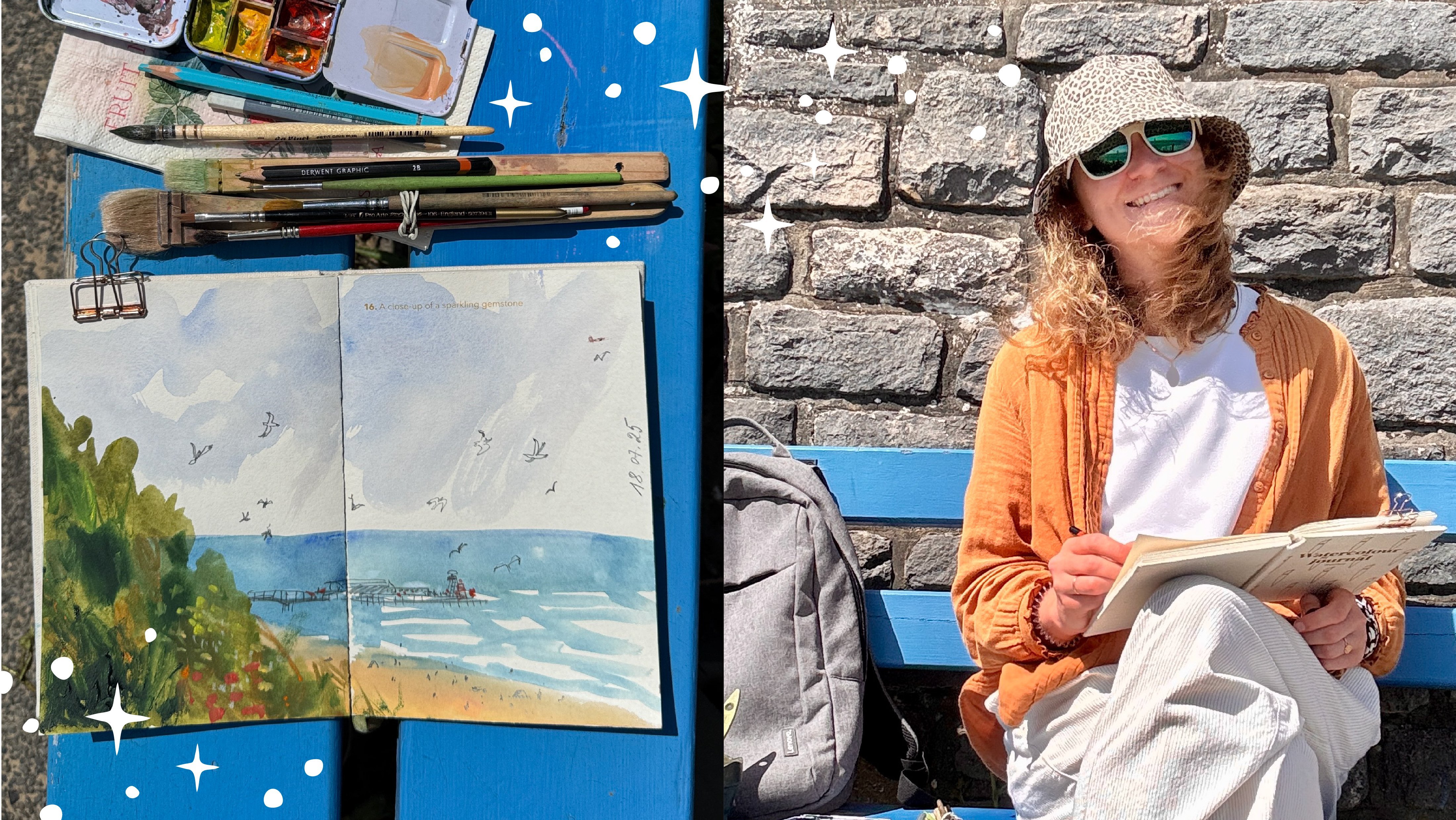
and pick the best one. If it's a plain air sketch, it is usually quite easy to find a nice way
to photograph it, since the process itself and the environment are often
visually appealing. By the way, if you haven't
checked out my class on how to sketch places
quickly with watercolor, I warmly invite you to do so. Well, for sketches
from observation, it's always interesting
to show how it looks in real life and
how you depict it. As you've probably noticed, I always try to keep
the phone parallel to the paper surface and avoid
distorting the artwork. It is very important. Oh, lots of examples
in this video. I hope you've got the idea. In the next video, we'll talk about
extra stuff to add to support your artwork and
the photo composition.
5. Tip 4: Use Extra Stuff to Support Composition and Tell a Story: Well, let's talk about
extra things you can add around your artwork to support the composition
and tell a story. Basically, there are two
main ways to photograph your work with a styled
environment around it, creating a composition
in the photo like here, or as a simple clean shot
of just the artwork itself. Most of the time, when I
photograph sketchbook pages, I like to include surroundings and art materials in
the frame because this helps to show the atmosphere and mood and for a sketch,
that's important. But for standalone artworks, I often leave only the piece itself because that is
where the value is, and I don't want anything
to distract from it. In the end, it is always
a personal choice. It's worth mentioning that
photographing your artwork, your illustration with no props can be more challenging
than it seems, and we'll talk about
it in the next video. But for now, let's focus
on the environment. Why does this pota work well? First, the lighting is good. Second, the artwork
is not distorted. The sides are parallel. Then the bright
color of the sketch is enhanced by the
objects around it. The fact that I happened to have a notebook and a book in
yellow was a pure luck, but it was really fun to
play with the composition. Plus, I painted mimosa
from observation, so I brought a real fresh
flower into the fota. Osa, I often include
watercolor pans and a ceramic palette in my fotas because they are
essential part of the process. Just turn it in a way to show the right side with colors
that match the illustration. Let's take a look
at another example. Here, I have a
sketchbook spread. I photographed it on a
sunny day deep in the room, away from the window and
direct sunlight on a bed, placing it on a white paper. Not bad, but I didn't like
how the shadows fell, so I rotated everything. This already could work as a pretty good photo
for the spread, and for some purposes, I might use exactly
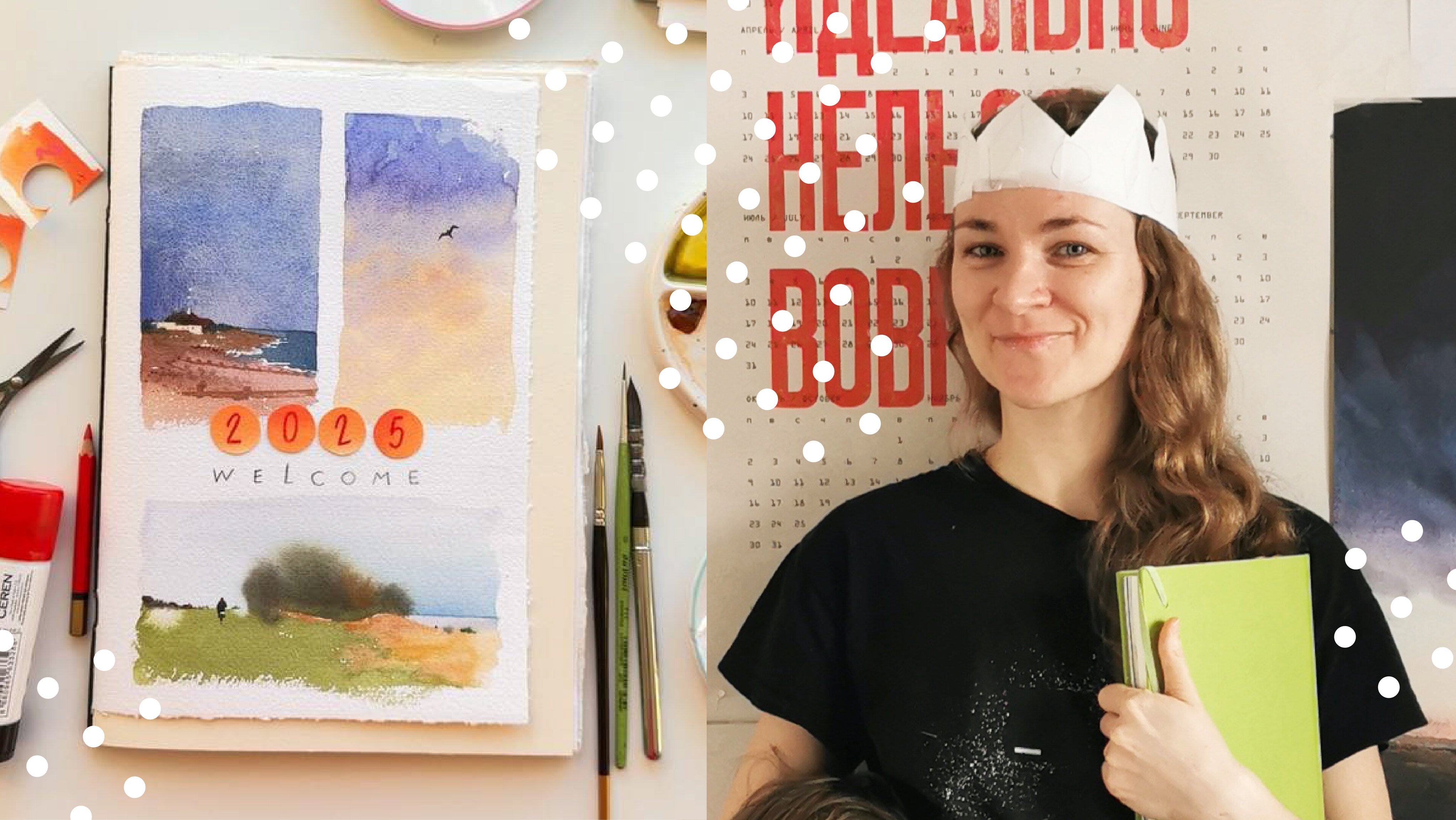
this version. But this time, I wanted to add objects around it to give the
illustration more context. So I placed the art materials
I used to create it. My watercolor set
a ceramic palette, brushes, glutick and scisss
with a little piece of paper. I cut the dots for the
eye letters from it. So in this photo, see not only the final result, but also a glimpse into
the process behind it. Here is a similar example
with coals elements. Without a scissors, it
might not be obvious that some flowers were
cut out and glue on top. So the environment
solves two tasks. First, it adds context and tell the behind
the scenes story. And second, it visually
supports the artwork. In this example, I used a
real tulip as a feature. Fresh flowers brighten a pota
like almost nothing else. And here is another one. The idea is very similar. Flowers, a palette, brushes, something interesting
happened with this photo. I finished the sketch
and took a photo. And while looking at it, I noticed how beautifully
the yellow of the flowers worked with the blue watercolor paint
left in the ceramic palette. So I decided to add a blue
background to the flowers. I like both version. This is a very good reminder that when you pay
attention while shooting, new ideas and discoveries can
appear during the process. In the next video, we'll look at how to
photograph artworks without any surroundings when you want nothing around to distract
from the piece itself.
6. Tip 5: Photographing Artworks Without Surroundings: And this lesson will
cover how to photograph just the artwork itself
without any surroundings. Sometimes this is
necessary when you want to print your work as
a card, for example, or submit it to an open
call or simply showcase the artwork with nothing around it to
distract the viewer. Taking a photo of just
the illustration with no props can be more
challenging than it might seem. For example, here
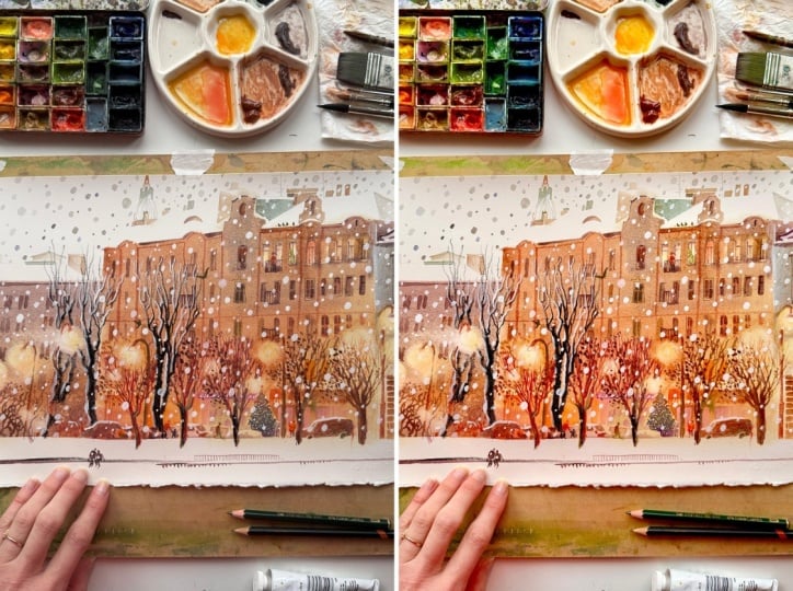
is a real case. I painted this winter piece. As you can see, the
lighting was not very good. And if I just photographed
it as it was, the white paper looked
not actually white. It appeared gray and other colors didn't
look nice as well. And moreover, paper might
not be flat due to paint, or it could be a
sketchbook page with a curve which makes it even harder to make
a good picture. But what I need is an image that looks like this as
close as possible to how exactly I see the
illustration with my own eyes so others
can see the same way. So how to achieve that? Let's return to the example from the first lessons where we
photographed this piece. Remember, basic
principles are the same. Find the best possible light and keep the phone in
the correct position, parallel to the paper surface. Because this artwork is
in a vertical format, it's better to shoot vertically to get the best
possible quality. Carefully crop along the
edges of the artwork. And if you do everything right, the crop frame will nearly
match the edges of the paper. Well, we've got a rather
decent photo of the artwork. The result you get
will depend hugely, hugely on how good
the lighting is. You might still need a
bit of color correction, and that's what we'll talk
about in the next video. Another way to create
a digital image of your artwork is
to use a scanner. Yes, I know early in this class, I mentioned that all you need is your phone camera and you've seen how to get
good result with it. But if you like to show
you illustration without surroundings or you need a high resolution
file for printing, for example, consider scanner. You might find it way easier. It is also more predictable
as the result doesn't depend on light conditions and the quality is often better. Here is how a scan of
the same watercolor. It's similar, but
there is a difference. The colors are deeper, the edges are without shading, and the resolution is higher. Not all scanners are
good for artworks. Some are designed mainly
for printed documents, so it's better to
choose a photo scanner. I use absent perfection V 392. It's affordable,
compact and gives very good results often without any need for
color correction. I'll write the scanner model in the class project
description. But again, you can
absolutely get a decent quality photo
with your phone. Most likely it will need some color correction
and small adjustments. So let's talk about
it in the next video.
7. Tip 6: Color Correction: Well, the tip number six
is about color correction. Before we start, I should
mention that the less adjustment you need to make your photo look
good, the better. Ideally, with good
natural lighting, your photo looks great as it is, but it's not always possible. So let's talk about
color correction and other adjustment. I'll show you my workflow. I created this illustration. The lighting is
obviously not good, but let's see what we can do. First, attempt, the
edges aren't parallel. Try again. Better. The edges are almost okay, but let's crop it because the background isn't helping
to present the illustration. You see the paper
should be white, but it's gray and the
squirrels colors look dirty. It's much more
beautiful in real life. But still, this pata might be decently adjusted
to look good. Let's keep it in mind, but try improving the
background and nearby objects. First, I moved away
my wooden board. It was a horrible background, and the white table
works much better. Then I looked at
my art stuff and found items with matching
colors that could help. I rearranged them to look good. Then I noticed my shirt also had a matching color and rearranged everything
a bit more again. And now I'm quite happy
with the composition, but the colors could be better. I usually use a simple built in photo editor for adjustments. It works well enough
on both my phones new and old because I keep the
corrections very basic. What I definitely don't
recommend is using filters. You created your
artwork and planned the color palette very
carefully, worked on it. So please not to slap
a filter on it later. Basically, you usually need to make the photo a bit brighter, so I slightly increase exposure. The brilliance parameter
gives a nice effect. Try moving it back or
forth to see how it works. I usually increase
it a little bit. Next highlight. I brightens the light
areas on the pota. I'll increase it slightly too. Contrast. The thing is, iPhones tend to make
very contrasty photos. So usually I decrease it
manually to soften the pota. Brightness. I'll bump
it up a little too, since as I said, I mainly
need to brighten the fota. But without overdoing,
please be careful. Time to time, I tap on the fata to compare
with the original. Black point can be
useful sometimes. Look at how it works. Decreasing it makes
the fata look faded, while increasing it adds depth. And saturation. I always
increase it a bit. I can't remember a time when I wanted to decrease
it, but not too much. Don't overdo it. I leave it at eight. And finally, warmth
or temperature. I'll decrease it
slightly because there is some yellow
tint in the pota. Mm hmm. That's about it. Let's compare the original
and the final pota. Uh huh. Not bad, isn't it? Let's look at another example. Let's take another
pota and edit it. Actually, I'm quite happy
with how this photo looks. I just want to increase
an exposure a bit. I'll tweak brilliance slightly. Add some saturation. And make it a bit
warmer. Mm hmm. Done. This shouldn't
be complicated. It can be a very, very
light adjustment. So the main parameters
I personally adjust for color
correction are exposure, brilliance, highlights,
contrast, brightness, black point, saturation, warmth. But most of the time I
don't touch all of them. I just use a few. In the next video, let's summarize the
key ideas to make a good photo and talk
about your class project.
8. Class Project and Final Thoughts: Well, we've covered
six main tips for taking beautiful photos
of your artwork. The most important one, in my opinion, is good lighting. It makes the whole
process much easier. The rest, holding
your phone parallel to the surface of the paper, choosing the right background and surrounding that
support your artwork. All these scales come very
quickly with practice. If you need to photograph often and prefer to
show your illustration, your artwork without
any art materials and other stuff around it,
consider getting scana. It could simplify
the process a lot. I really hope some
tips and examples have been helpful and you will
implement them in your routine. The class project, I suggest sharing before and after photos. We all love them
because it's great to see the progress
to celebrate it. So please share
photos you did before and after taking this
class, applying some tips. I'm really, really
looking forward to see your class project to
celebrate your progress. And if you found
this class helpful, please consider
leaving a review. It helps a lot and means
more than you can imagine. Thank you for joining. Uh, please enjoy
your creativity, cherish it, and show
your work beautifully. See you in the next classes.