Transcripts
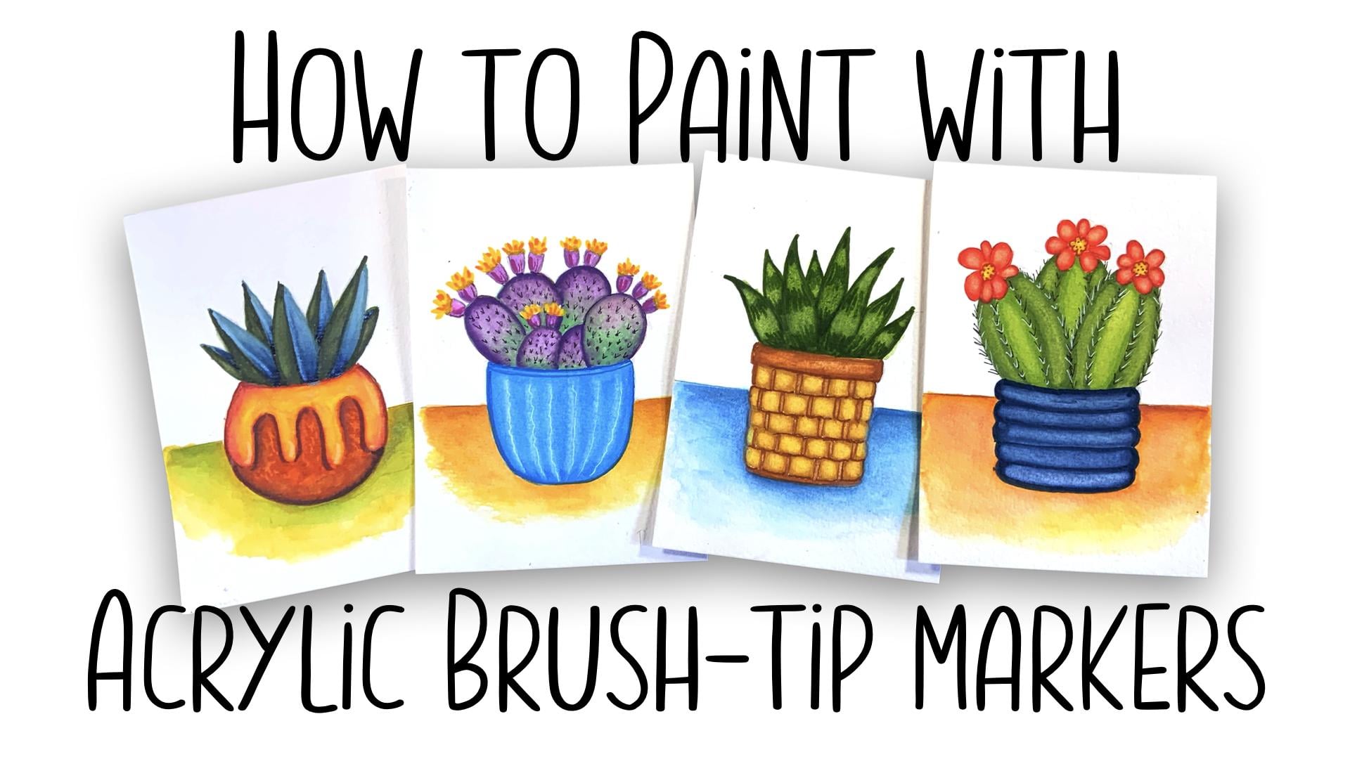
1. Introduction: Hello, everyone. My
name is Jessica and I am a lifetime artist,
illustrator, and teacher. I live in Southwest in
Santa Fe, New Mexico, and I like to paint the interesting plants
that we see here. I just painted these and
when you look at them, you probably think that
they're watercolors or even soft pastels and
they're on watercolor paper. But would you believe
it if I told you they were done with
acrylic markers? There's a new type
of acrylic marker that has just come on
the marketplace in the past year made by a few different companies known for other types
of acrylic marker, and they have a brush tip and the tip is
flexible and that is the difference right there
because you can make a very thin line
and you can make a fat line and you
can do calligraphy. You can make leaves,
you can make petals. You can also blend this while it is still
wet and herein lies a secret to making
acrylic painting blend and look more like
a watercolor or gouache or even pastel. So in this class,
we're going to use a combination of
these new markers, water brush, and a Filbert
type brush for blending. We're going to work on 100%
cotton watercolor paper. That combination creates just
a beautiful blended result. This class is for everyone at every level because it
is all step by step. For each of these, I have a complete drawing lesson and then a complete
painting lesson. Your project will be to paint
these four fantastic plants with me and it's going to be a fun and very
rewarding adventure. Let's get into the first
lesson and get going.
2. What is an Acrylic Brush Pen: This class would not exist
if it hadn't been for a very exciting thing that
happened during 2025. They say there is nothing
new under the sun. In most cases, that can be true. But every once in a blue moon comes an art supply
that is actually new. Paint pens and markers have been around since
the early 1900s, but they were mostly
industrial for marking machine parts and so on. Then around the
mid 80s sometime, a company came out Posca with
a NIPASka set of markers. I got them in the
mid 90s, I think, at an art expo and they
were new to me then and I bought them and
I bought lots of sizes and I did a few
things with them, but it ended up
that mostly I did craft items and I
didn't paint rocks, although a lot of
people use these to paint rocks and
little flower pots. Lots of point sizes, from seven millimeter all
the way up to like I said, you have them that come
with inch wide nibs. Last year, a lot of the people on YouTube
art people started to receive boxes from a company called I think you
would say rtexs. It's ARR TX and it was a new kind of acrylic
marker that was different. For one thing, you did not
have to shake it to use it, you do not have to
depress the tip, and it has a wonderful
brush tip that is flexible. I'm just going to use
a little extra piece of paper here to
show that to you. You have your tiny point and
you have your wide stroke, and you can make
the leaves with it and you can do
exciting things that you were not able to do with a bullet tip and
fine tip markers. Nobody seemed to know what really could
be done with these. I saw several folks
try them out as a part of their mixed media and a couple of
painters I admire, they tried them
out in paintings, but they ended up
thinking they were really good only as an add on. Acrylic painting is the one that is the most difficult
to blend colors. And so I don't know
how this happened, but when I got my hands
on these brush pens, I decided that I would try to do something that would
get them to blend. Because it was a watercolsque, I have a lot of watercolor paper around and I love to work on it. I thought, well, what
would happen if you took the acrylic brush pens and you used them with
100% watercolor paper. Then I decided to get one of my trusty watercolor brushes out and see if between the marker
and the watercolor brush, I could create a way of painting with acrylic brushes
on watercolor paper, and this is the result. And I'm excited. I'm excited to show you how because this is a
beautiful look. You would never see this and think it's an
acrylic painting. You would think
watercolor. You might think gouache used
as watercolor, definitely think soft pastel. This has a look of all of that, but it's all done with these very marvelous
and brand new art tools used together in a dance that turned out to create
some beautiful harmony.
3. Supply List: As we talk about our supplies, I'm going to use a visual
of Amazon on my iPad to point out what they
look like and what they cost and one of the places
that they're available. I want to make it clear though, that I have no affiliation with Amazon or with any
brand that I recommend. When I recommend something, it's because I bought it
and I use it and I love it. And I don't get anything from
anybody if you love it too. With no further ado about that, I looked up my orders in order to tell you exactly what it is that I'm working with. Now you can see
that I jumped right on December of 2025 as soon
as I saw these things. I got the Artex set of 120 colors and they're very
nice and they work very well. However, I found the
colors to be very muted for things that I do
and I can show you that. This top area is that set
of 120 and you can just carefully take a look
and they're beautiful and it's a great range of color. But I am just really
into bright color. I turned around and I
bought the other set here in January 4,
I didn't take long. This was a set of 60 and it's the set that they
label drawing cartoon, comic art supplies,
blah, blah, like that. The colors are brighter and
here's what they look like. If they're not backlit
by the screen, you can see that there's more brightness and the
range is also lovely. Those are two possibilities. Let's look at what
the current price is of the set that I did buy. The 60 color set is 51 99, under $1 per pen. Coincidentally, right next to
that particular set that I bought is another set that I bought that
is a big favorite, and so I'm going to take us
in to take a look at that. The brand here is Tular
TOOLI hyphen art. They make all of the
types of acrylic markers, and I have used them a lot over the years over
the PASCA kind just because they sell sets that are interesting
color ranges. This particular set, which I like very much is earth tones. There are 36 markers and 37 99, and again, around $1, a marker. What is lovely about these
is the colors themselves. I'm going to bring
that up so you can see it. They're earth tones. They're not I don't know
how to describe it. They're earthy, but
they're not dull. They're vibrant and I
just love this set and I reach for more often
than any of the others. Our next necessary supply is watercolor paper and 100%
cotton watercolor paper. I'll explain why
that's important. 100% cotton
watercolor paper does a different thing moisture with water than any other paper. It's sized in a certain way. It allows a certain
amount of wetness to stay on the surface of the
paper and some to sink in, and it's a really complicated
thing to explain. But it's always been worth
it to anyone painting in watercolor and having any
serious intent about it. And so it always was
very, very expensive. Arch or arches, some people say, it was the king brand. I used that all my life. Fabriano, the brands at the top of the price
range are all excellent. If you have any of that, you can certainly use
that. That's great. If you don't and you
don't have a big budget, a recent event is that a lot of 100% watercolor paper
that is really, really nice has started
to show up on Amazon, even in sketchbooks,
which is great. What you see me using in this class and getting
these results is this particular brand and it actually was five by seven pad, I think it's 20 sheets
and it's 12 76. The brand, you can see
right here is Tumrata. This is my favorite. I buy
their sketchbooks like crazy. Light wish is another
brand that is good. If you happen to be a sketcher, their sketchbooks
are just awesome. Now, you want 140 pound
minimum weight of the paper, and you want a cold
pressed surface. That's what I've been using in this class and getting
these results. A hot press surface
is fine as well, but it will be a different
blending situation. It will be a different look, part of the pastel
painting look that we get in this class is due
to the cold press surface, which is slightly rough. Anyway, if you want to use exactly what I was
using, this is it. The five by 740 pound
also called 300 GSM, it's 16 sheets, but still very affordable
for this product. Our third necessary supply is what's called a water brush. On my YouTube channel, I have a wonderful
little class on exactly what this is and how it works and why it works and
what you can do with it. Basically, it carries water in its barrel and that
water is continuously wicked to the tip in a
very slow, low quantity. As you paint with this, you are continuously
adding water. Can you see the little
shine in my finger? You're adding water.
Constantly as you go. This is very important in
keeping the acrylic paint wet long enough to spread
it out and blend it. My favorite brand
is the Ni gi brand, NJ, and my favorite
size is the small. Working on a five by
seven piece of paper, a larger a medium would be
too much water flowing out. I recommend the Niji
in a small size, and that's what I
used in this class. But there are a lot
of other brands. I like the control I have from the Niji and that's
why I use the Niji. These run sets are $21. Individual ones. Let's see if they have the
individuals. Here's a small. It's $12.18. It'll last you forever. You keep refilling the barrel,
you can carry it around. You are on the go with it and
not carry water with you. If you're using
watercolor mediums, this is a wonderful
thing to have. Next on the list is a couple
of blending Filbert brushes. Filbert brushes you
might already have, if you have bought sets of paint brushes for
watercolor or acrylic, it has a soft
shoulder rounded tip. Because of that, it is a great blender from
a bunch of angles. And so these are wonderful. It doesn't really matter how expensive they
are because really, we're working with acrylics and acrylics can really
rack brushes. I would not say I would
say for certain don't go for sable or any
expensive brushes, but if you have some
less expensive brushes in this shape or you
can get ahold of them, they are fabulous for
doing our blending, and you're going to
beat them to pieces. If you see this one, it used to look I used to look like this. But I have pounced and blended
enough and scumbled and so on that I have basically
made a mess of this, but it's even better
blender because of that, because it got even
softer on the end. So these are wonderful.
It should be a synthetic and it
should be soft, not the stiff nylon. That isn't what
you want. You want the softest ones
that you can find. A sketching pencil and eraser. I use one of the H
hardnesses usually a three or four and I do that
because it makes a light line that I
can erase easily. I use a vinyl eraser. This is for drawing. Our class is focused
on desert plants. A couple of cacti, and a couple of
succulents that pretty much might not be
accurate succulents, but I looked at the
plants around me here in the Southwest desert and I just chose something
that looked like that. In our class, there is a full lesson on how
to draw each one of our four subjects and a full class on how to
paint that subject. No, some people don't want to
deal with the drawing part. The drawing lesson is very good. It teaches you a lot. But if you don't want
to deal with it, I have put a pencil
drawing of each of the four subjects along with pictures of the finished
paintings for reference. I have put that PDF in your resources in the
resources area for the class. If you have a printer that will print on watercolor paper, it's a little bit heavy
like a card stock. Then you could print
these drawings right onto watercolor
paper, to a sheet. And they will be the five by seven size that
I'm working with. Or you could print them on
regular paper and trace them onto your watercolor paper and you could skip
the drawing stage. I don't recommend
that because I think drawing is the most
important thing that we do when we make art. But if you have no time
and it's your wish to do this and just the
painting, that's fine too. That basically is
it for supplies, along with some paper
towels and a jar of water. So let's gather these things and start on this very
exciting path.
4. Painting with Brush Pens Part 1 : Sometime early in 2025, influencers on art influencers on YouTube started to
receive big packages of these incredible markers from a company called rtexsH I
think you would say it. They were a brand new thing,
but people weren't sure what to do with them and we'll talk about that confusion
in a minute. But the reason they
were a brand new thing is this incredible brush tip. Now, on some versions
of paint pens, there are several artex
versions and they're also made by Tuarts
another big company. Anyway, what made these
so different from the acrylic paint pens that
we're all used to is tip, the brush tip is
just super flexible. And so I'm going to show you up here how many kinds of marks can be made with it and how
much flex can be had. I move this in closer. Okay, so it has a
tip that supposedly goes from they say 1
millimeter to five millimeter. That's going to depend
on your pressure in your hand and how
you use a paint pen, but very light touch with the tip gives
you a mark like that. And a little heavier, you see the flex of the Tip
is like a real paint brush. It's not many brush tips have been hard felt and
this somehow is soft felt and you're able to do an actual paint
stroke with these. That really has
become a cool thing. With a lot of pressure
and on the side, you can make a very wide line. The range of use is huge. Also, the Color is
intense and lovely and paint markers have always
had this valve system of shaking and pushing
down the top and so on. It's been tricky and it gums up and stops working and streaks. You know the story
because I know that almost everyone has
had their hands on crylic paint markers. Well, these you still shake. This particular Artex set, this is 60 colors and
they're quite affordable. This set shows you the
color and a little window, and also it works
better if shook, but the tip is not ever pressed into the marker
to get the paint to flow. If you were to start to use your brush marker and it wasn't giving you a really
solid coverage because they are
supposed to be opaque, you would put the cap
on and you'd shake it and you can hear little
balls in there when you do. And that would mix the paint and make
the coverage better. Okay, so when people got
their hands on these and started to test
them in videos online, they did the obvious thing, which was to fill
an area with color, and it does it very nicely. And neatly. That's really a good thing when
painting with acrylics is neatly because I always make a mess. I
don't know about you. I only have to say the word
acrylic and some spots show up on my desk and my hands. Anyway, this is a familiar look. This is the look of so much
illustration in modern times. It's the look of a lot of
work done in Procreate. It is the look of a lot of
flat work done in gouache. So big difference, right? However, this can act differently and give
you beautifully blended shading through a
little process of wetness. This is a water
brush and lifting. I'm going to show
you that process. The very first part
of it would be to be ready with your wet water
brush and a paper towel. And when I say be ready, it's because when this
paint is freshly applied, it is water soluble for
a little bit of time. And so we're going
to do this again. Fill it as quickly as I can. Then this is one
of the reasons for using the watercolor
paper is that it helps. I'm squeezing some
water through my tip. It helps the paint to stay wet longer because it stays
on the top of the paper. What I'm doing here is I'm wetting it while it's still wet then and make sure you squeeze your water brush out so no
acrylic paint dries in there. Then with my Filbert
brush, just damp. I can go in and I can lift
color and beautifully blend that color.
Isn't that pretty? That is one difference we can make and you
can play with that. Unlike watercolor. You can play with
this blending longer, but it's going to dry permanent
and not a very long time. So we go from flat color to beautiful
lifted blended color. Now we're going to try a two colored blend and we're
going to act quickly again. I got my cap off of my
water brush already and I squeezed it on paper towel to get rid
of any color in the tip. I'm going to again
start with my blue. And I'm only going to put
it over on this side. And then I chose on a
lovely purply color hair. And I'm going to jump into the middle of
this with a wet brush. You can also go from
one side to the other. But again, while it's still wet, you can do a beautiful
blend of color. This is what we're going to be doing when we're doing our
paintings in this class. Let's move down here and
we'll just demonstrate a more dramatic color shift. Taking my yellow almost
to the middle here. Probably should have shaken
out a little bit, too, but and jump in there right away with the
water and damp and everything. Now, if you go from the
yellow side into the orange, you're going to bring that
color into the orange and red and if you brought
the red over this way, you'd have more staining
power and less yellow. Now, the nice thing, even
when it's still wet, is that you can go in
and you can actually brush in some more of your other color to smooth out any transitions that
you didn't like or if you didn't have enough
yellow left over here. Okay. So that's a second
blending of more than one color. And now we are going
to lay down a color and let it dry and then show you how we can blend
a second color over that. So here's my purple again. I'm not watching my edges here because they don't
matter at this point. We'll go slower when
we're doing our painting. I want to actually lighten
that up a little bit, too. I'm going to add water
to the entire square. Make sure the tip of my
water brush is nice and wet. You can do a lot of lifting
with the water brush itself. And then bring in my Filbert. I love filberts for lifting. They're just lovely using a little broom really picks up when they're
slightly damp and thirsty. You can get a really nice
range there of lighter color. We're going to let
that dry and look at how we can shade over
dry color with wet color.
5. Painting with Brush Pens Part 2: While we're waiting
for this to dry, I'm going to show you a paleted version of these
markers of how they paint. Paleting means that you put
the paint on a palette, and then you pick it up to
paint with and it gives you a lot lighter wash
still really blendable. Instead of taking the
marker directly in here, I'm going to scribble
it on a palette. I'm going to choose
another color too. Just because we don't
want to get boring here. I'm using one of my
own glass palettes in case you wonder what this is. This is always around because everything including
acrylic will wash out of it. I'm going to shake this Can
you hear that weird sound? I think tiny little balls in there or something
to shake the paint. I'm just going to
scribble this and get my water brush and wet this paint and then
go in and apply it. And look at that, you can
wash it right out into a graduated wash really easily. This gives you an entire
new possibility for pastels and pastel blending and light and dark
so the same color. You can also lift this to adjust your graduation to be whatever you
want it to be. That's already a lot of
mileage of this paint. Now, what if this
happened to you? I let this happen on purpose
it happened because a little more drying was on
this blue edge than this one. But what if you had this going on and it didn't
make you happy? Well, one of the ways
to fix it would be to palette whatever color
you're needing to fix. And then get in here
and make it wet paint. This isn't going to
stay wet forever, but for long enough sometimes, and then we're going to go
in and we're going to smooth out what happened there. This is not watercolor. Therefore, when you go
back in with wet paint, when it's dry, it's not going to disturb the underlying color. So you can wash your color right over to take care of any problems that
you had in blending. Now I think we have
enough dryness here to try our shading on this. I want to show you up close
that you have to really clean your water brush until clear water
comes out of the tip. Because if acrylic paint dries in the bristles
of a water brush, it's going to be toast because it won't come
through it anymore. Can use a styrofoam plate. You can use sheet
protector, a mat, finished sheet protector,
something that's laminated, anything plasticy
and waterproof. But if you use your
plastic mixing palettes, it's going to be
real tough to get the dried acrylic off of those. I would use a
disposable thing or a palette that you know is
going to clean really easily. These and the porcelain palettes will clean really easily. Anything with plastic in it
when the acrylic meets it, I think they think
they're cousins or something and they want
to stick together. Anyway, we are going to
do a little shading. With the same marker
that we used here, only this time, we're going
to put this is dry now. We're going to put a stripe of the full color and then
spread it. Right away. Again, don't sit around and
wait, take the whole thing. You can blend it out in
the middle somewhere, you can take it to
the other edge. It doesn't matter because
it's not watercolor. It's not going to go back and
make cauliflowers for you. You can also, if you didn't
get it quite what you wanted, can go back and you can
do the paleting thing. And just get a little bit and add it in until you have your absolute
final touch you love. You can go back and
lift some more. You're only lifting that
top layer of shading. I'm going to try that with a little different
color over this one and jump right in. And move that edge.
Now, in this case, I don't have to go
all the way over to this edge because
this will blend away and dry right where I put it
there in a very subtle way. You really like that because there's something
that you cannot do with watercolor and yet you
still have a similar look. Last but not least, I'm going to show you how
you can add highlights in two different ways to your
painting with your brush pen. I'm using my blue again here and quickly filling my space. This time, I'm going to
just add the water in a specific area to make those highlights and then take my lifting brushir
and lift the paint, lift and blend at the
same time, you see, because of this
being so soft and nice and have highlights. Now this looks like a
little ripple thing instead of a solid color. That is one way to do it
and another way to do it. You take a white paint pen. Now I will say that these
brush tips all have a white, but they're not always
as I'm shaking it too to make sure I have
all the opacity I can get. But they're not
always very opaque. That one's not bad. The idea is, I'm going to
be more subtle here by using a seven millimeter
tip white pen. I'm going to make my
little stripes on here. My highlight stripes. And then I'm going to take my damp Filbert brush
and mess with them, blend them a little bit, make sure that they get wet here. Once you're sure they're wet, you can make them as
subtle as you want to. Sometimes you put a
highlight on and dear. It's really a highlight
and you want to pull it back. You can do that. With the dampness factor, you can even go in and blot
and left with a paper towel. This has given you lots of ways to use these pens to
paint and we're going to use all of these ways in painting our
succulents and cacti.
6. Drawing Succulent 1: The great part about
succulents and cacti is that there
are so many shapes and varieties that almost
anything you do suggests one or
another plant and you have a lot of artistic
license just to make pretty things and call them succulents and cacti because
who's going to argue them? I'm starting This is
a five by seven piece of the 100% cotton
watercolor paper. And I'm going to use a common horizon line
on my drawings so that my plants match if we're going to
have four of them and they're all lined up, that's going to be a
really good thing. You can frame them as a
little set and lots of stuff. We're going to keep
the size kind similar. I'm going to start this
one with a round circle. You notice that I draw in little tiny sketchy marks
and I have always done that. Because I'm finding my way. I call this hunting the line. And that's not a
real good circle, but it's going to
be I also really turn my paper and keep my hand comfortable
while I'm doing this. But the idea is
when I draw things, I hunt for where the
shape is because my brain knows my brain knows what
the circlepups to look like, and so it tells me when
something is out of whack. That's not an inner critic. That is an inner guide, which is such a blessing
to have when you make your judgments on balance
and shape and composition. And so on. Okay, so I'm starting with a
circle because this is a really roundy ceramic
pot in my imagination. Then I'm going to come up here and I'm going to make
an oval at the top of this circle because that's
where the plant goes in and none of this is going to show because we have
leaves in front of it, so I'm going to get
rid of that patch. Now, basically, I have
the shape of my pot. I'll get the horizon
line out of there. You know I want this
pot to be one of those ones where it's
ceramic and then they pour they put a glaze up top that is so wet
that it runs down into, you know, driblets.
I don't know. It runs down in a
nice liquidy way. Usually, there'll be a bump at the end when it's down
like a drop comes down and then it dries with a little little edge
of extra glaze. Okay, that's not the world's
most beautiful spill, but I think it's going to do for our purposes, our
decorative purposes. This comes down. I was like, I'm gonna clean it
up a little bit, but first I'm going to
put a plant in here. That's silly looking
right there. So I'm going to make
that a smaller guy. Like that. A little more real and we have to maintain the
roundness here in our lines. I couldn't be just straight because it's a curved surface. Even the spill is
going to be curved. Whenever I draw any plant, I start with the
leaves that are in the front because they're going to hide part of
what's in the back. And so this is going to be like a sword leaf plant made
out of parentheses. Just like you would
make parentheses and you'd put something in them, put them together instead. Okay. And I want height
coming up there somewhere. So there's our first leaf and I'm going to divide these
in half because I'm going to want to
paint them that way. Two, really harmonious colors, but a little different
from each other. All right, so I've got that one, and I'm going to
put one over here. Might even be a little fatter. Put the vein down the middle. Let's have one come up not
quite as tall in the middle. And one kind of
back of that one. It's on the other
side of the pot, but we see part of
it peeking through. And we do the same thing here. We're just going to divide
that and look for balance. I think that goes out too far, maybe for this composition. This guy's a little
kind of straight, maybe more than he needs to be, so I'm going to let a little
wonkiness happen there. Pretty much want
symmetrical leaves here so that I can divide that color when I
paint later. Okay. We're going to strengthen
that horizon line, which in this case is probably the back of a tabletop
or something. My procedure from here is that I go to clean
up and I'm going to show you how I do it and then do not do it on screen
because it's just too boring. But basically, I can have a soft eraser like
this or a white vinyl. A vinyl eraser doesn't
hurt your paper. I go in and I softly get rid of a lot of the messiness
of my sketchy line. So you see the difference here already between the messy
ones and the cleaned up ones. And then I go back
in and I've hunted that line. I found it. And so now I go back
and I strengthen it. Just with a little
darker pencil. We are going to be painting without ink lines in this class. These clean lines
after I make them would be if we were doing an ink drawing with watercolor
or something, they would be the
ones that would be inked in and then all the
pencil would be erased. But this time, our
paint is going to be covering things up
for us and we're not going to need to have those inklines Because
even acrylic paint doesn't always cover the ink
lines without some work, so we don't want to work. We want to play all right. And then I just go in, you know, again, with the eraser, clean a little more mess away and then strengthen
the good line. So I'm going to do that off
camera and I'll be back. Okay, I think I finally
got what I want. You will find when
you go through this cleanup stage
that your eye and your brain might be telling you to change this
or change that. I felt that I had too
symmetrical of a plant going on. I spent a whole bunch of time drawing and redrawing
these lines. That's why the pencil is a creative blessing and not an enemy like some
people try to say. Pencil. If I could only
have one thing to make art, this would be it because I
get to change everything as I go and create on the
run, so to speak. So this is what I ended up with. If your brain tells you to
make something shorter or fatter over here or
over there, go with it. That makes it yours and
it makes it please you, and that's what
this is all about. So that's our first
succulent ready for paint.
7. Painting Succulent 1: The way that these
paintings will go is that I will do a part of
it step by step with you. For example, show
you how I'm going to do one of these leaves and then I'm going to let you
rather than watch 100 million hours of
me messing around, I'm going to let the rest
of them wait for you. I'm going to paint
the two parts of the pot to show you
how that is done. Then you can stop that video and you can go
and finish your leaves. Color choices are
totally up to you. I have certain ideas in mind
of what I'm going to do. I make color charts for all of my paint palettes of all
kinds and this one is crazy. This particular one is all
of the Tuuli art colors. Like I told you, you
have your run here of the primaries and green
that is really great. This set here is
the Earthtn set. The first thing I'd like to
work on here is the glaze. I'm going to use a yellow base. This is my palette that I chose. This from the Tuliart
earth tone set. If that's the one
you got, you could have a matchup with me. But I'm basically
going to apply this yellow to the entire area of the glaze and put a nice
smooth covering of it. And we're going to shade it with the terracotta collars, sir. But when we lift it, we want a little blend that gets a little
more Southwestern. Um, Sienna looking, I
guess, is what I would say. Anyway, my entire area
that is glazed on the pot is now yellow. Now, I don't have to wait
for this to dry and I'm not going to because I'm going to take the top
off my water brush. I want to make sure that I have the time to make this look
like I want it to look. And so I can't yellow or the wetness of the yellow
is going to help me with this because it's
still damp under there and that's going to
give me more time here. I don't want to spread
this terracotta color, but not entirely
into the yellow. I just want it to mix there and I'm reaching in and wetting. I'm going to just maybe run
the water brush ahead of me a little bit so that I
know I'm working on a nice damp surface. When I just use the tip of
this and the surface is wet, it already starts
its own blending. D, I don't want
that mass though. I want this to blend and I don't want
anything stripy here. I want it to all blend in like it looks like
it belongs there. Okay. All right. Now there's
no time to waste. The first thing I want
to do is to get rid of any lines that we're
going to have. If you go over like that,
it is not a problem. We've got about 20
ways to fix that on the way through the
painting. All right. I like it. I'm
going to go in with a little bit of a
darker shade too. But first, I want to lift. I'm grabbing and wetting
and blotting, my Filbert. I want to do some
lift and blend here. Well, I've still
got all this going on and bring the yellow
back here by lifting. But any place I see, it's going to be a hard line. I'm going to just
blend and fuss with. We have to wait for this
to dry and then I can do a leaf or maybe I can do these two leaves which
aren't touching this. In the meantime. I want to choose a really subtle
blue and a subtle green, let me see what I can find. I grabbed a darker
green, number 27, which I just think is
going to work better for me on my leaves, I am going to have both colors, both the blue and the green in each leaf and I'm going to keep if this side
is blue on the leaf, I'm going to keep that that
way all the way across. That doesn't really matter
one way or another, how you choose that. But I think I'm going to have my green on the left
side of each leaf. I'm starting by just making my outline
there of the shape, filling the shape
and jumping right in there with the water so that I will be able to lift
some form of this leaf. For these little ones, I'm
grabbing my small Filbert. Zero, I think, and using it to blend because
larger ones too large. Just bringing that
green down there. I'm going to have to
make it darker later. Then I'm going to go over to the next leaf I'm going to do that is not touching
my glaze area. Again, trace the shape. You can do a very thin
or fat line with these and that's really so good. Yeah. You can use any brush
you have to do this pickup, just that the filberts have
this shape that is so nice in these little soft shoulders
that blend so beautifully. I haven't found
any other type of brush that's got those
qualities exactly. Okay. I am going to stop with the leaves there and go back down
here and it's dry. Probably isn't the
way to check it, but I can tell from
where I'm sitting, I can tell there's no gleam. We have our glaze on our pot. We have our plan for our leaves, and we just have to do this pot. Now, the base for the pot, I'm going to use what
my mid tone was here because this is going to
be a deep terracotta pot. I'm going to need
even a darker color for my shading than I
had with my number 20. Again, I'm going to
take my lighter color of terracotta and
take my time to be careful here and paint
in the base layer of pot. I'm not going to take too
much time because I do want to lift a little
highlight as well. I over here and move quickly. I'm going to add some
water here as we go because I'm going
to want to pick up. I don't want it all so deep. I got to keep going here. I never put a timer on my art, but I guess it naturally
has one when you're doing stuff like this. Hurry up. Otherwise, my motto is
no hurry, no worry. I'm tired of it, you know? Most of your life,
you have to run around being in a hurry, and I'm retired from
being in a hurry. Okay. You still working some moisture into our thing here.
You keep adding it in. I don't hold this
paper will hold it for a little bit longer. Yet soak it up enough so that you don't have
what happens on canvas when every brush stroke is
showing what's happening. Now I've got all my basecat on, so what I do I have to get
in with moisture here. Have to keep checking the
camera so that we don't get off where we're supposed to be. That's really not bad already. But I am going to just add a
little get out of here, Mr. Fly, and going to work. I had a hummingbird in here
the first one of the year, flew right in the greenhouse
a little while ago. That's really exciting
and I'm going to have to put it
in my sketchbook. Right on time every year
they show up around April 19 or 20th.
This is the 20th. Now I'm going to grab
my Filbert damping, and then And then just blend it smoothly. Okay. And now I'm going to get that little shadow guy
and see what we can do. The first place we know is
going to be some deep shadow is around the bottom and
the edges of this pot. So I'm not pressing very hard
so I can get a smooth line. For my background, I just
washed in some paleted color. I started with a
yellow and I worked. It was still a little bit wet, but then I overlaid a green. Here is my finished
succulent number one. Everything here was done with exactly the steps that
we talked about here. Some coloring direct,
some spreading, lifting direct, some adding in little bits from a palette. I'm wondering what
adding back shading, I went in here to make the
bottoms a little darker. I wanted more om. There's never enough oom for me. This really gave me more darks and that
gives you more pop. Now, if that is still
too pastel looking, and I mean, pastel
the medium for you, you can add inclines. It's always an option. Before or after you
do the painting, but I suggest after so that you don't have to paint so carefully to not go
over your ink lines. If you wanted to see
this really pop, you could use ink lines to
define everything in the end. It doesn't matter. It's a couple of style choices. So if this is more
to your liking, go ahead and add ink
lines over the top. That's the end of
our first painting.
8. Drawing Cactus 1: Now we'll draw the
first of our cactus. I'm going to make the
pot shape on the paper. This is going to be
a pot that is not as circular and sort of come down and then
curve in at the bottom. Have the bottom a little
looking flat, but it has to. Whenever you see the top of a cylinder type object which
all of these pots are, you're going to
have the same curve basically at the bottom
as you have here. Putting a straight line
across here would be as weird as that horizon
line looks right now because we know
that the edge of a pot is the same height all the way around no
matter you know, how it looks when we're
looking at an angle. We know that the line here
at the top has to have the same curve as the one
at the bottom. All right. I'm going to leave
that for now because I think that when I
embellish this pot, I'm going to just do it with the acrylics and without any. It's going to be very random. So and we're going to draw a very interesting pad cactus
called the Santa Rita, and it's so interesting
because when it gets cold, it starts to turn pink
instead of green, we'll address that when
we're painting it. But it's very, very attractive. Again, like I did
with the succulent, I'm going to start
with the shapes that might be most forward in this pot and I'm going to put
prickly para cactus hays, little knobs or sometimes
ears or weird little things. Sticking out. I'm going to start at each
corner with a smaller one. We're not going
to see that line. We're not going to see that
line anywhere, actually. So we can always get rid of it. This one will put
another little ear. He. Okay, so now I'm going to move backwards to a larger pad shape that would be behind the one. It's up here in front and go all the way back into the pot. Get
rid of that one. This one's going to have a
couple of ear things on it. They look like little
critters to me sometimes. I like it. And they
are pretty round. Okay. And then back
behind that one, I'm put another one. See how easy this is, right? If you're working
right along with me, you'll see that this real time things pretty easy to do. Okay. Now, this cactus probably goes into the dirt
back here somewhere, but that looks weird. So I'm going to put a tiny one, a more tiny one in here, which effectively hides wherever this one would go
into the cactus mix. That's too big, I think
for that smaller pad. Okay. Now, I want to
adjust a little bit because these are very round. I don't want them
to be too skinny of an oval because they
are round pads. Again, this is why the pencil is such a great creative stick because you can just
change anything, especially if you're working
on good paper like this because the paper is not
going to really care at all. About you erasing. Thinking maybe a
baby right here. That makes things look
a little more even, and I still don't like this. I think I want this to
be rounder, this pad. And then maybe it's a
little baby, if you will. Be off of that side.
That's balanced. I like that. They're
going to come up right against
the top of the pot. I think there will be
a little rim visible. I think this pot has
some thickness to it. Debating about this,
but I'm going to do it. My balance is really important. My symmetry. When you're trying to draw something
like a pot like this, it's going to be symmetrical. You can help yourself out with this center and just make a
very light guideline thing. I wasn't in the center.
That's more of the center. Then, look at this line as it relates to the part that's
drawn on this side of it, and as it relates over here. I see that this needs
to be a straight or drop in order to match up
with what's going on here. It's just that line
makes, I don't know. Is your brain has
a really hard time looking at something going that way and comparing it to
something going that way. It takes a long time for your brain to learn
how to do that thing. In the meantime,
it's not as hard for your brain to match a shape
against a straight line. That's the reason for
doing that and you graduate from having to do it. But when you're beginning, it's such a helpful
thing to have going on. Again, I'm going to
clean this up and strengthen the main good lines. I've got my lines cleaned up. Now we're going to revisit these little ear things
because what they really are on this cactus or it's
a little vase on the top, and from those little vases come the blooms,
which are beautiful. They're yellow. They're bright yellow along
with all this purply pink. Uh, purple and yellow
are complements. Those two colors just
really set each other off. I'm going back to make
little vase things, my little ear like things. Then we're going to add some
flowers, some blossoms. Where these occur. There's a lot more of them
usually on the cactus. Now I'm picturing
when we paint it, we'll have yellow
up here and there. I'm wondering for balance
if we might need a little more yellow
to happen in here. Because there will be a
flower in those spots. We are going to
paint our flowers in our painting process because using the acrylic brush pens, we will be able to quickly
make the strokes for blossoms rather
than have a lot of pencil involved in
pre drawing them. We're going to strengthen
this back table line here and call this one
ready for painting.
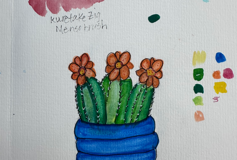
9. Painting Cactus 1: There are just two major parts. Well, three, if we add the flowers to our
first cactus painting. I'm going to start with the pot, and I want to do the pot as a decorative thing
like this or like this. I'm going to decide that
as I get through this. If I pick up and I don't
feel like it's enough, then I'll go back with
the white pen like we did and add to the whiteness. Now, this is a large area. And so sometimes unless you
go really, really fast, by the time you fill this area, you are starting to dry out. So if you live in an area
without much humidity, if you live in a
real humid area, you're not going
to have a problem. We make sure the tip
of your water brush is wet and pre paint the area
with just clear water. It's okay to take your time because we're
going to let this soak in. We don't want a bunch
of water sitting on the surface when we do this. We're going to let it soak in. But we're just pre
wetting a little bit to see if we can get this acrylic paint to
stay workable longer. Now, I I missed a spot there. I don't know if you
can see the glare, but tip your paper to see
if you missed a spot. I want to make sure
I get my rim here. This is already drying here. I'll tell you, desert
Southwest is real interesting as far
as drying times. I'm going to go now I'm using
an Artex pen this time, and I'm going to
start to fill in. Right across that wet surface. This is going to give you a little bit lighter
version of the color from your marker obviously because it is mixing a little
bit with the water. Another thing I found
that's tricky is when I just reverse and
went sideways here, you got to watch that
because you can get that stripe showing up at some point and
we don't want that. If it's dried, we're going
to be in a lot of trouble. Once you do this thing and
go the opposite direction, you want to even it out again. I'll show you what
I mean by that. Right in this area, I'm
going to bring back my verticals and hope to skip any little issues
with hard edges drying. I'm going to jump back
to my water brush. And it's funny. It looks lighter when
you go in chalkier, it helps because you can see what you're doing
a little better. I've got this pretty wet
and I'm going to come back with my pickup
brush and get myself a few white stripes
in the glaze on this pot. Make sure to clean
your brush after that little intense
endeavor here. I'm going to use
smaller I'm going to start with my smaller
pickup brush. And just make a series
of white stripes. Follow the contour of the pot. It should not be just
a straight line. I a little straighter when
you get to the middle here. But what you really want is to define the shape of the pot. So I'm doing this through
the drying process, enhancing my white accents. Until the blue has dried, I'm not going to add any
outside white to it. I'm going to wait and that
can be more of an accent. While our pot does
its drying for us. It's a great time to tackle the Santa Rita a
prickly pair cactus. It's a really,
really interesting cactus because it starts out green and if it gets cold or sometimes
even if it doesn't, it starts to turn rosy
purple around the top. I went to the Artex set of 60 and found a green is a cold green that
I like for the idea. I really suggest
that you look up, you Google Santa
Rita prickly pair cactus and look at the colors really
carefully because you'll be able to pick
something that works for this. I'm going to start
out with our thing we did where we put a
little bit of color and then spread it with our
water brush into the rest of the piece of our pink there. So I'm going to start
with this cactus right here and I'm not going to do that much color in
it, something like this. Now grab my water brush, which is wet and just
get in here at the edge first because that's
where you're going to get dried first and we
don't want those marks. Jump in there and I'm blotting my brush because I don't want too much
green at the top. The green and the pinky purple are going to be right
on the borderline of being complimentary colors, and they're going to
gray each other out. If we let them be
in there too much. Now your green at
the bottom should be a little bit stronger
than it is as it washes up. You can go back and
forth here with this and add more
color or less color. But up here, I would
keep it really pale. Because we have to
have that dry as well, let's just move
over to our other one and we'll have
a backup practice. I'm going to start
the green up here and come around to
here and then add a little more at the bottom of
this one and jump in right away with the edge to get rid of the edge and come down to wet. This is the whole key
to this blending thing is to not have any
hard lines dry on you. This one's got more
green at the bottom. We'll just see how
interesting that is. This is almost dry and a tiny bit of dampness
left is not a problem. Now, we're going to put
I chose two colors here. These are from Artex and my
green is a t517 and t358, which is a warm purple. I'm going to start because this is so staining and heavy duty. I'm going to start paleting it. This time, instead of
my my glass palette, I'm just using a
strip of laminated, it was a trim from something I laminated and it was a
satin finish laminin, so it makes a great palette too. We're going to put that on
there and introduce it, get it wet with our
brush and introduce it from the top of the cactus. Pad, I guess this would be
called and then clean up my brush and bring this
color in in a subtle way. Because that's what
this cactus looks like. It looks like it's turned
pink, but it was green. That's the look
you're going for. I don't want any hard line. I might want a little bit
more red or pink up here. You see this is doing a lovely graying out thing
when they hit each other, which is a perfect look
for the natural cactus. Everything is not
totally bright. You and I went out
of the line over here and we're not going
to let that bother us. Yes, we are. But anyway,
just a little fix. I'm not even a recovering
perfectionist. I'm just hopeless perfectionist. I think it's good to strive for perfect because
you can never get there, but it gets you along
the road anyway. I'm going to do this
again and I'm going to start with a
little fresh swatch here and pick it up and
bring it in from the top, maybe a little more
color on this one. Maybe this one is mostly pink. And then clean off your, your we brush and come in and work with the
blending like that. Now, if you feel like it, you can also do a
stronger thing and just put a little bit of the tip of the actual marker instead of paleted and spread that in and you're going to
get a little more drama. Sometimes it's good to have darks and real lights
amongst your values. That gives you some pizzas
in the finished piece. Now, these little guys here, these little cups
that will be flowers. Originally, they
start out green. Before they flower, they turn to a purply red let's
take a careful look here at what this cactus actually exhibits
as far as color. This gives you the green. I wonder if we can
get those bigger. We sure can. It gives
you the exact thing that we were just doing with
the little prickles on it. You see that some of the
pads are a lot green still, and some are a lot more pink. Sometimes if they
get really cold, the top ones get pink
and purple entirely. I'm showing this so that
you can just enjoy it. Here's our little things
that become flowers. You can see that where they're
going to flower like here, they turn a more reddish version of the pink purple
that we were using. And here you're seeing
the yellow at the top. Here's more and oh, I love this. I have a photograph I took
that's like this, too. Those two colors together. Here's a close up of the little um I'm sure
these have a name. I'm going to say buds, okay? These guys, here's a close up of them and they are
very pinky there. So it's like, do we
make them pink and then they bloom or we
have them green? Here's all purple with just the yellow flowers and
the same purple as a cup. There's a lot of choice, and I think my choice
is just going to be to do these with the tip of a
marker that's just a little. It's like this color, but a little lighter pink
so that we can see it. Let's see how that works. So this is t333
from this same set, and I'm just taking a look at whether that
is purple enough, and I'm feeling like
it isn't so what I might try to do here
is mix the color I want. If this isn't quite
purple enough, and then just like mixing paint, I put some of this in and
then I get over there with my water brush there I'm getting the colors
just like I want. I have that on my water brush. I'm going to be very
gentle and delicate about it because I don't want
to blob it all over. But I like how that looks. That's a little pinker
than the purple. That is how you mix these
colors on a palette. Again, if you have humidity,
you might have time. If you don't hurry up. To use your mix before it dries. Now on this drier one, I am going to put the little marks where the little spines are
and I'll show you how I do this and you can do it
anyway that you want to. I'm going to keep my wet
water brush right here. I'm going to take my purple
and go to the drier one of these and only touch with
the tip just barely like so, and you're able to
see this, I hope. Make tiny dots. Because what goes on is a little purply dot is on the cactus pad and then the little stickers
come out of it. But I don't want it to
look cartoony like that, so I'm going to
jump right in and I'm going to blob it out. I'm just spreading it here. To give the idea. And then I'm going to soak it up with a piece of paper towel. And now we have something that's pretty realistic looking. Is this still too wet? Now this is good. I'm
going to do that again. Make sure my brush is wet. Okay. And I'm just going
to pop a little bits of colour all over
the cactus pad. Smoosh them a bit. You don't have to be as violent as I was at
first point through. The idea is that they're not little sharp points because
that doesn't look realistic. Okay, and pick it up. That's even better
than the first one. To add my spines, I'm taking 0.3 fine liner and the marks I'm going to
make are going to be teeny Vs like this. Just if you looked at it
large, it's like that, but you're going to make
them nice and small so that they fit and you bring one out of every
dot that's left. And this is going to give you a very realistic look
for a Santa Rita cactus. So I'm going to show you how we're going
to add the flowers. And I'm thinking that I'm
going to take my little vase tops out of here because the
flowers would hide them. But why have that
extra pencil in there? I'm just going to do this
particular one right now. Okay, those flowers are vibrant yellow because these
are brush tips, you are going to be
able to make a petal. Point press, point, press, just like everybody teaches you on Instagram and
wherever else YouTube, it won't make the
great petal that a pointed round brush
will, but it's not bad. I'm going to use a bright
yellow and make myself a flower coming out of these. Now, it is opaque acrylic paint, it will cover any
little leftover pencil. Now, you're good there, but I feel like I would like
a little more definition. This is a tulle art from
the yellow set number five. I am going to look for something with a little
more shading for a yellow. I'm looking at two of
my different sets of stuff and it's going
to be a yellow ochre. Now, what I'm going to do? I'm not going to blob, if I blob new things on it. I could lose the old
one and I might just rather make little marks
with the tip of the brush. Just to define a little bit
that these are flower petals, make them show up a little. I'm going to add a little
of this yellow ochre color. But you see how much more
this shows as flowers now. So I'm going to add my
flowers here to this one. Alright, now, I'm
going to look for a little orange of some kind and see what
happens with that. Here I tried a kind of a middle town orange and I like it a lot
better than this. This just makes pop, and this is a little
more dull and defined. I went in and put my
little spikes on there so that we'd look at these two and it'd be a
fair comparison. But I am going to go with that. We are back to our pot, which is nice and dry now. I'm going to add the
effect that we've done already was
this one where we picked up the color I'm going to add this one
on top of that where we added a little extraneous white from another acrylic paint pen, and then we fudged
it with our brush. Now, I'm going to go
one at a time here because I don't want
the first stripe drying in the meantime while
I make the rest of them. I'm going to do this lightly and not try to be a
straight line at all. I'm going to get in here right away and soften
that so it doesn't look garish or a
crack or something. And very light
these thin markers, that's not a problem
sometimes because they don't want to do anything but very light or make the
mark it all sometimes. But anyway, that's what I
wanted to do with my pot. Now I have combined my cactus painting with
my pot painting. I washed in a little place
for the pot to be sitting. These are abstract
grounding things. You don't need the real
table or whatever because really the um the whole emphasis
is on the cactus plant. I shaded a little bit with
a darker blue on my pot and did exactly on my cactus pads
what we did in our lesson. I will point out
one thing when I put the yellow flowers in here, it's supposed to be opaque, but it wasn't opaque enough
that the yellow popped. I waited for the yellow
to dry then I took the trusty extraneous
white acrylic. And I did the petals in
white and I let that dry. I think I might
have even done it twice and that gave a white
background to the yellow, that allowed the flowers to
pop that were right in there. This is our SantaitaPrickly
pear cactus.
10. Drawing Succulent 2: Our third plant is going to be another imaginary
succulent based on several different plants from snake plants, sword plants. I don't know. But the reason that I'm doing it is
for the painting, the little painting technique that we'll be doing would
be very interesting. I'm going to start This
is going to be a basket, and I'm going to start the
top band of the basket. Just above the
horizon line here. This is the band
that goes around the top of a basket
and holds it together. Now, this basket is
going to be pretty straightforward and pretty
straight sided. The bottom. Again, it's going to have to match the angle that we're
seeing the top from. Is going to be a
little bit curvy. I'm going to start it in here. Now, how to draw a basket? This might not have
to be as curve. You've straighten that
out a little bit. How to draw a basket that
is convincing as a basket. We're going to start with
horizontal dividing lines, not too curved but following the same feeling and trying
to have the same spacing. No can I fit? Yeah. Somehow, I got that even. Let's see, one,
two, three, four, five, there wasn't a
better way to do it. If you got an even
number of things, you can divide a
thing in half and then divide the remaining parts. But now when you
have five things, we'd have to do
that differently. Here's where we're
going to start. What these are rows of where some basket thing is
woven in between. You'll see that in a minute. I'm going to make
verticals here, which they would actually go down and be the things
that you weave around. This will be sketchy. It doesn't have to be
absolutely aligned, but somewhat is good because
you're going to base the rest of them
on this first row. I compare this and this. I think maybe I'll move
this over just a little. And then move this
guy over a little. That's our first row and
then they're going to alternate because the
band of basket stuff, I don't know what
you would call that. I really don't it does weave in and out and we're going to make
it look like that. On our next row, we're going to put the weaving
sticks, just made that up. Between where the
other ones are. When we get in the third row, we're going to go back to
match the ones from the top. See how this already starts
to look like a basket. The next one would
be way over here. This row matching this one. And then the bottom one. This is the same
stick coming down, it has to look like
it's the same stick. Now, I'm going to
go back and make this a little less harsh. First of all, you don't like
that bend going up there. To make this top a little
bigger and a little rounder this collar on here. Then we're going to make it look a little more baskety by making these sides actually round. Now, it is really starting
to look like a basket. And we can put a plant
inside our basket. This is going to it's
going to be similar to our sword leaf thing, but a little more roundy. I don't know whether it'd be a succulent or not or if it's just a mother in law's tongue
plant or a snake plant. But again, I'm going to
put a little curve to the I'm starting with what
would be in the front. It is always what you
want to do when you're doing a plant because some stuff's in the back
and then maybe here is one and one behind
this one or here. A little bit of
personality curve there. This will maybe go out
like this and come in like this and still making
stuff up here, maybe a little one here. I'm going to take one
leaf over this direction to balance out the composition.
So there's that one. Then that leaves us
with we could be having one behind this one. But what I'm going
to do is make this one fatter so we don't
have that odd space there. Cleaned up here and I decided that these sticks
when they hit the bottom, they had to be
connected to something. Even in my
imagination, they did. I added this little
bottom something. I don't know whether it's a round piece of
wood or what it is. But anyway, it's a place
for the sticks to end up. Then this succulent is
ready for painting.
11. Painting Succulent 2: We have gotten a lot of painting progress under our belt
and so it's going to get easier and shorter
videos from here on out. Our second succulent, which
might not be as succulent, it's got fat leaves
though I'm going to say so is sitting in a basket, and this is going to be
fun to create this basket because it's easy and it really looks like a
basket when we get done. Let's take a look at it. There are going to
be two colors here. There's going to be
a more rusty brown, it's going to be the rim. And all these little, I don't know what you call them, little spine things that I don't know what you
call these either. I'm not a basket maker. But anyway, the fiber that goes in and out
and weaves in and out of these little stick things is going to be a
yellow ochre color. Let's see. I'm looking right now at whether these sticks go straight up and down because if they didn't it wouldn't work. Right here, I have a problem. I'm going to move this over, it makes more sense. It all looks like it
could hold together. Even though I'm not
a basket person. Let's take a look at how
we're going to paint each little section of this. This is a number 14 from the yellow set of
Tuuli art markers. But anything that's close to a yellow ochre will
do or light brown. I have my water
brush at the ready and I'm going to use my smallest
filbert for pickup here. I also have that dampened
and sitting right here. As simple as this, I'm going
to start with the larger one right here and we are going to color the square
add a little water brush, which is already picking
that up nicely and get our little Filbert and pick it up in a real
blendy fashion. I'm going to do one more
of those with you here. Then I will go off camera
and finish them and you'll see how nice they look. This will be mindful and meditative for you for
a little while and for me because it's like a
coloring book, water, yeah. Picking up, I don't even
really need the Filbert brush, I don't think I'm getting a lovely pickup from this marker. So I'll be back with
my basket weave. Before I go, I'm going to mention that this
didn't occur to me until a minute ago that I'm
going to do the first row, then the third row, then the fifth row in order for our tops and bottoms not to
touch while they're wet. This band and the bottom
band are going to be the same color as the
uprights in the woven basket. So I'm going to make this, fill it with color so
that I can come back. I don't like my edge there. I can come back and lift it, give it a little form. This holds the top of
the basket together, and I've got to get in
here with water real fast in order to be able
to move it and lift it. There's the top band. And then I'm going
to pick the brush up straighter so it
doesn't make too fat of a line and put this bottom in. I'm not even going to
try to lift that because it actually is supposed to
be dark down there there. So now we have our
top and our bottom on and we're going
to use the tip of the brush to make these sticks. Just a little bit of
pressure is going to give us the right line for that width. You might have to double
stroke it just a little bit. But the idea is to
put the uprights in. Now, whether I'm going to get any reaction from lifting here. I don't know, but I'm going
to use my little filer and C. It's possible to just give them a little roundness so they look like those sticks, but they're not just flat. We can go right to the next row because we don't have
wet touching wet. I'm going to finish that
and then I'll be back. I'm back with my done basket, and I filled in all of these and lifted a little
bit, while I was at it, I painted the leaves
with a nice green that I found because
the next thing I want to do is show us the result when we
add a darker color. And do a little of our. But that's called a scumbling. I don't think I
mentioned it before. I comes out of oil
painting and it means a dry brush, scumbling. I guess that's what
they call it that. But that's what we're doing with a web brush to paint that
wants to dry really quickly. But the result is
the same thing. It's a mottled effect. We're going to use a
really dark green. It's the darkest one I have, it's number 22 from
the green set. From tuliar but all sets
will have a darkest green. We're going to look
at the shape of the leaf and want to put shadow a variety mark, which we'll see on a
lot of leaves like this into places where it
would bend away from us. We're going to do something like this in that shadow area and I'm not just going
to leave it stripy. Going to scumble it looks a little more natural like that. Part of the leaf just has darker green there here it's coming back out towards us and so it's going
to be light there. But down here, it would also have those markings of dark green and
probably at the tip. When you look at that,
I think you have seen plant leaves that
look just like this. I like to look. The nice dark is a contrast with the
lighter basket and so on. You have to make
your own decisions here for light and dark. This is really the same
procedure that we were doing here and here on our
painting lesson. But instead of going light into dark that way and just
lifting and putting white in, we are adding a dark and getting
a really similar effect. On this one, I'm going to
show you I approached making this little vignette background here and you start right
at the wine you made. This has got water coming
out of it the whole time. It's water brush and you
want to make sure you squeeze it over a paper towel. You're going to work
this blue color in here. You're going to come
down at an angle, go around the bottom, and you just scribble some more. Okay. W more color coming down and you want to guys wash your
color out to white. That's how you're going
to make that Vignette. And we're getting
our paper nice and wet in the meantime and
that's a good thing too because when we put
a little darker of a cyan or a little
turquoise color, you want to have this all blend. I'm looking from an angle, I can see I've got pretty
wet area going on or paint. This way, using the
paleted version, you have much more
control than to try to come in with your mark or and put a heavy mark in there and think you're going to
blend it out without it doing its own blending. But what I am going to do is the tiniest touch now that it's all wet and bring that down. Because that's
going to give me a little deeper value there. Paper has soaked
up some water so the paint can't dry
quite as quickly. See it's getting a lot drier
over here on the pallet because there's a wet paper
under it to keep it to flow. This is the way I've done
all the backgrounds on this and I'd like to look. It just gives the basket
or the pot a place to sit. I want to make sure this
is all still wet because I'm going to take in I'm going to palette a little
darker version here and pick that up and
add that to the flow. It's going into
the lighter color. It's going into the water. You have a high quality
of watercolor paper, you shouldn't get
into the problem of damaging paper because you have wetness that you're using. I'm going to squirt more
out of my water brush. I mean, it's wicking
moisture all the time, but maybe sometimes we need
more when we want to wash something into a
white eventually, you have to have something
contrasting with that white. All of this is working
around this is wet. I don't think I'm going to go. Much further with this. If it dries and I decide
something has to be deeper, I can come in with a
wash over the top. Here is the finished succulent
number two in a basket. I added by putting a dark blue on a palette
and using the water brush, I added a background here to ground the container
and finished my leaves. I wanted a little more
warmth in my highlights. I added yellow to a palette also and used the water
brush just to glaze, I would call this
because remember, this is acrylic now, so when it's dry, you can glaze over it without disturbing the bottom layer. I just glazed a little bit over the highlights in the leaves and the basket just to give
it a little more light, a little more warmth. That's that on this plant.
12. Drawing Cactus 2: So let's draw our second cactus in yet another a container. This is going to be a round
and square kind of pot. I'm starting with a rough
sketch of a square, and that's where
its bottom will be. I wanted to go above the
horizon a little bit. But then I'm going to go back to the square and put that oval in. That defines the top of
what this pot really is, and then I have to match
that oval down here. I'm curving like that. Get this line out of here, so it doesn't confuse my eye, get my guidelines out the side to be
straight up and down. I want this to be a coiled pot. I'm going to show you how
you can space something that has odd number of things. In this case, coils. You've seen videos and stuff of people
making coiled pots, where you have a rope of clay all rolled and you just
pile it up on itself. That's the pot that
we're making right now. So I'm going to put my first coil is I'm going to try and
find the center here, and I might even use
a ruler a little bit, that's about 1.5 and about three quarters of an
inch would be the center. Let's see. This is
actual center of this. I'm going to make that
into my middle coil. And my coils are going
to be that wide. I've got that on either
side of that center mark. This coil is pretty much
in the middle of this pot. I'm going to divide we want our coils up here
to be just a stick, then all we have to
do to get five coils is to divide those
two spaces in half. Is to divide these
two spaces in half. Now, this is a coiled pot. That means that each of
these is going to be round and not flat like that. Our cactus is going
to be a little more generic this time. Let me start with the first one that would be in front here. Basically, it's a big oval. Let me shape this out
should be rounder here. Then it's divided
into two parts. All right. I'm trying to figure out is that
as fat as I want it? Maybe not. Maybe I want it
to be more fat. All right. Something like this,
like this, like this. Then of course, we're
going to have to have somebody coming
out of the back here. There are three, we're going
to say there are three arms or whatever parts
to this cactus. Now, the thing about
these that is fun is they have really cool
blossoms right on the top, and I'm going to start those with a little center of the flower and we're
making up the flower. I'm just going to make it a four petal flower
by adding those. We'll keep it a little
bit simple because the body of the cactus is not, especially when we get some spines that we'll
put in there and so on. Okay. I don't know. I don't know if I want
to make them a little cadiwampus and give
them more petals. Yeah. I think I'll just add a bit. Make them a little more fun. Because we're
making this far up. I could go look it up
and try to be realistic, but why do that, right? So some nice fat ones. Now they can get a little shaped differently and you can pretend they're
going at an angle. And that's how that happened. Can do something like that. I want this bigger and I want this whole
cactus bigger. Back here. This is all for the balance
of the composition. Now I'm still looking at it. I think I want that rounder and I do we like it? I think so. I'm going to clean
it up and we'll see. Here's our barrel cactus already in flour
and ready to paint.
13. Painting Cactus 2: Our second cactus in our final painting is just going to be a
piece of cake and going to breeze right through it
because the entire thing is created with things we've already learned and
we've already done, and now we have learned
where the pitfalls are and maybe mistakes and so
we know how not to do that. I am going to start
because I want a blue vase or pot
on the bottom. I've got my dark blue marker. I've got my paper towel. I've got my full
water brush ready. I've got my two sizes of
Filbert brush ready. All right. I'm going to dampen
them also just so I can grab them to lift. The first thing, I'm going to do the bottom row on my pot. I'm going to trace
around the shape trying to be as accurate as I can. I do this first because this
is going to be dark anyway. It's not really going to
be lifted along the edge. I figure if I did that
first in my middle second, the middle of it is going to be liftable because it's
going to be not as dry. This brush has a lot of water. Here comes the lifting brush. I'm going to that on this because it's such
a deep, deep color. I'm rewetting the
lifting brush and adding some water back
here a little bit. I'll have to fix
that line later, but I don't stop to worry
about it now. Okay. That makes my coiled pot look a little more
like it's actually coiled because it looks round once we pick up
the lifted color. That is what you are going to do in whatever color
you want to do it. I would again suggest doing
this one and every other one. Um, so the third and the fifth so that wet
doesn't run into wet. Because even if it's just
a little leftover wet, it can make your edge bleed over and that isn't what
you want. All right. I showed you one of
those for my cactus. This is more of a barrel cactus and they're segmented
in a vertical matter. The look that I like for
this is two tone green. I'm choosing a
number 26 and number 27 from the Earthtne tuliar kit. But I'm going for a lighter yellower green
and a deeper bluer green. Whatever your set has, you can see if it has
anything like this. I'm going to put the
lighter green in the middle section and left the light is going to hit the inside of the section more
than the edges. These edges are ridges and they won't be hit
by the light as much. I'm not sure this dark
is the one I want, but there's one way
to find out here. Because if it isn't
will only go darker. I'm safe doing this knowing
that I could paint over it. Let's see how it looks. I think I like it. Let me grab the Silbert here. I think that's going to be nice. It's not too severely
different, close values. I think that that is going
to combine really well. Then I'm going to
choose a bright red for my blossoms and probably a bright orange yellow for
the center of the flower. I was able to find
a nice orange red, which is just what I
wanted and it's a number two from the red
set from Tuuli art. Just find not a cool dark red, but a bright orange
red because that's what these blossoms really
do look like in real life. Again, I'm going to use exactly the same
procedure edge first, middle, second, and
attempt to lift here. Don't lift away too much on the red because red
can just go dull and boring really easily if you lift too much color from
it, just gets flat. And I think for my
tabletop this time, I'm going to be
choosing probably the yellow ochre sienna
kind of thing that we did. I was going to pick
this orange up and it's just going to be really nice
against the blue down here. I am off to spend the
next half hour or so enjoying the process of the painting and I'll be
back to show you the finish.
14. Final Thoughts: Here we have our last painting, our cactus number two, just like we talked about, I painted it exactly
the same way. The outline the fill and
pick up wetting and pick up. I put little yellow centers in my flowers and just a
dot of the color from the flower petals and debated a while
on whether to add a highlight with a white
marker and then smudge it, but I thought I could get in
trouble, so I didn't do it. And then I put in a
yellow base background with a burnt sienna
over the top. I took my fine liner and I
went in and made our little Vs for the spines on the
cactus and then I thought, I might like it because they
sometimes have a reflection. I thought I might
like it if it had a little white reflection
on it too. That's it. Yours might look very different, but I'm sure it's beautiful. This is a nice little set here. Let me zoom out a little bit so that we can see the
four of them together. So very handsome as a set. I might even frame these
originals in the same frame. These are five by seven
inch pieces of paper. And the drawings I provided you in the resource section
are also five by seven. So if you have a printer
that will put through a piece of 140 pound
watercolor paper and give you a waterproof ink, then you can just
go ahead and print those drawings out and paint them if you don't
want to draw them. But of course, it's more fun
to draw them and paint them. So I am very excited to see your paintings in the project section for
a couple of reasons, I always love to see the
students work and talk about it. But this is a brand new
paradigm in painting. You just haven't been able to do this particular thing with
these particular tools before. So it's challenging
and exciting, and I would love to hear from you where stumbling
blocks might have been. Now, this is exciting as well because it's so
unusual to have a permanent medium like acrylic blend so beautifully
and be able to have transparency and look
like watercolor. Also look in some cases like a soft pastel piece of artwork. It does not look
like acrylic at all. It's so I don't know, non plasticy, I guess. But it's also so well
blended and that is so hard to do with
regular acrylic paint. I hope you've
enjoyed this class. I have really enjoyed it, and I'm going to pursue this
medium and see what else we come up with in the future.
Have fun doing this.
 Jessica Wesolek, Artist/Teacher