Transcripts
1. Welcome to the Class: Sunflowers are a symbol of
happiness, honesty and peace. They're my favorite flowers
as they always remind me to rise and shine and
hold my head high. I've also been super obsessed with painting
sunflower landscapes. Because each time I sit
down and paint them, I can immediately feel the positive energy
radiating through them. And that brings me so much joy. And in today's class, I'm excited to bring you
a similar experience. Hello everyone. My name
is I'm an artist and art educator based in Bahrain,
originally from India. You can find me on all social media platforms by the name this
simply aesthetic, but I'm constantly active and sharing my love for
art and nature. If you wish to know
more about me, you can head over to the About
Me section on Skillshare. I'm excited about this class because I'm going to take you on a wonderful journey to painting these beautiful sunflower
fields along with me. Don't worry if you're a
complete beginner because I'm going to guide you through
each and every step that you need to know when it comes to painting with acrylics and combine all of them to paint a beautiful class project. We'll start off by
knowing the art supplies. So paints, brushes,
canvas, all of that. It's going to be covered. We'll then move on and learn a little bit about color mixing. And this is going
to help you a lot. We'll also learn these beautiful brush
strokes that you can make using your flat
filbert and round brushes. And then we'll learn how
to use a brush to paint these beautiful clouds that we'll use in our class project. After gathering
all our knowledge from an exercise lessons, we're going to use them in
our final class project, which is off this
beautiful sunflower field. It is filled with so many beautiful warm colors and a lot of positive energy. So if you're someone who's always wanted
to learn how to paint such landscapes using
acrylics and want to experience the positive
energy that I'm talking about. Then join me in this class and let us go on a
wonderful journey together. See you inside.
2. Art Materials Needed: Let us talk about all the
art supplies that you need. The first thing that
we're going to talk about is the canvas. I'm going to use this ten
by 12 triple prime chest. So Canvas, it's a single
thing can whisper, which I really
wanted to test out. This is from the brand
Campbell, as you can see, it has this beautiful little
texture on it as well. And this is what our
final artwork is. So we're going to
paint on this canvas. The next thing that I
want to talk to you guys about is the paints. I'm going to use these
collegial acrylic paints from Winsor and
Newton will discuss all the details about the sheets that I'll use and the
different color mixes that I'm going to use
in the next lesson. So you can tap in there
to know more about your colors that you need
for the class project. The next thing that
we are going to talk about, the brushes. I'm going to use very
limited brushes here. I'm going to use a size 12 flat brush for all
the background washes. I'm going to be using. The flat brush for blocking in the color is majorly so you can use different sizes
of flat brush. This is a half an
inch flat brush. You can use whatever flat
brush is available with you specifically slightly
bigger because that helps you cover the
surface a lot more. Next I have this filbert brush that I'll be using
for the clouds. It works amazingly
for the cloud. And I'll teach you
all about how to use that in our exercises. The next, I have a round brush which is
of size two and double 0 for adding in the details of the sunflowers and
leaves, none of that. So I'm just going to be using on four to five brushes
at max for this class. You don't need any
fancy brushes. You're just a flat brush or
filbert brush, Amazon brush. The next thing on my list
Are these palatine nerves. I'm going to use a
size one pallet knife, the one with the pointed
edge for adding and textures and details
on our foreground bit. So that works really well
because you're able to add in different strokes
using the palette knife, are able to get these rounded some flowers that
you see as well. And I've just used
my palette knife for that and it works perfect
for the textures. So make sure that you
have a pallet knife. And even if you don't
have a palette knife, you can sort of get the same
effect using your brush. But having a palette knife
will cut the time by a lot. Next I have this mixing palette is somewhat wouldn't
mixing palette. I haven't actually build off the plastic off of it
because I'm going to use the ballot with the plastic, so it's easy to just peel
off and throw it on. Next, I have Oh, jar of water. As you can see, the condition
of this jar is very messy. That's because this
is specifically for painting with acrylics. So yeah, that is why
it looks like that, but makes sure that you have
a jar of photo with you. Next, I have a pencil
for a very basic sketch. Nothing fancy, just a pencil and a cloth rag makes sure that
you have a cloth rag with you and stop tissues because it helps in getting
rid of all the pain that might stick on your
brushes and tissues, you just end up using a lot
of tissues for the chronic. So make sure that you have
any drag, right, that is it. In the next lesson
we are going to be talking about color
mixing. So see you there.
3. Exercise : Colour Mixing: Let us talk about all the colors that we
need for the class. I'm also going to show you
all the shapes that you can make using
these basic colors. First, you need to have titanium white and
a Payne's gray. If you don't have Payne's gray, you can use black itself. You don't need to
have Payne's gray. But I wanted to go with Payne's gray instead of lamp black. And I have taken titanium white. Next we have two warm colors. We have our yellow, that is cadmium yellow
and cadmium orange shade, which I'm going to use
for the sunflowers. Next I have sap green
and hookers green. I'm going to use
a combination of these colors for the leaves and all the background washes in the field of sunflower fields. And lastly, I have a brown
shade which is burnt sienna. So these are going to be
all the colors that we'll be using for our
sunflower fields. And right now I'm just going
to show you how you can make many different colors using just this to
be your base color. For that, I've taken yellow, orange to greens and
browns on my palette. And on the right side, on the top side I've taken
white and my Payne's gray. I will be mixing
different combinations of yellow with white. So I'll add a little
bit of what I'm just going to show you exactly
what I'm talking about. So it makes a little more
sense than it does right now. Here's a clear swatch of
paint directly from the tube. So you can see this is what the original color
looks like. Right? Next, I'm going to
add a little bit of white to the
paint, to my yellow. I've just added a
little bit of white. And as you can see, the color is tone down
from its natural color, which was from the tube. And if I add a little more
white to the mix, right? If I'm adding,
increasing actually the quantity of white you
can see it gets lighter. So each time you add more white, the color gets lighter. Let me show you what
happens when you mix yellow with
the Payne's gray. So I'm going to mix a little
bit of Payne's gray first and see just a little amount of Payne's gray and more yellow. You can see it has completely
changed the color. It looks more of a
greenish mix, right? So it looks more brown or
greenish, green rather. If I add more gray
to paint gray to it, it has gotten even more olive green to the
colors gotten darker. So as you can see, there's
like a huge difference comes in when you're adding your white and green together. Even black, Let's say. Now to get a more neutral color, you will mix yellow,
white, and gray. And when you mix these
three colors together, you will get something that
looks more toned down, right? More neutral. So you can use these colors in a lot of places where you
want neutral tones. So you can see this is a
combination of yellow, white, and Payne's gray. Now I'm going to repeat the
process with all my colors. That is going to be
my orange green. So let me just show
you what it looks like when you take orange. So this is our cadmium orange
directly from the tube. You can see this is
the shade it makes. And when I add a little bit
of white to the orange, just gotten tone
down immediately. You can see the
shift in the color. Next, I'm adding a
little more white to it. So this gets to look more pastel orange
shade as you can see, it looks more peachy. And this is width wide. So you're going to
practice this color mixing each time with the shades that you
have and you add a little bit of the white and then you increase the
quantity of white. And you do the same thing with the Payne's gray or black
color that you need to use. As you can see when
I add Payne's gray to my orange shade, it gives me that beautiful
dark brown shade. As you can see, I've got
a nice dark brown color by just using orange
and gray together. So even if you don't have
browns in your color palette, you can always make
these proteins using your primary
colors. Secondary colors. You can see the
last row is more of a neutral tint that regards it has that brownish
light brownish, grayish tone to it. Now I'm going to repeat
the process and I'm going to slightly
speed up the process. You're going to do this
with all the colors and find out many different colors that you can make along the way. Now, it isn't that only
these two different shades of mixes you can make with white are only two different mixes you can make with grape. You can get various
mixes depending on the quantity of three and the gray or the white
that you are adding. And you get a lot of
different colors. So instead of freely holding onto all the colors
in these mixes, you can get your basic colors and mix the colors that
you need for a painting. Mixing these colors on
your own really just makes the painting look even. And it doesn't look odd
when you try to get an separate colors from tubes that are not
from the same mix. Mixing your own colors
really bring out a lot of difference
in the painting. So what I'm gonna do now is keep quiet so you can
follow this step. And see how the mix
a lobbying firm that all the colors
I've mentioned earlier. Alright, so as you can see here, all the sheets that
have made with the colors that I need
for the sunflower field. I also wanted to show you
the shapes that he can make using ultramarine blue, that is the color that you're
going to use for the sky. So I'm going to mix
my ultramarine blue. As you can see, this
is what the color looks like directly
from the tube. It's a nice deep,
warm blue color. Next, when I add in a
little bit of white, you can see immediately
the color is toned down. It is completely different from what it looks directly
from the tube. And when I add in more white, you can see there's a
huge shift in the college looks more like a baby
powder blue shade. This, these are all the two
colors that you can make using a mix of ultramarine
blue and the white shade. And then I'm going to show you exactly what happens when I add in Payne's gray
into the mixture. So I'm just going to mix blue
and Payne's gray together. So I'm going to start
off with just a tiny bit of Payne's gray. As you can see, the colors immediately more darker, right? It's even darker than
its original color. I'm going to increase the
quantity of Payne's gray. The color gets darker skinned
and it's a more deep, rich, deep, deep blue color. So this is the fun bit
about color mixing. You get to know all these beautiful different
sheets that you can make with your normal chase
that you get in your tubes. And I absolutely love doing this exercise before
I'm painting, so I just know what
the sheets are and what quantity of
paint I need to mix. And then when you
do it on your own, you get a good practice
of the thing as well. So here are all the shapes
that we have mixed. As you can see, we've gotten so many more colors
from our basic colors that I mentioned
earlier encoding these beautiful mixes
with white paints, gray, and the neutral colors. So now this exercise
is gonna give you a clear idea of how you can mix different
colors when we are painting our sunflower field. So I hope you enjoyed
this color mixing bit to this color mixing chart with you because it's gonna
be really helpful. And in the next
lesson we are going to practice some brushstrokes.
4. Exercise : Brush Strokes: Okay, let us learn all the different brush
strokes that we can get using the brushes
that we're going to use in this class project. So for the first few
brushes that I told you, we're flat brushes, filbert
brushes and to run flashes. So let us learn the
different brushstrokes that you can make
using your flat brush. If I just want to
hold the base of my brush and use it in
the horizontal way. I would get this huge
stroke if I just turn it 90 degrees and just
done it by 90 degrees, this is the stroke
that I can get. And if I vote to use it
perpendicular to the paper, I would get thinner strokes. With your flat brush, you can get three different
widths of brushstrokes. You get the thickest
one, the medium one, and the thinnest one, by using it perpendicular
to the paper. They can just pay attention
to the way I'm holding the brush and the way I'm
turning the brush, right? So the first one was flat, the second one was
twisted 90 degrees. The other one was directly
perpendicular to the paper. Next, I'm going to show
you how you can make different brushstrokes
using your filbert brush. Now the difference
between the filbert brush and the round brush is that silver brush is more rounded as compared
to your flood brush. So the ends and other starting width of your stroke is going
to be more rounded. So you can repeat the
same process with the filbert brush in the same way that we
did for the flat brush. And one other good thing that I like to use my
filbert brush for is making the clouds because it has that beautiful round edge. I can make these
circular strokes. I'm using that circular stroke. I can paint a lot of
different Clouds. So if I were to make the
strokes like this I can give my clouds are
really fluffy. Love using this brush without having to work on
the shape a lot. Now, if you don't have
a foot bud brush, you can go ahead and use
a round brush as well. That's fine. You can try it out with
your own brushes too. For me, for the brushes work
best for painting clouds. Next, let me show you what strokes you can make
using a round brush. I'm using a size two round
brush with maximum pressure. This is a brushstroke
that I get. This is my maximum pressure that I'm applying on my brush. And as I slightly released
the pressure on my brush, I get a lighter stroke. As you can see, the
thickness is reduced. And with the lightest
pressure where I'm basically just touching
the surface with my brush. I get these really
beautiful thin strokes. And that is how you can use these brushes
to your advantage. And how you can do
that is when you are making petals and
leaves and all that. You can start off by just
touching your brush on the surface and then dragging
it and then you release it. You get these beautiful
thinner stroke. So the variation in
which the brush moves can be changed
with the amount of pressure that you
are applying on it. So go ahead and just try your, try different brush
strokes using your round brush with
different pressure. For the petals. What I like to do is touch, apply the pressure and release. And I'm just going
to try this out in different directions so
that I get a little bit of a practice before I go ahead
and make the class projects. But this is not
really important, but getting to know
your brushes really changes everything
because you know exactly how to use them and how the brush strokes
can be Soviet, I'm just tapping
in some strokes in different directions to see
how my leaf strokes word luck or what stroke would look with the different pressures and different directions in
which I'm dragging it, what it's gonna look like. It's just a good practice to understand your size
two round brush and make so I'm going to
repeat the process again with the size double 0 brush. Now this is almost
like a detailer brush, but you can't really cover
large areas using that brush. And this brush is generally used only for adding in finer
details in your sections. And just get going ahead
for all your final details. I'm just going to repeat
the same step like I did earlier with my
size two round brush. And as you can see,
the brushstrokes are much thinner as compared
to the previous one. Even applying a lot of pressure
does not changes or make a major difference
in the brushstrokes because the brush is very fine. It's double 0 brush. It's a really fine brush. So I'm just repeating a
few brush strokes using the same brush to get a
good grip on it basically, and just get to, get used to the
movement of my brush. Alright, so I've titled
all of them so that you can see sides are flat, size six, round size two, round doubles 0, what
the strokes look like. And you can just try these out
with your brushes as well. Just to, you know, it's like a good
warm-up exercise before we go ahead and
paint on me artwork. In the next lesson, we will
be practicing a few clouds. So see you there.
5. Exercise : Clouds: Let us learn how
to paint clouds. I'm going to show you some of
the artworks in which I've added clouds using
my favorite method. And you can see a lot of the times you're
able to capture in the little shadow bed and a lot of the highlighted
bits, the clouds. So this is kind of like my favorite way in
which add clouds, but I'm not really
focused on the clouds. As you can see most
of the subjects. There's a lot happening
in the foreground. But I still want
beautiful clouds in the sky where I don't have to put in a lot of extra
work. In this lesson. I'm just going to
show you how you can get that fluffy look into your sky without actually
working really hard for it. So let us quickly, quickly get started in practicing a little
exercise with the clouds. So I've taped on my paper on all four sides is just
using an extra paper. You can use Canvas
April as well. I'm going to use my titanium
white and ultramarine blue. And I've put it on my canvas, not, not on my
canvas. I'm sorry. I've put it on my palette and
I'm just going to mix blue. So we're going to start off
with the ultramarine blue at the top and then slowly
transition to a lighter blue. So you remember where
we added a little bit of white to the blue and we've
got a lighter blue color. And then we added
more white to the blue and we got an even
lighter blue color. We're just going to
repeat that step. That same sort of
mixing startup, starting off with the blue
directly from the tube, then adding in a little
bit of white into it, and then adding a little bit
more white into it and then creating a graded wash with our acrylic paints for the base. Now, right now as you can see, you'd be able to see the
paper or the Canvas, whatever you're painting on,
you'll be able to see it. That's okay. This
is our base layer. We're just blocking
in the colors first. When you're making
the wash, it doesn't, it's not important to
cover all of it at once because once
this layer dries, we are going to
repeat the process. And when you do that,
you will see how magically opaque everything
gets off the bat. So right now, just focus on laying the colors and once you're
done with that, you're going to let it dry completely before moving
on to the next step. Alright, so my paper is
completely dry now, I'm gonna, I'm gonna do is start
the process again. Start off with a blue
shade at the top. Transition to a lighter blue in the middle and then the
lightest blue at the base. As you can see when I'm
applying this layer, everything is much better, much more seamless,
much more opaque. You cannot see the
paper at the back. That is why, especially for the basis if you're
walking into layers, it just fixes everything. So go ahead and create
the second base. Alright, now that my
paper is completely dry, it is time for us to
paint the clouds. Remember, I told you that
I use filbert brush. Now's the time to whip out your favorite brush and
start painting clouds. For that, I make
sure that I have not added any water on
my brush and I'm just using dry brush and thick consistency of
paint with no water, nothing just paint
directly from the tube. And again, one another
thing to keep in mind is if you have titanium white, it would be the best because
it's more opaque and it's much more like it stands, right? It's much more opaque.
It's much more deeper and richer instead of being light. So titanium white box crate. So I'm going to
start off by adding these clouds and these tiny, tiny float or clouds
in the sky as well. You can see the
movement of my brush. It's much more than
that circular motion. As I want to release
the shape of the cloud, I just go in this left
and right brushstroke, but I just released in the
base strokes without having those sharp edges further
top bit of the clouds. But I want it to be fluffy. I have the circular brush
stroke, as you can see, when I want to
transition to the base, but I want to stop the
shape of the cloud. I just go in this left
and right motion to slightly relieve
adding textures in that area without
having it really just left there in the sky,
just floating around. Since we're using a dry brush and there's really thick
consistency of paint, the brush will just add
in the textures for you. This works really well, actually on the Canvas, since we're using paper, the effect is much different
as compared to what it would be on the Canvas since the cameras has more texture, the texture that
the brush leaves on Canvas, It's beautiful. You'll see the difference. When we paint the
main artwork on the canvas as well, on paper. It's slightly different,
but let's just go with it. So I'm just going to go
ahead and add some clouds. Now I don't want to confine you into one particular way in
which you add the clouds. I just go with what comes
into my mind mostly. Or if I'm looking at
a reference picture that I just tried to recreate the shapes that I'm seeing in the reference picture, but the method remains the same. For now I'm just focusing on the clouds at the base
in the lower part of the painting to be more smaller as compared to the clouds
that are at the top, right? So they are going
to be much more bigger because I want to
give that illusion that it's closer to the observer
and the sky is above you, where the clouds are bigger. The clouds at the
base are going to be smaller and the clouds
are going to be bigger. So just go ahead and
add in the shapes. Remember, this does not
need to be perfect. We're just trying
to practice clouds and just understand our
filbert brush better. Alright, now that
I'm done actually adding the base of my clouds, I'm going to go ahead and start adding the
highlights. For that. I start with the same filbert
brush, the same motion. But this time I'm only covering the top of my clouds because that's what I want to show
the highlighted section two, for it to appear
much more fluffy. And as you can see,
I'm only covering the top sections like brushing it in the inward direction
towards the base as well. That there's a seamless
blend in the clouds. And another thing that
I like to do is add in these tiny float
clouds along with the bigger ones so that
there's a bit of texture and movement and all of that going on in my
accounts and stuff, it just fluffy
individual shapes. So adding in a little
bit of texture and the slow the
clouds really help. So go ahead and add this second layer at the
top bed of your clouds. Now that I'm done with
the second layer, I'm going to add another
layer over it just to make the highlights
pop out even more. So I'm just going
to go ahead and do repeat the same process, the swap this time
covering even lesser area. And you can also
make new all clouds. Add in more textures wherever
you feel is necessary. Again, remember I told you
what your mind tells you. Imagine a sky and just think of the clouds floating around
and see what you can add. Always remember, you can
have fun in this section, this is not your final painting. I don't want to confine you into something in a particular shape and anything of that sort. So I want you to just
enjoy this process. Just understand what working with a filbert brush is like. Understand its
movement, understand the capabilities because
that's more important. So go ahead and
highlight your clouds, give it more of
these highlights. Now remember, I showed
you and told you that there's gonna be a little bit of a difference when you're
painting on paper, as compared to painting
on canvas with acrylics. Because on Canvas you
have the texture, rough green surface, and on that your brush strokes and a lot different as
compared to paper. But remember that we're here, let's just understand offer
but brush and just practice some clouds before we go
ahead and make the final one. So just enjoy the process. I'm really happy
with the way this is actually turning out. And I just thought that I should add in a little more texture around these bigger
floating clouds because I felt I the missing something. So I'm just going
to use my brush and add in a little bit of texture in this left
and right strokes. And since it already we're
using the dry brush method. Your paint is thick, so as
you glide your brush over, it's going to just create
this beautiful texture. So go ahead and add in
the textures where you feel like it, enjoy the process. And once you're done with that, let it completely dry and then
carefully be the tape off. Alright, so here's what the
exercise paper looks like. As you can see, it's got these
beautiful fluffy clouds. You remember how I mentioned
earlier that the texture of the canvas works really
well for this technique. So you can see there's a huge
difference between the two. Again, now, I wouldn't say
extremely huge difference. But the texture of the canvas really
works well when you're trying to add in
those float clouds and they look much
better on the canvas. And I hope this
exercise really helped you understand the movement
with your filbert brush. And I can work on the shapes and adding the highlighted bits. So now that we have
everything figured out, that is quickly learn
the composition of our painting and get started
with our class project.
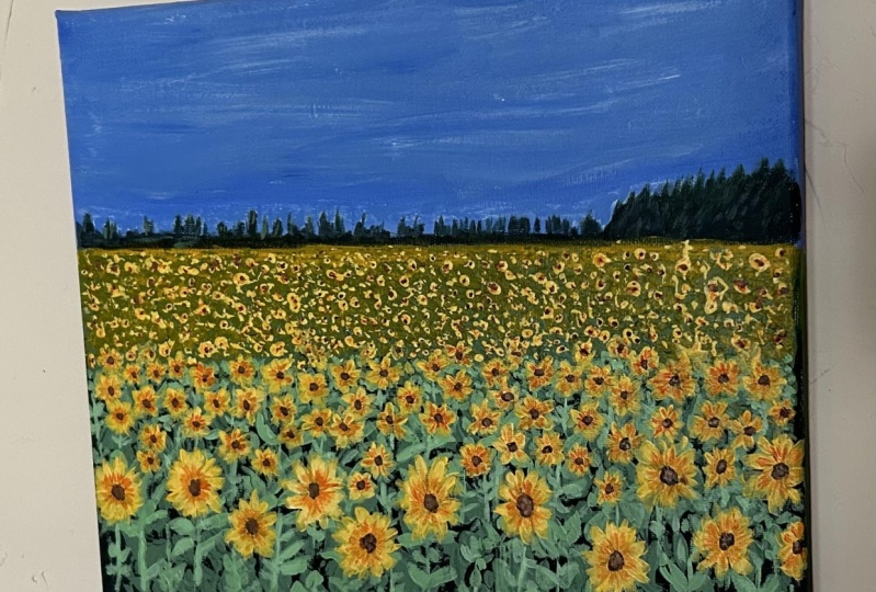
6. Understanding the Composition : Before we move on to painting
our main class project, I wanted to walk
you through how I decide the composition
of the painting. Here I have a beautiful
sunflower field landscape. As you can see. This has divided into blue beds. If you've got a
beautiful blue sky and all the yellows and
greens at the bottom. Usually I take a combination
of two or three images, but let me show you how I'm
going to work everything down over here for this painting that
we're going to paint, I've taken the inspiration of the sunflowers
from this section. So here you can see we've got the sunflowers right below the horizon line that
are really tiny, almost like getting textures and you cannot see them clearly. You can just see them as little yellow freckles
into the area. And in that section, then you move into
this middle section of the bottom part where you
have medium-size sunflowers, you're going to see
little more petals, a few more details. And then in the final section
you have larger sunflowers, but you're able to
see more petals and more details into it. So here you see,
we're going to use three different types
of sunflowers sections. Then you have the
horizon line that divides the painting
into two-halves. You've got beautiful sky
and the sun flower bed. For this painting,
I'm going to take inspiration of this movement, this movement of the sunflowers. One more thing I
wanted to bring to your attention is the
details of the leaves. Over here you can
see the leaves, the stems at which the
subtle flowers are on. You can see them in detail. But right at the back
in the middle section, you can just see a few leaves. You cannot see the exact detail. And that is what we will be putting an art
painting as well. Again, we're not getting into
the details of everything. We just sort of taking inspiration of what the
sunflower field looks like, how the sunflowers Look
when they are closer, when they're in
the middle section and what they're going
to look like far away. The young you've got
the larger sunflowers, you can see the stems and
the leaves that we've added. And in the middle section,
smallest sunflowers. And lastly in the last section
we have more textures. So here we've got quick idea of what everything
is going to look like. Now, like I said, I'll usually combine two
or three reference images to make my own painting. And I'm going to show
you how I do that. So like I told you, we're going to take
inspiration of what are some flowers look like
in that painting. But we're going to
paint the orange or the sunflowers and
the colors we're going to get inspired
from this one, where it's more yellow and
there are these orange bits. I got inspired by this
image to add in the orange and the sky is going to be somewhat from this
reference image. So like I said, we're going to use
a combination of different reference
images to make our own painting where understanding the
elements from one, the colors from one, and shapes and all of that from different
images and combining all of them to make our own. So let us quickly
start painting, and I'll see you in the
next lesson where we are going to paint the
base for our sky.
7. Project Part 1 : Sketch & Sky background : Alright, let's us start painting our 12 self peptide Canvas. This is a triple prime, just so Canvas, so it's completely fine for
me to start painting. I have my colors
by mixing palette, all my supplies ready with me. So let us quickly get started with our
basic sketch first. So the first thing
that you are going to do is take your scale and divide your surface
into two halves. So the line divides, it's going to look
like the horizon line. And the top portion
is going to be your sky and the bottom is going to be where our sunflower
field is going to be. So once you have
the horizon line, you're going to have these far off trees at a distance which I'm
not really going to sketch out
properly because it's all going to get covered
with our acrylic paint. So it's completely okay to just stop right here
with a basic sketch and quickly start blocking in the base colors for our sky. I'm going to start off
by mixing my ultramarine blue with a little
bit of white paint to get a lighter version of my ultramarine blue and not just deep ultramarine
blue color. So here's a swatch of the
shape that I am going to use. Now to my mix. I'm going to add a little
bit of water so that the consistency is
slightly then down. And then I'm going to start
painting right from the top. Here. The idea is to create
a gradient sky. We're going to start off
with the darker colors at the top and then slowly come
down to the lighter color. Now, don't worry about getting
the perfect brushstroke, are getting good color
spread out evenly on the canvas because we are
going to lay this again. When we do that, the opacity is going to stand out even more. And you're going to have
those even brushstrokes. Don't worry about it
in the face there, but just try to block
in colors for now. So as you can see,
as I move down each time I'm adding little
more white to the beat. This way you have single color toning down
towards lighter version. The latest version of the
ultramarine blue is going to be right above the horizon line. So as you can see, this is the third section
in which I'm adding the paint and this one is lighter as compared
to the color that is. All right, so go ahead and create this nice
gradient in your Skype. Now you can go back and forth
and blend them together. Again. Don't worry about the perfection
because once this dries, we're going to go ahead
and layer it again. That is when we will worry more about blending the
colors together. Well, here we're just trying
to transition between the darkest color or the medium bluish color and
the lightest blue color. So now here's the basic
blend of the colors. I'm going to wait for this
section to completely dry and then go over
and code it again. Alright, now the canvas
is completely dry. We can go ahead and
add another layer. Remember that your
paint needs to be dry. You can speed up the process
by using a hairdryer. That's completely okay, but makes sure that it's evenly dry. Otherwise you're going
to mess up your blend. Now I'm going to start off by laying down the darker color at the top and then slowly
create the same gradient. Remember, you can add a little
bit of water to your paint to thin down the consistency
so that it's not too thick. And that makes the
planning process easier. Now when you see it, when I'm laying the colors
down, it's more opaque. You cannot see the canvas. Now sometimes two
layers don't work. You need to work in the
third layer as well. So it just all depends on the quality of your
acrylics as well. Since I'm using a
good-quality of acrylic paints for me to do two layers is just good enough. One can be when I just
block in the colors. And the third one, sorry, the second layer is going to be the layer where I work on more perfecting the blends and adding in that
obesity comes out. So the second layer
can be for that. As you can see, these are the two shades majorly
I'm going to use, and the color in the middle
is just going to be a blend between that little dark
blue and the lightest blue. So each time we move down, make sure that you're
adding a little bit of white and then knows a time
we're going to go ahead and sort of blend everything together so that we're
happy with the way our sky gradually goes
from the Docker Hub to slightly darker blue color to the lightest blue right
above the horizon line. I'm pretty happy with
the way the blend looks. So I'm just going to
wait for this to dry. And in the next lesson, we'll be adding the clouds.
8. Project Part 2 : Painting the Clouds: Alright, now that the base
layer is completely dry, we can go ahead and start
painting the clouds. For that, I'm going
to use my size three filbert brush,
as you can see, it has that beautiful
rounded edge, which works really well for getting into pictures of
clouds and the shape. I'm just going to directly use the white paint from the tube. Now, you don't need
to add water in this mix because it's just going to thin down
the consistency. And we want that thick
consistency because it works really well when you are
trying to add in textures. By Texas, I mean, you see
the strokes that are making. It has these really
rough edges, right? It does not have
those sharp edges, but I go ahead and blend it out, just mixes with the
background and it doesn't look too harsh that you can achieve by just
using paint directly from the tube or from the bottle or whatever
you're using, right. Without any water content is
what I'm just trying to say. When you use that directly
in that thick form, you get that beautiful
dry brushstroke. Now, I've been talking a
lot about these methods in which you can add
textures in your clouds and almost all my classes, I always talk about using
the dry brush technique, especially when it comes
to painting flowers, because it gives us that
nice rough edge and it's not too harsh and it's very easy to build up colors as well. Now, let me talk about how
I'm laying down the clouds. I've started off with
thinner strokes at the base. So the area that is
right slightly above the horizon line
is going to have these clouds that
are added distance. And that is why they
appear smaller. And as you can see
on the right side, we have a bigger fluffier Cloud. And that is because I want
to give that illusion that baptismal section is
closer to the observer. So all these sections right above the horizon
line is all smaller. It's not very detailed. They're more like textures and these open flowing clouds
in the background. Then the more fluffier ones or you want to actually
add that fluffy look. We're gonna go ahead and
go that circular motion so that we get in that
nice rounded shape in. And then at the base was
sort of just brush over with a brush sort
of drag actually. And that way it blends
with the background. Now, this entire process
of painting the clouds, like we've practiced before
is going to happen in layers, are going to have
the base layer. Then you're going
to work in probably three to four extra layers on the top just to block in the more highlighted
bits in your clouds. This is one of the
easiest ways in which you can add clouds, where we're not really
trying to go into the depth of painting.
Clouds died. We just want the clouds
to be there in that, in that form where it has those little darker bits to it and the
highlighted bits to it. You can achieve, achieve that by just working on with layers. The first layer is
always going to be slightly lighter even
with titanium white, because it's the base layer. A little bit of the blue
is going to be shown. And when you work over it with another layer and blocking
those highlighted bits, you can go ahead and make the
cloud appear more fluffy. So as you can see
in the base layer, I'm just going to work with adding in the textures where
I want the shapes to be. Don't ever think that this is going to be your final shape. Each time we add a layer, you end up fixing things, adding a little more
textures around the clouds. As always, there's always
room for you to sort of improvise on the shape of your Cloud with each
layer that you add in. It doesn't have to be that
this is the final layer. Just go ahead and have fun. In this section, you can follow me along and see how
I'm adding the clouds. Just remember that you have the fluffier clouds at the top. Then at the base are going to have slightly smaller clouds. So you just have
to kind of work in that size comparison
as you can see, like I'm doing, right? You just have to
work on the side, compassion and everything. Other than that, it's just about having fun and
adding the clouds. Add in textures. You can add in clouds
that are more flowy. If you want to add clouds
that are sort of not fluffy and constraining
that little shape. You know what I mean? Like
the one that I'm adding on the right side corner is a more flowy clouds is
just x shows and the sky. And when you brush with dry brush and dry
paint, dry pain, but whatever consistency of the thickest paint
is going to be, you brush over with
that consistency, you get that dry
brush stroke that I always talk about that
I really, really like. And as you can see that, that lecture on the clouds, without trying to work
really hard to achieve them. So go ahead and enjoy the
process of adding the clouds. Feel free to go with
your imagination, right? If you want. You can also look at a reference
picture and sort of Bringing those clouds
into your frame as well. It doesn't have to
be just this way. It's set up so you can always
improvise and have fun. So go ahead and add in your
base layers for the class. Alright, so I'm really happy with how the base
layer looks right now. So I'm going to stop here and then wait for it to slightly dry and are working on the
sections that I think is dry. The left section
has sort of dry it especially the one
near the horizon line. So I can go ahead
and start adding the second layer over it to block in the
more highlighted. But I want the top portion of the clouds to be highlighted
and be fluffier. I'm going to start applying
a second layer over it. Now, as you can see, each time I start applying the second layer, it gets slightly more opaque. And this is when I
said you need to work in layers to bring up the
opacity in your clouds. So the second layer really
makes it more opaque. And in that section
number actually adding by almost all
over the surface. But when I come to those
more fluffier clouds, I'm only going to add
in that second layer on the outermost section
of the clouds and slowly just blended
in words as well. So that just doesn't
look like it's standing on top as
a second layer, but it's slightly blended
to our base layer as well. So I'm going to go
ahead and repeat the process on almost all the base
layers that I've added. So go ahead and add in those clouds of the second layer on the outer edge of
the fluffy clouds. This is the time where you can actually fix things
as well, right? So you can add more textures where you think it's necessary. Work on the shape if you want to make it appear
slightly different, slightly bigger, or have a little bit of
more spread out version. This is the die where
you can fix it, fix it, but make it more
appealing to the eyes. So that is going to be what you're going to be
a second layer. And that is going to be the
process of the secondary. As you can see,
it's really adding in the highlighted
bits of the cloud. Like I mentioned earlier, this is one of the easiest
ways in which you can add clouds where you're not really working in
different colors. And this works really
well for Brad. Bright skies. I've taught the same
method in gouache as well. So even if you don't, you don't, you don't want
to use acrylic paints. You can use gouache paints and sort of paint along with
me in the same process. But instead of acrylics, you can use squash beans. But the process is
going to remain same. Throughout art painting. Yeah, go ahead and add
in your second year. And once that is done, you're slightly
going to wait for about two to three minutes until the base
layer dries again. And then you can go ahead
with your third page, which is going to bring out
the highlights even more. See, I always tend to add in a little more clouds and
more textures work on the shape every time that I
add another layer because it really adds to the entire
composition of the sky. As you can see, I'm done with the second day and now
is the perfect time to wait for a minute or two and
start with our third layer, which is going to bring out the highlighted bits even more. Load your brush with some paint, and then you can start of highlighting the
section even more. This time you need
to work only on the outermost edge and
sort of blended in. Even fewer strokes are involved. You don't have to cover the
entire surface as well. Just sort of little
sections where you want the color to be
highlighted even more. Once you're done with
that, we're going to stop. As you can see, when I
added the third layer, it's bringing up the obesity of the outermost section of
the clouds even more. And then again, you can always go ahead and add
in more textures around your fluffy clouds so that they sort of like
a transition between the clouds are more
spread out into the sky and the clouds
that are more clustered together to bring out those cotton candy
sky image, right? Yeah, go ahead. As you can see, the step got over really fast because you're just sort
of highlighting the bits. Once you're done with that, I'm actually really happy
with the way this is stalled out and I'm not
going to overwork this area, so I'm going to stop right here. And in the next lesson we shall adding the cheese
at the horizon line.
9. Project Part 3 : Trees at Horizon: Alright, now that my base layer and the clouds and
everything is dry, I'm going to take my
size two brush and make a mix of my hookers green
along with a little bit of Payne's gray to get an a deep dark theme
sheet that I'm going to use as the
trees in the background. What I'm going to go for your
is have a more bigger bush. If that's how you can cut
it on a bush actually, but like almost like
a bigger forest with easily clustered
together on the right side. And as you move
towards the left side, you'll have more
like an uneven Hill. Probably can add in like a hill and then add in some
trees in the background. You're going to start off
with making these soft like work because uneven strokes and once you have
the base shape, but you can always fill in
the colors using your plush. Not don't worry about
getting into perfect. Look for the tree because it's
not necessarily right now. Working on filling in the base layer is more
important in this section. So I've got that
little hill which is filled with trees
on the right side. And as we moved
towards the left side, we're going to have
another set of hills more further away from the observer that is going to be using
the same color. So you can start off playing
in this irregular shape from the left side and then bring it all the way
towards right side, just sort of connected. Now since these are
really at a distance, we don't have to work a lot. Also, bringing in the lighter colors,
in the darker colors. And we can just leave in these far off sections
with the dark color. And we'll just add a little more green towards
the right section. So as you can see,
this little hill, I'm just adding these
irregular shapes. I'm not really working
on perfection over here. Just go ahead and add in
this irregular shape. I was done with that. We
will add further details. So bring it all the way
towards the right side. Alright, that's what I'm
done with this section. I'm going to switch to
my size double 0 brush, which is this nice, very thin small brush. Using this brush,
I'm going to add in the details for some cheese
in that little section, which is on the left and the
center bit of my painting, these trees don't have to
be in perfect shape, right? You're just trying to bring in the illusion of a tree, right? It'll have to work
a lot in detail. So I'm just making
these vertical lines and tapping in some
strokes around them, trying to make sure that
they're not all the seats size. You want to work in variations. You want to make
some of them taller, some of them smaller, so that there's an unevenness
in the trees that you see. Now, I'm also going to make in some smaller strokes
that are really just slightly up from the hill
shape that we laid out. And this is just going
to add an element of texture onto the section and just make it more
uneven rather than have those smooth edges that
we laid out first. Both newborn uneven. They were still sort of like gradually going up and down
and they were really big. Event. In simple words, I had to
say they were more even. And when I add in these little vertical
strokes above them, I'm adding a lot of details and variations and the trees
that are in that section. So go ahead and add in these trees all the way
towards the right side. Then when you come
towards the right side, you can also sort off, fix the shape of the trees that you laid out so
that you can add in a little more
details just to make the trees more
taller, more defined. Standing right next
to each other. I'm really happy with the way
this section trust on out right under that bright blue sky with those beautiful clouds. It looks so nice in
this little section. And I'm really happy
with the way there's a stone doubt, as you can see, all the little
imperfections in the clouds right above the horizon
line has been hidden, not able to see anything that you messed up
in that section, which is a very good thing. And I'm really happy with how the trees look
in the right section. Once you're done with this, you're going to wait for
this to completely dry. And then you're just going
to add in some light green towards the hill and the
trees and the right section. Alright, so let me just show you the shade
that I'm going to mix, which is just my hookers green mixed with a little
bit of white. So there's very, very
small amount of white. Add a small amount of
black in the same mix. Some more like a
neutral green color that we mixed earlier. You're going to use one of
those shades to stop it in this little section unevenly and you can even use your fingers
to sort of blend it out. Just trying to add a little
bit of extra in that section. That is, it, just to add in a little lighter
variation of the tree, it doesn't have to be in the proper tree shape or
anything of that sort. It's just to add another bit of texture in case you feel
that the green that you made it slightly darker as compared to what
looks right now, you can always just wait for it to dry and cover it with the darker green or even the base
color and then start over. We don't want the
color to be too light. Remember otherwise I look really off going to have a lot of light cream color variations
happening in the foreground. So we don't want this little section to
be too green, right? Remember that it's just
supposed to be slightly lighter or slightly greener as
compared to the base color, which was a mix of this
nice Payne's gray. So that is the only thing
you have to keep in mind. And I'm actually really
happy with how it looks now. So I'm not going to overwork
in this section and wait for it to completely dry. And in the next lesson, we'll be adding our
foreground layer.
10. Project Part 4 : Blocking the Foreground Base: All right, Now that
we're done with all the stuff that is
above the horizon line. We can start painting section that's below
the horizon line. I'm using my flat
brush and I've loaded my brush with my cadmium
yellow directly from the tube. Not really working
with any water bits in this section and just using
the acrylic paint directly. Let's start off by laying the yellow right below the
horizon line very carefully. Next, I'm going to
load my brush with my hookers green without
cleaning my brush. It's okay to have the yellow
on your brush. It's fine. Just load your brush
with some Hooker's green and apply it right
under the yellow. And then you're
just going to load your hookers green and
again, start blending. This time, once you get rid
of a little more yellow, you get a darker
hookers green mix. Now, I'm going to
load my hookers green with a little bit
of the Payne's gray. When I just load them together, I get this deep green, almost black color.
It's not really black. I would say it's a
duly deep green color. So you get this
color and that is perfect for background Porsche. Again, the one to body
about the perfect blending. In this section, we've sort of just blocking in the colors. Now, once we have that, we're going to wait
for this to dry and then lead over again. And that is Ben, we will worry
about fixing everything. Alright, right now we're
just blocking in the colors. As you can see, we have
the yellow at the top. Then we have slight mix between the yellow and the
Hooker's green. And then we have the hookers
green in its natural form. And the last color that we
have is our deep green shade. It's a nice transition between these for different
shapes that we need. And this is a section
where we're just going to add in sort of blended out. Not having to really work on the perfection and
the brushstrokes, but just getting in
the car was ready, having it all placed and blogged in before we go
ahead with our second layer. So I thought like the yellow was really are getting hidden. So I went ahead
and added a little more yellow at that top section. And then I'm just going to not overwork this
section and wait for it to dry before I go ahead and add in
the second layer. Now, as you can see, my section, my base
that is completely dry. Remember it has to be
fully dry before you go ahead and start adding
in the second layer. And once it's completely dry, I'm going to repeat the
process that you just did. Again. Starting off with
the yellow at the top, then I'm just
loading a little bit of Hooker's green with
your yellow brush, going to have that mix. And then you have your
hooker screen and then hookers green
plus Payne's gray. So a dark green sheet. That's all we need. So
go ahead and repeat the process again to make
this section more of it. So as you can see,
the second layer, GOD makes everything
more opaque. You can't really see the base
of the canvas and you have that beautiful blend between
the colors that I mentioned. So I'm not going to
overwork this section. I'm really happy
the way it looks. And I'm going to
stop right here and wait for it to completely dry. The next lesson
we'll be working on adding a lot of texture.
So I'll see you then.
11. Project Part 5 : Adding Texture in Foreground : Alright, now that the base
layer is completely dry, I'm going to take our
size one pallet knife or any small palette knives
that has nice at the top. Then you're going to use
that and make them mix of our focus, cream, white, and a little bit of black, just a tiny little bit of black we're going to
add into our mix. This is what the shade
is going to look like. I'm going to quickly
swatch it for you guys. So you can see the
color that I'm talking about is gonna
be a lighter color. So that when we lay
it at the top of our base layer is going
to stand out, right? So we want it to be lighter as compared to the base
layer that already is. You're going to load
your palette knife and you're going to start making these regular
shapes and strokes, adding in the pictures. Now, don't worry about
perfection here, because we are not
running after that. We are just running after adding in these shapes which
are very random. I'm just loading my
brush and it's making these vertical strokes
in different directions. This is going to act as a
texture in the background. Over this, we're going to
add our leaves and all of that in a much better way
in a much proper structure. Right now we're just focusing on adding textures in
the middle layer. So go ahead, make that mix and just add in these
bigger strokes. Now, the only thing that
you have to pay attention here is that the ones
right at the bottom, they are going to
be slightly bigger. And as we move towards
the middle section, the strokes are
gonna be smaller. And right at the
top, I'll show you how to get in all the colors. But right now in this
little width of area, I'm going to go ahead and
add in textures and strokes. So go ahead and add that, right? So not done with this
section as I move upward, strokes, going to be smaller, as you can see,
they're not proper. They are just these little
strokes that are making smaller size as compared
to the base ones. So again, don't worry
about perfection. Adding smallest strokes in
this section all the way. In this little width. It's like a small
inch of width, right? So just use little
strokes in that section. And once that is done, I will walk you
through the steps. Right here is just
smaller strokes. Again, don't worry
about perfection, just worry about adding in the pictures because that's the only thing you
want to do here. Adding textures in the
background so that it looks follow when we add more
details in the foreground, more details of our leaves
for details of steps. This is just to add an
irregular shapes in the base. So right in this area that
slowly merges into the yellow, I'm going to go ahead and hold my palette knife horizontally, if I were to call it. And then I'm just
tapping in the Greek, just trying to tap in the dream. Make sure that you
are tapping because that way you're
able to add extras and illusion that
this little section is further away
from the observer. We want tap in and not collide like we did
for the other strokes. We can see here, I'm just
tapping it in rather than gliding and creating that
stroke that we did earlier. I'm just slowly trying
to bring it down and tap while bringing
it down so that the smallest strokes
or merge with the horizontal dragged
layer that we have. So just trying to
merge this together, trying to add delusion that, that's more follow-up.
In a sexual way. You can see the
darker background that's like four closer
to the observer. Since it's only
green at the top, you are not able to see
the depth or the ground. Right at the top,
I'm just going to load my brush with
some yellow paint and start tapping it in this section where we painted
the base yellow layer. Right now, all you
have to focus on is just loading your
brush with some yellow and sort of just tapping it in. The yellow zone. Focused on that.
Just tap, tap, tap. That's only thing
you need to know. Don't worry if it goes
out the r of the line, we can always fix
that. Right now. Just focus on damping and merging these
two colors together. So as you can see, I have captain add texture. And this is going to
be the section where sunflowers are going be really further away from the observer. If you think the green is overbearing or the
yellow is overpowering, can always go ahead and
load more of the color that's getting under-powered if that's a word and sort of added in to add
in more textures. So write down really happy
with the way this looks. So I'm just going to
wait for this to dry. And once this is dry, we'll go ahead and
follow the next step. Make sure that the base layer completely tries before that. Alright, So my phone sort of missed and WIC to be on
regarding this process. But let me just walk you
through what I did here. I used a mix of cadmium
yellow with white, and that is why the
color is lighter. And I've just added
a lot of textures by just tapping my
brush in that area. Especially right under
the horizon line section where it's sort of met with the yellow and
green together. I tabbed in these like I loaded
my brush with some paint and just dab that in this circular form as you
can see at the base, right? You can see they look more like circles to make sure that you're tapping it and more like circular form right
in that line. Because when you do that, you can give them the center
part of the sunflower. So step in these
circular forms like I'm doing right here with your brush, with
your palette knife. And how you do that is
just load the tip of your palette knife with
paint and just tap it in. Don't drag it, don't move it. Just tap it with the paint. And when you do that, you create that beautiful circular doesn't have to be a perfect circle, but it looks sort of circular. And that is how you can
add in the textures for the flowers in
the background. Now, once that is
dry or even drying, and I'm going to move
all the way up to there. We're going to go
ahead and create a mix of Hooker's green
and white together. And this time I'm going to
make vertical lines and then add in our
leaves, not flowers. Always getting confused
between the two words. You're going to add entities. As you can see, I'm making these vertical strokes
of different sizes. So some of them are taller, some of them are
slightly smaller. And then I'm making this leaf strokes very roughly around it. As you can see, it's very rough. It's not perfect at all. I'm saying that because we
don't have to make it perfect, we are going to layer
over this again and a lot of layering and
things like that happen. So perfection is really not something that you
have to run after, especially for painting
or sunflower field. So just go ahead and create these vertical lines and
these leaves strokes. Now all your strokes
don't need to have a stem to rest on. Some of them at the base
can just be leaves as well. And it can be leaves around a particular
stem that you created. So again, just enjoy the
process of adding in the stems. Now, why are we adding in that stance when you
add them as stamps, it kind of gives you an idea of where sunflowers
are supposed to be. You can just place
them in section where you want to send
flowers to be at. Now, the stems that
I created right in the bottom section
are going to be the sunflowers that are
really close to the observer. That is why you can see the
entire stem in that way. You can see more
details as compared to the fictions that's
really further away. Now in that middle section, as you can see
between the yellow and the green deep API data, I'm going to lay out some
more strokes for the lease. That is by just tapping and dragging my brush in
different directions. But this time you
make them smaller. Can you see the size
difference between the leaves strokes that I made
at the base and the deep stroke that I'm
making in this middle section, you have to make
sure that they are smaller because if you don't burn out into the
depth of your painting. Now, I know a lot of times whenever I'm
teaching sunflower fields, people find really complicated. But it's really not
because a lot of times people are running
after the perfection, getting the perfect painting, getting the perfect strokes. But painting such artworks
and not about that. These artworks are more about enjoying the
process and just clearing out the colors and
leering out the strokes. If you get into size correctly, it doesn't really matter if your leaves look perfect or not. What matters is, you've captured the depth in your
sunflower fields, you've captured the sky, you've captured the sections
above the horizon line. So capturing the essence
of the painting is more important than getting
it to look perfect. As you can see, my leaf
strokes are not perfect. They are just random
dots clustered together, especially in the
middle section. I'm just focusing more
on adding the textures, adding in these leaves
that will probably get covered mostly with
my sunflower heads. So it doesn't really
matter if I pick, are trying to
perfect them, right? Because in the end they
are going to get covered. And that is why just enjoy the process of adding
in these fields. I'm really happy with the
way this has turned out. I'm just going to add some
stems wherever necessary. And in the next lesson we'll
be painting our sunflowers.
12. Project Part 6 : Painting the Sunflowers: Alright, so now I'm going to
use the same mix of color, that is my cadmium yellow
with a little bit of white. To get a lighter yellow color. I'm going to use
that and load it up with my size two round brush. I'm going to start making these
small some flower shapes. I'm just actually
tapping in petals in the circuit of getting
those uneven patterns. Now when you tap that N, you'll also notice that it dries out to be slightly
less opaque and you can see, still see the green behind it. Don't worry, we'll layer
this over at least two to three times so that
it's very nice and opaque. Now the alternative
to this is to lay out a white base first and then add in your yellow on top of it in case you don't want to work in multiple layers. But I didn't mind going
ahead and let it go for this two to three times and
then adding in the colors, because when I do that, I end up making extra
petals around it. So that really adds
to the details and my flowers rather than
it being really flat. Which would happen if I
were to just lay down a whitespace and then
add yellow on top. I'm going to start off
with smaller flowers in this section where we added
some smaller leaves, right? So when I add in these
smaller flowers, you can clearly see a transition between the flowers that
are really further away. So that's almost like circles. Then it transitions to
these flowers that are slightly in the
middle of my field. And then as I come
closer Where we made stems will have bigger
sunflower sheets. So currently we're just
going over and creating smallest one flower shapes and then that middle
section of our field. And then we will
proceed further. So go ahead and add
in these flowers. Feel free to add them
wherever you want in a very irregular shapes
that don't follow a line. I don't make a line
form and try to make them move around so that
it looks nice and uneven. Now, I'm really happy
with the way this looks. I'm not going to
bring the flowers all the way till the bottom. But right now I'm just
going to make sort of like a circle
around the circle. I'm going to tap in the leaves, the leaves, the petals. So as you can see, I'm
tapping in the petals. I'm just creating these
brushstrokes around the circle. Now adding in the
circle just gives you a more structured log
for your sunflowers. So as you can see, that
little circle that I created is going to
be the middle part, which holds all the petals
together of my sunflower. I'm just randomly adding in
the petals, as you can see, not thinking it
through a lot to get the perfect petal shape
or anything of that sort. I'm just creating
those brush strokes that we've learned earlier. Tapping and dragging,
that is it. You create that circle
and just stop around it. Tap and drag your brush
around it to create that nice brushstroke
for the petals. Now, you can also make the sunflowers slightly
tilted with what I mean, instead of creating a circle, you can create an oval
like I just did here. That will give the illusion that the sunflowers
like you blend a bending in another direction
and moving with the wind, or just adds a lot of little
variations and the flowers, It's always fun to experiment with different sizes,
different shapes. So for now, just go ahead
and create a bunch of large sized flowers
in the foreground. And then once you're done with
the extremely bigger ones, you can add in some
smaller ones in-between. Wherever you feel like
the space looks empty. The idea is to just fill in the space with a
bunch of flowers. Make sure that they're not
covering the entire space. They are not able to see
the leaves that we added as we want the leaves
to be visible as well. So make sure that you're not
covering it all the way, but at the same time
you have enough. That it looks nice and dense. So that is the idea
that we're going for over here from the
reference picture, we have just caught
the basic idea. And then we're just
interpreting it in our own way, not really thinking a lot. We're just having fun with
the deference picture. You look at an
image, you gotta get an idea what you want it to be, and then play around
and have fun. So that is exactly
what we're doing here. So right now we're
creating the base layer, as you can see,
can still see the green in the background there. So we're just going
to add all the, all our flowers in and
then wait for this to dry. Alright, now that my base
layer is completely dry, I'm just going to go
ahead and Leo over our shape again with the same color to make
it nice and opaque. So go over and carefully make the same brushstrokes over the base layer that
you already laid out. This is just a process
to make the flowers more opaque and make it
stand out even more. So you really need to do that. I've had, you know, your flowers don't
look transparent, but rather they stand out. So just go ahead and layer all your flowers all over again with our second
layer of paint. So I'm really happy with
the way it looks now, you can see the painting
is really coming altogether and not looking
crazy all over the place. So I'm really happy
with the flowers. They look very nice and opaque. So once I'm done
with this layer, I'm going to let it
dry before we move on to adding further
details to it. Alright, now that the base
layer is completely dry, I've created a mix
of my burnt sienna, a little bit of orange
and beans create together to get this
nice deep brown shade. I'm going to load
my size two brush with the paint and
carefully tap in silk goes in the texture that we created using a palette knife. Now, it doesn't
have to be perfect. Remember, these flowers
are at a distance. So the middle portion of the sunflower is going
to be really tiny. We don't have to do it on all
of the flowers are all of the shapes of the
textures that we added. You're going to do that. Do this dot in the
middle of our circle, in the ones that we made
circles using a palette knife. So just carefully add these tiny dots depending
on the size of the circuit. If they are larger,
you're going to have the dot to be slightly larger. And if they're really small, then you just need
to have tiny, tiny. But as you can see, you can see the variation. So the circles that are bigger have slightly bigger
middle section. And I'm not doing
it all the way to the horizon line is just on those circles that we tapped
in using a palette knife. So that is the only
flowers I will get this middle section of the
seats section of my sunflower. Alright? So once you're done adding all the dots in
that little section, you're going to go ahead and
create the circles using the same color and
all the flowers that you have in the
foreground as well. Again, I'm going to
tap in the circus. If you notice very carefully, I'm not making perfect circles. I'm making circles. And if in a sunflower
I think I've given it a direction to
slightly move sideways. I'm adding in these
ovals as well. This just adds into the
variation of our flowers. So make sure that
you're not adding perfect circles but slightly giving them a little
oval shape or a little, or pick a random shape which
almost depicts a circle. It doesn't have to be
a perfect cylinder, especially for the
sunflowers in the middle, which we drew with the brush. Those sections are going
to have tinier dots. Then when you come
to the sunflowers that are larger and bigger, they are going to have
slightly bigger Brown, so-called CVS section
of our sunflowers. Alright? So you're just going to fill in the
circle that you draw initially and then just fill the entire thing with
the brown paint. So I've added in the middle
section of my sunflower, as you can see, that really
looks like a sunflower. And I'm going to let it dry. And in the next lesson
we'll be adding more details to add some
flowers and leaves.
13. Project Part 7 : Adding Final Details: Alright, let us add
some more details to our sunflowers to make
them look more frail. Alright, so I'm going
to start off with some orange color on
my size two brush. And I've added a lot
of water in this. So what happens when
you add a lot of water is your paint is really thin down and do this
because it's very thin down. You'll be able to see
the background as it's almost like
glazing technique. Going to glaze over
another color, over the background
color that you have without really completely
blocking the base color. Because you want to be able
to see that little bit of the yellow in
the back, right? So because of that, you want to make sure
that you're adding a good amount of water so that
your paint is really thin, almost like water consistency, so that there's only
a little bit of pain. Just we just need
the hint of color. And that is we don't
want it to be really thick so that it blocks
out the yellow completely. And you can see as
soon as they brush over with this
consistency of paint, I'm going to be able to add
in the orange in the middle. And it's not really overpowering or like blocking in the yellow. And that's exactly
what we want just to add in a little bit of
variation in the color. So go ahead and add this orange color on
all your sunflower, especially the ones that are in the middle and
the bigger ones in the intersection that's
closest to the observer. So you want to make sure
that you're adding in this orange so that there's a difference in
the color as well. It's a little bit of yellow. There's lot of yellow
and isn't going to be a little bit of
orange in the center. You're also going to
add a little bit of orange in the
sunflowers where you added the center bit
in, In back section. You're going to add
a little bit of orange in that area as well, just so that he can
show the radiations. For this section in the back. I'm just using my round brush. It's set to tap in a
little bit of orange to add in the variations.
It's not perfect. It's almost like adding a
texture, just tapping over. So we just want to add in a little bit of orange
in that section. So go ahead and add it in. Once I'm done with
the orange bed, I have to go ahead and
add in the browns again because a little bit of the brown had the orange
color that I didn't want. So I went ahead and
added in the browser. This time of making
sure that I'm making a circle even more uneven
as compared to before. So I'm just adding
a little bit of variations and the
deals in there, which is just adding what
sort of line strokes. And that's sort of mix of
center but not look sharp edge. It has that uneven
bumpiness, right? So go ahead and do that, especially to the
ones that are closer because you're gonna
be seeing more details in that section. And for the rest of
it in the background, you can just stop in
like you did earlier. Alright, now that I'm done
with all the brown section, I'm going to mix a
little bit of white into the same brown and dab it in my sunflower section
in the middle to show the lighter highlighted
colors in my seed. And it doesn't have to be perfect with just
adding in a little bit of texture to make
it pop even more. Starting slide details.
And that is it. It doesn't have to be perfect. And you're gonna do
this on the sunflower, especially to the ones that are closer to the ones in the back. You can just make
smaller dots somewhere along the line just to
show that highlighted. Alright, so I'm really happy
with the details of a yard. And the next thing that
I'm going to do is add in some more lighter
colors in the leaves. So repeating the process like
we did earlier, this time, adding fewer leaves strokes
and making the stem pop out a little bit more by adding using the green color
that we used earlier, but this time we just
have a little more white so that it
stands out even more. So as you can see, I'm making fewer strokes over here
and making sure that the stem at which
these flowers rest upon are more highlighted. This way. You know what stem is the one where the
sunflower is basically, you're going to add
them, these strokes just like we did earlier, even to the ones in the middle. Again, doesn't have
to be perfect, doesn't have to
have exact shapes. But just adding in
some little shapes in this section, in the middle. That section, you don't
have to worry about at all. When you come to the
ones in the foreground, you're just going to make
sure that you meet them proper and just adding in
some leaves around it. I'm really happy with the
way that says stand out. As you can see you, you're able to see more highlighted details
into your leaves. I want it done
with this section. You're going to wait for
it to completely dry before we go ahead and
add in our final details. So we just want to add a few more layers to the
leaf bed so that they get highlighted a
little bit more as compared to right now. And you're going to wait
for this to completely dry. Alright, now that this
section is fully dry, I'm going to go ahead and mix a little bit of
white in my green. So there's more white. And I've changed my brush
to my size double 0 brush. And I'm just adding in
highlights into my leaves. As you can see, they're
very thin strokes. I'm just trying to make those stem bit pop
out a little bit more and just add in a few highlighted
details to my leaves. It doesn't have to be perfect. They're going to
do this only for the sections that's
closer to the observer. And that is why adding in this lightest green color helps. So as you can see, adding in this very
light cream color has made the leaves
pop out even more. It's having those
beautiful details in the leaf section as well. And you already have
a lot of details into your sunflowers and it
looks so nice and happy. The variations of the
green and the orange and yellow is really making
painting pop up a lot more. Once you're done adding
in the final details, you can stop right here and take a step back and
admire your painting. I'm so happy with the
way this has stoned out and I love the
colors in this painting. I hope you enjoyed
painting along with me. See you in the conclusion
but of this class.
14. Conclusion, See You in the Next Class: This is it you guys, we've reached the
end of the class. I hope you enjoyed
painting along with me and learned a lot about the concepts and the
techniques that goes behind painting the
sunflower landscapes. Let me give you a closer look. As you can see, we've got beautiful textures in the
sun, flowers and leaves. And I also ended up painting the sides of my canvas black so that we don't have any
messy sites in the Canvas, but we just have the beautiful
painting in the front. I love the colors of
the sky by the way, I love how vomitus and
the beautiful yellows and oranges is just bringing out so much positivity right now. I don't know if you can feel it, but I almost feel
like I'm standing in that picture smelling
the crisp fresh air. Here are some of the
other paintings that I've painted along with this one
that we did in this class. I've painted many
more which got sold. So in case you're interested
in buying my artworks, you can definitely reach out
to me here or an Instagram, and I do Chef Paul bytes. So you can have an art piece of mind wherever you
are in this world. I would love to see
your creations, so don't forget to upload them
under the project section. And you can also download the reference images I
use from under them. You can also reach out to me on Instagram at the simply
aesthetic in case you're interested in my
walk or just want to talk about art in Ginger,
do hit me up. I would love to get
in touch with you. And that is that this
is my cue to sign out. Now, I hope you had fun and I'll see you in the
next class. Bye bye.
 Payal Sinha, TheSimplyAesthetic- Artist & Educator