Transcripts
1. Introduction: Welcome to this
course on learning landscape painting
through master studies. My name is James sigma t, and I'm a freelance artist,
engineer and writer. And today I'll be
your instructor as it goes through the making
of this painting. In this course, we're going to be doing a master study as a way of training our creativity to understand how to paint
realistic landscapes. In this course, we shall also be learning
a lot of things. Some of those include setting up interesting
compositions. Shall also be learning how
to build different forms and materials such as rocks,
water and mountains. Chart also be
creating landscapes. Learning how to create
landscapes with depth, harmonizing the landscapes
values and colors. Training our imagination by implementing our own
creative decisions. Fixing flat paintings, color, correcting our walk into
harmonious artworks. I've also provided a full brush park in
the description of this course so that you
can follow along with me. It's videos or sped up. Otherwise, the course
would be ten hours long. There are four. Feel free
to pause the videos. To think about the course that's deeply as you walk
at your own pace. When you're done. You can then come back and
resume from where we left off. After this course, you will
have learned how to approach any complicated paintings
such as this one. And they seek teach to learn
from it and knowledge that you'll be able to use in painting other
paintings of your own. So I look forward to
seeing you in the lessons.
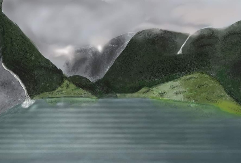
2. Sketching of General Forms: We begin by setting up our canvas and
navigation panel shows. The navigator is a
small window TO rate in which you can see a thumbnail
version of your painting. It will be especially
useful when we are walking while zoomed
in to our Canvas. Next, we learned
the horizon line, which in most cases
determines our islands. It will influence how we look at the ships in our composition. There are four,
how we draw them. We then welcome
to General ships. It is important that
you walk from general to specific when
sketching or painting. This will help you simplify complex shapes into easy ships. It will also help you set out
and balance the shapes in your composition so that they
walk well with each other. Establishing points
of interest is also something that we do
earlier on in our painting. This is so that we see
how the ships walk with one another and the
composition of a row, and we can make necessary
changes where necessary. My point of interest is going
to be the tallest mountain. The tallest mountain
peak in the background. Make it more straight. Upright. 98 appears in the original painting,
the time referencing.
3. Tightening up of shapes: We shall now reduce the opacity of our
generous ships layer. On a new layer, we're going to tighten up the ships who walked
on previously. Tightening up the
ships helps you make the composition
more readable. This stage helps us add a little more detail to the general shapes
in the composition. You should also use this stage to adjust
ships and move them around so that they match the composition
relative to each other. Feel free to explore
alternative designs to. At this stage, if you feel, if you feel like they could make your composition
more interesting, feel free to explore the
alternative designs as well. You can see I changed
the midground peaks slightly to appear different
from the original painting. Because I think this
is going to be more interesting than the
original composition since I'm going too late, it a little differently.
4. Ground Selection and Making Channels: When we are done laying down the general unpaid internships can make a selection and divide the composition into
three sections. We use the lasso tool to
create the background, mid ground, and full-grown
of the painting. Several selections in channels
section by clicking on the channels with a
specific selection active, and then clicking
on the mask icon, you can then rename the channel to any
name that you want. I kept mine with the same names I used when referring to the
position of the composition. This way, you'll be able to select them again when needed.
5. Base Color Blockin: Keep the lane walk on the
top layer at low opacity, 100 and textured brush
begin adding best colors. I use textured brushes from the start when painting
these realistic landscapes. As they help you build
detail from the start, which can be very helpful
when painting this way. Meaning when you're painting
realistic paintings, use the selections you made in the previous
lesson to help you walk much faster
and be more accurate, it is important to think about the color values at each
section of the painting. Therefore, even if you're
painting best colors, you need to worry
those colors so that light and shadow areas can
be clearly distinguished, as well as the general
forms of your composition. Keep the colors more desaturated as this will help
you later when you want to explore
different degrees of saturation for different areas. You want to build up the colors instead of
fighting them later on, building them up begins with desaturating the
initial best colors.
6. Background Mountain: We have added our
initial color blocks, but their ships
are still flat and undefined without the
help of the lane walk. Therefore, we shall begin by eliminating the
lane walk and walk on building form and details
into the composition. This starts with the
background mountain for which we are going to
zoom into the painting. This is why you should have your navigator window containing the small thumbnail of our
painting open to the side. It will help you know
whether the mock search you're making much
well with each other. During this detailing
odd form starting with clearly defining how light and shadow are
interacting with a mountain. Then with your texture brush. Break up those lightened
shadow families with the opposing values. For instance, in
the lighter areas are the few shadows and
contrast them with highlights. That this break
can create a rigid visual that will appear
as rocks at a distance. The same thing should be done with shadows, although
these tables, you should break them with light and contrasting
darker tones. Repeat this process until you achieve the
result that you want. Watery shall get into this
later on in the composition.
7. Red Midground Mountains: Wish our first work, some snow into the background
mountains that are actually behind the
midground read Mountains, which is helpful so that we avoid visible
cutoffs in our walk. Therefore, it seems pointless to paint something if you're
going to paint over it, but this is important in
establishing realism. You don't want to have
visible cards in your return. The line marks to carve out
the blocks for the midground. When doing these mixtures, a thick colors
you're selecting for the midground are more saturated than the
background mountains. This means you will have deeper shadows and
software highlights. Shadow in the background
mountains is later than the light in this
midground mountain. This will help you establish
depths in your painting and stop you from flattening out
your composition or making, making it boring and marquee, begin with the best
colors that give an indication of
light and shadow. Paint with broad strokes with an aim of defining the
general shapes first. And then when that is done, get rid of the ln, walk a game. Meaning just turn off
the linework layer. Repeat what we did in
the previous class, where you break up the ships
into contrasting elements. Maybe say mean, go to the
plains in the shadow, and then paint
some light values. They're contrasted
with deeper shadows. Shadow colors of the plate. Do this over and over again to create these
jagged landscape. Do the same thing for
the lighter areas. Remember, keep the ships lose ordinary add detail from your texture
brush at this point.
8. Resolution increment and adjusting affected parts: We started our composition
with the small canvas, so we need to increase
the resolution. For that. We go to Edit, then click on an image says, then change the
resolution to pick source or your
preferred measurement, and then just bump up the pixel dimensions after
which you click okay. You can also just increase the
resolution from 72 to 150. This is good if your
computer is slow like mine, but needs more detail in the later stages
of the painting. Doing this though, will
blow your painting. But for me, this
is an advantage of increasing contrast between what is in focus and what is not. Again, this is just a
hard, It's my technique. You can feel free to use
the Torah abundant it. Therefore, if you increase your canvas size and
or your resolution, you will have to
go back in and add finite details that
will be in focus. This is also the time to
vary the ship so beat. You are still painting using the same painting
techniques we use though, such as painting from
general to specific, breaking up the planes with varying color
variations and so on. Go back to the background layer and add more details as well. Unless you want it to appear
blurry in the final image. Keep zooming in and note to make sure that your values hold. Get the snot ready
for detailing.
9. Midground Mountain initial blockins: We're now going to walk on the midground mountains
that are in the IC shadows. It is a repetitive process of what we've been doing before. But for this lesson, we shall walk onto the
other midground mountain that has vegetation on it fast, would begin by making broad strokes of the colors that will make up
a given element. Feel free to explore as you set up the light
and shadow areas. For this mountain. I tried to increase
the contrast between this orangeish light and
the greenish shadows. I thought it was interesting and I wanted to increase that. So anything that you
find interesting, make your composition
highlight that part more. Yes, when you find something that you
like about painting, make it more dominant. As long as it doesn't break
the values of the painting. This midground heel is also more saturated than the
other two attribute in walking on before. As you can see, that the first midground mountain
even has a bluish driven, has bluish shadows, whereas this one has darker
greenish shadows. This creates depth between the two paintings
of the mountain, mountains and it introduces
atmosphere between them. The orangeish lights are also more saturated
and brighter. And the oranges, the midground or the background that you've been walking
on before this, these are things I need to do in order to create the
illusion of depth required to keep this painting more interest, more
realistic. Interest.
10. Detailing Midground Mountains With light and shadow: Once we're done with
the initial blocking, we are going to tighten up the ships as you
prepare to detail. This mountain. Detailing beat is
nothing more than a play of light and shadow areas
are on different forms. We shall also be using a
special leaf brush for this. You can find it in the brush pack provided
in this course. When using the leaf brush, you want to only pass highlighted leave
strokes where you have, where you have loved
patches of orange, and leave some greenish
areas to act as shadows. You will also have to use the leaf brush with a green shadow colors to add
bugs, some lost shadows. Very brushes to keep an even more interesting
composition, as you can see here. So you can use more than one
type of brush vegetation. To achieve this. Do not use one leaf
brush as it will make your walk
repetitive and boring. Don't forget to keep zooming
out of the canvas to see how well those colors
walk with each other. You can zoom in and out
very quickly by clicking Control Plus tab on
your keyboard and then dragging on the
section of interest, I did not flip the canvas March, but flipping the canvas is very important when
painting in general, I'll include a quick tutorial
on how to do that here. To add it should cut all
go to Edit button and scroll down to the keyboard
shortcuts under that, go to Image and
expand the options. Then scroll to where your sleep. You'll find flip canvas
horizontal and click on it. It will prompt you
with a textbox. I personally use
control plus F to flip my Canvas so you can input that or you can make
it whatever you want. Vary the intensity
of the highlights so that this will create
a natural light fall-off. These natural aid follow-ups
are very important in any realistic painting
that has late and shadows. They help you sell the image
and make it more realistic.
11. Miground further detailing and water blockin: We are going to
continue detailing the midground and walk
on the shadows as well. The same way we
did with a light, even in the shadows. Form is created by adding shadow and light areas to
the shadow planes. This is what I'm doing here. Each hill or mountain folds
in a certain value range. Even painting the shadows within shadows or highlights
within the ladies. This is important
to keep in mind. We shall also welcome
the water section in this tutorial to help move
our painting uniformly ahead. The water at this
section is just to blocking of the several
marquee colors. Don't worry much about it. When dealing with
painting water, your strokes have to be almost parallel to
the horizon line, although you can let them
down diagonally Azi, if they're pointing towards
a particular vanishing 0.1 to creating shadows
in the mountains section. Avoid colors that
break the value formerly of the shadow planes. By these same mean
you're painting should not have a
lot of contrast.
12. Midground Icy Mountains: We're now going to walk on the midground icy mountains
in this painting rate, after we add some shadows to this mountain with the eye CBT, we as parsing lighter blue marks over the bluish tone
to represent ice. Cold part of the painting. We can define some
rocks in the ice tool which will add interest to
that part of the painting. Break the monotony
of the ice with such rocks and shadow regions. We shall walk in the
surrounding rocks that aren't covered in ice. But make sure you keep
the values called. Making them bluish. This will help keep your
painting believable. You want to add things
that will help. So the fiddling that you're trying to portray
in the painting, this is why I added the misty beat at the
end there to show that this place is cold
even though elements seat in my reference image. The midst also
helps titles parts of the painting
together and gives us separation between that part of the painting are those
hills and the foreground. This is very important in creating depths on
your paintings.
13. Creating a rock texture brush: We're going to create
a rock texture brush from this photo. This is not composer, but I wanted to show
you what you can do about creating one or
how you can create one. We use a photo for many free stock site and
we need the rock beat. So we first crop,
then under Select. We'll go to Color Range
and then select shadows. The parts in white will be preserved while the parts
in black would be deleted. This is what I want, so I'll click Okay, and that will be my selection. Then I can create
a new layer and copy paste that selection there. Then I can turn off the previous layer that
contains a background, which will leave me
with a modified for auto detect now have to make fewer random lens so it has a Brush Preset and get it ready for use in the
upcoming tutorials.
14. Forwad midground icy mountains: When using the brush
we just created, it is very rudimentary and you might want to
make a few changes fast. But they love the Dana
museum that it's stamp mix. So use that to build the form of the midground
icy mountains bit. If you're using it to
paint over landscapes, you might need to fast change a few things in the settings to match the field that
you want to go for. Anyway, I quickly switch
to another texture brush, unwelcome that stamp
a little bit more to come up with an
interesting rock formation. This is just a play on
values in which we are establishing later
and shadow areas. But it is important to keep the value formula is
harmonious and close to those over the
surrounding landscapes or necessary surrounding
elements or the landscape. We can walk on adding
more light to the shadow. Italy either in the
other greenish mountain that you walked on fast. Stamping such a
brush and then using the stamp as a best
to define my form helps me achieve very
artistic results faster than e firewall to
build it all by myself.
15. Foreground Mountain and Flattening Mistakes: We are going to deal with
the foreground mountain and treat it the same
way we did to the rest. But before that, I'll
just add a few strokes to show the water
a little better. As I walk my way towards
a foreground mountain, Lynn make a selection
that will help me map out the silhouette of the
foreground mountain better. This mountain is
also going to have the most saturated colors as
well as the most contrast. This is because the
closer things are to us, the more detail we
can make out of. This difference. In contrast also helps in establishing
depth in a painting. Painting here, I'm trained
to use paint to create form. Although it is not
a very good idea. If you denote have
a general direction for the format you want to
create is a big mistake. You want to use. Lanes are
reading lines to show you the plains of the plane changes of the elements that
you're walking on. So you're better off creating
that would sketch marks as guiding blocks so that you can clearly define the forms
of the element you want. This method of painting without generally Teams
is okay when Dan, two elements that are farther
away from the camera, but when you do it to the
elements near the camera, it tends to flatten out
the element or the lake, in this case the heel as you, as you will see in my painting, and it makes it much
harder to correct.
16. Design Definition of Foreground Hill: You can see the
time struggling to establish my shadows and lights, something that I would've been that would have
been clear and easy. You've had fast tried
to study the form. Another issue that flattened lot an image is having a hard cut. Silhouettes. In realistic paintings that seem out of place by
hard cut, I mean, using the selection tool and mapping out using
those hard edges. In nature, nothing is
a very straight lane. Similar to what you might get when you use the lasso tool, what I should have done instead is to make
the edges a bit fuzzy so as to soften
out the field. Another mistake that makes
the images flat exert. You use the same
shadow values to define all the different
shadow planes. You must vary the shadow and light intensity if you want
to create believable ships.
17. Further foreground detailing and water blockins: I'm going to begin
taking steps to cover my mistake by creating a few shadow variations using the curves
adjustment layer. This requires me to understand how the light is interacting with a rock and how I can use that to define
the forms better. I use a curves adjustment layer while walking on the mask. To introduce these
shadow variations. I also added these bushy trees to soften some parts
of the heart age, as well as the vegetation. The vegetation also
helped to soften. Those had ages to break up that line that doesn't
exist in nature. I'll leave it for the meantime
and walk on water as well. A bit more just to introduce some contrast into it before
we insert the reflections. When using a hard
brush on water, let it be a flat brush that
tangent to the surface.
18. Last detailing and color corrections: We shall continue to vary the shadows in a
mountain region, as well as the late regions. This will help us remove
that effect of being flat. We then want to add
details within, want to detail the water
by varying the colors, adding repos and
then reflections. Remember to flatten out the
brush that you're using. You want the water to have
a smooth finish fast. Before you add the
repos and reflections. The repos must appear to C2
on the surface of the water and they should be lighter
than the rest of the water. You will get the feel for
it the more you do it. Don't worry much about it. Then to make the reflections, you are just going to use the selection tool to
copy one of the hills. You will select and copy it
into a new layer and then rotate the layer
so that the image appears upside down
to its original. Then you can hide the
layer using a mosque. Soft brush, paint some parts of the mask back to
reveal a selection. If it is too in terms
lower the opacity as well. With that, you will have created a pretty convincing water
reflection linearly. You want to apply color adjustment layer to tie all the colors of the
painting together. You want to apply a curves adjustment layer
to increase the contrast, as well as correct the
white balance of the image. Experiment with color
adjustment parts until you get what you want. And with these
image is complete.
19. Outro and Course Project: This course has been sped up
to make sure that I cover all the important topics you need to become good at painting. Your task now should be to paint using the ideas
we've talked about. Feel free to revisit
the lessons for those areas that have not
that may have been too fast. All that you have
not understood. Do not Photoshop,
brush or much paint. You can create your
own brushes door, as we've done in this course. Remember, this is
a study that is meant to help you understand
foam building color, harmony, composition and so on. So when you're comfortable
with the work, I have lived at predicting the description that
you can consider doing. After getting it done, please post your work
here so that I can take a look and give you
feedback where need be. And those students will
also be able to help you. With helpful
feedback has worked. My socials for art are gems
at James and as core is KG on Instagram and James
psychomotor on YouTube. That is it for this course. Please share your
feedback as well so that other students can
know whether or not his course will
be useful for them. Your feedback will also
be very helpful as they walk on posting
more courses. So please let it be genuine. That is it for this course. Thank you for watching.
 James Ssekamatte, Freelance artist, Writer and Engineer