Transcripts
1. Class Overview: Hello there. Since you're watching this, I can assume that
you're interested in learning digital
anaemic coloring. You might have even
tried it before, but maybe it felt too
hard or too confusing. So you couldn't quite
get the results. You want it. Don't worry. I've been there to. My digital artwork is very
bad when I first started, but with time, I learned new techniques and
practice them. So my art improved a
lot over the years. And let me tell you, you
can do that as well. Digital drawing is a skill
and anyone can learn it. All you need to do is to learn
and understand the basics. And from there onwards, you can go on your own
improvement journey. This course will
help you acquire those very basic
concepts of digital drawing through
learning how to choose your canvas size,
understanding layers. There are more than features
and how to manage them. And learning techniques that can escalate your
drawing process. After that, you'll
learn how to create a complete character
artwork with a detailed explanation of
the core steps of sketching, doing the line art,
adding the base colors, painting the shades
for the skin, eyes, hair, and clothes. And then finalizing your
artwork with color adjustments and background of the
sounds exciting to you. Join this course to advance your knowledge of
digital coloring, I look forward to
seeing you there.
2. Introduction: Hello everyone and welcome to this course. Allow me to introduce myself. First of all, some of you might already know me from my YouTube channel or my animal drawing for beginners course. But either way, I'm cluvious, a self-taught anima artists have been practicing digital art for more than 10 years. And along the way, I learned so many centuries that simplify the digital drawing process. So in this course, I want to deliver it to you what I've learned through the years in an organized way from the very basics. So whether you're just starting out with digital art or have been practicing it, but feel like learning new methods, you'll hopefully find something useful to learn here are perhaps use it as an inspiration to try new techniques. As this course focuses on digital drawing, to follow up with the lessons and being able to apply them, you would need to have a graphics tablet if you're using a computer. Or you can also draw on your phone or mobile tablet. A few prefer to choose whichever digital device that feels most comfortable to you. This course is divided into two main sections. The first section, we'll introduce you to the basic concepts of digital art and the software features. And the second section we'll be going through the creation of a character's artwork from scratch delivery and the software I'll be using in this course is Paint Tool SAI. Why Paint Tool SAI, you might ask the simple answer is, is the main software I used throughout my digital drawing journey. So as the one I'm most experienced with, but to give you more details, psi is a very user-friendly and simple to use software, so you can get used to it very quickly and in return, feel comfortable with digital drawing and very little time. It's also a very low in size, so it doesn't consume much memory and can be run on most Windows computers. If not all, it also has a 30 days free trial, so you can test it before deciding whether you want to purchase it. It will still work after the trial period is over. However, you won't be able to save your files. But the good side is that you'd still be able to use it for practice, by the way, as a disclaimer, I'm not at all affiliated with Paint Tool SAI in anyway, and my recommendation of the software is purely based on my own opinion and experience. One thing to note, though, psi only works on Windows computers. So if you have a Mac or are using a phone, you would need to use other softwares or apps. In that case, I would recommend going for aerospace for Android devices are muddy. Bank paid for all devices, since both are free and easily attainable. But honestly speaking, I've only used them a few times. So I can't give much advisor and put about them. By the way, in this course I used Paint Tool SAI version 2, since my screen is big and Version 1 of psi doesn't work well with it. As you can see, that X n items are too small for you to read, unlike site to which is more compatible. If you have the license for psi 1, you can upgrade decide to for free anytime. However, if you feel more comfortable using psi 1, you can still stick to it because I mostly won't be using psi2 features in order to keep this applicable to everyone. Now with that said, for the introduction of this course, that is all I wanted to mention and clarify. You can now proceed to begin your learning journey. Let's get started.
3. Canvas Size & Resolution: To do digital art in the right way is essential to understand the importance of canvas size and resolution. Drawn on screen is different from drawing on paper. You're drawing might look very big on one screen, but one display it on another device are printing it. It might look so unexpectedly small and this can be very frustrating. So before I'm creating a digital artwork, understanding how to choose the right canvas size is super important. It might look a little confusing at start, but the concept behind it is very simple. I'm now gonna go into technicalities. I'll just explain it to you though. I understand it. We have two key points to understand. Canvas size and resolution. Let's first start with resolution. The way I understand resolution is that it's about the number of divisions of the canvas. A high-resolution Canvas would have a lot of divisions are squares. In other words, a high number of pixels, while a low-resolution Canvas would have less divisions and therefore a low number of pixels. Of course, the more pixels we have in a canvas, the higher-quality would be. So it's better to always go for a high resolution. I usually go for a resolution of 300 DPI or dots per inch. Our artworks, because that's the minimum resolution for high-quality print. A good resolution for printing is between three hundred and six hundred DPI. Yes, you might not be aiming to print your artwork, but you never know one day you might want to. So it's better to always work on equality suitable for printing. Besides, you can't scale up your artwork actors than it would lose the quality. However, the opposite is possible. You can always scale down your artwork to a smaller size without affecting its quality. So better always be safe than sorry. Let me show you an example of how resolution affects quality. We have these two pictures. They're of the same size. Both are five-by-five centimeters, but the difference between them is the resolution. The picture on the left has a resolution of 300 dpi, while the picture on the right has a resolution of 72 DPI only, which is the usual resolution of screens. This picture is zoomed in just for the sake of comparison. But you can see over here that the actual size of this low resolution picture is this small. So the picture on the left has a higher number of pixels because of its higher resolution, and therefore, it's of high-quality, unlike the one on the right. So now that you understand how resolution matters, choosing a canvas size should be very straight forward. When we want to create a new canvas, we go to File New. And then this little window will appear. We mainly care here about these three boxes with height and resolution. The best way I've found to choose a kava sizes to base it on real-life measurements rather than pixels. So over here, I will choose my unit to be centimeters and then set the size I want. Of course, you can choose millimeters or inches as well, depending on what you prefer. I avoid choosing pixels as my unit because changing the resolution would not be effective at all. Notice how in my years is pixels and I changed the resolution. The width and height of the canvas do not change. However, when my measurement unit is a real life measurement like centimeters, and I changed the resolution. The corresponding pixels of width and height change as well. The higher the resolution, the bigger they become. What I usually prefer to do is to draw an an, a for canvas size with a resolution of 300 or 350 dpi. I can choose this from the safe templates over here. But in case you don't have it, you can just type in the measurements yourself. An A4 size is 210 by 297 millimeters. And pixels, this would correspond to 2480 by 3,508 pixels. If you're looking for a different paper size, like letter, for example, just do a quick search on the internet and find out the measurements. Then manually type them in. In case you're drawing software doesn't have their resolution settings. Don't worry too much about it. He can use these pixels for an A4 size 300 dpi canvas are, as a general rule, I would say, safe to draw on the canvas size of 2 thousand by 2 thousand pixels or more to ensure that you have a good quality result.
4. Layers: Doing digital artists mostly requires making use of layers. Unless you're aiming to go for a painting style on one layer, it's essential to use multiple layers for creating your artwork because it will make your workflow much easier. And there is, as the name suggests, a sheet or a slice of your drawing. You can divide your artwork on multiple layers to ease the process of drawing and coloring. For example, in my artwork here I have the line art of the drone on one layer, the hair on another layer, eyes on another, and so on. If we look at an exploded view of this art work, we can see how those layers are slices buildup to create the final image, starting with the skin colors and going forward with the elements until we have the line art at the very top. Of course, this is a simplified version. Since I merged, the shading varies with the base color. Wants to show you an overview. Bye throughout creating my artwork, each of those sheets was done on a separate layer. As you can see, since there is Come on top of each other, they cover the price that are below them. For example, see how this can is crossing the borders of the line art. However, it doesn't show on the end result. That's because the skin is covered by the hair and address. So in the final image, everything looks in its right place. There's can be renamed, rearranged, combined into groups, and much more. Learning how to manage an art learners in an optimum way would make your digital drawing process so much easier and smoother. So do allocate some time to understand them. They're super simple to use. But in case you feel overwhelmed with this information, don't worry, we will talk about all those details one by one in the coming lessons.
5. Raster & Vector Layers: There are two types of fairs and Paint Tool Sai, normal layer and line work layer. In other words, raster layer and vector layer. And normal layer as a raster layer because it's defined by pixels. So resizing it, especially to a bigger size, their grades is equality. While a vector layer is defined by path. So resizing does not affect the quality the slightest. You can do more reading on these two dice to understand the technical concept behind them. What we want to keep things simple here. So the main take from this is that you understand the difference between them in terms of quality. As you can see here, we have the same I drawn on a normal layer and the line work there. But after resizing both layers, the normal layer and losses quality while the line work they're retained it, it's important to understand that the work we do when we draw is on raster layers. That's why choosing a big canvas size is essential to get a good quality result. Because the final result is a Raster image and can't be resized. As for a line worker or a vector layers, I personally rarely used them in my drawings, but they are very helpful in drawing straight lines, curves, and the likes. Some artists use them to do the line art of their artworks. Work there is can also be used with a mouse. So they allow artists who don't have a tablet to draw decent finds despite using mouse to create a line work there, click this button here. Once you create it, you will see a set of tools specific for this kind of layer. N is used for a free hand drawing. Eraser is for free hand erasing. Weight is used to change the thickness of the lines. You can choose the size of the address you desire from here. Then click on the line to change it. Colors used to change the color. Just pick your color, then click on the line to change it to edit is used to modify the lines, like for example, moving or deforming the control points. These are useful tools in adjusting the lies you have already drawn. If you're interested in using line work, there's take some time to explore all these options. Then there is a pressure tool is very useful for manually adding pen pressure. To use it, click on the control point and drag them off to the left to reduce the size or drag it to the right to increase the size. The cell pen is for freehand selection. And the salary laser is for freehand selection erasing. Then there's the Curve tool used to create curvy lines. It's a very useful tool for mouse users to create a line art. And finally, the straight line tool to draw straight lines. Of course, you can still adjust those lines with all the tools we explored earlier. By the way, normal layers cannot be converted into line work layers. While the opposite is true. To convert your line work there into a normal one, click on your line work layer and go to layer than rasterize. Now it's a normal or raster layer. Keep in mind that not all drawing softwares come with vector layers. They all come with raster layers as a default. But despite that, I thought it's important to explain this for you so you understand the difference as I think it's a core concept that every digital artists should understand.
6. Layer Clipping & Transparency Lock: Two very important linear features that you need to know as a digital artists, are there clipping and transparency luck? He might ask, what's the use of them? Let me quickly show you why we need them. When you've set out your base colors and want to start shading next. If you just color on top of the Larry, if just painted, you'll end up crossing the borders of your lines unless your exerts so much patients and time to get it right. So how can you easily color without crossing the borders of the lines, or rather the borders of the base colors you've already inserted. This is where they are clipping and transparency a lot come in handy. Using them allows you to color with peace of mind without crossing the borders. Let's explain their concept using a simple circle. Let's say I want to share the circle without crossing the border. I can do this in two methods. The first is layer clipping. In this method, we add the shapes on another layer than a clip it to the layer below it. In paid toll psi, it's called the clipping group. So when I take this box here, my shapes layer gets a clipped and all of the shapes stay within the layer beneath it. You can clip an unclear layer anytime. So the order of your actions is irrelevant here. This feature and different names based on the software you use, like clipping mask or just clipping. It should be easy to spot. The keyword you need to look for is Eclipse or clipping. The second method is transparency look, basically shading on the color and air itself. Why lock in it? So we don't Cross its orders. In Paint Tool Sai, This is called protect opacity are preserved opacity, you must look transparency before you start coloring. Otherwise, your shapes will stay the way they are outside the borders and you would have to manually erase the extra parts. So to use this feature, we activated by clicking on this button. Now that layer is locked and we can shade a freely without crossing the borders. The advantage of this feature is that CSU color on the layer itself. You can blend colors and go for painting style if that's what you prefer. This feature as well, comes under different names depending on the software you use. Sometimes it's called luck transparent pixels. Other times is called protect alpha or alpha lock. Their keywords you need to look for are lock, protect, and alpha. Now that we've learned how to use them, let's go back to the sketch from earlier and try to shade again while enabling them. See how shading got so easy. Now.
7. Opacity & Layer Modes: Two other important features of layers that you need to be aware of, our capacity and layer modes, which are sometimes called blending modes. Let's first talk about capacity. When you stack layers on top of each other, they are all opaque by default, meaning that you can't see what's beneath them unless you disable them. This is where opacity comes in handy. Layer opacity is basically the transparency of the layer. It ranges from 0 to 100%. So a layer with an opacity of 100% is opaque and the layer of an opacity of 0% is completely invisible. Anything between 0, 100% makes the layer transparent and you can see what's beneath it. So a layer with 50% opacity is half transparent. The higher the opacity that less transparent than there is, and vice versa. Now let's move on to layer modes. They are modes allow you to blend your current layer with what's beneath it. All layers come and normal mode as a default. But when you click this arrow, you can see a drop-down box that shows you all the other modes. Paint Tool, Sai version two comes with more moist than version one. But be assured that all the almost we will use in this course are available in version one, which are basically the first six on this list. And if you're using a different software, don't worry, every decent drawing software comes with similar layer modes. Let's explore these. They're modes admit duplicates of this sketch of my character. And I'll be using this violet color with different modes on each copy. So you can see and compare the difference between the modes. This is how it looks like in the normal mode. The layer here is completely opaque. I won't go through all their moods, but I'll show you my most favorite ones. They're the ones I used repeatedly in most of my artworks, starting with the ones that add brightness. My most favorite one is shine, sometimes called add or glow or luminosity. It adds a high saturation glowing effect. I mainly use it to add highlight sunlight reflection on hair, eyes enclosed. The second brightness mode to screen. It adds a gentle, desaturated kind of highlight. Sometimes it's useful to add the hint of another color. Next, there's overlay. Overlay doesn't really add brightness. What if more like colorizes what's beneath it, as you can see here, her hair became more purplish because of it. Moving onto the last two multi-use, these ones, add darkness. The first is multiply mode. It adds a desaturated kind of darkness. And lastly, shade, or sometimes it's called Linear Burn. It adds the high saturation kind of shape is very useful in making your shapes dark and of high contrast. So these are my favorite and most used layer modes. If your software has more of them, feel free to explore and play around with them. You'll be amazed with the cool effects they can produce. Playing around with capacity and their most as I think we'll do a lot later in the course. So keep them in mind. They're super fun and we'll make our artworks look really nice.
8. Layer Management: The last layers related thing we're gonna talk about this layer management. In other words, setting the layers in an organized way to make your workflow smooth. There are two things that can help your layers stay organized, naming them and combining them into groups. Both are very simple and straight forward. To rename a layer, simply double-click on it and type in the name you want. Always name the layer based on this content. For example, rename the sketch narrative, sketch, line art layer to line art, hair color and air to hair, and so on. Throughout the upcoming step-by-step lessons, I'll show you how I renamed mine as further groups. There are, as the name suggests, a group of layers. You can combine layers of one category into one group. For example, in the full artwork, I always have a group for my line art layers, a group for character colors. I grew for background elements and so on. You will see that as well throughout the lessons later. To create a group, click on this button. You can either directly create a layer inside the group by clicking on the group and creating a new layer. Or you can simply drag there is you've already created inside the group. Groups are pretty much like layers. You can rename them, reorder them, change their mood, clip them, lock their transparency, and so on. You can also clip layers as well as groups to them. The possibilities are plenty. So feel free to explore.
9. PaintTool Sai User Interface: Let's get to know that being Tool Sai user interface now, it's a very simple and user friendly one. But before that, I want to remind you once again that this is Paint Tool Sai version two. So you will see some difference from the original version because many features were added with the update. Again, he can upgrade anytime to version two or you can just stick to version one. Either way, I'm skipping all psi two features to keep it applicable to everyone. The user interface of psi can be divided into five components. Menu bar, quick bar, navigator, and there's panel, colors and Tools panel. And finally, the view selector and status bar. I won't explain every single detail an option in those components now because there is no way you'd return all this information at once. But I'll be introducing them as we need them throughout our progress later. So don't worry, you'll get familiar with them easily that way. For now, I'll just give you an overview of them. The menu bar has the options for file management, editing the canvas layer and selection editing, color correction filters and other options related to canvas view and window customization. The quick bar, as its name suggests, has a quick options for adjusting the canvas of you, like zooming in and out, rotating the canvas and flipping it. It also has the undo and redo buttons. This panel has the navigator. It shows us a thumbnail view of your canvas as well as the view adjustment options, which are just like the ones in the quick bar, except that you have more freedom of firing them. And down here we have the Layers panel. We discussed layers and most of their options and features are in there. So I won't get into them again. If you missed that, make sure to watch the previous lessons, to know how to use them. On this side, we have the color and Tools panel. This is the panel that we will be using the most. The top part shows the color options. It shows the color wheel by default, but you can also show and hide other color picking options like RGB sliders, hue saturation value or HSB sliders, color and mixers, swatches as scratchpad. Personally, I mainly depend on the color wheel, but those options can be very useful as well. So feel free to explore them. This section here contains tools like rectangular selection, lasso tool for freehand selection, magic wand tool for specific areas selection, Move tool to move your objects around. Zoom, rotate and hand to freely adjust your canvas of you. And the color picker to pick colors freely with. We also have the foreground and background color. The color on the top is the foreground color and is the active color that will show up when you use your tools. This little button over here is so tiny, it's so useful. It makes all your tools transparent. In other words, your tools would turn into an eraser. You'll see later how useful that is. Next, we have the Drawing Tools box. This box is fully customizable because you can add your own tools, rename them, and delete the ones that you don't want. When you click on age tool, you will see is corresponding settings in the vicinity here. You can adjust all kinds of settings here, like opacity, pen pressure, brush hardness, shape, size, and more. He'll can't understand these options as we progress through the course. Finally, down here we have the view selector and status bar. On the left side you can see all your open files and switch between them. And on the right side you can see the memory status and drive usage. Basically how much free space you have left on your drive. Any error message would show up here as well. So pay attention to it to avoid running into trouble. One last note I want to mention is that you can adjust where the color and there's panel appear by going to Window than playing with these two options here. You can have both panels on left, both on right, or one on the left and one on the right like mine, are reversed. Feel free to choose what suits you best.
10. Keyboard Shortcuts: One way to make your digital drawing process easier and smoother is making use of shortcuts. Implementing shortcuts can save you so much time and effort while doing digital art. There is more than one way to set shortcuts. For example, you can make use of the Express keys that come with your tablet or your tablet. Penn might also come with its own customizable buttons, or you can set shortcuts using your keyboard keys. The latter method is the one I use. I'm very dependent on keyboard shortcuts. I have shortcuts set for all of my tools like pens, brushes, razors, Paint, Bucket, selection and all. And I totally recommend you implement shortcuts in your workflow as well. Chart because our personal, so feel free to set them up the way you want. There are two ways you can set them up in pain tool PSI. The first is by double-clicking the tool you want and simply typing whichever key you prefer. And the second and main way is by going to other than shortcut keys. On the left side of this window, you can find all the keyboard keys available for you to use as a shortcut. And on the right side you can find the different tools or tasks that you want done. So the way to use this is simply scroll down the keys, click on the key you want, and then choose the task from the right side. For example, I'll scroll down to the old key and assign an arbitrary task did like switch transparency for example. I'll do that just by clicking on the task. Feel free to choose any option are tool you want as you wish throughout the course. Whenever I'll introduce a tool, I'll let you know which keyboard shortcut I've assigned to it in case you want to follow my example. By the way, one last note, make sure to scroll to the F key here and remove the transfer painting to next layer are transferred down depending on which version you're using, you're moving this task will save you so much unnecessary trouble later of merging the wrong layers unintentionally. So to conclude, gif keyboard shortcuts, sometimes you set them up and you want to regret it. They will surely save you a lot of time and effort on the long run.
11. Steps of Drawing Process: We can break down the process of creating an artwork into a number of main steps. These are the steps that will be following throughout the course as well. Now and then we'll help you in understanding how digital artworks are generally created. The first step is sketching the base, laying out the race of the pose or gesture outline of the character you are about to draw helps a lot in getting EarSketch right. After that comes the sketching phase. Sketch out your character with all of their details while following the ratio just sketched. Of course, you can skip the sketching phase if you choose to do your sketch traditionally on paper and then scan it to color it. After you're satisfied with your sketch, you move on to do the line R so that the drone looks neat and is easy to color. Once the line art is done, you paint the base colors for each part on a separate layer. Your artwork will look pretty flat at this phase, some artworks are left in this phase though, depending on the artist's preference. But you can add dimension to your character in the next phase by painting shades and lighting. Personally, I find this part to be the most fun. Lastly, you ask some touch ups of color Corrections, FX, and little details here and there to finalize your artwork. Of course, these tests are not a set of rigid rules. Every artist can have their own approach and the possibilities are countless. The steps we discussed are just the most common way to create a digital artwork. And also the simplest to understand.
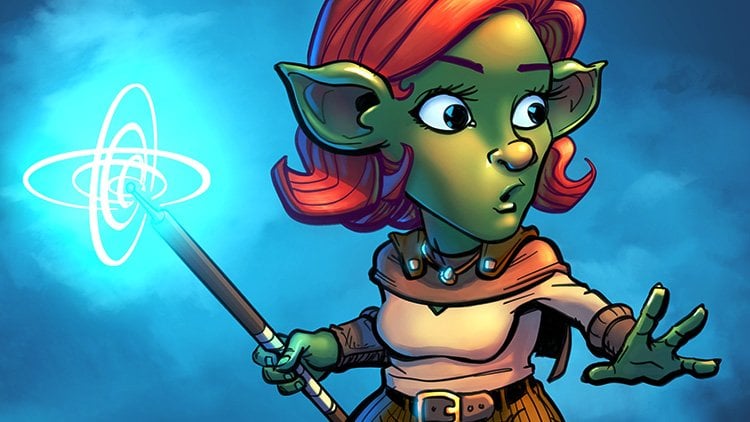
12. Artwork Creation: Sketching: Alright, it's finally time to start the artwork of this course. This lesson we'll be covering the sketching phase as this is not a drawing course, but the coloring one. I won't be explaining how to draw the characters. However, I'll be showing you the tips and tools that you can use to make your digital sketching process faster and smoother. You can use any brush of your liking to sketch. But I'll show you the one I usually like to use. It's one I made for myself. That's a pressure sensitive and easy-to-use air brush with a sketchy texture. If you'd like to create a tool similar to it, right-click on any empty slot in your tool's box. Click airbrushed, change the brush hardness to the following. Change the minimum size to 35% and the density to 75. Click this drop box here and choose Breton noise texture. Then click on this button here and check the display density control assist box set amplify density to 100 and slightly reduced this handle to somewhere around 85. Finally, double-click the tool to change its name and shortcut. I called mine sketch and said the F key as a shortcut. If you're using Paint Tool Sai version one, these are the exact settings of the tool. Just adjust them like the picture and you're good to go. Alright, let's open a new canvas by going to File New the size and resolution that you want. I'll go for an A4 size with a resolution of 350. I prepare this 3D model in advance using design or software, and I'm gonna use it as opposed reference for this sketch I'll draw. It's always a good idea to use a reference for the artwork fueled draw because it will help you get a more correct result. So I'll go ahead and start sketching the basis of the poses. I usually like to use a blue or pink colored during this phase. But of course, you can use any color you want. It's a personal preference and totally unimportant at this stage, the first step you can apply to make your sketching faster is to set the shortcut for the Eraser tool. I said the shortcut of my eraser to the 0x0. So now as I'm sketching, I keep switching between the F key for the sketching brush and the Iike for the eraser. It might look like a trivial step, but it actually saves you a lot of time on the long run. The next useful tip is making use of the selection brush and selection eraser. These two pressures are just like oppression eraser, except that when using them, you'd be making a selection of the area. You can simply add them to your tools by right-clicking on an empty slot in the toolbox, then click on selection pen, double-click it to change its name and shortcut. I keep mine called self pen, but I said the S key as a shortcut for it. I also take them inside checkbox to enable controlling size with Ben pressure and I make sure the density is set to 100%. Similarly, right-click on an empty slot again and choose selection areas, or this time, double-click it to change his settings. I kept the name as it is here as well, but said that leaky as a shortcut here as well. Dig them insights checkbox to enable Ben pressure. Now you can easily press the S and D key to quickly select and deselect with a brush. Once you've selected your area, you can press Control and T to move or transform your object. The transformation option is under their marquee tool over here. You can see different operations here, like free form, resize, deform, and rotate. But personally, I think that the free form operation is the most useful one because you can do all the other three operations here. Once you are done, press the Enter key and then control plus D to Deselect the selected area. You can also flip this elected area from the button's here in the manner that you prefer. You can flip the canvas horizontally from the button up here. Doing this is very helpful in spotting mistakes that you might have missed in the Normal view. So it's a good thing to keep in mind to flip your canvas every now and then while sketching. Since I'm sketching to characters, I decided to first sketch them on two separate layers. So I created a new layer to draw the second character on it. By the way, another very useful transfer operation is a deform one. You can either choose it from the options or you can just click the Control key. While on the free form option all the control key and drag the points to freely transform your sketch in the way you see suitable. Again, press Enter or this OK button here to apply transformation. You can deselect as well by being on the marquee tool and clicking anywhere on the canvas. By the way, I set the W key as a shortcut for the Marquee Tool. So every time I select something, I can just press the W key to go to the transform options. Or of course, most of the times I just press control plus d to quickly activate transformation. I'm gonna change the color of the second character's sketch to pink to make it easily distinguishable from the first one. I love the transparency of the second character is layer. Then using the pen tool, I'll paint over it with a pink color. The Pen tool on using is left in its default settings, but I have the n key set as a shortcut for it. I usually use the pen tool when I want to pay something in a solid way without mixing it are blending with other colors. We'll talk more about it in the base colors lesson. You can also do a free selection with the Lasso Tool over here. You can use it to outline the area that you want to select. I don't use the lasso tool much so I don't have a shortcut for it, but feel free to set one if you'd like to use it a lot. You can move your selected region around using the Move tool. I set this shortcut to the Qx Qy. And as I mentioned earlier, you can also move it with the transform operation when it's active, choose whichever suits you best. But generally speaking, the Move Tool is good for quickly moving stuff around without having the Transform tool activated. The Move tool can also be used to move the whole layer or group throughout the canvas. Now that the basis of the characters are almost complete, our crop the canvas to have it surrounding the characters properly. I'll select the area that I want using the marquee tool. Then go to Canvas, then trim canvas by selection or crop, depending on the version you're using. Don't forget to save your Canvas so you don't lose the progress you've achieved so far. You can save it from File, Save name your file, and make sure that the file type is set to psi or psi two. Again, depending on the version you're using, I'll adjust the positions and sizes of the basis one last time using the transform unmoved tool. I'll also areas intersecting parts, then merge them into one layer. Also, I'll change their color with another method. Now, basically, I'll create a new layer and eclipsed by clicking on clipping group. Then use the Paint Bucket tool to fill the whole layer. This way, the color covers everything in one goal. The colour can also reach eight using the pen and transparency lock method I showed you earlier. Now I'll start sketching the details of Y2 characters. I'm going to sketch them on the same layer of the base, but you can create a new layer and have your sketch on it. Of course, merging the layers and changing the colors. And all those steps are personal. So feel free to do them the way you want. This is just my way of doing things and its recent. Every now and then I change my procedure. So there is no one set way. What matters is that you grasp the overall understanding of the procedure and practice using the tools. And you'll find that with time, you'll come up with your own combination of process steps. And of course, if you feel more comfortable drawn on paper, you can skip all of the sketching step and draw on paper instead. Scan your artwork or photograph it and directly jump to the line artist step, which we'll be covering in the next lesson. Since I'm not telling you about the tips for sketching and let you watch the rest of my sketching process. Also, I totally suggest you search for drawing time lapses or speed pain videos online by multiple artists and watch as many as you can, since they'll help you pick up a new tips and tricks and also serve as an inspiration to your works. You can do one extra but optional step before moving on. And that is decided on the colors of your characters. Create a new layer and move it to the lawyers sketch, roughly painting the colors. At this point after you're done, you can say that you have a rough draft of your final artwork. Make ARAF draft is especially helpful when you're drawing a scene and want to blend your character with the scenario or the background behind them, which is outside the scope of this course as we will be making a simple design background. But it's a good thing to know about this stuff for future reference. I might highly likely change those colors yet again later, but there are good base pointer referred to. So with this, we can say that the sketching basis W1, time to move on to the line art.
13. Artwork Creation: Lineart: It's time to do the line art now. But before that, let's have a better understanding of the tools. What tools to use for the line art. You can literally use any tool of your preference. For example, we have the pen or pencil, we have the air brush, like the sketch tool we created earlier. You can still draw the normal airbrush tool if you want to have a very smooth line art. But the one I mainly like, it uses this brush tool. As you can see, the difference between those tools is mainly in terms of their size and density. For this tool, I set my minimum size to 50 percent. The minimum size of the brush is the size you'll get when applying a minimum pressure on the pen. Let me enlarge the brush to show you clearly what I mean. So now when I first press, I'll only get 50 percent of the size of the brush. And the more I increase my pressure, the more the size will increase. And thus what the minimum size setting as far as for the density, it's basically the transparency of the tool. So reducing it reduces the capacity and increasing it increases that. So for this tool, I go for around 80 percent density. The minimum density setting is just like the minimum size one, but in terms of transparency, so setting it to 50 percent will give me 50 percent starting capacity. No matter how lightly I press on the pen, I usually set this to 0%. However, as for blending, dilution and persistence, these settings are mainly for the painting kind of coloring style, but I'm not going to use them because I don't do that style. Feel free to explore there if you're interested though. We also have more settings over here for adjusting pen pressure settings. Personally, I don't use most of these, but the one I may only care about is this one. The press hard, soft brush size, the bigger the number you set, the easier the lines would come out with lightly pressing. The smaller it is, the harder you need to press F4, the line to come. I sat somewhere around 80 percent. So it's not so hard and not so soft either, somewhere in the middle. So this is the tool that I'll be using for the line art part. Feel free to create your own tool. Or you can recreate this tool by right-clicking on any empty slot and choosing brush, then modify the settings to the ones I just showed you. By the way, I use the V keyboard shortcut for this two. Alright, so time to move to the line art process. But before starting, let's clean up the layers a little bit. Usually I don't pay much attention to the organization of thirds while on the sketching phase. But starting from the line art on words, it's best to keep everything organized. Include understand. So I'll merge the color layers together and call them rough colors. And I have two copies of the sketch. I'll give the final one only and rename it to sketch and delete the other one. Then I'll make a new group called the sketch and drag both of them inside it. I'll hide the colors layer now because we don't need them at this stage. Now we can just reduce the opacity of the group, or we can instead create a new layer, clip it and using the bucket tool, fill it with a light color like baby pink or blue. This would make it easier to do the line art, sketch with and get in our way. Now I'll create a new layer and call it girl line art. And I'll create another one for the guideline art. And I'll put these two in a new group and call it line art. I made two layers for the two characters, because when you have multiple characters, it's better to have each one's lines on a different layer. One last thing before starting, I want to explain one more useful shortcut while doing the line art and coloring, which is the pen tool. If you hold the Spacebar button, a hand tool will show and with it you can pan around the canvas. This is very useful for easy navigation, especially when you're zoomed in. You can also activate the pen tool from the button over here. But I prefer the space bar because it's quicker. As for the line art color, feel free to choose any color of your liking. You can change it anytime she doesn't like it later. Personally, I don't like going for a solid black color except when I'm doing a black and white artwork, I usually choose my line art color from this location, among these colors, from purple to blue, depending on the tone of the artwork. If I'm going for a warm tone, I pick my color from this range. And if I'm going for a cool tone, then I'd pick my color from this range. Generally, I like to go for violet as it's in-between and this time as well, I'll choose violet. So let's start lining. I'll zoom and rotate the canvas as needed when working to make the lining process moved from my hand. As for the size of the brush, I never have a certain size that I pick. I just tried to go for our size that's close to the sketch. So it does multiple sizes until I find the one I prefer. So for this artwork, I'll go for a size six, lining your artwork. Avoid doing slow strokes while pressing heavily on the pen. Instead, keep your hand light and do fast strokes. Since the toddlers surface is a little slippery, it's very normal to keep undoing and redoing until you get the lines right. That's why usually while drawing, my other hand is always on the keyboard ready to click Control plus z, which is the shortcut for undo. You can zoom out to see how your line artists coming together. I felt that the Allies were too narrow, so I'll manually add some thickness to them. If you want to see how your line art is doing without having to zoom out continuously. You can go to View and then New View. Click the restore button and arrange the two views as you prefer. I usually keep the zoomed out view on the right side while drawing here on the left side. Now I can see what I'm drawing immediately without having to zoom out. When doing the line art is necessary to practice varying the pressure on the pen. My current method is I start with high pressure and release it as I draw. Or you can also start with low pressure, increases in the middle, then decrease it, whichever works for you. Line art needs patients and a lot of practice with time, you'll see that you will get better. Two important steps here. The first is to make your line art more appealing and just the thickness of the lines in some parts, especially those where there is trunk cheating like under the hair and in the corners and so on. The second tip is when you are drawing details inside, reduce the size of the brush. This adjustment in variation in their brush size makes line art look more interesting. By the way, the shortcuts for changing the size of the brushes by default, the two square brackets. The left one is for reducing the size and the right one is for increasing it. You can vary the thickness of the lines after you're done with the line art. But I prefer to do it on the go, so I don't forget about that later. So basically, I'm going to keep repeating those steps over and over until I'm done. Feel free to flip the canvas, rotated, zoom in and out. Those navigation tools are there to help make it easier on you to draw. When you want to draw lines that overlap with those you've already drawn, just create a new layer. Draw those lines than areas, the overlapping parts from your original line art layer. After you're done, click Merge Down button. So you merge the two layers and continue the lines on one layer. As for the face, I usually like to draw it on a separate layer. So I'll create a new layer, rename it to girl phase, and then draw the face here. Of course, you don't have to focus on the smallest details when doing the line art. Because your final artwork will mostly be viewed in a zoomed out size. So many of the details that you would put extra effort and might not even show while they would just diarrhea and consume time to do. I usually focus on the hair and face bars the most. Then do the rest of the line art world, mostly being zoomed out. One other div for lining is that you can set the stabilizer from here to reduce the FFT of the shakiness of the hand. The stabilizer is set to 0. That means it's off and the shakiness of the hand would show on your lines. I usually set my stabilizer to seven. The higher the number, the more stabilization you'd get. So experiment with it and see what number lets you draw beautiful lines comfortably. I realized that I've drawn those parts on the wrong layer. So I'll use the lasso tool, gotta choosing control and x, then based it using Control and V somewhere above the line art layer, then merge it down. This is why it's very important to pay good attention to layer as well drawing. So you avoid making mistakes and drawing on the wrong layer like I just did, because it's not always so easy to fix the situation. It's good to hydro sketch layer every now and then by clicking on the I button to see how your liner just going. Try to close your line art as much as possible and avoid leaving it open-ended. Because a closing it would make it easier later when filling the base colors. When you want to draw straight lines like those of the pen, for example, he can use this feature of sight to, that makes your brush drawing a straight line by clicking on this button. Or you can create a new vector layer and use the line tool. But personally, I don't like to use vector layer as much because the lines come out different from my liner brush. So for this part, I'll be using the straight lines too. Sometimes you might need to adjust your lies slightly. You can still use the selection brush and transform tool, just like we did in the sketching phase earlier. But be very careful on doing this to avoid running the quality of your lines. You can also copy and paste some parts of the line art where you need the exact same shape, like the curve here, for example. I'll copy this part and pasted while resizing it a little bit in order to get a similar curve. He can also adjust the sketch if you notice something is off with it. For example, I felt like her hand was a little bit long here. So I just added from the sketch layer. And now that it looks good, I'll continue my line art. To line their bracelet. I'll draw one curve on a new layer, then go to layer, copy layer to duplicate it and now adjusted and merge it down and continue the other parts. I'll do the same thing for the other side, while areas in the overlapping parts from both lines to complete it. Now that I'm done with the girl line art, I'll switch to the guideline art and start lining him. We can arrange layer is even further and create two groups, one for the girl lines and one for the guys. And then drag the relevant layers inside them. You can keep organizing layers until you are satisfied. Here as well. I'm also going to create a new layer for the line art of his face. By the way, if you experience ICE train while doing the line art, you can create a new layer below all layers and fill it with gray. Then hide the sketch color layer and lower the opacity of the sketch group. This way you can do the line art without having to continuously look at the white areas. But I'm fine with drawing on a white canvas because I take multiple breaks. So for now, I prefer it this way. One last thing I want to tell you is one that I recently learned. You can erase overlapping lines, for example, like those of the guys overlapping with the girl here, without actually losing them. This is called non-destructive erasing. And you can do it by creating a layer mask through this button and using the eraser, erase those overlapping lines. What the mass does is just hide those parts. You can always disable the mask or even deleted if you don't want to. And that way you can restore those erased lines. So those are all the divs I wanted to tell you about doing the line art. You might still discovering new ones every now and then in by checking different artists methods. And with time and practice, you can certainly come up with your own. I'll lead you towards the rest of the lining process and then we can move on to the next step, which is filling the base colors.
14. Artwork Creation: Base Colors: Now that we're done with the line art, it's time to move on to the coloring process. What we're gonna do first is we're going to fill the base colors for each part on separate layers, so we make it ready for the shading process which comes next. Sometimes this process is called flattening, basically because it's about adding flat colors. So what I'll do is I'll create a new group, call it colors. Then I'll create two new groups, again, one for the girl and one for the guy. And put those two groups inside, the color is one. I'm going to place the geyser group below the girls one because he's standing behind her in the drawing. And now inside the girl group, I'll create layers to color the different parts one by one. I always like to start by coloring the skin. So I'll create a new layer and call it the skin. We can now enable the rough colors layer we made earlier. I'll delete the sketch color layer because we don't need it anymore, and I'll hide the sketch layer. Now I can pick the colors from here as I fill the base colors. So I'll pick this green color first by holding the Alt key, the color picker tool will show. So I'll tap on the skin color ticket up. And now I can see the color has been picked up and is now the foreground color. In other words, is the active color. I'll hide there of colors group now to proceed to fill the skin. Now, we have two methods that we can use to fill base colors. The first is we can go to the line art to group or layer, choose a magic wand tool, and then select the areas we want to color. In this case, it's the skin while on the line Arctic group. Why though I said the archae as a shortcut for the magic one tool, since this can is below all the other parts, I use the selection brush and select it in this way to make sure I won't be left with transparent price between the colors and because later I'll color everything that comes on top of it. However, I make sure not to go outside the edges of the character. For example, I avoid doing this and stay within the characters limits. And of course, if I select something extra by mistake, I can just use the selection eraser to remove it. After I'm done selecting all parts of the skin, I choose the bucket tool, which I have the G shortcut set for it. I'll go to the skin layer, then just click to fill my selection. Then click Control and D to de-select. Now we're done with the skin. So that was the first method of filling base colors. The second method is I can set my lie are two group to be a selection source by clicking on this button so that I don't have to go back to the line art layer every time I want to select an area, I can do it from any layer now to demonstrate, I'll color the hair next in this method, I'll pick the color from my rough colors and create a new layer above this canon call tear. Now I don't have to go back to the line art layer to select. I can do it while on this hair layer. Now filling the color can be done using two different tools. I can either use the magic one tool located earlier, but change the selection source over here to specify layer and select the parts. I want to color them, fill them with the bucket tool like we did earlier. Or I can just use the bucket tool directly, but change the selection sort's to specify layer here as well. This way I have one last step to do and can fill the colors even quicker without having to go back and forth. This is the method I usually prefer for a frill and my base colors. And the one I'll mostly be using to fill the rest of the colors here. As you can see, I can fill most of the parts, but some small areas are not getting filled with a bucket. In this case, I just grab the pencil or pen tool to manually fill in those parts. You'd need to be a bit careful here and sometimes use minimum pen pressure and make use of the areas are two areas, any extra parts? By the way, my pencil or pen tool is left in this default settings and I said the n shortcut for it. You can also hide your line art layers to quickly see those uncolored parts and fill them. Of course, you can still fill the base colors manually using the pen. But that would take a long time. And that's the reason why the bucket and the Magic Wand Tool exist. As for the organization of flares, you can organize them the way you want, but I prefer to keep mine in the order of w, the character up to bottom of the character down. So the skin comes in the bottom of all, since it's below everything else, while the hair comes on top of everything, if the girl was wearing a hat or a hair accessory, than that will go on top of the hair, says It will be covering it below the hair. I put the eyes so I'm going to fill them now. I want to pick the color of the eyes from the rough layer, but since I can't see it now, I'll hide the color as a group so I can pick it up, then unhide it and color it. In cases like this where the lines are not connected, you can either go back to the line art and connected or you can fill the gap area with the pencil, then continue to fill it like usual with the bucket tool. Next, the eyelashes, I put them on top of the eyes layer. By the way, you can see here that the hair is coming in the way of the eyelashes. So if I fill it now, not everything will be filled. Since I draw the face on a separate layer, I can hide the grid line art layer, fill this area, reenabled the line art layer. Or you can also set the growth phase lies to be your selection source without having to hide anything. Literally any layer or group can be your selection source. But personally I prefer to have it for the overall line R2 group and change it only when needed. Below the ice comes the mouth and so on. I guess you get the idea off their organization. Now, one important thing I want to mention is choosing your colors. It is very common along beginner digital artists to choose highly saturated colors. For example, I want to full the skirt with a red color with some artists would do is go for this kind of threat. But as you can see, it is very vibrant and hard on the eyes and it ruins the quality of the artwork. So it's better to avoid it. Be careful there from somewhere around here. Like these colors, for example. The same thing for our pink or magenta. Avoid going for these colors and go for a gentler ones. Of course, this is not to say that you can't use those very vibrant colors. They can look quite nice, one used correctly. But with time and practice, you'll get to know where they look good and where they don't. Choosing colors is a big topic that needs way more talk than this and is beyond the scope of this course. But I highly suggest you observe how your favorite artists do their color choices and watch tutorials that are specifically about this topic. Also, I suggest you read about color theory to understand colors better. For here, I chose my red color to be more on the pinkish side and not very saturated. So I'll go ahead and color it. I'm going to call this layer reds, since both variable and sqrt are red and will come on top of the shirt. By the way, if you're not satisfied with the color, you Chas, he can always adjusted either by creating a clip layer above it and then filling it while making sure to change the selection source, the current layer. Or you can simply go to Filter Color adjustments, hue and saturation, or hit Control Plus you and adjust the colors from here. The first slider changes the hue, which is the color. The second one changes the saturation. Basically how pale or right the color is. Left makes it pale, right makes it bright. And the last one changes the value, which is how darker and lighter color as left makes a dark, right makes it light. So this is a very useful tool for quickly editing your colors. But I'm satisfied with the color I chose, so I'll keep it the way it is. All right, now what to do when we want to fill an area with a very light color. For example, I want to color the shirt with white, but I can't see anything at this point. Actually, I'm going to use a color that is slightly darker than solid white, like a very light yellow color like this. But it's very hard to see this color. So what to do on this case? We can color it with a darker color first, then change it to the light color that we want. Let's reserve though white-collar by switching the foreground and background color from here. You can also do this by clicking the X key, word key. I'll use a darker color here, for example, gray. And now I can color just like I did earlier using the bucket tool. And then after I'm done, I'll create a clipped layer above the shirt. Click the X key to get back to my white color or switch the foreground background color again. Then with the pencil tool, I just color over it, then merge it down. I'll do the same thing for the frills over here. Again. I'll fill them with a gray first, then change the color to white. But I noticed here that my line art needs a bit of adjustment. So I'll go back to the line art layer to adjusted. I didn't say the line art color. So I'm just going to duplicate the line art to group while hiding the colors in order to be able to pick the original color that's not affected by a transparency. Since the brush tool I used for the line art is a little bit transparent. And then undo that or delete the duplicate line art layer. Now I'll add just the first part of that I forgot to draw here, then continue coloring. It's okay to go back to adjust your line art while coloring. But the earlier you do it, the easier it would be to fix. Now it's looking good. So I'll continue filling with a gray color. Let's done now. So I'll change it to white. I can lock the layers transparency, and using the pencil, I'll immediately paint over it without having to create a new layer. This is another method that you can do it. I'm done with the grass colors now. Time to move on to the guy. I'll switch to his group and start filling the colors. Essentially repeating the same as two-sided earlier over and over, until I finish coloring the whole thing. I'll leave you to watch the rest of the process.
15. Bonus: Making of Color Wheel: So this is an extra part, but I'm going to add this color wheel element in the artwork. And since I'm including it, I thought of showing you how I created it. I'll choose the circle tool from here, which is a tool that's only available on site to. I'll choose a dark color, hold Shift and draw a circle. Then I'll copy the layer and change the color to a lighter one. Then hit Control plus T to transform. I'll size it down while trying to keep it centered with the bigger circle. Now I'll select both layers by holding Shift, then go to Layer rasterize to change them from vector to raster layers. Then I'll hold the Control key and click on the smaller circles thumbnail here to select all of it. I'll delete the smaller circle layer. And well-being on the bigger circle layer, I'll click this arrays or icon to erase the selected part. Then I'll deselect. Now I have a hollow circle. I want to divide this hollow circle into 12 sections and color them like the color wheel arrangement. So I'm going to create a new line work there, draw a perpendicular line and try to center it. Then I'll copy this line and rotate it a little bit to give this section that we'll be separating the colors. Now I'll merge down the lies and make them into one layer. Then I'll copy this layer and rotate it while holding Shift to get a 90 degrees rotation. I'll merge those layers, then copy again and rotate. But this time I'll do the angles manually, since I want to have 12 divisions. I'll copy it one last time, rotated and adjust all lies to finalize the divisions. Then I'll merge all the layers together. Of course, this operation can be done in other software is easier, but I wanted to show you how to do it in a simple software like sigh. I'm going to close these lies manually with a pen so I can be able to select those parts. Now I'll select those parts, disable the lines layer, then go to the hollow circle layer and click the areas are part to raise them. After a de-selecting, I can see that I have a shape like a color wheel. Now I'll just create a new clip layer and go to the color. We'll pick the colors bit by bit while going through the color wheel in a clockwise direction. Basically kind of recreating the color wheel, but in simpler calories. Now that is complete. I'll merge it down, then copy and paste it on my artwork. I'll place it on top of all the layers and rename it to color wheel. Then I resize it to the size that I think looks good. Now I'll rotate this slightly since I don't want their, their site to be clashing with this current Css read as well. Looking good like this. Finally, I'll hold the control key while dragging the handles to do a free transform as kuwait to match the picture I have in mind. Now that I'm done, I'll hit the Enter key to apply the transformation. And now we're done. Time to move on to the shading process.
16. Artwork Creation: Skin Coloring: Alright, now it's finally time to start. The most interesting part, which is the shading. Our artwork will start coming to life now as we're gonna shade every part recolor so far, one by one. You can start the shading process in any order that you like. But I'll go ahead and start with this. Can I'll start with a girl first. So I'll add to her skin color layer, create a new layer above it and clip it with a clipping group button. Then I'll choose the airbrush tool, which I have the achy set as a shortcut for it. I said the minimum size of my airbrush to be 100% and the density to somewhere around 60 percent. I'll change the brush size to a bigger one and pick the skin color using the Alt key. So usually when coloring is can, the race color would be in the yellow to the orange range, or we could go for a slightly reddish tones. But for the shades, I like to go towards this side on the range of red and pink. So what I'll do now is I'll go towards the reddish colors and select a slightly darker color than this one. And now I'll start lightly airbrushing the edges and shaded parts of this. Can I reduce and increase the size of the brush as needed? I'll add the light blush to her cheeks and the light shade to the nose. By the way, if you want to erase the parts that you don't need, he can do that in two ways. The first is by pressing this button, which switches your tool to a transparent one, basically turned it into an eraser. You can use it on any tool to make it an eraser. You can set a keyboard shortcut for this to quickly enable and disable it by going to other shortcut keys. I usually set the J key as a shortcut, so I'll scroll down to it, select it, then click Color, then chooses, switched the transparency and click. Okay. Now every time I hit the J key, I guess switch to and from transparency. So this was the first method. The second method is by creating a new soft eraser tool. Right-click any empty slot and choose eraser. I'd like to call this tool error laser and said the Z key as a shortcut for it. And then change the hardness to the softest option, enable the minimum density and reduce the density to somewhere around 75 percent. Now I can use this areas or anytime I want is helpful for quickly getting a software ASR without having to switch to transparency. We can also make use of the blur tool. I'll change the hardness to the softest option. As far as shortcut, I have the BK set for it. The blur tool is helpful to make some parts even smoother by blaming them. For example, onblur the nose shade here to make it smoother. When shading, you can select certain parts and shade them separately so that you stay within the area that you want to shade. I'm not very happy with the color I've used so far. So I'll hit Control Plus you to get the hue saturation menu and then just to slightly until I'm satisfied. Now for the next step, I'll create another clip layer to add more sheets. From this part on words, I can either choose darker colors while going towards the pink side or. I recently started doing is choosing a sort of light and pale pink color and setting the layer mode to multiply, then I start shading and adjust the color if needed. For this part, I'm going to use the water tool while living it in its default settings. I have the CK set as a shortcut for it. So I'll go ahead and start shading for the hair shades. I press hard at the top, then release the pen as I go towards the button. For the nodes, I can either pay in the shade while pressing hardly, then pressing lightly to blend. Or I can use the blur tool, use any method you prefer. Part doesn't need harsh shades. So I'll create a softly with the water tool then blurred. Or I can just share the directly with the brush tool. For the neck, I'll switch to the brush tool to do harsh shading on the edge, then blend the rest with water tool. We can blend the edge slightly too. I'll also add light shades to the top of the mouth, the eyes, and the areas with the water tool. By the way, when shading is essential to decide where your light source is. So since I went in this direction, I'm going to have my light source to be on the right side. I'll draw this little sketch on a new layer to have it here. As a reminder, let's go back and continue shading. So basically, I'll use a number of tools at the same time to shade. And this is why it's very helpful to set keyboard shortcuts so you can easily switch between the tools as your color, saving time and effort on the long run. Since the arms are around, I'll shade them with the air brush to indicate their smooth Karina's lawyer, any parts that need learning and use the areas are to fixed price that need fixing. For heart-shaped like the one under the sleeve, I'll use the brush tool. I can do shading like this. Then blend the in-between with the Author tool to give its softness. Let's share the hasNext. Again, I'll mainly use the water tool, but I'll keep switching between multiple tools as needed, like brush, eraser, razor, blur, and so on. If you find some areas are hard to shade or you're unsure how to shave them. Like this hand, for example, it's helpful to look at the reference picture. For me. I look at the reference picture I used earlier to draw the poses from and refer to it as I shade this hand. Of course, if you find this kind of shading too detailed for you, you can keep it simple. With time. You'll get to know what kind of look you'd like to go for and start developing your own style and methods. Hello, I just the color again by hitting Control plus U to bring the Hue Saturation window. Now I'll create another eclipse layer and set its mode to multiply. Again. I'll test something colors until I find the color I like. Now that I'm satisfied with the color, I'll add another degree of shape to some of the parts. I'd say this step can be optional, but it tells us bring more depth to the character. So as a nice addition, if you decide to do it. By the way, using the Multiply mode allows your layer to blend in with what's beneath it. So I find that it makes the shades look more appealing. So I'm done with shading the girl's skin. As a summary, these are the tools I mainly used for shading hair, skin, water, brush, airbrush, eraser, blur, and sometimes a normal eraser. Now let's similarly shade the guy Alta scholars first before I settle on one, remember that the light source is on the right, so his shades will still be on the left side. So I'll airbrushed his skin first. Then create a multiply layer. And after distinct colors as starch-eating the skin with the tools I showed you earlier. I'll also look at my reference picture for the shade here. Now I'll create another eclipse layer with multiply mode. Choose a slightly darker color, then add the second degree of shading. For a darker skins. You can also add another layer and paint some skin highlights. The highlights color would be within the yellows and orange colors. But I said just you don't overdo the highlights and blend them as much as you can. So this doesn't look like it has a plastic look and instead looks more natural. So that's it. We're done with coloring the skin. Next, we're going to work on coloring the eyes.
17. Artwork Creation: Eye Coloring: Now, when it comes to AI coloring, there are hundreds, if not thousands, of ways to color them. I coloring differs so much from an artist to another and from one our style to another. And even you will find yourself trying new eyes tells every now and then is the same for me. I changed my eye coloring style so much and experiment with new styles every now and then. The eye coloring method I'll teach you in this lesson is only the one that I've been using lately. But to sum it up first, you only need two or three elements to color the eyes. The first is the eye pupils. They can be as big or as small as you want them. The second is the highlights, and the last is the light reflection. Of course, you can eliminate any of those if you don't want to include them, set yourself free one coloring eyes as they're of the most enjoyable parts to color. But anyway, let's start coloring those eyes now. I'll pick their base color, then head towards the pink side and pick a darker color from somewhere around here. And using the brush tool, I'll divide the eye in the center with this curve. Make sure to follow the roundness of the eyes when drawing this. Then I'll use the water tool to blend it on the upper side. But the color wasn't enough here. So I'll add more color with the brush tool, then blend it again until I get something like this look. I'll add a little bit of edges here. Now, on the same layer, I'll draw half a circle for the eye pupils. And using the water tool, I'll start blending by pressing from the empty side, then moving in a circular way to get this look. If you don't like doing this or find it hard to do, then toggled transparency and areas this part. Next, I'll use the brush tool again, but reduce the size to a very small one. Then draw data as following this sort of curve. Very small lies that are next to each other and get shorter in the center. It's very subtle, but gives nice details to the eyes are slightly I just discovered from hue saturation to make it darker and pink here. Next, I'll create a new layer. I'll pick this color, then go towards the purple side and pick an even darker color. And using a small brush, I'll control the eye pupils. And I'll do this sort of shading to give the eye more details. We can open a new view to see how the eyes are coming without having to constantly zoom in and out. Next, I'll create another eclipse layer, but change the mode to shine or luminosity. For this part, I can pick the race color of the eye or any light color that might look good. And using the air brush, I'll brush over here and then reduce the opacity as needed. Slightly edit the color of the second shade and make it darker and more vivid. Now I'll create a new layer above the line art to group and call it highlight reflection using white color and a brush. I'll paint the light reflection. I paint the main light reflection in a kind of trapezoidal shape. Instead of just having it as a plane circle, I find that it looks more appealing this way. I'll also paint parts over here, but I'll have them in a circular shape. Now I'll create a new layer below the eye colors and call it I whites. I'm going to use a dark color and paint the eye whites part with the pencil tool. And I just did with the eraser tool. And after I'm done, I'll hit Control tissue and drag the luminance to the very right to change the color to white. Now I'll lock the acidity of this layer and I'll pick a shade color from the violet side. I'll go for our light and pale violet. Now I'll use the air brush while changing its hardness to the second one. And I'll pay initiates while following the position of the shapes of the eyes. I'll pick a darker color and add more shadows on the edges only. Next, let's color the eyelashes. I'm going to pick a dark purple or crimson color and airbrush the center part to make it pop. And I'd like to add a sort of pinkish highlighted the edges of the eyelashes. Finally, we'll color the lies of the eyes. I'm gonna go to the girl phase line art layer. I can either look the opacity or create a clipped layer above. I'm going to lock the opacity and pick the base color of the eye. Then airbrush this part to give it a light look. I can take a color from here as well, an air burst. This part. You can see how the eyes becoming smoother. Finally, I'll pick a color from here and lightly brush the edges of the eyelashes. When it comes to this, you can see that this good week through the face on a separate layer so we can color the lines of the eyes freely without cluttering the main line art. Now the icon is complete, but of course, we can still add more details. I'll show you what more we can add here. For example, I'll go to her eyelashes, create a new clip layer, then pick a color from here, and with a brush tool, add some highlights here. I can also go back to the first shade layer, locus opacity. Pick this dark shade color and slightly airbrush the bottom side just a little bit to give it a darker look. And one more thing I can do is create a new layer above the eyes one. And using a light magenta color, for example, we can add more highlights to the eyes while reducing the opacity of the layer. I'll change this color to violet. Also, I cannot more highlights by creating a new clip layer and changing a small to shine. Then use the base color or any light color and paint more highlights. I'm not very happy with these, so I'll just pick their color and then I'll just replace the side like this to give a feeling of flight reflection. We can add more colors to the wise. For example, I'll add a light pink by airbrushing the edges of the shapes. I find that pink as a nice transition between violet, gray and white. The list of details you can add to the eyes goes on and on. Literally endless. These were just some details I wanted to share with you. Feel free to go creative and come up with your own details. I just realized I forgot to color her bottom eyelashes, so I'll color them now with the brush tool and then lightly airbrush their edges with a pink color. Now start to color the guy's eyes. Again. I'm going to repeat the same steps to color them and let you watch the process. And since we're at it, let's complete coloring the face by coloring them off. Since it will be super quick. I'll create a new clip layer above the mouth one, and pick a dark pale pink color and shade the back of the mouth with the brush. Then likely airbrush the tongue part and use the razor to adjust it as needed. I'll adjust the color a bit with a hue saturation. That's it for the girl's mouth. Now for the guy's mouth, again, I'll create a new clip layer above his mouth one. I'll pick the same color I used to shave his eyes. And using the brush tool. I'll add sheets to show his teeth. One last step. I want to add a more defined the blush to her cheeks. I'll use the air brush with a pink color like this and lightly airbrush her cheeks and areas and the extra parts with the eraser. I can also add those little blushing lines using the brush tool. And I can also erase some circular paths from here, so they show as highlights. Finally, I'll reduce the opacity of the brush layer because I don't want it to be so intense. Now that we're done with the face, it's finally time to move to the hair.
18. Artwork Creation: Hair Coloring: Alright, now starting to color the hair, I'll go to the girl's hair color layer and create a new layer above it. I'll pick the hair color, select their brush, then pick a purple color with a value darker than the base color one. Then I'll airbrush these parts too. I can select this part and invert the selection from select, invert. And now I can color while avoiding shading these strands. Next, I'll create a new layer and set the mode to Multiply. Then I'll select the brush tool and do some color testing before finally settling on this light violet color, I'll zoom in and start coloring. Now the method I use one coloring the hair is as follows. I first choose the brush tool to draw the edges of the shape, then use the Author tool to blend it. That's basically it. So let's start coloring. I'll start adding shapes while following the curves of the hair. So I lay down my shade edges with a brush tool, then lambda in-betweens with the water tool. I'd like to add details in the middle as well. We can also do this. Then blend them at the bottom with the water. To the nice thing about the author tools that because of its blending, it lowers the color. So we can go back and use the brush tool to add more details and certain places. I'll also add these kinds of scratchy shades while following the roundness of the head. I find that this kind of shade as a nice detail to the hair. I'm also going to add this sort of shade using the oppression water tools together to indicate the parting of the hair. So I'm doing this here because supposedly this hair is parted in the middle. I'm also going to shade the brace one by one using the same tools. I've come to encounter these trends again and they're underweight. So I'll select this area. Then invert the selection and erase what's on this part. Then invert the selection again and continue shading. So I'll keep repeating the same steps of shading with the blending with the water tool until I complete the whole hair. You can also make use of the areas, the edges of the shapes to make them look smoother. So I'm done with the first degree of shading. I'll go back to the hair layer and create a new layer below all the shading ones I've created so far. And I'll pick this sort of lighter brown color. And they are burst this side of the hair because it's right across the light source. The shading is looking good so far, but it's still feels kind of flat. So I'm going to pick the color I just used, then log the opacity of the shading layer. Now I'll choose a slightly darker color than likely airbrush parts of the shapes to make them darker. Next, I'll create a new layer and set the smoke to multiply again. For this part, I'm going to set a new view so I see how the hair is coming together. So using the same color, I'll start adding more shapes with the brush tool, especially hard chase on the coronaries. I'll also add shapes of the upper part of the middle side like this. Use the water tool to blend the shades when needed. I'll continue shading like this until I finish the whole hair. You can see how the hair is getting crispier with the second layer of shading. Now that I'm done, you can clearly see the difference between the before and after. Next, we'll move on to add the highlights. I'll create a new layer and set the smoke to shine or luminosity. I'll pick a lighter brown color or orange color. Or you can also pick the base color of the hair. For this part, I'll use the brush tool. Now there are multiple ways to paint the highlights. I sometimes do them this way by creating this kind of shape and then adjusting it by toggling transparency and erasing some parts are what they do lately is just like what I did earlier. Continuous scribbles next to each other. I reduce the opacity a little bit because the color was very strong. Now you can see it's looking more smooth. I'll draw those lines while varying their thickness and length and following the roundness of the head, I drew them around the hair parting tool. They get shorter and the middle of the head. We can also use the water tool to blend the bottom side of it. The blurred tool works as well. Since the light is coming from this way, we can also control the edges of the hair and some parts of the strands on this site. I'm going to also add highlights to their grades so they look more distinguishable. I'll continue adding highlights to the rest of the strands while keeping it simple and not overdoing it. I'll adjust the color of the highlights a little bit and make it more orangeish. One more thing I'll do is I'll create a new clip there. Because pinkish red color and lightly air pressure the parts of the hair that are close to the face. Now I'll create a new layer above the line art to group and call tear strands. And I'll pick colors from random places. Then with the pencil tool, I'll graph long hair strands. This little detail makes the hair feel more flowy. One last thing we can do is create a new layer and with a light violet color and the brush tool, I'll add this color to the extremely shaded parts. And then a lighter color is useful, especially when you're coloring really dark color is it tells distinguish the details of those darker parts. I reduce the opacity because the color was very intense. I'll adjust the color and make it more purplish. Finally, I'll color the line art of her banks by locking the transparency of the line art layer and airbrushing with a color I picked from them. Of course, we can add more details. You can keep going as much as you like. But this is looking good enough. So let's keep it at this level. Now it's time to color the hair of the guy. I'll repeat the same process, but with a different set of colors that match his hair color. I'll shut his hair with orangeish colors that go towards pink as they get darker. As far as for the final step of adding, I'll go for a lighter blue color, then reduce the opacity of the layer. And with that, we're done with the hair. Next, we're going to do the last part, which is shading the clothes.
19. Artwork Creation: Clothes Coloring: So now it's time to color the close. I'll go to each of these parts and color them one-by-one, including the items they're holding is going to take some time. But after we're done with this step, we'll be finalizing our artwork. So let's get started. I'll start with the shirt of the girl. So I'll create a new layer above it. I like to shade white with light violet or blue colors. I'll set the layer mode to multiply and we'll test multiple colors. So I decided to go for this color. Now, what I might change it later. So for the close coloring, I'm going to use the brush and water tool. I'll follow something similar to what I did when coloring the hair. I'll paint the edges of the shape with the brush tool, then blend them with the water tool. Again, as a reminder, when you press harder on the water tool, you'll paint the color. But when you press lightly, you can blend and soften the color. So we're gonna make use of that as we add the sheets. Make sure to remember the light source direction when you paint the shades. We cannot heart-shaped and soft cheese, for example, this is a heart-shaped because of his hard edge. And we can make a self shade with the water tool only while blurring or blending its edges. Now when it comes to close coloring, understanding how wrinkles work takes some time and needs some observation skills and studying from your side. I would say observe the close around you, how they're shaded and how they're affected by the light. Also observe the artworks of the artists you admire and see how they shaped their clothes. It also helps to redraw an object from your life or for marine life photo for studying purposes. With diamond practice, you'll see that your skills of shading close will improve. Remember that objects drop sheets on each other. So don't forget to add those sheets. For example, there have been here is dropping a shade on the shirt. So we have to add, it. Says the clothes are pulled over here. I'll add those sorts of triangular shapes to indicate the poll. I forgot to draw her shirt buttons earlier. So I'm going to go back to the line art layer and draw them. I'll adjust the color a little bit and make it more purplish because it's looking pale now. Now I'll create a new layer and set the mode to multiply again. I'll choose a little bit darker color next by moving towards the violet side. Again, alter some colors before settling on one. So this color is looking good. I'll start adding another degree of shading to this plus that need darker shades. I realized that the color of the shirt lines were incomplete. So I'll go back again to the line art and fix that. So I'll add hard chasing the corners too. We can lend them with other tool whenever needed. How continue shading that are. So the shirt like this. When I shade white clothes, I like to do the following. I go to the first shading layer and lock transparency. Then choose a light pink color and lightly airbrush the edges of the shapes. This step as a nice warm touch to the shades, as you can see here, is starting to look more interesting. We're done with the shirt. Now. I'll pick a darker color. For example, this crimson color and unlikely airbrushed some parts. I'll reduce the opacity of it. Now I'll create a new layer and set this mode to Multiply. I'll test colors until I find something I like. I'll eventually go for this light purple color. So I'm gonna go ahead and shade just like I did earlier using both the brush and water tool. I'll also share their events. This is on the same. They're looking good so far. I'll add another clip multiplying there and does the colors again. Before settling on this purple. I'll add the second degree of shading now using the same methods again. You can also make use of the air pressure while changing its hardness to the second one. It's useful for adding blurred hard sheets. As you can see, when shading close, you don't need to be very zoomed in. Coloring a zoomed out view is good enough most of the time. Since the bracelet is read as well, I'll use the same colors I use for shading this curve and shade it as well. I'll use the air brush with the harder edges to shade this part. Now I'll add some highlights to this curve. I'll go for this lighter red color and softly highlight the right side of this curve while blending with the water tool. I'll also highlight the ribbon over here. I'll adjust the color slightly and make it more orangeish. And I'll also highlight the bracelet with the same color, but I'm going to change the layer mode to hard light. Then I'll create another eclipse layer, but changes more to shine and add more highlights on this side. What are slightly adjust the color. We're almost done with the girls clothes. I only have the frills and append left to color. I'll show you the frills with the same colors I use for shading the shirt. And I'll shave the pen with a pale blue color on a multiply layer using the hardware edge air pressure in addition to that brush and water tools. Finally, I'll color the line art to finalize the girl. I'll lock the transparency of her line art layer. Grab the airbrush tool and lightly airbrush over here lines for the white parts, I'll color their lines with a violet color. For the red parts, I'll go for a dark purple color. And for the skin, I'll go for a crimson color. We're done with the girls clothes. Now it's time to color the guy's ones by applying the same process. I'll shade these white church with light violet color is similar to the ones I used for her shirt. Hello transparency, and use my water brush tools. And then when needed. I can also make use of the tool here to blur the edges. For the second layer of shading. I'll also address the edges of the first shade with a light pink color to add that nice warm. As for the vest on and multiply in there. I'll also use a pale purple color. I'll use a pale pink color for the first shade. And I pale light violet for the second one. For the vessel. First shade it with a light purple color on a multiply in air. Then I'll lock the transparency of the shading layer and change those shapes to different colors. I'll go for a pink on the orange part and a pale orange on the width part. I'll also add those slides to give it the look of a pencil. Finally, the sketchbook. I'll shade the winding first. Then highlighted debit. Then I'll shade the papers with a grayish violet. I'll also add these details for the papers on a new multiply in air. I love just the color slightly. An airbrush the edges with a soft orange color. Now I'll grab this pose, a sketch I did in one of my practice sessions and place it on the sketch book paper. While setting is what to multiply, and I'll adjust its proportions with the Free Transform tool. Lastly, I'll color his line art again by using the air brush and lightly going on the lines with darker colors. That's it. We're done with coloring the characters. All that is left is to do some color adjustments and add the final touches. Then we'll be done with this artwork.
20. Artwork Creation: Finalizing Your Artwork: All right, now we have reached the last stage where we'll finalize this artwork. I'll give you a different tips on what to do when you've reached this step. And from there onwards, you can embark on your own journey of digital drawing. I'll create this light source layer because we're done with it. So now that you're done with coloring your characters, there are a couple of things you can do. First of all, if you want to save a copy of this image with a transparent background, then go to File, Save As choose your file location, and then set the file type to PNG, then name your file and click OK. Now there is something important to note when it comes to saving with a transparent background and Psi 1, when you do the same steps, this window will pop up. In this case, you would need to choose the second option to save your file as a transparent variant. However, inside to get a transparent file, you need to make sure that your canvas is set as a transparent one. To do that, go to Canvas, canvas background, then choose a transparent option. I usually go for transparency white option. Or you can also use transparency bright checker. This way you'd see the white and gray checkered background, which is a known background to indicate transparency. Choose whichever one you like. I prefer to keep mine as white to make sure you save your image correctly. Open it in a photo viewer. For example, I open mind in Windows photos app to check it. Now I can be assured that I saved it correctly. One important note dimension is when you save your file as another format, the open file you're left with is actually the new one. See how my file is saying artists dot PNG. Now the previous artists does psi. That means any changes I'd make now would only be reflected on the PNG file. And that would be very problematic because PNG is only an image file and it doesn't retain the nearest details. See now how when we attempt to close it, we get this message that says artists at P&G has unsaved data about layer structure is advising us to save it as a sigh file so we don't lose our progress. In this case. We're fine. We haven't made any new changes. So I'll just click null, then open the file again to continue working on it. Okay, now let's talk about color adjustment. So we finished coloring the characters, but sometimes we might feel that the colors are a bit lacking and need some sort of editing. There are multiple ways to do this. We can go back to each layer that we're not happy with and hit Control Plus you to edit it from the Hue Saturation menu. But this process is not very efficient and can take a long time. So another measure that we can do is create a new clip layer above the colors accrue, grab the airbrush, and change the layer mode to the one that matches what you want to do. For example, I want to darken the shapes of some areas. So I'll set my layer mode to multiply and lightly airbrushed areas I want to darken. He can use any color you prefer for this artwork. I felt that light, pale violet would work the best to give me the results I desire. Of course, this is only a quick mother diaries or two. You can use any other tools like they're brush or pen to do more detailed shapes. I'll also create another eclipse layer and set its mode to overlay. Then with our bright violet color, I'll airbrush some person the edges to give them a purplish highlight. Another very quick yet very interesting effect you can do is backlighting. I'll show you how to do it on this artwork because it's kind of a dramatic effect that doesn't fit with our current artwork. So for this cool effect, create a new layer above your color as a group are the artwork. And pick some sort of purple or violet color. Then choose the bucket tool while making sure your selection so as is set to current layer, now fill this a new layer with the color, then change the layer mode to either multiply or what I prefer in this case is the shade or linear burn mode, because it provides more contrast, I'll adjust the color a little bit and make it darker and paler. Now create a new layer and set this mode to shine or luminosity. Because warm color like orange or red, then use the air brush and lightly brush over the edges. This gives the impression of a back-light effect and is a very cool, quick way to finish your artwork, especially if you don't know what background to go for. Make sure not to miss those small parts and Airbus them as well to show how light is passing through. As you can see, we have created this cool effect with two layers only. Of course you can keep going and add more layers with more shades and highlights, as well as experiment with different layer modes. You can also likely airbrush with the background color, which in this case is white. This helps to blend the character better with the background. So that's it for this effect. Now, going back to this artwork, I don't want to do any dramatic effect for it, and we'll just keep it simple. Looking at this stage, I wasn't sure what kind of background I'd exactly go for. So I kept trying multiple things. I'll show you some useful tips along the way that can help you make simple design backgrounds. For example, you can use the lasso tool to create a curvy area and then fill it with a color. He can duplicate this layer, change the color of the button copy and slightly drag it upwards to create this outline. You can air brush with a different color on a new layer with overlay or screen mode to lightly add some glow. You can also do a similar effect to the one we did earlier when we shaded white clothes, basically airbrushing with a bluish color, then on a new clipped layer, airbrushing the edges with a pink or reddish color, which is like the background I made in this artwork, for example. I want to increase the canvas size a little bit on the left to help the characters look more centered in the artwork. So I'll go to Canvas, change canvas size, then go to the second tab where we can extend each side separately. So I'll extend the left side by 3%. Then I'll fill the background with a very light yellow color, slightly darker than white. I'll hold Control key, then click on the arrow next to the color is a group to select the silhouette of the characters. Now I'll go to selection, dilates selection to expand the selection. I'll drag it slightly to increase it. Then click Okay. Now I'll create a new layer above the background and below the characters and fill it with a light orange color. You can see it looks like we have an outline for the characters now. So these are some of the tips that will hopefully help you come up with multiple, simple yet creative backgrounds for your own artworks, take your time to explore and try them. As for me, I reached a point where I felt Paint Tool SAI was not enough for the background I want to go for. So the time came for me to switch to another software, which is another tip I want you to know. So how do you switch to another software? The answer is very simple. Just go to File, Save As and choose the dot PSD file type. The PSD files, basically a Photoshop document file. Now you don't need to have Photoshop to use it. Psd format works with most drawing and photo editing softwares, so it should be fine. But in case your software app does not separate PSDs at all. Then in that case, I suggest you use the transparent PNG file we saved earlier, import it into your app and work on the editing as you wish. As for me, since I want to use this artwork as an advertising material for this course, I wanted to create a good-looking and appealing background. So I switched to Adobe Photoshop and continued my editing there. You'll see that I kept changing a lot of stuff and colors along the way. But that's basically how designing a background for your artwork goes. It's a process of trial and error. I intentionally kept this recording for you to see how many iterations I went through before arriving to the final result. So keep trying at it until you reach a look you're satisfied with. And that leads me to conclude these lessons. I hope you found this course useful stepping stone into your digital art journey. Remember to take it easy on yourself and take it one step at a time. As long as you have the passion, he can do great things with digital drawing. So keep experimenting and enjoy the ride. Thank you for taking this course.
 Pluvias, Webtoon Artist