Transcripts
1. Introduction : Hi and welcome everyone. My name is Chris Yellen hammer on a decorative artist
living in London. And I'm here to teach
you about flow, effects of foe marbling. So wood graining,
anything that has to do with a bit of
tow truck employ. That's what I will be teaching. So I started off by
teaching the gray brush. And now in this class,
I'm starting today. It's going to be the
roseola van tomorrow. I frame this gray brush width. So you can start from
a black base and we're going to add
some burgundy colors and some white veins, and yet very, very beautiful, and it's super fun
to paint as well. So I think there's
gonna be a really, really good class and I
hope you'll enjoy it. Just a little bit. Information about it. It's an Italian marble come from the northern part around the
liquid in the Curia ligand. It'll be here on the side, in the grid area, area. And in Italy, a brush marble
as well as the gray one. Differences like it
does have smaller, more angular stones within. So it's a bit different. And it got tons or more colors. Well, because some greens
hidden in there as well, which is quite interesting and it's nice to see when
you get up close. But I think that we're just getting started and just pro or South in there. And I'll explain as we go. So please enjoy my class
and have a great time.
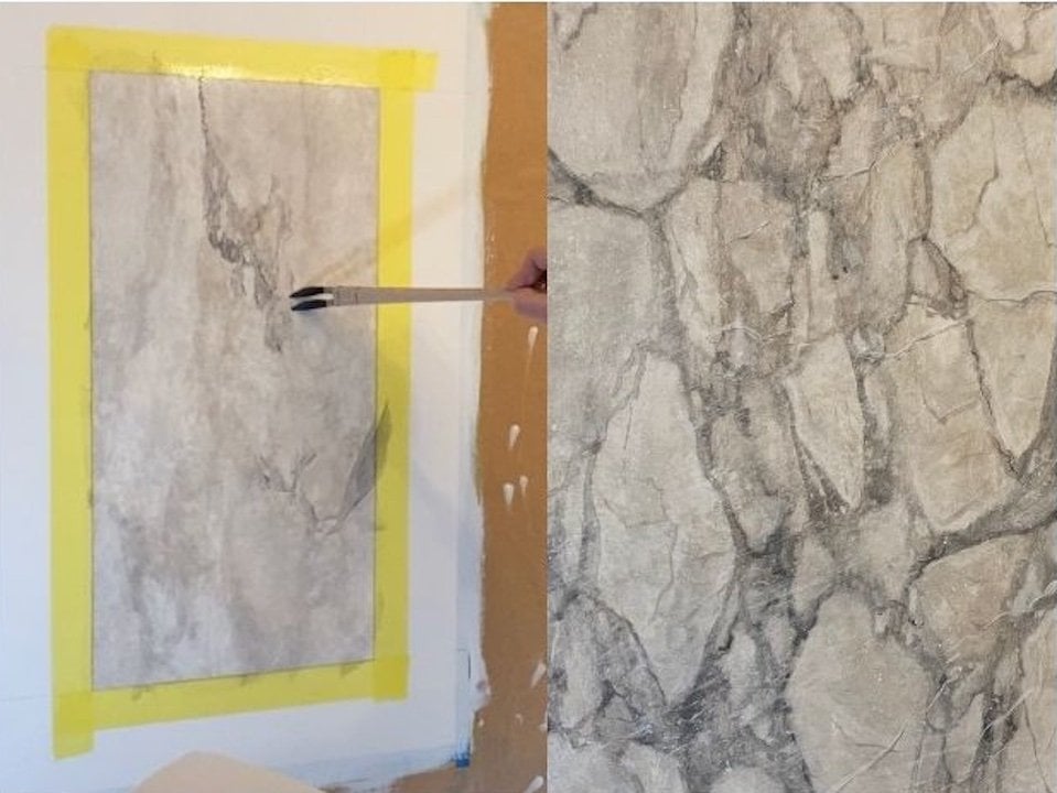
2. Project : Okay guys, so the project, but this time it's
going to be to paint this russell
a van to Marble, which is this reddish brown, black marble from Italy. And he got these lovely
kind of white veins coming through it
with a bit of a red, sometimes green over wash to it. It's a very interesting marble. It's multi-directional. It is a brush, just like the gray brush
that we did earlier. This is also a brush. And as I explained
earlier as well, a brush marble means
that it's broken. It's tons and tons of different fragments
being shattered. And then these white veins are just combining
them together. Important in this as well is the layout of your
styles and rails. We spoke about the
stance and rails for wood when we did
the Burj tutorial, when doing styles and Wales. And the marble is completely different because
you've got to wait. That needs to be carried out. So I will go through
this as well. But overall, I used to want
you guys to learn how to build up a lovely
framework of the marble. And I think we're ready to go. So let's just enjoy the class.
3. Protect and Seal : Okay, so to get this
thousand rails ready, three marble, we need to
protect what we've done. So you're some low tack tape. This is, this is not the lowest tack because
I'm working on a canvas. But if I was working on like
a fragile wall or something, then I would use pink. This is yellow. This is still low tax, it's not going to
rip the paint off. So let's just get going. So to get my corners
straight again. Yes. But in my 5.1 and I repeat, we're being taped in the
corner on the 45-degree angle. And again, burnishing the tape. In this case, I've got
an old rubber cone head. You're saying just to press
it down towards the canvas, so towards the surface edge, just to keep this
tight as possible. Now. Now we're going to
try something new as well. What I'm going to show
you something new because we're going to base
these out in another color. And I definitely don't
want that to bleed underneath the tape now and damaged my work on this
marble that I've done. So, well, this is doomed, but at flat artist brush or whatever you got
and some magnesium, we just going to seal the tape. So we're going to put
this on quite thin. But we definitely
want to make that, that CLs to tape edge. So you might, you might want to do two
coats of this. That's okay. Just to make sure that
your tape is nicely sealed because it's so devastating. If you paint bleeds into the marble that you already finished and that
she was so happy with. It's just it's just a shame. That's the reason why
we're doing this. And this is also a
perfect way of doing it. If you're, if you're protecting floor and
you're going to paint the base board are skirting to put the tape
down on the floor. And you just run some
math medium around it to prevent any paint from from sipping in underneath
the tape and damaged the flow or any other
objects for that matter. I mean, when you take off the door frames
towards the wall, so or anything where you've
got different colors. Okay. So I'm just going to
let that dry now and then we're getting ready
to put the base codon. So as you can see now, I'm just trying to protect the area that I'm finished with. So I'm just putting some well, in this case, just
some paper over it. You can use marketing paper
or plastic or something, but just to protect it, because I decided that
we're going to do a black marble base on
the styles and rails. And we will paint a rosy Levant, which is a reddish brown
marble on Lacan, black ground. So I think that's going to look very nice together
with the gray pressure. And because we're
doing a black base, that means that our tape
really needs to be sealed. So I hope you've sealed it with magnesium at least
once or twice. Because otherwise,
the chances that it will go underneath the
papers really vague. Better safe than sorry, I would say NPDES, you might want to thin the paint just a
little bit as well, just to make sure that
we minimize your, your brush marks. Also, you can use a nice
little tight mohair roller or similar something with a very short nap to try to
roll it on really tight. Just because we're doing marble. I mean, if you're
doing wood graining, sometimes you can actually gain a little bit from having a couple of brush
strokes underneath. But for marble, don't really
have brush strokes in there. So just try to get your your paint to level
as much as possible. So possibly two coats of
this should probably do it like this Really good. Now we're ready to start.
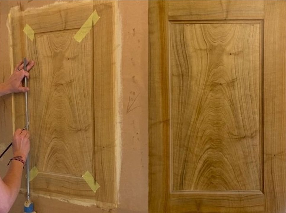
4. Stiles and rails in Marble : Okay, so the first part of
what we're gonna do now is to divide this into
styles and rails again, like we did when we did
the birch wood graining. But one thing that is
quite important for marble is that your, your Rails. We'll lean upon the styles. So when we're doing
the wood graining, usually your styles go straight up and then you got
to rail coming this way. But in this case
we're going to have the rail on top of your styles. Your cut lines are
gonna be here. And down here. I will show this on a visual
on the right-hand side, my right hand side,
your left-hand side. Make it a little bit easier. And also, I have a
tendency to just offset my cut just a little bit with maybe half an inch or a centimeter just to
make it a little bit. So it actually feels
like it is framing a bit more than just
sitting on top of it. So I'm just going to draw
these lines quickly. And then we'll get started. Again. I need to find some tape. And then we'll take pop so that we can actually start
doing the modeling as well. Yeah. Sometimes I've had this tendency to be
very well-prepared and sometimes I just completely
forget that I need to do. But I would say yes, start by taping up your styles. And we start doing them. And then we'll come back
and we do the rails. And again, we're going
to burnish the tape with the old credit card
or something similar. Like I got this old
hotel room cottage? Yes. Burnishing. Help to minimize the bleeding
of the glaze paint. Okay. Let's, let's get started
with the font stuff yet.
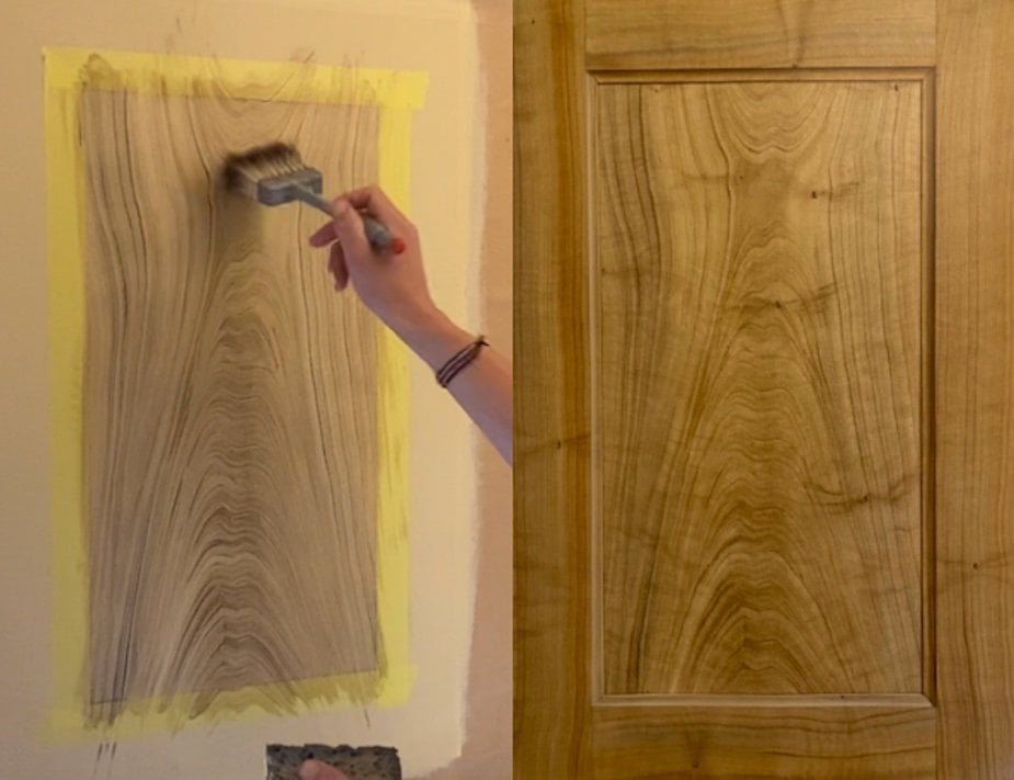
5. Background Stiles : So for the rest of the band, we're going to start by laying
down the background and tools that we'll need for this will be the natural sea sponge. We can also use a shaker term, the common different
different kinds. This is a squirrel mix
and this is seminar, which is synthetic hair. If you don't have these brushes, you can use deceased
boundary works just as well. But I'm going to show how to use at least one of
these in this tutorial. And also we need the badger
brush, an application brush, Fitch or a sash brush, glazing brush, flat
artists brush. And then I got this
little color shaper. Then I'm going to use,
which is just a rubber that I've cut into a couple of
different square shapes. So I'm going to show you
how to use that as well. It will almost be like
using a thumbnail. And you can scrape and you
can shape your background. And the colors we're going to use are going to be titanium, white and raw sienna, carbon black, burnt sienna, red oxide, and Alice
Eric Alizarin crimson. Okay, so let's get going now. You can see I got
my palette loaded with black raw sienna, burnt sienna, red oxide,
and alizarin crimson. A lot of colors for a
small panel like this, but I like to have options. It's quite nice to have
something to start off with. Also, I'm using a
translucent place that will allow me to
have some open time. And it's not going to make
my acrylics dry right away. So you can use
proceed from Golden. I know they changed the name. I'll put it down in the
description on the new name. You can also use
the acrylic places from HBR here in England. So it just might be something
from other milestones. Okay, So let's,
let's get started. So I'm just going to apply a
lot of place to my palette. And I'm just going
to start by building up the background
in a red oxide. It's going to test
the color here. And I'm not too uniform
with my colors. I'm just testing them
out at the moment, just going over the
black on a dry base. I'm going to do the same
thing on the other side here. I'm picking up a little bit
of that burnt sienna as well. So far, the color
is quite uniform. It's nothing
spectacular about it, but we just dabbing it on
in a quite organic fashion. In some areas it almost
looks a bit pink. But you can start adding a bit of alizarin
crimson as well, which make that color look really beautiful
on this panel. Named Russell advantage
means it's a read that too. There's also green, the Vento lemon
tourism area in Italy, which is famous for the really
dark almost black marbles, which breaks up this
lovely red and green. And it's a multi-directional
marble as well, which makes it a little
bit more difficult. Because you need to,
to consider all of these different variations in the veining and then
the background. But it is, It's beautiful. It's lovely. It's a lovely
marble to paints k. So we've got a lot
of red on there now. So at the moment it just
looks like that don't read, but what we'll do now is. We're going to use
the sea sponge and we're going to start to shape it and take some off. If you've got too much water on your sea sponge because
it needs to be done. Then you can always
wring it out in a damp cloth or a dry cloth. Now, I'm just going
to start dabbing it over like this to create
this background, this bunch. And don't be afraid to leave the red quite heavy in places. Because as it dries, black will take over and start shining
through quite a bit. Don't be scared of
leaving some of that red. Now we can use the reshape
that you can start to use it like Badger in a
figure eight motion. Don't want to overdo it. We don't want it to
smudge and disappear. We want to keep
the pattern there. But just to get rid of those. If we still got any brush marks or anything that doesn't look
very pleasing to the eye. Just do this. Let's
get rid of it. Also, if you got little bit
of a bristle somewhere, you can use to brush. To take it up with
the Shift Enter. This will work as
your Spanish now, you could do this with a sponge. So you're going to use your
sponge, has an applicator. You start by taking Spanish like this and you're just
getting a bit of glaze. And then you start by adding a couple of
colors on your sponge. And you can start
applying like this. You can take a
little bit of that. You see here how you create
those kind of starker, harsher marks on top of it, on top of the background
we already done. And works really
nice for the sponge. But I prefer to use a brush trying to keep my
hands a little bit cleaner. I think I got it too much. Place on this. What I want
my brush to do is open up more like this. To create the small, almost like a sponge would
create small, small fishes, small fragments or dots
on last year's craters. What they will do later
on is they almost look like like veins coming
in the background as well. Like I said, this isn't very
multi-directional marbles, so it does have a lot
of veins going on. And the background is super-important on all of these. Different colors is
going to help a lot. When we think that, okay, looks like we got
some colors in there. We can start with adding
a little bit of the, the raw sienna to
the mix as well. Give us more colors enough
background as well. I don't know if you can see
that for the camera lens, but we've got a lot of different colors going on down here, which looks absolutely lovely. And when this brush, I'm
just dabbing it like this. I'm actually pulling it through as well to
create a couple of small veins and smoke
small openings in-between. We can add a little
bit of the white, give us a little bit more
of like a pinkish tonality. To set ourselves up. And if there's something
that we don't like it, you would think that
looks to pink up there. Always come back, just
used the sea sponge, little bit of water
and just give it a little bit damp and
open it up here. That's fine. There's nothing that we do
that we can't get rid of. Don't be afraid, don't be
scared of using these colors. I'm going to go on
and on about this. I've already started, but don't be afraid
of using colors. There's nothing that
we can't get rid of. You can always go back on it. Varied when no big
lays push it back. This is your scrape funds
and then practice of course. Okay, so now I'm
going to come in with this color shaper and
just open up what I call stones in the marbles
in the rest of the band two, you got some really
dark black stones. And we're just going to
create a couple of them. And they're going
to help us well when we start to establish
where the veins are going. So yes, going to drag it
Fred is quite a couple of and not everywhere. It's always nice to
leave areas that doesn't have clumps of it. But hopefully you can tell now how that creates
couple of dimensions. And it gives you that harsh line
on the underneath that will almost reflect
as a highlight as well. So always make sure that you go for
your tape as well. So what we've tried to do is what we call mark
the cut as well. So it's very important that you can actually see that your panel different different
pieces of marble. It's not one and the same
piece that is framing. You've got your styles,
you got two rails, but it's important to actually mark the cut to
make sure that you can see the difference in
variation in these as well. So that's why I'm
trying to go through my tape at all time as well and create something
a little bit bigger here. Look really lovely. Couple of small ones. Now always keep in mind
how a stone would look. You don't want them all
to look like triangular, but it's quite nice yes, to give them a couple
of small unusual shapes and stone it looks bigger, couple of smaller. Don't be afraid of
skipping around. Can use smaller side of your
rubber thing and just jump. Create all of these. And if your panel
is starting to dry, just come in with a flat artist brush and
just some pure black, either black from
your base coat or Carbon Black Cats and acrylic. And you can use
start painting these Blackstone's and there's
nothing wrong with that. So just feel free to
explore that idea as well. All right, so now I
feel like I got enough of these kind of Blackstone's. I'm just going to give myself a smooth badgering
action on this. I'm always trying
to keep a couple of those red veins going through my black stones as well
because that's going to help them to, to give life. So yeah, we got those. And for final for
this step as well, ms. Can take my my flat brush. I'm not going to do
any more black stones, but I will create a couple or a mixture between raw
sienna and burnt sienna. Now, they will be asked extra color to this panel. This is where I'm
marking the cut again. Because the likeliness
that, that exact color, it's going to come
back when I do my rail is highly unlikely and I'm going to make sure
it doesn't happen. And so can a little bit of white as well as
to change the color. Couple of small ones. You can twist your brush, give it dimension as well. You can see here how my bottom piece is
lighter than the top. And that's just because
I picked up a couple of more colors on my brush. So we just going to give
that a light smooth as well. Under overdo it because
we still want to keep colors separate someday. Right? That's very nice. Also, we could do is just to give a background
light spattering. I mean, we we can always come
back and do this later on. But if, if we give it one now, it will give us a color. That might be really, really hard to get later
on when you start to do your your overlay seeing which is going to have
different colors as well. So I'm just gonna do
this as an extra little. And it will make your
panel look a bit more sophisticated as well. Between us. And like always, quick battery. Now I'm gonna do the exact
same thing on my rails. I'm going to let these dry. I might just hair dry them. And then I'm gonna do my rails. And then we're getting
ready to start painting. So let's just do this. Let's remove the tape. But there's always gonna be, like when we did the Burj, there's always gonna be a
little bit of bleeding. So important thing
is the steady hand and a semi clock. And I'm pretty sure
I said that before, but there's nothing
wrong. When you tape. You can see on the
tape you can use a magnesium or a varnish, something to just make sure that your colors doesn't bleed
underneath the tape. You can do that. I have a tendency not to do that when I do small
panels like that. But if I got a massive job, I would make sure that 100%
are seeing them on tape. Because last thing you
wanna do is run around with a small club and stock or even with a brush and
start touching up stuff. It'll take forever. So ceiling the tape is a big
big helpful thing to do. So okay. Yeah, stay tuned. And we don't like,
crack on with it.
6. Background Rails : Okay, so I'm just going to
speed up this section now and see if we can make
it a little bit quicker. I'm gonna do the
exact same thing now. They thought the reverse and try not to make it
look the same everywhere. And there's nothing
wrong with doing your, your black chunks a
bit bigger as well. Because in reality these
stones are massive. If you've got too much paint
sometimes in your brush, doesn't do what you want. To bet on the side of the panel. Open it up and
make sure it does. What you wanted to. Don't be scared of
changing your color, then you can add a
little bit more of that. And lambda, sorry, we'll see Anna Olson by changing color. You are going to help that
show the cup as well. You add a color that's
not in your first spouts, then that's going
to help as well. And again, can you Yes. Make sure composition
feels so right as well. Something more like this. Again, these stones doesn't
have to be everywhere. It's quite nice just to leave
some these big red areas. And what we're doing, we're setting ourselves up. So all of this might not, we might not keep this in the next section when we start doing the painting and
might feel like out, all of that feels a bit too
small and gibberish garbage, so we'll get rid of it. But what is harder to do is to set yourself up after you've
done the veining. So you want to give yourself
the opportunity to do these small interesting
effects. While you got there. The opportunity, right now, This sounds like a
biggest down here. Here's Badger it
into background that you don't have to keep
everything you do because that's
involved with work. But it's a little
bit this battery. And this first section is done. And now it's just over two. Starting the reigning in
getting all that interesting. The interesting
movement of this, this multi-directional
marble going. And please stay tuned. And the first place is done. Again. Never, ever, ever forget. Clean up your if you got any
bleed to clean it up now. Well, if I have the
whole team crunch. But that actually, yes. My lines look crisp and sharp. And I'm super happy.
7. Veining Stiles : Alright, so where we're getting ready to start painting now. So I'll do the same thing
as I did in the first, In the beginning of this
tutorial that I'm just going to tape off my, my styles. We'll start doing
the styles and then we'll dry them and come
back up and do the rails. Guys, you all understand this is all dry now has been
drying overnight. I mean, when you get confident, you can do all of this in the first stage
like you can use. Let it here are a little bit and you can
start painting on top of it. But if you do mistake, it might be a little bit harder to remove an end to
make it right again. So in this case now when
we're working on a dry basis, we will be able to
open it up with a color shaper or with a
sponge or something is to give us a little
bit more security if you want to call
it on my palette now, I'm just gonna go straight
up titanium white. So I'm using this from
proceed from Golden. And you can use pretty
much any, any white. You might even use a
regular acrylic pour wall paints together with the glaze just to make it a
little bit more fluid. That works as well. For tools. I'm going to use a couple
of different ones here. Now, I'm going to show you
this pointed free header. It's inexpensive brush,
you don't have to have it. It helps when you're
doing marbles, there are a lot of
different things going on. It will speed up your
painting process. And that's the same thing
for the double-headed. The double-header is probably a brush that we will
use a bit more, especially on this because
it's a smaller area. And then I've got two different pointed
brushes as well for veining, for detailing and
brushing as well. So this is like the gray brush. This is also a break
abridged marble, but it doesn't have the same
features as the gray brush. This has a more angular texture. I'm just going to try to,
I'm not going to try. I'm going to start by painting
with a triple header. And hopefully you will
see what I'm doing because what do you
want to do is to be, you want to be right in front of your work when you're
working this brush. But then I will block the camera and everything
for you viewers. So I'm going to try
to be a little bit on the side and we'll see how that. So I'm just gonna
load that up with the acrylic place on
my palette, palette. And then I'm going to start picking out some of the whites. And of course we're
going to test this on there on the panel as well
to see if it reads as well. Usually white on
black or dark should, should read quite good. But I'm just going to stay
tested here on the side. Not gonna do too
big of a motion. A little bit of a wiggly,
something like this. And tried to avoid some of these lacks that I got
these stones here. One to work around them. Make sure you don't
go beyond the tape. And leave some of these a little bit
more open as well. You don't need to over do this. You need to have these things. Everywhere. And then of course
it's quite nice to have different values. Because when we overlays this, you will be able to
see the difference. But also because this panel is quite small, the triple had them might
just be little bit too big of a brush to use in this instance. It's gonna do a
little bit more down. You can actually see the advantage of using
something like this. And because it's a
multi-directional marble, you can actually allow yourself to just swirl it around
a little bit as well. You don't have to
follow the same shape so you can come back into it. You can swear loud. Do a little bit more like these things here to French
it out and just create all of these lovely small
fragments in-between in Dagestan and angular manner. It's quite nice
to sometimes just create something that
almost looks like a spine. Can you just go straight
up and can come down? And it will just make a little bit more sense
out of your panels. Sometimes. Also remember to work your brush until
it's almost empty. To create values. Like this. Of course, what you want to do is to start to tighten some of
these together as well. So I don't think that
I have to use my, my bigger brush at this point because I've used both the triple header and
a double header. So it's a quite small
and narrow panelists. So I'm just going to use a smaller pointed
painting brush. I'm always trying to remember that it is quite an
angular piece of marble. So I'm just gonna try not to make all of
these two rounded. And as you can see, we've got
a lot going on down here. So I'm not gonna, I'm not
gonna create too much more down in that area. I really, really loved
what's going on here. Also, what you can do
is to play around with these stones that we
created in the middle hair. Yes, give them a little bit
more of a small accent. That's just a nice kind
of thing that you think. They think. Break it up. And now it's still, if you see something that
you don't like completely, you can still come back in
with a sponge and you can use start to just
dab a little bit, just push that raining back into the background of
your of your marble. Sometimes it might
just feel like, oh, I overdone it. I made quite a heavy thing. There. Doesn't quite work with the rest of the
composition on my panel. Then. Don't be scared,
just push it back, knock it back a little
bit with a sponge. Maybe come back in a little
bit of badgering this. And that would all. It will just help that image to come to life. To do what you wanted to do. All of these kind of elongated
straight vanes going on. Here. They are. Now known
in the Levant. Marble. Don't be scared of
doing them because they do look very realistic. And also what we could
do and come back in with a color shift,
shape, color shaper. Open up some of
these areas as well. That stone there wants to
live a bit of his own life. So that is that for that
set of the veining of this valve and now
we're just going to continue dry that reversed
the tape and do the rails. And then we'll get
ready for the overlays, which will just make sure
everything back a bit and add a couple of
more colors to it, which will make it look a bit more real, realistic as well. So stay tuned. We're up to brilliant
start here. I'm loving what I'm seeing. And I hope you did too.
8. Veining Rails: Okay, So I reversed the taping and we just
gonna get ready to do. So because I started with a
triple header on the other. On the styles. Do the same thing here. But I'm going to try to use
be a little bit more careful and try
not to overdo it. You can quickly
see how much work that's being done in such a short amount of
time we using this brush. If I were to use a
single headed brush, that will take me probably
tripled the amount of time. And it wouldn't give you that same organic movement that you will get
from this as well. There's a lot of accidents that happened which will help
you along the way as well. It's almost like you probably
heard about Bob Ross. He always said that
happy little accident. And I agree with ME. It really helps sometimes. You can see here
how I create these longer and veins going
through as well. Because it is important
to give your panel a bit of a bit of these kind of stable marks that
makes it look like it's been cut or got
shipped in there as well. It's not just these small stones that are swirling around, but this really hard cut does make huge difference when
it comes to the finish. And sometimes you can see how swirling back and pull that. Well, he asked us
to add a little bit of interest and some
different variations in the veins as well. And now just to finalize and
then come back in with that, the painting brush here. Now say, remember to
work your smaller, small stones that were
paid for this bond. Can you just give them a little
bit of a color somewhere? You might not think it
makes the difference, but I can show you, will. We're doing this. More of a multi-colored
marble are definitely going to be harder to do than, than the ones that are used. Black and white or gray. Because now all of a sudden
you need to think about where you call us a
go and you add white, a read and all of a
sudden goes pink, but you wanted it to go orange. It's just a whole other mindset on where to go with colors. And it's all about practice. Tons and tons of practice. Difficulty with
this is of course, that we're working on
a very small area. And so we sit to overdo this with veins and veins and veins. And yet so much on that, you're losing the background, which is so important
as well for, for these especially like the red advantage because you
still want it to look red. You don't want it
to look pure white. You want that red darkness to come through from the
base that we've done. So just be careful
and not overdo this, but I know that the
painting has become part. So by all means, go for it and enjoy the trip. I just want to make sure that
my veins here doesn't end up meeting my veins that
comes from this part here. And I mean, we can
always adjust this. But quite nice thing to try
to keep in mind as well. Okay, I'm gonna call that
the end for this step. So what we'll do is the
same thing as always. Remove to take, clean up that
edge, make sure it's sharp. Let it dry. In hairdryer
because it's water-based. Acrylics will dry. You can hairdryer or you
can wait till tomorrow. And we're going to start
over glazing this now. And then you will see it all come to life in a
whole other way. And I promise you, you're going to
love this because this will be spectacular.
9. Overglaze and Chrystalisation: Okay, So we're getting ready
to do the oboe glazing now. And I'm not going to tape
off my stylus and Rails now. I'm just gonna go for it. You just get all of it
done in the same time. What we can do to preserve some of these lines is that
sometimes you can put a blade, like a filling blade or a knife or something
that got the same width. You can put that to just
protect your areas. Or a sand paper that
you just hold there. As you work in
this section here. I'm not gonna do any
of that at the moment. I'm just going to
try to cut it in, make it look as
good as possible. Colors for this now
will be some pyrrole, red alizarin, crimson,
titanium white. Jenkins screen, and
just pure carbon black. And brushes and tools will
be always a club or a rag. Sea sponge not going to use. She could turn an
application brush. In this case, it's a
Fitch badger brush, pointed veining brush,
and a flat head. Artists brush as well. I might actually pick up on one of these
brochures as well. If I just need to feed anything, in fact, some of the stones. But I think we've got enough tools here
to actually do the job, so let's get going. So I'm going to start
with just mixing up translucent color
for the Everglades, like a translucent, darker tonality which
will be quite red. So I'm going to mix
it up with just some Perola read some Alizarin, crimson and some black. Then I'm gonna get that
over the entire panel. Hopefully it will be
enough to cover the panel. We still want to work
quite translucent. You just be, be careful
not to add too much black because you don't want and don't want to
call it to be too opaque. Okay. My brushes. Yeah. It just broke. And let's see if that works better. Okay. So let's try this. Oh yeah. So as you see now, skipping again over my panel because it's a beautiful color. But I still wanted to
preserve some of that white. Don't want this color
to go on every way. But at the same time. Don't want to be mean with this. Then you can add this little
bit more black as well. Because by adding
the dark colors will give it more
dimension as well. I just love how this step
all of a sudden makes, makes it all look a bit deeper. Now all the sudden these
lovely colors dodge come to light that down there. So now I'm just going
to give it a badger. Quite I'm quite strong
now at about here, you can use another brush
if you want as well. Good, I use for
this blend it in. I don't want it to be too fine. I just want to knock it
back into the background. And now we're deceased bunch. What can you just dab it and debate and drag this to open up variations. I like this area to be quite red hair because that's where we made
a little bit of a mess, where they're white. That looks very nice moment. I like it. Now. I'm going
to come in with it. Then she gets her now picking up some of
these leftover colors. But also we're going to
pick up more of the black. Because now we got a lot of
that red in the background. But we still want to add
more depth to some of these. We just going to dab
on almost pure black. And this will just help. If it feels like some of these veins are approached
forward too much. You can use help to push
that back even more. And it can pay off to be quite dry with this
brush sometimes. I mean, this is how much paint it's
loaded with that moment. And by dab, dab in that
around on the panel. It gives more of that kind of translucent feel
to it as well. And I drag it against the
veining direction as well, which makes these lovely
little flares or more rays which are very distinguished
in this model as well. If you want some
more of that kind of white to shine through again, we can always come
back in with this with the sponge and just open up some more of
these areas again. But one thing I would
say is because this is such a heavy marble and
it's just the surrounding. You don't want it
to be too punchy. You don't want your veins to be too wide and in your face. Because you just want this to
be a surrounding that makes your panel the look beautiful. And by doing this, it's not going to make your panel
look to painted either. It will actually feel more natural when it's been
pushed back at this. Because sometimes even the hit, even the real marbles looks
paint and because they're so, they're so strong in
color and contrast. So keep that in mind
that subtlety can sometimes you can sometimes be your defense can work with
you instead of against you. I'm just going to step
back and have a look. That looks very good. I like
that very, very natural. Very, very light. Badgering, very, very delicate. I like that, that
makes beautiful. I've just cleaned up my my
free header. There are water. And now you want it to be and you don't want it
to be completely dry. But you do want it to be it
can't be soaking wet either. Because what you want is for
it to open up like this. If it's too wet. All the brushes are just gonna
gathered at me shut. But you want it to be semi damp, just enough for it
to open up and make these lovely friendships that you would get from
the sponge as well. I just find it easier to aim
it when it's on a brush, but you can use that
sponge hundred percent. You can add some order. Your Jenkins. Green. Yeah. We ask them to add
that green areas. Don't want it to be too much. But that green is
definitely in this marble. So don't be scared of adding it. But try your best to keep it to a couple of these
lighter areas. Let it sit on top. And don't overland this. Be there. And you can also pick up his
little bit of black, mix it together
with that green to make another shade of
that green as well. Okay. I'm starting to think
I told you not to do now when you start to
go over everything, but yeah, that looks very nice. It's going to use
the sponge again. Open up a little bit in between. Yeah. Very, very, very soft. Drink here. And now we're just
pure black lace. Of course, this liver
transplants and come back in. Some of these, I'm sorry, into some of
these fragments here is to justify the
shape a little bit, just to show that some of them are black. It will just create one more dimension that
we've been talking about. Badgering. Couple of final small tricks here is just to add some pure white will test
this. It might be. It might just be a little bit. Without pure white,
you can just come in and you can highlight
some other connections. Like this one here is for CBS wanted to highlight for it. If you'd go quite dry, you can actually follow through these because your brush
will do the job and kinda skip on that as well. And if it's too connected, of course, like we always do, we'll take the sponge and make sure that it doesn't
look to start Yesterday. Smaller. And as a small final, I'm going to get another
of these pitches. And we're just going to make
that one with a bit of, a little bit of
glaze and quite dry. Pick up a little bit
of the Alizarin, crimson and a bit of white to create almost
like a pinkish color. Very dry on your brush. And you're just gonna give this a small spattering like
we did earlier as well, just to create that like
crystallization as we call it. Who has looked like
small, small, white. You to post more
crystals in that marble. If you want to create
a couple of big ones, just add a bit of water, make it a little bit more wet. And you can just create
a couple of big ones. Now with a cloth gently than all other. Keep, make sure that you clock phase does have like almost like a pad pounds,
it's straight on. Just to lock them in. Then Yan play badger. Yeah. And this is pretty much as
far as this marble now, so we're just going to clean
up, remove the protection. Make sure we're happy
with the composition, and we'll take it from there.
10. Conclusion : Okay, My friends. So we've come to the end of this class now and it's
time for the conclusion. So what have we learned? So first and foremost, I just want to point out that the ceiling of the tape that we did in the beginning
before we base coat. And this, you can see how crisp these lines
are right here. And if you compare that to something where you
haven't seal the tape, you will definitely see
small nudges of paint seeping through
underneath the tape and it'll look like a jagged edge. So I will say that that ceiling the tape
is a crucial step, especially when you're doing
black and white like this. Then we went through
the base coating, we went through
the background are cuts in the marble are super-important
compared to the wood. The wood like between your styles and rails
cut will be here. If it's wood in marble, this is super heavy. It needs to lean on top of your, of your styles. Important thing. And that goes for
door casings as well. If you remove this and, and and pretend this is a door, you casing comes around here. You cut will always be
on this angle here. So it's never gonna
be here and here. Because the weight of the
top will then make your, your style to be pushed away. So super-important, always
make your cut straight. Like that. Background, we talked about the veining with a triple header to speed up. This was probably a bit too small to actually show you the power of the triple header. But I think we're going to
come back to this marble, or maybe we'll do a sea
green vector mayor, like a Mediterranean
green marble. We've got all of
these veins as well, and we can use the triple
header a bit more and I can show you some small, small tips and tricks
without the double-header. Showed you again
how to overlays. This time we used, we actually used a reddish
black color to over glaze and push our veins back instead
of the white marble, we used a white place. So now when we were doing this, it's gonna be a bit
more intricate. Got a bit more colors
going on, on the palette. But that will just
be more fun as well. So I hope that you
enjoyed this class and that you will
follow me and promote. I really enjoyed doing
this class with you guys. There will be more to come. I will create a
trunk ploy on this. I got tons of other
stuff lined up for you. So we're not gonna we're not
gonna go dry or anything. There will be tons of
woods, marbles. Trump ploy. We might even get
into doing some of the decorative finishes that you can use for walls as well. Maybe some C3a or
some crisscross stream a that will almost
look like a fabric. But time will tell. So please feel free to upload as much as
possible in the gallery. I'd love to see your work
and then leave reviews, visit my Instagram
for more ideas. And so, thank you so much and I shall see
you on the next class.
 Kristoffer Gyllenhammar, Decorative artist