Transcripts
1. Introduction : Hi and welcome everyone. My name is Chris Yellen hammer. I'm a decorative
artist living in London, originally from Sweden. My classes we've cover
the basics such as the veining and marble
and important background and would do some of the most difficult
techniques in the world of faux marble, wood
graining, anthropoid. I'll be teaching
in the way that I use in my everyday trade. From the quickest way to do 12, to pause with glazing, to an intricate three possible that the
mahogany imitation. We will also add some
employ moldings and frameworks just to create some
extra depth to our panels. The aim of these costs
such introduce you to the wonderful world
of the creative art. But also to let you
experience and practice techniques used in a trade
for hundreds of years, which are still used today. You will discover new ways of looking at and using decorate the bottom techniques
which can be applied in both professional
and personal spaces. I cannot wait for
you to experience this course and I can't wait to see what you guys play with
my techniques and my methods. I hope you will
enjoy this course as much as I will
be teaching them.
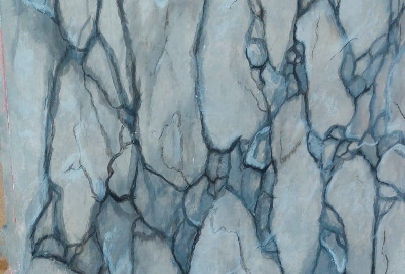
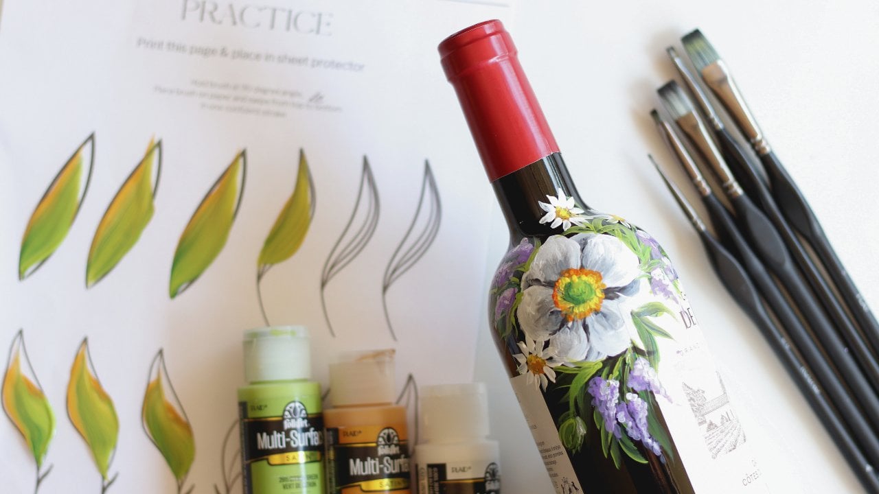
2. Project: So hi and welcome everybody to my first marble material online. So this time we're going
to paint the gray brush. And we're going to
paint this exact one that I've done here. So actually I'm
kind of cheating. So I'm making this introduction after I actually painted it, but that's just to show
you what we're gonna do, make you a little
bit more excited. And it actually gives me
something to talk about as well. So the meaning of a brush is
that it's broken up marble. It's not in veined marble, so it's almost like
you're taking a mirror, smashing it to the ground. And then you trying to pick up all the broken pieces and you tried to
recreate the mirror, but you really you can't really do it because
because it's so hard, it's like the biggest
parcel level. So that's exactly what's
happened to brush marble. So it's a good thing to
keep in mind because, because that established
like these big, big chunks of stone and then you've got the
smaller ones in-between. These really, really
small ones that really just combining
them all into one. So in this video, I'm going to go through the
background how to create it. Because justice,
a finished piece, it might look a
bit overwhelming, but I'm going to narrow it down step-by-step and make it quite easy for you to
understand what I'm doing. So we're going to start by
creating the background. Then we're starting
to add the veins, the brushes, enhancing some of the colors and create that. And after that, we're
going to put the, the overlays on
that lovely kind of milky that will just push
your work back a little bit. Give it a couple of highlights. And that's pretty much it like we're going to do
some counter veins that goes goes against the general
flow of it as some flames. And I really hope that
you will enjoy this. Because I really enjoyed
to make this video. And that's pretty much it. I think we should just get going and see what we can we
can make out of this.
3. Breche Marble Pattern Practice: Okay, so before we get started, I'm just going to
show you a little bit about the shape of the brush, how to build it up
with to think about. So, first of all, we're going to focus
on the fragments. So we're actually painting more of the stones that were
actually painting the veins. So what that means is that you just quickly going to show you some of the
shapes of the stones. So instead of painting veins
going up and down like this, we're actually going
to create stones that look a bit angular like this. Lithium bit more like. They can change into
shape like that. Some of them are
almost like diamonds. Some of them can come down, look a little bit more
like a shark tooth. So those are the shapes
we're going to focus on. I'm just going to
wipe that out a bit. And to do this, we're going to set it,
setting ourselves up. So by starting with the
with the two header, we just going to
skip a little bit. So you can start by just
doing something like this to create small movements. And you can create these
all over your panel. Well, not all over, but you can skip
around a little bit. Then you can come back
into it and start moving around doing
something like that. And what that gives us
is a nice movement. Somewhere to start off. Here will be a big fragment. You've got a couple
of smaller one. You got one here, you've got tons of those little
ones in-between. And then with the smaller
brush or your brochure. You can start by type,
tying these together. This mix down here, you can start by doing this. You see you already got that. Going to store a big story, Swedish by the way,
and means big. But you got it. Got a big one here. You've got some medium-size. I got here is a lovely one. I can do the new creating a couple
of the ones here. By skipping and doing this. I'm creating tons of these smaller ones here
almost like a Shane. And you can just come up here, tie that together, create
a couple of ones up here. Maybe up here. Can come down. You can create that one. If you feel like, Oh, I don't really know where to go, come back in with a
double-headed arrow again and create a couple more unusual small moves. If we do something now I'm here, is to break it up a bit. See how quick this is as well. Already. I'm starting
to fill up my panel. The list together. Maybe have a stone coming there. You can even move into
smaller brush again. Used to finesse it a
little bit. Do that final. But try to remember to
keep it quite sharp. In this marble. I don't
want these fragments to be too rounded. Word British means it means
a breach or a, or a break. It's something broken. So the brush is the veins. And all of these islands are stones that
we're creating here. Those are the fragments. So I'm just gonna do it for fragments and all of these small ones
in-between here. There are also small fragments
of stones that are just being floating around within. It. Just, it's a
really nice thing to paint because it's very, he got a lot of impact. It's a very strong marble. Then again, you can
always come back in with some small veins within
your small stones like this. And you don't have to
follow the same direction. That is the general buildup
of a brush marbles. So keep this in mind while
you start into vein, while you start into
the brushes that you can always skip around
with the two heading, two header brush, just
to create new paths, new opportunities on where
you brush wants to go. So it's a very helpful exercise. So sometimes just come
back and do a couple of these exercises because it will help you to build
up that muscle memory. Also, when I'm doing this, I always tend to hold my brush in the palm
of my hand like that. Because that gives
me the freedom of using my entire
breast, my entire arm. And it doesn't restrict me. Like if I was doing
this as a pen, then I will be very restricted into doing something that doesn't look natural. So by holding it like this, you will have a
little bit of shake. You will have a little bit
of Unusual illness as well. And you're completely free
to do whatever you want. Can, you can create square ones. You can create some. I mean, this one might be a little bit
stronger like that. Mr. Break it up a bit. But practice this pattern. Practice how to use
these different brushes. And let's get over
to the fun part. Let's start painting, okay.
4. Grey Breche Background: Okay, so we're
going to start with the background of this
gray brush marble that we're doing now. So on my palette, I got Titanium White, Ultramarine blue, and black. Goes free will be the main
colors for the background. I'm just going to add a
little bit of warmth to it, which will be my burnt
umber and my raw sienna. And a little bit of cool
as well wish will be a dash of the Rwanda. Then tool. Why is this going to use my application brush or
my sash brush that I love? A badger brush. I'll go to Fitch,
which is quite nice. And of course a damped
natural sea sponge. And this is just to create some texture to the background. And well, let's just
see what you get on it. So as I told you in the width grinning
video I did earlier, I'm only using
water-based products, so I'm going to use
an acrylic glaze. And all my colors
are acrylic as well. So the techniques I'm using, especially with the sponge, will not be applicable with oil. But you can use the vector brush and open it up with some, some white spirit
and stuff like that. But I'm going to teach you the waterborne
way of doing this. So let's get going. Yeah, I'm just gonna get
my application brush and my palette and my, my acrylic list that
I got here as well. I'm going to start by
just on my palette now, mix up with y dash of
black to create that gray. Pick up a bit of the blue. And I'm going to be using quite
a bit of this as my base. So I wouldn't want to make
sure I mix up enough on my, on my palette to start
off with this very blue. That's okay. And again, just start by
applying to the panel. Now when doing the marble, we don't need to
stretch to glaze as we, as we did in the
wood grain in video. Because, because
we want movement, we want the background, we want that texture
to, to shine through. I'm not too concerned
about if it's sensing a little bit if it's sagging or whatever because because we got plenty to go on here, sir. This is now super-duper weight, which is good, which is good. So, I mean, if you want to
start this Padre little bit, I have a tendency to use my application brush
with the color. Now I can use to start by
adding a little bit more. And you can start by doing this. Almost stick lid on
because already, instead of getting brush marks, you get puddles of
deeper color in areas. Then you've got that unevenness that you want for the marble. So it's a very nice way of starting to get some
movement in there. And now pick up a little
bit of burnt umber. Gap. Here is quite nice. Don't want to overdo it. I'm going to do bit down
here with raw sienna. I'm saying don't overdo it, but don't be afraid of
add colors because we are going to pair it out
with the sponge as well. But what we do want
is to keep that gray. Because that gray is
quite important for the. For the image, for the
final results as well. So at the moment,
we're going to keep to the sponge
because he's quite, it's an easy tool,
it's accessible. But I will, later on in other videos explained
about the Chiquita brush, which makes this a
similar kind of pattern. And we'll we'll keep your
hands cleaner as well. Okay. So I'm just going to move
over to my to my page and start creating a little bit of streets are dabbing in a couple of other
colors as well. But always try to keep your, your palette quite gray. Because as the name suggests, it's a great brush is not the brown brush is
not a yellow brush. It's gray. So what I'm doing now, I'm just mixing the
gray back in with with those different colors that we got on the panel at the moment. Taking care of some of
those bristles as well. It's trying to put my
brush down somewhere. And now as the sets, you can dab it a little bit
with the, with the Badger. This to help it on the
way to set up or stipple. And always try to keep your
colors translucent as well. Because what you don't want
is for your college to be overpowering and not allowing the base code to shine through. In this case, I mean, we
started with a white base code, but it still looks quite light. But when you're starting to
naughty little bristles, as you will see now soon. When we start to pair it out
with the with the sponge, it will show you a
lot of movement. Because of that white base code. You can tell it's very glaze works or
the glaze is very wet. That's okay. That's fine. Okay, So what I've got
here is quite old kind of Nackerud sea sponge,
natural sea sponge. It's been with me for a while
and I've opened it up a bit to give some more
irregular patterns as well. So let's just try this and see. And I decided that my
pattern in this brush will be a bit elongated and it
will be quite straight. So I'm not going to make too
much of a weird pattern. So that's why I'm not, I'm not dabbing it like this. I'm trying to fix
it and roll it a bit to give those lovely small
fringe patterns as well. Because what we're
creating now is a bit of a background texture that will show us where to put the
veins or the brushes. So it's quite important to know your dad because
if you use that, that's just going to create that same pattern over and over. And that's not going
to help us a lot. And of course you can keep
some areas bit grayer. That will be quite nice as well. I mean, I can keep
this area right here, which is quite nice,
that almost looks like a like a fragment
coming there already. Know where all my
hair comes from, but what bristles this must
be from. One of the brushes. Data joint. And always make sure
that you I'm sorry. He phase just makes
sure that you rinse your your sees bunch as well. When you're done there because your hand will be quite wet when you've
been in the water. So make sure that
you clean your hand and deceased punch as well because you don't want
it to be dripping wet. You just want it to be
damp enough to open up the pattern in
your in your panel. If you feel like, oh, I want it a bit
whiter or I want it a bit more open. Just
go for it again. Don't be afraid, afraid
of dragons bunch either. Because that will make
another pattern that, that will look very, very natural. Very nice. I'm going to keep that there. I like that. It's a small
thing here and this Yeah, So coming alive here, We're stepping back
to have a look. That to me it looks
like a very nice start. So let's see if
that that's okay. Now, just going to use like the figure eight were
badgering this because we don't want to just make
all of it in one direction like we would in a
figure eight like this. Get rid of any brush
marks or weird, weird sponge marks
that you don't like, make the texture a bit softer. As you probably can see, my panel is quite weight. It was a bit bigger,
would have been good and helpful because then you wouldn't smear as much of the texture that I am
lonely, but it's fine. I mean, it is a quite like the background texture of
this marble is quite soft. And most of the power will be in the brush in the
actual veins that we're all gonna put
on in the next step. Now, we're just
going to let this, this background set or
dry up complete here. And then we'll come
back in and start applying our veins to it. Don't be scared of getting a little bit extra
force into it as well as history for setup. I might just go through a couple of areas again would sponge. This step is, is quite,
quite, quite easy. It's a nice step to
practice to give yourself some nice different backgrounds,
different color waves. And most of what you're doing in this step can be
overlays to push back. Don't be scared if you get, if you've got a dab here
that's completely black, it can still disappear
into the marbles. Don't be scared of any of it. And it takes a little bit of practice to get
used to the badger. But as with with everything, I'll show you, we'll
be down to practice. So just enjoy this first step. If you, if you're
not happy, well, just use this bunch, wipe it off, reapply
it, try again. Yeah. We'll be fine. But right now I'm going to
let this dry up the reset. Then I'll come back and I'll
show you how to protect.
5. Grey Breche Veining and Breching: Right. So as you can see, I had to change my tape so I put the yellow one instead because the pink
that I had before, It just fell off and it didn't
keep a tight line either. I shifted into a
yellow tape just for addition and just keeping
my lines curving up tight. Okay, so we're gonna start
with the more exciting thing, pretty great brush,
which will actually be the brush we are going
to start doing the veining. So on my palette, this, I got a titanium
white, Carbon Black, ultramarine blue, and
some burnt umber. And for tools,
we're going to use the natural sea sponge damp and a couple of
different brushes here. So we've got the application
brush, of course. And a Fitch. Hogs hair, I think it is bad your brush, as
you've seen before. And now I got a double-header. Synthetic hair, a brochure, which is also synthetic, and two pointed brushes
that are synthetic, different sizes as well. If you don't have
a double-header, you don't have to use it. You can use to pointed
brushes and you can hold them like this. This is just to make the
pattern a bit quicker. So you can use those two
brushes and you can use to twist and turn and
forelimb around. Or if you, if you want to, you can use, use one brush
as well to create these. So when I'd say we'll
just get started. Yeah. So again, in this case, I'm just going to start with a clear glaze or the
little bit of color to it. I don't want it to cover up my, my work that I've done before, but I do want to make my surface just to be a
little bit damp with glaze. And in this case I'm just going to add a
little bit of color. You can go clear, you
don't have to add color, but it's just, it, it feels like you gain
a little bit more depth if you add the little
bit of color to that. The initial place work. Yeah, When you're just applying
the place in this case. And then put it
on quite quickly. Doesn't have to be
perfect in any ways. Just badger it a little bit to get rid of some
of those brush marks because we don't want to see them in keep the keep
the budget close by. And what I'll do now is going
to start with my fetch. Carbon Black to my mix. Little bit of blue or black. Then you can click
on start sketching out roughly my pattern. So as I said before, I want my, my brushes to be quite
angular, quite straight. So I'm just going to follow
through with what I got here. Just create almost like small stone formation very
roughly in at this point. You remember we spoke
about this big stone here. I'm just going to start
by outlining that almost like like this. And I can add a little bit of the burnt umber to
my mix as well. To add a little bit more heat. Scared of that at all. It's quite nice. A couple of different
variations in the color. This is just to create
that rough sketch. And a bit more
variations in this. I think that the meaning
of other brushes, like, I don't know if
it's Italian or or some. It's some kind of European word, I'm sure, but I think
it means break. So it's a really strong
break in the marble. Now after establish a
bit of my direction, I'm just going to gently Badger this into the
background as well. Go with the marble up
and down, up and down. Then a little bit side
to side like this. And of course, if you feel
like it's a bit strong, it doesn't quite do
what I wanted to do. You can come back in with the deceased bunch and you stab to just
open up a little bit of more of the underground of the stuff that happens underneath this
little bit like that. And we're going to use that a bit more when we
start to vein now with I'm going to start by using the double-header to
establish a bit more of my, my network of veins. And then I'll move over
to the breccia and probably finalize
it by using them. This more pointed brushes
that I got there as well. So I'm just going
to get some place in into my double header. Make sure it's soaked. Generously. I want a lot of color in there. We're just going to
start by mixing up. It's just black and
blue at the moment. That might be a bit too strong. Well maybe not. Let's try it
with kinda start here by. So I'm skipping with this brush. Making, building up a
little bit of a network. And I want to preserve some of these open areas in between. Crystals will create
the fragments. Little bit bigger suite
of prolongs the lung, the sides as well. It's quite, quite nice. And try to keep the
color on the gray scale, gray side of the
palette at all time. But don't be afraid of
adding a bit of blue, a bit of the burnt umber. You see how I'm working the brush up and
down, up and down. Constantly following the shape
that I'm trying to create. I'm not going this way. I'm, I'm going up and down. And I'm following. You can even, you can cut through a little
bit here to create bit more. At the moment, my, my
color is very translucent, so I'm just going to
add a little bit more, more black and more blue. Pick a white. Make sure that my brush
is nicely loaded. And I'm not going to
start up here now because I created some
lighter veins there. So now I'm going to
start down here, but the bottom
line come up here. It's very easy to
overdo it with a two-headed but don't
go too far with it. Just establish your
general movement and then move over and start
using the brochure. Because you don't
want your panel to be overpopulated with
just veins either. You do want it to be open. You want a lot of that
background shining through. And it's important that the background speaks
as well as the veins. Ms. quite good to be
little bit shaky as well. You don't want everything to be perfectly rounded or straight. But already now we can see it's starting
to grow to what we got. Here's a really
nice big fragment. Big one here, a
medium-size big one, and a couple of small
ones in-between. We're going to create
some more of those. But already here we can
see how it starts to grow. And now, gently give it a
little bit of a badger. Get rid of some of
those brushstrokes. You can add the veins
on a dry basis. Well, but I use prefer
to do it this way because it's so nice when you can actually blend
it in the background. And also it allows you to
get a little bit more of this on-off feeling
with it as well. Where where your veins
are disappearing into the ground if people
say that but into the back of your marble. Now I'm going to
come back in with my brush shirt and I'm just going to start to
connect some of it. You see how I created
that stone there? I feel like kind of
fringed out there. Look completely natural. Trying to knock that
into more of a sure. Not everything needs to
be connected either. Because skip and
jump around a bit. But this is the part where you can, you can spend so much time, so much to play with. Like you can keep adding a little bit too rounded
to break that up. Like I said, I wanted to pray. Quite angular shape to this. You don't have to follow, prove everything.
That's quite lovely. You can see how this
little fragment was just broken up
from this big one. And every time I pick up color, tried to change my color a
little bit on, on the palette. Sometimes it's actually
easy to make bigger panels because you want your
glaze to start to set up just a
little bit that you can you can add your veins and make them
a little bit stronger, a little bit harsher
if you want. I think what I'm
gonna do here now is I'm going to add
a sponge a little bit and just take out a
couple of not take out, but just to dab on a couple of these areas to make some
variations in there. And of course, the most
important thing is that the painting marble, you have to think about
the marble itself. Marble didn't know that
it was gonna be cut. So your veins always have
to go through the tape and make sure that they actually
live their own life. So down here now you can see this little, this fragment here. Yeah, it will probably
follow through here, and this one will
come down here. You've got a little bit here,
but you've got something. Another one here, because
this one on the side, that one would probably
go about here. And this one could be a big one. Always have to
think a little bit, like we say outside the box and see what else you
can, you can create. It's not just about
what your paint, it's what's outside of
what your paint as well. If you feel feel like. Okay, I don't want to
add more right now, you can leave this to dry
and you can come back in with a little bit
of a darker color. In the next step. I'm just going to add a
little bit more right now. Then I'm going to do just that. It's going to let it sit.
6. Grey Breche Veining And Breching part 2: I'm just picking up
one of my brushes. There's a white, little
burnt umber, bit of black. You always want to make sure that you caught a
little bit darker. Now, the finer the brush, the dark you call
it wants to be, doesn't want to be black, but it does need to make
a different difference. So at the moment is going
to start down here now. I think my mistake is pretty much started in
the center of the panel, but I think it'd be okay. You can now see how
I'm starting to create these small brushes or fragments in-between of
my bigger, bigger guys. All the time. This is what I'm looking for. I'm trying to work
my brush until it's dry and it doesn't have anymore anymore color of paint. And then when your
brushes almost exhausted, I mean, I still got
quite a bit of material. But you can back in
into these ones, in, into the actual pregnancy
nucleus creating a bit of a vein going cross
that one like that. This makes sure that quite a bit because
that's supposed to be part of what's happening
within these fragments, like this one concept there. When doing these very
fine names like that, you can afford to play around a little bit to try to
make it an angular. Don't try to make any swirly, round things like this. Because that's not that's not
how a marble was created. I'm sure you can find some. If you start to Google it or
you want to prove me wrong. But I'm trying to teach you the classic techniques
that I was taught. And I'm trying to keep my, my darker colors down bit more towards the bottom to give my panel a bit of the weight. It's always nice to add a
little bit on the top as well. But but I'm trying to to pick an area where
I want it to stand out. Lovely thing is like
when your brush, when the glaze dice out of your brush will use
making natural fade. Into the background. You can already see now
how it's starting to come alive with a couple
of different colors. You see these darker
here that I added. How that just makes this
section here come to life. Let's do a little
bit more natural. And even within these
and the gray areas that we started before, that will also be small, small stones or
fragments within them. You can always make a
little bit of a statement. Bigger, brush like that. It's definitely don't
be, don't be afraid. We're using the entire brush. Also, you can just
make a couple of dots. Doesn't have to
connect every way. But you have to do these
small skip ads as well. If you tried to keep
them in the connections. Like where, where
your where are you? Things meet. Very natural, very hard. And like I said, make
sure that your veins go proved to take me
into the background. Just make sure that
your sponge is semi clean because you don't
want to smear everything. Like if you if you
dab on the dark part, you don't want that part to transfer into
the lighter areas. And I'm just going
to continue by doing a little bit of this inside
of some of these fragments. And try not to make it go the same way all the time because
that doesn't look very, very natural because
these were stones that were broken apart millions
and millions years ago. They didn't know that
they were going to end up in the same direction. Today. We just tumbled around. And then the brush, as we call it, the veins
cemented them together. Some of them can be darker, some of them liked. Again, like I said, you can really continue like I can I can work
on this for how long? Wherever you want. Because this is really
the part that I love with the marbling is to do
the veins and the brushes. And it just, it's so refreshing. Like every brushstrokes
makes an impact that, that creates the image
that you're looking for. It's always easier. Like at the moment I'm
painting from my head, but I've been studying
this for years and years. And I got an entire
library with pictures. But if you want to, you can, you can
print depiction, put it up next to you and
start painting from that, or you can have
it on your phone. Now, I'm very happy with that. I feel like that's already starting to look like
lovely piece of brush. That's what it's supposed to be looking because that's
what the painting. So we've got this little thing here. I'm not I'm not the biggest. Going to break this down and you'll see us create a
couple of smallest stones into something that if
there's anything you don't really like this, try not to make
them too rounded. That's the only thing is
you don't want to end up with perfectly round
kinda pebble likes. Now, that's not natural. It does occur in
certain marbles, but in the grain brush, you want it to be quite
angular, quite harsh itself. I'm very happy with that, so I'm going to leave
this to dry now. And then we'll come
back with the overlay saying we're going to enhance
some of the veins as well. Keep practicing and enjoy it. And it's all going
to fall in place. And studied in material. And remember, try to follow your pulse with your brush up and
down, up and down. I mean, even if, if you want your marble to go
this way, well, then keep your brush display
and dance like that. All of this we will go through, just going to take a
little bit of time, but this is a very good
exercise to start with. And it's quite
easy to just paint something that is coming
from the top going down. So enjoy. Keep practicing.
7. Grey Breche overglaze and highlights: So I've left left this to dry overnight and we're getting
ready to overlays this now. So for the colors, for the overlay thing, it's gonna be titanium white, black, and a dash of
ultramarine blue again. And the tools we're going to use are going to be the same, pretty much the same
as we used before. So the natural sea sponge, placing brush, your brush. A couple of different
pointed artist brushes. But now also we're
going to use a couple of flat artists brushes, depending on the
size of your panel. And you can use some bigger one. Or as in my case, I probably use this smaller one, which is a twelv. So it just depends on the
size of your fragments. So if you've got
bigger fragments, you can use a bigger brush. But for these really small ones, I would suggest you
use a smaller one. So yeah, let's get started. So again, I'm using
the acrylic laser God. And the first move we're going
to make is just to cover the entire panel with just pure translucent titanium white. I'm just using the glaze
with the titanium white. And I'm just going
to start rushing it over and use a bit more glaze. This is just to give you
a panel debt as well. So it will create like a, like a white film on top of it. You still want to translucent, but you want the white to be a bit potent as
well so that you can, you can feel that it
is creating a sort of a film over your,
over your brushes. You can go a bit more
in places as well. It doesn't have to
be a perfect film. You can shown a bit
more white down there. Maybe a bit more
up in the corner. This is just really an exercise
of composition as well. When you applied all of this, you feel quite happy with your work or your
compensation of the white. Then we're going to start, you're punishing it out
yourself by using the, the natural sea sponge. We can start by dabbing
it a little bit, open up. But also now you can
use your sponge as swiping tool where
you push down on it and drag it through
and coming this way. And that will just open up
and create some, some flames. We might have to add
a little bit more. But as a good start, It's just nice to drag
it around a little bit. See what the white will
do to the picture that we're painting already now, you can see some crystals
coming alive here. And it's really, really nice. I might have to add a couple of those flames later on
when it started to set. But right now, I'm quite happy
with what we've got there. I'm just putting my
my sponge down in the water to make sure it's clean for the next time
that we're going to use it. So I'm going to just bite your
desk in the figure eight. Motion again is to make sure it just evens
out a little bit. And now what we can do
with a flat artists brush, we'll start to apply
a bit more white. This keep your pure white. Because you want, you want this to make an impact as well. And you can use start
by adding it on one side of your
of your fragments. You can follow a vein as well. It's almost like employ
when you're thinking about like the light and
shade coming on one side. If you pick up on one side here, this will be where
the light hits. But the difference is that you don't want to
do that everywhere. You don't want it to come
from the same same-side. You, you want a
bit of variation. So I'm just going to continue
now with this pure white. Because also what it will do, it's just to enhance
some of these fragments. If you do it on this
side, on this fragment, you can just do it
on this side here. Gently, faded out with this. Maybe you just do a
little bit down here and you can you can add
a pregnant as well. Okay. That's just pure white. But it makes it look
so real as well. You can you can make a
couple of veins in them. That's okay. Because we got these different
variations of gray. All the white that we put on, which will be, which
is quite pure. We'll read differently as well. Not everything needs
to be connected. You can create something a little bit more
unusual in here. And you can roll and grow
your brush. Move it around. Create a couple of
like New Paltz. Maybe this isn't
very successful. Well, it's successful, but maybe you can't really
see this one here. So I'm just going to
add that little bit. You can put your brush down. You can most likely
make that big one. Populism is more. And because my, my canvas
is quite, quite weight, like my glaze stays open
for quite some time, so I'm not going to hurry up
by badgering at that point. But if your glaze is setting up, then of course you have
to come back in with, with the bad your brush and
just start to smooth it. You want one side to be
softer than the other. Don't want to leave. You don't want to leave it with brush marks because the
brush marks mightiest. Make it look a bit to paint it. Don't be scared of leaving. Leaving it like this
where it's a bit harsher in some areas
because he's quite nice. And here I'm just
going to create something that looks a bit more like a brush,
like a fragment. So sometimes you have to, you have to paint your
fragments in there as well. If they're not
instantly visible, then you might just need to give them a little bit of help. Here. It's going to create this one. You can. It can come across something more
like that as well. Not all. The fragments of
stones are the same. This big one we got down here, definitely want to enhance that. Because I think this
one is beautiful. And it's so typical
to have a big, big fragment in integrate
brush like this. And also you can use follow the veins that You've
got the crossover them. In a really dark section. You can use create something that resembles of a fragment. Doesn't have to be
completely circled. But if you just do a
little bit of something, it will just help
the impact of it. Notice how I'm I'm trying to keep within my fragments here. You don't have to
do this everywhere. It's just to enhance
some of them. This one cuticle here, that's a very sharp fragment and that is so typical
is so typical. For degree brush. Also, that's the typical pattern for the brush. We are late. These really, really kind of
off white gray marbles are these really sharp fragments
almost to flake like if you think of a sharp like
a great white or something, you've got this
really, really nice. If you do something that you
don't pin super happy with, you can just use the
sponge or like I do. I've got a bad habit
using my fingers, but sometimes the fingers are
really nice tool as well. I'm just going to step
back, have a look. I think that looks
absolutely gorgeous. I like that. Really nice. And
like I said before, always make sure
that you call us, go all the way through to take because it's not
just about what's going on inside the
tape is also to think about the outside. Marble didn't know that
he was going to be cut. So that's why we need to make sure that all the
paint goes through. Okay. So I would say with
that step kinda done.
8. Grey Breche Touch ups and Crystallisation: I'm just picking up a
smaller pointed brush and pick up a little bit of the black little bit
of the blue bracket. And I'm going to start
to touch up the brushes. Touching up, I mean, yes. Come into some of these
areas where we can just make a little bit
more of a misstatement. Here's a little bit more to go. We do that. We can use gently value that. I can not going to
do too much up here. It's going to make
something else too. You can skip. You can skip it
but don't skip it, but you can use skip
with your brush. So you don't you
don't want your veins to go all the way through. You don't want them
to touch everywhere. But you can just
make a little bit of a statement in in this joint where you want a
little bit more action. And if you feel like I
can have a couple of more brushes or
fragments in there, you can recreate them if they
disappeared on you earlier. Here. He is to create little
bit more action. And I'm just going to drag
it into the background. Make a couple of darker
sections like this. Maybe down here it's very dark. The bottom. But I am keeping this within the veins that
I've done earlier. So I'm not going through
my mike fragments. This section here
calls for a little bit dark in this corner. And if you feel like
that is too strong, of course, you can always
come back with the sponge. So if you just want that
to be a little bit softer, we push it back into
into your work. Soften it. Section here feels like it's
something I'm finished. That looks better. Right
away. Yes. Bunches. I always try to, in this case, worth more side
to side and up and down. Sometimes if you make something
really dark that just traveled from here to
here, it looks a bit. It doesn't look natural, it just looks painted. So if you want to work
from the top going down, I would just suggest
that you do a couple of smaller dots where where
your fragments meet. Like this. Maybe just
skip around it for a bit. Maybe just go on one side and just try to
create something new. Not going to put my brush in my mouth because then you
can't hear what he's saying. But he didn't like that. Then you can use come in
within this work up here. With a dry brush. You can still create
quite a bit of skips and the funny effects within your bigger brush
areas like that. And just soften it. So if you want it, you can leave this here. But I'm going to continue
working on it for a little bit. Okay, so what I'm doing now, I'm just mixing up quite a bit of titanium white on my palette. And I'm going to start by actually painting
with my sponge. I'm dipping my sponge in this
and I'm creating crystals. Sometimes you actually need
to dig into the pure titanium white to make sure it it
actually makes an impact. Because if you do two glazed, you're not going to
be able to see it. But I'm just dabbing this
all over my work now. And that just creates all these lovely crystals
that you can see in marble. It's called the crystallization. And we're just creating this as a irregular pattern to go over
the works that we've done. And again, come back in a bit. You can, you can do this
on a dry ground as well. At the moment, my my works is still a bit wet from the glaze
glazing work I did before. But it does look lovely. And again, with even more white. Now, I can start just
creating couple of these claims that I
talked about before. So I just push down on my
sponge and drag it like that. I hope you can see that pretty, pretty camera creating a
couple of running out of y. Okay, so I loaded my
palette with more white. So let's just see if we can make it a little bit more
of a statement. Now. I'm going against the
direction of my brushes. You can see it's all going down. So my flames will meet. You can go the
opposite direction. Something up here. Heavier. That's a bit too strong there. They didn't add out the bit. That looks really nice. So I'm done with the
sponge at the moment. This bad greenness. Oh, okay. I said it was done
with a sponge, but I need to open that up. Clean sponge. I don't know if
you can see that, but that looks very harsh. So I just want to try to give that a little bit
more of a of an opening. It's very easy to overdo this. And almost your work
that you've done before. Because it's such a, it's such a fun
little thing to do. But resist the temptation of
going everywhere as well. I'm just gonna do a couple
of smaller things down here. Easy for me to say, resisted the temptation
and then I keep going. So I'm going to do
this little bit of badgering the
smoothing it out. And what is Mary nice to do is what what I
call the fissure. What we, in the decorative art
business called a fissure, which is just a couple of
small white veins that goes against the general
direction of the marble. So the temptation for
me is always like, Oh, I want to go straight
over to the middle. But I'm just going
to try to keep this with my
direction comes here, My flames go there. Maybe I'll just try
to follow my themes. So disconnect. Something like this. You can see I'm not holding
my brush as a pencil. I'm holding it pretty far out. Is if you hold it like a pencil like this, you're
restricting yourself. But if I'm holding it out here, I can actually use
the movement of my of my wrist and my entire arm
to do whatever I want. To make this a little bit more because this is
why it is going to die back a little bit as well. So sometimes you need to pick up more white than you
actually think. Or a very opaque white. Sometimes the titanium
white isn't enough. You might want to go
for a pretty wide that he used for your base
coat or something similar? It doesn't always have to
go all the way through. Like you can have a vein
that starch like here, then skips, dies
out into nothing. But it is very effective. If, if done right. You can have one that just
connects them a little bit like that. Can skip around. You can do a couple of smaller fragments or free-floating fissures. And it just adds to the depth
of the picture as well. With this, you can
also come back into some of your
fragments if you want to. Just circle them, make them pop a little bit
more. If they need it. If you want to. Now, you can use mixed up a little bit of that gray color. Just a very light
gray will glaze. Very light gray again. And you can just write
underneath your veins. Look a little bit. Little bit, okay. Yes, Go right underneath that vein to give it a little
bit more of an accent. It's almost like a shade. It's okay when where it
goes over the darker areas, but right where it goes
over to whiter areas, there might be a little
bit hard to see sometimes. Now I'm actually doing
what I told you not to. So I'm just going to you can skip a little bit
with this approach. The brush I didn't tell you
about in the beginning. We're just going to use I'm
going to use a hog head, fakes and hug have Fitch. If you've got another
spattering brush, please feel free to use that, but we are going to spatter use the little bit of
your sprayed out pure titanium white
on this is to give those crystals and
expert pop as well. So very dry. And you use go like this. Might not show on the
camera at the moment. But when I do close
ups, you will see it. And if you want to, you can add a little bit of raw sienna to it to give
it another color as well. I'm going to keep
this quite plain. So I'm just gonna go straight
up with titanium white, but if you want to,
you can definitely add some more colors to your,
to your spattering. And of course,
clean your fingers. Use clouds if you got some. Because I am it's typically
for me not to use gloves, but really they should. And if if some of you
spattering is a bit too big, just use a cloth and
you can just gently dab it just to push it back in.
9. Conclusion: Okay, so we come to an end. The absolute conclusion of
this video is that I've gone through pretty much
everything from the from the base
code maybe but, but from the background,
from the veining, the overlay sing, what, what, what makes
it the Borussia, a brush, colors,
pushing it all back. And now really, it's up
to you to create what you can with my techniques
and my teaching skills. And also feel free
to incorporate your own techniques if you got something that you've learned
online or you read a book, or maybe you had a cost with some other Marston
vector AD artists from somewhere in the world. I don't know, but just enjoy this because usually this is exactly what I'm doing. I'm taking, I'm taking
ideas from, from classes. I've taken from teachers I had from masters I worked with, from books I read from
what I've seen in reality. I mean, my photo library
is endless and every, every now and then,
every day almost. I'll try to learn
a little bit of something new that
I can incorporate, but just feel free to explore. And I'm always here. You can send me, you
can send me questions, you can send me pictures
of your work and i'll I'll try to guide you
through it and give you as much information
as you might need. Or if you need me to
give you tips and tricks and change something,
feel free to ask. I'm always here. Thank you so much. And I hope you enjoyed
this course as much as I enjoyed teaching it to you.
 Kristoffer Gyllenhammar, Decorative artist