Transcripts
1. How To Paint A Butterfly In Watercolor Intro: Hi, my name is Lindsey
and welcome to this lesson on how to
paint a butterfly. Three ways. I'm gonna
be breaking this into three different lessons. All these lessons
are going to be step-by-step and lessons that
you can follow along with. So if you're a beginner, I tempt you to
have a go at this. We're going to be painting
three different butterflies. The first lesson is going to be a line and wash butterfly. We're gonna be using some
really lovely bright colors. And we're gonna be using a
limited palette as well, but really bright and
bold with this butterfly, we're going to be using
watercolor and waterproof pen. Lesson number two,
we're going to be painting a fun and
loose butterfly. Again, we're going to be
using a limited palette with some really nice and bold colors that you can mix
together easily. We're going to be used
in a primary palate, which is the blues,
reds and yellows. And in the third lesson, we're going to be painting
this more realistic butterfly. So we've got some
gorgeous pink is going on in this butterfly
which are really love. Again, we're going to be
using the primary palate. So we're going to be using
a few colors and mixing them together so you
don't really need loads of colors to get started. My suggestion for
this class to watch each video through
and then apply what you've learned
to your own painting. So grab your paints and
follow along with me. And if you go into paint
all the butterflies, you can use your
drawing that we did, and you can trace over it and apply it to two
more paintings. So you can practice this
over and over again. You can swap the colors up
if you want to as well. So you could start off with
the colors that I'm using. And then if you wanted to, you could swap up and
use your own colors. Let's go straight into these fun lessons and I
really hope you enjoy them.
2. How To Draw The Butterfly: We're going to start sketching
out the butterfly now. So this is the same
butterfly we're going to use for all
three butterflies. And what's good about
this is we only have to do the drawing once. To make this nice
and simple to draw, I'm going to start off with
some very simple shapes. The body of the
butterfly is going to start with the head
and the torso. So I've just drawn
two bean shapes. They're, they're very simple. Then I'm going to start with the bottom, lower right wing. And I am just focusing on the outer edges of the
butterfly's wings. I'm just looking at
the basic shape. This might be with
respect to fly. There are quite a few scallops
on the outside edges. So you can see that
I'm really making this quite square to start with. And then we will come
along and we will make this more
scalloped and more detailed on the outer edges and will really fix up the
actual shape of this. But to start off with, I'm just looking at the rough
lengths of those wings. I want to look at the positioning
of the wings as well. I also want to look up the rough shape that
those wings and making. So you can see that I'm being
quite simple with this. I'm going to start with
the left wings now. So I'm just trying to mirror
image that right-wing. It will be quite difficult to freehand mirror image
this butterfly. And you will see at the end that my butterfly doesn't look
the same on both sides, but that really
doesn't matter at all. We are going for quite a
loose style butterfly. And I am going to start
with our bottom left wing. You can see that I've
left a little gap in-between the top wing
on the bottom wing. And then dress carefully
outlined in the edges. Looking at the length of
the butterfly's wings. And also the position in-between the top wing
and the bottom wing. So I'm using the
body as a reference. I'm using each wing as a reference to where I need
to draw the next line. I'm gonna go over
my pencil marks now and I'm going to start drawing in the correct shape of the butterfly
as I can see it. I'm pressing quite hard
with my mechanical pencil. And you definitely don't
need to press this hard. The reason why I'm
making my lines quite dark is so that you can
see this on the camera. But I would definitely suggest pressing quite
lightly with your pencil. We are going to go over
this with pen later on. So if you don't want the
pencil to show underneath, underneath your paint,
then do press lightly so that you can erase
it with an eraser. I'm drawing in those shapes on the inside edges of the
butterfly's body as well. So you've got those
lovely lines. Then I'm drawing in the rough scallops of
the wings as well. We are going to draw
some veins in the wings. I'm just roughly draw in a
tiny little line on the edges. And that's gonna give
me a rough idea of where those veins
are going to be. And you can see that I'm
drawing in the veins now. So I drew in that sort of triangle shape with
the little square. And then I'm just
using the edges of those scalloped
lines and just draw in the veins and
joining them together. So now I'm drawing
the scalloped edge. So this is a wavy
line that I'm using. I'm using some nice, very
curvy and wavy lines, so makes a really beautiful
and pretty butterfly. Then I'm going to start
drawing in the veins. So you just want to have to make these veins completely straight. You could wiggle them, make them very irregular shaped. They are not complete. Straight lines. You can look at the
shape of the wings and curved those veins to
the shape of the wings. So it gives the butterfly
well shapes and it makes it look more 3D and
more curved and rounded. So you can see that I'm
going to continue to draw in these veins. And some of them I'm
joining in the middle, some of them I'm taking as a fluids line all
across the page. And some of them I am drawing into that middle shape as well. So they are not all going to be the same size and not all
going to be the same shape. Some of them are a bit
more curved or wavy. And then I'm going to start curving this bottom
wing as well. So I'm just using some
lovely curvy, flowy lines. And then I'm just going to continue with the veins as well. So you can see that I'm using
some very short veins here. And now we're going
to start drawing in the eyes and the antenna. You can see that I didn't join the eyes to the top of the head. You can certainly join the ice to the head
if you want to. I just preferred to
do it like that. And I'm going to make sure that the antenna is a nice
and curved on the edges. Now, taking my eraser, which is actually
my son's a razor. So this is a little
Power Ranger when I erase some of the lines, just the ones that I don't need. I'm going to flip
my drawing over it and then use a soft lead pencil. So this is a to B. You could use any B pencil, which is nice and soft. And then I'm just going to shade the back of my drawer in. The reason why I'm doing
this is because if you flip it over and then take your pencil and start drawing over the lines of the butterfly that
you've already put down. What's going to happen is
that's going to transfer your drawing onto your
watercolor paper. You can also lift
up the paper to see if you've missed any areas. But press nice and
firm with your pencil, not too hard so that you're
making dense on the paper. But make sure that you're
pressing hard enough so that you can actually see
the lines underneath. You do not want any
dense because then the watercolor is going to
settle within those dance. I'm not gonna get a
nice smooth result. Now once again, I will
lift up my drawing as well to check that I
haven't missed any areas. Next, I'm going to show you
what art supplies are used.
3. The Supplies I Used: The paper I'm using
today is by arche. This is £140 and it
is cold press paper. It is 100% cotton and the size of this is nine
inches by 12 inches. I'll also be using selection
of my favorite brushes, which are by silver
black velvet. We've got a size ten
pointed round brush and also a size 12
pointed round brush. I've also got my size
eight script brush. So this has got a long
painted pointed to it. And I'll also be using
my fine rigger brush. And I believe this
is a size one, so it's got a nice
long and pointed, thin and forgetting
some fine lines. I'll also be using a
selection of tubes, paints. So these are Winsor and Newton. I also use Daniel Smith, but just use whatever
paint brands you have. I'll also be using my favorite ceramic mixing dish for mixing paints and
also some clean water. And I do like to use two
jars of clean water. I'll be using some cloths and paper towels
Fabien off my brush, and also a board. So this is an art
board that's I got from Jackson's art supplies. And they use that to
tape down my paper flat. I'll also be using
a hot lead pencil. So I use this mechanical
pencil a lot. This is a rupturing ticky. They did get this from Amazon. I'll also be using a fine
liner pen which is waterproof. And then going to use this on the line and wash butterfly. So this is going to be a
black fine liner pen and also some scrap paper for
testing out my colors. So let's sketch showing you
what colors I used next.
4. The Colors I Used: The colors I'll be using our
lemon yellow, cobalt blue, permanent rose, also
dioxazine violet, and some Payne's gray as well. I'm going to mix the cobalt and the permanent
rose together to get this lovely sort of violet,
magenta, purple color. I'll also be mixing up some of the permanent rose
with the cobalt blue. So this has more
permanent rows in it, so it's more of a magenta color. You can also drill
down at the permanent rose with a little
bit of the purple. And you can also mix the
lemon yellow and the permanent rose together to get this lovely orange
color as well. So we will be mixing on the
paper in some respects. And in other respects, I will be premixed
colors such as this permanent rose
with the violet. I will take a picture of this. So this is my mixing chart. These are all the colors and color mixes fast I used
for the butterflies. So I will include this in the projects and resources
area for you to find. Most of these colors I've used today are by Winsor and Newton, but you can use any paint
brand that you've have.
6. Butterfly 2: Loose Watercolor: I'm going to start off
this loose Butterfly by wetting this wing here. So I am going to take some of that clean water also
onto the background. The reason for that is
because I want some of the color from the wing to
bleed out onto the background. So we get a lovely bled Outlook, which will give a nice
loose fields for butterfly. Here is some lemon yellow
that I'm dropping in. And I'm also going to
take the cobalt blue. I'm popping down the cobalt blue while that lemon
yellow is still wet. And letting those two colors
blend into one another. You do want to work quickly on this while the
paper is still wet. And also, Hello, those
pink colors to touch each other while the first paint
color is still wet as well. So here is some violet
that I'm also dropping in and also some really
concentrated Villette. It's got little
bit of water mixed into it to get that
paint running. Then I'm tipping up my board to allow that paint to run freely. Download the paper. I have sped up by areas. So it did look like it
was moving really fast, but in reality, it was
moving quite slowly. So yours is probably going to move a bit slower than mine. I've got some more
concentrated cobalts nose. So this has caused
a bit more paint mixed into it to make it darker. And then dropping
that onto the wing while that paint was still wet. Now I'm going on to this
left wing and I'm just using some clean water all over the background on the left
side in that top corner, and also on left-wing as well. And now I've got
some lemon yellow and I'm going to drop that into the wing just like I did on the first wing that we painted. I've also got the cobalt blue. This is called quite a bit
of water mixed into it. I would say this is more
like a coffee strength. So if you don't know about
paint consistencies, I would say this looks like
coffee in a coffee cup. It's got a little bit
of paint mixed into it, but it's not as transparent
as a tea consistency. So we've got the violet now
which is going on as well. And you can see
that I'm trying to avoid the lemon yellow
with violet because lemon yellow and violet,
purple and yellow. They are complimentary colors. So once they touch each
other and once they meet, they will help to
Dell each other down. And I do want to keep this
butterfly nice and vibrant. You can see that I'm
moving my board, so I'm just tilting it to the left to allow that
paint to run down. And they also added some
clean water drips as well. So get that paint really
flowing down the paper. Now I've got some clean water on this bottom right
wing and I'm going to paint it over the wings only
so I'm avoiding the paper, the background like we
did with the top wings. I'm not going to take that water over on
to the background, so I'm just staying
within my pencil lines. I've got some
permanent rows here. So this has got quite a bit
of water mixed into it. You can use quinacridone
rose as well, because those colors
are very similar. If you haven't got
permanent rose, you could always use
Alizarin crimson because those reds and pinks have
got a bit of blue in them, which makes them more
vibrant and make some very sort of just family punchy and bright those pinks
now a really my favorite. So quinacridone rose, this
is lovely, vibrant color. If you want to look for
vibrancy within your paintings, I do really suggest trying some quinacridone because
they are very vibrant. This is the cobalt blue
going on now and you can see that it's mixed with
the permanent rose. And that's going to make
that a lovely purple color. Cobalt and permanent
rules mixed really nice to make a lovely
violet, purple. And I'm just running my
brush over the edge of that blue area
there and allowing some of the paint to seep
out onto the background. And now I'm taking some
more concentrated paint and also just dropping
it and see and dreamy. Now I've got some clean
water and I'm doing the same with this left side wing. So just keeping within
my pencil marks. And then I'm going to
take the permanent rose again and drop that into
the top of the wing. You can see that that
lemon yellow at the top on those top wings is ever
so slightly damped still. So don't worry about that. I do want this to be a
nice loose butterflies. So if the pink starts
merging into the yellow, then that's a good thing because we do want
this to be a nice, loose and fun and realistic
looking butterfly, weenie, it's gonna be a very
nice, colorful butterfly. Lots of fun colors. And how many moles
times can I say fun? We're dropping in some
lemon yellow and you can see I'm just wiggling
my brush around, so mixed so the pink and the yellow together
and we're getting a bit of an orange color in the middle and go
with the cobalt. Again, this is more of
a milk consistency, I would say so it's got nice
thick paint mixed into it, but also lots of water. So it's very pigmented, but it's very flowy and it's
still transparent as well. You can see there's still
see the paper underneath. I'm using the tip
of my brush here to carefully outline the
edges of the butterfly. So I don't want the edges of
the butterfly to be neat. So I do want to keep
those nice and flowy. And nice and neat. And then I'm just
taking a dump brush and then running along the edge of the
bottom of the wing. Now I've got some paint in my brush and I'm
just using some pink to splatter onto the background there that was the cobalt blue. So to splatter paint, I will load your
brush up with lots of water and lots of paint and just tap the end of the
paintbrush that will disperse some of those water droplets
onto the paper. I'm outlining the body here with concentrated
permanent rose. And then in the middle I'm
taking some watery cobalt. And then we're allowing
those two colors to touch. Now on goes the Payne's gray and I'm painting
in Nissan turn ice. So I'm just using
the tip of my brush. If you wanted to use
a smaller brush, then go ahead and do that. It might be easier to
actually use a smaller brush. So I've got some more concentrated Payne's gray
and I'm running that on the left-hand hand edge and the right-hand edge just while
that paint is still wet. And on goes some permanent rose. So I've got lots of
paint mixed into this. It's quite vibrant and it is
going onto the wet paper. So you can see that lot blended in with those
colors on the paper, the yellows and the blues. And it kind of made
more of a blue, nice splatter feel where the wet wings of the
butterfly layer. And then you can see
where it's dry and it's gone onto the white paper. He getting smaller droplets
which are more crisp. And the standout law, it all depends on whether you want wet splatters to go onto wet paper or you want the wet splatters to
go onto the dry paper. You could always
leave the wings of the butterfly to dry
before you add splatters. If you prefer the more crisp
and more defined edges, I've got a dark color now, so this is more
of a bluish gray. And I got that from mixing
cobalt blue with Payne's gray. So I'm just outlining the
outside edges of the butterfly. And you can see that
I'm sort of trying to really round off those edges. I do want these nice
and neat and rounded. And then I'm going to bring
them out a little bit. So I'm bringing the
tip of my brush down to sort of bring
it into a point. And then I'm just using
a damp brush here actually just to keep
it nice and soft. Because we are going for
more of a loose feel. You are going to have
lots of blending blue dyed cheese and just
keeping it nice and soft. And it's going to be
quite unrealistic. So I'm just blending those edges with my fine rigger brush. I'm going to take
some paint onto the dry paper and I'm
just adds in some veins. So I'm just using
the tip of my brush. These lines are nice and
irregular but very thin. You can see that I'm
just using my brush with a very light
touch on the paper. And I'm taking a few of those
veins across the paper. You can see that I am
crisscrossing some of them. So they're not
completely straight. I did wiggle my brush
a little bit to get them quite irregular shaped. And I'm just using
my rigger brush. So this brush that I've got here is actually
not a rigger brush. It's a script brush by
silver black velvet. And it's a nice long brush. So I do actually like the
way that this paints. And I can get some really
lovely thin results. So I am using the script
brush just on the edges. Then I'm taking my size ten. And that's a dump brush and I'm just blending out the edges. I'm just darkening up
these edges again with a bit more of that
blue gray paint. And this paint has dried now. So this is going
onto the dry paper. Now I'm painting onto
the dry paper again with my fine rigger brush. I think the size of
this rigger brushes are one and it's by
Princeton Neptune. And I'm just using some
light touches on this is the gray blue mixture
that I'm using here. Now I'm going to outline the edges of the
bottom wings with a color that I got from
mixing the permanent rose. Or if you're using
quinacridone rose, use that and they mixed it
with the violet so you get this lovely sort of
pinkish mauve color. It reminds me a bit more
of a magenta or move. So it's a lovely sorts
of purply color and they really like it for
outlining the edges. Now I've got a damp brush and
I'm just taking that long, the edges just softening out those edges with my damp brush. Now I am using a damp brush. So if you have too much water
or moisture on your brush, you're going to end up
flooding the paint. And it's going to push
the paint out and create a colleague
flowers or back Wrens. You don't want to have too
much water in your brush when you soften the edges, you do want to dab your
brush onto a cloth. You do want it done.
If you do want to have some moisture
in your brush, but not too much, you don't want to
have it dripping wet. I'm going to apply some
Payne's gray on the side of the body of the butterfly now so this is
very concentrated. It's called hardly any
water mixed into it. And now I'm taking
the damp brush and I'm just running that along the edge of that gray
that I've just painted. Now I've got that permanent
rose mixed with the file. Let's color again and I'm
just blending out that edge. And then I'm just
taking off some of that gray just with a dry brush. And next we will be painting a more realistic butterfly in some lovely soft
pinks and purples.
8. Project: Well done for completing the watercolor
butterflies curse. I hope you've had lots of fun. Go and paint your
own butterflies. Now using the skills that
you've learned today, I would really love to see your wonderful masterpieces in the projects and resources area. And that is the top
underneath this video. So all you need to
do is either take a picture of your
paintings and post them, or you can also scan
your paintings and upload that file to the
projects and resources area. A lot I like to
do is to give you some feedback on your paintings if that's what
you're looking for. So I really do love to see your creations and it's
really nice for you to share them with other
followers as well because gives them a
bit more inspiration. And also it gives them a
little idea of what sort of painting they can do themselves as well by following this class. Thank you so much for
taking this class today. If you are interested in
learning more about watercolors, then follow me so you don't miss any of my future lessons. I do have a number of classes
uploaded onto my class, so be sure to go and
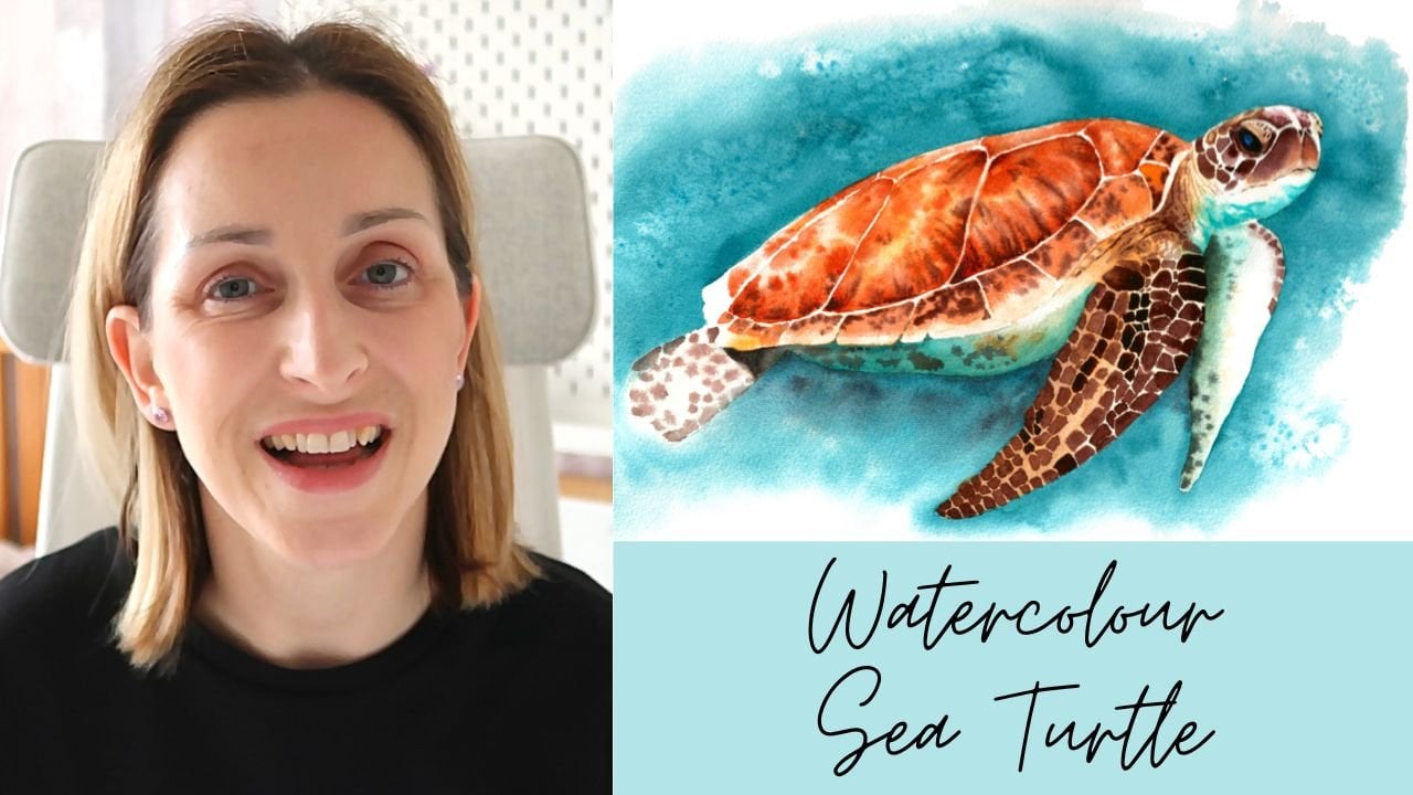
check those out. I've got a sea turtle arose, a cheetah, and also a
toucan to name but a few. So have a little look and have
a lovely rest of your day. Happy painting, and
I'll see you soon. Bye.
 Lindsey Dawn Art, Watercolour Artist