Transcripts
1. Intro: Hi, I'm Hale now I am a Senior
Art Director at Disney and I'm pretty sure my
level mood boards is the reason that
I'm wearing on today. Moodboards are my
favorite part of my job or one of my
favorite parts of my job. And I really take pride in them. And people come to me
for those moodboards. They know that I'm
the person that will get that mood across. Whether it's for a photoshoot, whether it's for
an illustration, or whether it's for a
larger brand campaign. They know they can come to
me. So today we're going to take you through how to
make the perfect moodboard. We're gonna go through the why, why are you making
this mood board? Is it for a photoshoot, is it for an illustration, is it for a logo project? And then we're gonna go through
the resources that I use. What are my sources? How do I find the images or the illustrations needed to make the mood board that I make. And then we're gonna go
through the ingredients. What is the perfect recipe
to make a perfect moodboard? And then I'm going to
show some examples of my favorite mood board. And on some of them I'll
show you the mood board to the final piece and
how those relate. And last but not
least, we will give a project to you to make
your own mood board.
2. The "Why": Let's talk about the why. Why are you making
this mood board? What is the reason behind it? Because once you know
the reason that will help facilitate what type of mood board you're
going to make. Is it going to be having images? It's going to be heavy in logos and type
treatments and colors. It all depends on what type of mood board you're
going to make. For example, you can
make a logo mood board. So we need to know the color, we need to know font,
type references. And we didn't know what era potentially this
logo is living in. If you're making a
branding mood board, this is about the larger
brand for your client. This can include lifestyle
images and color, and Logo treatments, etc. All things that are
needed to make a brand, especially if it's something that's going to have
a brick-and-mortar. What does the interior design
of the space look like? And then when you look
at an ad campaign, you're trying to get
the overall mood for what the idea is across. This one is more on
a conceptual level, then potentially some
of the other types of mood boards that
are like photoshoot or illustration based. Speaking of photoshoot, these ones are really fun
for me because I have some really great photo
references and I'll talk about where I
get them in a minute. Photoshoot mood boards
are all about the tone and the color and the treatment of images that we're finding. And how did they feel
cohesive for interior design, you might be pulling textures
as well as furniture and there might be more overlapping elements
for illustration, we're really trying
to accomplish what is the illustration style? What are the colors? Is it photo-realistic? Is it abstract? And our moodboard is hoping to accomplish and answer
those questions. And then maybe you're
making a mood board about manifesting your dreams. Maybe you want pictures of
places you want to go to, or maybe you're
trying to express that you want to live in a giant mansion
and then you want to have all of the
designer things. Why do you want to
make this mood board? And how do you want
to convey that idea? Another really important
thing to figure out for this mood board is the
mood board for you, or is the mood board
or for a client, if it's for you, you have a
lot more freedom to play. Be messy, especially when you're doing your manifesting
your dream idea. But if it's for a client, you have to think of how you can get your
full idea across each element that
you're showing in a mood board should represent
something different. So that when you look at
the thing as a whole, you can really get that
main mood, an idea across.
3. Resources: Now let's talk about
the resources. Where am I finding the images? How do I bring
them all together? And what are my sources? You might say, this is
actually my favorite part because of the
research that you put in to find everything. It's kinda like a scavenger
hunt or just the regular one. And this is the part
that takes what's in your brain and puts it
out into the world. Here's one of my favorite
sites for Inspire. So first, we have Pinterest, which is really just a giant
mood board site in itself. But what's really important
here is the search terms, especially if I'm doing a
photo shoot or if I'm doing an ad campaign or a
manifesto mood board. So whatever I'm
looking for, let's say it's Christmas time, I would do Christmas time
aesthetic because what that does is narrows what type of
thing you're looking for. So you know, you're gonna
get Christmas time imagery, but it's gonna be
a wide range of clothing or home decor
or mood lighting. Also, when I'm searching
for a photo shoot, I'll use search terms
like photoshoot ideas or I'll do a flat lay or trending. I also really loved
design inspiration. This is good to find
references of posters and logos and more typographic
graphic design references. It's very artsy and modern. It's a really good compliment. If you have too many
lifestyle images or photoshoot images, this can balance
your mood board. And then of course, we have to talk about Instagram. So I actually save a lot
of inspirational posts. I can just go back
to my saved folder and search through to find certain images that makes
sense for my mood board. And I'll screenshot
then crop them the right way and then add
them to the mood board. I follow a plethora of photographers,
artists, illustrators, designers, and I'm
constantly picking up references that I can
later use in a mood board. I also follow
interior designers. Maybe my mood board isn't
about interior design, but something in there can relate to what I want to get
across in my mood board. For example, I do
trend research boards, which are still a mood board, but they're relating to trends. If I'm talking about, say,
checkerboard trending, I'll find it on floor tiles, but I'll find it on
a cake decoration and I'll also find
it on clothing. All those things can
be found on Instagram, screenshot and put
into one mood board. You can also search the hashtags,
obviously on Instagram. That's why they're there.
And that can help you find something for
your mood board. And then I mentioned that
on some mood boards, you want moving items
to help convey a mood that you can't accomplish
with just a static image. For that, I go to Giphy, give me I love, but it's kind of hard to find the right search terms for this. So I would just start anywhere. Let's say I'm searching
something for work. I would type in
Disneyland and I'll get some fun moving
images and gifts. And then I can
click through those and find something
maybe more specific. Kinetic is a really good
word to use if you're trying to find animation references, those can be good
for logo projects. Or maybe you're
doing a mood board about an animation style, okay? And then if we're talking about photography, I love Unsplash. Unsplash has really artistic, almost bespoke imagery that you can use that is entirely free to use and has really
talented photographers and it's not super stock, like it's very moody in itself. And you can convey
that specific mood in the photo and also what's
in the content of the photo. I really use Unsplash for campaign mood boards and
photoshoot moodboards. And then to supplement that, there's another site
called stock C. This is really, really
good for imagery as well. It has a different type of mood and it's sometimes
called a little more amateur looking
at the difference between stock C and Unsplash. Unsplash has more of a higher level mood that you can convey
and in those images. And then stock C
is more specific. It will find the
region, the people, and have multiple images like a full photoshoot for one look. So you have a few more options
within it and succeed. You do have to pay
for the images, but I can just drag and
use the watermark that is very subtle until I know that I want
to use that image.
4. Ingredients: Now we're going to
talk about how to bake the perfect moodboard
with ingredients. One part of this,
when part of that, and put it all together
and it's perfect. But I should note that these are my perfect ingredients
for a mood board. I think you should
be able to take this learning today
and make it your own. Some people really
like to overlap there imagery in
their mood board. Maybe they want to have their
own illustrations in it, kinda make it feel a
little more scrapbooking. That's not my style. Maybe that's your style
and take what you learn from this and
feel free to adapt. But first thing for
my border ingredients is a variety of content. So I like to have some photos, some illustration,
some logo, some gifts. And that variety
is what makes it a really fun mood board. But then once you have all
of these different elements, it's important to have
something that brings it back together and
makes it cohesive. For me, that's usually the
color and tone of the imagery. There was also a mood
board that I did where the cohesive element was
spheres and circles. So there were some
graphic circles, there were some flat lays
that had circles in them. There was some lifestyle
photography that had circles and all the gifts had
moving spheres and circles. And that's what
brought it together. And the color palette was
kinda why most of the time, it's my color palette that
brings everything together, or it's the tone of the image. If I'm going for a really
light and ethereal, I want to make sure that
all my references also have that light and ethereal
tone because I might find an image with
the perfect content, but it does have the same
tone and light feeling as my other ethereal
images in the mood board. And so I won't use it all
either edit that image to have a lighter feeling
oral, find another image. The next thing for
me is a focal point. I'll make sure to
stagger the size of my images so that there's one or two that's generally
bigger than the rest. And that's the focal point. That might be the best image and might convey
the mood the best. But either way, I want to
make sure that there is a focal point within my Moodboard as the
hero he might say. Then along with
that, I don't want to overwhelm my audience. I don't want to
overwhelm the mood, so I like to leave whitespace
between my images. I think it makes
it really clean. I think it helps
make some sort of uniformity that kind of
brings things together. It's another cohesive element
for some mood boards. I'll actually put in
the full color palette, especially if it's a logo
or brand mood board, I'll actually bring
bars of color into the mood board to really convey that these are the
colors we're going to use. The rest of the moodboard is actually complimentary to that. And knowing that these
colors are going to be the actual colors for
the brand or the logo. It has a dual purpose
at that point, the last ingredient
that I put in my mood board is
optional as well. I think this is kinda
like a garnish. If it makes sense to you, I put in a moving
element almost always. This might be my focal point because when you have
one item that's moving, that helps bring the
focus to that one space, I will have sparkly
twinkling lights falling, and that is supposed
to convey magic. And sometimes you can't
get that full feeling by just a static image. Also, like I mentioned before, if it's for an animation
reference, for our logo, for a animated spot, It's really good to have
that kinetic energy or some other type of motion
graphic reference. And that's what gifts
can do for you.
5. Examples: Now we're gonna go
through some examples. I'm very excited to
share these with you and I will show you that it's progressed over my time
of working on mood boards. And that will show
that not everything is fast and solid on these
rules for Moodboard. And you can take
them as you will see how the execution
works for you. So this first one
is a mood board for a logo that I
was working on. It was called artful ancestry. And it was a brand for creating vintage pieces and kind of giving them a new light. And so I was really
leaning into that kind of heritage and vintage vibes
for this mood board. You'll see here, I
didn't use whitespace between my mood board, but I did use whitespace on
my header and my description. I don't actually
do a description anymore because I speak to it. But here you can see that
I was really trying to convey vintage,
elegant and Italian. So I was using
Italian typography. I was using a Vespa
to convey that, even though this is just
for the logo itself, you can see that I'm bringing in other elements to help
convey what the mood is. I also used a range from textured rustic feeling examples and then some that
are brighter and New. And I'm using a mixture of modern styles with
vintage typography. Because when you're
creating a logo, It's not just about the logo itself because the logo
is also going to tell a story and this mood
board is telling that story before your
logo comes to lay. Another thing you
can see here is my color palette feels cohesive. We have some oranges and reds mixed with greens and blues.
They're very vibrant. You can tell that that
rustic feeling is coming across in some
of those tones as well. Here's another mood board that I had made for that same project. This one has a
little bit more of a bold distress feeling, that lettering press feeling. Alright, so this is another one that has a description below. It says retro
Mexican street cars. So this is for a brand
called Barrio burgers. It's in crescent heights in LA. And the vibe here
is very much like this vintage and neon sign
with these cool vintage cars. And it's a burger shop
and it's supposed to feel very local and authentic. So you have the mixture
of a hand lettered style as well as a neon sign. So how can we make those
things work together? Feeling that Mexican vibe, I think you can see
that the colors here are very neon
and vibrant and it's a little bit busier than
you might see in different. On this next page, you can kinda see how this logo came to life. They really wanted this car
to be a part of the logo. So we have that vintage
sign type field, but it's also hand lettered. This a moodboard is a little bit different
than the other ones. This is a self-initiated project where I was trying
to show that I could create a product and a soft lines line of
clothing for Disney. So this is kinda me
pitching what I can do. So in my mind, I really wanted to create a
Jasmine slash Aladdin line, kind of in the
vein Anthropology. So what I was doing
is I was conveying the styles that you would see in Aladdin and a color
palette and then varying different
illustration styles that I was inspired by. Again, I left negative
space between the images. I had a color palette in mind. I was showing
illustration style. I was showing
lifestyle photography, for example, the image
on the top right. That's not really something that I would use for the soft lines, but it's conveying a minute. You're in a desert place. You're feeling really elevated
with all the jewelry, the nice nails, and it's
a little bit abstract. This next one is
really fun for me. While I was working at
Disney through quarantine, we were doing a lot of
at-home projects too. People interested in working on Disney things while
they're at home. So for this one, we're
going to create a kind of DIY project and actually
relate to products. So what we wanted to do
was we wanted to create, tune town out of paper and have it be a table scape in
the middle of your table. So it's parked party. It's part DIY is gonna be
made of simple shapes. Very elementary, you might say, with primary colors
and minimal design. On the left you can see we were trying to get that
cityscape idea across. We are trying to show
that it was gonna be a party with the bottom images. And on the right you can see
that it was a table scape. So when you put
that all together, you can see how it came to life. The fun part about this
one is I actually got to construct the town. I got to do the
photo shoot myself and I got to try on
all the products. This is something
that's very rare. It was just because of quarantine
and limited resources. But normally, I would just
do the mood part of this. I would select a photographer
and select a stylus, and those people would
help execute it. So obviously when I'm not the
one that's executing on it, then moodboard is
super important to convey all of the things
I want to bring to life. Now I'm going to show
you a photo mood board. This is for a photoshoot we were doing at alanine in Hawaii, which is the Disney resort. The fun part about
this is I created a specific mood boards
for different elements. This one is. Capturing a moment in time. We wanted to capture action. We wanted to capture a feeling
through those moments. The next mood board
for that same shoe was really trying to
convey family moments within the family that are
really representative of that love and that
connects all of these mood boards should
be building to one idea. This next one is exclusively about treatments and textures. While the content
themselves might not be what we're going to
show on this photo shoot. I want the textures
to recaptured. I want these rich cool
tones to feel really warm. So this one is an illustration
mood board that we worked on for holidays of last
year for organic social. The idea behind it is that we're going to
create these kind of postcards celebrating
different holidays in the winter season. And we wanted each
of them to have a slightly different style of
illustration and lettering. We wanted it to feel
like vintage lettering, but in a modern,
clean graphic way. And the illustrations themselves
are also very minimal. A little bit whimsical as well. And here you can see
the finished product. I was very proud
of them actually did most of the
illustration myself. And then my coworker
did the lettering. Some of my favorite
mood boards I've ever created was when I
worked for the Oscars. They are really
playful artistic. So I'm going to show you some of the mood boards for
the 80th Oscars, which was a long time ago. Now, we were really leaning
into the idea of infinity. This was 88 Oscars. So if you took the a
and put it sideways, you have an infinity symbol. Also, the academy has very
clear triangular iconography. The academy logo is a triangle. So this page specifically is
trying to convey the overlap between the circles for the infinity eight
and a triangle shape. And how does infinity
show for that mood? Here's a mood board specifically
for pattern inspiration along the same lines of
infinity and triangular shapes. This one was all about taking infinity and making it kinetic. So we have a mixture
here of everything. Here is photography,
but it also has things overlaid on as
graphic treatments. It has typography, has
illustrative elements, graphic elements on top automate this kinetic
motion clear, this one was taking a
different direction for infinity and he was
leaning into repetition. I also made the color
palette here very muted. Everything is black and white, and this became something
we explored two, should everything be black
and white except for the Oscar statue
in this campaign? And how does repetition
play into infinity? And this one was another way in which was more
about reflection. So the Oscar statue itself, of course, is a super
reflective surface. So what are we going to show
and how are we going to show that in relationship
to repetition? Or how are we going
to show that in relationship to infinity, you can think of
an infinity room. Are those infinity
mirrors as well? And then we had a mood board for what the decor
could look like. We also very much are
leaning into black, white, and gold here, because those would
be the colors of the Oscars and black and
white affair with gold. To represent the Oscar statue. We really wanted to show
a retro elevated space. We wanted really high-level
black and white decor everywhere with gold accents. And we wanted it to feel a
little bit gaudy as well. So while that was
the event space, this is more of the table scape, so it's still complimenting everything we showed
on the previous page, but it had its own mood board.
6. Class Project: Now that we've talked
about the why, now that I've shown you
the resources that I use, the sources that I use. And now that I've told you all the ingredients to make
the perfect moodboard. It's time for you to make one. I'm actually going to
give you two prompts, two options for the mood
board that you're gonna make depending on what
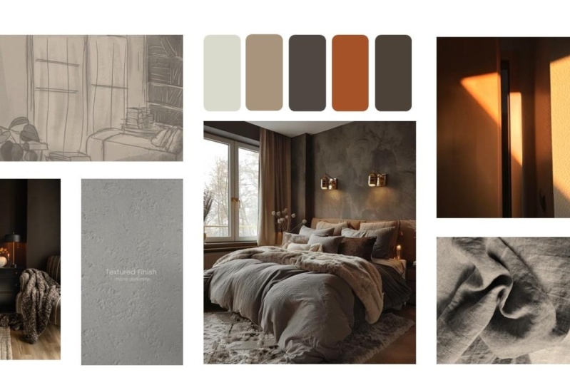
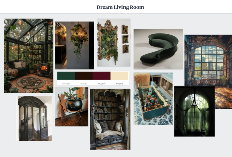
feels right for you. Prompt a is to create a mood board based on
your dream kitchen, bedroom, or living room. This one is very
much going to be an interior design
style mood board. And it's also going to
have a little bit of that manifestation that we were talking about at
the very beginning. What does that space
look like to you? If it's a kitchen, I want to see what the
fixtures look like. I want to see your
color palette. I want to see the
textures of the walls, of the floors,
maybe the ceilings. Prompt B is to create a mood board for a
client who is opening a cupcake business and Palm Springs and needs
help building the brand. I'm hoping that
those specifics are broad enough that you can
do whatever you want. But it also can kinda
give you a direction for what colors you
see coming to life, for what style you
see coming to life? Is it going to flip the script on what a cupcake business
should look like? Or is it going to be very much in line with what you think of when you see a cupcake
business in Palm Springs. This one is leaning more
into the climate realm. The other one is more
for you and your style. So think about that as well. So the final piece should
be uploaded as a JPEG. Usually I do 1920 by 1080, that's a standard size, just like this whole class. The last thing I wanted to say as we give you
this prompt is, how do I make my mood boards? I usually make them in either InDesign or
in Google Slides. It's really up to you. I think Google slide is
harder for design layout. Indesign is much cleaner
and much simpler and much better to
use for a designer, but feel free to use whatever
you have available to you.
7. The End: Okay, Now it's time
to say goodbye. I'm gonna miss you all. I hope you learned
everything you could ever want to know
about a mood board. I hope you learned more
than you wanted to know, and I'm really excited to see
what you guys come up with. Thank you so much
for watching and I can't wait to see
your mood boards.
 Hail Nowak, Illustrator / Art Director / Designer