Transcripts
1. Welcome: Hi, my name is Gudlaug and I'm an Icelandic artist
and illustrator. Welcome to my first skillshare class how to make a mixed media landscape
spreads in your sketch book. I absolutely love
working in a sketchbook. I am a perfectionist by heart. So working in a sketchbook
somehow helps me convinced myself that my artwork doesn't have to be perfect. And the same goes
for working with brush pens and mixed
media in general, it has allowed me to work faster and without
overthinking every step. So my art has become
more expressive and freer after I started on
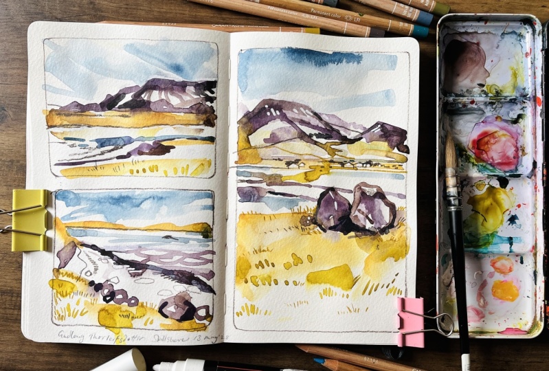
this sketchbook journey. Today we are going to make a mixed media landscape
spread in our sketchbooks. Like this one, we will make three different illustrations
and the color swatch. I will begin by going
over the supplies you will need what
colors to choose. Preparing your
sketchbook, drawing the reference images, and
finally, illustrating. This class is for beginner
to intermediate artists. But I also believe that everyone can learn
something from this class. If you want to make a more aesthetically pleasing
art in your sketch book, or if you want to practice
your mixed media techniques, or if you just want to
make a cool spread in your sketchbook of an
Icelandic landscapes and this is the class for you. So let's start by going
over the supplies. You will see you in class.
2. Class project: The class project is
to posterior mixed media landscape spreads
in the project gallery, the reference images that
we will be using for this class are taken on one of my favorite
places in Iceland. It is a bay called later Vogel, and that is close
to where I live. It overseas month AS yeah, which is a very known landmark that can be seen for
most of Reykjavik. You'll be able to find
the reference images in the projects and resources
tab to make this breadth, you can use the colors and art materials that I recommend, but you're also welcome
to use whatever you have on hand or are
comfortable working with. Mixed media is quite
free to interpretation. So just go for what
feels right for you. But if you want to follow
exactly how I make mine, I'm gonna go over my art
materials in the next lesson.
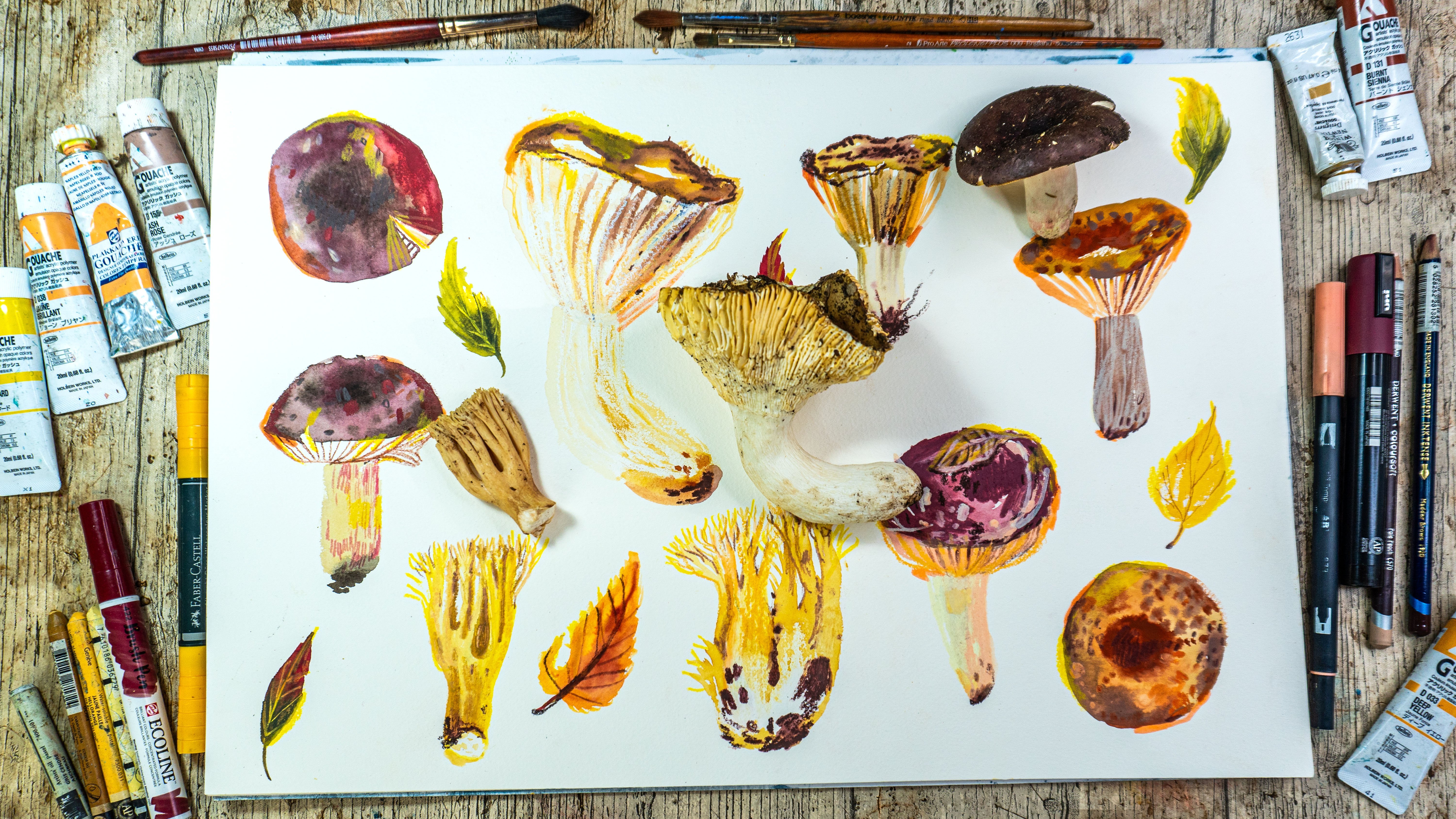
3. Supplies: The materials that I will be
using to make the spreads are my trusty Strathmore
mixed media sketchbook. This is a 500 series sketchbook. It's my absolute favorite. And I highly recommended
for mixed media. It has 100% cotton paper and
the paper is really smooth, which works really
well with the markers. Most watercolor paper
has a rough texture, but this one has
really smooth effect, which works really well
with this technique. It holds water quite well, but the paper buckles
a little bit. Whatever sketchbook you use, just be aware that the
paper should be thick enough to hold the medium
that you will be using. Mixed media sketchbook or
watercolor sketch book will usually be best. I use tape to get these clean lines in
my sketchbook spreads. I will be using this
Scotch Magic tape, but I don't actually
recommend it. I am really sensitive to
the adhesive and most tapes and I use this one because
the adhesive is safe for me. But a terrorist the
paper a little bit. So I don't really recommend
that you use this one. I would recommend that
you use something like masking tape or
something similar. If you are not sure, just try it in your sketchbook and see if
it tears the paper or not. So next up, our brush pens. I mostly use Tombow brush pens and sometimes these
e colon breast pins. But I will only be using
the Tombow for this class. I really like using them
because they are water-soluble. They dry really quickly and don't bleed
through the paper. They also come in so many
different colors that everyone should be able to
find something that they love. If you don't have markers, watercolors or gouache
would work really well. Instead. You will also need
colored pencils. I mostly use these
Luminance colored pencils. And these polychrome
most colored pencils. They work really well. I'm layering over
markers and to add tiny details and texture
to your illustration. You will also need
new color too. They are wax, oil,
pastel, or crayons. I use both 1.2 and
my work because I can't always find the
colors I like where I live. But for this class you
will need new color to. The reason is that
it is water-soluble and we will be spreading it
out with water in this class. In general, these are great to add texture and some details, but it's hard to make
small details with them. You will also need a paintbrush, jar of water, paper,
towel, pencil, eraser, a pencil sharpener,
and little scraps, scrap pieces of paper to do
swatches on these clips here, really handy if you have them.
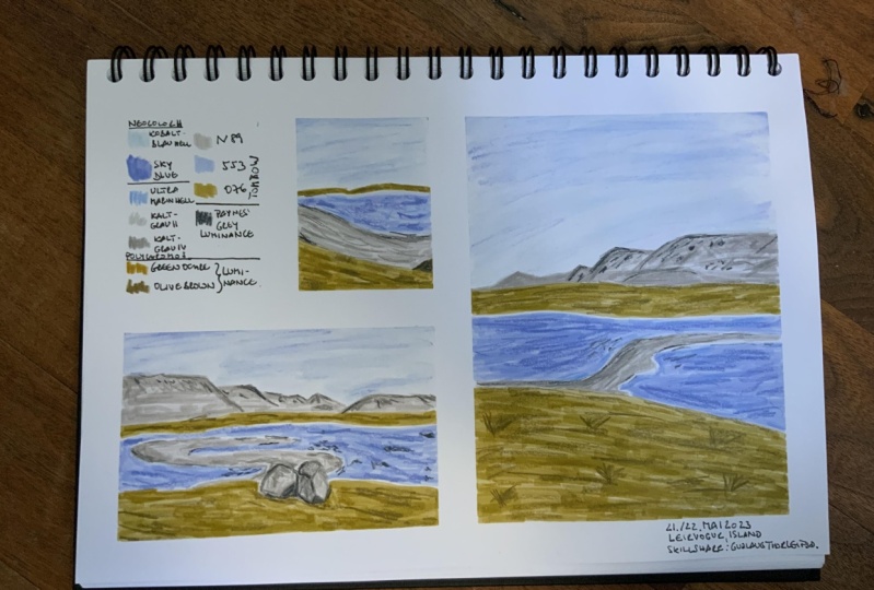
4. Colors: I have been really
enjoying using this color palette
here, this one. And I'm going to use it for the illustration that we
are going to paint today. But I've tried to simplify it a bit to keep the
supplies to a minimum. You will also notice
that there's a bit of snow on my reference images, but I'm not going
to include that. But go for a more
of a spring luck with these beautiful
green and blue colors. You don't have to use the exact same colors
as I am using. Try to use what you have. But for the method
I will be using, it's best to have one base color for
each of the elements. So this guy, the grass,
mountain and ocean, and then 123 colors to layer on top for
texture and details. Tried to go for colors that are a little darker than
the base color. Preferably two to three
different darker tones, but not too dark. It's easy to go overboard. So for the sky, we will be using
this new color too. Crayon. The color is
light, cobalt blue. We will also be
adding this sky blue. Just a little bit. For the ocean. We will be using Tombow 553. Again, the sky blue near color. This polychrome, most
light ultramarine. For the mountain and the beach. We would be using Tombow and 89. We will be using these two polychrome most cold
grade two and cold gray for this is the cold grade to the cold gray for for the mountain. I'm going for such a light
base color that I wanted to. I think it's more
important to include more variation and tried
to build up the color slowly instead of using
a darker base color. And this is luminance
Payne's gray. I love this one. I use it so much, but it's really dark and
just use it sparingly. Not too much, but it gives
a great pop of color. It's almost black, but
not quite beautiful. For the graphs, we're
going to use Tombow o76. These two luminance colors, this one is green ocher, and this one is olive brown. So this is, these are all the colors that we
will be using today.
5. Preparing the sketchbook: Okay, so we're going to start by taping off
all of the edges. Try to line it up with
the page as best you can. Get a nice straight edge. Make sure if you tape doesn't go all the
way to the end that you overlap it. Like here. The other page. When it's good to press it down. So you don't get the eating. If you've got long
hair, just like here, you can just press it under. It's also nice to have these clips to hold
everything in place. Especially if
you're on location. You have wind and everything. Okay, so next we're going to
divide this page in half. I'm going to place it just a
little bit above the center. So I get a nice square, tried to make it level. If you don't have the clips, you can make the tail longer, just pressed it under like this. Then the final piece up here to divide this in half. Like so. Next, we will start drawing
the reference image.
6. Right page, drawing: So this is the first
reference image, and we're going to
draw it here on the right page in
your sketchbook. I'm going to start by drawing these two lines
here of the grass. Somewhere around the center. Probably need to
make that darker so you can see it like so. Okay. And then the mountain shape. I wanted to end
someplace around here. So this part here. And we're just going
for a rough outline, it doesn't have to be perfect. Just going for visual interests. The little mountain over here. This one again,
Something like that. I think that's nice. And then for the
grass over here, maybe like goes
down a little bit. Like so. Okay. So this
is the most tricky part. I think. There's a lot of snow and ice
covering here on the beach. And it's kind of hard to see
what swats because we're not going to include
the snow and the ice. So I know that this part here, snow here is covering the beach. But this part here, this is water that
has iced over. So when we're drawing the beach, it's gonna be
something like this. Something like this. This will
be water here all around. Suggesting a little
bit if you want. That's the first image done.
7. Left page, drawing: Okay, So this is
the second image, and we're going to draw this one over here
on the left page. And again, we're going to start here with the
base of the mountain. Two lines like to make them not, you know, to straight
makes for more interest. And next we're going
to draw the mountains. And I like to mark off the
height of the mountains. So I'm going to start like
maybe here in the middle. Something like this. This one here goes a little bit higher and this one
even higher than that. Then there's like
this one around here. So please start. Yes. Again, it does not have to be perfect. We're just trying to
make basic shapes. Okay? Something like that. Next, I'm going to go do
this grass line over here. Leave a bit of space. For the C. Again, the Beach is a bit
of a difficult to draw. Same problem as before. It's hard to see what's the
ocean and what's the beach? Because the snow covering
the beach over here. But if you mark like it
goes in like this S shape. And if you mark here, goes all the way out here, then it can start filling in something like that. I think. Just go over it again if
you're not happy with it and make adjustments along the way. And so for the last part, these are the rocks here. And the colors I'm
going to be using are going to be using the same color for the
beach and the rocks. So be nice to put them move
them a little bit lower. But I don't know if I'll
if I have room for it, but maybe I'll try. Actually, I think if I mark the size, making it too large, should be a little bit smaller. Maybe like that. My plan for moving them a little bit lower didn't
really work out, so we'll just figure it out. Figure it out. To do a little bit darker. I don't know if you can
see what I'm drawing. Okay. I think that's done. And the last image, this one here will go
here up in the corner. And this is gonna be a
really small drawing. So it's important to
just go for basic shapes and try not to put too
much detail into it. Okay, I might actually
be nice to cut it off. No, I'm going to start again with the horizon line over here. And it's nice to put it a little bit above
the center line. And there's this grass areas over here that I really like
and I would like to include. And then I'm gonna go do them. Grass area here, like this. And then Beach. I think I actually
want to draw it. Like if I cut it here
and just do it like maybe like this. This is 100% accurate,
which is fine. But it makes for a nice shape. Okay, that's it for
the drawing part. We're ready for the next stage.
8. Right page, base layer: So now we're going to start
painting the first image. This one here on the right. And we want to start with the eraser just to raise
slightly over everything. So we want to see the lines as much and
just want to erase until, you know, you can
barely see the lines. Just whatever you're
comfortable with. Okay, I'm going to
start with the sky. I'm going to use this
new color to crayon. And colors light cobalt blue. And I'm going to go over
all of the sky with it. This is a really light color. So don't put this on to lightly. Be careful around the edges like this. And next, I'm going to
go for the sky blue. And because I know this
is a really light color, I'm gonna go a little bit
over just very lightly. Just over the top
because I want to make like a little gradient. I think it would look nice. Next we're gonna take our
pencil or paintbrush in water. Can't see this but just
a bit off like this. So you can take the excess off. We don't want it too wet. Then we start painting
over or rather activating the pigment by rubbing it like this until you get
a smooth finish. Just keep adding
water as necessary. Until it looks like
you wanted to. You don't want to
put too much water. Smooth everything out
as best as they can. Think that looks nice. Rinse it off. Now that this is what we don't want to start painting here
around the edges. So next, I'm gonna go over to paint this
beach or color it in. I'm going to use this Tombow
and 89 color for that. Using short strokes. Like coloring. When you use these markers, if we go over the
same place twice, there will be a bit darker, so you can use that
to your advantage. Data's adds a bit of
texture like this. Still too wet to
do the mountain. So I'm gonna go, I'm gonna
take this green color and do the grass areas like this. This area here. Okay, next I'm
going to go in with Tombow 553, coloring the ocean. The ocean. I'm going to leave a
little bit of a white line here next to the beach areas. Because I like to leave
a little like to add a little texture
later and variation with other by adding other
layers on top later. Something like this. Now that this is dry, I'm going to make the mountain here just like coloring a little one over here. Then I want to trace a little, let's say this part here. Make it a little dark, darker. In some places. More interests. And try to, try to
layer in some texture. Never step if you can, like this. And that's the first part of
this illustration finished.
9. Right page, details: Okay, so now we are going to
add another layer on top of this one with colored pencils
and these near colors. I'm going to start with the
mountain here because it's the focal point and I think it's a nice
place to start there. So we will take these
three gray colors. This is a very light color. So I want to use these a bit darker
colors to layer on top to make it a bit darker. To add in shadows and
shape to the mountain. And just to add visual interest
and texture in general. So the colors are
cold grade, too. Cold gray for and
this is Payne's gray. This is very dark, so I'm going to use
it quite sparingly. But I'm going to
start with these two. Here's my reference image. But this doesn't really
have to be perfect. You just want to, like I said, Add Shape and interest. Like to start by drawing
a bit of an outline, sort of shape. Think about where
the shadows are. But in general, want to
keep it quite light. Doesn't have to be much. So I'm just going back-and-forth with the lighter one and
the darker, cold gray. And this mountain here
in the background. So it's lighter because
it's further away. Just a little bit there. Okay. Something like that. And
then I'm going to do the same for the beach over here. Okay, So next up is the osha. The two colors I'm
using for that. Our new color, sky blue and polychromatic
light, ultramarine. This one gives a lot of texture. So just very lightly. And for this one, I like
to know these lines. The shoreline. Okay, lastly, we have the grass, and for that we are using green ocher and all their brown. If you're using dark colors, just be careful
not to overdo it. It's really easy to do too much. So do like grass texture. Okay, So now look over your piece and see if
there's anything missing. I think I can define this
mountain a little bit better, so I'm gonna use
my Payne's gray. I think it's not, you know, I can give it
a little bit more pop. If I use this dark Payne's gray. There's like a lot
of sand here around. A lot. Just a little bit. Okay. Now this page is finished.
10. Left page, base layer: Okay, so for the second page, we're going to go through
the same basic steps. Start by raising the
hard, harsh pencil lines. And I'm gonna go, and we're
going to do the whole page. This one is so small that it
just do it at the same time. And the color swatch as well. So again, we start with
light cobalt blue, neon color for the sky. I'm just going to color
in a small square here. Just like before. Adding in a little
bit of the sky blue. Well, I think you can put
a little bit more than I did here for the water. Try to smooth it
out a little bit. Okay, now we wait
for that to dry. And while we wait, we can start with
maybe the grass. So there's supposed
to be grass here too. But I want to wait with that because it's it's almost dry. Should be okay. If it's not, just wait a little bit longer. The gray cooling over some areas. Again. For little
color variation. The rock here trying to
get a little bit shape, making a shadow like this. Something like that. Mountain. Same as before. I'm happy with that.
Lastly, we have the ocean. It would be much easier
if I could turn the page, like twist the sketchbook, but kinda hard when
you're teaching, but if that's easier for you, then please go ahead
using short strokes. Okay. Now the base layer of the
second page is finished.
11. Left page, details: And now for the final step of this page is to
go over it again, making another layer with colored pencils and
the near colors. Like before. I'm
going to start with the mountain or the
Gray Mountain and BJ suppose mostly using to lighter colors. I'd like to do this like broken outline to define
the edges of the mountain. But not a sharp
outline all the way. You want it to be like darker in some areas and
nothing in some areas. The lighter colors are
perfect to color in like lot larger areas for a bit of depth, and the darker colors
for smaller areas. Okay, that looks it looks okay. Next I'm going to do
these rocks over here. It's nice to have the reference image
close by so you can see. And again, I'm going to outline
them roughly like before. Like the, like I
did the mountain. Too much. Add in a little bit of texture. And beach area. Like the beach as it is. I don't want to add too much. Okay. This one over here. I also forget to add these
colors match like this. Okay. Next this, the grassy areas. Maybe add a bit of shadow
here underneath the rocks. Does not have to be much simpler than it looks okay. Okay. For the little one,
color swatches. Okay. I think that's
looking good. And lastly, the ocean areas. I already did this one here. So start with the knee are cooler because it
gives really grid texture. I just really love it. How it looks. If there are areas like here. When the base color
isn't all that smooth, It's really nice to layer
texture over it like here. So you can see it as much. It's not as obvious. Okay. Last color is Payne's gray. And the last step is to just go over and see if you
want to add anything. If you wanted to
define some shapes. And I'm going to go over
with the Payne's gray again, like I did on this page, for this mountain to define
it a little bit more. And maybe do the
same as I did here, adding a little bit
of little rocks. So some interest. I think that looks pretty good. And for this one, the reference image
for this one there was this rock over here. And I think it'll be
interesting to add it here. And there was also
this rock over here. But I think it would
be too much to add it. Maybe if I add
something like here, Most bit larger than I
intended, but that's okay. Just go over it. What do you want to define? What you like and what do
you want to change about it? Okay. So I think that's
about finished. Yeah.
12. Finishing touches: So now our page is finished. And we always want to look over everything and see if there are. Just look over and see if
the page looks balanced, if the colors looks good, and if there are any areas that you would like to
define further. And this is a good
time to do that. And now the final
step is to write the names of all the colors that you used and then
peel off the tape. This is light, cobalt blue, sky blue. This is a Tombow 76. And just write whatever
feels right for you. Whatever makes sense and so that you will understand
what this means. For instance, I sometimes use these equal line markers and then I often write
E in front of it. And then the number. So I know that it's so I know the difference between the
Tombow and they equal one called grade two. This is called grave for green ogre. Olive brown, light, ultramarine. And this is Payne's gray. Now we can start
taking the tape off. I'm going to start
because I know I started with the edges. Now I have to start peeling
off from the middle. Depending on what kind
of tape you are using. To be quite careful
not to tear the paper. Coming off quite
easily this time, but sometimes it can
be quite difficult. And it's also good
to rip away from yard work so that if it
starts ripping the paper, they won't drip into the middle. Almost done. I started off so well. Well, just take your time. Try to get it off in one piece. Spit. Look at those. Straight clean. I just
I just love that. Okay. I'd like to finish by writing a few things here that
I want to keep track of and I want to keep
track of what day it is. So I'm going to write that here. You can also sign your name. 29, more, 22, 23. Sometimes I like to write the
place that this is drawn. So this is of little warmer. I like, I would write that up on the screen for you if
you want to include it. Or you can just write Iceland. And I also want to note that
this is a Skillshare class. I'm going to write here. First. You share. And we're finished.
13. Thank you: Thank you so much
for taking my class. I really can't wait to
see what you create, so please post your
sketchbook spread in the project section
of this class. If you post your
work on Instagram, I would love for you to tag me so I can see your
beautiful creations. My Instagram account
will be posted here somewhere on the screen and
please use the hashtag to. It will also be very helpful if you would leave a
review of the class. And thank you again so
much until next time. Bye.
 Gudlaug Thorleifsdóttir, Artist and illustrator