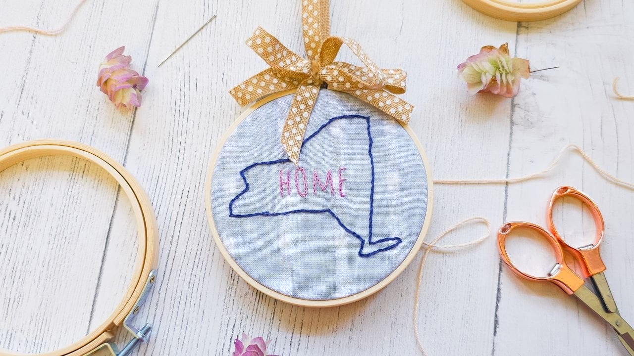
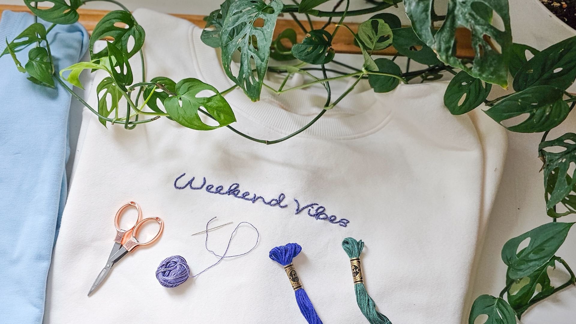
Transcripts
1. Introduction: [MUSIC] Out of all of the mediums you could
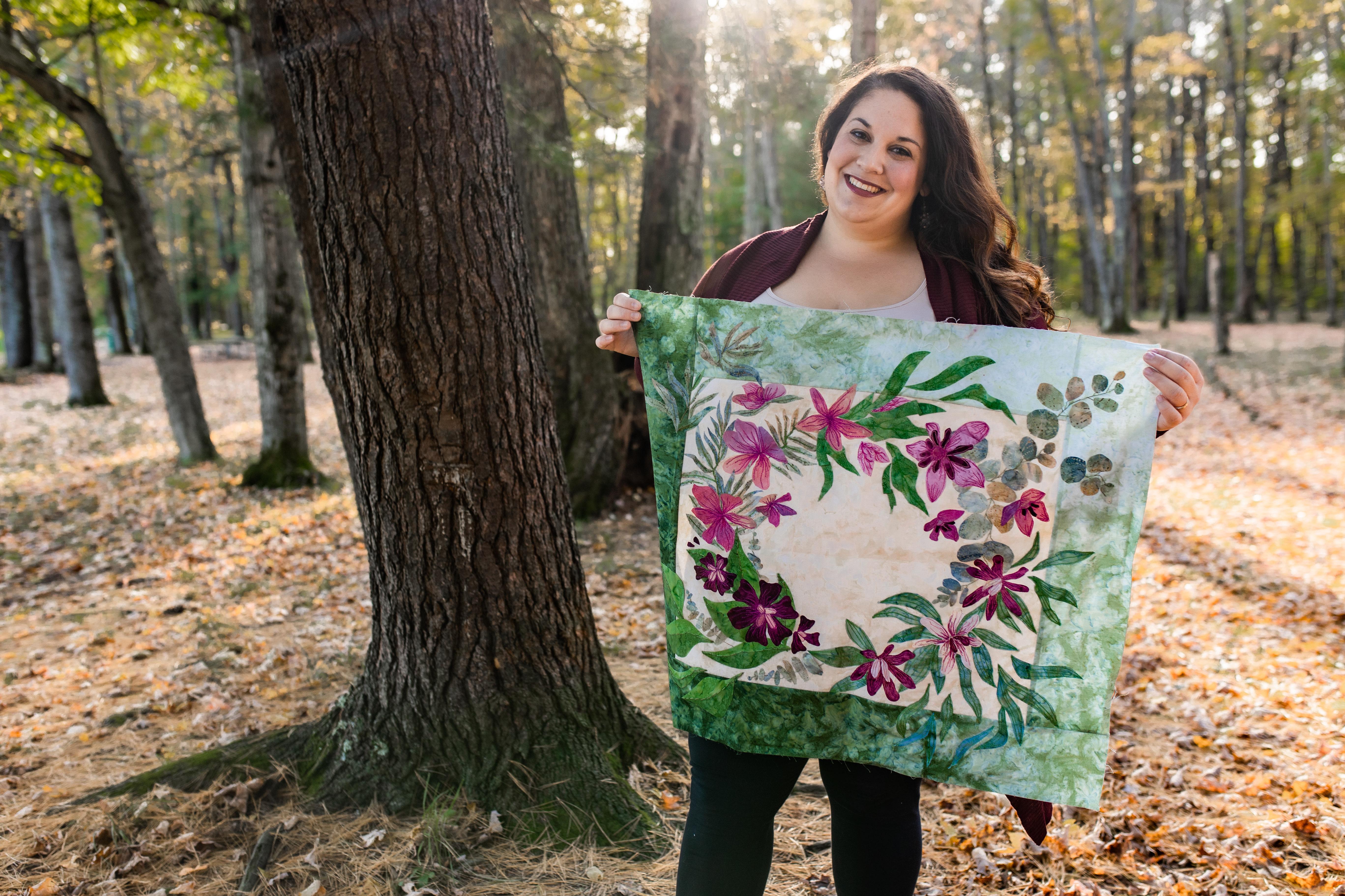
use to express yourself, have you ever considered fabric? Hi, I'm Lauren Weber, artist, designer, and
quilter from New York. No, no, not that New York, [LAUGHTER] this New York. I grew up on a small hobby
farm surrounded by plants, flowers, and endless
inspiration. I was drawn to a sewing
machine at a young age, and I've been
crafting ever since. Now I'm the owner and founder of Garden Girls Studio where
I quilt, illustrate, and design patterns usually, can you guess it?
Garden inspired. I love plants and creating. I realized pretty early on in my quilting career
that I wanted to design more than just quilt
blocks, squares, triangles. I wanted to paint with fabric. In this class, you will
learn how to illustrate with fabric through the art
of fusible applique. Fusible applique
is like collage, but instead of using paper, you're using fabric, and instead of using line
work, you're using stitches. I am going to walk you
through how to take your ideas and sketches and
turn them into fabric art. For your class project, you'll create a simple
fabric illustration based on what sparks
your imagination. You know nature gets my
creative wheels turning. But we'll have a whole lesson on how you can find your
own inspiration. We'll start with
choosing your fabric and deciding which prints, patterns, and solids work
best for your project. We'll progress into strategically
layering fabric and thread to showcase the focal elements
in your composition, and we'll touch on some of my favorite embellishment
techniques, including embroidery and thread painting to bring
dimension to your project, which can really take your
work to the next level. Seriously, these extras are really going to
make your work pop. Feeling nervous to get started? To make the process easier, I'm providing a template
that can be used to create a simple illustration using the techniques we
covered in this class. This class is perfect
for beginners, but all skill levels are
welcome to join in on the fun. We're letting loose, this
will be low pressure. You don't have to worry about
perfect seams or stitches. You just have to have a
desire to create with fabric. Without a doubt,
fusible applique is a great skill to add to
your creative toolbox. If you're a traditional quilter, it can help you think
about working with fabric and thread in a new way. If you're a DIY
crafter or creative, why not add fabric and thread
to your creative portfolio? Think about all of the
projects you can make. Or if you're someone
who just loves fabric, but doesn't know where to begin, allow me to introduce
you to fusible applique. Join me and we can step into the world of creating
with fabric. By following along,
you'll not only learn new fusible applique skills but this process will help you
expand your creativity. These techniques
are going to shift the way you think about all of the possible tools you can
use to create your artwork. Now is your opportunity to think outside of
the quilt blocks. If you're ready to
paint the world around you with fabric, grab your favorite
sewing supplies, and let's get started. I'll see you in
the first lesson. [MUSIC]
2. Class Project: [MUSIC] Let's dive in. The goal of this class is to illustrate with fabric
and thread using raw edge feasible applique and have a little bit
of fun along the way. For your class project, I'm going to ask you to
create a simple fabric and thread illustration
using the techniques we cover in this class. I'm going to ask you to create a template for your project. Choose your fabric,
assemble your illustration, and then choose one
thread technique to incorporate
into your project. You can opt to do more, but I'd like you to choose
at least one technique to try to give your work a
little bit of extra detail. When you're all done, I'd like
you to upload your work to the project gallery so that we can see what you've
accomplished. Take a picture of your
fabric illustration. Tell us a little bit about your process and fill us in with the parts of the project
that you absolutely loved and the parts that
gave you a challenge. Let us know if you
had any questions. The more that we share
within this community, the more we all learn. I can't wait to see we've
upload and be sure to keep us posted with
updates along the way. In the next lesson, we're going to dive in
and learn a little bit more about what illustrating with fabric and thread means. I'll see you there. [MUSIC]
3. Fabric and Thread as a Medium: [MUSIC] Welcome back.
Let's talk about fabric and thread as an
illustrative medium. We often see fabric
used in fashion and home decor and in
classic quilting projects, but how often do we think about using fabric and
thread in our artwork? Well, in this class, I'd like you to think of
fabric and thread as tools that you can
use to create artwork. Fabric is going to serve as the foundation for
your illustration. Often, in painting or drawing, we work in layers. First, you sketch
general shapes, then you start layering in
extra colors and details. That's what we're going
to be doing as well. We will be using
fabric to create the base shapes for
our illustration, then layering in thread to
add shading and details. In order to do this, we're going to use a technique called raw edge
fusible applique. Raw edge fusible applique
is a way of layering irregularly-shaped
pieces of fabric. The edges of the fabric
are generally unfinished. Their are cuts which
makes them raw. Thus the name raw edge applique. In traditional piecing,
every square, block, and triangle has to come
together and line up. You have to have seams
where points need to meet, edges need to be finished, but in fusible applique, we throw some of those
rules out the window. We can start layering
our fabric pieces and gluing them down and
sewing them together, which gives us a lot more
freedom in our creation. It's like collage. The freedom of
collaging with raw edge fusible applique means
that we can make illustrations with our fabric. We're not bound by boxes and points and squares
and triangles. We can freely create shapes
to make our illustrations. We can explore
different fabric types. We can use these fabrics and compile them in a way
that's going to create texture and movement
and space in our piece. Within this class,
we're going to be using quilting cottons. But even within that realm, if you think about the
different prints, patterns, and solids that you can use, I want you to
picture walking into a craft store or your
favorite fabric store. You'll see all of the bolts
of fabric along the wall and just imagine that those bolts of fabric
are your paint palette. Think about all the different
colors you can use, all the different textures. Are there stripes?
Are there polka dots? Are there florals? These are the materials
that we're going to be using to create
our composition. I want you to start thinking about fabric as
your paint palette. How can these
fabrics be layered, mixed, and put together
to create something new? Now, let's talk
about thread work. Fabric can only get you so far, but ultimately, it is flat. Even if you layer multiple pieces of fabric
to create shading, thread is another
tool that you can use to start creating
dimension in your work. We have a number of thread types and threadwork
techniques that we can use to enhance your work and build on
our fabric foundation. Think of thread-like
paintbrushes. Different brushes
and writing tools give you different effects. The same is true
for thread work. Our goal is to build on our fabric foundation and
use thread to add details, texture, and shading
to our project. We're going to cover some of these embellishment
techniques later on in this class but for now, I just want you to start
thinking about how you can use thread as
line and shading. I want you to start
thinking about how you can use fabric to start building the foundation
of your illustration. For example, if I'm
looking at a leaf, maybe then I'm going to
use thread for the veining and fabric for the leaf shape, and so on and so forth. Once you start realizing all the different tools that you have when you're working
with African thread, it's going to open the doors for you to be able
to start creating textile art and this class
is just the beginning. I want you to start thinking
about how you can use these tools to create
your composition. In the next lesson,
we're going to start talking about
finding inspiration. If you're ready to get started, I'll see you there. [MUSIC]
4. Gathering Inspiration: [MUSIC] Welcome back. This lesson is about finding
creative inspiration. Sometimes when we're
working on a project, we just need a little
extra creative spark. In this lesson, we're
going to cover some of my favorite ways
to get inspired. The first way to get inspired, getting out and exploring
the world around me. I love going out
into my garden and getting inspired by
the plants I see. Get on out, take a walk,
explore your surroundings, see what's around you, and see if anything's
sparked your inspiration. If you see something
that inspires you, sketch it out or take a picture, use it as inspiration
for your project. My favorite way to
gather inspiration is to really notice the details. Don't be afraid to really
look deeper at your subject. You may find
something there that you weren't expecting to see. The reason why I
love plants so much is that they are
beautifully diverse. If you look closely,
you'll start to notice different forms, lines, shapes, and textures. Seeing all the little
differences and noticing how each of these plants
and leaves are different, really helps me with my
embellishment details later on in my project. These are the details
that I'm going to be adding using thread work. I grow a garden to
pull inspiration from, so I often bring plants, leaves, flowers right inside, up to my desk and I
sketch them out there. Sometimes taking a pen or
pencil to paper can really help you notice the details when you start to sketch
out something new. Last but certainly not least, I enjoy taking inspiration
from photos that I've taken. Whether it be a
vacation and adventure, time with family and friends, a new public garden. Using those photos
has really given me great inspiration and
ideas for my projects. I wanted to show you
this project that I came up with a few months ago, I was cold here in New York. It was snowy, it was
blustery, it was freezing, and I wanted to re-experience a warm tropical
vacation of years past. I went through photos
that I had taken old photos and I put them and I categorize them into all of
these different categories so that I could draw
inspiration for an art project. If you're inspired by
what's around you, whether you're on
vacation or at home, or experiencing something with your friends and your family, take a picture, take a snapshot. I mean, yes, I might look silly, but look how cool this
pattern is in the background. I mean, whether that's
a stitching pattern or something I want to make. I mean, look how awesome
this plant is cool. I mean, I can create an
entire color palette just from this photo. Taking our own
photos helps us make sure that our
artwork is original. It's really easy to
jump on Pinterest or Google to look for ideas, but it's far better to take our own photos to draw
original inspiration. When we take our own photos, we can use them to
create our artwork. For example, if I was
really overwhelmed by this viscous flower and I didn't think I could
draw it freehand, I could upload it into one of my programs and trace
it or trace it by hand. Taking the time to really dive deep and take your own photos is really going to help you create original
artwork and it's going to give you a lot more freedom
and your creative process. Once I had all of
these things gathered, I actually made a
mood board, and yes, I have an Instagramable picture, but don't feel like
it needs to be the perfect Instagram mood board or idea board or
inspiration board. Get messy with it. I mean, I pulled out all of
my favorite colors. All of these neutrals, these sandy tones, I pulled out even some
of these murkier tones, they're great, they're perfect. I pulled things that I
loved the colors of. I love how the pineapple
buds match the sunset, match some of the flora, match. Even the pineapples match the
golden on their roosters I saw and did I use all of
these colors in my project? No, I really did pull
it all together. If you get some fatigue
in your project, you can come back to your mood board and
get excited about it. Feel that warmth, that energy that you had at the
start of the project. Don't be afraid to look
back at your photos. Pull them all together, see what works, what colors
are really inspiring you, put them all in one space
and you can reflect back on it later in your project
or as you're moving along. It's just another
good option for you to gather inspiration. This is how I find inspiration, but what inspires you? I encourage you
to make a list or a mood board of the things
that have inspired you. Keep that inspiration handy for the next time you're
working on a project. That way, if you need a
little extra creative spark, you're ready to go. In the next lesson, we're going to talk about composition. I'll see you there. [MUSIC]
5. Composition: Hierarchy and Repetition: [MUSIC] Welcome back. In this lesson, we are going to talk
about composition. Now that we have all of
our inspiration ideas, we need to take all
of those ideas and organize them in a way
that we can create a cohesive design based on a few key compositional
principles. Let's talk about some
basic principles that we can use to help us build a strong design that is
easy on our viewer's eye, balanced, and can help us showcase the important
elements in our work. We can help our
audience understand our work by creating a
compositional hierarchy. This hierarchy can be created by establishing
key focal points. It could be emphasized by color selection,
contrast, and repetition. Let's look at some examples. The first thing I
really want you to think about is how are all of your elements
interacting with each other? What do you want
the viewer to see? Are some elements going to be
more important than others? The answer is yes. You've probably already decided what you want to illustrate. You have all of your
inspirations in front of you. Maybe you have a lot of ideas, but ultimately you
want to create one or a couple of
small focal points. Our focal points are going to be the key features in our design, and they are going
to inform many of the design choices we make
throughout this process. Oftentimes your focal
points are going to have more detail. They're going to contrast from the rest of your
work in some way, and we really want to make
sure they pop and stand out. There's a few ways that we
can go ahead and do that. The first thing I want
you to think about is establishing a foreground, a middle ground,
and a background. Now, luckily, with fabric, this should not be too difficult because ultimately we have to layer these pieces anyway in
order to build our picture. Establish a base fabric. This is going to
serve as your canvas, and oftentimes, it's also going to serve as
your background. You may have some other
background features, but they're often
going to be muted. They're not going to
have as much detail. These elements are
going to build the foundation of
our composition. The next element I
want you to think about are going to be
your foreground elements. A lot of times perspective-wise, your focal points are actually
going to be closer to you. It's going to be
your foreground. They're going to
have more detail. They're going to
have great contrast with everything around them. They're really going to
draw the viewer's eye in. These are the places
that we want our viewer to look at and notice. Then we also want to
talk about mid-ground. Your mid-ground elements are going to be your
supportive elements. They should support
your focal points without detracting from them. Slightly less detail,
maybe slightly duller, or tones that coordinate but don't take away from
your focal elements. These are important things to think about when we're
thinking about fabric, color choice, brightness level, darkness level,
things like that. Now, we'll get into
fabric selection a little bit more
in a later lesson, but just keeping in the
back of your mind how you can distinguish your
layers, foreground, middle ground, and
background using light, color and detail texture. Now, the next thing I want
you to think about is, where am I going
to put this focal point in the composition? If your base fabric
is your canvas and you divide that
canvas up into thirds, both vertically
and horizontally, you're going to get a grid. We call this grid
our thirds grid, or in this case, we are going to be
using a rule of thirds. Generally, you want to try
to place your focal elements on one of these
intersecting lines. These intersecting
lines indicate locations that will be
pleasing on the viewer's eye. We can use these key
locations to emphasize our focal elements using our support of elements
and negative space. Negative space is
your softer space. It's your non-focal region. You want to establish
negative space because it's important for
your viewer's eye to rest. So oftentimes we're
probably going to use our background space to
establish negative space. That's why we want very few
details in the background. The other benefit of
using negative space is that it's actually going to draw the viewer's eye to
your focal points because there's not
going to be as much to look at in those
negative spaces, so your eye is going
to start roaming until it lands on
your focal point, the place that you wanted
your viewer to see. The last compositional element I wanted to discuss is repetition. Repetition is repeating
similar techniques, elements, characteristics, and qualities
across your canvas. In this case, if
we're using fabric, we want to have consistent
colors across our canvas, or maybe our elements
have consistent shapes. That way our viewer can really understand what's
happening in our piece. Let's say I have 10
leaves in my composition. Of those leaves, five are red, one is blue, one is purple, two are green, and
one is yellow. My viewer would probably look at my composition
and be like, why did you do that? They might not understand it. But if I made all
of my leaves green, even if they were just shades
of green, or in this case, if I used different
green fabrics that all coordinated
with each other, they'd be like, okay,
in their heads. Even if they're not
saying it out loud, they would establish that all
of those leaves are green. Now, I could do the same thing and all of those leaves could be purple and they
would still accept that because consistently
across my canvas, even though purple may not be a standard shade
for a leaf color, they would accept that, okay, all the leaves are purple. They've established
it as a rule. In my composition,
I'm going to be grouping different
leaves styles together. In order to distinguish those, I'm going to give them
each a different type of shape or line. I'm going to have
super wavy leaves. In another spot, I'm going to have leaves that
look like palms. They're going to be
skinny, teeny, tiny, thin. So within even my wavy leaves, they're all going to be
a little bit different. But because the general shape
of those leaves is wavy, my viewers can understand
that those are a different type of leaf
than say, my palm leaves. If you establish repetition
as part of your work, you'll be creating basic rules that the viewer is going
to internalize and say, okay, I understand this piece. If you want to
create a moment in your design and showcase
something important, you can break your own rules. But you can only break
them if you've established rules consistently and clearly
throughout your design. Let's say that I was
creating composition again. I have 10 leaves and
they are all purple. But let's say I wanted to have one of those
leaves stand out. There was something
really important that I wanted to show in that leaf. Well, if I made nine of the leaves purple and
one of them orange, suddenly my viewer
is going to be like, "I wonder why that's orange. Maybe there's something
really important with this orange leaf that
I need to look at." Now, if you want to
create a moment, something important,
really show off something, you can break your own rules, but you can only do it
if you've established that rule consistently
across your composition. For us, it's really
important that we are making intentional color choices when we're choosing our fabric, and it's really
important that we're consistent with the
way that we are drawing certain shapes in
our elements for our design. This consistency
will really help our viewer understand what
we're trying to express. In this lesson, we've covered some basic compositional
principles that will help us intentionally organize
our design elements so that we can create a
balanced, cohesive design. In the next lesson,
we're going to take all of these principles and use them to create our
illustrations layout. But we are going
to use that layout to create templates
so that we can cut out our fabric and start
assembling our project. If you're ready to get started
with creating your layout, I'll see you in the next lesson. [MUSIC]
6. Layout & Templates: From Planning to Prep: Welcome back. Now that we've discussed our
compositional principles, it's time to start discussing
designing our layout. In this lesson, we are
going to be finalizing our illustration ideas in
creating a design layout. We are going to be using this design layout to
create simple templates. What will we use
these templates for? Well, we need these
templates to cut out our fabric shapes for
our illustration. Let's walk through how we
can take our sketches and drawings and turn them into
templates to cut our fabric. Step one, you are going to sketch out your
illustration ideas. If you haven't finalized
your subject or what you'd like to create for your
illustration now is the time. Your sketches don't need to
be particularly complex. In fact, they can be
relatively simple. We just need to get an
idea of what elements we are going to be using
in our illustration. You can use whichever drawing technique works best for you. You can sketch digitally by hand or even trace
your design elements. Sometimes I'll use
one or more of these techniques depending on what type of project
I'm working on. Use whichever technique feels
most comfortable for you. Step 2, we need to determine how each of
our sketched elements, will be placed in
our illustration to start creating
our design layout. Now you're going to see how all of your design
elements are going to work together to
create your composition, I'm going to recommend you create little
thumbnail sketches. Take all of the
elements that you sketched out in Step
1 and arrange them, keeping in mind our key
compositional principles. Don't be afraid if one of the
thumbnails is not working. Just scrap it and
move on to the next. Keep sketching until
you can see how all of your elements are
going to work together. Do you need to make certain
elements bigger, smaller? Do your objects overlap? These are important things
to start thinking about. You can also work
digitally if you're more comfortable working with your elements on the computer, I say, go for it. Keep in mind, you don't need to know every single
detail at this point. Start to understand
the details so we can add them as
embellishments later. But for now, you just
want an idea of the size, scale, and placement
of your elements. Keep in mind your
rule of thirds, your use of negative space, and how you're going to
lay out your foreground, mid-ground, and your background. Step 3, at this point, it's important to
define a clear edge on your elements in this layout. I know sometimes
when I'm sketching, I tend to leave things vague. My drawing is very loose. Now is the time for
clearly defined shapes. That is because these edges are our guidelines for
our templates. When we go to cut our fabric, we need to make sure that
these lines are crisp. These lines will indicate where we're going to cut our fabric. If you haven't already darken the outline for all
of your elements. In Step 4, we're going to trace each
of these outlined elements onto a separate piece of paper
to create our templates. I'm going to say trace onto a separate piece
of papers that we can reuse those templates over and over again
in the future. Personally, if I make a mistake or if something doesn't
come out quite right, I like to have my original
template to refer back to. Keep in mind that as you're tracing each of your
design elements, none of these elements should
be overlapped anymore. You need to be able to
distinguish and cut each shape separately so that
each shape can be cut from fabric as
you're tracing, this is something super
important to keep in mind. There are some situations
when you will not want to trace your template
exactly on the outline, you may want to slightly
extend any edges of design elements
that are positioned underneath another object
in your composition. This will give you
wiggle room down the road when you go to
reassemble your project. If I know two shapes
are going to overlap, then I trace a little outside of the outline on the bottom layer. This part of my outline
won't be visible because it's sitting
under the top layer. In this case, my leaf has an extended edge which will be positioned under
the flower petal, leaving a little extra fabric to overlap means that I have a little more wiggle
room for cutting errors when I'm
reassembling my project. If the shapes fit
together exactly, there's little room for error. The edge of your fabric
shapes will need to be cut nearly perfect, to fit together
properly on reassembly. Instead, draw your shapes to extend underneath their
neighboring shapes. That way if you're
cutting isn't perfect, it won't be an issue when
you're reassembling. Any objects that
have visible edges, those edges will all be exact, traced right on our outlines. I am only extending the edge that is going
to be covered by another object against when
I reassemble my composition, my fabric shapes
won't have to line up perfectly edge to edge. There will be a
little wiggle room for my final placement. Personally, in my
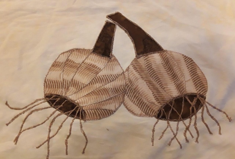
wreath project, I'm going to be drawing
around every leaf shape, even if its placement is behind or under another
leaf in my composition. There are so many elements overlapping in this project
that it would be way more difficult to reassemble
if I had to try to crop each leaf and pinpoint
its exact location. Instead I'm cutting my
leaf shapes whole and we'll let them overlap
in my final project. That is what works for me
in this project but you can consider outlining what's visible in your composition. But keep in mind that your placements will
need to be more exact when you go to
reassemble your project. Step 5, if your templates
are super complex, make sure you label
letter or number them. Because we're outlining all of our objects as
standalone elements, it's really easy to
get them mixed up. Suddenly something that
was a pumpkin is now a whole bunch of really
abstract shapes. Or something that
was a flower is a whole bunch of really
abstract shapes. To make sure that
you're putting them all together in the right order, number or letter them in your
original sketch and then number and letter them
on your template piece. That way you can refer back to your original drawing to know exactly how all of those elements are
going to fit together. I want you to use
this lesson to create some templates for your
feasible applique. I'm also going to
recommend that you avoid working with teeny
tiny elements. As you're creating
your templates, try to keep your shapes in your objects at
a reasonable scale, at a reasonable size. The smaller that you work, the more fussy it's going to be when you're going to
lay out your project. If you've teeny-tiny little shapes and you've got to
keep them all in one spot, they're much harder to manage. But if you have
pieces of fabric that are of reasonable size, it's going to be a
lot easier for you to work and get through
this project. Don't be afraid to keep
your shapes simple. I'm going to be touching on
some embellishment techniques later on that we're
going to use with thread work that
you can use to add details and textures
to your illustration. We can always get
more complex later and we can always add
more details later. To recap, you're
going to sketch out your ideas based on
your inspiration. Create your compositions layout, outline the edges of
each design element, trace your elements
onto a piece of paper and label your templates. All right, everyone that covers layout and
creating templates. In the next lesson we're
going to cover one of my favorites, fabric selection. If you're ready to
choose your fabric, I'll see you in the next lesson. [MUSIC]
7. Fabric Selection: Pattern and Color: [MUSIC] Welcome back. Now is the fun part,
fabric selection. I love this stage in
the process because I can finally start seeing
my project come together. Planning is great, but
creating is so much more fun. As an artistic medium, fabric is pretty awesome
because it's already printed. How do we know how to
layer these prints and patterns together to
create a composition? Let's talk about
the different print and pattern styles that
you can work with. One of the first options
you have are solids. Solids can be a
challenge to work with, they are a total blank slate. On the bright side, you can create whatever you
want with them. On the downside, it
is a blank slate, so it can appear
flat if you don't add some extra details or
pep it up a little bit. In order to make your solids look a
little more interesting, you may need to add
embellishments, painting thread, other fabric, maybe you need to layer
a little bit more. Now, my favorite
style of print to work with, are near solids. Think batiks, hand dyeds, those types of fabrics. They're usually tone on tone, they have good
texture and color. The reason why I love
semi-solids so much, sometimes I can find
elements in the fabric that will guide how I use them. If I have a bunch of leaf
shapes like for my wreath, I'm going to find fabrics
that already have nice lines, like vein lines, or maybe they're blotchy, like how I would see
leaves in nature, so there's interests
already in those fabrics. They aren't as dull as solids, but they aren't as
robust as prints, which is what we're
getting to next. The third type of
fabrics that you can use are prints and patterns. Now, prints are pretty awesome because they have a lot
of texture already. It's like having a paintbrush
in Adobe Illustrator, you can sweep your whole Canvas, and suddenly you have
a new pattern or texture running through
your composition. It's great, but it can also be a little bit overwhelming if
it's not used properly. Keep in mind that you can mix and match these
different options, so you can pair solids
with semi-solids or patterns to take
your doll solids and give them a
little bit more life. You can take your busy
prints and patterns, and you can subdue them by matching them up
with some solids, so explore and find
out how your fabrics play together and
determine which parts of your illustration
you want to be a little bit more busy or a
little bit more subdued. For example, your focal elements are going to need a
little bit more detail, they're going to need a
little bit more movement, so maybe in those
parts of your project, you can have a few
more busy patterns, whereas maybe some of your background
elements may need to be a little bit duller and
a little more subdued. Think about how your
fabric palette and how your fabric choices are going
to impact your composition. How do you choose
a color palette? Personally, I usually
work one of two ways, I either like a whole broad
color range of colors, or I work monochromatically. You can work monochromatically, or you can work with a
wide range of colors. But ultimately, the most
important factor that I want you to think about is how these colors work together. I want you to think
about contrast. The colors you choose
for your focal elements should stand out in contrast from the other
colors in your palette. Your midground
elements are going to be supportive elements. The colors you choose for your
midground design elements should emphasize
your focal points. You may want to choose colors that are slightly more muted, slightly lighter, slightly darker to make your
focal elements stand out. Your background elements
and base fabric should have the most contrast relative
to your focal elements, but be sure to choose a color that doesn't compete
with your focal point. Establish neutral colors to
help balance the colors in your illustration and give your key elements a chance to shine. Using a neutral color
for your base fabric is a great way to help draw
attention to your focal points. Now, keep in mind that these are not hard and fast rules, play with color
and have some fun. Lay out your fabrics
and see how they worked together before you make
your final selection. Which colors pop, which colors fade
into the background, and how can these
fabrics be used to emphasize key moments
in your illustration? If you're feeling stuck, if you feel like there's
too many color options, you're not sure what to do, now is the time to go back
to your inspiration board. See what colors we're inspiring you at the start
of this project. See what might work now that you've decided
on your layout. Now is a great time
to get re-inspired, revisit all of
those early ideas, and get the creative
juices flowing. In terms of what type
of fabric to use, I'm going to highly recommend
using quilting cotton. The feasible web that
we're going to use, or at least the one
that I'm going to use is heat-activated, and not all fancy, fun and
silly fabrics can handle heat. I'm going to recommend
you avoid silk, chiffon, netting tool, unless
you have a lot of experience working with
those fabrics and fibers. You can create some really
awesome compositions using just quilting cotton, and that's what we're going
to focus on in this class. To recap, we've talked about different
fabric print styles, how to consider contrast in
your fabric color selection, and again, I highly
recommend you use quilting cotton
for this project. These are going to
be the fabrics you use to create your design. This is the fun part, have some fun with it, lay out your fabrics, see what works. Make sure your fabric
is washed, pressed, and ready to go so
that we can move on to the next step in our
process, cutting our fabric. If you're ready to move
on to the next lesson, I'll see you there. [MUSIC]
8. Cutting Fabric Elements: Welcome back. In this lesson, we're going to work on
prepping and cutting our fabric and using
our fusible web. We're also going to discuss how to use our fusible web paper. Now, every fusible web works
a little bit differently. Be sure to follow your
products given instructions. But essentially fusible
web acts like glue. We will be activating this
glue twice in our process. Once to attach the glue
to our fabric shapes, and again later to place these shapes in our
overall composition. In this lesson we're
going to cover tracing our templates onto the
fusible web paper, activating our fusible
web glue so that our templates are
attached to our fabric and cutting out
our fabric shapes so that they are ready
for our composition. You are going to
trace each group of elements onto a piece
of fusible web paper. So if you haven't already decide which fabrics you
are going to use for each object in
your illustration, you are going to trace
each group of templates based on fabric type onto
your fusible web paper. They're all grouped
by fabric type. Your piece of
fusible wet paper is likely going to be
2-3 layers thick. You're going to have a
rough layer and that's going to be your glue
or your fusible web. Then you're going to have
a waxy or smooth piece of paper and that's
the side that we're going to trace our
elements onto. What's really important to
know is that you need to trace a mirror image of your elements onto the
fusible web paper. Why? It's like if you were taking a glue stick and a
piece of construction paper, you're gluing to
the underside of the construction paper
and the pretty sight of your construction
paper is going to be face up. Same concept here. The bottom of the fabric is going to be what the glue
is going to be attached to. When we flip it over, the right side is
going to be facing up. As you're tracing
your templates, trace them in reverse, trace a mirror image. An easy way to do
this is to hold your template drawing
up to a window or use a light-box face your template outward so that you can see the lines through the
piece of paper using the light from the window
or your light-box, then you're going to trace
those reversed lines onto your fusible web paper. If you're like me and
you're doing a wreath or something very natural, it won't make a
huge difference if the leaves are
flipped mirror image, it's not what we
were hoping for, but it won't be the
end of the world. But if you're doing something
with say, lettering, that's going to be
a huge difference because all of your
letters are going to be backwards when you go to put them onto your
base fabric layer. This is super important. If you don't do this, you're
going to realize later that your elements are reversed and if it's something like
lettering or font, it's going to come
out backwards, which I've really
just don't want to happen to you after
all of your hard work. Be mindful that
you're going to want to trace a mirror
image of your elements on to the smooth surface
of your fusible web paper. As you are tracing, group all of your elements
that will be cut with the same fabric together
on your fusible web paper. Organizing your templates by fabric type will help
you be more efficient. This way, we can fuse
all of our elements to a single piece of fabric and cut them all
at the same time. Once you have your elements traced onto your
fusible web paper, cut around the edges
of where you traced. No need to activate all of
the glue if isn't necessary. Then cut your selected
piece of fabric to be slightly wider than the
templates you just traced. Now we need to sandwich these layers together
so that we can activate the glue onto
the back of our fabric. The way that my
fusible web works, this is how I make my sandwich. Step 1, place a piece of parchment paper down on
your ironing surface. Step 2, place your fabric on top of the parchment paper
with the backside facing up, so the non printed side of your fabric
should be facing up. Step 3, place your fusible
web paper template so the glue or the rough side is down on top of the fabric
so that the glue is in direct contact with the back
of the fabric you selected. The smooth paper we traced
on should be facing up. Step 4, cover these layers with another
piece of parchment paper to protect your iron
from any straight glue bits just in case. My fusible web is
heat activated, but follow the instructions
for your fusible web. Yours may not work
the same as mine, so for mine, I'm going
to heat up my iron. I'm going to press and
hold for a few seconds. Once I know that that
glue is activated, of course I don't want
it to burn, I'm not going to leave it
on for too long. But once I know that
it's activated, I'm going to remove my iron and I'm going to
allow it to cool. Now you want to
make sure you give your fabric enough time to cool so that your pieces have enough time to fuse
and the glue has enough time to react while you're allowing
your fabric to cool, go ahead and repeat all
of these steps for all of your different fabric
groups until you've completed all of your
different elements and shapes. To recap, make sure that all of your elements are grouped
according to fabric type. Make sure you trace your
elements as a mirror image, and then go ahead,
create your sandwich. Use your fusible web according to your manufacturer's
instructions for each of your fabrics that you are going to
use for your project. Then once all of your
pieces are cool, you're going to go head
and you're going to cutout right on those outlines. There's likely still going
to be a piece of waxy paper protecting the other side
of your fusible web. Try to keep the paper
attached if you can. It will help the longevity of the fusible web because we
have the glue on one side. But our next step is going to
be placing our elements on our base and then
gluing again so that they stay attached
and our composition. If you can try to keep that piece of paper
attached for now until we're ready to do our full composition
that would be helpful. If the piece of paper falls
off it's no big deal. Don't stress, it's
just something helpful as we move
forward in our project. Go ahead and continue this process with all
of your fabric shapes. If your elements need
to be arranged in a certain way or if they
are lettered are numbered, makes sure that you
keep them labeled and organized so that they don't get mixed up at this
stage in the process. Personally, I have both either drawn right on the outside of that smooth
piece of paper if I can, if that piece of
paper falls off. I've also printed
pieces of paper that have my template on
them from my computer and I'll put the
individual pieces of fabric right over the
shape that they're representing so that I
can't possibly mix it up because I'm good
at mixing things up. Stay as organized as
you can and I will see you in the next lesson
to assemble our project. This is getting exciting.
I'll see you there.
9. Final Layout and Assembly: Fusible Appliqué: Welcome back. We're
almost there. We're entering one
of the most exciting stages in our project, seeing it all come together. So in this lesson,
we are going to discuss our final
layout and assembly. The idea is to build your
layers from the base on up. The first thing
you're going to do is prepare your base fabric. This is going to be the
canvas that we are going to be building our
composition on. You're going to make
sure that it is washed, cut to size, and press nicely. That way we can start
assembling and laying out all of our fabric shapes
on top of this base layer. You're going to lay
out your base fabric on a flat surface. That could be a table, a design wall, an ironing board, any flat surface so that
we can start assembling and layering our design elements to create our composition. So now you have
your base fabric. If you have any other
background elements, it's time to start
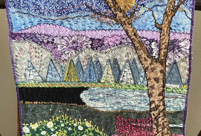
laying those out. For example, if you're
doing a landscape and you have some distant
mountains or horizon line, now it's the time to put those pieces on top of
your background layer. As you are arranging
your fabric elements, be sure to place them glue side down into your composition. The printed side of your fabric should be face up as you're positioning it and arranging
it for your illustration. Don't forget to remove
the little pieces of waxy paper on the back of
your fusible web elements. That way, once all of
your pieces are in place, you'll be ready to glue. Next up, you make
ground elements. In my case, this is
often my leaf shapes. A lot of times I use flowers
as my focal elements. So my leaves are my
mid-ground elements. In my wreath project, I'm using my mid-ground
leaf elements to create contexts
for my layout. I'm grouping my leafs
by shape and color, and I'm starting to form that characteristic
wreath shape. Starting to define
the wreath area in my illustration by placing
some mid-ground elements to create context will help me know where to place
my focal elements. Finally, you're going to
add your focal elements. Sometimes I do add in my focal elements a
little bit early. I'll place a few of my
mid-ground elements, but then I want to make sure that my focal
elements are going to be in the right spots. The location of
your focal element is what's most important. We need to make
sure that they are placed in their
proper positions. You can always add back in some of those mid
ground elements later once you know where you're going to
place your focal elements. Those mid ground
elements can be added back in by just tucking them underneath your foreground
elements or your focal points. Keep in mind, you
will likely have to make adjustments as you go. That's totally okay. Maybe you'll realize that your contrast isn't quite
what you thought it was going to be or maybe the scale of your shapes
is just a little bit off. Goodness knows, I've trimmed
elements along the way. That's totally okay. Remember that we
can use different embellishment and
thread work techniques to add contrast, texture, and extra
details to your elements. The most important thing to remember at this stage
in your project is just making sure that
your elements are in the correct locations. Once you have all of
your design elements in their proper locations, we're going to activate our feasible web
for a final time. Sometimes before I activate my feasible web for
the final time, I like to take a break and
step away from my project. I'll come back later with fresh eyes just to see
if I want to make any other adjustments before
everything is finalized. It is 100% okay if your design
evolves, if it changes. It doesn't need to be like
your original thumbnail. It's okay if you've found creative happy
moments along the way and added them into your
project or realized maybe something wasn't working and you've changed it,
you've adjusted it. This is meant to be a creative process
where things can flow. My projects often
change as I go. [LAUGHTER] My style gives my patterns a little
bit more character, and that's what I
want to show through. I want my designs to show my unique style and
my unique character. I want your unique style
to shine through too. Now if you don't feel
comfortable fusing elements down directly to your final Project or if you
have a lot of little pieces, say like a flower and you've
got a lot of little petals, and you want to
assemble those before placing them onto
your final project, there's another technique
that you should know. To do this, you're going
to take your elements, you're going to arrange
them between two pieces of parchment paper and according to your fusible
application instructions, to a very light gluing and
then you can still peel off your newly fused object before placing it
onto your final project and then
fusing it again. Now I say lightly
fuse because it'll be easier to pull off
your parchment paper if you've lightly glued it. But honestly, I could
peel it right off and it's still activated
on my background. Now, the benefit of this, is that now I can
take whole flowers and move them around without moving around individual petals and individual flower centers. I can take the entire
flower shape and move it where I want it
in my composition. This is another little technique that maybe useful for you. Now, if you're struggling with
a lot of little pieces or maybe your elements just
won't stay in place, don't be afraid to step out of this process and make
it work for you. This process isn't set in stone, so if there's a technique
that's going to make your workflow faster, better, and more efficient, easier for you to work with, I say go for it. For example, like I said
my elements tend to move, I'm pretty clumsy, so I will
bump my shapes and then I whole flower will
move out of alignment. One of the techniques
that I use is, I'll use a tacky
glue and I'll take a toothpick and I'll take
the smallest amount of that tacky glue and
I will place it on the bottom side of my elements, say my petals and I
will use them to anchor my objects in place before
my final glue down. This helps to make
sure that nothing is moving as I'm working. You can also use pins or the clips or whatever
happens to work for you just to keep
everything set still, so that you can get your whole layout ready to
go before you glue it down. If there's a technique
that's going to make your life easier, add it into your process. In fact, I'd love
to hear about it. If you're willing to
share it with a group, tell us about it in
your class project, or in the discussion panel. We would love to know what techniques you used and how you made them
work for your project. The more that we all share, the more that we can all grow and learn in this community. I cannot wait to see
what you come up with. Once your layout is just
the way you want it, now is the time to fuse it down. If your glue is activated, remember to use your
parchment paper to protect your iron and you're
ironing surface. Be very careful when you're placing your piece of
parchment paper down that it doesn't bump or move your elements that you've
just so nicely laid out. Make sure you
activate every shape. You don't want little
pieces falling off and you go to lift up your fabric composition, so make sure you are activating all of your glue that all of your shapes
are nice and secured. Once everything is
all fused down, we're going to move on
to the next lesson, where we're going to discuss the different ways that you can incorporate thread work
into your composition. If you're ready to get
started, I'll see you there.
10. The Importance of Threadwork: [MUSIC] Hey everyone, so we just finished
assembling our composition, awesome, super exciting. Now it's time to start
adding in some details. We're going to get
into thread work. Over the next few lessons. I'm going to be reviewing
a few practical stitches. These stitches are
going to be perfect for finishing your project quickly getting through DIY
projects, low touch projects. Then I'm going to cover a few illustrative
embellishment techniques that are going to have some
more decorative stitches. Be a little bit more fun
and flair for your work. Now, you don't need to be pro sower in order to
tackle these stitches, we're covering just some of the basics of hands stitching
so that you can get comfortable as we move forward with our
embellishment lessons. Some of you may be thinking, do I really need
to add stitches? Really, you don't have to
add any stitching at all. I'm encouraging it because it's going to help
add dimension to your work and it may help
reinforce some of your fabric. I use permanent feasible web. If you're using a
light feasible web, it may be important to reinforce your fabric just
so it doesn't start fraying, it doesn't start peeling
from your base layer. Adding just a few stitches is going to help make sure that your project lasts a
little bit longer. In some cases, if you
add fun stitches, it's going to take your
artwork to the next level. If you decide to go through
and stitch your fabric, you have a few
different options. You can choose very
practical stitches, stitches that are going to
help you get your project done quickly and efficiently. They're going to hold your
project structurally together or you can use
embellishment stitches that are going to be a
little bit more fancy. They are going to add
texture dimension, depth to your work. You may work with
a few different fibers and techniques just depending on your
overall composition, we're going to cover
both strategies moving forward depending on what your goals are
with your project. Let's talk functional stitching. Not every project and fabric illustration has
to be a work of art. It doesn't have
to be loaded with a ton of decorative stitches. Sometimes we need to
consider function overflow. Are you in a time crunch? Are you just looking for a simple DIY project to
do with your family? Are you looking
for something more functional than decorative? Well then these stitches
may be right for you. These practical
stitches can also be used as decorative
stitches later on. It's a good idea to
go ahead and get comfortable working
with a needle and thread if you aren't already. Keep in mind, I don't
want you to fret about having perfect stitches. Goodness knows mine aren't
going to be perfect. A lot of times I worked by
machine the stitches I'm going to be showing you
in the next few lessons we're going to be doing by hand. I tend to work with irregular
stitches because I'm doing a lot of work
with nature themes. I don't want my stitches
to be perfectly even and neat because I want my work to look a little
bit more natural. Now, you may want a nice even coat or a nice
even edge to your work. That's up to you, but you're going to be
looking at my status, I promise you they aren't
going to be perfect. I don't want you to
feel like you're statistic to be perfect either. There is a place for irregularity and
natural looking work, and it's okay if your
work isn't perfect. The goal of these next
few lessons is to get comfortable hand stitching
with a needle and thread. In the next lesson, we're going to cover
the running stitch. It's a simple stitch. If you're ready to start sewing, I'll see you in the next lesson. [MUSIC]
11. Practical Sewing: Running Stitch: Welcome back everyone,
let's get sewing. The first practical
stitch we are going to be learning
is the running stitch. The running stitch
is very versatile. It's not a continuous stitch, which means there's going to be stitches and spaces
between your stitches. You can vary the stitch
length and the spaces between your statistics to get different looks and effects. I love this stitch because I can use it in hand embroidery and I can go rogue and not
stitch in a straight line. But if you want to
be super practical, you can use this stitch to stitch along the edges of
your fusible applique. In my next few examples of
these practical stitches, I've used heart's down to a piece of fabric
so that you can see how these stitches may be
used with fusible applique. You can also opt just to use
a simple piece of fabric with an embroidery
hoop and just stitch in the space on that
piece of fabric. You can use just
that open piece of fabric to create an index for your stitches if you'd like. Depending on the weight of
the thread you're using, these stitches will
look different and they'll create a
different outcome. For example, if
you're using floss, floss strands can be broken
down into one strand, two, three, four all the way up
to six different strands. My stitches are going to
look different if I'm using a single strand from if
I'm using six strands. If you'd like to
keep an index of your stitches as you go so
that you can refer back to them when you're
working on your work and see how you might like to use different stitches at different thread
weights and how those may impact your composition, I totally recommend it. I encourage it. It's
super not mandatory, but it might be something
that can help you down the road as you're
working on your projects. To get started, you're
going to need thread, needle, fabric, and I'm going to encourage
an embroidery hoop. Let's dive in. First up,
your embroidery hoop. Basically you have a knob here, and it's going to
loosen or tighten your fabric so you can just
lefty loosey, righty tighty. There's going to be an over
hoop and an under hoop. They fit together,
and your fabric is going to get
squeezed between them. When you're working
with your project, you're going to want to center as best you can
your working area. You're going to put
the smaller hoop on the bottom if you're
working by hand, and you're going to put the
larger hoop on the top. I'm going to just tighten this
up just a little bit more. Then you're just going
to go ahead again and tighten it up. Now we're ready to work. We're going to start
by threading a needle. Now, I'm going to
do my DMC floss. I have two strands here. I'm going to go ahead
and thread this needle. On the other side,
you're going to make a basic knot to a double knot. The nice thing about the floss and especially using
multiple strands, It's that it's a
little bit thicker. If you use a thinner thread, like a basic polyester thread or just something really thin, you might have to do a few
knots because you don't want this knot to pull through your fabric as you're
creating your stitches. [LAUGHTER] That is going to go on the back side of our fabric. You're going to go ahead, and I want you to just pop through. Now, running stitch
is really simple. I'm going to actually
turn perpendicular here. You're going to actually just go over maybe about a
quarter of an inch, poke your needle down, pull through from the back. You're going to come
again, come back up. Pull your needle right through. Again, I'm going to go
about a quarter of an inch. Sometimes I like to use the
tip of my needle to measure, and you're going
to go back down. Now the key here is to keep your line nice and
straight and even. But more importantly, try to keep your stitches even size. That's going to help
that stitch look neat. Same thing for your spaces. When I come back up, I am going to try to keep my space to be about
the same distance. Again, we're going
to go back down, trying to keep my
stitches as even as possible. There you have it. Now, I don't want you to fret if your stitches
aren't even. This comes with practice. Again, most importantly, it's that you are creating a stitch that's going to work for
your illustration. I'm going to go ahead, and
I'm going to show you on a fusible applique piece
just so you can get the gist of how we would
use a stitch like this. I want to reinforce the edges. I'm going to show you how I
would just go right around the edge and reinforce
using a running stitch. You can choose a
contrasting color. In this case, you
can see my stitches. Or you can choose a
color that's close to matching the applique piece
that you're working on. Again, you're going to
go a little distance. You can work left to
right, right to left. It doesn't make a
huge difference. In this case, I'm
going to stick with my quarter of an inch size. Again, the length
doesn't matter as much as consistency matters. I'm going to go to my backside. I am going to come back up. I'm going to try
to keep the same distance from the edge, for all of my stitches. It's equal from
where I'm inputting my needle and to the edge
of the applique fabric. That way, it looks more
nice and consistent. Go ahead and put this back down. I'm going to go ahead
and do this all the way around until you see I have a
really cute running stitch. Make sure that as you're
doing your stitches, if you're working along a curve, like I'm here on my heart, that you go ahead and try to stay parallel as best
you can to the edge. I can see my edges here, and I'm going to try to stay as parallel to it as possible. You can work your way
right around the piece, and all of your stitches
are going to look like they're flowing
right with your fabric. If you start running out
of thread, that's okay, just tie off a knot and
get a new piece and start right where you picked
up and where you left off. There we go. As you can see, we've done a running stitch
all the way around. Our stitches may not be perfect, but our fusible applique
has been reinforced. That piece of fabric is
going to stay in place, and we've gotten good
practice on the stitch type. We're going to go ahead,
and we're going to move on to our next stitch. Now that we've practiced
the running stitch, we're going to move on and learn another classic stitch,
the backstitch. If you're ready to see how the backstitch can be
used in fusible applique, go on ahead and I'll see
you in the next lesson. [MUSIC]
12. Practical Sewing: Backstitch: [MUSIC] Next up in our practical stitch
toolbox is the backstitch. This stitch is simple
and effective. Unlike the running stitch, when you're creating
the backstitch, you are going to be
creating a continuous line. Let's dive in. You're going to start by popping your needle through your fabric, pulling it all the way through. Then you're going to go ahead
and you're going to drop a stitch just same
way we did last time. Leave a little space, pop your needle through your, pull your thread
through the back. This time, you're going to
leave a gap from the backside. Come back up the same
distance as your stitch. Pull your needle through. Then you're going to go ahead and place your needle down in the same spot that your
last stitch ended. Go ahead. You're going to
pull your needle through. That's the start of
your backstitch. Again, my needle is
on the backside, I'm going to come up about
the same stitch length, trying to find my spot here. Looks a little big. Again you're going to
put your needle up. One stitch length out. Pull your needle through. Drop your needle in where
your last stitch ended. Pull your thread
through the back. Again, you're going
to try to want to keep your line nice and even, your stitches nice and even. But we are not
perfectionists here. Well, we maybe, but we're not going to worry about having
perfect stitches. We're just going to try to
get this technique down. Again, I'm going to move on
and show you how you can use this with a fusible
applique example. We are going to get started
on this new applique example, again with a backstitch. I'm going to go ahead and bring my needle right on
up and through. Just like so. I'm
going to turn so I can work parallel to the
edge of my fabric here. Again, you're going to
make your first stitch just go right down. Just like we did with
the running stitch. You're going to go ahead
and bring your needle up but equidistance from the edge, pull your thread through. You're going to
take your needle, place it where your
last stitch ended. Pull the needle through
to the backside. If you've got a backstitch,
what's nice about this is it's seamless so you
don't have the gaps, it's just a different look. If you want a straight line that doesn't look like a dashed line, this is a good option for you. We're just going to keep
going all the way around. Now you can see this backstitch
goes all the way around. More even the stitches are, the more uniform
the stitch looks. This is an example of the backstitch and
how it can be used in fusible applique to
reinforce your fusible glue. Now that we've covered
the backstitch, we're going to go ahead and move forward with another stitch that's a little bit
more decorative but still very practical. The blanket stitch. If you're ready to get started
with a blanket stitch, I'll see you in the next lesson. [MUSIC]
13. Practical Sewing: Blanket Stitch: [MUSIC] The last classic stitch that we're going to cover
is the blanket stitch. Unlike the running stitch
and the backstitch, the blanket stitch is a
little bit more decorative. The stitch is not only great for reinforcing our applique, but it's perfect
for finishing off the edges of your fabric
on your DIY projects. It adds just a
little extra flare while still getting
your project done, so let's dive in. The first thing you're going
to do is you're going to put your needle
through the fabric, and you're going to pull
thread all the way down, then when you come down
about a quarter of an inch, put your needle through the
fabric and come back up in the original spot
where your thread was. You're going to pull, and then you're going to leave
a little bit of a loop, and you are going to take your thread and pull
it through the loop, and that is your first stitch. The next thing you're
going to do is come over about a quarter of an inch. Again, come down and then
go through the fabric and, then pop back up perpendicular
to the last stitch. You're going to pull through until you have just a
little bit of a loop, take your needle from the outside and put
it through that loop. You're going to pull it up and then out. I'm going to
show you that again. You are going to
go ahead and put your needle in and
again pop it down, pull through, leave a
little bit of a loop. Take your needle from the top, come through your loop, pull your thread up and in the direction that
you are stitching. You can do this from
the left to the right, it doesn't make a difference, can try to keep
everything nice and even. It's the general rule
of thumb for stitching. If you can try to keep it
uniform, that's great. Later on you're going to
be learning that we can break all of those
rules and you can make stitches that are different
lengths if you need to, because we are going
to be drawing thread. Just know that if you want your stitches to be really
decorative and neat, keep the stitch
lengths nice and neat. If you're okay with
drawing and improvising, then it's okay, we can be a little bit messy and we can get into
that creative flow. Again, I'm going to
show this to you on our applique hearts
and then we're going to move on to our next
part of the project. The last tutor we're
going to do around our heart is going to
be a blanket stitch. Here we're going to
go ahead and pop up through the top of our heart, right along the edge, come down about a
quarter of an inch, pull that through
and try to come right back up in the hole there, and then you are
going to go ahead and pull through your loop and follow right along the
top edge of your heart. I'm going to go right
back down along that bottom edge and I'm
going to pump through. Again, we have a loop there. You're going to come from
the top of the loop, pull up and out. Again, go about a quarter
of an inch equal distance as best you can in or
on a curve in an angle, you're going to come down, push through, leave
yourself a little loop. You're going to come from
the top of the loop, top of the loop, pull up and out towards the
way you're stitching. Your going to go ahead and
do this all the way around. Hey, everyone. I just wanted to take a minute to show
you my final product. Again, it's not perfect, generally I'm not doing many of these decorative stitches, I like moving on and working with my machine and
thread painting, but I thought this stitch
would be nice to work with if you just want a
fast and easy way to secure the edges
of your applique. Yes, we did it. Another classic
applique stitch, check. I hope you're getting a little
bit more comfortable with your hands stitches and working
with needle and thread. Just remember it doesn't
have to be perfect, we're here to make art, get our project's finished and
out into the world. Next up, we're going to talk about some embellishment
techniques, ways that you can use
stitching to add detail, line shading to your work. These stitches are a little
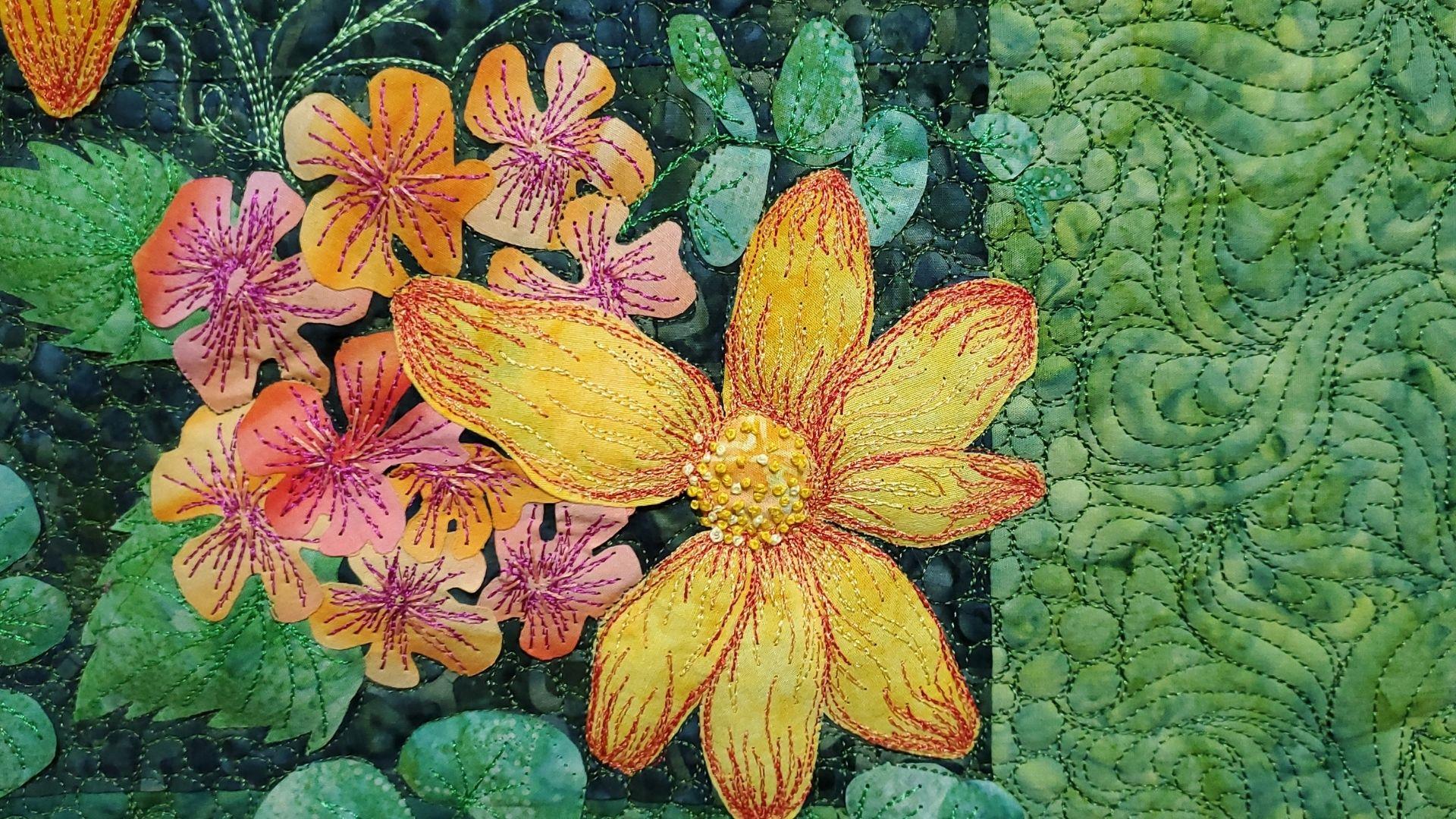
bit less practical in a little bit more compositional. If you're ready to get started, I'll see you in the next lesson. [MUSIC]
14. Embellishment: Thread Painting: [MUSIC]. We just covered some
classic stitches. Hopefully, now you
feel a little bit more comfortable with
needle and thread. You can see how
stitches can be used in a practical way to get your
projects done more quickly, to reinforce your
feasible applique. Now, we're going to look a
little bit more closely at some embellishment
techniques that can be used to enhance
your illustration. Before we get started, I want you to consider how you're going to incorporate
thread into your project. Adding line in details
is great but you want to make sure that you're making
decisions with intention. Know why you're choosing a thicker thread or
know why you want denser needlework or why you're choosing a heavier
weight or what color you're going to choose. Sometimes too much or too
many details can really start detracting from
your focal points into your work and
we don't want that. I want you to be really
intentional about your choices. I want you to think
about the colors you're using with intention. I want you to think about
the types of threads, yarn, strings you are using and how they're going to
enhance your work. I want you to think
about the density, which sewing techniques
you're going to use, are you going to use
all of the techniques? Will it be too much? Or are you going to use
them in different ways to really bring out all of
the best in your work? Now that we have
our fabric base, we're thinking dark, we've
got our composition ready, we want to start adding
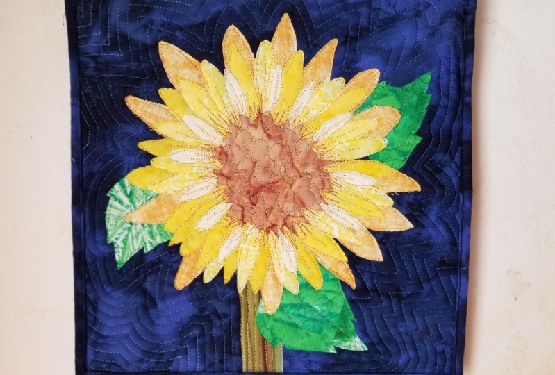
in those details. There are so many different ways we can add in those details. I'm going to cover three
in the next few lessons. I'm going to cover
thread painting, I'm going to cover
hand embroidery, and I'm going to cover
quilting, just the basics. You could have full classes
just on those topics alone. But I'm going to cover enough to get you starting to think about how you might use these
techniques in your project. The first technique I'm going to talk to you about
is thread painting. Thread painting is so much fun. What is thread painting? Thread painting
is a way of using thread to build color
in your illustration. The way thread painting
works is you are going to be layering in thread. I'm just going to be
sewing up and back, side-to-side almost
like a W motion up and down until I'm covering the space that
I'd like to cover. I often use thread
painting for shading, for adding extra dimension. I work with a lot of semi-solids or hand-ides, toner tones. Sometimes I work as a
tendency to be flat, but when I'm adding
in thread painting, it really starts to make my work have some dimension
and some shading, but I'm in control of it. Whereas with a fabric, I may or may not have
a ton of control over where the print goes, where the pattern is lying. But when I'm thread painting, I have full control over
where I'm placing my color. I tend to thread
paint by machine. I free-motion stitch. I dropped my feed dogs. I used my free-motion foot
and I worked the fabric back and forth under my needle and [LAUGHTER]
I worked in a W motion. What's nice about my
free motion stitching is I can go in any direction. I dropped my feed
dogs so I'm no longer bound by the straight
forward and back motion. I can move my fabric
any which way, which gives me a lot of freedom
to draw in any direction, create curves with my stitches. I don't have to have everything
being perfectly linear. Now, if you're not
as comfortable with free-motion sewing, you can use just your
forward and back motions and between your stitch length. If you're going forward, you're going to drop your
needle pivot just a smidge and then you can back stitch
in the other direction. Again, drop your needle
pivot just a smidge, and go right on back. Or you can run over the same line and then when you get back to the top again,
change directions. If you're not comfortable
with free-motion sewing, you can certainly use
other functions on your sewing machine to
get a similar effect. Make this technique
work for you. Keep in mind that if you
are working by machine, you may want to use
a fabric stabilizer or an embroidery hoop. Using either a
fabric stabilizer or an embroidery hoop
will help prevent your fabric from puckering. A lot of times when you do heavy thread work and when
we're building layers, they can get to be really
heavy thread work. It's going to start pulling and tucking your fabric in just
from the sheer pressure or tension so having an extra layer of fabric stabilizer or
hoop is going to help keep your base
strong and firm so that your fabric isn't puckering the way that
you don't want it to. I like to use a nice peel
and stick fabric stabilizer. You can certainly use an embroidery hoop with
your machine as well. Don't forget if you're
working by machine to bring your bobbin thread up to the top before you
start stitching. If you leave the thread
underneath your work, there's a good chance that
it's going to get sucked back into your machine
and create thread vomit, and no one likes thread
vomit on their project. We've all been there,
we've all done it, but it's much better if you
can pull that thread up to the top of your project
before you start working. Hold it in place
for just a moment as you start stitching
until your project is anchored that way
you're not getting a mess on the underside
of your work. Keep in mind if you
don't feel comfortable working by machine or if you
don't have a sewing machine, you can absolutely try
this technique by hand. You can use your running stitch and back stitch techniques
a little bit more irregularly to create
this up and back motion. Instead of working in a nice, neat straight line like we were doing for our practice examples, you could use your running
stitch or your back stitch to go back and forth until you get the thread
layered effect that you like. Personally, I like working by machine because it's
a little bit faster, but you should do what
works best for you. This is your project, use the tools that you have
to make your creation. I want you to keep in mind that some specialty threads can
be challenging to work with. As you're choosing your threads, I wouldn't just go and grab
every fancy metallic thread, yarn fiber off of the shelf. Some of these threads
are beautiful, they're glitzy, they're shiny. But that can also mean
that they may be brittle. They may break more easily. I don't want you
getting frustrated working with a thread that
is hard to work with. Learn the techniques, and then after that you can
start branching out into more complex fibers. The majority of the threads that I worked with
in this class are just basic floss and
basic embroidery thread, poly, or a rayon thread. I also want you to think
about thread color. Are you choosing a
matching thread? If you match your thread
color to your fabric, it's going to subdue your
work a little bit more. If you use a contrasting thread, it's more likely to be seen. Use these in different ways. In my work, I will use contrasting threads
when I really want the detail to be seen. But if I want the
detail to be more subtle or a surprise or softer, I'll use the matching threads
that you really have to get close to see those
surprises in details. When I'm thread painting, I like to use multiple
thread colors. When you start
building thread color, it's going to give your
work more dimension. When you look at a
leaf, for example, out in nature, it's
not a solid color. It has shading. It might
be curved from the center. The tips may be a little bit different than the
core of the leaf. I want you to start thinking
about details in your work. When I'm looking at a flower in the center, from far away, I can see that it
is maybe lighter on the outer petals but
darker in the center. But if I dive deeper and I
really analyze that flower, it's not just one solid color, it's actually going
to be shades. It might be darkest
in the center and then slowly work
its way lighter. Those are the sorts
of techniques that I'm going to use
for thread painting. I'm going to have my densest
darkest colors towards the center of my flower
and I'm going to start working my way out from there. Every flower may be different. That's why it's important
to have your inspiration. Look back at photos
you're using and really look at those details. Be mindful of what
you're creating. It's just going to help your thread painting,
your embellishment, your whole illustration
just come to life. I'll show you the
different techniques that I used for my project. You can see how thread painting
will enhance your work. I build my thread light to dark and don't be afraid
to use multiple colors. Consider using a few colors
that are just a shade off and building that color
onto your design elements. I'll add a light-base
layer that might be close to matching
my fabric shape. I used my lightest color
a little bit more broadly because it's not going to
show as much from far away. Then I might add in
slightly darker thread to build in a little
bit more detail. The darker thread colors
are going to have a much bolder impact so I can use them a little
bit more sparingly. Then in this illustration, for example, I
used a dark color. I use my darkest
color as an accent. That's because it's
such a bold color, I don't need a lot of
it to make an impact. I can use it to just define the edges of my petals
where I'm seeing some of my darkest color or some of those deepest shadows in
the veining of my petals. Anatomically, a petal
generally isn't flat. It's going to have different
veining running through it. I want to use this thread painting
technique to show that this piece of
fabric is not flat. It's going to be a petal and it's going to
have dimension. Keep in mind how your color and contrast
is going to work for your project and use that to help guide your
thread color choices. I do like to make sure that
my stitches are a little bit irregular with
my work because I like to work on
nature-based projects, so I don't want everything
to be perfectly linear. I want some of my lines longer, some of my lines shorter, but do what works best
for your project. If your project lends itself
to knit then your lines, geometric shapes,
work with that. I tend to work on
nature-based projects. This is what works for me, but if your project is more
architectural by all means, shade the way that works
best for your project. These techniques are meant to be adapted for what
you are working on. We've covered thread
painting, in the next lesson, we're going to cover
hand embroidery. I'll see you there. [MUSIC]
15. Embellishment: Hand Embroidery: [MUSIC] Welcome back.
In this lesson, we're going to be
talking about hand embroidery for fusible applique. We can talk about hand
embroidery for a long time. There are so many decorative
stitches and knots and patterns that you can use.
I'm going to keep it simple. I just like taking
basic stitches a lot like my running
stitch or my backstitch. In my project that I
worked on for this class, I used floss, I kept
it pretty simple. Floss generally comes
as a six-strand unit. You can pull apart those strands so that you can use them at different widths. If you opt to add embroidery
to your fabric illustration, you'll probably want
to use a hoop or fabric stabilizer to prevent
your fabric from puckering. Like I mentioned in the
thread painting lesson, I prefer to use a peel and
stick fabric stabilizer. If your fabric
elements are dense, this may also give you
plenty of support. Personally, my fusible web and my overlapping petal layers give me a ton of extra support, almost too much support. Sometimes it's
challenging to push my needle through
multiple layers. So consider which tools
you are going to use to prevent your fabric from
puckering as you work. What's great about hand
embroidery is that it's elevated. It already has dimension
because generally, you're using thicker flosses or yarns or ribbons
to make it happen. It's going to start pulling
your work off of the fabric, off of the page, if you will. In my work, here I use some simple straight
stitches and I used some French knots and I'm going to show you
how those work. You can use these
different stitches and different density levels. So I can have a lot of
French knots altogether, for some really intense detail. Or I can start spacing
them farther and farther apart to just add little
touches here and there. Again, I want you to keep in
mind that some threads and fibers are more
[LAUGHTER] challenging to work with than others. Some may be gorgeous
but may be brittle. So sometimes those
brittle threads are a little bit easier to work with by hand
than the ABA machine. You can play around
if you want to. But again, I encourage you
to work with what you have. Don't take on too much
with this project. Keep it simple. I just want you to add in one embellishment technique for your project if you add
in more bonus points, but I don't want you
to get overwhelmed with all of the options
that are out there. Now let's go ahead
and look at how I worked with some
floss for my project so you can see how
you can incorporate hand embroidery into
your illustration. A lot of times, hand embroidery is
going to be used to emphasize details in your work. At least that's the
way I like to use it. I like to use small
lines and dots, in this case, small
stitches and knots. Specialty knots
like a French knot to emphasize areas of my work. For these lines, these dots, a lot of times it really is fine detail because
we're doing handwork. It's hard to make it happen over the entire project unless you've got a really
small project. If you've got a large project, a lot of handwork is going
to take a lot of time. A lot of times I condense my hand embroidery into a
fine area that like I said, the centers of my flowers, the tips of my petals, maybe the edges of my
leaves, something like that. This is going to be a great
time to reflect back on your inspiration
board and any of those fine detail
inspiration pictures, photos, drawings, sketches
that you did and see, hey, where were the extra lines? How can I use hand embroidery to reflect some of
those finer details? For example, I like to use French knots for the
centers of my flowers. To make a French knot, I bring my floss up through the fabric. I twist my floss around the
needle two to three times. Place your needle
back down very close to where your needle came
up through the fabric. I pull those twists
to the base of my needle so it's resting
against the fabric. Then you're going to
hold the thread tail to the side as you pull the
needle through the fabric. Release the thread tail and allow it to slide
through the center of your knot and voila,
you have a French knot. Then you pull your
needle up through the fabric where you'd like
your next not to be placed. I usually make knots
in one floss color until my strand runs out and I need to
rethread my needle. Then I use a second floss color, usually a shader to offer my original color for
my next round of knots, and I keep alternating
until I fill my space. Using two or more colors, makes my knots more dynamic and that's going to draw
my viewers eye right in. Again, you're going
to want to use these techniques in the way that works for your illustration. I have a lot of
nature-based projects, so I like to use French
knots for leaves, petals, a smaller, finer details just depending
on what I'm working on. But if you're working, say with something more
structural, a building, a brick, could be anything, maybe fruit, maybe you're doing fine details on a
teacup or a coffee mug. Use these stitches
to create some of those fun embellishment
patterns so that your work is starting to
lift off of the fabric. For the lines that I use, I use similar techniques so we're running such in
our backstitch again, except I'm going to be a
little bit more irregular. I might distribute my
spacing a little bit more. But ultimately I'm just pulling my needle up
through the fabric and placing it back down again and then when I put
my needle back in, it's going to be where I want
my next stitch to start. It's as simple as that. We don't have to make it
any more complicated. I tend to place it in locations where I want extra detail. So that's how I use it. But think about how you can use it for your project as well. The real importance of incorporating some of
these finer details is, anyone can see your
project from far away. But what really
captures someone, you might grab their attention
when they get close. These small details are going to be what really makes a person stop and pause and get
enthralled with your work, to really get absorbed into your work and keep them
there and looking at it, it's an exciting moment, it's something that
they didn't realize right away but it
keeps them looking because they want to know
what other surprises you have in store for them. These extra details
are going to help make your work less flat, less stall. It's really going to start
bringing your project to life. Now we've covered some simple
hand embroidery techniques that will really
enhance your work. In the next lesson,
I want to show you some quilting techniques and if you're traditional
quilters out there, this lesson might be fun for you and a way to think about quilting a little
bit differently. If you're ready to hear about
quilting and how you can use it to enhance
your illustration, follow me along to
the next lesson. [MUSIC]
16. Embellishment: Quilting: [MUSIC] The last
embellishment technique we're going to cover in
this class is quilting. Keep in mind, you don't need to create a quilt with your
fabric illustration. This lesson is
geared toward those who are planning
to quilt and bind their illustration
to make it into an art quilt or wall hanging. It's geared toward
quilters who already have some basic experience with
traditional quilting. If you aren't planning to quilt your illustration,
that's okay too. There are other ways to
showcase your illustration and we'll be covering those
methods in the next lesson. Let's talk about quilting. Traditionally, quilting
is the process of stitching through
a quilt sandwich. Now, a quilt sandwich
might sound delicious, but really it's made
up of three layers. You have your quilt
top, or in our case, our fabric illustration, you have batting or
a fluffy material, usually batting, and you
have your quilt back, which is usually another
piece of fabric. The process of quilting
is stitching through all three layers
so that they are bound, secured together. This is what gives quilts their characteristic full,
warm blanket effect. We stitch through
all three layers and because of that
piece of batting, the stitching will
create imprints, which we can use to create stitching designs in
our illustration. Now, stitching
patterns can vary. A lot of times you'll see
basic geometric patterns, linear lines, loops, squirrels. But what I want you to think
about what this technique is how you can stitch as another
illustrative element. Your quilting does not
have to be repetitive, geometric, it does
not have to be a pantograph where it's the same repeating pattern
from edge to edge. You're quilting can
reflect your project, which means if you
have a landscape, you can quilt in clouds
or a butterfly flying by. You can take your floral, like I did, and quilt
leaves in the background. You can use this quilting as an additional layer
in your illustration, for another level of detail and surprises
for your viewer. We can use any quilting
technique we wanted. We could just do lines, but my question is why? How does it enhance your work? If lines will help
emphasize a horizon line, perfect, I love it. If wavy lines will
help emphasize waves in a landscape or
a beach-scape, perfect. But why not add in
some extra elements when you can also so
that it makes sense? Anyone can do triangles
or loop de loops, but how do they
enhance your work? How do they reflect
the message that you are trying to send
with your piece? Instead of using a
generic pattern, I'm going to encourage you to think of how you can
use your loops or your swirls or whatever shift you're going to use
to enhance your work. How do they play into the story of what you are creating
with your illustration? It's an opportunity to draw
people into your quilt. From faraway, they might see my composition and be like, that's pretty let me go
check that out and when they work over and they
see the quilting, they'll realize, oh my goodness, there's so many surprises
and details in here. That's what we want. We want people engaged with our work. We want them really
embracing what we've done, and thinking about it,
and sitting with it and being like that's cool. What else can I
find in this piece? Sometimes those
little extra details are just what makes
work stand out. So all of the decisions
that you make as you're creating should have a purpose. If you're going to be
quilting your work anyway, choose a quilting
pattern that is going to correlate with
your illustration. Let's take a little peak
at what I've created. I'll show you how I
moved through the work, how I thought about it. I want you to think
about how you can use this technique in
your work as well. Similar to when I was thread
painting, I am, again, free motion stitching, so I can stitch
in any direction. Remember to bring
your bobbin thread up through your quilt
sandwich before you start quilting to prevent a mess of thread on the
back of your quilt. Again, I tend to
work by machines, so this is all machine quilted, but you can work
by hand as well. When you think about
quilting is a lot like drawing with a continuous line. If you were to put your
pen or pencil down on a piece of paper
and not pick it up, that's how you're
going to quilt. If you're going to doodle or draw or create waves or clouds, how can you move around
your illustration without picking up your needle? Now of course you can pick it up here and there and of course, every time you pick up and move, you're not going have
to not off your work, and that gets tedious. [LAUGHTER] The more
that I can move around my space
freely, the better. I try to plan out like center working outward
or left to right, top to bottom, how I'm
going to move across my illustration with my thread so that I don't have
to pick up my work. Quilting is often done with a basic polyester
or cotton thread, usually a finer weight. Even if you used a 12 weight
or a 28 weight thread, from far away, it's probably going
to be hard to see, but from up close it's going to be a really exciting moment. In my project, I did use a couple of different
thread weights. I used a 28 weight thread and
I used a contrasting color. I used a 40 weight
polyester thread and I used a coordinating color. I want to show you
the differences in the effects that you get between these two thread
types. Let's talk color. When you have a
contrasting thread, it's going to pop
more instantly. It's going to stand out
from your background. Now I think this can be good in some situations when you're
working with quilting, but ultimately, you
really don't want it to detract from the rest
of your project. If you add in too many details, your work can get busy. Think how you're going to use it in your project and if it's going to work or
if it's going to take away from your
other focal elements. Now if you use a matching color, it's going to be a
lot more subtle. You can do dense quilting
and dense patterns, and people will be able to see those lines without it really detracting from
the rest of your work. Again, this is where
the subtle surprise is, this is where the magic happens. The other thing I wanted to
mention is thread weight. The 28 weight thread that I
used is a thicker thread, which means I need less of
it to make a bolder impact. It's going to be seen
from farther away. You can see these leaves
are bolder, right? It's a thicker thread,
it's a contrasting colors, it's a little bit brighter,
a little more vibrant. Now, my thinner thread, my 40 weight polyester thread that I used for the
rest of my quilting, it blends right in, but it still makes an impact. Now, the style of
stitching that I used, I wanted to mimic leaves. In the photo I had, it was just this
vast green oasis, and of course I didn't
want to add all of that because I knew it was going
to detract from my flowers. But, why not add quilting
that has s-curves and c-curves and flourishes
that mimic extra leaves? That's what I chose to do. I also placed traditional
quilting pebbles, which are just small
little circles or ovals around my flowers. I wanted to make sure
that my quilting was the densest right
at the edges of my flowers so that when I
didn't quilt inside my flowers, that space would puff up. You can use quilting density
to your advantage as well. I wanted to use it to really
highlight my focal points. You can use the loft to
puff up certain areas of your project or make
those areas recede. The density of your stitching
makes a difference. If you decide to go
the quilting route and add in this extra
layer of detail, consider how it can help
enhance your illustration. That covers machine quilting. We've covered our
practical stitches, we've covered our
embellishment stitches, we are on our way to
finishing this project. In the next lesson,
I'm going to show you some finishing touches and show you how you can wrap
up this project. I'll see you there. [MUSIC]
17. Finishing Touches: Showcasing your Work: [MUSIC] We are almost there. We've covered how to create
our fabric illustration, we've added some
thread embellishment. But what now, how do we
finish off our project? There's a few
different techniques. I'm going to walk you
through them depending on the type of project that
you decided to work on. Now if you want the DIY route, you may be close to done. If you decided to
embellish, say, a tote bag or a t-shirt
or something like that, your project may be finished. But if you opted to
create a fabric base, and create a fabric
illustration, we need to take a
couple extra steps. Let's go over a
few different ways that you can wrap
up your project. Let's start with
the quilting route. If you've quilted your project, like we talked about
in the last lesson, then you can go ahead and bind it like you would
a traditional quilt. I wouldn't use this
as a bed quilt. You put way too much
work into this artwork. Definitely use it
as a wall hanging. I would add a sleeve to the back so you can hang your
quilt on a curtain rod, or one of my
favorite techniques, you can use Velcro to
hang your project. You can put Velcro
along your wall and along the back of
your wall hanging, and then you can switch out your art quilts seasonally
if you wanted to. If you decided to go
the quilting route, go ahead and finish off the
edges with classic binding, and hang your
quilt, show it off. You can also frame your project in a
large embroidery hoop. Why not show off your
work in a classic hoop? I think it's very fitting. Get an embroidery hoop
that's a little bit bigger than the size
of your project. This works especially
well if your project's a little bit on the smaller
side because they don't have infinitely sized
embroidery hoops. If you have a project that will fit into
an embroidery hoop, go ahead, and center it inside the hoop,
tighten it nice. You can either trim the edges, and glue them down or
tuck them in the back, and then go ahead
and you can hang up your embroidery piece. The other technique
you can use is you can mount your work in a frame. This again works a little bit better for smaller projects, but it can totally work for
larger projects as well. It's just another
way to showcase your artwork as a wall hanging. Of course, there are plenty of other techniques you can use
to finish off your work. These are just some
of my favorites. If you're a traditional
quilter like me, you're probably going
to bind your edges. But there's nothing wrong with putting it into
an embroidery hoop, especially if you're in a hurry. Binding and quilting
can take a long time. Again, maybe your a DIY crafter and you want
to use your artwork. Maybe you've made an
apron, a t-shirt, a tote bag, or a banner, you might be done already. Maybe after you added
your decorative stitches, your project was ready to go. Keep in mind that some fabrics and stitches
hold up better in the wash. So if you are using your
project in everyday use, be mindful when you're
going to wash it, to make sure that it
doesn't get ruined. Don't want all of that
hard work going to waste. Go ahead and finish
up your projects. Don't forget to take
lots of pictures and upload to the
class project gallery. I'll give you a few of my final thoughts in the last lesson. Congratulations,
you're almost there. [MUSIC]
18. Conclusion: [MUSIC] You did it, it's time to celebrate. You've reached the final lesson. We've gone through how to
create a fabric illustration, how to find inspiration
for your project, how to add those
embellishments in details, and now we're at
the final stage. I hope this class gives
you a better understanding of how you can use fabric and thread to illustrate how to
paint with fabric and thread. Now, I want you to remember you don't have to have
perfect stitches. This class is meant to
add a few new tools to your creative toolbox and to have a little bit
of fun along the way. I hope you learned something and had a great time doing it. Be sure to upload a picture of your final project in
the project gallery. Share with us what part of the projects you loved the most, which parts were
challenging for you, and any tips, techniques, and tools that you learned along the way that you want to
share with the community. The more that we
share our experience, the more that we
can all learn and grow as artists and creatives. Thank you all so much
for following along. I hope you had so much fun and I can't wait to
see what you create. [MUSIC]
 Lauren Weber, Artist + Quilter + Gardener