Transcripts
1. Introduction to this Class: Hello everyone. My name
is Robert Marzullo, and I'll be an instructor
for this class, how to draw with
light and shadow. In these lessons,
you're going to learn how to control light and shadow. We're first going to start with some basic practice activities, get you warmed up, you thinking about some
various concepts. Understand that
not all rendering needs to be pristine and clean. Rendering can be more broken up, and it can add lots of
energy and texture. The main thing is to
think about gradients, and again, the transition
from light to dark. Will learn how to keep
your light source in mind as you
develop your forms. This understanding will
help you to draw and think more three dimensionally
about your illustrations. You will work through
various project files to implement what you've learned and help you to commit these concepts to memory. You're also welcome to
share the project files with me along the way so that
I can gauge your progress. Also, let me know if
there's any way that I can improve upon this class
and the content for you. As well as answer any
questions you might have. Thank you for
considering my class, and I can't wait to
see your progress. Good luck with your
art and bye for now.
2. Basic Fade Practice: Welcome back. So now
what I'd like to talk to you about is really
what I call A B fades. Okay? So just picture that if you labeled the bottom
B and the top A, vice versa, it really
doesn't matter, could be a down here, B up here, something like that. A B fade. And all I
really want you to focus on is that we're going
to try to transition fades from the bottom to
the top from dark to light. This is just an exercise
that I like to do, and hopefully this will
help you feel more comfortable with the projects that we're
going to do later. But essentially, you got to realize that you
can create fade all sorts of ways with all
sorts of lines that you make. They don't all have
to be super clean. They can be messy in areas. And they can be cross hatched in all sorts
of ways as well. So I like experimenting
with concepts like this so that I can get a nice range of ideas that I can use, textures, rendering styles. And I think at first, a lot of what we look at is, you know, how clean
can we make the lines? A lot of artists will
get caught up in that. And it's okay. You definitely
want to try to get better at rendering
and line control. So what I'm doing here
is I'm making a bunch of short little marks in succession that are well within
my ability of control in relation
to my hand position. So I'm resting the base of
my hand against the screen, and I'm just pulling you
know, a comfortable distance, where if I tried to
do it like this, a whole thing is
still do it, but now it's getting out
of my comfort zone. You can see by the ends there. And likewise, if I go like this, now I have a really
hard time controlling the lines distance side by side. So again, using the distance
that's appropriate, and so with digital,
that means zooming in and out to getting
to a comfortable area. Sometimes rotating the canvas, which I do quite a bit,
you'll see some of that. And then sometimes speed helps, sometimes slowing down helps. Varying up the way that you create the
strokes based on speed. And there's a few different
ways that we could implement the change in tone. So as I come up to the middle of this box and say that's where I want my fade to
start occurring, right? I could either
break up the lines, start adding more
space in between the lines, something like that. I could also cross
hatch further down into the base to give the O
comparative darkness, the contrast, basically, I could put
that at the base of this. What I mean by that is I
could come back down here, and I could start cross
hatching a different direction. You see, I'm not being
too awfully careful. I can go into the other part of the illustration if I want. You don't want to
get too caught up in the perfectionist mentality
when you're doing exercises. At that's what I
tend to think about because I want to explore ideas with a sense of freedom
and have fun with it. Because if I can do that, that means I can sit here
longer and create longer. But if I'm so caught up
in perfectionism and, my lines just aren't right, and how am I ever
going to get good if I can't control my line
weight or whatever? Like, you don't want to
get too caught up in that. Just allow yourself to
have some fun with it. You know, an experiment,
try a different layer and try going through
all these lines, even. You know, you could put another passive lines that are bigger. Obviously, more intense lines
as far as more thickness. That's another way to get
this this bit of fade here. And so the goal here is
just to generate a bunch of lines and get this
area to start fading. So just so I don't bore
you to death with this, I'll speed it up
just a little bit, and I'll keep narrating
to explain the process, but you can see it's really
going to be more of the same until I get up to this point where I want
to start seeing a fade, and then I will do, some
variation with these lines. So let's go ahead and
speed this up just a bit. Okay, so again, more of
the same and as you see, I'm just picking
different angles, drawing the same type
of lines over and over, you could literally
copy and paste ses if you're working digitally and you wanted to move a
little bit faster. I personally like it. I mean, there's a certain amount where if it takes too awfully long, I will do whatever it
takes to save time, like recycling old
illustrations, things like that on a
light table or digital. But There's a certain part
of it where I don't know, I just find it to be a
little bit relaxing. So putting on some
good music and then just getting to it. A lot of times the
repetitive stuff just seems like it takes
longer than it really does. So usually if I pay attention to the
clock after the fact, trying not to look at
it while I'm doing it, I usually am happy to see that it didn't take as
long as I actually thought. It's just that
time sort of slows down for me as I'm
doing repetitive tasks. But again, it is a
very useful technique, and it's something that I like starting here with
people because I like to show them
that if you can draw a couple of straight
lines in succession, then you can do this, and they don't have to be this straight. It's very It's very
accessible to anybody. Now just cross
hatching it to get that next level of
depth and darkness. Remember, you don't
have to even just do this with two angles.
You could do this. If you've got more
patients than me, you could do this multiple
multiple times and really get a nice rich sense of gradient
and texture to this. This is an effect that
I've seen for years, and I absolutely
love it in my work. It gives a nice contrast to a lot of different
areas in the work. Yeah, just very versatile
and good to know. Okay, so now for the next
one, similar concept, but what I want to
show you here is that you really don't have to even use lines
if you don't want, so you could do stiple shading. Now, you can sit here and do these little
dots over and over. And if you've got
a ton of patients that that can be fun to do, you can also just do
these little scribbles. So I think that's
a little faster. And kind of a bit more fun
in my own mind, I guess. But similar concept,
we're just going to start with a heavier
version of this. This can mean more pressure on top of these
little squiggles, or it can just mean more of
those tighter in succession. It's still a form
of stipple shading and can be, you know, great for all sorts
of areas within your work to apply texture
and grit and imperfections. Yeah, the stuff actually
is pretty useful. Same thing, I'll
work up the side to establish that AB
fate I spoke about. Just as we get up here, we can start to break that away and get lighter
and lighter. Don't worry your scribbles don't have to look like my scribbles. They can be entirely
unique to you. And I really like
doing stuff like this because there's almost no
way you could mess it up. And even if you
did, you could go back with negative drawing, a little bit of white
out, and you could do these little squigglies
in the opposite direction. But again, this is going
to be pretty repetitive, so I will lapse and
expediate the process. So let's do that now. Now, this one, I
would say took me most tried my patients the most. Let's just put it that way. But remember that you don't need to do this
every single time. I mean, some of you
are absolutely going to love even doing this, right? There's people that
just really get into pointosm and stiple shading, and they have that
connection with it, that patience. Hopefully
you're like that. Maybe there's times
you have that and times you don't as well, but just remember
that you can save all of this and you
really can reuse it. It's your, there's ways to
use it as traditional piece, scan it in, save it as a layer, and again, put them in folders. This stuff. If you're bored, you could fill up a page of this stuff with a
bunch of varieties, and save them where
it's accessible, and it can be, again, a tremendous time saver. You can see that now I'm
starting to fade that off, just breaking up the dots, spacing them out more,
scribbles, I should say. Again, you could play
with all sorts of variety to the
types of scribbles, the types of marks that you make and really
explore this idea. But it's simple and
fun to do, and again, I think this is another one
that's pretty accessible. To most people with a
basic understanding. So we'll stop here and head
over to our next lesson.
3. Rendering with Broken Lines: And welcome back. So
for this third one, I want to show you how
we can use lines again. But this time, what
we're going to do is we're actually going to we're going to do
a couple of things. So I want to get
you in the habit of seeing what you can accomplish with
thick to thin lines. So starting more heavily at the base where
the shadow would be, fading off as you go upwards. Okay? And there's lots of
ways you could do this. If you're working
digitally, you could hold a software like this, you can actually hold shift. You know, I'm sorry.
That's not the software. That's another one. So used
to using different softwares. Here you'd have
to use the ruler. And this would be
more time consuming, but it's something you
can do if you feel like your hand eye
coordination or your control, I should say, isn't quite there, and you could even
copy these, right? You could draw one
and copy them across, or I would recommend maybe
draw one, copy it over, different varying widths,
and then get in between it and fill them in B I personally, I've kind like the
hand drawn look. So even if I'm going to do
something overly digital, I try to mix it up, okay? So that's one way you can do it. If you need a ruler, if it makes you feel
more comfortable, I do want you to also make time to practice
just doing this. And so all I'm doing there is I'm kind of
sculpting the line. They're not all
going to be perfect. In fact, none of them will be perfect. But that
doesn't matter. It's about just
getting a kind of organic feeling to
the lines, I think. I'm going to actually
take this a bit further in the way that I want to show you with this
particular one. We'll do some cleaner
ones later on, but then this one, I'm actually going to purposely
bump it up, like that. I think that's a great
way to look at it almost immediately because what it does is it's easier,
for the most part. It's a lot harder
to focus and get this nice pristine clean
taper. I think anyways. I guess we're all
different there. But but I also like the texture and the imperfections
that this provides. This is great for
tattered material, brick, busted up
concrete or pipes, or you name it, anything
that's weathered. So we're going to do
that one. But again, keep all those variables in mind that you can use a ruler, that you could draw one
and then edit it if that makes you help you to get through this
bit of the tutorial. But don't let that
always be your go to. I think it makes
sense to practice drawing by hand and developing your skills
this way as well. And don't be in a rush to do it, be patient with yourself. Yours also can be messier as far as these brakes
that I'm creating. I think these breaks add a lot of energy
and effect to it. Again, it's actually easier. Oh, by the way, you could
actually draw in another layer beneath this and Yeah, you can hold shift
with the software. I'm sorry. So shift. I must have held
it down properly. I just thinking, I use this
all the time for grids. But you could draw a grid like
that on a previous layer. Same thing with traditional, you could draw a grid
with your ruler. Roller rulers are
great for that. And then you could put it beneath the other sheet
of paper on a light table. If you got one. Some
people will just use their screen if it's
bright enough or a window. That all works. Just
be creative with it. But just these
little line breaks. You can even stagger them. You can bring them off to
the side a little bit. They don't need to be completely
straight up and down. But hopefully you can see
that even by doing this, we're starting to get a
little bit of fate and you could go back down to the base and you can
widen these a bit. Right? You could even
go down to the base and widen them and create
another shape. So if I go with a curvature
like this, again, I'm creating another I don't know if you call
that a negative shape. I guess you would. And
that can be really fun. You could go through this
and you could do a wave and you could taper these so
going stronger at the base, but maybe lightening
them right as they come up to that other shape, and I would obviously
put that in with another layer so I
didn't have to erase it. See, I mean, there's
all sorts of neat and inventive
ways that you can make this rendering more interesting to look
at dimensional, your own, you know,
your own style, your own imaginative way
of piecing it together. There's just so many
possibilities with this stuff. And something about doing
these little breaks makes it a lot more relaxing for myself. Again, we could all
be different there. But it's almost like the
breaks give you a break. They give you a way out
more easy going way to look at it where when
we're trying to be so clean and pristine with
our lines and our drawings, again, this could be
more personal to me, but definitely what I feel
is that I will get a little bit more anxious or self
critical of what I'm doing. There's times that I want things to be very clean,
so I just do that, but I also take breaks
from that way of thinking, maybe move over to something
that is a little bit more gritty and lends
to imperfections. It's one of the reasons why I really enjoy loose sketching, especially as it pertains
to figures and scenes. I would rather sit there
and sketch all sorts of rough ideas because I'm in a non critical part of
my illustrative process, and it basically
is more forgiving. On my you know, I'm less likely to enter that perfectionist
mentality, which is, I don't know, more look at
the more I do this stuff, the more I think that's a very destructive way to be at times, you know, maybe
everything in balance. But don't stay there
too awfully long. Learn to critique your
work to get better, but then get right back to
loving everything that you do and realizing that
the long term journey is where the
transformation happens, not the overly critical. I've got to be better
tomorrow type mentality. That's a sure fire way to drain the energy right
out of it, I think. Again, you can see, I'm just
randomly placing these. I'm starting to get to
where at the very tip. I'm spacing them out further. You could go back
and put little dots and blips here and there. You can really push that This one is obviously a
much faster approach, but I'm still going
to time lapse this next little part just
to speed it up for you. Again, it's more of the same. So let me do that right now and we will get
this part wrapped up. I just got to admit
that a lot of times when I'm doing a
technique like this, I do see an opportunity to just copy one side and move
it over to the other. But even if I do that
with a layer or even folding the paper over and
light tableing the other side, I just go back with
some white out and I make sure to make it look
a little bit more natural, a little bit more hand done. But again, I'm always
looking for time savers when it is something
overly repetitive. You can probably tell that
all the three effects, this one was actually
much quicker. Okay, so there we go. And
then also, like I mentioned, another thing you
could do is you could practice adding a couple
of things really. You could add some
lines this way. And again, they don't need to be as clean as you might think. So really, they just add
a little bit of texture. But in a sense, it's
sort of like cross hatching because, you know, the more you add of
these at the base, and then slowly fade those up, if that's your goal,
then you'll get a sort of darkness
at the bottom. And a little bit
lighter effect at the top and then you could break this texture off like this. So there's all sorts of ways
you could approach this. So it doesn't need to be just 45 degree angles
and things like that. You can really get super
creative with this. You could go heavier with the textured lines at
the base like this. And then you can also come
back with your negative lines. You could go on top of these and make them pop
a little bit more. You could do something
like that. You'll see this effect a lot with veins, just that little bit that
might catch the light. I'm not going to leave
that, but that's just another thing to practice, and then another thing
is just to come back through the tips of the part
that you want to fade more. Again, you could
do that over here. Same ideas. You could put negative shapes and
squigglies all through there. So all of this stuff
is just great practice and gives you hopefully ideas for different ways to render. Again, these are
just on a linear or what I call an AB fade. But now what I'm going to do, we'll go to the next lesson. We're going to talk more about wrapping
certain lines around a spherical object and talk about some of the
lighting terminology. So with that, let's move
on to our next lesson.
4. Single Light Source: Yeah, we'll come back. So now, we'll talk about doing a
similar sort of effect, mainly just cross
hatching, and again, play with all sorts
of variables as far as line weight, thickness, length, stutter
stepping the line, line brakes, you know,
all that good stuff. But in this case,
what I want to do is first think about this
as a single light source. Okay? So if the light source, if we were to orbit around this, it's my really poor orbit there, and the light was,
we'll say right here. Okay, so it's going to
radiate towards the object, something like this, right? And based on that,
we're going to get some oval like that. Somewhere in there. That's
the idea for the first one. As far as orientation
of the light. Again, I find it hard
to just say, Well, here's a light
right here because you don't know if it's
on the opposite side. And if it's on the
opposite side of this, we'll do another
example of this, but you're going to get what's called rim lighting,
or edge lighting. It's because it's on
the opposite side and the light can't wrap
all the way around. Same idea is like look at the
phases of the moon, right? So with this one, we're going to say that our area of influence is
something like this. And then we're going to start to wrap our rendering
lines around it. Now, if you're not
comfortable doing that and, you can't say taper or align and make a curve
at the same time, you'll see mine aren't
going to be perfect either. But if you don't feel
comfortable with that, remember, just like the
example furest to the left, you can still get away with a similar effect with a pretty
straight lined approach. I'll just start there, do
a quick example of this, just to help out those
that aren't ready to maybe curve those lines because I know it can feel a bit tricky. And I'll even do this messy just to show you because again, I think it's important to be aware that you can still achieve this effect with
something as simple as a bunch of little lines. And over time, you just get better and better even
controlling this, right? So I don't do this one as much, it's probably going to come out a bit wonky, but
that's all right. The only rule I really
follow here is that every time I go
over a given area, I just try to change
the angle of the lines. I don't even know if
that's entirely necessary, and I'm definitely not doing it to some sort
of perfectionist. It's not like I'm not hitting
other lines that might be parallel or breaking that rule. It's not a rule, essentially. I'm just trying to do that
as I move through this. And so I can do that two or
three times, probably more. But I usually land
to about three, maybe four, as far as
overlapping angles. So say you get it to
about right here. Okay? And then my goal is to
create more of that fade. Right? So say the next
portion is faded. I could go about
it a couple ways. One, I could just come
over to the very edge, and I could add
some heavier lines. I'm just going to go all the way around like this, nice and even. Right? And I don't
have to stop there. I can really just keep criss crossing and
darkening that edge. Likewise, as I come up this way, I can separate the lines more. Really just start to put
less pressure on the pen, applies to whatever
you're using. So I can just break
those up pretty easily. And again, I can go back
with negative lines if I kind of push it too far or, you know, maybe I
have too harsh of a line right through here. I can break up that line, generate more of a fade just by using some negative
lines to the direction. So again, if you feel
like it's a little bit difficult for you to get the lines we're
going to generate next, go ahead and give that a shot. Again, there's no rhyme
or reason to this stuff, or maybe there's a
rhyme or reason, but there's no one way
to get it done, ok? There's lots of different ways. And I actually really like
that look right there. And again, there's a
time and a place for it. So if I was to I guess I'll just do the
next one. I can reuse these. If I was to take this and say, Okay, but I want there to be, the style that I like is
going to be the thick to thin wrapping around it, It's just one particular
way to think about it. So I'm just re
pressurizing that line, basically sculpting that line, and then letting off it and
continuing around that curve. I wouldn't say that
this particular curve matches the sphere completely
or anything like that. Is just my approximation. To me, it's better than
just going flat with it. But that's again, just my
own perception of it, right? I just what I'm
trying to accomplish, what I think I can
do and what I think might look cool, what
I'm used to doing, because I've done it on lots of spherical similar type forms. So whenever I render anatomy, I try to think of it
more spherically. Not entirely a sphere for
every portion, obviously, but it's got spherical
aspects to the form. And so this is the
way that I typically render. So something like that. And again, your
years can be wider, they can be more broken up, they can be all sorts of things. I put a very thick one right by a thin one there.
That's kind of noticeable. Maybe generally try not to do it as noticeably as I did there, Go for a not consistency, but whenever you have a really noticeable
contrast in anything, it does become sort
of a focal point. So if you get those kind of oddities in your
work, that could be hy, that basically you're putting something that's too noticeably different right next
to something else. So if I was to do a very Fortis, if I did a very clean line. Let's try to do a
clean line here. As I say that, I
start to mess it up. Go back. Imagine that. So I do a nice clean line,
something like this. And then all of a sudden, I
do a very thick pumpy line. All right? Well, that becomes a noticeable focal
point pretty quick. It's got to be probably even a little bit more dramatic than what
I just did there. But it does do
that to your work. So be careful. It's not that you can't
have inconsistencies. They're all going to be
a little inconsistent. Just try to balance
certain things out. Le line thickness is
probably a good one. You see, I'm really shifting my curve here. Didn't
mean to do that. I probably should have picked a point of reference of, say, maybe a center and pointed towards that because
you can see that by here, I would have been
more like this. Let me do that. I'm going
to leave that dot there, and I'm going to go
back just a little bit. Where did I really
start going on? Probably about there. Okay.
Let's try that again. It's a little better.
I just want that curve and now at least I'm trying to somewhat
point it to that dot. I'm not trying to go exact to it and get too awfully critical. I do see that I'm
starting to suffer on my line width ale bit. Now I can go back and edit that just a bit and bring
these together. I can do that as
an afterthought. But I'd rather slow down just a bit and catch myself in
the process if I can. Over here, I'm going
to start to need to taper it down anyways. I'm
going to start to do that. I think it's really the angle in which I'm pulling
these lines, which is causing me to get
a little too much spacing. It's another thing
with that whole finding your comfort
zone and rotating the page. There's
nothing wrong with that. It's always an effective
way to make sure you're in control of your
lines there as best you can. Okay, something like that. Then now I'll cross hatch it. Basically, any number of
ways we could do that, but I'll just pick
an angle here. I'm also going to go a
little bit thinner since I made these initial
ones thick anyways. I'm just going to cross
hatch on this angle. Sometimes I really zero in on the little diamonds
that I'm creating. If you notice all
those little diamonds that are being made
by the overlaps of these two lines or these two
angles of types of lines, but obviously a lot
more than two lines. But anyways, that's something
you can pay attention to. It's like that secondary
pattern that you're making at something you
can pay attention to. But just like that, we now
have a little bit darker tone. And a bit of aid there. And then with this, I would
definitely want to come back. I feel like these are a
little too inconsistent here. So just some negative
lines right through here. I can even bring those right
down into the overlaps. And I don't know, personally, I really like that kind of look. I mean, there's again, many ways you could take it, many ways you could
think about it. But those are both a
single light source with the light
sources closer to us, and probably what
I would consider more of a diffused material. And so diffuse just
means the light hits it, and it disperses like
kind of, across. So if you think of
something specular, like a bowling ball,
the light hits, and it's a very
intense point light, almost a spotlight kind
of look on one point. L the light would
just go like oh, I had to be on black here. The light would just
look like this, like a glare, right? So that's specular, but diffuse when the
light can hit and it can travel across You know, it just fades across the object because it's not so specular where
it's constricted. So chrome is specular. I would say, a T shirt, cotton is more of a diffused. So to me, this is more
of a diffused and a more softer way
to light something. And again, with that, you're going to generally
get more fade, so you could do a lot more of a transitional of dark to light. You could have a lot
of medium tone here. You could have some
smaller little bit. You could really
carry that a lot further than I did here. But hopefully that gives
you some ideas right there. So now we're going to go over to the next lesson and I
want to talk more about Cor light and our core shadow and how that occurs and how
we can illustrate that. With that, let's move on.
5. Dual Light Source: And welcome back.
With this example, I want to get into
showing you more about what I think is a lot more popular
for the most part. Maybe the single light sources, but dual light sources are
really neat for illustrations. They just make things pop. They can allow you to bring in a secondary or multiple colors on each side of the objects. It's just super effective. What makes this happen
and I would say most things are reflective,
at least a little bit. On that always opened
my mind up to this is as you start to digitally
paint, even sculpt, and things like that, you realize that skin is more reflective than
you would assume, especially as you
play with these little sliders and stuff. And I never thought of
skin as being reflective. But the more you
study photography and lighting and try
to illustrate it, you realize it's actually
quite reflective, and that's why it can look so dynamic and cinematic shots
with the proper lighting. Well, so how does this occur? So it has a sense of
reflectivity, that's part of it, and it could be skin or
anything else that's mildly or relatively reflective,
and most things are. And so how does it occur? Basically, you end up with
a light source on one side. So again, if we were to think about that orbit I spoke about and our light ball being like
right here or whatever sun, and it's radiating light, and you can think of
the radiant lines as perspective lines really, and it hits, but it can't possibly wrap
all the way around, as we've talked about, and that would give us a
single light source. But what if either I don't know, you're out in space, and
there's another light source, or this light is actually catching light from even
the initial light source, but it's on just the right angle where it can bounce back. But we'll say in space, you
got multiple light sources, multiple stars,
things like that. And then all of a sudden,
you get bounce light. So Bounce light or two light
sources, in this case, will radiate, and
then it's almost like they kind of fight back and forth is
the way I look at it. So you're going to
have one that's more dominant and one
that's secondary. So with that, they basically
create a light source on both sides in
this middle area is what's referred
to as a core shadow. So that's CORE, forgive my bad. Writing here, core shadow. Okay? There's that. And I'll illustrate
this for the material for you to know the terminology if you
don't already know it. I'm sure most of you do. And then we render from
that point outward, however we choose, and we
get this very dimensional. This doesn't look great, by the way, but we'll get there. We get this very
dimensional thing. Now, the other way
to think about it is this is that this is like this would be more like skin or objects in your
room right now. That really what happens a
lot of times is that you end up with I'll draw it
on this side, I guess. You end up with
something like this. So you have a light source. Again, a little let's just do a sun. That's
easier, right? Little sun there. Or a
light bulb in a room, or the sun's coming
through your window. But it bounces off
the table here. What's call this a table. It comes down here,
hits the table, right? And then it bounces off this like a mirror and
hits the other side. That's where you get, again, this idea that you have a
single light source here, bounce light here, shadow here, and something that's a bit
more dimensional to look at. And then based upon if
it's very specular, you even get a bit of chrome reflectivity
through these areas. It doesn't completely
become shadow here, but it can get pretty dark right through
the middle there, and this can break off, like how we're going
to fade this as lines, you can even do the same
thing with the chrome like stuff, and then down here, you'd probably do, you'll
see this a lot of times, especially in comics,
we'll fade like that. All of that is because of the way that light
bounces around, refracts of things, some are more specular,
some are more diffuse. That's the concept
of it right there. There's other things to
think about as well. Like, for instance, the The difference from a drop
shadow to a cache shadow. I'll do that just real quick. And again, I'll illustrate this for your written
material, your sheets. But that's a drop shadow. If you just took this
and it was hovering above something and it
casts a shadow downwards, it would be a drop shadow. The difference from that
to a cache shadow is a cache shadow is elongated
like perspective. There's ways to figure
this stuff out. I'll be honest, a lot of times it's just
better to eyeball it, I think, but there
are actual ways to map this out in perspective. It usually requires finding the edges and dropping
them to the ground plane. But we'll just do a down
and dirty version for now. And then usually
what happens with a cat shadow is that it starts a little bit
darker, and then it fades. Which makes total
sense because it's dissipating because
the intensity of the shadow where the lights
block the most would be right under the object
blocking the light. And then as it fades away,
what's going to happen? You're going to get more
atmospheric light and bounce light to start
blending this off. Okay? So all these things
kind of tie together and start to give you a
better understanding for how you might utilize light. And actually, this
would probably be it wouldn't be
at the very edge, by the way, I'd be under
it just a little bit. If you put it to the very edge, it looks a bit less dimensional, right? Anyways, there's that. Now what I want to
do is illustrate the dual light source for you. We'll go and keep it
the same curvature as the other examples. For this, what I
would just do is essentially sketch in
an area of influence. Play around with this and
where you might want this. And then again, for
this bounce light. And so the bounce light, you could do
something like this, but it would look like
the light source is on the opposite side and you're getting a bit of rim lighting. I don't particularly like that. I would say it makes more
sense to do an oval like this, or maybe it's just the way that I like to do
it. I'm not sure. We're going to do
something like that there. And again, this is
another thing where you can play with all
sorts of variables, right? You don't have to use the
shapes I'm using here. I want you to experiment. I want you to also think about when you bring
these lines around, getting that last little
bit of curve right there, or more noticeable
curve right there, gives it that
feeling that you're wrapping around
that sphere, right? So don't get in the habit of just going real straight across. It basically kills the
spherical nature of the form. So I would keep that in mind. And then, again, you can
play around with these. You can move these around, especially if you
working digitally, and you can find, maybe you don't want that
much core shadow. Usually the core shadows aren't very big or I don't know if you want
to say usually there, or if I should say
usually there, but from what I notice. So I'm going to
take it like that. And then I'll go
and clean this up. Turn this, so it's
easier to draw that. I'm going to render this anyway, so I don't need the line
to be too awfully perfect. And I'm drawing a
line through here because these aren't
connected at this point. Number two, you
could fill this in a lot larger than I'm doing. By larger, I mean, you could
have the core shadow take up a greater percentage
of the spherical shape, and you could use negative lines back in the opposite direction. If you're more
comfortable, you could fill this in all the way
up here and then you would use white lines in
reverse. Erase it back. All sorts of ways to do it. Now, I'm going to take this and render up towards
the light source. Actually what I'll
do is I'm going to put a dot here and a dot here, and I'm going to render
towards both of those. And you can pick whatever lines, whatever type of lines
you want for this. I'm going to go with
these tapered ones, thick to thin, pointing
towards that area. Okay. And let me go
ahead and time lapses. It's just going to
be more of the same, and I'll render
all the way across here and then around like this. And then cross hatch up. So let's go ahead
and time lapses. Okay. So I'll just continue
bringing these lines around, trying to keep some curvature. And then once I
get to the center, you could consider that the apex of the sphere
from our angle. Then I'll try to wrap around
to the other direction. So this is really a good hand eye coordination or hand mechanics coordination, I should say,
dexterity and getting an ability to rotate lines
around I don't know. I just feel like it's
a good exercise. So hopefully you'll
see the benefit in it. This area is much easier
because there's smaller, more abrupt strokes,
but same thing, pointing to that
point of reference. And then now we'll
crosshatch that. I find this to be much easier. I felt like it was a lot harder
to do the initial lines. This part is much easier. I also break those away as they get to the
light source side. So you can play around lots of variations with that
as well. All right. So there we go. And remember, you could still come
back with this, say this harsh line through the middle was a bit
too much for you. You could practice coming in. Actually, let me do this
even on a separate layer. But you could practice
coming in here and trying to soften up that line. Probably say go
with the direction. Pretty much. I mean, you could take it in a
different direction. Again, play around
with the variables, but I think it's easy
enough to just go like this and continue some of
the lines we already got. Sometimes I'll draw right through the previous
lines above, maybe another angle right here. But I will admit that
this portion usually works better if you do it all throughout
as another layer, has a bit more consistency
to it or something, and it also works better if you do it with
a style like this. If it's already me, criss crossing over top back and forth,
doesn't really matter. It's kind you know, easier to do that, I guess, but same thing here, I could probably go
across this way. You'll find certain ways that you texture will work better for doing this
negative after effect. If I continue this as a
starburst kind of look, it should work. I don't know. I don't know if
that helps or not, but it's another
way to look at it. Again, if you're trying
to soften up that edge, if I take that away, more of a harsh edge.
I don't mind it. I actually like a
lot of my comic work to be rendered that way. But there are times that
go back and add, again, some of those negative lines at the very end, just
to tweak it a bit. So we'll go ahead and stop here. Hopefully, this gives
you some nice warm ups and ideas to practice. Let's move on to
our next lesson.
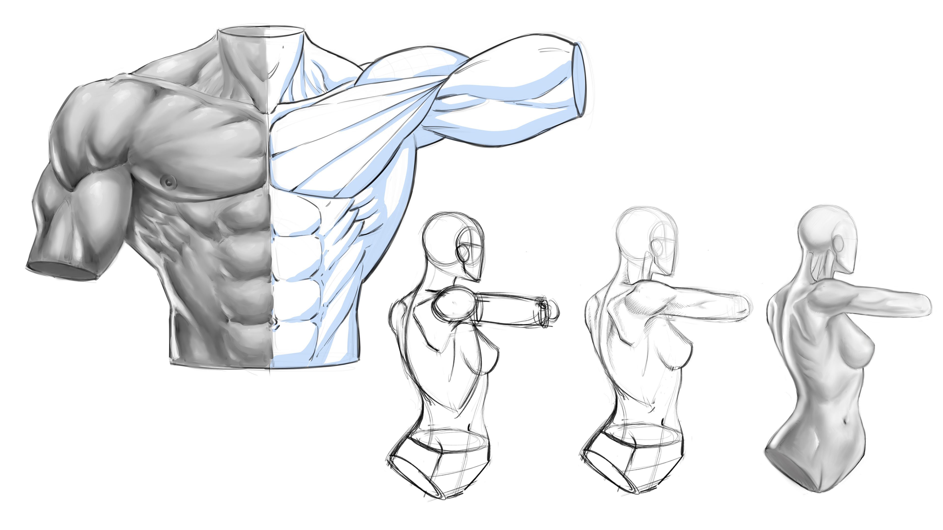
6. Drawing the Arm Model: Everyone, welcome
back. When this one, we're going to talk about
shadowing and rendering. What I'd like to do is first
start with some basic ideas. I'm just going to draw a
portion of an arm, a leg, and we'll render
those because it's a lot of what you're
going to be doing when you draw a comic card anyways, but it can apply to
all sorts of things. Forgive my little glitch there, updated my system and now it drops in a little bit
of text as I'm drawing, not a big deal, but it's a little distracting,
so to be aware of it. But essentially, when we
go to shadow anything, it's really a similar idea
of creating basic ideas of, where the lights
emanating and hitting, where it's bouncing
and hitting elsewhere. So I think that when we
go to draw characters, there's a lot to
consider, right? A lot of different
volumes and shapes, and a lot of areas that
could be bouncing from. So and then you get into
stylistic choices as well. So there's just a
lot to consider. And I think that's
why I can get really super confusing rather quickly. But what we'll do
is we'll just draw some basic models
basically to work from. That's all this is,
I'm just constructing some models that we can
shadow and play around with. You see, I'm using the
basic cylinder structure. You don't have to
do that. I like to. It just gives me a little bit of idea where these directions
and volumes are going, and then I can drop
anatomy over top. I've got other lessons on that. Again, that's not really what
today's lesson is about. But I figured I would
show you the process and build up just because. And so that'll give us a
basic arm to work with. And then you can get
in here and erase some of your cylinder
drawings and stuff like that. Scale up this brush,
get that out of there. And so we'll start
with this one first, and in the next lesson, I'll do a portion of a leg, and we'll use different
shading methods for each area. Maybe even incorporate a
little bit of suit designs. I'll probably do
separate lessons on just suit designs that's been
requested more than once. So always remember
that reach out, let me know what lessons you
want to know specifically, and I will get those on my list. So with this, we've got a series of shapes
now to work with. And again, with anatomy, it can get tricky
because you know, you could consider each
shape individually, but you need to do that as well as think of the
entirety of the arm, g, whatever it is,
full character, right? So if you get too awfully confused by each area or
maybe focused on each area, so you do this area, this area, this area, It can look really segmented
and kind of weird. Um, no, some styles, it looks really
cool, nonetheless. I mean, it really does play
into a couple of things. And again, I think that's why it can be somewhat confusing because sometimes it breaks all the rules and looks
really cool because of style. I think that
generally, if you have a more overly stylistic
interpretative thing going on, so lots of hard angles, lots of dramatic
charcaturizations and the work, then you could
probably get away with even more stylized shadowing and rendering as well because
it just sort of like plays into the whole
cartooning role of it all. It's like, that's definitely not realistic, so what
does it matter? So where if you have a more realistic depiction
of your characters, then maybe people sort of expect the light and shadow
to be realistic as well. I don't think that's a
rule. I'm just sharing with you my opinions about
why that might, you know, people might
expect a certain thing, like a certain directional
pursuit to what you're doing. But so we've got this
arm in place and say we, you know, just pick an area
where light source is. And so I like to use a dimensional kind
of representation. You could do
something like this. I'll see this one
done quite a bit. And so what it does
is since you can see the three dimensional
shape of the arrow, it makes you realize that we're sort of closer to the
viewer at this point. If I was to do
something like this, you don't know if that arrow is further away on the other side, closer to us. There's just no There's no orbital way
to kind of depict that. Until you do
something like this, you could put the orbit there. That's a little bit easier
to discern as well. But you can see that this
one now would actually reside somewhere over
here, just higher up. But as far as the
orbits concerned. And this matters because
if you don't think of the light in a very
spherical way, just like your subject matter, in this case, just a basic arm, then obviously, you're going to falter as you apply
the light source. So what I would perceive
is that at this point, this light is emanating
down like this, and it is hitting, we'll say, at the highest point, you know, you got to think
about the bicep area going around like this, right? Well, it has what
I would consider an apex in relationship
to the light, which would be probably
right about there. So we could start
with that concept. Now, I'm not saying I'm going to be able to focus in on
that all the way through, but at least if I start
there and say, Okay, let's say the highest point
of the muscle that it's hitting right there is
that little plus sign, and that's our peak
of our light source. Well, now we can
start to shadow, and we really got a great idea
of how this might shadow. So I'm going to start with a single light source
on this particular one. So say I shape the
bicep like this. Okay. And one of the things I like to think about as I shadow anything really is
how much width, you know, how much depth, how big is the
volume of that area? So if I put this
line, for instance, if I take this line
and I go for one, if I go like this, I mean, that just really kind of kills the shape of
it almost entirely. It flattens it out a bit. It doesn't entirely because this side over here drops down. It actually, in some ways, actually works pretty well for the bicep because the bicep does have a difference of width as it goes
around like this. And so thinking about
that and getting that in with your initial shape of
shadow works out really well. So I might take this and cut this way and drop down
this way and bring it, you know, I try a few
different shapes. Obviously, if I'm looking at reference, I can pull from that, but I like to draw
stylistically, as you probably know if
you follow my lessons. And so I just play around
some of these shapes, but I make sure to get the
difference in width and the implication
or implied volume as I move around that form. And then needs to happen
really to every muscle group, but that's something
I do think about. I'm going to try
something like this. If the height and sort
of not really the apex, but the apex of where the light would hit is right about there, then I have to perceive that as it gets down to this
muscle that's behind it, this tricept that's on
the back of the arm, that it wouldn't
be the same idea. If I took the shadow here and I tried to
relate that down to here, I might do something like this. It's probably not bad,
but I don't know. I just envision that now we're further away
from the light source, and so I probably need to do
something more like that. I need to have more shadow
down here, not less. Again, that's a little
bit of a guestimation. I don't know that to be a fact. I'm just saying that
that's how I perceive it. And so here we've got this
smaller muscle group. Really, I just feel
like this would catch a lot less light anyway. I'm going to do something
like that. Here. Maybe you get a little bit of
light right there. And by the way, this is a more darkly
lit model at this point. When you're putting
these heavier shadows. Another thing that I like
to think about when I go to light a character, model, whatever is, what percentage of shadow
do I want on this? Sometimes I like to darkly light the model just because it pops more on a
particular scene, especially if there's a lot of, like, surrounding details, then I think heavier
shadows works better because it makes the character
stand out really well. Obviously, mood is a big
one, the biggest, really, like how dramatic is the scene, what is the mood of the
scene, things like that. So as we get over
to here, again, we think about this
initial point right there the bicep and that
peak of the light source, and we come over
here and say, Well, this is going to actually
catch a lot of light now, so maybe just a smaller shadow there for that bit
of definition. The muscles on the thumb side. We can say that over
here it's going to get a pretty large shadow. Now, another thing that I do, and it's a little bit of a style choice is I do these
little points going into the smaller either divides of muscle or direction
of the muscle. It's kind of tricky because I think that if you
do it too much, lots of little triangles, lots of little points, it can get overdone really quickly, and it can start to look like
broken glass or something. So I do a little bit of it, but I try to be careful to not go too awfully
crazy with it. You really want to
play around with some more organic
shapes as well. You don't want to go
too angular to organic, you want to find a nice mix. I also feel like
there's a little bit of shadow from this tendon, so the bicep connects down through here and you get
this visible tendon, usually if somebody
is flexing their arm, this looks and feels
like a flex position. Those are the base
shadows that I would do. And I would just
continue on with this. Again, play around with a mix of angular
and organic shapes. And also, if you're a little
bit more new to this, lean a little bit more
heavily into angles. Angles are generally easier
to work with at first. That's why you'll see a lot of cartoon like styles that
use real heavy angles. And It also to me, it's a little bit more
of a design approach, designed way of thinking. You got to figure like
if you were rough out of a city in a building, you start very structural,
very angular, right? It's easier to map perspective. It's easier to map size of spatial relationships,
all of stuff. So just use that
to your advantage. If you're a little
bit more new to this, be okay with some
more heavy angles. You can always go back and make things look
a little bit more organic after you do sort of the design phase of
what you're doing. We're going to stop here. We're going to go
to the next lesson. We're going to fill
these shadows in, talk more about this and
get to some rendering. With that, let's move
on to our next lesson.
7. Adding Rendering to the Arm: Welcome back. For
this next portion, we can start to fill this in, and you could block this
in with a solid brush, really, I would want to
sculpt this another layer. Maybe I'll soft
erase this first. What I'm going to also show you is like a dual light source, maybe a shiny material versus a something more specular versus more of a cotton
or less specular. There's different terminology
for that is escaping me. But it's good to think
about those aspects of it. Sometimes you're drawing
real shiny leather, other times you're drawing
just a basic material. Sometimes you want
something that looks tattered and gritty
or worn leather. There's just all sorts
of different things to get in your work there. There we go, we just block that in just for
reference, really. And so now, when we
go to render this, once you have this basic
larger bulk of shadow, I think the rendering
gets pretty easy, really, but it's good to
go in with a game plan. By the way, you can also segment into these
areas different ways. You don't have to leave it here. You can break this stuff
up a little bit more, get some definition in there. We'll talk about doing veins
in the other direction. So these concepts overlap. For instance, one of the other things that I
really think we have to keep in mind when doing
this is that You know, when you draw your wrapping
lines, that go like this, so you're using
these to flesh out the shape of that particular
muscle group, right? Which I recommend. I
really recommend drawing lots of illustrations where
you do just this right here, and you can do it
per muscle group or per the entirety of
the entire arm or both. You could do the
divisions like this, per muscle group, or just the
whole thing, which really, I think it makes
more sense to per muscle group on something
like this because you really need to
think about each of these areas as
dimensionally as possible. So that when you
do go to render, that plays true and
you're rendering. So for instance, if
I take this and say, if I render like this,
for instance, right? This really fights
the look of it. So let's say I do this. Right? I mean, you can
probably tell almost immediately that that fights the look of the underlying form. It feels like a negative. It feels like I'm trying to push these forms down
and in to space. And that's just the opposite of what I would
want to do, right? You can see it really I mean, it just almost immediately, just really looks bad. You know, I mean, it shouldn't look that bad
for those little of lines. So another Another thing that happens, and I
want to point this out. Again, these ideas
overlap quite a bit. So I never know
what to teach when because there's so
much that connects. But basically, when you
start to render across this, I would recommend that you go up and around like this, right? It doesn't mean they exactly
have to follow this, but this is the overall
way that I would try to shadow this area. So that's kind of the
shadow mapping that I would consider for
just that area. Also, something I see a lot that I think really hurts
what could otherwise be pretty good rendering is when people bring their
lines either with no taper and or really
spaced out like this. So to me, like it's going in the right
direction relatively, but it's not it's not
holding together, it's not cohesive enough. You got to kind of
think of this rendering as values and shifts
in tone and value. So personally, and some of this is personal
preference as well. So I have to really be careful how I explain this
to you because I don't want to hinder you from doing something that's
better than I do, cooler than I do, a
different perspective on the way that I would do it. You got to keep an
open mind all this. But a lot of times, what I think, I guess, again, I want to make sure
I'm not pushing my personal views on you, but I think that rendering
that is tighter in succession and then has
more taper to the lines Emulates the effect of
shadowing much better. It looks like it's going
from dark to light. To me, that's what I like. Again, maybe a little
bit of preference there. But I would definitely go
around the volumes more. Just think of it like
you're basically taking dark and you're fading it with the taper
towards the light. That's one simple
way to look at it. And there's all sorts of ways
you can accomplish that. I mean, you don't even
have to use tapered lines. You could stifle
the entire thing. I guess that's really
what you need to do is like when you
practice these lessons, also go and look at
all your favorite ways that shading is
accomplished and say, how would I incorporate
that into my style? How would I my own
version of that. But I would say to start
with something like this, practice your ability to taper
and then also keep an eye on how close they are together
at the thicker point, so this point down here towards the shadow because
that's the part that gives you that ability
to fade off that harsh line. That's really what I'm looking at when I do stuff like this. I'm trying to say, how can
I fade off that harsh line? How can I direct
the light source? How can I make it look
cool at the same time? There's always that
factor as well. You see, I'm starting to space
model a little bit more. Now, there is another
potential reason that you would space
model a little bit more. Maybe you're going
to cross hatch it and when you cross hatch, you generally fill in
that negative spacing. There's that as well.
I'm going to show you a few different ways that I would look at rendering
stuff like this. Let's say it was
at my base shadow that I wanted to apply. It's a little bit off. I feel
like I went too wide here. It does take a certain
amount of concentration. I usually do a little
bit better when I'm not yapping over a video. If we go over here, now I can take this and
I can cross hatch. You can use different angles. You can use for five, you
can use, whatever you want. I do this visually,
but if you notice, what I'm doing now I'm
breaking it off the other way. I'm starting wider here. Or tighter in
succession, really. Then as I bring it up this way, I'm thinning the lines, but also spacing
them out further. All sorts of ways
you could do it, but you can see it now it adds another level of
shadow right there, and I can continue that
on in all sorts of ways. I feel like this error right here would be
a little darker. It's too light right there. It's too You know, it's too plain.
Doesn't look cool. Always throw that in there.
It doesn't look cool. It doesn't look cool,
I add more lines. Same thing and I might
cross stch down this way, and I'm really repeating
the same technique. I don't want to get too
awfully crazy with it, but I don't want it to look
too plain Jane either. So I'm trying to just
play around with this. Some this way. There we go. Then sometimes I will
just bring lines up and around the form like that. I just feel like to me it does two different
things that I like. It rounds over the form
visually this way. It almost gives it
another plane change. Now, if somebody was to come
in here and color this, say I was a colorist and I took this from
somebody else's work, I would look at that and I go, maybe they're trying to tell
me that this area right here should be a little bit darker
tone of whatever this is, suit design, skin color, whatever it is, a little
bit darker than here. It's almost like you can
again direct the lasers. Remember what I said originally
about this little x, which I'm going to get
that out there now. But that that's where the peak of the light
is kind of hitting. Like, if you were
going to put a glare, you might go like this. Like say it was kind of a shiny, you know, cyclopes arm. I'd probably put a
glare like this, right? And then I would
start doing those segments.'s doing a messy version, we're
not going to leave this. And then I would shadow against those segmentations to make
it look like a metal arm. So again, it's sort of
that continuity way of thinking that, well, if that was a lines that
went right through there, it would direct the volume, and it would also give
me a plane change. I guess I'll throw
in a third, too. Again, I think it
just looks cool. And a lot of times,
when it comes to rendering I hate to say it, but that's a big
motivating factor for me. Does it look cool? When I initially
started rendering, it was all about,
did it look cool? I didn't know where
to put anything. So I was just I
don't think I had a real good concept
of light and shadow. It was more like, Hey,
this kind of looks neat. I think I'll do that. So I think a lot of it does as
it pertains to comics. That's kind of a big one. And so really, I'll
just repeat this. Now, as I worked down into
say this area of the tricep, I would do the same thing,
but I would actually Probably bring the
lines over even more. I'm going to do that.
Now I would also simplify it because
it's a smaller area. I don't have as
much room for a lot of multiple angles of cross hatching and defining a top
center to the form as much, at least it doesn't
feel that way. I'm just going to add some thick to thin lines on
an angle like that. I could still cross hatch. Maybe do through
here a little bit. Remember two, you
can make these lines different thicknesses as well, just from neighboring
cross hatching. So what that does is it just helps it to not all
blend together. So you could do some real tiny little lines for
your cross hatching versus some heavier ones for
your initial hatch work. And I'd probably
leave it like that. I'll go back probably at the end and do some
little white out effects. I like to do that in
a lot of the work. So same thing, smaller area. I'll just like this. Now, the other thing is, they don't all have
to be as long. But remember, as
you shorten them, you're kind of saying to
the viewer or colorist, even, because you got to
always think, you know, you're relaying this
information to the next person. Now maybe you're the colorist, but you're kind of saying Oh, light hits there
more predominantly. That's why I left it open. I mean, again, that's kind
of the way I look at it. So, personally, I
feel like this area, I can't remember
this muscle group, but Anyways, to me, it's going to get
more in shadow. Even if they're nice
little thin lines, again, you could run some really thin ones like this
if you wanted. I feel like that makes
more sense for that area, that this is going to get
the bulk of the light. These other ones, not so
much. So something like that. Then as we get to this
top shoulder area, we can do the same
thing and we'll render, I'm going to take
these up and over. Think of this like a hill. I'm going up and over the hill. Again, if you had to map out, now, a little quick tip for you, you could put another
layer in here and use another color and
just real lightly, and you could do your
wrapping lines first. If you have a hard time
directing the rendering, There's no harm in
doing this first. I mean, look how much more
dimensional that feels. Of course, your rendering is going to make more
sense going over that. You're going to have something
to pay attention to. So keep that in mind. That I'm not going to do that, but I just wanted to give
you that little FYI there. I sort of just like
doing it like this. Now, another thing to keep in mind is that maybe
you don't render as well with the hand mechanics
of pulling up and over. So don't feel like if you're
watching me do it this way, that your arm has to be
oriented and by arm, I mean, this arm, not your arm,
your drawing of an arm, that it doesn't have to be
oriented this way, okay? Be open to rotating the canvas. I like to challenge myself
to render this way, but I can feel it right now
that it's not my strong suit, that I'm struggling here. I do like to push the
struggle, though, because I think that that makes better And there's times I do
like to just render upward. I just want to get
the hang of it. But I'll be honest, my
ability to render is a lot more controlled as I pull down and towards the
bottom of the screen. So don't be afraid to utilize what's best for
your hand mechanics. So if it's better for you to
rotate this and pull down, it's faster and cleaner. I mean, you probably see
a difference already. There's a difference in
my hand control there. So you have to use those
mechanics to your advantage. Again, I still like
to test myself. I would still recommend
that you test yourself, but don't fight the uphill
battle the entire time. If there's just a
better way to do it, and it's saving you
time than, you know, work smart and not hard
kind of sort of ne to playing at some point, right? So now I'm going to cross
hatch this way, same concept. I'm just going to
space these out. I like to also stutter step
the lines occasionally. So you'll see me do a
little bit of that. You can also do that just by
going back with white out. So we're going to
stop right here. We'll head over to the next lesson and
continue rendering. So with that, let's
move forward.
8. Additional Cross Hatching: All right, welcome
back. So we'll continue on with the
shoulder area here. Again, I could keep cross hatching to get
the next darker tone, darker value. While
adding style. I think I'll bring some
up even on this side. You see that over here, this
is where the light would be. A lot of times it feels awkward to render on
the light source side. What I said that precips or peak is right about
there in the bicep. Well, in that case, the light would really be
pretty strong there, but we need to also consider
the muscle group is going down and wrapping
away from the light. So there needs to be a little bit of value
shift right there. Maybe not a lot, but at
least a little, I think. And also, you could still make the argument that there
would be a little bit of rendering on the
very edge because this muscle is it's not
like it's rounding, and then it stops can't
even do an arrow here. It's not like it's rounding, and then it stops flat,
right? Doesn't do that. It's rounding away from
our view, like a globe, like a planet, similar to that kind of
concept, some spherical. So in that case, you could do some rendering
on the very edge. Just keep that mind and you'll see a lot of artists do that. You probably pick up
on that, I imagine, but just something to point out that it's okay to get a little
bit of that over there. It's not like the side with the light source can have
no shading whatsoever. I'm really sorry that
it keeps popping up random file names of other
things that are worked on. That's crazy. So Let's
see with this spot, Let's get this out of here a
little bit, clean that up. Now, you can also get in the subdivides of
the muscles, right? So if there's a little
striation right here, you could shadow
that independently, or you could just add it as another shape and then
add a little bit of, like, area around it. I think that still works.
It doesn't need to be rendered identically to
these other bigger groups. And remember what I said about
maybe adding something th this kind of peaked area or another shape that's
kind of going like that. You don't have to
do it, but it's something again, I like to do. I think it looks
cool stylistically. I'm going to add that in there. Sometimes I will do
a little cheat too, when I'm working
digitally and I'll throw these things in. I go, what would
that look like if I put it over here
and I rescaled it, and I just play around
with the tools like that. So sometimes it yields
a better result. We'll get down into
the form area here. Same thing with this area, I'm going to block
this, like this. You can bring these
tapered lines really heavy to the sides. What's nice about
that is it starts to shadow it this
way to this way, just by widening or thickening the tapered
lines on the shadow side. Again, I can run some thin
lines right through there. Okay. Now at this
part of the form, I can render up and around
and just to speed this up, I am going to rotate it and take advantage of my own
hand mechanics. Again, pulling down
feels a lot more comfortable and a
little bit quicker. Now, another thing is you
don't have to go thick to thin pointing towards
the light in this way. I'm going to show you another
method here in a second, which is probably
pretty obvious, but you never know what to
explain with these videos, what somebody might be
questioning and wondering. That's why if you do have any questions about this process, make sure to comment so I
can help you figure it out. Let me know what to
actually answer. I'm going to cross over here. I feel like this
area would be der. Like that. Another one that's neat is to bring
lines up and over. I picture like they're leaning
against the other line. It creates a little bit
of a diamond in there. You'll see a lot of people do this really well with a cro qui. Never really mastered that pen. It doesn't have to be
a can be anything, but it looks really good with the natural taper that a does. When you can master suckers. Just like that. You
see that, again, gives another way to kind of
round over that form muscle. But the other one I wanted
to show you is that you could really you could do
it so many different ways. I mean, obviously, there's
not an infinite amount of ways, but there's a lot. But another one is just
like thicker lines. And shoot, they don't even
have to be thick to thin. They can just space out. It could be the same line, just slowly spacing out. And this is a really nice look. There's times I really get into applying that sort of shadowing. It almost feels like it
would flatten it out, but if you do it in
just the right way, especially if you render
the other lines this way, you can get this kind
of spherical thing going on just by the
way that you know, you bend them around like that. And so I don't know. It's just another
neat way to render. I don't do as much of that
one for a lot of anatomy, but there's times I do it. Like, so another thing I like to do is really just change up the rendering based
upon the scene as well. So if I'm rendering
this sort of cross hatching that I just showed you all through here
for the anatomy, I'm not going to use that
for the background stuff. I just like that difference from the character to the
scenery, you know? And usually, it kind
of boils down to if it's something more
straight and angular, then I typically use, you know, more straight
lines to render it as well. So again, a couple of little
cross hatchings, that. I could do those
same little angles, but it's probably a bit
too tight in that area. And then for the veins, it's sort of like
wrapping lines, right? And so I generally will draw across this stuff in this way, like real light, and I'll start to try to
figure out the shapes. And I really should pull up like a vein chart in one
of my anatomy books. I usually don't. I just
sort of draw some in. I do a little bit of
white out through here, and I just I look
down at my own arm, and I s find some shapes that I typically have
used in the past. And that's how I do it. But just keep in mind, there's great anatomy
books that you can pull from and see the vein flow, and it's probably for the best. You're going to get that sense of knowledge in your work,
which people appreciate. But I've seen a lot of art styles where they
do it stylistically, and it looks pretty cool, too. But the main thing here is
that you think about again, that underlying form and volume. You got to always think
about that as you go. And then when you
draw the veins, they need to look like
they kind of roll around that even
as they're doing these kind of zigzag
cross sections, you know, sprawling kind of
veiny thing that they do. So yeah, it's kind of
tricky because you have to think of a couple
of things at once. Much like everything
in comic art. It's just not just
one thing, right? So figure out the
direction of these veins, first, make a few
mistakes like I'm doing, get those mistakes out
of the way, fail faster. And you get the bigger
tendons from the wrist areas. You could probably start there, put some heavier
shadows on those, and then spin these
out and around. Now, another thing you could do is you put them
on another layer, which is what I should
have did because it does make them a lot
easier to just draw, especially when you go back
and forth from dark to light, the white out is much easier or white digital ink digital lines. But just keep doing
that. I'll probably have to soft erase this just because it's a bit messy right now. I push this all back
so I can see the mess. What you're going to do is
just show the way that it's reacting to the
underlying forms, both in the larger way of
the way it wraps around spherically and in
the smaller ways of where they overlap
and hit one another. Like these tendons here from the wrists, you got
a vein that goes over, while it's going to
create a little pocket of shadow in there somewhere. You pick back up
on the other side. You just continue a
little bit of that. K Same thing here. We do a negative line right through the shadow,
that looks cool. You can also put a
little bit of bumpiness to the shadow over here. For instance,
instead of just one smooth line, you say, well, the vein gets wider here, then out there, wider here, and you can do that
usually with the shadow. You can apply it on the
other side as well, but you want to me personally, I try not to draw this
line on the other side as. You can still get it to show
with adding the rendering. Through it, and then go back with the eraser and
just get rid of the line. Maybe leave just a little
hint here and there. But I don't know, it looks really looks really
good when you can get confident enough to not need the lines on the light
source side as much. You want to play
around that concept. Then for the vein, you can
add just tiny little bits of rendering, like that. You can fade those out,
pick them back up, so many different ways to do it. Alright, so we'll go
and stop right here. We'll head over to
the next lesson and start to ink the lines. So with that, let's move on.
9. Inking the Arm: Now we're going to
go ahead and take this and ink the work. The reason why I'm
going to time lapse, the ink portion
for most of these, and I'll slow down some
areas and talk about it, but it's really redundant. Hopefully you can gain a
lot by observation here. So essentially, just shaping
the work, filling in areas, and the same idea will apply
to the cross hatching, as I spoke about before. We really need to zero in on the idea that we're trying to wrap these
lines around the forms. Not every style
will require that, and I'll show some
different examples where you can still kind of
emulate that more. But again, if you're new to
this and you really want to get the most depth out of
what you're trying to do, it's better than you
know, fighting the form. And by fighting the
form, I just mean, if you're not kind of perceiving
that the rendering lines in some way are wrapping
around that volume, Then obviously,
you're going to start flattening out certain
areas and hopefully, I've already illustrated
that well enough with the other examples. But that's really something
that I think helps us a lot to reinforce the dimension
that we're looking for. Now, it doesn't mean
that every bit of rendering works out
exactly the way we hope. Some of it, you just
kind of have to let B and then come back
with future revision. So what I mean by that is, find a style that works for you. It's not like it all has to be perfectly congruent with
the underlying forms, or it's just a waste. There's a lots of styles where they just kind of
throw it in because, again, as I mentioned
before, it looks cool. And I don't think there's a
lot that's wrong with that. I just think that again, if your goal is to, like, really get this nice
dimensional feeling to the work with your rendering, then one way to achieve that, probably the easiest way
is to really think about those lines curving
around the form. Next, it's just thinking about it as a gray scale
tone, of value. There's times I've seen other artists and I've
tried this myself, where you can jump in and do a quick digital
paint kind of version, especially if you're
working digitally that's as simple
as adding a layer. And you can sort of add in even more ranges of values,
like digital painting. You can use a soft brush,
hard, whatever you want. But the idea there
is that because you instill this kind of
dimensional value system, your rendering will
make more sense. And like anything
else, it's just because you have more
points of reference. And I'll show an example
where we do that as well. It's similar to the idea
of the wrapping lines. Again, any way that you
can start to think about these areas as three
dimensional forms in space, then your work just tends to get better anyways in lots
of different ways, but very specifically in the way of creating shading
and cross hatching. Now, also remember that you're going to want
to play around with lots of different ways to
establish these lines. I tend to go with longer,
more tapered lines. That's just one particular way. Obviously, there's so many different
ways you could do that. You could go with very
tight abrupt lines. You don't have to taper them. You want to try the
different variables, but This is a style that I've developed over
years that I really like. It's not the only style
that I'll utilize. In fact, there's lots of times that I play around
with a messier style. So again, I'll give you different examples so you can really pay attention
to this stuff. I wanted to start
a little bit more clean and concise or what I do the most of what I aim to be my
own particular style. But again, that's
something that I developed over many, many years. So don't expect that you
need to start rendering and get my style or another artist's style
that you really admire, it's great to admire
that and take observational notes and add little things into your
system of doing thing, your style from these people
that you admire, for sure. I think that's one of the
best ways to level up our skills and learn
more efficiently. But also, be careful not
to pressure yourself with getting a replication of
that because For one, we have no way to know how long they persevered
through certain things. And chances are,
they went through a couple things that didn't work and things they
deemed not functional, not part of their style before they got to the one that you see that they really had a
kind of eureka moment on. I like, Wow, this is my
style. I love this look. I finally found it, right? That takes years sometimes for us as artists to
find those moments. And then ultimately,
it inspires us, and it makes our work better. So again, you can't
just hope to look at somebody else's work
and immediately have that sort of euphoric effect. You can definitely
learn and grow faster from seeing what they do well and what they do
right. Of course, Paying attention to
their shapes of shadows, paying attention to the way
they use their line brakes. When do they double up lines? When do they make messy lines just in
certain areas to kind of show that
compositional difference from area to area in the work. Like, there's times when
you really need to, like, mess things up and add some grit and grime
to the work, right? And certain artists
do that really well. But again, pay attention
to that, learn from that, but don't have
false pretenses or expectations that now
make you feel like, well, they can do these
clean, beautiful lines, but I can't probably
worked really, really hard at getting their
hand control that way. And that's why I talked
to you about turning the screen and really zering in on the way that you
hold the pen even. Like, you know, you do want
to think about these things. It's not that it's going to be the all determining
factor because really, I think the big
one is just time. And you're going to
have to create lots of illustrations with lots of different lines so that you start to feel what
works and what doesn't. And that again, just
doesn't come overnight. So be ready for
that perseverance and that hard work ethic and just enjoying what you
do so that you can put enough time into it so that you get the
results that you're after. But again, trying not to have those expectations early
on, where it's like, Oh, I got to make my stelf
look like, you know, whomever's work because
that's just a recipe for whenever we
compare ourselves to things we can't possibly
know all the details of it, it can be disheartening. So, here I'm putting in
some negative lines. So I do this as well at times where if I want to sculpt
the shadow even larger, and maybe in this case, I didn't take the time to put the rendering on
a separate layer. So if you're working digitally,
I do recommend that, do your shapes or shadows on one layer, your
rendering on another. It's not that you can't fix it, as you see, I'm doing
it here with white out, and I'm going to usually play around with it for a bit
to get what I'm after. But what I'm really
looking at is the shape of the highlight on the bicep just wasn't quite what
I was looking for. So sometimes I will go
back with white out, and I will re sculpt
that area in a negative. And actually, I do that, I wouldn't even say
sometimes at this point. I do that all the time.
There's something that's so cool about being able to use white out in the illustration
that immediately, it helps you clean up the
work more efficiently. It helps to add another
level of detail and style that I never seem to get
if I just draw with, black and, you know,
black on the white page. It's not until I go back with the white that I sort of find other design elements and
ways to sculpt the lines. It's super honestly, I can't even explain it
because it just seems like I would just
eventually pick up on that and draw the
way that I want to see it. And still, even after all these years of drawing,
it's not that way. I just really love going back with white out and creating, you know, like, especially like you'll see when we
do the Face example, tiny little fine lines
and things like that. There's just certain elements
where it's just much, much easier to go back
with a white pen, in this case, digital white ink, if you want to call
it that, white lines. And it's just really,
really effective. And I remember
picking that up from watching comic artists
just use white out pens. And so it was one of those techniques that I really wanted to incorporate
in my work. So here just adding some
finer lines to the hand area. Another thing is,
don't be afraid to shadow smaller areas. So for the longest time, I was always kind
of apprehensive about shadowing
fingers, for instance, because they're a lot
smaller volume than say, the upper arm or the chest or the bigger scene in
entirety, right? And you really can't do that. I don't think it always
looks weird if you have like this good amount of
shadowing everywhere else. Then there's a lot less
on a certain area. Again, it's that continuity or that consistency
through the work. Just remember, you can use very fine lines in smaller areas, and that's
what I'm doing here. I'm doing tiny little
sketchy lines. Now I'm a lot more
comfortable with it, but that's something else
I wanted to mention to you because I remember
more in the beginning, I was actually very apprehensive or even just wouldn't do it. I just wouldn't add those
tiny little shadows and sketch lines in areas like fingers and
smaller details. Just remember line variation
can be all across the board. I could have definitely
taken this to a lot more of an extreme
version of that, losing lots more line variation. And that does, in turn, help you to kind
of give a sense of scale within the illustration. So we'll go ahead and
conclude this lesson here. And the next one, I want to
show you how we can take this illustration and now add a secondary
light source to it. So with that, let's move on.
10. Adding a 2nd Light Source: All right. One
quick tip on this. We're going to do a
dual light source and some different parts
so that, you know, you've got different ways to perceive this and utilize
it in your own work. And remember, this is just I know we use arms and legs
a lot and stuff like that, but these are just models. So for instances, but you
have to take what you learn here and utilize it on a
variety of other things. I actually forgot a
little spot here. It needs to be
rendered in black. But what I want to show you real quick is that you can also take some of these
single lit ones and easily convert them to
a dual light source. So let me show you that. A lot of times it's
better to go in with the idea rather than to
do it as an afterthought. But I'll be honest, I do
a lot of after thinking. So what I can do is
pick an area such as, right here, and I could say, well, this is a
low bounce light. Make sure I've got pure
white there didn't look. Maybe the brushes
into full opacity. But I can start and I can
block in a little bit of a bounce light on the underside of some of these
muscle groups like this. Yeah, you know what, I'm not at full capacity. That
is the problem. Okay. And just like that, I can drop this
in rather quickly and I could test it
out, see if I like it. Like anything else,
it's probably even good to do this
from a distance. You can really see it
all work together. But what's nice about
this way of doing it is that if you've got enough
predominant blocks there, it's easy enough to drop in and even connect some of this, which really gives a nice look when you get it just right. So you want to think
about the light source being stronger obviously at the base where it radiates or hits and emanates
off the surfaces, but it might roll into the
next neighboring muscle group, like we talked about
with the shadows. There's a certain
point where the stuff has to interconnect or it'll segment too much and
look a bit funny. I feel like this is a bit forced, so I'm going to go back, but I just wanted to explain hopefully part of that process. But you can start
off with just having the light catch certain areas. Obviously, like I said, more heavily on the bottom, where it's closer to the light
source, things like that. Have it maybe intercede
intersect with the vein here. Then from here, we can
just render out from that. You could start more
heavily like that. It's on a floating layer,
so it's easy enough to do. Then you can just render into the shadow area in
the same way that we did the cross hatching and a black ink style,
and go like this. I probably keep the
edge here pretty solid. So this is kind of fun.
It actually reminds me of if you've ever used
the scratch paper, you get those pads of
paper that you scratch away the I don't
know what that is. So kind of surface, and it's a similar way where
you work in reverse. And it's a neat
experience, actually. I need to do more of it. But you can see that
just like that, we can introduce a
secondary light source. Again, I really don't like doing it as much of
an afterthought like this, but It's there if you need it. There's just times that
you might get done with a particular part of your piece and go, H i, you know what? It's just not rounded enough. I really want that
dimensionality. I want to introduce
another cool color into the lighting of the
character or whatever it is. This is a great way to do it. Because you got to figure now, you can do that cool secondary coloring that really
adds drama to the piece. Blow this off any
number of ways. Again, there's
probably no point for a full segmentation right there, so I'll
just connect that. There we go. Check
it from a distance. Yeah. I mean, I
think it actually adds a lot of depth
and dimension to it. Another thing we can go into
here. And fade this back. A lot of times the
blunt edges of anything will be distracting and the rendering
can soften that up. That's what I was
seeing right there. I was just a little
bit too blunt like a stop, a full stop. You could probably even come back with some black in here. I wouldn't get too awfully crazy with it because you don't want to really you don't want
to be too distracting and I feel like it's
on the level of that right now. I'll
leave it right there. Then if anything, I
would probably add maybe I'm going to shadow
this a little bit more. And then maybe we'll
try it one more time right here and then
we'll call it good. Because like anything
else, whenever you're adding white highlights, white out, highlights
in the eyes, it's such a powerful
and neat effect that it's like it can be
overdone rather quickly, so you've got to be careful, and that's usually
how it is with any effects that are really
predominant and strong, especially if they kind of
while you out a little bit. You got to be careful because
that's like it's real easy to overdo that because
you're so impressed with it. We got to remember
that you know, that could just be the
wile factor, right? And too much of that will be distracting to your
viewer. So there we go. I'll show you the difference. Again, I think this
is a great way to introduce that secondary
light rather quickly. And I just got to reiterate, I would really
recommend going into it with the right idea, for the most part, but
it's there if you need it to add it as a
secondary effect. We'll go ahead and
stop right here. We'll head over to
the next example and explain more on light
shadow and rendering. With that, let's move on.
11. Drawing a Leg with Dual Lighting: For this next example, we're going to do a dual light source, and we'll just start with We'll do an upper part of a leg. Again, something
that you're going to probably be doing quite a bit. I'm going to go with a
very stylized muscular leg because that's
usually what I draw, but you can do whatever version
and variation you want. With the leg, I just
like to break down. I draw like this shape
for the quadraceps. This for the adductors. I think they're
called a ductors. It widens out there,
gets thinner here inside of the knee,
inside bends in. They both bend in or outward,
I guess I should say. But one has a more angular one, one is more of a smooth
curve on the outside. But again, this can
be anything you want. You don't even have to draw
a leg if you don't want. I just like it to be something recognizable at this point. Again, I feel like this is
if you're following my work and you typically draw on comics and anatomy
and things like that, then this should apply
to you hopefully. But you can tell me if I'm
totally wrong on that as well. Always good to know what I'm doing right and
what I'm doing wrong. Okay. So with the quadraceps, I'll break those up by doing
the split down the middle, the recs and the Bastus
medialis, Bast lateralis. And I'll leave you alone
with the terminology there. I just want you to what I'm doing and where
I'm going with this. Now, I'm ready to apply some shadows and get this kind of fleshed
out a little bit more. Again, you could go really
heavily segmented with this and really you got a
little bit of a divide here. You can also bring out the
definition to the Sartorius, but it's not generally
very visible, but since we're in
the land of comics, anything goes, so I guess
we can add that in. It'll also give us another thing to render in more detail. So the thing is the pick your
dual light source, right? So you're going to have a
light source that's more heavily on top or it could
be stronger on the bottom. This character could be
standing above a city, and there could be a light bab hanging over top on
the roof above them, and there could be a
lot of light emanating from the city lights below. There's so many
different possibilities. That's really where
you just have to again draw these visual
representations, these three D arrows and
maybe do one big one small. I'll take this one and it'll be more on the opposite
side just a little bit. And I'll make it smaller because that will tell us
or at least give us an idea that this is a less dominant light,
something like that. So now we need to
think about how these two light sources
might affect our model. We need to think about how
they're pushing against one another and creating a
core shadow between them. And so as I shape the first
shadow or light source, whatever way you
want to look at it, I'm going for how I think that top
light source would affect each of these
segmented muscles. I can start more
divided at first, but then I have to sort of
interconnect those as well. And then at this point,
we need to consider, at what point does
the light source kind of stop radiating or stop being so intense on the
surface of these muscles? And at what point does that
secondary light push back against it to create another
shape on the opposite side? So again, they're sort of
pushing back and forth. And at this point, I also
like to consider how specular or how diffuse
this material might be. Am I going to render
this material like this with these little
short abrupt little lines, or am I going to
do something like the previous example
where I have a lot of long strokes of
cross hatching. You know, even that
plays a factor. Is this a more
specular material? Is it more of a satin
or is it more diffused? Like, all those
things play a role? So, and I'll make
some more examples where I talk more about the
differences in specularity. Again, the main ones I think
about diffuse specularity, maybe a satin, which is I guess, more of a name of a material, but they all have
different ranges for the way the light reacts, and then therefore,
your rendering can change based upon that. So you can pay attention
to the shapes I'm using. Again, I'm going to say this multiple times
that the shapes of shadows are sometimes
stylistically done. I would say a lot of times. I mean, if you study life and then you try to
transform it into your own work, you're going to make some very different distinctions on the shapes of the shadows. Typically go more angular as you can see here. I have
a lot of points. Obviously, there's a couple
ovals and circular shapes, especially on the inner
part of the leg muscle. But I go very angular, and that's to say
stylistic choice. You don't have to
do that. You can play around with all
sorts of shapes. The main idea that I'm
trying to convey here is the differences that
the two light sources would have on each
side of the leg. And then when you go to ink
and color things like this, as I mentioned, I think,
in the arm example, it provides us this
really neat kind of cinematic way
to light things, and it really rounds
out the form. So that's all we're
really focusing on at this particular point. So again, the shapes
of shadows can be really all sorts
of variations. I did this back bow
thing with the muscle, it doesn't have
to be that shape. I would say that that's a little bit more of a stylistic thing. The one thing that
I'm trying to do here is I'm trying
to make it look like that this muscle here in this area here are a lot
larger by comparison. That's why I did
this bigger opening like this and like this. I almost draw your
eye to it and say, k, those are wider areas.
Those are areas that have. Again, remember, if we
used our wrapping lines, this would really bow out more than the others.
So with this. These are the two big
masses of that area. This one would be if the camera was on the
other side of it, and this one is pretty
small by comparison, maybe even a little bit flatter. I mean, it's on the
peak of the leg, but it's, it's not as big of a muscle group,
at least the way I draw it. Maybe that's not accurate based on reality, but
the way that I draw it. So something like this, and you could even do a half
shadow across the knee. Let me fill in the rest and
then I'll make that decision. I don't know if it would reach
over to this other side, so probably not here,
probably not here. I probably just fill these in. I feel like the side of the knee would get more right here. I'm going to widen that out.
Something like that, maybe. I feel like the knee here
possibly would on the side. But what I'm really in the
habit of doing is drawing all these lines down the
front plane change of the knee rather than trying
to light it to the side. That's probably a
mistake on my part, but I'm just going to
go with it because it feels the most consistent with
the way that I do things. There is that. There's
a lot of times when I will do things out of sheer habit and what I feel comfortable with.
I'm going to leave that. I will put a bigger
shadow over on this side because we get the light coming down and we got the other
light coming up to the side. I feel like this would probably
have some shadow there. That might be wrong, maybe not on the very top of the knee. But again, I'll keep pushing these ideas around and
then testing them. The other thing
that I'm going to introduce and I'm
going to sketch that in now is just wrinkles
going through it. Again, just like wrapping lines all the way around these
forms and helping to explain the forms by hitting them and
wrapping around them. Wrinkles are always
a great thing for your comic art to make
things look more impressive. Don't have to add a ton of them. You could just add a
few here and there, but they generally will make
it look more impressive. Even something like this where you put a wrinkle
through the front. Again, that little
dip that would occur in between the muscles, a couple of little
spots on the side, and you can do that
wherever you want. As much or as
little as you want. Just make sure that when you
bring that wrinkle around, utilize it to explain that underlying form
that it's passing over. I'll just draw straight across when you could use
that curvature to help define your
drawing a bit better. And you'll see, I
won't use all these, but I like to throw a few
sketch lines in here to try to pick apart what I want
to keep and what I don't. So that's really it. Like,
just as quickly as that, we've got a dual light source upper leg
with some wrinkles, and I feel like that's enough to get us going to where now I can add some rendering to
this and bring it together. So with that, let's head over to the next lesson
and continue on.
12. Drawing Our Shadow Shapes: And we'll come back. Now
we will take this example, and I'm going to go and jump more towards the inks faster. Really, it's the same concept. You can draw it out. Generally, what I tend to think about when I'm
sketching or drawing is that I'm a little bit more
open to transforming the work, adjusting the work, sketching, finding ideas, things like that. So that's really.
Other than that, it's the same concept, and over time, if you
practice going to Inks, it'll feel awkward at first. Now, digital, you know, I want to say digital and traditional
interchangeably, really, because so I was going to say digital makes
it a lot easier, but that's kind of like
the perception of it. So for instance, traditional, I've seen artists and I've
learned a few techniques myself where you can get really good with whiteout and
you can start pretty messy and adjust things with whiteout. It's
rather amazing. So find the artist that
had it Find the artists that you see that do it
really well and zero in on that and study.
It's really neat. That being said, digital
at first will feel easier because you can just flip back and forth from
light to dark. And so there's all
the various brushes. But again, it's really the same. If you put enough time with
your traditional techniques, you will figure out
some very cool methods. You'll find different white out pens that are more opaque. I like to use a posca, I also like using the
the painted white out, and you'll find
different brands that are more opaque than others. Some, you'll go to apply them
and they seem very light, and it's like maybe
not what you want. You know, the thicker it is, usually the harder
it is to control, but you get a nice
heavy white out, which is really nice. So, give it a shot, try both. In this case, obviously, I'm just using sketch book pro here, but same thing, I'm going to block in
the shapes of shadows. I'm trying to incorporate
little bits of angle as you can probably
see as I cut around this. That's again, just
a stylistic choice. Does it have to be that way. You can go with a lot more
curvatures in your work. It's really just
personal preference. And what I'll do is get a lot of this shaped in
then do a flood fill, and then we'll get into adding the rendering and shaping this. So the other thing to
think about is that, if we look at the light source
coming up from this area, and then basically, widening
out here for two reasons, one, the adductor
group or this area of the leg it's pretty
hefty, right? It's a big volume
to think about. So we can make that wider
there based on that volume. Also based on the angle
of the light source. Same thing here with
the medial muscle, it's pretty big and it's that direct angle to
that light source. So realistically, this
could be the same. And I would say even this, but you do want some variation or at least I like to
show some variation. I just feel like if I took the same line and
I went like this, even all the way around. Forgive that lettering that keeps popping up,
sorry for that. Figure that out. But if I
went even all the way around, the same thickness right
there, all the way around. There's a time and
a place for it, but it just flattens
it out a bit more in my perception of it, my perspective of
the way I see it. Again, I just want to give you some information on the wh why
I'm doing a certain thing. I might instead of making
this two straight, I say, Well, what if, just
on this bottom angle, I cut it over just
a little bit more, just to make it a little more give it another
variable right there. It's not too awfully even. I don't know if that's
the right choice. Again, I move these
shapes around a lot. Sometimes they'll
say, well, maybe you should curve this out a little bit and then create
a back bend right there. Does that look more
appropriate for that area? I think it actually looks a
tiny bit weird right here. But I'm going to leave it. I'm going to leave
it just for now. But again, these are
things that I do. These tiny little
adjustments and angles. I know it almost
probably seems like, does that really matter much? I think that it does in the way that when you don't
know what you're doing, and you're trying
to find your style, find shapes that work well for the way that
you're drawing things, I think that these little
changes do add up. I try to tell people,
I'm a bigger fan of small incremental changes than big sweeping changes
because I feel like when we make large sweeping
changes to our we pass by the intricacies
or the neatness, the things that really zero in on making great R. Just my
own personal idea there, But I just feel like
if you're always constantly dramatically
moving one way to the next, you're probably
missing the details. You're probably missing
the tiny things that really zero in on
a professional look. That's why I think a
lot of times we can see art that looks
pretty darn good, and it's just missing
a couple of things. And it's probably
because they're really making the big changes, but they've just
got to zero in on the tiny little things that
make a big difference. So And, you know, I'm not excluding
myself from this. I got a lot to learn, but it's just one of the ways that
I tend to learn and study. So right here, we'll get this bigger
shadow at the base here. Now, another thing that I've kind of mentioned,
it's easy to do. I mentioned it in
the previous example with the arm is it's easy to want to
put a bounce light here, a bounce light here. And I'm not saying
you can't be careful that sometimes will start
to get a bit distracting. Like, it's easy to over
use a good effect, right? Like I mentioned with white out. That a lot of times when an
effect looks really cool, it's like a bit of eye candy. You're like, really
like that look, and so it's easy to want
to put it everywhere. It's going to somehow
just make the art better. But that's usually
not how it works. We have to keep in
mind focal points. And so if something really draws your attention and becomes a
focal point in the artwork, That's good when
you're directing that and utilizing that
to your advantage. It's bad when you don't really
have a rhyme or reason, you're just putting
them everywhere. You can over dramatize or put focal points in multiple places. Well, then it takes
away the potential of the real focal point
where it should be, things like that. Try not to do things just because it works
well in one area, so you decide to put
it in all areas. There is a right time and place for certain things,
especially highlights. In this case, that's really what the secondary light source
could be considered. It's another highlight.
It's another way to round out the volumes. And I'm also trying to break
up lines here and there. That's another thing and
add line weight as I go. So I guess I should probably touch on line weight as well because it does tie in. But generally, what
I would say is that line weight is heavier on
the shadow side, right? Well, you know, here, we've got light on
both sides, right? So where am I going to put
the heavier line weight? So let's take this wrinkle
across the leg, for example. I'm going to put the
heavier line weight or shadow at the bottom, I'm going to wrap this around the form as much as possible. And instead of drawing
a line on top, I'm just going to put
a little line that picks back up on the
underlying form. And that conveys that
little sense of a wrinkle, and then a good colorist
will come through and add a little highlight there.
Same thing with all these. Now, the lights coming up here. So would I put the
shadow on the top? Um I don't I guess right here, I might try to do that. But yeah, I really
don't think so. I would still put the
shadow on the bottom there, so keep a continuity from that. I'm not saying that's the
right decision that could be a bad decision based on
where that light source is, but I just feel like
maybe Maybe on this one, I would because I
feel like the light would directly hit
the bottom of this. I probably can't put
the wrinkle there. But here's what I'm going to do. I'm going to drop
some of these n, and I'm just going to go back with white out and
touch them up. On this side, I definitely
would put the shadow on the base because this light is hitting this side of the leg. Over here, we're still getting that downward radiant light. These would definitely have
a shadow on the bottom. That's where this stuff
does get confusing. But again, remember that this
little white out technique, You can really let
you quickly jump in there and check
this stuff and go, Okay, what does look better
from an angle like this? Does this work? You can
just go back and forth until you get a little
more confident on it, what works and what doesn't
and why? Good stuff. Yeah. Regardless, I like
these types of lines, even if they're not in the
perfect place because they add so much more depth
to all these areas. Again, you can really play
around with them wrapping around the underlying
forms and volumes. It's just a neat way to
immediately create more depth. So I'm a big fan of that. Anyway you can Me this stuff look cool
and dimensional faster. Yeah. And so back to
the line weight itself is I would generally put heavier line weight
at the bottom area. This is an area where I
would definitely put it. I feel like it's a little bit it's a little bit contradictory to the light source there, but I still feel the
need to do this. This is where it gets tricky. Generally, the
heavier line weight is going to be on a
couple of places. Now I've seen artists use it in all sorts of
variations, by the way. It's usually going to be on
the more bowed out area. I remember hearing one
of my favorite artists, Todd McFarlane explay this. And he said that he puts it
on areas where the area bows out the most because it adds
curvature to that volume. I can't remember how he said
it, but something like that. Now, a lot of artists
will say, well, it goes on the shadow
side of the line. So if you've got the leg turning down away from the light down
here on the bottom left, you would put it
heavier down here because this is on the
bottom of the form, and it's away from that
more dominant light up top. Right? So now with a secondary
light, would it be here? This is the bottom of the form, but there's another
light emanating right to the bottom left of it. And I would say yes, still. Why? Because as
soon as I added it, it looked more dimensional. Now, I can't add
it where there's already a shadow unless I had a break in the light
source, like edge lighting. That's kind of what
this area is over here. So I can add it there. There's already a
big shadow there. So I would add it up here right
by the light source side, again, because you can see it immediately
rounds it out more, and makes it feel more it gives it a little bit more definition
on the page, I guess. So sometimes you're going to use line weight
to make things pop. Other times you're
going to use it to help explain more of a
shadow, you know, where light is not as
dominant, you know, waiting the bottom of a line
or shape to imply shadow. Um, so there's a few
different ways to look at it. If I find any more as along the way where I
can explain it better, I will, but that's
really the gist of it. Is that generally
it's for shadow, but I also use it to just round out the, you know what?
There is one more. The other thing that it does
for you is it gives you a contrast to the inside lines. Faces are a really good example. You want good line weight
around the head of your character around the
faces of your character because it makes the
interior lines of the face read as
smaller and more fine. That's what you want.
Well, you could have a style where you have heavy lines on the
inside of the face. But generally, the inside lines of anything you draw are usually
a little bit thinner, and so line weights another
way to make that happen. And then finally line weight around things that are
much, much closer. Like if you're drawing a fist
coming out towards camera, you're going to put this big
heavy line weight around it, and then move that smaller
as you go back into space. So that's it. We're
going to stop here. Next, we're going to actually
apply some rendering now, but we've got the ink lines
in place so that we've got something solid that
we can now render. So with that, let's move
on to our next lesson.
13. Adding Cross Hatching to the Leg: And welcome back. Now, I just
want to give you an idea. Remember what I said
about if you want to, you could place wrapping
lines around a given area, really map out that dimensional
feeling to the form. Let's go and give that
a try might as well. This might help you. If you're somebody that has a
problem with drawing very flat lines,
give this a try. But remember, you have
to roll it around these forms as best you can because you could obviously just draw
these lines flat. I don't even like what
I did right there. Let's go back. Let's
start with this. You have to wrap these
around, like how they sound, wrapping lines and really try to imagine the depth perception
on these given areas. You could do it here as well. I don't think it's as
necessary, but might as well. Let's see how you have
to try to curl those. If you're working
traditionally, this just means light
little sketch lines. Remember when working
traditionally, a two H lead is generally better when you're
going to ink over it. I mean, I like using a HB lead, but it gets messy real quick. Especially if you're
lefty light mean and you smudge through it,
that's always lovely. Okay, so there's
some wrapping lines, just as a reference point. I guess I could do
the knee as well, but that's really enough. That's how I would
think relatively dimensionally about the
underlying volumes. So as I go to render over this, it gives me a little
bit of an idea. Now, as far as mapping this, as far as having an idea going into it or the way
that I want to render this, remember there's all sorts
of ways we could do this. There's lots of styles
where they just simply get in here
with a cross hatch. Going to do a quick version. I've got it on a
different layer so I can do it and get rid of it. But I just want to show
you how if you don't like the real time intensive
stuff that I typically do, which will probably
give me carpal tunnel sooner rather than later because I work so much harder on
creating those lines. You can see that that right
there works pretty well, and I'm not having to really
overly develop these. It's not the type of
look I really like. I mean, I don't
mind it. It's just I like the other stuff better, and that's why I
put the time in. But you could
definitely do this, and it's much faster. But I'm not getting
as much taper. I can still create gradients because each time I
add that next angle, then I'm still getting a nice sense of
gradient on it, right? I'm just widening
them out as I go away from the shadow side. I can rotate this and get ice comfortable angle to the way that I like to
create the brush strokes. You can even do the
vertical lines as well, same way, something like this. Some of these this way. B, again, much faster, actually, I don't want to
bring lines up that way. I'm get going a little too fast. You can still go back
with your negative lines, your white out, and
cut into these again. I'm a big fan of that as well. I think it spruces it up a bit. It can clean up little
errors where I went over. Let me get rid of
the blue there. So you can see, just like that, it does create relatively nice gradients
much much faster. And again, I know that that's something
that I don't know. It's tempting because
it is much faster. And you could still come to the other side here
and say, well, I'm just going to do a
little bit different style over here because well, I don't even know that you'd
have to, but let's try it. Let's try it this way first. I'll create some lines radiating this way.
Maybe this way. Didn't like that first gapped
line, so I'll fill that in. And then over here. A fan of that. Let me go back. That's the other thing
with going a little too fast is I actually just I tend to lose focus and control because I'm trying
to blaze through it. But it's hard to not want to do this stuff faster when
you know you can't. When there's a
technique that still is relatively pretty nice, if I pull back from a distance. I mean, that still
pulls together because that's the other thing
we got to think about too. When you do finish this
and you pull back, does it read well because
that's what you're looking for. A lot of comic art is reduced. Same thing I would add
some lines blow here. Technique for this
is just you have to practice going from one point
to another and pulling. You'll see how I put a
little curve right there. Well, that's because my range is more like this for
a nice straight line. Since I know that, I'm going to zoom in and out to the area to to not go any
further than that. Then speed usually
allows you to get straighter lines versus if I sit there and I go like this, I'm actually more likely to pull off to the side
for some reason. I have to go to a certain speed. So practice with various
speeds, distances, learn what your pull is
with your wrist movement before you start to veer off and just little
things like that. Here I'll do lines that
are parallel to this. Cross hatching this
way, same here. Now, after you get done dropping
in some of these lines, you can go back and pull back out your wrinkles if you
happen to bleed over it a bit. Same thing with that
white out effect, you just go back over
and re establish those. I'm just trying a few
different angles here. You could even add tiny little
lines with the wrinkles. Obviously below them,
and that's like that line weight thing
that we talked about, you could even add
little tiny bumps if you really wanted to push
those up a little bit more. Here's an area where I
would need to go back and bring it back out with
a little bit of white out. That's about it because
I wanted to just show you how I would do
a faster version. Again, that's not
traditionally how I do it, but there's a lot to be said for it because it's
much much faster. Now with this one, I'm going to do the other style of
rendering that I like to do, where I go up and actually,
I'm on the wrong color. I'm going to go up
and around this area. I just need to pick how far I want the shadow to go
up and around this area. Again, I'm going to
rotate this because it's easier and faster
for me to pull this line. Et you see, this is a lot more
time intensive, obviously. It doesn't need
to be this clean. As I mentioned, I stutter
step in some of these lines. I like the look it provides, and then I'll go up and
around this way now. I can widen these out as
I come up around this w. Now, quick little cheat. I know I'm going to feel a little guilty
showing you this, but I got to show you is
you can take some of these. And when you start
utilizing your time, and it takes you longer to
do a particular effect, you start thinking
about stuff like this, especially digitally,
you're like, Well, if I just took this and distorted it, I'm not
going to do that, but I just wanted to show
you you can do that, and I'm not going to check your work and blame you for it. I just think that sometimes
it does work out. As long as you don't feel
guilty, that's the main thing. So same thing, T the thin lines. Wrapping up and
around that form. And it doesn't
have to go exactly with those other lines
that we established. If you have those on the
page. It's not a big deal. I just wanted to
show you, again, another technique
to sort of think about it so that you
don't draw them too awfully flat and that you try to think about that
underlying form as you render. That's it. It's like every line has to go
that exact direction. And then as we go to
crosshatch, Let's go this way. Actually, I want to probably
put them on both directions. You can really round those
out. You can also get some nice variation and how
thick to thin they are. I think the reason I tend to do it this way is I'm
really trying to get a little bit more that feeling of nice cro quilt work that we just don't get nearly as
well with digital. I've always said that. I love creating digital lines
and inking this way. Definitely love the
coloring process digitally. But I always admit
that nothing beats, cro quill and a brush when you really
know how to use them. But there's a lot of
benefits to digital as well, just like having
all your tools in one device is a pretty neat
aspect. So same thing here. Up and around. Now here, I'd probably want to bring these lines all the
way up this shadow. But I'll just shore
them up a bit. I'll make them a bit shorter. And then you see there's
an opening here, so it naturally makes me want
to not render as much over there because it feels like there's a light
source there, right? So again, this rendering is
was connected to, you know, where's your light
source and you know, is the rendering helping to explain what you've
established with your shadows? So I'm going to leave
that opening up there. And obviously, your rendering doesn't need to look like mine. Experiment, play
around with this, fill up pages and pages
of just rendering, just practice running all
sorts of different ways. Different angles,
different thicknesses. Try dropping in heavier shadows, lighter shadows, all the
variations, all the variables. All right. I'm going
to just continue on with the same kind of angle. I feel like it's
working pretty good. By the way, if you are using
Sketchbook pro like I am. Keep in mind that when you hold space bar for
this hockey puck, you're better off
rotating out here. If you grab towards the middle, it spends really fast
because it's based upon that little.in the middle
has a rotation point. So slower rotation,
faster rotation. So seeing like that one, I feel like the upward
lines really do a lot for. I'm going to bring those
lines up this way. Maybe thinner, tighter in
succession, for the most part. Each one of these angles and ways to generate lines
adds a different gradient. You could even
bring this one line all the way up the
side here like this. There's just all sorts
of ways to look at this. In fact, I think that's
what this needs right here. E's pull back, check
it from a distance. Get rid of the
blue for a second. Yeah. That's the style I like. It feels more controlled
and I don't know. I just like the look of it, but it's all preference there. But we'll go ahead
and stop here. I know this takes a,
but it's necessary if this is the look you want and hopefully you're learning
through this process. Let's stop here, head over to the next lesson and continue on.
14. More Rendering to the Leg: And we'll come back. Now
with this lower left area, which actually
really I still got some in this area
down here as well, but I want to start
talking about this lower left here and we'll
fill it all in as we go. But you can really think
about this or if you want. You could try to render this in a little
bit different way. You'll see this very commonly. I guess this was a
real big 90s thing. I would imagine it
still is today. But by rendering
that different way, what I like about it is it gives another variation overall
to the look of it. I kind of reinforces that idea that one light
source is one way, one light source is another. Personally, I like it. I think it again, I like introducing variables
and variation rendering. If not, it can just look a
little bit kind of overdone. Like if you do the same rendering all the way
through an entire piece, it can still look
very dimensional if you're good with
the light source, but It just doesn't have the same rest and relaxation
for the eyes, I think. It just needs to
have those variables to look as good as it could.
That's what I'm going to do. I just want to do
that part real fast, which actually don't mind
the look of it right there, but let me go back and try to
do it a little bit better. I maybe sometimes
fast works, right? Let's do it without that
blue line in the wake. I'm not going to need the
depth and dimension as much. I really got to figure out that. Reason why it's doing
that with the text. So even though I'm going to go more
parallel to the shadow, I still have variables of. I could go thick to thin. I see that even
felt a little bit uncomfortable for one aspect of the way I was doing
it. So let me go back. So it felt like the speed
or the amount of Zoom. You go like this and get
that angle just right. You know what? Actually,
bring it down this way. Now, another way
you could do this, if you wanted the
shape to be very, very clean, you could actually introduce
a selection first. The way I'm going
to do it since I know it's on a floating layer, I'm going to go from this point, but I'm going to
overshoot a little bit. Rotate it and I can
just erase back. Clean up that shape
a little bit. Wow, I think I might have like
the faster version better. Maybe I need to try that. Yeah, I think I
like that better. You can always go back and thicken up the lines
a little bit more. Okay. And then erase the edges. So I'm just kind of
imagining that shape that would continue around
the muscle right there. I can't think I'm going
to try this one again. Again, with the
speed part of it, I need to be a certain distance. There you go. Because again, if I pull it
from too much of a distance, I blind start to
flail around a bit. Yeah, I actually like that. So this area up here
could be better. I could scrutinize it
and keep going back, but you have to be careful
that as well because, you know, time is of
the essence, right? You don't go too far. So down here, same thing, I'll continue on with this
sort of rendering that I've established in the top
middle of the leg. I'll break these lines apart as they move towards
the other side. Something like that.
I'll rotate here. Bring some this way. Break
them up a little bit. I'm going to get that bottom
plane change of the knee. And I can add a little
bit on the top portion. Okay. And a little bit
of going down this way. I don't even know if I
need any right there. It feels a little bit
and a bit forced. I'm going to leave that are out and a little bit
more right here. And some right here. Again, you could put
the tiny little bumps on the bottom of the
wrinkles if you want. I don't know that it
does a whole lot for it, but it can bring that ridge
up just a little bit more. Let's check it from a distance. Usually at the very
end, I'll just go back and I'll just a line
weight a little bit more. I might add some little
renderings here and there. Now, if I wanted this to
be a tattered material, I would just add
more imperfections. This is like a
smooth suit design. Again, it's a dual light source. But, that's really probably about the extent of what I would add to an area like that. Maybe a little here. I don't know if it
needs to. Let's try it. Yeah, probably leave
that. There you go. Now you've got a dual
light source example. There's other ways you
could go into this. You could add some more cross hatching in this
secondary light source. I would avoid making it where it starts to look like you're just emulating the other angle. I don't know if it needs
that. Let's see it without. Because again, I really
like that variation of that distinct difference from the one light source to the other. I would probably
leave it like that. With that, let's go ahead and
move on to our next lesson.
15. Lighting the Face - Top Left: All right, well come
back. In this one, we're going to go
ahead and shadow the face and talk about that, I've drawn this
simplified stylized face. You can download it work
along or draw your own. I just want to talk about
some of the things that go into shadowing a face like this. First off, we're going
to take and again, pick an angle of
the light source. We'll do something like this. There's our dimensional arrow. Then just to speed things
up in this particular one, I'll actually introduce
another layer and block this n with a tone. I find this to be a
helpful way to hurry up and get some of these
ideas in rather quickly. We're going to cast a big
shadow from the nose. And this is from the
top left down so that shadow will carry over through here,
I would imagine. Bit of shadow from that wrinkle. We're also going to block in some of this
side, I would say. Since this is a more
stylized character. I'm going to probably
go a little bit more angular with the shadows. So something I would
recommend to for this is that when you are learning, trying to get better
at the stuff, lean into the
oversimplifications. Stylizations, and
simplified shapes, and that applies to shadows, that applies to your
drawings, everything. Then over time as you want to refine and get into more
complex concepts, you can. But generally, simplifications will make
your life a lot easier. Get the ball rolling basically. I probably bring this shadow
even further over now. I might do some
negative linemking with details like the glasses, But for now, I'm just
going to look past that. Probably a little bit
on the side plane. So another thing to think about when you're doing this is, what are the major planes? So if the lights
coming down this way and hitting, say the nose, it's possible we'd get
a little bit of shadow, maybe even some edge lighting to the that bottom
plane of the nose. We could probably block it in, but it's pretty close. I'd say we probably could. So I'm going to leave
it for now, but again, that's something I
might edit back in the other direction
as we move forward. A lot of this I
do check as I go. I'm just placing it, staring at it for a bit,
working on something else, coming back with fresh eyes, and it's usually the best way
to figure these things out. I found drop shadow from
this big early mustache. Top lip would be
in shadow anyways. Again, thinking about
the plane changes that are facing away
from the light, And obviously, if
you really want to push the style of
something like this, you can go kind of crazy with the dramatizations of
individual features as well. If I really wanted
to make this chin look pretty pronounced, I could put this weird shaped
shadow in there, right? It's not something I particularly
want to do, but again, these are ideas that you can
think about when you start to place this in here. Nice, big shadow obviously under here because the lights way
up here, pressing down. So we're going to get
a nice heavy shadow from the head there
against the neck. Probably a little
bit from the collar. You definitely get a little
bit over here and under here. And the hair, I would still use these bits of
separation with the shadow, even though the light source. It's not that the
light source is actually right at
this very spot. It's at that very angle. So hopefully you get that. I just couldn't draw
it way off the page. But at the same time, I'm still going to think
about as I move this way towards the light that I'm going to do larger
pockets in the hair, maybe move down to strands. So I can start heavier th here, and then as I work up
here, go into strands. That's a reoccurring
thing you could do. You could do that
with the eyebrows. I don't think I'm going to
fill these in real heavy. I think I'll keep
them more stylized. But it's the same concept with big to small shapes
all over the place. You could do the
same thing here, block the underneath
more heavily, some heavier pockets to create a sense of
volume to the hair. But then as you move towards
the light, maybe thinner, but they wouldn't create
any pockets of shadow, just maybe a little bit less. That gives you a
sense of wrapping around towards the light. Some wrinkles over here. Shadows off the high folds. You could do some off
the lenses as well. Here it would probably
just block in together. Right here, you'd
get a little bit of separation and some
details from that. And then from here, I'll just finish drawing in some
of the smaller details, just little wrinkles
through the brow area. If I want to any more
wrinkles over here. So again, I would just bring this together
with rendering. So now, you can see like that, it's pretty messy,
but it's an idea. I know it's a way to level
up to the next set of ideas, basically, way to kind of relay the next bit of information. So we can take this
now and we could start to beef up some of the shapes. We can add to it a little
bit more as we go, Oh, definitely be one right here on the
side of that wrinkle. But now we would
just clean it up. We're ahead and stop right here. We're going to go to the next lesson, draw
another version. We'll get a couple
more of these in, then we'll ink them and talk
more about that process. With that, let's move on.
16. Lighting the Face - Bottom Left: Welcome back. So now we will
take and create another one, and we'll go ahead
and move our arrow. Let's take this and see if I can recycle my arrow.
A little smaller. Let's do an upshot
from way down here so that dramatic upward lighting, and let's see what we
can come up with here. Another technique for this as
well is to start way back. It's really up to
you, but it can be another way to forge your
mind into simplifying. It's pretty hard to over detail when you're way far
away from something. You're going to typically use bigger shapes a little
bit more instinctively. Yeah, it's just another
encouraging factor to get you to simplify and just picture that using a big
marker on the stuff. Blocking it in rather quickly. And also just working from a
distance saves time, right? It's always a huge time saver, especially when you're digital. Well, you know, I would say
always when you're digital. I think you al I
already mentioned, you can't really zoom up
as much in traditional, aside from the big
crazy spectacles, you know, the big
glasses and magnifying glasses and stuff like that,
but you can still do it. So it's just really it's
almost too easy with digital. Yeah, we can really turn it
into a bit of a bad habit. We got to be careful
of that. Same concept, we'll start very heavy with
the shadows on the top. In this case, I'm thinking about these smaller plane
changes, obviously. Really you could start there. There would be a plane change
on the top of the cheeks, because the cheeks round up and then back
towards the eye. There's going to
be a plane change and shift right on the
top of the cheeks. That's the one you've seen
a lot of scary photos, with the lights coming up
and they look terrified. There's always that big shadow
on the top of the cheeks. You're going to see the bottom
plane change in the nose. Really the simplest
way to think about it is that it stages
back and forth. You're going to get some on
the top of the mustache. That makes the bottom plane
of the nose pop out more. Then back and forth, you go. This will be filled in here, obviously, top of the lip, bottom of the lip, but
it's not the shadow that would typically drop
from the bottom of the lip, it's the top of the
skin right here. I think you really need to think about that because if not, you can end up shadowing
it the same way you would. We're so used to seeing a shadow at the
bottom of the lip. But again, this
isn't that shadow, and really it would be
thinner by comparison. That's the other thing.
Make it nice and thin, but it's still there. I don't know, that
almost feels too thin. I'm going to go a
little heavier. Then the shadow here is
the top of the chin, so it's the light
hitting the bottom and wrapping around and up and this is the
shadow it's leaving. It takes a little bit of
practice to get used to this. Same thing here. It
feels like I'm dropping in a drop shadow from
the chin, but I'm not. I'm actually thinking of this as a round and away from the light. I do more of this. I guess realistically you
would probably round up the negatives of the
shadow more like this. Hopefully that makes sense. Same thing here, I
probably wouldn't block in the entire
bit of hair mostly. But if I left any light, it would need to occur on the part of the hair that
rounds down and back. But then it can't
go too far down because the top of the head is going to be creating a shadow upward. This is a tricky era. It feels like just block
it all in and maybe do a couple negative lines to
show some hair strands. We'll play around with that entirely sure
about that spot. I feel like there needs
to be a little bit of light I don't want the character to
look like they're fully in the dark, but. Some of these are
tricky to figure out. The main thing is start
with the shadows and then push down
towards the light. I'll block in this entire
ear because again, the light is to the bottom left. Same thing here and here. I'm going to put
a heavier shadow against this area.
Little bit here. Some against the iris. Then some on the top of the eye and the top
plane of the ear. Probably the side of the collar. And I would imagine even the
collar is going to create a drop shadow back
up onto the neck. The other thing we
got to think about is when the light hits
something from the bottom. Well, how much could it possibly catch before it rounds
over that object. So realistically, we could probably bring the
shadow from the mustache all the way down like this
and just catch the bottom of it. So I don't know. That feels like it might
be a little bit too much. I'm going to go back,
but maybe something in between what I had
and where I tried to take it cause that
almost feels like a little bit toole too
light of a shadow. I But again, as
we clean this up, we can push things
back and forth. Pup a little closer
and check it. You see it's a bit messy. But again, I like
doing it this way because all I really need
is a reference point. What we'll do when I get
to the inking part of it is I'm just going to
drop it back like that, and that gives me
some really good work to polish off to
ink and clean up. That's really it. So we're
going to do one more example. Then I'll time lapse the inking part and move on with that. So with that, let's
move forward.
17. Lighting the Face - Top Down: And welcome back. Now we're going to do one from
a top down view, but also we're going to do it with a more
extreme version of it. So this is probably a little
more typical of most shots, that top down kind of
perspective of it. But then as soon as you
take the shadow and you go really heavy downward, it brings it more to the front
and again, more dramatic. Another thing to think about
when you're shadowing is, and I think I've
already mentioned this, I've probably mentioned
everything twice at this point. But another thing
to think about is what percentage of the
character is in light versus dark and really playing
around with that slide or that variable because you can really intensify
things based upon that. You'll probably find
your style for again, what's typical, what you
generally default to. But what's nice about this
exercise is it gets you to break out of that
comfort zone a little bit and play around
with some new concepts. That's really the
beauty of zeroing in on any one aspect of
your illustrations. Because if not, we
tend to think about everything at once and default into our comfort zone because we're trying to just
get an entire piece out. But if you look at each
individual element, then you can really again play I tend to think of like sliders. Almost like when you're
designing a character in a game, you get those cool sliders,
tug back and forth. Try to think of that
with your own artwork. And all those different
variables you can orchestrate to make some cool style
choices and designs. Again, really trying to push
some of the same shadows, but obviously the shadows are on the bottom of each
of these little areas, and even though it might
look like right here, I'm putting that one
above the cheek, like we did from the up light, this is actually the
bottom of the eyed. Some of them are just
going to be really close to the other ones, but just on the opposite And here we could probably
block in the whole eye cavity, really, except for
that bottom eyelid. I really like that shadow that shows the thickness of
that bottom eyelid. That's really the
thing you have to think about with a
lot of the stuff. What kind of thickness would I see to each one of these
areas of the skin, folds of the cheek, the eyes, how thick are
they? How wide are they? How thick is this ear?
If it's a cartoony ear, we'd probably see a pretty
big shadow on the bottom. If it wasn't, you know, maybe and if you didn't
want it to feel as thick, you just shorten that shadow, and it's going to feel
like a thinner volume. You know, so the thickness of the shadow is very
descriptive of these areas. And some shadow to the collar. Same thing with the hair
will start heavier down here and then just break it
up as it comes to the top. Shadow from the glasses. You could even do a
shadow from the lens. You might render that
a little bit lighter, and sometimes it'll become distracting too with
neighboring shadows. You see the bottom eyelid and the shadow from the glasses, almost look a bit like two
wrinkles under the eye. We'd have to be a
little strategic probably with the
rendering there, but I still like it. I'm still going to
leave it. This ear would probably be blocked in. Now, we could probably bring the shadow from the
mustache up a bit higher. Again, we're trying to go
for a little bit more drama. Now, the other thing too
is we could really push the shadow pretty heavy
down here if we wanted. Again, something else
we have to do is we have to think about the
individual volumes, but then we also
have to think about the character entirely in this element of
light and shadow. So brighter up here, and then as we work
down into here, we could really play around with these shadows and pull them up pretty heavily just to
see see if it works. What it does is by comparison, it intensifies the
light source up here. That spherical nature
of the top of the head. All that gets more intensified. We probably don't want
to take it too far. It might be a bit much, but because now what it sort of does is
it sort of makes the jaw look like
it's very thick. And I would say on a
character like this, you know, he doesn't
have a very thick jaw. He's more of a, a skinnier guy, so I'm going to go
back on that part. I think that's a bit too much. But still something
to think about. We could still introduce
that with the rendering. Let me just go back to
here. Pull this back. Because again, it just
makes it feel like he's got this really thick jaw, which I don't like that in
this type of character. He's more of a scientist,
not a football player. Okay, what else? Probably a little bit
more shadow on the iris, even though Actually, that's
probably about right. We could probably
even bring the shadow on the bottom of
the eros like this. What that does that
helps push away that next neighboring edge of the top of the bottom eyelid. Top edge of the bottom eyelid, that's hard to
explain right there, but that's what I mean. There we go. That gives
us enough to work with. And obviously, we could
keep pushing that. We say, well, what if
the cheek bone was a little more defined
from an angle like this because it does stand a
reason that the shadows would maybe start to curve around
the bottom of the cheek bone. So we could play
around with that. I mean, there's all sorts of distinctions you
could make here. But again, it's really
nice comparatively. So what I'm going
to do now is I'll bring them all side by
side. I'll go and income. I'll time lapse it because it'll probably take me a good 30, 40 minutes, maybe an
hour. I don't know. It depends on how
it goes, I guess. But I'll narrow it
through the process, get the key points about it. In fact, here, let me just bring them all together
right now for you. Okay, so there you go.
So now you can see just, you know, the little bit
of difference there. It's not massive,
but it's enough to play around the concept and
see, a bit of variation. And again, that variation
is great to explore, will help you
develop your style. But let's stop
here, head over to the next lesson in Inks, and let's see what
we come up with.
18. Inking the Faces: Wel come back. Now
we're going to go and ink these and basically, I'm just looking for
the big shapes first. I want to start this one
with the shapes of shadows, really talk about what I
go for, what my goal is. My goal is to obviously
clean up the work, but also find stylistic
choices as I do this, little angles, little
different ways to explain various shapes. I might draw nose a specific
way for quite some time. Then find a new shape
that I don't know, just looks more
creative and something that I start to think might
be a better fit for my style. As I'm shaping this, I'm always looking for those
new and inventive ways to draw and ultimately shape and stylize the variety of elements within a face
within a character. I think that's one
of the things that allows us to continually
develop our art style, but also find ways to save time. I'm a big fan of
that. If there's something that I can draw stylistically with a
more simplified shape and it still looks good. I'm still happy with
the end result, then I'm definitely going to incorporate that into Martyle. We have to also remember
that when we get better at drawing things based upon looking at the
shapes of shadows, it relates really well
to size reductions. When you go to draw your smaller versions of your characters, you really lend to
that way of thinking those big shapes of
shadows that again, simplify the work, make it read more quickly to the viewer. So it's definitely something to really zero in on and
pay attention to. Another thing that I
think is helpful when doing this is looking
for patterns. If you notice with
the hair like shape, it could be overly
repetitive C or curves, moon like shapes side by side. But if I left it that way, it just wouldn't have the
sense of flow or fold. What I do is even
though I repeat those shapes of
those C like bends, I occasionally cut into
them and it starts to create this W or like
shape that I usually see, especially on the side
of the hair there. But again, looking for
those patterns when you're inking can again, aid with simplifications,
aid with speed, give you a sense of comfort,
and all that good stuff. So look for those patterns. Now with the shapes
of shadows in place, we can start the rendering phase for this first lit scenario. Again, a real simple way
to think about this is if you were to point your lines
towards the light source, that's one way to explain the idea that is going
from dark to light. Other way is just
to crosshatch them, multiple two times three
times different angles, and each time creating
a sense of gradient or light and shadow
just dark to light. You're basically softening
up the edging of that. But again, you want to think about the underlying form and the character in this case as a three dimensional object and
try to round over to that. For this next example, I'm going to start
with just line art, mainly to because I
want to expediate this and show the variation, show the different approach, but I'll use as the line art
for the third as well. But the thing is that when
you go with this approach, it can be great in a systematic
breakdown of the artwork, and also creating
different lines and nice clean lines
all the way through. Maybe e zero and on line weight, but in this case, I didn't because I'm
going to fill in a lot of that with shadowing
anyways and rendering. I'll leave the line
weight more to the end. But it did give me
that next version that I needed for
the third example. But the only drawback
to this part is, I feel like it almost takes a little bit longer
because now we still have to go back and get in our shapes of shadows
and stuff like that. This is just
personal preference. You'll want to try different
variations of all of this. Do you feel more comfortable
blocking in big shadows? Do you feel more
comfortable with a large brush versus
a very thin brush? Do you feel more
comfortable with a marker versus a
fine point pen? All these things will
affect your style, your comfort as you move
through the artwork. Again, play with
these variables. It really helps you to zero in on what your strengths are or what you currently feel more comfortable doing
at this moment. Also remember that
if you feel stuck, if you feel like you're
not progressing, sometimes it can be really nice to jump in with a
different approach. So for instance, if you feel better using that
thinner line approach, maybe challenge
yourself the next day or for the next week to use a big marker and see if you
can shake something loos. Sometimes we get a
little bit too caught up in our repetitious
monotonous behavior, and it stifles our creativity or at least that's
what I've experienced. So now you can see
with this one, I'm trying to put
those really deep, big shapes of shadows under
the chin, under the eyes, under the nose, going for
those major plane changes and getting and also adding
a larger volume of shadow. Now, there's a lot more
nuances to light and shadow, like how far back is the
light behind the head? Is it a spot light versus
environmental lighting? There's a lot of variables. So this is meant to be, again, a simplification of these ideas, to get you rolling,
to get you thinking about this and practicing
in some different ways. But the main thing
is, is just to take your sketches like
this and move that light around and experiment so that you do start to open
up to the possibilities. Again, the simplest
way to look at this is go for those big shapes. Then from there, you can always break into the
secondary details, the forehead wrinkles, the wrinkles around the
mouth, things like that. But first, get those
major plane changes in. Okay, now we're going to
start rendering this. And again, same concept, if you want to keep
it very simple, just think of the
shadow breaking apart into tiny little lines that point right towards
your light source. That's the easiest
way to consider this. But then the other
ways are well, anything from stiple shading to various cross hatching to
various line thicknesses. Also experiment with line
length, for shorter volumes, so that if you notice the
wrinkles right by the nose, aren't very big folds. By the time you went
up to the cheek bone, how much distance is
that, not very much. So it would make sense to use finer or tinier little
rendering lines for that specific area. But if the volume is larger
or say you wanted to shadow from the base of the chin all the way up to
the side of the temple, you could do that
with a bunch of tall, thin lines, of course, and then cross hatch maybe
the cheek bone, the jaw, under the lip, things
like that to bring that fade kind of to make
it more dimensional. But generally you're
not going to. Generally, you're just
going to grab each volume. By that, I mean, like
the chins of volume, the cheek bones of volume, the side of the masseter
muscle by the ear, that's its own volume. Again, breaking these
things down into planes, volumes, and then adding your rendering to reflect
what it is you see there. Now blocking in
the third example. By now, hopefully, you've
got some good practice going in and you're starting to
see some patterns here, some ways that you
can break down your own artwork and
simplify things. Again, going for
the major areas. Obviously, the top
of the head would be in full shadow from a
single low light source, and just grabbing big pieces of the top areas of each one
of those different forms. The lip, the chin,
the nose, each one, treating it
individually, All right, which will give an
overly segmented look. But again, you can
do that at first and then slowly kind of connect them together
where needed. Now, I particularly like
a nice segmented look for this kind of
dramatic uplighting. I think it really makes it
look more spooky or something. I don't know what the
right word is there, but, you know, it adds to the
effect, and I like it. Again, as I've mentioned, at other parts of this course
is basically when you know, you try to make as
many decisions based upon what you know to be true
and what you've studied, what you've learned
from different artists, from studying from life,
all those good things. Then there's a certain amount of it when you come to comics or any kind of storytelling where you're
creating the characters, whether it be comics, manga, storyboards, you know,
you name it, any of that. You're going to just bring a certain amount of
your style to it. It's not like everything's
going to be 100% correct. Oh, yes, the shadow
would have only hit here and the light
would have only hit there. Maybe in a perfect world. But we're being creative here. So we're going to take
creative liberties with that. And I like that ability
to sometimes stretch or dramatize something that I think just might look cooler this way versus the
way it really is. So I never take
that off the table. In fact, I enjoy that aspect of creating
imaginative characters. But it also takes a certain
amount of studying where it's connected to
some real knowledge of an understanding of
the subject matter, or it just doesn't work, right? In fact, there's always a time at a place to study
the way things really look. But then you have to
basically translate that into your own style and take some
creative liberties with it, explore some various ideas, go against the grain, mix it up. I think that that again, is another opportunity
for you to develop your style and some
self confidence with your own abilities to say, I know this wasn't right,
but I made it work. I think a lot of the artists
that I admire that I've grown up aspiring to be a little bit more like
and things like that. I think I've always found and appreciated
that in their work. Now, some just do
things so well, it looks like it could have
been a painting or a photo. And then others, they do enough of the areas that are right
that need to be right, and then they explore
just a variety of other things that are just sensationalized
or super creative or arcaturized, Um,
but that's really it. Hopefully, these lessons
are bringing you, again, some good information on
how to go about this and how to explore these
various ideas, and I'd love to see your work. So thank you for watching
and more in the way.
 Robert Marzullo, Online instructor of Figure Drawing and Comic Art