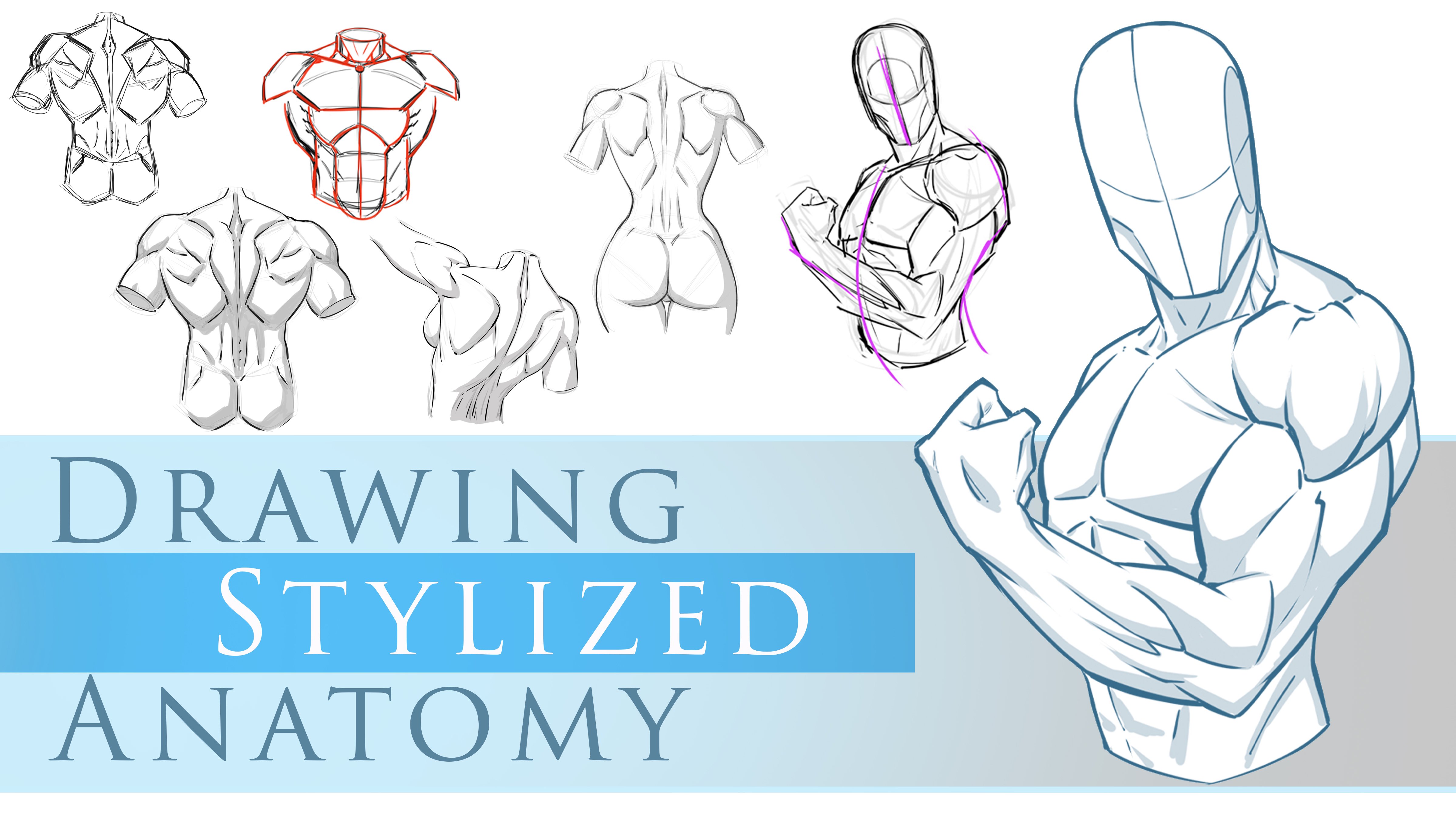
Transcripts
1. Introduction to this Class: Hello everyone. My name is
Robert Marzano and welcome to my class figure drawing,
liner and value. You find yourself getting into a certain part of your
illustration and stopping, maybe starting over or
feeling like you just can't draw that specific
thing. I'm here to tell you. We all do that and there's
nothing to worry about. But one of the things
that you can do to combat that is specific areas of study. And that's the purpose
of today's class by focusing our efforts on these studies of
specific areas of the body that we're a little bit less knowledgeable about. I find that we can
catapult are further faster and feel
more accomplished. In this class, I'll be sharing studies of the human torso, both male and female. An area of the knee that I find is important to
pay attention to. So you'll learn about
bony landmarks, anatomy, terminology,
things like that. Keep in mind that for
your project file you can work on whatever
part of the body and angle that you want. Just use some of
these techniques to create line art
and value studies. And I'd love to see
what you come up with. Thank you for
considering my class and good luck with your art.
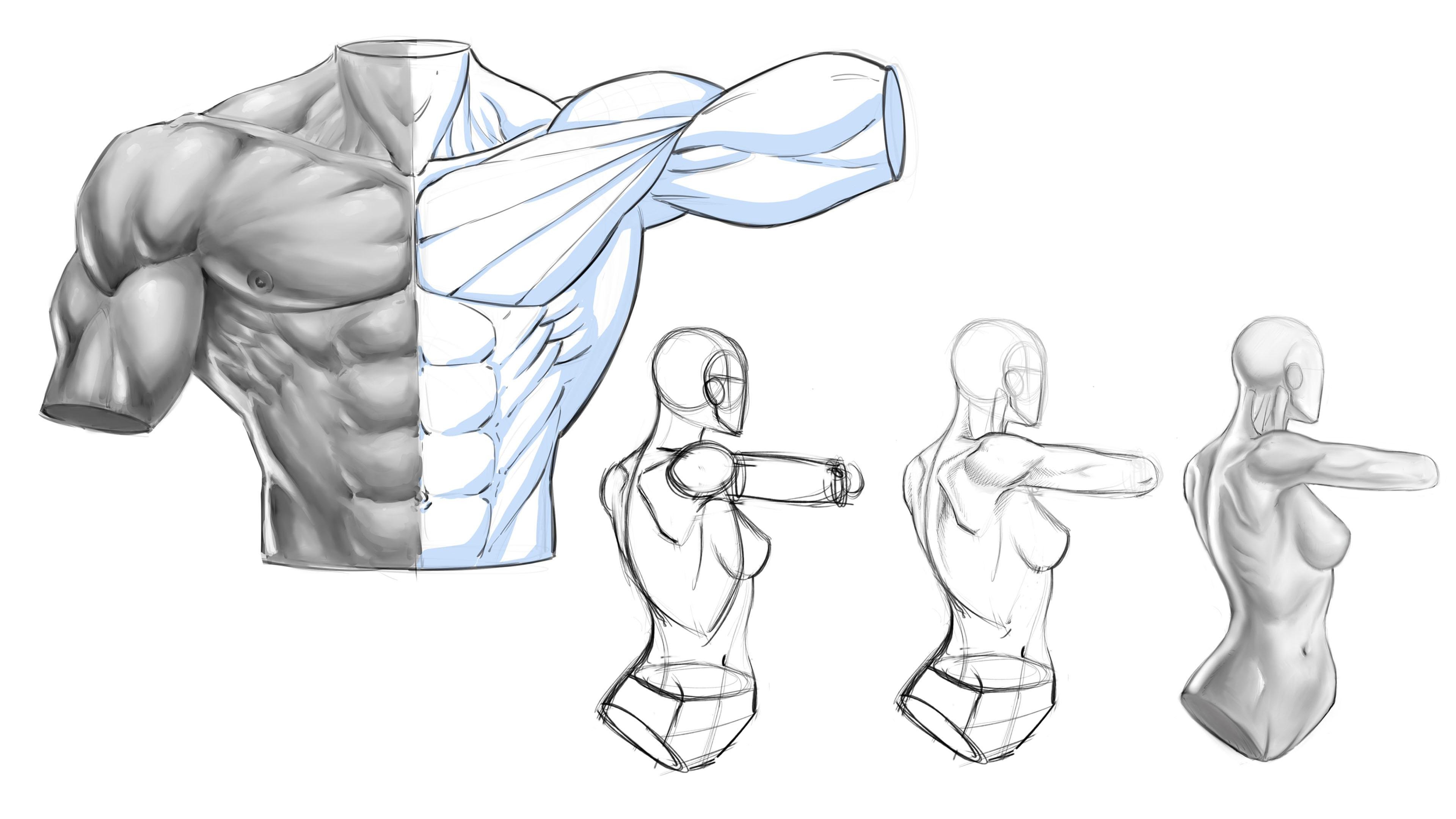
2. Spine of Scapula: In this section, I
want to show you some different studies that
you can work along with me. And we can really
address some of the tricky and sometimes subtle and not so subtle
areas of the body. And just things that generally I feel are good to practice. So these are things I've
practiced daily now, but then also I want
to look at it in a way of if you're
a younger artists, more aspiring, what are
the things I could tell somebody that I wish I
would have practice sooner. So this particular study, I want to start with the spine. And we're gonna
put a line going, getting that S hook of
the spine in place. Bend something like this. So there's that noticeable
S hook to the spine. This would be the neck
here at the very top. And so what I want
you to do here, as good in the three masses. So the torso. Remember it's gotta be
oriented with a bit of a tilt. If you if you need
a little bit of assistance with
creating the tilt, then go ahead and use
the primitive first. Something like that.
I'm going to jump pass this and go ahead and introduce the oval with the divides of the shape of the ribs
there, something like this. And then likewise
for the pelvis, if you need a little bit
of assistance getting that tilt visually in place, you can use the primitive,
something like this. I'm going to see probably very little that top plane change, but you can get that that
tilt and orientation. Shoulder will be roughly in here somewhere for the pelvis, I'm actually going
to bring this back. So I want the, I'm going to
draw a couple of versions for a real quick so that you get the idea of what
I'm going for here. I want the look that
the pelvis is twisted back towards our view a
little bit more like this, the severe center line. There's that floating underwear. So if you were to notice
that this top one, the shoulder opening
would be here. So there's a very distinct
difference in twist and orientation that we're
gonna go for on this one. The other way that you
can think about this, if that floating underwears too complex for you and
it's not looking right, just remember that you can first establish the primitive
of this area. Something like that. And just remember,
each time you adjust any plane of this in a
different orientation, obviously the rest
has to follow. So if you adjust this plane, you have to just
everything else. Proportionately connected
layer or whatever. But again, you can easily transition and
shift that if you need to. I think that's
actually about right. I probably a little bit
more of a tilt away. When I go back to the
initial starting point, I'm going to bring that
back to about here. I don't want to
twist it too far. It seems entirely unnatural. And so I'm going to convert
this to the pelvis shape, the floating underwear
opening for the body up here. You see when convert
that back to the initial shape
that, and again, I generally will freehand this
n. But that took practice, so don't rush it. You'll know when that time is, get a nice sense of
comfort. Withdrawing it. The basic primitive way, if that feels better for you, go with what feels right. Over time, you will jump
to that next level. So now I can put the opening
for the shoulder again. I said that's up here. Really
getting a twist in there. So this would be the
side of the body. Okay, this would be the front. Can't see that cross-section because the body is
going to be turned away. Okay, so now let's go
ahead and touch the head. I want the head to
be facing away. Something like this for
primitive head shape. Here, back here. I feel like that's a little
too much of a profile. I want to turn it
away even further. So I'm going to go
back to boy here. What I want to think
about to do this is I have to get more of the back of the cranium kinda figured out and then
bring that oval. That basically implies
the side plane change of the head that needs to
be brought over here more. Just use the IRR
as a placeholder. The more you bring the ear
towards the front of the face, then the more that
head is turned away. Alright, because the profile
of the face is going to. Get closer and closer to the
ear as it had turned away. Just like if you are looking
at the back of somebody, it would look like the ear is basically right against the
front plane of the face. You really see that back
connection point of the ear and the hair would overtake a
lot of the rest of them. You won't see any of
the facial features. You just see the line change
of the side of the face. So it's all about getting
that ear and the right place. And then you're also
going to change the look and shape
of the jaw line. So pay special attention
to those areas. And I'm not going to worry
about drawing the neck yet, just gonna kinda connect
across this way for now. Okay, so there we go. So we've got this idea going. A little bit of a
connection point. And really the spine would
be way underneath there, but this doesn't
represent the spine. Think of this more
as just a line for the back of the neck. But we've got those three
main masses kind of working. We've got some twists and orientation
differences going on. So now what I wanna do is
I really wanted to show you a couple of things
in this particular pose. One of which is
that the body gets way more expressive
when we do turn these. That's the main thing. But also we're gonna get into areas like the
back and the pelvis. Specifically, areas
like the deltoid, which are tricky from
different angles. And those are things
that escape a lot of us and they require
a lot of practice. So what I wanna do here is show you that if we
bring this arm up, so we've got the Delta up here. I've got the arm coming
out away from the body. And we'll just get the
back of the arm here. So I'll just drop in a cylinder
rolling and that'll be the best way to jump too
far into the anatomy yet. So you get the back of the arm. Elbow will be in here somewhere. So we've got an
arm out like this. And then on the back I want to show what happens to
the spine of scapula. This is going to be a
very important area of the body for us to study. Very important bony landmark. And it does so much for a
lot of different poses, really great for females
and males as well. But, but a lot of times males, the muscles will overtake
the look of the spine mount. It helps you to place the
trapezius really well. But we'll get into
that. We'll get into different examples
and what to look for in different instances. But in this particular one, the scapula is very noticeable. It does a lot. It's a
really big place holder for getting the back
drawn incorrectly. So as we connect some of this, I'm just going to
put a little bit of curvature for the lower, lower back, I would
say the lower lumbar, but we're starting to
see more of the front. This is more of a perimeter. So this could almost
be more of the oblique from this viewpoint. But if the pelvis
was turned away, this would be our
lower lumbar and our lower back muscles, and we'll get into those
in detail as well. So from here as we work down, you get a little bit a lot. This and this area back here. A little bit tricky.
What I like to do is find the center if
you can see it. And again, that's
another big placeholder. So I'm going to get
in rather early race back some of these
construction lines for you. Then from the center line, like to figure out how much of this other side
are we going to see a really quick and easy way to get a bank to look better
on your illustration. And the more dimensional is to show from an angle like this, is to show the separation down the middle and that spine and then a little bit
of the other side. So that shows that
there's a twist there. And a lot of times that's
something that gets missed. So again, I want to do
some studies where I tried to point out areas that
we often overlook. And then we flatten out
our characters because we just don't incorporate
certain area like this. Now the other spine
of scapula and the other shoulder blade or or scapula gets
lost over here a bit. The area on the side
is very narrow. There's not a lot of
room for definition. We know that if we
were to look straight on the two spine of the
scapula come down like this. That gives us a look
of the trapezius. I get something like this. You get a little diamond
of separation back there. The trapezius kind
of dip in around the shoulder blades and those other muscles
were getting into. But it does something like this. That's really shorthand method. But it's knowing
that's one thing. But then when you go to
draw a more steep angle, it's some of that gets lost. And you have to sometimes
be a bit more subtle. You can't force in all the
information that you know. And that's something
we traditionally wanna do in the beginning, is we learn all this
anatomy and these muscles. And then we go to implement
them and we forced them into a view that they otherwise
don't get seen him. And that's where your
studies are very important. So we just have to sometimes
pull back from what we know. And less is more
sometimes that applies. We'll get the breast
kind of sitting against the ribcage there. The other perimeter shape, the twist is occurring here. We know the navel is about in the mid sections and we'll
place that right about there. The hips right here. So just like that, we've got a fair amount of this worked in. Remember to status
and neck as a curve. You don't want to stack the head right on top of the body. I think we've talked
about that a few times, but I'll keep reiterating
that as well. You some nice curves there. Just like that. We've got
some construction in place. We've overlaid some
aspects of the anatomy. We're focusing on
some specific areas that require a bit more
knowledge and study. So I want to refine
this a bit more with you and talk more about it. Let's stop here and head
over to our next lesson.
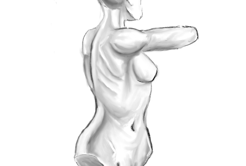
3. Spine of Scapula Refined : Okay, so now what I wanna do
is 0 in on this a bit more. And we're going to go and
soft erase this back. Okay, so the main focus of this particular study is really want you to see a bit more
clearly into this area. So this is a popular
kinda thing, you know, characterizes
their arm up. Person raises their arm up. And what is the delta two? What is the spine of scapula? What does the scapula do? The spine of scapula, again, like I mentioned,
travels down this way. It gives us a great reference
point for what it does to the trapezius on somebody
that has less overall muscle. And definitely on
the female forms, you can really see pretty
defined shoulder blades. So it's a really good
landmark to almost start with because of the reference
points that gives us two the other major
muscles of the back. The other thing is the way that the deltoid encompasses it. So it goes down here. You get the rear head. The posterior head of the
deltoid is down here. Now if I was to trace
this completely out, it probably looks
something like this. You're you're gonna
get the medial head up through here somewhere. I don't want to be that rigid
and trying to explain it. A lot of times, it's hard to really look
at it that way anyways, when you're doing
figure drawing because everybody's muscle composition
is a bit different. I mean, there's
definitely consistencies to know about and
look for for sure, but they kind of blend
together, right? So what I'd rather do is show you the overall shape
that I would go for. And then just explain
to you that part of it is a rear delt, a posterior, the medial. And then on the other
side of this you're going to see the interior. So a big portion of
getting the deltoid right is knowing when you're going
to see two of the heads, I say that three of the
heads would probably be if the arms were fully
back, stretched back. And we might do an example like this where the arms
are fully back. What happens is your
arms rotate back. The deltoid spins back this way and becomes more in
full view of the back. So when your arms
go up in the front, it looks like you're seeing more of the doubt
when the arms are up. But you start to see
more of the pectoralis major go in front
of the deltoid. Trapezius is here, your
collarbones are here. Just a quick illustration of it, but this is a front view of the arm going up
the bicep in here, coracobrachialis and
their tricep here. We'll definitely do an example like this because
it's a popular poles. You get the latissimus dorsi
here, serratus through here. And again, I'll do an example
with you in more detail. I just want you
to know that when the arm raises up like that, you're dealt spins back.
Let me show you this. Spins back lands more to
the back of the body. You may or may not notice that, but it's something
to think about. But from this angle of
what we're studying now, I really want you to see that it goes around that
spine of scapula. So again, the spine
of scapula being a very predominant bony
landmark to be aware of. And so now, once we have
that reference point, we would say that the doubt kind of blends down into
here, sweeps up. I find this part right here to be tricky as far
as subtleties go. I don't want it to
look like really pointed line coming up to
that looks too segmented. What this really would be is as I incorporated any rendering, I would want to fade
and blend that. Okay, so let me just
show you real quick. I would really soften this up. It would be values that
would really convey this or just some soft cross hatching it. So just
keep that in mind. I'm trying to show you a
little bit more visually. But when I tend to draw things
and so defined like that, it takes away from
the look of it. So you've got to be subtle
with your conditions. You got to think of these forms as blending in and
out of one another. So draw the arm, I've got the overall
volume of the arm. Like this. You've got a tricep back here at the elbow
in here somewhere. It's kinda bent and the rest of the arm is
facing away from us. So what would happen here as you Soften up some of
those transition here. If the person is very defined, you'd get in some of
the tricep definition. But again, you have to
be subtle with that. I think even that I
feel that it's too much unless it's a very
muscular individual. So you have to play around
with the subtleties of it. Hopefully that
makes sense for it. Even back here. The
definition on the very back right here
is a bit too much. It would be more of a
blend, something like that. Again, if it's more
of the hatching, you would use some
softer lines and just kind of establish a bit
of what I'm thinking about. Is it the bulk and the
form is like this. But as it gets to here, it has to blend into
the spine of scapula, flattens out a bit and
not completely flat. But I have to convey that
without drawing these lines. And we can get in here and
do these types of lines. He's wrapping lines. It becomes a lot easier to see some depth and dimension here. These are great for studies. I recommend you do
this quite a bit. It's something about,
it just gives you a better visual representation of space and depth in there. Then if you were to get
very critical of it, bring this back a bit. These real quick. We'll kind of conveyed
the space and the depth. They're a bit better than
just a line drawing. But then what if I
wanted to really bring out these triceps? Now maybe it was
a good amount of definition here
that I want to see. Then you would curve these around each
head of the tricep. Then that would blend back
into this larger form. Alright, there. So again, this is all dependent
upon what you're after, how much definition
you want to see there. But these can be a good
way to explain that. I'm going to bring that all
back about right there. Okay, So now likewise here I can blend
some of these lines. A little bit of shadowing. Okay, so as I work
down into here, so to shade some of this back, push some of this
information back. And we just get rid of some of our construction
lines though. The other thing to
look at here is the trapezius goes up
the back of the neck. Right? We know it goes
right through here, blends down into the back. Unless the person
is very defined, you're not going to
see as much of it, but it kinda does like this. It goes around the visually, it goes around the
spine of scapula, visually goes up the back
of the neck click that. You can see that as soon as I
do that it looks too rigid. And the approach, so
I would want you to know where the kind of
direction and flow of it as. But again, I would convey
this with a little bit of rendering to make it
look and feel softer. Like I need to bring
the face over more. What's the position
is letting me know that is that
I know that down here I've got the
sternocleidomastoid that needs to come
up behind the ear. So again, this is
another example of where these different connection
points were really tell you when something's off and
when you need to nudge something over and move it
this way or move it that way. So that's why they're
so important. That's why landmarks
are such a great aid and getting this stuff right. So the other thing
that's appearing to rigid to me
here is this line. Okay. So again, I'm
just trying to show you that spine of scapula, but I would convey this with a softer transition
to the forms, whether that's
crosshatching, value study, whatever I would blend that. That's what I'm doing there. I'm pulling this way as well. Then on this other side, it gets a bit tricky because
the space is very condensed. You're getting a little
bit of the shoulder, the perimeter shape
of the deltoid, little bit of this
portion of the back. And then as you see some of the trapezius and the way that
it reacts to the scapula. Gotta kinda bend this this form. And again, I think it's
better to show that with rendering versus linework. And you're probably
not gonna get a little bit of shadow and separation instead of a line
down the middle of the back. So again, lines are
great for showing direction in a very
specific approach. But we have to blend those and convey form with a
little bit more. Generally, value is gonna be
better for convenient form. But there's obviously
some styles out there that do pretty
well with line work, right? So it's not a it's not
a Always type thing. It's like, do you
have to use a value? You can get a pretty good with crosshatching and developing it. And cross hatching doesn't
have to be pretty imperfect. A lot of times, a
lot of artists will recommend that you
go with the forums. So you wrap in the direction
the forms are heading. But some of it's going
to obviously go away from it because your
cross hatching, whereas here you're
going to angle it away a little bit
for the cross hatch, for the darker tones. Okay. So there's just a
little bit of line work. But again, I just
want you to think about the specific
area of the body. I think it's very helpful to do lots of studies at
this particular area. What I'll go ahead
and do too is I'll, I'll blend this a bit for you. So let's go ahead
and time-lapse that. I'll blend this and allow you to see at a bit more clearly. And I think that'll
give you a better overall study of it. But these are the directional lines that you
should pay attention to in the landmarks of
this part of the back. That really helped to, just really helps to do a lot. We're going to do more angles and versions of the
back because such an important thing to spend a
lot of time on what that, Let's stop here and head
over to our next lesson.
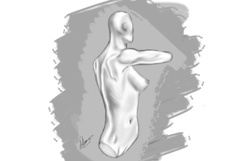
4. Spine of Scapula Value Study: Alright, so now
what I wanna do is take this and
introduce some value. So just remember value is
really just shades of gray, everything from dark to white, and everything in between. And it's just really a nice way to describe forms
throughout this course, I want to show you ways
to describe things with wines and value as well. So value is going to
typically give you realism. It takes lots of practice
to get a sense of realism, but recommend it whatever level you're at, you just
start doing it. And keep in mind that
you can do this with just a regular pencil and a rolled-up piece of paper
as a blending stump. That's actually how I started. I moved into
charcoal for awhile, but now I just use
a smudge brush. But if you notice I introduce some lines and then I
just smudge them around. Now another way is just to take a soft brush and
turn the opacity down and use it really
lightly and slowly build up. And then scaling the brush up and down to get
more defined edges. If you need help with that, i'd, I'd be happy to make a, another lesson that's
more specific on that. But here I don't want the education to be
about that as much as I just want you to see
the difference in what the art looks like as we
start to introduce value. It's just a different way
to explain the forums. Again, I like to do most
of it with line art, but I think it's important to show you
a variety of ways to accomplish these
techniques and really the effect that it has as
you develop the forms. So one thing that
I find helpful to do is not really look at this like some instances as I'm
doing this is not to look at each of these areas like the anatomy that
I'm trying to describe. So for the most part, I'm trying to be aware
of the shapes and forms mean a shoulder blade or the scapula or
deltoid or trapezius. But then at certain points, I find it helpful to
block that part out and simply focus
on the gradation, the value in the light source. If not, it's very easy to overdo describe a
certain shape that you might be used to drawing and then not describing
the neighboring form. Okay, So again, I think it's helpful to do both
parts where you definitely want to
focus and 0 in on the very thing that you're
studying very specifically. But then, as I think
I've mentioned before, not to be so rigid
in that way of thinking so that you don't
overdo describe the form. You don't make the description of it too harsh
with the shadows, too overly drawn
out with the lines. It's, it's a idea
that these forms are blending in and out
of the larger masses. Very important, and that's the area we're going to
need to soften things up. So sometimes you can have
something described really well and you just need
to pull it back a bit. You need to blend something. You need to use a softer edge where you have a hard edge. Simple
things like that. But one thing I
will tell you about this way of doing things is, well, like anything, you
have to be very patient. It doesn't come to you immediately or at least
it didn't for me. And I still find areas
like this to be difficult. I would say that more
than likely for me, it's because I spend more time describing things with lines. But it's not like I
don't ever paint. I paint good amount. I went on areas of my work
where I did a lot of painting. So I'm very used to blending it and trying to
describe forms with it. But I think that naturally I'm more comfortable with line work. So again, all of this really is, is a smudge brush. You can find it in any software. And you just want
to play around with the intensity of the smudge. What I like to do as well
is increased the size of the brush and make it bigger than the area
I'm trying to smudge. So what I mean by that,
if you can see that the size of the brush, that little circle that's
moving on the screen. It's larger than the area that I'm actually
thinking about smudging. So if I want a better blend, I'll increase that brush
size considerably. But I have to be
careful because I can destroy some of the
harder edge shadows that I'm trying to convey. So again, it's just a
very subtle approach or a subtle blend that I want. And that's why you'll see a
lot of artists that do this. They go right to a soft brush
and less with the smudging. The reason I kinda like this too is when I'm
introducing these lines, it feels like I'm working
just like I would on paper. So that's exactly the way
I would use charcoal. I would throw in some
little sketch lines. Generally those
lines are gonna go right with the
direction of the form. I think that's helpful
to do anyways, because when you go to do, you'll see as we
do more examples and our line art versions that you want the lines to go with the direction
of the forums. I'll be honest, that's
something that I didn't do. A lot of recently learned that from different artists
that I've studied. And it's something that I
just need to approach more, need to apply more
in my own work. But luckily, I can share
that with you today. And I'd say, you know, when
you're doing these lines, make those wrapping
lines or those, those shadows and forms at
crosshatching even make the primary look of those lines go with the shape of the form that
you're trying to describe. Here. Introducing
some soft brush just because it helps me fill in the rest of the major
forms of the body. So the entire torso and I'll do that with the arm
and everything else. I find that to be a
better way to blend the white to a deeper value. So what I'm generally
doing this, I will work off a
colored background. And you pretty much never
want white in there. You want white to be
very sparingly used. It's very powerful for one. And it's not as evident in
real life is we would suspect. A good way to really pay
attention to this is to take any photo that you admire, just any photo really, and convert it to a grayscale
and a software like Photoshop or Procreate
or Clip Studio. They all have abilities to
convert to a gray scale. And not without adjusting
and don't adjust the values. What I mean is simply convert
it to a real grayscale. What's neat about
that is you'll see, you'll get a better idea and representation of the values of skin in a table and an ashtray or a wall
behind something else. You'll start to see that
white is very rare around us. Generally, the only
time we do see it isn't something that's been constructed and fabricated or
sheet of paper or something like that and even still
very rarely bright white. So once you start to pay
more attention to that, you realize that when you're creating your value
studies to use very, very little white and
they use it just for those tiny little highlights and those extreme peaks of the form. Something that's
glossy or there's a strong glare,
strong light source. And then what it does
is it uses that are, that starts to be a lot better representation
of a powerful device. So I could direct
CI really well. And it, it really
finishes off the work. So you start to
really utilize that sparingly and more effectively. But I think in the beginning, when we try to do
stuff like this, we're very, we go for what looks cool and then all sudden
we see that white is very powerful and
then we overuse it. And then it comes across
as more amateurish. I haven't mastered
that myself yet. It's something that takes lots
of time, lots of studies. But first you have
to be aware of it, and then you have to make
sure that you develop that particular
part of your skill set as you create your studies. So another thing is I've
also made sure to shadow the form a little bit
darker from the bottom. So another way to
convey scale, tomos, anything but definitely things that are larger
you really utilize this technique is you always shadow the bottom just
a little bit more. If it's something
dramatically large, it's usually a little
more apparent. But in this case
just a little bit more of a shadow on
the base of anything. And then obviously the side away from the greater light source
skin is very reflective. So that's another reason I
wanted to introduce some of these studies into
this course is because it's very apparent when you do value
studies that you can see that reflectivity in
that dual light source and that's usually pretty
apparent and almost anything, it's very rare that we have just one strong
specific light source. Again, scan is actually
pretty reflective and you see that more I
think, in value studies. So I thought it would
be important to showcases also
introducing a little bits of lines as I go here, just trying to kind of
point out certain areas. I think there's a little
bit too much space in-between the way that trapezius is on the
back of the skull there to the sternocleidomastoid
that mounts. Just blow the ear
behind the ear. So that's something
to be aware of. There is some definite
space in-between those, but I think there's a little
bit too much distance there. Now. I want you to know that that's something that I
think we all have to do. We have to analyze our
work as we get through it. None of these works
of art are perfect. But the idea is that we get
closer and closer and we, you got to stay excited
about that process. You have to look at it, say, I know it could be better. I know that I'm missing
something here, but you have to look
for the areas within your work that are less than perfect and become excited about figuring
that area out. Being intrigued
about the pursuit. Now, I also think it's important to look
at areas and say, Wow, I really liked
the way that came out. So for me, I wasn't liking the way I was explaining in the forums and the
volume on the back, the trapezius to the
spine of scapula, and the separation of the back there as it starts
to approach the lower lumbar, which we can't really
see from this angle, but that area with the
trapezius and the scapula. I wasn't really
enjoying it first, I was thinking that it just wasn't coming out as
good as I had hoped. I kept going and kept
pushing forward. And now it's actually
in this illustration. It's one of my favorite
parts of this illustration. Again, it's allowing
yourself to have those wins. And acknowledging the loss is acknowledging the things
that could be better. And then going into
it with a productive, happy state of mind. Not getting, not beating yourself up too much
where you're like, Oh, I just can't draw
that all voided. All I'll get to that later. You don't wanna do that instead. Acknowledge it,
make notes of it, and come back stronger and
really go for that area. I think that's super important
that you're gonna get a lot more mileage out of your studies by
going against the grain, against the things that
you don't understand. But again, also making time to appreciate the things
that come out, right? That's a great thing as
well because it does boost your confidence and
let you know that you are making some improvements, which is highly important. But the main thing is
the actual amount of time that you put
into these studies. So I think that a good
thing to think about is when you're a novice,
when you're a beginner, is to spend half of your
time studying and half of your time creating
the next amazing work of art that you want
to see finished. And so you might think
of that and say, well, if I'm drawing the next work
of art or an eye studying, then I think there's a
very different mindset from studying in considering it in a study and looking
for things that you need to study versus that
next work of art. So again, I think that in the beginning
it's more of a 5050. And then as you become
a professional and you segue to more and more
time of completed works. I think you still
need to make time. I don't think you'd ever go
to a point in your career. Be personally anyways,
where I would take it below 20% of my time, creating studies to
improve my skill set. So hopefully you've
enjoyed this video. We'll continue on and do more studies and talk about
more areas of the body. So with that, let's
move forward.
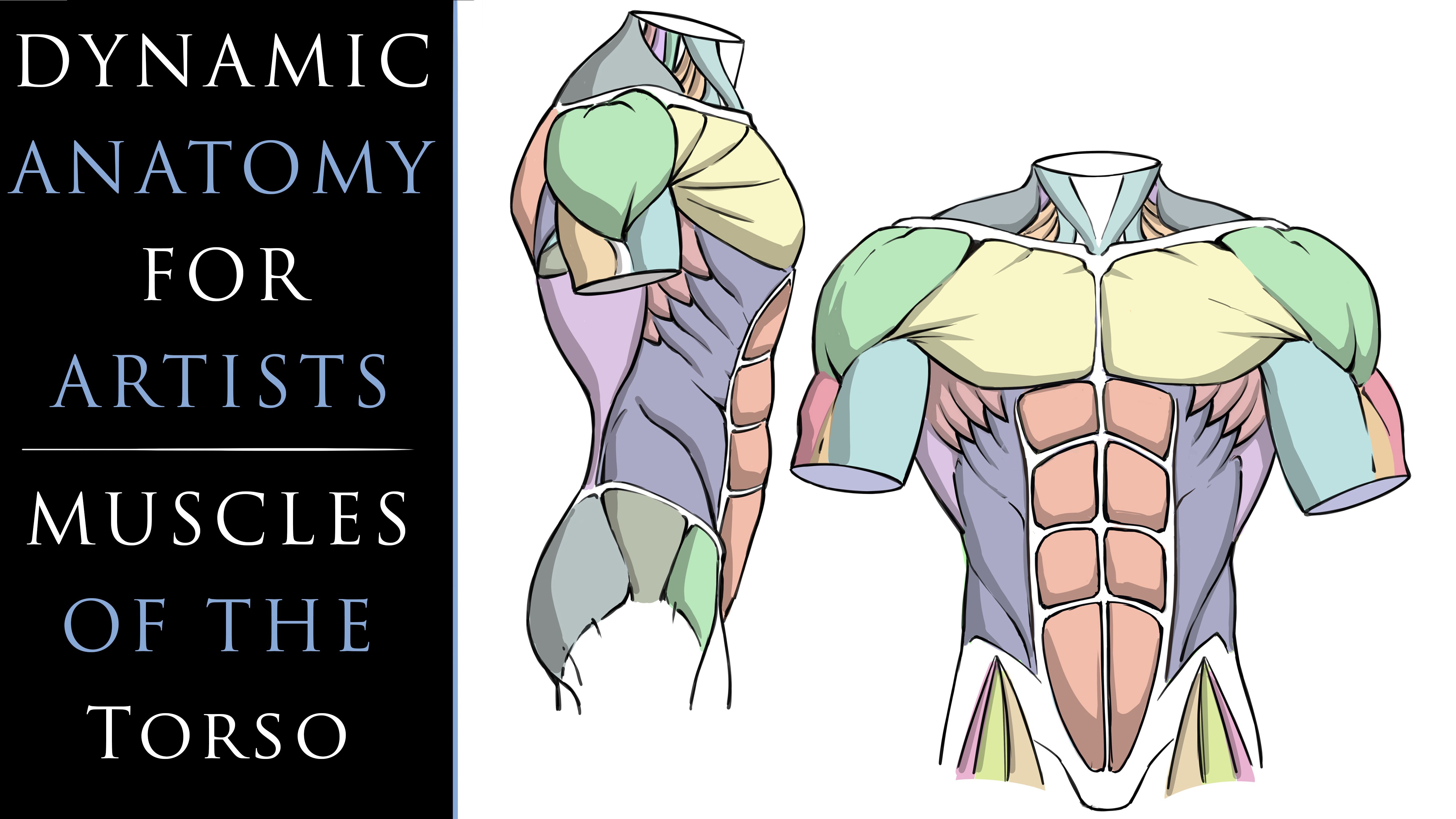
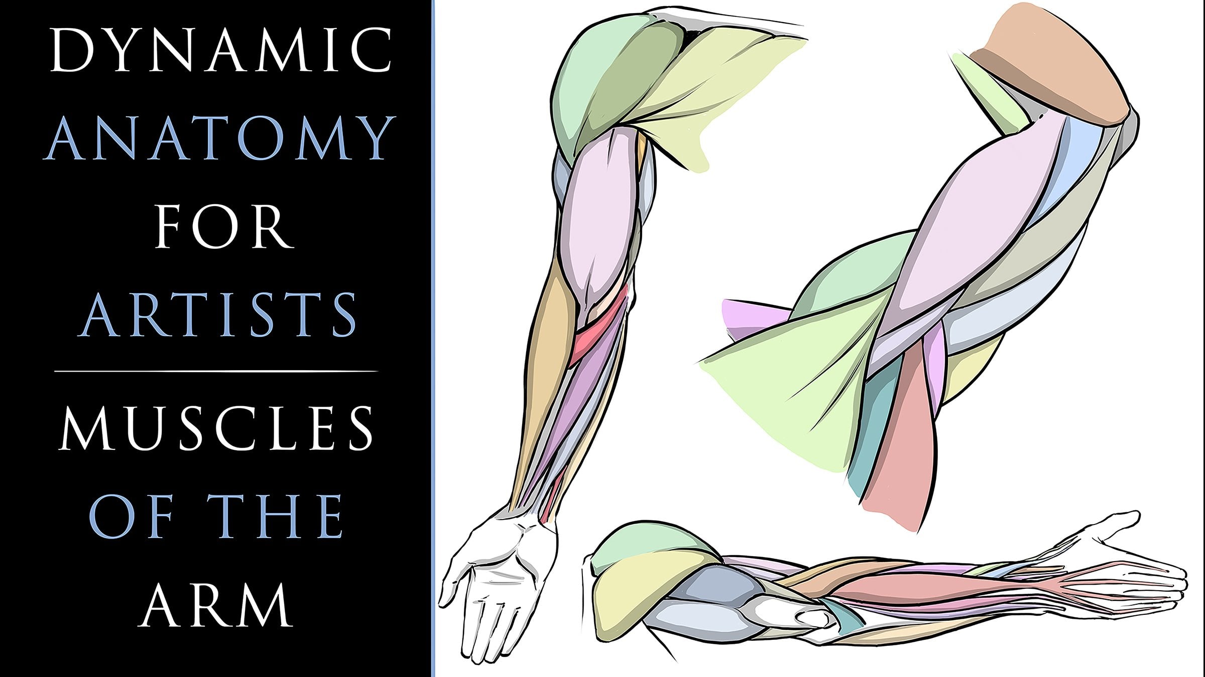
5. Clavicle and Sternum: All right, we're gonna
get into drawing the torso some more. But what I want to
show you is that a very simplified approach to the collarbones is a bit
of a handlebar like look, if you just picture the dip down an angle across horizontally, little bit of an angle
up an angle back. Now obviously
there's more curves, organic curves
associated with this. But this is a very simplified
way to look at collarbones. It's better than getting in the habit of drawing
collarbones like this. And some people do have a little bit straighter
look to their collarbones. Generally, if you're
looking up at the body, you might even see it where the collarbone center area
looks a bit more like this. That's just because
of the difference of the orientation
from our viewpoint. But again, as a
simplified approach, you can think of it as this
bit of a shape right there. You could draw these
with some dimension. The pectoralis muscles are
going to go against here. And the sternum would
come straight down. And it has a bit of a diamond
like shape at the base. Something like that. And again, that's just a very simplified
way to look at it. Now if we're tilting
this away from our view, might do something like this. It's good to really just
practice this one area, draw it from some
different orientations, different scales. Really tried to figure out the, the curve and the band. Lot of times I'll
start from where the deltoid is and work in. That feels a little bit more natural to me for the most part, but but really just focusing on getting
that bend in there. It's almost like a bird flying
through the air, right? So whatever you have
to envision that helps you remember to
get that bend in there. But again, I think
the handlebars is a good device for that. Now let's go back to that. So from here, if we were to think in simplistic
terms for the muscle, the muscles of the torso. Let's first get in our
basic primitive of ribcage. Hey, we'll figure are
deltoids will be over here. Something like that. We won't work too far down. We want to stay specific to this area because I
really want to show you the relationship of
these bony landmarks. Now another one that's
really important. Remember you get this
little bump right here. That's usually pretty noticeable on anybody that's
relatively lean. What that is, that's
the acromion process and that's actually
part of the scapula. So just remember that it looks like it's part
of the clavicle, but it's actually
part of the scapula. And another error I want you
to pay special attention to is in-between the
deltoid and the pectoralis. This little triangular shape. And it's actually a gap
in between the muscles. And that's actually called
the infraclavicular fossa. You also have this
indent right here, which is called the
jugular Faso, like that. So those little
areas just kind of help you remember placement. And actually this probably would be a little bit further
over because what happens here is
the deltoid really passes into this area
where the pectoralis is. Now. You've got the pectoralis,
minor and major. And the minor actually
goes below the major and makes it protrude up. Or that combined
with the fact that the separations of
the the pectoralis, they all kind of spin
and converge over here. And so you get this bulk of mass right there
in that area. So it's something to
pay attention to. Now what I wanna do here
is show one side of the body here with the
deltoid and the arm down. So I can show the difference
that you get here. We'll have the bicep
here, tricep here. And we'll just kinda stop there. The brachialis muscle in there. So all of these portions of the pectoralis spin and converge here at that coupled
with the fact that the, the minor version of the
muscle is beneath there, pushing it up and outward. So just remember that you are on a very
defined individual, you get some of the latissimus
are latissimus dorsi, dorsi. However you say that. And then the
obliques, like this. On this side, I want to
raise the deltoid up. And this is an interesting
area of the buyer to pay attention to or something we need to dedicate
a lot of time too, because something kind
of unique happens here. So on the arm raises up, the pectoralis
muscle, goes with it, as we see here. It inserts in-between
the deltoid and on the lateral
side of the bicep. So what happens here is as
this bicep comes up like this. And you get the
coracobrachialis here, tricep here, something like that and
we'll stop right here. So what happens is you have
to envision that all of these separations
from the pectoralis have to wrap around
and meet up to here. And also you'll tend to get
a bit of a bump right here, are bowing out of the muscles. And I think that's a
combination of two things. One is, again, all
these separations of the pectoralis
converging in that area. We know that the minor is
also protruding out there. It's possible it's still pushing that outward a bit on the side. Then also the fact that it's
wrapping around the arm. So it's creating
this bowing effect. And see originally
rule for years. When I studied this area, I always thought this was the deltoid because it
kinda looks like that, especially with that bowing of that portion of the muscle. So it was very easy for
me to misunderstand. But this is actually again, the pectoralis going up
front and then the deltoid reverses to the back
more so as we raise our arms up and we
rotate them backwards, the deltoid is more
visible on the back side. And you really only get the
one head from this angle, visibility of the one head. We also have to imagine
or envision that the muscles encroach upon the clavicle area
and cover that more. So that's another noticeable
thing is when you see somebody who's very defined, a lot of times you see less of the bony landmarks because their muscles start
to get larger. And again, a culture encompass
everyone to look at that. They start to cover
that up more. Just like if you have fat deposits and the body
has a similar effect. Obviously a little bit
different overall look but same concept. And then back here,
yet the trapezius. And what I tend to
notice there is that as your arm rotates upward, it kinda pushes this back more, so that becomes less noticeable. In all of this starts to kind of take dominance and
block that a bit more. But you do still see a noticeable dip separation
than the deltoid. I think that's important
to pay attention to over illustrated the
acromion process there. So I'll push that
back in the revision. But again, it's good
to showcase that there is a good amount
of separation there. And that it doesn't
just blend in from the dip of the trapezius. The trapezius generally
goes like this. Comes down more abruptly
right here. And then over. And that's where it
would hit the chromium process spine of scapula, something like that, but that's just another thing
to watch out for. Then through here we would
get the sternocleidomastoid. That also separates like this. The trapezius comes over it
a bit of a shift like this. And then down here into
the abdominal area, as long as the ribcage
is not extruded outward, then you just get the abdominal
muscles through here. You remember that the
abdominal muscles, There's a lot of asymmetry
that generally happens there. It's kind of strange because
the rest of the muscles can seem pretty symmetrical and nothing is truly
symmetrical in the body. But for the most part, visually they can appear
pretty symmetrical. But it's very common for the stomach muscles to be
very asymmetrical for the, for this particular exercise or keep them relatively
symmetrical. And then so on the sides
here you get the serratus. Remember, as I mentioned before, this is really the
latissimus dorsi, dorsi. And that's going to protrude outward more with
the raised arm. So we have to get a little
bit of that in there. We might even see a little bit of the rear delt right here, which would be the
posterior head. Back into here we would get the obliques come up like this. They would interlock
with the serratus. You can notice once you
interlock these together, it looks sort of like a blade, the teeth on a blade. So saturated, means
a jagged edge. And serratus is actually
derived from Latin. And the Latin meaning is to saw. So it's just a good way to
remember these shapes here. So just like that, we
get those in there. Representation those anyways, the obliques come all
the way down into here and flow into the side
of the rectus abdominis. You've got the sternum down
the middle clavicle there. And so again, this is all just mean this
particular example. I really just want you to
focus on the bony landmarks that allow you to get to the deltoid and the
pectoralis muscles. But then also keeping in mind
that when you raise an arm, that you get a very
distinct difference there. And I think that's very
important to pay attention to since it's easy to get wrong. So we want to definitely
focus in on this. So in this next lesson, we're going to clean
this up a bit more. It's a bit messy right now, but we'll refine this a bit. And I also feel like the
arm is too detached away from and therefore
making the pectoralis to really needs to be
back into here more. So I'll try to fix
that as we revisit it. And then also I want there to be a very distinct
difference from the, the lat on the one
side to the other. Because we have a very
different being out of the body when we tend to raise
and rotate our arms back. So let's stop here, head over to the next lesson and continue on.
6. Clavicle and Sternum Refined: Okay, so now soft
erase this back. She was like a kneaded eraser. If you're working traditionally, push all that information
back and get, get to where you
can look through it confidently and then start to draw through it and really
defined some more of this. So the anterior head of the deltoid sits more
on the front like this. It's usually a little bit higher than the medial head
from this angle. I want to get in that
difference there. Also want to get that
separation of that in for navicular fossa. The pectoralis major in there. Get the striations
of the muscle, the biceps, brachialis, and the tricep will be
approaching arms in more detail. So don't worry too
much about that. I just want to get really
this area right here, I want to keep pointing out. So this chromium process here, the curvature of the clavicle, the jugular fossa right
there, the curvature. And then on this
side, a really thick, it needs to be
noticeably hidden. There to be some separation
of the pectoralis muscles, but not too much. I feel like there's a
bit too much there. But right here is the
arm starts to raise, these muscles, start to get
pulled in that direction. That collarbone is really
going to get covered up. I need to really explore that. And again, if you're
looking at somebody with a lot of muscle mass, that's going to happen even
in a more relaxed state. So it's good to pay attention. And that's why the bony
landmarks are one of the reasons why the bony
landmarks are so important. We've got to also envision that the arm is pulling this muscle away from the point on the work connects on the
sternum and against the ribs. So where there might be a
lot more volume to the base here was gonna be a lot less volume
on the other side because it's being
pulled and elongated. So we have to think
about that as well. We have to stretch
these outward, kind of wrap this around. Again. This is the anterior deltoid, biceps, coracobrachialis, tricep, and the rear
delt, posterior. And then some of the light
or latissimus dorsi. Your obliques on the side here. Rectus abdominis. Remember the navel
is right about here. And then you have the obliques that converge into the serratus. Give you a bit of this saw like a saw blade, tooth like effect. These kinda flowed
down into this area. Alright, and then appear
the neck, the trapezius. I'm purposely making the
one side of the trapezius more abruptly inward towards
the body like right here. I'm making that more
distinctly different than the other side because it wouldn't be right if
you're raising an arm up, it's going to have an
effect on that area. And they shouldn't be even. So if I made this
the same distance all the way over to here, I feel like that would actually hurt the overall look
of what I'm going for. I do feel like the the
deltas still too far away. Like that needs to
be back into here. So I'm going to
adjust that again. Yeah, I feel like that's
starting to look better. Like it just shouldn't be
that far away from the body. It looks a little disjointed. I can work with that. So this would be a little
bit cleaner version, but now what I would like to do, I'm going to time-lapse
this and I'm going to clean it up one more time. And I actually want to do one example with you where we go right down the middle
of this and do one that's a value study and the other one that's
left with line art. So it can give you a
nice reference point for what you might see
from one to the other. So let's conclude here. And with that, let's move
on to our next lesson.
7. Clavicle and Sternum Value: Alright, so in this example,
like I mentioned before, we'll do half of it in a value study and the other
half will be line art. Hopefully this gives you
a nice reference point to spot the differences
from one to the other. And I think that ultimately
one does help the other. Anyways, I tend to
notice that the more I practice doing value studies
or even colorizing my work, the more it changes
my perception on the way that I
draw my line art. So it's, it's really
important that you practice all variations of
what you can do to create depth and
dimension on the page. I don't think that any of it
is wasted time or effort. So what this I'm taking a very simplistic
approach and laying in a medium gray and then blending it back with
the smudge brush. And the difference from
using this technique versus a soft airbrush is that you generally will get a little
bit more of a painterly look. But again, there's no
right or wrong way. You can use whatever
method you want. I've seen people use both together and separately
and yield amazing results. It's all about the artists, a lot less about the
tools that you're using. Just make sure that you can get the value range that you want. And so one of the things
I like to do here, as I turn back the opacity
quite a bit in it, let it slowly build up. Now that can sometimes hinder
the process level as well. So you gotta be careful because
it can get a bit monkey. There's a lot of artists
that we'll just pick 34 or five different
gray tones that they like and work with
those at full opacity. And that's a nice look as well. It's really, again,
just depends on what you're used to and
what you'd like to see. The reason I like to
do it this way is I can slowly watch it buildup. And it gives me a chance to stop things that are heading in the wrong direction
a bit more, I think. But again, it's really just whatever you're
comfortable with. So I'm blending back some
of the segmentation. So that's another thing to
watch out for that you want these forms to look like they flow in and
out of one another. Even in somebody
that's very defined, you want to be careful to
not take that too far. I was definitely going for a very chiseled effect or
features on this character. But again, you have to sometimes play
around with blending those shapes together and softening up those
transitional areas. Now there are some
areas that you want a very defined, hard edge. Bony landmarks, large muscle mass that is rounding
away from your view, shows a definite
segmentation there. But then there's
others where you want things to blend in. So I started to over
define the obliques. You'll see that shortly and
I had to blend that bag. So again, sometimes being careful of not overly
segmenting the anatomy and also not making the
things look too bubbly and having just the
right amount of sense of rigidness
where it's needed. But also a lot of organic
feeling forums as well. And again, in the next example, I'm using a bit of bounce light. Here you see me
applying a little bit of white to bring out the roundedness and the
secondary light source on top of the forms. I really like the effect
of bounce light on skin. I know I've already
talked about that, but I think it really does a lot for showing how the body looks, what that secondary
light source, how it basically shapes
and forms into space. I think that's why
it's so popular when you see good photography. They'll almost always
bring that out. Or it's, it's a
pretty common tactic because it just looks a lot more impressive
almost immediately. Singular light sources
are nice as well. They typically can
be pretty dramatic. Definitely sometimes can
provide a nice eerie look. So you really want
to play around with all sorts of lighting
environments. One of the things I like
to do is take pictures and either up to contrast or bring out certain
elements of it. When I want something
that appears a bit more stylized and a bit
more dramatic. But there's a lot to be
said for just paying attention to the subtleties
of a regular photo. So I really do recommend
taking photos, converting them to grayscale, and paying attention to
the areas that you want to improve at specifically. And just really, really trying to capture
those subtleties. It's something that
requires a lot of time and dedication
because I think at first our eyes don't really grasp those subtleties
and those variations. But with time you'll
start to figure it out and it's definitely worth it. You get a very, you can get a very realistic interpretation
of your studies. And then you can bring that
into your stylized work. So far. It's all, it's all good food for thought. So just notice some
very simple things are going to the sides
that are further away from the light and then under the arm,
obviously darkening there. Another thing to
notice too is when you do the secondary light source, you'll generally start to notice that you have the
brighter light source. And right beside that
you have a shadow. That shadow then blend into the medium tone or gray scale of whatever
it is you're doing. So always remember that generally that
brighter light source, coupled with the
secondary light source, will usually have
a deeper shadow in the middle of the two. And that's something
that generally will make it look pretty dynamic, are pretty interesting,
I should say. But that's always something
I tried to capture as well. This is about the area where I start to over define
the obliques. So again, this is something
I want you to be careful of because it's easy to want to do. It's kinda like when
I mentioned overusing the bright white light source or the specular highlights
on certain things. So we tend to find something that looks cool and I'm guilty of this
is what I'm saying, is that I find something that looks cool and
then I overuse it. And that's where getting
up and walking away and coming back to your studies
can be a great thing. You generally will
spot those errors. Maneuvering the work
in a different way, rotating it, flipping
it, things like that, asking for somebody else's
perception on it there, their insight is
always a good thing. And that's really where
you gentlemen will spot those things that are a
bit too overdone really. And again, I'm totally
guilty that there's parts of my work where I see something that looks cool
and I want to exploit it. And that's not what gives you that overall nice end result. What gives you that is
through time and repetition, you start to find the
subtleties and you start to see things in your work
retrospectively that you're like, wow, I was totally misrepresenting
that area of the body. It's like this
particular illustration. I like it right now, but I can't tell you how I feel about it five
years from now. Well, I can give you a
good inclination and that's probably that I'm going
to see nothing but flaws. But again, that's
part of the process. We all do that. It's always going to happen. The human body is so complex, you're never gonna get
everything 100% correct. But with years of dedication, you'll get a lot closer. And you'll also just see some things that
were kind of like those face palm
moments like Wow, I can't believe I used to draw the pectoralis major like
that or whatever it is. So it's zeroing in on
the things that you can improve upon
slowly but surely. Trusting the process, relaxing
and allowing yourself to keep revisiting the
same thing over and over. I think that's the toughest
part about anatomy. Figure drawing is that you have to do it over and over and over for you to really
start to spot these things. Obviously some have a
better eye for it than others and accelerate
maybe a bit quicker. But I don't think anybody just wakes up and there are great
Figure Drawing artists. It takes a lot of time
and dedication and lots of studies and revisiting again the same
thing over and over. And that's where that dedication and perseverance shows
through in the work. Because most people
will give up. Most people say, Oh, I'm good enough at this area, I'm onto something
else on board. But that's not what brings out greatness in anything
in your life. It is being aware that you can always get
better and better and better in revisiting
it because you want that end result that you want to be the very best that
you can be at it. So as I mentioned before, I really wanted the specific
area of study here to be the clavicle and the sternum, as well as the deltoid
and the pectoralis major. And the way that it
shifts and changes from one side of the other
with the arm raised. We're gonna be
doing more areas of study in this particular area. Because again, as I've said, it's one of those things where you have to see it
from different angles. You have to pay attention
to the way the forums change from those different camera
angles and perspectives. So it requires lots of study. And we'll do one where
we're looking at the back because we're going to delve into the back
quite a bit as well. And we'll look at
the way the deltoid looks as you raise the arms up, we'll talk about bodies with more and less muscle mass
and more fat deposits. That's also another thing that I want to really delve
into in these lessons. Because again, it's very easy to draw these well-defined
or skinny individuals. And that's not a figure
drawing is about right? We've got to explore different aspects
of the body and how the body changes based
upon all sorts of things, posture, even imbalance and all that fun stuff
and bodies in motion. But hopefully this has given you a nice segue into getting
ready for all that so that you understand
pieces of the puzzle as we get into the more
in-depth studies. So we will do more
breakdowns like this. And keep in mind, I'm always interested to hear what you
want to see specifically, what you're struggling
with and what you're doing while width and
all that good stuff. It's all good food for
thought for me so that I can provide better overall lessons. So I hope you've enjoyed
this particular lesson. Let's move on and
cover some more.
8. Leg and Knee Anatomy: So for this lesson we're
going to talk about the skeletal structure
of the leg first. That way we can discuss some of the bony landmarks and
what to look out for. And this really
allows you to make more sense the anatomy
and understand why it looks the way that
it does when you attach the larger forms over
these specific areas. So notice the large
ball-like mass on the upper portion
of the femur. This is the greater trochanter. And I want you to pay special
attention to the angle in which it comes down and
meets the knee joint area. Also, there's some
important landmarks here. One of which is the aces, which you can see right here. That little comma like
description of the form. The protrusion on the front of the pelvic girdle and it's at
rest along the iliac crest. And this is a good one
because we're going to use that to place quadriceps. It's really good for placing the abdominal muscles
and everything in that middle region of the body as you draw characters
from different angles. So these bony landmarks are
just very, very important. So you can see here by
the curvature of it, in the angling of
it that it's not as easy to discern just by
looking at a person. Hi. I think that basically
it doesn't really look the way that you would picture once the
anatomy is applied, will obviously be doing
that here shortly, we'll put some
anatomy over the top so you can really
see the change. So again, this is the
femur right here. That's the big powerful bone
of the leg, the upper leg. And it's really helpful to pay attention to the
difference of the angle, which is also referred
to as the gate. The gate of the hips and the angling of the
upper femur area. The width in-between
the two heads of the bone are basically
different from male to female. Now as far as the overall
height of the legs, from the head of the femur
down to the knee joint. It's roughly the same
distance from there as it is from the knee all the way down to the bottom of the foot. So again, this is more of a proportional aspect
of it, but again, it's another thing to pay
special attention to. Would also like to
point out here is that the tibia
being on the front, but that fibula being very much to the side or
lateral side of the leg. And again, this is
important because we start to realize that
when we draw out the leg, that there's really
only two points that you can see that bone. And it's that bony protrusion of the top of the fibula
and then the ankle. And then notice too that the inner ankle is much
higher than lower ankle. And now we're aware that one
is the tibia and fibula. So this is again something
that I think that you have to draw the skeletal
structure to really start to grasp and
pay attention to. But once you do this, it becomes a lot easier to understand why things look
the way that they do. So now I'm going
to start attaching the quadriceps to
this upper leg. You see the rectus
femoris goes right from the knee right up to that Acis. You've got the adductor group that goes right up and attaches to the pelvic and then
the muscles of the leg. And I'll label these for you
so it's easier to discern. But notice how the
calf muscle is behind all of these other
muscles of the lower leg. And again, notice how the
forms are very different now that we've attached anatomy over top of the
skeletal structure. So hopefully this gives you a better visual
representation of how the leg changes quite a bit once the anatomy is applied. And then it changes even more
once we render this right, we apply a skin over
top and we pull back from all this
segmentation and definition. But it does help to know
this stuff so that you can draw more competently and really understand why certain forms protrude
the way they do, why they received the
way that they do. Well. So here I want to give
you a rendered version. Now, notice here too that
I've started with the knee, the tendon under the knee, the patella tendon, and then the quadriceps tendon that comes off the top of the knee,
that's all in place. The two rounded marks beneath the patella up and eaten the
area are really fat pads. Now, that's kind of a mixed
bit of information there because you'll often
hear me talk about this and in different
renditions I'm going to talk about the condyles. So the two big bony
masses of the tibia. And so that is what's there and that is
part of what you're seeing. But we also have fat pads there. You have tendons, you have skin, you've got different
muscle mass, so you've got different things
going on and that's why the bulk of the knee becomes
really quite confusing. The tibial tuberosity is the pointed area below a point that out
right here for you. And so that's something that
we can really rely upon. Again, that's that
bony landmark. And then we have the the head or top portion of the fibula. I'll point that out. So again, these bony
landmarks really help us to place these things, start to gauge what
we're looking at. But again, there's so
much going on there. And then you have different
aspects to the knee, which are some people
have water retention, some people have
chubby or needs some, some have more fat
mass and those areas, lots of things going on there. Bulks of skin, knee injuries
can change the overall look. And so it's not that
you're gonna be able to describe
every form exactly the way that it is
and probably discern everything from every
study that you do. But again, it goes into understanding it and
then being aware of it. And then maybe just
relying a little bit more on the things
that you do know. And maybe blending back and away from the things
that you know less about. But again, lifestyle, these are so important
because you're going to see that there's a lot of variations within different
parts of the body, but especially in the knees. For instance, you have
people that have both legs. You have people that
have knock knees. So that's just the
inverted kinda posturing or angling of the femur. And then also to
compensate for that. The lower legs were there
bend outer and so again, lots of variation,
lots of things to study and pay
attention to here. We're gonna do
various studies in various angles of this
portion of the body. Delve further into this. So hopefully you find
these particular lessons to be very informative. So what that, let's move
on to our next lesson.
9. Lateral View of the Knee Area : All right, so now for this
one I want to show the knee bending again more
from a lateral view. So let's start with
the bone structure will get in the femur. The femur kind of has this
rounded view from this side. And this one is
especially interesting to pay attention to because this, to me, this one's really
deceiving and why I felt the need to show this view. I mean, you really
should try to draw everything from the
most basic views. Lateral, anterior views, posterior, prompt
backside, everything. But what's neat about
this is that the kneecap or patella kinda floats. And as this rotates back, the tendon will
pull it like this. You get that front protrusion, the tibial tuberosity
right about there. So this area will start
to look like, it'll, it'll look basically
like this is further away from this bony landmark, which it is, it pushes
up and in a way a bit. So it does float a little bit. And I think that's helpful
to pay attention to. Now, obviously there's probably some subcutaneous fat pads and different things
going on in there. I don't mean that it
literally floats, but it's not connected
to these two bones. Again, these ligaments
and tendons. Tendons, I believe
patellar tendon and quadriceps tendon are
what hold it into place. But again, as this rotates into this groove here,
this pushes upward. Over here, you're going
to have the fibula. So it kind of sits in this
recessed area right there and down like this. So again, I think this is a pretty good one to
pay attention to. Because immediately when I, when I look at this and I start thinking about applying
the anatomy over top, it immediately makes
more sense to me where there's lots of times
I've wanted to draw a leg, especially a bent leg pose. And I always have always
struggled to place the knee. And it's because I'm
generally thinking of it without standard studying
this underlying anatomy. I'm generally thinking
of it more like the knees just in
this specific spot. And so as I draw it like this, kind of always wanting
to place it there. And then I want to slope
down maybe a little bit to to flat. Not as, not as interesting as it would be knowing
of what's there. So knowing now that the
knee is pushed up a bit more in instead of the orientation of
the knee being here. It's actually up here. Then, now knowing
that that pulled away from that tibial
tuberosity and that we hit that bump lower
from the knee from this particular kind of posing. But again, the main
thing is this is it now teaches you to pull the knee up and in
that kind of orientation. I don't think I
knew that before. Again, this drawing, that
underlying structure as what elevated my thinking to understand that a bit better. Then. So from here on out, then I can attach it. Okay, I get the medialis here like this and
have that blend in. That noticeable dip
under the knee as well. So that's another thing is not just drawing the
tendon straight down. Sometimes you're going
to see people have a very noticeable knee kind
of dip under the knee. So I'm kind of bringing
that out like that. And let's see if we
got that fibula head. I think that's right
way to say it, but the fibula is
over here somewhere. So as we see with the
illustration there. So again, it's basically these give us that those
points of reference. And now with that in there, we generally can get a better
representation of a leg where without understanding that we're doing a little
bit more guesswork. Alright, so hopefully it gives
you a better understanding of what to look for
on a lateral view. And I know these are
very basic positions, but I do want to get you the necessary information in
the simplified approaches, these basic positions so that when you go to draw the
more advanced ones, you have that basis of
knowledge to hinge upon, to really aid you throughout. So now what the rendering here, I'm just going to establish
some shadow and some volume, some different value ranges. I can do that. Starting off with just
some real rough line work. I'll actually end up blending this one in more of
a painterly style. Now as I paint through this, something that I find
to be a little bit tricky about a side
shot like this is you want to put a good
amount of volume on the vastus lateralis. So that's that big bulky
muscle on the side. But then also you have the large overall
volume of the legs. So basically the hamstrings. So essentially that
rounded form of the leg. It's good to think about
that and its entirety. But then also, you want that vastus lateralis in a very defined individual to
protrude out even further. So you're going to add
more value under that. The calf muscle from this side kinda gets
blocked a little bit. I feel like it's when
you render it from this side that you're going
to have it very defined, very strong, it's
very big muscle. But you start to see
more of the fibularis, longus and brevis and
extensor digitorum, I believe, those side
leg muscles and they look very linear from
a shot like this. So that's why I have some lines going up the side of the leg. We're on the other
side as we get into the medial side of the calf, you'll see it's, it
looks quite different. And that's really the way
it is all across the body. So again, it's good to
always pay attention to the difference from
the medial side to the lateral side of any part of the body. So there we have it. That'll complete this lesson and we can now move on to the next.
10. Final Thoughts: And so now for your
class project, I'd like you to take the
techniques you've learned here and create some
studies of your own. Of course, if you feel
you're not ready for that and you want to
build some confidence. You can just share
the work that you followed along with by
watching this class. And I'll do my best to give you any feedback and
insights that I can. So I really hope you've
enjoyed this class. More content is on the way. Good luck with your art
and I'll talk to you soon.
 Robert Marzullo, Online instructor of Figure Drawing and Comic Art