Transcripts
1. Introduction Video: Hello everyone. My name is Robert Marzullo and I'll be your instructor
for this course, how to Draw Stylized
poses and Anatomy. This course starts from
the very beginning and we're going to start
with basic Shapes. My goal here is to
teach you how to simplify the complexity of
the body was simplified. Shapes, forms, looking
for rhythms, gesture, all sorts of things that
will allow you to build this backup and then draw more dynamic
interesting characters. This course also
includes a lot of localized studies before we get to the bigger
Full Figure drawings. So that way we can
study things like the Torso, the shoulders, the individual
parts that a lot of us have had trouble
along the way learning, but makes it a lot
easier to draw those Full dynamic figures. In this course,
you're going to learn Stylized Anatomy for Comics. Dynamic poses, light and Shadow of the Figure,
line, Weight, cross Hatching and Rendering, gesture and body language, as well as how to construct
Male and Female Poses. Some other
downloadable resources that you'll get with
this course are step-by-step tutorials
and high-quality poses for you to study and
draw along with. Keep in mind that this entire
course is in real time. That way, don't glance
over anything and I show you exactly what it takes to
create this type of work. And remember, you get
lifetime access to this content and all
future updates are free. So if you're ready
to take yard to the next level,
let's get started. Thank you very much
for considering my course and I can't
wait to see your work
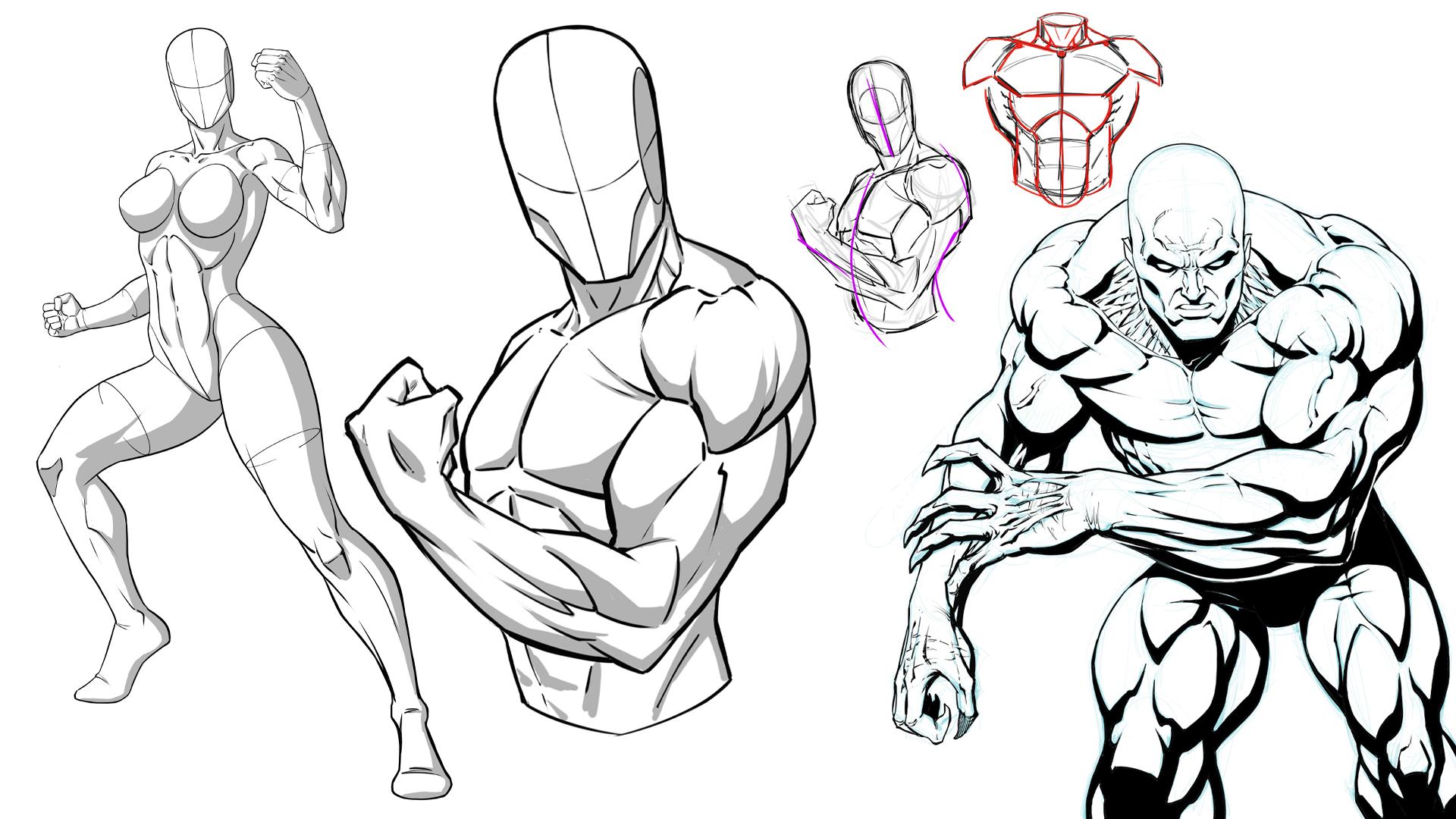
2. Practicing with Basic Shapes: Welcome back. So what we're gonna do here is I wanted to get you warmed up with kind of learning
to process Shapes. Lots and lots of
different shapes. Everything is just a shape, a line form of volume. It's all explained
it as I go, but, but really it's just
getting in the habit of developing the shapes in a way that you can
maneuver them. I want you to always think your drawing is like
a ball of clay. Just so you could see
what I'm working with. I'm going to use Procreate
on the iPad Pro, but you're welcome to
use whatever you want. This is not software specific. You can use paper. I just find it easier
to be able to show people my process this way. So just so you understand
the settings there they are. But again, doesn't
really matter. You can use what you want. But what I want to show you, the main thing that we
want to really address in this particular lesson is to get used to
developing shapes. And so for instance, if I was to draw just a
rectangle here, right? Pretty basic, right? I think most of us could
pull that off, right? If you can't, you need
to sit here and practice rectangles and every way, shape and form that
you can think of them. At first you're going to start with the rectangles
just facing you. And then you're going
to eventually get to a point where you start
thinking of perspective. And all you're doing is
making the sides of that converge a little bit to an
imaginary vanishing point. You could place that vanishing point and you could draw
these out if you want. But really I find it to
be helpful to warm up your imagination by doing
just this simple exercise. Really stretch it. So really take it and
see how far you can take some of these basic shapes
in every conceivable way. So maybe even start with an
angled version like this. Draw some lines
that basically are converging relatively the
same direction, right? So if they went far
enough back to a point, a bit of vanishing point. And again, you can
draw that if you want, but that's not really what
I like about doing this. I think that by free handing it, you're forcing yourself
to make some estimations. And there's nothing
wrong with that. I mean, there's a time
and place for ruling every line and drawing every vanishing point, all
that good stuff. But in this case we're
really just want to express a lot of different Basic Shapes
and we're not being too awfully critical
about anything. So again, try some
different ones, maybe a square, maybe see
the underneath, a bit more. Maybe draw through so
that you get this kind of see through prism. Alright, so I'm as
simple as that. You see, I'm not trying
to refine it is I could see some real flaws in that
little shape right there. If I wanted this
to be a true cube, each one of these flat planes would need to be
roughly the same. You see, they're
not, they're skewed. But I'm not going to crack that. That's again, not the point. I'd rather login lots
of mileage here, if you will, and keep drawing, keep expressing lots of things. Another good
exercise when you do your circles and you connect
them to make a cylinder, you can put like another
one in the middle. Another thing you
could do is draw, I kind of a floating rectangle
and the middle of that. Let me do another one. Well, it was kinda
messy to show you. You could go the other way
as well and do that again. So let's take that
and go like this. We're going to have it
converge a little bit towards a receding point. That's what gives it
the illusion of depth. And then we'll put
this rectangle, let's say right here this time. So that goes over here.
So we'll draw through. I didn't get the other side of our circle there
will draw through. And so this needs to
converge as well. He's a hit that little circle angle here should
match the angle over here. You see even something
as simple as that. There's a lot going on there. But that's why these types of exercises are
so good for you. Because although
they're super-simple, they teach us a lot. And all of this comes
together into characters, buildings, cars, you name it. I mean, everything is
comprised of Shapes. Now you say, you could
look at this goal. How does that translate to a person will get into that
more and more as we go. But essentially what
happens is when you can take a box and you can
maneuver it like this. You say, well, that's that's an up-shot to a
head right there. We won't need to refine
it to illustrate that. But then when you go to add
the Torso, you're like, Wow, I want the Torso to be
tilted away from the head. And I want there to even be an angle that's
different from the head. Okay, so now we have a Torso
that's slightly tilted. And then likewise the pelvis, maybe a different
orientation and also a different tilt away
from the upper torso. We end up with
something like that. We attach the spine. The spine runs
through like this. You see real quickly How now these boxes
that we've been messing around with do
translate to a body. And this is more effective than a lot of people
give it credit for. Because essentially,
I always find this like I just draw, right? And I just go to organic forms. There's times I can pull it off and there's other
times I can't seem to get the perspective right or the relationship of the
proportions, right? I'm just a little bit flimsy. In my approach. This structure allows you to induce or you can utilize
perspective in the body. You can see it. There's, there's
perspective to the pelvis. It's on its own orientation. The Torso in the head. Each one has a
perspective to it. If you go like this all sudden, you know the direction the
head is facing, right? So it allows you to utilize
perspective in the body. It's very mappable, it's very
understandable, digestible. I just think it's a
really good technique. Now, you do couple this width, slowly working into
organic forms. Ribcage might become
something like this. Simplified rib-cage, obviously finding the
center line to it. You might convert a ribcage
is something like that. For your next step. The pelvis might become
something like this. Like he's floating
underwear, right? But that's again, I want you to I want you to slowly
build up to that. Like if that's too much for you, then go even more simplistic. Tried taking just the me go back and show you another
possibility here. The main thing is that you stay simplified as long
as you need to start expressing shifts in the
perspective of the body. Because if not, what do we do? We tend to draw characters. This is a common problem with most beginners and
even events artists. You get kinda caught up and
doing this way too much. Alright? You want to really fight that. This is a great
way to fight that. So again, maybe you just
simplified this box like prism, this rectangular prism
with just a center line. And just that upward, upside down V, you
get right there. And that's it. You'd go right into
the same shape. Maybe that's your
simplified rib-cage. Whatever you need. Again, it's a matter
of keeping things as simple as they need to be until you're ready to
move up to the next step. But the thing I'm more interested
in is that you start to realize that the pelvis
doesn't align with the Torso. Torso doesn't lie on the head. They all have their little
subtle differences. And it's easy to see that in something as simple
as that right there. Now next, if you were to take somebody
who shapes and say, okay, well that
explains how you might use boxes for those areas. But arms and legs, you're not
going to use boxes, right? Let's go back to these
cylinders right there. And you're also
going to practice like if I draw a
cylinder like this, it implies it looks like column, but it implies
foreshortening applies, implies that this is
receding away from our view. Or it just means that
that's a tapered object. It could be almost
parallel to our view, but it could be
tapered on one side. That's really what I would
recommend for arms and legs. So when I draw an
arm and I go back to the cylinder method to do something a little
more like this. Okay. And then a hand becomes
a bit of a wedge. And then fingers I
could sit there and try to fill in little cylinders. I mean, that's what
they look like. Our fingers do look
like cylinders, but I never really do that. I go more gesturally
at that and we'll, we'll get into the gesture of as it applies to the
Stylized characters as well. But see I do something
a bit more like that or another technique
you can do again, keeping things as simple as possible as you can draw
a hand with a mitten. And that's a pretty
simple shape. Or you could, you could
make the argument. It's probably about
three or four shapes if you were really to break
it down, Something like that. But it's super simple
that right there, we'll do a lot of work for you if you struggle with hands. Because we can all
kind of envision different hand
gestures as a mitten. And then you just break off
a finger to break it up, but break it off from
the bulk of the form as the mitten and the handles that a lot you will see
hand poses where the hand, the fingers are bent,
Pinky's out, alright. Whatever they're holding the
glass and the babies out. So same concept applies. This minton, you can
draw the mitten. And by itself it
looks kinda boring, but as soon as you pop
that little pink you, it's a little bit
better to look at. It's one step closer. The right direction for you, instead of trying
to jump in and draw a hand that's all
contorted and crazy. That gets a bit confusing. So look for the Gestures
and the hand again, we'll get into Gestures
more as we progress. But for arms and legs, oh, pose to Draw a Leg, kind of in a standing position and do that basic
floating underwear. It's pretty simple shape right? Then. The upper leg would be
a tapered cylinder. Like that. You would probably start. And the most simplest
form is a circle, even though it's not very
circular the most part. And then another
tapered cylinder and then a wedge for the foot. This is bad, is that is, and so you can see that
all these shapes, I mean, this is
really all you need is some circles and ovals. Some cylinders. Will circles becoming
the cylinders, the box like prisms with a little bit of
imagined perspective. And just having a
login pages of these. And I know it's boring and
I know it's like really, I want to get to the good stuff. I wanna do, the font stuff. Don't discount this right here. This step, this step is super important and a lot of people
don't spend enough time. So say you've got a lot
of this and I hope Kim, I'm going to bring out a foreshortened version
of the Leg because I'm feeling pretty good about all my practice and now I'm ready to make it
look more dimensional. The next step is you take the same cylinder
and you say, okay, if I was to bring that
out towards the viewer, how would that taper? It's obviously going to
look different than this because we have to imagine
that foreshortening, changing the shape of it. But that's not too, It's not that hard
to play around with this cylinder over
and over again until you figure out the knee would be in a particular
pose you might want. The knee would be really
high up like this. So that means that if it's
going to relate back to this same flat plane of
the opening for the Legs. While it's not gonna get
much wider than that, right? If at all. I mean, this is straight down, so I might widen out, but
it's still has to meet here. Your connection points usually expose how big those
areas and GDP. So that's your one
point of reference. As you work out. You just kinda keep
moving this oval. This one here, into
different scenarios with the same general width of the
opening of the Leg there. What if what if I moved
it right in front? You know, how dramatic
would that be? This one is going
to probably didn't more difficult to envision. Let's say it was
something like this. Now that needs like right
in front of the upper leg. You have to almost imagine
like this bit of depth around. I don't want to make
it too confusing, but you'll have to imagine this being the
knee until we placed it. But it's really that process
of maneuvering that around. Maybe you want the Leg
higher up and you want the knee way up here and the
shorter part of the Leg, the lower leg is coming
down here right? When that case and
that oval opening for the knee is
gonna be up here. Same reference point
to about there. Something like that. Then when you add the
next part of the Leg, it would come down from there. Right. Now you get a leg that's
starting to go upward. But then as we refine it, we attached the knee kinda floating into here and
we'll get into that. But I don't wanna go
too far too fast. The main thing is
that you utilize these basic shapes and take your time and express lots of variety to learn to
simplify your work. So let's go and stop here. We'll head over to the next
lesson and continue on. So let's move forward.
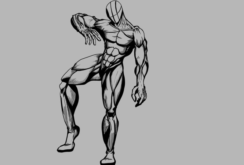
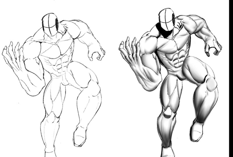
3. Overlapping Shapes: Okay, so now
hopefully you've had plenty of time to draw lots of basic primitives and
really try a variation, triangles, pyramids and
all sorts of stuff. Just, just play around with all the basic
primitives you can. But now, let's also think about how we can wrap
those around forms because this is what happens
generally when we move to the next step of thinking
about some sort of Anatomy. So we get pretty good
at maybe drawing a body and I'm
going to skip over, but I'll come back to it. I'm going to say we've got
some gesture of the body. Okay, So buys like this. So I'm skipping over how to
get to a Torso like that. But again, I'll come
back to more gesture. And you've got to Leg
back here, Leg up here. And I'm just going to
draw this in rather quickly to get to the point I want to make about how to look
at other shapes over top. So when I'm doing this, I'm actually thinking a
lot about silhouettes. And that takes some
practice to do. But it's, it can be a fast
way to draw characters. And I'm also again thinking
about the gesture. So I'm trying to get that
curvature of the spine, this slope right here. So this me is more of the
gesture and even the Arm. I tried to get a rhythm
of the Arm like that, so it's not so
straight and stacked. Nothing worse than Santa
shoulder, upper arm, forearm. Now, as we mentioned, that was in the previous
step of how you would do it. You wouldn't stay there. That's an initial start to start getting a sense
of perspective going so that you can maneuver
these shapes and forms in a kind of 3D
space in your mind. But you have to remember that the shoulder connects
around the upper arm. The forearm protrudes
out from the upper arm. And we'll get more
into this as well. But they're just they're not
stacked there, if anything, there's a back-and-forth,
almost like a zigzag. It goes there but
just not stack. With this. We get this
basic Pose going. Like this will say, you look at this, there's a lot of Shapes
going on here that wouldn't just be basic
cylinders even at this stage. And I haven't even
really started refining and placing a lot of anatomy. A little bit kinda
hinted in there with the silhouette
drawing, but it's not. There's gonna be more and
more of that as I refine it. Well, let's get enough of this in here where
you can make it out. Let's say we get to about
right here and I'm like, Okay, I wanted to
start refining this. But up until this point, the shapes have been doing
or just cylinders and cubes. How do I even process and do something like this and get
it to look more natural? What I would say is that
when you go to do this, let's zero in on this Leg. So at first you're
thinking like this, okay. You got a cylinder, you got a circle. Got a tapered cylinder. You're getting a
little more advanced, so you're not drawing your
Saunders like this anymore. Can you see the difference? One just has a little bit
of curve to the outsides and the other ones
more solid and flat. This is okay to start there, but eventually you're gonna
get to here where you start to bend them
a little bit more. Remember everything's a ball of clay and all of
this is malleable. All this is something
that you can twist and contort and move on the
screen. Anyway you want. The more you start
to think that way, the more the your
imagination kinda opens up. Okay, so let's go
back to to here. Now you're at this point
and they're starting to get a little bit more curves are starting to think
a little bit more about silhouette
drawing as you do this. But you're not quite
sure how you would build other forms onto these forms. Well, the way that you do that is you have to think
about these as two ways. Really. One is individual forms. So a muscle that goes to Leg. It looks something like this. You might have another
segmentation or noticeable mark to the
Leg Right about there. You might have another one that comes down and back,
something like that. Alright, so the trick is, what am I envisioning
right here? And say, well, I know that's
the vastus medialis, right? And to me that's
the right shape. It might not be, it might be
a little bit more like this. Remember, we're
stylizing this are being imaginative or
having FUN with it. It's not always gonna be
exactly the way it is. The main thing is
that I come up with a simplified shape and
form that I can envision. And I can throw in
there anytime I want. What I like to do. So it's the calf muscle To me, the calf muscle, it
looks like this. It's a bit of a diamond. Like it's a there, it looks like a spearhead, but it's a bit of a
diamond light shape. And so that's how I draw it. This is what I envisioned when I when I get to the calf muscle. Now obviously I'm
not drawing it as segmented as you would
see it right here. But to me it's a simple shape. In the more I can do that, the more I can get through
an entire Figure doing that, the easier things are for me. There's another muscle I don't know if it's a solely as I pick, it is not going to
get into name and every muscle here because
I'll slaughter some of them. But I got to usually be looking at my reference
sheets to get it. All right. But let's say
it's this muscle right here. To me, it's that shape
and on and on that goals. Now, again, this
isn't going to be the end result or I'm
gonna get somebody that looks very mechanical, very virtual reality, bad virtual reality
graphics from the '80s. I know it's just going to
look really weird, right? But it's a great way
to think about it. And so the knee. So here's another quick example. Let me zoom in here and
show you something. I think it's worth mentioning. So if we bring the knee
out like this may say, Well to me, this
is my simple knee. It's a triangle right there. Then that's fine. And that's better than nothing. But then at some
point you'll probably get to where you keep
paying attention to need illustrations or
the body and gentlemen, You know what, there's a
little angle right there. You go from basically
this at first, which is better than a
lot of people really. They won't even
just, I don't know. It's like the knees like something where people
try to do this and they do some weird thing and it turns into a lumpy look
and elbow or something. But I would say in this case
it's better to simplify. And then eventually as you develop your
knowledge, I cannot. Your next simplification
would be this. Then your next one? I'm just speaking from
my own experience. We're all going to have a
different road map to how we start to perceive the human
body, I think anyways. But then your next one
would be like this and go, you know what, there's
always this little bump right there under the knee. But you see how even even this is really just a process of what I thought about the knee initially as all
there's an angle, they're all know
it's an angle and the kneecap actually
points up more. And you start to
learn this as you do Anatomy breakdowns and you'd look at where the tendons
go and all of us in that. And then you realize, oh no, there's some bony
protrusions right there. And at first you
draw on the Leg, maybe completely
straight back like that, the shin area and then also no, you don't want it seems like for most views that I see it bends out a little
bit right there. And on and on that process goes. It's really just developing
a memory of what you see and then also what you adopt as being right
for your style. So let's go back to this. And I'll just do another quick version right
through here. Because again, I
think this something you have to practice, but now we're talking about
the vastus lateralis To me, it's this kind of shape. And you get the
hamstrings on the back, we see a little bit of a pull this way or it could
be the other way. I might be. They could
be this way down. And then you've got
some muscles here at the glue here is kind
of bring up like this. This might, you got to
iliotibial tract in here, but I usually do is, I think it's a shorter
version of that. Let me bring that
up a little higher. Something like this. Rectus femoris here. So again, this is my simplified version
of the side of the Leg. And it's gonna be a little
different for all of us. Like you might look at that. I just look right,
Rob. And that's fine. That's where Stylized
drawings are. Okay? Because we have to make
our own distinctions. So again, calf muscle
like this on the outside. I think it goes more like this little bony protrusion
right there. Down to the foot here. I'll just do a
boot version here. Ankle here Something like that. Sometimes less is better, so I'd probably stop it there. Then you have to remember
too, when you start to Shadow and shade
and develop things, you're not going to
use every segmentation and every, every bit of that. But if you, if you need more, that's when you take
your basic version of what you considered, your style and
your memory of it. And then you go to
some source material. Pinterest is gray
and I've got about four anatomy books that I
rely on at any given time, medical Anatomy and then some that are
illustrated by Anatomy. Burn hogarth is one
of my favorites. So again, this is my
stylized version. Now, here's the other thing. I love looking at other artists and seeing how
they interpret it. And I suggest you do
that with my work, but then also you have to
all always table that with your own research and
development, okay? Yeah. So you're gonna hear
people say don't copy other artists because
you'll copy their mistakes. I don't wholeheartedly
believe in that if they're better and they've done
their due diligence. And you can see
that in their work, by all means, learn from
them, grow from them. Never trust one source. I don't care if it's a book. I don't care if it's
an artist, a mentor. You want to be a advocate
for your own knowledge. You want to go out
there and really just research in add bits and pieces into your own development. So again, we could
continue on with this, but hopefully you get the idea. What I want you to practice here is not just the Anatomy
shapes I've shown you here, but I also want
you to think about these other shapes now because we're going to
need these as we progress. And so you're going
to take the Shapes I showed you in the
previous lesson. And you're just going to
draw some things that look a little more like this. That was pretty bad. Let me try that again. Have a hard time going
left to right on the screen is really rotate it. But see how this gives you
a nice dimensional feeling. And it's also got some
curvature in there. So now what you're
doing is you're incorporating again
the previous step. With this step we're getting more of a sense of dimension. And this works great for
Anatomy because you have to imagine that all of these
muscles are dimensional. Strips of clay will save yeah, bands or clay or strips that I don't know how to really
make that sound for you, but, but again,
they're malleable. They have contours. Some are thick or thin. Lots of muscle groups in the body and you
need that variation. You need some that
appear strong and bulge out and then you need
some that are like little bands and
little tiny strips. So you're going to
have to practice thinking of shapes like this. Maybe it goes back like that. Maybe it tapers
together, gets thinner. So see how it starts thicker. The air gets thinner there. Then maybe have
another one right by a lot of times muscles will converge in a
similar area, right? So we do something like that. Again, these little lines, these little lines are
basically like wrapping lines. So when we get into
drawing the Anatomy, specifically, more
and more I'll, I'll explain it further. But what you're
trying to do is think about developing these shapes
and a way where you can. It's almost like you're just, you're trying to see things. Everything is a basic shape, basic series of shapes and
forms that you can maneuver. Again, I'll just keep
relating it back to trying to get your
artwork to become this malleable
ball of clay on a, on this white canvas. It can sometimes be daunting. But if you go back
to thinking of it as all these potentials
for Basic Shapes. All sudden it becomes a
lot easier to process. Because now you can just
move these shapes around. They're not so intimidating. Yeah. It's not like that's right. But I can since I can understand each
one of these shapes, I can maneuver, am I
can nudge, want around, I can grab this piece of the puzzle and slide
it over there. So that'll be it for
this particular lesson. Hopefully that's informative
where let's head on to the next lesson and see
what we come up with.
4. Adding Volume to the Form: Alright, welcome back. So another thing I wanted
to point out before we move on to this. So again, you've got this trips, you've got the bent shapes
that you should be working on. These, again, will
help out with a lot more than just drawing
the Stylized characters. So really suggest you do it. It's also thinking about
the belly of a muscle. So you kinda have it here, but let me just draw
it off to the side. So any muscle or almost
any muscle I should say, is going to have a noticeable
kinda belly to it. So it's good to practice
these types of shapes. You can call them teardrops. I've, I've heard people refer
to them as chicken legs, all sorts of things. But it's just kinda
this belly like form, something like this. And even practice
just kinda wrapping these in front of and
around each other. This is a lot of what makes the Form really
complicated to draw. Because it has a lot of this
that has some smaller ones that kinda protrude out. And you can think of them like many
little cables as well. Pull up their since
see it better. These tiny little cables. But again, it's kind
of a noticeable thick, thick, thickened area and it's called a belly
to the muscle. And you're going to see
that in a lot of areas. So it's good to
practice these as well. And then sometimes
you're even going to see these areas wrap around. Another group. Do something like this. We kinda warm around. So that's something else. It's worth practicing. There's times I like doing
this affect with cables. So it's kinda somewhere to this. It's been to practice
and all that really is. And it can come in handy
for muscles as well. As you draw. Let's just say one big
cables so the will ignore the belly
portion for now. Just to show you this
little exercise, will do these little
wrapping lines. So the wrapping lines are
just there to get a sense of depth and dimension souls you do is you put
a little curve on them. And that immediately gives you a little bit of a 3D kind
of vibe to that, right? With hardly any effort. Then you take another
one, much thinner. So I'm going to bring
that over here. I have a wave around
a little bit. So it's not just a
straight cylinder, but other than that it is, it's a cylinder with a
little bit of bend to it. And in some tiny little
wrapping lines, right? And just like that,
without hardly any work, you put a little
shadow right here, maybe a little bit over here, but definitely more
noticeable on this side. Groups that we've already
got something that feels like a couple of cables
on one beneath the other. I mean, immediate depth perception for very
little effort. And you can continue
on that path. And it's really kind
of a font exploration. So I, I liked just going
and going with this. It's almost something to just kind of zone out
and do a bunch of, then you can play around
with different variations to the wrapping
lines if you want. But essentially, what I
like about this the most is it's just an
immediate bit of depth. With very little effort. You can keep building
upon it randomly. So you can say, I'm going to
curve it over to here and have this pass under these. I'm going to start with
some really thin ones now and I get these
nice and thin. I'm going to have
them go against the current direction
because again, these are random right? Now with muscles until
you get to the veins. They don't really
seem as random. Is this. Oh, you know what,
I'm kinda disjointed. They're always draw
it through as well. It's not disjointed, but it's maybe not as random
as this for muscles, but this is still a very
good exercise to get you thinking in that
dimensional way. That interlocking kind of
way of like veins even. But again, play around
with this and then you can get to a point where
you scale the brush down. And you can even
do some that are just silhouettes
in the background. You can use some
negative lines to show the separation if you want. But you can really keep
going and going smaller and smaller and show a little bit
of variation in the wires. Stuff like this color is
up really nicely too. But sales simple,
that idea is really, and then you can add a
little bit of rendering to, you know, if this is a cable. But again, I really just want
you to think about the idea of depth perception
and overlapping forms. And then here, thinking about
the belly of the muscles and really trying to envision if one is in
front of the other What does that do as a belly
in front of the other? Is other one get dwarfed
by the size comparison. Does it pass beneath the
next few that come up? You'll see as we
illustrate these ideas, there's gonna be a lot of that. There's gonna be a lot
of things that move up and then overlap and other
objects and other Form. And you have to think about
how the Shadows react there, how the line Weight
reacts, things like that. So practice that as well. And so back over to here, I wanted to mention
one more thing before we wrap up this one that is basically to really envisioned and
play around with the, remember, as I talked about, the strips of muscle down here, right here, and
those are basically just thin strips of muscle. And there's a lot of
areas of the body. We're going to have
to think about that. But there's a lot of thin
little strips of muscle that if you draw them too bulky, they're just going to look
inflamed and ridiculous. And there's a time in a place, certain muscles you're
going to want to show big bulging biceps, right? That's a pretty common term. But then you wouldn't want
to do that everywhere. Because then what
happens to the biceps? They look dwarfed by comparison. Or if you do it
everywhere, it just looks like somebody that's got a really bad Inflammation brought me there all
inflamed every words the swelling everywhere
just wouldn't make sense. So what you have to do is
once you get to the point where we're gonna keep going over these basic
shapes to look for. So one of the Basic Shapes here, there's a diamond on the back of the the separation of
the muscles trapezius. The trapezius comes
up like this, like this into there. You get that diamond
of separation there. They're pulling
against the spine. Alright, so it goes like this. Then it goes up and
around the spine. The spine of scapula, the shoulder blade is
somewhere like this. It just kinda goes around that you get this
bit of a shape. Now, if I was going
to simplify that further for him and
try that again. I would definitely start with the diamond because to me that's the most noticeable kind of
landmark, we'll call it. And I would, if I was going very simplified, just do this. It's almost like, well, let's just say what the back there's a lot of
v's and w's will get into that More like
when you draw the lat, basically looks like a
W shape right there. But again, we'll
get into all that. But the thing I want
you to focus on here is sit at your to the
point where you're like, okay, this is the simplified form of the trapezius that
I've gotten my mind. Right. But how thick is that? If it was consistently
the same width or thickness strip of muscle
that I talked about, maybe it will look like this. Look how flat that
looks. All of a sudden. It doesn't look like
overly bulky trapezius. I would say that's an error
of the body where you would want more definition
and more curvature. So again, it's not just memorizing the shape at
first, that's what you want. You want some simplified shapes. You want to convert
that to memory. You want to make your
own distinctions for sure, don't trust everybody. Source, make up your own. Be inventive, be creative. You might just come
up with the best, next best way to explain a certain muscle group
and that's gonna be your style or part of it. Well, in this case, again, that's just too flat
so the shapes not wrong. It's the perception of depth
in, in relation to it. So now let's take
the same shape. You do get a bit
of a divide here. Sometimes you'll see there's
more of a separation there, but I feel like just kind
of implying that is enough. But what I'll do
is I'll put curves here for the wrapping lines. And I'll just kind of envision
a little bit more depth. See all immediately.
We can get that to look like it's protruding away from the base form of the back. It's now it's got it's got some rural
perception of depth there. And then obviously
we added to that. Let's take a Shadow. Me, lighten that up even more. I'll just put like a
nice big shadow here. Obviously, it's pretty easy
once you start adding in these grayscale Shadows to show a lot more
curvature in depth. But I just want you
to get the point. Like you need to practice
these in ways where you are perceiving depth and you are using your wrapping
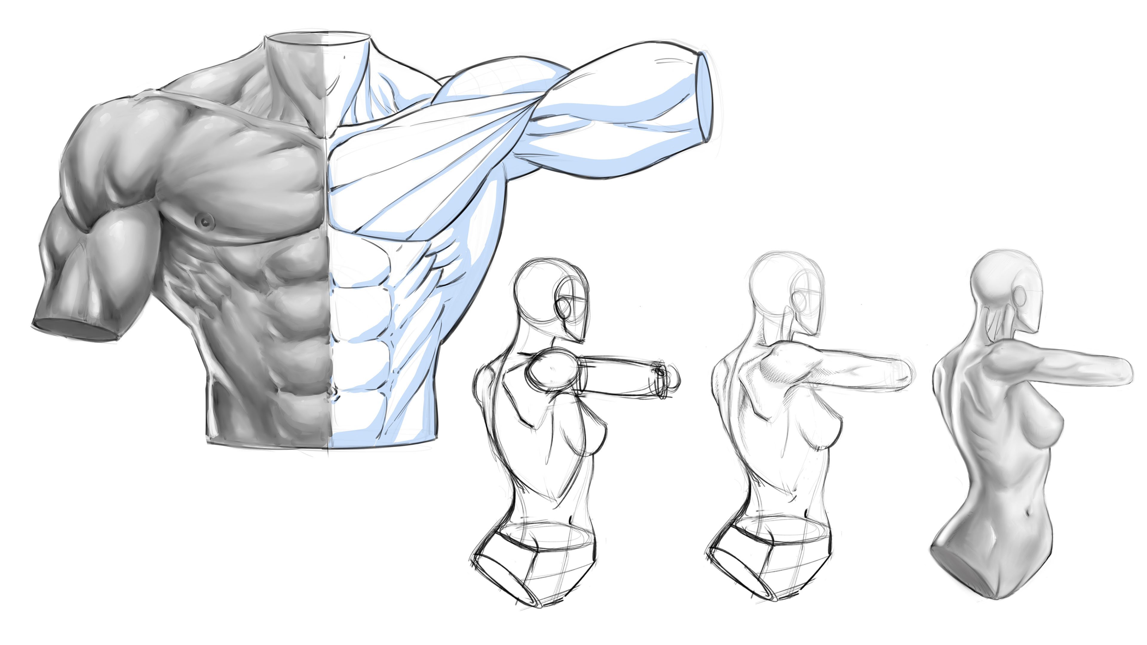
lines to curve over. This shape of the deltoid
looks really flat, right? Right here, just to me, the deltoid is really like
a heart shape and you can see that's pretty much what I
drew there. Sideways heart. You do have a medial head. You have a posterior
head or posterior? Had you ever anterior
head what you would barely see it angle,
something like that. I mean, I don't know if
that's exactly right. But then again, is
there an exactly right we're talking
Stylized Anatomy, but, but the difference is here. I need to figure that out
where that segmentation is, where those three
main muscles are. I can break off into
smaller striations. But then I need to, again, I need to really perceive the curvature of
the muscle groups. It's gotta be depth
and dimension there. Let's see all that
immediate looks a lot more dimensional without the Shadows and it's just those wrapping lines
versus something like that. Where are we really don't know, you know, is that flat? Is that what does that, you know, it's implied a
little bit but not enough. So again, the separation
figure out where the heads of the
deltoid would be. Something like this. And then get in the
curved wrapping lines. It's almost like
you're drawn Spiderman suit or somebody, right? There you go. Now you've
got some implied depth. You can also add a little bit, a little bit of
Grace Hill to it, which are really push it out
at the viewer a lot more. So you get like you're
shapes of shadows going. Again, we'll get into all this. I'm just trying to slowly
warm me up to these concepts. And just like that we
have something that looks and feels a little
more dimensional. Let's really, and again, it's going to be practicing
all these things. So focus on this, for this particular lesson, focused on the belly of the muscles in print and really play around
with this as well. So I probably
should've showed you a little more variation
to that. One more. It's not just gonna be, you're going to have the belly of the muscle
and it's good to find that and pinpoint that
all throughout the body. But you're going to
want to show like really some variation
in the way that occurs. So some are gonna be big center belly and
they're going to thin out quite a bit. Sometimes you're
gonna get a belly to the muscle and the tendon is
going to be a lot longer. And then again it's gonna
be the variation and the overlaps to those. Sometimes they're
going to pass in front of around
through underneath. So again, play around with
the variation to that. Then also couple that with the idea of conveying
thickness and weight. You can use definitely
use your wrapping lines. You can also use a
little bit of gray, gray-scale and shadowing value. But keep it simple and practice all sorts of
variations with this. And then also practice studying from life or Comic
Art that you like. But break it down in this way and see what you come up with. Let's go and stop here and we'll head over to our next lesson.
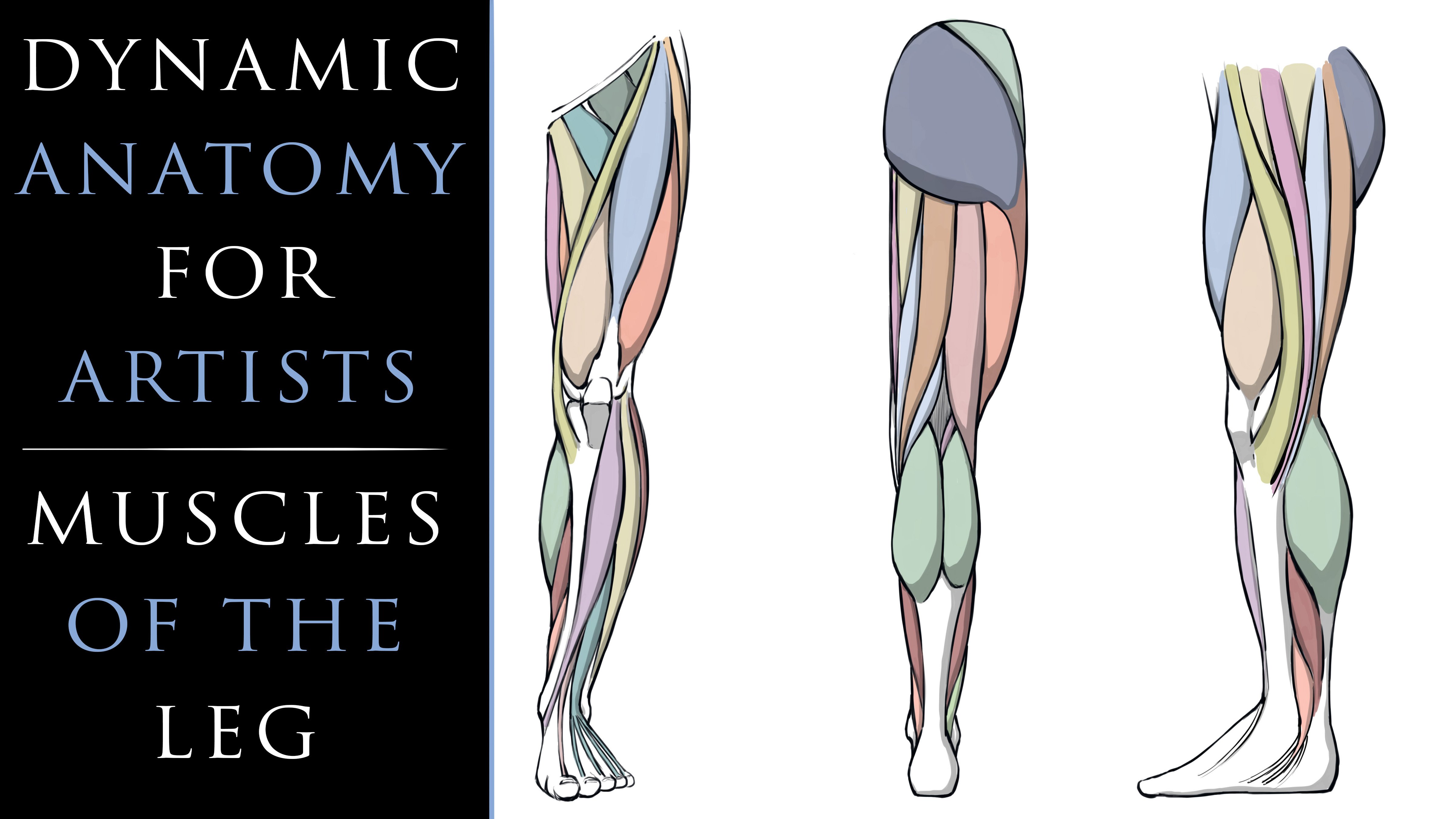
5. Drawing the Front of the Leg: Welcome back. So now what I'd like
to do is talk to you about simplified shapes. So I'd like to break down
some different areas for you with you so that
you can practice these. And again, really
try to think about the shapes and forms of
different parts of the body. Simplified ways. Now, be inventive,
tried to come up with your own versions of what I'm
getting ready to show you. But if you don't have
any better versions and you're feel free
to use mine and then you'll slowly develop
your own process and skill set over time, I think, but let me show you the ones that
resonate with me the most and hopefully
that'll get you going on this thought process. So as we draw something
like a Leg, Right? So say we start with
a cylinder method to get a base structure going. Ok, and I'm going to taper
the inside a little bit. I'm going to put
a curved outside. Put a circle for a knee, lower leg, bit of an
angle on the inside, curve on the outside. Now remember what I said is about starting with
basic cylinders. So very straight
cylinders at first. Okay. Then you go to
tapering those inward. And then eventually you
start to imply Anatomy. So I'm skipping those
steps a little bit, but hopefully you
understand that, that I'm just going
for a little bit of a sense of applied Anatomy. But feel free to do whatever steps you need
to, to get to here. But I think this is a
better way to kinda do it. And you don't have
to even draw him a, a version of the calf
muscle like that. But you could definitely do a little bit of
curve like this. One of the rhythms that
we see in the Leg. Our curve, relatively straight curve and the insides a lot
straighter by comparison. Okay. So it's definitely
not that the Leg, the inside of the
leg is straight. It's just by comparison, it's kinda noticeable that's a little bit more straight
than the outside. So just pay attention to that. And that's kinda what I'm
implying right there. Even with this basic
cylinder approach, it even goes right down
into the foot with a foot. Jets out, usually a little
bit more like this. All right, so even a very
blocky representation, you might draw the foot
something like this. Again, it's an
oversimplification. But there's a lot of times
where that's very beneficial. And then as far as proportions, so you're also
gauging proportions. And we'll get into that
in more detail as well. So it's hard to really
teach one before the other. A lot of these things are
interlocking techniques. So by looking at this, I would say that
upper leg needs to be longer, taller by comparison. So I would adjust that,
something like this. So again, we are thinking about proportions as we do
something like this. So now to the Basic Shapes. So again, this is kinda been something we've already covered
as far as this portion. But when you go to
Draw Anatomy, it, it becomes a little bit
trickier to figure out how to overlay this in a way that doesn't get
confusing awfully quick. So I'm gonna do is
I like to actually add a layer at times like this. And so that's the screen mode. I just want something to
be able to draw over top of in a way that you could soft erase it, whatever
you wanna do there. But to draw over
top of it in a way that's very discernible,
very easy to see. So the shapes that I'd
like to think about the Leg from an angle like this. One of the things
is the quadriceps. I like to look at those like an upside down heart Leg shape. Okay, so at first I'm
going to start even more simplified
than it really is. An upside down heart-shaped with this middle of the heart
roughly where the knee is. Right there. We were probably doing better
than a lot of people in the beginning stages of work because they just draw
legs too awfully straight. Now, one thing I want to
point out is the medial side, lateral side or not even. I've purposely made them
even here because again, I want to slowly work
you up to these ideas. I just want to throw you into the deep end of
the pool and say, well, good luck
started swimming. It's like you need to slowly,
hopefully understanding. Now if you're more advanced, you can progress passes. You'll have to make that
decision for yourself. But what I like to do here, if show this shape,
practice the shape. You should be able
to Draw heart. And if you can, just
keep practicing, it doesn't even have to be. Is Stylized the minute you could homeless really
just get away with a really stretched
heart-shaped for the spot. It does explain the shape that you're going to see
their for the quadriceps. Now, the quadriceps are the medialis lateralis
rectus femoris. Again, we don't need to get it in the terminology too much. I want to say there's
one below it as well. I don't think the
sartorius is part of it, but you do get this
sartorius muscle that comes up right through
here and goes down like that, like a elongated as we'll
talk about that as well. But The next step to here
is just to really take the middle muscle
that you get in the Leg and just kinda
segment it like this. You see how simple this is really a good thing to think
about here are teardrops. Okay, so we've started
with the heart Leg shape. We break off into this
other segmentation, right up the middle. And we think about
a teardrop shape. Look if you take
another color here, you go right through here. Let's just looks
like a teardrop. And really the Leg itself can be simplified with
a bunch of teardrops. A lot of muscles have these
teardrop look and shapes. Remember what I
said about paying attention to where the
belly of the muscle is. But you can really
keep going and going and draw a lot of
teardrop look and Shapes. And you generally will get heavier organic look and feel
to the anatomy that way. So it's worth paying
attention to. But I just want
to show you that. So we're taking this
quadricep area, we're segmenting it with an upside down teardrop because it would be
falling the other way. These could be considered
to other teardrops falling kind of a standard
way of looking at them. And then over here, we're just going to take the what does this I believe
it's the adductor group, but we'll say the
inside of the thigh. We'll just have this
kind of come out. So think about this, instead of even picturing
the entire volume there, just think about this one line out and then a wave inward. You can play around
with variations to that slope into
this muscle more. Also, also I'm really
trying to convey their is it you just
don't want to do that. There's nothing
completely straight, even though we did
start that way. I'd rather you just
think about, well, this has a volume to it and
one part of it's thicker. In one part of it's sloping into the neighboring
muscle group. So something like that. And as I mentioned
with that sartorius, it goes from up here and
all of these, by the way, come up here and connect
to what's called the ASIS, anterior superior iliac spine. Really, it's just good to know that they come
up here and they attach to the Front
of the hip area. But this muscle goes down here through the
side of the knee. It does this big
kind of sweeping. Or this is another rhythm
that you'll see in the Leg. It does this big sweeping. Look at it like a
giant elongated S right through there S, right? And so when you start to see these different rhythms and you connect it with
these basic shapes. It starts to get a lot easier, but it takes some practice, so don't expect
too much too soon. Let's move down here to
the the calf muscle. And let's just explain this
with a diamond light shape. Will see that just a
basic diamond there. Again, these are
oversimplifications, but I think that's important
to start out with. So as you come down here into
the knee, knees are tricky. But one of the things
that I do as I just simplify it with
this shape here. If you find that to
be even to complex, you can go a step further. You could say, well, what if I just drew the
bottom of the knee? Just this shape right there. It's like it's really like
a little triangle with, instead of having
that tip there, you just kinda cut it off. So just think of it like that, just a little
triangular like shape. And you're just going
to cut that base off like that and
flatten it out. Pretty simple, right? It's just drop that in there. And so what you have to envision here and
maybe not even draw, sometimes I even leave it out. Is it, It's coming up like this. It's connecting to a
tendon that's going to the rectus femoris. In fact, I don't even know
if it connects there, but it does a sort
of shape there. So it's worth paying
attention to. So really you can
just divide these up and kinda get this feeling that it
comes down into the knee. It's pretty simple to do. But again, let's keep
this very simple. Something like this will
probably bring the inside of his knee and further it
looks too wide there. I'm always gonna be
nudging this stuff around. And then for the other
side of the knee, we're just going to
keep the knee is a bit of an oval for now. So this whole area of the knee
just going to keep it very oval like side here. I'm just going to
bring this down. And we've got a lot
going on over here. We'll talk about this more. But for now, what I really wanna do is I want to bring this out and slope it right
into the vastus lateralis. Usually what you
see on the side of the Leg here, looks to be Like one shape, but
this muscle cuts in. So we're just going to
do something like that. Again, trying to keep it simple. Same thing with the Leg here. Remember we talked about
those Initial curves earlier. So we're going to bring
that out, curve it down. And I feel like this curve
needs to be pushed out. Again, always nudging
the stuff around, just kinda sculpting it. And our ankle is higher. Just get an idea
like that in place. Okay, so now what I want
to show you here is that after we get enough of this and let's
get this part right here. So we've got these muscles
that come in front of the Leg. I'm not going to
get into too much. Again, I want to
keep this simple, but I do want to say that
the Front of the Leg needs to feel a
little bit like it's in front of the calf muscles. The calf muscles are on
the back of the light. So it's very easy to draw these like I have
and they feel like they're on the side
of the Leg and other they're poking
around the side. But this part right
here needs to have the feeling That's
definitely in front of you. Got a muscle that wraps around. You've got these
little divisions. You get one that pops
out here to the toes, the digits, but I
don't wanna get too much into it because it
could be very confusing. And rather you focus on
this and you go okay, If I had a wrapping line
going right through here, this would clearly
be in the Front. And these aren't too
far off to the back, but they're going to wrap
back in a way a little bit. Hopefully that is visually
making sense for you. It's a subtle area, but it needs to be that
way because if not, you get this very flat widened
out view of the Leg there. Likewise up here. I wanted I want to show
you two things here. I'm going to bring this
out a little bit more. Again. Always pay attention to the difference from the n-side
to the outside of the Leg. The more you can
zero in on that, the better your Leg
illustrations will get. But right here, this
is an example of it. So the media Alice is a
lot lower than lateralis. So just like we have this angle
right here for the ankle, we have to also get
this angle like here. You see, I didn't I
didn't start with that. I wanted to show you
the simplification of that heart Leg shape, but it can't stay there. Well, I guess based
on your style, it could I've seen
styles where they they definitely leave it like that and I have a lot
more evened out. So that's up to you to decide if that's your style and it's okay if it looks
good, it looks good. But for me personally, I guess it's one of
those things once you start to see can't unsee it. And I feel like this needs
to come in like this. Have that distinction from the
one-sided being up higher, the side B and lower. They're also not
exactly the same size. Again, I'd probably
change that as well, but first I'm going to just
adjust that one to be higher. Also going to leave
that divide I talked about from this
down to the knee. And I could get in here
and keep detailing, but I'm actually going to
slow down because again, if I detail everything
and I go too far, I mean, this might already
be too far for so many. Now, keep in mind if
it is to slow down, go back, redo the lesson. Don't pressure yourself
to draw as fast as me. This stuff takes practice. And then remember, get in here, do some of your wrapping
lines and really flesh out the dimension that
you're looking for for these
forums and volumes. And just try not to make
them look too flat, right? So you're going to
put curves here. You can go back like
the previous lesson, add some volume to it, which will continue
on with this one. I don't want to move
passes too awfully fast. But go ahead and work
up until this point, work on this and see
what you come up with. But let's go ahead
and stop here, head over to our next lesson and add a little bit
more volume to this. So with that, let's move on.
6. Volume to the Front of the Leg: Welcome back. So now let's continue
on with this. And so what the adductor
group kinda divide this, but you always see a
whole lot of that. I'll just draw a couple of
those divisions in there. In the Leg is going to
attach on a bit of an angle. Keeping in mind that when
we do male to female, you'll see that the angle
there is a bit different. It's more steep angle
lot board for females. Also. If you struggled to get
your, your shapes right, always remember that center line can be very helpful as well. And then there's a
slight plane changes. We'll get into plane changes
and in more detail as well. It's all this stuff. It's just, again,
it's hard to really talk about the one without getting into the
other a little bit. But then they each
really require their own explanation
and practice activities, I believe, because they're
just also powerful. All these techniques really
help drawing things to look and feel a little bit more mechanical is great
for the start. I just don't feel like
it should stay there. And then you also get these in this little shape
right here under the knee. So just to show you a
simplification of the knee area, let me go over to the
side here and say, okay, if I was just this is
zero in on the knee, this would be my simple
set of Shapes for it. Remember what I said about
the angle being cut-off. Now, I would start
to round these areas over a little bit more
organically as I preceded. So again, just like I
mentioned about the foot, you can start
mechanically InDesign, but you don't end
up there unless you're drawing a robot and then you'd stay there entirely. But then the next shape that
I see, something like this. Again, overly simplified. I would try to get in
there more organically. And then when I
bring the knee up, comes up like this. Now, the medialis sits really
right on top of the knee. But what I tend to do is I tend to put a little bit of the pocket of the skin
right over top of that. Now, hopefully this isn't
too confusing for it, but I'm just trying to give you let's even take
that part of way. Let's just focus on
this right here. That is the shape. The basic shape
memorization I have. For the knee. Obviously you have the inside of it
and the outside of it. I feel like the inside
has a little bit more of a bowl like
this. It's lower. Side has a curve like
this little higher. But again, that's my overly simplified version
of just the knee. And I do that for really
each part of the body. And then I just practice
interlocking those shapes together and then building up the organic drawing
over top of it. Get rid of that for now. You know what? I'll leave it right about there. Just save that in
illustration for you. So going back over to here, I want to add a little bit
more of a sense of volume. So as I mentioned,
these quadriceps, which are basically a
heart and teardrop like Shapes go up to that
point called the ASIS. Look at your anatomy books fine, that it's really great
to find these pinpoint, these areas where you can
pinpoint the Anatomy like that. It's also good to pay
attention to where are these bits of Anatomy
start, where they end up. Always study your Anatomy. But for now, I want to
just show you the shapes and how I build up on these
and connect them altogether. So let me add a little
bit of volume here. So I like that. Grab a solid brush. Can actually what
I'm gonna do here is make it at full opacity. And I'll just control the layer
to drop down the opacity. You can get away if you're
working traditionally, this just means a nice, hopefully have
some gray markers. I have some by Prismacolor wall. I definitely have
some promo who who which just got a set from them. Alcohol-based markers,
which are great for filling in these grayscales. But for me, it's really
easy to do this. You could use a gray
colored pencil, whatever you have, just
use your graphite pencil. But what I'd like to do here is really pay
attention to the way that I can build up the feeling of volume to these muscle groups. And I might add some angles
in here to the Shadows. And I feel like I'll be
giving you a lot more on shadows as well
just because again, it's all super important. And I do want to say that really practice patients,
really practice, enjoying the moment
of doing this and not pressuring yourself to be great overnight and a month. You have to slow way
down, enjoy the journey It's going to take awhile to
get all this stuff mastered. But if you're
enjoying every day, then that long while will be perceived as a
quicker amount of time. It is like if you
go to some FUN, exciting place on vacation,
it flies, right bye. Alright. So the trick
is not to be so impatient and put all this unnecessary
pressure on yourself, just, you know, I'm
sure it goes without saying, but right here, what I want to point
out in this area, I'm trying to add
that shadow all along the side vertically
on that group, that muscle group
because I needed to feel like it's in front
of the calf muscles. If not, It's gonna
be aligned with it. It's gonna be two parallel,
two side-by-side. And it's just going to
flatten out the Leg. Also, you could probably Shadow, I tend to Shadow down
into here and then pick it back up with
the light source as it pushes out away
from the foot. And I absolutely love creating
these types illustrations. Because I feel like there's
a lot to be learned here. It feels like a very designed
way of illustrating. And I can always apply
Anatomy over this later. But hopefully you can
see now, you know, the distinctions from the inside of the Leg to the outside. How we started very even, but as we cut into it, we just kept pushing
the sense of, of differences from
the segmentations. Now this is overly segmented. Hopefully you realize
that as you would apply Anatomy over top of this, if you wanted a more
realistic character, you would, you wouldn't
connect all your lines. You would still try to imply and establish all your
forms and volumes, but you would do a lot more
implying than tracing. So just remember generally
tracing gives you more mechanical looking
characters and then implying areas and leaving line
breaks definitely on the light source side is
going to give you a lot more of a natural look to scan or even clothing
or just in general, just in general,
you don't want to trace around every object. But for studies, I do feel
like it's very helpful to do prior to shade in the whole medial side
of the ankle here. And then again, as we
get into plain changes, I'll explain that further, but I really kinda
over accentuate plane changes for
Comic Art as well. So even the knee area,
simples, that is, I would Shadow this bottom
plane of the nice section. You see I did it right
there. And then I would leave a light source to the top. Likewise, I would shadow
under this era the knee, maybe the side of
it a little more. And on and on that goals can I'll get into
that more as well. But that's basically it. So use your wrapping lines also. You can actually use your wrapping lines the
other way you see I've only established them the one
direction where you can go up the volumes vertically
as well, right? And I don't know To
me, this is super powerful and often overlooked. If you're finding
it tough to get a dimensional feeling to your characters
and tear Anatomy. Try these wrapping lines
really, really stay here. Dedicate some time to it. Think three-dimensionally. Look at some 3D, never see those 3D diagrams
where they show the grid through it
and look at those, even pull those and then
draw them in your own style. And see we come up with use your center lines to
your advantage as well. A lot of times they have
to turn the page to get a horizontal feeling of it. Horizontal lines are
always tricky for me. Really get in there and
detail that I don't know. I just find them to
be super-helpful. Really more-is-better,
but maybe not, maybe, maybe just as many
as you need is better. More is not always
better. There we go. So now we've got a leg
from the Front view. Obviously, you know, I'll
have all these illustrations saved for you so you can check
them out in more detail. Maybe some all refining greater
detail, stuff like that. So let's go ahead and stop here and head over to
the next lesson and keep talking about
simplified shapes
7. Rear of the Leg: Alright, welcome back. So now we're going to
draw the back of the Leg. And what don't wanna
do here is first draw this floating underwear shape. And then we're going to
draw the bone coming out. This particular little
illustration right? There is a really
good one to remember, mainly because it
helps you to think about the Leg coming
out towards the hip, back down, inward towards the body, and then
coming back out. So it's just a very
simplified skeleton. But it's better than thinking about everything
stacked upright. So we'll just do
the one side here. Get something like
that drawn in. And then on top of this, we can lay on our cylinders. And you can see that
even from the slant, it starts to give
us that feeling. Remember what I mentioned about the curvature on the outside of the Leg and then a relatively straightened us
on the inside of the Leg. You can see that
kinda comes from the starting point right there. And taper this N word will say the ankles about
here will attach to heal. So as far as simple cylinders, maybe something like that. Okay. And so from
here we can say, okay, well let's start
a plant, some Anatomy. But what are we
going to look for? So you're going to
bring it out here. What I'm gonna do,
let me show you this. I want to show you a
silhouette version. So we're gonna go right
from the cylinders here to a silhouette drawing. So we'll put the glute
here inside leg, which is straight or straighter
but still isn't straight. Obviously. You get a
noticeable bend the knee, you get the calf muscle. This calf muscle which is a little bit more
elongated where this one has a
little bit more of a protrusion outward
towards the metal. You also get, even though I'm talking more about
the silhouette, I just wanted to show you. You get this bit of a
diamond right there. So I'll explain that
here more in a minute. And then for female characters, you're going to do more of a widening at the hip area
and also a taller pelvis. Something like this. Alright, so there's
our basic silhouette. Needs a little bit
of work, I guess. But just to start out, those are basic silhouette. So I'm gonna do is
bring this over now and show you how
we'd refine this. Okay, So the reason why I wanted to go with the silhouette
version here, really, I just want to give you
different ways to think about all these different areas of the body and your
illustrative work. Again, I've mentioned
it, I'll reiterate it. A lot of these techniques
inner weaved together. And I think what you
have to do as an artist, as learn when they
suit you the most. I think there's very different
techniques that I use for not only arms and legs,
the Torso, whatever. Also, there's different
techniques that I use based upon certain poses, even that I'm just more
comfortable with than other ones, I have to revert back to a bit of basics,
things like that. So why don't wanna do here now is break down some of these, these interior shapes for us so that you know
what to look for. But again, it's really helpful. Let me actually
let me get rid of stuff on the inside right here. But it's really helpful
to pay attention here, silhouettes, there are
certain silhouette, certain angles and poses that are just gonna make
perfect sense to you. We're actually really good
at spotting bad silhouettes. It's something something that's, we have a bit of an, of an innate ability for honing that can
really be helpful. You'll see painters take
advantage at quite a bit. Digital and
traditional painters, they do a lot of Shapes and
then cut into the Shapes. So with this one I
want to show you, is that one of the most
discernible things? And you're not always going
to see this in a character, but as the divide
right up the back leg. So you get the hamstrings. This is where you start
to see that diamond. And then the calf muscles
actually go up and spend into those something like that or they intersect or either way they create
this sort of diamond. And really the diamond is more important than I think the segmentation of the
muscles now the calf, you could say, is pretty
important because what happens here is it's
very discernible That the calf is has a
has a divide back here. Okay. So that's that's
worth paying attention to. Because again, if you've got somebody that's pretty defined, you are going to see this. This divided the
muscles right there. I think to me the capture one of the most noticeable parts of definition and most
people were not. Everybody has big biceps and triceps and all
this other stuff. I mean, but a lot of people, even if I've even seen
overweight people that have pretty definable calves. It's just something that
is a lot more common. Now. Then you have this tendon
that comes down the back. And now everybody knows this
one, your Achilles tendon. Then right through here
you have your ankle. Again, as I mentioned, you have the definition
or the angle of the N side,
ankle being higher. But opposing to that, you have the inside calf muscle gastrocnemius
being lower. Okay. So that's something
to pay attention to. Again, you have this
definition or this protrusion here that you want to
be getting in place. And you have a bit of
curvature right here. So it's not just
completely straight. You get a bit of a
been there. I know I am drawing more
organically here. This is a bit different
than the previous exercise, but now the other thing
to pay attention to, I think that's a good one is that you've got these your
hamstrings to the back here. But then through the side here, you have your IT tract known
as your iliotibial tract. And he wanted to say that would
be your vastus lateralis. So we've got the
medialis lateralis. And I want to see you're
seeing some of that as well. But a lot of times in your
medical illustrations you're just going to see
this labeled as IT band. But again, it's good
to pay attention that does come out like this. If you were to fully
illustrate the glute, you would get the glute
that looks more like this. And then you actually have
the medial head of the glue divides down basically where
the IT track is beside. But again, if, if you're
going for basic forms, you're going to ignore that
because I don't think in most people you ever
see that definition. Again for the back of the Leg? I find this to be more than adequate for what
we're gonna be doing. Now, again, I just want to let you know that these are meant to be simplified versions of what's lot more of
a complex subject. Obviously have a course on the detailed anatomy in a
more realistic depiction. But this has meant to teach you the basics so
that you can get to the Stylized drawings
that we're gonna be doing later on in the course.
So keep that in mind. I just don't want to
overwhelm you with Here's a little muscle and there's another
one here and here. And it's just that
it can be a lot. And again, I don't think
that's really necessary to teach you to Draw
Stylized characters. Now, also, this is meant to be a preliminary basis
for your understanding. And I would still recommend
that you do continue to study anatomy and go as in-depth
as you possibly can. It's just, we have to always be mindful of how much of it we're really going to
be able to retain. And you generally
are just going to retain things you're using
more on a daily basis. But then it becomes easier to resource the other
data when you need it. So for instance, I'm
not really going to study organs and
things like that. But as far as the
superficial muscles, that makes a lot of sense, but also making the
simplification so that we can resource that
material easier. So there's the back of the Leg, again in a simplified form. Now let's go ahead
and move on to arms. Will do the Torso, and then we'll get into
some other aspects of character creation,
creating these poses. Dynamic and interesting way. So with that, let's
move forward.
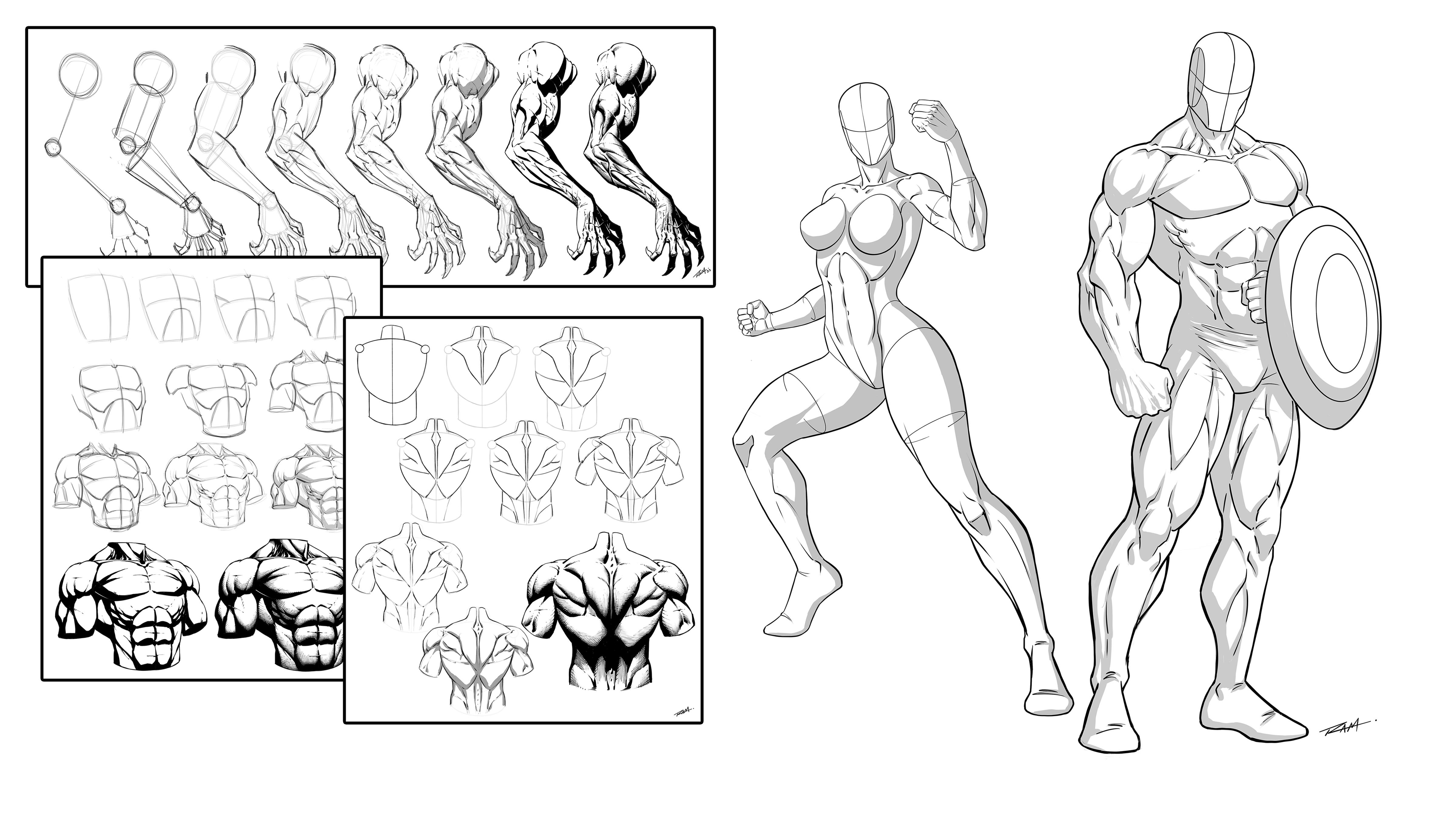
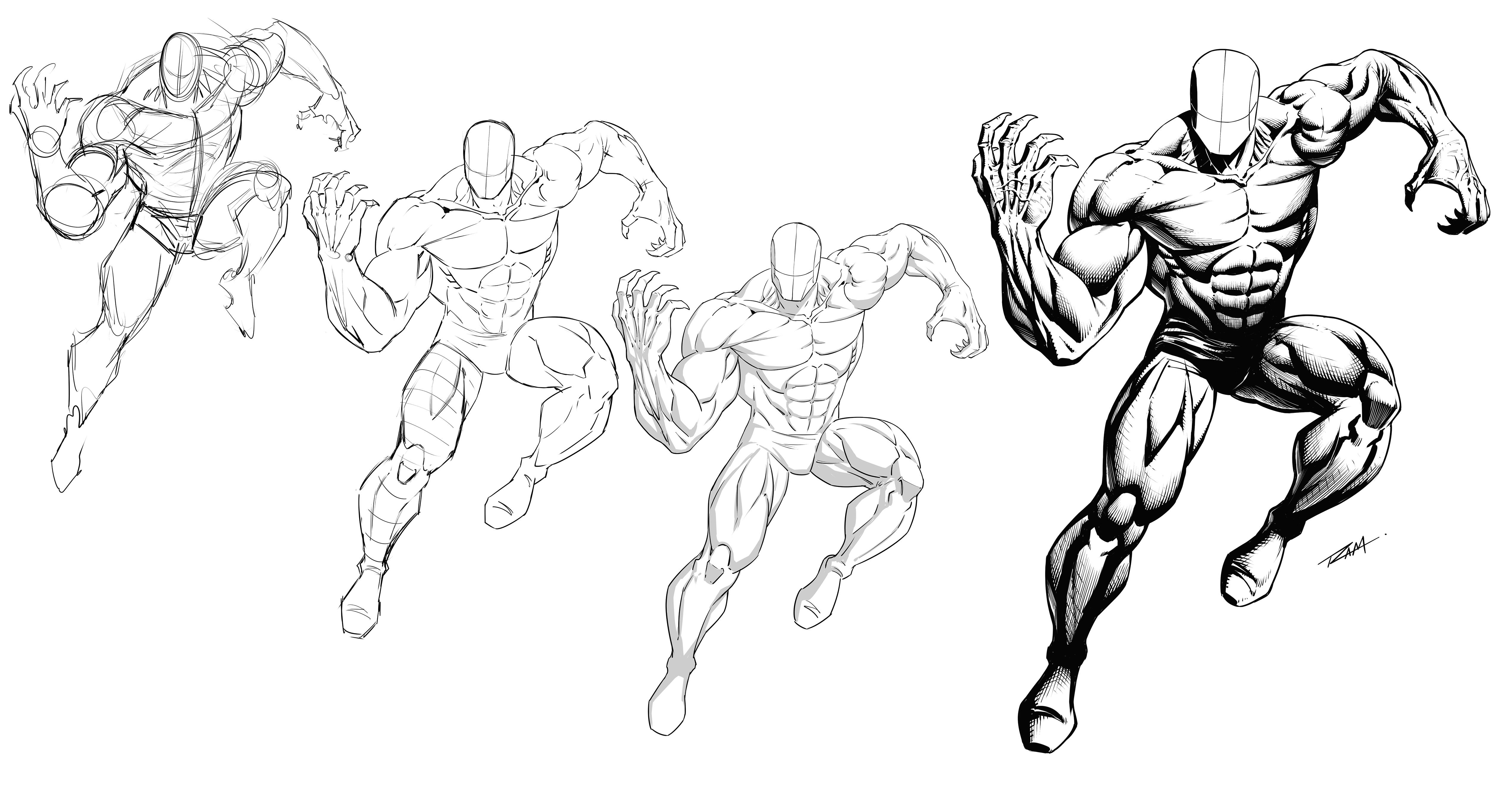
8. Basic Shapes of the Arm: Okay, so now for arms, again, I'm going to just jump in
and get us moving on this. I'm gonna do a very basic Arm. And another one I
want to show it, or another technique I
want to show you here is after you establish the length, something like this, a couple of things you can do
jump right into cylinders, but one of the techniques I
would like even more than that is this one. So I show this one off a lot. I honestly think it's so simple and effective.
Absolutely love it. It's a little bit of
a lightning bolt. And so what this helps
us to remember to do, and you still combine your
cylinders if you want. But what I like
about this is helps us to think about how the
Arm is not so upright. So when you get somebody
that's new to drawing, generally even with the
cylinders they Draw, will do something like this. That's their arm. And there's times that
I've started it that way, but I just I know enough about the body now
and I end up there. So say I did start there. So I go like this. I would at least move
the cylinder over a little bit in this
cylinder over and tapered. So hopefully you see it
That's a little different than that even with
that messy line. So I'm gonna, you can do
it that way if you want. But again, remember
not to stack it so awfully upright and aligned. And what's better is to get in this basic
shape of something like, will say something like this. Like this here. Kind of a football
shape for the bicep, diamond or something like that. For the tricep, the
Arm will come out, the form will come out
away from this a bit. In, then back in,
towards the wrist. The wrist is actually a bit
of a thin rectangular shape. And then another diamond
off to the side. So it's a bit messy the
way I've done it here, but let me clean this up for and show you what I'm thinking. Let's get rid of some
of this construction stuff through the middle. So there's our silhouette
to pay attention to. Right? If you're just looking
at the silhouette, attach a hand here, bit of a wedge to a
block light shape, making sure the middle knuckle
is a little bit taller. Even if this is
the knuckle here. And these are the fingers. You always make sure
that middle mcals just a little bit taller. The thumb is a
diamond or I'm sorry, a triangle, I guess. And then another little
piece like that. So that's my simplified first
from an angle like this. Now keep in mind
when the palm is down and away from us like that. This is called pronated. So just remember, pronated Supinated palm up as
Supinated hand down, palm down as pronated. So this is a pronated Pose. Say at the Form of
it too long as well. But I guess I should be able
to adjust that as we go. I also feel like the
deltoid, It's too small. Now another thing about
the shoulder, the deltoid. Deltoid comes from, pretty
sure it's Latin or Greek, but it's part of
the same I guess, but it's a, it means
it's like a triangle. The symbol is an upside down
triangle, delta, right? So that's something to think about when
drawing the shoulder. You see I've started with
a rounded version of it. But if I was to simplify that, be a triangle like this, what I like to do is a
little bit of a mix. I actually like to do what I consider more
of a heart shape. If you go like this. And I kinda see
something like that. And the reason being is it doesn't all line up
right in the shoulder. The one heads a little higher. You get a segmentation from the anterior head
to the medial head. The medial head protrudes
down lower into the Arm. So to me it looks
more like a heart or fruit or vegetable oil, you know, something
like that, but not, not so much, just a triangle. But again, it's good to
know these things about, you know, what the
shorthand ideas are. Just makes you realize
there were simplifying the shapes a long, long time ago, right? Even name them after
simple shapes. So if we keep adjusting
the silhouette, I would increase the
size of the Form, which might help make it
not look so elongated. In which case I would
have to increase the size of the fist as well. So just remember that as you're playing around with
your silhouettes here, you can't just, I would
say just one thing. It's going to affect
the neighboring part. So you gotta look at that. And I still feel like this
shoulder needs to be bigger. So I think personally, you really have to get these proportions right with the Arm, especially the shoulder,
because the shoulder houses it holds all that weight and
that all that strength and I got everything connects through the shoulder
to the Torso. So it's kinda has
to be right there. But just keep playing around with it till you
get what you like. So now we'll cut into this. So want to bring this over? I just need this part. So get rid of this right here. Just to show you, we
got that silhouette. Now cut entity shapes
and I'll show you the basic shapes
that I tend to see. And actually, let's,
let's try it this way. I'll start with a color. For the deltoid, as
I've already mentioned. I see it as well first, I think it's helpful to get
the separations of the heads. So let's just put this in with some basic kind
of ovals for now. Remember, we're going
to refine all this as we draw our character
concepts anyways, and we'll get more into
striations and all that. But I want to keep
this simple for it. But what I think
is important to do is to at least first start
making the separations. So you have anterior,
medial, posterior. It's easier to see on something like a top
view where you're gonna get the three heads
more visibly. Say you're kinda looking
down at a little bit, I guess it's kinda Down
in out and you get like the clavicle
spine of scapula. They're not exactly even
but just simplifying that. And the trapezius goes to the
middle, some neck muscles. So again, medial
head to the deltoid. The back of the head is the posterior and the
Front had on the chest, the anterior things you probably don't need
to know to draw this wall, but there it is. Now at the bicep. Obviously it's in
the name bicep. You've got two heads there. I very rarely if ever
draw the two heads. But the divide is kind
of up the middle a bit. Unlike anything else.
They're not even, even though in my illustration and kinda look a little too even it's always a long head, short head, anterior,
medial to lateral. But I want to say it's
long and short head. It's it's just basically
just know that they're not the same
in but what the bicep, I really don't show the definition hardly ever
with my illustrations. So that's up to you
if you want to seek out where the divides are more and you want
to show that more. I'll just very rarely
show it now if there are very flex position, the arms up and shoulders
are rolled back, then it kinda makes
a bit more sense. You're going to see it more
noticeable be there, I guess. Now with the separation
here, you've got bleed. It's the brachialis. Forgive me if I'm wrong on that, but there's a muscle that is
very distinct right there. The main thing that
I want to point out here by time you get to the center muscle and then
you get to the tricep. It's really the staging of it from this angle
That's super important. So if you look right here, it all just looks flat across. But what I would really
recommend that you think about is that it's actually if you were to look
at it a little bit more from the side, like a bicep. Let me zoom right
in here real tight, but I'm gonna do a
small illustration. So it's a bicep, say
we're viewing it and I was kinda level to the middle of it
right through there. Right. So you're looking at it. This next muscle is a bit higher and the tricep is
even higher than that. So if you are looking
at it straight on, you're actually
going to see these. And you don't see that from an angle like this
unless you illustrate it as such in the way that you apply or
Shadows and everything. So what I mean to
say is that you have to think about it stacked. And when you start to do that, it looks a lot more impressive. So the shoulder comes
through like this. Segments down here are there. But this is all kinda
stacked and that's why you will see it from
looking straight on. If not, you would see the bicep and these would
disappear entirely. In sometimes they do like if the arms rolled
back far enough, you're just going
to see the bicep. But sometimes you'll see these and they actually
raise up and away. I don't know what
they're much higher, but there are a little
bit higher enough to make a difference where you can
see it from certain angles. So just pay attention to that. Hopefully that little
illustration makes sense. Yeah. That they're not just, it's not like this is
a straight flat line going across the
Arm Right there. Now maybe for somebody with really little definition, okay, so there's always different
instances, I guess, but now another tricky part, especially when doing the
silhouette first is right here. So you've got these
muscles that come out, but then they come
back this way and point towards the thumb. In fact, they actually
coincide where the tricep is. Now since the tricep is
disappearing back there, I probably brought it
out a little too far, but I like to over
accentuate some other stuff. But the main thing is that
this line right here from the tricep and these
muscles coincide. So they come from here. They wrap around the forearm and point towards the
base of the thumb Hey, something like that. These mostly come through. So this is where it's
tricky because all this kinda spins around. There's a lot of spinning
aspects to the Form. Because of our
ability to rotate, radius and ulna, all those
muscles twist with it. But these ones right here go right to the
base of the thumb. Your extensors. I like to group these together, especially for simplifications,
become like this. I hit the hand. You go out to the digits. So it's probably
extensor digitorum. So, but the extensors, and there's a few
segmentations in here, but I'm going to want to group those together to
keep it simple. Then here you've got your flexors kinda
protruding around. So you get a little bit of
a diamond like shape there. My see a little bit of elbow
back here but not much. Then the other side of the cell, your flexors, you're just
seeing it from the other side. And then you also get one or two that comes out
to the side here. I want to say this is
your maybe extensor that goes to the pinky. Don't quote me on that one, but actually let's
leave that out. What, again, what I want you to see is these overall shapes. And I don't want to put
too many of men there were just it just becomes too
confusing for you to get. I mean, there's a couple of little ones that
wrap around here. There's lots of details, right? What I want you to focus on
as these big, broader Shapes, I'm going to clean up some of these illustrations for it and I'm actually going
to label them. Because again, I want
you to really zero in on the silhouette, the bigger, broader shapes that you can commit
to memory easier. And then you can
always go back and do more detailed studies of
each one of these areas. And you'll be able
to see like, hey, what was he talking about here? All of these are actually, this is actually two muscles
that spin around there. There's actually two
more divisions here. And you can break
off into smaller, again, incremental studies
to get better at that. But I want you to really get this basic shape
memorization going first. So just to recap, three heads, the deltoid, two to the bicep. Even though for these
illustrations we're going to keep it as a big football shape. I perceive the tricep here
is a bit of a diamond. A lot of these are
glorified teardrops. So you could really go
through all this and do teardrops if that's
easier for you. Remember that the tricep and the muscles here
coincide along that line. And then they wrap to
the inside of the thumb. This is probably a
bit big by the way, so proportions will vary. These are just proportions
I chose to use. Your extensors go into
the back of the fingers, group those together and like
one big tear drop shape. And then your flexors
protruding out around the side. I kinda see that as
a bit of a diamond, but maybe just a triangle. You'll see a lot of ovals and triangles throughout
the body as we go. Triangle here for the thumb, wedge like shape for
the fifth. That's it. So remember the smaller diagrams here explaining how you might perceive the heads
of the deltoid and the stacking of these muscles
through the upper arm. Okay, So we'll go ahead
and conclude right here. We'll head over to
the next lesson. Do another view of the Arm. And with that,
let's move forward.
9. Shapes of the Arm Supinated: Hi, welcome back. So with
this one we're gonna do palm facing up until this
is going to be Supinated. And let's say for this one won't will start
with the lengths again. So shoulder, upper arm or humorous
and simplified skeleton. Now, one of the things
you'll notice when you see illustrations
with the arms out, in, not even out, but the palm facing up. You'll notice that the forum
kicks out a little bit. It doesn't come
like so say here is the show you real quick. Let's say that we have
the body next to it, the Torso, simplified
Torso like this. You're never going to see the Arm Supinated
coming straight down. It's almost hard to even do. It's you almost have to force your triceps
behind your back. It just feels really awkward. You'll notice that when
you drop them down, Supinated and your arms out, they fall outwards just
a little bit and then light in the opposite
with pronated, it's more likely to do this. Think about how much more comfortable with as
have your hands in your pocket or even when you're swinging your
arms back-and-forth, just kinda looked
down and notice your elbows kinda poke out
just a little bit. So I know it's such
a little thing. But it can, these little
things really add up, they can make a
world of difference. So as we draw Supinated version, might as well have the
Arm commodity little bit and that's maybe a
little bit much. Let me move that just
a little bit over. Because it needs to be there. It doesn't need to be extreme,
but it needs to be there. Okay, so we've got our
lengths established. Again, I'm gonna go right for silhouette
drawing on this one. Or you know what
better yet we'll just take what we learned on the last one and we'll
go right for shapes. So I'll follow along
using the shapes I'm using or just use ovals. You don't have to go with angles data if you
don't want it, you can start with ovals. And then you can apply angles. So you could say, well, there's three heads
to the the deltoid. I just saw him explain that. So you start with a couple of
ovals had here, had there, and then you just cut into it and I'm going to
add some angles, don't want it to
look more rigid. You see how that's
pretty easy to do. You remember the heart-shaped I told you about or the fact that it's named after an upside down triangle, things like that. So again, I'm just
going to go for a shape about like this. This is the medial
head dipping down. And then for the bicep is going to draw this elongated
football or oval shape. Definitely just
put an oval there or an oval it to
angles at the base. Remember what I
said about seeing that muscle before
you see the tricep? Now, the tricky thing is this. You may not actually
get all of that. You might from an
angle like this. So this is what happens as we rotate our hands
upward and outward. In any way. The bicep follows. They all have connection
points and they twist with it. Alright, so let's go ahead and drop in the
Form first because we might want to just
get a little bit of the tricep and we might see, we might start to
see more of it here. The other thing that pay
attention to as a tricep is such a wide muscle by comparison that
there's times you'll see a little bit of
it on the outside, a little bit of on the inside, sometimes a good amount on one side and very
little on the other. And then obviously when
it's rotated so far, you're not going to see
them the other side. They also have a
little strip here, the coracobrachialis, I believe. And so you bring
these ones over. Remember that I said
that these ones came out and pointed towards
the thumb will now the thumb is over here. So these come out. They're no longer wrapping over the forms that
we're drawing. And then you've got the flexors can actually come out from this. Let's say this, the
condyle, the bone anyways. But you'll see that
pretty distinctly. And then you'll see them
spin out from there. But we're good. We're going to group those
together just like we did the the digitorum, so are the extensors. So again, remember that the wrist is really
more rectangular than, than oval in cylindrical. So it's kinda tricky
to teach that part, explain that part when it's
kinda contradictory to the beginning stages I was showing you where are
you drop in cylinders. Again, you have to remember that Lot of that stuff
is a way to start. But you don't have
to end up there. Okay, so just like
how we're doing these segmentations and very almost robot-like
illustrations at this point because it explains the different muscle groups more effectively,
I believe then. But by the time I show
you how to render this, we're going to be changing things here and there to
make it look more organic. Again, these are the
shapes. I'm looking at. My group these together. And then we'll draw the, will attach the first tier of the poem divides
right up the middle. Thumb comes over to the side. You've got 12.3. Then for the closed fist, get the shape and first little
fingers a little bigger, and it's right next
to that divide and the palm in really am, again, I'm oversimplifying this, but really you should even
get a little bit of curvature in the fingers, even as a squeeze
and press together. Just notice that when you
pull your hand together, they're pretty
straight, but there's actually pointing towards the
middle just a little bit. The more you squeeze, the more that happens and
they roll inward this way. So just those two little things. So you'll see a lot of, and
I make the same mistake. I draw these phis
that look like this. But that's like wait
a second, pivot, slight little curvature
into the palm. And the more squeezed, the
more that occurs and then also the more squeeze
the more of these role. And that's the superhero fish. You always see
somebody Draw, right? The good artists, these draw it with the knuckles up like this. It kinda over accentuate that because there's
expressiveness. There were this way, there's not a whole lot
of expressiveness, right? So we have to pay
attention to that. Will make sure to get that
in later illustrations. There we go. So now we've got one that's
Supinated, That's it. Rest a little long. These aren't, these shouldn't
be so even as well. So that's another thing, is that the inside is always different
from the outside or however you want
to look at it. One side is always
different than the other. Even the tricep here is not
even from side-to-side. You've got the, the
inside had his long in. The short head is more abrupt and they're
just not aligned. So this is a bit to
a line for my taste, so clean that up. And then what I would say is, I'm just going to extend this one quite a bit
further down like this. This one's more abrupt. That's right word,
but it's just, it's got more of an angle, I'll say, compared to this one being more
elongated down the arm. Same thing with the
long head there versus this shoulder again, what I mentioned from
the previous one, I really want to make
sure the shoulder is big by comparison, so it can look like they can
support all that weight. While the strength comes
from the shoulders. So it needs to be
evident in our drawing. And I feel like the other
thing is just proportionately, I could really thin
some of the stuff out. So as I mentioned,
kind of what the chest to chest to waist ratio. A good thing to also pay
attention to as redrawn this stuff is the
width of the areas where it should be more
tone or it should be closer to the bone and less overall muscle tissue
and things like that. It's really good
to pay attention. Those are the risks.
Here is a prime example. Even this area is any
connection point from the next neighboring area of the body will get more
into that as well. But that's really it.
So this is again, another simplified version, which we could clean
up even further. But I think this about covers. What I would like to do
is get you more examples. So even though some of these might not be as clean
as I mentioned, I will find some of them
for your notes and things. But I want to get you some more dynamic
examples because you really need to see this stuff working a bit more functionally. It needs to be presented
in a way where it can be an actual poses and dynamics, not just these flat
starter poses, but what they do is
they give you that base knowledge of
the group shapes. That's really what I'm
trying to show you here. Okay, so now I'm gonna
go ahead and copy this. Move that over. And I just want to show you the simple shapes so that I get a little
bit messy heroism. Drawing this. Again. Let's pick route here to
make sure you can see this. I just want to give you this simple breakdown
of the Shapes. These ones actually just say no, these actually go right into
the tendons of the risk, but I always show the
divide like this, and then the separation
of the tendons like this. That's up to you. But
there's just so you know, if you look at the
Anatomical illustrations Extra go like this. That's another thing
is kinda confusing, is when you look at either defined bodybuilders and then you look at
medical anatomy. It's almost hard to read. It's it looks different because of volumes of the muscle
and different definitions, different way people flex versus just a standing illustration. I think that's why it's
such a complex topic. Then you see Stylized drawings
and that puts a whole, another variable into the mix. So again, I just want to give
you these simple shapes, make it a little bit more
discernible for you. Hopefully, these next lessons
can work more effectively. So let's go ahead and stop
here and continue on.
10. Male Torso Front: Hi, welcome back. So now we're going to
talk about the Torso. And so for this, Let's just draw a center line. Line across a W like
shape cylinder. I'm gonna put an angle
here, angle here. So he uses this
to measure Cross. Actually have a bit of
a circle right here. Angle here, angle here, angle here to here,
here to here. And keep in mind that if
any of these are harder for you to draw like
this, draw through. Always remember to draw three. You should draw through anyways
to check where you're at. So always you can draw through in a couple of
ways. Let me show you that. You can draw through like this. If you're good at that,
if that's hard for your hand mechanics and
that's not your, your way. Another way is like this. You find center and use straight lines but
you draw through. I would say it, this is
probably a better way, especially if you're
used to using a ruler, you're going to really be
able to map things out. If you use a roller ruler, you can go from a
certain point, roll up. I mean, they're just amazing
and love those things. But just keep that in mind that drawing through
in either angles and, or curves will help you
to map your symmetry. So it's super important. Now we've already drawn the
shoulders, but I really, I like drawing the
shoulders here again because they relate directly to the chest,
the pectoralis. So I'm going to Draw those
again like this, like this. That's kinda the shape I used for the simplified shoulders. Trapezius. Neck is a cylinder like this. Wider for a masculine
male character. So there we go. And
then for the ways or the abdominals and just kinda
draw a shape like this. It's actually two up here
that complete the set. But for the hero, Esq., Form. I leave those out. They're still there
and you could still you'll see
people shade them. They almost look like ribs
because they're not as, they're not generally
as noticeable. Especially if somebody's bowing their chests out will
explain more of that. And we get into the, you know, when you cover the
section on Gestures, remember that each
one of these sections bounce back-and-forth as needed. Again, these are
interlocking techniques, not always one before the other. So something like this
is our basic shapes for the Male Torso. Okay, so there's lots of the things to
consider the serratus, I'm gonna do an overly
simplified version. The serratus are pretty
complex looking, interlock with the
obliques and not going to confuse you with
all that right now, a lot of times for
simplified Anatomy, you'll see even marks. Just as little as that to imply. The main thing that I want
you to focus on here is that the kind of the
hierarchy of these forms, the chest is out the furthest, right, the Front of the
ribcage right here. That's what we'll call it. Is. Out. Next. The serratus go from there
and connect back into the lats and the
simplified version. But in any obliques, you can leave it
relatively strip. They usually taper down into
this area just a little bit. Not usually completely straight. Sorry, the abdominals rectus
abdominis is actually on top of or in front
of the obliques. So again, as far as a
hierarchy of levels, because when you go to start illustrating this
stuff and shading it, That's really what makes a big difference that you
start to think of it. And that way, if not,
you'll just shade it, cross it, it will
start to flatten out. So you can have as good
looking illustrations that look really flat. But that is the simple
shapes that I use. Now if I was to help
you envision this as these primitive
basic shapes and forms. And you kinda get a
little bit of a divider here to the obliques. They actually go up in front of the lats are behind
all this by the way, you want to be careful not
to illustrate it with, Let's look like they're parallel to the size
or something there. They're very much on side
and the backside of the bag, you'll see as we
illustrate the bag. So again, let me go over this one more time
and kinda hit home the simplified shapes to
look for another color here. Okay, So if anything, I think the chest is
good to group together. But remember what I said about the chest
and the shoulders. The shoulder is really cut into the chest pretty
significantly. In fact, even have
the shoulders come in and you have a divot here. It's actually called
a fossa in one here So those are good to pay
attention to as well. So you have the jugular
fossa in-between your clavicles and you
have the clavicular fossa in front of or below
the clavicle and in-between the pectoralis
and the deltoid. So it's a really good
one to pay attention to. That's actually a
lack of muscle. There's there's nothing in
the spots are hollow I guess, or something but but you can
pinpoint things off of that. So it's good to
know those spots. Obviously, the sternum runs
right down the middle. For the chest, the shape
that I would say there is, I would really look
at this whole shape. You get it obviously
dips down with the collarbones and
collarbones are obviously not that straight. I'm really simplifying them. Collarbones are more like like that obviously
from a view like that. In just so you know, the pectoralis doesn't
go right up to them, which you'll see that in a
lot of comic illustrations. It sits below it in it. Believe it connects to, it connects to that
and the sternum. And they divide and spend
towards the armpit right here. So that's why I drew this
one right here for you. But again, as far as
the simplified shape, look at this whole shape right there and you
could even go straight across it first. Kinda looks like a little
bit of a superman logo, but it's kinda like,
uh, a bit of a diamond. But then you'd cut the diamond. The diamond would go
like this, right? So it's like a
diamond, but you cut the base of it off for
like a superman logo, we've cut the base,
base of it off. That's the shape that I
would say for the chest. Then you dip it in
for the collarbones. If you want to be
more realistic, you put the curvature
of the collarbone. Again with the shoulder. This is where you really see
where it got its name from. The side. I said to me, this view
is where you really see the diamond or upside
down triangle should say. But again, it's just a bit of a, a wedge like shape or this is the basic shape that
I would see there. Remember it's the medial
part of it that goes down to the middle of the Arm.
Something like that. Then for here it's really easy. It's a big like why didn't
W curved edges of a W? I don't know To
me that I just go with a very simple form there. It's probably a bit
too much, but it's so easy to remember,
it's really simple. And then for the abdominal,
the rectus abdominis, you could just make this point
straight line and a curve. I've seen styles like that. They render it beautifully. It looks nice. I just add a little
bit more to that idea. It's the same thing. Point up here,
slight angle here, straight than the curve. You can obviously take
that a lot further. And keep in mind that really
the abdominal muscles have a lot of asymmetrical
values there. I keep them pretty symmetrical
and Male illustrations, but that's up to you. For the lat. You'll see the lat on the
back is another W. But here I would just say it's
basically just a big, you like shape if you
were to draw through it. But in front of that makes sure that you get your
obliques coming up. And I would say, personally, try not to make them
completely straight. If your style looks good
like that, go for it. You gotta be careful
with these little bumps at the base of the
obliques because if you, if you protrude
them out too far, people are going to
see your character as love handles, right? So you kinda wanna
figure that out. It's usually for
very heroic form. You're going to take it
easy on the love handles, but I don't know. Who's to say your
character couldn't have love handles and
still being superhero. The trapezius from here, I just generally
go with an angle, make sure that you perceive that this goes up behind the neck, up the back of the neck. You'll see that when we
do our back version, the neck as simple
as a cylinder. Maybe not as simple as that
because you have the V from the sternocleidomastoid and they also sloped down like this. They do these two
little bends like this. So it's maybe not as simple as just a cylinder,
but you start there. I like to draw the neck
and think about it. All of it flowing down and
curving into this area. And the trapezius going
up and behind the neck. So that's how I
generally illustrate it. But just like that, we've got the Front male Torso with
the simplified shapes. And hopefully that makes
some sense for you. And let's go ahead
and do the back and they'll do the Female Torso. And then we'll get to actually putting this all together and creating some cool
character poses. So with that, let's move on.
11. Female Torso Front: Hi, welcome back.
So now we'll do the Female Torso.
And same thing. We will start with a
bit of a center line. A lot of the same shapes here. So we can do the V for the
collarbones like that. And I'm gonna do the
floating rib cage first. And I'm just gonna go
ahead and attach well, actually it's not a patch, I would say detached. But the floating
underwear like this. The reason just say
no, the reason I'm attaching the pelvis
here and I didn't the previous one is because here it's more necessary
for the previous one. We'll get into that as we
draw the character concepts. But just keep in mind, it's the same thing. From here down to the pelvis. The pelvis difference
is the angle, a big part of its angle of the connection
point with Legs? It's more sloped for
a female like this. And then also the Male hips are less angled inward like the
hourglass form like that. Other than that, it's the
same and don't worry, we're gonna get into lots
of examples where we draw that the Male hubs as well. So I just don't want to be too redundant as I show
you all that stuff. So as we get into here and
we get our center line, we've got our upside down a or upside down
V, no, right there. But again, it's like this
W shape for the ribcage. So now the position of this
and comparison to the aces, the Front of the
hip area is pretty important depending on depending on what you're after your style. So I noticed that a lot of
times I have to maneuver this. Okay, so I'm going
to drop that down right now because I just
kinda know how I am. I'll end up needing
more space up here. So this is another thing
we tend to do as artists. We want you to Draw
an office stuff. You start to remember
what I always seem to make this area too narrow. Let me go ahead
and fix that now. And that's a great thing, right? It's like showing that
you're starting to learn more about yourself
and your process. Remember the abdominal
muscles, how I dipped him in. What I tend to do here with the Female character
is really put more curvature
through these kind of instinctively right there. So they go pretty low. I know it seems a
bit low right there, but you generally don't
define them as low. Like when you refine
that she joined, don't maybe draw every
abdominal muscle, but they do go pretty
low into the pelvis. And so for here, again, we've got
the collarbones. Remember what I said? I like to attach the shoulders
and get that angle in their shoulders are generally a lot less massive for females.
Something like that. And then for the brush, you
can start circular obviously. But I like to try to envision teardrops so that I don't
keep them to spherical. So I bring that shape up like
a teardrop into the chest. Likewise, if I want something
that looks more natural, I would put those
remember what I mentioned about the collarbones
going like this, I would get something
more organic. I'll tell you a cool trick for the collarbones
is just remember, draw them like a bicycle handle. Handlebars is what I always say. Like if you were to think about bicycle handlebars coming
down into the sternum, That's a good shorthand
method for the, the collarbones or a good
mnemonic device or something. So trapezius, they're usually sloped
inward just a little bit. Will bring up the neck. Remember the next starts as
a cylinder in this area, but then it slopes into this cavity of the
upper torso area. Also you get this
a little bit of skin that comes in to the side. So the pectoralis, you'll
see a bit of an angle right there is it blends
into the breast area. And another trick that I like to use for placing the nipples is just a triangle like that. Just kinda helps you to align
that from, from each other. And just remember that angles in general help you to
map these things out. Then from here I would
just keep checking proportions and
nudging things around. I think I tend to do that more with the female characters. Like I really need to find the right balance
from proportions and width to width
to width ratios. So yeah, I do a lot of
that kind of clean up Abdominals, I would
show the division here and maybe a little bit
into the next division. And then that's about it. And the belly button
would be right about where the tapering
of the waste is. It does vary. Keep that in mind. Not everybody is belly button is exactly in the same spot. Imagine that there's our
crude version of it. We can push back, get rid of some of the
center lines here. I would definitely
soften up the forms. There's times I bring the breast closer together,
some further apart. That's up to you. It's just there's different
ways to go about that. But again, I think that
would helps as well. One of the things that helps to, and you'll see the angled
shots that we're gonna do. The more dynamic poses is also perceiving the
breast as not sitting like so spherical onto
another plane like that. So even that has a little
bit of a flat spot. You want to think about gravity and then also
that there's soft, right? And then you have
the ribcage sternum is pressing it so they're
going to flatten out at spots. And again, I think teardrops or better representations of
them just from any angle. So just keep that in mind that really want to think
about the flat spot. And you could put that
probably on a pose like this. You'd probably put a little
bit of it right there. Generally is just going to
make it look more natural. Likewise, wider at the
bottom and then tapering. And again, this is
kinda teardrop thing, wider at the bottom and then tapering thinner
towards the top. Again, I'll show you that as we, as we do more refinements. So let's go ahead and take this. Now. I'm gonna do
two things here. I'm going to redo
the shapes again. But actually I want to show
you how I clean this up. Because again, I think that for female characters I
typically do this more. So I'm going to clean this
one up where it just a little bit because I feel like what I have here
is is just a little bit uninteresting for
the female form. So what I would do is try
to thin this part out. Which internal widen out
the hips without having to. If I thin this out and widen up the lines on
the hips right now, it might be too much. So always try to ease end of this stuff so you don't go
too far past your mark. But I'm going to soften
some of this up. I'm going to still
keep the shapes that I wanted to see. Obviously. What I said too about the
angle being more extreme. The slope of the opening of the Legs here.
Try that again. And then it's also bring the breast is filled
to straight and flat. So I'm going to try to show
you what I was talking about. Their soften them up a little
bit and bring them in. I'm trying to push the
curvature towards the center of the chest more
hoping see that. Which means that I really don't need a lot of the other stuff. So to me, that's starts to
make it look more natural to because I'm not tracing
all the way around it much like a lot of
the other forms. Now bony landmarks
are different story, I generally will over
accentuate those. Actually, I'm gonna
go ahead and show you the more organic
version for this part. I think it just looks better. So the other thing is this. Whenever you do
these characters, if you're leaning more towards
angles for everything, they're just going
to look more rigid. And so now for somebody
want to appear strong and powerful and all
that good stuff, that's fine. But sometimes you want
these characters to be soft and friendly and nice and
approachable or whatever. You don't want them all
to be tough guys, right? Well, that's when using more your curves in every
part of the illustration. Even bony landmarks, just something as simple as
a round over versus I could draw this same
collarbone with almost identical and I could put this very sharp
point right there. And not only is it going to
make it look more Stylized, is just going to make
it look a little less often friendly, I
guess. I don't know. It's just going to
give it a different vibe to the shape language. And the more I do
that all throughout the illustration is just going
to keep hardening up the, the illustration where
the softer a little bands will do the opposite. That one I just wanted
to show you how you could add more curvature
through there, even the stomach muscles. I would hint to the definition. I would fade that out as it went down or wouldn't go all
the way down with that. But I would get little bits
of definition in there. So I'm just kinda
slowly adding it in just to see how much I really want details around the ribcage they're in on and on, but that's That's kinda
how I would approach it with the Female character. I would, I would really
ease into the details. Unlike where a male character, I would just all sorts of details and
striations and cuts. And so it's just a little
bit different approach. So there's the Female Torso. I guess it could feel like I want to add
these definition, definition of the hips there, but then I put it in and I
feel like it's too much. We'll keep working on. And really we could say, well
what about the obliques? I'm going down to here,
has too much too. Alright, so we'll go
ahead and stop it here. So let's move on to draw on the backs of the characters now and then we'll get into some
practical applications.
12. Back of the Male Torso: Okay, So again, just a
straight shot of the back. I'll start with a center line. The back is actually, it's pretty hard to draw. But then once you realize
it's all triangles and a lot of triangles really,
it becomes a lot easier. So let me show you what I mean. So the trapezius comes
in like this, dips out. I'm gonna go very angular. You gotta diamond right here. Roundabout. You've got the shoulders, as we already talked about,
those are triangles. Something like
this. I like to put that little angle right there. As you can see. Then the neck would pop up
here but just a little bit. And then the W for the lats. So we're very powerful looking character the lats are
really discernible. So something like that. Then as you work down
into the trunk or the base will just do
a cylinder for now. But our add the glutes
or somebody else. I'm going to get mad at me
for not drawing a button. Content. Got to have a bot.
It's part of life. So these angular, I would say maybe you could get away
with something like that. But obviously they're gonna be, even on a male character. You're typically
going to draw them more organic than Angular. But I do mean, but to start, you want to always
my own opinion, you want to always start
angular because it's just easier to map
all this stuff. Easier to, it's like when you're trying
to draw buildings, so much easier to get all those details
and stuff in there with the angles of perspective that applies to even
drawing the body, especially the symmetry, because you're trying
to think across the line here and get
things placed accurately. So I feel like have too much
space for the lower lumbar, but let me just put them
in and see what we get. A lower lumbar, you typically see the two muscles right here. It's escaping me what those are. Always, always just say
lower lumbar region. Then again the lat, now the light actually
if you could see it in more definition and you'll
see it go across like this. You don't generally
don't see that in moles, so I could probably
leave that out. Also. I think it's
a good thing to point out right
here at the arms. Really, you can see that
noticeable protrusion outward. So I'll just go to about here. But again, that's where It's
kinda helpful to draw these, these shots of the body from different
angles because then you really pinpoint different
things because of it. So if you avoid drawn backs, it can really be a hindrance to your work
and a couple of ways. So let's go over like this now. Right about here is the
the spine of scapula. Just like the
collarbones are really important in the Front
spine of scapula is very important
landmark in the back as it relates to the trapezius, the shoulders, everything. And then the scapula
comes down like this. Now, in a male character, you don't really
see them as much. Unless they're doing a pose
that is like pushing really, really hardcore gets his
shoulders and pushing the scapula is out. But what I will say is it
just for a shorthand method, you kinda get like this, a
little bit of a Y, like this. And this covers
these few muscles. But what I'm going to
say here is it honestly, you have to Draw this area over and over
with different points of, of, of flexion or whatever. But you have to see it in
action. You really do. You have to draw a box or
punching you have to Draw arrests are getting their arm pull back a bit or whatever. It changes so much. This is a basic idea
of the muscles and it's like first vanitas, teres minor, teres major. But that's not really what's
important for these lessons. It's More importantly,
you just realize that for one they're not flat. This may be a short-hand
diagram to get you going, but they push out differently, very differently based upon the definition of the character and the Pose that they're in and what
they're under stress for, what stress or putting on
the muscles in that area. So you just have to Draw those. Unfortunately, I can't think of a better answer
for you for that. Yeah. You really do. You just have to draw
them over and over. A lot of the other parts
of body a little more discernible because or
a bit more stationary. They all, they're all
tricky and their own right because our body moves and
flexes and all less than that. But but yeah, what this area I think you really do you have to draw like a shoulder pushing back against something
and you're like, well, you start with the
trapezius because you know, that's kinda understand that
form from a different shape. You understand the shoulder,
understand the lat. But then when you get here, that's where you
have to think about the way it might push
and create a few Shapes. Oftentimes you'll
see in Comic Art. They'll just explain it with a few interconnecting
kind of bumps. But that's really what it
almost looks like because it's not just a
simple I don't know. It's like every time
I see that arrow, it looks different to me. I don't always explain it. But I would start by making sure that they're not flat
and they're not even. And I would go for the
big muscle groups first, you understand like hopefully by the end of these
lessons you have a lot better confidence of the trapezius has
shoulder the lat. And then you'll be
able to bridge the gap and drop in some of those. And sometimes you will see the shoulder blade
pretty distinctly. You see it a lot more distinct, distinctly and vividly
and female characters, their shoulder blades
are a lot more evident. So we'll get into that. But again, do some specific
studies of that area. From, again, life
studies of action, sports is a good
thing to reference. So with this diamond here, lots of triangular like Shapes, lots of angles and
general W for the lat. Why for the divides
here above the scapula? We've covered the
shoulder quite a bit. So you should have a good
idea that by now would hold a quick cylinder
for the upper arm. Obviously it's one more
complex than that, but just starting, the
other thing is this. I have drawn the trapezius where the right
against the spine. Keep in mind that all of this
pulls away from the spine. Alright, so really there's
a divide to all this. And then you actually can draw a couple of the vertebraes
here and there. That's always a kind of a
cool look and you can just Shadow to one side and
drop those in there. But again, that's
a simple shape. You have a medial
side of the glutes. So a lot of times you'll
see the definition of the glutes kinda dip in
and come out like that. Again, starting very
angular with that. But there's our, here's our quick representation
of the back. I want to distort
that. There's that. And just to make a
few notes over top. What I will say too
is it's gonna be very important when you
start to illustrate these. And again, we'll cover
this in greater detail, but you're going to want to show the definition of the
muscle groups raised up. So actually let me do a quick
refinement of this one. We're going to turn this back. But what I want to do is
show you hopefully that the you want to really
get the volumes going. Was an area like this. For one, as is, muscles are going down the
back but dipping N, right? So that's going to be a noticeable difference
from what we see here. This is going to look
pretty flat even as I introduce some wine way. But we have to
really envision that this area of the back is
receding away from our view. It's not all flat. The trapezius would
be the furthest out. They need to appear the
highest on all these forms. Remember, if you want things to look a little more natural, tried to break up the
lines a little bit. Something like that. And kinda speeding through this. I don't wanna take
too much time, just some PR example. And this isn't gonna be our
finished finished renditions. This is all just
techniques and ideas that I just want you to
think about in the real, the real exercises
for you to do it. But I do want to show
you a little bit of, a little bit of
volume on this one. So now what I'll do is add in something for a Shadow layer Like so. And so again, I want
you to think about how as you move down the back here, this is all, a lot of this is gonna be placed into shadow. We get a little bit of
light hitting the base, but definitely from the bottom. If you were to think about
just the lats on somebody, It's really defined
this superhero Anatomy. There's just no way you
could Shadow that flat. There's no It's not it's, it's like a big barrel or
a lot of curvature there. And that's going to cast
a pretty big shadow on this information down here. That's really what I
wanted to point out. Now, I'll Shadow the rest
like so you're gonna get indentations are here. You can probably
make the argument. All of this would be in
shadow because it's, you get this big trapezius
that's casting some Shadow. And keep in mind too, when you Shadow something
that you can bring that Shadow into the
Form in different ways. It doesn't have to
just trace around it. It can be heavier here than it can thin out down to where it
collects this other Shadow. But yeah, sometimes you have to. Well, you remember
the lesson where I talked about the
belly of the muscle. Same kind of concept. That Shadows should reinforce that concept of the
belly of the muscle. So just think about like that. Alright, and then go
over to here or here. Bottom plane, right
there would obviously be a flat plane that would
receive no light. So hopefully even this little exercise and Shadow helps you, but I'll do more of them as
we render full characters. I know light and shadow
can be a nightmare. I know I've struggled with it. Still get my comfort
zone there with that, but that is why we practice
right over and over and over. Something like that. You could get some of
the sides a little bit. Some interior here. Same thing with
the glutes there. They're very rounded, right? So I probably could bring
the shadow up higher. So it can be think about
the way I did the lats now. But just remember if you're really trying to
round something out, you're going to bring
that Shadow up higher. Doesn't necessarily have to be a round shadow all
the way through. So I cut back a different angle. But I do mean I keeps it and I do mean by
but it's like you have to bring that Shadow up higher if you want that
form to appear larger. So really it made me
think more about this. Like maybe I can even bring that up a bit higher because this is, to me in my mind of
visioning this illustration, the bank is very
large right here. If I put the same way
to shed on everything, it flattens right out. So I have to think of ways
to be creative and say, well, maybe it could put a little bit heavier
shadow here. Shoulders are pretty spherical. I could really bring that
Shadow up higher there. I want to show the difference from the shoulder
to the triceps. Maybe put a shadow here first. In online, you go with that. So hopefully that starting
to make sense plus probably wouldn't be bad to
check it from a distance. You also do have a bit of
divide and definition here. I feel like that's a little
too much, but it is there. So pay attention to that and
your anatomy books as well. But again, I want
to show you more from a stylistic standpoint, so I'm not gonna go
too crazy with this. Yeah, Let's say
right about there. So that gives us back illustration for
the male character. The females just the same as the difference
of proportions. But let's go ahead and do one of the Female character to
have that on file as well. So what that Let's move forward.
13. Back of the Female Torso: Alright, welcome back.
So now I don't wanna do is talk about the, the back of the Female Torso will start the line
down the middle. And again, we're
just going to keep this really straight for now. But we'll get into some
more dynamic versions. So don't worry. This is established two
circles for the shoulders. You could draw the simplified
rib-cage if you want. Mainly just a sort of V or start the hourglass shape, right? So you'd go down
into here and attach the hips to this one.
Just kidding you. An hourglass kind of form. You could draw the
floating underwear. Just make sure the
rural difference. As you start this especially will mainly if you're
drawing this from the front, I guess, but you still
want to think about it, this steeper angle that you get in the female
body like that, but this is gonna
be from the back, so we'll put in the
glutes over this. But if you were to
get to about here, we could do a little attachment. The arms. Always find it
helpful to draw like the neighboring muscle group or appendage or any
of those things. My goal is to stop here. I almost feel like I
need the neck here to define this because
all these muscles run into each other, right? So muscles, bones, everything. It's all, it's all different
landmarks that you need in relation to the
neighboring bit of anatomy. So what I want to show
here is that the typically in a female that's relatively
lean, maybe not even that. I mean, it's usually
pretty noticeable that the scapula Female
character is just a lot more discernible for
the most part than men. Not, not always, there's never
an always scenario here, but I tend to notice that you see the scapula
pretty well-defined. So it's almost like maybe because of a lower
overall muscle mass, you're seeing more of the
bony structures for more predominantly. It
really depends. You can have a sheet hall
type of character, right? And you're going to pack on the trapezius and it's
gonna go right over top is, or maybe you show both. But it's almost like they fight for a little
bit of dominance. Now, in an illustration
that's tilted, then it's easier to pick your, pick the area that
you want to discern. So for instance, we come
over here and we say, okay, we're going to angle back, alright, well, then you're
probably going to pick one. Pick like the shoulder
blade this time. It's not that I'm not going
to draw the trapezius. Of course they're
gonna be there. It shows I might get the maybe going after the effect where the scapula
is more raised. Now, there's certain
poses where that happens. Flexing the shoulders back, I guess would pinch the
trapezius together. Really, it's almost like when
you flare your scapula all. So if you roll your shoulders
forward, it does it. But again, I feel like on
the female characters, it's just more noticeable. Now keep in mind to the spine of scapula as part that
would come up like this. Lead off to the
deltoid, the trapezius. It's right along that. So that's a really great
landmark for the bag, which I believe I've
already alluded to that. But then obviously you have these other muscles
that are on top. But again, if you're
if you're going for a skinnier female or
one that doesn't have as much muscle mass
and definition, then I would probably
I probably wouldn't do a whole lot of
definition right here. So we get kinda
like that Y shape. And it's as simple as that. Obviously, there's some bulk their to each of those areas. But I would probably shy away from that and
I'd go more like this. And then you'll get the
curvature of the spine. So you have these also, you have these
muscles right through here and they almost
look like they would be the latissimus dorsi are
the lattes but it's not, it's actually the
erector spinae. I couldn't remember last time I was talking
about the back, but I always call it the
lower lumbar region. But the erector spinae. They have these two muscles
that go right along your, your vertebrae all
the way up the back. But they're more Predominant in a, generally
on lean females, I mean, lean individuals
nonetheless, but, but you see it really
evidently in lean females. It's almost like That's just one of their more dominant muscles that shows true supports the spinal that but it
looks like it's a lot because really the lack comes down like
something like this. But I didn't show you that in
the previous illustration. As far as with lead
as I showed you, the W effect, the
simplified shapes. Because I want you to
look at the volumes, not really knowing exactly
where they insert and which ones layered here and there
will talk about some of that. But it's really not pertinent
information to Drawing while at least I don't
I don't believe so. I've never, you know, a lot of this stuff
I've learned more recently and I think I was already drawn it
pretty decently enough. Now, the knowledge
is always great. I'm never going to say it's a bad thing to learn this stuff. But I want to teach you the
things that are going to get you up and running the
fastest gets you Drawing well. And you can always go
back and keep studying, which I do recommend. So we'll get like the glued in here because
it looks kinda funny. We got like a twisted
character here. For the glutes just when I start rounded right
in this area, as I mentioned on
the male character, you really have this kind of, we have this medial
head to the glutes. It's off to the side like that. So you'll get a bit
of definition here. But I don't know that
you need a lot of it. And then the, the main
thing that is super important besides obviously
the hourglass figure, but it's where you get that. So you get that from the
bone coming out like we talked about, like this. And so make sure
that you widen it out and then taper back in. You can generally
get pretty soft. Good luck to the character, the female form like that. Just by thinking about that. So again, we know the trapezius
comes in through here. Dip sound, and you
get that separation. You get that little
diamond up here. That's all. It's all the same Anatomy. It's just different
proportions and definition. And ultimately, it looks
so different because of the fact that again, it'd
be too redundant here. But essentially when we have low muscle mass and
body fat and general, we're going to start to see
more of the bony landmarks, but it therefore, it's
almost confusing. It makes you think that
something's different about the anatomy because it looks
vastly different from that. But I would really zero
in on paying attention to the shoulder blades
for shot like this. And then also, when you go
to do your form studies, you're going to practice raising those with your shadows
and everything else. I feel like I got the upper
area a little too wide. Next see to, i've, I've illustrated this
with one curvature. That's not as realistic
obviously, but again, we're talking a little bit more about Stylized drawings, right? So let's recap here with the, the actual shapes that
I would look for. I think it's super
important to pay attention to the
spine of scapula. It's a great landmark for looking at those
bees and the body. The back, there's a lot of bees, lot of angles to
pay attention to. It gives you that at
point at which you can pay attention to the
angled downward to the back, but also relates really
well to the deltoid. Do variations where you try the muscle more defined over top of the scapula and then
do some versions where the shoulder blades are
higher and more pronounced. The lat probably look issues More to find a
little bit more like that. Remember the lat does go all the way down to here,
but again, it's, it's kinda like a W shape for the lat as far as
the simplified form. And then a bit of a V, I would say the scapula
really probably rounds out more like this. If you're being more realistic. Again, that's not
the way I draw them, so I'll just show you
the Stylized way to it. It's more like a V
and a hook over. These coincide dependent on the way the arms
flexing one's gonna be more dominant looking. So play around with that. And again, these are just kinda like tubes
running down the back. They usually fade
off as they go up. Some people have really defined muscles there and
it goes up pretty high. So there's variation to that. You get a little bit
of a V right here. We have the divided
a little high there. And for the glutes
I typically again, a teardrop idea that I mentioned before what
the breast like, it's, it's better than just
going to awfully round. And also square. And then really paying attention
to the hourglass Form. I guess we could say that it's roughly the same, at least
the way I've done it. I guess I made the hips
a little bit wider. And obviously there's gonna
be lots of variation there. So your play around
with that as well. Yeah, that's it. And then as far as
the arms coming out, remember that they kind of
tilt outward a little bit. So as we get into
illustrations where we draw more advanced poses, it's good to pay attention
to things like that, that they're not they don't
connect and go straight down. And even if they did, even if the arms are
straight down to the side, you would still see a little
bit of this angling out. So I'll point that out as
we do other illustrations. So let's go ahead and stop here, head over to the next
lesson and continue on.
14. Back of the Torso Refinement: Okay, welcome back. So now we'll go ahead
and clean this up. And so what I'm looking
for here is just to obviously refining the lines, get a bit of
smoother curvatures. And here, one thing
I will say too, I practice a lot trying
to get a hand control. And I see him doing a little bit more of a
Sketching right here. So Sketching and connecting
the lines end over end. I've worked a long time
to be able to do that. Now, it's probably more efficient to practice
like AB type strokes. And I'll talk more about that as we clean up Line
Work and refine it. But it's just like
getting used to putting one point down, either visually on the
page or just in your mind, and then throwing the
line from a to B. So again, I'll show
it more in detail. Maybe come up with some
practice activities for it because it really
is worth doing. But there's other
methods as well. So like softwares like this have stabilization
features, things like that. Some have curved tools
with Bezier handles. Now maybe you're working traditionally and that
doesn't apply to you. But then probably the best tool for you as a French curve. And I never got used to it
myself probably because I switched to digital and was
able to do a lot this way. And also because I
practice, like I mentioned, really getting my hand
control down where I can usually get the lines that
I want within reason. Not all perfect. Obviously, it does take me more revisions where somebody
that's really good with a French curve can
really jump in and nail these spots a lot quicker. I've seen people that just, they almost worked miracles
with them is just amazing how fast they can discern the
part of the curve they need. And then they map it to their
work and draw through it. It's really impressive to see. Again, it's not a skill set
I could share with you. But I at least wanted to
mention that because I do get a lot of
students that say they have a hard time getting the
line clarity that they want. Also, I've even seen people
use French curves on top of digital displays like
this, which is kinda while. Now I'll move over
to this other one. And again, I just want to
clean these up for it. And I want you to hopefully see into the illustration
a bit better. And notice just
decisions I've made and what Shapes I'm deciding to accentuate with a heavier line. One of our refining this stuff, I tried to think about obviously the volume of the muscles and the overlaps and
things like that. As I mentioned, I think
it's really good for you to practice doing different studies of the
scapula area and the trapezius. Somewhere they're pushing away, somewhere they're
pulling towards. And you're seeing
the different ways that the muscle groups move. But I will be sharing as many of these different variations
as I can with you. So this particular one, I want to show you
an arm raised. So I'm going to start
with the deltoid. And here I'm going to work
back to the trapezius. But keep in mind,
I'm also thinking about the collarbone
on the other side. So I feel like
you're not going to see much of the collarbone maybe like a little
bit right here. But it's it's in my mind
as far as placement. So again, these bony
landmarks are really helpful. So the spine of scapula, which is right about
there and it's going to sit just below the trapezius. And then that clavicle
on the other side. Those are really
good place holders to fit the other muscle
groups in and around. So I really recommend that you, if nothing else, learn
the bony landmarks. Like there's just a lot of ways that they help you
to pull this all together. So the other thing is
when the arms raised, the scapula pops out, jets out a little bit. So that's why I wanted
to draw this version where you see that
it's not completely stationary like other parts
of the body might be in respect to different
parts of the body. Like a lot of it has rotary movements in
different things like that. But the scapula has a
lot of range of movement and it affects all
of these muscles quite significantly,
quite noticeably. So what I'm doing
here is just drawing the trapezius around the scapula and trying to show some of the way it might flex from
a movement like this. And again, just try to give you an idea of
what things you might look for and what you might study when you go to
your own versions. So always look for these
poses that when you go to do your figure drawing
or your Comic Art from Figures and your
stylization, whatever it is. Look for those poses that you
see an intermediate like, Wow, that looks
interesting to me, that looks different. Or
maybe it intrigues you. Maybe it's something about it. You're looking at kind of scratching your
head about Walden, that is a perfect opportunity to study that particular thing. Quite, quite a lot
like to really slow down and pay
attention to it. Zero in on whatever it
is you don't understand. Lately for me, it's
really been a lot of the back muscles
because it's so easy in Comics and illustrations
to always draw these cool characters
forward-facing or shooting off to the side. You don't have as much of a
need for drawing the bag. But especially if you're drawing a lot of Cape
Crusaders, right? They're all wearing keeps
over the back anyways. But that's why we have to be diligent and take note of that and condition ourselves to Draw the things that we
could easily get away from. And then I know in my mind, the next thing for me is like
I really have to sit down and draw more vehicles.
I avoid them. There's techniques to
just get through the day and not have to draw them, draw them other ways and use software has all
kinds of things. But it's not going to
make me any better. So it's one of my, my things that I might conditioning that
I want to achieve. I want to be able to draw them in a very competent manner. So that means taking
time, not avoiding them. And again, poses like these. Not always exciting to do these types of
studies. I think. I mean, I actually enjoy them, but I can see where a lot
of people wouldn't like. That's not what I want
to Draw right now. I want to draw some
cool super villain, some awesome bond superhero. But zeroing in on certain things like just paying
attention to the scapula. Just just like taking note
of that one area and then drawing it over and
over and then picturing what it would look like if
you move them together, if you drew the arms at
a different position and then researching and finding
the source material. You need to go with that if
you can't draw it, alright, so you can know a lot
of these parts of the puzzle and then
still not be able to envision it because the
body is just that complex. It's a lot of things
going on here. But if you do keep studying these parts of the puzzle
and you do keep our structuring these
things and redrawn them and all sorts
of different angles, it will start to make sense. I mean, there's a
lot more that I can draw from memory than I
could a few years ago. And that just came from a lot of studying in a lot of patients. And also just being excited to keep drawing the same
thing over and over. I mean, it's, it's kinda tough
because you're like God, drawing the human body
over and over and over. But it's, no, it's
something about it is so interesting that I
guess you don't get bored of it anyways, because there's that
much to learn about it. Whenever. There's
that much to learn about something that's
pretty hard to get bored. So here I'm just
trying to point out that section of the muscles that you might see from
the back here. So, but again, i'm, I'm gonna pull away from this
because I'm trying to show you really the stylistic
way that I would draw this. And this is about as
far as I would go. Now, I could get in there and
add more of those muscles and I could definitely do that. But it's not to me, it's not always necessary. Like I really want to, I really want to put
down just enough to convey a good illustration, but not so much where it
just becomes a distraction. So when we talk about like
focal points and we'll definitely get into that more as we do more character concepts. You really don't want detail everywhere just for
the sake of detailing. I think that it
can be oppressive or you can think in your mind That's impressive to the viewer. But it's really a
distraction in it. They don't know what
to really zero in on what studies like this. Really, I don't need there
to be detail everywhere. I just need enough detail to convey the sense
of Anatomy, the, the feeling of musculature
where it needs to be detailed that and that's why you're going to
see me when I do this stuff, I like to use line breaks, like to use line weight. A lot of that is directional. A lot of it is like,
Hey, look over here. This is what I want you
to see are this is what I'm really focused on in
this part of the drawing. If not, I would probably trace everything with
one big flat line. Well, I don't know. I wouldn't
do that anyways because it really is just a
boring Look where line Weight in and of itself
just looks better when it's has a sense of
variety to it, I think. But again, the allotted this to you when you're
drawing this stuff is kind of a sense of focal
points and intensity. Because again, if I put like
heavy Shadows everywhere, it wouldn't have
the same effect or appeal than if I used a few
heavy shadows and some choice areas and some nice strong light source
on the other side. Then it all sorts to make
sense and read better. So yeah, it's,
it's just a matter of finding that
balance and your work. So hopefully these
illustrations are giving you some ideas on how you can
draw the Female Torso. And Let's go ahead
and wrap up here, head over to our next
lesson and continue on.
15. Gesture Drawing: Welcome back. So now we're going to
talk about Gestures. And so gesture is something that we should
practice all the time obviously. And you should
practice it in life. From Comics, everything, you
can see everything and get your eyes on Leg going to Pinterest and capture
and some good Gestures. But also you want to really experiment that coupled
with Thumbnail Sketching. And you want to express lots
of ideas really quickly. So there's all sorts of things to pay
attention to a gesture. A lot of times people
will say go for the spine, girlfriend
action line, like the most dramatic
curve through the body and work out from there and try to throw your lines,
throw your curves. Now, when I really tried
to do this quite fast, I end up with something
a little too whimsical. I don't know. Almost like I'm drawing a flowing thing and obviously doing this
without reference. I'm just grabbing some
idea out of my head. But coupling that with gesture is so it can sometimes be
a little bit on effective. It's important to do this. One of the things I really
like about this is trying to simplify something like a Leg with as few lines as possible. And you say I'm going a bit
angular here and I should probably be using more organic. Let's try that again
with something organic. So you can see that
just by doing that. So that's the Leg for me, right? And it's a very
simplified approach. It's neat to test
yourself and see what you can come up with with as
few strokes as possible. So that's one part of it. You're almost always gonna
get something that feels a bit more gestural
when you do that. And you're gonna be a lot faster as long as you don't go
back and try to fix it, you start getting
in here and trying to refine little
bits and pieces. So there's this idea
of forward momentum with it as well that I
think is important to latch onto the way that I do it as I draw smaller because then I can get more on the page. And I also like to express a
lot of different ideas and I might default to something
very typical at first, I think that I do
More often than not. So if I'm trying to
get a quick sketch, something that feels hopefully energetic and somewhat gestural, but more comic book like I do it with a lot
of basic shapes. Sometimes I'll lean more
towards some stick figures. It just depends on
the current pose. But I'll admit that I
typically default back to something very
repetitive, very safe. I guess in my mind, like I just kinda go for some pose that I've seen
over and over again. So that's what you
see me doing here. I tried to interconnect
with Basic Shapes. I tried to explore a little bit of perspective
in the Poses wall. I might do a little
bit of a tiny bit of a background if it
makes sense with this weird stance or something. So that's my quick thumbnail
sketch that I do for Comics. And it's, it's really suits me. So again, it was kinda like that gestural thing I just
showed you at the Leg. But I might do an Arm Pose
to blow that up for you. As simple as
something like this. That's my shorthand
method for an arm. You see allow us shapes
we've been talking about kinda present
themselves in here. But it's a very crude
version of an arm. The reason being is I could take that and I can maneuver that really quickly to all
sorts of different poses. And now I'm drawing
bigger intentionally to, to help illustrate
this point for you. But remember that smaller
is better for speed and you are a lot less likely to get in here and try to fix
things where if it's bigger, it's like maybe it should refine this fine that and
all sudden you're not in the gesture all conceptual mode
anymore in my own opinion. So let me get rid of these. What is my Undo button? Doesn't my tabs don't
work the way they should. Love it. Okay, so right here, and so let's just knock
out a few of these. And so what I really
expect you to do to, hopefully you will do, is try to draw a bunch of these and just really
have FUN with it. And after you warm up, you'll feel it that you start to get a little bit more of a sense of fluidity to it and
range of movement. So you might try a
different camera angles. I'm going to draw a little bit bigger than I normally would, just so that you can
see it more clearly. But because I never know what somebody might be on
a smaller device, but, but again,
smaller is better. Okay, so here's another thing, just like you would practice different gesture drawings
at different speeds. So what the speed
does is it forces you to make some quicker
decisions, right? Because you're kinda
timing yourself and like, well, I don't have time
for any refinement here. So I'm just going to grab
the big strokes and move on. So just like that's super
effective for figure drawing, it's also really effective for this sort of Comic
gestural drawing. But also to Draw smaller. If you're drawn smaller, it's a lot easier to cover
larger spaces, right? I love drawing little
tiny thumbnails of the entire scene,
background, everything. And it gets pretty murky
in hard to read at times. But it's super beneficial. Also try to really
stretch the spine. So maybe draw the spine first. You get that curvature
of the spine. If that ribcage in there really stretch the Pose to the point of where it almost looks broken. So I say, Well, I don't want a bunch of
broken looking characters, but at the same time,
you draw a Comics. So you really want to
see where that limit is before the character breaks and then pull back from there. But you do want to go
to extremes because it's dynamic comic book Art. So you need to
really push things. So sometimes I'll
put a Leg really high up where most poses, you're not going to see
something like that. But in Comics, and
it probably are. It's like a realm
of pass, belief, suspension of disbelief,
I think it said, but you want to really
stretch these ideas. Hyperextend. Bring that head way back on a pose like this so
that you get this kind of ultra heroic feel
to the character. Bring a leg way back and if it's broken and you
just don't use that pose. But again, this is, and I really shouldn't be
going back to your us. Nothing about this
as you want to try to move forward no matter what. Now there's a couple
of ways to do that. One, which is you
could start with a very thin line and
get that Pose down. And then you could come back over top of the heavier line. But really it's maybe just err on the side
of a thinner line. You see I'm using kind
of an ink line here. And then just avoid the
idea of fixing and racing. You're gonna get some bad ones. The more, it's more
important that you get a nice variation. So let's try like even
different proportions. Let's try like, it's good to go onto this with a
very distinct idea. So I'm gonna have like a whole Clip character
thrashing his hands down, maybe that one that
you see where they're blasting the ground and
ground cracks open, right? I'm going to jump in there. And illustrate that. My very crude boxy forms. That chest way down, head could probably go lower. So to move their
head, I'm just going to redraw right through it. Little bit darker. Knees would probably
be out to the side. I don't know if they'd
be up that high. It's going to bring
them way up here. But I feel like
that's a bit much. So I'm going to undo it. Shouldn't be doing that, right. But I'm just going to
bring those down to here. Now another neat thing about
doing this, and again, the speed of it is that you can always go back and
do iterations as well. In fact, I find myself
doing that a lot. I would say it's one of the more I want and if I
bring the feet there, then the hands aren't
low enough, right? So what kind of messed up there? So Alright, let's just use an iteration here
instead of redrawn this. So we'll say he was just praying in his hands
together and clapping them. But I'm going to work
off of this and say, okay, but that wasn't right. Okay, so let's try it again. Iteration. Maybe you could even change the camera angle at
a point like this. Let's bring his backup
higher than the head. I think that's part
of the shoulders. You need to be really low. So the collarbone is
gonna be way down here. These are hinting
towards the trapezius. I'm going to bring these
fists right out here. Draw those first. Sometimes I'll draw like this and work back. Again. This is
meant to be more of a development of an
idea, not a Refinement. So I got to really avoid that. Let me fix the arms.
Arms don't want great. I don't know if this like
the spacing here, right. That's not how it's
going to end up. Okay, It's not how I
do foreshortening, but for here, it makes
sense to just let it go. You know what? I didn't I
didn't start with the feet. The feet needed to be
at the hand plane, maybe even a little bit higher dependent on the perspective Because he's hitting
the ground, right? In fact, I'll do this
little crack or something. Figure would be a
little more of a zigzag and cracked and
grown impact shot. Simple as that. Now the feet are gonna
be way back here, maybe even cover those
with the impact shot. So if I'm gonna do that, I need to think about how
to work back from there. And again, sometimes
I'll even draw those feet first
as a placeholder, just like I did the hands. And then I'll work into these shapes and see if
I can connect the dots. Right here. This would actually be all covered up by private
placement and Shadow. But hopefully you see that
by doing it like that, we're able to work from this, create an iteration
and get to this. Not the prettiest
drawing I know, but at the same time, it helped me develop
an idea that gives me a blueprint for that Pose. And had I been
drawn this larger, I might have maybe stayed here and move
the legs around it. And that did a real iteration. So keep that in
mind that this also is great for just
iterations of these ideas. I probably different way to say it, but that's
how I'm going to say. So now let's try another one. Let's try something I don't draw enough of the
back of the characters. So let's draw the back. It's bringing Arm all. You can combine this with that stick figure
kind of approach. Normally this curvature of the spine and try
to keep it fast. Also, a good thing
about this as well is experimenting with Ben's of the arms and limbs that
you normally wouldn't. So I default a lot to this
kind of arms out thing. It does match a lot of
superhero type drawing, but at the same time
it can be a bad habit. So like right here
pulling this leg back, it's easy to add these
shifts when you're drawing very representative
like this, very loose. So take advantage of
that where again, if you're drawing bigger, you might not break out of your comfort zone quite as much. And you might find yourself just drawing a little same poses
that you know you can draw. Feel safe and get you to
the part where you can start adding all the
Fun details and get, get the Art finished. But yeah, there's,
there's a lot to be said for just doing this
and letting it laying there be a wonky
looking foot, doesn't matter. This is like the no
judgment zone of drawing. That's what I like
to think of it as usually less likely to share
these because of that. Now also another good thing to practice here is
your perspective. So as I mentioned, moving
the camera regularly see these are all
relatively straight on. Don't underestimate the ability
to just draw on some kind of basic idea
perspective like this. If you want. Some people
need this, some don't. Draw this box like prism. And then just draw
your character through it or rounded or
whatever sitting on it, standing next to
it, whatever it is. But just give yourself the opportunity to
play around with this. And also try to shift the Torso from the
direction of the head. Things like that and make
a relatively boring Pose more interesting. Stacking the head,
torso, and pelvis. Again using that little bit
of a stick figure approach. Because of this plane, this box like prism, I have an idea of where
to attach the feet. Here's just kinda signal with his hands on his hips, right? Just to start with the stick
figure, some basic Shapes. Keep it simple. Practice drawing through
all the complexities that you might think over
the poles like this. But again, that
little prism gives us that reference point that
find it to be a lot easier. If I, if I draw this Pose
with that little box, let's say, and I couldn't
get it relatively close because I've drawn
poses like this a lot. But at the same time it
becomes a lot easier with these little references
to perspective. And again, this simplification just makes it that much better. So there you go. Give
this a try, try. Lots of variation, will do more of these and
we'll also explore how to develop them passes
point-like grabbing one and building up with all the other techniques
we've talked about. Let's go ahead and stop here and head over to our next lesson.
16. Gesture to Pose Refinement: Welcome back. So now I don't wanna do is show you
how to take one of those smaller sketches and
refine it and blow it up. So let's start with
something that's pretty maybe iconic or typical. Had kind of angled down. Body, gestured over just a
little bit with the shoulder. The fittest kind of flexing
and tilted sideways. This tough guy pose that
you see a lot in Comics. Throwing some basic
shapes just to get a sense of the
Anatomy like that. So again, the head's tilted
away from the Torso, which gives it a
little bit more of a dynamic feel like that, maybe a little bit of the back. And bring that
midsection or lower, upper, mid, mid section of
the body up here, but more. So you can really try to
get the curvature here. Maybe push that a bit further. So there we go. So you
see how quick that was? It's very tiny. So let's say that you do a
bunch of these sketches and you could really stay here and
try to do some variations. But I think this
one will work just fine for what I'm looking for. So what I would do is just
take that, blow it up. Alright. Not really
worried about the distortion
right there because it's it's pretty crude, especially when you blow it up. I mean, look how bad that is. But it has the overall
gesture that I'm looking for. So I'll just turn that back. Then. Now clean that up. And uncle for the
big shapes first. You see I'm still kinda scratching through it,
Sketching through it. Mainly because I feel like if I sit here and sketch through my drawings
a couple of times, I'm exploring the possibilities. But if I got in here
with a very distinct set of lines like this, I'm not seeing it
wouldn't come out okay. Because again, I've done
this stuff for awhile, so I should be able to come
close to something good. And I'm going to save
a bunch of time. But I'm not there yet. I feel like I still want to
explore connection points. A little bit of a
Shapes, the proportions. So I'm still doing one more
rough iteration through this. But again, this gives
me enough to kind of work from and get to that
next level of the drawing. Remember the football
like shape for the bicep, tricep up higher on
the back of the Arm. I'm going for a little bit of a stylized representation of all this obviously
comes up like this. The middle there. Remember what these
rap towards the thumb? So if the thumb is up
in the air like this, then these are going to point over to this point right here. So just remember that
kind of relationship. And then these muscles spin
to the back of the hand. Suppose we bring this
hand up like this, kinda start with a
blocky series of Shapes for the hand there. Get the elbow one
place on the elbow goes to the the back, the other side of the wrist. We can do something like
that and kind of pinpoint that you get a little bit of the ribcage in there. For that kinda tough guy
local angle the head down. Now these parts like this, the oval on the
side of the head, the lines for the
cheekbones are roughly, it's not really cheekbones, but it's a guide for that. I'm really thinking
about plane changes. Plane change of the
Front of the head and all of that comes out. Or it helps you for the refinement stage of
illustrating a full-on character. So we're going to first do a variety of these almost
mannequin like illustrations. Just to get you to a
hopefully a comfort level. Tori understand this process and then we'll do
some Refinement. Stomach muscles
right about here. And so hello, this is body's pretty much
what I was after. The only thing I'm not
really liking, but so long. A couple of things rather
the proportions for one. Something like the the
chest feel like it could be much lower, much bigger. Maybe it's that Try to fix that. Maybe even raise the
shoulder up a little higher. I feel like I could push the the gesture a
little bit more. I don't know if maybe bringing the waste back a little
bit might do that. Let's try that. I think that's helping a little bit where we're getting more of a sense of I was draw through
this just to show you. We're getting a little bit more this kind of shape going on. So that kind of
lean essentially. So yeah, let's go
ahead and take this now and clean it
up one more time. And I think this will
give us what we need. I'm going to bring that over. And I'm gonna make
a copy of that. And I will turn that on back. Draw through it one more time. Okay, so now the swollen nudging
lines around. Again, keeping the
shapes pretty simple. You can also practice throwing the lines for cleaner effects. So if you're starting to see the illustration at whatever
stage of your work, you're feeling confident about
some of these directions, then you can start practicing nice clean strokes from
like point a to point B. So I would picture
from here to here, throw that line here to here. And usually I can
get this angle. One stroke, something like that. This isn't for every style. It just depends on what
you're after for your style, but this generally will give you a cleaner look for
your end result. But it's a little bit
more shape-based. I feel like when you do this, more defined shapes basically. But again, I don't draw this way when I'm still trying
to figure this stuff out. So I sketch more
when I'm trying to design and work through a
part of the illustration. And then as I start
to feel a little bit more confident about it, I may jump to
throwing lines from, again, like an a to B, kinda perception of my mind. 0.8 point B, point a to point B. They're not always big jumps. And you see when I sketch,
I get just that right. A lot of weird overlaps
and stuff like that just has a different look. I think what's
interesting too as well, when doing this is trying to get some mirror line
Weight in at the same time. It takes a little practice, but you can throw these
these lines and try to, not only to worry about
the angle you get with just a little
bit of the line Weight at the same time. There we go, get this shoulder blade side of
the bag popping through. Another thing is like
little areas like this. I just feel like this
will look better. Have that on a separate layer. I feel like this would
look better if it had just a little
bit of a downshift. So sometimes these
small changes like this can make the Anatomy look a little bit
more impressive. I'm having a hard
time getting there. So just that little
bump right there. I feel like it looks a
little bit better than just gone down smooth
end to that area. So again, play around with
little shifts and the Angles, they're all sorts of PFK-1 ways to
be inventive here. Now you see the areas
that I didn't throw the wine as confidently have
to go back and clean up. I guess I don't have to.
I could just leave it. You see, I don't have
any definition from the anterior head
to the medial head. So probably throw a segmentation
right in about here. And I gotta be honest, I don't have a set rule
for where I put those. I mean, obviously the medial heads right up
the middle like that. But I play around with
all sorts of variations. Sometimes you're getting
here and go really crazy with it and add lots and lots of little
definition shifts. So it's it's up to you to
play around with that. But yeah, I don't really
have a set rule there. I would say for a
different characters too, I add more or less. So if it's a clean
cut character, Hero ask, maybe I don't
go so far with it, but for the villains and the kinda grittier
character designs, I'll go a lot farther with it. So there is that there and I'm trying to draw
more of a profile, the hand, but I feel like I
could almost get away with either maybe the middle
knuckles lot higher. You can almost put that
on the other side here. Or it could raise up one
of the fingers like this. I don't know. I feel like I'm just
going to go with the basic profile
shot like this. I guess I could get
a little bit of the other poem and like that, or I could even maybe
play around with the other knuckles showing
on the side like that. Just say anything to make
it not look so flat. But I think I'm just
gonna go with that part. Let me abdominal
muscles down to here. The obliques little bit of a implied love handle without
putting that bump there, as I mentioned earlier. And then let's see the
center line to the head. Side plane change of
the side of the head. Then the downward slope, alignment for the
eyes and the brow. Because that just makes you kinda tough guy look and Pose. And then the plane change
of the cheekbones. So I feel like all that stuff is important
to show you because I, mainly because I
do it every time. So when I go to
draw my characters, I put all these little bits of information that I'm showing you right now, go into that. Cleaning this up
religious redraw. It was pretty messy in here. So you see, I started to
get a little bit more confident with the winemaking. As I went through
this, at first, I felt like I was
still Sketching and kinda finding these ideas. So yeah, there's always a few iterations to
clean things up. And that's essentially
how would take it from. Let's see which
one we have here. From that there to that. And let me actually drop in, will go ahead and
clean this up one more time or at least dropping a implied Shadows for you. So with that, let's move
on to our next lesson.
17. Line Weight and Shadows: Hi, welcome back. So actually before we
get to the Shadows, I want to show you how to clean up the line
Weight so it's pretty, pretty close right here. But I like to have
a few more details. And I just kinda go
back and check things. So I might add a little
bit more line weight on the base of some
of the muscles. So generally line Weight
is on the bottom line, Weight is on the curvature. Line Weight is heavier on the perimeter of the character
versus the anterior. And that's probably the big
one that I'm seeing here, is that if I don't make
sure to bump that up, a lot of the lines on the inside are kinda too heavy
by comparison. Let me explain it like
right here with the Form. If I put a nice
heavier line here, are weighted line there. And also right on the
base of the Arm here. It starts to make the interior. The interior lines
look a bit thinner, which I feel like is necessary. So with line Weight, I've heard to explain a
lot of different ways. Even one time I heard
an artist mentioned, they just go back and forth, thick to thin to thick to
thin all the way around. And it was the only thing
they had kinda mentioned and I thought that was crazy. But then another
one that I heard, and I don't think it
was the same artists, but it coincides with the way of thinking of
the one I'm telling you about where they were
going to pick them tick the the other one
said something. The effect of it's just, it's just better to have it did not have it
like you should. If you don't know
where to put it, just put it somewhere in. Always have the Line going
back-and-forth, thick to thin. But they didn't really
mentioned like where. And then other artists I've
learned from have mentioned. You put it on the shadow side. He put it on the heavier
side of the muscle. One of my favorite
artists time and for him even said at one point, you put it on the curve that's
bending outward the most. So all these things are a little bit different
perception of it. One thing I would say most, if not everybody I've heard
speak about line Weight, agree upon is that the outside line should be heavier than the interior lines. So the perimeter line should be heavier than all
this interior stuff? I would say I agree with that. I really agree with
all of them, honestly, because it just adds some
more interesting effect. Now the other thing is
that if an object is closer to the viewer, you want to put a nice
heavy line Weight on that. So simple that, something as simple as the Arm Right there. Notice how by making it
heavier right there, it feels like that forearm or the biceps is coming
out towards us a bit. You can really do
that all the way through a working
forward to back. So you'd say, well, this one
needs to be even heavier. And another thing that I want to say is that a lot of people underestimate how heavy
line Weight can really be. There's some styles
that really take it quite far and I
absolutely love it. I feel like it's just a neat way to propel the work off the page. So yeah, definitely
experiment with it. I mean, throwing some nice
heavy lines here and there. Even experiment with the
interior lines and say, well, this part of the chest is
closer to us then this part. So I'm going to make it just a little bit thicker right there. This is a perimeter edge, so I'm going to
make it heavier on the shadow side of
the pectoralis. On and on it goes,
this is, this, this is closer than
all this other stuffs. Want to put a nice heavy
line right around it. And I'm also going to make
it have a little bit of variation by itself as well. So I'm going to put like
maybe a bigger angle here, little bit thinner
and then have it get wider again as it goes
towards the thumb. Have you get wider as it
comes to this part of the thumb and kind of
does a little point. So you can shaped and
sculpt these line weights, all sorts of PFK-1 ways. And again, it just makes
it look more interesting. And I think I feel like I want to even one of those points right back
here on the tricep, even though it wouldn't really have a point
like that, alright, but it's kinda funny to
explain it that way. You can also make
these areas heavier just based upon muscle
definition along with this nice, strong looking shoulder, I would definitely
make it heavier around the neighboring muscle versus
a a a wrinkle or striation. So there's that as well. So you can even get inside
the interior forums and play around with the
variation as well. All sorts of PFK-1 ways
to utilize this stuff. I would say there'll
be careful on the interior forms not to go
too awfully crazy because then it takes away
the the luster or the effect of the line
Weight on the outside, which I feel like it's a
little more important. So there's that clean up the head shape here
a little bit more. I get a bit too messy
in there for my taste. Okay, so now back
to what I said. Let's apply that Shadow. But now I get something that
I feel pretty good about as far as working through the Pose. Remember, we started with
a very small sketch. We will find it tried to push some of the gesture
around a little bit. It's a simple poles,
but it's iconic. It's something that
you're gonna see a lot and probably use once
or twice and your own work. So it's, it's good
to know these. And again, I think if we do more of this type of
stuff where you get to see some basic
Gestures at work. Then hopefully it'll lead, lead you up to the
more advanced stuff and just give you a base of understanding that
will allow you to draw the more complex poses. But notice a lot to be sad
for these iconic ones, the ones that you see and
Comics over and over again. There's a reason they are
in those reason they work, they carry a certain
mood or they work in a shot well for a certain
set of reasons and he has. And with that, I
really want to say, Take your time to study these iconic shots
from great artists of Meier and do these running
out of better there and do these breakdowns
that we're doing here. And basically in
the same format, break it down in your own style and use it and don't
feel bad about that. That is something
that's very important for all of us to do as artists. You're gonna see a lot of growth by studying from
others that have mastered certain
things that you're not well versed at yet. So never feel bad about that. I see a lot of conflicting
information about that. And I think it's just silly. I think it's wrong when people say things like don't
copy from other artists, you copy their mistakes. I mean, obviously you want to want to be aware
of when they're making mistakes and their work and try to learn
from that as well. But at the same time, it seems like you would grow
the fastest by studying the, what you consider the masters. And that's been done since
the dawn of time with artists and with every skilled
trades you can think of. So do not feel guilty about it. You're gonna probably
learn the most by it. I know I have. So if there's a Pose I
can't get right what I do, I look at other people
that do it well, and I draw it in my own style. I don't copy it. I guess it is a copy, but it's a translated copy because I made sure
to draw it on my own with these techniques
and do breakdowns. And then I tried to change
it as well as I go. So it's not a exact duplication. Change in Arm, change of
facial expression and change the light
and Shadow every, all the above. There we go. Got some shadow there. And I generally will add the
shadow like this first and then I'll come back with
another layer and ink over top. We'll do that as we get closer and closer to more
finished versions. But again, I want to slowly work you up to these concepts so that you feel comfortable. And I just wanted
to throw you into the deep end and expect
you to swim here. So I'm trying to break
this down for you systematically and make sure you let me know what's
working for area and what can be better
and all that good stuff. I'm always listening
for good feedback. I think that's about right. Let's pull back and look at it. Yeah, So that's that's about it. That's about the
level I would add. I don't know if I should
push out on the Zidel ahead. I like doing this
because it helps me to see the plane
change with the head. We have to get into that as
well as lots of little plane changes that you should really
practice taking notice of. So we'll stop it here. Hopefully that gives
you a good idea and something to work on with all the techniques
that we've studied. But again, play around
with these breakdowns, working from your basic sketch
all the way up to your, your cleaner liner
and your shapes, the Shadows and see
what you come up with. So what that will stop here and head over to
our next lesson.
18. Angle of the Torso: Welcome back. So
another thing we should probably practice and talk about is the
twist of the Torso. So the abdominal area, the relationship of the upper
the rib cage, the pelvis. There's a lot of range
of movement there. So if we don't practice, that will get very stiff. Life was characters won't
have a range of movement for the action that we want to portray with our characters,
things like that. So what I suggest you do here is practice the floating rib cage. Floating lower pelvis area. Pelvis, I should say. Lower Torso error is
what I was thinking. And so you end up with
something like this, alright? As a starting point really. But this at least gets you
thinking, Well, you know what? There's a nice Arc
to the back here. Here's the collarbones. There's the orientation
of the pelvis, the orientation of the ribcage, that's shoulders, collarbones, all that good stuff,
the sternum here. So there's that difference
in orientation. You could say this one's
pointing up like this. And this one's pointing
something like that. That should at least
get you started. Now, we have the abdominal
area where there's a lot of twist and contortion that happens
right through here, right? Obliques, rectus abdominis, all this good stuff right here. Not only can we twist like this, obviously, we can
curl over like that. And so there's just a lot
of range of movement there. So again, this is something that you should practice a lot. So let's go ahead and
draw a, just an example. So again, I'm going to
start with that curvature. You could draw just a bit of an action line through
there if you want. And let's do the in that
floating replicates. I'm really just going to
repeat what I just did, but we'll do it a bit more fine. I just wanted to
explain the idea first. And we'll go right
through the middle here. And really kinda push this
now, again, as I mentioned, it's not just the ability
to be oriented differently, it's also the
ability to twist and pinch and contour as well. So let's say that we just draw the Leg coming out to here. Like you went out to
here and kind of tucked under something like that. Then we'll just put the
shoulder is about here. And we'll bring the head back. This maybe just bring the arms back into
the ground because that little lightning
bolt kind of method, if you want, will
attach the press. This. So now we've got a
clear distinction. This is just gestural obviously, and we still have to
how it's been a mix, I guess there's a mix of
gesture and forming here. Mold too much Form to be
entirely gestural I guess. But just like this, we can say, okay, we've got
enough of this in place. We can clearly see that the
front plane of the chest, if where to put a rectangle
on it would be pointing up and out this way, right? Where it same thing
with the pelvis. It'd be down in this way. So again, it's really
helpful to be aware of that and also to do other ones where we do more
pinching and extension. So generally even
hearing kinda see it. This side is going to
have more of a pinch, this side is going to have
more of an extension. So another thing
that's prevalent in all these different poses
when you look at the Torso. But then also, we need to again twist and
contort that a bit. But we'll start
here because again, I don't want to, I want to
overwhelm you too much. Something like this. So now let's take this
and bring it over. There's our first iteration. Again, I was trying to think a bit more gesture lay about it, but that's we came up with. And so now we'll go
through this and refine this with some
more solid forms. It could be cylinders It could be just shapes
like so for hands, I like to use this
glove technique. Yeah. Just, you know, big broad shapes
for these areas. So for the Leg here,
I'm going to bring it out and then say okay, or would receive a lower
portion of the Leg? Say she's kinda sitting on her foot and foot's tucked back. Again, kinda like
the idea of a glove. I'll just do a simple
shapes for now. But again, if you need
to work out perspective, you can draw through this and
you can get in cylinders. Cylinders, you're usually
gonna be a lot easier for you to convey a sense of
perspective, right? You can even go, some
artists go as far as drawing a cube first and then cutting into
it with a cylinder, I find that to be a
little too much work, but whatever works
for us, works for us. Collarbones, remember there
they're not really straight. I'm gonna go overly
simplified there, but I want to show those. It's a really strong landmark, bony landmark on
the Female forums. So I want to get that in there. So now I've got some more
implied volumes here. And for the midsection of the stomach will
come down into here. Over define that shape. Naval belly bottom be
somewhere in there. Okay. So now I've established those. Yeah, I don't know if
we'd see the other arm, maybe a little bit of
the Arm right there. Maybe we'll say
drop it on for now. Remember, you can put these little wrapping
lines throughout. Can generally help you
figure out the forms. Remember the triangle, finding, the placement of the nipples
works out pretty well. And teardrops for the breast. So now we've taken that gestural one and we've
added a lot more of a structural design
feel to the Pose. So let's take that now. And so at this stage
are generally will go in a lot more organically or think more
organically about it. So let's go and try that. I do like to use
a thinner line at this point as well as I'm
trying to figure out the Pose. Now, I did say organically,
but keep in mind, I am still going to
use angles that I just I'm not confusing there. So what I typically think about is I'm trying to breathe
life into this pose. Or as I render it into
a style that I like, make it more cohesive with all these things that
I've always messy lines. I'm trying to clean
it up obviously. But when I say organic, I don't just mean
the curvatures. I mean, I definitely
mean that because that's what gives it the feeling of organic scan
Anatomy and all that. But I still throwing lots
of angles based on style. I love what angles
do for the work. Sometimes I see work
that looks really good, but then it's like
curves everywhere. So much soda where it just has too much of a soft
feeling to everything. And although there's
definitely a time and a place for things to appear soft, they need that rigidness
in there as well to kinda counterbalance,
I think so. You got to play
around with that. And maybe I'll do a lesson
specifically in Angular versus organic to explain
more what I mean there, but it's something we all have to develop
within our style. Figure out what works where
there's some general ideas like angles are better
for bony landmarks. But not just that. There's, there's times I I see nice sharp angles
and muscles as well. So just have to play around with it and
see what works for you. So stylistically, I
could do a lot of things like just
imply certain shapes, certain definitions
like so for instance, I guess the stomach muscle here, I wouldn't trace it entirely. I mean, some characters
are more defined, but I usually will do
something like this where I maybe sculpt the first muscle, wanna get a little bit
more curve in there. Something like that. And then I might imply
more of the others. So again, like line breaks. I can always go back and soften some of
these up even more. Something like that. I might do just a little
bit of segmentation across, kind of looking up at this parse and maybe been that upward. But I feel like even
that's too much, there's just less is more. Also. I kinda don't like what I
did here with the ribs. More. I thought I would probably simplify that and just
go with the basic shape. And here it probably just imply some of the
serratus like that. Again, if you want the
collarbones to look more natural, you put more curvature, but they do tend to look a little bit more straight
from an angle like this. So usually when you're looking
up at something like that, the curvature will either
fade behind the other muscle, like the deltoid will
fade behind there. Probably makes more sense. But just, you know, the curve itself doesn't look as noticeable, is still there. You do stuff to put it in if you're going
for that natural look. But yeah, it's just a
little less noticeable. Shoulders around
and then the neck. You usually see a little bit of a dip from the
sternocleidomastoid. It goes up the neck,
but then there's another little branch of
it comes off to the side. Trapezius are gonna be
a lot less visible for looking up at this. Mischaracterize my bat. So you see a slow
way down right here, a lot more careful about
the decisions I'm making. See some people, they can throw lines right through
all this really fast. I'm not that at way. I just have to take my time. Now. I generally refine this
one more level as well. So you see it's pretty
loose and maybe because of that I'm slowing
down even a little bit more. But if you're eliminating an entire step and that's
still gonna be time-saver. If you're not ready for
that, don't feel bad. So again, I want us to tell you like if
you're if you need 234 levels of refinement before you can get to the shapes that you're
comfortable with, then that's where you're at and there's nothing wrong with that. You'll you'll skip
steps as you progress. There's definitely a time not long ago where I
couldn't even do this. I couldn't even do it this way. I would need more refinement. And there's times even
today with the way I am where I need to go back and say I'm not
drawn as well today, I'm not getting those shapes
down like I wanted and I just use more
levels of refinement. Maybe draw from some reference and study from life and
all that good stuff. So it's not, it's
not a big deal. Like you just don't
want to put that at a pressure on
herself thinking that you have to keep up with what you see
other people do. There's no there's no
way to really quantify if that's even I'm
inaccurate comparison. We can't we can't really know what other people did to get good and
all that good stuff, how long they'd been at it. Even if they claim
certain things, like I just don't I don't think it's a good thing to
do those comparisons. Just allow yourself to be
we're at, enjoy the journey. Be patient with yourself and you'll get there
when you get there. But the main thing is that you enjoy it so you don't give up. You just keep doing it
because you love it. And that's, that's the
real joy of all this. Let's quit and stop right here. We'll head over to
the next lesson and continue refining this Pose. So with that, let's move on.
19. Refinement of the Torso: Welcome back. So now
let's go ahead and continue cleaning up this Pose. My brush, right? I'm always adjusting this
for different drawings. And as I think I mentioned in a couple of these and
I'll continue to mention, I really think a thinner
line as you're trying to find shapes and forms seems
to be a little bit better. And also I feel like a thicker line seems to be better for the
overall gesture. That's might vary
based on your style, but something to think about,
something to consider. So what I'm trying to do here. So I've kinda let me go back of step just to explain
this a bit better. So I started with
the glove approach. Okay, So just a mitten luck. Its way to simplify the hand to get a little bit more gestural. And the hand is pretty complex, where a lot of stuff
going on there, some basic things
to think about. And I'll probably
address this in some very specific ham lessons. I think that'll be a nice add
onto this content for it, but I'll kind of brief
over some of the stuff. Some of the easy ones to
remember are that basically a halfway point from
the middle finger and it's real
noticeable in the poem. So the middle finger is roughly
the height of the poems. Little bit awfully. So I'm me anyways, we
probably all very there. But it's a good thing
to pay attention to. And you see, I've kind of
establish that right there. I'm will start there. Obviously, we all know
that the middle fingers, the tall one, right? Another thing that's not as evident in people always
seem a little bit surprised. I know I was when I first
started to pay attention to it. Is, your poem is taller
than the back your hand, that the skin in the
folds slopes, okay. It's kinda hard to see or
maybe you could see it, but it's real noticeable when you just looked
at the knuckle, the position of the knuckle, you flip it over like, well, it's way back here because
the skin is higher, so that's something
to pay attention to, that the palm is taller, that the knuckles
sit back further. I guess this is the skin
is angled like this. Again, these things, it's really the knuckle
placement that plays the biggest role
as far as paying attention that now
the other thing is, is it your knuckles? One back here, that's hidden. Alright. This one of the
thumb lines up pretty well, not exactly to these tip of your thumb lines up pretty
well on exactly these. And notice the arch or ARC. And also that's something to
pay attention to as well. And then obviously for
the tips of the fingers, It's a bit more of an
angle there to there. But anyways, the
thumb relationship is very important
to the knuckles. So you can bring that tip of that thumb right to those first row and
not close within Arc. Okay. Forgive me. It's hard for me to
I'm trying to look at the video so I can make
sure I'm on camera. It's hard for me to get the ARC the way that I want
to show you there. So anyways, those are some of the general
proportion principles that we can think
about what the hand, there's other things like
the hand is roughly. I've heard people say
two-and-a-half for the forearm. But I don't know. I think that that's that's kinda tricky because some people
just have really big hands. Some people probably
have longer limbs and shorter hand
is smaller hands. So I would say
roughly two hands, but I think the role
that most people go by or guideline I should
say, is about two-and-a-half. So again, all those
things kinda help. Even right here, I can start
getting in the AHRQ a bit. I could play around with the the distance
right off the bat. So you'd say, well,
you know what, I'm gonna make the polymer at longer this way. Then to here. I still want a nice
gestural field of the hand. So maybe I do a
couple iterations. Remember what I said
about the thumb being to this first
row and knuckles. So this is the row
in the hand or consider in the hand
is the first row. The next row, the thumb
lines up to his right there. And I usually will
do two divides. And then I can always
add that third divide. Especially for Comics,
are simplifications because I think it's really the tricky part
about getting hands right, is getting a good sense, a good strong sense of gesture. But Refinement can a lot
of times kill gesture. And it can zap the life and energy right out of Comic
Art, in my own opinion. I mean, I guess again,
that could be subjective, but the gesture if
you can retain that almost always makes sure
it looked better. Yeah. Over Refinement can make
things look the body. They can make them look older. They can look more rigid You gotta be very careful with the way you choose
your refinements. So what I would do here
is just maybe start by getting in the
pointer finger. Again, going for
these two segments at first middle fingers longer. It's right up the middle. Obviously the divide, the line
is right down the middle. So that's pretty obvious, but something to
pay attention to. What else here. A lot of times the
pinky and the, the point while the pinky, a little bit of the pointer, but the pinky and the thumb have a very different relationship than the rest of the fingers. So that's something to
think about and you'll, you'll see that with a
lot of your Gestures. And we'll talk about
drawing lots and lots of hand gestures
because to me that's probably the best way to get all this information
in the forefront of your mind is to start with lots and lots of hand gestures. But what I was going
to get at here is it, you could easily take the pink and do something like this. It looks relatively natural. I don't know that I captured it as well as I would like to. I think I need to bring
the knuckle back more. So again, there's gotta be
at more of an ark here. And then the pointer finger is definitely a little wide there. So I will still
adjust it as I go. But the pinky and the thumb kick out just a
little bit differently. So you'll notice immediately
when you open your hand, how these kinda stay
together a little more. These to stay
together quite a bit. In fact, almost
to where it feels awkward to separate them. You know, everybody knows that expression and some
people can't even do it. I've heard. But the pinky of the thumb
chum they shoot right? Almost like claws. Sounds a bit funny,
but then the thumb, if you zeroed in
on this and again, I don't I hate to get too awfully overly
Explanatory in this part, but hands are just tricky, so I'll go ahead
and continue on. But this one's more about the overall
Torso, an expression, but I don't want to
leave you wanting in this areas and we'll come
back and as I mentioned, we'll talk more
about hands because they really are important. It's one of the things
that you can actually improve probably the most dramatically
about your Art by just really taken time
to focus on these, you're going to
learn so many things that help you with
the rest of the body. But the thing about
the thumb is it really kinda sits
off to the side. So I'll put a fingernail
in there just to explain. Like so if you put
your hand down liquid, it does, it kicks off and out. I mean, I guess I'm
kind of forcing it, but it just does that
a bit naturally. So that's something to
really pay attention to. And again, how the
other ones stick together. Something like that. But you could really
bring the pink, the pointer finger over as well and get another
sense of gesture. And let's try that. You could say, well the middle, to stick together
pretty, pretty well. Let's bring this
other pointer fare over just a little bit. Make sure to make it almost
as big as the middle finger, but a little bit shorter
than the ring finger, which I've heard that's not always the same for everybody. Right? I know my ring finger is bigger, but I want to say that may
have a difference there. I'm not sure. A lot of times they
just look at my own hand for reference. Then you can get in here
and you could add knuckles, remember it the knuckles or center to the finger obviously, and not the divide. So as you draw an
angle pose like this, you would really get the divide maybe first
because it doesn't matter. But just don't. Here's the thing for an overly stylized look. You'll see a lot
of people do this. It's not bad. It definitely
probably would look more like that as
the hand angles away kinda sorts of
blend into the the edge, the peripheral or the
perimeter of the shape. So you could get away with that and you'll see
a lot of styles do that. Tend to think it looks
a little better if you put the knuckles
just an inset. But again, as that
hand shifts away, that's going to
blend into the edge. More and more total things
like that. So that's it. I'm not gonna get too
far off into that. I just wanted to show
you how to refine it. One thing I would say, like many areas, like the face, especially in female characters, less is more because
the more you will find this and we add all the
tiny little details, the tendons on the
back of the hand. You're going to start
to age the hand. It's generally better to just
err on the side of less is more hedge of this Arm and
I think they'll keep that. I think that looks fine. And then up here, like the shape of
the head going. Again, I know I deviated a bit, but it's kinda hard when
you start getting into these more detailed
renderings of the body. There's just more complex areas. And I feel like it's all worth discussing because I want you to be able to work
through the entire Pose. And yeah, it's, it's just one of those things where the
body is so super complex. That as we get into the, again, the more advanced renderings
it's going to almost require that I talk about
some of these other things. So what the hat, I'm
just trying to get the head shape and
the positioning of it using that kind of
Andrew Loomis method. Figuring out some
basic plain changes, some basic Shapes, but a simplified mannequin
for the head. It's all I'm gonna do there. And again, just really focus on some of these poses where you
have a pension extension. This is a bit light
as far as that goes. You could definitely
take that a lot further and also find, find ones where you can
get the twist as well. So this doesn't have
hardly any twist. But the main thing that I
just really want you to zero and a focus on at
least for the Torso, is how the the ribcage and
the sternum is pointed up. The pelvis has
pointed out this way. And because of that, it gives a little bit
more life to the Pose. So there's just a lot of artists out there that
will be pretty good at Anatomy or all sorts
of aspects of their work. But maybe they just don't
explore the ability to twist and contort the Torso. And I think that really
does do a lot for your Art. Now if we take away
the Line Work, the other thing that I wanted
you to be able to see what this development of
this particular one is that you're trying to imply
certain forms and maybe, maybe trace other ones, but not trace every Form, not connect every line. And we could really keep
taking this further. Like I just feel like areas like this probably
don't even need that. You need maybe a
little bit of a hint to it and you could
render some lines out. We'll get more into
rendering later again, I wanted to take this
nice and slow for you. You can put heavier line
weight on the shadow side. Obviously a value study
of a pose like this. It'd be great for, great food for thought. So we'll why it's a mom. I'll clean this up and add
some gray tones for you. And yeah, I would
just go through here, thicken up some of these lines to really push it a bit further. I would still play
around with some ideas. Maybe I tend up the waste. Maybe I change the curvature
just from here to here and create a little bit more
of a dramatic band. They're constantly explore these these changes
along the way. I felt like maybe the
hip, it looks a bit off. Let me try and move that. Just a little extra little wrinkle there
something or bring the, bring the wrinkle up. The folders scan. We also play around with
that since this pain's fine. To really play around with the line Weight
because you can take that a lot further
on a pose like this. You know, again, heavier
weights at the bottom. Alright, but let's go
ahead and stop here. We'll head over to
the next lesson and continue rendering this. So what that, Let's move on.
20. Adding Shadows to the Torso: Hi, welcome back. So again, I would get in here and probably even
clean it up again, my, my lines feel a little messy, but I'm more interested in
adding some line Weight. Actually, you know what
I feel like I'm going to change the proportion
or two as well. So I felt like the head could
be a little bit bigger, feel small for the body. And then also the foot. This butt right
there, I would say. So. What I'm gonna
do is just extend the shape out
because I feel like the shape overall as
it's close enough, it's just not big enough. It's going to try
something like that. Move the ankle as well. Good. Probably
installed be bigger. So a lot of times I checked
proportion from a distance. I feel like you see
proportional differences better from a distance and
from taking a day off. I don't know what it is
about that I can have some very horrendous
miscalculations and proportion. And then all sudden
I come back the next row when it hits me in the
face like a ton of bricks. So there is that
thing were taken off some time and coming back with fresh
eyes can be a great thing. So much soda where
I try to avoid sharing work the day or night of the illustration process because I can sometimes come
back and go What was I think and yeah,
just be aware of that. But as far as shifting
the head size now, I'll be honest, it's as simple as when you're
working digitally. And if you're working traditionally
to use a light table, you can pull off the same effect copier machine to
just do something, put that back to just
do something like that. And that's about the size that I want from a distance here. If I go back to the old size, see it's a lot smaller. But I've kinda made
the commitment with this series of license to not take advantage of
every digital means here. In fact, I really want to quit, take an advantage all
the tools anyways and use this stuff
more traditional, like a more traditional manner. Because I don't
want it to hinder me when I go to
work traditionally, and I do like to
go back-and-forth. So what I'll do here is the
same way I would do it. So I'm still trying
to connect some of this some heavier
line weight to see, even though that's the, the
top side of the breadth, I still put a heavier
line in there, so it's not always
the very bottom. But a lot of times, a lot of times it
is like right here, it's very easy and I probably have taken advantage of
this and I shouldn't, but it's very easy
to get a curve like that with the software. But if you just give
it an am using I do. So I guess that's the
difference there. But if you give yourself
enough tries like this, I feel like this
is a better way to use the software because
what you're doing is getting your hand to
eventually get that shape. So kinda re-throw on the line. But if not, you can just sketch
the line just like this. And you'll be amazed at how
good you can get with that. It takes. It takes a little
practice and you might need to go
back and erase bits. And so again, if you're
working traditionally, Well I don't, can't sketch
line nice and clean. Lots of artists get really
good with white out. And that's all I can
say is that I've been amazed watching comic artist over the years use white out. Not only to fix their mistakes, but just to generate some of the coolest effects
you've ever seen. So even when I'm sitting here racing and
click this and it seems like it might be that kind
of easy process digitally. You might just want
to perfect your use of white out because
there's a lot of good ones. One that I really like is
by posca, right there. You can work wonders with this. Makes sure you shake it up good. I'm not going to use it on
this illustration obviously. And then another
good one is Presto. This is harder to manipulate, but it's super white. So the other one is, can be a little bit
more transparent. You really gotta make
sure to shake it up good. But those are
lifesavers when working on paper and having
to fix these areas. Okay. So now I feel like I can
even make that foot bigger, but I'm gonna, you know, again, I'm going
to fix the head. And I'm gonna do it the way I
would just soft erase this. Or if it was ink, I would put a piece over top. Translucency paper or transparent
paper or a light table. Usually use a light table. The same idea. Or if I'm fixing it and pencils, which is really where you want to fix all your proportions. I'm just going to
emulate that by cutting and pasting it,
dropping the opacity. So it's like a soft
erase, same concept. And then this is how I
fix the proportions. So as I look at this from
a distance, you know, the head has three heads
wide to the shoulders. I think two-and-a-half for
females but three for males. Broad shouldered males. Again, all these things vary, but I don't know that I
want it that much bigger. But what I could tell
you or what I can tell you is that when I
increase the size, Let's just do a really rough, It's kinda look pretty bad. I wanted something
more like that to me that looks a bit better. And I don't really
have to be this critical considering
this is more of a mannequin style polls that
we're trying to refine. But it's just good
to really zero in on things like this and fix them when you can so that you start
getting better at this. We start going, you know what? The hips you to widen
this character. What if I send them out? What if I extended
the Legs further? There's all sorts of
things but you have to get in here and see how you would fix it and what changes make your work
that much better. So I'm gonna do is extend
the line all the way around. So I'm going to increase
the size that way. Still using obviously the, the other work is a
bit of a template. Visually. Ignore
the ears for now. I don't think I need to
go really far around. Maybe I'll need to add more. I don't know, but
let's start here. Check it from a distance. Yeah, I don't know. I guess it could be a
little bit more even, but that's the tough call. Because then when
you start adding like say you're putting this
style of hair or whatever. Hair kind of floating around. Almost needed sometimes
need to see it like that to make the judgment call
because it really changes it. But I think you could actually
be a little bit bigger. So I'm gonna go back again. Okay. And let's go for
a little bit more. That's about right. So I'm just gonna go right
back to the sketching process. I was trying to be
clean about it, but feeling I feel
like it's working. So I'm just gonna
go right back to Sketching through all this, refund those plane changes
on the side of the head. Designate the brow line. And remember that's in conjunction with about
the top of ears. And actually the top of the
ears is really the brow line. I'm probably a little
bit more where the eyeline is this,
keep that in mind. And sometimes I'll do two lines across and I'll use that to
place the eyes right there. Sometimes I'll find
the plane change for the cheekbones coming down. I typically do that more and
male characters just say No, especially more of
this type of bend. But again, I'm just going
to use this mannequin, so I'm not really worried
about it being perfect. What I'm gonna do here is
get rid of the sketch. Repeat the process of toning it down just like
I would soft erase and redraw over top this up one more time and then
we'll drop in some Shadows. Now I always tend to slope. You can probably
see it right there. I've got a sloping to the left. So I'm going to try
to correct that, but it's actually
one of those things. It's really difficult for
me to visualize and see. And I usually correct it later in the illustration or I've put here on
most of the characters, so that really helps out. But yeah, it's
something that I've tried to become more aware of. Infixes I go just
like misaligned ears, as always been a problem for me. So a lot of times I will
draw lines and even use another layer with
lines going across To counterbalance
the fact that I know that I struggle
visualizing that on my own. I do tend to tilt my head
a lot as I'm drawing it. So maybe that might have
something to do that. But the point of the me sharing that with you
is that we all have to figure out those things about ourselves and figure out
ways to correct them. You'll look at other
artists as other artists and pick their brains about ways they've corrected
certain issues. If they've experienced at
some don't experience. I've noticed like summer
just really good at spotting symmetry and
center and proportions. And we all have our own
different bag of tricks. And we all have different
things that hold us back. But the good thing is I can assure you there's other
artists that are just like you that you'll be able
to find and learn from. And it'll all make more sense. We seem to do better when
we find somebody that has the same battles that we do. It makes us feel a
little bit better, especially if they're
really amazing artists. So one of the stories
that I absolutely love, it's helped me. Is it a Da Vinci was notorious for not
finishing projects. I'm sure he struggled from perfectionism
and things like that. But it's a neat story because when you look
back at people that were so amazing by even
today's standards, they still had battles. They still things that
they had to overcome and you just assume they
were great all the time. So it makes them more real. I think when you see that, I'm gonna go ahead and
add some shadows to this, like I mentioned. So I'll just pick
a light source. I could start with the head. Bring it over this
way is a Shadow. I'll turn this back. Remember, for traditional
and good way to do this, just, you know, some markers. So just like that, I like to picture an actual
light bulb in the scene. So you can actually take
and draw like a little sun and you can radiate
lines from that. Now, obviously it's
not as simple as that, but it's good to
kinda think that way. And try to imagine this
three-dimensional space, right? But sometimes it does
help to simply just add that off to the side for
doing something like this. But the real trick
is to imagine all of these muscle groups as three-dimensional shapes
in interlocking shapes. I think that's the
hardest part really. So it's easier to start
off with cylinders and football shapes and diamond, diamond like Shapes, or I should say
pyramids at that point. So I've rolled depth to them. But yeah, the fact that they interlock and
create all sorts of other shapes and Shadows
makes it a bit trickier. But hopefully through
this process, you will start to gain
a competence for it and an understanding of it that allows you to
do this much easier. Okay, we're gonna
go on stop here. I don't want these lessons to be too awfully long for you. Let's head over to the next one and finish up our shadows. So with that, let's move on.
21. Final Drawing of the Torso: Hi, welcome back. So now let's continue adding
the shadows here. So one thing I wanted
to mention for this, if you find that you need some good source material
for something like this, for where Shadows might go. They have some pretty
cool apps that you can get for your various devices. And they allow you to drop in a model and move the
light source around it. I actually prefer 3D. I do a lot of, maybe not a lot,
but I do a bit of ZBrush and stuff like that. I'll make my own models. They come with
some great models, but I like to make my own. I play around with that, but at the same time, just keep in mind that there
are lots of little apps. Pose. Just type in Pose
apps and it'll come up. So that can be a neat way to generate some ideas
for Shadows and how, how big some of the volumes of Shadows and how they
interconnect might look. Now, that being said, I really prefer just studying Comics because I'm looking
for style choices, I guess I'm looking for over
dramatizations of the ideas. So for me, I think it makes more sense just to look at Comics and the way
that people do it there. I just, I just think it's
super cool because it shows that you can just add a whole nother level of creativity to your work by your decisions
with the Shadows. It doesn't have to
make sense and be housed on a bit of knowledge of the implied version of
three-dimensional space. Like there has to be
some knowledge there. And you're gonna get
that from real life. And even like 3D, 3D does really well
because it's based on physics or in design
of reality essentially, you can definitely
take it past realism. But it's, it's pretty accurate. And obviously, for water, what real light would do to the objects in that environment. So again, you can
learn a lot from that. But you can also
learn a lot just from studying amazing artists that have a really strong
ability to do light and Shadow. I guess you study
from all of it. Take nothing off the table. Never trust one source. Be diligent in your pursuit
of knowledge and development. And never underestimate
the fact that you can learn from anyone. Really. That's the thing about the time that you look at
somebody's work and think that maybe you've surpassed them or there's not as much
to learn from them. You kinda shutting
off the process and you never wanna do that. We can learn. We tend to learn from places we don't even expect
to learn in people as well. So it's good to just
keep an open mind. And what I think is
amazing as some people, they might not be as good at will say Anatomy or whatever. But they might be exceptional
at Line Rendering, cross Hatching or
whatever it might be. So yeah, it's always
neat when you see that. I think I saw that a lot. An independent Comics where people will do their own comic and maybe they weren't
great at everything yet. But some you would
see that they'd be super amazing at
something even early on. And that's probably
what fueled their, their passion to they
found that thing about their work and it
fueled them to keep going. But yeah, I feel like
the Shadows here or maybe not as good
as they should be. And that's part of
my own inner critic as I do this stuff. But it tells me, go back, go back and study
some more studies, More Shadows make
time this week to do More Shadows studies. One of the books
that I'll recommend to you that I, that I like. I should say love, I love
all of a burn Holger stuff. And I think it's
dynamic inking Shadow. Let me see your dynamic
light and shade. I always mix up the name, but I swear to you, I love it. It's been on my shelf
for a long time. I probably bought two
or three copies at this point because I seem to lose things or lend them all. But yes, excellent book. Highly recommend it
to anybody who is trying to get better
at light and Shadow. And Comics and general To me that, that man was
way ahead of his time. Is work on Tarzan
super cool to look at. Okay, so now I've got
a lot of it in there. And then also no
priority mentioned this, but also I could take this. I'd like to try to do as much
of this from memory, okay? So I kinda look at it like this. Sometimes are bad memory can be our best road trip
to style choices. Because if we study from life, so if I was looking at a model, doing this Pose, it would book
came out very differently. Maybe better. I mean some ways,
definitely better. But in other ways, not as stylistically motivated. Just because I'm going to start locking in on what's in front of me and trying to pay special
attention all those areas. It's just going to
come out differently. What I actually like to do, what a FUN that I do more these days is I'll give
it my best effort. Just like I've shown you here, by developing a gesture. You can definitely start with the model as well and
grab your gesture. There's nothing wrong with that. Just like I mentioned, there's nothing wrong
with doing that. Even with Comics, I really
recommend that you do do that. But then put that away. Work through your Basic Shapes, your knowledge of primitives, your knowledge of
orientation, relationships, the three heads wide or
two-and-a-half percent, whatever your decisions are for proportions and you
work through that, tried to picture proportions
there as much as possible. Then even imply or Shadows
are implemented shadows. But then there's no reason to
not go back and check this against other artists you'd
like, other styles you like. And then see if
there's something that then sticks out like, oh wow, you know what? They bring the shadow together right here for
instance, is this. I'm just thinking
of some artists. I'll see you do this and maybe it'll work
here, so I'll try it. But whatever it is, it's just another way to kinda mix that stuff
altogether and learn and grow. Yeah. And again, you
can do that with life. You can do that with Comics. Everything, everything is,
take nothing off the table. Give it all, give it all a go. I don't know if I
like that. Maybe. I kinda want to bring the shadow up even further this way. So the more I bring this
Shadow up and over, the larger this volume becomes, and I feel like that that's helping that area like it needs. I wanted that volume
to look pretty heavy. And then I have to
think about okay, if the light source over here, so I'll cast a shadow. The foot's probably going to be predominantly Shadow,
if not all the way. I don't even know if
there'll be any light making it to the calf here? Probably not. So let's try to fill some of us. Yeah. I felt like a lot of those
could just be in shadow, if not the whole foot. I'll do some bounce
light examples as well. We're just again,
I'm trying to start as basic as I can
and work into it, which may make this
content extremely long. But hopefully in
depth and hopefully you're learning and
growing because of it. That's my goal. So I'm going to bring the
shadow up even higher. And I could probably
say now the shadow would be way up
here on this Leg. Really depend on
the exact location of our little sun there. But I feel like that
feels a bit too high. I'm going to go
with right there. I also feel like this
isn't working right here. So I'll cut that back a bit. Kinda like the implied
wrinkles all not that you can see it each time I Edge out the shadow a little heavier, just making that Volume feel, hopefully feel a
little bit wider, a little bit taller. More more depth and dimension. So the bottom of the Leg here, I don't know that we would
get any row light on that area based on the
rest of the drawing. What I've kind of implied. But sometimes I will leave that. So I just mean that light
source on the calf right there really would get a little bit of drop shadow into that area. And I don't know what you
would have much light there. But I kind of like it, so
I'm going to leave it. I still know how to feel about this area of
the hip right there. I want that. I liked the size of the Form, just not really enjoying the bulk of the
shadow for that area. I'm not sure why, but I don't
take it to deal breaker. I just want you to
be aware of again, how I'm looking at this
hom critiquing it, and what decisions I'm making. Ny Remember you can also
add in little angles, are back bends to the Shadow. You can do a lot with that. Like it just looks
more interesting, I think then the smooth
curves everywhere. Like even something as smooth
as the Leg Right there. I think it does suit
that error more, but I can I still can make
a decision like shorter, more abrupt curve here, a little bit of a back
bend and curve here. And then just a little
bit of angle where the knee is like back-and-forth. And to me that that
looks more interesting than just a sweeping S hook. There's, there's a
time and a place for those sweeping SOX because they do denote beauty. It's called a beauty curve, beauty mark beauty lines,
something like that. But you can also get very
creative with these Shadows. And just kinda go back-and-forth and just really play with it. See what kind of
decisions you can make. Their some of it I think becomes just your shorthand method for what you decide
to seeing your work. So there's definitely that. And a lot of what I do, like, I've done a certain
thing like this Arm. I don't know if you notice
and I barely explained it. I just threw it in there
and I kinda moved on. Well, the reason
being is that it's almost like what I'm considering my best decision for that
area that I've done a lot. So it becomes that
very habitual kind of process because you haven't come up with
anything better yet. Like I sometimes I'll get
in here and do all this and separate those two
divides, the forum. But I generally will wait to do that because if it's something that is a more
defined character, then I'll do that
in the rendering. So it kinda add that later. Mainly because things like
that can become very powerful, are overpowering and the design. So I tried to keep it
as simple as possible. This is really about as
far as I would take it. I still feel like
this area could be that Eric could be
a little bit heavier. And that's really it. So now just to finish off again, we've started with some gesture. We got into some shape
Refinement cylinders, adjusting proportions, focusing on directions
and even a little bit of implied planes of the body,
different plane changes. And then we got into
refining the, the Pose, making some different
adjustments and then adding some shadows. Hold on 1 s. I just got to as I
was looking at this, I was just like I got to
make some changes to it. So again, I've kinda
mentioned this to you like I'm always
analyzing the work. I'm always making
last minute changes. I don't know that ever
stopped developing something. There's poses that I've
pulled up from old drawings and reworked just because
it irked me so bad. This isn't horrible, I
could definitely use this. Hopefully you're not seeing huge glaring mistakes
it making not like it, but you never know. You might have a better eye
for certain parts and I do. And you're always welcome to
let me know that as well. But I just feel like
I'm gonna go ahead and fill in this
area right here. So I'll show you the areas
that just started to bug me. And I thought I probably could segment this a little bit more. As long as it's like, you know, bigger pockets of shadow
that cut into smaller areas. I feel like that segmentation
could look good right here. So I try to avoid overly
segmenting the work too much. But I don't know. There's times I like now, I'm kind of stone the fence
about this area right here. I mean, realistically,
that's more would it look like we see from
a distance? Yeah. I just feel like yeah, I feel like it's forced
even though I really like leaving little bits
of light like that. But I just can't see the light actually
hitting it like that. If anything, it would
probably be let me show you. It would probably be
a little bit more of a drop shadow from the Leg way down here somewhere and maybe
just a little bit of light. And now with that brush, so home on a little bit of
light down here, maybe, I guess that
would be more plausible. But I still feel like
even that's a stretch, like it just doesn't
doesn't feel right. So I'm just going to put, put that shadow back in there much as I like
to have it now. This was a bounce
light one and again, I'll show you another version, but then we would
do stuff like that. We get a little bit
of bounce light, which does happen
a lot on the body. So it, it really helps you to not have all those
forms bleed together. And there's a lot of
times that I will at least add a little bit
of bounce light at the edge lighting to an
error like that because I don't want it to blend
all together like we took that all a solid, which eventually we would do
if we're inking it fully, I would clean it up again
and ink it and render it. Will do that in later
versions of this. Bye. For now, I would say I
would fill it in solid first unless I'm really looking for that bounce light effect. But when I went to ink it, I would erase back a little bit of edge
lighting at the very least right here because I don't want those forms to
blend together two months. So I will use it right there. Just so that we see that bit of definition
and separation. Also right here. This is really the area that
was bugging me, the Molson, I wanted to come back and
show you if you notice the shadow right here being this wide on the back
of the character, it kinda miss explains
this section. I don't know why I wasn't
seeing it right away, but the more look at
it from a distance, it's just not thick enough,
it's not wide enough. So in reality, the Shadow
probably would line up, at least with the rib cage. Let's try that. Yeah, immediately, that
looks better to me. So again, it's moving these
shadows around and trying to perceive how much depth you're getting on each
volume, on each form. Is it looking dimensional
as it should? Is it, is it pushed away
from the other forms and volumes and a way that that
represents what you're after. If not, just keep
sculpting the Shadows. So hopefully that helps. So what I'm gonna do now is
we'll go ahead and stop here. We're gonna do a lot more of these are a good amount more of these different poses
because there's just so much to cover and all of
them are kinda unique. And I want to give you a nice
variety of ideas that can really elevate your
thinking and allow you to draw the characters
that you want to Draw. So thanks for watching and let's move on to
the next lesson.
22. Drawing More Gestures: All right, welcome back. So what I wanna do now is talk more about
gesture drawing. So I've just started my day. And the best way to
start your day is poses as small sketches, thumbnail sketches,
gesture drawing. Yes, super, super important. I've never found a
better way to go about doing things
is because it's the the basic structure of
everything we're doing. Once you get in the
habit of simplifying the character and drawing them all sorts of potential ways. But seeing into
your initial sketch more freely is super important. And the only way you're
going to get there is lots and lots of gestures and little, little thumbnail sketches
that are perfect, but they're discernible to you. And you find a sort of
freedom in that expression. Sometimes I will totally zone out to what
I'm trying to draw. Like not even thinking
about a particular thing, just being a bit random. And other times I will go in
with a very distinct idea and I will do the
iterations like I talked about with these
previous ones out there. I believe I talked about that. That was already a week
or two ago and my time, so be aware of that. But I want to give you a lot of different ideas with this stuff. I want to show you that this is a creative process
that you have to let go and do a lot. More importantly than
all the other advice I can impart on. People. Say, Oh, well you're now you should study this and now
you should study that. And I need to work
on your anatomy. Now you need to work on your proportion,
blah, blah, blah. You're going to hear
those things over and over again from different instructors and from different artists that
are more advanced in you. And although that can be
very true by them looking at your work and trying to
give you some insight. A big, big part of this stuff
is you finding your rhythm, your flow, your happy place. I don't know. But to do that, It's developing a comfort
over time with your mistakes. Like things that you know, aren't particularly write
about your work right now. But being accepting of that. And then over time you're
going to look back and go. I got past that. But if you sit there
and stress about it and you're still negative, but it'll, it'll freeze you. What I like about this type
of drawing is that all that goes out the window because
this is a judgment free zone. This is a explorative fun zone. If it allows me to stop being
so critical about my work, which is super
important for growth. There really is. So there's that part
where you need to be critical to get
better obviously. Then there's a part where
you have to shut that off and you got to
just do the thing. So it was let me
put it this way. You always hear the
10,000 hour rule, right? I don't want you to draw
or not just draw anything. You do anything for 10,000 h and you'll be a master
of you heard that one? Well, I somewhat believing that I'm sure the
number is arbitrary, but it's I believe
in the concept of lots and lots of
volume and you get there. This is a big area where I like to put a
lot of that volume. These sketches aren't perfect, but there's probably something
in each one of them. This is either I've learned from or I can utilize
them for an iteration. So sometimes you'll, you'll
draw a pose and you're like, Oh, it's so close,
it's right there. But something's not right. But what you should do is try to look for
those areas where something and it is
right and utilize that, memorize that, build upon
that, things like that. Because if you're always so
super-critical of everything, you're just, you're
just going to change gears and you're
going to slow down. You're going to go back into I needed to I need
to start all over. And there's nothing worse than starting all over all the time. It really is a bad, bad habit. One thing I want you
to think about too. When doing these, again, keep them very
simple, basic shapes. Get more into the idea of
maneuvering the forums. At first, it's harder
because you don't know what shapes to put
where I get that. But hopefully by the
end of this course you'll have a lot better idea that you just keep studying
from people that do it well. But the other thing that I
wanted to mention this I think is super powerful for me
and hopefully for you. Is that when I look at artists that I
admire that were so amazing. Well, put it this way. A lot of them, you
notice when they're at their peak or maybe
not at their peak, but you see their work when it's pretty powerful stuff and that's why you're
seeing it, right? It made it pass all
the gatekeepers and it's now in the mainstream. I you know, it's, it's out there and you're able to
become a fan of it, right? So that's, that's something
you have to consider. That took a long time, that took a lot of hurdles before you ever got
to see their work. And so are like going back and seeing artists in
their development. And in through comics. It's kinda crazy because each comic is a
large body of work. I mean, make no mistake. It is not easy to make a comic. I mean, I think let's see, I've made five full comics
since I've been doing it. Well, I guess more
than that I did. Aaron assault wanted
to did it again, 3M for Blackstone
would be number five. I'm almost done with
Blackstone to number six. I guess five and
then almost six. Okay, so I've been
added a long time, which really I should
have more and I have learned to drive and Heroes book and I've done
some other things. Lots of covers, lots of interior short stories,
different things, right? But the point is, is it comic
is a massive undertaking in when you're seeing your favorite comic
artists that has done just a huge amount. Again, a big body of work, multiple comics, I mean, a series of what
you're going to see a big transformation in
their work in you should. Even before that, there was a huge transformation that
you didn't get to see. Don't put a bunch of
stress on yourself. Definitely don't
compare yourself. I'm not asking you to compare. So what I'm asking you
to do is look at this and realize that a lot of them come a long ways just in
the work that you see after they made it into a massive industry that
was hard to get into. So again, it's like
just allow yourself that patient and realize that retrospectively you're going
to look at your work and go, whoa, whoa, I got
so much faster. I learned so many
cool techniques. I learned when to simplify, went to just throw in a basic
shape and hint to areas. When do you use a big pocket
of shadow to make a scene look more dramatic but
also easier to draw. Like there's a lot of
techniques like that. You just don't get until
you draw a lot of work, until you express a lot
of different ideas. But again, I loved the volume of ideas that you can do just
with these little sketches. I'm actually doing
them a little bit bigger like it really, they should be super small
because the smaller draw, the more you'll get revisited pretty much the same
poles without meaning to. So that'll happen as well, but that's something else to
kind of pay attention to. Where does your mind keep going? Is there a reason it
keeps going there? Or are you trying to perfect a polls that you really admire, that you really want
to see in your work? Or is it a bad
repetition because you lack ideas and inspiration? In which case, again,
what's the best way? They're probably picking up
some of your favorite comics. I like nostalgic things. I feel like the idea, nostalgia does a lot for me, awakens my sense
is a little bit, so I'll pull nostalgia using
music obviously that's, I think we all do that. I'm sure we all do the
nostalgic thing as well, but I'll sometimes go
way back like humans, stuff that inspired me when
I was just a little kid. And so that can be fun. There's all sorts of things. But it's, it's really
just the volume of work. So what are you excited to draw? And maybe sometimes
asking the why, like why are you doing
this particular drawing? Because I know with myself
is that I can get caught up into doing something
that I, I don't know. Maybe I think others
think is cool, which isn't always the best. Rarely is the best thing to do. It's acceptable, It's understandable
because you're trying to build an audience. You want people to
love your work. You want to see what they think about characters
they know and love. We all do that for sure. But is that why greater than while
maybe today I should be studying anatomy for my
composition or whatever, for my own comic. That as we work on whatever, you got to ask the y's, as you're doing this stuff, why am I studying all the time
versus completing work? Is there, is there a
real benefit to that? It's not as simple as
just doing the work. I mean, it is in the sense that it's better to just do the work
than nothing else. So if you're doing
nothing else is better to just
scribble and draw, and draw whatever
pops into your head. But then if you want to get more determined about something Then asking yourself the whys of what you're doing can give you more
bang for your buck. Because now you're
more focused, right? So creating a journal on some notes about
what you're after, what your short-term,
medium-term, and long-term goals are. And then the y's
that get you there. Like, why am I drawing on
this date will also achieve that short-term goal that I need that I'm
currently focused upon. Versus maybe just blindly go in and say I'm
just going to draw because whatever
happens happens. I mean, I don't know. Maybe there's a time for
that to de-stress your mind and allow yourself to just free. I mean, there's, there's
definitely a place for that. Maybe it helps you get near your zen state or
something like that. But, but then other times I
I like having a game plan. I'm just that type of
person where I like having a bit of structure. I'm not saying I always stick
to it as much as I should, but I like I like doing it. Now I'll just expressing
again another big carriers. Let's make sure I don't
repeat my poles there. But I'd like to draw a
variety of character sizes as well as all like to draw
these big hulking brutes, big shoulders, little head. Remember the smaller
you make the head bigger the body gets. I like practicing one leg
back, one leg forward. I always picture these
big hulking brutes to, I don't know why I'm
remembering when I do this, but I always picture them like stepping out of something that I think it's easier to draw. That big monstrosity when
you bring the one leg up, another leg maybe out of a hole in the ground they
just made or whatever. And then same thing
with the arms. Try bringing one forward. Maybe not this. And
it usually wouldn't bring the one
forward with the leg for it, but I guess
it doesn't matter. We can play around with that. So bring one forward. I think right from here. So I'm kinda bouncing around to create these lessons, but again, I want to show you that
that's kind of part of it because each day you're
going to work on your poses, your compositions,
your rendering. And I almost always, almost always start the day
with what you see here, just some basic poses. I think it's really
powerful stuff. It gets the brain box going, get your imagination flowing. At least for me, it
does hopefully for you. Well. And remember, just
don't be too critical. So these are all
just basic shapes. You are a director and you can maneuver these
shapes anyway you want. It just takes time to get a comfort level with
what your shapes are. Shapes relate well on your mind. Study from other artists
you'd like, Look, look for their basic shape utilization and
things like that. But yeah, we got a few
more gestures will continue to do more
because again, this is something that we all
have to really dedicate to. But I'm also going to move into showing you how to
foreshortened the body. So don't think that just
because I glance over some poses that I'm not going to show you some other
techniques for that. It'll be a whole section on foreshortening the body and
drawn it in perspective. But remember, it
all starts here, just playing around with
these little sketches. Hope that helps, and let's
move on to the next lesson.
23. Refining the Arm Pose: Hi, welcome back. So now I want to
clean this one up. So when I come back
and show you how you can take these and refine them. So get rid of that part. So this was the basic
action on it both. So this was the basic shape. And keep in mind to, I think I've already mentioned
it, but if I didn't, this is these, if you're
thinking about real Anatomy, these come towards
the middle like this. Okay, this one's
off to the side. That one makes up for
the volume of that. Generally, though, what
I tend to draw as more, again, I think I
did mention this. This is the definition
of volume that I see. I do More like that. That's what we're gonna do.
We're going to take this now and develop this further Shadows up a closer
representation of how this would look for Comic. This way I would draw it. Okay, so that's just tracing over the lines
obviously and putting a little more definition there. But then I would also
start to segment this little details like this. Pull back. I feel like the tend to look at it from
different angles as well. I feel like the hand
is too far away, so I'm going to bring that in. Just draw over a little bit the poem to about here. Just keep nudging
everything over. Now, keep in mind
it's digital so I normally just grab
this and pull it over. But then I feel like, well what if you're
working traditionally, alright, so that
might frustrate you. So this is how I do it
work in traditionally. So now I got enough of
that in there where I can now get rid
all the messy stuff. I got a little bit
cleaner version. Still not as clean
as I would like it, but I can generally will
get it to about here. And then what I can do
is as I add my shadows, as I define other things I can
render into it and fix it. I'll show you what
I mean. There might add some wrinkles or here a little veins here
and there. Have our veins. I just fake it. I guess I do this zigzag, swirly thing like this. And so I start off for
a light like that, but I can always be
from arpanet Shadow. I particularly like the one that goes through here because I can add a cool shadow
right through here. Immediately adds a
little bit more depth. I'll show you that as
I progress forward. But what I want to point out is this part
of the illustration. It kinda looks like. So if I didn't know
what I was looking at and if I haven't done this, hadn't done this 100 times over 1,000 times
over whatever it is. I would look at it and go, Man, I really don't like
that Line Art because I don't at this point
in this juncture, I don't like it, but I know
enough about the process now. My own process, I mean, hopefully you're starting to feel this way by
your own process. Well, is it you're like, you know what? I can fix it. I can keep moving forward. This will come together,
this will look nice. That's one of the reasons to, I like doing these iterations. I really do it like this and
say no what, you know what? I want to see this come together because I'm not
feeling it right now. And then all sudden, by the end of it,
I'm like, Well, I'm glad I stuck through it. Just stuck it out on that one. Let's see if we can
make that happen here. So there's no little
things like you don't want to Line flying off
the side are there. So we can beef up our line Weight here and there as we go. That always makes the more impressive interior
lines can be thinner, as I've already mentioned. So like that. Also, you get a little divot right there in between the
deltoid and the pectoralis. And then here the
pectoralis starts to spin outward from there. So you get a little
bit of that in. Again, I always like to draw the neighbouring
thing to whatever, whatever it is I'm drawing of the body, something like that. So now let's go ahead
and get a little bit of shadow in here. Give me a lot to work with. And again, I'm going
to keep cleaning up these messy lines. Now I could really
get in here as you got to look how
bad that hand is But I think I can or not, I think I can fix that
as I move forward. If it's really bad,
I'll just copy and add a layer over top
and redraw it again. I really think that what the
Shadows and everything that should be enough, we shall see. Okay, so now I'm
dropping some Shadows. One thing I like to
do and you could say, well, I'm not working
digital what I do, just grab a gray marker, but one of the
things I like to do, or even a pencil that's
something that's erasable. So you can maneuver if
you don't like this, which I don't know,
they might have erasable markers, right? Let's look into that. But I like to block
and the shadow here. Some reason using
the gray allows me to see into it a bit better. I think it's like less. It's not so dominant right away. Which it's weird because a lot of times I will
just convert it right to black and then sculpted a
little bit from the black. But it's, it's weird. It seems like I would just be able to see it just as well, fill just as good
about it in black. But I don't know I really
liked this technique. It seems to work
out pretty well. Just playing around with
different shapes here. Again, I'm going to overlay,
define this segmentation. Look even though
it's not accurate. So the point that out when I'm clearly doing things that
I know are not accurate, but I still liked
the look of them. That's worth style
takes over, I guess. Even beef up some
of the Shadows. What the veins I just
Shadow to the one side. Then obviously if it hits
another area of the body, a couple of little
Shadows together and I make a deeper
recess look to that area. And then also advance.
I noticed that it helps even if you just
do like a little. This is, I'll have to erase
this back a little bit. But these little bumps
of shadow like that, I think what happens there is, is it helps to give
that look that it's not just this clean line
because you have veins are like thick and thin and
some are more dominant. So you need that organic
feeling to them. Every now and then I
will put a mark on the other side if I need it to show that the thickness
of the vein like that, but I keep it very light
on the light source side. So just be aware that
it's very light. Like less is more when you're
on the light source side. When do as much in the
shadow side is you can to explain all the
forms and volumes. And then a little bit on
the light source side. And again, I don't
want to like this one, but I know I can fix
that with when I come back with what basically
would be like a whiteout. Still not feel like
the volume here are the bicep needs to
be shadowed here. So this is another
thing to think about. And you see up until this point, and I'm trying to keep things
simple relatively until we get to the more advanced
sections of this course. But basically, it's easy to just trace the whole side of
something, right? Just keep going down the
side, down the side. Don't say, you can
really flatten it out. So we have to think about these shapes is
compounding curves. They curve this way. A curve this way. I mean, they're,
they're, they're curved all or other organic. They're bubbles, but they're not hard to explain other than, again, if we go back
to the wrapping lines, that thought process, alright. They are compounding
bands all over the place. Like, even like this, it might start where this
is the highest point facing your right butt
as you get over here, this is probably
curving away from you. And as you get over
here, this is probably curving away from you
in this direction, this scribbling away from
him that direction, right? So it's very dynamic shape. Well, because of that
when you go to Shadow IT, you have to consider that. And you can't just run a curved down one side because now you've turned it into a flat to
like object, I guess. But what you can do, you put little cuts here and
there, Stylized the shadow. Areas that are higher Then you can also have
Shadow along another edge. So now it's making it look like, okay, yeah, it's curving
down and away this way. So it's curving away this way, it's curving down
and away this way. And lights over here. So anyways, just think
of things like that. So instead of just running
a shadow like this, maybe you would Shadow this, but then thin it out here. And then maybe it would
pick up this way. Possibly. But I don't
want I liked that. I'm just giving you
a for instance. I'll leave it for now, but
I probably won't ink it that way. Over here. We want to also think
about the Shadow the bicep is casting. So there might be just a little pocket of light right there. I would like to
leave those here and there when I can I pick. It. Looks more interesting. Likewise, I'll
make sure to leave a little bit light on the vein here as it
goes into the shadow. I think that makes sense
because what it does is it's like it's raised pass
the the forearm flexors. I believe there's a
flexor muscles but anyways it's raised
pass that stands. The reason it's going
to catch a little bit of light and I
don't know if it would go all through
here and do all of this. It looks cool stylistically. So definitely play with that. Their styles that,
that looks amazing, but I'll just err on the side of less is more for now,
something like that. But I'll do that all throw. I love negative drawing
in the Shadows. It's, it's really powerful
stuff and it's easy, like it's a nice, easy
add-on to the word. So again, i'll, I'll
angle these Shadows bit differently versus just going through a nice even
curve right there. I'll try to dropping these little bits of
shifts and the angle. Also, I feel like it's helpful
to do this because if not, you're saying that the
muscles is just too awfully straight and even just these little
cuts in the angles, in these little bumps
in the Shadows. To me just makes more sense. So give it a try. See which come up with their also even play around
with this grayscale. And I'll do like some
of the grittier kind of definition and some of
these other areas like this. It's not that necessarily
ink that sometimes I just do it for food
for thought, I guess. Has a here anyways, and this is a very easy
add-on to the work. So something like that. Shadow under these fingers, those are Shadow entire
inside of the palm, side of the thumb, side of each finger
a little bit. Something like that.
Alright, so just like that, we've got some
Shadow introduced. Will go and stop here, and we'll go to the next lesson. I'll show you how I ink this. And again, I know it's a
pretty boring static shot, but these ones hopefully, as I've mentioned, will
give you the tools to get into the more
advanced section and have some bond with it. So let me know what you
think. So Let's move on.
24. Inking the Shadows of the Arm: Welcome back. So now what I wanna do
here is I'm just gonna do move this over a little bit. Again. I really liked these iterations. I think that you can
learn a lot from them just by saving
your steps like this. Probably good to
name them as well. I don't do a whole lot of that. This one and this one. Those together. Duplicate it. One over. Okay, so now I've
got those stages of the work. Then I'll take this one
and ink over the Shadows. Let's, It's all pretty
much right there anyways. So I could really just
go right over top of it. I typically will do something like a blue line or whatever, but it's not a big deal. I mainly just want to show
you how I'm cleaning this up. Again, how I think about it. Like I really try not to worry too much about
all those little hiccups. I mean, there's definitely
times they go on with a very clean approach. I'm not totally innocent of
that overthinking mentality. But sometimes I'll see people going in the cleanup as they go. And it looks it looks like it's saving them a lot of time and it looks like it's More Fun. So sometimes I think I just over render when I don't need to. So just be careful that
with your own work. Sometimes it's good to be messy. Let's say that's the
only way I can put it. The simplest way I
can put it, I guess. But it's hard when
you're really trying to perfect what you're doing. So it's find, find ways
to overthink it, I guess. Is you're basically just like, oh, I gotta get better,
you'll get better. So you're, you're putting so much frustration and what the process when
you don't need to. But I get it. I'm totally guilty of it. So you're not alone
if you're hearing this message relating
to that part. But try to get in here and just know that as you
keep adding things, you are cleaning it up. And you can always
get in here and nodule line over,
erase something back. You're never really stuck
because the main thing, so fill a lot of
this in as you go. I think it's really
great if you can hit a certain area and get it
finished and then move on, It's a good way to be
about your process. On can't say I always do that, but at the same time I
feel good when I do to it. Like, it's nice to know I got a certain area down and I
don't have to revisit it. But then again, I'm
always bouncing around, so maybe that's not going
to be as helpful for you. Feel like me and you
bounce around a lot. So again, just kinda picking
apart these Shadows. We're having these
little shapes here. And also I think it's helpful to do these
little line breaks like that. So whenever you have a little
bit of a break in the Line, it's, it's more of an
implied light source. Looks like you're shown a
light source is hitting one of the very simple
look to the fingers there. Lot of times I'll get in
there in detail those more, but keep it simple right here. And a lot of times I will leave like a little gap like that, mainly so I know where to come back with the arrays like this. And actually since I'm working
over top of the other one, I'm just going to use white. It's almost like a whiteout. Same time, I'll just clean
things up with this as well. Can always just convert this
to multiply, multiply layer. If you're working digitally,
it's not a big deal. A little line breaks
are here as well. Go back to black. Because some of
the sides of these shadowed go and so on and on with that process,
it's really simple. I think I like to do
all the shapes as Shadows first before I get
in here and start rendering. So I can kinda look
at it and say, Okay, yeah, that is working. Or no, I need to come back with a few more negative
shapes or whatever it is. Sometimes it's a
matter of getting it in here with finer details. But also sometimes it's a
matter of less details. It really depends on how far
away you are from the shot. I think that's the way
I usually gauge it. If this is a close-up shot, like a close-up panel, then I'm going to really get in here and
add some details. But if it's not, then all
these details are wasted. And I really need to
think from back here. So super important that you get a grip on that because
you can spend a lot of time refining things that no one's going to see and that's just a horrible way
to spend your time. You wanna make sure that
the work you've put in there as valid. I think it needs to be there. So now I could speed
this up as well by doing these drawn shapes and
then not filling this. But I always have to go back with this brush anyways
and clean up the edge, but I'll show you
the difference. So if I go, Well, I thought that was closed. Whereas the opening again, no hit opening right here. I think it is one anyways, I'll make sure that
that part's close. Now, the other
particles right there. So what it does, it leaves that little perfection
now, again, kinda that thing of if you're
working from a distance, that probably doesn't matter, especially when you
save something out. Because a JPEG or
something race even you, when you scan your ink to
work from traditional, you generally fixed
stuff like that. So there's ways around it, but you can blur the
line work just a smidge. I usually blends areas
like that together. I know I was even doing
that back when I would scan my traditional Inks, but always put like a
tiny little blur on to make it look a little better. Okay. So there's that can get
some nasal bumps in there. So it doesn't look
too awfully smooth. The bumps can go into the
vein as well obviously, because really you do want you want it swaying back and forth. Like to me, this area up here looks more natural
than this down here. So another thing that
I do is if I do get a certain area right,
I really milk it. Like I go Oh yeah, figure that part out
and then I transfer that bit of information around
through the illustration. So yeah, there's
definitely that has, and that's one of the
reasons why I think it's so helpful to work from other artists that are doing a certain
thing really well. To stop and kinda study
and do some redraws of their work and there's
nothing wrong with that. And what it'll do is it'll
kinda give you that boost of, of of clarity to work through whatever
it is you're facing. It's not meaning that
you're naturally going to be great at that thing that day. But it does seem to give a significant enhancement to
what you're facing in laws. We will get through it. And that can apply to all, should apply to everything. If you're struggling Shadows, looking at Shadows
from another artists, if you're struggling
with compositions and do some quick sketches. And the thing is, I
don't think they need to be like all day studies either. They can be some
almost gestural, quick interpretations of it. It's better than nothing. And just like I tried
to always tell people, like if you see a
pose that is really good and you love it, like stop and draw it. Again. That applies to
everything, not just the Pose. It applies to a Anything
that resonates with you, that you see my
wall, That's cool. Me at least get a picture of it. But really you should stop
and do a quick sketch of it. You'll time well-spent. Now, the one they I don't like seems like as I rendered this, it feels like it's
going flat and not curving with the muscle. So I don't know if that's the
way a shadow to see here. Again, we can use white if we have to erase
some of those back. I'm going light source side. Windbreaks. I feel like it needs
to look heavier down here and then really
trail off up there. So maybe that's
why I don't know. A little butter line
breaks really do help. And then same thing over here. Little implied forms here. And we will have your shadow on this slide winded up right here. And play around with
the curve of it. That back-and-forth. Really don't like this part for some reason somebody get
that right out of there. Come back. Try it again. That's all better. Kind of a bit. Too much. You know, actually
what I'm gonna do, I'm going to soften it
up right through here. I still want this connection
point through there. I just don't want it
to look so connected. So sometimes it's nice to blend it again in and out
of the Anatomy. So yeah, I liked that better. And really the colorist could
come back and pick that up and make it look
cooler and connected, but I just don't feel
like it needs it. And then down here, while I get this white out
kind of thing going on, draw another one
right through here, which I connect those. Maybe again, pick up
on the shadow side. And you can go crazy
with this effect. You can do these Chris, Chris cross veins all over the place. I don't do a lot of
it from my style. I do think I need at
least one more right about through here. This needs to be a tab wider. I just want to show
you how to do it. But you really need to
take this and just go crazy with if that's your
style, if that's what you want. I mean, you criss-cross
them all over the place and sprawl them wherever somebody does. My favorite artists
for veins is Dale can. Veins are on-point
like it doesn't perfectly I don't
think I've ever seen anybody do it that
confident in that while. But yeah, so that's really it. So that gives us all it
gets a little bit up here. So this gives us the Shadows. And then next we would render this as far as like
cross Hatching in that. But I think what I'll
do is I'll give you a few versions like this, little pick some to go
back and Rendering. You can always request
which ones you want to see as well like any of
the content here, I tried to be as
receptive as I can. But essentially what I'll
do here is I'll do a few of these were really focused on the
shapes of shadows. Get you warmed up
to that process, gets you to where you're, you're doing more refined artwork. Then we'll get into
some rendering examples and some full body examples. It's Pose all that good stuff. So thank you for watching
and onto the next lesson.
25. A More Dynamic Leg Pose: Hey, welcome back. So what don't want to
talk about here is making even a boring Leg or a Leg
Pose more interesting. So we already did that kind of stiff upright Leg Anatomy Pose. And I think it's good
to practice that. I think it's good to really
think about where the muscles go in a very basic pose, right? But then you have to explore how to make it look
more interesting. So first off, I'll say
gesture is essential. So, or rhythm of the
Leg or whatever. But when you take a Leg and you kick it out to the side for instance, right? You can look at it like this. It's already got a
Leg out to the side. There we go. Here's
our characters Leg, throwing some cylinders. We've got some shape
going on there. But bring it out to the side. There we go. Right? You could draw on top of this and you'd probably
come up with something pretty close to
what I explained in the the basic
breakdown of Shapes. But it wouldn't, wouldn't be very interesting and
wouldn't have like, I don't know what nice power
and rhythm to the Anatomy. I mean, if you start here, you might get
through it and look past all this and still
Draw a cool looking like. But chances are it's going to hinder you a little bit
based upon your startup. So let me show you how
try to think about that. Even in the gestural
stage of it, even in the basic mannequin
or basic skeleton. So I would really bend this
first line to the knee. So here's the hip. Remember you've got the
Von jets out like this. You get the basic
floating underwear. You could get into Tilton that all away from camera,
different ways. But we're going to
start basic with that. And you put this band right
here for the upper leg. Not because the upper
leg bone is bent. That's not why It's
because they Anatomy has been then we get down
to here to the knee. And same thing. I'm gonna put a band right here. And I could really
make the argument that it's a back bend
as well because if you looked at the
inside of the calf, it does this bends
inward you this. But again, I'm going
to ignore that. I'm going for almost a little bit more of the
outside of the Leg. Remember what I mentioned about the bend to the
outside of the Leg and the inside was
relatively straight, even though it says nothing
on the body straight. But Let's say
something like that. And then attach the
foot and an angle. And then if I was to think like a silhouette but still gesturally
about that silhouette. I might do something like this. Okay, so now what this is is I've established
the lengths. I put a curvature in there
to remind myself, you know, I want something
that's, you know, it's got more bend to it. These limbs are never straight. And especially in Comics, you can really take that a lot
further if you want it to. Some people go really wild with it and get
really good at it. I'm just going to say
something like this, but now I'm working on
the silhouette of it. Okay. So there's parts that
I feel like a widened out. There's parts that I feel like they straighten out right there. Parts I feel like they
protrude out like a diamond. Talked about that
with the calf ankles, trying to get those
those edges in there too that I like
to see in my work, the angles and the sharp
here is bring the heel down to the ground Petco
to hear the tall Front. And so now I'm getting
a little bit of thought process of the
foreshortening in as well. But I am still going
right for the silhouette. So if I erase everything
on the inside, my previous step, basically
it all that out of there. Even this. The silhouette should
read pretty decently. If it doesn't, good time
to change it, right? And it's usually pretty, pretty easy to do at this stage. Just proportions change. So I think it could
make all this work. This looks a little
funny right here. So I'd probably
lighten that up a bit and then try it again. I want it to be wider up here. The knee actually come jets out just a little and then
points back again. Now, I think I've already
pointed this out, but I'll mention
again because one of my favorite aspects of this part is just remember
that have this relationship. So up here somewhere else, say is the ASIS, anterior superior iliac spine. You have AS long S
curve of the sartorius. Sartorius stops here, but
don't call me on that. What I'm trying to say though, that you want to
pay attention to is this rhythm where you get
this nice little curve right, all the way down to the
medial side of the ankle. And that can really
help you to make legs that are not so straight
up and down, please. I find it to help me. And I feel like it
just adds that organic You know, a bit of
curvature that you need evident in the Leg. So just, just keep that in mind. It's like a long
stretched out S. Let's continue on here. So what I would do now is start to get in some
of these volumes. So the other thing is this, remember that the Leg, legs usually bow
out a little bit. Alright, so that's the
curves I was trying to get. And remember, like I basically don't want to put the knee
like right here on the front. So I'm trying with you that so I might even need to change this silhouette a little bit more. And then also the vastus
medialis is gonna be lower. Then the latter alice, which is right over here. And the quadriceps can look
like this big teardrop shape. I think I've already
mentioned that in the other basic shape version, but you can group them
altogether like that at first. You can divide the rectus
femoris like this. If you want. Some people show
up more defined in their work, others than others. And then, but the
main thing I think is really important for
a shot like this. The foot orientation
usually matches the knee. Almost want to say always, but I don't think it does
because if I looked down on my foot I can rotate a
little bit away from my knee. Not much. Maybe different there. You guys can't do that then
I need to go see a Dr. but see how the knee is
not totally centered. It's kinda pointing outward
at an angle a little bit. I mean, that's what
you'll see in a lot of athletic Leg Poses. Nobody's feet are really
pointing forward like that. Unless they're doing
it intentionally. Maybe some do, but
it's generally, it looks kind of athletic
to point them out a bit, to have more bold to the Leg
along with the big Anatomy. Powerful legs at all, just kinda works together. So try that. Now the foot looks
a little small and funny, quite honestly. We keep adjusting that, but just remember that this is a starting point and a
bunch of guides to get you going so that you can draw the more interesting light poses and not have things
look so flat. So hopefully, you
realize that this will take still some refinement
to make this look good. Also, another thing I like
to do that I think helps a lot is when you have these almost wanted to say wrapping lines are
not wrapping lines, but they kind of
do the same thing. So you have these
little wrinkles in a suit design or
something like that. But you haven't go round
the muscles and interact with the segmentation
of the muscles. And it really adds a lot
of depth and dimension. So I'll show you that as well. So what the Front of the Leg, this part kinda bows
out More right here. You actually have a muscle
that goes across here. It's escaping my memory there, but it goes across the
Front thick the soleus is on both sides beneath
the calf muscle, gastrocnemius,
something like that. A lot of times you don't see all these different separations, but it's good to have
an idea of them. Hey, and really the media, unless it's pretty closest. Now we're doing
Stylized drawing here. You can really go to
town with this stuff and explain it and all sorts
of ways and add muscles. I mean, there's there's
styles where there's just divisions on top of division striations
on top illustrations. And it just looks cool. But again, I swear, like even the people
that do that and go very stylistically
heavy and their work, you can just sort of tell that they know what
they're doing. They could draw
it realistically. They just choose to take it
to a whole nother level. I think because of that, it's a little tempting
to just think, well, I'll wing it. I don't need to study anatomy. And although I want you to experiment with the way
that you develop Shapes, Shadows, the way that
you explore proportions. I do still think that it
needs to be housed upon a basic understanding
of real Anatomy. I just feel like for me what has happened
and then the most effective is not to rely too
heavily upon drawing from the Figure all the time and only coming up with my
character designs based upon what I can find. In real life. I would rather keep developing the ability to
perceive the shapes, have an understanding of them, explore variations to that. And then again, be able to draw characters from my imagination, from any, hopefully one day,
every conceivable angle. But again, remembering that we all have to make time to
study what's really there. And make simplifications, as
well as things that allow us to commit to memory when we're not looking
at the reference. And that over time will help
us to develop our style. Okay, so I'm going
to stop right here. This gives us
enough to work off. So what I'll do too, is as
I'm still making Changes, I feel like this calf muscle silhouette
can come up higher. Again, this is very exaggerated, but that's, that's
what I'm after. But I'm mainly wanted
to show you to get that outward bend. Something didn't look so flat, like the other example, you could slowly start
introducing more gesture and expressiveness into
something that's still looks and
feels kind of solid, has some strength
to it hopefully. So let's stop here and head
over to our next lesson.
26. Shadows to the Leg Pose: Welcome back. So
now what I'm gonna do is going to clean this up. If there's any changes
I need to make. Again, what I drawing
will do here, soft erase and, or light
table or whatever. Obviously I'm using this device. And I can take this
and say, okay, let me get in here
with just a thin line and finalize the line work. Now, keep in mind, there's a lot of times I
do multiple revisions. I know I did a few revisions
here in front of you. As I've mentioned
before, don't put too much pressure on yourself
for that as far as like oh, he didn't to revisions, why is mine still
need some work? Never compare yourself like that at this a long, long time. So just in case and
hopefully you got it done faster and
that's okay as well. Just whatever it
takes, it takes. The main thing is that you
feel good about what you're doing and you keep moving
in a forward momentum. I'm a big fan of
the thought process of you can go as slow as
you want, just don't stop. I really think that applies heavily to our and
i've I've used it to save myself from worrisome behavior with
my productivity in my, my progress with Art. So awesome doing here is I'm going to start out pretty thin. I'll get a little bit of
hint to line Weight as I go. I'm also going to explore
different shapes. So you'll see that as I do this, I will agile shapes a little bit differently
here and there. Some of it's based upon previous drawings that I did that I liked and it
just kinda pops on my way. I remember when I did the knee with this little
back bend right here, I kinda like that and when
I added this shape here, I did something like
that, whatever. But some of it is just
decisions on the fly as well. And that's how I think we're always continually
developing our style. I like to add these little
hook lines like that. I'm not sure, like Dara there. So they're not all winners. Sometimes it's as simple
as moving a band from. So if you notice, I
started kind of like this inward bend to kinda
don't mind that either. But I'm always
playing around with little variations that somebody
do something like that. Instead of bunting muscles up side-by-side like the
soleus right here. And forgive me if that's
the soleus. I think it is. I'll sometimes just
wrap it in front of and then make some kind of connection
this way, right there. We'll see how it looks
layered by doing that versus everything
being side to side to side. It's right here at all. Kinda looks like parallel. Where here. I think hopefully
you agree that I was able to make it look a
little bit more stacked. So I'll try to point that
out when that occurs. I think that's a really good
thing to try to be aware of. So basically, a lot of
times what makes or breaks these types of Poses and definitely in
foreshortening is overlaps. So I will definitely
be doing more on foreshortened poses
because it's very tricky, but a big part of
it as the overlaps then proportions come into play. Mine way. There's a few things, even the way you
render, I guess, but the biggest part is
definitely the overlap. So if I just get in the habit of connecting all these
lines side-to-side, the side like this. It's going to look
a little more flat. Look a little more like
cartooning at this point. But then as soon as I
bring these overlaps N in front of one another. Now you have a distinction
that this is in front of this, this is in front of
this, and that's just from that overlap. So right here, same thing. If this comes down into here. Look how that fights the
look of it a bit, right? It's not the way it would be. It would be this in front of this and I can even use this
little Stylized zigzag, but I like to do, you see I
did it twice right there. I'm kinda overusing it. So it's getting those overlaps
and then even works in the anterior or forms
of the anatomy. If I go like this and like this, this isn't a real muscle group and just trying to make a point. It looks like it's well, actually it looks
like it's parallel. This looks like it's
behind this because this is kinda looks like a
heavier muscle group. But I was trying to
get the overlap. I'll try to find another
spike because that's that's actually not why'd you oh, yeah. So what I was going after is just this little bit be I
want this way in front, so I'm gonna make a
heavier line there. Like something like that. Okay, So let's see if I can find another area to showcase that. Likewise, if it's a very dominant or big muscle
group, I'm going to, again, putting some nice heavy weighted lines, bring that out. I don't know that I liked
that angle right there. So these are the
adductor group abductor. Yeah. I think it's abductor. Abductor. I think it's a Dr. but anyways, these muscles right
here and I'm just going to try a couple of different ways to explain
that group because yeah, I really didn't like
that angle there. I thought I would. So I've tried to
get as many angles as I can into these areas because probably bored
you to death by saying, angles are going to
give you a very rigid, strong feeling to certain
aspects your work. It's not that you want to
put angles everywhere, but you definitely want to experiment with them
because they do, they solidify that give the
great for bony landmarks. They're great for powerful
looking characters. They generally convey
masculinity, all sorts of stuff. Shape language is all
throughout this stuff. So if you're doing like
very powerful character, you might use a very blocky kind of approach to his
shoulders and his head. Obviously the angles, if
you're going for a villain, definitely want to
overuse the angles. Disney as a good
reference for that. They do that a lot with their characters
are given like the, the villains all have the pointy noses and stuff like that. You know, they, they, they really know how to mock the shape language
in their stuff. Yeah, I think that's
good reference for anybody really to utilize that. So there we have some
cleaner Line Art. I'll go and do the
gray scale will drop in heavier shadows
on this one as well. So I'm gonna give you some
examples where we do that. We'll go back and
watch your render, some of them as well. So that'll again hopefully give you a nice variety of
the approaches that use here, the techniques
that you use here, and how to put them
all together and make your own designs and how a car. So let's go ahead and
drop in a grayscale now. And we'll use that for our next stage where we will inking and clean
it up one more time. So I like to do probably
already know I like to add these same with a
grayscale first. And so it's probably a good idea to work into this lightly
as far as your line work. So the previous step where
he did the Line Art. If you're gonna do some
heavier or Shadows, then you probably want to avoid line Weight a
little more than I did because you might lose a lot
of it as you did this bond. I don't know. Line Weight
can be helpful anyways, I guess because it
still gives you a sense of depth and dimension to
each of these muscle groups. So it kinda helps you warm up to the idea of the way that
you might add Shadows. Anyways, if you go to a
secondary light source, It's helpful because
you'll end up seeing some of the line Weight anyways, maybe we will do
that on this one. I really like secondary
light sources are probably overuse them. Just kind of blocking
in some of this area. The plane change engine
under the knee here. Some of the separations of the muscles throughout the Leg. And as I already
mentioned, I like getting the wrinkles and show
him the way that they react around the muscles. Just like wrapping lines
in that way and they really do a lot for
the Illustration. Quickly. Remember you can
cut into these and shifting angles
around as you go. Shadows do not have to be
rounded and even this part, why kind of leave these points at the end of a
lot of my Shadows. I know that can be distracting and really hurt
the design of it. So there's times you want
to get away from that. I feel like this muscle
cross the front looks a bit distracting and it's not
always that noticeable. So it really feels like the
entire leg is just to flexed. I might get that out of there, but I can always fix
it in the inking stage when I finalize all
these Shadows anyways. And just like we've got some base idea of
the Shadows here, generally it's gonna give you a nicer solid vibe to the
work, which is great. Times I avoid shadows
on my R and yeah, I really got to quit doing
that because it does, it really, really gives it a more solid appearance
on the page. You can always add more
as you go as well. Okay? So what we'll do now
is we'll stop here. We'll head over to
the next lesson. I'll show you how I refine
this a bit more in ink and N. So with that, let's move on.
27. Inking the Shadows of the Leg: Welcome back. So
now let's go ahead and ink this N my watch off. It's always distracting
the way a bit. Okay, so now I'm just going to ink right
over top of this one. Then you can play around with
these shapes if you want. You don't have to
go as curved as I do work and try more curves. It, I think that what
happens here is if you use too many rounded curves
around the muscle groups, it softens up a bit too much. Then if you use too many angles, it can feel very robotic. So it's, it's finding
that balance. And I think we all have to
just find that for ourselves. Part of it. You'll see other
artists do really well, you know, grab from that. Nothing wrong with that. And then other
parts are just like you've kinda find
it on your own. And I think even still, some of what I've
noticed is when you think you've founded on your
own and then you realize, I think I pulled that
from somebody else, but once you see their work,
it's almost subconscious. So yeah, and we all do it. Don't, don't beat yourself up if we're grabbing from
your favorite artists, it's part of the process. The more I learn about this
and my study other people, they all talk about it and
you're paying homage to him. Write differences. If you do a carbon copy all the way through and
you don't say that. So that's, that's
the difference. But taking little pieces of
the puzzle, that's just, that's just our
Besides when you, when you implement it, you'll, you'll put your own
creative spin on it. You almost can't help it. Okay, so again, try
to play around with different ways of angling these and edging out these
muscle groups. Think about bouncing in and out of the forms
and the volumes like, you know, highs and lows
and everything's not just so smooth and aligned. You know, there's a little bit of definition in
different areas. Just kinda play
around with that. I don't know if that part works, but I'm gonna try it. So another thing I tend to
do is I race back a lot. See if I'm on a floating layer. I'll just go back and
forth from light to dark. So if you're inking, that just means ink and then
your whiteout. And it's it's kinda
funny because then you, you start to figure out
ways to correct your work. And then you never feel stuck. You start experimenting more because you realize
you're not really stuck. You know, obviously
I'm not stuck. I'm working digitally,
but even with white out on paper and ink, I'm feeling more and
more comfortable all the time because you just get
creative with that white out. Here. I'm just trying to get the
little pockets of Shadow. Now I could do
better with these. I can have these wrap
right around the forums. I can even go around
each muscle groups. I could come up here, I can have it fade to white. I could pick up down here. Actually, I'll kinda
over illustrate it first and then color it back. So let's say that I went around this muscle group with
a curve back this way, around this muscle group, pig, pig high curvier, pick back up, we'll Shadow another curve. And then I come back with white. On the very top edge. Level of separation there. See how that just
looks raised in it. It helps to explain
this form right there. Even though there
was nothing there. Without that, I wouldn't need, I would need to
colorists to do that, which I draw the
color, my own stuff, but not always BCL that does
these little techniques really do a lot for the
work and they're super easy once you get in the habit
of implementing them. But at first it's just like
kinda like where do I put it, how do I, how do I put it down? And again, that's where
watching others do it. And then doing it over and over. And then not expecting yourself
to get it the first time. It's such a big deal. Never expect yourself to
get it the first time. I like to imagine
that no one ever has gotten it the first time. Maybe that just makes me feel a little bit better about home, how many times it takes me. But the other thing is this, if it does take me 1020 tries, 50 tries, whatever the number is I tried to focus
on the fact that that is just an opportunity for me to work on my diligence
and hard work ethic. That means more than the the part of
me that would get something immediately
by being gifted. I don't know. So I feel like bask in the idea that things
are hard for me. I'm wanted to put any effort because then if
something hard pops up, I'm ready to take it on and
don't freak out and grow. Goodness, I got everything else. The first trial, why
can't I get this? I feel like when people
talk about being gifted, talented, a savant,
things like that? I know I'm definitely not
that I'm okay with that. I guess I would expect
it to be harder for that person when they ran into some real tough
areas in the work. But hey, if you're like that and you're out
there, good for you. I'm happy for you. Just not just not YM does
not will how it's been for me about successes
for all of us, as long as we just keep pursuing what we're after
and truly believe that. Okay, so I don't know about
this muscle right here. Excuse. I can't even remember
what the name of that. I'm pretty sure the
ones on the side of the soleus have to look, but I'm still going to try it. I can always get it out
of there after the fact. So see, I'm just
grabbing a little bit to these pockets of shadow
from the gray excuse me, that opportunity to clean it up. I like to shadow a little
bit heavier down here. I don't think we
would see a whole lot of light against
the inside ankle, but I'm probably going
to put it there anyways. Sometimes they just do
things based on style. Not necessarily always. You know, an idea of oh, yeah, it would
definitely be there. I don't know. Would it
be there? I don't know. Like that. Nice. It looks a
little funny there. Inside of the foot. I'm probably a
little too close to this backup here and check this. Something else we gotta be
careful of when working on, especially digital mainly. So you can zoom in too
far and all sudden you're over Rendering
are detailing. Sometimes it's not looking right from a distance and
you should always check it from a distance since most
of our stuff gets reduced. Okay, So as far as
like segmentation, I mean, you could
just keep going and going right there.
You'll see some style. You go absolutely crazy with it. Totally up to you.
I'm gonna go back. I feel like that's
a bit much. Also. I will usually add something
like this right about here. So remember I was adding those
divides there and I feel like I could probably get another one right there
in a very thin line. So as those other lines come over to the
light source side. So like right here I could
say this is a heavier one, but then it needs to be thinner. Maybe even disappear
right here a little bit. I think I liked
that a bit better. So there's that there's
that back-and-forth of heavier stuff on this side, thinning it out over there. How did the other shapes
interact with one another? I guess I really don't
like all this right here. It just feels distracting. I'm going to bring
that all the way down. I don't know if I
like any of that. See what it looks
like without it. Yeah, That definitely
looks more natural, but there is there is a
bit more to it than that. Yeah. I'll just leave it. What I don't know that I liked now is this arrow right here. I could just probably add
a couple more wrinkles. So this is another thing that I do and I'm sure
lots of people do, is if there's areas
that look weird and generally it's
segmented areas. It's areas like
the hip, the knee, ankle, elbow, right?
The shoulder. You can just render
things into those areas. I mean, look at how
many character designs have knee pads, shoulder pads,
right elbow, back. Like there's a
reason I mean, yes, part of it is it makes them Tougher, right? They
have these armor pieces. So there's that with
the care design design. But come on, I mean, there's characters
that are impervious. The part of their strengths are being impervious to
darn near anything. And they'll have shoulder
pads or knee pads. Alright. I think that just means the artist's original designer just didn't want to Draw knees. But maybe I'm wrong. So just play around with
concepts like that, that you can like. So right here we've got
the wrinkles already gone for the hip area. All we can easily incorporate a couple right through
the knee area. Have them wrap right
up and around. The knee. Change the side ageing
just a little bit. So it changes the
silhouette just a tiny bit. Grab this, go to, go to white, bring
that into here. You see this is really
easy to do and might just add a little bit more
of a interesting vibe. Maybe, maybe not,
maybe was too much, but again, it's easier to do, it's easy to try.
You can do this. Again, if you are
working digitally, you can add a layer if or not does just means
like I've said, white out and all
that good stuff. Let's work into some
of these real quick. Can go for the top edge. So as you're doing this, you're
just putting the light on the top edge and the shadow on the bottom edge of that
little bit of light. It's just repetitive kind
of thing that you're doing. Here. Shadow here. And what I would say two
is be careful not to make the folds to identical
over and over. So if I got a big one here, probably want a nice little
thin one right here. And I can even zig zag
that back-and-forth. So it just generally
looks a little more interesting than if you have like a bunch of similar size folds
back-and-forth and back-and-forth. Sometimes some materials
will look like that, but play around with
variation even in that area. Okay, so now we've got a leg that's got a
bit more angle to it. I'm sure if I like these
little areas right here into the knee but generally
draw those in. So I'm gonna leave that I think. But now we don't wanna do is I think I'll go ahead and render this
one with the Torso. So shadows are definitely
part of the Rendering. And then another level of the rendering is
this Cross Hatching. And so I'm gonna do examples
where we do, where we don't. And again, hopefully that
gives you a lot of opportunity to experiment and try different versions and see how this stuff
looks in different, even different rendering styles. But alright, so we'll
go and stop here, head over to the next lesson
and add some more Rendering
28. Cross Hatching on the Leg: Okay, let's continue
on with this one. So we'll do some rendering. There's a couple
of edits I want to make as I'm looking at this. So let's see if we go
to the Shadows here. Feel like this could be larger. And also, if you notice, and I could just say, Hey, this is my style. This is the way that I do it, but I'm constantly
studying, again, different things around
me, whether it be live, will there be other
illustrations? But I knew something was
bothering me about this. I liked, and I think
I mentioned this in the previous lesson that I
liked this muscle here it is, is there it starts on this side, ends up on the medial
side of the foot. You kinda have to.
If you look down, you flex your toes out and widen your almost like
widen your foot. You can kinda make that protrude out or just flex your foot
up and you basically see it. But then right here, this part was bothering me. More than just that part. It's actually a combination
of so as I mentioned before, you have this relationship
to pay attention to. It comes down through here
and down through there like an elongated S and
see how it kind of falls off right there. I just feel like
that would look a bit better if it didn't. So I'm going to bring this
in Shadow all through here. So hopefully by doing this, what I'll do is I'll push that
calf muscle back visually, especially by the
time I render it. That already looks better to me. So again, it's these little
incremental changes. They don't all carry a
ton of weight with them. But when I see something
that sorts the irk me, then I just have to I got to mess with it a bit
and see if I can fix it. So now we're going to add
some rendering to this. I feel like that's a little
bit better for what was bothering me. What
the rendering. I'm just going to come
up from the shadow side. Obviously, you can do
this all sorts of ways. You could start this
way if you wanted. Just going thick to thin. Like to keep these
lines very thin. And the beginning, I guess
it depends on what I'm rendering really in this
style I'm going for. But lately I've been trying to really thin out these lines. Now I will taper to one side. We'll try some little line
breaks here and there. I like adding these line breaks because they make the Line feel a little more interesting. I could obviously go
back and just erase those and get that same effect. I think it's good for me as well because if I don't do it, then I might get into this very repetitive mode of trying to make every
line look the same. And I'm not doing that. I don't know how well
it might look like that or how it might look
to you as the viewer. But I'm really trying not
to make them look the same. I want them in the
same direction. Resume up on that soon. See. But I don't want them to be all consistently designed or
whatever I want them, I want there to be
a little variation. It's more interesting. It's easier, which is great, to let go and just only
focus on one element. And the one element,
if anything, is just the that
they're parallel. That's all I'm really
shooting for it there. And really they could have
been a bit more curved, probably to make that
even a bit nicer. Then what I'll generally do
is go a bit of an angle. I tried to make these lines
different in some way. So in this case I'm just
going for a little bit of a longer thick to thin line. Generally, I try not to pull up. I do a little bit
better this way. Definitely speed up a
little more like this. I do like to
challenge myself from time-to-time to do
it the other way. Just so I can eventually
bridge the gap. But it just feels awkward from my hand position
for some reason. Okay. So there's that so I've got that one
kind of blended. It rounded a bit. It's not like it's super round, but it gives a little bit
more, an interesting look. So in this area the wrong, the adductor group, this
particular part of it. I'm going to try to put the fade and gradient
over the whole thing. And then just dark and
from here up and around. So let me illustrate that
for you because I think sometimes it gets lost as to why I'm doing
what I'm doing, okay, so I'm going to cover
this entire area like this. Then I'm going to cross hatch, at least through there. So that's my that's my goal. Now I could obviously put a
layer in their tone down. A red layer would
probably a good way. I'm just going to
go for it, but I want you to at least understand My thought process previous to me just jumping
in and doing it. Now, same thing, pick the
thin using pretty thin lines. What I like about the, the
smaller thin lines is to me it makes the volumes in
the forums feel bigger. So it takes longer to do. And if I get in here and I
use these big heavy lines, are tapered lines, it will definitely give a very
solid feeling to the work. But I tend to like
it more like this. I feel like it has a
neater design to it. And again, it makes the volumes of the study, the area bigger. So if it's a smaller
illustration, I'm obviously not
going to do that because it's just, you know, you don't want to waste
a tremendous amount of time on things people
no one's going to see right now as
I cross hatches, I just want to round out
the side of it like this. You don't want and I'll
bring it right into the top of Leg here. Does my as well Shadow all that. So I guess if I if I darken
this more by adding maybe heavier coverage right there, then it says, Hey, the light source is
now lighter here, darker here, darker there. Right? I'm trying to curve that a little bit more, I guess. Hello. I still feel like
that looks a little flat, but hopefully that'll
come together as a new section by section. So now with this area, I'm just going to bring it
up to about here, like this. Like this. And as it gets down into here, I'll go ahead and bring
that together like that. Okay, so that's the goal
for those two areas. Pretty simple. Now a lot of time zone, longer, skinnier bit of the Anatomy. I will pull lines up the side. Try this first. My time. Again, kinda breaking
up those lines. One reason is because I want that other shape to show through that kind
of wrinkle effect. But also again, as I mentioned, it's just more interesting
looking to do that person is trying to get all
these perfect bits of Rendering everywhere. So another thing that
you can do right here, as you can actually space the Cross Hatching to the
highest point of that muscle. What it does, I think is it gives it almost like
a Tritone effect. You got light, you got a
couple of lines and Shadow, you get this cross
Hatching back to the lines of Shadow
with no point to them. Yeah, it's a little
different on the side and it feels like it just
rounds it up and over. So just a little bit different
technique. I like it. So I'm gonna go out and
leave that in there. Same thing here, the spacing that away
from the very edge. Likewise with the hatch work
as you pull up in a way. Remember you can have a tighter
and then just faded off. Practice that as well, that I can offer a nice
little variation as well. So you see that error
is pretty quick and I feel like that's
enough, that's adequate. So now over to here, we continue on
with the same kind of method like that. In FY, a lot of
times it's better to not go edge to edge and
these little areas. Just go through them and come
back with some whiteout. It's you're almost always
gonna get a cleaner effect. I don't know why I
do that. I think I'm just a glutton
for punishment. I'm just trying to
perfect something, perfect, something I
really don't have to. There's an easier way to do it, but I still take the more
difficult path sometimes. Okay, So again, coming
up here and I can even bring these into
that area and then stop a little bit ahead
of that very edge. I think that looks kinda neat. So a lot of times this stuff, I'm just trying different things and finding different patterns. I don't want bad things
if you experiment too much all over it can, it can look a little disjointed or not very
well thought out. So what I'll do is I'll do
this rendering together. I just want there to
be some continuity. But I really kinda like that. I could probably and try
to bring that down here. Now I can still
incorporate some of this kind of effect right
through here as well. So I could just bring
you something right up through the middle. It gives it a little
bit of texture. Can still be nice
to round it out. I can bring that right down. And so it's basically a
third row, cross Hatching. Let me try it another way. Because I feel like that
could look pretty nice. But I could come down into here, make some heavier marks. And then as I bring them up, just having kinda round
over and then space out and go right up that
at vastus medialis, I could probably make
those even bigger. Then I'm getting
really tiny up here. Yeah. I don't know. Not digging that
entirely to leave it, but I know there's a there's a possibility there I could
mess around with that, pull it off, but
let me go ahead and recreate similar to what
I did with the other one. Don't turn it this way
so it's a little faster. So again, a nice thin lines. Trying to picture how I could round this out as I do this. A little bit thinner. So it's good to practice
these variations of thick to thin variations of
how much spacing in-between the lines
you're leaving. Variations of the way that you break them off into
the light source side. Variations of angles. Sometimes it's really messy. Lines can be phon, like you to remember. Messy lines have more energy. But if you get too tight and rigid with the way
that you're creating these. So, so clean, ultra clean, you lose a little bit energy. So there's, but there's a
time and place for all this. You might want a very rigid
look to certain things, very clean look to things
that are mechanical and engineered,
things like them. And it was pretty
to get a couple of little lines are here. I also think it's neat
how you don't really need a lot of these
little lines, especially the colorist, whoever you're working with
is going to pick up on that. They're going to see
that and I'm going to take that as
an opportunity to really make things
look even more interesting or emphasize it. So always look at this stuff. Like you're just
kind of a director and there's people behind you that are going
to pick up on the, the direction they're given your hand that off to
your teammates, right? And then becomes something
cooler with each, each person that adds to it. It's a team effort, right? It's very rare when you got a comic artist that
can do it all. And even if you do, you're going to see probably
the best work when they work together with a team
of creative professionals. So there's most of the Leg. Let's go ahead and stop here. And I will do some more
rendering to this. So with that, let's move on.
29. Finishing the Cross Hatching: Alright, welcome back. So now let's continue on with
the rendering of this Leg. Now another thing we
could do is we could Shadow more heavily as we
get down to the base of Leg. Typically light source
for the most part, not always obviously
will come from the top. In which case you could
slowly work down on the gradients and dark
and down here even more. Which really you even start
from here and work up. And that would kinda help
you visualize that as well. But it's not something
you have to do. You'll see a lot of styles where each muscle
group is shaded. Very much the same way. Deal breaker. And again, the
colors can come back and fix that anyways, I guess, but add some darker values to the base of Leg
or whatever it is, the same, but you could definitely do it in the rendering here.
Probably should. So as we get down here,
because the other thing is, if I rendered say this, this particular and I rendered that here, here, here, here. And I did the same kind of up and then stop up and
then stop up in this style, every little piece, right? It would definitely start
to look pretty weird. I mean, that's not indicative
of light and shadow. That would be like more like, Hey, Rob got stuck on a rock. Just kept doing the same thing. Kinda zoned out, right? So it's better if you
can pick apart some of these areas and figure out, okay, how can I make some
A's look more in shadow, which either as pushing
them behind the other form or it's giving us a gradient
effect of light to dark, you know, in a linear fashion, but light's hitting up here. And then as we get down
to the base of the Leg, maybe we Shadow all through
here. Something like that. Let's see all that rounds
it out a little more and you could definitely
take it a lot further. You could do some
type cross Hatching through the bottom here. You could do three
rows instead of two. I've seen styles where
people just almost scribble and it looks
really well done. It's just, it's a matter of the artists and their
understanding of light to dark and
their confidence to implement this stuff. It's not that it
has to be so clean. But I do feel like there
has to be a game plan. It's gotta be a bit
well thought out. Even if it's like this messy
kind of scratchy style. I can't, I can't
remember who it is. There's tons of artists
that do it well, but they will literally
get in and scribble, but they do it in
just a way that explains the it looks cool. I don't also put
it not something I'm the greatest that I would
like to practice it more. But ultimately, if you
can just really keep thinking of all this
as light and Shadow, say, Well as I add this little bit of cross
Hatching down here, I'm just trying to I'm
trying to do two things. When I when I do those
little lines there, I'm rendering a cross hatch. But I'm actually
trying to Shadow this muscle as it intersects this other
volume of the Leg. So we try that again a little tighter and hopefully
it becomes more apparent. So I want this muscle group right here that
starts on the side of Leg, finishes out Down here. I want it to blend into that. You could say that it
kinda does that already, but I feel like it doesn't
go with the direction. If I go with the
direction of the muscle, I feel like that that does it, that shadows a bit
differently from here. So it makes us look,
will say higher. And I guess it looks like it
kinda raises off of this. Then if I went to render
again through here, I would avoid this spot. So let me show what I mean. I would render through here
and I would avoid that. Why? Because I'm trying to keep that little
bit of segmentation. See that it's not real
noticeable, but it's there. And again, I think a
colorist would pick up on that and bring
that out hopefully. But it doesn't work from
back here as a question. And I think it does good enough. I mean, could it be
better? Probably. Alright, so here, same thing, I'll Shadow with these kind of consecutive little
lines at first. Like that. Same thing. Pushing, basically trying
to push some of this back. And then for Hatching, I will just create a couple of little
marks going this way. Nothing too crazy. I don't want that to be
too awfully distracting, but I want something there And then for the knee
will just render up with these little
abrupt lines. So keep in mind too, when you do these little
abrupt little marks, you're basically
saying that the, the, the Form and the volume
is just coming up and over. There's just so this
is the way I look at smaller marks versus
elongated marks. Smaller marks like this mean. If you were looking
at the volume from the side, the Form, you might have
something that rounds over like this. Okay. So that's what I'm
picturing there. Here. I'm picturing that
you have something that rounds over more like an ark. And that's why I bring
the lines up higher. Now that's not the
only aspect of it. It's really dependent
upon the light source. It's also dependent on the
specularity of the material. But just so you know, that's
ultimately what I'm doing. I'm just saying that this has a very short little round over. If I wanted that
round over to peer elongated or I wanted to bring out the round over
of the knee across. Then I'm just going to render from this side
or whatever side, the opposing light source. You see I've kinda shadowed
along this left side, so I'll keep it consistent here. And so now these are
a little bit longer, really doubler, most triple, then these little abrupt marks. But that's what I
would want. I want the need to look like it. It has a longer span in a more
not so abrupt, round over. Hopefully that makes
sense for you. So it's not just as
simple as thrown in these marks wherever you want. Again, there's a little bit of thought process and
don't not much, not too awfully advanced, but it's the thing about okay, so I'll get rid of these
because there were just expressions of what
I was thinking there. Right. So now under
the foot, same thing. I would bring that up. Not too abrupt. I want a little bit of
a transition there. I can really tell when I pull
from my an awkward angle. Show you kinda as well that I get very inconsistent lines. I also have to tell myself
to slow down at times, especially at the
end of the artwork, whatever the, whatever the
area or piece I'm working on, I will almost get excited
and start speeding up. And sometimes it will compromise the quality and I
just have to relax. Now sometimes they'll
literally take a break, just kinda breed and chill
out a bit and come back as, you know what, why
mess up at the end or why rush through the finish. It's not a race. I mean, we're all kind of in a race against ourselves
to be the best versions and constantly strive to become the next level up the next
level on our Art Game. But you don't want to attach any unnecessary
stress to that. Just kinda learn to relax into
it. Especially rendering. I feel like Rendering is something you
really just have to chill out and enjoy the
process and relax. And do. I mean, obviously you should
enjoy the entire process. But to me, rendering
is a little more of a tranquil experience more
than the rest anyways. Okay. And as we get to the
Front of the foot here, I would use more
abrupt marks again. Hopefully you see the
difference there of where you've got this
rounded overshadow, but then here I
wouldn't want that. I mean, at least what I'm
envisioning for cross Hatching, keep it kinda basic. Run a couple of
lines on the side. So these folds, same thing. You could use a lot of tiny little bumps to get
the feeling of these folds, wrinkles and clean up edges and marks as you go. Alright, just kinda
analyzing it, see if there's any
glaring mistakes, but that's really it. I mean, that's that's the
process of using them. Usually at the very end, I can go back and try to
beef up the line Weight. So usually what exposes
that for me as well, is when I take away
the sketch lines, the rough sketch lines below it And so then I'm just seeing
the ink work, right? And solve for that. I usually have to
go back and say, Okay, now it's really exposed. Now it's very visually. What you see is what you get kinda thing where the
sketch lines can sometimes adversely or not adversely actually make it look
more impressive, but it can make you not
see what you need to see, and that is without
the sketch lines. So at this part, now given this white gap right
here on the why, but I didn't see
that as being bad. I feel like I could use a little bit of
rendering in there. So final touch UPS, little bit to line Weight. And then I would call it good. Obviously, you can
also go back and add a little bits of
secondary light source. A lot of people will draw this in as they're doing
all the other stuff. But I found it's pretty
easy to add in as well. So providing there's enough, enough of a shadow there to work from and there's
plenty on this one. So this can be a neat
thing to do as well. And actually what I
would do here, again, this will unfortunately apply to digital artists if
you can use layers. But I'll show you, I would
actually add that as a layer because then it just allows you to experiment
a little bit more. I'd probably try both what I just showed you where
I go right for Rendering. And then also do
one where you try a little bit more of a solid
line or shape, I should say. Going around the, the
bottom parts they Anatomy. And this is a
really neat way to, to add dimension and effects. Because again, with the
coloring you can get in here. And you can add this
kind of mood lighting, this dramatic lighting,
something like that. I can't like that. And then
let's see if we are in, you could render this all
sorts of ways as well. You could bring lines up
the volume like that. Not too shabby. I think
that looks kinda me. Then another way is like
the way I just showed you. I think I might have liked
that Moran's try it again. So just kinda start heavier. And then just break
the lines off towards the picture that round over
of that part of the Anatomy. Yeah. So all sorts of ways
to be creative with that. That gives you an idea of how to Draw and render
a Leg that has a bit more emphasis to the
curve and gesture to it. So let's go ahead and
stop here and we'll head over to our next example.
30. Male Torso Top View: Alright, welcome back. So now what I'd like
to talk about and show you is how to Draw a
torso leaned over. So this is great for
those threatening Poses, those animalistic Poses. Think of somebody like Wolverine or even like the hawk
shots or whatever, just any sort of characters, ominous and coming out
the other character, these are a perfect
shots for that. So this is where we start to think a little bit more about perspective and the body. And it's a bit tricky because
we spent so much time learning to Draw Anatomy that we think is there,
we know is there. But then omitting it
becomes really tricky. In fact, there's a lot of drawing and I find myself
doing this as well. We're all force parts in and I just kinda know like
that shouldn't be there, that that'll be covered. So we'll talk about that. But one of the things
to get us started with this is a basic sense
of perspective. So we're gonna go back to
the primitive shapes effect. Very good for leaned
over shots and really just keeping perspective in
mind as we draw the body. So if you were to do this based
upon perspective drawing, you would drawback to a vanishing point on a
horizon line, right? And you can say this particular point,
it goes back to here. The rest is horizontal. Lines are parallel and
horizontal, right? So that's the basic
idea of perspective. Now the trick is you
might be drawing a scene where the
horizon lines here. And it'd be like, well, why
is it tilted like that? Well, it's because
of the body is more independent of the scene, right? So everything else in the scene, you're going to want
buildings and everything converging to the
horizon line here. But the character may
just be leaned over. And in which case you're
going to draw a different I'm vanishing points
to parts of the body. But really I don't
even take it that far. I'm just giving you
an idea of what this particular plane or prism would be like in a
one-point perspective. Something as simple as that. Now you could say really, this is a two-point perspective and there'll be another
point down here, which I think it's referred
to as a vertical to point. It looks actually
really cool for buildings, but, but again, we're going to jump pass all that because I
feel like you need to know is you need to practice drawing basic primitive
shapes like this. As I mentioned earlier
in the course, you should really
practice this right here. And it may take some
getting used to your Shapes may look
wonky at first. You're going to also play around with overdraw monetizing
the perspective. Really squeezing it down to a very extreme
vanishing point. But you don't
necessarily need to draw those vanishing points. I just think it's good to
practice these shapes and even shapes on top of Shapes. So for instance, as soon as
you do something like this, almost start to get a sense for a head that's tilted
away from the Torso. So again, practice these
basic block like Shapes. There. There are a lot more
important than you'd think. And again, you don't have to run vanishing points all over
the place for these. It's better to think about
them as floating prisms. Practice that fact. And then you'll,
you'll have a lot of the information
you're going to need for parts of the body. So back to this, we've got our Prism is going to represent the upper torso. And so when we do this, we have to think about again, what areas are going
to get covered. And so what I do
from here as I just basically kind of work
from the center out. I might think about the ribcage if I want to get into those simple
shapes, right? So my start with
the W, the chest, I always find tricky. So I start with this shape like this at a
downward view of the chest. But the really tricky part I guess is giving it
overlapped to the ribcage, even sometimes over
the stomach muscles. It just depends on how far we're looking down
at this character. So we can use the V like
shape for the collarbones. Again, overly simplified. The little dip there that you
get for the jugular fossa. Then an opening for the neck. So you see how, hopefully you see
even at this stage, how the box-like prism
really gives us a lot of reference points
and that couples with the other points we've
already talked about. Connection points,
bony landmarks, you got the clavicular
fauces over here. We'll just draw those in the basic shape and fill that in. And keep in mind, that's
this isn't to say, that's exactly where
they go, right? This is all basic landmarks that we use to guide us through the next
stages of the process. Just like a center line. It gives us that reference
point from here out. It's not that it's perfect. It's not that these shapes
are going to be symmetrical. You see, I always draw asymmetrical even when
I'm not trying to. And but it gives us that reference point
that is super important. I mean, the center line is
probably the most important. So draw your prism, get these basic shapes in there. Now as we work down to
the abdominal muscles, I find this really to
be the trickiest part. And you have to practice forcing some of these
shapes in there. So just like it's
called foreshortening or even I've heard it referred
to as forced perspective. You have to sometimes
squeeze information into a smaller
part or really go, go a bit more heavy
on the overlaps. So as I draw the first
two abdominal muscles, which really there's
two more up here. But in Comics you'll see
that often not drawn. And even in people you
typically see these ones More like if somebody squeezes
their abdomens together, the other to kinda
get hidden a bit. So let's say that we do
something like this. So that's not bad. But then what you might practice
doing is if you're like look the belt cutoff for this
character is right here. Okay? I know that's where I want
the final point to be. Alright. But you get, say, for more abdominal muscles
that fit in there, well, you have to kinda
practice pushing those behind in under
the other ones. And also as you start to Shadow, that really covers it up. In fact, you might just put very little light
on the bottom ones. Maybe none at all. Maybe you block all and maybe will block those in all the way. But by the time we
get down there. But you have to play around
with this idea of like, how do I make it look like they're underneath
one another. So shading does that, size relationships, does that. But it all starts with that force perspective
kind of idea. And if you don't think
about that enough, you'll do like what I find
myself doing and I go, Oh, just keep extending the muscles down here. That
looks about right. And what I'm really doing, because I'm drawing two
parallel to my view. Even though I should be focusing on the
reference points of the perspective which is
not parallel to my view. It's receding away from my view. So it's a tricky thing to
get right, let's go back. I feel like even putting this here might be
messing with me a bit. Now, another good thing is just like like I've
kinda pointed out, is figuring out where the
belt line would be in it, even thinking about, Okay, if we're looking at
the belt line to a character forward facing,
what does that look like? So we come over here. Let me say, all say we're looking at a superhero
belt line, right? So here's the belt line. Here's the famous on these. Alright? So this is a curve there. And granted, I'm imagining what this looks like
forward-facing, alright? So let's say it's
perfect, pretty close. And so something like that. But then it's definitely not going to look
like that over here. We have to kinda play
around. That's okay. What would it look
like over here? Well, I'm going to add a
shape to help explain this. And actually I'm
gonna make it run, make it easier to visualize. I'm going to draw through this. We know the waste is
somewhat of an oval, not perfect, but it's close to it or an oval than
it is a square, right? So if we take that over
when we put it over here and we look at it at
a downward facing view. It could be anywhere
around here. But notice the
curvature right there. That's the main thing that
really has to round away from our view to have that feeling that we're looking down at that
area of the body. So this could be a pretty
good reference point. Now see you needed
another step with that and you wanted to
go off your prism here. Duplicate this just
so I got a backup. And actually let
me go back to red. If you were to draw down
in through the prism, you could almost make the
argument or guestimate that. It would look
something like this. Alright? That looks about right
as far as a prison goes. Let me make all this in red, see if that makes it
stand out better. I don't know if you can
see that any better. But basically you see that
it does basically work as, as a rough guide. Well then if you took that
same oval and you put it here, you see it could even probably
be a little bit smaller, which I guess that would vary. But you could squeeze
it into this area. And all sudden you have a reference point of what potentially could be the
opening for the ways. This probably looks a bit messy, but let me hopefully clarify
this a little bit more by I'm going to take
the red down on this. I go back to the prism and get rid of the red
here because we just needed that as a
reference point. Let's get a clean it
up real quick for you. This is where I really
should use separate layers, but it's just a guide just
to kinda check your work. That perspective can
really allow you to do some neat things here. But since something like this, and then now we go back
to wanting to draw onto this direction what
this would be on time. So now I'm going to say, well, that means the
waistline would be around something like this. Okay. And then you get the
ribcage coming out, the serratus with
their little bumps. I kinda put them
on the outside of this first W like shape, right? Again, that's a
simplified approach, is not really how it
looks, but it's cool. It's close, It's similar. Bringing the chest muscle
to hear like that. One of my favorite
landmarks event, the pictorial muscle pectoralis,
something like that. And then now that I've
got the belt line here and I could really
go further, right? I could put the extra
lip on the belt. I could really start thinking, remember every side
edge will taper N. I could really draw
that belt out them. I'm not going to do that by
just maybe that helps you. But what I'm gonna
do is really pay attention to the curvature. So now I've got this
reference point right here of the curvature
of the waste. To me that gives me a little better idea of
what the abdominal muscles, how far they should curve back. So that's, that's
really what I was trying to show you there is that these things become guides and reference points
to each other. Just like bony landmarks, it guides you are at least gives you a point of
reference to start from. It's better than just I'm
guessing and maneuvering. You know, some people can do it without any of these
reference points. So he's just Draw and draw on. It just comes out. Some of us who needed a
little bit more help. So hopefully that's coming
through for you is something that hopefully you
don't need it, but if you do need
it, it's there. Okay. So now we've got the
collarbones back here. I just put a curve
for the trapezius, but it's obviously not
really that simplified. And I'm gonna go ahead
and duplicate this again. I'm gonna get rid of
the red ring for now. And then I'm, I've
got the duplicate. I'm going to I'm free form. I want to keep it uniform. Get rid of this for now and
the more floating underwear. And then duplicate this over. Just to kinda stage
the work for you. And I actually wanna make
the other one's smaller because I'm going to attach
some arms on this one. I think this is a very
important pose to see. See the arms in
relationship with. Okay. So we'll soft erase this back. So what we'll do is we'll
go ahead and stop here. But what we're gonna
do in the next lesson is we're going to refine
this a little bit more. Attached the arms. Really bring it all together. So what that, Let's stop and
move on to our next lesson.
31. Refining the Male Torso: Welcome back. So now let's take this and turn back the
opacity function. Am I just put this
on a separate one. Make it easy, easy, peasy, like this. Alright. So now I'm going to
attach some arms to this and same thing. So now we've got a
sense of perspective. I feel like this pretty
much works like that. To me. I can see through
this, I feel like the ribcage connection point
could be a little higher. So some little things, but little things that I
could fix along the way. Hopefully you see that as well. But then the shoulders, this is where it
gets a bit tricky. So I think I've already
mentioned this once or twice, but the collarbones bend up
a little bit more like that. Alright, so again, we could
go overly simplified. I mean, there's collarbones, people will just do something
like that. Like that. I mean, you could, you could
take this all kinds of ways. But yeah, we'll keep it
simplified like this. But when you get
to the shoulder, It's good to think about the spine of scapula
coming this way, the collarbone
coming up this way, the shoulder going right
around it and then also hooking in connecting
into the chest area. And that's where you get
this little pocket of the navicular fossa
is right there in-between the two and so
the chest goes through here. And I think I've already
explained all this, but the main thing
is that you get this feeling that you're looking down at the top of
the shoulder, right? The Torso is now leaned over. And we really need to get that top down view of the
shoulders to make this work. So I'm going to start there. I feel like the rest is
pretty close anyways. So opposed to simplify
the shoulder shape, it would come in like this
back out and dip down. Not saying that's perfect. I'm just saying
that's kinda how I start to shoulders for
something like this. Another tricky thing about
the shoulders I think, is really the proportions. So you want these nice big, heavy shoulders for strength
and imposing character. And it's kinda easy to get that particular
proportion wrong. I think so. Nice big shoulders. Now, here's the other thing. I need to think about how I draw a shoulder forward facing. So let's say that I draw the shoulder forward
facing like this. Okay, trapezius back
here, chest over here. There's that clavicular fossa, jugular phos or whatever. I'll get I'll leave that one.
I'll center of the chest. There we go. This is maybe my shorthand
method for the shoulder. And as I've mentioned, I
kinda see a heart Leg shape. You might see or recognize it as an upside down
triangular shape. But this is basically to
me a circle with a point. Okay, if you wanted to
really keep it simple, I just put a few angles
in there because I'm used to draw on it over
and over and over again. So what does this mean to
me as a break it down, it means you've got
the one head here, the one head in the middle and one had on
the back that we can't see. They're not this simple shape. Again, that's my
over-simplification of that. So as I come over to here, does that translate well? Well, it doesn't it doesn't
and my own opinion, I mean, we're all going to
have a different visual opinion of this stuff, but I feel like this part works. This part makes sense. The point does come down
further into the Arm. What I don't
necessarily feel like it works is this
spot right here. So I think naturally, I just went up and over because that's what
I would do here. And a lot of times
our force a habit seems to mess with
our ability to draw more complex
poses and scenes. And it's like, what, what do you think it looks like? And you go right for
what you think it looks like an afford facing shot. I've done this plenty of times. So what I would say is here, I need to rethink
this In downslope it. Even if it's like this. Let's check that
against the other side, see if it makes more sense. Sometimes it's as simple as maneuvering,
something like that. So let's see if that helps. I think it's a little better. I don't think it's great. And then I'll know more once I attached the rest of the Arm. But what I do feel
like is that it definitely does need
to go down because the Front had of the
deltoid is going to come up and connect over something
like this on Miami, you need to drop down more. I'd probably put a little Strand and muscle
in-between there. Well, that's a striation. I believe it would be
called Illustration. And then on an on and I would
wrap those around and down. So let me try that again. I feel like that's a bit messy. So I do like that better
than the other side. Let me try the other side down. Then also tend to find is times I'll make a
change on one side, but then it doesn't click
until I do it on the other. I don't know why that is. I tend to draw
because I think I've mentioned I tend to draw
differently from side-to-side. And sometimes that benefits me and other times it does not. So I feel like it doesn't need that
downward that so again, we're looking down
at the shoulder, we have to really try to get those curves down and around. So anything that would
be straight to our view. So let's say we continued
with the abdominal muscles. Maybe those abdominal muscles
are a little more straight. For vielleicht does not box. I'm doing here though. They still have to round down, but not as dramatic, but here they have
to be more dramatic. So everything you see
from a straight on shot is going to get more
dramatic as it comes to this. And that's why a lot of times
I will draw or at least pull one of my straight on shots off on the screen or whatever as a reference
point to look at. It helps me make sure to put the more extreme downward
curves into this. Now, I'll attach the arms. I know that was a lot
of explaining there, but at the same time, there's a reason areas
like this are tricky and some people can do it
well and others can't. It's just not easy. So don't expect to
get it right away, but definitely, definitely
try these techniques. Hopefully it'll work for now
with the Arm going down. Now we could start
with cylinders here. Okay, so remember a
big downward curve. You want to perceive, like if you were drawn through this, what would that
cylinder look like? You should be able to
see the top plan of it. Now, we're drawing
the upper arm. And let me go back
because you see I started to draw the Anatomy and I
don't want to confuse you. Let's go ahead and add a layer
on top of this with a red. So if you need to cylinders and cubes and prisms for your
perspective, right? But the trick is the upper
arm is really going to get more shallow height-wise
from an angle like this. That's what I've noticed anyway. So I tried to draw this
stuff over and over. And then I realized, like just making it too tall. So again, it's that
idea that you're drawing something
parallel to your view. But as soon as
it's not parallel, it starts to look
very different. So I would really focus on making that
upper arm very shallow. I would also focus on maneuvering the Form and the upper arm to be at
different different angles. Let me give myself some
more real estate here. Oops. Okay. So what I'm trying to show
here is that in the red, this is the top
plane of the Arm. Hopefully you can see
that he gets a bit confusing when I
do these overlaps. So let me illustrate
it like this. That is the top flat
plane of the Arm that's gonna get
hidden by the deltoid. Okay, So now what the green, it's going to come out and down. So this is red is going back, back into space, Okay, and that's why you can
see the top plane. The green is the opposite. So we're going to see the Form come towards us this a bit. Not, not all the way. I guess we code, we could put
it wherever we want, right? But now we're seeing the bottom plane of this
one coming towards us. So the curvature wrapping
up would be here. Like this. That makes sense. But for the red, the curvatures
wrapping down like this. So you're wrapping lines
would go like this. But a lot that's going to
get hidden and it's gonna get hidden by deltoid, which went like this. This was our deltoid shape. The brush too vague.
Shape right there. And again, I'm not saying this
is the exact right shapes, especially based on your style. It's going to vary, right? Hopefully you understand that. Then I'm just showing you
the shapes that I see in the way that I use them to
construct my characters. So essentially like that. And then I'd probably
take that just for visual reference
like that so that you could see how far those cylinders for the
upper arm go behind it. So now at that in front of us, we try to draw over top
of this with black now. And actually I would want to see is all this
good right there? I'm probably just bring
this up and draw for this. Yeah. So now I will use what's
there in front of us and seek this a little
bit lower for opacity. Here we go. Now, I would attach the
anatomy of muscles. I'm sorry, I said
Anatomy and muscles. All of its Anatomy, right. So you've got the
triceps back here. You're going to
have the chest kind of coming in front
of prior right about here of the bicep,
right about here. You can get depends on
where the thumb is. Let's say the thumb
is over here. Okay, So in that case
you're going to cross this bit of anatomy
over this down. Like that elbow. You gotta kinda play around
with that and see if you would actually see it
from an angle like this. Something like that. Maybe you've got the
am going like this. Feel like that looks a
little more natural. Remember, like I mentioned, I tend to draw one side different and then
I'll either relate that information
or I'll leave it asymmetrical because
obviously the arms, you have a good range of movement from one
another, right? I don't don't need
to be symmetrical. I feel like I would probably make sure it's on
camera for you. I would probably just bring
this right up, like this. Okay. The collarbone simplified. Bring it out towards
the shoulder. Ok. And then the tricky part, as I mentioned before, getting the ribcage tucked
under the chest muscle. Muscles is just right. So a big part of what
makes areas like this complex is
omitting certain areas. So I have to like play
around with these shapes. I have to get them to
feel like they're stacked and behind one another. So as I draw the first setup, abdominal muscles
are gonna be taller. They're going to
More likely cast a shadow on the neighboring to. But then I have to start
shallowing up the distance from the height to get that
sense of perspective. Really the Shadows
to a big part. Also, you can bring up the connection point into
the rest of the, the wastes. They're at an angle. That's going to help give you
that sense of perspective where if I was to bring
these lines out like this, it starts to flatten
out those shapes. So that's something
else, something. And you can over-exaggerate
these as well, right? It's imaginative,
Stylized drawing. You could go crazy with that, with the obliques here. And probably bring, you
kinda get this a little bit of segmentation from the
top area of the obliques. And then I would quickly
dropping the other one. Remember, I got to keep
that belt line in mind. There were playing
around with it, so something like that. And then, I don't know on a real person you would
even see the lattes, but on a Stylized character, I would put them in there. So I'm gonna go and do that. But I'm going to try to push
those back when I try to imagine those behind all this and and recessed back there with Shadow
them online as well. So you'll see when
we add the Shadows, it'll really help push
the concepts here. So let's go and stop here and head over to
our next lesson.
32. Making Changes to the Pose: Alright, welcome back. So what don't wanna do
here is show you how to change one of the arms to be
tucked back even further. So realistically,
I really wanted the arms to feel a little bit more like they were
down and pulled back where I basically feel like
with what we got so far, they're just they're just out in the front a
little bit too much. I liked the perspective
on the Torso. I don't mind that. But again, I would just
at least want to show you how we can hopefully get even more of an exaggeration
to the Arm pulled back. It's very important to play
around with Arm positioning. Anyways, this should be a
good opportunity for that. I made a copy of it, but what I wanna do is just
take this existing one here. I'm going to erase this back. What I wanna do is perceived the upper arm going back
further behind the deltoid. So I'm even gonna get rid of our little makeshift
diagram here, practice gear with
all this for now. And let's see, I could draw that back in
as a reference point. So the shoulder is going
to change shape even more. And I think that's
what led me to point it down too much and
then bring it forward. Is that the deltoid pointing down in the
medial head right there. Just starts that
process of thinking about it directionally
like this. So what I probably should do
is first omit that part of the deltoid temporarily so that it's not pushing
me to think that way. In fact, I could
probably say, well, if the arms pulled
back really far, the deltoid would
protrude up higher. You know, we'll get into
some more dynamic versions, but there's There's a point when you start
raising the shoulder, is that even your the chest and the collarbone,
everything's going to change. It's going to follow the
direction of the scapula, pulling back the shoulder going up and back or rolling back. All this moves with it. But we can start with just moving the shoulder
back a little bit. I don't think it's going
to be this dramatic. But also getting rid of
that point there that might otherwise make us think about making decisions towards that direction.
That makes sense. So the upper arm, I don't know if it's
gonna be about one here, but I'm going to really make
the point where it gets to the the point where
it gets to the Form. Like hardly any space. So you see we've got a
lot more distance here. If we really play around
with this shape right here. And it's basically
just remember, it's just that cylinder
behind the shoulder. So it's a pretty simple shapes. Sides are pretty
flat at this point. Curve at the bottom. Keep it very simple
and just maneuver it. And think about, well, if this Arm was
really pulled back, then this bicep would be extremely hard to
sit, not hard to see. It's just not as much
distance there to show it. And so you have to play
around with how you bend the bicep down and around. But I'll show you that
here in a second. Let's just get our Basic Shapes. And so now the arms
are pulled back. I can play around with maybe
moving this line back here. Lot of times getting
these overlaps and just the right way is going
to help get that feeling of, of forced perspective
foreshortening. And then we'll bring the same
shape out for the forearm. We should keep the size
relationship in mind. I'm going a little bit big here. We'll say something like this. Again, we're going
to have to keep this simple because we're still, we're still maneuvering these, these primitive shapes around to figure out if
this will even work. I guess the thing I want to point out here is that the
more you can look at this, this is your problem-solving
arena, right? You're just messing around
and moving shapes around. But you're not jumping in and
just refining everything. I think there's a
lot of room for growth at this particular
juncture of the work. So again, these simple shapes play
around with the manubrium, all sorts of different ways. Sale the body reacts when you move an arm back and you try pulling the other
muscles towards that Connection point because
obviously that has to occur. You got things like the sternum
which is very stationary. But then the mid section is not an even when you
pull the shoulder back? Yes. The sternum stationary,
but all these muscles stretch and
pull different ways. So hopefully I can
explain lots of these versions of
what you'll see. But some of it you're
just going to have to pick apart from, again, your favorite poses,
looking at life, different things,
but you're going to use the same approach. And I'm showing you here with simple shapes for breakdowns, which can actually
be a lot of PFK-1. And again, once you find your
rhythm in your flow for it, it can save you a lot of time. Model headache, let's
say something like that. Arms now pulled back. And again, I still want
to play with this. I still feel like as I look at this in to the next
stage of it of Refinement, I'm probably going to
shape the bicep like this. I'm probably going to
bring the Form up higher. So now I'm thinking a little
bit more about the anatomy. I'm probably going
to pull this in a little bit more on an angle. Just a little shifts like
that to see what I see. If that's kinda feeling it out and seeing if
that's going to work, if they'll shapes, you're going to work
and I feel like they're I feel like if
the arms pull back, all the chest is gonna
be in front, right? So this, these muscles are going to go over here,
connect into here. It's not the shoulder
never looks like it's in front until we're really
raise the arm forward and up, then it definitely starts to look like it goes
in front of the jazz. But the connection
points don't change. So it's always good
to pay attention to that. So there we go. So now let's go ahead and
this over a little bit. You can attach the hand. The hand. Just remember that these are your flexor is back here
on the bottom side. Here your extensors. If you're always aware of
where those are going. These extensors always
point towards the thumb. So if we take the
hand or so all want a bit of a pronated
view of this hand. We could see some of the side
of the fingers obviously, but it's still pronated
because the palms facing down. So we do something like this. Kind of a clunky him there but just something
to get us started. I picked all open that down just a little bit so I can give it a little
more expression. Well, since I'm making the hand to align to the wrist area, that kinda looks boring. So likewise with the fingers, try to roll those
fingers. If you can. Show the thumb here at the base, make the risks thinner. Zeros probably a bit heavy, but proportions are
going to vary, right? I'm going for a pretty
bulky character, but this is still just a basic representation
to get us rolling. And then remember, use
your wrapping lines. Kinda figure out where these, the direction of these forums never underestimate
your wrapping lines. Super powerful,
simple technique. I love it. So again, probably have something about like
this, the Anatomy. And that's really all I need. I mean, again, I
could refine this. Obviously, it always makes it
easier when you refine it. But I'm just gonna go
ahead and turn this back now and go back to
the Line Art layer. I'm gonna reshape the
shoulder and just try to connect it all together. So none don't feel like a whole lot of this
is going to change this the shape of the
shoulder a little bit because they
arms pulled back. You got the Front head of
the deltoid, which looks, it looks like it's
a bit higher and it looks very triangular like a bit of a pyramid. I'll just say a triangle. But then when you get into here, going to have to picture
these muscles rolling around the curling
over like this, right? But the thing is that we're, where is this medial head ads? So it's, it's kinda tricky. So if you start with
too many segmentations, you can get messy, is
what I've noticed. Bring this medial
head way back here. And then I'm just going to avoid the segmentation
for a moment. So to me, the medial
heads right about there. We're seeing some
of the posterior had something like that. Okay. So now we get like we're looking down at the shoulder
a little bit more. I haven't drawn all the
segmentations because again, they can get very hard to read. Same thing with the tricep. Tricep would really be pretty far back on the
Arm at this point. So I'll just go for the
silhouette for now. I find it to be faster anyways. I want some of the other fingers and view because it helps to make the hand look
more dimensional, right? A little bit of a
downslope difference from the risk to the first. I think that helps. Just a
little bit of segmentation. Anatomy. The bicipital really curl down in front of the forearm
at an angle like this. There we go. So now we've got
a basic Arm Pose shifted. Again. What I mentioned
about the chest, it's going to come in
front of this area. Something like that. More
notice we're thank work. As this arm was to move forward, eventually the bicep
would start to come in front of the chest. Even though you've
got to remember it does still
intersect right here. No matter why, just
the shapes change, the look of it changes. So let's attach the other fists. Quick here. Again, the extensors
on this side, the flexors on the bottom. So that means the
thumb is over here. So just remember these always
point towards the thumb. So that means the thumbs over here doesn't mean you have
to Draw a fist every time. But for a lot of these
I will just because it will do more on hands. But for right now I want, I really want the
focus to be over here. But again, I like to show
as much of this as I can because I don't want you to feel like you're missing
out on some ideas. It's kinda tough to know when to stop showing you stuff
because there's, There's so much that goes
into making cool poses and drawing full
pages and characters. And I mean, obviously
it's just complex topics. So lot of times I don't I
don't want to stop refining something because I'm
afraid afraid you miss miss out on
something important. Don't want that. Okay. So I'm just going to keep that simple, but that's
all I really need. Same concept where we see a little bit of the
side of the knuckles. Probably could bring this
finger out more little messy, but I think I can still read it relatively well to fix
it. Just like that. We've got that Pose refined and hopefully you
can see to that just by making it asymmetrical, it makes it more
interesting, right? So when you get
something like this, there's certain
things you might want to do that for sure. But then generally asymmetrical poses like that are gonna be, they're just going to look more advanced as long as you can do them without
too many hiccups. I mean, I've got a bigger fist over here and stuff like that. So there's things that need
to be refined, but generally, asymmetrical poses will give you a little bit more
of an interesting look. So let's quit and stop here and head over to
our next lesson.
33. Adding Shadows to the Torso: Welcome back. Now, we'll go ahead and add some
shadows to this. So it really don't need the base primitive that we started with. But again, remember that's a
really helpful technique for keeping perspective in mind for more difficult
parts of the body. I want to also
point out that the actual me get the neck and but I wanted
to also point out, remember when I
talked about placing the three major muscles of the deltoid and they're
not this even by the way, but again, for stylization, I find it to be okay. You know, your opinion
may vary on that. But the main thing that I
want to point out is it, since I didn't put that point to the base here,
it actually helped. And so it makes it read better. And the reason why, at least to my understanding, is it because it's
receding away from our view and as spherical way. We might not see those points. Or at least for the
over-simplification and stylization. It makes more sense, right? So if I, if I draw that same shoulder and
I show that point, it's going to be
really hard to get that feeling that we're looking right down
at the shoulder. But as soon as I cropped that off and it's not
that it's not there. It's that it's basically
receding away from our view. So if we use are wrapping
lines to imagine this is a pretty bad wrapping lines
and we try that again. So there arcing all
the way around. Well, just like something
that spherical. This. If if your camera angles up here and that's where
you're looking at it from. Your line of sight. Can't really make it
around that edge, right. So if you have a shoulder
muscle that has a point, striations or whatever
you wanna call them. But the different heads intersecting with
the Arm down here, you can't really
see that, right? So that's, that's what this is. Hopefully it's not
confusing you. It's just one of those
things where that's why it looking at all this
stuff is the simplified shapes can make a lot of sense because you'll have
to do a lot of maneuvering to problem-solve
these areas of the body. But I feel like that that works. So hopefully
you see that. So back to finishing
off the neck area, the trapezius really comes up and goes up the
back of the neck. So it sweeps and goes up
the back of the neck. The neck would actually be over here unless it's pushed
down really far. And that's kinda
what we're showing that it's pushed down more. But just keep in
mind that trapezius goes up the back of
the neck like this. It looks a little more
like that wasn't attached. You'd actually have the
muscles coming up the bag. But since we're not
going to see that, we're just going to go
across like this for now. It's actually good
to draw through. Anyways, I've found,
instead of trying to go one to, the more you do that, the more you get
asymmetrical asymmetry to the work and sometimes it may not be what you're after. So draw through as much
as possible for that. So bring down the neck like
this simplified version here. We'll say the opening for the neck or something like that. But again, if we're trying to move that
over a little bit, if we're trying to
really push that, that leaned over pose, we're going to bring
the head way down. Just a representation,
get us going. So there's that will get
rid of the base primitive. They're probably get
rid of these as well. Now, let's drop in
some shapes of shadow. Let's just pick a spot. Again. I liked this
effect where I tone it back and also making the brush bigger so that I
can kinda blob it in there. Now, another thing
about placing Shadows. It's a good idea to try it. The way I'm showing you, also, to try to draw them in. So some people do better
with drawing them in. Some people do better with, I don't want to say blah, but amendment
sounds kinda funny, but that's kinda
how I look at it. Then I'm just
placing almost like I just think of it like
I'm using a big marker, going to town with it. Now, this is the
other thing is well Can always add your shadows. You will. In this way, you can add and
subtract pretty easily. But say you are just
working with more of a permanent marker effect. You don't have an
erasable marker or you're not as proficient with whiteout. Just remember you
can always add. You can really ease up
to what you're doing. Kind of analyze it and a little more lines
to add a little more. So just know that's pretty like an of
course type situation. Of course that's
what I would do. But sometimes we're just in a bit of a rush and
pacing yourself and slowly coming up to the edge of what you're looking to do
can yield some good results. A lot of times quality work is really the
subtleties. I found. I think that a lot of people are on the verge of
making really great Art, but they just blast right past it because
there's just too, they're moving too fast. Maybe they're trying to be fast. That's definitely a thing. We're just trying to get
faster with your work so you blow right past the mark. Then another part of
it is just having the I for where the
subtleties are. That's probably
the biggest part, takes years to develop that. I'm just going
glycolysis in from the side so your obliques
would be pretty covered. The ribcage, again, Stylized, serratus areas,
Stylized ribcage. Around that over
a bit like that. Some heavier shadows on
the side of the chest. For the deltoid. I'm even going to
have to Shadow this differently because here we're seeing more of a parallel or
side view, the medial head. But here we're seeing
all three heads. But also since the Arm
is tucked down more on, need to incorporate
a larger shadow. On the bottom like this. I think I will. And
I don't even know. Let's see. I guess this
would be the medial head. So you get just keep in mind when you
started this shoulder, you'll see that it
actually has a bit of W like striations
going through there. I don't do a whole lot of that. Again, I go for a
simplified version. But when you study
anatomy books, you'll see what
I'm talking about. But here I just
want to get to the, the round over of it. You can always add more
divides as I render this, but I like that way
that divide us. So I'm going to simplify it, taught that for now. Just go with this. Then for the bicep here. Probably put all
this in a shadow, but I'm going to heavily
Shadow this again. So a lot of times when
you drop in Shadows, you're pushing forms back. And likewise with the light, you're bringing them forward. So if this arm is receding back, then chances are it's just going to get less
of that light, right? So I'm gonna push that back. I don't know that a
block the whole thing, but I might I mean, there's definitely times it
was just kind of test it out. So it looks like definitely
times you'll wanna do that. And I would say this side of the arms still going to get some white maybe to about here. And then we'd have to cut
the Shadows into this area. About like this. Yeah, I feel like
that kind of works. But then it'll, it doesn't
allow me any rendering there. So let me see if I, taking
something like this, I might want to
render that area. And if not, I can always
fill it in later. So I know it already
works as a shadow. But I did want to
show you a bit of a rendering technique
right here, so something like that. And I'm also trying to get a little bit of a
cast shadow from the deltoid going down
as well. Let's try that. And the Shadows are actually little more to the
right of everything. But the reason I have
some to the left here is because this
isn't just the same. So if everything was parallel, then I'd put the Shadows all against the right,
like right here. It all kinda be on
the right side. But as soon as something goes down and away from our view, it's also not going
to receive light. So that's why I'm
putting shadows here. This is a cast shadow from
the chest and shoulders. This is as well. But again, I have to
think about these as compounding shapes, not just Not just boards right there. More dynamic in nature. There are multiple components, multiple directions that these
shapes are curving into. And so that's why sometimes
it'll look like I'm adding Shadows
inconsistently maybe, but I'm trying to be as
consistent as again, the most part a lot of
it will be to the right. But then I just look
at certain areas and along the tire here,
it's lower here. This ridge of the risks would give a little
bit of a Shadow. And sometimes it's just throw in little things because
again, they look cool. So that's another
part of it as well as I've mentioned a bunch
of now at this point. All right, it was
that trapezius. You could draw more of the
separations of the chest. Ready? So there we go. I think that's about it now. Again, if we wanted to push this further with the Shadows, so we've got a basic Shadow map or whatever you want to call
it, shapes the shadows. But experimental lot
with areas like this, make copies of the work
and just say, Okay, I want to see this
side-by-side and I'm going to really I just really feel like the bottom part of these abdominal muscles
wouldn't receive any light. The characters
really leaned over. So play around with
this blocking, blocking larger
shapes of shadow. The lights only hitting one
side will really I mean, I probably would stand to
reason that wouldn't be any light at all on the labs. I don't even know that you
would see him that clearly. I just kinda like it. I could probably bring
those up a little bit. But see how just by adding
more shadow like this, it does kinda reinforce that the Torso is receding back
away from our view more. And autonomic goals, once
you attach the head, you'd put a nice big cast shadow from the head right
down to the center. That's going to help. Another thing is
you might really post a Shadow more
heavily on the base of the deltoid from this angle, the inner part of the tricep, inner part of this arm. So again, there's
a good opportunity to practice here and see
what you come up with. Let me go back and
see if I liked that more in Canada like
that more actually, but, but that's what's
neat about shadows. You can always add to them. Yeah, like that almost
feels like it's safe, but it's not really is
accurate as it could be. So let me go back. Yeah, I think that that
actually looks a bit better. So let's go ahead and stop here and head over to
our next lesson.
34. Inking the Shadows: All right, welcome back.
So now let's go ahead and add a layer over top. Let me go ahead and ink this and render it for you with yeah. I just feel like it's kind of an important policy
practice and we'll do some full poses obviously. But my hopes, as I've mentioned, is that these poses
is incremental. Poses will help you feel
more confident about this. Because again, it's kind
of overwhelming at first. One of the ways I feel
more comfortable with this stuff is just to
break things down. And you can always
piece it back together with new knowledge that
you gained along the way. Definitely take advantage
of that as well. So now I'm just going
to get in here, try to make some clean lines. Grab these shadows as well. And we'll also add little
details are along the way that I've kinda hinted
to seize little marks that I like to add in there. Sarah, it look a little
more interesting. Remember you can
play around with the angles in which
you cut your shadows. Just these little
shifts in angles. Try to find a nice balance
of curves as well, so it's not too angular. Start to look a bit robotic. Always check it from
a distance as you go. The wrinkles from the hands, just remember they spin
out towards the knuckles. Shadow this base of the thumb is because it's
going away from our views. We might as well simplify
it with a shadow. So another great technique is to use these shadows
to your advantage. You got to figure if you, if you don't put an adequate
amount of shadows in your work can sometimes
become harder, not easier. Shadows can be a
great time-saver once you use, use
them effectively. So we make the work
look more solid. My opinion. And then also they can
be great time savers. Some little line breaks. No, not really to
the texturing part, I guess it's kind of resembled texturing about the
cross hatching, but I like to kinda
get those in early on. Hands bother me a little bit, but I'll I'll figure
out a way to fix it. Okay, so again with
the deltoid here, you can play around
with breaking off these bigger shapes as well. You don't have to
leave him this way. But I do think if you don't
have a good idea of where you want to see your
segmentation to the muscles. Just start simple. Because it's like
basically these simple shapes right here work. There's a lot of artists that will just draw the three heads. Sometimes not even that. Some artist just draw like what looks like
one big head to the shoulder in a
couple of lines there and they're randomly
and call it a day. So there's lots of ways
to really go about it. I find that if I just at
least draw these three, I can always add to it. And adding to it
can be as simple as just cutting into it
some different ways, detailing it like that. You can pick it apart
as much as you want. I'm going to keep it
pretty simple for now. And always do more when I go to actually render
the crosshatching. And I'm going to push
this lot back further. Honestly, I don't even
know what you'd see it, but it was just feel
like it looks cool. So I'll leave it, but I may feel the need
to turn that back. And each time I erase here, it's going to push
it further back behind the character
from an angle like this. Probably just fell down. I was thinking I wanted to leave a little negative line there, but I can always go back and add that if it bothers me. But
I wasn't really, there. Wasn't really liking that. Let's surrealists not really reading as well as I
would like, healer. But once about, I'd probably want to add
negative one is right here. It's like the chest is
getting a little too lost. Could also come back in and do some bounce light effect like I showed you on the
other examples. But start with this for now. Just saw the shape
doesn't get lost. Now. Working into the
abdominal muscles Okay. Hopefully that
fills them. Okay. So messiness which affects and then what I would
probably do there. So I actually liked the
impact. I don't know. I'll come come back to this
and really not liking the way that I'm trying
to fix the chest. But you know, what I
might do is is I might add a little bit of negative line work or shapes
to these other areas. So here's another one
of the serratus, right? So if I continue
this line like this, just a little bit of
light, maybe on the lot. I don't know that
might be too much but or maybe that's not
the right placement. But what I wanted to explain
to you there is that you can build this line back by
the shapes under you see it. Since I haven't filled
this other area and it works better over here, maybe because I brought
the shadow up too high in the opposite direction. Sure. But it works
better over here, but maybe it won't work as well once I've filled
with sand, let's see. So some of these shapes do
get lost in the shadows. But there's ways
to bring them back and be strategic about it. And we'll keep making these
adjustments along the way. So let's go ahead and stop here and head over
to our next lesson.
35. Rendering the Torso: Okay, So let's continue
with the Shadows here. Phones very back finger. The next one. A little bit on this one. There's that someone can sum is a little line breaks. So a lot of times
it just makes the, the bigger bulk of the Shadows
not feel so overpowering. So just practice
these little bits of texture in line
break to add details. Times outbreak right
off the existing line to do more of this as we
render, but we're almost there. So like to add it as
I go a little bit. So I feel like the shoulder here we're going to see more of a separation because
the arms pulled back. That's what I'm
trying to get some of these divides in there. You could even take
this and say, well, you can see a little bit
of this head back there. Can the trapezius
aren't this straight? But for this type illustration, just gonna go right
through there. And I feel like what the chess, and it's probably just
as per array here. So a lot of times when I'm looking at one
side of the other, almost always there's one
side that looks better. It's not that that's always
a reason to change it. Because again, you really
have to get used to drawing in more asymmetrical concepts. The Shadows, definitely
the position of the lens, in which case everything
else changes. But it's, it's kinda distracting if things are too symmetrical
anyways, in the body. So it's finding a
nice balance so that the fact that we're
drawing it means that we can make things
perfectly symmetrical and all sorts of crazy
decisions in our work. But yeah, we have to know when to when
to do that, when not to So now I'll go ahead
and render this. And I wanna do. I also want to thicken up this area right
here a little bit. So I'm going to take a pretty
thin line and rotate this. And as I've mentioned
what this is good to play around with variations
too thick to thin. The tightness of the lines, angles of the cross hatch. All sorts of ways to
be creative here. How far up you bring
it on the forearm? The biceps, go about that
far on the base of it. Along the sides, I can
go up a little higher. And that's pretty good for
just rounding out that area. For this area, I'm
gonna go right through the entire Form. I'm trying to push this
muscle group back. Then for this area. And we'll go crossed. Let's see, cross hatch this way. Actually I'm going to show
you both ways just to see, just to show you
how experimenting can yield different results. So like that's fine or even and, or, but say or just going to bring them
off to an angle like this. Yeah, I actually
kinda like that. I looked at those
little patterns, they create the
diamonds or whatever. And let's see, along this area here will start straight or parallel to the
length of the shadow. And then bring a
couple this way. Be very creative with it. Do all sorts of things. I'm not liking the shapes
and hear a whole lot. Mainly I don't like the
back of the tricep. It looks like a
straight objects, which wouldn't make sense. I definitely should have got more creative with
the Shadows here. I also feel like the
tricep almost feels like it's too much on the
side of the Arm, not on the back of the Arm. So just keep that in mind that a lot of times
you might need to push shapes around to avoid bad habits like that if you
do that and your own work. So let's see, let's try
making this wrinkle smaller. And put another one here. Just to make it look a
little more interesting. Back with a negative
line right through here. And this also feels
too straight and boy, so it really is a bad
habit and a repetition. But I'll see in my work and
generally, when I'm doing it, I'm doing it kinda all
over and I need to go back and kinda clean those
things up and fix them. And that's what you see here. It's a little too. Like I was just going To habitual what those points. And to me it's something that I don't
always find myself doing. But when I do it, I kind of run through the
whole artwork and I've gotta go back and look
for them and fix them. That's what I'm seeing here. But not a big deal. Easy enough to fix that. Okay. So go ahead and Shadow for this area, probably
come across to here. I'm gonna ignore
that little kind of design element
wrinkle I put in. Lacrosse had Sierra first. So it looks in that I can
always put that back. So a lot of times just getting these cross hatch
marks to wrap around the Form is a lot of the battle kind of
explaining the Form. I'll tell you a lot
of times I think of them just like
wrapping lines. So it's a similar idea. I don't always, as you
can probably tell, make them go right around the Form like
maybe they should. But again, that's why he's
cross Hatching to still give the illusion of shadowing without always getting it to wrap directly
around the Form. So like what the deltoid here, it's a lot easier to
perceive it going up and around the medial head of the
deltoid with the direction. It's kinda set at. But it's not always that easy. Like there's certain angles to the body and certain
muscle groups, which I just find it harder to try to wrap
right around it. So again, I think that
as long as you're getting a sense of
gradient to it, I think that's, that's
pretty adequate. I know there's
definitely styles out there where they do a
lot less Rendering. And I've definitely seen
styles where it's not very well thought out other than just a few little marks
kinda thrown in there. Obviously, if you look back
at Comics from the '90s, the Rendering was a lot heavier, a lot more predominant then
comic styles of today. But ultimately, I think we
just have to experiment with a lot of different various
ways to introduce it. Obviously paying attention
to artists you admire and paying special attention to how they incorporate
their Rendering. Love doing that. I love
learning from other artists that do it well and just saying, how can I understand
that a bit better? So inking over their work
is a great way to do that. And ultimately just
being creative and open-minded to new
ways of doing this. So let's head over
to the next lesson and continue rendering. So what that, Let's move on.
36. Adding More Rendering : Alright, welcome back.
We'll continue just cross Hatching this and
adding more and more. So remember, you can go to
three different directions. What the Rendering,
usually three is my max, but I'm pretty sure I've seen people go overboard with it, you know, four or five
different directions. Again, it's really effective. As long as you just keep the volumes and
the forms in mind. Then a lot of times you can get the dimension you're after. I mean, like anything else, any other aspect of
this type of work? It takes a lot of practice
and a lot of patients. I would say that
this era of the work requires probably the most significant
amount of patients. But it's also tends to be
the most relaxing for me. I'm not sure why I
think that for me. A lot of the work that
was done to build up the artwork with the knowledge
of anatomy and shapes, the shadows, and wondering
if the symmetry is right. And all these other things. To me that is a bit
more of a if any, if you could ever call any of this a stressful experience, which it shouldn't be obviously, but there's times it's tough. I would say that end of the
work is more stressful where the Rendering feels like a bit more of a relaxed
state for me. Now, that could be totally
different for you. We all have different strengths
and weaknesses obviously. But what I, what I can
say is that once you find the sense of patterns
and your values, you're like, you know, I just want this area to be shadowed in this
area to be raised. And once you start to feel more comfortable with
that and realizing that all sorts of Rendering types can
help you achieve that, then you just start
to lean into it more relaxed and
just experiment. Have FUN. One artists that I'm always
going to refer that I always admired for that ability is Todd McFarlane is work where he uses a lot of different rendering
styles throughout his work, a lot of smaller
lines that'll little bumps off the edge
of the line Weight. So many, so much
variation, so much thick, thick to thin or big
to little lines, which I think is really neat
like he basically creates a lot more depth and dimension through the
illustration with that process. So if you think of it like you're bigger shapes of shadows. And then you have
your tapered lines that render off
of those shadows. But then what about all
the little tiny details and textures that you can
create along the way. So now if it's a shot like this, we have a little bit less that we can introduce
with that unless they're wearing like a cool
suit that's maybe has like a metallic finish or some textured material
of some sort, right? Carbon-fiber, whatever it is. So then you can
experiment a More. And if it's a suit with
multiple materials and you can go in and crazier. But it doesn't really mean you can't just incorporate blemishes and dirt and grime and little
bits of imperfections. And other artists that
does it amazingly well. And I'm sure if
you know my work, you probably already know
is, but it's David Finch. And again, he takes the rendering to a whole
new level of depth, dimension, texture, and style. So again, this Torso probably isn't the best version
of that because again, I'm just trying to show
you how to shade Anatomy. But every now and then practice
on your pieces and do, do a bunch of little
imperfections, do a bunch of little mark-making
Jamaica copy so that you can just totally
go wild with it. I think that's important
to do because you can be very Critical. Again, like, like
everything else we've talked about
throughout these lessons, it's easy to become overly
critical your work. And then all sudden,
you're not exploring style as much and
opportunities to be different. But if you do a few pieces here and
there we let anything go, Are everything goes, then
you're definitely going to find some new style choices. So again, in this one,
I'm really just going for value, so Shadows. And I'm not even
going for a lot of variety in the depth and
dimension and Shadows. It's just like to me, this is like a small bit of round over from
dark to light. I'm and I can always add more, but I like to do
that for the Anatomy because I want to
make sure that I'm explaining the
anatomy and hopefully similar to what it
might look like if it was ever drawn in this way. And I'll but not no, I don't want to go to
awfully crazy when I'm trying to explain Anatomy. Because then we're going
to have to talk a lot more about texturing and
different surfaces, specular versus matte finish. So you have to practice all those
different finishes, right? So you have to practice. Common one that I remember
an old are magazines, was practicing
drawing, shiny boots And also get an image of some shiny boots with the
folds and everything. I wanted to say this was even
one of the Comic Art Books. I can't remember which one. And it's a really good exercise because what you learn there, you're learning the
folds of leather. You learn the sheen of the boot. You learned so much so
zigzag pattern that you have to get really good at
for clothing and Comics. It's very evident there. All these things
relate really well. You just have to find them
you gotta practice on. But it all starts here, I think where you're
just looking at some basic shapes of shadows. You're learning to cross hatch away from the Shadow
and to the light. I mean, look at the
shoulder right here. It could pretty much be a It's definitely
like a football shape, but it could pretty
much be a ball, sphere. Each one of those kinda looks
a little bit spherical, maybe too much, as
a matter of facts, but that's really what
it all boils down to. And let me know to if you
guys need some exercises where we just work off some
spheres and sum square them. I'm happy to do that and
add that to the content. I, I wanted to give you whatever you need to feel
comfortable with this. But remember that all of these things are really
just Basic Shapes. And you're learning to
interlock them together. Then when they look to
divided your Shadows and you're rendering
or another way to pull those shapes together. But they really are a
lot of Basic Shapes. Footballs, diamonds, prism, different cylindrical
shapes with a taper. They're all just Shapes.
And I think the more that at least for me, the more that I started
to pay attention to that, I started to feel at ease about the process where at
first I was just so consumed with the
fact that I couldn't draw a part of the body to look like
that part of the body. And it took a lot of painful revisions and mistakes
for me to ever get there. So again, I want to stress
that to you that it's, it's a patient process. You have to be
extremely patient with yourself and take your time. So hopefully you're in
it for the long run because it's not an
overnight process. There's a reason it's called
the artistic journey. So like you mount
the bicep here. I'm just trying to
Shadow and most of it. Now. I was kinda thinking that
this part and saying wall, I probably should Shadow
the whole thing entirely. Why I'm trying to do well, I'm trying to show
that the bicep under the rest of the Arm or the Arm is pushed
back further. So now the bicep starts to
get under the shoulder. It's definitely behind back
behind the shoulder as far as depth wise from us, the viewer and the scene, right. But then also the
more tucks under that shoulder and back, it's getting even
less light, right? So again, these are all things that you just
have to envision, especially if we're not
looking at reference. But again, there's, there's so many great tools and nowadays for even getting referenced for
something like this. So what I would recommend here is that you draw the
Pose a way that you want. And then if you're
struggling to get the Shadows envisioned
and say for instance, you can't find a good
reference shot and the Comics that you
source or whatever, there's 3D Pose apps. I'm not going to say
any of them just because I don't sponsor stuff like that and I
don't know if they one-minute there around
next minute they're gone. So I don't want to date
the content by doing that, but at the same time,
I've seen a bunch. I use a few and they,
they're pretty great. I actually like to sculpt in 3D. That's gonna be cumbersome
for something like this. But there's these great apps that you can find
for your devices. And you would Pose your characters in a
similar pose and the app, and then you'd move the
light source around. Well, that can be a great
way to get your Shadows. Another one that's even
better in my opinion, but I know a lot of people don't really think this
works out as wallet. So I have a camera tripod
and for shot like this, especially if I can't
get something right, it just seems faster to me
to take a few pictures. And I can even amplify
the light source. And I can definitely
maneuver the light source, but I can amplify
it in Photoshop. And so it becomes very easy
to grab this information. Now, the trick is to
not get distracted by yourself or your
model or whatever, and not be able to look past that and draw
something very stylistic. And again, as I mentioned
with reference earlier on, I like to start with the
drawing first to help me avoid the distraction
of the reference. So for instance, even if it's Meet me in
the polls, right? Not so much that I'm entirely
distracted by myself. It's not that it's that I will start to think about
the reference. I will start to draw
differently than I did before, because I sort of enter into a copy mode of the
reference and the photo. Well, when I go to
draw from a photo, my Art looks totally different. I don't know why. I don't know if that's just me, but something to think about. But when I draw
stylistically with nothing, my proportions will maybe
be skewed but in a, into me and a good way, in a way where I
can explore ideas. I'll use more angles. I'll make it look more edgy. I'll throw in
random details that might be nowhere to
be found in reality. Well, To me, that's all kinda what I'm looking
for in my style. But again, if I start
with the photo, then it comes out
very different. So you have to test yourself. You might be somebody
that thrives and does really well
photos and has no problem. Look and pass it. Now there's
a ton of great artists out there that use real
heavy photo reference. And then you can look
at their techniques. It's amazing stuff I would
never say not to try it. I want to give you
what works for me. And again, when it
comes to style choices, I seem to do a bit better
by pulling back from that and avoiding that a
little bit, but not entirely. There are definitely days every week where I tried
to draw from life. So again, keep that in mind. I'm not saying don't
draw from life. I'm saying, if you want your style to come through
a little bit more, you might want to start
with your rough sketches first and then maybe integrate some of
those other aspects. So just again, be aware that I'm definitely saying
don't draw from life because to me there's a bunch of other stuff
that we get from drawing from life and that's what
you know, accuracy for one. But then also just a sense of fluidity and knowledge of the body that you're just
not going to get by, drawn from your imagination. So again, it's
finding that balance. So let's go ahead
and stop right here. We're going to head
over to the next lesson and finish up our rendering. So with that, let's move on.
37. Final Rendering on the Torso: Welcome back. So now just to go through
this little bit more, so now you can see I'm just selecting back-and-forth
from black to white. Same idea. And I know it's repetitive, but I really wanted to give
you all this in real time. I know it's been a request
from a lot of students, so I just want to make
sure to deliver upon that. And I get it because I'll watch time-lapse videos
of stuff like this. And although I still glean
some information from it, and I'm still happy
to see as much of it as I possibly can. Because it does feed the idea, process and thoughts of what
they're actually doing. The speed of it tells
us another story. I mean, I always like seeing it done in real
time as well because I want to know I don't want to compare myself and
I don't want you to compare yourself to this, but it's still good
food for thought. And it kinda gives you a better idea of how
the strokes are made. And so a lot of
times people ask me, How are you getting those
thick to thin lines? And hopefully you can see, especially by watching
it in real time, that I am doing multiple
strokes per line. There is Line
sensitivity somewhat in the brushes that I used
for the Procreate app, but it's not that significant. In fact, I pretty much
turn a lot of that down. I want pretty close resemblance of what it's like
to use Micron pens. So I've never mastered or crow quill and I need to and
hopefully will soon. A brush obviously gives you a very good range
of thick to thin. So I've done a little
bit more with those. I can't remember the type,
Winsor Newton 104105. I can't remember the brush type, but I don't use them often
enough to be proficient at it, to tell you things like that. But what I can
tell you is I have different brush pens that
I've used over the years, which I can no longer get. Those have a very good thick to thin ratio with one stroke, but it's still a different
kind of drawing for me. I'd rather use a plain nib, so a micron, a pit pen. Let's see, There's
another one that I, that I use quite a bit. But I'll say microns, microns are by far the one
that I use, the moles. So with those, you're going to taper the Line by doing
multiple strokes over and over. And that's essentially what
I'm doing here as well. I'm also purposely
skipping the lines. As I've mentioned. I like the texture
that it provides. I am pretty sure I picked that up from watching
David fence like, I don't know if he
would go back and erase the lines or the anchors that I've looked at
when over his work, the more that it's just
one of those things where you kinda see a certain thing and
somebody else's work. And then you adopt it
because it just looks cool. And you just go on and off from there like
even the chest muscle. How I did the lines
going down and then down the side that's
parallel to the serratus. And then across the bottom of the pectoralis near the ribcage. So those two different angles. And then I pulled those lines up along the side of the chest and make
the Cross Hatching. If you look at that pattern. I know where I got that. I got that from watching Wilkins work in the way
that he doesn't now he does it masterfully and I'm nowhere near to that level
doing it the way that he does. But what I'm trying
to say, there's it's okay to do that.
We all do that. All artists pickup
techniques from each other. It's a great thing,
not a bad thing. And you're going to put your
own spin on it over time. You're just going to add little
bits and pieces and then eventually you're
just going to try something altogether
new as well. Your yard is just going to
transform over the years. So be okay with taking everything you can end
developing it that way. But again, it's, it's first experimenting with all
these different concepts. If you don't know what to do and what
experimentations to try, then the best thing is, is just to look around
and take little bits and pieces from people that you admire that do
things really well. Now I will say
this, that there's, There's been plenty
of things over the years where I've
tried to emulate it and put it into my work
and it just didn't work out. And that's okay as
well. That teaches you something else
about yourself. Like well, let's
just doesn't really apply to my way of
thinking or my style. And I say my way of
thinking More than anything because I feel that, that all of this is a language, it's a visual language. And so some of it
you can appreciate, but you can't quite understand. There's a lot of styles
that I absolutely love, but I just can't do, for some reason, it just
doesn't click with me. Now, the good thing is, if that's the same that you've experienced,
not a big deal. It is what it is kind of thing. But the thing is there's
so many different styles and ways to go about this that you're
eventually going to find what you love and
what you're good at. Those two things will coincide. They don't always need to be on. I got to draw just like
this person or that person. And that's why again, going back to comparisons
are really don't like them. Your comparison should
be against the you of today and tomorrow. You've yesterday, I should say. So that those are the
comparisons you should make. You should strive to be a
better version of view. And that's it. That's
where happiness is because expectations can sometimes lead
to disappointment. Not that you shouldn't
strive for excellence, but if you're comparing
yourself to things that you can't quantify other
people and their success, for instance, then that's a
recipe for disaster, right? What I've found, and again, it might not apply to everybody, but what I've noticed
in my own life is that if I just drive to
keep performing better and look back at my my work retrospectively
every few months, six months is usually
a good marker for me. I'm usually pretty amazed
and I'm definitely amazed by five
years in a decade. Now, not everybody is patient enough to
think that way, right? It's like real easy to say, oh goodness, I don't want to wait five years to be
good at this stuff. And maybe some, you won't
have to be and that's great. But the good thing
is if you're in love with what you do and you're ready to put in
that time anyways, then you're not going to feel a ton of anxiety by pressuring yourself for
that short-term gain you, because you're just hopefully gonna be having FUN with it. But again, looking
back, heels go, whoa, not only did I learn a ton, have FUN doing it, and that should always be
the goal, I guess so. Enjoy the journey, enjoy
the daily routine. If you can fall in
love with the process, the day-to-day grind, your chances or successor
Weight greater. Again, I don't mean that
to somehow take away from hard work because hard
workout that is part of it. That is not easy to Draw. Figure Drawing, Anatomy, Comics, compositions,
backgrounds, perspective. These things are not easy. These things are in some
ways amazingly difficult, but that's why people appreciate
it and that's why you'll appreciate yourself after you get through all that hard work. So just be patient, grind it out, have FUN with it. But remember too, that the fund does not replace the
hard work ethic. They actually need
to go hand in hand. I don't think of metal, whole lot of comic guard, especially ones that work on actual book titles that I've been fortunate
enough to talk to. And by the way, that could be independent Comics doesn't have to be
the big name guys. Always keep that in mind. Independent sector is just an
important and people worked just as hard and honestly they're having
a lot of successes days. So don't discount that
tickets all about working for the big guys because I really
don't think it is. But then, but all of them that I've met
that have worked on these Full books which are
a huge undertaking, right? I've never heard anybody make
it sound like it was easy. I've heard everybody pretty much make it sound like
it was worthwhile. So that's, that's
the main thing. Not easy, but you will
definitely be entirely grateful to yourself
and to your people you work with to get
something like that done. I know that some of
my best times, my, my greatest accomplishments are just the five books that I did. The book that I did for
Learn to Draw Action Heroes. It took me six months and it was really grueling and hard, harder than I
thought it would be. But when I got done, I've felt so great
and I can look over and sit on the shelves and
I can go into a bookstore. It's it's totally worth it, but it's a lot of hard work. So you've got to be able to
marry those things together to get to then get the
end of that, that race. So again, forgive
me for getting off on a tangent and speaking
about some other things, but this is really
redundant at this point. Alls I'm looking at
as different angles and different ways of
generating this cross Hatching. Hopefully you can
see that I am trying to keep it lighter and
the light source side, heavier Rendering, heavier
shadows and the shadow side, I perceive the
light being up top, shining down on this character. So you see there's
very little to no rendering on the back of
the arms and the trapezius. And I'm mainly
trying to pull lines From the shadow side up
towards the light source side. Now, I don't always stay
entirely consistent with that. I need to get better at it. But I'll tell you the main thing is I'm no longer
avoiding Shadows. And so that's another thing
that I wanted to make sure to teach you guys in this course, because I think I have been in a really bad habit
of avoiding shadows, but at the same time, just knowing that I could
fix them in the color stage. So I would think, well off, I'm going to color
this are anyways to, I really need heavy shadows. You just learned so much by forcing yourself
to Draw Shadows. It's It's not just that it can look cooler and very
neat, very professional. It gives a very solid feeling
to the work on the page. It just teaches you a lot. But if you void them, you'll never get good at and
like anything else, right. And that's where I found myself because I didn't feel like
it was naturally good at it. Realistically. Again, not to sound too preachy. I know I do, but it's
when you when you avoid things that
are hard for you. Sometimes I don't all
about every time, but sometimes avoiding the, the most, the biggest transformation that you
can make an yourself. It's really kinda crazy and I think that definitely
applies to our light. If it's not everything, that's what's tricky about it. You can't say, well
everything you avoid some big transformation
that you're missing out on. But for me, I know
that it can be I mean, oftentimes we do avoid the things that we know
we need to be doing. It's almost like we're
tricking ourselves with some sort of fake reward. But the reward is actually
making ourselves do it. So now just going
around the edge, picking apart from line Weight. Now, here's a funny thing
about line Weight to is like you could say, well, if it's on the
light source side, wouldn't that Line be very thin? Maybe even some
areas nonexistent. There are areas where
that does work. So try that out like so you got it works on
an area like say, the very top most area of a
helmet makes a good example. So you've got the shiny helmet
to your character array. It's sometimes it
looks very cool to go to the very top edge
where the light would be very specular
and bouncing off the helmet and erase the
line back a little bit. You can put a little
drawing of a glare but no connected
line there. Why? Because it basically implies that the light GOT so bright and intense that you didn't even see the shadow
of the line Weight. Okay, so just little
things like that kinda makes sense
now I wouldn't do that on Anatomy as much to me, I like to put heavier line
we all around the character, even on the light source side. So the top of the muscles
at this particular drawing, because I want the artwork
to pop off the page. I want it to fill solid
all the way round. But again, keep that in mind. Sometimes you will
erase lines back, you'll definitely do it
on the interior forms. And you can see that throughout this even a little bit that I tried not to connect the
lines all the way through. I really could have played
with that a bit more as well. So on the Shadows, the Shadows are going to
connect around the forums more. But then on the
light source side, you can really erase back
some of those lines. And if there's enough
of it around it, the shapes will still show. So it's something that's, that's kinda neat to
play around with. So here I'm just
kinda analyzing it, looking for a little
ways to adjust it. Do that a lot. Usually at the very
end, I'm going back-and-forth from
light to dark. I'm putting little lines. So right here I'm putting tiny little lines on the serratus because I felt like
they were they felt like they were
to forward too close to us or competing for the distance of which was in front
of the Bode ribcage, which really would
be the serratus. But I did this Stylized W that I talk about, that bold ribcage. I know I pick that up from following Jim Lee's
work for years. It's just something that he's, he's done even talks about
it and his YouTube videos about simplified
rib-cage design. And I think it works. It's, it's, it's kinda a little bit extreme
if you think about it, like ribs don't really look
like that of the serratus. It's almost like somebody
is like breathing in heavily in bowing out
their chest all the time. But I don't know how it works great for Comics, I like it, so but yeah, that's it. Just final touches and
we'll call this one good. So we're gonna get into
a lot more examples. Hopefully this has
beneficial for you. Again, I love to always hear your feedback so I know
what to deliver upon, what poses you want to see, what we can delve into
further stuff like that. So I'd love to see
your work and let's continue on to the next lesson.
38. Drawing a Full Figure: Welcome back. So in this particular one, I want to talk to you about foreshortening of
the body some more, but also why I like to utilize
kind of creepy Anatomy. Alright, so exaggerated Anatomy, creepy monster like
Anatomy, crazy proportions. So every now and then I
need to draw things that are something no one
could really contest. I mean, someone will
always contest your work. Unfortunately, it will say I could've been better
suited to this. And other times it'll
just praise it. And for the sake of praising it, I guess don't buy into
that stuff too much, but at the same time, think about what you need. I know that for myself. I need to draw things that are a little
more exaggerated and wild and disproportionate
because it really lets me let go and lets me make
whatever I want to make. Where if I try to draw
something that's realistic, I might fall into a
portraiture style of drawing are looking at reference too much
and all sudden it, it's not as exaggerated or creative as I would
like to have made it. Okay. So what I'll start with
first is just the concept. So I'll maybe I'll draw
a couple, but let's see. I usually draw these until
I feel like I really see something and I like
where it's going and then I, I carry
it to what I want. So I might draw like, you know, big shoulders, chest going down and away
from our view a little bit. At attached. Tried to keep this again, like I've mentioned what
the gestural lessons very loose, very sketchy. I think the more like picture, like you're looking
through some fog, like you never see
people squat there is and I'm trying to blur
their eyes intentionally. That's one of those things
where it's a good thing, even the broken up lines
are to me symbolic of that. Like I don't want a nice
strong, clean line everywhere. Because then I'm, I've already committed to the idea too much. But if I do these all broken
up lines, I could do, definitely do some
gesture lines as well, but that's what
I'm gonna do here. I'm just going to
go for the shapes. Might overly curve a forearm or something like that to me, that's kind of an idea
of gesture as well. So do something like that. I'm pushing Arm back with
the monsters wants to, i'll, I'll even sometimes, lot of times unnaturally
curve something back. So I kinda like that, like it just depends on your style if you want to see that kinda
stuff in your work, but I think it's cool. Okay. My bring a leg up
and I bring it up too high just to start. Just to see if the
exaggeration looks cool. Bring the other
one down this way. Most resembles like
they're looking up. Also tilt the body
away from the head. Little things like that help. Just kinda looks like
they're leaning up on a ledge of some kind, but I'm gonna put the foot down. That'll reinforce that kind
of jumping expression. Took this hand back
and want to go for it, kind of a monstrous character. And then I'm not liking this
arm in front of the body, at least not right here. But now remember,
if I change that, I have to change the
upper arm as well, which is always keep that
in mind that when you change the Arm and you start to pull it
out word for instance. So I'll start with the
Form here. Bring it up. I hope this way. Well now I have to bring the
bicep way over here. Tricep over here. You have to bring
the shoulder out and around and chest
over a little bit. All that has to move around just to simply rotate the arm. But just look at your
arm when you rotate it, how the shoulder reacts and, you know, I don't
think this is one of those things you really
need to pull reference for. A mirror by your Art tables. Always a good idea. But it's something
as simple as this is very disproportionate,
but I liked that. I'll probably even
push that further. Honestly. Bring your foot down like this. It's still a
relatively easy pose. You'll see as we refining this, I'll explain more about it and hopefully get
you to see that, that it's really not that bad. But the trapezius
are pretty darn high there because it's,
well, let's see. The body is really
straight, right? The hips are really
straight to the upper. Here's the shoulders, right? So it's really not that bad. But let's go ahead
and take this. And let's say one of
these creepy hand poses for these I
just draw on like a little gestural version, bunch of points and figure out where the fingers go after that. Again, I'll probably keep
lowering the trapezius. I'm probably going to
lower the pelvis too. So let me drop that right
down now because it just feels a little
too squeezed up there. I still got to get
these bill lattes and bring that down on paper
in this laid down as well. Okay, so there's just a
sketch and that really took longer than a gestural
sketch should take. But I think it's
something I could refine. What I'm gonna do
is blow that up a little bit on the canvas
here and make a copy. But I'm just going
to work off of this and draw through it. And so there's, there's things that
really needs to be fixed. This a lot of times when I
need to make something better, but I kinda like enough of where it's going, where
I can see into it. I just I just go
for those things. It needs to be fixed for that. I can discern whether or not, like I know right now, I've drawn this kind of
Arm Pose 1,000 times. I can draw that. That'll work. This will work. I'm not so sure about the
Leg and the Torso. So what I'm gonna do
is start there first. Now, the good thing about exaggerated Anatomy
is that you can really kind of hide
things quite a bit just like you can
with your rendering. So if I get in here and I say, okay, I'm going to start
with the shoulders. And when I draw the shoulders, I generally think about
them right with the chest because they're they're
so interconnected. They work they work
together like they, you know, one moves,
the other one moves. I guess it's the way I see it. So what I'm gonna do is just
draw that as one big shape. And I'm gonna go for that first and then build out
from there just because it's really the area that I'm the most
concerned with, like looking at like, I don't
know if I can fix that. So I'm going to get that
out of the wave first. Actually, you know what
I'll do two times. I don't like CMD. Gray in there as much. Throws me off for some reason. But then after I add that
blue layer is a screen, I usually have to darken
that a little more, but now I can clearly
discern my Shapes. And at least in the
way that I look at it, I can see it hopefully
see it better. But just like this, I might get in some
of the, the deltoid. Notice here too that
here the medial head is more visible because the
way it arms tucked back, at least again in
my stylization. But as the bicep comes out
in the arm is rotated out, Supinated right palm up. The shoulder, rolls back. So the rear head is
gonna be back here. The medial head will
be off to the side. The bicep will be here. I don't want to get
off from the Arm Jack because like I mentioned, I feel like I can fix those. No problem. For me. Let's swallow the
biggest frog first. I know it's gross term, but the idea is that if you get the things out of the way
that are hardest for you, the rest becomes easy. I like to apply that even
to my, my comic work. So I'm really wondering if I can solve it
just like I might even need to reposition it,
changed it all together. So again, I'm just going
to get in here and try to fix it or I'm really I'm actually not
even change it that much. I'm going with the
initial pose just to see if I add these
Stylized muscles over top. Will it look okay? So just throwing these
little curves and shapes and they're kinda simple. And keep in mind, this isn't the refined Line Art by the way, it probably looks
like I'm doing that. I gotta be careful with that. I don't want to mislead you. I would still refine this again. So as I probably already
mentioned multiple times, that when you are
sketching phase, it's the design phase, right? You're, you're
looking for ideas, searching for ideas
even in your own mind, even in your own
work on the page. But if you get into
these clean lines, it can sort of
shifts you from that to a finalization state of mind. It's not that you can't use them together because you can't. I've seen lots of people,
they throw lines. You'll see a lot of people on YouTube throw lines and
undo, redo, undo redo. And it's kinda neat. You can tell they're still
searching for their shapes, but they do it in a very, I don't know, a different, more methodical way.
Maybe. I don't know. It's which I typically don't do. It typically do a
lot more Sketching. But there's a time and
place and it's good to practice all these different
ways of doing things. Especially when you
feel like you're kinda burnt out and you need something to reinvigorate
your creative process. Well then that's to me, that's when you pick
up a new technique or you utilize a technique
you've been using, but you do it in a
different way or some new Art supplies
That's one of my favorites, will grab some new Art
Supplies and then try to try to work with them. So you can even
draw the same type of stuff you'd like to Draw. With some new Art Supply's, it becomes our new pen, something you're
not used to using. It becomes a new process. That's fine or like
the one that's pretty interesting as pickup
like a really big marker. And then try to, try to draw
on a big sheet of paper. And here's a FUN one. You take a big marker
like the big Sharpie. You get the next two down. Yeah, that's that's pretty
cool and you only use those. So it's not easy, be ready, but it's Fun. And so what it does on
a big sheet of paper, it makes you rethink your scale of the
way that you work and it can actually be
pretty interesting. So give that a shot. But I don't know if I'll
keep that leg, but i've I've at least
made it, I don't know, feel more relatable like I
feel like I could keep work on that and keep it but
I might still change it. So I'm going right to the Torso, abdominal muscles,
simplified, rib-cage, BIG W shape, bright. These little hooks
off to the side. I would say get a lot, a lot more detailed in there, but I'll just start with that. Obliques up to here. Here. Maybe a little bit of a lot. I feel like that's kinda forced, but I'll leave it for now. Definitely would see a
lot more to this side. But it's covered by the
Arm as well. Alright. Say that again. I'm not sure that I
want to keep that, but I feel like it's doable now if I could roll with that, I kinda like giving
them smaller legs. The feeling of smaller lakes,
that bigger upper body. Again, I'm playing
with proportions. So what's the next
thing I would say? The next thing for me is fixing this Leg even though I
feel good about that shape. So this is a shape I've
used countless times, again, higher up
on the one side, lower on the other for the
medialis vastus medialis, the, the silhouette of the
Leg overall looks decent. So I'm pretty sure I
can make this work. But what I'll do is grab
some of these shapes now. Make sure that I can make it
work and just never know, I guess they finally do
it, but pretty sure. Then higher up on this side, bring that curve down. And I should bring this foot
out towards our view more. So it's not pointed
straight down. So that's, that's something
that's really easy to do. Just pointed straight
down, fill it in, no one's going to notice,
right? You can do that. But the other way
is to say, well, if it was coming at
us just a little bit, this would curve up. This would curve up. You just try to figure out the volume a little differently. There'd be like a curve over
the toes right about there. This part of the foot
would go up and around. So you can use your
wrapping lines that kinda figure it out. In a lot of times the reason you won't see a lot of
artists do it because if they're not wearing
shoes or shoelace is kinda hard to show it. It's lot easier to
just fill it in, but I got to take the
extremely easy road here. So middle muscle Leg only this. Again, just to own
these basic shapes might not be exactly
where they need to be. But It's good to just
make a decision, get something in there. Yes. C. So that's funny. Like so now I throw in that leg and
I actually don't like it. I'm going to do that again. But I really liked the
silhouette that time. So mind-blowing, just somewhere. I see I even like at
that stage I think it's the way that I
segmented the muscles. I'm gonna try that again. The feet could even be bigger. But yeah, we're
we're getting there, but this is something
I want to show you, want to show you how
to break this Pose down and build it back up. So let's move on to
our next lesson.
39. Adjusting the Pose: Welcome back. So
now let's get back to this Leg that somehow
threw me for a loop. So let's try the wrapping lines. So I feel like this part
of the Leg is going down and away from our
view where this one's a little more parallel. Maybe even rapping and
curving up a little bit. And then obviously
each muscle group in these areas have their
own bending curve. That's when you
work, usually starts looking more advanced
when you can really delve into
each muscle group and get the dimension
going on there. But at first, I think
it's helpful to just really pay
attention a silhouette, like I said, I feel like
the silhouettes working. But as soon as I start
cutting into it, somewhere along this path, I'm losing some of the look
and feel that I'm after. I'll be honest, knees are
always a pain for me. I usually my
simplification for that is just a shape like this. Something like this. This. Alright, let's my
over-simplification of a knee. The shape right there
doesn't always work though, and these are actually
pretty, I don't know. They're just there tricky like you gotta kinda look
at the knee joint, know that you got the
bone that comes across like this, like this. You get the patella
and the middle there. It actually points up more than, you know, it doesn't
point straight at us from an angle like this. You got the other
bone that comes down the side like this. So it's just tricky. Remember this bone
comes out at an angle, connects into here, right? So it looks something like that. You were to think about
the skeletal structure. Then obviously this
one comes over, gives us the ankle here. So yeah, it's a bit tricky, but if we avoid all
that for right now, just try to simplify. You know what, let's do this. Let's simplify it by just drawing the lower
portion like this. So if we were to draw that as a simple shape and that's it, nothing around it because
I think what happens is the more I put the
other shapes around it, the more it becomes
more difficult to, to illustrate, I could just, I guess that applies
everything right? So if you think about
simplifications in general, the more you learn to
simplify things and just grab as much as you need, right? Kind of a minimalistic approach, then you generally get a
better read on the work. Now it's not to say
that you can't draw intense and crazy detailed,
imaginative stuff. It just you have to be more
aware of what's going on or it can actually start to
expose flaws in your work, I guess is what
I'm trying to say. But think of cartooning. Cartooning is a lot
of simplifications. And some of it, most of it reads better
because of that. So yeah, it's, it's something to
definitely think about like sometimes less is more. If you don't understand
exactly what you're where are
you going wrong, then I would say just to
get yourself out of that is approach it as less is more. Be a little bit more
of a minimalist. And then over time you'll
be able to bridge the gap, figure out where you need
to add in the details. So I'm gonna leave it
like that for now. Kind of sit on it a bit, just kinda keep glancing at it. See what else I need to adjust their give bring the bottom abs. Don't like this. I know a lot of people don't like you want to draw eight abs, but that's what I see. Some people can actually
have ten just so you know, that everybody agrees there,
but it's, it is what it is. I mean, it's imaginative. You can draw 20 abs
if you want it. I guess. So now the bicep, and as I mentioned this to me, this part seems easier. It's not to say I still
have problems with it. But generally you'll you'll draw enough poses of any given thing and then you'll go,
Oh, you know what? I remember doing that
and it was easy. Eric came out just the
way I thought it would. All that's just you're finally getting to your comfort
zone of drawing a particular thing
enough and well enough that you just have
a bit of a process for it. So, you know, the bulk
of the muscle here. They're Muslim, another
side of the Arm here, you've got the extensors. It would still reach to
the back of the hand. So I'd probably go to bring
those around like this. Something like the
end. These are just basic directional Shapes. Sensors for the
back of my hands. And then a bulk the bulk of the extensors on one side of
the flexors on the other. Kinda closer to the pinky side. It's this it's not
exactly where they go, but it's close enough where
I can I can discern it. So not close for the fingers. And then obviously I didn't draw the third segmentation
for the fingers, so I'm gonna get
that in there now. I oftentimes start with two. I believe I already
mentioned that. In then I draw the third
and on the next iteration, it just helps me to
kind of process it. Also like that. Another creepy hand, one to do. Now that's a pretty bad thumb. So I'm going to
bring the, you know, again what the knuckle, this one's, this one
is back here, right? This one's kinda
lined up to these. So this bring it over and
curl at buying these fingers. Something like that. Remember these go to the
back of the restraint. Morning here. You also
have a on your pinky side, you've got the the ulna. The ulna, head of the ulna, something some kind of
actually, I'll have to look. I don't know if that's called like a lot of times these are called my backyard and
other called epicondyles. I don't think that is
here's just called like the head of the ulna, but every bony
landmark has a name. I just can't tell you. I
remember him at all times. But when you are looking
for additional studies, a good way to spend
your time is not just drawing the muscles
and insertion points. That's obviously part of it, but also just knowing
your bony landmarks, maybe not knowing
the terminology. I don't know that that's I don't know what that
benefits you a whole lot. Not a bad thing, but definitely
knowing where they're at, drawing them in like that. I mean, it really is helpful. So you see on this
big bulky character, I didn't draw the collarbone. Lot of times what I'll do on these types of
characters is all draw just the area where
the jugular fauces, That's that little
dip down right there. And these are the clavicles? Clavicular clavicle some
and then I'll just bring, bring them up like this maybe. But I actually purposely tuck
them behind the muscles, make the muscles are bigger. It's just something I do. Southern you have to do. You can definitely
bring that up higher. Remember they kinda
handlebar out? Did I kinda thing? And I might still change
that because that since we are let's
change it since we are looking down at the
Torso area more clearly. I would think that they're
going to get covered up less. So from a top-down shot, I would definitely
show lots of them. Just show the this middle
jugular fossa area. Remember over here your
clavicular fossa on both sides. So here I've got this muscle
pretty high but I can just put a little dip in there
somewhere by the shoulder. Okay. Trapezius are like
out-of-control on this one. So I'm going to bring
those down quite a bit. I'll probably increase
the head size as well. You see it's just a basic
starting point of the head. Make sure to roll
the trapezius back, the neck in there. Trying to point it down, you see the center
line is way over here. So obviously the neck has
a huge range of movement, but at the same time
it still needs to center up to this point. But then we can bring the
head way over to here. That's not a problem.
I feel like as long as the point where the
jaw line just below the ear hits right above the neck, the
Sternocleidomastoid. Then you're pretty good to go and then you just
go up from there. Obviously the head shape
was already kinda funny, so I'll change that
a bit as I go. Usually have to
Draw head shapes. A couple of good times. Yeah, starting to get there. And so what this arm
tricep on the back, it relates to the extensor
muscles pretty well. By step on this side. Flexors way back here. Get that curvature. Checking the
silhouette of the Arm and making sure to
tuck the arm back. And I could I think I've already talked
about we could move that back further and further. You can really play around this. A lot of times. Maybe even just moving the
tricep up and back like this. So you can kinda move
the tricep back in the bicep down or cover it more. But you can kinda
play with those. There's just, just remember
they shouldn't look too aligned in the more
you tilt the Arm back, they should probably look
less than line basically. So again, getting in
the creepy Arm Pose, go for the back of the wrist. And hopefully you can see two, I'm really trying to bring out bony landmarks with angles. That's part of what
I like to do here. It's also why when I'm drawing the creepy vellum
like characters, I'm doing a thorough,
unlike sharp fingernails. Obviously it's got to
put the character, but Sharp angles in general are just going to make the
character look more villainous. You could do that in ways
that are a lot more subtle. Doesn't have to be
sharp fingernails. It can be even appointed
face like a pointed chin, just all sorts of
ways you could do it. But that little bit of line and shape language
makes a big difference. There's some of that. Can even do it with the
wrinkles even I mean, there's all sorts of ways
to drop it on there. Okay, so now we got also
it's good to flip the work. It's usually one spot,
something kinda weird. For me, the
weirdnesses that Leg. I'm just going to
get it out of there. I was thinking I
could salvage it, but what it does look even
smaller now than I wanted. I guess the Arm could I
could say that looks weird to but I don't know,
I don't mind it. And now this is again where these creepy
characters or whatever. A lot more of it is
acceptable to me. Like. So really, I liked that because I want to be able to experiment
with these characters. Don't want to bring
some of that, that oddness that I
allow knees back over to my characters that I think or I don't know,
more, more refined. Like I think that
this stuff is super important to let go and
be more expressive. It's very easy to get
caught up and saying, trying to refine something
and saying, well, it needs to look a
little more realistic, like actually can't stand
that word as it pertains to this type of drawing.
That's just me. Like I want things
to look imaginative, creative, supernatural,
and not realistic. It's just not a word that kind of relates wall
for me in my mind. But it's hard because all the things that
we do have to be housed upon a knowledge
of the real-world. Or they look, it looks like we just don't know what we're doing and we didn't study
or something. Yeah, It's a tricky thing. But when you can
learn that stuff and then go far past it, when you can explore ideas that are just super expressive, then I think you're doing
a whole lot better. I'm gonna try another pose here. I'm going to get rid of the initial sketch and see
if I can now clean this up. Again. Basic Shapes will
start with the knee, since the knee gives
me the most trouble. Again, just go for rotate this photo,
bring this way up. Troponins are Basic Shapes here. So what I can find and see if I get
rid of this now. Analyzing it. Yeah, I think I like that. So one of the things is
making me want to do though, is it's actually
making me want to go back and change this
Leg now because now this Leg feels a little to save where I'm actually liking the energy and the
curve of that Leg more. So again, it's a little bit
of a pen ball process for me, but let's go ahead
and stop here. We're going to head
over to the next lesson and keep refining this Pose
40. Cleaning up the Line Work: Welcome back. So what I meant by this Leg being less safe
is I feel like the angles, even though I don't know, this kinda looks like a bit
of an awkward pause really, but I like it more in the sense that it's a tiny
bit more exaggerated. So if we take this
and we just bring out a little bit more of
that type of feeling. Let's see, I think
I'm stone that Leg. We want to merge that together, but I want to just
exaggerate it. So sometimes just
adding More, bend. The, you know, especially
when you got to portion of the body that's
going away from our view. Adding More bend from
the knee to the ankle even can make that
look more interesting. Even from the hip area, you could bring this
out, bring this lower. So sometimes just
sculpting this stuff a little bit differently
can help to add that. I don't know that a little
bit as zip, explain it. But again, it's kinda
from here to here. So you could push inside
to outside, high to low. And you can also push from connection point to connection point
with more curve. So bringing this out,
We're like that. Bring this end Quaker slope. Tell you what you
could do like that. She could bring the
calf muscle out like this and then sweep it right in. But the more you
push this end and you get a little bit more
of that bend occurring. We see that this those little intervals make the Leg look and feel different. So yeah, tripe tried curving. So again, from the
elbow to the rest, you could put more curved. They're like This, could use it. Actually what I
want to see here is actually what the
hand to be bigger. So, but I'll just, I'll just set as I redraw again, it's easier for me to select
it and just shift it. I just got to show
you since the season, but I'm not going to leave
it because I do feel bad when I do this and somebody
is working traditionally, it's easy for me to do that, too easy for me to turn it
right and call it good. So there's that, but I'm
not going to do that too. Yeah. As I mentioned, I want to try to keep this as traditional as possible just
to keep everybody happy. So what I'm gonna do
now is bring this below the blue line and
I'll do the cleanup. So actually I'll start the hand just because I want to
increase the size anyways. Okay, So also I have to do
is go outside of this a bit, should be able to show a little bit of difference
in size that I want. Also, I can shrink
down the rest. I think that's enough
because I really didn't like when I resize it, I think I want a bit
too big anyways. But also I want you to see there is a lot of times subtleties. Subtle shifts make
a big difference. So you just have to ease
into these changes. And you'd be amazed
at how quickly you can maneuver and
get things done. But if you're making big sweeping changes all
the time and you're just missing the mark sometimes, least that's what happens
to me, I think so. That thumb over there. See I do the one side of the tendons in the Ham and
come back into the other Lot of times I'll turn
back the opacity of the blue line layer
for details as well. I just find it easier
to see into the work. But for now with the bigger
shapes, I like a darker. So I'm kinda kinda weird
like that, I guess. Seems to be more discernible for the bank of the Arm here. I guess really what
it would be is it all this would
really come over more. So I'm going to
bring that down to here like this and then get these extensors that go to the back of the
hand, something like this. Let's go privately moved over. So again, a lot of
times this stuff is in the realm of
where it should be, but then I have to play with a little bit,
move it around. Lot of times you'll see
I'm putting these bumps. It may seem somewhat random
land and sometimes it is. But I'm just making sure to put like these
little hooks in there. So it feels more like
Anatomy unless like, I don't know, repetitively, even shape or something
like just Anatomy has these variations of bumps and we can't say I know whether
all that definitely don't, but I tried to at least
emulate that idea by putting those variations in their someone, the blue line is really
defined like this. This aqua blue, greenish blue. When it's really defined
in visually strong, I just feel like it pulls me more into a direction
of tracing the work. So the other thing
I'd recommend for you is that you play around with variations of the intensity of that than mine were,
even the colors. So I don't know that that
plays a very significant role, but I will tell
you that I liked, I liked experimenting with it. If nothing else, I like
shifting the colors that I use for the
screen layer like that. Just, just for a different mood, just to mix it up. But the other thing is this. Just trying. As I think I've
already mentioned this, but the method where you use a blue line for maybe
your rough sketching, a red line or purple
or whatever you want for your refinement, or maybe grab your big shapes with a color in-between those. Yeah, I I really
need to practice that more of myself
because to me, I truly enjoy the part where I break things down
systematically. It makes me feel easier
about the process. I think it eases some of my
anxiety for the process that unfortunately like
to say I don't have but I do it's there, um, because I want to be able to create more quickly
and repeat my success. And so I don't know something about breaking
things down into those iterations and those bite-sized chunks
in those repeatable, I like to say
repeatable process. Set of processes that are set of techniques makes
things better for me. I don't know if that's just
the way my brain works. But yeah, it's something
that I like to do. So working with those
different colors for each step can do that. It's probably also
why I ended up Enjoying and creating so
much step-by-step content. Because that's just
the way that I like to work anyway is it
gives me a sense of ease. Plus I can go back and I can
look at those step-by-step. So you go okay, I see what I was
doing right here. Why did I veer away from
that and start doing this? And it just gives me a blueprint
and a roadmap to follow. So hopefully that helps you, but it's, you know, we're all so different. It's it's hard to
tell what, you know. If those things will help you. You just got to implement them, try them and maybe they don't, maybe you're just better at doing whatever feels
right at the moment. Yeah. I think I mentioned
there's a time in a place for just letting go and doing
whatever a random thing, even drawing random
things can be so beneficial to loosen up
and stuff like that. But for me, for the
more complex stuff, I will lean back to what
I just mentioned and that's breaking things
down step-by-step, really paying attention to
each stage of the work. So you see a lot of this. Everything is in front
of me and I'm just going back through and small changes. It's nothing too dramatic. But these little
iterations will add up to the style that I'm looking for and give me
the look that I'm after. But it's all pretty
much right there. It's just adding little
bits and pieces as I go. I think a lot of times
getting good at this stuff is getting better and better at knowing how to
get close to the mark. And then saying,
okay, you know what, I can problem-solve
my way through that. I can I can figure this out
now because I'm pretty close. And that's to me, that's what
gesture drawing is so cool or why it's so cool because
it's not a refined drawing, but you can look
at it and see like the energy and the imagination. Your imagination
kinda thrives, right? There was a good
gesture drawing. And certainly like, Oh yeah, I can totally make that work. In fact, a lot of
times I will feel a general excitement at
the beginner sketch level. Now it's not that every
time those will get refined to something I can
call a finished piece. And sometimes they make it, sometimes they don't,
but most of the time, more often than not. I can tell right
from the sketch, and this comes with long
duration of drawing as well. But I can tell right
from the sketch like, Oh yeah, that's got
the energy I want. I'm definitely gonna
be able to refine that in that energy carries
through to the end results. So that's, that's a goal. You draw that initial gesture. You start to see into it, your imagination starts to
fire up and you're like, Oh yeah, I'm gonna, I'm gonna turn that into something cool. And then you just
cross your fingers and work really hard at it. Let's go and stop right here. And we'll continue
on with this one. So let's move on
to our next video.
41. Finishing the Initial Line Art: Welcome back. So now
let's finish cleaning up the perimeter lines
and interior lines. Yes. Is Line Work in general? It's all pretty much right
here in front of us. And play around
with line breaks. Like to also play around
with lines side-by-side, even though it's a little
bit more like Rendering, I just throw some of that and
food for thought and then I can add to it and find it
more in the next stage. And it goes my Pyramus. You can see I also like to
rotate the canvas a bit. The best feeling to
my hand mechanics, which is always for me
down and towards myself. I pull sideways
across the screen. I just can't do it effectively. I mean, I still try because I'm always trying to figure out ways to improve my abilities
that I'm weekend anna. But yeah, I just I cannot do it. So much soda where
when I even do the guidelines for a phase, I will either cheat
and use this method. Or I will turn the screen
sideways, Draw the first-line. And I almost always
copy the first-line. So again, to another cheap, but it's really important
to me that I get good guides for areas that have to be somewhat
symmetrical like the face. I mean, you don't want
everything to symmetrical, but it's going to have some can't have one I up
here, one down there. It looks a bit funny. Let's you Draw an Igor or a monster and then you
can do whatever you want. Okay, let's see. Like this. Another thing.
Here's the device. My son, I've got all of that. Another thing is I don't
know if I've mentioned this, but I'll just say
it just in case is keep in mind the
rectus femoris right here actually comes down and connects to the
knee like that. I think the tendon
connects right there. So you don't have
to draw that end. But it's good to think about it like kinda like a landmark or just something to remember
about the muscles. Again, the medial
side is always lower. I think I've got that
a bit too extreme. You do want a bit of tilt there. I'm gonna leave it
for now, but I might fix it if it hurts me later. The adductor group goes
towards the crotch there, but I'm not going to
draw all of them. There's, I think there's two, there's two divides, three
muscles, something like that. I don't draw them all. I just want you to
see that there is a line that usually
goes up there. Sometimes you see it,
sometimes you don't want. And then as far as
the quadriceps, they all kinda grouped together and I've already
talked about that. But they grouped
together as like this big upside down heart. And point up here to the aces, which is on the front
of the hip and it's the anterior superior
iliac spine. I think I see that
one just because I'm proud of myself fraction
remember on that. But it is a really
good landmark. All the bony landmarks are super effective and very
worth learning. You don't have to
memorize all the names. Just have to get a general
sense of where they are and some of the alignment. So even like the ankle, the inside ankle is higher, so little things like that can really help out tremendously. I've been drawn this
one more where you come down and get
this little bump from the will that be you
got the you know what, I'm not going to I'm
going to mess up there, but you do have this
little bump to the bone. I think it's tibia, fibula, but don't don't
quote me on that. Again, there's some things
that I have to be looking at my anatomy books
to fully remember. There's some that I've just
over the year has been able to commit to memory. But it's really not
what's important, right? That's, that's kinda like icing
on the cake or something. It's a good thing,
I think again, I've never tell anybody not to try to learn and
memorize this stuff. But it's more important that
you find these shapes in these patterns in this
flow of the Anatomy. Yeah, To me, that's a
lot more important. So one I already mentioned and
you can kinda see evidence here that the Leg is
relatively straight. Again, nothing
straighten the body. And then there's a
more noticeable bend back-and-forth on the outsides
of the Leg like that. So that's one I always look for. And then after a while you
start getting a bit better at where to put the exact
way it protrudes out. And that can be
based on your style. So I'm not saying like, Oh, the Leg has to bend
now right here and it has this peak
here and come back. And that's just my
particular style. I mean, I think it's relatively consistent with the
way that it is, but a lot of, again, can be just style
choices, right? So at the Leg here
I think I need to show just a little bit of
the glute on that one. Yeah. Feel like it doesn't look
right if I don't know, this Leg does feel a bit wonky. But I like it more curved. I feel like I can fix it maybe by somehow
adjusting my knee. Like maybe this sharp point of the knee right there is just a bit too much. I don't know. It's not it's not a
total deal breaker. Like I would totally just go with this and
not feel guilty. I guess. Where there's certain
aspects of work where I tried to go kinda
crazy with style. And I just make up something
about the Anatomy or do a funky bend the arm
or leg or whatever. And I feel like it's
just too much and I just can't like proceed forward
with but I don't know. Then then I'll see somebody
that has real good, really good sense of freedom
in their work and they're expressed expressive
nature in there. Even though character designs. And it's so cool to see like and then I'm not even
just talking cartooning. I'm saying like
some really gritty, kinda cool Comic
Art that they just really let go and do
something pretty wild. And it kinda makes me feel like that's where you got to learn to
adopt some of that. You got to learn to not get
so caught up and making everything look
just right? Yeah. I don't know. It's
hard to explain. I wish I wish I knew how how
some people manage that. Like we get just so good
at the expressiveness. And they know when
to pull back from stylistic choices and went to just really let go and just do whatever
they feel like doing. Some can do it in some
struggle with it. So it's, it's constant battle, but we just have to keep
exploring these ideas, playing around with Shapes, playing around Line Art, rendering all that good stuff, and see what we
can come up with. So I'm trying to figure
out this new shape. I feel like if I bring
it over like this, come down, It's a little too simplified,
but I don't know that. And almost reads well,
but let me try it again. So like anything else, it's good to always keep
playing. Changes in mind. Alright, so when I'm
thinking of the knee here, if I was oversimplify it, it would be this this that would move maybe
back a little bit further. So almost like if I'm
thinking prospectively and just getting a basic
sense of a plane change, maybe something like that. This comes up. Sometimes I'll actually do this. We're all draw like almost like constructing
robots or something. I'll draw it very robotic. But that's what basically
plane changes look like to me, is like robot parts. But it's super-important to do because it helps you really decide that along with
the wrapping lines as to where these forums are going. Because if we just sit
here and do this stuff, it's pretty like angles definitely help as well
as I've mentioned. But until you start
connecting it across, sometimes it doesn't
read as well. Now, it should read perfectly
fine without connecting it. That's the goal. So let's say
something like this. Actually, I'm going to probably
connect even though it was going to try not to, but if feel like
you have to there. Well, let's say some point that yeah, I can live with that. Okay, so now this medialis, a lot of this, I feel like
the shapes are pretty good. I'm not feeling the need
to change a whole lot. Just go with it. So here we need that
Leg to really be in front of the hip. And then also I feel like
this feels a bit off. So a couple of wrinkles. So here just to imply clothing, you can use those
like wrapping lines and curved those around. You can curve around
this part of the Leg. So it really what I
usually used for clothing. If not, we're not gonna
get a whole lot into that. It's just a zigzag pattern. Use backward Z right there. And then this actually
has a forward Z, but I'm just saying the zigzag
back-and-forth and then float around the forms just
like you're wrapping lines. So that that's usually
what I go for there. So there's most of that, it's going up here now. The trapezius. Can you see me do a lot of these repetitive line zigzags and Marx it. Again, that's a bit of my
simplification process. Oversimplification of
what's really there. In these quicker strokes. A lot of times
will help me avoid overthinking and getting
in there and saying, Okay, what does this
really look like? What does this really
start and stop? I mean, if I do that, I can get very critical very quickly. And then I'm pulling
reference and I'm looking at Anatomy illustrations
just for this area. And I look at the clock, I like, wow, I should have
already been done with this. So these quick lines are a little bit more like
what a cartoonists would do. They get good at
throwing lines a to B. I think I've already
talked about that, but I call it a to B,
but point-to-point. And so you say, okay, I'm gonna go
from here to here. I want to introduce
that with one line. Yes, it can lead you
to be more angular, even though once you
get really good at it, you can get really good at throwing curves just
as efficiently. But I usually have to throw shorter curves and connect them. And sometimes I still miss
the mark on areas like that. Now in this software it
becomes really easy to go. I'm just going to click here, hold here, and then
put that into place. Again, I'm trying not
to use too many of the features just in case you
are working traditionally, but that is really what
I do a lot of times, especially if I'm
getting frustrated in my hand is not
working is good. Some days it's weird. Some days it works
better than others. And then I will use tools. Now, keep in mind though, a lot of people will look at angle I worked traditionally, I can't use that yet, but you do have a French curve or you should have
a French curve. And those are excellent. One, that, one thing that I
had an no longer have it. I used to use it
when I owned assign company and I had to cut vinyl, but it worked really well for lines is I had a
bendable magnet. Now, you wouldn't
use it on paper. The cool thing was it worked
on paper really well, even though it was made for, I would use it on a metal sheet or something that
actually attached to. And then I could lightly cut, cross the vinyl with my
exacto knife, right? Will also worked really well for drawing because it was heavy enough where you just bent it, kind of place your
fingers, shoot. And it had a really
good amount of band. So it was, To me it was
better than a French curve. But some people get really
good with a French curve. These are all, there's
always a tool, so just be aware of that. Obviously, I forgot
the knee right here. Now let me look at the way I
did the other knee because sometimes I'll I'll change it. I think I mentioned
Art and sometimes it'll change it
from side to side. So you gotta watch out
for inconsistencies. I am always exploring
different ideas. I tend to change things up
a bit, sometimes too much. Okay, so now we got here. So I think we're pretty much
ready to play some shadows. So we've got our line Weight in. We could obviously
add to it as we go. But let's head over to the next lesson
where we're dropping some Shadows and
let's move forward
42. Adding Shadows to the Figure: Hi, welcome back. So now
we will get into this and dropping some Shadows and we could start, it
doesn't matter. I usually start
below the blue line or I shouldn't say usually
sometimes they do. So we don't want to
first do is pick apart where I think
the Shadows should be. I know folks, he's
got a little head, but I think I mentioned smaller head makes
the body look bigger. I also like bigger hands on
the monstrous characters, so he has just, just kinda
something I do there, but that is intentional,
I assure you. But let's start with placing
the shadow under the chin. So just by angling
it over, we can say, we can start the
process of, hey, where's our light source
that you don't want? Let's even take and go like this because
really the head would probably cast a
shadow over this. Drop down to about, let's say here, maybe
a little lower. So here's like this. Obviously if you drop the
shadow further, right, So you're you're putting
it down further this way, then you're saying that
the head is taller and away from area of
the body, right? So it's good to really play around with
that concept all over. Like, how far do you
want that cache shadow. You're also, you
could also be seeing the light source is at
a different position. If the light source
is behind the head, it's obviously going to cast a very different Shadow
until the Front. Then if the shaft of the sun
is high noon kind of thing, if it's the sun, right? So anyways, the only way I can try to help you here say just you gotta practice moving
that light source around. You gotta do lots of variation. Think of them as
Basic Shapes inside the muscle groups,
but then connected. So you don't want to,
in my own opinion, you don't want a whole
lot of segmented shadows. So imagine if I say,
well I want Shadow here, then I want to shout on
this muscle like this. And honest shadow on this
muscle like this, right? See all those segmentations
is look kinda weird. I'm not saying you can't do it occasionally for
particular styles. I guess you just wouldn't
do it like this. But to me what makes a little more sense is that
they would group together. They kind of interconnect. But then you also
need to worry about, as I mentioned, not making these sharp points over
which I tend to do. But I'll, I'll start there
for now because I can always go back and change it. But I tried to add these
little differences in the shadow and try to find a more organic way of doing it. Not always. I mean, there's
some areas I leave pretty angular but star here. I don't like that
little bump there. I was thinking I
would like that. Then as we get back to here, I'm going to perceive that
the chest is pretty big. It's gotta be
casting some sort of shadow over to the Arm here. Not much because the arms
coming out towards us. But there has to be some. Likewise, all of
this is going to cast a pretty heavy
shadow against the white. I could probably block
a lot of that end. And again, I'm always
trying to think about, well, if I push that back, you know, what
parts come forward, what parts go back
into the scene. And he's got these
massive shoulders. I feel like I need to add more
to the base of that area. Do want to show the
striations here, the chess, I'll get
some of that in there. Thinking I might
try a little bit of bounce light this time. The last example or one of the previous examples
of the Torso, we fill this all in. So I'm going to put a
shadow under the chest. Those I'm going to figure out
a way to good shadow here, but I'm going to leave
a little bit of light source on the bottom and I'll have to render that
because I think, like I mentioned before, like by itself, it actually
just doesn't look as good. So what I'll do is I'll
go back and I'll render this way to try to get that
feeling of a round over. That almost does it there, but I'll I'll do it a little
bit better than that. I just want to show
you the idea for now. Same thing, I could
probably do that on the bottom of the light as well. But one thing I will
mention is that if you're unsure about a
secondary light source, well, two things really
of how to approach it. One is just fill it all end
with a single light source, but maybe just a touch
heavier on the shadow side, so that you have room to go back and introduce a
secondary light source. So Firenze is I can fill
all this and first. And then the other thing is, if you're not sure how to do it, don't rush it and don't ruin
and otherwise good piece. Just save it for your practice pieces and
Figure completed works. Just do a single light source. It's very important
that you get better at a single light source
versus guessing and maybe looking a little bit
less polished by always doing a secondary light
source that you're not completely sure
on how to well, I shouldn't say completely sure, but you're not
confident at yeah. I don't know that anybody
can be completely sure where the light
and shadow goes. Some habits they had a lot
better idea than others. I know I'm not completely sure, I just piece it all together and that's what
you see me doing here. I'm basically saying, okay, this muscle groups
should be larger. I also feel like it would
be thicker down here. And also feel like the
light one reach down there, all those ideas combined. Then I go to the next muscle. I said while I don't think
this would be too big, it's a thinner
muscle right here. Again, I think it would be a
little thicker at the base. I also feel like the Shadows
when intersect through here. So I'm going to connect them. I don't want them all
to be flattened in the same depth and dimension. I taper some of the lines. I'd bounce some lines
and maybe add an angle or reverse bend to the Shadows just to see
what it looks like. Kinda liked it. So maybe not so much. Yeah, I don't like it, but sometimes I do like that effect. So again, I just tried to
figure out how to connect these in a way where the
shadow looks cohesive. Because if it's
overly segmented, it can look, you can look weird. Thing is to, if I think that's part of the problem
when you go to start doing this bounce light. We have to really get a good
sense for it because if not, you start going crazy with it. In the Anatomy, it
looks overly segmented. It will tend to look more segmented when you
do this anyways, but it'll look overly segmented and you can get
messy really quick. So people that do it
masterfully are Dale can, Steven Platt did it really well. I think he I think
he still does it, but I think he pulled back
from it is like as 90s where he was doing like it was on everything and it
looked very segmented, but still masterfully done. Just super cool stuff, but great eye candy. So a lot of times I feel
like when you do this stuff, you can kinda make up for it in this kind of eye candy factory. And I go, well, that doesn't look great,
but it sure does look cool. And so there's that as well. Because ultimately, you
know, you're trying to share a bit of your imagination, right? I mean, it's not just how
good you can draw a bicep or whatever. Whatever
the thing is. It's like, Hey, checkout, this bit of style and imagination that I introduced
into this wall trying to draw a really cool bicep or spaceship or whatever
it is you're doing. I don't know about
the fingers here. I feel like it would
probably definitely be a shadow up this
part of the finger. Alright, thanks. So here's another thing too. It's like if you're not sure, just had a little bit
kinda kinda I don't know. It's like, I don't like telling people to bounce around
the illustration, but I guess I will say
because it's what I do. I do bounce around, but I do it in a way
where it's not Avoidance. Okay. So I'm not going to
avoid figuring it out. I'm not going to stop and not finished this piece for you. Alright, I got to finish it. I will add something and then kinda chew on
the fat a little bit. Just sit back and say, All right, you know, working. It gives you a little
bit of time to get some fresh eyes on it, to look at it comparatively through the rest illustration. There's times I go
to a different part of the same illustration. And I have a little bit of
a eureka moment and like, Oh, this makes sense. I really liked the look of this. And I feed off that energy. And then I move, move around
to the Russell illustration. So I think it's far better
than beating your head against the wall on just one
spot that's not clicking. We could we could vary there, so just take it as you well, but I think that Definitely helps me
solve. It will help you. And I am going to
fill this in for now. It's a bit distracting for now, but I am gonna go back and introduce a
secondary light source. But again, I'd like to
show you in a way that is hopefully more simplistic Nicea add also added the drop
shadow onto the chest. So it changed the
volume of the chest. So what I wanna do
is just show you that the difference as I go. But if you are working
traditionally, you just, you know, sometimes it's kinda nice to
leave a little line there, come back and fix it, but you'll still have the other side. I feel like that's something
we have to drop in there. It's got these big chest muscles not going to be just a shadow on the base suggests
there's gonna be at least a little bit a cast
shadow, I would imagine. I'm not sure that we
have to put that there, but I'm going to go
and put there for now. So now let's W
shape of a ribcage. Bleak. I see I added that little
double line there, but I might come back and salvage that are just fill it and
doesn't really matter, but does seem a bit weird to put it in and
then not use it, right? So simplified version
of the serratus. Obviously the serratus go a lot more like come out
and then the angles, some kind of emulating that with this little
shorthand method. So keep that in mind
that I am aware that I'm overly simplifying
that area just faster. Okay. So we got most of that and I'll same thing kinda
what we did with the other version of the Torso. The shoulder is tucked
back so we can get a heavier shadow on the bottom of the
shoulder muscles here. Right into the chest. Probably even get a shadow
against the collarbone that would push the chest
out a little bit more. Definitely could render into
these areas if we wanted to. So far I liked the
direction it's going. Good. The stomach muscles go in here. So kind of a similar thing
to the chest as I mentioned. You're going to have a bit
of shadow to each muscle. Then a bit of cash shadow. I'm going to put
all the Shadows On the bottom of the
muscle group first. Something like this. Then I'm gonna put
a little bit of shadow to this segmentation like this set is just
that little line. Also going to put a
little bit of shadow on the indentation next
to the muscles, next to the obliques. Just helps to create that
sense of definition. Overly segmented
definition, but it is abs. And then I could say, okay, what would it look
like, what the shadow dropping down to
the next muscle. I feel like that's a
bit much so I'm gonna go back on that part for now. I can always add it in later, but I just want to show
you that process to award. Sometimes it's
helpful to just do piece-by-piece in a
very systematic way, I guess, can be helpful to get areas like
that to look right. Alright, so we're
making progress. So let's go and stop here. We're going to head over
to the next lesson and continue adding our shadows. So with that, let's move on.
43. Adding More Shadows: Welcome back. So now let's
continue adding Shadows. And also what I want to
point out is it so far I've a very evenly dispersed
set of shadows. But as I mentioned, we
can always add to it. And so what I'm planning on
doing is I really want to bow out the chest more, right? So I could even start down here on the abdomen and
say, You know what? This bottom row are, even know if you'd see it
real well and then just block in a bit more. I definitely would like
to add more shadows as we get lowered to the
mid section because it makes us upper portion
look bigger more in light. Where you'll see if I add a little bit
more to the bottom, and I can keep adding to this to see how far I can
post the effect. Will start to round up and over because I'm trying to,
trying to do here. This a little more segmented, but I feel like that kind
of represents chest better. Likewise over here, I'm going to keep pushing this over as well. I like the shapes
that I have here. I don't want to lose those, but I want to increase
the shadow to him while trying to retain those Shapes. Little by little.
Adding to it, right? Okay. Even the Bicep really
probably make that feel a little larger increase in
the shadow here over here. Okay, so now let's
work up from the Leg. So same idea. I could probably Shadow this
portion of the Leg. Darker. So again, instead of going
like this, this this. All right. I said this
is better than nothing. So I just go like this all
the way through the Leg. Almost like an even
even better Shadow. Now the good thing
is it's quick, it's easy, and it's
better than nothing. Okay. But it, it starts to almost flatten out
as little to linear. I don't know, It just doesn't have the curvature that
I would like to say. I'd like to see the
Leg feel like it curves here outward towards us. This bends back but also has some curvature in subadults wrapping lines to the left end, but it still curves outward. And then as far as the whole
thing that there should just be some shading down here at this
part of the Leg is should be further
back than this part. So to do that, I will place a larger
Shadow through here. So remember, whenever you want to make something look like it's either receding
away or it's larger. You want to kinda shadow
from the bottom-up. Just helps to kinda
get that feeling of scale and you know, for tobacco pushing things back. So if I put a
Shadow through here and then I picked back
up the light here. It to me, it says that this
has receded down and away. The foot is coming out so
it catches the light again. Even the little shadow
here shows the difference from that portion of the
foot that we have it as, you know, kind of an angle and the toes come
out a little more. So just little things like
that helped to explain that. And I think you can
play around with this. You could try blocking in
all of this and Shadow, but I'm gonna stop
there for now. And sometimes it's just got to see it for a bit and
kind of analyze it. Then for this portion
of the Leg. Same idea. I'm going to shadow
from the bottom up. So I'm going to put
heavier shadows at the base of these
two big muscles. I'm going to blend
those up a bit. I see we got a
little bit of shadow more to this left side. So I could probably get a
little bit that segmentation, this muscle is higher than
the side or back of the Leg. Also get this little
V right there. Yeah, I might leave
that in there. They're there. And maybe a little shadow
here. I don't know. Havi well is that sometimes
I'll add this stuff and Am I pull back from
some of these ideas? Likely to accept for this shape
right here is bugging me. I don't know why. Seems like a shaped by
what I used before but widening out this area and
also Shadow a lot of this end. So one of which is I feel like the Legs going to
cast a bit of shadow. And I think that it
just makes sense. Shadow and most of
the pelvis anyways, lower pelvis or just pelvis
is lower Torso is what, a second because it it just generally
isn't protruding out. It's we we talked about it's angled down and
back from the upper torso. So it makes sense that a lot of times it's
going to receive less light. So probably just highlight
maybe a little bit of the cloth like material, whatever your whatever
you got there. But just less light
in that area, I think helps to
push the Legs out, push the upper body out. And again, it makes a
little bit of sense because it tilts back and
away from the upper torso. Okay, so now on the Leg here, I could probably get away
with shadowing the whole, I mean, I could really
bring that Shadow all the way up through here. Alright, and then cut into
these other muscle groups. I might, but let me, he's up to that as well. But awesome picture
and it's like area. So if you see the shadow
from the head casting onto the trapezius and down this way to angle of the
light's hitting here. How far could it realistically
wrap around there, right? But it could be bounced light. It could be atmospheric, or the tricky thing about light as it bounces
everywhere, right? So I think you'd call
it ambient light, but, but essentially
it's like an Comic Art. You try to simplify
it a little more. You have to get more, I guess, knowledgeable in it. And 3D, 3D is pretty wild. Light gets very, you learn all sorts of
things about lighting. But in Comic Art, you kind of emulate
and Stylized, simplify all that good stuff. But you still have to have a
pretty advanced knowledge of it to make it right? I guess so. Again, I think it's
best to start very basic and then
keep adding to it. But you have these rounded forms and they're receiving light, say, directly from
one or two sources. But that's not the that's
not the entirety of it. I mean, that's most of it. But then the light bounces off all sorts of objects and
skin is highly reflective. So that's when it gets really
trachea like you have, does radiant light
that's everywhere. And then you have the idea that you're trying
to make things look very, I don't know, very
solid with Comics. Or you can make, tend to
make things look very solid. So it's tricky, but just think of these as
rounded volumes and forums. And you're trying to explain the depth and
dimension of each. But also not in a way
where there's so overly segmented to wherever muscle
group is in and of itself, every muscles and,
and of itself. How it met. I've done that quite a bit with this character. But hopefully there's enough of the interconnected
Shadows to where, you know, the segmentation
isn't as distracting. But I do find it harder on, you know, very
defined characters. I'm going to show a little
bit more segmentation, but it can be, can be a little bit
of a balancing act. Also, we can get some
implied wrinkles, even what the Shadows Keep pushing this shape further
and further if we wanted. Because again, Arm
being rolled back, the deltoids pretty
large on this character. Really play around with the
Shadows that we get in here. And try to think of the fingers
like basic plain changes. A little easier to
envision if you do that. All right, well, let's do the take away
the wrapping lines, now, see how it
looks on its own. And so I'll block and
little things like this where it just looks
like a distraction. So I'll look for
areas like that. Usually just kinda sculpt it here and they're
a little bit more, you will want to see a
little bit more separation in a certain area
and muscle group. Maybe less, maybe this
is a distraction, so I'll fill that in. Also, it's a good
time to experiment with things that were
on the fence about. So like I could take the side of the Leg and just
block it in real quick. Okay. Would it read
better like this? I think it probably would, but let's try up there. It's a tough one. I feel
like that does read better. I feel like if we did
that would probably even carried up
through here as well. Alright, seems like a lot
of that would be in shadow. Versus let's go back. And definitely like
the ankle filled in. I'm gonna leave that for now. I guess I a bit unsure about what don't want
to see their Maria this muscle that comes across this but I don't know how
to find that would be. I just feel like without it, this area looks to to plane. But really it's getting this
sense of scale where this needs to feel like it
comes up and wraps around. Like there's a lot of
curvature on the front of the Leg Right there
and these are back. Further write a calfs are to
the side or back of the Leg, related the back of the Leg. So they need to look like that. Then over here, I'm trying to figure out
the fingers I probably block in the back of
the fingers here. To about here maybe
not. The pinky says is starting to curve away. Then usually in-between
here I'll do some texture, something, so I'll get a
little bit of that in there, but save that for the rendering. It's really the
process. I'll just keep nudging these shadows
around at this point. Again, I might introduce a little bits of detail
on segmentation, but that's really most
of it right there, just getting that sense
of shadow in there. So let's go ahead and stop
here and we will continue on and add some rendering.
So let's move forward
44. Cross Hatching the Figure: Welcome back. So now we will
convert this to full black, and a lot of times I'll
convert it to gray. And especially if I go into
this stage, very messy. And I'll clean it up
one more time over top. But I feel like we
can save a lot of time just by doing it
right here, the cleanup. So another thing
is I'll put the, this particular layer if
you're working digitally, I'll put it on top so that if I want to go
back with whiteout, it lands on top everything. But I still have the
Line Art saved as well, so it's kinda neat way to work. But essentially what
I wanna do here is notice I shadowed in the back of the
fingers right there, which I don't think is wrong. Maybe it's a bit too heavy. But you know what
makes it look funny? I was sitting there. Look how it looks so funny. Well, it's because of the
back of hand isn't Shadow. So that's another thing is as you can have to
have this consistency, especially in the lower part, triazole would
definitely be in here. The back of the fingers are shadowed than this era
definitely has to be shadowed. Then I don't think
those would be high enough where they would
receive light like that. So I'd have to figure out, okay. Do I just leave a little bit of negative light to the tendons because I don't think I
would fill it in entirely. So I'd have to look
a little bit more like something like this. So let's see how, you know, a lot of times one thing
will lead to another, one thing will connect
an idea to another. I'm not saying this is perfect
or anything like that, but I think it reads a bit
better from back here. I feel like it's actually
too strong overall. So I'm going to try a
different approach. I think I don't
think I like that big shadows on the
back of the hand, but it might render
more in that area. But again, I wanted to just
show you how just shadowing the back of the fingers didn't
work as well as I thought. Now I could just
Shadow to the side of the finger and the
side of the knuckle. I think that would
work a bit better. And likewise down here, I think that probably
works a bit better. Let's try it, you know,
work over from here, see if it pulls together or not. A little bit. So rendering
in there as I go. Okay. Yeah, I felt like
that reads better. We could keep going on with some veins cross the
back of my hand. Remember to use your white out on the highest point,
light source side. Back the Shadow. And so here, I mean, it's probably
self-explanatory, but I'll just get
into it a little bit. Is I would put the Shadow,
I would connect it. I have to look at
the tendon here, the back of the hand, like
it's the next raised area. So I've put a rounded
shadow against the tendon, is probably a bit much for the distance of which the Poses. But if you're trying to get in here and
add these details, ram this Shadow over top
of the tendon, right? Even if it's just really slight. But then as you get
into this next here, this area is the furthest
back right there. It's more recessed, right. So you could Shadow
down and around into that area and even a
little bit more heavily. So up and around the tendon. Again, you want to
keep the Form in mind. Hi, I'm sorry. I
know this is messy, but it's actually pretty small. I really wouldn't do this
much detail in this area. But I think it's worth
pointing out to us. So again, drop shadow into
this area and really, okay, I actually made them
a small mistake there. I think that the
pocket of shadowing here probably bend
down and inward. So the reason why I'm saying
that is because this, this area here, I'm
kinda perceiving it. If I was support wrapping lines in there and
perceiving it, going like this
doesn't have to be, that's just the
way I'm doing it. But Again, as I add these
little pockets of Shadow, they need to reflect that. So up and around
the tendon here, you could kinda
really push that, are really kind of
extreme with that. And then down in to
these neighboring areas, that makes sense for you. And you can just hint to
the top side as well. You don't have to put lines
all the way through it. You can do very little better when you use the
Shadows around it to really convey it
seems to work better than you pull back and see if it reads well, that's good enough. I feel like I could use another
vein right through here. I can really go crazy
with these obviously. Then we go. Then I'd probably also, just the way I like to do it, I would add a little bit
of texture on this side. Depends on the
character I'm creating, but I like to have these
creepy little textures. I would roll in some of these textures and a
downward curvature. Like this just makes it a
bit more gritty and von. But again, it does depend
on the narrative, right? It depends on the character
you're going for. That's the stuff I
do also like to have these tendons come right up
to the knuckles back here. Then I can figure
out how much detail I want to add to the fingers. But again, I do want to stress, that's if you're doing a
bit more of a close-up, we don't want to
get too into that. But if you're, if you're closer to that part
of the illustration, then you can kinda
go crazy with it. You get more of the wrinkles
in that phone stuff. Just don't lose sight
of it if it's possible. Let's character on
the background. It's really easy, especially digital zoom in there
and just go crazy, like whoa, wasn't one's
going to even see that. What was I thinking?
Maybe share that one with with all your ear buds just
to get some eyeballs on it. Like look, I put all his
work into this area. Someone's got to see it. Okay, so something like that. And then as far as Rendering, same ideas apply like how do we want to
convey the Shadows? I would say this area is
going to be more in shadow. So I'm going to start with
these tapered lines again, I pull a few lines forever one. You can also go
heavier to one side. As you do that. You can go heavier to
every side really, you can go heavier to
the tapered sides. You can go heavier as you'd get to the shadow on this side. And you can even pick back up. You'll see some artists even go back up here and taking them. There's so many ways to
be creative with this. And then check it
from a distance. If it reads wall, then that's
probably the right choice. Let's go with this. Let's try something like this. My block in here
with my hand there. So down here I'll
try to blend this off right to the side
end of the white. And I can even go
with where I've kinda perceive the shape
of that muscle. So I tried to do that. Hopefully that reads the
way that I was thinking, but that's what I was
thinking anyways. I can go back, I can add
to these bits of taper. And for Hatching, I guess
I could go this way. I could go this way. I don't know if there's an
actual right choice there. Let's just try try
this, I guess. So as I mentioned before, I will try to make
these thinner. I like the variation from
one angle to the next. I don't know why. It's just something
I like to do. Not exactly sure
where I pick that up. I mean, I've already mentioned other artists
who this course, a lot of those artists of the
main influences on my work. There's others but that's,
you know, there's, there's usually those
main view that I really look to their
work to gain insight. I'll tell you that I
didn't really like Hatching like I
thought it would, so let me try it the other way. I don't know if it
was the thickness, I think it was the pattern. So a lot of times I'm
just looking for this, this bit of pattern. I like it to look a
certain way. I guess. It's better. It's cleaner. Yeah. I can live with that one. The other one I couldn't
live with for some reason. Let's see. So through here as I go also touch up
these little bits. So remember we're on that
floating layer that I put in kind of
haphazardly little bit. I wasn't too crazy about it. But there is a lot to
be said for throwing a lot of these shapes in and then sculpting
them as you go I feel like it leads to
more creative expression, so be careful of
getting in there. And really, and I am probably said this a
few times as well. Be careful of getting
in there and being too awfully clean and
precise with everything. You know what I want to
try for some, this one, I want to bring these
lines over this way. I'm always experimenting with little bits of variation
from what I would, because I was gonna
go up the side of the muscle which might
go back and still do. But I like to just say, well what if I try it this way? What if I do this instead of that Zig instead of zag, right? Almost like that by itself. So some of these bits of
Rendering, do they work? Well? Even without hatch work, I generally will go back and add at least one
more line the other way. But sometimes it
does work just as simple as some little
points off the side. It's definitely faster. There are styles where the
rendering is very light. There's lots of styles where people don't get too awfully
crazy with the Rendering. I don't know. I just personally,
I seem to like the stuff that's
highly rendered. Yeah. I kinda like that. And it goes right. So when you go over
here, some of those. Now one thing I'll
say to be careful of, It's not a big deal,
but you should kinda keep an eye for it, is when you're Rendering. And say I've already
introduced some texture, you want to make sure that
the rendering is a little bit different of an
angle than the texture. Indefinitely waited
a little different. It doesn't have to be much, but if it's it can
blend together. I don't know that it's a deal
breaker and a lot of areas, but it's something I
also look out for. So I just wanted to make
sure to let you know. Sometimes you don't want
your texture and you get lost or muddied up by some additional cross
Hatching that could have just been maybe applied at
a different angle. I always think of
Spiderman suit. Like if you do a lot
of cross Hatching, he already has the webbing that's got to go
through there, right? So you kinda have
to be a little more strategic about the way you introduce Rendering because it's a live already going on there. So stuff like that. Sometimes this adding
these little bumps to the various side symbols they
are can do a lot for it. Alright, so what we'll do is we're going to stop right here. Let's continue on and add some additional
Rendering to this. So with that, let's
move forward.
45. Adding more Cross Hatching: Okay, let's continue on. So same thing that
might come across here. I'm thinking I'm gonna
go with the angle of the shadow here and try to bring it all the
way up this way. So just seems like
it made sense. And then also, I feel like
if I add this throw here, it will push the Form out. The product could be
a bit more curve. I feel like it is
flattening it out. Let me try to wrap around
the Form a bit more. Then as a cross hatch from
his will bring it this way. And I think I'm
going to bring it up and over these lines, There's my son, Optimus, if I fix that real quick. So unfortunately these devices can be a bit finicky at times. And this one anyways, ever had that problem
with myosin 800k. But I actually really
prefer inking on this one. So synthetic data while ago. But enough of my
problems, right? Okay, so there's that I feel like that rounded
it out just fine. I mean, again, I probably could've went more curved
with that first row, but not a big deal. I'll also touch up
the shadows as I go. Here, I will just
render up and around, but I'm going to try
to get more curvature in my rendering as I go. No, I just feel like why not? I should be, should
be shooting for that. Even this little
dimple right there. A lot of times they'll
render off stuff like that. Bring out the bicep has
two muscles, right? Also play around with
line weight as I go. I want to continue on with
the same concept going up the deltoid here. And I'm going to try to
get a little curvature in there, taper and curve. For this rendering.
I think I'm going to pull in this direction. Also skipping the line
just a little bit. At the end. I feel like right
here I want this to be heavier on the line Weight, so I'll get that
one. I'm over here. Same thing, try to wrap
around as far as Form. And I think that if the
minds are too far apart, it can look a little funny, but you can always go
back and just try to beef up the base of it, the thickness of the taper to
the one side of the shadow. Shadow side. It's
pretty easy to do. But you know, it's I don't think it's
something you have to do, but I just felt like it looks better when
they're closer together. That's another part
of your style, what you might experiment with. Then keep checking
it from distance. And this one, I'm
actually going to bring some over on this side as well. Feel like he could use it. And same thing here. Now here I will go
with the chest. Kind of parallel. These lines. Now have those fade back
over to here a little bit. Pick back up right here. Kinda repeat that process. And I feel like they could almost be that way
by themselves. But then I feel like this
shadowing looks heavier. So just to kinda keep that Consistent, a little bit of
cross Hatching here as well. Okay. So you're saying just had a little bit
of marks the other way? A couple of marks the other way. Ones is you will miss direction. Yeah. I feel like I like that. I guess I didn't. The
tricep here you get that. You see this. It's
pretty time-consuming, but you don't have to
take it as far, okay, So hopefully you experiment
with your own variety of work here and realize that this is just a style that I've adopted
for this type of work. It's not something you
have to have to put all these marks and you can
get away with a lot less. And likewise, you could add a lot more if you
wanted to as well. I'll put a heavier line
weight right here. Feel like it needs it. As far as the
relationship from the Interior hatch work
to the line Weight? Personally, I would
just make sure to make the the outside lines heavier by comparison to everything on the interior step for
the bulk of the Shadows, but the lines is what I mean. I just wouldn't have hopefully wouldn't do any
illustrations where I have heavier lines on the
anterior and thinner lines on the very exterior just I think it would be
it wouldn't read as well. So just play around with
beefing up these line weights until you will know it'll have a nice solid
feel to the work. So that's, that's
what I'm looking for. Remember, you can render off
the side of lines like this. Just as easy. You can cross hatch a
little bit into there, but things like that.
They're nice for falls. So if this line looks
awkward to you, you could just render
on an angle like that, kind of softens it up. Alright. Let's get the for the portion of the ribs, serratus or whatever. But it's kinda like a
simplified rib-cage really is. I will go against this way. Let's try a few. This direction. What I'm going to do
is actually bounce around the line
right through there. You have a little texture. Picked back up on the
slide a little bit. Again, just, I don't know, just kinda fits that shape. I think it's also clean up
some of those messiness. So you see, once we
zoom in pretty tight, my shadows are really, really kinda crude,
but I don't know. Again, I know it's
already said this. I'm going to have to
keep repeating things. It's such a contents along, but you really do have to allow yourself to be messy at different parts and see
what you can come up with. The, I mean, it's a balanced again because you
want to clean things up. Obviously. You want your look, your work to look professional, clean, concise,
well thought out. But then there's a part of it where some of that messiness adds a little bit of
life and grit and grime, and it's a tricky one. It's a slippery slope for
me to figure out myself. So So I guess we're all
well on that road, that path on our own innocence because our style is
something that we have to develop through a
longer duration of time. Again, I really
feel like studying from other artists
is super important. But who knows what decisions we integrate into our
own work and why. And when that doesn't
have probably ever stop and probably always transforming our work
and our ideas of what our style means and
what we like about it, what we want to, what
we deem worthy to, to commit to our style. So I still feel like even though the light source is kinda radiating from this side, I still feel like they have to Shadow this bit of the lat. But I'm going to at least
start the lines from the darker side and then radiate them or thin them out towards
the light source side. Maybe that'll help.
I'm not sure. Same thing with the
bits of the serratus. I feel like they just need
just can't be in plain light. That was something I feel like anyways, something like that. I'm not sure if I like that, but sometimes they'll just throw some extra lines
and just to see, it's probably better, but
I'll hold off on that part. But I do want the serratus
to be built on a little bit. Me know what, Let's try this. Let me go back just a bit. So I'm gonna do is
come over here first. I'm add these little
marks right on the edges. And I know when you
typically do this, it makes things appear
a little too segmented. You know, when you
just kind of approach each area individually
like this, it really does, but I don't know there's
certain areas of the work where I just feel
like what else would I do? Now? I guess what I could
do even though as I could apply it like this and I could go back through
and I can just hatch over like a zipper
tone or a tonal value of the whole side
of the Torso as 11 unified object because that's really what it is, right? So you have the idea that
you're trying to render these forms to be dimensional exclusively
from one another. But then realistically it is one big connected
Torso, right? So you have to have that
unified feeling as well. So that's where light and
shadows really tricky. I'll tell you if somebody,
if you can translate from another artists a
painterly style to ink to work, one that I would
always recommend. And you're gonna
hear this from a lot of different artists because it's so influential
was Frank for xydA, especially his later work
where his Shadows are just so well Designed. I don't also put it
like he just has a neat artistic designed. There's so many
aspects to his work, but as Shadows are one of my favorite to pay attention to. And I think he's influenced a lot of comic artists
over the years. I mean, I have no
doubt heard plenty of people refer to his work, so definitely somebody
worth checking out. So let's go and stop right here. We've got more to go obviously. So with that, let's move on.
46. Additional Rendering: Welcome back. So now let's continue on with the Arm Right here. Too dark. So my bag or cross
the other way. A little. Arrows like this. I like to put lines right through it two
more on the Shadow. Let's see, Let's work
on the tricep here. I feel like this area because
this is the brachialis, if I remember correctly, this needs to be rendered
to look a bit more rounded. And I might have the tricep a little off in
conjunction with that. A lot of times this
middle muscle brachialis will raise up and
tricep will push back from a shot like this. But I'm just gonna
go out and leave it. Just keep that in mind
that sometimes you might want the effect where this actually comes up
through here More and the tricep move back further. Okay, So now let's get
this area right here. I shall bring the
lines up this way. First line, we're right there again, we can render off the Shadows. Some point that I think
would soften them up. Abet seems to work. Play around a little
textures as we go. You can these wrinkles, although it's safe
for stuff like this as make sure
it's not too awfully. Even. Seems like when you just put
a couple lines parallel. Kinda doesn't read like wrinkles of any kind but you know, skin wrinkles or even
clothing and folds. You just have to have like
a bit of variation to them. The way that they wrap around, in the way that they're shaped through to awfully even
it just I don't know, it takes away from
it a little bit. We can go back with
a negative line as well and work into
this side if you want. I always think that
looks kinda cool. These are a bit, a bit much, but I like it compared
to the other side, there's more going on
there, but that's fine. Alright, so now let's do I'd like to add more
to the back of his hand. Texturize through here Well that's rendering to here. I'll clean up somebody's
messy Shadows, slums, really kind of messy,
kind of hard to read. Little bit of
rendering off here. Got a phone so many spots, so hello crazy in here, get a bunch of little
imperfections. I need to touch up. Texturize the back of a
hand a little bit was like I did on that other
one and the other side. And really you can texturize all through something like
this if you wanted, but it would take me
forever at this point. So I don't want to
bore you too much. Again, I really hope that these real-time versions
are good for it because I know I know a lot of times I would tell him time-lapse through this just
because it's repetitive, but I don't know. I just feel bad for the
people that want to. We're requesting to see this
stuff all in real time. But it does take awhile. It's not it's on
a quick and easy. I mean, I think that I
think it's easy relatively once you once you
get used to it, once you start feeling comfortable about the process
and it becomes easier. I should say not easy. But it's definitely
not fast for me. Not in this regard, like not in the type of style
that I'm doing here. And again, that's why I
mentioned where I started to compromise some
of the detail. There's times I
still do, I still do a lighter style
every now and then. Just to get a piece out. It's just tough because
like for instance, I can digitally paint. Say I hadn't bossed, and I can do that in
under 2 h easily. But if I do an entire
detailed comic style rendering with the detail
that I like to see. There's times it takes
me a day. Sometimes two. You just got to have
a lot of patients and sometimes that's okay, Sometimes that's suitable and everybody enjoys
that kind of detail. And then other times
you need to be able to hammer something out and just get it done faster. What amazes me though
is when you see the ultra detailed work and they somehow get it done so fast. So speed does come with it. I'm definitely a lot
faster than I used to be. So try not to burden herself
with that idea of speed. We're all trying to get a
little faster what we do, but it does come with just practice and
you start to learn to take little shortcuts that you want aware of
when you first started. Take a big part as you, you learn when to simplify, when to block things out. And Shadow has all sorts of little techniques that
you pick up along the way. Okay, I think that's
adequate for there. Let's move down
into the Legs here. These are pretty messy. Really messy. I have just flying
through the spot. I got to pay the price
because I can see a lot of hair is I need to
clean up here now. So I feel like the shape
here is getting lost. It's not looking like the way I would normally want
the Leg muscle looks. I'm going to work on that. Can go pass the
Line Art too much without dropping
in some white out. Like this seems to be closer
to the knee. The knee feels. But two disjointed from here. I'm probably just going to take whiteout and all this
will help me cover up the previous Line Art
layer at the same time. Probably need a little more
light to this one side. Maybe that's what's
bothering me. Remember, sometimes you can even cut right through
the shadow there. You'll make it look a bit more
like the light's hitting. So like if you go up here, same thing with this spot, the spy probably
introduce it here. And it just gives it a
fact that the light is coming down hitting that
area more significantly. You see, I've made
sure to leave it open there on the
shoulders, stuff like that. So we could do that here because what I think happens is if you
leave it like this, it can start to look overly
segmented real quick and then there's not as the light source doesn't look as noticeably
correct or sometimes just doesn't look like it's
being displayed properly. So play around with swiped
out here in a sense. And just keep pushing these shapes around until
I get what I'm after. Maybe even just feel
like it's a little to segment and on the top
portion of the Leg down here, I don't mind it as much. But evenness didn't
think this bother me. Even this right here
is kind of strong. I think part of
it too is since I know we're gonna go
back and render this, that I feel like a lot of this maybe doesn't need
to be so bold, so boldly explained
with these shapes. And I could probably even
go heavier on this side. I think I liked that better. So let's try that. Also. I felt like the shape needs
to be in here because it's looking all it's
blending altogether, so it's just not reading well. I also feel like
this Shadow can now go this way a bit more. Yeah, I think that's
a little better. Right. So there we go. So let's, again, let's
go and stop here. And now we'll get into
rendering this Leg. So with that, let's move on.
47. Rendering on the Legs: Alright, welcome back. Let's continue on this
journey of rendering. So like most of us know, so little messy, but once I
render over it, it should be. Good. Trick is, is that
you can keep zooming in, zooming in, and it just
gets messier and messier. You really do have
to stay back a bit. You don't want to just
over overwork something. I feel like that's about right. Let's let's go and test it out. One thing, it's still a little
is this shape right here. I don't quite want it to all
blend together right here. I don't like that. It was just a little bit more
of a downward curve here. Little bit more of
a point up here. Let's try that. It's really tricky
sometimes getting, getting the right shapes, but I think that's a bit
better actually in over here, I'm going to also like
to take a thinner line. So a lot of times they'll
do these negative Shapes. Left end. But then I'll refine them
at the end with again, almost like this
bit of white out. Yeah, I think that looks better. But it's that
relationship of big to little shapes that there's
a lot for this stuff. So that's where I
keep thinking about sculpting the work
and why I don't mind Blocking in a big shapes. Sometimes I pay the price, sometimes too messy and I feel like I can't work
myself out of it. But the challenge
is a good thing. You should try to blob and some ink and then see what you
can pull out of it. Yeah, it's not always not
always successful at it. But it shouldn't be with enough
practice have definitely gotten better at it over the years and I was, so
that's the main thing. I can see the light at
the end of the tunnel. Let's That's what
I'm looking for. Okay. So now render
up from the Leg here. You might remember it is I
usually don't render up. It just seems like I can
show you a bit better. My hands covering the
work a little bit less seems easier to get
my hand out all the way. So that's part of it. Any other thing is that
I feel like I'm starting to get a bit of a
comfort level with it. Maybe I don't have
quite the control of the speed as I would pull
on it the other way. But it does serve a purpose. I feel like I can see
it come together a little bit more
this way as well. So it's not just
blocking your view. Sometimes it's even black
and my own view and I'm just kinda feel where I'm at with the way
that I'm rendering. But in this case I felt like it should be
pulling up like this. I want a little too straight. I'm trying to come back
and rounding that over. I should work this way. Go Cross. Actually,
you know what, let me beef up just a couple of these really get bothered by those little gaps
between the lines. I don't know why just hurts me. And it's something
I have to really be conscious of as I'm
creating these lines. It's very easy to leave too much separation
between these marks. Alright, so again,
round the other way. Here, I'm really trying to
compensate for the fact that I didn't round as much
on the first one. So I'll try to curve these
little stutter step. I feel like that's fine. Okay, So over here, let's kinda start
heavier break-off to just these little bumps. Quick way to introduce
some rendering there. Do the same thing here because this isn't
a very big muscle. Minus x1. I get too
crazy into their Same thing over here.
I'm not going to see as much shadow on this side. So I'll just add just a
little bit of rendering. So it's not too awfully plane. So it doesn't look unfinished. And then I get down
here to the knee. The knee area, I typically
wouldn't render as high off the knee, but we're getting
lower to the Leg. So I want to bring
this Rendering up. But something else I
could do is I could render as high as I need
to across this knee area. Alright. I could go back
and I could create either a cross Hatching or another thicker pattern
right at the base. So then I'm just
trying to explain that round over of the very
edge of the knee. So I can even go back with
a little bit of white. Also kind of create that next pattern to make it look like it's running
over at the base me. So there's just so many, you know, there's a lot of
ways to think about it. Again, I could cross
Hatching cross here. And if I stopped the Cross
Hatching pretty low, it'll give me that little
round over as well. That kinda feels a little messy. I'll actually go back
to about right there. I feel like that's
Let's good enough. When thinking I should have the lines thinner on this side. Again, that's kind of pointing that there's more of a light source on that side. Heavier weighted
lines over here. Even on the very edge. Bigger shadows in general. And soften that up, pull back a little bit. So another exercise
it's good to do is sit here and render something and try to bring the lines as close together without,
without zooming in. If you're working
digitally, obviously, if you're working traditionally,
you can't zoom in, but it's still practice bringing those lines as
tight together as you can. Then variations of that and then variations
of the Rendering. And all that will help you for when you get ready
to do your next piece of it will just kick in
muscle memory and will kick in and super-effective. Now this is a longer area. I still feel like I need some
kind of segmentation here. So I'm going to bring
something over like this. I don't want to pull
these lines nice and straight then right
through here. So just another way to do it. Obviously there's
no taper there, but it just quick, easy. I can still cross
hatch this way. A little bit different look. But it is much faster. So there's a lot
of people that get really good at just pulling
a bunch of straight lines. I think I already
talked about that. You get priority, talked
about everything twice at this point because
there's just, you know, unfortunately this is just
a bit of repetition here. Same thing. Bring some
lines down this way. Cross here. Then over like this. I wanted to say that if
you're not good at carving the lines around and I I know I definitely
struggle with it. Places. I don't think it's
a deal breaker. I really don't like,
I want to say there's plenty of styles where they just keep good at Rendering and keeping the forums
and the volumes and mind. And then just
different angles of cross Hatching about looking
at his work right now, I want to say if you
look at Scott Williams. Scott Williams and Jim, Jim way, I want to say a
lot of their cross Hatching is straight lines. I'm pretty sure without pulling it up and
analyzing it again, but my memory serves me correctly and it showed since I've looked at their
word for many, many years, it seems
like these a lot more. I'm not saying they
won't use any curves in there cross hatch work, but it's less it's more of a Designed way of
cross Hatching where the patterns generate the gradients that
they're looking for. These, that's why I see, yeah. And I'm going to push this bags. We have a little bit of light, a top of that leg a little bit. So now if I stay
consistent with this, I should probably
bring my curves up and make sure my camera
so straight for you. My lines up like this. Again, try to curve them and break them
up as I go this way. I'm actually going
to try one more roll around this way because I feel like it just didn't
curve enough right there. Like I wanted. Doesn't have
that sense of bend or air. So let's this sense, this idea of compounding curves. That can be tricky to get. That helps explain
a little better, but it's still a little
flatter than I hoped for. But again, when you go back and you
have this stuff colored, McCullers can really
work wonders. I feel like the shape here, it looks a bit
funky for the knee. The relationship of the muscle almost would need to
flatten out over here. Shoot down this way. I think that looks better. Just looks a bit odd for a knee, but I think if I just had a
little bit right here, maybe maybe we'll get there
so we're reading close. Alright, so let's
go and do this, will stop here and head
over to the next lesson. So with that, let's move on.
48. Final Inks on the Figure: Alright, welcome back. So now I want to work into
this error right here, mainly two, because
the more I look at it, this area is too far and
feels like it anyway, so hopefully the rendering
will help that out. But if not just black and some more shadow and see
what we can do to fix it. I wanted to show you
some downward polls to see if it is a little faster. I know it might block a little bit more of the
work with my hand, so forgive me for that. But I do want to show you how
I might speed up as I good. I would get a certain game plan going right with any piece. And then I tend to pick up a
little momentum at the end. Now, I might speed up and get a little bit messier as well. So sometimes it's
not a bad thing, it's just got to be aware
of how far you take it. But if you're under the gun time time-wise and you gotta
do what you gotta do. So there's times that I will speed up just
because it works. Gotta get done. I don't typically you see
how much messier that is that some of the areas like some of it's
cleaner so it's messier. I could always go back and say that's just too much and
I got to clean that up, but I'm just going to go
into cross hatch over it. I'm just kinda warmed up to
pulling pulling upward now, all of a sudden do
anything enough times and becomes
second nature, right? Alright, so I'm not sure if I flick this needs to be shadowed back
even a little more. I could probably
bring the Shadows all the way through here. I feel like that's better. Like the Leg just wouldn't beside the Leg just wouldn't
receive that much light. This side fills to to close
into the lower pelvis. So push that back. I can bring these wrinkles back out if I want to keep those. Do add a little bit to it be I would just keep pushing
that over a little bit. I think that by itself
does a lot for it. Minus or here maybe ram the Shadow going this way. We could also cross
hatch this way as well. Right? So just keep
darkening that area. So all sorts of ways to do that. Then for the calf here, same thing is what we did
on the other parts of Leg. There's draw upward, curve
that a bit as we go. As I mentioned before, just try putting
these parallel lines. A little bit of cross
Hatching, read through it. Same thing for the foot. Shall go ahead and pull
wines over this way, first, breath View and this
other direction. Okay, So now let's
kinda check this over. I don't think I'll add any
rendering to the head. So I feel like that's
starting to or not starting to notice is this is
looking pretty good. I could go through
and play around with the line Weight as I usually
do right at the very end. I'll do that intersecting
parts of the anatomy as well. But then just mainly just give it a nice variety to the line Weight so that it's not so even all the way around that it's got a little bit more intensity
on the perimeter. Then it does on the inside. I could also add, let me get this little
part right there. That's bugging me. I could
also add, as I've shown, like little details like this
across the muscle groups. Basically like wrinkles
and a suit design. But again, it's To me it's
almost like beneficial, almost like wrapping
lines like you see around lower pelvis. It just it just makes it look more interesting.
It's easy to do. And also as I mentioned,
secondary light source. So let's go and do
that real quick. So I'll say now you've got
it to a point where you've got all those in place. And we went through an
integer beefier line way to put some more curves where
things look a bit flat. All sorts of little
designs in details. And you're ready experiment with that secondary
light source. Me personally, I
would add a layer. But if you're working
with whiteout, sometimes you just
gotta go for it or an overlay on a light table. But what I would do is just pick words that
secondary light source. So typically, I
bring the shadow up higher on the side that I plan on adding the
secondary light source. And I know I've already alluded to this with the other lessons, but then just to try
it out on a character, more of a Full Pose, I would start like this. And I would just go
around and try to connect the light and then blend into the shadow,
something like that. Now, I think the big
trick about this is not to go too awfully crazy
and put it everywhere. I would go for the biggest
muscle groups first. Just do a little
bit of a gradient. Play it safe if you want to see what it looks like at first. Feels a little to Angular. So let me try to round
that down a little bit. I don't like that. They're not all gonna be
winners and you're not going to need secondary
light all the time. It's just what I like about it, is when you go to color it, it, it just really
looks kinda neat to add that extra color in there. The bounce light or it just
gives it that it rounds over the anatomy really well or whatever it is
you're applying it to. I like the effects, but it can be
overdone real quick. So you gotta be careful. But it's just like highlights. I always, I always
used to love adding the highlights at the
end of the airbrushing, set airbrushed T-shirts
and license plates, all kinds of stuff
when I was younger and I used to love the part. We add the little highlight in the eye as with the airbrush, it was like folic a
little bit of magic. So that's kinda what I
look at. When I do this. I just feel like it's it has that extra bit
of depth and dimension. For not a lot of effort. All the hard work's done. This is kinda easy. But again, it's kinda
easy to overdo as well. Okay. I probably wouldn't
add it to those side. I mean, if anything
on this side, it would just maybe
be a little bit on the bottom of this deltoid. But that's, I don't forget
to go too much further. And even that looks weird. In a lot of times
it looks weird. If you get like, you kinda
like negative drawing here. So if you get a weird shape and they're kinda changed
the Anatomy right there. So I'd probably go
back with black. Just show you. I would maybe it changed the
shoulder like that. Then I could bring the
white out even further. So again, it's just changing
the look of it a little bit. We might need to
edit that as you go. I don't know if
it's your whole lot here and let's try it though. Kinda on the fence about this part, but I
think I'll leave it. It's It's kinda hard not to put everywhere when
you start doing this. It really is like, Hey, it looks cool, so more cool is better, right? Not always. But I
feel like it needs to be consistently on the bottom
left of the bigger forums. Yeah. It's just one of those
things where it kinda has to flow through the the
character to make sense. I think I like it right
about there though. And then just so we're here, any other final things might be you could soften
up some things. Maybe think the knee is to
predominant right there. You can soften it up like that. So many cool ways to use this kinda little
whiteout affection come into the neck area. And so I'm just losing
too much of the detail. Maybe put a lot of cool
details in the neck or the Shadows just wash away too
much of the detail for it. It's not reading as well
as you think it should. All then you just get in
there and add that back in. Remember what I said about maybe extending certain parts over. The negative shape reads, well, just little
things like that. I think that's pretty good. Again, I can go on
and on, but there's, there's our finished character with full Rendering and
I know it took awhile, but hopefully that's
showed you a lot and we'll get into
some more variations. So yeah, let's conclude
here and continue on.
49. Class Project: And so hopefully you've enjoyed these lessons and they've
opened your mind up to all the possibilities
and how you can rework the Figure into basic
shapes and forms. Now for your class project, I'd really like to see you
take everything you've learned here and express it into
a Full character design. The polls can be
anything you want. If you feel more comfortable
following along with mine, then that's more than fine. But don't be afraid to
venture out and express your own ideas and really
explore these, again, these volumes, these forms, sense of direction,
some foreshortening, just, just have been with it. There's no right or
wrong way to do this. There's just a series
of techniques that help us to recreate
our successes. So I can't wait to see
what you come up with. And thank you so much
for watching this class.
 Robert Marzullo, Online instructor of Figure Drawing and Comic Art