Transcripts
1. Intro: Hello guys, I'm Laura
and I'm here to teach you how to draw
plants as beginners. What qualifies me to teach
you this, it simple. I'm also a beginner
at drawing plans, but I applied all my previous
knowledge and I will break it down for you into
five easy steps. If you follow this class, you will be able
not only to drop lens from photo references, but stylize them and give
them a magical virus will. This class is divided in
the following lessons, which are also the
steps of the process. Sketching, line art, these
colors, shading and lighting. And of course, the
project where you spend time to
nurture your skills. I would like to get
to know you better. So feel free to follow me on Instagram and let's get to
know each other better. We are all artists and
we're all trying to grow both in our artistic skills
and on social media. So send me a direct message telling me that you
are coming from Skillshare and I will
follow you back. Previous students of
mine can tell you that I always love giving
personalized advice, explanatory videos and sketches
over on direct messages. So really you got
nothing to lose. So without further ado, let's grab our tablets
and get started.
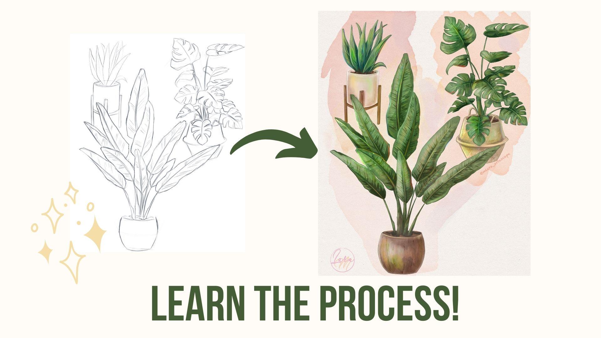
2. Sketch: Hey guys, and welcome to the sketching phase
of this class. In this lesson, I
will take you through the whole sketching process of free different houseplants. And I will tell you
what I'm thinking about when drawing
inanimate objects that I wish to Stylize
and that I wish to look colorful and full
of life in the end, if you have seen my
previous classes, you should know by
now that I'm more of a character artist rather
than a prop artist, however, I feel like every
artist needs to go outside their comfort zone and tackle something new,
something different. Personally have never
drawn plans before, but I felt confident
enough to be able to use the
art skills that I learned during the ears and the flight amount of clearance
instead of characters. If you think about it, plans
should actually be easier to draw ten people because you
don't have strict anatomy. You don't have proportions that you need to
be careful about. You don't have expressions that needs to be drawn and so on. But what you do have is a challenge when
drawing plants is knowing when to
draw plants details and when to choose
to draw just noise. For instance, in the first reference
picture that I picked, I don't especially like the middle area with
so many leaves. So I will definitely leave some out and change the
position of some others. This is because I
want the silhouette of my plants to be readable even without someone's single the details that
will come later. So similar to what I do
when I draw characters, I tried to measure
the proportions between the plant and the face. And then for the plant part, I tried to see what
are the biggest shapes that create the
silhouette of the plant. Then I sketch those leaves that capture the most attention. We are not adding in any
details to the leaves yet, we are just drawing
the general shape. This is the skeleton
of our drawing. I feel like too many beginner
artists feel like they need detailed to the max the first
small parts that we put on paper even before having the skeleton of the
drawing greedy. But if you do that, you will simply have some really detailed
piece floating on the canvas without
something to bound them together onto one subject. So first you should sketch the overall subject
by using big shapes. Then you start refining
the sketch and only later when you add all
sorts of small details. In phases, also the phase
where you capture rhythm. Maybe your object is really
bouncy or really stiff, very organic are very static. The sketch should be the part
in the process that is so free and draw that you can actually feel what
you are drawing. After I have two large
shapes in place, I will start working on the
line of the leaves and maybe add some small holes in the
leaves everywhere in there. I tried to respect into some
degree the reference photo and address some of the
most eye-catching leaves, while others are totally
replaced and made up. I create depth by making
some of the leaves more to the front and
others to the back. Somewhere above other. The distance will be later
shown through shadows. Okay, so now I set this sketch layer side and create a new layer
for a new plant. This one is rather easy, but I still wanted to do it. I spent some time working
on the base and its holder, and then I start to
drawing the leaves. Compared to the previous plant. This one is quite
straightforward. The leaves don't have much detail and
neither does the base. Now I want to play around a
bit with the composition. I'm trying to obtain a big, medium, small kind
of composition. And I move them around the
canvas until it looks good. When I'm satisfy, they start
working on the final point. I want this one to be the largest and the
leaves will be the most eye-catching due to
all the texture on them. Just like before I start by
taking the proportions and trying to figure
out the composition of the final element. I want the leaves of this
one too spread out quite a bit and cover parts of
the other two plants, but without overshadowing
them completely. More like making them feel
part of a composition. I'm still drawing
large shapes to get the feel of the plant before
jumping into details. Don't be afraid to make use of your digital tools when
working on your composition. Multiple schedule around
skill elements, rotate them. You can even use
Liquify to adjust some of the wonky shapes
you are in control. Right? So we are nearing the
end of this sketch phase. I will let you watch the rest of the video and I will meet
you on the next part, the line art phase. See you soon, guys.
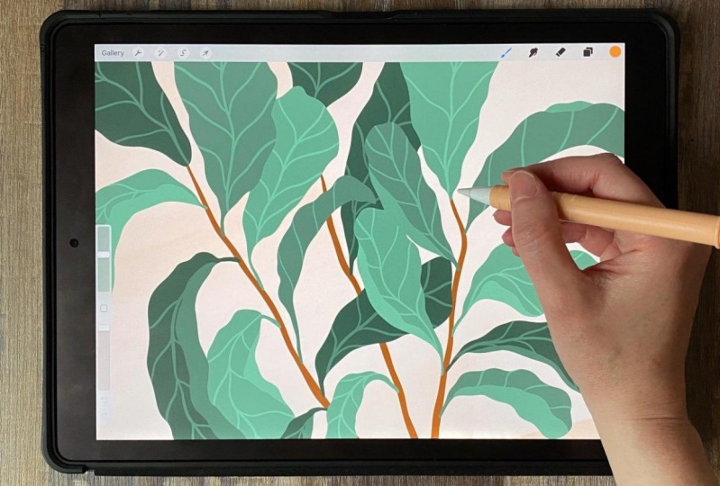
3. Lineart: Hello guys and welcome
back to the class. In this lesson, we will
pick up where we last left off and start
refining our sketch. It's getting a little
dark around here, but hopefully this
won't take too long. When it gets too dark
to keep filming, I will switch to
screen recording. If this isn't the first
time you watch my classes, you probably already know
about my customer liner brush. But if you're new here, this is the brush that I
always use for my liner. It's creamy, It's smooth. It has an awesome
pressure sensitivity and it helps you
with line weight. You can get it for free
for being my students. And you can simply
now a little bit from the resources section. When I do the line
art overdrawing, I first said the sketch layer to a lower opacity and create
a new layer above it. Then I essentially
start tracing. Line variation is important
when doing the liner because it can create
more areas of interests. It can create the impression of depth and the
impression of light. Procreate is also
the best apps that I know for facilitating
the liner process. It helps to create perfect shapes and lines
by holding down the pen on the screen after you finish scribbling
the wonky shape. And then the shape
menu will appear. I use it the most in perfect
circles or streak lines. I will let her watch
the rest of the process now and I will meet you again
on the base colors lesson. I will show you how to
create a watercolor wash, how to use a paper texture, and how to select your
colors for your piece.
4. Base Colors: Hello guys and welcome back. In this class I will
show you how to quickly block in the
colors and how to obtain a really nice wash and a watercolor background
for your piece. In the screen recordings that I usually make in my classes, you'll always see me using the Lasso tool and filling
in the shapes fast. I believe that filming the whole tablets
at this time might give you a better insight on how to actually use the tool. It's a lot of pinching, zooming in and zooming
out and having the color fill activated so
you can see the colors fast. It also helps if you try different colors while still
having the, an active. Now because I want to
sketch to be presented. I want to give it a nice
watercolor wash underneath. So I browse Maxwell it nice
watercolor max pack and mess around with
different brushes to see what kind of
effect looks better. Then I take the
paper texture and put it as a background and set the watercolor layer
to multiply so that you can see the
paper texture underneath. I'll put the paper texture in the resurfacing in the
resources section as well. In case you want to
play around with it. Because I wanted
the plants to have the same watercolor
paper texture. That means that I will
have in my layers on either multiply or overlay so that each layer will
build upon the other. Will let you watch how I choose all the base colors and
then we will go into more detail in the
next two lessons, shading and lighting. Make sure to be there.
5. Shading: All right guys, now we
start the shading process. Some of you may have skipped
directly to this part, but I strongly believe
that without a good base, a good foundation, no matter
how good your shading is, the final result
won't be satisfying. That means the short recap is an ordered in case you
skipped previous parts. I need to let them know
that my base colors are all on either multiply
or overlay layers. Each part of von drawing
on a different layer, the face, the leaves, and one. I chose to make the likeness so that the paper texture
will be visible. Because I want the
soft traditional way. It will create separate
multiply layers for each part of each plant
and start shading. I want all the plans
to build it from the same direction from the upper left side
of the drawing. I need to keep that in mind
whenever I create shading, since it's directly
affects what are the darkest part of the
drawing will be when shading, keeping in mind, what
is the volume that you are trying to
depict is this fear? Is it the cylinder
may be a cube. Then keep in mind
that the material, is it something reflexive
like glass or golf? Or maybe it's something
math like a wooden table. In my case, I'm trying to create the ceramic cylindrical
debt has the analytics. So the base will be darker on the edges and quite
lit on the middle. Some very light far to be on the upper edges where the
light is coming from. However, the wooden
parts will be more cohesive since what is
not the shining material. So neither will the
shadows be extremely dark or delight, very white, unless the light
source is extremely close and we'll
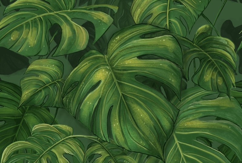
create deep shadows, but that's not the case. The leaves are sort
of reflective and their darkest parts will
be around to the middle. But for now, I wanted to create a dark area on the base
towards the roots, and they will later come
to darken the details. I also created some
shading on the right side, the one that is
farther away from the light will also combine green shading with
blue shading to create more depth and more
color variation. For deeper shadows. Instead of using the brush, I will use the lasso
tool and also create some details on the
leaves for this plant, most of the shadows or
towards the middle of each leaf and where there are leaps casting shadows
on other leaves Onto the next plant. This plant waste has a really nice texture
in the photo reference. So I will try to
obtain something similar and create some
marks on the base as well. I use textured brushes to get the effect I want and I try not to create too much contrast. The leaves of this plant
are only the wavy, so there will be some shadows on the edges of the leaves
as well as on the window. Later on, we will also add all the little things that
make this plan so pretty. But now we are sitting the
general shadows of the plan. Before diving in deeper
in this shading, I want to alter the colors of the leaves and make them
a little more yellowish. Okay, this has been there. For starters. I want to read the details of the
leaves with the brush, but instead of covering all
the leaves with small lines, I would choose only a
few areas to do that. Because the human eye
will automatically assume that the same picture
is on the whole leaf. But in art, creating lines
on the whole leaf will be too much detail and they will take away the special
effect from it. Now to create deeper shadows, I will also use the Lasso
tool around the middle of the leaf and to create some
stronger details as well. Now that I'm satisfied
with the leaves, it's time to create some
details for the basis. Well, I have my
reference on the left, so I will do my best
on some mark-making. I will also test out some new brushes that
I got from RAAS drugs. It's the advanced flashback
in case you are interested. This is your
friendly reminder to also go out sometimes so that you don't get lost in details that can
really be noticed. Now we are moving on
to the next plant. This one has a low
one kind of face. So it's really texture. I don't think I will be able
to reproduce it exactly. But we're stylizing cure, so let's give it a shot. I simply throwing
spaghetti at the wall here and trying to
see what sticks. I'm trying different
texture brushes. Now multiply layer is coming off as a
bright orange due to the fact that the basis really
liked and set to overlay. So I will try to change that
and see where that gets me. Now that I have a better base, I will test out some more pictures
until I feel satisfied. You will see how many brushes I have that I hardly ever
use on my appropriate. Now we'll do the leaf shape. How create some dark
shades on the middle of the leaves and very lethal
texture on the edges. The lines that I will create
in the lighting video, we'll make this plot
look or special. But for now we are keeping the shading to a
minimal for this one. Before we go to the lighting
phase of this class, we will spend a
couple of minutes to change the color
of the liner. We will set our line art
layer to alpha lock, that we will only apply our changes to the
pixels of this layer. That means we can
grab a big brush and color over our lines. I tend to create a
slightly darker color than the one immediately next to the line so that it will still be visible but it'll disappear. Right? That's it
for this lesson, I will see you all in
the lighting phase where this drawing will come
together. See you soon.
6. Lighting: Okay guys, I always
like to leave the lighting for the
last part because I just know after all this time that if everything worked out well
in the previous steps, the lighting will simply enhance the beauty of the piece and it will tie everything together. But first I will have to do some adjustments,
respectively, moving gauge, plants, line art, and nature of their
respective groups of layers. I know that I want to
use a warm color for delight is because
on the shading part, I used cold colors
like green and blue. With a round brush, I will follow the shape of each leaf and create
some diffuse light. Afterwards with a smaller
brush for finer details is I will create the lighter Street on the middle of the leaves. Because I wanted to The
first find the lighting. I will try to create some yellowish portions here and they're using a
larger round brush. I also want to create
some details like making some nice lines to create some roughness to the
design of the leaves. In this face, I will
also use normal layers propelled me cover some states
or adding more details. For these bonds, I want to add some lighter vines that will give it some
really nice detail. Nothing fairly happy
with this vase. So bear with me for
awhile is I tried to create some interesting
reflexive colors, like yellow from the light
and green from the leaves. Because I want this class
to be a bit magical, I will create some
small white particles, urine, they're kind of
like dust particles. So let's do some
before and after. Before. We're going to
move on to the next blend. I will start similarly
on the second plant with the large round brush to
create the main light, also using a warm color. Using a smaller brush, I will try to then
differentiate some leaves from one another by equating
the lighter contrast here, they're just like before. I will emphasize the
middle of the leaf with a nice slide straight before
adding details to the leaf. In. Now to add some lights, the base I will
liken the middle of the face and then
with a smaller brush, I'll create some
details and fixture. Just like before
with a normal layer, I will add some details, some reflective light,
darkening some areas, and adding more texture
in various places. After checking the
progress so far, I feel like this plant
needs some alarms. So I want to add a subtle thing. After filling again fast
with a large brush, I will erase part
of the red light and only leave some
salt Hansel form. Now let's move on
to the final plan. First, I wanted to create
some light texture on the ways because
it's been bugging me, not be able to obtain some
of the rachel mixture. After I feel better about it, I start putting in some round
breath light on the leaves. On a different layer, I will start creating
the details with a smaller brush starting from the middle and working
towards the edges. Creating this lines will
add fixture to our plant, but it's important not to
exaggerate when adding them. Not every leaf will be equally important in our final piece. Now let us move on to
the base again and put some light on some
certain areas. Again, we will try to keep in mind the texture of the base or rather the basket and not
exaggerate with the light. I'm adding against the
small dust particles to every leaf manually. I feel like this leaves me
the lethal more attention. So I'm trying some texture
brushes on some of the leaves. This is about it
with this plant. Now let's check them
all again and see if there's anything
else that we can do. Finally, we will create some adjustment layers before
calling the BCE writing. Sometimes it's
necessary, sometimes it isn't only by trying, we will see how we can
enhance more work. That was it for this class. I will see you on
the final lesson where I will give
you your court. Be there guys.
7. What's next?: Congratulations on
finishing this lesson guys. You did really great and I'm
sure that now you will grab your tablets and start
exercising growing plants. Because let's be real. If I managed to draw some plants when all I'm
drawing our characters, I'm sure that you
can do with two. What I want you to
do is search for one house plant on Pinterest
and start sketching it, coloring it, add the shading, the details and the light. Then whatever you do, don't forget to submit
your drawing in the project section
so that you feel demonstrate that the
flipping the work. Not to me of course, but to demonstrate
it to yourself. If you are following tutorials, you should spend one
hour to actually try to apply the new knowledge
and make sure it sticks. That means that guys, if you'd rather draw characters, I've got you covered. I'm currently at the beginning
of my longest program yet, the Character Design
Crash Course. There are two classes
out already that are breaking down
everything you need to know about character design. Next will be a class about
character expressions. So don't forget, follow
me to be the first one to know when the next
class will be out. Stay safe and keep
creating. Bye.
 Lara Militaru, Digital Illustrator & Coach