Transcripts
1. Intro: Hey guys and welcome to my
class on how to draw mermaids. I'm so excited to teach you
guys how to draw mermaids. It's a really
awesome subject and quite popular one to murder
me just ended a few days ago, but I'm sure that you guys
would love to tell them at different times of the year because they are just
simply fun to draw. So in this class, I will
show you from sketch to finish how to create this
beautiful illustration. Well, beauty is subjective, but you know what I mean? You can adapt it
to your own style or draw along with
me on that note, let me tell you what your free
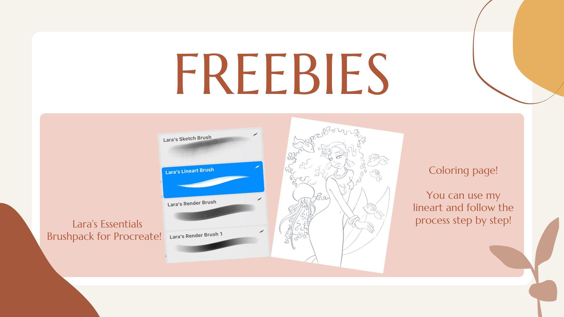
gifts are for this class. As my student, you'll be able to download my essentials brush pack and you can use my most favorite brush,
the liner brush. Also for the first time, I will be giving you for free the line arc
of this drawing in a PNG format so that you don't have to spend time
doing it yourself. And you can just
focus on learning how to color from my class. Find this freebies in the
resources section down below. Now let's see what you will
learn from this class. I will start by explaining what grayscale is and how to do it. How to add the base colors without getting a Monte aspect. And then how to do the
first layer of lighting. How to add contrast, how to create an underwater
background and make your character look like it
belongs to its surroundings. And finally, the
finishing touches. It's a lot of ground to cover. So get your iPad charged, make a coffee or a fee, and we can get started. I will be using Procreate
for this class, but it's not
necessary to do that. If you have it, it will be easier for you to
follow what I'm doing. Obviously, you will
also need to do the assignment because
how else will you grow? Draw your own mermaid
or color along with me and upload your art
in the project section. I can also give you some personalized tips
if you do that, let's also connect
on social media, you can find me on TikTok, which is slowly becoming my main platform
seeing is how you are over there enjoying
bite-sized content. But you will still find
me posting on Instagram to and engaging with you
all on stories and VMs. Finally, you will of course, find me on Skillshare where the Character Design Crash
Course is still going strong with one new class being released
every single month. Alright, so that being said, let's get started, guys.
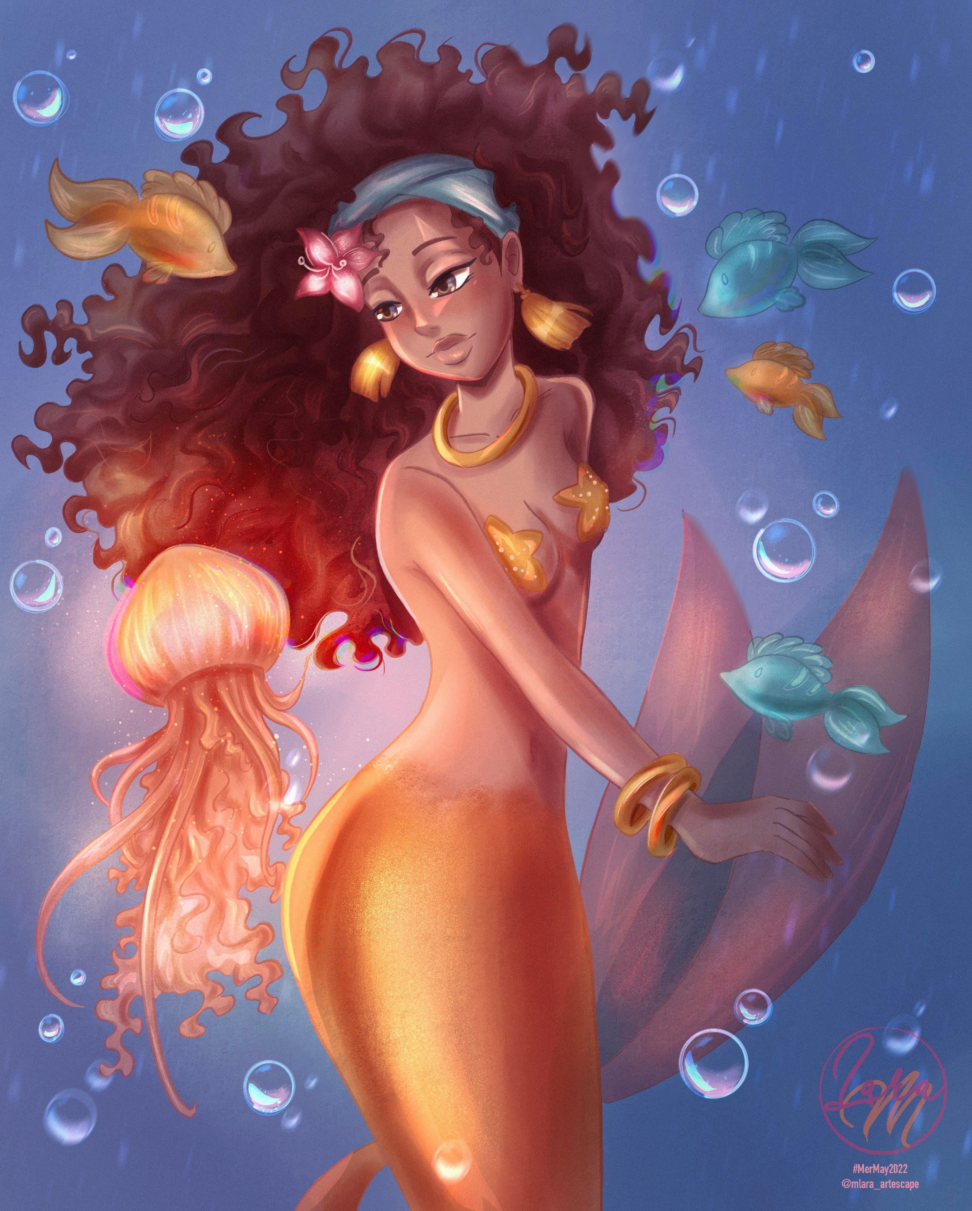
2. Lineart and Grayscale: Welcome to the first part of the class where we will go over a few line art pointers
where I will let you know what brush I use and how
you can use it as well. Also, we will go over
the basics of using the gray scale method and why
it helps you with your art. Alright, so as you can see, I already have my sketch
finished and I didn't want to take time from the class with the
sketching phase. But if you do want to see
that there are a lot of classes of mine where you
can see me sketching. I especially recommend
the first-class of my character design crash
course where I show you my process of sketching
the character from a fairy tale based on its
written description only. Now back to the current class. I think it was
mentioned in the intro, but this artwork is, is barred by Carolyn
Piotroski's draw this in your style
challenge on Instagram. And I really needed that extra
push to get into mermaid this year until this challenge
showed up on my feet. I wasn't sure whether I
should do Mermaid this ear, but not having to think about the new design which I
wasn't in the mood for, really got me going. So you can see that I use the reference
option in Procreate and book Caroline's or
regional art work on the side. As a constant reminder of
the Mermaid that I have to draw now in Norfolk to have
a nice clean line art. I like to use a brush that has a good pressure sensitivity. And the good stabilization. Stabilization basically
means that you feel like aligns cursive and it flows
on the canvas. So to say. You can always modify that
from the brush settings. If you don't have
too much experience with using brush settings, you will find a brush that
I use for line art in the essentials
brush back that I'm giving away for
free in this class. You can find it in the
resources section of the class. So I already started the
line art in the video, but you can see that by
lowered the opacity of the sketch and on a separate layer that
comes above the sketch, I start tracing the sketch
with a nice clean line. Now let's address whether you need to have a line art or not. The short answer
is no, you don't. The long answer is
that it's a choice and it depends on the style
that you are aiming for. Generally people who don't
use a line art and the only rely on the sketch which they
are later erased Anyway, those artists tend to go for
a more realistic approach. I'm not personally into
that style for myself. Yes, I appreciate the
stylized realism, but I don't find any
pleasure in doing it myself. So my art style is fully stylized and it takes a lot
of inspiration from animate. Therefore, not having a
line art that goes against what has always
inspired me to draw. But everyone is different, so don't be fixated on
having clean lines. If you feel like you
don't need them. I will let you watch the rest of the line process and then we'll check back in again
on the gray-scale bark. Okay guys, so we
finished the line art. Now it's time to
grab our Lasso tool, have the color fill
option activated, and start selecting
our character. Now you can do it in
one go instead of taking it piece by
piece like I'm doing. But while I was filming, I was in a cafe and quite an uncomfortable
position with my hand. And they kept closing the
selection by mistake locks. So I decided I should take smaller chunks to
fill in with color. After we've finished selecting the whole character and
filling it with a light gray, we will make a separate
layer above this one, set it to multiply and start putting down some
ambient occlusion. Ambient occlusion is
the general soft shades that the character would have. And I'm deepening
get a bit depending on where my light
source is coming from. The jellyfish to
be a light source. So the shadow will be
mostly on the right side. This light shading, I'm using a hard round brush with a
slightly lower opacity. In certain places, iPhone
smudge the shading a bit. It doesn't matter if it turns
out soft in some places because we will link there
in force our shading anyway. Alright, so one last
thing to do before moving on is we group the
layers together. We flatten them into one layer. And then using the curves menu, we will adjust the layer
to give it a pinkish tone. Something between
pink and orange is my preferred shape because it helps a lot with the
base colors later on. It's like having a glaze
underneath your painting, like the old masters did, or like the blog under our skin. It gives off of
vitality and the voids, the muddy effect that
you would normally get if you use the
grayscale as a base. Okay, so that's it
for this lesson. I will see you guys
in the next one where we will lay
our base colors.
3. Base Colors: Welcome back guys. Towards the end of
the last lesson, you saw me testing
a small portion of skin color and I
liked this month, so I will go with it.
To recap a little. We have our gray scale
layer turned pink, and I explained why in
the previous lesson. Now, we will make multiple layers that
will be set to multiply. Then we will this help colors that we want to
use in every area. King Herod fail and so on. If we want to lighter colors, you can either case
you're multiply layer and change the mode of the fill
layer above to overlay, then decrease the opacity until you obtain
the desired color. So you will have a
multiply layer below. And the same layer which was duplicated that is coming above. But you are turning it to overlay and you are
decreasing the opacity. Or if it's a really light
color, what you want, you can make the layer into overlay from the very beginning. I usually do this when
I need almost white, like for the whites of the
eyes or different accessories. Enlarger to move fast with
filling in the colors. I used the Lasso tool with the color fill option and select each area over
different color, also, each different color, we'll usually stay on
a different layer. In the next lesson, we
will talk about shading, so I will let you
guys finish saying this process before jumping
in on the next lesson.
4. Shading: Welcome back guys. In this lesson, we will cover a lot of the artworks progress, including a simplified
explanation of how to shade curly hair. If you want to see
a detailed version, check out this older class of mine that was quite popular. But I will try to cover a
few basics here as well. Part of the reason that I wanted to jump in on this challenge was exactly because I miss
drawing curly hair. So let's jump right in. Most of the shading
will be done on separate multiply
layers that will be clipped to the
base colors layer. Occasionally, I create
some areas, Normal Layers. I will start with the
shading the hair and cover most of the hair with
the hard round brush. Then in order to
obtain some texture, I use the damp brush from
the painting presets of Procreate as a smudge brush
and just smudge around. Before moving further,
we detailing the hair. I will also clean up this Kim. Now that I cleaned up, it's time to grab
my line art brush and on a different
Multiply layer, start creating curlies, creeks of hair all
over the place. After I finished drawing them, I will blend them in with the painterly brush from last draws, essentials,
brush back. Now to take a break from
the hair and reset my eyes, I will start shading
the tail and the body. Nothing fancy here. I will still use the
hard round brush and the damp brush to smudge
and get some pictures. Now I'm adding some
shading to the jellyfish. And I also hold my
reference from Pinterest. As you can see, most of
its effect will come from the lighting and I will add
those cool yellow accents. Time to add some
fence to the fish. We'll pretend that I did not
forget about the fence in the first place because
I didn't. Okay. Maybe I did, but it
doesn't matter because we can add them now and
copy paste them to each. That's the beauty of digital
art. No one will know. Well, you know, now, but only because I lead to moving on to the accessories, we will add some
nice dark accents to the earrings and smudge with cross, cross painterly brush. Now let's do the flower and then we will move on
to the next step. I will admit that I
hate drawing flowers. I love having
flowers on my desk. I love seeing flowers, but I think drawing them, which means that I need
to exercise them more. Maybe I will make up class about that too,
quite figure it out. We finished putting
down our main shading. So this is the perfect
moment to color our lines and make
them more subtle. Line art layers to Alpha Lock and pick up the closest
color to the line, or a slightly darker one
and colors over your lines. That's it for now,
but make no mistake. This is not the final
shading that comes later. After we give our drawing some contrast and create
the underwater background. But be patient, we will get there in the next few lessons. Okay, so I will see you
in the lighting lesson.
5. Lighting: Welcome back guys. This is where a lot of the illustration
comes to life and we will later perfected in
the contrast listen. So I want to start by
trying a gradient layer and see if I can already get
a nice thin of color. You do this by getting
your coloring so far in the line art on a single layer and then duplicate the layer. Go to the Adjustments menu
and choose Gradient Map. Tried to go to the selection
of gradients that Procreate has to offer and choose the
one that you like the most. I tried the purple
gradient and reduce the opacity but did
not like the results. So I eventually the liquid,
the gradient layer. Now it's time to actually
get into lighting. I pulled up my reference of the jellyfish and on
an overlay layer, I start creating the
light yellow accents, which I will afterwards blend
with the painterly brush. Then I will grab an
airbrush and give a nice yellow gradient
to the lower side of the jellyfish and
in the middle of its body, giving
translucent effect. And because the
reference also has some things beneath
the yellow highlight, we will add the two Using the same thing. I will give a similar thing to the hair that is closest
to the jellyfish. And because the
jellyfish is also very close to the mermaid tail, we will proceed into adding the yellow soft light
to the tail as well. In order to relieve volume. We won't only put the light to the exterior of the tail
close to the line art, but we will also do that
towards the middle of the tail. Leave a darker shadow
in-between the two lights. Now let's keep up first flighting to the
accessories as well. Nothing complicated for now. We will then move to the tail
and clean up. Afterwards. We can now do the
lighting for the fish using the nice
turquoise blue fish. And the same meal was
before for the Golden Fish. Adding some soft light, the flower in the Harris. Well, once again, I'm
reminded how much I dislike drawing
flowers, but oh, well, now we will use a new layer
set to color dodge and use the hard round brush with a lower opacity and create
some harder lighting. It's good to alternate between soft and hard
shadows in order to avoid the airbrush
look at the end, which is often associated
with beginners. One thing that I
like to do to give even harder edges
to my lights is to erase part of the
lighting and create a really hard edge on the face. I also like creating the
small triangle lighting, which I also obtained by using the eraser
for crisp lines. You will now see me selecting
various places with the Lasso tool and create
a nice light gradient. Now with an orange color, I will give some
lighting to the hair. Now because the hair is
currently it won't have too many hard lighting areas because the fuzzy hair
diffuses the light. Unless there are some
really defined hair strands like around the face, there shouldn't be any eye
grabbing light in their care. So we will start by giving
a gradient to the edges. Now let's add more life
to the accessories, like the earrings
and the bandana. You can see that
on the bandanna, I like to create fast
shapes with the lasso tool and then come with a brush
and softly create a light. I don't use the
color in this case because the light would
look almost white. This is a more subtle approach. Now I want to give some nice
highlights to the fish. It's the small details like
this that are really cute. The park where I'm liking
the eyes and the face. I liked putting some
nice white highlights on the lower lip. Then separate the chin
from the neck with the highlight and adding some cute triangles
of life on the nose. As I mentioned before, wherever there will be
highlighted on the curly hair, we will later diffuse
it with a smudge brush. So basically, we are giving the illusion of highlighted
clumps of hair. We will add a few
more highlights to the body and the fish. And that's pretty
much it for now. They illustration is, however, not yet finished because after adding shadows
and highlights, the next thing to do is repeat. That's where the
contrast will come in. I will see you in the
next lesson for that.
6. Contrast: Okay guys, let's go over
what we have so far. Starting from the base colors, we added the shading, which defined our
illustration a lot. Then we added our
first lighting. Now, it looks nice and
we could stop here. But we want the
difference between beginner artists and let's
say intermediate dark. This is that the first
category may want to continue, but if don't know how
does resulting in quite a difference between the final result of the two different
categories of artists. Contrast is really
what beginner artists tend to not For it
into their art. Contrast is essentially making your darks darker and
the lights lighter. I like to start by making the hair around the place darker with a large brush on a
layer set to multiply. This already gives a
different vibe and you can feel the depth even better. Now, moving on, we will do the same for the tail and add some darker orange here. Now I want to clean up the
face of bit before moving on. After cleaning up,
I want to make the darker shadows first
like around the Niklaus. And because I'm
trying to be careful with not adding to my shading. I jump around to
different places. Now I want to add some
depth to the eyes. And this looks amazing. Be careful not to darken
your illustration too much. And if you ever have doubts, step back from your drawing and take a look again the next day. I think you'll get the idea, so I will let you watch the shading process for
the lightened phase. We will talk in the next lesson, Where are we will
also discuss about the underwater
background. See you soon.
7. Underwater Background: Hello guys and welcome to the
final part of this class, probably the one that some
of you expecting the most. It's quite tricky to incorporate the character into
the background and avoid the feeling that the character was
copy-pasted on background, but doesn't really belong there. So let's see what we can do to avoid that and create harmony. First thing that I do is
create a multiply layer above the character and with a large brush,
create the vignette. That basically means
we will create shadows in the exterior
of the illustration, which will bring attention to the center point of
the illustration. In this case, the center
point is the jellyfish, which shines on the mermaid. So her face will be where our
eyes will next be led to. This might be a good time
to explain a bit the composition that was fought
out for this illustration. The eyes of the viewer are supposed to start
from the jellyfish, go towards her face than on
her right to the free page, down to her visible hand, up her arm, and from the
shoulder back to her face. Basically like a spiral. But it all begins
from the jellyfish. So we need to make it catches on a separate layer set to overlay using a
bright coral pink, we will create an aura
around the jellyfish as a tip for when you are using Overlay Color Dodge to
create flows like this. The darker the background, the brighter your glue will be. If you have a light
background with the overlay or color dodge layer
won't show much. Okay, so in the video, I already started
preparing the next step, which is the bubbles. I want to add bubbles for
a nice touch of magic. So I will show you
how I'm drawing them on a separate
layer set to add. Using a hard round brush, I start creating circles every hearing there's a
faster process. You can copy some of them
circles already made and place them wherever you
want to place your bubbles. Now create a new layer and
with the lasso tool creates a semicircle thing in the lower each circle
that you previously made. I will choose the mold of the layer later on
and you'll see me do a combination between lightened
layer and an added layer. I want to diffuse the
upper part of this blobs. So I choose the painterly
brush and blur out this line. It's not mandatory, but
I think it looks better. Now on top of this blogs, we will make a smaller
lies on a separate layer. Remember what I
mentioned earlier, that if you want
dislike and be visible, the background
needs to be darker. That's why it's necessary to
have the first blob colors. I chose pink because
it's supposed to reflect the jelly
fishes being polite. But depending on the context, you can do blue, purple, or whatever you want. Now, on a new layer, we will create an
upper highlight and we want it to be blue. Notice for all the bubbles. I now want to add some extra
detail to each bubble. So I will create a new line
using a fine liner brush, and I want to give
it a blue stem. Thanks. Finally, I will add some
magical sparkles because I liked where something a
little bit glowy like this. Now I want to create
some depth so I will keep all the layers resized to duplicate it bubbles and arrange them on the canvas. I will also add
some motion blur to this bubble to make them look like they are
way in the back. We are done in the biggest
part of the background. Now we will start making small adjustments
here and there, but these adjustments as a whole will make
the difference. So let's start by diffusing sunlight on the
hair and the fish. Now we will add
lights, super eyes. I really loved this part. It's where I draw
this nice circle around for a few pills as if
she was facing a ring-like. We will also add some extra small highlights
around the eyes. Then we will enforce
the edges of some of the existing
highlights on the face. I also want the fish to
be a bit more visible, so I create a subtle
glow for them. Now let's group all the layers and see what we have so far. We will also need to bring up the solid blue
background from the envelope in the group before we merge all
these layers together. Now, all that's
left to do is to be patient and try
final adjustments. Starting with a gradient maps. Play around with the options, set the gradient
players to multiply, overlay or just lower the opacity and see
what you like most. Thanks. I will also create some small details
with the liner brush, such as strands of hair or
accents on the jewelry. Let's also not forget to add the details on a
starfish from her chest. All we need to do in
the end is to add a bit of noise to create them. To our illustration. I also decided
last minute to add some chromatic aberration on some parts of the illustration. And that's pretty much it. Now let's see you guys
on the project list.
8. Project: Congratulations for
finishing this class, guys. I'm so proud of you. It really shows that you are making an effort into growing as an artist and that you want to learn new things all the time. We went through a lot of
information and a lot of different stages
of this illustration. Remember to trust
the process even when you're drawing
isn't exactly moments. Because I sure have
a lot of moments when I'm seeing my
drawings this ugly, but I keep telling
myself to keep going. The process is strong. It's tested so many times and as long as you are happy
about your sketch, which is basically the
foundation of your illustration, the process should offer
you a satisfactory result. And don't forget to download your freebies if you
haven't already. As a reminder, you can get my essentials brush pack
and the coloring page. Also don't forget
to work on your art though the assignment and submit it in the
project section. If you post it on social media, don't forget to tag me any shares and recommendations
to your friends. Especially appreciated. Whenever you have
doubts or questions, feel free to message
me on Instagram. A lot of you did this
before and I love to offer more insights into
the drawing process. Now I'm off to prepare
the next class for the Character
Design Crash Course. While we wait for
that one to come out, feel free to check the
first three classes of that series on Skillshare. Stay safe and keep creating. See you guys.
 Lara Militaru, Digital Illustrator & Coach