Transcripts
1. Intro: [MUSIC] Hey, everyone. My name's Will Elliston and welcome to my Skillshare class. I've been a professional
artist for many years now. My painting skills
have been growing throughout my career
from an early age. Watercolor has been my
favorite medium ever since I was given a painting
set as a child. I've been fortunate
enough to take part in many exhibitions
around the world, I won multiple awards by well-respected
organizations that have been featured in a
lot of art magazines. I started off my career
painting wildlife. After having success
selling my originals and thousands of prints online, I decided to pack up my paints and brushes and start
traveling the world painting. My style is modern and I tend to grasp the essence of
what I'm trying to paint whilst allowing freedom and expression to
come through by simplifying complicated
subjects into easier shapes that
encourages playfulness. Today, I'm going to teach you my process for painting birds, although same aspects can be used for wildlife
or any subject. I also experiment
with a variety of different techniques
and texture you can achieve with watercolor, whether this be through
using dry brush, sponges, or even
salt techniques. This gives your painting
an extra level of depth. It's going to be an
easy-to-follow step-by-step guide whether you're a beginner or a more advanced artist looking to revitalize
your painting techniques. This way of painting is a lot of fun because it starts off
loose and expressive, then you can decide how
much detail you want to add later on into
your finished piece. This class covers it all. I'll explain which supplies I use as I use them
throughout the painting, including paint, color
choices, brushes. I will start off with
an outline drawing, which covers how to
create a composition ready for the painting
to go on top. I'll cover how to decide
on what color to use, how to mix them,
replace them where. What makes watercolor so
special is that they can achieve effects that can be
created in any other medium, from being cautious in color gradients to
smaller details. I'll show you these
various brush techniques and various other tips
and tricks along the way. I'll explain how you
can use mistakes or happy accidents
to your advantage, taking the stress out of
painting and having fun. When you enroll in my class, I'll give you a set
of photo references you can use for
your own paintings, including the one that I'll
be using for my painting. I'll also include a
set of my paintings of birds as a guide to help you
when you can paint yours. I'll also included my
very useful color charts, we should use it for choosing
a color and mixing them. I'll talk about that
more during the class. We'll be covering a lot today, but I'll be splitting up
the whole demonstration into little parts. It was a bit easier to digest
and take in and learn. You can call us heading over to skip ahead if
you're confident, you know where you're at
and what you're doing. If you have any
questions throughout, be sure to post them in the
discussion thread down below. I'll be sure to read
them and respond. Don't forget to follow
me on Skillshare by clicking the green
Follow button up there. It means to be the first to know when I publish a new video, have free giveaways or want to share some
of my students work. You can also follow me on
Instagram @WillElliston where I'll share my
latest works and news. Ready to learn some
new techniques and create an elegant, expensive
watercolor painting? Great. [NOISE] Enroll,
and let's get started. [MUSIC]
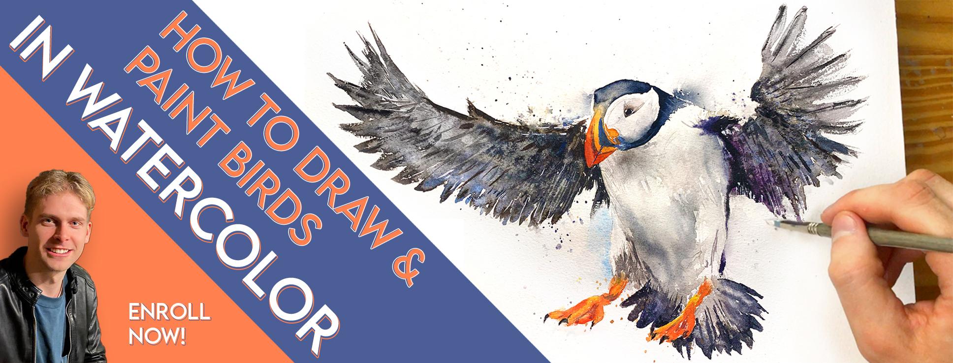
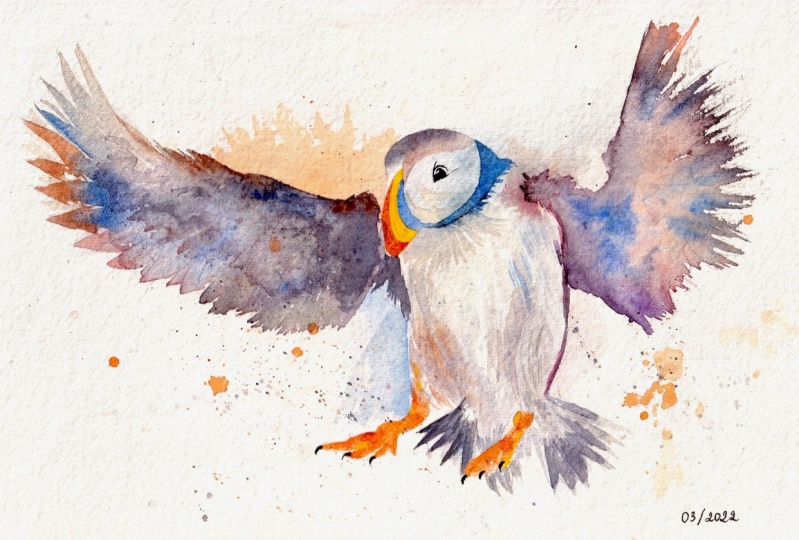
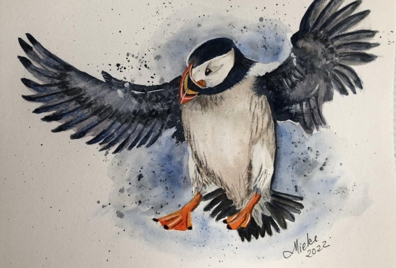
2. Your Project: [MUSIC] First of all, thank you so much for
joining me today. In this class, we'll be learning how to paint birds
in watercolor, and this will be
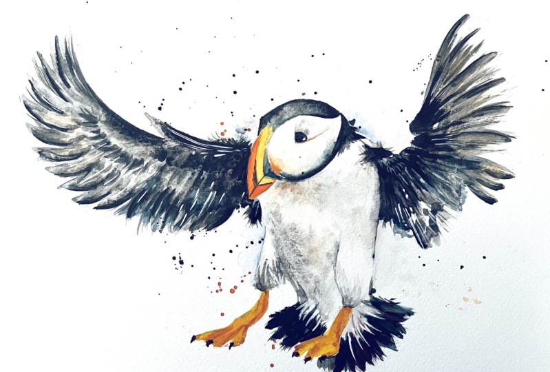
the painting that we use in the demonstration, bird puffin, one of
my favorite things to paint in wildlife. The movement of the wings and the sea spray just adds to the atmosphere and
it just looks great. Having a good reference
photo is very important. Some photos look good just as a photo whereas when it
comes to painting them, it doesn't look so good,
it's a bit difficult. I've included some good examples
of reference photos you can use in the resource tab
if you check down to link, including the one that I'm
going to be using today. You can also use
your own references if you've been inspired
by one you already have. When I paint, my
goal isn't to be as realistic as possible
but to try and capture the energy and essence of what inspired me
to paint in the first place, going back between
loose brush strokes and more refined details. You can also check in the
resource section some of my other paintings as references for your
own during this class. The techniques and methods
you'll be learning today don't just work
for bird paintings, but for all types of subjects, wildlife, or other. For example, when I teach
about dry brush technique, that can be used to convey
small feathers like in birds, but also hair, skin, trees, or even clothes. The possibility is endless with these different
techniques and how you're able to apply them
to your own work. If you're a beginner,
you can follow along, if you're a complete beginner, you can just watch and see what possibilities
and watercolor can do and get a better
understanding before you actually attempt
putting paint to paper. If you're more advanced, you could incorporate what you already know about painting. You don't need to
follow me as much, you can add what you want, as well as trying to adapt
what I teach in this lesson, and that's how you develop your own style and
individuality in art, and I love to see that. I'd love to see your results and paintings that you
achieved in this class. I really enjoy giving feedback. Please take a photo
afterwards and share it in the student
project gallery, and I'll be sure to take a
look and comment myself. You can find the gallery under the same project
and resources tab. On the right, you'll see a green button that
says "Create Project." Tap that, and once you do that, you'll have the option
to upload a cover photo and a title and write
a little description. You could include both images and write a little
description if you want. I'd love to hear
about the process and what you learned during
the whole class. Once your product is uploaded, it will appear in the
student project gallery. You can view other
students' projects here, and it would be great
if you could help support each other through
likes and comments. We all put so much
time and effort into painting what inspires us, why not share it with the world and support each
other along the way? Now that you have a
good idea of a class, let's get stuck into
it and I'll show you what supplies and
materials that I'll be using.
3. Supplies: [MUSIC] When it comes to supplies and materials, it's a very personal thing
because for example, with brushes, there's so many different types of
brushes you can choose, different brands,
different preferences. I have many, but
for this painting, I'll be using these four. The main one that I'll use,
actually, is this one, the cheapest brush
I own. It's cheap. That's okay because the early
stages of the painting, I want to keep it loose. I want to express
movement and energy, and having a brush that isn't so refined,
allows you to do that. This is a Chinese-style brush. Most art stores have them, but it's not a
brand or anything, so I can't give you a
name in terms of that. But if you ask the shopkeeper if they have Chinese
calligraphy brushes, this is what should show up. This is another brain brush that doesn't need
a specific brand. This one's a Da Vinci, synthetic size 0 brush. I use these, the small details towards
the end of the painting. I don't really use
this early on. This is quite brand specific. This is Escoda
Perla brush size 8. It's probably the
best quality brush out of all these four. It allows more control when wet, it creates a nice tip that
you can use for details, but also larger brushstrokes
the more water you add. This is a sword brush or a
rigger brush, quite long, but actually, it's only used
for very small details. Once wet, again, it all comes together and creates
a very fine point. But because the shape, it's quite difficult to control, so I only use that
for very small, fine lines like feathers
or things like that. But each of those brushes are, I'll show you what
they're used for during the painting process
a bit better. Now, this is the palette
that I'll be using. It's quite useful this palette because it has a
thumb ring there, which I can hold the palate if I want to stand
up whilst I'm painting. I have 14 colors, which I'll go into a bit later. I keep the paints very wet because almost the
consistency of acrylic because most people are beginners and have
their paints very dry. It's difficult to
pick up that pigment, and it causes the painting
to be very faint. It doesn't have a powerful
bold feeling to it. When the pigment is thicker, you can apply it easy and the
colors will be more solid. The 14 colors that I use, I won't go through them all now, but in the resource section, I have my color charts
which lists them all. Again, it's not brand specific. Any brand. My personal
favorites are Winsor & Newton, Professional series,
and the Daniel Smith. But if you're a beginner, the cheaper ones are still
okay for practicing. These colors are all in
whatever brand you want. Also with these color charts, is great because I've mixed each color with
every other color. When it comes to
choosing a color or knowing how to mix a color, you can look at
these for reference. There's 14 colors there. The other pigment
that I do use at the very end is this white
watercolor or gouache, which I use with these
small brushes just to add a little bit
of life at the end. But again, during the
painting, I'll show you that. The paper that I'll be using
is a porches but again, there are other brands
that work well, as long as it's cold pressed
and made out of cotton, those will bring you
the best results. During the sketching, I'll just use a basic
mechanical pencil and this party multiple rubber. Multiple rubbers are better than regular rubbers because
they don't leave residue. Of course, when you're
painting with water, you don't want to get bits of
residue caught up and stuck in the brushes or
paints as they dry. I'm talking about drawing, having a hair dryer
is extremely useful, because when you
paint in watercolor, you paint in different layers. You don't want parts of it to be wet or damp when you are applying a
new layer or maybe you do, so having that hair dryer
gives you control about how wet or dry you
want the paper to be. Of course, you don't
want the paper to be wet when you're rubbing it out. This is my water container, it's best to have a white one or a transparent
one so you can see how much water is being contaminated before
you have to change it. Of course, the larger
your container, the less often you
have to change it. Also, you less likely
need to change your water if you have an old rag or cloth or
this is an old t-shirt, where after you want
to clean your brush, you just wipe it on there first, get rid of that heavy paint before you mix it
in with the water. That will make your
water last a lot longer. Also a few other
things you might want to have is tissues. I always have one in my hand because there might
be a little mistake, that you need to quickly get
to on the paper or again, just wiping away if you want your brush to be less
wet, you can just dab it. It's very useful to
have in your hand. For this painting, I'm not
going to use masking tape, I'm just going to paint
directly onto the paper. But if you're going to do
with your personal technique is a bit wetter or messier and goes towards
the edges a bit more, you can create a border
by sticking masking tape onto the edges
of your paper, onto a board or what not. For this painting, I'm also
going to be using salt. You don't have to
just experiment with a few different things every
now and again and why not? That might be something
you want to have. That's the supplies
out of the way, let's get on with
the sketching stage.
4. Sketching it Out: [MUSIC] This sketching part
of the process, it's arguably the
most important part of the whole painting. Even though the painting
isn't involved yet. If the sketching
isn't done correctly, then there'll be no way to do a good painting on top of it. In fact, you shouldn't start painting until you're
happy with your sketch. When we sketch for paintings, I'll try and talk
while I sketch, we sketch a different
way to how we might do when we're sketching for
the sake of drawing alone. We're blocking out
different sections where we might put paint. Notice how I'm not
going into details yet, I'm drawing very faint
and that's on purpose. I hope you can still see, but I need to first of all, map out the larger
shapes and then I can go into the smaller ones once
I have that accuracy. To the outline, it's a bit
like paint by numbers, but you're actually drawing out the paint by numbers part. Try to make the
silhouette look good. Let's get the overall
shape, the large shapes. See how they relate
to other parts. Well, I have my rubber here, my patty rubber so that I
don't leave any residue. So now that I've got
the major shapes, I can start correcting
a bit as I see it. Start to put in the beak here. Notice that in the photo
he's eating some fish, has some fish in his mouth. I'm going to draw him without
the fish because I don't think it'll look as good. It looks more powerful without, and that's the kind
of editing you can do when you sketch out first. Artistic license. I start to go a bit harder on the
pencil now that I know where everything is going. Doing that, trying
to simplify what I see so that it's easier to paint from so that I can be a bit
freer with the paint later. Only going into details once I know it's correct and the
larger shapes are correct. Also I'm drawing a bit harder than I usually would
do so that you can see it. Because at the end
of the painting you're going to have to rub
out these pencil marks. It's hardest to rub out
if you press harder. These pencil marks are
just meant to be a guide, a skeleton to build
the paint upon. Of course, you can
practice sketching in your own time and that's how
you improve your painting. Painting is basically sketching, but with the added dimension
of color and texture. But you can skip
this video and go straight to the painting if you're confident enough of it. When it comes to painting, I probably won't even stick
very strictly to this, I'll use it as a guide, but I won't rely on it. If I want to express myself with loose brush
strokes then I will. [NOISE] Just implying details so drawing them because
we'll be painting, of course, so these are
just loose markings to imply where bits
will be going. I probably won't
even use my rubber, but I might use it at the end just to tidy up the
loose markings, but I try not to use rubber so that it forces me as a habit to see things
correctly in the first place. Of course, it's these kind
of things that take time. You don't learn
this out overnight. The tail. Sometimes I sketch quicker than this
depending on the subject, sometimes it takes much longer. Sometimes it can take a
couple of hours to do a sketch if I'm doing something quite complicated
like a city scene. But that's why I
like doing wildlife, because the eye understands
what it is much easier, and its much more forgiving
than some other subjects. You can draw wings in
the wrong proportions, or the head a bit smaller, or the beak in the
wrong position a bit. Because that less
familiar objects, your mind accepts them more than other things like
human head or human face. So it's good practicing for beginners and a good way
to learn watercolor, because it allows
for more mistakes. I think we're getting there
now. We're almost done. Now I can tidy these bits. [NOISE] That's basically it for
the sketching stage. I might crop it down a bit. Let's get on to the painting.
5. Starting the Painting: [MUSIC] I've already gotten quite messy palette
for my last painting. I don't need to clean it
because there's already, some nice graze and
colors I can use in here. It's basically a gray way. If you don't have colors
already on your palette, you can just make your
own from your black. But I'm going to do a mixture
of warm grays and cool gray or a bluey gray
and a reddish gray. To start off with I'm just
going to flip it just goes up. It's not that necessary. It just gets me into the
vibe of not being so tight. I want to be loose,
I want to feel free. I'm spraying this as
well. I didn't mind at this stage because I'm
starting it with light colors. I'm not going dark
at the moment. [NOISE] A little bit of
warmth for that part. [NOISE] These details, these
aren't neat details. These are just brush
marks that will be very insignificant
at the end. But just starting
off the painting, just doing these light
colors to begin with. [NOISE] Sometimes I wet the paper
before I even put the paint on, just because I know as soon
as I add the paint on this, it will spread itself into
the areas that I want it to. I'm always looking
for an opportunity where I can add some texture so that I can just bring
the brush rug along. Can't see anything at
the moment really, but because it's wet, as soon as I add
some more pigment, it will spread into these gaps, even if it's a bit
slower to see, eventually it will
move in there. [NOISE] Whenever there's hard lines like this leg coming out there, I want to make sure I haven't wet that area so it doesn't
bleed into that area. If you see I've got cool grays
here and warm grays here. Almost brown really.
6. Adding Splashes for Texture & Depth: I'm always checking to
see how wet it still is because just before it dries, I'm going to splash it with just pure water with no
pigment or paint on my brush. It's going to create
some nice effects. Always takes a few
seconds for the effects to show up when you splash
it with paint like that. Also, this might be a good time to add a few
background spatters. I like to add a few black background
splatters because it adds a bit of depth. Don't know what it
could be. Maybe it could be water spray. It doesn't really matter just having little
splatters, some thick, some thin [NOISE] just gives
it a bit more movement, a bit more action. [NOISE]
7. Negative Space Painting: What I'm going to do here, I can see on the
photo [NOISE] that the background is lighter there than the bird
because the bird is white. [NOISE] I'm going to
make that fade out. I'll just make that edge of the puffin a
bit more obvious. These things might be
difficult to see now, but by the end of the painting, it should be a bit more obvious. I like to choose blue paints for backgrounds because cool
lights recede in the distance, so you're more likely
in nature to see cool colors like
blue in the distance than warm colors,
generally speaking. [NOISE] I'm going to warm it up with
some burnt sienna. Still keeping up the
grays, but even warmer. [NOISE] It doesn't have to be
burnt sienna though, it can be whatever
color you want. Basically, keep gray
as the main color and add whatever color you prefer just a tiny little
touch of that color into it. You don't need a
lot. [NOISE] A lot is going to mess with the
brighter colors quite yet. I'll do those last. [NOISE]
8. Timing & Wetness of Paper: I'm going to take some very, as this area is getting
very close to drawing, I know that the paint
won't spill anymore. If I do quite a thick
paint like that, I know it's not going to bleed all around into the rest of it, but it will allow for
a nice smooth edge. I'll just put that in there. These things, you might get
better over time rather than the first attempt
because you have to work out the painting. The paper is almost
dry but not quite, is damp and that's the darkness you want to
add to have that effect. [NOISE] That's just black mixed
with ultramarine. [NOISE] That's a very thick pigment, but then I can put
pure water with no, I just washed the brush
there's no pigment on that and I'll just bring it next to it and it will
bleed out like that. [NOISE]
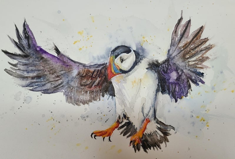
9. Wing Painting: Salt & Dry Brush: I think I'll do this wing first. I usually work from
there to there but whilst I've started that I think I'm
going to continue. [NOISE] I'm going to take this burnt sienna [NOISE]
and this ultramarine. [NOISE] That almost is a gray. Add a bit more. [NOISE]
[inaudible]. It's quite thick. Now that's going to
be my base color. I'm just thinking for a second which area isn't
going to paint in there. I'm basically going to
block in this wing. But I'm going to
stop just before it gets to those details
of the feathers. [NOISE] I'm going to experiment with something I don't usually
experiment with now. [NOISE] A little blue
there to contrast the brown and the experiment
is going to be salt. I'm going to get some purple. But the purple I've got there is just Alizarin Crimson and
ultramarine mixed together. Let's bring this out.
[NOISE] Now before it dries, [NOISE] I'll take this salt and just
drop in there. As with most parts or
techniques with watercolor, you don't see the full
effect until a few minutes later once the paint
has dried or moved. Now I'm adding in more
some darker pigment now. This is just pure
black actually. Here I'm going to go very black. For the time being, I
think that side is okay. Now I'm not going to forget
about this side yet though, because when it gets
very close to drying, again, about 90
percent almost there. I'm going to flip
it again with water and it's going to create some nice effects
that will imply detail without actually
having to put it in. [NOISE] But before I move on
to the next slide, actually, I will finish off these feathers here, just like that. I might change to a
different brush here [NOISE] because I want to create
a dry brush effect. Which means when I
drag it out like that, it creates a nice
textured effect. I think that would help imply the movement of the
wings flapping out like that. Now, I'm not actually being that strict
with my line work, I'm painting straight
over the lines. That's why it's fun
to do these paintings because you don't have to be that [NOISE] realistic
if you don't want to. You can afford to be a bit more abstract if you want to
and it'll still look okay. Now I think it's the time to splatter that with
water. It's almost dry. Let's go do that.
In a few minutes, it'll create a nice
texture there. [NOISE]
10. Wing Painting: Wet into Wet: Now I'm going to leave
this along while that's drying, and start on this wing. I'm just thinking,
before I commit to it, my plan of action. Let's mix another bay. This is a purply
gray, starting here. I'm covering it. I just have to paint it that angle
for a second. A bit thicker at the top there. I'm making sure
very carefully now, I'm not going over that beak. I'm just going to splash
it with some water. I could use some
more larger slats in general of a higher
pigment to this. There we go. These will
dry darker, the spots. I'm just going to pull up the ones that have
gone on the beak. I always have a tissue
in my hand ready to pick up any splats that
may be in the wrong place. Now, I've got that
name going on there. I'm just going to stretch
it out into the feathers. I'm getting that dark
pigment and again, taking the black and mixing
some burnt sienna in it. Then you can assume more
drops are watering there. Because I really want
to add that texture. It could be quite
messy to begin with. Then you can tidy up just with
a few details at the end, you can fix it. It's creating order
out of chaos. Brown and blue go well together
because brown is really a very dark orange and
orange compliments blue, so they work very well together. You don't necessarily
have to follow the same reference
that I'm using. Because I must admit the
reference that I'm using isn't a very good quality. It's quite pixelated. But I'd just like to pose that the same techniques
I'm using here can be applied to all well
left paintings. Starting very thick at the tips. Then using my other brush, is very wet, just
merge this into there. You can even pick
up the painting? You can see I'm picking
up the painting and just adding water
and letting it run. Really learning to
paint watercolors, learning how you can manipulate the paint is not like a critical oil where
you have more control of it. It's more about theory, I guess. There is more order
with acrylic and oil. It's a bit more
chaotic with this. Hang on, let me
just clear my mind. It's about learning the
limits of the medium. Then once you've experimented
rule the limits, you can better know how to push them and to bend
them to your will. I'm sorry if I'm
blocking your view. That's strong enough for
me to put my hand on. I'm just going to paint
the outline of that beak. In fact, I'd like the paint
around the beak to be very dark so that it makes
the beak itself pop so there's high contrast
of light and dark. I like creating soft edges because it makes it
more interesting. It needs to have
the broken up edges to create atmosphere energy. Put it upside down a second. This is just water again. I'm going to put a bit
more salt on the side, especially where the
pigment is very thick. This is what I will do, I don't really experiment
with salt that much so I thought it'd
be fun to give it a go, I'm going to put the pigment
on very thick layer. I could quite concentrated
way, put it either. I'm going to draw
it now. I'm not going to touch it a tool
whilst it's drawing, just that you can see how this dries because it will change
by the time it's dry.
11. Adding Details to The Chaos: It's dry now, and I'm very happy with the way
it is at the moment. That's what I love about watercolor being able
to create these effects that are just so unique
to any other medium. Of course, you can get
more detail in oil, but you can't create
this kind of, I don't even know the word. It just has this energy, but it's too early
to call it yet, haven't finished painting
it, anything could happen. Creating that chaos and then implying details
on top of it. [NOISE] I'm going to use some more dry
brush effects there. [NOISE] I'm not afraid to use my fingers. I could use a tissue,
but not necessarily. The same again on the other side. I'm making sure my pigment
is quite strong on my brush because it always looks darker
than it actually is, and then it dries and it
turns out to be too light, so you've got to make
sure you put enough. Make sure it's thick
enough. Make sure your paints in your palette
are wet enough as well. Those are the wings,
pretty much done. I might touch them a
bit at the very end, but for the time
being, we can move on.
12. Painting The Head: Using Gradients: Going to wet the area first, actually a little bit of
pigment so that you can see what's there and then use it to fill
in the whole area. Then once you've filled
in the whole area, you can put in more ink in the areas that
you want darker. For example, back here, it's the darkest drum brush and take a little bit of liquid off because it is too wet. [NOISE] It has to be a lot
darker actually. [NOISE] That noise. I can blend into
there. [NOISE] I try not to use black
just by itself. Whenever I do use black, I mix it with another color. Even though you can't see it when it's very
thick like this. Whenever it comes to blending it out or adding more water, it will be more interesting. In the photo, this puffin is carrying food,
but carrying fish. I want to edit that out of
my painting so I'm guessing with how his beak looks
without the fish. [NOISE] Please let me know
how I'm doing with this painting or
video if there's any way I can
improve it for you, or you want me to address
any certain things. Again, here, there is a white
edge with a background, so I'm just going to pre-wet the background and let the
paint drawer out into it. [NOISE] I'm going
to grab a tissue. Just dab that a bit
away so it blurs out. Could do that here a bit too. [NOISE] More so essentially there. That will probably be enough. [NOISE] There's a white edge there that I want to
emphasize as well. That seems to be
okay. There we go. I'll go back with a warm gray. I call them grays because their most predominant
hue is the black. Of course when they are mixed
around with other colors, they didn't look like gray. But that is the
most dominant color in the colors that I'm mixing. Have a bit of a bleed, reactivating that
blue to merge it in. [NOISE]
13. Painting The Tail: [NOISE] Now I'm going
to do these wings. I don't know what part
of the bird that is, like the tail of
the bird, I guess. Let me know the
scientific word for it because my mind's gone
blank. Maybe there's a tail. [NOISE] This wetting some
random parts just so that some of those bleed up
and create some nice effects. Then I've got to be careful not to go over the orange feet. Sometimes I do the orange or the bright parts first but
for this particular painting, I'm leaving them to last. [NOISE] Some people are against using such a small brush but it just depends on
what you're painting. As long as you get the
technique that you want, then there should be no rules. When I paint landscapes. I find it impossible to use this tiny brush to
draw the main parts. I might use it for little
highlights at the end, but it's essential
for what I'm doing here. That's why I'm using it. [NOISE] I keep on jumping
back and forth from a black with ultramarine
blue and/or cobalt blue or any other blues you
want and a brown, burnt sienna which
is what I use. [NOISE] Into this rigger brush to get
a few finer hairs in there. This rigger brush,
it's useful because it goes right to a thin point. [NOISE] Now I'm going to
dry it off again and paint the orange bits, the colorful parts. [NOISE]
14. Painting The Beak, Feet & Eye: [NOISE] Get it wet, that area, the top of the beak. We will start with similarities
to come in yellow. [NOISE] To dump it in there. There been a bit of blue there I'm going to
add some orange because yellow and blue make green and I don't
want it looking too green. [NOISE] That should be okay. [NOISE] Then here's a
bit of a orange section, and it carries down. [NOISE] Then it's actually a
very reddish-orange. [NOISE] Sorry, I'm
losing my palette. I'm mixing red with
yellow to create. It is slightly orange but
it is a reddish-orange, and I put it on there. I create a little
tiny winy white gap there just to make sure
they didn't connect. [NOISE] I bring that beak back down. [NOISE] I'm going
back to the yellow. I'm just dabbing blobs and letting it do the
work itself really. [NOISE] By dabbing in like that, and then I think
that's pretty much the same color I'm going
to use for the feet, so I'm going to go
down to the feet here. [NOISE] I'm painting those feet. It's a bit more red in between the toes if
that's what I call it again. I'm just going to
put red in between the toes and then I'll go back with the yellow to make the rest of it
a bit more orange. [NOISE] It should bleed out quite nicely. I'm never trying to
make these paintings realistic that's not my goal [NOISE] but I do
want to be able to. It's not adding detail, it's implying detail, making it obvious what
it is, it's a Puffin. I don't want it to look
anatomically incorrect. But keeping the abstraction so that I can abstract work, finding the balance between
abstract and details. [NOISE] If you just zoom down on these it won't look like
feet I don't think. But in context with the rest of the painting your eye can work it out and
it doesn't look odd. [NOISE] Just a few fun little splatters. [NOISE] The eye is dry so now I'm
going to paint in the eye. [NOISE] I'm going to again use black mixed in with, what goes we'll use. [NOISE] A warm gray, black and red, I think. That's very thick pigment there. [NOISE] Now I can wet the area
above and let it merge out. [NOISE] That's a bit too much I'm
just going to dab it. There we go. [NOISE]
15. Improvements & Corrections: [NOISE] Just looking at
last-minute details now. I think some areas need
to go a bit darker here. [NOISE] I think I do need to emphasize a bit more volume on the body, and so I'm just going to
[NOISE] wet it again. [NOISE]It's a bit too flat,
if you know what I mean. If I had a little
bit more emphasis on the shadows. See
See what I mean? [NOISE] It makes
it pop a bit more. [NOISE] Likewise
up here, I think. Maybe a bit here too. [NOISE] I'll go
blue at this time. There's a purple
thing going on there. [NOISE] Dries off again just so that I can go in with some
last-minute details like on the feet because you're
very close to the end now. [NOISE] Let's bring the
palette back up here. It's going to go in again. Let's get some darks. [NOISE] I'm going to put some blue shape here that I
just have to fill in. Cobalt blue, rather
I'm filling in with. [NOISE] Okay. [NOISE]
16. A Few Tricks for Extra Detail: Now for the finishing touches, I'm going to use some white. Well, first of all, I'm going
to get my rigger brush, get it wet, but not over wet, and then I'm just going to run some lines straight over here. Impossible to see,
even I can't see them. I'm just putting on there, waiting a few seconds for
the paint to wet again. [NOISE] Its not that obvious at all. Just small little things. [NOISE] So now going back to this white, I'm just going to apply these very white lines, not many at all. [NOISE] This not that necessary, I just like to do it. Just after I've gotten this far, so I may as well do
everything I can do at my disposal to
improve the painting. Takes a bit of finesse,
just a tiny dot, but a tiny dot makes a lot
of difference on the eye. [NOISE]
17. Final Tips: [MUSIC] Hello, again. Hopefully, now you have
your own masterpiece and you've learned some new
techniques along the way. Just before we go,
I thought I'd share a few more tips and some advice. There'll be quite
a few pencil lines of the original drawing
underneath the painting. But if you want to rub them out, be sure you use a
hairdryer to make sure the painting is completely
dry before rubbing away. Sometimes the paper can
feel dry to the touch, but it's actually
still damp inside. Your paper can wear away a
bit and get a bit filthy, which is not something
you want obviously. Here's a tip for if you want to share your
painting online. After all you've worked so hard, why not share with the world? I find some of the
magic is lost though. When you take a
photo or scan it, doesn't have the
vibrancy of real life. Don't be afraid to edit or
enhance your paintings on Photoshop on your phone app. That's how you took the photo. If you're going to share
your painting on Instagram, be sure to tag me @willelliston because I'd love to see it and give the feedback. Please check your paintings in the student project
gallery down below. Also, the most important bit of advice I can give you
sounds really obvious, but it easily gets forgotten
about and overlooked. That is to have fun. Be happy, remain
positive when painting. Watercolor can be a wild
unpredictable median. It's easy for
mistakes to happen, to get stressed, and lose
faith in the painting process. True face most of the time, I don't know whether
our painting will be successful until the
very last moment. Sometimes I feel like it's
going to be a disaster, but somehow it recovers
and still works out fine. But sometime is not.
But that's okay. Even the masters make
mistakes every now and again. Either way, all my
top paintings have come when I was painting
with a positive attitude. Playfulness and faithful
in your painting brings out the best
qualities of watercolor. You need to be bold and accept mistakes if you want to
be good at watercolor. It's in these moments
that you learn the most and improve your
painting ability. The best watercolor
artists have to deal with unsuccessful paintings
every now and then. Remain calm and have fun. Because after all, that's why we went into our investment. Remember, please click
the follow button at the top so you can
follow me on Skillshare. This means that you'll get notifications when I
published new lessons, want to give out free giveaways, or share some of my favorite
words for my students. Thank you so much for joining
me in this class today. If you have any
questions or comments, please leave them in the
discussion thread down below, I'll be sure to check them out. I hope you learned a lot and are inspired to pay more in
this wonderful medium. You can follow me on
Facebook and Instagram. But that's it for
the time being. Thank you very much
until next time. Bye. [MUSIC]
 Will Elliston, Award-Winning Watercolour Artist