Transcripts
1. Introduction: Hello, my name is
Alicia Paran and I'm so happy that you're joining me today for my Skillshare class. How to draw and paint a weedy
see dragon in watercolors. And we didn't see dragons, also known as common sea
dragons and these unusual, beautiful and magical
creatures that live amongst the seaweed beds and
are related to seahorses, in my opinion, even
more regal and elegant. They also have special features such as leaf-like appendages, which let them camouflaged
among seaweed, making them very hard to spot. In this class, I will
teach you how to draw a 3D sea dragon
from scratch. And I will also teach
you how to then lay down a very base coat and subsequent
layers of watercolor. And finally, I will teach
you how to use ink pens to add the very final touches to really bring your 3D
sea dragon to life. This class is designed more for intermediate to
advanced artists, as you will be expected to know, basic watercolor techniques, such as wet on wet, wet on dry. As well as how to lay
down a varied wash. If you would like to learn
these basic techniques. I have dedicated
an entire section covering this in
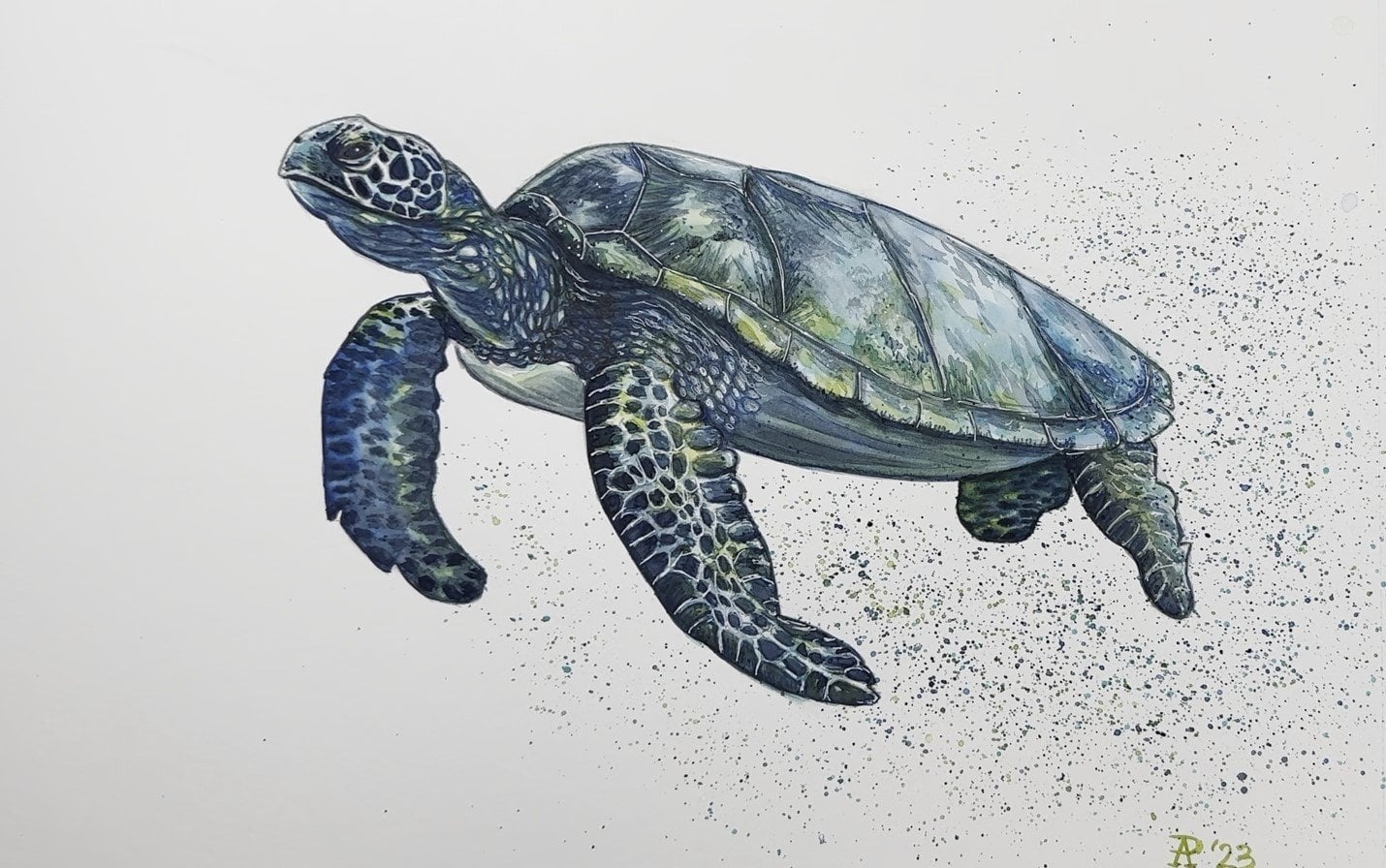
my previous class. How to draw and paint a sea turtle in
watercolors and ink. Feel free to review that class if you would
like to do this one. So if you're ready, let's begin drawing and painting a beautiful
3D sea dragon.
2. Materials: Hello. We are now at the
materials section of our course where
I'm going to tell you everything that
you need to undertake your project of drawing
and painting or VDC, dragon and watercolors and ink. So let me start first with
the paper that I use. I'm going to use this
brand of paper by Kansan. It is artist's quality
paper and as you can see, it is 300 g/m square, which is what you
should use because this simply means that it can
absorb a lot of water. It's not going to buckle
under the weight of water as you layer more
paint on top of it. And I love using this format of an A3 size bound book of paper. Simply because I have
a habit of drawing very big and I like to have
the space to work with it. And I loved that all
the papers are bound together so you can keep
all your art in one place. All there are little dotted
lines over here that assist you in tearing out
whatever paintings you want. You don't have to use the
same brand of paper as me, but I only suggest
that you use are these quality paper that
has the same weight. Next, I'm going to
take you through all the materials that
you need to draw. So I use this brand of mechanical pencils
called Pilot super grip, 0.5, which simply means that's just the
width of the lead. I love these pencils as they're
very comfortable to hold. And I tend to use two pencils at a time just in
case one runs out of lead. I also have an eraser. This one is just by
the brand state law, but you can use whatever
soft white eraser you have as long as it
erases, clean me. And here's a tool that I discovered recently that
I can't live without. This is a mechanical
eraser pen, soda. I don't exactly know
the name of this, but the brand is
Tombow mono zero. And this is such a handy tool to have because it looks
like a mechanical pencil. And you push out the
small little area of eraser that helps you erase very small lines and very
tiny areas of your drawing. This is so handy to have. Next for the painting. I just want to take
you through some of the equipment that I use. So I tend to use a ceramic palette simply
because with ceramics, it just doesn't stain
when you use paint on it. Even though most pain sets would come with their
own little pallets, I prefer to use a
separate palette that's bigger just because
you have more space to put more paints on it and large areas that you
can mix paints with. So I would highly suggest
using a separate palette. Next, of course,
you have to have water to work with watercolors. And I tend to use two
glass jars of water. The glass jars just let you see how how much paint is in your water and when
you need to change it. And I tend to work with
two jobs at a time simply because you don't
have to keep changing your water and you can
keep working for longer. I also tend to use
either paper towels or a rag to absorb the excess water off my
brushes when I rinse them, I tend to prefer to use a
rag though simply because it's more absorbent and
whenever it gets very stain, you can just simply throw
it into the wash. Next, I want to talk about the brushes that I'll be using
for this project. So this is the brand of brushes that I've
recently started using. So it's silver black
velvet and these are all round brushes and I got them in a size for a size
eight and size 12th. I love this brand of brushes
because when they're wet they still tend to retain
their very pointy tip, which is very handy for
painting very small areas. You don't have to use the same brand of
brushes that I do, but I would highly recommend
you use Addis quality brushes because it will really
affect your brush strokes. Now next, I want to talk about the pains that I'll be
using for this project. So I've decided to
use this brand of pain by Jane Davenport. And there are two
different palettes here. So this is the bright palette and this is the neutral palette. I love these paints that I discovered pretty recently too, because they're very vibrant. And these are artist
quality paints. So for this particular project, I'll be using only a couple
of colors from here. So I'll be using this yellow, which is named buzzy, which is very similar
to a cadmium yellow. I'll also be using this purple Which is very similar
to ultra marine violet, and this is called royal. I'll also be using
this dark color here, which is called Inc. which
is very similar to indigo. From Mutual palette. I'll be using this deep yellow, which is called mango, and is very similar
to Indian yellow. I'll be using this
red called Apple, which is also very
similar to a cadmium red. Next I'll be using this color, which is very acutely
named kiss, kiss, which is very similar
to burnt sienna. And finally, this jock
beautiful color called Raven, which is very similar to just
black or even Payne's gray. Now you don't have to use the
same brand of pains as me. So I've given you the names of the colors that are very
similar to this brand of pain. And I just suggest that you
use artist quality paints as well because they will really make a difference
in your work. And last but not least, I wanted to just talk
about the pens that I'll be using right at
the end of the project to add some highlights and
texture and dimension. So let me start first with this white gel pen by the
brand's Sakura Gelly Roll. And 0.8 is the thickness of the lines that
you can create with this pen is so useful and I've used it so much
throughout the years. Next, for this project, I particularly chose this brand, penn called Pilot G2. And it's a 0.7 width. So it's a beautiful
pesto yellow. And what I love about this pen
is like the white gel pen. It can stand out on
very dark surfaces. So for our VDC dragon that has lots of little yellow
dots all over its body. I test it, this pen out and it stands out beautifully
against dark colors. If you can't get this
particular brand of pen, you can try other brands as
well and of pastel colors. I would just suggest that when you are at the shop buying them, perhaps you can bring
a scrap piece of paper that has some
dark paint on it, some dot watercolors, strokes that you could lay
down before that and just test out the pen just to see that it
actually stands out. But you can also use a brand such as signal
that should also work. So this is the yellow pen that
I chose for this project. I also want to add some dark shadows and a few
outlines with this pen, which is by the art studio
graphic pro fine line pen. And it's in purple and
it's 0.5 MM width. Last but not least, I shall also be using this black fine liner
pen by fabric Estelle. It's a Pitt Artist
Pen fine liner. And it's small, which
is actually 0.3 nm. So that is pretty small, but these are just for
the final touches. So that's all the materials that you'll need to do this project. So if you're ready, let's begin.
3. Sketch - Part 1: Hello everyone. Now we're about to sketch
our beautiful 3D sea dragon. And something that I
like to do to help me with this sea dragon who
shape is quite complex. I mean, like first of all, it has this very thin, straight snout
that's like a pipe. And then it has a very
curvy body and tail. So something that I
would like to do to help me just get the
proportions right is I want to draw sort of
guideline that's going to go through the body of the Sea Dragon just so we
get an idea of the shape. So we're not like I'm confused by it and
I feel that it will help me with the
proportions as well. So I'm going to start first
with a straight line, and I'm going to start all
the way at the edge of my paper over here because I tend to draw big when I'm looking at a
reference photograph. So I like to get myself
a lot of space because I think my 3D sea dragon is going to occupy this
whole piece of paper, which is an A3 size. So I'm going to start over
here and I'm going to first draw what is a
relatively straight line. So I'll see dragon is going
to have a straight snout, I believe is what you call it. And so I'm going to just draw a little line just to remind myself this now it's
gonna be this long. And now I'm just going to
go a little bit further straight to because this is
sort of where the head is, where the neck begins. Now, I'm going to
start going down. And this is where the
neck is going to be. And it doesn't have to
be a straight line, so it's going to
be quite curved. And this is a line
that if you imagine is going through the sea dragon. But it's not going to go. So I'm going to
just do this neck, but I'm going to curve
up a little bit here. So at this part here, I'm going to start curving up, but this line will
make sense later when I start doing the underside
of it, so to speak. And now there is a very
nice obvious curve here that I'm going
to continue down. Yeah. And then it's gonna go
up again and go here. And here. Starts to become a little bit less angled and straighter here. Then it's going to at
an angle here, go up. So that's a bit of an angle. Turn here. Another angle here. When I say angle, I just mean these little
parts here, as you can see, it seems to form an angle as real change in
direction is what I mean. This is going to
go quite up here. So right now it doesn't
look like we've got much, but believe it or
not, we actually have a lot to look at here. And we can, we can
always adjust. This is a very rough guideline. So this straight
line here is going to represent the snout. And now I can sort of add a
little bit more detail to it. I can do this, the cute end of it. One of the reasons I chose
to draw this animal when I really wanted to
teach a class on it is because sea dragons, I just really, really beautiful. They are just
stunningly beautiful. And they just have this
really amazing shape. They are cousins
of the seahorse, but for me they're like, you know, even more elaborate, just very majestic
looking animals. So what I've done now is this. Now from here I can also like start doing a bit
more detail of the head. So the guideline that I've drawn is just
a rough guideline. Like sometimes it may go
to an edge of the animal and sometimes it
might just go to The through the middle. So it's a rough guideline and now I'm just starting
to add more detail like I've done the sort
of like under a chin, so to speak, like a jaw so to speak of the of this animal. It's a little hard for me to, I'm trying to relate it in, in terms of a human
body which is hard. So this, I is going to go
somewhere here like that. And I will add the
detail in later. And then there is a bit of a, a little curve here. And it finally goes up into what I call a
crest, so to speak. Like a dragons
crest on its head. So I'm just adding a bit
more detail to this. Still using the guideline
though that I've drawn here, which is very handy. So we've got a little bit of a kind of like a curve
that sticks out here. I can see that from the
reference photograph. And it's also going
to go down here. So as you can see,
my guideline is now going to sort of like the extremity of sea dragon. So over here, it's actually
going to dip down. Let me just try and
get this right. It at this stage,
we're still feeling the shape so it doesn't
have to be accurate. We can always change it later, like, you know, refine it more. That's what the whole
drawing process is about. It's about getting
a rough idea of us, is what I do before I
really dive into details, because if you don't have
a good idea of the shape, I do feel that then that's going to affect how realistic
your drawing is. Some still feeling
the shape out of it. Which is why I've
got an HB lead. So it's not going
to leave a lot of marks over here is where it's a very important point here
because I'm going to have a I'm definitely going to
have a FIN coming out here. And this part is
gonna go up here. And as you can see, I'm sort of following the guidelines
that I've given myself, but also defining it
a little bit more. So this part should
go a little higher. I'm not going to draw the
vignette as I really do feel that I would do the fins later
when everything is done, when I get the
proportions right. So I'm going to just just so
I know that the thickness, so to speak, of the sea dragon, I'm going to do
the head as well, like the top part
of the Sea Dragon. Just to get a to get
the thickness right because I don't want to
work on the bottom and then it doesn't really
correspond with the top. So as you can see, my guideline now is connecting the extremity of
the top of our sea dragon. And now I'm going to marry
the two, so to speak. The bottom lines and the top. I feel now when I look at my reference photo and
looking at the guideline that I can sort of make
this even more curvy. But the guideline has
been very useful for me. So it's gonna go down here. And I feel like there is
a bit of a notch here, like this is where another tiny little thin is going to be. So I'm just going
to mark that now. But the guideline to me
has been very helpful in just getting the
shape right so far. So we're going to
have a fin here. And I feel like maybe this fins should
be like more this shape. So I'm going to use
my eraser for that. Okay? And I also feel now looking at the
reference photograph that I can go up more, I can curve it more. And this should be a
little higher here. So this is now going
to meet over here. So I can erase these lines
that I've drawn before. Because I'm just refining
the shape a lot more now So a fin is going to be here. Well, two things actually. And I've already got
this beautiful curve going on over here. So this, this curve
should be more like that. Now I've also got something another
little thin over here. It's kind of like,
like it's tiny. And if you think
about it's sort of like when you see
a plant, right? It's like a, a new bud, a new leaf bud, so to speak. And now that I'm
looking more at my, at my sketch that I've drawn. I feel like we could
move this a little bit back because I feel that I'm just trying to
decide now looking at my reference photograph and like I've said before
in my past videos, that you don't have to follow a reference
photograph exactly. Like the whole point of art is. You're not taking a photograph. It's about capturing
the essence I feel of my subject rather than
taking a photograph. If that's the case, then
you don't need to draw it. If you are going to do
it exactly the same. It's also your interpretation. So I feel that this
should start a little bit later and maybe perhaps
be a little bit bigger. And there is a bit, a bit more of a curve
here then my guideline. But I feel very happy that I did do the guideline
because it's helped tremendously with this process. And I feel I can move
this a little bit back. So over here, this is sort of like a
diamond shape, so to speak. And from the
reference photograph, this should come
before this fin here. Now, I'm just looking back, just taking a step back. I mean, to just have
a really good look at this because I do want to try and resemble
my reference photograph. And I've just decided to just
move this slightly back. But I'm probably being a
little bit pedantic here, but I just wanted to get to really capture the
essence of it really well. Okay, so I'm happy with that
now because I do feel like, okay, the proportions
are right here. And now we have this little
area here before the tail. I can even make this
a little bit higher. And I'm just going to
now start with the tail. So this is the tail end. So I've got a curve here. As you've noticed that our, the shape of our sea
dragon has gone from thin, a little wider here
it goes down narrow. The body is the thickest part. And now we're going to taper, taper onto the tail. So one small, I can always
change the guideline a bit. Now my guidelines seems
to be heading towards the I'm just looking at
the reference photograph. I feel like this part
should be a little higher. And we can erase all
these lines later. So I'm now doing the
bottom of the of the tail. So it's going to taper
all the way to the top. Now, just, I'm not
getting confused here. I'm just going to gently erase all the lines
that I don't need. Like I've I've made it
go a little higher here. This line too. I just want to make sure
I can see it properly. And I feel like I want to
change the guideline a little. I feel that it should
dip down more over here. So then it should go
up here like that. So it doesn't have to be
this thick over here. And I even feel like
this should just kind of like do, do that. If you can draw continuous, like a continuous lines, I find, I love to break them up like, like what I'm doing here Because I feel it gives
you more control over your pencil as opposed to
just doing a continuous line. So these are all drawing skills that you pick up
just from practice. So I'm just taking a
step back looking at my at my we do see dragon feeling quite
happy with the shape. Yeah. Because it is a complex shape. And it goes down here. And it goes up here. So I'm just going to now, I'm at the stage now
where I can add a little bit more like a
details with the curve, with the curvature of this line. Make it look more natural and less just like a straight,
a straight line. So we're going to see like
sort of like little segments. If you can call them that like each part of the
tail has to have, has a little bit of a curvature over a sudden part
of the length. And this last part
here is actually more like a leaf, a leaf shape. And I can actually
see one of the fins, Yes, I just wanted
to put that in. And this is sort of
ending in a leafy shape. So I might as well just
refine that right now. And just go down
here in a second. I'm going to erase all my my lines that
I don't need anymore. Overall, I'm really happy
with how this turned out. And now, now that
we're happy with the with what we've drawn
from the guideline. We can really start to
refine it a little bit more. Now, just so we can see
things a little better. I just want to
erase my guideline. Just so everything
becomes a little clearer and cleaner to this. Mechanical eraser is just one of the greatest things
I've ever discovered as an artist for sketching. It just works so well for
these little thin areas. Yeah. So here is our sea dragon, what we've done so far, and now I want to just
refine it a lot more. So now's a good time to
just check things like, Oh, look, little, little
curvatures here. The I Did I make
it the right size. So I'm just going to
it even has a pupil. Yes. So I just want to add
the the pupil here. And just now, I'm just
now checking things like, Oh, did I make the
crest big enough? I think I did. But I just can now just refine
the shape a lot more now. So just it's looking good. I think that's a little bit more of a curvature here than
just a straight line. So this goes up here, comes down a bit here. And now I can just
erase those lines that, that I don't need. Now what we're really
bringing it to life more. And let me just check these a little bit
more like if you think that maybe I made this a
little bit too low here, or this is too curved. Now is the time that we can just fix that
before we paint it. Overall, I was quite happy
with the way this turned out. Actually, I think
it should end here. And we've got this little
bulge here and the neck, and then it comes out
slightly over here. And we got this part
that comes out here. I feel like now this
is a little bit, I can probably make this have a little bit more shape to well, I don't have to totally
erase this actually because it's the fin is going
to come out here. And so we also, I feel that now if
you're happy with the shape of your sea dragon, we can start doing things
now like adding the fins in, which is gonna be
quite fun to do
4. Sketch - Part 2: I think I want to start with the top little thin that it has. So the Sea Dragon has fins that really help it
camouflage that look, look like it's kinda
very leaf shape. And it's kinda going
in this direction, like this one here. So I'm doing another
little guideline. I really find guidelines to
help you to get the direction right and the shape
of a, of a feature. So I think this should
be about the right size. So these beautiful
fins and it has really helps it camouflage
with its surroundings, which would be like
seaweed and kelp. Which is very clever. This little thin here should
be smaller in proportion. So that's my guideline. I'm just going to,
you don't have to do it exactly the
same shape, alright? Like it's because at this point everybody knows
what you're drawing. What I'm seeing here
actually is the start of a of a fin like, sort of like a bud
that you would see on a flower, on a plan. I mean, so I'm gonna do, there is a very beautiful
massive fin over here that looks like a giant
leaf and it's attached to this thing that
looks like a bud. And I'm just going to
do this so it comes out in this direction. Kinda like that. Once mom using broken
lines to draw this. So it does come up a little
bit away from the body. And then it's gonna do, it's gonna do this. We're gonna go out here. So it almost ends in a bit of
a look kinda like a square, like it's quite unusual. This fin, it it does look I think I might
have made my fin a little bit wider than it. Then. I'm just going to narrow that down a
little right now. One small all part of the
drawing process. There we go. This fin does stick out
quite, quite a distance. And I'm just going to do there is another thing over here that starts here that is
folded like so to speak. Or it's just the,
this angle is a little is a little different. It's one small, very leaf-like. And just just do
your best to try and use the reference
photograph as a guide. But It's okay. I know some parts
might be darker than the others in the
reference photograph, so we got a thin that kinda looks like that,
like it's folded. I might just make this
part a little longer. And now we also have, so we've drawn the start
of this like a thin. I'm just adding a little
bit of detail here, like so this is
where it sticks out. Now we've got a sort of like
dorsal fin on the back. That's very, it's like a ridge. In fact, this animal is
just so unusual and so beautiful that it's kinda like something you would
see on fish, right? The dorsal fin. So looking at the
reference photograph now, I just feel like I want
to I want to just curve. I just wanted to make it
a little bit curvier. I wanted to do this now. You can, it's fine to change the shape now I haven't
started drawing it. It's just when I was
doing the dorsal fin, I noticed that this pot could be a little
bit more raised. I like this small. It's a lot. This animal is very, very curvy. So I've decided I
just wanted to make this ridge a little, a little bit, a little bit more pronounced. So that's okay. So see the shape is
still it's still like I'm still keeping
to the guideline, but I'm just going to do
this dorsal fin over here. That's gonna go like that. Then ends over here Hope I haven't made
that too high. So let me just refine again. And can I say that
the drawing process, It's not a race. You don't have to do
this really quickly. I would say enjoy the process
and really like learn that, you know, use this as practice. So I'm going to
just do this fin. So it has a bit of a kind of sticks out over
here like that. And it's going to come at a pretty steep angle from
the reference photograph. This should actually go
higher than this thin. So even though we're also using the reference
photograph as a guideline, we're not using it as, you know, as something
to be copied exactly. So at this point, it's going to just go like that. And there's a bit of a tip here. And then I actually, I'm just going to check
that this is definitely, as I use my ruler. I sometimes use a
ruler to just check. Yep, it's definitely higher. And I can even make
it like high of I12, but I don't have to. And I might just raise
this a little again. Yes. Because I just feel
like I might have made the fin a little
bit too thick. So I think that that
will that looks better. One small, it's up to you how, how much you want to follow
the reference picture and how realistic you want
your sea dragon to be. But I'm pretty sure
that you guys have something that
resembles a sea dragon. Now, if you're happy with
what you've got and it, and it resembles it. It's good. That is good. You don't have
to be as specific as me. So we got this another tiny little thin here that looks like a
leaf as well sticking out. And I just feel
like I want to just raise this just slightly. Because I just think this
should be a little bit higher because our sea dragon
does have big fins. And now we got this little roundish
shape on the top here. And what I like
to do is I'd like to take a step back and keep looking at my drawing just
to make sure that from a slight distance you can see if you feel that the
proportions are alright. And right now over
here, there is a, another little leaf-like thing that I see that
that's pretty curved. It's it's kinda curved all
the way here like that. Not too big. So it's just like a slight little. There we go. So this is looking good so
far, looking really good. And while I'm at it here, I'm just going to I'm
just going to add a little curve here
because I feel like I can see this pot was a little
bit too straight for me. So these are all part of the refining process and it can happen just when
you notice something, alright, and I'm
happy with that now. So I've almost
done all the fins. I just want to say there is a little thin that's sticking
out on this segment here. We are almost finished
doing our sea dragon This is gonna go up like that. So we've got a leaf that's bigger than the last one that we've done over here. That's a rough shape here. So we don't have to add like all the detail right now
because when we paint it, there will be more
detailed at it. So I'm just looking at the tail and just using this opportunity
to refine it a bit, especially the parts
that I feel are a little bit too straight. So I'm going to just
add another leaf here. I'd say leave another
leaf-like thinness. What I meant, they really
do look like leaves. Cut this shape. I'm just going to do that. Something like that. And then this segment is kinda bad here, but there is a, another little leaf
looking fin here. So it's gonna go up
like that, this angle. And it's gonna be smaller
than the last one. Slightly smaller. And finally, we have the
little one that I did previously that sits
pretty high up here. And then it finally, I'm just going to make the
tip look more lifelike now. And also just make it look a little bit curvy. So now you can erase
your guidelines. Now that we've drawn the
outline of our sea dragon, there are a few more details
that we would like to just indicate on the paper as a guideline just so you have
more detailed to work with. Once again, this depends on how detailed a
picture you wanna do. As you can see, I've taken quite a lot of time to
get the shape right, to get the proportions right. Because I do believe
that doing the drawing, getting it as accurate as
possible really does help to give your subject a very
realistic look to it. But this really depends on
how much you want to do. But I do feel that even
though we will be painting the whole body and you're not going to see
all these lines. I do want to now add a few
things to our sea dragon. For instance, I want to add, I want to now refine
the shape more like adding these little details like how it has a
bit of a of a shop, shop sort of a thorny
projection above its eye there. And I also do see a bit more of like sort of like a cheek, so to speak, like over here. So I'm just going to add
these little details now. Just, just a few things to
really give it character And so when we do this head now, I want to now do the neck, which is going to have some, some lines that go all
the way to the body. How I wanna do this
is I'm not going to think about this too much. I just want to once more, I've looked at a few reference
photographs just to try and get an idea of what
this should be like. So I'm just going
to start over here. Actually, that's gonna be a
sort of these lines yeah. Once more. Like you don't have to I'm
not counting like, Oh, I'm not looking at a picture on the Internet accounting exactly
how many lines there are, like how many segments
there are here. I'm going to stop here
and then I'm just doing this, just following. Not even really following.
I've just looked at a couple of photographs of how its body
should look like. Now, I'm going to just
at a guideline here. I now want to add some dots here that are going to
actually represent. These are just more and more
details to this creature, which is very unique. It's a very unique creature. And now I'm going to just
add these spear like shapes. Like it's kind of like how
would you describe it? Kinda like like a flame, the flame of a cat on
top of the candle, like these markings that this beautiful and very
unique creature has. And they kind of go all
the way up to the neck. And I'm not going to like
like count all of them like, I think that would be too much. But they are here. And I think they do get a little smaller and less
prominent as you, as you go along the body. To tell you the truth. I just want to make
this a little bigger because it is bigger in
reference photographs, these little markings, you
might not even see them once we're done with our sea dragon. So that is a rough idea of what it's supposed
to look like. And yes, it is. It is a very strange creature. And that, I think that
would be enough detail. You don't have to
go overboard with this because we will be
painting it as well, these pots and using
some pen later. I actually want to
use my time now to just do things like give our, just like how I was defining
the cheeks here and staff, we can use this time
like for instance, this make this part a
little bit more pointed. Hour. I will see Dragon also has like, I wanna give it this a bit
of like protrusions here. These are all things that we
can add now that we've done the actual the first sketch. So these are all just like
really the icing on the cake, making it look more realistic. But I feel that getting
the general shape right is such an important part of the art process before
you even start painting. Because it will
determine whether your animal does look
realistic or not. But if you're going
for a very Adi look, that I just wanted to make this tail a little
bit more realistic. If you're going for a
more abstract look, that is absolutely fine too. It's just, this is my
style that I like to do where I like to make
it look realistic, but I'm not going to
really go overboard. Trying to capture every detail, trying to capture every
every number of dots are, or who, you know, or
segments that it has. So I can even make this part
a little a little wider. So I'm just going to use my eraser to just
clean up a little. So far. I'm really happy with
the shape of this. So if you see me
like making lots of alterations during
the drawing process, this is this is the
drawing process. Like I it's okay to
change your mind halfway. If you feel like, oh, I can add more to this animal. I just wanted to also
do this c Erase, so we're giving it
more shape now. And there we go, just cleaning up a bit. And I'm just checking to see like is there any other like, little bumps and stuff
that I can I can give it to give it a more
three-dimensional feel. So that's looking,
I'm actually quite, quite loving it already and I don't want to add too much to the point that yeah. So later on, we're
also going to add a lot more details with our Pen once we
finished painting it. I don't think there's any
point in doing that right now. So I'm just standing up, having a better look
at it just to make sure that there's
nothing more that I can add right now
before I start painting, but overall, I'm really happy
with the way it looks now. So it took us a while to get
here to get to this point. And I really did take
my time to draw this as accurately as I can draw
this live with you. Just so you can see
my drawing process. I just wanted to make this
pot a little thicker here. Because if I look at a few
reference photographs, I do see that it is
a little thicker at the beginning and
then it tapers down. So there we go. And I do believe now we are really ready
to start painting. So see you in the next video.
5. Painting - Base Coat: Hello everyone. And we have come now to the painting section
of our course. And we are now going to lay down a base coat for our
beautiful weedy see dragon. And so I just want to, I have my palette
over here and I've chosen some colors
from my paints. And I'm just going
to try and put them over here so you can see them. So the first color I want
to use is this color called buzzy from my Jane
Davenport pin collection, watercolor paint collection. Now, a buzzy is very similar
to a cadmium yellow. I also want to put down this beautiful color cotton mango. So I'm just going
to put it here. So it's like a, a darker yellow. I think it very closely
resembles Indian yellow. And I also wanted
to just put down this color called kiss, kiss. I don't know if you
can see it over here. So kiss, kiss is very
similar to burnt sienna. And I'm just having it
ready in my palette. And also this color
called apple, which I feel is very
similar to a cadmium red. And after that,
we're going to drop in another color called royal, which is very similar
to ultramarine violet. So this is a beautiful purple. It's very nice and deep and
more towards the bluish side. So what I like to do is I'm going to use a
bigger brush and I'm going to wet very carefully within
the lines with clean water. This whole area of
the Sea Dragon. I mean, you don't have
to be too precious here. My water is already a
little bit colored. And I don't have
to do the leaves, these little leaf
structures right now, I want to mainly
focus on the body. It's okay to go
out here a little. So everything outside the
main body can be done later. Because when I lay
down this base coat, we do have to work reasonably quickly because our water will evaporate and we want to have a uniform a uniform sheen on it. The same amount of
wetness because some parts were already
started to dry. As you can see, this part's
already starting to dry. So I'm going to just
re-wet this area. So try and work quickly. But if you have to, we can always rewet areas. That's the beauty
of watercolors. And we are going to be laying down multiple
layers for this project. It's already wet now, I want to switch to
my smaller brush. And what I like to
do is I'm going to, I like starting with
the lighter colors. So I can see there's
a bit of yellow here. There is a bit of
yellow down here. So all I'm doing is using
wet on wet technique to drop in the yellow. The yellow areas where I see them there under I'll
see dragon over here. And this is all just
based on looking at reference photographs
on the Internet. Because the reference photograph that I personally took of the, of the see dragon was in an
aquarium and the lighting was not particularly really great that I can also see just a tad bit of yellow
right on the edge here. So what I was saying earlier
is I like to lay down the, the lighter colors first
before I do the darker colors. It's just habit, but it's
darker colors will always lay a well will always sit well
on top of lighter colors, whereas a lighter
color will not sit on top of a darker
color in watercolors. So now that I've done this, I'm going to use this. Just dry my brush a bit. This pane called
kiss, kiss, kiss, kiss is kind of all around, all around our sea dragon. So what I'm doing here
is I'm not going to cover every every
area of it because From what I see, there are I can get more from there are also
beautiful red colors. So I'm just going
to drop it in here, but I'm not I'm not like
being particularly careful. So I just wanted to
put down some kids, kids over here first. I'm now going to use a bit of this beautiful red called Apple. And I'm just going
to drop it in. The only thing I
would say is try not to try to leave these little spear shapes
that we create it. We want to try and
leave that uncolored. Well, try to, if
you don't have to, but because we are going to
do some purple on it later. So we just want to kind
of leave that unpainted. So as you can see, how pain is already
starting to dry. But that's okay. You don't have to panic because
we can always re-wet it. In my reference photograph
towards the end, the the tail does
get pretty dark. So what I want to do now, and I did, I want it to
actually add a bit of mango. Mango is like, it's almost
like an orangey yellow. And I do see it
in certain parts. So it just builds up some color. But to tell you the truth, I can already see a lot of
mixing going on between the the color buzzy
and this red. So I'm just dropping in a
little bit more to emphasize, like to emphasize these
yellow parts here. It's just like another
layer of color. Some parts are just going
to look a bit more orangey. But at the end of the day, it's perfectly fine
because we are, we want some color variation and we're also going to do
plenty more layers, so you will see a lot more
color, colors mixing. And I also want to just
re-wet this area here. Even though it's very dark. Now, while I'll paint
is still a bit wet, we're going to do
something quite exciting. We're going to use
this color royal. Now. It is. Sorry, my, I hope my arm is in
blocking too much of this, so I just have to angle
my hand over here. So this part of the weedy
see dragons snout is Dhaka. And we're just going to
go up here a little. This is not really a time
to do a lot of details, but we just want to drop this in now while the paint
is still wet. As you can see, the paint
is already starting to dry. Here. We are. I do have to work
quite quickly here, but I can always
re-wet this area. So I'm just going to this
area is up here dark. We don't have to
save some time on the to make sure it
doesn't fully dry. I just wanted to do the
areas that I really have to. So this purple kind of
acts a bit like a shadow. Before this dries,
I've cleaned my brush. I've used just a
clean damp brush to kinda spread this paint a little so it didn't have any
hard edges of purple. Now, I'm just going to
work quite quickly to do. I can see that shadow down here. So I just wanna do these pots while my paint is still wet. The puppet really does
add a bit of shadow, but I think it also
gives us a bit more of an outline of
where, of what's happening. Where the boundaries n. I'm going to go
back to my paint. My just get a little
bit more pain here. While this is still wet. I want to just It's okay
if it spreads out a little because I actually
don't want this to look to define these little
spearheads patterns, whatever you wanna call them. So it just spreads out
slightly, which is fine, which is actually quite like what the pattern
on the rail see weedy, see dragon looks like. So as you can see, there's a little
bit of spreading. And this part
actually gets quiet. Is in shadow. So I'm just gonna do this
pulpal border over here. And just so I'm quite happy with the way
that it's mixing right now with the way you're seeing
some blending happening, but it's not, it's
not too pronounced. And I also want to
take the purple up here because I do see
some purple there. And this is just like we're
going to let it just blend in a little more purple. There we go. And I just want to
carry this on here. So as you can see, I'll
paint is already starting to dry towards the tail here. So I'm just gonna do this like outline the
tail as much as I can, working quickly but also trying to to stay within
the tail boundaries. While as you can see, we already have a
very beautiful, colorful and I'm just going to, well, this is a base coat so
I don't have to like work. I don't have to do much detail now what
I'm doing now though, is I want to re-emphasize
this boundary here. And I'm also going
to use a bit of water to spread this up here to blend it
more with the tail. It's quite subtle, but we're just now
that that's wet, I can actually just drop in a bit of purple here
and it will spread. So with this base
coat, like I said, we don't have to put a
tremendous amount of detail in and I'm just trying
to work as fast as I can. So taking a step back. Yep. I'm quite happy
with what we've got so far because we are going
to add a lot more layers. And I just want to I can see some light purple markings
over here that I kind of like, yeah, a little bit segmented. And I just want to
blend that in a bit more with a wet brush. These are just subtle markings
on the on I'll see dragon. So, so far, we have
done that for the body. That's our first base
coat, which is great. Like we can always
add to that later. So now that we've done that, I feel that we can start working on these leaf structures. So what I'm gonna do is
I'm going to wet them and I want to drop in the color. Kiss, kiss. Very cute name. I'm not going to paint
the whole thing. Just going to leave
a bit of white. And while that is still wet, I'm going to use a pretty
strong mixture of Royal. And I'm going to let this, I'm gonna do the outline. But as you can see,
it's blending in. And we're going to
repeat the process with, with this, this huge one
over here, this huge fin. Okay, that's looking
very, very lovely. And now I'm just going to
do these little fins here. Same, same method of
dropping kids, kids in. For these peck fins. I noticed there
were a bit darker. So I don't mind dropping in
like maybe a bit of the red, which is called Apple In a little bit
just, just to like, you know, I'm all about
creating variations. So one small same method
of using the purple. It's okay for this
structure to be quiet. Dark these fins here. So the base of the, of this fin can be quite dark. It's nice to have
some variation. And I like if you feel like you want some to be more purple than
the others, It's fine. Okay. And that's looking quite good. And in fact, I
might even just use my purple to just give the tail even more definition by just
kinda outlining it a little. I'm gonna do the
same on this side. But we are going to drop in a lot more color
in the next round. I might as well just do
this little part here. That's this fin here. So this is looking very, very good for base coat. Some quite happy with this. But I was actually
thinking now of dropping in even more color, like a darker color. So now that we've got the
purple is going on and stuff, I actually wanted to
introduce this color ink. As you can see, it's very much, It's like a shadow color
that I really like. And it's, I would say it's
very similar to indigo. So what I wanna do
with this color that's very dark is I want to drop it in in some parts. So I definitely see the
snout being darker. But what I wanna do to
make sure that there are no hard lines is I want to introduce this very
carefully by just wedding. Wedding, the areas that
I want to drop it in. So it's not gonna
be put everywhere. I can definitely see a lot on the head here
and the neck here. So I don't want to drop
this in every way. I just wanted to
re-emphasize that. So which means I'm not going
to wet the entire area. So I'm going to work
quite quickly now. And I apologize about my hand, but I'm going to
drop this in here. So as you can see, it's a strong color. This is still part
of our base coat, but I just really wanted to introduce this coloring
because we even have a darker color that's very similar to black or Payne's gray that I'm
going to put in later. I think it's a bit
early in this stage. So as you can see, it's already giving my weedy
see dragon some definition. It's already, you know, making it look more realistic, more three-dimensional
by adding this color. And yeah, it's a very beautiful
color and I actually want to bring this
up here as well. I'm going to use it to outline my end to make sure that it, to make it look more natural, I'm just going to
use my brush to blend this in a bit because the leaf has already
started drawing. I'm gonna do the same here. What's important is use clean
water and a damp brush. If you don't want very
hard edges to just like smooth these
edges a little. If you don't want hard
edges in your painting, but if you do, it's fine. Like I'm just wondering, move
a bit of pain here just so this looks more
three-dimensional guy. So as you can see, this color
is a very beautiful color. I use it a lot
because it just, it, it provides shadow and dimension without being as
strong as a black, for instance, or even gray I
find could be very strong. And it also has like a sort of a purple purplish kind of
tinge to it, which I love. And so I'm just now
re-emphasizing these pots. And I can even put some on this like little fin
sticking out here. So with this color and it's looking really,
really gorgeous, actually. I'm just going to do the same
with these fins over here. So I just want to wet it so
that I can introduce the the I forgot what
the color is called. Sorry. I know this. That's like indigo, but they call it Inc. in this particular set of
pins by Jane Davenport. So we're already,
as you can see, we're introducing
so many colors to our fins and their judges
looking very beautiful. And now I'm just
going to work quite quickly with these fins as well. I think I can just wet them. Think they should stay
wet until I get to them. And I also think I would like
to introduce this color. So these are things
that I can decide while on the go, so to speak. Like, even if I do
plan on a painting, I feel that I can change
my mind and decide, Hey, I think I want to add in
these effects as I go along, which are perfectly fine. Feel free to change your
mind as you go along. I think I need a stronger, stronger version over here. So as I do this, I'm going to go along, yeah. Introduced that color. And as you can see, it's blending very beautifully. And it gets pretty dark
towards the end of the tail. So I'm just going
to go down here. Alright? And we can actually, I'm just going to use
my clean wet brush now just to try and blend
these colors a bit. Just so they know like, uh, real hard edges. So as you can see, it's looking quite, quite great. I'm quite happy with this. I might just want to add a bit more shadow color under here because this is the
underside of our sea dragon. And still making sure that
the yellow can be as visible. But I'm going to take
a step back now. And I think that that is a really good start to
the gray to a base coat. The only thing I
would like to do is introduce some of
this color in here, in these little what do
you want to call them? The spearhead patents that
had some purple in it, but I think that they
would benefit from having a bit of the
shadow color in it too. There is one little thing
I'd like to do now. I'd like to just add, I forgot about the eye of
the, of our little guy. I might just use
some of the kiss, kiss to just go over
this area here. I think I'll base code is done. And we're just going
to let this dry. And I will see you
in the next video.
6. Painting - Second Coat: Hello. We're back. In this video. We are now going to
add more layers of watercolors to our
beautiful weedy see dragon. As you can see in
the last video, we've already laid down a
very beautiful base wash, which I feel is the
foundation of the painting, the base wash. And
now in this video, I'm just going to
teach you how to build up layers and in turn, give your weedy see dragon a
more three-dimensional look. I'm also going to
introduce a new color. So this set calls
this color Raven. And to me it's a very, very, let me just see if you
can see that in the palette. I'm just going to put it
over, over here actually. So Raven to me is a black. I don t think it's
the Payne's gray. It's actually pretty dark. It is a genuine black color. So this we are going
to introduce now. I didn't feel that I
needed to introduce it in the base wash because
I felt a strong color. We also want to use
it only sparingly in certain parts of our sketch
on watercolor sketch. So right now I'm doing
what I always do, which is just adding some water. Wedding. Our subject, I might just leave the eye area
untouched now. So all I'm doing now
is gently introducing water because it's just going to help our pain spread
when we add more layers on. And while I'm doing this, I'm just taking care
to try not to move the base colors around much. So you just want
to gently dab it. So I'm going to start
again by introducing the lighter colors and I want to reinforce the yellows here. Down here may have become a little a little less
obvious down here. So I'm just using the wet on wet technique of just
dropping in some color, some paint, I mean,
so I'm also going to emphasize the yellows here. And I do believe there was also a bit of yellow up
here, just slightly. Once more. I'm just doing this based on reference photographs
that I've seen on the Internet and also
a little on my own, my own reference picture. So I've done the
light yellow now I'm going to drop in
a darker yellow, which is called mango. And I just wanted to
put some over here. So this is a DACA
stronger yellow. I just wanted to maybe just reinforce some of these areas here that are supposed
to be yellow. So don't worry too much about about the colors like bleeding there for now because we
actually want that. And now I want to use kiss kiss. So I'm just going to drop kids, kids in like in some areas. Like not not all over. And I'm just letting this, don't worry too much about
these colors fading here. Because to tell you the truth, these bleeds, they will
all dry very nicely. And we're also going to
cover this area later on with some ink pen. So don't worry too much if things are bleeding
out right now. It's cool. I'm just I feel that
the tail should have the tail should be darker than the rest of the body because
it's a narrower area. And I now want to add
in some of this apple, this apple red, but I'm gonna do that sparingly because
this is a strong red. As you can see. I just feel like I see some on
the tail. Yeah. So I'm just dabbing it in. I just want to make
sure I don't put put it everywhere such that
you just see a red, the big red tail. Because I do like these other colors that are coming through, the purples and the yellows. And it's also mixing very well with with the kiss kiss color. So what I'm doing
now is I'm going to use the red a little to kind of go over this
little segment lines But I'm I'm letting I'm
actually letting it just bleed. But it's also just
giving me a bit of a of a line as you can see, but one that's not very clear. So I'm just letting this
just bleed in here a bit. This is all going
to add effect to our beautiful sea dragon. Some recent dropping, just a
slight amount of red here. One small, you don't have to follow the exact placement
of the colors that I do. This is really your work. And this particular VDC
dragon is this color. But we do see dragons actually come in many
different colors too. So I feel that it is a painting. It's not it's not a photograph. Like I always say. We're just capturing the
essence of the animal, not the exact the exact
photograph of the animal. So now that I've done this, I'm going to work quite quickly. And I just want to introduce
a bit of the purple again. And I'm going to drop
in some more kiss, kiss because I feel like it's, it's kind of faint here. So what I'm doing is I'm just using the wet on wet technique. And I also want to introduce our black here now. So be very careful about your hands touching
a wet surface. You don't want to
smudge your paintings. So I'm introducing this
beautiful black color which the set calls Raven. So as you can see, it's starting to just
spread a little bit. But I can help that by just letting my brush
go in a little bit more. And I also wanna do this. So as you can see, it's starting to mix quite beautifully. And, um, while I just have to check that the snout looks
a little bit too wet still. I don't want to drop in my
black in there just yet because I don't want it to
just become very muddy. So I might let that
weight a little while. And in the meantime, I can do this fin over here. So what I'm gonna
do is drop in a bit of the eye one more color. So I want to drop in
more of the kiss, kiss. So once more, just using
that wet on wet technique, dropping it in, try not
to cover everything up. If I want to create a
bit more variation, I can even add some
of the red in, leaving a bit of white
gaps over there. And I'm going to just
pick up my black. I'm just going to
need more black. Oops, I think I got
the wrong color. I think the black is
actually this one. Sorry. I don't want to
dirty that, so I'm just going to bring
it down here. So this is what happens
when you're working live. I'm just going to keep going. So I don't want I don't obviously don't
want the whole thing to just be black. So we're going to yeah, that looks good sparingly. Let it spread in here. That's looking good to me. So I'm just going to
use and actually, before I go on to the next fin, I can see that the
trunk is looking quite it's not as wet
as it was before. So I'm just going to drop
in a bit of this black. So that's a very dark
trunk. Did I call it trunk? And then a very dark snorkel. So just letting the black
spread very slightly up there. And I I'm just Going through letting
these little details, I'm trying not to go into it, just really sticking
to their outline because I really
would like this. The colors to still
shine through. I only want it to be
black in certain areas. So as you can see,
it goes up there. Yeah, that's looking good. All right. Can you
see the difference? It's a beautiful like three-dimensional look now
to our sea dragons head. And I didn't feel like we could take it
a bit further here, but I don't I don't want
the whole head to be black, so I'm just spreading
it a bit here. That's looking very good. And now I can go back to
doing the fins again. If you think it's looking a bit dull with
the blackout put in, I can't wait to show
you what I'm gonna do with the, with the pens. This dark surface is
actually going to make our the pen really stand out. Just wetting this, just repeating the same thing
I've done last time, just dropping in
a bit more color. And I want to make
this a little bit, little bit red, a
little bit different. And I'm going to now
introduce the black again. And also just to
add a bit of red, just to make it a little
bit more vibrant. Alright, so just going to blend this again
with a wet brush. And I might just add a bit of purple up here because I just want the tail to
have some color. That's looking good to me and I don't think I really want
to touch it anymore. So all I'm gonna do
now is finished. My, whoops. I don't want that color. I wanted the black, so I want
to just finish up the fins. So this is just
spreading before, before the water
dries up so that the tip of the tail is going to be quite dark in
my, in my painting. That's looking very good to me. I'm going to take a
step back and see what else I could do right now. And I think I do
see what I can do. Now that this part
is semi dried. I want to reinforce the purples to do things
like reinforce the, the eye. So I just wanted to add a
bit more of that color. Kiss, kiss. Yeah. Emily,
I'm purposely leaving the top a little lighter just to create that
three-dimensional look. I also feel like I wanted to
just add a little bit of it here while it's drying. I'm just looking and I
think I want to start reinforcing the the
gorgeous purple. These little spearheads
sort of shapes. If this is dry now, I want to do the, the, I I don't know if you'd
call this the pupil, but I just wanted to leave a
little white.in the middle, I like that whole look. I still feel that this
whole snout can be a bit darker because we really want it to be dark when we
do our gel pen work on it, it will really look
more striking. So I might just use a
little bit of black on this Once more in a very
controlled way because I just feel that this needs to be quite dark for our gel pen
to stand out later. And I'm just gonna I'm gonna carry the
color around the eye. But I'm going to
blend it out very, very, very carefully
because I don't want the whole face to be black. I just really feel it's very
important for the snout. I'm sorry if I keep
calling this a snout, I'm in well, I guess I
would call it a snout. Okay. So what else can we do? We're just going to put
a bit more purple here. I feel that I could make these these segmented
markings a little bit more pronounced. So even though we did do a
bit of that just now, I, I wanted to just do
this like I feel that it will help give our 3D sea dragon
even more definition. So just using some of the apple red color to just reinforce
those segment lines. So that's looking good. Just rinsing my
brush to smooth out. Using a damp brush just to smooth out anything that I feel is too too sharp edges. And what I like to
do is I always like to take a step back
and have a look. I'm happy with this effect. I also see a bit of like
red coming down over here. So I just want to at this
little red line that I see in some of the
reference photographs I've looked at of our guy. And I also still feel
like the face could use a bit more of a
reddish tinge to it. So I'm just going to
drop in a bit of red the user a wet or damp brush just to
smooth this out a bit. Just blend that with more
water if you have too. And I might drop in a bit of
kids kids too, into that. Yeah. I just feel that this
part should be a bit redder. So this is all a matter
of preference for me. But if you're happy with how your weedy see
dragon is looking, you don't have to do exactly
what I do with the colors. Like, you know, feel free to
play around with the colors. Just using this time to
just add a bit more color. But overall, I'm really happy with what
we've done so far. And so I'm just looking to see where else
I want to add more colors. So this is where, for instance, I want to drop in a
bit of purple just for some variation to make
it a little bit darker. Just in certain parts,
not everywhere. I feel that maybe I want to
add a little bit more shadow. I want to drop in a
bit of purple here And even some more
of this ink color. Because I feel like it should
be darker towards the end. And just spread this a little. And believe it or not, I still want this part of the
tail to be a brighter red. So I'm going to wet it
and I'm going to drop in a concentrated amount of red, apple red here because I just
think it would look great. Being a bit red, a k, and a bit more purple here. So, so far, I think it's
looking really, really great. And just trying to see what else I can
do to reinforce it. I actually wouldn't mind just reinforcing these purple areas. Again. The shadow will not Shadow,
sorry, these patterns. So this is what
watercolor is all about. It's all about layering. So if you want to go darker, you just layer
more on top of it. And I think it's
great because that way you put one layer down
and it's not dark enough, you can always just
layer more on top. And another thing
that I want to do, just wanted is to really redefine these dots that we may have lost just now. That are an important part
of the, of the pattern. I feel like I'm just going to just gonna do that. And I'm just going to
spread these under here. Okay, and taking a step
back and having a look, I think this looks great. I just wanted to add. I still feel that it could use a little bit more shadows
in certain areas. Like I do feel that I wanted to just drop in
a bit more purple up here. Once more. This is up to you how
defined you want to make it and the amount of color
you want to add to it. Just adding some purple
here for the tail, just to give it a little bit of give it a bit more
of a textured look. I also want to add a bit of
the shadow color I feel like just to the shadow color ink. So these are all
things you can do now before you do the
very final touches. But overall, I'm really
happy with how my seahorse, I mean, my sea
dragon is looking. I just want to also
use a touch of black to just do this
sort of pupil area. Yeah. I'm still going to
try and keep that nice that really,
that nice white dots. Just to give our our sea
dragon a little bit of life, so to speak, like to give him a bit of a
twinkle in the eye. And I'm actually
really happy with how this has turned out so fast. So I feel that I'd
like to stop it here. And in the next video, we will be doing the very final touches
of our VDC dragons. So I can't wait for
you to join me then
7. Painting - Final Touches: Hello everyone. We are in our final stage of finishing our
beautiful VDC Dragon. This is gonna be very fun. After we add the very
final touches of pain, we are going to
use our ink pens. And this is going to
get is always to me, kind of like the icing
on the cake is probably my favorite part of doing
watercolor sketch like this, just to emphasize all those beautiful
things like patterns, highlights, and
outlines with pen. And I just feel it just goes
so well with watercolors. It just really compliments the watercolors so beautifully. So without further delay, what I wanna do now first
is I'm just want to finish the very final layers
of pain fibers that are going to really
make our sea dragon pop. In the last video, I had started doing
these segments with the red paint,
if you remember that. So I just wanted to
continue doing that because I was studying the patterns on the weedy
see dragons bodies, just looking at
reference photographs. And I do believe that the pattern is going to continue all the way into the tail. It's just that from the reference photograph that I personally took
in the aquarium, you couldn't quite see
that from the picture. That's because the tail
was in the shadow. So I just want to
just reinforce this. It may seem like a bit
of an effort to do, but the final product
is just going to look so beautiful that I really
do feel that it's worth it. But this is totally up to
you if you're happy with how your VDC dragon already
looks, That's fine. I'm just somebody that likes
a lot of detail in my art. I'm just using the
red color apple. Now, this whole
segment will actually be covered in yellow ink, but I am just re-emphasizing this just because
it will stand out. It will make the
yellow ink stand out more against the darker
backgrounds, so a darker red. So now these stripes
are going to continue. So I just feel that I would like to use the very dark color, which is called Raven, which corresponds to black. I'm going to use
a separate brush. And I'm just going to wet the area that I
want to drop it in. I do like the snout. I think it is. It is quite dark, but there are just
certain areas. I want to just emphasize
a little bit more shadow. I just wanted to just drop in
a little bit of black here. And I would just advise you
to go very, very carefully, very sparingly with
your paint groups. And as you can see, please be very careful
with your hand. So I'm just very subtly adding a bit of
shadow here where I see it. So we're not gonna
do a whole outline. I don t feel that we need to just be careful
with your hand again. So just going to do
that a little there. And I don't want to overdo that. So I just want to drop in a
bit more black over here. And just a little bit over here. I feel that the tail is
dark enough already, but there are other things
that I'd like to do. I want to use my black
color to actually add a bit more depth to these patterns here that
you see on the neck. So what I'm doing is, I'm not, I'm not painting the entire
purple purplish spear or teardrop shape. It's just I'm just adding a little bit more shadow
to the bottom area. And if you take a step back, that does make it look even
more three-dimensional And I'm also going to use
my black now to really emphasize certain
things like the stem. Well, I call it the stem, but the base of the fin that
attaches to the main body, I just want to make that whole structure
darker, more pronounced. So just just dry brushing here. That's all I'm doing. I'm re-wetting the area,
anything like that. Just so I've got a bit
more control over. Once more. Please be very careful where you
put your hand down. You don't want to smudge your beautiful picture this
late into the process, even if you do do
it, don't panic. I would just advise you
to very quickly use a wet brush to try
and correct that. Try and remove the pain
as soon as possible. I personally never think that a painting is ever
like non salvageable. I've made many mistakes in the long time that I've
been using watercolors. And I've always found a way to try and make the mistake work. Just using the black to
emphasize certain areas. So I did this little thin here, and I might just
darken these areas here because I'm gonna
be using pen over them. But I don't mind having the purplish color
like be visible. And I don't want I like keeping that color there
so you don't have to do everything very uniformly. So I already feel that that
does now is dark enough. So maybe I should probably
stop touching it. But I do feel. So watch your hand again. If you have to turn,
turn your whole arm. Whoops, let's do that a
bit, a bit more carefully. I'm just want to reemphasize
these dots that we see on our weedy
see dragon that, that kinda acts like a, like, a like a cross-sectional line that goes through its main body. It is such a unique
animal, it really is. But these dots do, based on reference
photographs on, on the Internet that
I've looked at, they do seem to not go all the way through
to to the tail. So we'll just leave it at that. So let your pains just completely dry before
we do the next part. The colors that I want
to use for the gel pens. Or I've got these, this pastel yellow pen that I talked about in
the materials section and it's a Pilot G2 07. This pen. What's great about it is
it's going to stand out against a dark color,
which is really cool. It's like white gel pens that I previously used in the past. So I want to use the white
gel pen right now too. At these cute little,
as you can see, cute little white
dots that we see. And I'm not really doing this. It's kind of random. I'm not really thinking too hard about where I want
to place them. I'm just doing what
feels natural. So as you can see, the reason I had
done the snout dark because these white gel
pens just stand out so beautifully against
a dark background. I've used white gel
pens so frequently to add things like stars
against a dark background. They're great for
so many things. Adding highlights, adding shine. So I don't want to overdo that, but I'm quite happy with that. And also I want to take
the white and do the base. The pattern that we see
here on the base of this fin on the head. I also see it here. I add another one here just to it's very easy for me to get carried
away with this pot. So I have to be quite
mindful as I do love adding, adding little, little
details like this. So yeah, this is definitely my
favorite part of the process, just doing the finishing
touches with ink pens. From reference photographs. It does n on the stem, though. We don't really see it
being carried all the way into the main body of the fins. So I might stick with that So that's nice. I'm just taking a little
step back to have a look at that effect and it's
looking so good, it's really coming alive. Now. I think I will add some
white gel pen over here. Not too much on this part. I don't really see them in reference photographs down here, but it's really up to you if you feel that your picture would benefit from having
a few more dots. Go ahead. Like I said, this is not an exact
photograph of your subject. And in fact, I didn't have a clear photograph to work
with in the first place. So I did have to look at reference photographs
and things like that, but I'm very happy with how my weedy see
dragon has turned out. So now here's the
really fun part using the yellow gel pen. And I can't wait to start. This beautiful little guy
has quite a few yellow dots. As you can see. The yellow dots, they stand out very well against this
dark background here too. And these dots kinda
go all around, even around this eye. And this is also
going to one small, I'm just gonna do a little line, guideline of dots that goes down here just
so I know where, where the boundary is. And so that looks so beautiful. I'm having a lot of fun doing this part and I
hope you are too. And a bit more yellow here. And as you can see, this
yellow pen not only stands out against the dark
blacks and purples, but also against
the lighter colors like the red and yellow. So it really is wonderful. And these dots kind of
continue over here. And this is where our yellow pen is going to
come in very handy too. I can see that the
yellow lines kind of, you know, kinda
continue up here too. And so this is like my
boundary line to work within. And I'm just going to add these yellow lines
that you see now. They are going to kinda go
down these these boundaries. A little like the
segment area that we, that we were
emphasizing earlier. So it's also going to cover these purple dots
from here onwards. Once more, I'm being
quite specific, but you are more than welcome to do whatever yellow
pattern you want. Just a bit of trivia
for a long time, I was only using white
gel pen to add highlights because I didn't know about these other
gel pens that were, that I could use compatibly with watercolors that, you know, that stand out against watercolors like almost
in the same way that an acrylic pen would stand out against
the dark background. So I was very happy
to find a pen like this one that I could use with watercolors that
wasn't just white. And in fact, I've bought
other colors as well that I'll pass delete
that I can't wait to use in future projects. I think combining pen like this and working with different media for watercolors, it really compliments
the watercolors and it creates such beautiful
effects rather than just using
watercolors alone. So something I've
noticed now as well is that there is a little
bit of a yellow, very, very thin yellow
border at the top here. That I just want to you
don't have to do this. This is just something
I've noticed now and I don't know if
it's really necessary. So I might just,
while I'm doing this, I might just kinda spread
it a bit with my finger, blend it in a little
bit because it doesn't stand out terribly. It's not very noticeable, but I noticed that
yellow, yellowish color. So right now, before we
put our yellow pen away, we've used it a lot and
it's been wonderful. I just wanted to just
emphasize certain dots, makes certain dots bigger. The great thing is also
about with this yellow pen, I can do something where
if you work very quickly, you can take a wet
brush and just blend it in to make this area
like a more natural yellow. It's not too bright. So I just wanted to add
a bit of a yellow touch. They're just moving some
of that pain because yeah, I do feel like this this area should be a little bit lighter. I can now, if you
really want to, you can like make sure you you're happy with
the dots on the head. I feel like there
are enough there are enough dots on the snout. It's very easy. And I've done this before
to get carried away with putting dots for stars, for highlights and stuff. So I would just say, try, try and do it in
a controlled manner. I thought I'd put this pen down before I get really
carried away. Away this yellow pen goes. I've got a bunch of pins
here, as you can see. And I want to just
try out the black. So what I'm doing is I don't feel I want to
outline the entire animal, the entire body,
but I just wanted to emphasize certain edges. So I adjust with a steady hand. Like, like the
edges of the snout. For me. It's very defined, so I
just want to do that. But at the same
time, I'm not trying to outline the entire animal like so I'm not going to put it
everywhere and I'm also going to use a lot of
broken lines to do this. This is the effect with black
just doing a few ridges. And I'm just kinda looking to
see where I really need it. Like if my paint looked
a bit looked a little bit like it kind of went out
of the border a little here. I just want to emphasize that. But even with this yellow paint down here that's going out, like I'm actually
fine to leave that. It's part of the
painting process. And sometimes I like seeing like I like seeing the whole process so
little bits like that, they don't really bother me, but if they do bother you, you can work very carefully
with a wet brush to try and just remove that
pain like that. Very gently. But personally, I don't
mind seeing a bit of pencil sketches and
stuff like that to me, it's quite pretty, it
looks kinda organic. Now. Just going to take some of that yellow off if I just want to show
you how to do it. So you just use a
clean damp brush, not a wet brush, a damp brush just you
don't want to introduce a lot more water to your
painting because that could cause it could
reactivate the pains, make them move around
and you don't want that. So you're being very careful
with a damp brush to just go around those areas that
you want to remove pain. So personally, I like them, but if you want to, you can you can remove it. The snout here for me
is a little undefined. But I'm going to experiment a bit rather
than using black, I want to see what
purple would look like. And so even though I defined it, that, that section
a little bit more, me using purple
instead of black, I feel like it adds a bit
more color to the painting, rather than if I just toned
everything down with black, which you are welcome to do whatever you feel you would
like to do for your painting. But I'm fine to
stick with purple. And this is a pretty
dark purple by the way, it's not like really
bright or anything, so I'm fine to just use it too. You see like just
define some edges. So I just made that
middle projection right above the eye a
little bit more defined. Like so. Yeah. I I want to do there are a fine a couple of fine hairs,
hair-like projections. I shouldn't call them hairs.
I'm not sure of their hands, but hair-like projections
that I've seen on numerous reference
photographs that kinda come on this
part of the tail. And I'm just deciding
between purple and black. How about I just tried
this with purple for us because I can always go over it with black
if I don't like it. So poeple here would
look a bit light, so I think I might
swap to black now. Now we're just going to finish
our hair-like projections. It's a very, very unusual
and beautiful animal. So just try and keep the has
like as thin as possible. So it kind of goes down a little here and it stops at the
first segment of the tail. So it's very unusual animal, but I just thought I
include those heads because I just thought they
were very cute. Actually. I'm not too strict
about removing pencil lines, but if you want a cleaner look, you're welcome to do it
like this just very gently. Before we call it a day. But if you have something that
you're really happy with, this, you should be
so proud of yourself. This was not not a really easy
animal to draw and paint, and you definitely tested all your watercolor
skills like wet on wet, wet on dry, doing varied washes. So congrats to you. You've done very, very
well to get this far. So I'm just looking at my beautiful sea dragon and just deciding if I wanted
to do anything more, like if you want to
define anymore areas now. But personally, I'm, I'm
really happy with it. And erase this line here. And if you are happy
now with your painting, you can do what I love to do this as a very satisfying
pot where you can just sign your name with a
pen, sign your initials. So I I use pen
sometimes to do that, but I'm also very happy
to use a paintbrush to just so I hope you're happy
with your VDC Dragon. This has been work but
really rewarding fun work. And you've used new
techniques of combining watercolors with ink by
adding the beautiful dots. For the patent of your
sea dragon with ink pens. I hope you're really,
really happy with your painting and well done. And join me in the next segment, just for my final thoughts. And once again, congratulations
8. Final Thoughts & Thank you: I just wanted to
thank you so much for watching my class how to draw and paint a weedy see
dragon in watercolors and ink. I hope that you've enjoyed yourself and that
you've also learned a few helpful tips about how you can create
very beautiful, very vibrant, and very realistic art by combining
watercolors and ink. Please feel free to upload your arms so that
I can see them. Also. Please feel free to follow
me on Skillshare or my Instagram page
to get updates from me about new upcoming classes. One small, I just wanted to say, thank you so much. And I wish you all the best
in your watercolor journey.
 Alicia Puran, Artist, Musician, Teacher