Transcripts
1. Introduction: Hello. My name is Alicia Paran, and I'm an artist who works
primarily in watercolors and Inc. And one of my favorite ocean animals has got to be the Giant Man Dre. I've been lucky enough to snorkel with these
beautiful, large, peaceful and enigmatic
animals that can get to be as large as 28 feet and yet are completely
harmless to humans. In this class, I will teach
you step by step how to draw and paint a giant manta ray with beautiful light
reflecting highlights, framed in an ocean background, complete with coral formations and a school of
tiny silver fish. This class will cover a general
giant manta ray anatomy that will help you understand the basic structure
of the giant mantra, so you can sketch it with ease. You will also learn how to
create a background for your mantra by laying down a base wash using the
wet on wet technique. I will also teach
you how to build up the dark color of the manta
ray by gradually adding more layers of water
color and how to lift off pain to create the
distinct lighter pattern on the manta rays body. We will then use ink pens to add definition and
highlights and finally, strategically add some
metallic watercolor pain on the lifted areas to give the illusion
of the pattern of our manta rays body
shimmering underwater. This class is designed for intermediate to advanced
watercolor students, as you'll be required to have some basic watercolor
technique knowledge, such as how to lay
down a base wash, how to use the wet on dry and
the wet on wet techniques, and also how to lift color off so as to preserve
lighter areas. So if you are ready to create a beautiful mantra shimmering
underwater, let's begin.
2. Materials: Hi, everyone, and welcome to the material section
of this course where I will point out all
the materials that you need to create your
beautiful Manta picture. So let me first begin
with the paper. I'm using for this project this canson A three
sized watercolor pad, which I absolutely love. It has a weight of 300
grams/meter square, so it is really
good for layering multiple layers of
watercolors on top of it without the paper buckling. What I love about this pad is that it also has these
little dotted lines that make it very easy to tear paintings out
after you're done, or you can just keep it in
its nice bound book form. Next, I will talk
about the materials we need to sketch the painting. For this project, I have used the pilot
super grip pencil, mechanical pencil, which has
a lead thickness of 0.5 Mm, and I tend to use HB lead. I will also use two
mechanical eras. One is a statel plastic one and the other
is a tomb mono zero. We will also be using general
purpose Musking tape to simply stick around our painting so that we have a
nice neat border when we lay down the base wash. I'm just using this
brand called duck. But it's just simply multi purpose usking
tape that you can find at an art store as
well as a hardware store. I'm using one which has a
thickness of 18 M. Next, I'm just going to talk
about all the materials you need for the
painting section. Every time I paint
with watercolors, I tend to have two
jars of water. It's just handy so I
don't have to keep changing the water
while working. I also tend to use a rag to absorb all the extra water
when I rinse my brushes. Okay. For this
particular painting, I will be using a few brushes. I will be using a
1.5 inch flat brush. The brand I'm using is Ads
first choice by teclon. I will also be using
three round brushes, and I tend to use the silver black velvet and I have them in sizes
four eight and 12. Obviously, the four is for
doing more detailed work, whereas the 12 is for
coloring larger areas. I will also be using a ceramic palette to
put the paints on just so we can have a
large quantity of it when we want
to do a big wash. I love ceramic palettes
because the pain tends to not stick to the well
stain this palette. Now I will be talking
about the paints that you'll be using
for this project. We're not using
many colors at all. I'm using the brand
Jane Davenport, but you don't have to use
the same brand as me. In the brand of Jane
Davenport in the palettes, I will be using this color, which is called butterfly. It is very similar to your
classic Prussian blue. I'll also be using
a color called ink, which is very similar
to indigo, lastly, I'll also be using this
color called Raven, which is very similar
to pains gray or black. The very last pin
that I'll be using for this particular project is this beautiful metallic
glittery pearly pain. It is by the brand usa kab. It's actually from Japan, and this is called
Shine P watercolor, number 41 in dan color blue. If you can't get this
particular color or this particular brand, you can use any white metallic
paint that you can find. Okay. Last but not least. I will be using a
couple of pens. I'll be using a Faber Castel
pit artist pen fine liner in black in the size of S, which is 0.3 MM thick. I'll also be using this
white gel pen by Sakura. It's jelly roll zero five. This is going to be used to
add some white highlights. Lastly, I'll be using also
by Sakura this jelly roll metallic silver pen to add little details such
as the school of fish. Okay. And that all the materials that you'll be needing
for this project. So if you're ready, let's begin.
3. Manta 101: Basic Anatomy: Hi, everyone, and welcome to this section of our class
that I like to nickname Manta one oh one where we
are just going to talk about the very basic anatomy
of Al jian manta rays. The reason I want to take just a couple of minutes to just point out the main
features of Al Manta is from past experience
when I was trying to sketch and paint a subject that I wasn't very
familiar with. I found that I would put a lot
of effort in sketching it, painting it, and
then at the end, realizing that Oh I
didn't even notice that my subject had this feature,
this particular feature, or that I didn't get the proportions quite
right because I didn't actually do enough
research of my subject, especially since I like to do realistic or semi realistic
paintings of my subject, I really do feel that even if you're not
planning on doing completely realistic sketch
and painting of your subject, it really does benefit you to be familiar with at
least the main features of your subject that
you're painting, which is why I just took
a few minutes to just do this very simple
watercolor sketch of the giant Manta ray, just from the above view, just so I understood the
main features of my subject. The main features that I want to point out
before we start sketching and painting from the reference photograph
that I've provided is, you'll probably
first notice that the manta is quite
a flat animal, even though it's not
completely flat and it has these massive fins that resemble wings that help
it glide through the water very gracefully and these fins
are called pectoral fins. It also has another
very small set of fins that are almost
completely hidden by the pectoral fins and
these are called pelvic fins and they're more visible on
the underside of our manta. The giant matter ray also has this cute little dorsal fin, just like a little shark
that's very close to the edge of its body
where its tail begins. What's interesting is even though it's related
to sting rays, it has a tail that doesn't
have a stinging barb. That's an interesting
feature too. It has two eyes on
the side of its head, and it has these cool structures that are either called
cephalic horns or fins, they are the same structure except when the manta is
trying to trap plankton, These fins then unfold, as you've seen in
videos or pictures, they are using them to usher in plankton
into their mouth. However, when they're not feeding and they're just
cruising in the ocean, these fins can be rolled up to form what
looks like horns. Hence, in this
particular picture, it is in the horn orientation, so we would call it
scephalic horns. Another interesting
thing to note about the giant manta is that it has these lighter patterns on the tips of its pectoral fins
and also on the main body. This is just what we call
a chevron pattern where it's lighter compared to
the rest of the manta, which is rather dark on the top. These are things that
I want to showcase in the mantra painting that we are going to
do for this project. So once you're familiar
with the main features, you will also
understand when I'm sketching or when I'm painting a certain
part of my manta, for instance, if I
say something like the pectoral fin
or the pelvic fin, you will know what
I'm talking about. So I'm glad that we took
just a few minutes to familiarize ourselves
with the main features of our manta that we will
see when we're sketching. So if you're ready, let's move on to the sketching portion of
our class. See you then.
4. Sketch: Hello, everyone, and welcome to the sketching portion of our class where we will
sketch our mantra. I hope you've got your paper and your pencils and rasors ready. Without further ado,
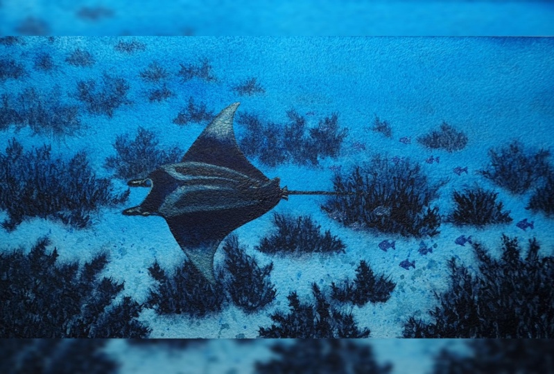
how about we begin? The picture, the reference
photograph that I've chosen of the mantra is a slightly
above view of the mantra, but you also get to see a
little bit of the side profile. You get to see the
eyes of the body, but it's mainly a top view. But you will see a few cool
features as well because it's swimming in this direction and we are viewing it
from slightly above. Because I tend to draw big, I want to start over here, and I want to start first with the sphalic horn
in the background. I'm just going to draw
a little roundish like a rod shape
with a rounded end. This is the sphalic
horn that's at the back of our picture. Now, if you have something
that looks like this, that's good, and I tend to
use broken lines when I draw. Now, we are just going to draw a line that connects
the bottom and the top and slightly
diagonal and we're just going to go above like that at an
angle and up there. We just by doing that, we've done the top of the head
that is in the background. Now, I just want to make
this part a bit thicker, actually, because it is
g a bit thicker here. Now, I'm just going to an
extension of this line, and I'm going to just
curve it around like that. This line is now going to
come around here because this is going to link this sphalic horn to the
one in the foreground. Because we are viewing the sphalic horn
in the foreground, it will look bigger. It will look slightly
bigger and it extends a little further out than the one we have at
the back there. There we go, and
we're going to do the same rod shape that has this roundish here and the rod that extends
a bit over here. If you remember the section
we did on manta anatomy, the I should be
somewhere down here. I'm just going to
draw a little bit of a roundish shape here,
a bit like a fat. This is where the e of
our manta is going to be. I'm just going to
draw a very rough. We can refine it later, just so I know the position of the. So it looks very simple,
but believe it or not, we've already
started laying down the foundation for
our mantas head. To me, that's the hardest part. So I just want to also thicken this part and make
it a little bit fatter, like it's becoming fadter
as it goes up here. And We can always do this later, but I just want to
make sure I get that shape right,
the mats mouth. If you have something that
looks like this, that's great. We just want to
extend this line here into to touch the
curve line here. That is going to be the
inside of our mantas mouth. We've got something that
looks like this now, which looks rather simple, but if you have got something like this,
you're doing a great job. Now, I just want to extend
this line up here a bit. I just want to get
the angle right. I'm just going to erase
that previous line I drew. I'm just going to go at a bit of an angle here because this is the
top of the head, it goes a bit up here, and then it's going to also at a bit of an angle
but a less steep angle. It's going to go up here, and this is where
we're going to start drawing our pectoral fin. But before I go there, I just want to finish
the head over here. We can just roughly put
the markings over here. Even though we're going
to paint them later. This is just the tip
of my sphalic horn. I just want to draw the
part that is a bit darker. The sphalic horn has
black tips here. I just want to mark
that on my drawing, even though we're going
to paint this later. So it also helps
me just make sure that I kind of get the
proportions right as well. So I've got the eye here. There's also a bit of a
black darkish mark here, which is just some pattern
on the cephalic horn. Over here, it kind of
goes in like that. Once more, we can
refine this later, but I just thought I would just put rough markings
here about where everything goes
because you'll just help me get the shape of the head right as
well as the proportions. What we have is something
that looks like that now. Now, I'm just going to extend a line past the eye that's a
continuation of this line, just that the eye
sticks out a bit. This would be the under
side of our mantle body. From the eye, we've got a bit of a a line here, a
black mark here. We're going to just
follow this line. Only goes a bit past the eye because I think
it's very important that we just map the black
part of our mantas head. So you know how the manta ray has a distinct sort of pattern. So it's kind of lightish
at certain parts. So I just want to mark
that before we painted, I think it just adds
a bit of guidelines. And this is then
going to go up here. All right. But before I continue doing more of the pattern, I think we should start drawing the pectoral
fin at the back, just so I can also get the pattern at the
at the right position. When you have a head that
looks something like this, and I'm just going to draw a very rough line
here because that's just going to indicate when
the light pattern starts, we are then going to
go up just like this, and it's okay if you're like me, you can use broken lines. We're going to do a nice
curved triangular shape that looks like a
shark's dorsal fin, is how I would describe it. This is our pectoral fin and it is very
triangular in shape, except it has this
pointy end over here, a beautiful pointed end that's
also a little bit round. To me, it really looks like
a big sharks dorsal fin. I'm probably going to have
to refine this a bit more, but I just really want to
get it's like a smooth line, a smooth transition that
looks really beautiful. It sticks out a bit here and then it goes to
tap to that point. Then it comes down here. Okay. So I'm just doing this kind of like that and we can
refine this later. So now that I've got the fin, I can just use it
to kind of sketch the the boundaries of the body where the body
meets the pectoral fin. The manta is quite a
flat looking animal, but I'm just going to draw this imaginary mid section line that's just going
to curve slightly up and extend out like
this to where the tail is. It's a very light line that I'm drawing just to add
as a guideline. Because yeah, we don't
want it to appear totally flat because it does it's not
a completely flat animal, even though it is kind of flat. It still has some dimension. So I'm going to then I'm holding my pencil like this
because I just want to sketch I just want
to try and get some light lines and also just
kind of follow the shape. And I don't think I can really do that with my
pencil like that. So I'm just going
to hold my pencil like that and feel free to experiment with holding your pencils because it also
makes a lighter line for me. So I have this shape over here. So it's kind of going down in a curved way down to
this mid line that we drew. And this also kind
of helps me look at the shape of the pectoral
fin I've drawn above. And I actually feel like perhaps I should
make it a little bit u a little bit why longer. I think it should just go
slightly longer because these are very big fins. If you're lucky enough to
swim at one of these animals, which I was fortunate
enough to do on a snorkeling trip,
they are massive. I definitely want to capture
the beauty of that tail. I mean, the beauty of how
massive it is the wing span, so to speak, of the fins, is just so wide. But what's lovely is it's such a gentle animal that's not even very
interested in us. I'm just going to
what happens with this fin, it's a
beautiful shape. Just think of a triangle, think of the dorsal
fin of a shark. It's triangular, but
it has a roundish tip, and then it comes
back down like that. But it also goes up
a little like this. Okay. And we're going to
taper down here. We're going to meet
with this line here. Another thing that our mid line that we've drawn helps us with is the placement of its
cute little dorsal fin. Amanda has this gorgeous
little dorsal fin. That also looks like
a little shark fin. So this dorsal fin is going to have that
very distinct kind of sharkish shape and because of the angle of the photograph, you'll see part of it. And I just want to get
that cute shape in. Then we can extend this out. There is a bit of a
in this photograph. It goes a little bit like this, and then we've got this
beginning of the tail. And the til the dorsal fin sits where the tail is.
I just want to do that. This is a very rough sketch. The tail of the manor
ray is not actually that long in comparison to its body. It actually has a
pretty short tail in proportions to its body. Now, while I'm doing this, I'm happy with how
this is looking, but I'm just feeling
that perhaps I just curve this part
a bit too much. I'm just going to
extend this a little. This is the part of
the drawing process where when we lay
down the foundations, we can start refining it a more. Perhaps I might
have made this part go out a little bit too
much. This is the time. I'm just going to use my eraser to just fix stuff up that we're not happy with angles
of lines, things like that. Also once you're happy with it, let's just erase the lines that we don't really
need because we want to clean look before
we start painting. It also helps us just
to see things better. I feel like that is good. Let me just clean the lines
that I did previously. Okay. All right. So
that's looking good. All right. I've got
a lot done already. I've got a lot laid out, which
is great because this is just going to help us
finish our sketch. Now, I'm just going to There
is this part over here that extend what I'm sketching
now is the blackish section. Then this is a little bit of the under side of our
manta that's showing here. I'm just going to now make
this extend the pectoral fin. The pectoral fin at
the front should be a little bit bigger than the one at the back because it
is in the foreground. So once more, we're
trying to do an upside down so shock shape. So I'm just looking
at the photo, my reference photograph. And I feel that I think I think it should probably come
out a bit more here. I think I probably
made it come out a little bit too late. So I want to just so
please take your time to sketch to get it right because you don't want to finish your
painting and then, you know, have regrets that, oh, I should have done this part better or something like that. So I feel like it
should sort of do that. I come to a point
over here. And then Okay. Come back. So that is the shape of our I'm just trying to see whether
yep, I'm happy with that. So I'm just going to now use this curve to kind of
refine that a bit. I think I might have
I might have made my might have made it go a
bit too. I think this shape. So what I'm doing now,
it's a matter of, you know, refining it now, just looking at your reference
photograph or, you know, if you want to make it as accurate as possible to
a reference photograph. But if you if you're happy
with what you've got so far, you don't have to spend as
much time as me refining it. I guess I'm I'm a bit of a perfectionist
when it comes to trying to make an animal
sketch look very well, at least semi realistic
because this is also this painting has a bit of of some fantasy elements because I do want
to add that shine. So your four ground pectoral
fin should be larger, slightly larger than that, and it should also, I'm
just going to use a ruler. In the reference photograph, you can see that the tip of this pectoral fin,
that's right starts. It kind of goes
more to the right. It's not exactly on
top of this one. It's not the same distance. Yes. Okay. I'm I'm just looking to see what else I can refine a little bit here. We've got the, but so far, I'm really happy with the shape. Finally, I just want to now, I'm going to just trace the boundary between
the pectoral fin in the foreground and the body. So as you remember, our the mentor anatomy
portion of this class, the sketch that I showed you
that I studied shows that the The pectoral fin is going to taper all
the way over here. But in this particular
photograph, we can see part of the
pelvic fin sticking out. I really want to include that. What I'm going to do is I've
got this part of this is where the pectoral fin ends, and we've got the pelvic fin coming out in this photograph. Every manta is different, but that is the
anatomy, basically. We can see it quite
clearly coming out and it has a bit of a
white marking on it. I'm just going to highlight the white marking by
just drawing it there, and this is where I'm
also just going to draw the pelvic fin
in the background. You can also see that quite
clearly in this photograph. I just want to put
that there. This is the boundary of the
other pelvic fin. Okay. I hope that
doesn't look too messy. Let me just clean that up a bit. This line is clearly the tail, and let's just do our tail. And we've got this is
the back pelvic fin, and then we also have this is the pelvic fin
in the foreground here. And it has this marking on it a bit of a white
marking here. And that's as much
detail as I want to do of this because I
feel like that's enough. Okay. That's looking good to me. We've got our dorsal
fin, which is very, very far at the back here, almost right where the tail is. Now the only thing, if you're
happy with the shape of your pectoral fins and let me just see
what else has to be done before we can
finish this sketch. Yeah. We've got
that shape there. I'm just going to erase
these lines that we don't need because we're
going to paint it Okay. So let's just round that tip there of the pectoral fin
in the background. Yeah, I'm happy with that.
And this looks a bit thick. So let's just erase these lines. Yeah. I think that looks great. I just want to see if
I left anything out. Oh, yes, the shading. I just want to check
the shape here. I think that's a good shape. I think we can see it comes
a bit down like that. It is a bit at an angle there. I just want to try
and replicate that. This is a time to do all these little adjustments before we paint now that we have
everything laid out. All right. Okay. So I just
have to do the the markings. So where the markings, so we've got The marking
here is just going to follow the boundary of the
pectoral fin and and the body. But what's important here
is the marking up here. Up here, we've got it's
going to come here. As you can see from the
reference photograph, it goes like this, and then it kind of
meets in the middle, the very mid line that we drew. Then we see that
again over here. And it's just going to also kind of come down at
an angle like that. And then it's not very clear, but that's all we really need. We've done it. That's good. And, um, I just want to refine
that line a little bit. Yeah, it's going to meet
where, I think that's good. I think I'm just being a
little bit too meticulous. So we've got the eye. I guess I could mark
the pupil right now. I mean, I could always
paint it later, but I guess it's
nice to have that. So there's our Manasing much
like a shock may I add. That looks great. I might as well just add this little line
here because I can clearly see this inside part
of the mouth is much darker than the
outer part. All right. Let me just take a step
back to have a look at it. I think a ray is
looking really good. What we can do now is also
just erase this mid line. We don't need it
anymore. Just erase the lines that we don't need. Okay. We can who. Let me just adjust this. We can erase this line. Oh, that's looking really good. I'm just wondering
whether I should just keep the mid
line over here. I don't think there's
any harm in keeping it. So I'm just staring at this and it's looking
really good to me. So if you're happy
with your sketch, we can then move on to the next section where I
will show you how to use masking tape to create a
border around your painting. So see you in the
next step. Thank you.
5. Creating a Border with Masking Tape: Okay. Hello, and welcome back. In this section of the class, I'm going to show you
how to use Musking tape to just tape a boundary around your subject so that
you can then paint a background and it won't
go past that boundary. So in this particular
painting that I've designed, I want to just work with a very simple
rectangular background. In order to do that,
and to just make sure our paint doesn't
go past the paper, and it will also create a really cute little frame
when we finish our painting. I decided, I'm just going to put this tape right at the
very edge of my paper. So I'm just going to
put it right here. So take your time to do this section because
it's worth like, you know, placing it very
carefully on your paper. The great thing about
masking tape is, you can just tear it
off, which is wonderful. You want to try and
create a straight border that's going to so you can see it's sticking
out a bit here. I just want to readjust
that and place it down. I'm also doing this in my book. I think this would be easier to do if you had loose sheets, but I just want my painting
to be in my book for now. So that's looking
pretty good to me. A very important
thing you need to do is once you place your tape, you need to just go over it
gently with your finger, just to make sure you get rid of all those air
bubbles underneath. Otherwise, your paint can just go through
underneath and then you don't have that nice
neat border anymore. I just tuck my tape a little bit behind the paper, the sheet. But please do take some
time to really do the step. Otherwise, the paint the pain can see through underneath and then you won't have
that neat border. So when you're happy with that, it's time to do this side. So I'm going to go
as close as I can to the very edge of my painting, and I'm trying to create a
neat rectangular border. I'm going to tear this. Just
tuck it in there. One more. That looks good to me,
looks very secure. Next, Okay. Remember, this step is not a race and you're better off doing
it very carefully. As close to the edge
again as possible because you will be painting a little bit over this tape
when you do your background. It's going to tuck that in.
Smooth out any air bubbles. I'm just going to
put this down here. As you can see,
I've a dotted line on my paper where
you can tear it out. I'm just going to try and use that dotted line as a bit of a reference line and tear
out my musking tape. Smooth all the air bubbles away. There we go. I can see
one big one there. And when you are happy
that your tape is in place and you've smoothed
out all the air bubbles, we can start doing
the background, which is going to
be a lot of fun. So see you in the next video.
6. Base Coat: Hello, and welcome back. And we are about to do our
very exciting laying down of the base wash. Now that we have our sketch secured
with usking tape. We are now going to create
a very loose background to kind frame our mantra and really will make it look like
our mantra just floating above some very
rough coral shapes below in the sand below. So we're not going to put an incredible
amount of detail in this because l mana is
the star of our painting. But what this is going to achieve is it will really
give the illusion that Amana ra is just swimming very gracefully above the
coral beds below. To do this, we're only
going to use two colors. I'm using Jane Davenport paints. And so the paints all
have their own names. Even though the
colors I'm using in this set will be
this blue over here, which is called butterfly
in the Jane Davenport set, but it is very close
to Prussian blue. We'll also be using this
color called ink in the set, which is very close to indigo. If you are ready,
let's pick up your 1.5 inch flat brush that we're going to just now use
some clean water, and we are just
going to apply and even glaze of clean water. So what you want to do
is you want to make sure your whole page is wet evenly. We don't want pools of water. We don't want it
to be just soaked. To do this, you might have to stand up
because even as I sit down, the angle makes it a
bit hard for me to see parts of the paper that have already started
drying at the top. I'm just going to go over
with my brush again. Now, you just want to
be a bit careful that you're not hurting the paper. You're not applying too
much pressure and making the paper you're not compromising the
integrity of the paper. To do that, I would just suggest very gentle brush
strokes of water. I'm standing up doing
this part because I just want to see if you have put the right amount of water in your entire sheet should
be have this lovely sheen, there shouldn't be
any puddles of water, there should just be a
nice and even sheen. I can see that
now. While this is happening while I
have this even sheen, I'm going to take some of this pain and I'm
going to put it here. As you can see, this color is very similar
to Prussian blue. I am going to I'm going to
have quite a generous amount of it because when I tried out this color earlier and
I did a flat wash. It may look very
strong and intense, but I can assure you that water colors always
tend to dry lighter. It will end up looking lighter. Don't be scared if the
color looks very strong. But right now, I'm
just going to do that. I'm going to pick up
some of this pain with my 1.5 inch brush and I'm just going to as you can
see, brush over here. I just want to make
sure that I don't leave any little bits of of unpainted areas. I'm just going to try and
apply and even sheen. I'm going to have to
try and get more paint out because this is
a huge surface area. I'm getting more paint out just going to dip my brush back in and I'm just going to continue. Don't worry if it's
not completely even because after all this
is supposed to be the ocean. Okay. So I've gone all the way to the bottom
of my page as you can see. But I want to I think, I just want to make the top slightly darker because I feel that in the reference photograph and since I was there when
the picture was taken, the sand at the bottom is actually lighter then we've
got the ocean around it. So, that's looking good to me. And what I want to do now is, I'm just going to let let
this pain just settle. So I think I'm okay with that. I mean, I was thinking of maybe even going over it another time with with the blue pain. Because like I said before,
when I tried this out, it actually dried a lot
lighter than I expected. Okay. So I'm just going
over it one more time. Just carrying the pain all
the way to the bottom. As you can see, my paper
is still very wet, which is exactly what
I want. Because now. Sorry, my brush
split a bit there. Now I'm going to do the fun part of adding
the coral shapes in. I'm not going to need my
1.5 inch brush anymore, so I'm just going
to leave it aside. What I will need
is to use a brush. To take some indigo. I call it indigo. It is
very similar to indigo. In this set, it's
just called ink, but I'm going to take this now. What I'm going to do
is, I think I might use my size 12 round brush. I'm just going to
wet it I'm using very concentrated pain because
I'm going to now drop in. I think I need to make
this more concentrated. I'm going to drop in some
shapes, as you can see. I'm not thinking too
much about these shapes. What I want to do is I want
to create the illusion that there are rocks or
C shapes at the bottom. I need to do this while the pain while the
background is still wet. As you can see, what
you're seeing is the paint is blending into the
background, it's moving. I'm just creating a
bit of cor shapes, really, this is very abstract. I'm not really thinking
much about it at all. And I can assure
you it will dry a lot lighter than it looks. So I do want to even though this is supposed to look natural and organic, I do want to avoid, as you can see in the
reference photographs, A manta is swimming
above some corals, But I would rather have the corals touching the boundary of the manta because I really want the
manta to stand out. What I want to do
actually is use the corals as well
to frame the manta. That is why I don't
really want to paint rocks like touching
the boundary of the manta. I'm just once more,
just doing the shapes. I think we can put I'm
running out of pain. I'm concentrating the shapes to be in the lower half
of the painting. Okay. Once more, I'm really not thinking
very hard about, what should the
shapes look like in stuff except I am varying some of the sizes of the
shapes because I feel like some variety
would be cool. Some are going to be
smaller than others. As you can see, it's blended, but it looks so much lighter
than then putting down, you know, The strong
indigo just now, it really does when
it blends out, it becomes so much lighter. So I'm going to now work. As you can see, my
painting is already, the background is
starting to dry. So I'm going to start trying
to put the shapes down. I have to work a little
bit faster. Okay. The bottom is still a bit
wet, but as you can see, starting to I
definitely want to do a little bit of
shapes like Well, my brush is as you can see the background
paint is really drying. So as we get higher
in the painting because our manta is kind this
is a bit of an above view. I just wanted to do the sing a bit kind
of diny and small. In the background because
that's supposed to be further away from our view. It makes sense for that
part to be a bit lighter, if you really want to think about perspective and
stuff like that because if you want your manta
painting to look realistic. It's just like how things
appear smaller in the distance. That's what I'm going for here. Maybe not as many Rocks and stuff in
the background. Don't worry about
the bottom because we want to make that
look a bit darker. I'm using it looks pretty
diluted, which is fine. The stuff in the background is going to look a little bit. What I also want to do now. While it's the paint
is still a bit wet is, I'm going to use a
bit of splattering. All I had was paint on
the brush I was using. Don't worry if it goes
on the manta. It's okay. We're going to paint the manta pretty dark color so it
won't really matter. I'm just trying to
create texture, trying to create the
illusion of hey, they rocks and corals of every
size on the ocean floor. That's all I'm doing. Okay.
And if you really want to, you can even dilute your
paint even more and just do some rough shapes
there in the distance. Even though I think that the
water is looking fine. Okay. So I'm quite happy with this. I think I just want to
splatter a bit more. What I want to do is, I really do think that my splattering did go out there, but don't worry, it's fine. It actually looks like distant
rocks. It's totally fine. I want to now use a smaller round brush because I'm going to
use my size eight. I'm just going to get
some more of that paint. What I want to do is
this is already dry. Well, drh. I want to just go over some of these shapes just to try and
emphasize the fact that hey, the corals that are closer to the foreground
of this painting are going to be darker than the ones that are further away. That's all I'm doing
here. I'm just creating shapes with my brush, not really thinking
much about them at all. I'm letting some of that
previous layer just shine. We'll see some because the view is slightly above the manta. We will see some edges of coral, but this is still very
much and above view. But we will see a bit
of edges of the coral. That's what I'm
trying to create. Now, going to use more
of the ink in color, I'm really not thinking
about this much. I'm just using my brush to create I guess the
pointy edges of corals. Okay. And I'm going to let some of that previous layer
show through. Almost has a bit
of a crystaly look about it, which I love. So now you understand why we've
got our tape here, right? It's going to create some
nice a clean border later. And I think I might while my paint is starting
to dry already, I'm just going to I mean, the backgrounds already drying. So now it's almost like a wet on dry
technique that I'm using. As we go further out
into the painting, it should definitely
get lighter, the rock shapes or the coral shapes, whatever
you want to call them. They should get lighter. I just feel like this will
look good here. I'm just rewetting the pain I already have and just trying to see the fact that we did some coral shapes
surrounding our manta will make the manta stand out
even more in this painting. Okay. So these rocky shapes
are looking really cool. But it can also come down here. Just turning my
brush upside down. Wow, I'm going to
need more paint. Okay, maybe a little bit here. These are all random shapes, but it will really come
together at the end. When we paint our man, it's going to look really cool. So how much you want to do of
this really depends on you. But just try and fade your coral shapes out as you get
to the background. So, I'm kind of already
kind of going Okay. So it's a bit of an ambiguous
shape there, but it's cool. Maybe I might do this one
just a little bit more. But my paper is the
backgrounds almost semi dry, as you can see, which is
why we're not getting a tremendous amount of
bleeding of the pains anymore. They're not blending
as much anymore. I'm just doing my
own little technique of pressing down with my brush to create pointy
shapes in the background. Okay. So look, if you want a more roundish
shape, that's fine too. You can you know, these are
supposed to be rocks or corals below Al Manta. Okay. So to tell you the truth, I think the top part
is looking fine. I don't think I really need
to touch a lot on that. I think that's more
like it's more just, you know, distant orally shapes. Okay, I'm I don't actually want to spend a tremendous
amount of time like, you know, doing this because I
feel that we are already suggesting the shapes at the
bottom of the on the sand. So I don't feel like I need
to do the ones over there. As you can see, we got
this cool effect here, which is just really
when we splat it. Yeah, it's interacted with the wet paper and created
some cool patterns. I'm just going to
take a step back. I'm just looking at
this, and I think, I think it actually
is pretty cool. These random shapes. Just having a look.
They're looking nice and they kind of fade
out in the background there. What I can do
actually now is just create a little
bit more texture. With the pain that I have
left by just splattering, whatever's left in here? I don't have a lot
of pain on my brush, which is why the splattering
is not as pronounced, but we're just creating, pebbly look on the
floor of the ocean. Just to fill in a few spaces, but I'm actually
happy with that. We don't have to
cover everything. Tell the truth, I think that's looking good.
I'm happy with it. As you can see,
it's darker shapes in the foreground fading
to the back there. We don't want to touch
these shapes at the back. I'm just wondering if I need
to darken this anymore I don't think we really
need to because the corals are not really
the star of this painting. I feel like that's fine already. I'm just having a final look. Perhaps I just want to add a little bit more of dimension on this
coral over here. Okay. Doing some funny
brushy pattern here. Okay. Yep. This guy over here. So this is my own
technique that I'm using to create
these orally looks. It's kind of, yeah. I don't really have
a name for it. I like. Okay. What I'm doing here is I'm concentrating
the darker color. The darker color should be
nearer the foreground here, but I can also alternate it between the lighter areas
and the darker areas. So it kind of looks
like, you know, coral kind has a bit of a three dimensional
feeling to it. But like I said before, the corals are not the star
of the show. The mantas. So I don't want to wait I guess I'm kind of eager to start
painting the manta. That's going to be so much fun. The last final bits
to try and create just a little bit of dimension. Okay. Yeah. And as I said before, how much detail you want, with your coral, with your
painting is really up to you. I think that's
looking really good. I might just a bit more
some dark shapes over here. Well, I'm taking a step
back and I'm looking at it. Maybe a bit of dark shapes here. It's almost like doing
petals on a flower, kind like a crystal shape. Almost done. Let me just re wet. I'm just going to
use whatever pain I have left in my palate to just darken some
of these shapes. All right. I think we are done. I really think we're done. I really don't think
we need to do anymore now that I'm standing up
and having a look at this. So what we need to do now
is just completely dry. Because even though I said
the background is drying, I can still feel it's
not completely dry. The paper itself still
feels kind of damp to me. It's like you can feel
the weight of the water. It's still in the paper. It hasn't fully evaporated yet. So the paper is still
not completely dry. What we want to do next before
we start painting Amanda and bringing it to life is we want to let this dry completely. In the meantime, go
have a break and relax. And when we come back
in the next video, we are going to start
painting manta, so that will be very exciting.
See you in the next video.
7. Manta First Coat: Hello, and welcome back
to our manta class. I hope you had a
good break while your background was
completely drying. So this is completely dry now, and I can't wait to finally
start painting my manta. Without further ado,
why don't we begin? Now, what I want to
do, it's to build up the color of the
manta in layers. Now, you might just think, am I just going to use
black because black is obviously a dark color or pines gray and just use
that color to build it up. I mean, we could
do that, we could. But for me, I feel
that rather than just applying two or three layers
of black or pines gray, I would rather apply the colors that I've
used in the background. So as you can see,
When we painted our flat wash in one
of the initial steps, O manta has obviously got
some of that flat wash, it's gotten the Prussian blue, which is known as butterfly
in this set of paints. It is already has
a blue tone to it. But because I would
like to paint the manta in a way that we're going to build
up the layers of color, but I would love some of
the blues and indigos to come through underneath when we go over them
finally with black. So rather than just use black, I feel that laying
down a couple of washes of the Prussian
blue and the indigo would really give our manta a sort of richer color that also
has hues of blue and indigo rather than just black because some of that
color will come through. So that's what I'd
like to achieve. Before we start painting, I just want to take you through
what we're going to do. So I'm going to start off using the blue that we used
earlier in the background, which is Prussian blue, but also called butterfly
in this set that I'm using. Rather than paint the
entire manta at once, using a flat wash of butterfly. What I intend to do is paint
the manta by sections. As you can see, there's
a line here where the pectoral fin in the
foreground meets the body. There's a pectoral fin at the back that meets the body
over here at this boundary, and I think I would prefer to paint each
section separately. Just so we have more control over each section rather
than to paint it as a whole, because we are going to use
a technique called lifting. If you look at your
reference photograph that I've provided of the manta, you will notice
that the manta has some lighter coloring at the
tips of its pectoral fins. It also has a lighter
pattern here on its body. I want to try and achieve that by applying down
a washer pin and then using a clean
dam brush to slowly lift some of that color off, so that we're exposing the
lighter coat underneath. If you want to do lifting, and I think is a pretty big area of Amanda we specifically want
to lift in these areas, I feel we have
more control if we just paint one
section at a time. This is just my take on this. I'm sure there are other
artists out there that can paint very quickly and
lift the paint off. But because we're going to do this lifting technique several times while we're
laying down the colors, I just feel that
focusing on one section at a time will just give
us a lot more control. So I've just spent a lot of
time talking about that. So what I want to do is, I think I'm going to use
my size eight round brush. I hope you've cleaned
your water jar from the last step that we did all that we used the
Prussian blue and indigos. I hope you've cleaned
your water so that you've got two new clean jars of water to start
with for this part. So I think what I want to
do is I'm going to start with the pectoral fin
in the foreground here. So I mean, you could probably use your size
12 brush for this too. But I'm just going
to lay down a clean Nice even layer of water. This pain that I used
in the previous step, the Prussian blue or
butterfly, as it's called, it actually is quite
a staining pain, meaning that once
you lay it down, it is very hard to remove. Some watercolors have more staining
properties than others, and in this one, As you can see, when I put the water
down, it didn't lift. It just when it's dried, it stays very put. Some watercolors do that
and you call them staining. Others don't really and you can lift them
up quite easily. That's fine for us to work with. I've already wet this area and
there's a nice even sheen. Before it dries unevenly, I'm going to put down some of that color we
used previously. What I'm going to do is, I'm
just going to drop it in. As you can see, it's
a nice rich blue, and I'm making this
pectoral fin darker. Don't worry so much about
me going past the boundary. It's perfectly okay
because we'll be painting that area anyway. What's very important
to note here is, I want to leave this area
over here lighter. Okay. Sorry, can be a
bit tricky to see because of the reflection
of the light above me. I might have to shift
around in my chair a bit and I encourage you to do so as well if
you can't really see. So I'm sure going to paint
at the boundary over here. It's it's almost a flat
wash except I left I've intentionally left that area a little bit lighter over here. Okay. But everything else
is pretty uniform. I'm going to stand
up and have a look. That's lighter. In fact, I thought I
would have to lift it, but I don't have to
actually because I've left that area quite a lot lighter. I don't actually have to lift
it much right now at all. Perhaps I'll do
the lifting later. If you don't have to
lift to, that's fine. I want this area to be slightly, as you can see this
tip is lighter than the almost flat wash that I've laid down on the rest of the pectoral fin
in the background. Okay. But if I am going to lift it, I just want to show you
what I'm going to do. I'm going to rinse the
brush I just used. I'm going to wipe it on my rag, and I'm just going to slowly
scoop up some of that paint. But I had already
preserved it quite well. As you can see, this
part is a little bit lighter than the rest, and that's exactly what I want. It's looking really good now. I feel that I can start doing the pectoral fin
in the background. What I'm going to
do is once more, use clean water to paint. Well, I use clean water
to just lay down a layer even layer of water because we're going to do
the exact same thing. Okay. This is still very wet and I
will still be observing it because if the pain start
to come into that area, we will have to use the
lifting technique again. But in the meantime,
it's looking okay. I may have to lift it later. While this is happening, I have a pretty even
sheen going on here. I'm going to do the
exact same thing. I'm going to drop in
my Prussian blue. Right at the boundary here and
going to get more of that. Go all the way. I think since we want to save the area
right before the tips, we can go all the
way to the tip here. Just watch your brush here because you just want
to make sure that tip of the fin is nice and that nice rounded
shape up there. Now, I'm just going to well, as you can see the surroundings, the water is already drying. It's a pretty hot day here in Sydney right now
while I'm doing this. As you can see, it's already starting to dry, but
don't worry about that. We're just going to
clean our brush. I'm just going to even though
I left this area bare, I didn't drop paint
in this area. I'm just going to smooth out the edges of that area that's
lighter because I wanted to To look I don't want hard lines, and I'm
going to do that again. I'm just going to lift a
bit of the color here. This part is looking
really good. Don't worry if if it
doesn't look even, it's okay because we're going to go over this with
quite a few layers, so that's really fine. In fact, because this
dried very quickly, I'm going to just re
wet the area. Okay. Don't worry, if it
looks a bit messy now, what I want to do is,
I'm just going to re wet this area, the entire area. I'm just going to repeat
what I did last time. I'm just going to
drop in the blue. Very careful. Watch your hands. You don't want to rest
your hand on a wet area. Because the manta
is supposed to be, it doesn't matter if
I'm redoing the step, I just want to make sure
I cover this area well. Dropping in the pain again. And we're going to try and
drop in the pain everywhere except that very tip that
we want to be lighter. That section. What
I'm going to do now is I'm going to rinse my
brush again in clean water, dab it on the rag, and I'm just going to very carefully lift out
some of that color. Because this area is wet, it will be a look a
lot smoother than the edges that you saw
initially when I did that. Now this is already starting
to almost completely dry, as you can see, but it's
not completely dry yet, but it is a bit lighter. I feel that since
this is going well, and we've already lifted out
some of that color here. And it's still very wet we've
lifted out a lot of color, and I think that's enough. You can just try and
look at what the pattern is on my reference photograph. It looks something
like that. If you have something that looks
like that, that's great. You can even see it's
slightly lighter here, I can lift a bit out here. It's just slightly lighter. If you don't really want to
do the step, that's fine too. All right. That's
looking good to me. What I'm thinking is
this looks very light. As you know, as I've
said many times before, water colors always tend to dry lighter than
when you apply them. I just want to repeat this step. Like I did for the
pectoral fin at the back, I want to just re wet
this area and drop in the Prussian blue color. Same thing. I'm going to
just drop it in Okay. Just drop it in. And you're going to work you're going to work quite quickly, but not to the point
that, you know, you feel very rushed, but you do want to
lay down this color. Reasonably quickly because
your paper will start drying, especially if the weather is similar to what
it is for me now in Sydney where it's very
hot and dry right now. So your paper is going
to dry very quickly. So you want to try
and get that color down carefully, but
working quickly. There we go. That's
looking good. Okay. All right. So that's
looking good to me. And I've left that area kind
of kind of free of pain. So I don't think I
really particularly have to lift it too much right now. Sorry, I know that this
whole parts actually blue. It's just that it's the reflection that
you're seeing now. I'm happy with these two areas being left and I
don't want to lift any more paint right
now from this one because it's already semi dried. If I do attempt to use a wet
brush and lift the pain now, I'm going to leave some marks
that I really don't want. I'm going to leave
some hard edges. I'm fine with what
we've done over there. You can clearly
see it's lighter. This one you can also
clearly see is lighter. I feel that right now, Before we do the
main body and we repeat the steps
that we just did for the pectoral fins
on the main body. But then we're going to lift some of that paint off over
here to do the pattern. I think that right now, we should just let the two
pectoral fins completely dry because we don't want to start working
on this area yet. We don't want the pain
from here to bleed into the pectoral fins. My advice to you now is
just rinse your brush. And go have a break, a well deserved break. When your pectoral fins
are completely dry. Let's start doing
the body again. Hello, and welcome back. I hope your pectoral fins
have both dried really well. If they are completely dry now, we can start painting the body. Now, in the section
where I talked about anatomy of the
manta basic anatomy, I mentioned that these
giant manta rays have what we call a chevron
pattern on their body, where it will be a little bit. It appears to be
these white markings. What we're going to do here is before I do it, I just
want to let you know, we are going to wet
this entire area except the scephalic horns, which I want to leave lighter. We're going to wet this area
all the way until the tail, and we are then going to drop in the same Prussian blue color, which is called
butterfly in this set. We have put down even
layer of the blue color, we are then going to apply
the lifting technique, where we are going
to lift some of the blue off to create
that chevron pattern. I just thought I would talk you through what we're about to do. I'm just going to use my size
eight round brush again. I'm going to wet this
area all the way from the eye until Yeah,
until the tail. Once more, as always, we want a nice even
glaze of water. I'm just going to go
where that boundary is. If you have bright
lights like me overhead, please feel free to move around your chair or to stand
up to just check that you've completely wet
the area that you want to drop paint in because it can be a bit hard to see in this bright lighting. I will also paint
the pelvic fin. Because later on, we will Tell, I don't have to do I notice the pelvic fin has a
bit of a white stripe there. But that white stripe can easily be defined later on
with a white gel pen. If you notice I'm not doing the inside of the
mantas mouth right now. I will do that when
this is all dry. In fact, I might only
start working on the mouth like after I've done the body. Maybe we can also start doing the scephalic
horns as well. I'm just going over
it again with water. The tail is not too
important right now. We don't have to really do
the tail that well because, We can always use a black
pen later to define it. If you have a nice glaze
going on as you can see here, once more, I'm going to just my paints are really
drying in this weather. I'm going to start
with the head. I'm going to drop in the
color as you can see. The color is butterfly. All the way in the head here. So it goes all the
way into the eye. And we are going to just
let this color just spread. So as I said before, we do want to work like, you know, at a swift rate. You know, we don't want to
rush and make mistakes, but we do want to
keep that paint evenly wet when we want to
do the lifting. There we go. The tail is not that important. In fact, I don't have to
do the tip right now. I will just because it would be better if I did that with
a black pen later anyway. I'm just going to go
over this area again. In fact, I can use a more
concentrated version of butterfly paint because manta
is supposed to be dark. Once more, try and cover the entire area even
with the blue paint, including the dorsal fin. The tail. You don't have
to do the tail that well. All right. Right now, I've got this going on. For the Chevron pattern, I'm going to switch
to a smaller brush, the size four round brush. Wet your brush, remove excess water with the
rag as you can see, I'm going to lift
some paint here. Cleaning my brush,
lifting again. Every time you lift pain, you do have to rinse your brush. Just dab it on your rag to
remove the excess water. I can see this pattern
goes down here. Okay. Did you know that every manta has
a different pattern. It's like a fingerprint, which is how scientists
can identify them. So thought that's
an interesting fact when we're doing this
Chevron pattern now. I'm only going to
lift the pain where I want it to be lighter obviously
to create this pattern. So I can see that
it goes down here. It's a bit thicker here. That sound that
you're hearing is me rinsing my brush
every time I do this. So Okay. Yeah. So I would say we lift the color all the way until
maybe the middle of the body, then we stop. And we are just going
to as your pain dries, the pain is drying now. So I'm probably going to stop lifting the pain soon because I don't want to leave I just want
to do this part, just want to lift
the pain off here. I'm happy with that. I just feel that we might have to I don't know if we have
to repeat the step just yet, with blue again, like we
did with the pectoral fins. I think it might be
all right to move on and maybe start with Indigo. I'm happy with that
Chevron pattern that we've accomplished by lifting and our paint is
already starting to dry. So I think if you have
something that resembles this, you've done a good
job and we can stop doing it because I think our
pain is really sin and dry, so we have that pattern done. What I suggest doing now is, why don't we let this body completely dry and
while we're doing that, why don't we pay attention
to things that we can do like the scephalic
horn over here. We can start working
on the parts that are not touching the
head that we just did. So I'm just going to use a bit
of that blue and just kind of painted a little where the black tips
are supposed to be. So I'm just laying
down some color there, and then I'll go on top of
it with the black later. So don't worry about little
marks like this and stuff. I think that just
has to do when I lifted the paper
because we can easily cover that with the
black paint later on. So that's all looking
good, in fact, I might just use this blue actually to just
outline that boundary. This is part of the underside of the manta that we're seeing. This part is actually supposed
to appear a bit blue, so I'm just going to add
a bit of color there near the eye over here and then it's just a little
bit lighter over there. A man is going to look a lot darker once
we're done with it. These are little things
that we can do right now while waiting
for this to dry. I might just go over the tail because the tail is
like a separate part, so it doesn't really matter if I touch if the pain
there is still a bit. I just want to outline my define it a little
bit with the blue. But in our next step, we are going to
move on from blue. And we're going to start
doing um the indigo. We're going to use
the color indigo, which is called ink
in this set to go over our pectoral fins
again, each done separately. But as you can see,
the reason why I chose to do each
separately is we have so much more control
that way rather than painting the entire thing
and trying to lift pain. I think that can be
quite stressful, especially if you're not an
advanced watercolor student. I'm glad we decided to do
each part in sections. Right now, I would suggest we
can just wait For the body, the scephalic horns,
everything we've just painted in this step
to completely dry. Go have another break, rinse your brushes,
change your water. I will see you back
here when your body of your manta has completely dried and we will start
with the next color.
8. Manta Second Coat: Hello, and welcome back. And I hope your mantas
body has completely dried because now we're going to start adding a
much darker color, the darker color of ink that we previously used in the background
to do the coral shapes. Without further
ado, let's begin. We are going to start with
the front pectoral fin again, and we're just going to
repeat the same steps. I know it may seem
like a little bit tedious like doing this
over and over again, but we do have to build up the intensity of the
color of the manta. Okay. And, you know, my approach
is to take a very, you know, relaxed approach. Just, you know,
enjoy the process. It's actually relaxing to
tell you the truth now that we're doing each section
like individually. I did when designing this class, I did try to do the
entire man in one go. I can tell you that
the lifting of the color was very stressful when I had to lift color
in several areas at once. I'm quite happy that we're
doing each section separately. If you've got a nice even sheen here with the clean water, it's time to have fun and
put down your color ink. Okay. So once more, we're just doing exactly what
we did last time. So we want to work quite
swiftly, but carefully. So we're just dropping in
pain up to that boundary. I think I'm going to
need more of this color. And, um, We're just going to
add that in dropping it in. Try to stay within
the boundaries. Try not to go out
of the boundaries. We're going to try
and work fast. But remember, we don't want
to drop the color into that nice lighter
area that we've saved that we went to
the effort of saving. I'm going to have to put more I'm going to have to put a more concentrated version
of the color. I'm going to go all the
way to the end here, but do you notice I'm
avoiding that area. Okay. So just dropping
it in up here. That area is it's looking lighter now,
which is what we want. I'm just going to
drop in the color. You want to try and drop in
this color gently so that you don't move the blue around. The blue that's already dried, but even though I told you, it's quite a staining color, the Prussian blue or what's
called in this set butterfly. It doesn't which
is good because we don't want to lift right now in this step when it's
already dried. We just want to move
our indigo around. As you can see, it's
looking really good. The indigo has
definitely helped to darken the overall look
of this pectoral fin. And what I'm going to do is
I'm going to rinse my brush, the same brush I'm using
the size eight round. I'm just going to dab
it on the rag and I'm just going to do a bit of
lifting just a little bit, even though we'd
already left this area, untouched with the indigo pain. I'm just lifting it slightly because it will
bleed a little bit, so I'm just going to lift that I'm standing up to have a look and that's looking
really good to me. We've definitely kept
that area lighter. I'm just going to do
it one more time. Remember, clean brush,
and you want it damp. You don't want it
soaking with water, which is why you
have to dab it on your rag first to
remove excess water. If you're happy with that
and I'm happy with that, I'm going to move on to
the next pectoral fin. I'm going to do exactly the
same thing that I did before, putting some clean water in That's why it also helps
to have two jars of water. I use one jar of water as my clean water to put
it down on the paper, and I have the other jar
to wash my brushes in. I'm doing the same thing. I'm just lifting
the paper just to check that it has
a nice, even she. This is drying
really beautifully. Just watch your hand
that you don't rest on the wet area. That's
looking great. Now, I'm just going to get
more of this color ink, and I'm going to
start dropping it in. So we do want this area. There's a little bit of
a lighter area here, which I'm going to
save as much as I can, but I do want it
to look natural. I don't want it to
look like very edgy. I'm just going to drop in my
color like I did just now, all the way from the boundary
of the pectoral fin and the body dropping it in As you can see, we
are building up the color of our manta
very beautifully, may I add, which is why I really didn't
want to just use black. I wanted to use blues and indigos because all these colors will come through a little. At the end, even when we
do go over them with b, some of it will still shine. It will have a
bluish tinge to it, wh I feel prettier than
just having it all black. All right. That's
looking gorgeous. And as you can see, I left
that area very light. I'm just kind of blending
around it. And it looks good. I don't think I really
need to lift much. This part might be
a bit too light, so I'm just going to drop
in a bit more paint here. I'm just going over just
the boundaries of the fin. That's looking
really good to me. I don't think I really
need to lift it very much, but I might as well just
use my clean brush. I just don't want hard lines, so I'm just going to
use it just a bit. I'm just going to lift a bit. But to me that looks great. I just don't want hard edges. So I'm going to stop because I don't want
to remove too much of the pain and have
hard edges because the paint is already
starting to dry. So I'm just outlining the
boundaries right now, but as you can see, I
clearly have a lighter area, the lighter area here. So what we can do now, actually, while
this is drying is, we can start working
a bit more on the cephalic horns
and the mouth. What I want to do is,
I just want to go over I might actually
go inside the mouth. All I'm doing is putting
some of that indigo that was on my brush in here. Remember this part's going
to be darker because this is where there's a bit of a shadow with the entrance of the mouth. I'm also going to just
carry this color in here. Yeah, because we wet the area, so it's spreading a little bit, but we don't want it too dark. I might switch brushes now to my small size for round brush and
I'm just going to try and blend this
so it looks good. Yeah. That looks good. I was just using
indigo, by the way. As that dries, I can just
put some indigo over here. Along the edge there. I'm also going to do this over here. So these are the dark tips
of the scephalic horn. Okay. And I might as well do the eye too. Okay. And I might just do the outline over
here while I wait. I'm kind of doing this while my hand hovers over this wet area. Just so we can start laying
down some of that color. So this part is going
to be a bit lighter. I'm going to leave
that a bit lighter the underblly And,
that's looking good. I might just take
as you can see, my pins are drying very
quickly in the palette just because it's such
a hot dry day here. And let me just want to
do that section again. Yeah, it's looking good. Okay,
that's looking good to me. Now, I just have to it's not
fully dried yet. The body. I mean, the pectoral fins, they're not fully dry yet, so I don't want to attempt to paint the body yet and
lift the color because I don't want bleeding from the body to go into
the pectoral fins. So once more, we are going
to take a little break. Go and stretch your back or
your legs and go have a walk. It won't take long.
These pectoral fins are going to dry very soon. Why don't you just
go give yourself a little break,
rinse your brushes, change the water and your jars, and I will see you
back here when your pectoral fins have completely dried and we
shall do the body next. Hi, everyone, and welcome back. And I hope your pectoral
fins have dried completely. So without wasting
any more time. Now that you had a nice
little refreshing break, let's get back into
doing the body and adding the color
of ink on it and lifting out the paint where we want to have that
Chevron pattern. Here we go. I'm using a
size eighth round brush, and I'm just going to re wet
this same area over here. And this time, we're just repeating the same
steps we did previously. So I'm sure you must be pretty confident at doing that by now. Yes, as you can see, we've got that beautiful chevron pattern, very distinct looking pattern, and it's going to
look even better when we apply our darker
colors and lift out. I'm just going to
do the doors fin. I just want to that parts white, but don't worry about it. We can always use the
white gel pen later. And not paying too much
attention to the tail now. I'm more concerned about
the body and doing that evenly wetting
the body. Okay. So I'm only tilting my paper because I
just want to see that I have a nice even glaze and
I haven't missed any spots. So there we go.
Just bring it up to the dorsal fin and
a bit to the tail. So I'm going to take
more of the color ink. I do want a nice dark
concentration of it. That looks good. Now I'm going
to just drop it in Okay. And we are actually going to
just cover this entire area. So working swiftly
but carefully, I love that the manta is
getting its darker colors now. So what I've noticed
actually is, it's starting to look more
three dimensional, isn't it? Like now that we're leaving a bit of that area a little bit, you know, lighter and stuff
and the curvature of it, I better be very careful here. I just want to go to the
edge of my dorsal fin. And not caring too much about
the tail at this point. So I just want to make
sure that I drop in a nice dark layer
before I start lifting, while my pain is still wet, as you can see, I
want to do this area. Yeah, that's looking good. Okay. Now I'm going to switch brushes to my size
for round brush, adding some water on it, removing some water on the rag, and I'm going to
do the same thing I did last time, the lifting. We want to try and lift in the same area that we
lifted in just now. After every lift, you
have to clean your brush, or you will get it
won't lift properly. That's just the t I'm also going to lift
this part over here. Okay. So at this point, we are going to work quite fast because our pain
is going to start drying. So I'm just going to lift. As you can see, that's
lifting very beautifully. But we also want
to lift in a way that it's not going
to damage the paper. All right. So that's
looking good. I had just rinsed
my brush again. Okay. And I'm just going to
do this part again. Okay, that's looking good. And we're going to stop
soon and just let this dry. Yeah. So, I feel like
that is that's good. I don't want to overdo it.
I think I just want to do this side a bit more
because it is a bit. Okay. So that's looking good. And Yeah, I know this might seem a
bit tedious this process. But the reason why
I'm doing that is we really want these
areas to be lighter noticeably lighter because
it's going to look so good at the end when I put
that really cool glitter. Well glitter or metallic
shiny effect on it, it will really stand out on
those nice lighter areas. Once more, as always,
that's looking great. We're just going to let
this dry completely. Then when we come back,
we're going to do our very final layer
of paint of color. We're going to do we're going to add our black
layer of paint on, and that's going to really give the manta its characteristic
color and appearance. Right now, lucky you you
get to take another break. Just let this completely dry. Go have a nice little walk
when it's completely dry, I will see you
back here to start layering on the very final
coat of paint, see you.
9. Manta Final Coat: Hi, and welcome back. If your manta is fully dry now, we are more than ready
to just lay down our very final layer of color onto our manta and now really make it look a lot
darker and a lot more real. If you're ready, I'm going to
now use a different color. I'm going to use a color
also from by Jane Davenport, this color is called raven, but it is very similar to
pines gray or even black. It is very dark color. If you're not using
Jane Davenpot pines that's absolutely fine, black or Pines gray will do. Now, you're probably
an expert at laying down glazing each
individual part with water and
dropping in the pain, and of course, leaving
those lighter areas for us to paint over well, leaving the light areas, sorry, rather unpainted, so that they will really stand
out later when we do that very final cool
effect that I have planned for later. Let's begin. As usual, we are going to do the pectoral
pectoral fin that is in the foreground and we are laying in an even
glaze of clean water. And if you have been
lifting your color out, you should have a pattern
that looks like this. This whole class
really does show you the importance of lifting
and how valuable a tool it can be to lighten a specific area while still having a bit of
that original color. That's looking
really good to me. I'm going to get out some of that color raven I do
want it quite dark. Without any further delay, I'm going to just drop it in, and this is a beautiful
dark inky color. I love it. We can really
see our manta come to life. You want to try and put it as close to the
boundaries as you can. Once more because this
is a dark color as well. We want to work reasonably fast because I find that when you have a
strong dark color, it can dry quite quickly, especially in the weather
that I'm in right now. When you have a dark color,
it's heavily pigmented. You want to place those pigments where you want as
soon as possible because it's not mobile. This is something I've noticed. It's not as mobile as your lighter colors
like shifting your lighter colors around. I'm going to try and
work as fast as I can to lay down this
dark color. Okay. And as you've noticed, I've avoided I've
avoided that area, that same area at
the tip of the Okay. So that's looking good to me. I'm just going to stand
up to see if I have. So now I hope you understand
why I was choosing to lay down the blue and the
indigo in the layers, the previous layers
rather than just black. As you can see, some of that beautiful blues and
indigos are coming through, sorry, I went to the wrong part. Under the under the black. So that's exactly what we want. It creates some variation. As you can see, Beautiful variation rather
than just seeing. We have now we've got
blues coming through. As you can see, paint is
already starting to dry. I'm just going to
lay down the very final I just want
to really outline that the boundaries of the But it is starting
to dry already. Sometimes I find moving my
page around might help. But this is already drying. As you can see, what I
said with dark colors, it dries very, very quickly. I think this has to do with the pigments about how
heavily pigmented it is. That lighter area is actually
looking pretty good to me. I don't actually think
I need to lift it. I think it's very clear. All I want to do now before this pectoral fin
completely dries is, I'm just going to use the tip
of my brush to really just Make sure that the
outline is all good and it looks
really good to me. Yeah, it's already drying, so I really don't
want to lay down more black now because it can look quite
uneven after that. I'm happy for this to
just fully dry now. I'm going to start with the other pectoral
fin while this dries. S, exactly the same thing. We're just going to
wet the whole area. This beautiful triangular shape. Okay. All right. I don't mind that we
have a few lighter areas here because that creates some color variation. Okay. All right. So is
that nice and even as you can see the
papers already drying, so I'm going to just supply
the water there. All right. Okay, I just want it to be a bit wet when I work because it's already starting
to move around. This is going to be our
final layer of color. I know you must be
slightly relieved. I know it's been a lot of work doing each of these
parts step by step. Now I'm going to drop
in my dark color here and I'm going to
work as fast as I can. I'm going to need more pain. Oops. Just trying to do that
carefully, and we've got. Try not to touch the wet
area with your hand. And I just want to drop
in a bit more over here. Okay. Okay, that's nice and dark and we still
left that area. But I think I might have to
just lift that a little bit. So I'm going to get my
clean damp size four round, and I just want to lift
a bit of that color off, rinse my brush, and lift again. Because we've done
such a good job preserving that lighter area. I don't want that to go. That's looking good to me. Because the pain is still wet, I'm going to lift
it just a bit more. All right. That's
nice and light there. We don't have to lift
it anymore. It's done. The paint is still a bit wet. And I also want to
lift this area a bit where it does look a bit
lighter in the picture. There we go. Okay. That's looking good to me. All right. You've got
that lighter area there. You got the lighter area
here. That's great. While these two areas dry again, how about we work on the cephalic horn and the
features at the front here? I'm just going to go with the raven color over the
inside of the mouth here. I'm going to put some on the
tip of the sphalic horn. I goes a little bit higher here. Okay. And I'm just going
to also just yeah, laying down the dark
color over here. And And I'm also just going
to use some of that color. On the eye, I'm very
careful to kind of let my hand hover
over the wet area so that I don't rest
my hand on it. And That's looking nice. Yep.
So that's good for me. I might just use whatever
paint is left on my brush to just make this area here
a little bit darker, but not as dark as this area, as you can see
that from picture. So that's just a bit of shadow, I guess I'm just going
to rinse my brush and to a clean the brush and
I'm just going to blend this a bit because I don't
want any hard lines. There we go. We got a bit
of a bit of color there. Okay. No. That's looking good. I'm just going to let I'm just
using my dam brush to kind of just soften these
lines just a bit. And so it just kind of makes
a bit of color kind of, you know, flow a bit
through the rest of the sphalic horn that
we haven't painted. Because I just feel like
I just want a bit of that color to bleed out a bit. But, you know, it's quite
light and I do want it light. I think I just need
to put a little bit more of the raven color here. But other than that, I
think it's looking good. Let me just add a bit more
over here since I blended it out a lot. That's looking good. Don't worry about
these little parts that are going out a bit because we will use a black pen in the next step to outline our fins and give
even more definition. I'm just looking at
this and it's looking good. Just taking a step back. As usual, we're going to have to just wait for these two
parts to completely dry before we add more
color onto the body. I hope you can just be
a little patient and go and give yourself
another little short break because this should
be dry in no time, before we repeat the
same process and color in the body of our
manta, which will be fun. I will see you after
this short break when the pectoral fins have
completely dried once more. Hello and welcome back. As you can see,
the pectoral fins of my manta have
dried completely. This is what it looks
like when it's dried. I'm happy with the intensity
of darkness that I see here. Obviously, some parts I
feel could be a bit darker. But overall, I'm okay with it, and I'm just thinking
that maybe later on, when I finish doing
the body and I'm just doing the very final touches, I could possibly dry brush
on some black pain later. But if you're happy
with the intensity of your mantras pectoral fins, let's move on to doing the body. If you feel that
your pectoral fins are not as dark as
you want them to be, you are more than
welcome to repeat the last step of wetting
each pectoral fin and dropping in the dark color
raven or pains gray or black, whatever you have repeating that step again to get
the desired intensity. But I'm actually okay
with what I have here. Otherwise, if you're not happy, you can repeat that step
with the black pain or. We can just move on to
doing the body now. Since I'm happy with this, I'm going to move on to
doing the body in black. So we are getting closer
to the finish line here. I know this process may have
seemed a little tedious, but it's going to be
worth it when you see the very final result. What I'm going to do,
as you probably know by now is I'm going to wet the entire area of
the body that I want to color in There we go. Not really caring much about the
tail at this point. So all I really want
again is that even glaze, I might just move my paper around a bit to move that water. And I'm going to work quickly. As I explained earlier, I have this theory that
from my own experiences, The dark colors are heavily
sorry, heavily pigmented. And so I feel that they don't move as fast as the other colors when you're
trying to move them around. So I feel like you
kind of have to work a bit faster with them. So here we go. I'm just going to
start spreading that color as fast as I can. Okay. But you can already see the areas that we saved earlier that are lighter. They are kind of shining through even under this layer of black. I'm just going to taper
that off into the tail. And while this is wet, I want the manta hit
to be very dark. I want to drop in more black because I do want the intensity of
my manta to be quark. Before I start
lifting the color. Do dorsal fin carefully. Okay. So if that's dark enough to your
satisfaction, in fact, I feel like I want to
just make the head a bit I guess I do really want to repeat the
step of adding more on again. So let me just try and
get that color going. I do think that is quite dark. I'm going to rinse my brush now, and I'm going to use
the clean damp size four again to lift color. Because it's so dark, I can't actually see very clearly
the lines I just now. I'm going to just estimate
that it's over here. Believe it or not,
the paper is already starting to dry as well. While that happens, I
might just take more of that black color and do the tail since there's nothing else I can
really do right now. Yeah. Just filling
in the blank here. The the shaping it a bit. How cute is this animal that it has such a cute
little dorsal fin. I guess I could do things like do the inside
of the mouth with your hand very carefully
not touching the wet areas. I know that can be a
bit difficult to do, but I'm used to doing this
might as well just do the scephalic horns while I wait for the rest of it to dry. Overall, the effect is
looking really good. And as you can see,
we can clearly see that the chevron shape, even as I stand up. As it dries now, I might actually even
paint the pelvic fin. The pelvic fin here is it's black but with
a bit of a stripe. And a bit of an outline there,
so I might just do that. Might as well just
do a couple of things while I wait
for that to dry. Now, even though I'm
looking at this now, and I just feel like
maybe the intensity here, it's not as, It's like a little bit more black in between that chevron color. And I'm just thinking
of how I can possibly achieve that
in the next step. I'm thinking that now since
this is already drying, I don't really want
to mess with it. What I want to do actually is
when this completely dries, I might use a brush
to just dry brush on some of the black marks that I would like to see on the body. So my manta is
completely dry now. I just had a good think
about what I wanted to do with it. I'm actually happy with
these two pectoral fins. I think I'm all right with that. I was just thinking more
about this area here. And I was just wondering if I should re wet it or
dry brush on it. So but there's also a
couple of things that I wanted to do now that I had
a bit of a think about it. I wanted to take you remember how we did
a midline earlier? Well, I just wanted to
go over that a little with my I'm just using my
size four round brush, and I just want to. I just want to keep that line there because I
feel like this is just a bit of a mid line
where the dorsal fins. And I'm also just
thinking about, Okay. Whether I should dry
brush on some paint. Or if I should just kind
of repeat that step again. Yeah. So these are things that I'm just thinking
about doing right now, actually, now that it's dry. And Okay. Even though in the
previous video, I talked about dry brushing. I feel that if I
dry brush this on, it will create very
hard edges here, which I don't really want. So I've decided that I might just take this
time to re wet the area. I know I just drew this line, but I think I want
to actually repeat this step one more time
before we finish it. Even though I'm happy with the way the pectoral
fins turned out, I just feel like I feel this area is just a
little bit light. What I want to do is
the great news is we already have the intensity. The darkness. We already have some
good darkness to work with on this section. I don't feel like I really need to lift any
more color off it, which is why I want
to do this step where I just drop in
color where I need it. I'm just going to use
my size eight brush actually rather than the I did use the size eight
deny I just want to make the head darker. But this is the thing. I don't want to wet, drop in pain on the entire area. I just want to drop in
pain where I need it. I won't be lifting anymore. So I'm just following that line, the kind of guideline
that we had the midline of the dorsal fin. I want to color the
dorsal fin. Okay. So even though I had a very good idea of how
to execute this painting. Sometimes when you
actually do it, it doesn't work out exactly
the way you thought, for me, I didn't feel the
intensity was dark enough. So before I go on talking, I just want to drop in a
bit of black over here. Because I feel that this part was very light
where we lifted it. I just want to drop in
a bit of black there, and I also want
to do it up here. But in order to have a dark
appearance of my manta, I will not be lifting
any more color off it. That's
what I want to do. I'm just looking at
this, I think I want to make sure that my dorsal
fin is nice and dark. As you can see, I'm leaving
these lighter areas. I don't think we reading
a line going down there. I think, yeah, that
looks good to me. And I shouldn't get
very hard edges, which is what I
really didn't want. So I think that looks good. As you notice in this step, I didn't lift off any more color because I actually
want it to be dark. So let me just go over my
dorsal fin one more time, even though I think
that's dark enough. I think the heads dark enough. We've also done the body. As you can see, the paper
is already starting to dry. When it's starting to dry, I don't really want to put down any more paint in it because I don't want
to get hard edges. What I will do now
is I'm going to use the black to just go
over that little bit of pelvic fin that's sticking out there because
it's supposed to be dark. So just outline that. But other than that, I'm glad that I did this step
again because I really didn't feel
like the mantle was dark enough and I had maybe
lifted a lot of color off. So I'm quite happy
with this now. And if you're happy with your mantle and
how it's looking, let it dry and we
are going to do some really fun finishing
touches in the next section. You're going to love
it. We are going to use some pens to really define
our manta, of course, there is that really really fun shimmery
effect that we're going to add in in these light areas that
you work so hard to save, that is just going to
make manta look like it is catching the sunlight at certain parts
under the water. It's going to look amazing. I will see you in
the next section.
10. Adding Definition with Pens: Hello, everyone. And I hope your painting
has completely dried now, we are so close to the end now. I'm actually really excited
for this next step. Well, there are going
to be several steps, but I can assure you all the
hard parts are all done. And if you've gotten
something that resembles, something
that looks like this, you should be very
proud of yourself because we did something
called lifting, which is it's not
terribly easy to do. It does take practice. The more you lift the
better you will be, the more experience
you will get at lifting and soon you
will be applying this technique of lifting to many other projects you
undertake with watercolors. For example, I love laying
down a flat wash of blue and using the
lifting technique to make cloud shapes. That's just a few examples of how important lifting is and why we used it in this
particular project. So if your manta has
completely dried and I'm looking at
these lines here. And so some of the black paint has gone a little bit further than
I wanted it to go. I think it's okay on
this chevron pattern, but over here, I just want
to show you something. So we were lifting when
our paint was wet. You can lift when
the paint is dry, even though I don't really like doing this because I am scared of the hard lines that
this will produce. I mean, if you are happy with your chevron pattern
and you don't want to lift anymore
pain, that's fine. You don't have to follow the reference
photograph exactly. I just want to demonstrate, I just want to lift a
little bit of this pain to just define this part
a little bit more. All I'm going to
do is I'm going to use my size four round brush. I dip it in water and I remove the excess water by
dabbing it on the rag, I just want to
demonstrate lifting. I'm just lifting when dry. As you can see, I'm just very gently lifting a bit of paint, a bit of that dark color. Okay. So that was very
subtle, what I did, but I can assure you, I just did lift
some of the pain, which is why it looks
a bit lighter here. I don't want to do this
too much because I don't, as you can see, a very hard
edge has formed, right? So that you can lift
when your pain is dry. But I would say in
my personal opinion, I prefer to lift pain
when the paint is wet. I just feel like it's easier. Even though you may
have more control when you're lifting when dry, it can be very
tedious if we were to lift all this paint when, you know, the black was dry. It would be really hard to do it without compromising
the integrity of the paper because
I feel that, you know, the paper
also you can tear. If we are repeatedly using a brush and
water and scrubbing, so to speak, it can destroy
the integrity of your paper. So for me personally, you are better off lifting most of your paint while
the paint is wet. I just wanted to
demonstrate to you by doing this that you can
lift it when it's dry. However, I would highly recommend only doing
that if you want to define a very small parts. So, I can do that over here too, as you can see, I'm just lifting a bit more pain to make
this area lighter. But as you see, it starts
forming a harder edge. That's why I would
rather lift when wet. I just talked a lot about
lift when your pain is dry. But now, let's get
back to the fun part. Okay? So Before I put my
paints away completely, I think I want to take a
bit of time now to just fix up things like
the cephalic horn, the inside of the mouth, the eye that we may have
not given much attention to because we were
very busy painting our manta and lifting colors up. I'm just going to
use a little bit of this color butterfly. To I feel like it's
a bit blue here, and I just want to kind of I wouldn't say I'm following the reference
photograph exactly, but I just want to definitely
use it as a guideline. I'm going to add a bit
of that blue in the eye here even though I think the scepalcors
looking pretty good, I guess I just want to give it a little bit
more definition. I've used the blue
there and in the eyes. At any time, if you
feel it's too much, remember, you can always rinse your brush and use clean
water to blend it more. I also want to just
add a little bit of that blue in here just to darken the inside
of the mouth a bit. Now, I just want to use some
of that dried up color ink. Just while that's wet, add a a little bit
of shadow here where the inside of the mouth meets the top arch of
the mouth there. Okay. And yeah, but I don't want to completely
color in that area. So now, you know, it's just about Just using your own intuition and just
fixing up the parts that you like if you feel like you're happy
with what you've got already, you don't
have to do this. Now, I'm just going to finish
up with that final color, which is like black
called raven. I'm just going to put a little bit of that in there while it's wet and I don't like
this hard edge here, so I'm just going to
smooth it over with a wet brush and I'm happy with that. That
looks good to me. So I think I'm quite happy with the painting
section of this already. I think that's done. I don't think I want to
use any more pain. And the minute I said that, I just want to add
in just a little bit of the black color over there. And just using my dent brush to just get rid of those hard
edges and just move over. I think that's looking
pretty good already, and I feel that we are
now ready to just move on to our pen section
of this course. Even though I feel that
my manta personally, like the edges very
defined to me. I don't see too many
mistakes of pain coming out. But what I like to do
though is I do want to use a black permanent. This is called a fine liner and it's a size and
as you can see, 0.3, and it's waterproof. I just want to use this pen now. Just to do things like define certain things that
we may not see so clearly. For instance, how about
I start with the e? We can the great thing about
this fine line black pen is, you can add definition
very easily. Instead of, for instance, using a small the tip
of a small brush. You're just never going
to get as precise and accurate as
with a black pen. This is where I like
to use it right at the end to just
define the boundaries because it's a lot less
stressful to me than using a small brush and
trying to control it. All I'm doing now is just
going over the very edge of of this pectoral fin. Just smoothing the lines. Even though I think it's
pretty defined already, but I just want to do that. So the fin is going to
end somewhere here. You see, we can define
that very easily. And we also defined this like a little black area over here that I didn't have a
lot of definition. And I also want to use it for the very tips of
the cephalic horn. Well, I don't mind outlining it. Yes, you can see from the
reference photograph it is black there on that side. And this is going to be great to use I'm sure all the
pain is dry now, even the part that I
lifted previously. So I'm just going to
go around this area. As you can see, it's
just so handy for adding those really dark lines
with precision that you would feel a bit nervous
about doing with a brush. I really want to use this to define that beautiful
arch of the mouth. So we're kind of just
reinforcing it, you know. Yeah. That's looking good to me and also this part over here. Yeah. Yeah, to me, it just gives
the manta more definition. Even though I don't
feel like you need to be particularly
heavy handed with this step. I feel that the manta is
already looking really good. So I'm just turning my body a little just to try and
accommodate that angle. Okay. So that's looking good. I believe we did this
pectoral fin already. So I might as well
just I feel that by outlining it because
it's black already, I don't think it takes
away a lot of realism. I just feel that
it just gives it that extra additional
sort of Well, dimensions, but it
will also make it. I'll really make it pop out of the background
with this definition. Yep. So I'm just going
to go around here. Yep. Okay. And just once more, I'm using short broken lines because it just gives me more
control even with a pen. All right. That's
looking really good. Yeah, it looks great. I'm also thinking I might do the doors I don't think
we really need to do these two boundaries where the pectoral fins meet the body, but that's just my
personal opinion. I just want to do
the dorsal fin. Yeah. Just really
define its shape now. It might have been
lost a bit like the shape when we were painting using the
color raven just now. Of course, how handy does this black liner come
in when we're doing something as thin as the
tail that tapers to a point. So this is so good. You can accurately do that, see. Okay. There we go. The tip of the tail is very thin and the pen just comes
in so handy for that. And I see a bit of a black line. I think that's part of the
mid line that comes here, where the dorsal fin is. So I don't mind just
kind of defining that a little bit
because it can be hard to see against the
black of the manta. All right. That's done. I just want to maybe outline
the pelvic fins a little. And if you're happy with that, I think I'm happy with that. I think we can put
our black liner down. I'm just taking a step back and I love what I see.
It looks great. And now we're ready
to move on to just a little bit
of white gel pen. I don't mean a lot.
Just a little bit. Because there are certain white marks that I can see here. For instance, there's
a bit of white ware the top of the mouth is, and I think that will
look good being defined. I'm just going to use my
zero five jelly roll, white gel pen. Even though we define
this with black, I just feel like I just want to this area is
slightly lighter. So why don't we
just define that? Of course, my pen just
decides not to work now. I'm just going to use I've got another one on standby because this always seems to happen
to me when I'm filming. It just seems to
jam. There we go. This one's working.
As you can see, the white gel pen is just so. And it really stands out
against a background. So, I just see a bit of a white line there looks like this
guy's jamming too. Yeah. That looks good to me. I'm just looking anywhere
else I can see white. And I guess this part
has become a bit blue. So what we can do is we can just add a bit of the
white gel pen here. That's looking good to me too. Um I honestly don't think we need to use the
white gel pen a lot. I think that's enough. I think it looks pretty good. How about we move on to the very fun step of making our lighter
areas shimmery and beautiful and making it
look like it's catching the sunlight at those parts of the body and just sparkling. You can tell I'm really
excited about this part. I mean, we've done
all the hard work. I really do think
we deserve to have some sparkle and
shimmer going on.
11. Adding Shimmer and tiny fish: Metallic paints are
so useful for adding some shimmer and making
your subject well, look a little bit
magical, so to speak. But personally, I've done a class in the past
where I demonstrated how to use some metallic
paints to add shine and sparkle to two clown fish that I did that I painted with regular
watercolor paints first. My tip on using these metallic watercolors is
that You don't want to get too carried away and color your entire animal with this because then the effect of the sparkle just gets lost. For me, I honestly do believe less is more. You
will see the sparkle. It will stand out more if you actually use less of it
and you only use it in certain areas. I've
just talked a lot. I did talk about
this in the class, how to paint some clown
fish with metallic paints. I don't want to repeat
myself too much. But I will be using
this brand of paint. This someone who
knows how much I love art bought this for
me from Japan as a gift. This is called Shep
Watercolor number 41 and it's called
Radon Color blue. What this is is it's
a water based pain. But It's beautiful. What it is is like a
white metallic pain, but it has a bit
of a blue sheen, as you can see from this. And this just looks beautiful
against a dark background. So what I intent on doing
with this is, and by the way, if you can't get this
exact same pain, you are perfectly fine to
use a white metallic paint. You can find all
kinds of brands. In fact, I only just
acquired this recently. So A white metallic pain will
be absolutely fine to use. I just happen to have this one and I just happen
to love the color. How we're going to apply it
is, I would like to apply it, very gently on
those lighter areas that we've saved on
the chevron pattern. I also would like to apply it on these lighter areas of
the cephalic horns, and maybe also on
the pelvic fin. To use this, we are going
to apply this wet on dry. Now, this pin I'm
going to take my size four round brush with
a bit of clean water. To wake the pain up
a bit because it doesn't really immediately go into your brush as you can see you do have to work
it a little bit. You do have to add a bit of
water to get that sparkle going because it is a bit thick and it also is a bit
like a gel, this one. When you have enough on your brush and you
don't want it too wet I have this type of consistency here where
it's loosely the sparkles, as you can see a Lucy
coming on my brush. I'm going to start with this
No, sorry, pectoral fin. And I'm just going to go on
the areas that, look at that. Isn't that just so beautiful? I think I have a
lot on my brush. I'm just going to
dab my brush a bit, and I'm just going to very gently lay it down
without trying to move the pans underneath. I mean, now you can tell
why I love this color. And what I'm doing is, I
concentrated it over here, but I'm not going
to put any more on. I'm just going to spread this outwards on that
light area that we saved. And just very gently because I don't want to
disturb the pain underneath. And I mean look at that. It's so gorgeous, isn't it? Can you see that reticence
that shine it's gorgeous. I'm quite addicted to that. I have some more up here. I think that's enough.
In my opinion, that's enough for that fin. I've covered that
whole lighter area. And I'm going to
do the same with this pectoral fin up here. So I just concentrate it in that area that I want
and then I'm just going to brush it
gently outwards. Okay. And this is dry brushing, really like dry brushing. Yeah, I mean, I love
sparkle who doesn't. Look at that. That's
looking good. I don't want to put too
much though on it because, trailing it out into the
middle of the pectoral fin. That's beautiful. Very in love with
that. Also, we're going to put some on this
Chevron pattern here. So I'm just so that's
why we saved it. If you see the video in the introduction of
the video footage that I provided of
the manta swimming, you can see that the parts that are lighter
appear very shimmery. So that's what I'm trying
to capture with this paint, and we're only putting
it on the lighter areas. I'm just going to pause for a moment and just
close my window because there's a bit of a thunderstorm going on now
that's just suddenly started. So that's a lot more quiet now. So I'm sorry if it
was a bit noisy a second ago. So there we go. And just trailing it
Who's a lot there. Just going to dry
brush it off there. I'm in love with this color. It's gorgeous. Yeah. And
I mean, look at that. It just really
stands out so well. I'm I feel like I concentrated
it a bit too much here, so I'm just trying to
spread this gently. I'm just dry brushing off the whatever's left on my brush. Yeah. I love it. Just playing with it a bit. That's great. Okay. Okay. So I'm going to
have to re wet this because it's like
it's like a gel. And I'm just going to put it
on the chevron pattern here. Yeah. So I hope now it's clear why we were
lifting the paint. Like I'm going to stop it midway like that. So that's looking
so beautiful to me. You can trail it a little bit
further down if you want. I mean, the Chevron pattern
is supposed to well, chevron pattern for every manta is a little bit different. But you can if you want. I mean, there are no rules. I guess that would kind of
define that part even more. And I'm just using whatever
is left on my brush. I'm just going to
dry brush it down. You know what I'm
thinking as well. I wouldn't mind putting some
of it on the dorsal fin. Just because I feel
like it will help to define the boundaries
of the dorsal fin. This was not in the photograph, but I just want to do
that for my own pleasure, really. What else
am I going to do? I think I would like to
put some very gently on top of that white gel
pen that we put down. We don't want to move it of the pelvic fin, those markings. Now, whatever I have left, I want to put on the lighter
part of the cephalic horns. Wow, isn't Amanta looking so dreamy? Yeah, that looks great. I'm not going to put
it inside the mouth. I also feel like I want
to put it maybe on just the whites of the eye. Just to give our mantas
eyes a bit of sparkle. Yeah. I don't think I'm going
to put it on the underside. So I'm just going to
take a step back. Wow. I'm loving what I see. It's just so beautiful. I mean, I could get so tempted. Whatever I have
left on my brush, I'm just going to
just dry brush on, and there's not much of it left. Just dry brush it on And so far, I don't
think I've actually disturbed the black paint
underneath, which is good. I love it. Okay. I'm
getting very carried away. I really have to put this down. Actually, now, the
more I think about it. This is not an
excuse to use more, but the lighter area that we put down earlier
with the white gel pen, I'm going to gently
go over that. Just to Well, that is quite a thunderstorm
outside. Um, yeah. All right. I mean, there we go. That looks so good to me. And, you do have to
restrain yourself. Well, I do have to
restrain myself. I could end up, like,
you know, putting a lot of this everywhere. So I'm going to put this down, but look at that. That is so pretty. And that's exactly the
effect that I wanted. I'm really glad about that. I had to think about this earlier and B in the photograph, you can see shadows of little
fish in the background. I thought of maybe using a
darker color to fill them in. But then since we have a bit of sparkle going on,
I just thought, why not add some fish
shapes like you know, following the manta to
add a bit of interest. That's just me because I feel like even though the
manta is a star. I do think that that would also enhance the mantas
appearance a little because I feel that you know you do see tiny school of fish following
the manta in real life. So during the break, I had to think about it and I thought that instead
of using I mean, I didn't want to just
use this sparkle to do the fish because I just felt like it wouldn't
really stand out. So I have this little pen. It's also by jelly roll, and it says metallic
and it's in silver. It's by the brand Sakura. I just thought, why not do
a few fish shapes here? Just for interest, I
think it would look fun. It would look cute.
I'm just going to move my pains now that I'm
not using them anymore. Let me just have a
look at the camera. I'm just going to move my painting a little bit over here. And I am going to do a few fish shapes
like tiny fish shapes. So I'm not thinking
too hard about this. I just want to do something
that looks kind of like I'm just going to
use so I see them swimming underneath the
manta like under its tail. So I just want to do a shape
that looks a bit like that. Like and then just fill it in. So, that's a fish
shape over there. So can you see that? And it also reflects light. So how should I do this? Maybe another one down here. So they are just swimming under Amanta I just feel
like this kind of It adds a bit of
interest in the painting, and they probably well. You don't have to do this step. I just it would
look kind of cute and just complement
Amanta even more. Okay. Yeah, that's looking good. And you see it kind of
like tapers over there. I'm just going to fill in the
fish with the silver pen, wherever I see I left a gap. But that is looking
so good to me, and I don't want to overdo it, so I'm not going to put
fish all the way down here. I think that looks good. And I'm just wondering if I
should put it near the body, but I feel I don't want
to I don't want to take away from the I do want
the manta to stand out. This is the mantis painting. So I think I'm okay to
just stop doing fish now. And I'm going to
put my pen down. And now the last part
of this painting is we are going to carefully remove the masking tape that
we laid down before. And hopefully, if we smoothed out all the air
bubbles before we started, we should get a very
nice clean border. The way I like to remove masking tape is I did
put it down this way, like I did it clockwise. I'm going to do it anticlockwise like unmask
it anti clockwise, so this is the very last
thing that I put down. That way, there we go. We can unmask it easier
than if I tried to do it clockwise with
this tape on the top. To remove masking tape, I encourage you to do it slowly. Never try and rip it
out like a band aid because you might rip
part of the paper out. Do it slowly and carefully and
use your hand to hold down your paper when you do it
and just very carefully. Wow. See what I mean? You have to do it slowly. Even if you do it slowly, sometimes you can still take some of the paper off with you. It's just that way,
but that's okay. You can hardly even see that. But as you can see, I
don't you just love that nice neat border
that it's created. So very slowly. That's great. And I'm just going
to gently lift this off because I
did tape it down. Scrunch that up, put it aside, and same thing here. Very slowly hold
your paper down. Oh, wow. Love the
border that it creates. Yep. No paper being removed
here, which is great. And I tucked it underneath. There we go, scrunch
it up, move it aside. I'm going to have to
peel this one off. So I'm just going to very
gently peel that off. Okay. Fingers crossed. We had a bit of I think
air bubbles there, but it's really okay. All right. Holding it down. Nice, Looking very clean. Scranch it up. All right, one more to go. All right. Let me just peel this off. There we go. Whoops, I can feel a bit of paper
coming off there, so I'm going to be very
careful over here. I'm just going to
hold this down. It's okay. You hardly
even notice it. And if you are going
to frame this up, you know, I'm pretty sure you would cover
that part. All right. So, Good old Musking
tape, so handy. Wow, overall, I'm really
happy with the result. So very last bit last bit, very last part.
Little bit there. No worries. Oh, that's done. I'm
just taking a step back. Wow, L that looks so good. Let me just move that
aside. Oh, look at that. I love it. I hope you've had
a lot of fun creating it. Well, there is one
more thing to do. That would be to sign
your name on your art, which is what I love
doing at the end. I feel great satisfaction
in doing that, you know. We did a great piece of work
and let's now put our name. I hope you've come up
with a logo of your own. I want to do this with
this just my choice. I want to just use
my silver pen. There we go. And you're done. Okay. Just look at
that. That is so cool. What we've done is
we have painted a manta with beautiful
shimmery accents. We've also added a
school of fish in, but we have set our manta against the backdrop
of the ocean floor. You really do get the
impression that it's just floating very gracefully
across the ocean, across the corals below. Yeah, I'm really
pleased with this. I hope you've had a lot of fun and you're
pleased with your work. So thank you so much for
doing this class with me. I would like to just share my final thoughts in
the next section, but I hope you've had a
lot of fun and you've learned a few new techniques that you will apply
in the future. So see you in the next
section. Thank you so much.
12. Final Thoughts: I would just like to say a huge thank you for
watching this class and I hope you had a
lot of fun creating your beautiful
mandara paintings. I can't wait to see them. Please feel free to upload your completed projects
in the projects and resources section of this class so that other students and
myself can admire them. I hope you've had a lot
of fun doing this class, but you also learn some very useful
techniques such as how to create a backdrop
for your subject. Using loose shapes by using
the wet on wet technique and also learning
techniques such as lifting color off to
preserve lighter areas. Both these techniques
are so useful and applicable in future watercolor projects that you undertake. Please feel free to follow
me on Skillshare to get notifications of new projects that I have coming
up in the future. Also, please feel free to
follow me on Instagram. My name is Alicia Paran
and feel free to tag me on Instagram if you
would like me to see your work on Instagram. Once more, I want to
say a huge heartfelt thank you for watching my
classes and for supporting me, and I wish you all the best
on your watercolor journey.
 Alicia Puran, Artist, Musician, Teacher