Transcripts
1. Introduction: Hi everyone. Have you ever wanted to learn how to
capture the beauty and magic of the celestial
night sky to create a beautiful magical sky with glowing stars in
colorful nebulae with a few constellations
sprinkled in. And even better, apply this technique to color the silhouette of
your favorite animal. To create a customized
bookmark or even a caketopper. Hi, my name is
Alicia Paran and I'm an artist who works primarily
in watercolors and ink. In this class, I'm going
to teach you how to create the beautiful night sky
effect step by step and apply it to color in the shape of an animal
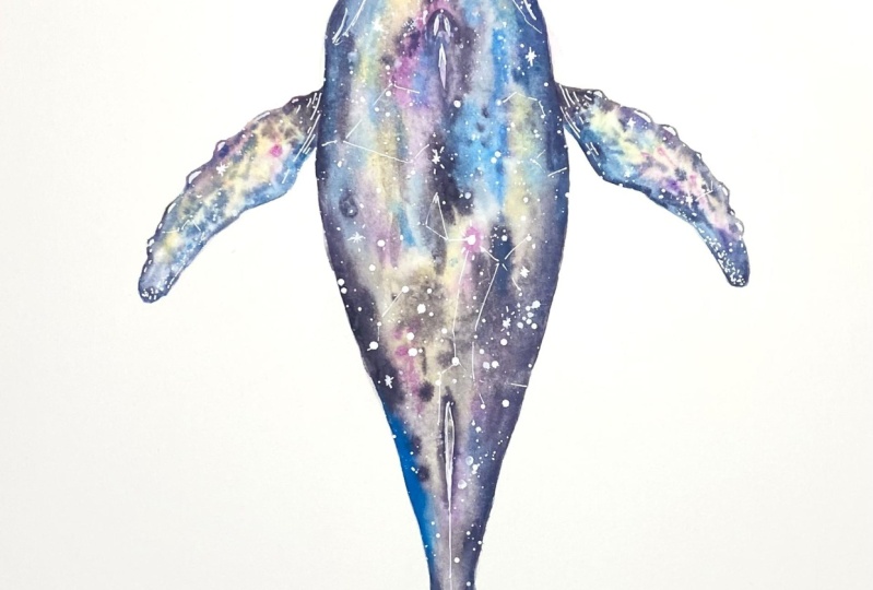
of your choice. In this class, I've chosen to use the shape of
a humback whale. First, I will teach
you how to drop in colors to create a
base wash using the wet, un, wet technique, followed by adding salt to create
a speckled pattern. Next, we will drop in a dark color to build up the
intensity of the night sky. We will then use some white
Gh to splatter in some stars. Finally, we will use white
gel pens to add more stars, highlight certain
features of our animal, as well as to add
some constellations. This class is suitable for
watercolorist of all levels, whether you're a beginner
or an advanced student. Once you learn this technique, its applications are limited
only by your imagination. If you're ready to
learn how to create a celestial animal using watercolor wash and
ink, let's begin.
2. Materials: Hello and welcome to the
material section of our course, where I will list all
the items that you need to create your beautiful
celestial whale design. First, you will need an four size sheet
of watercolor paper. I'm using the brand
Aldo Di Paolo, which is an artist
quality watercolor paper which is 100% cotton acid free, code pressed, and has a weight
of 300 grams/meter square. You don't have to use the
same brand of paper as me, but I highly recommend you use artist quality watercolor paper with at least a 300
grams/meter square weight. Next, let's talk about the materials you'll need for
drawing your whale design. I tend to use these
mechanical pencils by the brand pilot. They're Super Grip 0.5 which is just the
width of the lead. I use HB lead. I'll also be using an eraser. I'm using the brand,
it's a soft eraser, but you can use whatever
brand you want. I also find that this
comes in very handy, a mechanical eraser, just to erase those tiny areas
that you're drawing. This is also by
the brand stapler. Next let's talk about all the
items we need for painting. We're going to need water. I tend to use two jars of water at a time
when I'm painting, just so I don't have to
keep changing the water. After you rinse your brushes, you'll need to dry them. You can either paper towels, I tend to use a rag that I can just throw
in the wash later. I also highly recommend that
you use a nice big palette. You can put your
paints down here, and one preferably that has areas that you can
mix colors into. I love using ceramic palettes because they are just so
much easier to clean. Next, let's talk about the paint brushes that
we'll be using. I tend to use this
brand of pain brushes. They're silver black velvet, and they're all round brushes. And I have them in sizes 48.12 They are beautiful brushes that keep their tips
when they're wet. You don't have to use the
same brand of brushes that I, but I recommend that you get
these sizes and that you do use is quality pain brushes because they really
will make a difference. Now let's talk about the
paints that I'll be using. You don't have to use the
same colors that I use. Because I just decided I
wanted to have a whale in cooler tones and had a more
bluish and green look to it. You are free to use
whatever colors you want. However, if you would
like to follow me, I'm going to use
this color which is cobalt turquoise light by the
brand Windsor and Newton. As Windsor Green.
Windsor and Newton. I'm using Alizarin crimson, also by the same brand. Ultramarine violet,
also in the same brand. Prussian Blue, also by
Windsor and Newton. I'm also going to use these
colors of indigo blue. I'm using this brand of art spectrum and pains
gray also by art spectrum. All these watercolors
are artist quality. I would highly recommend artist quality
watercolor paints to. We will also be using this additional pain
which is white guash. I'm using it in the
brand art spectrum. This is also artist quality
and we'll be using that later to add some
cool star effects in. Those are the paints that we'll be using for this project. If you wish to follow the
same colors that I am. Also a very important
ingredient in this particular project is good old fashioned table salt
that you used for cooking. That will be absolutely fine. Last but not least, I will be using white gel pens. To add some final details in, I like to use this brand of
pens by Jelly Roll Sakura. I do believe I've listed all the items that you'll
need for this project. If you're ready, let's begin.
3. Sketching: Hello and welcome to the
drawing section of our class, where we will now sketch the shape of the humpback
whale from its above view. So without further
delay, let's begin. The shape of a humback whale from above is actually not
very difficult to draw at all. I'm going to start with roughly
the middle of the paper, and we're going to start with this nice round little
curve like that. That's going to be the
very tip of its mouth. From there I'm going to go draw a line that's
angled like that. It's going to continue
until about here. Then it's going to go down at a more straight angle like that. Right now, I'm just trying
to get the shape of it. We can refine it
a lot more later. We have something
that looks like that, then we're going to have a
bit of a almost circular, like a semicircle shape
that sticks out a bit here. I've looked at a lot of
reference photographs of whales on the Internet, and I've noticed that
right under here, we're going to curve
out a little bit again. But we're not going to curve as roundish as this,
if that makes sense. Yeah. We're going to get something that roughly
looks like this. I want to use my eraser just
to clean that up a bit, just so you can see it better. But we're still at the
initial stages of drawing. There we go. I want to actually
continue the whole body before I do the fins, just because I think I've
got the flow of the shape. I just want to
continue that with, with a humpback whale. Once we do that curve out here, we're now going to just go out a little bit here like that. And then the body
is going to start tapering in towards the whale. Towards the tail is what I
meant to say. They do rhyme. I'm going to do the same
for the other side. The humpback whale is
a very longish whale. It has a pretty slender body. The bulk of the
body will be here, but then it's going
to just taper down. The tail actually gets pretty narrow before we
actually have the, the very tip of the tail. I hope you've saved enough
space on your paper. Like I said many times for, I'm very guilty of
drawing really big. So I had to be very disciplined with how
much paper I was using. I just say I'm going
to clean this up now, but if you've got something
that looks like this, then you're doing well. All right. Just to get
it all neat and so that we can see what we're doing
at this very part here. We are now going to curve
out in a beautiful way. We're going to just go like this because the humbag whale is known for its
characteristically, very beautiful, shapely tail. I'm just going to,
the tail itself is pretty wide, you
can just imagine. It gives the whales so
much of a propellant, so to speak, of a force to swim. Then it's going to just
curve a little bit. There is this beautiful
roundish part that you really don't
want to miss out on. It's that beautiful tip here. You're then going to go inwards, it's going to curve like that. I'm sorry about the messy lines, but I will clean them up. You just want to get
this beautiful shape that is really curvy and
very distinct of this whale. I'm going to repeat what
I did on the left side. On the right we want to go down, then we're going to
go out like that. Just so I make it even, I might start over here now. We want this nice
curvy shape here. I just want to make sure I
don't do this site too long. I might as well use
middle part here as a yeah anchor point just to try and get this right because I don't want this
part to be too big. It can be a little bit
tricky to draw something symmetrically like this
tail of the humback whale. It's okay to make
mistakes and then refine it later as long as you just
get the rough shape first. That's what's really important. I've got this, which
I'm happy with. I'm just trying to see how
much more I can refine it. We want those nice
little ends here. This is going to
look so beautiful when we actually
finally paint it. Don't go too crazy trying to
make it exactly symmetrical, as it resembles a
symmetrical tail closely. I think that's good
enough. Just make sure you've got a good eraser. Because if you do choose, cut this design out later, You do want to try and keep any, any mistakes as
little as possible. You just want to make sure those lines are
not really there. But if you have something
that looks like this, I think you should
be quite happy. I always imagine this to be like a full grown an adult whale. I'm just trying to look
now at whether I should just maybe bring this
part out a bit more. I just feel like I want to
give the body more bulk. I do feel it's a
bit skinny there, so I'm just going to
bring it out a little, but I'm just basically going
to taper just like that. If you're happy with your whale, you don't have to do this. This is from what I've seen
from reference photographs, and if this is like
an adult whale, I just want to try and get the body shape as close as possible. I'm happy with this now. Just trying my
best to get rid of these lines that I don't want. They're not too distracting. Okay, that looks good. And we will be painting over
this part, so that's okay. Now, I suppose I
can do the mouth of the whale at this point
in this particular drawing, this painting that
I've designed, I do want to try and do
the mouth of the whale as it's like a semi
realistic painting. I wouldn't say it's
really realistic as obviously we're doing
a celestial effect. But I do like giving it
as much realism as I can, even though it's a
dreamy painting. This line that comes
from the mouth, it just starts a little
bit behind the tip. We're just basically
following the outline of it. Then we're going to curve
in here before we reach those semicircle curves that we drew earlier, the
mouth of the whale. It does have a shape like that. And then you've got
that nice curve here. Anyone that sees this can tell, hey, that's a whale shape. At this point. I'm
just going to try and clean up the lines as well. It's looking really
nice. It's looking very whale like already
before we even painted it, which is always a good sign. I'm just deciding how
much lines to have. There is a line that does go down the middle here of its mouth, on the
top of its head, I Then you have this like a, this line splits into
a forkish shape. We don't have to do too
much detail at this moment, but we can just like mark
that line as well as down here where we have that
little fin on its back. The humpback whale doesn't have a very pronounced dorsal fin
for such a large animal, which makes it quite
unique as well. It's such a unique,
beautiful animal. The fin would be somewhere here. I'm just going to mark that. But obviously if we're looking
at it from the top view, we're not going to
see a massive fin. You'll probably see
something that looks like that shape, it goes down here. It's just good to have these
lines just as guidelines, just so we know the
structure of the whale. Now we're going to do the
really, really fun part. For me, I don't want you to
feel like daunted by this, but we're going to do the fins which are
a really cool shape. The cool thing about this
beautiful animal is that it has a rather longish body and it has a massive tail that
just really propels it, but its fins are
also long and thin. We're going to start
just a little bit down here, a little space here. The thing about this fin
is it's so beautiful. We stretch out like that
in almost a straight line. I'm going to do a
straight line first, then we're going to add the really cool little
bumps on it later. Once we get the shape right, it goes down like this and we're going to curve now like that. Remember it has this
beautiful pointy look here. A roundish tip, but it's
pointy compared to the rest. Then it's going to do
this beautiful curve. The whale has so many
beautiful curves about it. I love the curve lines. I don't want you to be
intimidated drawing it. We now go up here like that. We have this beautiful
pronounced curve here. Don't worry, I'll
clean up the lines. And then we're going
to go back up here. It has very skinny, skinny fins for
such a big animal. But U, I want to do this right, I just want to make sure
I get this shape right. And then we're going
to have fun adding the, what would you call it? I just want to refine that
shape and make it really nice. I'm quite happy with that fin now we're going to have a lot of fun adding these little
bumps, so to speak. It's not a smooth thin, it has bits about it. We don't have to make
them all the same size. Some of them can be
bigger than others, there might be a bigger
gaps between them. These really do give the whale
that characteristic fin. We're going to put a
bit more here, I think. I want to put one bigger
one here like this. This is just me drawing
this from memory from a lot of pictures that I've
seen of whales online. Unfortunately, I don't
have a very clear above view personal photograph
that I took of a whale, even though I was lucky enough
to watch them from a boat. But yeah, this is all just looking at
underwater photographs. There are lots of whale
anatomy photographs on the Internet that
you can look up to. I just want to refine this little fin a
little bit more here. If you have something that looks like that, you should be happy. I feel like I'm happy with that. It clearly does look like a who. I'm going to try and repeat this on the other side as well. Don't worry if it's not
exactly symmetrical. Again, let's just start off
with how we did it last time. We have Adis line to tell. I want to bring this
part up a little bit. I now notice that this
is a little bit higher. I just want to bring
that a little higher. I hope I didn't distract you while I was
doing the other fin, but I just noticed something in a photograph that
there is this shape. But once more, it's very clear that it is a humpback whale. You don't have to, you don't have to drive
yourself crazy doing that. I just want to do it the
way I did last time. They should stretch out at a similar length and
angle, but it depends. Also is this guy like doing exactly the same
pose with his right, thin as he is with his left? It's up to you. I've
got this shape going. Remember that beautiful roundish tip that's so famous for? We're going to now curve it up. When we get here, I do feel
that this part should go up a little like I just did over
there on the left side. Then there it goes again. That to me looks good. If you want, you
can stand up and have a bit of
distance when you're looking at it just to see if you've got the
proportions right. But I'm pretty happy with this. Let me just make
this a little dark. I'm drawing my Finstar. If you have a cool
shape like that, I just feel like I should make this a little
bit thinner here. All right. Pretty thick line. So let's just get
rid of some of that. Okay, I'm happy with that. Like I say all the time, we're not trying to take a
photograph of the whale. This is also a dreamy painting, but I just wanted to get
the proportions right. Let's try and erase the lines that we don't
need just so we can see it. Now we're going to
have fun again doing really cool jagged little edges which we can definitely
highlight later on. Once we paint it, we've
got these bumps once more. You don't have to
evenly spread them out. Some can be smaller,
some can be bigger. That's what I'm doing here. I feel like I want to make this one very pronounced again. It goes back there, even if they're not exactly at the same height as you
can see from this. It's okay with me if it's as symmetrical as you can make it that
that's good enough. I just want to darken this side. I might just down a little bit even though I
know I curved it, but yeah. Okay. I'm not going to
change this anymore. I'm just going to switch to this eraser because it
has a sharper edge. All right, there we go. And I'm just going to
take one more look at it from above. I think it's looking real
cute and really good. Now I'm just going to use
this time just to check the proportions of my
whale just to make sure I got the main
lines that I feel will we'll make it very
clear that it's a whale. There are little details
that we can add later like the position of the barnacles
and stuff like that, but we can do that later. Right now, if you
have this shape and you're happy
with your drawing, we are done with the
sketching portion and we are ready to move on to
the painting section, which is coming up next. See you in the next
section. Thank you.
4. Base Coat and Salt: Hello and welcome to the painting section of our
class where we will be now laying down some
beautiful colors as a base wash for our
beautiful humpback whale. Let's begin. This is going to be very fun. I just want to get
all the colors that we are going to use
for this whale, U. As I mentioned before in
the material section, you don't have to use the
same colors that I am using. But if we do want to create
the celestial effect, the stars that we
will be adding later real do stand out
on darker colors. That being said, I've chosen some cool colors as I've shown you in the
material section, that are going to give a
more bluish green feel to my whale. But you're more than welcome
to use warmer colors. For instance, if you want to use some oranges, reds, or pings, and then contrast them
with black later on, that should also create a
warmer celestial effect. But I've just chosen
to use cool colors. If you want to do the
way I'm doing it, you can use these cool colors. Otherwise, you're
more than welcome to use whatever colors
you feel you want to, as long as we add darker
colors to add contrasts. But I've already spoken
a lot about that. Let me begin first by adding, whoops, that's quite a lot. One of the lighter colors
that I'm going to use is this beautiful cobalt
turquoise light. It is one of my favorite colors. I use it a lot, it's
just so beautiful. I also want to put
Windsor Green in. I'm just use this
little area here. Windsor Green. It's a green that really does
resemble Vidian to me. I'm also going to add a
bit of Alizarin Crimson. This is a pretty
strong pinkish red. We'll be using it
sparingly because I do want quite a bluish
green tone to my whale. I'm also going to be
using ultramarine violet. A purple that I use a that
is really, really gorgeous. I love it. We're also going to
use some indigo. Now, my indigo has
dried up in here. I'm actually just going to
scrape a little bit out with a ruler and then
put it in the palette. It's so hard I might actually wet my pain brush
and use it when I need to. I'm just going to
put this over here. Next we have our paints gray, which is close to black. It is a very strong color. I will be using it later. I'm just going to put some
in here for use later. But we're going to start with
our lighter colors first. The first thing I'm going
to do now is take my size 12 brush and I'm just going to wet the body and the
head of the whale. Right now I'm just
thinking about whether I want to do
the fins right now, but I think I just want to
focus on the body first and putting enough
water to get that nice, beautiful even sheen
that we want before we start dropping color
in just wetting it, gently damage the paper, you want to use some nice
big, gentle brush strokes. I'm just going to add
some into the tail now. One of the reasons
we don't have to do the fins right now,
at the same time, if we want to just focus on the body and the
head and the tail is because there is a
definite separation between the body and the fins. It helps if you can't see
whether there's an even sheen. You can tilt your paper because
the light above might be, make it a little
hard to see if it has a nice even sheen,
which we really want. We don't want some areas of the whale to dry
faster than others. With this technique, it's very important to
make sure you've got that nice
glossy, even shine. I can see it quite clearly. It's a nice even shine. I'm just going to add a
bit more water at the tip of this tail here just to make sure it's nice and even I'm happy with
how even that looks. Now I'm just going to, I can use this big brush. I love to start with
the lighter colors. I'm just going to drop in
some turquoise once more, not really thinking too much about where I'm
dropping this in. It's supposed to
be quite random. It's important to leave spaces, white spaces, the pines that
we're going to drop in. Next, I want to put in some
of this beautiful green. That's why I needed
the paper to be nice and have a nice even sheen. Just so these pins
just spread nicely. If you feel that it's
too concentrated here, just dip your brush
in water again. You can just rewet that. Going to drop some in. Now I'm going to add
some of that purple. I love that purple so much. It's a gorgeous
purple, isn't it? Just as I'm painting
now, I actually, I want to add a deeper blue in. I know I've already
put my colors here, but I can't help but
think I would really like to put some
Prussian blue in. I'm just going to
quickly grab that. I do want to put a bit of
Prussian blue in because I think it does need
a bit of that blue. Even though I'm doing this
pretty randomly, I do. The outer edges of
the whale should be darker just because
it adds a bit of, it adds dimension to the whale. Okay. I don't want
to use too much of this blue because I still
have other colors to add in. But I do feel like
it needed some blue. Now add some of this Alizarin
crimson in once more. If you feel it's too
strong, very simply, just rinse your brush and
help it spread a bit more. Like I said before, it's
important to leave a bit of space between the colors. I, I do like turquoise a lot. I don't mind adding a little bit more turquoise here in the. Yep, that's looking good. Now I'm going to switch
brushes to a size four because I want to
add in a stronger color. That's our black. I want to add in our indigo. Now, I'm just going to wet this. Just put it over here,
because indigo is a beautiful shadow color
that I love using. What I want to do
with indigo is I want to drop it in to the sides here. I am going to use the indigo a bit to outline the
way or a little, because as I said before, I feel like the edges
should be darker. I'm just letting this
color spread in. As you can see that there's
a lot going on here. It's looking very colorful. But believe it or not, before I add more, I am looking at it now. And now's a stage where
I think I want to add a bit of pink
here and there, because I feel like there isn't enough pink before
I add more in. This is a stage where you can
decide what you want to do. It's not set in stone. You can keep doing this. I'm constantly adding
things while painting. I'm sorry if I'm
distracting you a little by adding
some pink in here while I was doing the indigo. But I just felt like
I wanted to add a bit more pink before I start
adding more dark colors in. Finally, I'm going to
put the pink down, but it needed a bit more
color here and there. Back to our indigo. I'm, as you can see, my paper is still really
wet which is great. No part is drying rapidly yet. So I'm just going
to outline my way a bit because we do have a
very important step that we have to do before this dries
working quite quick now, getting more in the go out, I'm just going to outline
my whale as you can see. As I said before,
it is spreading nicely into the
interior of the whale. Even though we're
going on the sides, this is all going
to add dimension. I work quite quickly, now I'm going to start
going up my whale. Don't worry if you've got some pain coming out
now, that's fine. We can lift it out later. Just going up here,
all the way around, we're giving our whale like a boundary as
well and dimension, since this is still pretty
wet and it's going well. I think I actually might want to very quickly start
doing the fins. Very simple, with the fins, all I'm doing is wetting
it with clean water. And I'm going to
do the same thing. I'm just going to add in the colors that I
want to add in, in a pretty random way. Really, not thinking too
much about this at all. I think you could use some
pink here, some purple. I'm also like leaving some
space, the drops of pain. It's good to have a bit of
white just between that of that beautiful Prussian
blue that I've decided to use at the end here. Don't worry about
that going there. It's cool. It's all going
to add up very beautifully. While this is happening, I want to get more indigo. I'm going to just
start outlining. As you can see, the paint is
spreading very beautifully. Just try your best to go through the jagged
edges of the whale. We're working fast, like we're not just taking
our time because we have a very important
step that we have to do, which is the salt step. As you can see here, I almost
put my hand down here. It's very useful
to have a rag just so you ruin your painting. I was resting my
hand on my palette. Just be conscious of where your hand is resting
on because you don't want to put lots of paint all over doing this nice jagged ditch. And now I'm going up here, are you ready for
the really fun part? Now we're going to grab
our salt and we are going to sprinkle it all over O Whale. Make sure you get every part of the whale including
the tail, the fins. How much salt is enough? I do feel that when you
have covered it all, that is a lot of salt. I think that is
more than enough. What we're going to do
now is a hard part. We actually just have to be
a little bit discipline and we're going to have to just wait for the salt to completely dry. This is very important
for this effect to work. You do have to wait for the salt to completely dry
before we do the next step, because otherwise this
effect just won't work. We won't get that
beautiful speckled look that we see on humpback whales. That's why I say this
is the hardest step. I would advise you now
to go do something fun while you wait for
this to completely dry. I will see you in
the next video. Have a break and see you later.
5. Second Coat: Hello and welcome back. If you were good and patient, you would have waited until your salt completely
dried for me, that took a couple of hours
for it to completely dry. I'm now going to look
at what we have here. I'm just going to use my fingers and just brush away
the salt as best as I can. I have a lot of salt here. I'm just going to
use my fingers. That's the best way. And some of the salt will come off quite easily the
layers on the top, but some might be
stuck to the paper. You might need to really Yeah, As you can see, use your fingers so this doesn't go
all over the floor. I might tilt it into a
container that I have. Let me just get back. So I'm just going to that's a lot so I'm just going
to tilt it. There we go. As you can see, our salt has left some
beautiful markings. They're not clear everywhere, but you can see them here as
these little white specks or flowers that are on
your whales body. The reason I wanted to do this salt step is because
it just adds texture. It some nice variations and patterns that you would see on a real whale underneath
you can I think I've gotten all the salt of yeah, I would just say try and get the salt off as best as you can. I think we're done. Okay,
I think that's good. As you can see lovely patterns here that I don't think we could replicate
without the salt. It's really pretty. I feel for creating this
type of speckled texture. What I want to do now, I want to build some dimension to our whale because it
is looking flat now. To do that, I'm just
looking at my whale. I want to add some
darker colors just around the perimeter of the whale that will just
gradually go inwards. And I also want to make
certain areas stick out. For example, this
little dorsal fin here, this part here of the whale. To do this now I'm going to use my huge size 12 round brush. I'm just going to very
gently add water, just clean water and try and stick inside inside
the painted area. I've got a little mistake
over there, but that's fine. I can deal with that later
because I just really want to start adding dimension
to my whale once more. We're doing that whole adding
enough water to give us a nice even sheen. You might have to
rewet certain areas because the paper will dry. Rewet those areas
that you previously wet until you get that
nice, beautiful sheen. Try and go as close to
the edge as possible. I think I'm going to try
and do this in one go, including the side fins. I'm just doing the tail
right now, just wetting it. It's good. The colors are not
really moving. That's good. I'm just going to
tilt my paper just so I can see that's
an even sheen. That's good. I think I
also want to do the, the fins at the same time. We've got some
beautiful colors here, but to create the
galaxy effect by adding some darker colors around
the perimeter of the whale. I am going to mute the colors a little bit because
they are bright. Right now, we want the background to be a
little bit darker so that our stars do stand out. I'm going to swap to a smaller
brush size, four round. I'm just going to
use my paints gray. I'm just going to add. Some pains. Gray
where the fin is. If you feel that you've gone
a bit dark, which I do. I'm just going to add a
bit more water to that. I want to let the colors in
the middle come through, but I just want
to shape the fin. I'm putting it towards
the circumference, as you can see, I'm
going to quickly do this side as well here. I might put it
here just so I can see how concentrated
the color is. I'm just going to do that again, just using indigo to let the colors come
through in the middle. But I'm muting the edges. Now. I can see that my tail
is starting to dry up a bit. I'm just going to
rewet this area. I'm painting in pretty
dry air conditions because it's currently winter
now in Sydney where I'm in, and I've got my heater on. Okay. That's all nice and wet. We are now going to
start quite fast. I just want to rewet
this because I feel that it's quite concentrated, but I like this a lot now, this consistency
working pretty quick. But I want to keep that Fn, this area lighter
around the dorsal fin. I also want to just
add a little bit of this dark color inside the body of the whale because I feel that some parts are
a little bit too light. I just feel like the stars
won't stand out there. I want to add a bit of
darker color there, but just once more don't get too carried
away like I do sometimes because you don't want
to completely mute these beautiful greens and pinks and purples that you see. I'm going to have to
work quite fast now. I'm just doing the edge
of the whale's tail. As you can see, the color
is getting a bit muted. But that's cool. We don't
want it too bright. I want to do this special
part of the whale over here. We've got this little hamp
and this line over here, we also have this line
where the mouth opens. I'm also going to do the
edge of the whale here. Even though this step is
about building layers. And now it's also
a great time to, you can use the stage to
just make the colors, the colors that you
want to come through. Like I felt this part was
a little bit too red, so I don't mind muting
that part a little. I'm just going to use a
more concentrated version over here of my pains. Gray, it's a bit wet here. I just really want this
outline to be clear. Let's just do this again. All right, that's looking nice. I just want to make that
area here a little bit darker around the sides.
This is up to you. How do you want to go? But we do want certain areas to stand out more like this dorsal
fin around here. Don't worry if you can make
it stand out a lot right now, we can always add more
definition to that later. But right now, this step is about building up
the darker layers, just so our stars really shine through on top
of this darker area. I've got this, I might
just drop in a bit more. A whale is looking darker now. Once more. If you feel
like it's drying up, you can always re, wet the area. I'm just going to drop in
a bit more water here, but I like the, I like these
colors showing through. I just want to darken
this part of the fin, where it attaches to
the main body just because I feel like that part
should have more shadow. I'm just going to go around here if we want this to look nice and
natural, and organic. I would not do dark edges. If you feel like an
edge is really dark, you can use water on it. Just looking at
what I've got here, don't worry about the
pain going out right now, because we can always
lift that later. Just focus right now on
darkening those boundaries. Okay, there's the mouth
that's looking quite nice. And I've also just decided
to add to drop in a bit of a bit pain just in areas that I feel are
really light with whales, they tend to have a speckled
look on their body. I don't mind adding a
few little dots here and there to build up those speckles that
you see on the whale. But I just wanted to add that. We don't want to cover all the colors and our
beautiful salt pattern, we still want some of
that to come through. I prefer not to add any
more salt right now because I feel that we want
to build up the layers. Because when we do add salt, it will get lighter. We will create flower patterns. Right now, we want to try and you build up the dimension and it would
only make it lighter. So this is all about now,
trying to build that up. Okay, that's looking
very lovely. Okay. No, that's looking good. I'm going to take a step back and have a look
at it and I'm like, I'm actually really happy with my whale now. It's
looking very good. I just want to say I did use a concentrated version
of pains gray. It did look pretty dark. But yeah, I'm happy
with this now. I might just my brush to just
gently as it's drying now, but I don't want
very hard edges just to try and do the
outline of the mouth. I really want this area to
come through around here. Don't worry if you feel you've
made this part too dark. Because later on we can use our white gel pens and really enlighten
it wherever we go. I feel like that whale is
looking pretty dark already. I don't want to,
as I said before, mute all the color that this is. Good. Now I might. All right. I just want to add
some definition to the fin. But it's looking great. We're definitely going to get a beautiful celestial effect. Now what I might just do is a bit of green
there, but that's okay. I just want to
drop in a bit more of that speckled effect because I feel that
this parts a bit light, but I don't really want to
put so much dark color on it. And what you can
actually do now, there are certain colors
that I would love to shine through.
I love turquoise. I wouldn't mind dropping
in a bit of turquoise here just to let that those colors that might have been a bit too
mutant come through. Yeah, I think there
is enough green. I love turquoise. Okay, I think I might
have to stop myself, but I do want maybe
a little bit more purple to come
through a bit too. This is the time that
you can still play with the colors before we
start adding our stars. If you feel like you want a bit more purple here and there. But it's important to have these little, these white gaps. They are actually very important
because they will give your galaxy like a
nice glow to it. Yeah, I might add
a bit of turquoise on the tail because I
feel like this part a bit, it's a bit dark. I want to add a little here
just to lighten it up a bit, but other than that,
I'm quite happy with the way this looks. Yeah, I think I'm
going to stop it here. I hope that you're happy
too with your whale. When I say I want to stop it, I want to continue just adding a few more speckles here
and there on my whale. I know it's, it can
be quite addictive. Okay. Okay. Taking a step back and
just trying to see what I think we could definitely outline that
a little bit more. It's still wet, so the
color is still blending. You're not seeing like
a really hard edge. There we go, Looking
very lovely. Adding a few more speckles
before I put my brush down. Finally, I was just going over
the outline again just to, okay, I think our
whale is looking good. Let's stop now. Let
it completely dry. Yes. Please take a break
before we move on to the really fun section of
splattering white paint. And using our white gel pens. I can't wait for you to join
me for the next section. Have a break now while your
whale dries. Thank you.
6. Splattering and Ink: Hello everyone and welcome
back to our come back whale. If you've let it completely dry, like what I did, you might have something
that looks like this. Where we have the
nice lighter colors on the interior of
the whale and we've got our darker definitions around the very
perimeter of the whale. I'm quite happy with what
I've got right here. If you have something like this, you should be proud of yourself. I think you've done
very well now. We are actually
going to have a lot of fun doing my favorite step in this celestial galaxy effect, which we are going to use some artist quality
white Ga paint right now to do our
very cool star effect. I'm just going to put the
gach over here just so you can see it for yourselves
on the palette. Because we actually
have to add a bit of water to it because
right now it is very thick, we can't use it in the way I would like to use it just yet. What we're going to do is to use a brush and we're going to put some clean water to it. We don't want to
put too much in, because we still want
the guache to stand out against our whales body. This looks like a good
consistency that I have here, but I just want to just
test it out a little. This is a spare piece
of paper I have. What we're going to do is
do this tapping action. As you can see,
it's starting to, maybe I'll use this blue
background. Yeah, that's nice. As you can see a
bit on this purple, I'm now at the right
consistency of pain. We want pain that's
thin enough that we can flick it or tap it with the
brush onto our painting, but we also don't
want it so thin that it doesn't stand
out against our wall. Let me just move. All
right. I've just tested it. It's a very simple process of lifting up the
paint on your brush. And I'm just using
my size eight now. We're going to gently tap it. As you can see, we are
adding these white spots. They're probably going
to be more obvious on the darker parts
of our whale. But yeah, we are getting that celestial effect that I talked about. It's
looking great. Yeah, I'm using a
size eight brush now. The size of the brush
that you use is going to determine how big
your stars look. I don't mind using
the size eight. A little bit more here, but I'm actually
thinking of switching to a size four because I
feel like this whale is, it's not a huge area to cover. I don't want all the
stars to look really big, but it's nice to have
a few big stars there. But as you can see, this is
why we did that background. This is why we added
all those multi colors and darkinson areas. Because you can see it really
does look like a galaxy. And that's really cool. I'm just going to
finish up using the size eight once more. I've done this before and I can get quite carried
away doing stars. I'm going to let you decide how many stars you
want to put down. Yeah, I love a galaxy
full of stars. I don't mind putting
quite a bit in, but I'm going to use my
size four brush now. Once more, just test it out on a spare piece
of paper first before. As you can see, this is not
really flicking very much. I'm going to add a
little bit more water. Let's try that again. Over here. Yeah, I can see some
stars are coming out here with my small brush. I'm going to tap a
bit. There we go. As you can see, I'm covering the tail now with some stars. This is a fun, addictive step that you can
easily get carried away with. Yeah, at some point you need to tell
yourself when to stop. I'm do a little bit
more of the stars on the fins up here. Yep, wow. Look at our whale. So you'll notice that
the stars are really standing out against the
darker parts of the whale. All right, that's looking starry to me and I hope
you can see that effect. I might just lift my paper
up closer to the camera. If you can look at that, That looks like a galactic
creature, doesn't it? Yeah, it's a beautiful effect that I've used in
previous paintings. Like when I designed
the cover of my first song that I
released on Spotify, I did this effect to do
a celestial hair effect. The painting of the Go I used. Yeah, it has lots of applications that you
can use later on. I've done a lot of stars. As you can see, I think I might stop at this point because
it is quite a lot of stars. I just want to ask, I'm not a very patient person, but to just let it dry
before we can actually use a white gel pen to add a few bigger stars to
really make it stand out. I'm also going to show you a really cool effect that
you can do where you can add constellations
into your whale. If you painting has
completely dried. Now all those beautiful
white dots that we splattered on have dried. You should be able to have a really cool celestial
effect like that. That's one of the reasons I
also do use plastic on top of my desk just because it makes it a lot easier for all this paint to get wiped away
with a wet cloth. It pays to invest in a
piece of plastic to put over your work station. Even though it does add to the reflection in this
video. I apologize for that. But the reason I do use plastic is when I use
techniques like this, it's just easier to clean up. But I hope you're loving the celestial effect
as much as I am now. It's a really cool part where
we can use a white gel pen to either add more larger stars in or to do constellations, as well as to add a little bit more detail
to our whales body. I've got my three
jelly roll pens here, which I use a lot. I don't know if I'm
going to need to use all the different sizes, but I think I'll start with the 0.5 which is the smallest. Because I want to just now, before I add stars in, actually I want to use my
white gel pen to just add a little bit of definition to certain features of the whale. For example, the dorsal fin over here has got a little bit
covered up with stars. What we can do is we can just outline it with
the white gel pen. For many reference photographs, this dorsal fin actually forms a ridge that goes down
here to the whales tail. These are all features of our whale that I would
like to still keep. I'm going to have to switch to a 0.8 just to make it a little thicker as I feel that
my 0.5 is not as strong. I'm just going to do this fin, make it very highlighted down here into the tail is
where the ridge goes. While I have this as well, I just want to add certain things I do see
with the white gel pen. There are certain barnacles
on the whale also as we, let's just start
with the tip here. There are these
little barnacle marks that I don't want to lose because I feel like it gives the whale like character. There are a few of them. We can actually use our
white gel pen to add that. A few of these
barnacles over here, some here over here. I don't want to get
to carried away because I'm not
really specifically following one
particular reference photograph besides that. I also want to add
some very distinct White marks that are
on the fins here. I hope you can see
what I'm doing here, because these are
part of the whales. It's really obvious, these
dots on these ridges here. I still want to preserve that. I don't feel like I
want to lose that. This is by the way up to you, how much detail you want
to put in for your, for your whale at this point. Because you can make this a very dreamy abstract painting. That's absolutely fine. I just wanted to include these little things because
to tell you the truth, I like them. I
think they're cute. And they also really
do add to the image of the whale because we are
creating a very dreamy effect. I don't want to lose the reality, so to
speak, of the whale. I think that's fine. I don't need to connect them. I like them separated,
these little white dots. I'm going to, I'm just
going to move this aside first sec since we don't
need the pain right now. I also want to do the same
over here with this fin. Yeah, it looks really cute. I love the way our
whale is looking. I just want to add a
little bit of these. There's like a bit of broken white lines
that I think I can just get away
with by doing dots. I feel just a add to the effect. I think I see it
over here as well. I just want to try and replicate
that in the whales fins. I do. I've seen that in several photographs
on the internet. There are a beautiful, I can also see it a little
bit on the tail of the whale. I just want to add a
little bit of that. Not too much because
there's not a lot of it. Just maybe right at the tips. Yeah, that's looking great. Yeah, the white gel pen is just basically my best friend as an artist, as a watercolorist. I just love it convenient for adding these
little definitions. I'm just doing a
little bit over here. I think it does give the tail a bit of
definition as well. It's a little bit of
it, but if you notice, I'm leaving that dark outline just because I feel like it, it frames the whales body. I don't want to
lose all that also. Now I just want to look
at certain things that I can do with a white gel
pen to further add. As you notice, we've got
this line where the mouth is that I did with the
darker colors earlier. I just want to swap back to my 0.5 pen and hope it still works. Sometimes it gets jammed, but I feel like I
want to outline this one more than it's
working once more. I just want to use very gentle broken lines to just outline
this whales mouth. As I feel it's very important that we see this from the above
view of the whale. I'm just going over
the black that I laid down earlier when
I was doing the washes. And as you can see, that to me looks great. I don't have to do
too much to it. I think it looks great as it is. Anyone can tell? This
is a whale from above. And I'm just trying to
see what else I can do before I finish this. And we could add a few little constellations
in just for fun. And I think it looks great, but just trying to
finish up the whale now, just seeing if I need
to do anything more. I think that's
good. If you want, you can take a thicker pen. So this is my size ten, the
largest, white one I have. This part of the
whale is sticks out. I wouldn't mind using
my white gel pen to emphasize that part of it. Besides that, I
think that's where the blow hole is as well. I'm fine to then
stop doing that now. I'm just going to
take my white gel pen and I guess I could still
keep using the ten. I want to add a few big stars that just really
stand out that maybe we could even use as a
constellation later for me, how I put the big stars
where I decide them to go, I looked at the lighter
areas, for example. This is dark area, little stars stand out really beautifully, but I see a few
white cloudy areas. That's where I decide to put. Larger stars.
Because I find that it looks like these
larger stars have like a glow around them,
as you can see. There we go, I think one
should definitely be here. It adds a bit of realism
to it, the way they glow. Because when something's
really bright, is glowing, the area around
it would probably be lighter. These are all things
to think about when you do your galaxy effect. I'm just looking for
more of these areas that are once more, have fun with it. This doesn't have to
be an exact science, but that's what I would do. Just as you can see, this area is lighter. It can probably use a couple
of big stars on more. It's fine for certain areas to have more stars than others. That's absolutely fine. I think that makes it
look a bit more real, to tell you the truth than
a uniform distribution of stars. So that's great. And once more, if
you're like me, you can get very carried
away with this process. Maybe just restrict
yourself and just say, all right, I'm only
going to do this for a certain amount of time
and then I'm going to stop. Yeah, let me just
take a step back. Very important when doing
something like this, to take a step back to see I put enough
stars a overdoing it. What I'd like to do
sometimes is just randomly just hold
my pen like that, add a few stars in. Honestly, I feel like I'm getting quite carried
away now again, so I have to stop myself. Okay. I'm quite happy with
the way that looks now now, I just as I said that, I'm like, oh, you could
use a couple more here. Yeah. Okay, Let me stop now. I was going to show you
something really cool that you can do to
make constellations. I'm just going to show you a small piece of art
that inspired this. This is something that I
did earlier this year. I used a mana, as you can see, and I did that whole
celestial effect. This is how I applied
it to this animal. Because and I decided to make some of the stars
look like they formed a constellation that
spelled out the name. And the reason I chose
the name Dream here is because I'm a musician that performs under
the name Dream Manta. I was coming up with
my own logo and throwing some ideas around
and I thought, hey, the Celestial Effect
is actually pretty cool and you can actually spell out names if you'd
like with this effect, but that was just to
give you some ideas. But for this particular whale, I think I'm fine
to just stick to very small constellations
if you intend to. I was going to talk
about this later, but if you intend
to cut this out, which I was going
to demonstrate, you can actually turn
this into a bookmark. It can be a great gift. You can use that constellation. In fact, I showed you to
spell out somebody's name. I think that would be
such a lovely gift. Another thing you
can do with this, if you cut it out and you don't want to make
it into a bookmark, you can also use it
as a cake topper. Believe it or not, I have done cake toppers for
birthday parties, for my daughter's
birthday parti, and spell out her name in it. So these are just a few
ideas of what you can do. Yeah, it's really up to you
so personally with this one. I'm not giving it as
a gift to anybody. I just want to show you a
cool thing that you can do. Like for example,
constellations. How about we get doing that if you see a couple of stars
that look quite distinct. If you want, I'm using
the smallest pen size, 0.5 You can just connect. I hope my gel pen works. Is it not working
now when I need it? All right, I'm going
to have to swap. Sometimes these gel pens do get jammed. All right,
so there we go. There is a line here and you can make up your
own constellation. You don't have to specifically
look one up there. I just made a
constellation like that, tell you T, I might join
and I might even do this. As you can see, there's a cool constellation
there. Right. I can just try and pick out some other ones
that will be cool. You can even add your own, add more dots if you want your constellation to
look a certain way. These are all really
fun ideas that you can do with this effect. Might just add a star here. As you can see, it's a
lot of fun. There we go. So we've got two
constellations here. Yeah, you can decide where
you want to once more. I don't want to get
too carried away, but maybe I might
put one up here just to balance it out a bit. Maybe I might do like
tetrahedral shape, since we got a few triangular
looking ones over here. And then we just add the
dots to look like stars. This is a lot of fun. Yeah, the limit. It's
really up to you. How about we do one on the tail? Why? Let's do that. Maybe I'll turn this
one into a triangle. Yeah, it is a lot of fun and um, yeah, you can just
really get carried away. All right, I think I'm going
to do this one looks a bit strange, so yeah, my one tip is try and make the lines that connect your
constellations as thin as possible because it
gives a meter effect and it makes it more obvious
as a constellation. I'm just deciding do we
want to add any more, because we do have the body
of the whale to play with. I don't want to say it's plain, it has lots of stars, but we
can play around with that. I do see some stars here
that are begging for me to turn them into a
constellation. I might do that. There we go. You see, we can do all cool
constellation effects. I'm just deciding
if I should put, should we do one on each fin? Why not? How about one
That looks like that. As I said, you can get quite carried away
with this effect. All right. Maybe at a
different position over here. This looks nice. Let's
play around with this one. Maybe just join that. Yeah, so this is pretty cool. Just taking a step back
and having a look. I hope you can see
what I've done. That is so cool, isn't it? I don't think we really
need to do one on the head. I think that might be enough. If you want, you can
use your gel pen to make certain stars shine. Like for instance, I
don't like to do this a lot because how about
we work with this one? We're just going to add
very gentle lines on that. This is one bright star
that we have over here. Just filling it up a bit, but I don't like to do a lot of these because I
feel like it's already. What I do next to just tone
it down a bit is I'll use a tiny white brush to blend these little
lines to make them, to make them look like a glow. Yeah, I don't like to do this too much because I feel that there is
already a lot going on. I just wanted to show you
an idea of what you can do. As you can see, I've
used a damp brush to like create that glowy
effect around it, but now I'm just
going to have to redo that because it yeah, you have a bit of that glow. But to tell you
the truth, I feel like you don't need
to do that a lot. The whale looks pretty
good on its own. I just want to add a
couple more stars here, even though I said I wasn't
going to get carried away. Yeah, these are some ideas that you can do
with this effect. You can do
constellations or spell your name out if you're giving
it as a gift to somebody. If you're happy with
what you've got, you don't have to
continue anymore. Let's just let this fully dry. In the last section, I'm going to show you
how you can turn this into a bookmark
or a cake topper. See you in the next
section. Thank you.
7. Bookmark or Cake Topper: Hi, and we're back. If you're very happy with
your painting as it is now, you are fine to just leave
it on this piece of paper. But if you want to do
something really cool with it, like turn it into a
bookmark or a cake topper, then I just want to
show you how you can do that with this piece of paper. What I did during
the break was I did use some clean water and
a scrub brush to try and get these little paint marks of the outside of the whale just to make it look neater
like just certain areas. But if you feel
that you still have some dark paint that's sticking out that's
really bothering you, you can also just
undiluted white gash. Use a small brush and paint over these areas and it should help lighten it so that you don't
notice it as much. I mean, I still have a couple of these that I
couldn't scrub off, but they don't
bother me too much. I think that looks pretty good just to do a bookmark
or a cake topper. And this is a matter
of preference, I like to leave a bit of a white border
around my subject. I mean, you don't
have to do this. If you want, you
can cut it all the way right at the
edge of the whale. But for me personally,
I just like the look of that tiny white border. And I've done this before for like bookmarks and cake toppers. You don't have to follow me. But I like to leave a small, I think it helps the subject to just
stand out a bit more. Well, that's also just
a matter of preference. I'm just now going to cut
very carefully and try to keep the same thickness around the wall as
I go all around. But just try your best. Sometimes it might be easier
to cut the paper first. By the way, if
you're doing this, all these little bits of paper
that you're cutting out, don't throw them away,
because this is watercolor. Keep them so that you can
test out pains next time. With watercolor paper,
it's like gold to me. It's expensive. All these little things that you can do to save money, they will help you. I'm just going to
gently cut around here, but I need to get
back to that fin. Yeah, as you can see, our whale has this nice
white border around it that helps it to
stand out slightly. Okay, let's get back
to this fin here. Feel free to turn your paper
around if you have to. I'm going to cut
some more of this. I just can't really see
properly around here. Yeah, these little corners
might be a bit hard to do. Turn your paper around. All right. That's good. That's good enough
for me. I just want to just add a little bit, we can cut a little
bit inside here. Yep, that's good. All right, now let's keep going
with our whale. It's already looking so cool. I'm going to try and keep
the same thickness here. While I'm cutting this, I
just want to talk about. Yeah, I hope you've
enjoyed this process of creating a celestial animal. And feel free to
apply what you've learned on the
whale today to you. Any animal you want. Any subject you want. It doesn't even have
to be an animal. This effect, as I
mentioned earlier, looks great on, on hair. But the only thing I will say is to think about is that
this celestial effect, it best stands out
against darker colors. I'll come back to that
fin again. Notorious Fin. I'm just going to keep
going around here. Yeah. As you can see, that's why I left that white border. I just think it makes
the whale pop more. Yeah. This will make
such great gifts. Yeah. You can do such great, personalized gifts for people with this effect. All right. Curves. All right. I'm just
going to cut this once more. This is great spare paper
to try out paints on. I'm just going to, you want to try and follow the
outline as best as you can. It does go in here. I'm
just going to do that. All right, that looks good. Let's just do the same thing
that we did over here. We're going to just cut
a little bit in here. I don't think I need
to remind you to try and use a good sharp scissors
when you're doing this, it'll make it a lot easier. I just want to trim that
down, make it a bit under. And there is your cool whale that you can use as a bookmark. Let me just clean that up a bit. That's a really cool bookmark
to tell you the truth. I love that effect. And
as I told you earlier, you could even write out somebody's name and make it
look like a constellation. But I just love my
whale like that. This is a bookmark. A big bookmark. It's
still a bookmark. But I just want to show you now how you can turn this
into a cake topper. Like I mentioned before,
it's very simple. All you need are a
couple of two fix. Because the whale is this shape. It does. Yeah. I'm just
thinking, should I? If it's going to go
on a cake and we want it to just sit like that, I'm going to turn
the whale upside down and I just want to
use a couple of topics. I'm going to put it here
on this fin, on the tail. On this part of the tail, I
use a bit of masking tape. I just tear it out as neatly as I can attach
it to the whale. Don't worry about all
this that's sticking out. We are going to cut around it. Obviously, this is a bit of a strange shape to use
for a cake topper, but I've done this
before for my kids. What we're going
to do now, well, you can turn it around if
you want to make sure you don't like more cutting. You're going to very
gently cut the fin. Try and hide that over here too. My cutting is dodgy today. All right. All right, so as you can see,
you can try and hide that as much as you can. I'm also going to cut this, the tape sticking to
my scissors today. But there you go. You just put this, insert
this into your cake, and you've got a cake topper. And as I mentioned before, you could spell out
the kid's name. Doesn't have to be a kid. Anyone who wants this as a
caketopper for the cake, that's how you make
a cake topper. I believe this is the
end of our class. I hope you've had a lot of fun with this class
and it's given you a lot of ideas of how we can
use the celestial effect. Please join me in the very
last section of this class, which is Final thoughts. Thank you so much again for
joining me for this class. I hope you've really
enjoyed yourself. Thank you.
8. Final Thoughts: Once more. As always, I would like to say a huge thank you for watching my class, for following me on skillshare, and for all your support. I hope you've had a lot of fun creating a celestial
animal of your choice. Or applying the celestial
night sky effect in other interesting ways, such as to create the hair of a fantasy character or even
creating dreamy lettering. The applications of this
effect are endless. Please feel free to upload your class project
in the projects and resources section of
this class so that other students and myself can
admire your beautiful work. If you would like me to see
your work on social media, please feel free to tag me at
Alicia Paran on Instagram. Please also feel free to
follow me on Skill Share or Instagram to get updates on
new classes by me once more. Thank you so much again for watching my classes
following me and for all your support
and I wish you all the best in your
border color journey.
 Alicia Puran, Artist, Musician, Teacher