Transcripts
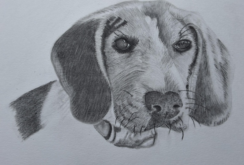
1. Introduction: Hey guys, welcome to how to draw a beagle. My name is Braden lesser. I am an artist, a YouTuber, and I make drawing content for the Internet of Things. And this one, I have broken it down into 13 digestible lessons. In those lessons, I'm going to be taking you through and teaching you all of the steps that I use in that I teach, which is pretty much how I drew up, but it's called the three-layered method. This method is very simple, requires a handful of tools, but I have the links to all of the tools that I use in this tutorial for you in the description of this class. If you are new to the three layered method, have no fear. In this class. I'm going to be breaking it down and explaining everything from how we lay down our base layer with soft charcoals. I'm also going to be explaining how we use the mono eraser to do what they call retrieve our high values. And I'm also going to be explaining the differences between soft, medium and hard charcoals and why we use them certain stages in the drawing that we do. And I'm also going to be showing you some really cool brush work with different sizes of brushes. And we're gonna be talking about drawing theory and hopefully having a lot of fun while we do it. I encourage you to follow along and draw your dog. And at the end of this class, please feel free to post your project in the projects tab. I would love to see your work and men talk about it. So that's the short and sweet of what this class is all about. And I hope to see you in class.
2. Tools | Basic Shape: All right, so this one, we're going to be using a graphite pencil to do our outline of our basic shape. We're also going to be using an electric artist and eraser, a Pentel click eraser and a mono 0, as well as a soft a medium and a hard rated charcoal pencil. Yes. We're also going to be using a number seven and number one. And of course, the little guy, three-sixteenths slider. There we go. And yeah, we're gonna be using a couple of brushes. This is just a diagonal cut to elf brush that I pulled from a makeup kit. And the old trusty Number 6, I should just regular number 6 brush for laying down our base layers of soft charcoal. We're also going to using this and some little scratch piece of paper to check our tones before we put them down onto the paper. And yeah, just took the lid off of one of my wife's candles and grind some soft charcoal in here. So sulfur base Larry. Alright, let's get started. So I'm going to use your graphite pencil. We are referring to reference image. And yet we're just gonna take our time here. In this first lesson, all we are concerned with is the basic shape of our Beagle dog here. And for those of you that aren't aware, the word shape in drawing by definition is simply the outer contour of the object in question. So and the reason why we want to focus on this because, you know, when your viewer first looks at your drawing, the shape of the overall shape subconsciously is what they're going to first and that's how they're going to begin to make sense of your drawing. With the input different values, whether they'd be high or low. That's how we basically give shadow to an object to help give it form, right? Give it that, that illusion, if you will, of that third dimension. Because forum, by definition is three-dimensional versus shape, which is only ever going to be two-dimensional. So form in drawings is essentially implied. And the reason why it's implied is because it is truly an illusion of three-dimensional, though. In actual space, it only takes up two dimensions. So it's your job as the artists to make sure that you follow the rules of drawing so that you can convey the most realistic drawing that you can. But as you can see, there's no right or wrong way to establish the shape of your reference photo. And for me, one of the things that I always tell my students is that don't worry about perfection. Okay? What we're doing is we're looking at this reference photo and we just are taking our time. And if we need to make adjustments, That's what I call them. I call them adjustments. I don't call them mistakes. There's no such thing in drawing. So what we're doing is I'm just trying to establish the structure of the face of the puppy here. And then I'm going to go about, and I'm going to start drawing out the ears, the ears on this Beagle, they tend to flop down. So I want to establish for the face is at, and then I can use the face and reference points on the face to identify exactly where the bottom of the areas, how far out the ear protrudes from the actual cheek of the dog to the outside edge of the ear. Just like this. Reference points are what I use to help me with my proportions on because I do not use anything like the grid method. I think that it's probably better as far as the muscle memories concern for artists to sketch out their basic shapes longhand. But that's just a preference of mine. You don't have to do that. If you don't want to, then I'm just going to pull this all the way up and bear in mind through this whole initial process of establishing the shape of your dog's face and ears. Just use a very, very light pressure control. Okay. There's, you don't need to press hard at all when you are using the three-layered method. And that's the same, that's the same for this step when we're using graphite. And that is especially true when the time comes to lay down soft, medium and hard charcoals. And you'll notice as we progress through this drawing, I'm going to be making a handful of adjustments to make sure that I solidify my proportions and try to get this drawing as accurate as I can draw in longhand. And you've got the little shoulder here. So we'll punch that in. And here, I don't quite like that, so I'm actually going to bring that down a little bit. So I'm going to grab my mono 0 racer and I'm just going to erase this real quick and then this is what I want you to embrace. I want you to understand that you're going to be erasing a lot and there's absolutely nothing wrong with that at all. In fact, I would be worried if you didn't erase all the time. I always tell people I mess up on every single drawing that I do in this tutorial classes, guys, you know, where I'm teaching you how to draw. I mess up all the time. It's just, it's part of the process. Okay. It's part of the process. So just keep that in mind and don't know what you are if you have to erase or if you'd all like how your first one or even two sketches of your shape look. Just make sure you, you try your best to enjoy it. Because you'll repeat what you enjoy it. You'll avoid what you don't. So we definitely don't want you avoiding dry and we want you to embrace it. So and then We're doing is I'm just going through and I'm trying to get a rough estimate of b much the the outside of this dog's nose. And being that this is the step where we are just worried about shape. We are not worried about detail. We're not even worried about form necessarily. We're just worried about the basic two-dimensional shape of this dog. A lot of times artists will start put in this little detail and that little detail in this whisker. And it's a movable, wait a minute. That'll come, a time for that will come. But right now, basic shape. Okay. Just a rough estimate. And that's all we're trying to do here is just a rough, rough estimate. Lot of times young, young artists, tm is certainly know where to start with something as complex as a portrait like this. But see this reference point here. I like to use the reference point somewhere right about here in line with the right side edge of that dogs nostril. It's like right here. So follow a line, operate there. So they're right about there is the corner of that that right eye in the reference photo. And then what I like to do with the dogs eyes is I don't worry about the detail. And as far as the reflection, all that, I just tried to worry about, the outer contour lines of the eyelids for the dogs Aja. And then of course, the shape of the eyeball itself as it sits in the eye socket of the dog. But she's kind of a rough rough sketch here. And then this is another thing that you can do too. So anywhere when you're looking at the reference photo where there's a low value and then a high-value. Low-value mean black or dark, darker shades, right? High-value mean white or lighter shades. You can go ahead and you can start to kind of establish where the breaks between those values are. Okay. The right like right here. I wanted to bring bring the muzzle, that dog kinda I kinda wanted to reshape it a bit. And I can do that. I can do whatever I want. I'm the artist. I have complete power over this drawing, just like you. So here I'm going to kind of establish and bring this over. You use the top of that i, and then the bottom of that I just like this. Start with my pencil, then I bring it over. And then that gives me kind of a rough estimate of the width. The other eye needs to be, to be complimentary to the other eye. And that's just a subtle little trick that I do for my proportions. Proportions probably won't be exactly perfect when you do it the way that I'm teaching you now. But I promise you that the muscle memory that you'll develop by sketching your drawings out longhand like this over and over and over again will benefit you in the long run. Remember what I always say, you know, perfection is a myth. In drawing. I truly believe that it's all about just the act, the action of drawing. We're not trying to, we're not trying to do anything fancy here. We're just trying to have some fun. In case I'm just going to kind of reshape that a bit. Okay. And then this is kinda what I was saying. You can do as far as the breaks between high values and low values. So see how there's a break in the reference photo between a higher volume with the way that your folds. And then the lower value and the back of the ear. And then here on the face we have the white muscle. And then that strip, that white strip that goes up between the dog's eyes. But kinda just want to get a general idea of where that break will be. Because for us with the three-layer method, what we're going to be doing as areas of the drawing that we want to convey a lower value that's going to require more charcoal, right? And higher pressure controls to really push and see that charcoal into the paper. And so in this step, we can be proactive in the sense that we outline exactly where those breaks are. Obviously. I always tell my students at this step is not finite, right? It is open for adjustments just like this adjustment that I made here. And we're going to be adjusting throughout this drawing process and drought each of these individual lessons. But like here, for example, keep this in mind. When it comes to drawing out the basic shape of your dog. The more structure you give yourself as far as, say for example, the breaks between high and low values. If you want to put in form frame lines to help you with recognizing exactly where the flow of that underlying form is. You can do that. And every artist is little bit different. So this is kind of in this lesson, a middle of the road, basic shape that I am showing you. The breaks here that I'm putting in with my graphite pencil are fairly, fairly normal. So all of these breaks you'll see in the next lesson when we go to start thrown around some charcoal, you'll see how these breaks do help me identify and remember exactly where to put more charcoal for lower values and less charcoal for higher values. But that's the cool thing about three-layered method is there are a lot of little tricks and things that you can do to end up with a really awesome drawing at the end of it all so, all right, Lesson 2, we're going to start throwing around some charcoal. And I'm going to teach you how to base layer with some brushes. And since managers
3. Right Ear | Base Layering: All right, so first we're going to grab our tone check papers, I like to call it and basically just a scratch piece of paper. And then I'm going to grab my candle cover with the soft charcoal that I have grinded. And then I'm going to grab my good old number six brush and I'm just loaded up here. I'm going to check my tone. Make sure that I have a nice low value. And the trick now, the trick to base layering is notice the technique that I'm using. As I'm applying the charcoal onto the paper, I'm getting a nice even spread by turning my brush on its side. And I'm using a very, very light pressure control. Okay? One of the things you'll find as you use brushes more and more, especially with the three-layer method, is that you don't need to use a very heavy pressure control. In fact, you hardly have to push on the paper at all. And when it comes to the base layer, and because we use a technique called retrieving or high values with our erasers, we very much want to use a very light control in this step, because what we want is we want the charcoal to rest essentially on top of the paper. Okay? All paper is, is porous. Some paper just dependent on how it's manufactured is more or less porous than others. But they all essentially all have pores. And so because of that, in this step, you want to go light with the pressure so that the charcoal arrests pretty much on top of those pores. And the cool thing about that is when you go into a retrieve your high values with your eraser and your monitor or race or specifically. And don't worry because we're going to be, I'm going to be showing you that as we progress through this, as you want to be able to lift that charcoal, right when you retrieve that high value. And so that's why you want to go super, super light. And then not only that, but as we grab more and more charcoal here and load up our brush, see you when we check and you see how all that extra charcoal fall off. That's when you know that your brush is fully loaded with charcoal. Okay. But what we're doing is we're referring to the reference photo and we are concerned with how the hair or the fur of the dialogue is flowing. And then not only that, but we're focusing on building up our low values, meaning our darkest values first. Okay? And there's a reason for doing that. The reason why you want to focus on your low values first is because when you do that, your high values and your mid values essentially take care of themselves, right? They, they, they pop out to the, to your eye as you're building up those values with your brush. But all through this, all through this may make no mistake just because I'm speeding it up a little bit because visually what we're doing is I'm kind of repetitive in this step. It's all super, super light pressure control. The magic of the three-layered method is the fact that it is just that it's just layer after layer. Okay? So now what we're doing is we're grabbing my number 7 smudge OR and the reason why I've switched it up is because the smudges all three of them, whether it's the number seven, the number 1, or the three-sixteenths that I showed you in the beginning. All of them serve the same purpose in that they give you more control over exactly where you're putting that charcoal onto the paper. Then brushes do. With brushes, you're able to move quicker and you're able to cover more surface area of a drawing. But when it comes to finite accuracy, right? At streamlined control, like what I am able to do here with the smuggler. I'm not really able to do that with brushes, even small brushes, it's hard. So in order to crank down on my control, use, which again, what I'm doing is I'm continuing to build those lower values up. I'm making them darker and darker and darker. And notice the technique that I'm using with the smudge room when you take this much like this. Okay. And you put it on its side, use this motion. It's kinda pull it left to right, left to right. See that, see that we almost get like a little bit of texture. So orbit able to accomplish two different things here we're able to lower the value, right, which is allowing us to build up our lower values. And we're able to convey one layer of texture. Okay? Just like building up the values now of, of our drawing from low to medium to high. We can also at the same time start to layer up the texture of our dog. And especially when it comes to any animal that's Ferrari, right? The more layers you have to your texture, the more realistic at drawing will be. Okay. I'm just going to grab some more charcoal here so I can kinda lower the value on it. Check my tone. My cow, how dark that is. I'm going to continue to do what I was doing before. But the more you play with your smudge, the more you'll you'll discover what works for you. Just because I hold the smudge or a certain way when I'm pulling it left to right to kind of bring out some of that texture and lower the value. That doesn't necessarily mean you have to hold it that same way. Alright, so long as the end goal is accomplished, which is lower in value and conveying texture in the stock 0. And any excess charcoal as you're actually doing this with your manager. And just, you know, take a break and then just blow it off of your paper. Yeah. Just like this. Just left her eye. A nice medium pressure control, right? Nice medium pressure control. And there we go. Then here on the edges you can kinda take your smudge or I would prefer, I would actually tell you to use your smokers to identify the edges of your dog's ear. Just like this. See this, just like this. Try doing that with the brush and I go to work, so just be aware of that. And hear the dog shoulder. I'm just going to give this nice little base layer here. It's back and forth through a quick just like this. And I'm going to turn it on its side, left to right. It's kind of gliding across the paper just like this. There you go, just over and over and over again. And you'll see that value get, get lower and lower, darker and darker. And so we want right here just, barely glide across the paper. And there's a trick to this, to, you know, a lot of artists. They'll put, they'll put crystal clear detail on every aspect of their drawing. But there is a method to my madness here. Okay, So now what I'm doing is I'm going to take my diagonal cut elf brush. And we're just going to dab the paper here, just like this. We're just going to dab it. Basically push at charcoal into the paper. And again, we're only going to do this where that value is lower. Need for the paper to be darker. And we're actually accomplishing a couple of things when we use this technique. One, we're lowering the value. And two, it's actually acting as a form of gradation for us, you know, a nice blend across all of the different values that we have in the air. And it might not look like it. But especially when we go and we blast this year with our mono Zero, bunch of high-value retrieval strikes. You'll, you'll see how we're able to have gradation even though we have texture, because we're handling the gradation part of the drawing in a layer that's underneath the texture to come. And one of the things you'll find too is that your diagonal cut elf brush and your, your smaller brush as opposed to the bigger number six, will give you more control. Any told you have that is basically smaller than other tools when it comes to drawing with the three-layer method, we'll give you more control. In any excess charge will just blast it. Alright, so now what we're going to do is this is another trick that you can use to if you just want to use your pencil, use a soft charcoal. Okay. Start going like this. Okay, It's quick little poles. Just like this. Quick little pulls. And what you'll discover. Is that this soft charcoal will be extremely gritty. Okay? And the reason why is because the soft charcoal as opposed to the medium and the hard charcoal has little to no binder infused in it from the manufacturer. And so because of that, the charcoal, just the tips, they pretty much fall apart pretty quickly. And then not only that, but once the charcoal is actually on the paper, it just kind of breaks apart and it's able to be pushed into the paper really easily. So your check this out, taking this number ones mature. And I'm using kind of a mid to heavier pressure control and I'm pushing and smudging this charcoal into the paper. And you can see what happens here. I'm blending this charcoal and back. Greediness is effectively going away. Just like this. There's a, there's a technique that was actually derived from Leonardo da Vinci himself. I don't know if he was the first artist in the world to utilize it, but he was definitely the first ones speak to it. And that's what they call the landscape methods. So I've actually taken it and applied it to my portrait drawings. Basically, it's where you detail out certain aspects of your drawing. So let's say the eyes and the nose and the majority of the center of the face of this dog will be super detailed. But then like the shoulder and the piece that we just got done working on a color and the throw of, we'll leave all that blurry. And we do that on purpose. Because when you're an artist, you actually can control exactly where your viewers eye spends the most amount of time appreciating your image. So, and of course, the trick to that is the amount of detail, right? Viewer's eyes loved to appreciate detail. So if you effectively don't put detail in a specific area of your drawing, your viewer subconsciously will not spend a lot of time looking at it because nobody enjoys looking at something that's effectively blurry, right? They go to where things are crystal-clear or things are sharp. And that's just a principle of optics and optical illusions. But see now what we're doing here is notice the strikes, notice how I'm, I'm wanting to lower the value, but at the same time, I want to make sure that I'm not too hard because I don't want to scratch the paper, but I do want to lower that value on to bring that value down. And so that's what I'm doing. Now notice how we put in that base layer with the soft powdered charcoal with the brush and then we went back over it with the soft charcoal pencil. Right? Now the reason why we did that is because we wanted to have a very nice smooth blend. If I was to just go in there with the charcoal pencil and start hitting the paper just like I did. Trust me, it wouldn't look good. The trick to the three-layered method Is layers, layer upon layer upon layer. And no matter if it's an ear or an eye, you want to put down a nice smooth layer of soft powder charcoal first. And then what we're doing here is I'm just very lightly using my number 6 brush. I'm just kinda blending all of this charcoal layer. I'm going to blow off any excess of charcoal. And then you're I got yes. And charcoal is smudge some Scott blasts out my Pentel clicker is her real quick. Kinda just get that off the paper. So on the next one we're going to be working on high-value retrievals and we're gonna bring out some detail with our eraser.
4. Right Forehead | High Value Retrieval : So we're going to just check our tone row quick here with a little elf brush. And you see this, you see this fold here in the air. This is how we're going to start to bring out that fold. Just going to very lightly brush the paper. What I'm doing, notice how I'm taking the elf brush and I'm kinda put it on its side and it's going up and down. Up and down them spin it and pull up, up and over, Up and over. Because what I'm doing is just like with the ear, we are establishing that base layer. Okay? So I'm not pressing very hard here, I'm just trying to get a nice base layer, but it is very important that even when you're working on the base layer for your charcoal, that you always keep in mind. The direction right? That, that the underlying flow, if you will, of exactly how that hair is ln, right? Which way it's actually flowing. And here I'm just going to build this up a little bit. Because right where that ear folds onto the side of that face, that value is a lot lower. So then here I'm just going to pull some of this charcoal over. Just going to grab a little bit more here on the tone chug paper. Pull down. Like this. The biggest trick and what's going to make or break your drawings as you draw more and more. Portraits with three layered method is that direction you pull with your brush. And if brushwork seems a little intimidating, right? Like if like let's say, for example, is the first tutorial of mine that you're watching. You're thinking yourself, Wow, I've, I've never actually quote unquote drawn with brushes before. Don't worry, Don't stress because it's, it's actually a lot simpler than it appears. And just like anything, the more you do it, you'll build up that confidence and you'll be drawn with brushes and you'll be like, wow, this is amazing and you don't even think twice about it. So and then once you lay that trickle-down, whose pull it like this. And notice how like when I pull a lift up and over and then I pull again, they lift up and over. And that is so that I can have some, some variance right between, between my streaks and the streaks of low value next to the streaks of high-value. And that just breaks up the value a little bit. That does add another layer to the texture, even though I'm technically my base layer. Right? But direction, that's the big thing. This stage in the drawing. It's all direction. All right, so I'm just going to grab some more charcoal. And it's gonna continue to kinda build this. And I'm just going to pull it left to right, just like this. And then up and over, up and over. And then underneath the eye here we have a pretty substantial low value. So we can afford to throw a little bit more charcoal on that area of the drawing. Just kinda pull this up and over. And you can see how even in your base layers, you're able to start to establish that underlying form. Just like this. There's nothing to it. Nothing to it at all. And we shall things in life verse, or as easy as this is Paul not over just like that. And it doesn't have to be perfect as long as the general direction is implied in this step, the rest is going to be easy. Because when we go in with our mono 0 racer, that's when you really kinda got to tighten up as far as exactly which direction the hair is going to flow. Okay, Now I'll show you that here in a little bit. But for now, with the soft brush as just a noose, the general direction when you know what is that general flow look like? It doesn't have to be perfect. We just want a general flow. When we start to bring out the detail and the actual detail of our texture. That's when we'll get a little bit more serious about exactly what that flow looks like. But for now, it's general direction. Okay. So now I'll take him on his or her race her and I've taken a razor and I've kinda snip the diagonal in the very, very tip of my mom closer or eraser. And then just like this, this is what I was alluding to in the lesson before, right? When I talked about quote unquote, retrieving my high values. That's what we're doing here. That's what, that, That's what this is called. Okay, It's called retrieving high values because what we're doing is we're striking the paper with our eraser tip. And we're essentially lifting that charcoal up off of the paper and retrieving I value or, you know, or a lighter tone, right? And then check this out. See how I was talking about. Now, we want to focus a little bit more on exactly what that flow of the firm looks like. Well, this is why the first layer, with the brushwork, that was the first layer. This is effectively the second layer of texture. And then when we go in with hard charcoals, that'll be the third layer of detail or to bring out the texture in the drawing. But one of the things that you'll notice as you do this is you'll notice that your eraser tip will start to become dull and it will start to become dirty with charcoal. So what you do in that instance is just keep an eye on it and when it gets all Dole and when it gets all gummed up with charcoal, you just pull it off to the side. Take your razor, snippet, clean cut in the eraser tip and go right back at it. But here you can start to see the method to the madness. We know by establishing those low and mid to high values with the brush work. Now when we go in and retrieve our high values with our motto, XHR a CR, all of those underlying values, they still hold true, right? They don't necessarily disappear. They blend real nice with the high-value streaks that we are bringing out right now. And it just all starts to come together. Alright, and that's the magic of the three-layered method. But be deliberate with your strikes, right? And I think one of the things that you'll find is if you want to use a lighter pressure control, you'll still get strikes. You know, you'll still be bringing out those high-value retrievals. And if you want to use a heavier pressure, you'll really bring out those individual high values and there'll be almost completely wired. So and then just like this, we are just referring to the reference image. And we are keeping in mind paramount. The flow, right, Exactly How does that airflow across the dog's face? What does it connect to? And then where does that hair takeoff? Where does it end up? And that's another thing that I think that you'll be pleasantly surprised with. The three-layered method is something that is new to you, is that the method itself is very forgiving. It allows you to make mistakes and it allows you to learn from those mistakes while at the same time still producing a very effective drawing. But what we're doing is we're just, we're bringing out that second layer of texture on the right side of the dogs forehead and bringing out dogs cheek. And in the next lesson, I'm going to be showing you in all real-time how we use medium charcoal pencils to outline the eye, smudges to blend the eye, and then erasers to bring out those high values and really make that iPod.
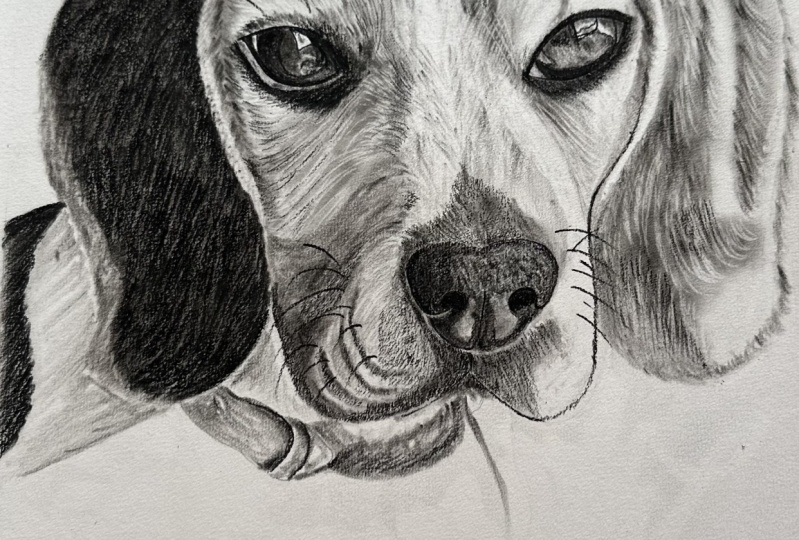
5. Right Eye | Linework & Smudger work: All right, so now we're going to be using a medium, charcoal pencil. And we're going to get brave here. What we're gonna do is I'm going to take a pencil and I'm just gonna push it. Push it from one end, nice and steady all the way to the other. Now I'm going to lift up as I conclude. And then I'm going to do the exact same thing for the top eyelid here. Start in the corner. Let's push it, push it nice and steady, nice and steady. And then lift up. And conclude, it's everywhere. Now that we've established those two lines. What we're gonna do is I'm going to go in, I'm going to start bringing out the detail in the eye. Now, both of those lines, the bottom of the island and the top of the island, want those lines to have a nice thin line quality about them. But at the same time we want them to have a nice light, lightweight. And then here I'm going to take my three-sixteenths. Martyrdom is going to go in. I'm just going to blend. I'm going to put a nice late blend kind of all over the I as, as a base layer. And then I'm going to put detail work on top of that. Okay. As I'm doing that, I'm going to explain to you what line quality in line weight is by definition, okay? In case you don't know, a line quality is pretty much the thickness or thinness of a line. So when you vary the line quality, you can show form in a drawing with just the US lines. And then line wave is used to describe the strength of a line or basically how light or dark it appears on the paper, right? So a lot of times, what you'll find in a lot of drawings is that when your line quality is super thick, your line weight tends to be very dark. When your line quality is super thin, your line weight tends to be very light. Okay? So just keep that in mind. And, and there's all sorts of different lines. There's, there's implied lines, there are contour lines, there are defined lines. But I don't want to overwhelm you, so we'll get into those as we cross them. But now what we're doing is we're just taking our three-sixteenths murder. And the reason why we grabbed at the three-sixteenths is remember what I said earlier. The smaller the tool, regardless of the type of tool, the more control you have. Well, we wanted to maximize our control because we're in a very tight area. And so now we're going to up the game a little bit because it, we're actually doing some work on the outside of the eye here. And take my number one smudge here and I'm going to blend this charcoal. I'm going to run it right up next to that line and then kinda around it. And then over the top here. Because we have a fairly low value right in, around the inside of the eye and around the bottom of the eye. And why don't we look at the reference photo. Let's blend that. I'm going to write them next to that line. And that's good. That's little tricky, can just take it and you can just kinda pull it in. And what this does, this just offers another layer of texture as well. Say that. And just like that. All right, so now what we're gonna do is we're gonna go back in with our medium charcoal. And I'm going to beef up some of the detail here in the sky. And I wanted to do this entire lesson for the AI in real time so that you can kinda see and you could draw along with me. I know in other lessons I've kind of sped through this part of it, but I didn't want to do that on this one. I'm just going to go from the line and pull up just like this. And a lot of times when it comes to drawing portraits, especially pet portraits, because so much of the drawing is texture, right? And the eyes of any subject, whether it be an animal or human, is very much the sole of the individuals. So we want to make sure that we take our time and that you're able to see all the subtleties, all the little tricks that are used in order. To help convey all the detail that we possibly can. Just go pull up just like this. But notice now we're kinda keeping, keeping almost like a circular pull. When we pull up. And there we go. Looks like there's a structure. And the reflection of this dog's eye here. Pull up on that. Down around on the bottom here. And notice how like when you look at the reference photo, notice how the eye of the dog as a super, super low value, all along the bottom of it, right? To the bottom of a tie. That's what we want and that's why we're drawing it the way that we are. Most like this. Just detail after detail after detail. There. I'm kind of beef up that line just a little bit. But one of the reasons why we're using a medium charcoal for this and not a soft charcoal like we have been using for the whole drawing up. And at this point is because medium charcoal has a little bit more binder in it, then the soft charcoal does. And because of that, it actually holds together a lot nicer. So when we're in tight spots like eyes, nose is Mao's of dogs. That is a much better option for us because we want to have charcoal that holds together a little bit more when we're based layering stuff. Say for example, like what we did for the shoulder, the ear, and then the forehead and the cheek of this dog than yeah, soft charcoal is our best friend. But right now, no. We need to change it up. And so that's what we're doing. And then of course, the hard charcoal has even more binder in it. And one of the things you'll find with hard charcoals, It's really, really good for that last layer of detail to bring out texture for a dog for. And I'll show you how to do that later on. And then just take your pencil here and just kind of pull it out like this. I'll go back and forth. And you don't have to press hard, right? If you press too hard, you'll end up scratching the paper. And that does nobody any good. So it's very lightly. Just let your, let your pencil do what it was meant to do. Just kind of pull it up like this. And just look at the detail. Look at look at how that hair flows. Always look at which direction the hair flows no matter what part of the dog you're actually drawing. And then what you can do, kinda like what I'm doing here is you just kinda pull the charcoal into the general directions as that low value part plugs in to the rest of the flow of the hair all around the eye. Right? Okay, so now we're going to continue our elf brush. We're just going to dab it real quick. Just like this. This does a couple of things that blends the charcoal real nice for us. Also gives us a little bit of gradation within the eye. And now we're gonna do is we're gonna go with our models or eraser. And we're just going to retrieve some high values here. See that? And this is another example as to why I was saying Don't press hard, right? If you press too hard, you won't be able to do this. If you press too hard, you'll go in with your mono Zero racer like this. You'll go to hit it and it just won't retrieve. It won't retrieved as high of a value because you push too hard in that charcoals seeded into the, into the paper. So now here we're going to take our artisan battery powered area server's gonna go ahead and just kind of tap this real quick. See that, see how it lifts. Lifts those high values for us real nice retrieves them. If you don't have a battery operated eraser, definitely get one. These being one of these guys flag 12 bucks. They're really, really nice though, especially for tight areas like eyes and noses of dogs. Let's go back here and my three-sixteenths real quick and just do some blending and iss kinda want to smooth this out. All right, I want to, I want to get rid of that grittiness. And then here it's going to take my medium pencil. The beef, these lines here to make it look like that I is seeded into that socket and that those eyelids are more or less kinda resting over the top of that, I write beef that up a bit. And down here on the bottom right, where that value is lower than all the other parts of the I kind of want to bring that out. I'm just going to pull down just like this. Again, nice light pressure control, letting my pencils work for me. I'm trying to get crazy. It's pulling down. It's more about saturation at this point, right? If you go nice and light and just kinda over and over in the same spot, that value will get lower and lower and lower. But you'll have her really, really nice. Saturation with your charcoal versus it being like spotty, almost like Through. That can happen if you press too hard and if you scratch your paper. But I would recommend using a medium charcoal for the entirety of the eye. For now. Don't use a hard charcoal because it's going to be too hard and it's not going to convey a low enough value for you and don't use a soft charcoal because it's not gonna have enough binder in it to hold up and give you nice, decent line qualities in line weights. So just keep that in mind. It's coming together pretty nice. All right, so in the next lesson we're going to be focusing on building texture, okay, so I'm going to show you how to do it with hard charcoal. Are going to be building the texture up around this eye. And we're going to be bringing out that form. So we've already started building the forum with the base layers, but with the texture. And that's what role really be able to solidify the texture. And by rights, the underlying form of this dog's face.
6. Texture Building with Hard Charcoal: All right, So texture building. So now this is where we're going to be using a hard charcoal pencil, okay? Or renders. We're going to grab the Pencil and we're going to stand it up on it. And we're just going to pull your quick, short little poles. Just like this. And a quick trick that you can use when you're drawing your dog is, think of it like this. Just highlight all of the high-value retrievals that you laid down with your mono Zero Eraser, right? Because those are already lane in the proper direction that your firm is flowing across your dog's face. So it's kind of a way to, it's kind of a way to cheat. But if anything, what it's doing is it's more or less solidifying the flow of the hair that you already dictated with your mom, 0, 0. And then that way you don't have to stress so much. But this one, the reason why we're using a hard charcoal for this step in the process is because it has the most amount of binder in it from the manufacturing process. And because of that, the charcoal holds together very well. In fact, it hardly comes apart at all, not saying you can't smudge it because you can. But when it comes to texture and building, a hard charcoal is usually always the last layer texture that one needs in order to bring out a very, very realistic looking texture on their dog's face. So but the biggest thing with this step is to ensure that you have a very, very sharp tip. And you can accomplish that by using razors for when you sharpen your pencil tip. Of course, just be very careful and be very aware when you do that. Okay. But see now because this tip stays so sharp, I'm able to get in here and I'm able to really bring out a lot of finite detail in the texture as far as exactly where that hair lays. And any kind of little bits and detailed pieces that I want to bring out in my drawing. But what I'm doing is I'm just following the flow of the high-value retrievals. I mean, that's literally all I'm doing. Anywhere when I'm looking at the reference photo that needs to have a little bit lower of a value, like maybe there's a shadow or something like that. I want to give that area couple more strikes. But the cool thing is, is that's not everything that you can do to bring out like maybe a shadow, right? I'll show you how you can use your brush and smudge is actually, believe it or not, to take care of those low value spots on your dog's face. But just like this, just take your time with this step. That's really the big thing. But if you use that little trick that I told you, just following the flowed for high-value retrieval strikes this part of the drawings actually a breeze. So just like this, I mean, it's coming out slowly, but surely, obviously every dog is going to be a little bit different, but I feel like a beagle is a pretty good testament to the majority of textures that we see on most dog breeds. Obviously, poodles and, and, you know, Yorkshire Terriers and stuff. You know, dogs have a lot longer hair on their face. The techniques that we use to convey those books will be different. This is pretty, pretty normal. This is what you'll do for the majority of breeds out there. But now here what we're doing is I'm taking my mono 0 racer and I'm just going through and I'm just retrieving some more high values in these areas of lower values as far as how the shading is working out for this specific reference. But all right, so now what we're gonna do is I'm going to show you how we're going to add even more texture, just subtle texture to this dog's ear. Because before obviously when you look at the reference photo, it's not a gritty massive charge on right there actually is texture there. And so this is how we convey that. Just very lightly. You don't want to push too hard. And when you go to put texture on an area that has a lower value. Because if you retrieve too much charcoal, then all of a sudden you have a really high value streak in the middle of an area that's supposed to all be of a lower value or at the very highest, a mid value, right? So just keep that in mind. And here along the edge you can just continue to retrieve high values. But remember, even in this step, even in this step, just be aware of the flow right here where the flow of the hair direction that texture lays. And you will be golden. My friend. Golden. That's good. I always like beagles. I was out there. We're really, really cute dogs. All right, so now that we can take our expression is very lightly. Very lightly. It's kinda hit this kind of Blender real quick. Because when we look at the reference photo, right, that this year is actually not really in too much detail. It's more of the face. Remember how I was talking to you about the landscape method from Da Vinci. We want to make sure that we kind of stick to that. So this is how we're gonna do that. Alright, so now we've swapped out the number six for the toothbrush. Just going to check our tone row quick. And remember how I was talking to you about different areas on the face or if you wanted to bring out shadow or or something you could, well, this is how, this is how we do that. You just want to be careful, okay? Because if you hit the paper with two heavy of pressure control, you can blend away any detail work that you just laid down with your hard charcoal. So just keep that in mind. But real lightly, just like this, It's real lately. A lot of it's going to boil down to your reference photos, specifically, the one that the one that you're using. As to whether or not you need to blend away texture or if you want to add texture and then blend it like what I just did here, right? But when you use brushes to put on certain blends and bring out certain shadows on top of texture. That's really when the magic starts to happen with this technique. It's just that, it's that layer on top of layer on top of layer that a lot of artists simply don't understand. They don't realize, Oh, I have to put four different layers on this to get it to look the way that I want to make it look right. So I'm just of run this left to right like this and blend that out. Here we go. And I think that's one of the biggest challenges for a lot of younger artists is just realizing that you don't have to necessarily detail out your entire drawing and quite the opposite. In fact, you only need to detail out certain parts of the drawing. And the majority of it, especially in portraits like, you know, shoulders and next and collars and the tops of dogs, heads and even some of their ears. Most cases are actually the out-of-focus and a lot of photos. So it's just that landscape method. Or you control the viewer's eye. You have complete power with your drawing. You dictate, happens and where you want your viewer to spend the most amount of time appreciating your work. It's going to pull it down. Pull it down, down and around real life. Because remember, we're going to be going through with our models or race or retrieving high values. We're going to be going in with our hard charcoal and we're going to be putting in some submit values. Mid to lower values. Just nice and lay. Nice and light. You want a nice even distribution for the most part. Here we go. Okay, so now I'm gonna take models or erased from. It's going to actually redefine the edge of this. Bring this up a little bit early. Yeah. That's why we want analysts kinda redefine the bottom of this. Let's charcoal will get everywhere. So I got three different types of erasers. All right. So now grab the good old number 7 smudge. And just like what we did with the Iran, we lay down the base layer with the brush. And now we're going back in with our smudge Rubik's, we want a little bit more control because when I look at the reference photo here, we do have almost like some, some skin roles, right? Where the whiskers, the whisker lines on the dog's mouth lay. So I want to be able to make sure that I can bring bring that out while at the same time just maintaining as much control as I can over exactly where I punch in those low values just like this. See that? Just like that. Grab a little bit more triangular. But that's the, that's the trick with this method is just add a little bit of charcoal and add a little more than add a little bit of charcoal and then add a little bit more. There's nothing wrong with going back and grabbing as much charcoal as you need, as many times as you need it. And just like this, even though the value is getting lower and lower and I'm losing some of my detail work in my in my texture. Don't worry about that. Because in the next one, what we're gonna do is we're going to be doing some adjustments. And we're going to continue to build more layering.
7. Adjusting Left Eye & Nose | More Texture: All right, so in this one we're going to be making some adjustments. So I mentioned this in the first lesson. We're just going to blast this nose here and scared of it north. And get rid of that nose. And I'm going to take my graphite pencil. I'm going to use a reference point here for the corner of the eye and down right about there. Right about there. That's nice. And then we're gonna do is I'm gonna take this graphite pencil and I'm going to re, draw or adjust the outline or the basic shape of light beagles knows. Okay. And this is what I was saying. Don't be afraid if you have to do this, okay. Most artists, most artists have to do this in a lot of their drawings, right? Just because you have to make an adjustment, that doesn't mean that your drawing is ruined or that it's not as good as it would be if you nailed it the first time, right? And get, get those, get those notions out of your mind. Understand that it's a process, the whole process from beginning to end. And when you make adjustments like this, you're making your drawing better because you are making sure that your proportions are truer to your reference photo than they were on your first go, right? The first time you glance data and started drawing it out. But I always want to be as transparent as I can be with my students in this regard, okay? We're not machines or people, right? And so if we need to make an adjustment to make sure that our drawing is more accurate than that's what we need to do. And there's no shame. Which no shame. We all do it. I do it all I do it all the time. I do it every day. And then right about here. And the bottom of the I bring that over to right about there. I'm just going to blast the psi and I'm going to adjust the eyes. Well, why not? Why not? Just at the nose and I adjusted the muzzle little bit now I'm going to just the eye. And I can do that. I can do that. Take a reference point from the dogs, right? I bring it over. Something like something like that. Right? Remember, we just want the basic shape. We want that to two dimensions of the dog's eye. And we don't care about detail work with layering and bringing out the line work with our medium charcoals and the detail work with are hard charcoals will be able to make the SIPOC and look really, really good. And then here what I'm gonna do is I'm just gonna kinda readjust the side of the talks face here. Something like that. There we go. Just take my eraser and kinda clean this up a bit. And I am much more happy with that. Much, much more happy. Okay. So now that we've made that adjustment, I can take my smudge, Jerry Herman number seven, I'm just going to bring it right up, right up to the edge. Nice and light. And this is the base layer for this part. I want to go lay so that I can go in and do some high-value retrievals with my modals or a racer and actually get ai value when I go to retrieve those high values from the charcoal. And then from the top of the nose, I'm just gonna kinda pull ups like this up and over and make sure that I kinda stay true to the way that hair actually flows, right. Always keep that in mind even when you're doing base later stuff with your with your smudge or which way does it flow? Then here you can take your smudge or like this and we can just kinda, kinda get a good idea of exactly where that break is right between that white streak, which is a high value. And then the other for which is because we're on, because we're using a monochromatic black and white scale. All is a lower value. So. Again, we're bringing out the contrast between high and low values or something like that. Remember this is that first layer of texture, first layer of texture. And this method is very forgiving in that regard. Me know, if you need to go back in and continue to layer up your texture. Here are some runaway charcoal, so I'm just rain and that all in blast there. Let's go. Heavier. Charcoal everywhere. Charcoal for everybody. Okay. Alright. So now I've got that sharp tip. Remember I told you you could dress that up with the eraser. And we're just going in. I'm focusing on the direction of my strike and the length of my strike. I've been proactive when lain down my base layer using a nice light pressure control so that when I go to actually strike the paper, I get an actual contrast between my high-value retrievals that I'm getting with my strikes. And then the lower value in the base layer. So it's that second layer of texture. And hear from the nose just pulling straight up, up and over, up and over. And this part of it, because it is going to be layered, because we are going to be layering it with hard charcoal. It doesn't necessarily have to be, have to be perfect, so don't, don't waste too much time on this part of it, the high-value retrieval part. And just make sure that you have enough space between each high-value. Strike that. That texture does shine through it because a lot of times if you're strikes are on top of each other, it'll be a completely high-value. There'll be no contrast between high and low values now, granted, sometimes that's warranted, like on the right side of this dog's face where there's lot more light striking the dog and I'll show you them. But on this side of the dog's face, we don't want that. We want there to be nice spaces between each high-value stripe, just like this, right? So at the texture does shine through. Then here you can kinda pull it, pull your eraser tip like this. Nice and light and you can kind of bring out those folds. You can see all those different folds and the dogs cheek. And that's how you can do that. And a lot of times when you just pay attention like the different shadows and and what not like on the dog's face. You can I mean, you'll start bringing out underlying form even though you're only focused on texture. And there's an actual relationship between texture and underlying form that I have mentioned and other tutorials like the ones that I have on my YouTube channel, where if you can nail the texture of your dog, nine times out of 10, you will simultaneously convey proper underlying form. Especially when it comes to furry animals, like dogs and cats. It is definitely a complimentary relationship between texture and underlying form, at least when it comes to drawing it. So just keep that in mind. Yeah, something like that. Something like that. And then here, this is where we're going to start bringing out some of that, some of that shading, some of those lower values, right? But same type of deal here. You know, when you, when you smudge, when you, whether you're pushing or pulling your sprinter, always try to give, give us some breaks. But the cool thing is, is usually when you've hit it with your eraser and you've retrieved those high values, even when you brush over it with a smoker, like what I'm doing here, that was high values. They are, they might, they might get a little lower in value, but that aren't gonna go completely dark on you. You'll still maintain that texture to some capacity. Okay? See you just like this. You can kinda see the divot from the cheek to the gel they're found to bring out. And use your three-sixteenths are your number one smudge or just, just like this G, you can bring out those little variations in value. So in the next one and less than seven, we're going to be focusing on the nose or in, and I'm going to show you how to do all that was majors and everything else.
8. Nose | Detail work | Brush work : All right, So now we're gonna do is we're gonna take us manager. And just very lightly start pulling up just like this. Okay? What we're doing is just like what we did with the ear and the eye of the dog. We want to establish a nice base layer. These base layers or everything. Because when we go to hit this with a brush work and other charcoal, we want to have that base layer to work with so that our saturation is as full as we can possibly get it. A lot of times if you were to just start going at this with like a, like a soft or a medium charcoal pencil, you would find that your saturation would not be up to par. So just take your smarter just like this. Kind of established the top of that knows just like that. And then if you lose your nostril hole, don't worry about that because I'm going to show you how we're going to take a medium charcoal pencil and we're going to redefine that nostril, and we're going to bring that out. Let's run that spandrel just like this. Okay? So just like this as promised, medium charcoal, pencil, okay. Take it out. Push a line, defined lines like that. Boom. From the top and under or over. And just lift up as we conclude this line here. Just like that. And then we're going to want to start from line. We're gonna pull down just like this, from the line, from the line right up to it. There we go. Just like that. I'm going to define line on the bottom here. And then a defined line we're just going to pull up and then just lift up like that. Okay? Basically defined line by definition, that's when you have a line that continues without a break. All right, It's just a solid line. That's a defined line. There's, there's what they call implied lines that are basically lines that look like a line shouldn't be there. They tend to be softer. They're not define though. Sarah, check the cell. Take three-sixteenths major. And I'm going to go right up to the line like this, see that, see that nice blend that we just got on there. And then when you look at the reference photo, obviously this line isn't this defined. So what we're gonna do is we're going to blend or charcoal. I'm going to blend it right up to the line. And just kinda pull this over. A lot of times you can put lines in areas that there's not necessarily a defined line in the reference photo. But depending on what you're trying to accomplish, you can make a part of a face look closer to the viewer's eye or farther away, depending on the payment on what is right. And run this right here, right up next to the line. And you can kind of see when we do that, our manager and we blend that line a lot of times it takes the, takes the quality of the light way a little bit right? Kinda thins it out. This nose is starting to protrude off the paper. This is what we want. Just like this little blending auctioneer. And hopefully you're able to follow along with me and do this exact same thing on your own paper. We've got the, we've got the links to all these tools and the description of the video. So all right, so just like we did on the left side of the nose, we're gonna do it to the right side of the nose. Her got her to fine line. Just punch in that Nostra. Darken it. A nice, a nice light to medium pressure control. Let's take her to find line on the one side, it's kinda lift ups. We conclude there. I'll take another to find line here on the bottom. Lift up. Just like that. I'm going to go back in here on this one and dark in the sun. Just like that. See you that. And then what I'm gonna do is real lightly, real lately, I'm going to take my medium charcoal pencil. I'm just going to put a nice layer and gritty layer of charcoal over the top and see what this starts to bring out. Because if you look at the reference photo, this dog's nose is all cracked and porous, right? So this is a way where we can accomplish a couple different things. We can bring out that, that texture that we see on the nose. While at the same time putting enough charcoal on top to where we go back over it with some smudges and some brushes. We can actually change. And we can vary the value on the nose as far as shadows and, and what not go, which of course will in turn affect that, that illusion of that third dimension that I was talking about earlier. Which is the true trick when it comes to drawing anything realistic, right? And then for these pores are a little bit bigger, rather than just gliding the pencil across the paper, we can actually start doing some bigger circles. We still want them to be tight right there. It's just kinda varies the the texture a little bit on the nose. And that plays to the realism that we're able to convey here. An O right now it seems like this noses kind of OneNote in its texture, but just bear with me. I'll show you some some other tricks you can do to really bring this nose together and make it as much like the reference photo as we can. Something like that. Notice medium charcoal. Don't use a hard charcoal and surely don't use a soft charcoal for the nose. So as promised, some tricks. So I'm just gonna take my elf brush and dab this share real quick. Just going to dab it. What this does is this varies that texture. I. So when your viewers looking at the nose, they think man, that looks, It's got that illusion, right? It looks, looks three-dimensional. But at the same time it's still got that bit of texture on it that we see in the reference photo. Brushes are pure magic man. And especially when it comes to three-layered method, they definitely allow us do some pretty cool stuff. In here. I'm going to run that charcoal. Seeing just like dabbing. See that. So yeah, there's that. The darker bits, rare and youth knows. This is what we can do to bring those out. So a nice quick blend, blow off the excess of charcoal that we got. All right, so now we're going to take a hard charcoal, hard charcoal time. Okay? And organs start mess around with some of this texture here on the cheek of the dome. Just like this here. And this is kinda what I was talking about earlier when it comes to just this technique being very forgiving, right? If you need to go back over a spot, hit it with a brush, let's say lower the value, but then you don't like the fact that because you had to press so hard to lower the value, you need to go back in and hit it with maybe a hard charcoal and maybe you retrieve a high-value and then hit it with a hard charcoal. Do you have some contrast between high and low values in your texture? You can do that effectively. You can probably do that to Max maybe three times before you start to kind of really lay on some wear and tear as far as the papers he's concerned, but that also depends on the type of paper that you're running. So and then here we're just going to take that hard charcoal restart polling straight away. See how that texture just starts to flow from the nose. It's flowing from the nose. So I just want to make sure that our strikes flow from the nose. And there was going to continue to bring that out. Again, just like with the rest of it, just follow the high-value strikes, right? Because you were already aware of that flow before. So just layer on top of layer. All right, so in the next lesson we're going to be focusing on texture and we're going to be doing some more base layering on the other side of the Beagle space.
9. Texture | Base Layering | Brush work: Okay, so now I'm just going to take my Until click race turns blast some of this charcoal row quick. Just get this kinda all cleaned up. There we go. Alright, so take RNR hard shark layer. And we're going to continue where we left off in the last lesson. Just like this, short, quick little poles. And we are following the high-value retrieval strikes that we laid down with our model is 0 or racer. And we are paying attention as we look at the reference photo to the direction that the hair is flowing. So that we can be sure that the texture that we bring out on paper flows in the same direction as the texture and the reference photo. By doing this, we are also bringing out underlying form. Obviously. With the underlying form, we have the texture aspect of it, but then we can also use brushes and managers to bring out any kind of shadowing or shades that need to be brought out at certain points. And then drawing, which will also help us convey underlined form as well. But just pay attention to the subtleties, right? It's the little things when it comes to texture. A lot of times artists will run out of patients for texture because they think, Oh, no one's going to care about this little bit here or that little bit there. Well, remember that old same how you do anything is how you do everything. Right? So just because someone won't notice, you know, a couple of little harder charcoal strikes underneath the islet. Say that doesn't mean that you shouldn't take the time and the effort to place them there as accurately as you can. And just like this, one of the reasons why I wanted to slow this part of the drawing down for you is because I wanted you to see how versatile this method is in the sense that you can go back over certain spots with your hard charcoal pencil and you can bring out texture over and over and over again. I'll be it, there is a certain point where you will overwork the paper, but it's always good to know just how much versatility you have in certain parts of a drawing. So and then we're taking our number 6 brush and we are establishing a base layer, just like we did to the left side of the Beagle. We're doing the same song and dance. On the right side of the Beagle. We are opting for the brush with the base layer because we don't necessarily have to worry about too much accuracy. But rather what we want to do is we want to move quickly and we want to get a nice spread of charcoal across the paper. We don't want to press too hard, so I'll be it We're using a nice light pressure control in the hand. But because it's a brush that we're using to apply the charcoal. It kind of automatically gives us a nice soft look and that's, and that's what we want, that's what we're going for. And just pull it. And just like with the other side, we are still making sure that we are paying attention to the direction that we're pulling. Here we go. That's looking good. And then once we've established to all of these base layers, we will be going in with her mom closer or racer. I'm going to make sure we cut it down to a nice clean sharp tip. And we're going to start retrieving high values. Let's see. Notice here like when I look at the reference photo there, if there's like a little little fold right there in the fur. And don't be don't be scared to start establishing underlying form early, like do it when you are putting down your base layer like this. And the OH, because the cool thing is, is just like on the other side, when we go over these, when we go over the base layer with our motto XHR or racer, that form will show through. Okay? And then here even where there's going to be a nice high value, you can still put a very light base layer. And then that way when you go to hit it with your mono 0 or Acer, even though it is a higher value, you'll still get some texture. Little shine through. Here we go. And lay nice and light. If you press too hard with the brush, you'll just, you'll destroy all that texture. And you've spent all that time building. Just like most things in life, that she's kind of a balancing act. But the cool thing is the more that you do it, the more confident you'll be in, you'll know exactly what you can and can't get away with in regards to your blends and, and your, your brush work. So in the next one, we're gonna make a couple more adjustments, are going to be doing even more paste layering.
10. Adjusting Muzzle & Cheek | Brush work: Alright, so now I'm just going to make another adjustment. I don't like how the dogs cheek is lining up with my eye. It's going to take my graphite pencil and I'm just going to make a quick little adjustment here. It's going to bring this down. Tuck it in a little closer to the nose. And I'm going to loop it around right down here. And then up. Something just like that. Okay. Yeah, that does look better. Looks a lot better. It's going to bring this up and over. There you go. Okay. I got a little bottom lip there. And then I think eventually I'll draw the color and then we'll kind of play around with that landscape method. I'll kind of show you how to accomplish that. And we go much happier with that. All right, so take our number six brush, just do a little bit of blending here. Kinda get a nice even distribution of charcoal for that base layer. So I can kinda go back through and hit that with the mono 0 racer and wholesome high values. I definitely use a brush for this part. You'll get a nice even distribution versus using a smudge or only uses muddier when you're trying to build up lower values. And see like in here, pretty low value. Punch that in with number six brush and then go a little lighter. And that's the thing with brushes that you'll probably pick up as well when you're loaded up. That's one of the reasons why you want to focus on low values first is because that's when you're going to be conveying the lowest values to get the most amount of charcoal on your brush tray. And then as you swipe the paper, more and more, that charcoals gonna kinda fall off, right? And so your value is going to get higher and higher because you have less and less charcoal on your brush head. So just keep that in mind. All right, So now on a little bit more control, so I'm going to grab my elf brush with a diagonal cut in it. And see this side of the dog is a little trick. Hey, simply because when you look at the reference photo, we have a lot more light striking this side of the dog's face. So because of that, we don't need nearly as much charcoal. So remember how I was talking about when you're, retrieving high values with your mono Zero racer, how you kinda wanna keep from striking your strikes on top of each other, right? How you want to keep contrast? Well, on this side of the, of the dog's face in certain areas. And that's actually exactly what you want, right? So just keep that in mind. Then here I'm just going to kind of pull this pull this down, kind of lift up right here. Kind of belonging it the nose of the dog here. And that's the big thing between the number six and the brush. The brush gives you just a little bit more control. All right, so now what we're gonna do is we're gonna take two models or eraser. And we're going to continue with these high-value strikes only on this side. See how some of the strikes are right on top of them themselves. And it pretty much, you have very, very little contrast between high in mid to low values. Well, that's okay because in that area of the reference photo, It's pretty much all on a higher value anyway. And then this portion right above the nose here, this is just the first layer and texture looks. We can go back over this with the hard charcoal to NADH as much texture as we need. But then like right here, like in this general vicinity of the drawing, like there's just a lot of light just a lot of light striking it. So if it's completely white, that's fine. Because that's where it is in the reference photo. So now when I look at the reference photo, all the hair kinda converges to a point. And then from that point up the nose of the dog, all the way up to between the eyes that kind of flares out to the left and then it flares out to the right. So we want to make sure that we're being true to that fact when it comes to the reference photo so that we can make this part of the drawing is accurate as we can see like this. And you can start to see that this is why, even though this part of the dog's face, it has an extremely high value. I still wanted to put a nice light base layer of charcoal so that when I hit it with my models eraser, even though it's all a very high value, you'll still see a little bit of contrast in between each strikes. So because if I didn't do that, it would just be one white streak. There wouldn't be any texture in it, which of course, wouldn't be as accurate as it could be. So we're coming along, coming along. But what we're gonna do is I'm going to continue to build up the texture, this first layer of texture in and around the eye. And then in the next lesson. And just like what we did in lesson 4, we're going to be going through and drawing out the AI in real time so that you can see again how we build that i up and how we make it look like it's sitting inside the eye socket of the dog's face. But again, with our high-value retrievals, it's just the direction of that flow. It's the it's the direction of the strike and the length of the strike. And that's pretty much it. Of course, this is the first layer of texture. And then we'll be putting that hard charcoal on top will be following the flow of those higher value strikes. And we'll be able to convey a very realistic texture for our dogs here. And just to remember guys, as your tip becomes dull and get sturdy, Take a little razor blade and just snippets like this. See that? Now it's not sharp. Now it's clean. And because of that, we'll get even thinner line qualities for our high-value strikes and will get lighter line weights as well. So you've got that texture up over the eye and I'm going to go under the eye. Just remember, don't worry about it. Run in that texture all the way up to your graphite line on the bottom of your, of your bagels. I, because remember we're going to, there's that really, really low value immediately underneath the eye. So we'll be using our three-sixteenths manager or medium charcoal to drop that drop that down and make that look realistic. But yeah, don't be afraid where there's really, really high amounts of light at a lot of high values in one area to just take your eraser and pull it sideways. I mean, you want that, you want there to be a variance between your high and you're low in your mid values. Because that's what's going to make your drawing look realistic. That's what's going to make it pop. Is pay attention to that direction. All right. Well, unless than 10 we're going to just be it's all going to be that that other eye.
11. Left Eye | Linework & Smudger work: Okay, pass just going to clean up here a little bit. Rein in some of this charcoal run all over the place here. Okay. Get that on, on here. So just like with the other eye, we're going to use a medium charcoal pencil here. And we're going to start the top or at the corner here. Push this line. Nice and steady. Nice and steady. And then just kinda lift up as we pull it down. And then we're gonna do the exact same thing on the bottom here. Starting from the corner. Bring it down. Nice and steady. Try to go at the same pace all the way through. Slipped up. There you go. All right. So now that we have basically the outside of the eye established, we can go in. And just like what we did with the other one, we can start to focus on building up those low values. And if you need to run a second line over the first line that you put down, go ahead and do that. Go ahead and do that. That's not a problem at all. Now what we're doing is I'm just kinda more or less outlining the significant value breaks I have in the reflection of the dogs I hear. It's going to highlight the significant ones first. And then I'm going to go through with my three-sixteenths mujer. And I'm going to blend the base layer in there, just like I did with the other eye. And remember why we do that. We do that for saturation purposes. We want to make sure that we get a real solid saturation and these eyes. So as promised, three-sixteenths. It's the smallest country we have. So we want to maximize our control. Just going to put a nice little blend in on all this year. And one of the reasons why we do this, because when you use a smoker and you get a nice base layer when you go to pick charcoal on top of that base layer, there, there's no high-value, there's no white paper basically underneath, show through your charcoal. So as a best practice, I0 is a nice base layer on and then all they are my charcoal because I mean, the method that I'm teaching you is called the three-layered method. Very much for a reason because that's what we do. We layer charcoal in order to get the facts that we want when it comes to our finished products, which are drawings. But I have found that when it comes to saturation, which is a significant part of any drawing, this is the best technique to use in order to accomplish that. And now kinda like as we did with the other one, we're just bringing out exactly where the low value is going to be in and around the eye. And then especially on the bottom. Just kind of blend that. And by blending around the eye like this, it, it really does a lot to make that I look like it's sitting in the eye socket. Real nice. And then here's kind of a Turkers were kinda want to define the edge of the side of the dog's face here. There we go. All right. Sorry, ticker, medium, charcoal, pencil. We're going to go back. And we're gonna go back to the eye here. And it's going to take it. And I want to start to build up this line. The eyelid, if you will. Let's build it to increase the line quality, right, that thickness. To increase it. And this also increases the line weight, right? It makes, it, makes it appear darker. And that's what we want. And then just like with the other eye, when you look at the reference photo, the majority of the reflection in the dog's eyes actually more of a mid value, a mid to high. And then the very, very bottom of the eye itself, not, not the, not the skin underneath the eye, but the actual eyeball does have a lower value. So we're going to darken that up. And then what this does effectively is it conveys to the viewer the illusion that that eye is more rounded in nature. Right here, we're just going to kind of pull down because it looks like the dogs in between two buildings. Like you have this building here, which almost looks like it could be like a deck or something like that. Then you have like what? I'm guessing, it's probably like a row of trees. And then you have the side of either a house or like a shed or something on the right side of the eye. Just like this here. I'm just going to beef up the bottom of the side, something like that. And then what you can do is you can start to pull down like this from that line with your medium charcoal. And that can start to give you that texture because this side, again, this side, slightly different. So we're gonna have to do slightly different things. And that's because the right side of this reference photo is just overall a higher value because it has more light hitting it. So where on the other side for that bit of low value that's underneath the dogs die, we were able to go with our smudge earners, blast it with our smuggler. Here, there's light hitting it. So that low value underneath the eye actually has texture to it. So we need to make sure that we speak to that the other side, we don't have to worry about it because wasn't enough light, but on the right side we do. Right side we do. So it's going to, it's like this, like this. So now we're switching for a number one smarter. And I want to go through, and I'm actually just going to blend some of this eyelid here. And then I'm going to blend some of the the bottom and just around the corner of the eye as well. Just like this. And just if there's any area where there's just a little bit too gritty. Just keep hitting it with your smudge, your right. Just keep hitting it with your smudge are nice and light. And it'll continue, it'll blend, it will get softer and softer and softer. Right? We're gonna switch this back up for a medium after we've blended it and we're just gonna go in a nice tight little circles, just like this. Nice tight little circles. And then you can also pull down from this. What that does is this kinda brings those two textures together. Or the hair meets the hairless portion of the skin that's immediately under the dog's eye right here. So that's neat little trick that you can do. And then you can just kinda go kind of back and forth just like this. Tiny little circles. Let me go. Then of course, grab the three-sixteenths for inside of the eye. And then just kind of blend away any of that greediness that you don't like. Kinda run that smudge or along the top. And then just kinda run it along the bottom. And then hopefully you'll have a fairly realistic I remember the size still doesn't look like it will completely. We've got to take a hard charcoal and kind of go all the way around it and start doing those tight, short little, little strikes to where we can start to bring out that second layer. So just like this, just like this. Just kinda standard up on Ed, kinda, you know, if you kick your if you kick your pinky out, you can actually stand almost completely, completely straight up and down. And you can start to strike the paper with your short, little, short little flicks with your hard charcoal and you start to bring out that texture. And then again, just like with the rest of the drawing, you can cheat. You can cheat and not have to focus nearly as hard. And you can actually move a little bit quicker if you just follow the general direction of those high-value strikes that you laid down initially with her mono XHR or a sir. Alright, I'm a lazy artist. So the techniques, tricks and stuff that I teach are designed to help you write. I like to be as effective as possible, while at the same time doing it the easy way, right? If there's a trick that makes something a little bit easier, but at the same time the end product is just as nice. Well. Let's figure out how that works, right? So all right, so in lesson 11 coming up, we're going to do, we're just gonna focus on texture building more and more texture. Let's do it.
12. Texture Building | Brush Tricks: Okay, So just like in the last lesson, we are continuing to use are hard charcoal pencil here. And when you look at the reference photo, anywhere where you see light like a shadow, right? Or an area where it's almost like the texture in the hair is lined up closer together, which makes it look as if there's shadow there. One of the things that you can do is you can strike your hard charcoal strikes deliberately on top of each other. And what will happen when you do that is that overall value will get lower and lower. So you can either do it that way or if you prefer, you can grab your toothbrush and you can go in and you can add shadows that way. I'll show you how to do that here in a little bit with the brush so that you can see both ways. And then a lot of time, let's say in this area, when you look at the reference photo, you see how like the texture just kinda disappears. Well, just use a gradually lighter and lighter pressure control. For like right here. See others, it's a little bit darker. Ans put those strikes right on top of each other. And that overall value will get lower and lower, or darker and darker. And that's what we want. Then like in here, don't be afraid to the blast a bunch, a bunch of texture in these areas that have a lower value. Because we can also go over those with the brush and we can blend them. Bring out some gradation, lower the value, and give it a nice look. Then right here, immediately above the nose. We do have some, some texture. It's a little bit more course, right? There's course. And so where the hair is course. That is where we will have to put in a hard charcoal to make sure that that texture is shining through. But the biggest thing with, with texture building is just that just going over a spot. And then if you feel like you need to go over it again, go over it again. You know, there's no there's no right or wrong amount. Let's just say just be aware that you can overwork a certain area if you go over it too much, but if you go over it's super, super light. Super, super light handed, you should be fine. So like down in here, right? There is a significant bit of texture immediately underneath the nose. So I'm gonna take our hard charcoal, we want to strike it. We want to make sure we convey that texture. But then as we get closer and closer to the right where obviously there's a lot of light does get lighter and lighter with your pressure control. Okay. It's lighter and lighter and lighter still until eventually it fades right? Then that way you have that same type of faded look on. It's in the reference photo in your drawing. And just kinda go like this. And then we can just take our smudge over here and just establish that that bottom jaw. Right? Bottom, John, That's okay. Yep. And then we're going to take a charcoal pencil here. It's going to pull a line here. Boom. And then effectively what that's done is that's pushed that bottom jaw back a little bit and it makes it look like those. You know, the top jaw is resting on top and a little bit closer to the viewer's eye. It's not going to take our elf brush. Remember what I was talking about with the shadows and that type of deal? Well, this is what you can do. Just more or less kind of dab it in certain areas. All right. Little here, a little there, maybe push it. And then all of a sudden you start to bring out shadows. Know, Davin it kind of blends it up like that. And especially for, for, you know, Pet Portraits, right? Like dogs and cats and pretty much any animal that has hair. This trick right here. This is what will really, really help you. Not only bring out the, you know, kinda that underlying form, right? Those wrinkles. Maybe certain muscle structures depending on what kind of dog is that you're drawing. Like say for example, pupils, right? They have an amazing muscle structure. Yet even in, even in their heads. So this is a way that you would be able to go in and bring out any type of shadows, because essentially shadows are lower values, right? But at the same time, you also don't want to XNA all of that texture, right? The sped, who knows how much time putting in. So a nice slight blast with like an elf brush or any type of diagonal cut brush will give you the same type of effect. And here's a little trick to see how, see how I kinda dab that. Just debit, lift up, dab it lift up to have it lift up. It gives you that break. And you know, it makes it makes it look more like hair. And that's what we want. You can go crazy when it comes to brushwork. And the thing that I liked the most about brushes is just the, the more you use a man, the more you use pressures, the more confident you become too, we're almost you'd prefer brushes when it comes to trauma. It's almost like we're painting with charcoal, right? Instead of trying with charcoal. Alright, moving on to lesson 12.
13. Left Ear | Base Layering: Okay, so now what we're gonna do is just like we did the dogs right here, we're going to do the dog's left here. Only this one's going to be slightly different simply because there's just more light hitting this year then there was hitting the other one. But principally, the approach is going to be very much the same. So we're going to be using our number 6 pressure. It's going to load it up, get a good amount and a good amount of soft charcoal on here. Check our tone. We are fully loaded and we know that because a bunch of charcoal does fell off the brush onto the paper. So we're going to look at the reference photo. We're going to start to put down charcoal where our value and the reference photo is the lowest. And then we're just going to pull up. Pull up. Because remember what I said. And even when you're establishing the base layer with your soft charcoal, you, you still want to pull the charcoal across the paper in the same general direction as what your texture is, right? And that just kinda helps you out. Basically it's, it's it's it's doing your due diligence in an initial step so the you don't have to correct your work later on down the road as you continue to layer and layer and layer. So and then as you run out of charcoal in your values per oppressively getting higher and higher, right? Lighter and lighter. We just go ahead and grab some more charcoal, which darker tone, make sure we're nice and loaded. And then we go back and we just continue to focus on those low values. And you can dab it to CIA that kinda texture, that Blache texture. This is how you can kinda conveys some of that texture. Let's go ahead and just dab it and have it over and over again. But notice how as I focus on the low values, those mid and high values, take care of themselves, right? And there we go. Alright, so now that we've got the majority of the base layer taken care of with number 6 brush. Now we grab our number 7 smudge or why do we do this again? Because we want more control. Yeah, we want more control. Now we have it. This little bit of taking these low values right up to certain boundaries, whether it's the edge of the ear or, you know, or tucking the ear up against the face of the dog. That requires more control. We can't get finite control like that with the number six brush. I mean, we kinda can with the soft brush, but we most definitely can with the number sentence manager. So then just like this, you know, we're looking at the reference photo. What we're doing is more or less trying to just focus on, you know, like the Placitas and exactly aware The low values are, right. And I'm not necessarily worried too much about the texture that's being conveyed with the smudge it because if it is too harsh, I can always hit it with a brush and I can blend it. Not only does a soften it, but then I get a really nice gradation across my different values that I have. So yeah, that's the thing that you'll notice as you do this more and more is the more you go over certain spot, the lower that value will become. So. And of course, we were using a nice light pressure control through all of that. So now what we can do is we can go in with our mono 0 or racer. And we can start to bring out those, those higher values, which there are a lot more on this side of the face simply because there's a lot more light striking the side of the beagles face than there is hitting the other side of the face. So I'm just going through and we're focusing on the length of our strike and the direction of our strike, same as we've been doing through this whole drawing. Let me just clean this up a little bit. There we go. And that's the thing that you'll probably notice as you draw more and more Pet Portraits with this specific technique is we don't ever really take like a medium or even a hard charcoal and put define lines on like the years and whatnot most of the time. Define lines unless it's like the eyes or the nose of a dog, or maybe eye color. They don't really have a place in pet portraits because you want the whole thing to look as realistic as possible. Because the majority of the dog from the ears to the for in general is, is so soft. Write. Define. Lines are usually found in animals that don't have for, right? Or a specific drawing or maybe there's the whole form of an animal's body. But in Pet Portraits, what you'll find is a lot of it's going to be brushwork and there's not going to be hardly any defined lines outside of the eyes and the nose, right? So like the ears, for example, it's all going to be implied for all implied lines. Now I think I very briefly touched on that in a couple, a couple of lessons ago. But basically an implied line is two different values immediately next to each other, where it looks as if there is a break in the value from low value to high value, right? But there's not an actual line there. So like say for example, when you look at the other ear right next to the eye, that's an implied line. Yeah, so now what I'm going to do is I'm to my medium charcoal. And I'm just going to, this is, by definition this is sort of an implied line because it's got breaks in it. See how I'm breaking it up. But what I wanna do is I kinda want to establish the low value of the ear here. Well, the same time trying to bring that face of the dog forward a little bit. But I don't want it to be too defined. So what I'm gonna do is I'm going to punch in some medium charcoal ear because it's got less binder in it and it's got a lower value that are hard charcoal. And then I'm going to go through with my name, with my three-sixteenths imagery like this, you this. I'm going to start blending it. Blending on one side. And then that gives me that form that I wanted. Perfect. And now I have some texture on the side of that dog's face. Now I can go with my models are Acer. Start bringing out that texture. Okay, so now we're going to swap that monitor or racer out from a number ones mature. And the reason why is because S1, we want to build up this low value here. Any excessive charcoal that falls off, you can just blow that off with your breath. And then if it's gritty, don't worry about that acts. You just blast that with the brush. Just, you know, data with like say your ELF brush. And that'll blend real nice. It will lower the value, but it will also blend and give you a little bit of gradation. Or you can just blend it with your smudge like this. It's really up to you, which depends on which tool you're more comfortable with. All right, and then here I'm just going to dab this and kind of blend this. You see how my saturations not up to par on that a little bit. All right. So in the next lesson we're just going to be doing some detail work. So I'm going to show you how to do some whiskers and we're going to, I'm going to draw out that color to it. And we're going to talk a little bit about DaVincis landscape method and the reason why I don't detail out everything in my portrait drawings. And yeah, we're going to have some fun. Last one.
14. Finishing Touches | Final Thoughts: All right, last lesson. So I'm going to take my graphite pencil here. I'm actually going to draw this out in real time so you can draw it out with me if you'd like. I know I didn't draw the color out in less than one where we did the outline and we established that the basic shape of our drawing. But now we're doing it. Sometimes I just like drawing as I go. So again, i'm, I do the color, am I were doing it. So a basic one. I'm looking at the reference photo, I'm just drawing out the basic shape of it. And of course I am. And bringing out any differences in values, right? So there's any breaks between like a high value and a low value. I want to make sure I highlight those with my graphite so I can go in now with my smudge tool. And I can start to very lightly and establish a nice, nice base layer of charcoal. Okay, nice space there. You might be asking yourself, well, why aren't you using a brush? You've used to brush for everything that you have put a base layer on up into this point. Well, the reason why is because look how small of an area, this is a pretty small area. And so because of that, even my brush probably wouldn't do me justice in the sense that it would be giving me the amount of control that I prefer in tight areas such as this. But so elongating an image or the landscape method or whatever is that you want to call it. Basically when it comes to portraits. And this is, this is true for human portraits as it is for dog portraits. But when your viewer looks at your drawing, in general, the human eye likes to spend the most amount of time on areas of a drawing or painting that are the most detailed, right? Unless of course we're talking about say like a Monet painting, where the whole painting is pretty much skew. But there's also a method to the madness as to why Monet painted like that. He painted that way because his paintings were meant to be seen from afar. Say it's like across a room you'd be able to look at like, you know, his painting with it, like it's lily pads, right? But close up on it. You get really close up on it and it's kind of a mess. Well, it's the same type of principle. Only what I do is I kinda take it a step further. So say for example, what we're working on right now with this color, I'm not going to be defining this color. Because if you look at the reference photo, is the color and focus. No, no, it's not. And the cool thing about that is when I look at the reference photo, my eye naturally wants to go to the muzzle of the dog. I look at the nose and then I immediately look up the nose to the eyes and I look at the eyes and I could look at the forehead, right. But I don't spend hardly anytime on the color. And the reason why is because that color is It's on focus. So you can draw that way too. A lot of artists, what they'll do is they'll draw the color, but they'll put that thing and they'll, they'll make it like putting all this detail and stuff that's not even there in the reference photo. So what I'm saying to you is that if you want to try this, then, then, then try it. You can put in a color, but don't give it hardly any detail. And what you can do is even though I'm putting in some medium charcoal here with my charcoal pencil and it looks really gritty obviously, I'm gonna go back through with my smudge and I'm going to blend that real nice, but it's still going to be out of focus when it comes to the majority of the dog, right? So and I, like, I, like I said before, I highly doubt the de Vinci was the first artists to do that, but he was definitely one of the first artists to mention it and talk about what he called at the time, the landscape method. Which in landscapes it's obviously much more apparent. Know you have your background and your foreground and that you're just between each of those were in portraiture. It's it's not nearly that expansive. Right? So SPE aware parts of your drawing like the eyes and the nose and the muzzle of your dog. That's going to be where your viewers spend the most amount of time, but don't waste time detailing out things like callers and the shoulder of a dog or maybe something behind it dog. You can control where your viewers eye. Goes and spends the most amount of time. And then here for whiskers, this is this is me being lazy. When it comes to whiskers on dogs. I just I know that it's a high-value, right? I know that those whiskers are white, not black, but quite frankly, I like this look better, especially when it comes to a monochromatic black and white scale. I just think black whiskers go really, really good on a black and white drawing of a, of a, of a talk. So, and this is how you do it. You just take a medium charcoal, you stay ended up on and make sure it's sharp and pull it in. Then as you pull, you just lift as you include that line. And you I, I really like the effect. I think it looks, I think it looks solid. I think it looks realistic. And it gives the drawing some character, right? So, but this is one of those drawings that, you know, you can, you could spend hours drawing it and you could get in there with your texture. And you could really bring out the contrast between complete black and white. But a lot of times I find with pet portraits that the less is truly more, right. And then see, see here homes going through and I'm kinda getting rid of that greediness, can drop my smudge a kind of get rid of that greediness. But at the same time, I'm not putting too much detail worked into the color. And the reason why is because I don't want the viewer to stare at the color. I want to be or to look at it and kind of gloss over the fact that there's a color on the dog because I want there I did go to the nose. I want there I to go to the dog's eyes. I want there. I do appreciate the texture, right? And as you draw more and more, you'll gain confidence in that regard, right? You'll be able to to think as you're drawing make, Oh yeah, I'm going to actually put a lot more detail right here on this nose because that's where I want people to spend the most amount of time as far as, you know, when they're viewing your are in when they're appreciating your portrait. I know, you know, especially if it's commissioned piece, right? Like, you know, if somebody hires you to do a commission piece of their pet, they want it to be as realistic as possible. So but the method that you learned in this class was the three-layer method that I teach. I have a handful of other step-by-step Pet Portraits tutorials on here on Skillshare. I have an English Bulldog, a French bulldog, a yellow lab, and a German Shepherd. So if you enjoyed this class, and I'm sure you'll enjoy those other classes. But until we meet again, stay happy, stay healthy. And remember, never stopped drawing.
 Messer Creations, Artist | Author | YouTuber