Transcripts
1. Introduction: What So my name is Brandon lesser. I am an artist, view tuber end. I mean, how does one say it? Online content creator, I have done a lot of similar drawing tutorials over all my YouTube, but I wanted to give it a go on skill share and come out with some classes that are a little slower. And that really gave me the opportunity to speak a little bit more in depth to the techniques that I use on my teach, a method called the three-layered method, where we use soft, medium and hard charcoals and an array of different tools, smokers, couple different types of erasers and brushes to kind of bring out the detail. In my drawings. It's a method that is fairly simple to comprehend. It makes for some really cool refined images and it's something that I think you will enjoy learning. So in this class, be prepared to learn a lot. I'm going to be taking you through each step in the drawing process. Everything from the basic shape of our reference image to base layering with our brushes and utilizing our softer articles. I'm going to be explaining the differences between soft, medium and hard charcoals. I'm gonna be showing you the different tricks when it comes to high-value retrieval methods with our Mano Xero and who, whom? Erasers. And I'm even going to touch a little bit on a method that was derived from none other than Leonardo Da Vinci himself. So all in all, this is a method that I practice just about every day. And if you're new to the three-layered method, I hope that it's something that you get a lot of value from and you start to use in your own drawings. Having said that, we've got a lot to do. There's lot to explain, there's a lot to learn. And I hope seeing class.
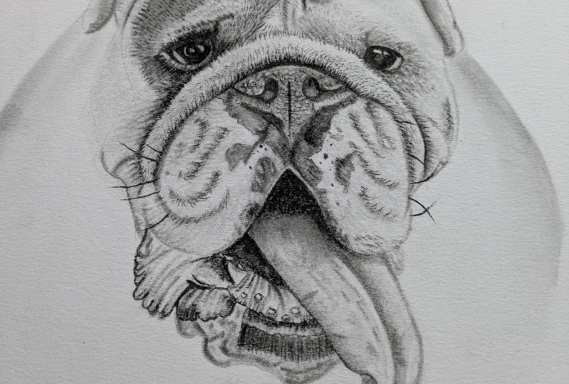
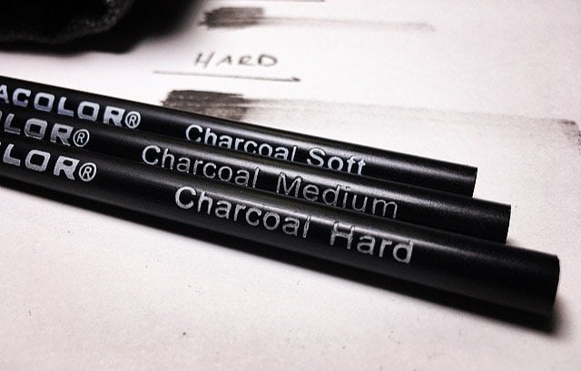
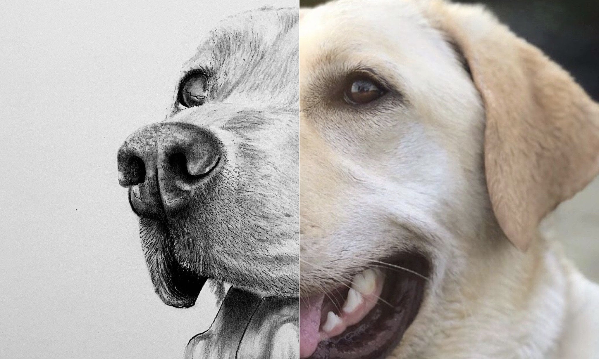
2. Tools | Basic Shape: All right, so the tools that we're going to use for this one are of course, a graphite pencil. And this is just a humble HB. We're also going to use a soft, a medium, and a heart rated set of Turkle pencils. As well as end who, who, a Pinto clinic and a mono 0 and eraser. Yes. We're also going to be used in three different does measures three sixteenths, a number one and number three. We're also going to be using sandpaper strip and what I like to call my tone check paper. We grind the trickle onto this and then we check our tone on this. And then we apply to the paper. And my Trustee do OK, I'm in number six, pressure along with my elf brush that I pulled from one of my wife's make-up bags. And that is it. All right, Louis, the cute little puppy hat. This is an English, both. Ok, so we're going to draw the basic shape of reference and mature. And now arguably, this is probably one of the trickier steps in the whole, in the whole process that you'll face. And the way I do it is I tried to start with the nose and especially with the a full frontal shot of a pup. Always try to start with the nose. And this way, you can kind of build your proportions of like say for example, the proportion that we're facing here with this dog's extra skin fold that it has here. We can gauge those proportions from the top of the nose to say the top of that skinfold on fairly accurately, just by kinda estimation, right? And these skill share classes, I'm not going to be teaching you guys how to use the grid method or anything like that. I think that for the method that I teach, it's best that you try to draw your outlines. And I think that's the the best method. Because that way you'll be able to build your muscle memory. And not only that, but your future drawings will be better for it. Alright? But what we're doing here is we're simply going slow. And I'm drawing out one part of this at a time. Now here I'm lining up the bottom of the nose nostril. And then right about there is where I'm going to put this skinfold that's coming off the cheek here. And there we go. Something like that. And remember what I always say about this step. The outline step is not finite. By any means. You can always make what I call my adjustments later on down the road. If you need to make an adjustment for your proportions, for them to line up more like what you want is something like this, something basic. And then from right about here, right about here, overturned about there and then up fat. And about their that's what we're going to put the corner of this dogs I here right about there. At the top of this i is going to be and what I just did right there, that's what I call a gauging your proportions. Using reference points. Reference points being like say for example, if I wanted to nail him by proportion on the top of the dogs left eye, I would just gauge it from the top of the right eye that I've just drawn. And that's just a quick, easy way that you can have more accurate proportions in your first couple attempts at the outline. And get used to that, right? C, so right about there. I actually don't like that, so I'm going to erase this entire thing and we can do that. We can do that. I'm a big fan of making mistakes because I can always make my adjustments and my drawing will be better for it. So okay, so right about here is where that line actually is. So I brought it over a little bit. And then notice what I'm doing. We look at the reference image here and basically just outlining those skin rules. Because where these lines are with the graphite, that's where I'm going to lay down a slightly lower value when it comes to ln matriarchal down in the next couple of steps. And you'll see what I mean when we get to that point. But that's the big thing with this step. It's just outline the skin rules and the main shapes at like say the ears, the eyes, the nose, the mouth. Right about here. See that? There's where that ear starts. There we go and this kind of bring them down and they're right about there in line with the either swear that you're stops. I mean, obviously, you want to try and make sure that your drawings are as accurate as can be. But by no means. By no means don't try to get your drawing absolutely perfect unless of course you want to. But I'm not a big fan of perfection. Kinda. Follow along with Salvador Dali in that instance, you know, when he said, don't worry about perfection, right? And they'll never reach it. I like that. And I think when it comes to a step like this, this initial step, this is where everyone gets the most frustrated because they're the most concerned with perfection. And that's not withdrawing is about right. It's about growing. It's about learning. You'll never know everything. And why would you, why would you want to know everything? In this step, what we're trying to do is we're just following that basic shape. Are not concerned about form, right? Not worried about form in this, in this case on at all. We're just focusing on the shape the form will come when we start to build our layers and retrieve our high values. In the next lesson. That is what we are going to be focusing on. In this lesson. It's all about the basic shape of our reference image. So like here's the tongue. Let's draw this out. Whenever you write about, here's where the top of that tongue comes out of C. It's like right in line with the eye here and use the reference point in and boom, right there. That is where we're going to want to start this tongue, something like that. Or we go and just gauge it right? Engage at the best you can. Get. A lot of times when you're so concerned with trying to get a drawing array, you actually will mess up even more on your reference images. I know that I have. So so right here I'm going to punch in the teeth. Can it get this ready here? And then I'm just going to outline this area or arena have low values. That's the big thing right here is you just want to outline everywhere where there's going to be a substantial break between your high values and your low values. And then let's say here and what I'm doing is I'm just gonna go through and I'm just gonna punch in exactly where those low values are going to be more or less. And then this way, when the time comes to lay down the charcoal and I'll know exactly where I want to lay down the most amount of charcoal so that I can really build up my low values. And just as importantly, I'll know where I want to go real light with my charcoal and then go back through and do some high value retrieval with my eraser work. And really bring up that texture that we see in the hair. And then here's another little trick. So when you look at the reference image, you see how there's those roles, right? Oh, there's those roles and in the cheeks of this dog, Well, what we're doing here is we're just taking or graphite and we're just laying down where there's going to be extra charcoal when it comes time to lay down our base layer of soft charcoal. Okay. That's what these are four. Just like that. And now I can take my one was eraser and I can just clean up a little bit any of these lines that I don't like. And because I was using a very light pressure control when I laid this graphite down, it lifts off of the paper very nicely for us. And that's what we want. Get this cleaned up here. And this is nice because now we have a really solid foundation and framework for the charcoal to come. A lot of times if you just started in with the charcoal and you didn't have an outline, I think one of the things that you would discover is that it's kind of hard to know exactly where those breaks between high and low values are. And then here I'm just going to iron out kind of the shoulders of this dog. And I'm going to show you a really cool trick. I actually learned by reading about Leonardo da Vinci. And it has to do with optics. It's how to trick the eye by not defining certain parts of the dog and you basically elongating the image. But in lesson two, we're going to be covering in base layering with our brushes were going to be going to revalue building with our soldiers, were going to be going over high-value retrieval with our erasers. And we're going to continue building that underlying form.
3. Forehead | Base Layering | High Value Retrieval : Alright, so this is where we can start having some fun. We're gonna do is we're gonna take our tone check paper and lay that down here next to the outline. And when I've done that Dickinson soft charcoal and have grinded it onto the sandpaper strip here. Let's place that on its own check paper. And then what I'm gonna do is I'm going to grab my number six brush. And I'm just gonna load up here and a little bit decent manage Oracle and then want to check and make sure I have the tone that I want and I want a nice midtone here. I don't want anything to light, but I also don't want anything too dark, gray. Nice, mid-value. And notice in this step what we're doing is we're using a very light pressure control, very light. And the reason why is because when it comes time for us to retrieve our high values with our mottos or eraser. We're going to want that charcoal to be resting on top of the paper. Because if we use too heavy for pressure control, what's going to happen is that charcoal is going to be pushed right from the brush onto paper and into the paper. And because that's gonna make it a lot harder to bring those high values out. So with everything that we do, this three-layered method that I'm teaching you. Everything's are real light hand, real light pressure control. Alright, so right here what I'm doing is I'm picking Romano Zoroastrian, and I'm doing what they call retrieving my high values. And see, this is one of the reasons why we wanted to use the soft charcoal for the base layering of this specific drawing. And that's because it has the least amount of binder in it from the factory, no binder that's infused into the charcoal. And because of that, it's very soft and it lifts off of the paper the easiest of all three charcoals. Okay, so keep that in mind. And I go out and do an picking three sixteenths smudge or this is smallest, smarter than we are using for this one, I'm going to check my tone. And now notice I'm looking at the reference image and right, where there is a much lower value, a darker value. That's where I want to focus my pressure control with this major. One of the reasons why I, I grabbed the three sixteenths as opposed to either the one or the three that I have as far as the sizes of my smokers is because I wanted to have the most control. A lot of the times when it comes to drawing, and especially with charcoal or graphite. The sharper your pencil is, the more control you have over exactly where that trickles going, right? Well, it's managers, it's the exact same principle. Smaller, the smaller the more control to bigger than smarter, the less control. So just keep that in mind. But this basically allows us to really focus and put those new mid to lower values exactly where we want them to be. And this is how we can build shadows. And this is the beginnings of bringing out that underlying form that we see in this reference image. But notice when we're looking at the reference immaterial were building this year, that's the big thing that we're doing is we're building those lower values. And here what I'm doing is I'm taking a medium charcoal pencil, making sure that it's fairly sharp. And remember I was talking about control. Well, this gives me pinpoint control. I'm putting a lot of charcoal exactly where I wanted to go. And this allows me to really bring out the form in that ear. So now what I'm doing is I've swapped out my medium charcoal for a number six brush load in checking my tone. And now I'm just paying attention to the reference image and the flow, right? The flow of air, again, my pressure control. But what I want to do is I want my brush to go right along those lines that I laid down with my graphite pencil. And this is the first steps of building those roles, skin rules that we see and just going isolate and build these slowly. Because if you look at the reference image, there is a lot of light striking the top of this Bulldogs forehead. And because of that, we don't want to put down too much charcoal because that's not going to match, right? So just keep that in mind. And whenever I need a little bit more charcoal, still coupled dabs just like this. Just a couple tabs. And then always check your tone, especially if you're new to brushes. Always check your tone. And then also like this, we just loaded up notice where I go with my brush. Notice where I go. See I'm putting my approach right along that line. Start along the line and then I pull back right along these lines. That's where I want to focus the majority of my brush work. And our slowed it up a little bit more. But this is what we're doing. We're following that same principle. We're just, we're following those graph I aligns that we laid down and see how that form starts to come out. Right now it doesn't exactly match the reference photo, but it will write with high-value retrievals with your erasers. The one big thing you have to remember that you have to keep in mind because if you forget this, your drawing is not going to turn out. Is that if you want to accentuate those high values, if you really want them to show through to your viewers eye, a little bit more charcoal in your base layer will do the trick because you're bringing out the contrast, right? More charcoal on the base layer, and when you go to retrieve it, you have a lower value all around, surrounding your high values that you just retrieved. It's, it's part of what they call a value relationships, right? And it's basically just a fancy way of defining contrast between values both high and low. We'd just keep that in mind. That's a, that's a big thing that once you start to get good at this technique of building out these base layers, you'll start to play with that concept a lot more. But it's a rookie mistake, not putting too much charcoal onto the paper, but a why do we make mistakes so that we can learn from them so that we can be better tomorrow. Irs right here, what I'm doing is I'm taking my brush and I'm going slow. Slower you go the more control you have. To always keep that in mind. What I'm doing here, some c where there's a low value, that low value patch all around the, I was going around the outline. And then I'm just slowly building this num lowering that, that value. And I definitely want to go a little lower in value than I have for the ears, the forehead, and the other side of the top of the dog's face? Just a little bit lower, but all the while, just because it's getting lower and value does not mean that I'm pushing any harder than I was before. It's the same pressure control. Only differences is I'm loading up the brush slightly more, right? More charcoal, lower value regardless of pressure control. So just keep that in mind. Same pressure control. The more brushwork. Because remember, I still need to bring out that texture. You've been in this low value patch that we see here. But this method will definitely test your brushwork skills. But once you master the brush, so many possibilities open up for what you can do. Alright, and speaking brushes right here, C isn't Health brush. Just to make it brush. Not anymore. Mecca. Oh, I have to ask them. But her hair. So one of the reasons why I wanted to show you this is because I want to show you the difference between a number six brush, how quickly you can move, but you don't have nearly as much control versus an elf brush. Do you notice the main difference? The main difference is the pinpoint control that I have. And believe it or not, this brush is slightly finer than that number six, right? And because of that, it holds a lot more charcoal. Then the number six does in a small area. So. For taking it and building out these low values around the eye. And then around the edges of those skin rules. The elf brush will actually be easier to use because it gives you more control. And especially when you're unsure, right? When you're, when you're doing a technique that you are unfamiliar with, the more control you have, the better you can start to really get loosey-goosey with a lot of your tools. So long as you built the skills, right, the more skills you acquire, the more kinda relaxed you become with your tools. Alright, so now here I'm taking my Mano 0 eraser and notice how I've cut a diagonal in it. This is a trick for when you go to retriever high values like this, see this, we're going to bring up that texture. Up here. You're not going to see it so much because there's a lot of super high values on the top of this. Pups ear and his forehead. But the main thing that you need to focus on and be diligent of when it comes to this specific step in this process is the direction, the direction and the length of your strikes. See you then. But then at the same time, be wary that you do not retrieve too much high-value. Where those low value breaks are. Because if you, if you take too much, what will happen is that skin role will disappear and that will cut down on the overall form that's brought out for your viewers eyes. So just make sure that you keep that in mind. But in this step, just pay attention to exactly where those high values are and try your best to examine the direction of the airflow. If you can nail the direction of the hair flow and then the length of the texture of the hair in whatever specific area it is that you are in, in your drawing. That, that's gold. That will definitely help you. That'll bring out the, the realism that You're going forward will bring out that texture. And at the same time, it will help you convey the underlying form. Texture and underlying form are definitely interconnected. Because if you have formed supposed to go one way and then your textures going the exact opposite, that's not going to look accurate, right? Like this rule right here at kinda have it rolls back but that that hares flowing back from the nose to the IRS. And then on this side of the head, it's very unique compared to the other side. We still very much have texture here, but because there's so much light striking the right side of the dog's face. It's in some areas, we're actually not going to have hardly any texture at all, but that's fine because what we're doing is we're mimicking. Those areas of extremely high value. And just like this, just going through and doing short little strikes onto the paper. But at the same time I'm not getting rid of that low value. Because if I got rid of that, that role would completely disappear. And that is not, well, we'll hunt. Like I said before, it's not about perfection, but we definitely want to, we definitely want to try to make our drawing look as much like the reference images we possibly can. Okay? But this is all it takes. This is literally all it takes to start to bring out not only the texture of your Bulldog, but the form is well. And whenever your monazite eraser tip gets dirty or there's like a lot of gunk on it or it's not nearly as sharp as it was, just don't feel like you can't go ahead and, and sharpen it with the razor, just re cut an angle in your tip. And then that way you're strikes will be a lot thinner, right? A lot more refined. And it's, it's definitely a more refined to look. And then here just screen, we want to keep, keep it the flow of this year. At the same time, we still want to retrieve that, that high value that we see up here, because this is where the light is hitting some light that our eyes so see you can see that I took, I took my models are off-camera and sharpened it. Because now I'm going to go in to this low value eye patch that the dog has. Very slowly. Focus on the flow, the direction of this Hare. And I'm doing just short, short little strikes, just like the short little strikes. Being sure to put proper distance between each strike. Right? If you're strikes or are on top of each other, what you're gonna do is you're just going to open up a big high-value spot on the dogs forehead and that's not going to look like you want it to. So just take your time, go slow and just strike the paper. Lift, move over and then strike the paper again. And that is all we're doing here. But he's starting to see how if I'm not conscious of the direction of the hair, how it can start to look accurate to the reference image. This is high-value retrieval. Now, there are basically two approaches to high values. One is retrieving, which is what we're doing here, which is basically where you, you retrieve the high-value out of a lower value. And then there's what they call saving your high values, which is kinda like what we did to the eyes. The eyes just complete, complete whitespace. And like let's say for example, we didn't want to draw in the eyes, right? It was just going to be a high value. That is an example of saving. You're not putting any charcoal anywhere in the area designated for i value. So you don't even need a racers with that approach. But alright, that looks pretty good for this lesson. Now in lesson three, we're gonna be going over detail work and we're really going to refine this image with hard charcoal.
4. Eyes | Detail Work with Hard Charcoal: Okay, so now I'm gonna take number six and I'm just going to unload it here real quick. Controlled around in a circle, debit. Make sure there's nothing on it. And I'm just gonna very lightly real hit this a couple times. And this is more or less just to bring out a sense of gradation across my high and low values here. And I'll give it a nice soft look. This is a dog. After all. Dogs are nice and soft. So now when we use them to commit number once manager and I'm just going to put some soft charcoal on it here. And I'm Scott, check my tone. There we go. I want a nice low value. And I'm just gonna start building. It's going to start building this lower value here all around the eye. And one of the reasons why I switched from, say, the number six and the health brush is because now what I want to do is I want more control in building those mid to low values, especially around the eye. And that's the thing with the tool group, right? Is your brushes gives you the least amount of control that you can move very quickly. There's pledgers give you the next amount of control, and then your pencils give you finite control. So when it comes to like line work and stuff that I'll be showing you in this specific lesson with the eyes. We'll be using charcoal pencils for that. But when it comes to areas like this where we just need to lower that value, right? And kinda bring out the form that we see around this Bulldogs I, smokers are the tool that we want to use. And bear in mind with this specific step. I'm not pushing Hardy. Every single step in the three-layered method does not need a lot of eye hand pressure. I mean, just like this, see how I'm getting these effects here. I'm just, I'm putting this mature on its side. I'm just more or less pressing than lifting, pressing and then lifting. Because at the same time, just because I'm lowering the value doesn't mean that I can forget about that texture I. Okay, so now what I'm gonna do is I'm gonna take my medium charcoal pencil and make sure it sharp. I'm gonna stand up on end. And I'm just going to pull it and just kind of pull it here. And this is what they call it defined line, right? And nice to find line there. And what this line does is this kind of pushes the eye back into the skull a little bit and gives that sense of, you know, those those fatty skin rules around the eye. And this down. Just like that. Wonderful. And I'm using a medium charcoal for this because I wouldn't want to use a soft charcoal pencil because there's not enough binder and the pencil tip. And it doesn't pull nearly as Kind of defined lines as you would need for this specific part of the tribe. But the medium chocolate has a little bit more binder in it, and so it does that for us. And now notice here I'm taking my three sixteenths mujer. And I'm just very lightly going in and I'm putting a base layer of charcoal in the eye. Because if you notice these, I's are going to have a very low value. And so this is a trick that you can do for packing and very low values. Because if you don't do this, what will happen is you can risk overworking the eye because if you don't have any charcoal is a base layer. When you go to put down that charcoal from the pencil like I'm doing here. Even though it's a medium charcoal alot of times little gritty pieces of paper, right? Will actually shine through the layer of charcoal. And it'll look really gritty. And so you'll freak out. They got mad when he hit that with my brush and you're gonna do it a couple times. And then you're going to realize that you kinda overwork the paper where this, notice how when I do my nice tight little circles with my medium charcoal, how there's no real white shining through. That's because we hit the paper with our smudge around inputting that base layer to help prevent that. But here on the top of the eye, it really doesn't matter so much because there's a reflection in the eyeball. So I'm just kinda want to pack that charcoal in, lower that value all the way up to that define line across the top right. And then here, it's kinda gotta build this up a little bit. There we go. That's nice. And remember what I always say about eyes get in, get out. Don't linger. Skewed and drop your lower values at your lines. And then skid at all. Okay? Somethin about like that. And then here's a cool trick. If you take your mono XHR or Acer and just kinda go like this little, little half-moon. Looks kinda like this. What this does is almost brings out like a, like a reflection. And if you go to moon like that, see how all of a sudden that eye looks circular. Just a quick little trick just like that can make that I look round and then that's it and then don't touch it. So now what I'm doing is I'm taking my medium now, charcoal pencil. And I'm just kind of go through and kind of built it up to say a little bit and, and trying to bring out a lot of texture that we see in this specific reference photo. And you can use a medium charcoal pencil for this step or you can use a herd charcoal. And it just kinda depends on how low you want that value to be. Let's see, I like using the charcoal pencil for this step because this just gives me a lot of pinpoint control that I need. You know, my smokers can't get this precise. Of course neither can my brushes. So this is why you want a nice sharp and medium charcoal pencil for bringing out the detail work around the eye. And notice while I'm doing this, I'm following that flow and I'm following the flow of that hair from not deviating from that. There we go. So can get there. They're just kinda doing some short little strikes with my medium. Alright, now, I'm gonna switch it up from my three sixteenths. And notice what I'm doing here. I'm going through certain areas and I'm just kind of more or less blending the charcoal. Now you don't have to over blend if you don't want to. But what this does is this kind of gets rid of that grittiness a little bit and certain areas while at the same time still bringing out that detail work of exactly where those high values are in relation to those low values. You know, it kind of solidifies those value relationships. And then here you can just take your models are IHS or if you want to do a little high-value retrieval and kinda let's bring out this, this edge here. Here we go. Make that, make that skin role that little round. Ok, so now check this out. Hard charcoal. All right. So now the hard charcoal is, think of it as your detail charcoal, right? And the reason why is because it has the most amount of ITER in it from the factory. And because of that, it holds together very well. And there's actually so much binder in it that it almost throws like a almost like kind of like a lighter gray, right? And it's not nearly as dark as the medium charcoal, but then this C like this just to ensure little strikes. So almost exactly what you were doing, the same kind of emotion that you had with the mono XHR or acer only this time you have the hard charcoal. Now, this is a little bit more complex than models are a TSR though. So definitely go a little bit slower and really think about where you want. Those hard charcoal strikes to be, but notice how you can define the edge of a patch, a dark patch on a, on a dog's face. Just by following that line. Just like this. Same principle applies with the other layers that we've done is that hair flow, right? Follow that hair flow. But you can see here how that texture is just really starting to shine through. So now three sixteenths check our tone. And what I wanna do here is I just want to lower this value. It's going to lower this value a little bit. Seeing I'm looking at the reference photo and you can see what I'm trying to accomplish here. Let's pull up a quick little poll will outweigh all that with. Here we go. That's looking pretty good. And then are, I mean, you see how those lower values are really where you can start to bring out those Skinner holes. And this is how you do it just like this. And just quick little strikes onto the paper. Just be, just be wary though you, you can't overdo it. You can't overdo it and very quickly. And that's not what we want. But I hear what we're gonna do is we're going to dry out this other eye with a medium charcoal pencil. And just like the other side, we're going to take our time and we're going to make sure that we have a nice steady poll, right? Nice steady pole. And just make sure that when you start your poll, the are committed, committed all the way through. And then as you conclude, your poll slipped up. Just like this, slipped up C and let that, let that define line a kind of fade into nothing. And it gives you a nice receding line weight. And here what I want to do, it's just like I did for the other pi. I want to bring out exactly where that high-value reflection is. So to just like, Just like that, then have to be perfect. And so now as with the first i, we're going to take our three sixteenths budget here. I'm just gonna, just gonna blends real nice, kinda nice little base layer down. So that when I go to fill in this, I with my medium charcoal, I'm going to get a really nice are really, really rich, really low value. And then while we're here, as I'm looking at the reference image, there is some, some lower values here that we can start to build and we can start to bring out kind of in the form of this. The skin right around the eye. With those defined lines that we put in with the medium charcoal. We've definitely made the skin appear a little bit more forward and we've made that I look a little bit more sunken into the head, which is what we want, right? Its amazing how just a simple lighter too can accomplish that. Band. Just real life, just, just barely touch the paper and slowly build these lower values. I mean, let me look how I'm barely just kinda gliding across the paper, right? Just like that. Just take your time with it. That's the big thing. Take your time with them, have fun. Try different things. Try different directions with your, when you strike to paper. Right? Now, swap that out for our medium, charcoal. And we're just doing nice, nice tight little circles, just like we did with the other. I. Just nice tight little circles. Lowering this value. Nice, medium line weight. Nothing too crazy warning, go right up to this high value, right up to the line. And then we're going to run, run that low value all the way up to that define line. There we go, just like that. Okay. Looking good, looking good. Now, same thing. Also eraser and then just do like a, like a little, like a little smiley face, right? Little smiley face. Just like that. Boom. And then leave it alone. I've got two little round eyes. And it is literally that simple. So now our charcoal and just be very cautious on this side of the dog's face, right? So if we look at the reference image here, what we're seeing is we're seeing that there's a lot of light, right? Because there's a lot of light, there's not a lot of detail because the value is just off the charts. It's completely white on this site in some cases. So what we want to do is we want to make sure that we can, the direction of the airflow like we're doing here. See expired but very light pressure control writer, very light pressure control. You can overdo this part of it extremely easily. This reliance kind of stick to where you'd already started to lower the values with your, with your, with your 316 smarter. Because if you look the reference image, pass the kind of glossiness around the dogs. I, there's not a lot of even texture really shining through here. So just keep that in mind. Then up here and look at the reference image. There is a little bit of texture that showing through here with, in regards to some lower values. But soon we wouldn't want to use a medium or a soft charcoal right here in this space, it would be too low in value, would be too dark. You wouldn't like it. Trust me. All the while. The direction of the strike and length of the strike. To say that over and over in your head. Direction of the strike, length of the strike, direction of the strike, strike like that. And remember, when it, when it comes to this, this specific application with the heart charcoal, less is more, less is more go detail work is always, is always extremely fine. It's very finite. It's of all the things that you do in making and drawing a piece of art. The detail is probably the hardest because it has the least room for error. Right? When you mess up on the base layer, you can cover that up. But detailed works usually one of the last layers. Alright, well, in the next one what we're gonna do is we're going to work on the skin role and get that out of the way.
5. Skin Roll | Underlying Form | Detail Work: Okay, and now I'm just going to take my pinto clicker a cern, clean up some of this runaway charcoal. And if you don't stay on top of it and charcoal will absolutely rule you. It'll just run all over the place. So ethylene do what you need to do to stay on top of it. Now this lesson's cold because I'm going to teach you how to draw out the jet giant role is skin that sits on top of the Bulldogs knows. And so obviously if we're going to draw Bulldogs, you need to become proficient withdrawing these roles of skin. But here before we do that, I'm just gonna kinda redraw this nose and kind of align it with the skin rules on the forehead of this dog. I'm just gonna kinda just draw this out real quick with like graphite. There we go. Remember what I said and when it comes to drawing out your outline phase, it's never finite, like absolutely not. You're always going to be adjusting. The cool thing is for every adjustment that you make for your drawing, it, the only real thing he risk is it being even more accurate to the reference image than it was before? So just embrace mistakes, guys. That's about the best advice I can give you is just embrace it. I I mess up on every single drawing that I do, every single one. But I don't let it get me down. I just laugh it off. Okay, so now I'm just gonna take my long answer or just kinda clean this up a little bit. Kinda is prep this. I wanna make sure that my portions are where I want them before I start laying down my base layer of soft charcoal with my, with my brush. So and here's how to add a little bit, little bit more texture on this side of the face. All I'm doing is retrieving i values because there's so much light on this side of the face, remember? So. Okay, number six, bro, you load this bad boy. Here we are. And then when it comes to this skin rule, what you wanted to start at the bottom, see this? Start on the bottom. Always start on the bottom of the role. And then you can start to blend up. It's, you know, really split up and up. Let's see what this does is this establishes the low light hitting the bottom of the roll and then a lot of the light hitting the top of the role. And so it gives the I, this sense of roundness already, right? And this is underlying form here. Base layers always underlying form. What do we, and what we're gonna do is we're going to go through just like we did for the forehead and around the eyes with our Muslim eraser. And we're going to retrieve the high values in this skin rule. And we're going to bring out that texture as well with the eraser and then also with our hearts struggles. And that's the cool thing about this technique and being able to break these drawings down for you guys on sculptures that I am able to go a little bit slower than I do on YouTube and really kind of get into kind of the meat and potatoes, if you will, of exactly why I do what I do know the ribs and reasons as to why. But the big thing is I just settled tricks. It's subtle tricks. And notice we're using a number six here because we want to move quickly and we're not working in an area that is small enough to dictate the elf brush or any other tool. So never take them a little eraser. I've sharpened it with a razor. And now pay attention to length and direction. Length and direction. And striking the papers like this. Just like that. And just go slow. This. Go slow and take your time. And just notice watch how I'm sucking in that texture. Every strike is important. See the kinda texture it's given us, but at the same time it's, it's not giving up that, that underlying form, if anything, what we're doing is we're accentuating that form. Okay. And C, you got dirty. So I just sharpened it again. And that's what I was warning you about. In the forehead lesson was when you're mono 0 eraser tip gets dirty. Just go ahead and sharpen it. Just like this. And notice right about here actually notice what happens. See how the skin starts to, starts to change direction. C that we want to be conscious of that. And we want to make sure that we replicate that on tar paper like this. See now we're pulling this way or pulling completely vertical. The vertical. We're bringing out the flow, the flow of that error. Then write abide. Here's where that flow starts to go from vertical to left to right. Whereas on the other side we were going from right to left. As far as how the hair was lane. C, just like this. There's not much to it. It's just being conscious of the flow. I mean, I probably said that 50 times. That is. That's really the only thing you have to worry about. This technique is very wonderful in the sense that it's also very forgiving too. But just like anything in life, habituation, just over and over and over again. And do I kneel, get really good at it? That rose S. And now here see how there's a lot of texture that I have yet to bring out. Well, I'm just gonna go in here and do exactly what I was doing on the skin rule. Because I just kinda wanna bring out this texture and through, through texture, Miranda, Psalm out texture and form a kinda have this, this enter, this interconnection, right? This relationship. And that kind of accentuate each other. There we go. See how we brought out that, that roundness and that skin role. Dario. Okay, so now I'm going to use them is going to hit this right here. Just kinda darken this up, just, just ever so slightly, ever so slightly. And what this'll do is this'll push this'll bring that skin roll forward and push the forehead and the I of the bolt OK back. So here I was going to load my brush this real lately, which really hit this is, this is more to get all the eraser gunk off of, off of the paper. And it does soften it up. And now here we go. So this is the heart chart on though remember how in the forehead we used the hard charcoal that more or less highlight those high values, right? And bring up some value relationships between high and low. Well, that's exactly what we're doing here. We're doing the exact same thing. Now if you're unsure about this step, I recommend doing this. See what I'm doing. See this. Start from the bottom. Just like you started from the bottom with your brush. Start from the bottom with your heart. Charcoal is quick, quick little strikes, just quick little strikes. Nothing too intense. And this will be a good warm up for you. It's just we're really bringing out that, that bottom boundary, right? Or that skin role rests right here, right on top of the nose. Now it kinda comes off here. And on to the cheek, the dog. Okay. All right. And then you start doing this. Then once you start to do that, chooses motion, see this. I wanted to show this in real time a little bit here. Just so you can kind of see lakes watch how I hit the paper. Because I'm not I'm not trying to put in actual lines with my heart charcoal so much as I'm trying to bring out what I already put down with my models or or a CRC. I'm just trying to highlight what's already there. See code like this, like a little here. And then a little they're kinda bring out that, that direction of the airflow. And the thing about this is that you can overdo it very, very easily. But the trick is, is just try not to put any hard charcoal towards the top of the skin role, especially as you get up close to the eye. And then what that will do is that will basically you'll have a very low value on the bottom of the role. And then you'll have like a mid value towards the center. And then you'll have a lot of high-value up on, up on top. Remember less is more when it comes to especially hair texture. Select this, see how I'm really focusing on the bottom, bottom to middle of the skin role. And then here what I'm doing is I'm just taking my charcoal pencil and putting some more detail. But see that's the thing. That's the thing with depth. When it, when you look at something as you want certain parts of the drawing like say the eyes and the for it, for example, to almost look like they're slightly farther back than that than that skin rule that is resting on the nose. And then as we come forward, we're gonna want the nose to look closer, then the skin rule. And then we let the tongue to look like it's the closest straight. That's the, that's what form gives us. But like I've said in other videos, forum is also the hardest thing to convey. And drawing. Shape is easy. Textures easing even value Building is fairly easy once you understand the principles, the principles of it. But even then, even with all that knowledge, a lot of times form can still, still run away from you, still elude you. So we want to make sure that we are able to conquer that through just practicing. And that's why we're making these tutorials. The sea just like this. And now notice here and you look at the reference image, you see how there's a lot of high-value, but right here there's some low value. That's it. That is it. Less as more. Ok, so now here what I've done is I've swapped out that hard charcoal for a medium charcoal. And I'm just going to go back in here because I feel like the bottom of this skin role needs to be lowered, still needs to be lowered and value. And see what's happening. We're accentuating that value scale from complete black on through to complete white. Bringing out all of those differences and value in between. And this is just making that skin rule look as round as we can get it. Right. Then here, back here, what we're gonna do is I'm just going to add some more texture to this role behind this one. There you accentuating the value. That's all we're doing here. Bringing out that form and see what the medium charcoal you can, you can do this kinda stuff. And then here notice if you look at the reference image, there are some small dots and parts where you can go in and you can add as much or as little detail onto this part as you want. But may or C, just like this. Little dots, little strikes. But towards the bottom, right, towards the bottom. Don't do this on the top because there's nothing on the top. It has this kind of texture. It seems like this. Stick towards the bottom, right. So in the next lesson, what we're gonna do is we're going to bring out the, all the detail and the nose with base layering, high-value retrieval, I'm going to show you the who or a cr.
6. Nose | Defined Lines | Ohuhu Eraser: So when it comes to the knows, what we're going to do is I'm going to take my medium charcoal pencil mixture. It's sharp and I'm just going to run a define line right here. Right here. And I just want to, I want to bring out this nostril. Get this nostril finished chair, ring this define line up and then just lift up. Lift up as you pull that through. And then when you look at the reference image, notice how there's like an asteroid here and there's a slightly higher value than immediately on top of the inside of the nostril. On this one we're doing the exact same thing. Less little define line. Pull that over and up as we conclude. Then same thing on the side. So B were the brakes add more, there's that high value immediately next to that low value. Okay, so same thing that we did with the eyes, right? We want to take our soldier and we want to go in here. There are three sixteenths. It's a super small area. And we just want to kinda, kinda socket in, lower that value. And then when it comes to this other area, we want to be lighter with our pressure control. Really light. Gloss over, right? That's it. I don't really want to go any lower in value than that and then just pull this kinda along the bottom there. Because those atop of the nose kinda overhangs right over the bottom of the nose. And so this more or less gives us some, some form to work with. And we'll just run this right down the middle. Something like this. The nose is no different. Bear in mind that the nose is no different from the rest of the dog. It requires base layer, just like everything else. Now you might notice that we're using this mujer, so the brushes. Why is that? Well, the reason why is because this area, even the nose, the whole part of the nose, it's too small. It's too small. We don't have enough control, even the elf brush for when it comes to lay, when it comes to laying down the base layer. But here with this ledger, we have all the control that we needed. Notice how we're kinda even in this step, we are concerned with form. Exactly what does that dog's nose look like, right? And so we can start to. Start to bring out that form human interface layer. Just real, I know some kind of cross hatching right here, almost surreal. I pulled this way left, right. And then vertical up, down side that yes, like that. Even in the base layer, you can start to bring out exactly how he texture looks on your diagnose. And this is one of the fascinating things about some letters. You know, a lot of people just, they don't realize how much you can do with them. And then just like this, notice what I'm doing is I'm kinda look at the reference image here and I am starting to bring out the form all around in the nose were especially where the nose plugs into the top of the Bulldogs cheeks. But in this step, just focus on the low values. Where exactly are they in the reference photo. Okay, so now I'm going to put that down. I'm going to grab my medium charcoal pencil here. And what I'll do is I'm just going in and I'm just, I'm really Lorine, the value Kraken, that down to the lowest value that I can get. Right? There we go. All of a sudden it's really starting to bring out that form. It's, we're accentuating that value scale, complete white to complete black, like this. There we go. That's a good same thing on the side. Bring the run my medium pencil along the bottom. Here. There we go. Okay, that's looking pretty good. Now of brush. Now remember how I said don't use the ALF brush for base Larry. Use it for this, right? Baselines already done. But now we're just using the fresh, we're adapting the paper. That's what we're doing here is dabbing it, softening up. The charcoal. Were basically giving it a form of gradation, right? Split, you know, give it a nice soft look. Now this is just one layer. So now we're going to use our hu, hu battery operated eraser. And I'm just gonna skip across the paper like this. You're barely like what? Like as soon as I touched the paper, as soon as I feel the tip touch the paper, step, Hold it up. Pull it up. I want to skip across the paper, right? See all that high-value retrieval, and see how fast I'm moving it and see how fast and able to do it. That's the other thing that's wonderful about the race. There's just like any tool, right? Like if you're building a house for something like power tools or like a hammer. Hammers, great, right. But a nail gun is even better. And just like this. And if this looks too sharp, really too abrupt, right? Don't worry about the acts are gonna hit this with a brush and some smokers here, check this out. Take my three sixteenths. And I'm just, I'm more or less kinda just bouncing off of the paper. I'm taking the tip of the motor, kind of touched on it like pressing and then lifting, pressing and then lifting. And see what I'm trying to bring out. When you look at the reference photo, you see, you see the low values, this you the form. And the dogs knows. That's what I'm bringing out with the smoker here. And this is something that you just simply can't do with brushes. You can get an all around nice blend on the nose, but smarter is or the formerly comes out. Then here I'm gonna take my models are always term's gonna kinda run this right along the, right along the top. Because as we get super close to the top, those poor is really good. Get close to each other. So let's pull this down, kind like this. All right, and now I'm taking a hard charcoal pencil. Just go, pull this down. There you go. And then check this out. Notice this though, this soon dune, I'm using a very light hand. I'm just kind of go on and like, like, like eighths and circles. And what this is doing is I'm layering my hard charcoal on top of the soft charcoal and the high values that I just retrieved with my Yahoo area. Sir. You know what this is accomplishing for us is this is bringing out texture. That's what this is doing, springing up Texture. And then here I swapped the hard charcoal out for a medium. Run this line, I'm going to bring that line out and see how that lines a lot more defined now. And then I'm going to do the exact same thing that I was doing with my heart Turkle, with my medium. You see, do you notice how much lower in value the medium is? See that hash because there's less binder, Right? Just like this. And you can see how that texture, it's, it's very much a layering process, right? That's what we want, just like that. And then appear we can continue to pack in more, more texture on the bottom of this skin role as it rests on the dog's nose. Okay. All right. Now, to take my eraser and I noticed this needs to be a little, little higher and value. And now I am excusing myself. Brush, just dab this, just to have this little bit. Just real light. And now I'm going to take my number six. It's going to load it up here. And I'll see. I'm going to take my number six. I'm going to start laying down the base layer for the low values as they come off of the English Bulldogs knows and onto his cheeks. Light hand. Right? Hopefully you're starting to get into the rhythm, right? The mantra of this, those base layers are all soft. Chuckle, No need to press hard. Right? And then here what I'm doing, remember how in the outline phase I was taking my graphite pencil and I was showing you how you could bring out in Mark or those roles are, well, this is y. And taking our brush and we're just running the brush right along where we laid down those roles in the cheeks with our graphite pencil. And you'll see why we do it this way. Here, it here soon. Just like this, we want those roles to have a lower value than everything else immediately around it. There's scope hurdle. But notice how they stay. They stay where you put them. Right here, right along that line. There we go, right along the line and then, and then it's okay to kinda do it everywhere else and the red along the bottom here. And then just everything's covered everything. And see now what we have. We have different values underneath. Right? Now we're gonna do the exact same thing on the side. Exact same thing. We want to have a nice base layer, but then we also want to bring out are these roles are, and we're just going to put a little bit more charcoal on these areas. And then this way, when we go to retrieve our high values with our Mano XHR or a Sir. We're going to be killing two birds with one stone. We're going to be adding the texture that we want. And then just like what happened on the forehead and we're going to bring out that underlying form of the cheek. Co, It's super smooth right now. Has that super smooth almost like marble look LA for them. For long. There we go. Okay. Now, smudge or time to Y. Four control. More control. So, and this one's going check my tone row quick. And this is one of the things I love about the smokers because when you need to really get in here and, and mark exactly where those low values are. It is so much nicer than the brush because of the control that you get. Put on here, what I wanna do is I want to be really cautious of exactly where the boundary is between my low value and then my high-value, that transition, whereas that transition between the lower value and the high value right here on this part of the reference photo. And so what I do is I kinda do it like this. I kinda established that boundary and then I just kind of bring it back on itself. See you that it's going to bring it back on itself. And then this way I can go back through and any specific areas that need to be lower in value. I can, I can continue to build those, but this is just to get almost like a base layer on top of the base layer if that makes any sense, only because the finished product will have to be a much lower value. So it's okay to put a base layer on top of another base layer, like we're doing here. And see how we can bring out that form and the nose by just continuing to lay on more and more target Lynch lower, lower, lower the value. And that's the thing that you'll probably notice, or if you haven't already is that but just because it's a different region of the drawing, like say right now we're working on the, on the nose where before we were working on like the eyes. The, the approach, you know, principally speaking is very much the same. You have your base layers, high-value retrievable, building up your lower values, bringing out that form and texture. It's, it's all the same. It's just, it's over and over and over again, which is one of the reasons why I always say never stopped drawing. Because the more you draw, the more that will cement for you. And you'll do it and you won't even think about it would be wonderful. And here I'm just going to kind of bring out this lower value, this like this. But see you can take your soldiers just like this and anywhere where there's like, you know, like a shadow or or maybe like a like a spot in the skin, right? That it's going to be a lower value. You can really pinpoint exactly where those are with your smudge are here. You didn't bring that out. Here we go. Let's start. It looks something like a dog. But don't worry too much about exactly what this step looks like. I do dike, don't try to get it perfect because we're going to be going back through with Lake hard and medium triples or we're going to be lining this all out. And then of course we're gonna be going over all of this with our Missouri or acer during her high-value retrieval step, which is going to be in the next lesson. So don't worry about getting it to perfect. And that's the cool thing about layering is like just the more and more layers you put onto something and the more refined it becomes, right? Okay. So in the next lesson, we're going to be going through all of this, all these base layers, and we're going to be retrieving high values. And it was a line work and some detail work.
7. Cheeks | Low Value Building | Detail Work: Okay, so for this one, we're going to make sure that the tip of our mono Xero eraser is nice and sharp. We want a good sharp tip. Because when you look at the reference image, we actually have multiple high points and then low points. So that's just a fancy way of saying that we have multiple roles of skin that comprise the cheek. And we need to make sure that we take that into consideration when we are striking the paper and retrieving these high values. So if you notice the way that I do it is I try to focus on each individual role. And what I do to help me identify individual Skinner roles. On the cheek is I look first at the direction that the hair is flowing and I realized that this hair is a little different than any of the other hair that we've worked on previously because it's the thinnest, right? It's the shortest. These were very, very quick high-value strikes. But the principle very much applies here. Just like in the forehead, just like around the eyes, just like the skin role above the nose. Length and direction. I've said it a 100 times in this tutorial, and it still applies here. Now see our eraser tip got dirty. Let's go ahead, sharpen it, and we are back in business. So, but notice here, notice how, when it comes to this role specifically, I want to retrieve high values from the low values that I laid down with my brushed Green Base Larry and phase. But at the same time, I don't wanna get too out of control. Morale I was talking about you strike the paper and then you lift and then come down and strike that paper again. And be careful not to have your high-value strikes on top of each other. That's what we're doing here and we're making sure that there's a nice gap. Because we want that low value that we laid down with our number six brush during the base layer in phase to show through, right? We don't want to completely get rid of our underlying form. C. Yeah, we now have texture on that cheek. That's what we want. And here we're going to be doing the exact same thing on this side. Just high-value retrieval. All the while. We want to make sure that we are bringing out each individual skin role just like this. See this, see how we're doing this. And this time it's a little different too because just like the right side of the dog's face, where there's a lot of high-value due to light. In this dog, that excessive Light is a much more prominent on this cheek than say it is on the other one. And remember with a lot of light in this instance, more light means less detail or at the, you have to worry about because it's so much high-value in one place. And remember how we were talking about the value relationships, right? High value and its relation to mid and lower values. And then here, notice this is a little different. See the skin texture right here, how it's almost blotchy. Well, this is how we're going to go about that. So rather than striking the paper like we were for the hair, this is almost like like skin that has pores and very little hair. So now here I'm particular number six and I'm just going to unload. It was very likely very likely hit this year. This is this is more to get all that eraser gunk off paper than it is to actually blend anything. Okay, so now I'm gonna switch it up and bring up my hard charcoal pencil. And i'm going to make sure that I haven't nice sharp tip on it. And this is the part where you're probably going to want to be a little bit more reserved, right? Remember how I always say that less is more, right? While in this step, what we're doing is we're bringing out T2. But notice exactly where I'm bringing that detail out at. I'm spending time on where those skin roles meet each other, right? Where they end. And specifically around where I put those lower values with my brush during the base layer interface. And then here, it's okay to put a little bit of a defined line in areas just to bring out the contrast between high and low values. Just like this. Just like what I'm doing here. Okay? Don't be afraid to do this. Just, just be very light handed and kinda lit charcoal. Kinda do its job for you. Great. You don't want the line to be too thick, right? You don't want them to have too heavy of a line weight. You don't want it to be fairly thin because it is already defined. Let's see that, see how it just gives a whole nother dimension to that low value as far as how it meets up with the higher values of the cheeks. That's what we want. And then here, same thing, same thing, less is more, but at the same time. Doing some strikes with the circle. And see how that is brings out those skin roles. That's what we want. And then here there's little pores or any little dots. This step right here, this step right here. This is basically your, your detail. Remember how I always say when it comes to the three-layered method, your heart charcoal is your detail. The charcoal. That's the charcoal pencil that you're going to use to really bring out that, that finite detail. And this is how, this is how three sixteenths motor. And what we're doing is we're just blending here. And whenever it comes to detail work with three 16's charcoal. It's, it's just, it's, it's very subtle. And I know I seem to say that everything is settled, but at the same time, you wouldn't want to do this with a brush because you just don't have as much control. And especially in the detail part of any trying, you know, control is paramount. But see I like skin here, you can just kinda smudge along and all of a sudden you kind of bring out that same type of texture that we see in the dog cheeks. Oh, this, this is how you do that. And notice how when you hit the charcoal, even in areas where you put down that hard charcoal, it it just gives it a really soft look and that's what, that's what we will do. Dogs by their very nature are skin is usually pretty soft. Me I'll be at it's hairy, but it is soft at, at the end of the day. So you wanna make sure that we speak to that. And then here I'm just gonna clean this up a little bit with my on 0's eraser. Scroll right up to the line here, right up to the line. And actually kinda take us away here. And this is just a quick adjustment. Remember how, remember how I always talk about making adjustments throughout your drawing. And that's what we're doing here. We're just kinda making this cheek look a little skinnier. And then we're going to re-establish the boundary right here. We're going to do that with our three sixteenths smarter at the paper just real quickly. Bone. And then we'll add a little bit more detail here. Quick little side pulls are pulling, pulling left, left to right, and then up and down here. And just to bring out some of this detail, then here there's a little bit of a shadow writers who are just going to put that on. Wonderful. Okay, so in the next lesson, we're going to start on the tongue and the mouth. So we're going to be doing basically Irene was smudge your work. And then we're also going to be doing some defined lines.
8. Mouth | Base Layering | Defined Lines: Alright, so now the mouth. So what we're gonna do is I'm going to grab a number one's murdering her, reloaded up. And notice how I'm using mice measure. Why am I using my sweater? You're going to say that I mean, some asymmetry because I want more control. Yes, that's right. And then just like this here and see this motion until the motion of my hand. And again, I'm not pressing hard hurdle. Not pursuing heard here. I'll what I what I want. I want a nice smooth IV and grade of charcoal. And I more or less want that charcoal to be resting on top of the paper. Now, i'll be it, I'm not going to be doing any high-value retrieval in the mouth. But one of the reasons why you would want to have a light hand still is because you are establishing a nice base layer for that lower value to come. So it's the same principle of what we did in the eyes, right? Even though the eyes are majority low-value, we still wanted to lay down a nice base layer of charcoal so that the high value of the paper didn't shine through the greediness of the charcoal. Okay. So just keep that in mind. And then here yeah, a little bit of the mouth hanging off here. And so this is how we're going to accomplish them that look and remember this, this whole method that I'm teaching you as nothing but layers. That's all it is. Just layer after layer after layer. The drawing itself looks the least desirable with the first couple layers. So keep that in mind. But with each layer are drawing becomes more and more defined. So as I'm looking at my reference image, in this case, what I'm doing is I'm pretty much targeting just about everything. I'll be it I'm not putting too much charcoal or too much pressure. Like this area here where there is not a very low value. But at the same time, any areas where there's an extremely low a value like the inside of the mouth, on top of the tongue there, and then underneath the tongue. And then this specific area of the jaw. I won't be layering with more and more charcoal and really lowering that value. Ok. This is just the base layer. And that's looking pretty good. But now I definitely want to put a base layer on the tongue. I'm just going to start in the center. It's gonna start in the center. Because notice when you look at the reference image to the left of the center of the tone is majority high-value, right? Where With the way that tongues sitting in the mouth, this right side of the tongue has lower values. But it's best always too. When you have texture that looks like this tongue does, it's always best to start laying down charcoal with your smokers because you have more control. So you can really pinpoint where that circle is going to go. And then later on, you can come in with a brush. After all, that your base is established and you kind of soften it up and you can build anything that you still need to build in the wake of low values. Now, what we're gonna do is I'm going to grab my medium charcoal pencil and write here. Put a little, little duck tail end right here. And I'm just going to pull this writer nice even pull. We want a nice midline weight here. And this is defined line, okay? And then just lift up, let it fade and that's it. That's all the farther to the right. I want to bring that to find line and then I'm gonna do the exact same thing on this side. And essentially, what this line is doing for the viewers eye is This is bringing those cheeks of the Bulldog forward while at the same time pushing that tongue back into the mouth. And then here, I'm going to put it a fine line. I'm going to run into fine line right here for the tongue. And then I'm just gonna stop right there for now. For now. And then there's a tooth right about here. So I just wanna bring that tooth out with my define line. When you start to get really good with your line work and identifying exactly where lines belong and more importantly, where they don't belong. That is when your drawings will take on a whole nother shape. The truly see to these teeth that's gonna bring these teeth out. It's what we're bringing these teeth out. Because the thing you have to be careful of though, when it comes to line work is that if you use, if you rely on line work too much to tell your drawing narrative, what will happen is you might get criticism in the wake of your drawing looking a little bit too cartoony. I know that's happened to me in the past. But, you know, as long as the criticism is constructive and you see the value in it, and you want to make that adjustment for yourself. You can do them. Then C, here's what I'm doing, is I'm establishing the boundary between that high value and then the low values that we see on the dog's jaw. And notice the lines, notice how the lines have. I have slightly different line weights. And that has to do with how hard you push when you establish the line or how little you push, right? But then say this part is going to bring this down. And we're really going to give this part of the dog's jaw somebody. But when it comes to your line work, it's it's best just to just to go slow. And just like the hard charcoal detail work on, on the forehead and everywhere else Pretty much less is more, right? Less is more. So now that we're done with our line work nominal start going like this, right? Because we have that base layer we established that base layer with are smarter. And so no, we can go in with our medium charcoal and scroll back and forth like this. Again, not pressing hard. Still a very, very light hand with our pressure control. But because we laid down that base layer of Turkle, we're not gonna get any high values showing through the greediness of our medium Turkle inside the mouth here. And then the cool thing is, once we've put down all of the medium charcoal that we want to put down to really showcase the low value that's inside of them. And we're going to be going in with our elf brush. And we're going to be dabbing and softening and blending up the transition between are extremely low value towards the top of the dogs mouth. And then we're lightens up into a higher value on to the tongue. And I'm going to show you, I'm going to show you how to do that. Cyclists are empty. Stabbing it. Just pressing, press down, Lift up, press Donald, lift up, press down on the piston, lift ups like this. And see when it starts to give us. Basically what this does is this gives us a nice smooth transition, right? That transition is what we want between low and high value because this is the kind of aesthetic that the reference photo has. And so we wanna make sure that we're speaking to that. But just over and over and over again to make it make sure you take your time with this step two as far as when you're pressing. Because the more patients you have, the more refined this part of your drawing will look and just go right up to the defined lines. Try not to press your brush immediately on top of the defined line so that line maintains its integrity, right? So one thing you kinda have to be careful of, and then here, just take your impressions. Pull up and down. Pull up and down, right, right on the edge and see what that starts to give you that search, to give you that, that roundness, right? Sense of four that we see in the tone and the reference photo. That's what we want. And bring your brush over here where we hit it with this major. And splendid, just blended. And there we go. Alright, the next one we're going to be going through and we're going to be building all of these layers and really bringing out the detail.
9. Mouth Detail | Low Value building | Underlying Form: And our eye, we are cruising right along here. So now I'm taking my medium charcoal and just like what I did on top of the tongue, right? Or doing that same kind of low value building hmm here beneath that tongue. So and what this is going to do is this is going to really established the fact that that tongue is, you know, coming up out of the bottom jaw of the tag. And it's going to give this tungsten for. But see, this is now, if you notice, this is the step now where we're already kind of have that that middle of the road value. That's what our base layer with the smoker was all about. Alright, that's why we did that step. And so now what we're doing is we're bringing out the contrast between her mid and low values. And if you're sitting there and you're thinking men's looks kind of greedy, right? I don't worry about that. Because what we're going to do is we're going to go in with our structure. We're going to, we're going to blend all of this circle so that we have a nice smooth look. A nice smooth blend, just like this here, C. And we're going to make sure that these are three sixteenths, right? Because, I mean, if you notice this is a pretty small area to work with, so we wouldn't want to use our brushes. But again, just nice light hand. You don't have to press very hard. And this is how we get a nice smooth aesthetic. While at the same time still bringing out that that's super low value that we see in certain areas. And then here, just, just unload. Just unload or smarter were bringing that value up slightly. Because when you look at the reference image, we have some texture here that we need to take into consideration when it comes to our drawing. And this is just in the gums of the dog. Just pull it like this. You that servers can kinda pulling that charcoal across the way. And this is bringing out the texture that we see on the gums of the dog because the texture itself is fairly smooth. It's just there's, there's high points and low points and the low points that almost like like like divots if you will, or indents in the gum. That is going to be our lower value with our charcoal. So we want to make sure that you speak to that. And then the tooth here, just like that. I absolutely love sweaters and some of you have heard a lot of people think that these smudges or Turkey owns or blending stoves, whatever you call it, are only good for just that, maybe blending something smoothly. But what that, when it comes to the three-layered method, you can do all sorts of things. But I noticed here, see how I'm taking my smudge and, and we're really focusing on the ends. What this does is this brings out that roundness that we see. In this section of the Bulldogs, Jonah. And then here what I'm doing is I'm starting from the line and I'm pulling from line to line. Okay. All the while trying not to destroy at the line in the process, he this louis. See how I take Mismeasure. Going right up next to the lines, right up next to it, right next to it. And you see what this is achieving for us. This is, this is making that job all of a sudden look rounded, right? It's bringing out that form. It's beautiful. It's like magic. And blend it just like this. Just like this. Okay? All right, so now what we're going to do is I want to establish some more boundaries here. So I'm gonna put in a defined line right here. And this is kinda like what we did in the eyes, right? This is that break between high value and low value. So this is the reflection here that you see in the reference photo. And this is the reflection. This is where the light is striking this part of the jaw. So so now that I've established that, that I want to go like this, see this, S1 to S1 to strike my paper. Nice short little strikes and vertical or Michigan they strikes or vertical. There. See you then. And then here I'm going to start from the line of pull flow on it. And this is just to have more pinpoint control with exactly where those low values are. You can also do this with a smudge your interests as you lower the values. I prefer using a pencil just because I'm kind of a control freak. So for me, the more control I have, the better. And again, the, the greediness. Don't worry about the smokers, right? Gordon, to go in, just kinda press a couple times and we'll blend that greediness and it'll disappear. Just like this, just right up to the line than, than here. We're just going to pull from the line. We're going to pull down. And then just pull up. See that? All the while when you're doing this step, Use want to continue to pull your charcoal in the same direction to convey that, that roundness of the job. And then as promised or using our smoker. And we're just using it to blend away all of this craziness that we see with all of the medium trouble that we just laid down with our charcoal pencil. Just like this here. And then we have kind of spotty textures to distort touching the paper and there was lifted up touching it and then Latina. And see you then. And see all that gradient is kinda blends Oy. And what we're doing is we're running our Schroeder right up along the line, right up along the line. Just like that. And then right here to make sure that we bring out the roundness, its okay to take your sweater and just kinda run it over the over the high-value like that. So yeah, wonderful. And then here, I kinda want to establish the bottom of this, this jaw a little more. I want to bring out. So there's texture sums lifting up. I'm just lifted up. And then I'm taking my smudge random kinda standing on its side and it's more or less kind of Paulina sea sick, this just pulling it. There we go. And that's it. And notice I'm not going to run define lines on the bottom of the chin. Remember how I was talking about if you rely on your defined lines too much, you might get some criticism about your drawing looking cartoonish. While that is a prime example as to not overusing your defined lines. Alright, so now doing some high-value retrieval, this is more, I like to call detail high-value retrieval if that makes any sense. So basically I'm doing is I'm just going through and any areas that they kind of need it, like little touch ups. That's what I'm doing. And then here I'm just taking my smudge and I just kinda wanted to put a little bit of chocolate. And the carrier medium Turkle. I'm going to re-establish this define line, but I'm only going to define this tongue on the bottom side here. Then I think I'll put one more to find life on the tongue along this backside, on this, on this underside here. That's it. That is, it tried to risk the temptation of love, putting it a fine line on everything. Trust me. You'll, you'll you'll thank yourself. But their rear let's see, one of the reasons why I only put a defined line on the left side of the tongue and not the right side of the tongue is because of the amount of light, right? That is striking the right side of the reference photos. So I wanted to put a define line on the left side because it's just a lot of times when you define only one side of something, like one side of a subject, what it does is it gives that object that you're drawing onto the paper. It gives it more form than if you were to, but a defined line on both sides. Ok, so now what I'm doing, I'm taking my smudge GR, and I'm just going in and this is morally detail smudging because like if you look through reference photo, you see all that texture that the tongue is comprised of. Well, this is one of the ways that you can go in and you can start to bring that texture out with mature sludge rework. Then here I just want to kind of clean this up a little bit because I'm not going to be putting define line right here. So the next best thing that I could do is this, where you take an eraser and you bring everything down into a nice crisp boundary, right? That's looking good. But then for more control or you can use a smaller smoker for this step. And all I'm doing here is I'm just referring to my reference. And anywhere where there's lower value. That is what I'm really focusing on in this step. So like if you live with reference photo, obviously that center line or the tongue kinda comes together. That is an area of focus. And then towards the bottom there, or the tongue kind of folds. That is another area of focus. But see this, you know, I'm just kinda Bernie my Smarter along the edge. And it's kind of giving the tongue that sense of roundness, right? A 3D look in 2D space. And as I've said in previous tutorials, right? And that's the crazy thing is, is that that's the biggest challenge is for, you know, like what we're bringing it out in this tongue because the mark of a good artist is someone that can bring out that third dimension in something that is only ever going to be in 2D space. So essentially, you know, people who, who draw your more realistic type stuff like this, let's say, you know, they're, they're almost like magicians and a weird afoot right there. They're tricking the people that are looking at what they drew. And these people are looking at and thinking, wow man, that they see the forum, they see that mentioned, right? Okay, so in the next one, we're going to go into final thoughts. And we're going to just do some detail work and we're going to wrap this one up.
10. Final thoughts | Finish Work : Alright, last lesson. So what we're gonna do here is I'm taking my number six. I'm just going to load it up lately. Do a little tone check. And remember how I was talking about when it comes to the tongue, Europe brushwork will come later. Well, this is what I meant by that, right? Street, some quick little blends. And because we already established a lot of the low values with our smudge your work. What we're doing is more or less, we're just kinda blending that altogether and it kind of giving that tongue and more smooth look. They just wanted to unload a little bit and then see this is just kinda, kinda blending this out and getting rid of a lot of that eraser Kunqu. Now we can reload. What I'm gonna do is I'm going to establish the shoulders now this is the trick that I was mentioning at the very, very beginning of this class, which this is what Leonardo Da Vinci called the landscape effect. And I'm sure he wasn't the first artists to do it, but he was one of the first artists to speak to it. But essentially what it is, is it's a way to elongate the drawing. So like say for example, when you look at the reference photo, you really see that the full scope of the head of the dog, right? His eyes, his nose, his mouth, that's all in great focus. And then his ears aren't quite in focus and then his shoulders definitely are not in focus. So why would we spend time defining something not even in focus in the reference photo, right. So how I put those shoulders and leave Malone just like that. I know that you might think that it looks slightly unfinished. But what you've just done is you've done an optics trick for your viewer and your viewer won't even realize it. But it's called the landscape effect. You can look it up if you want to create trick. I've used it a lot in a lot of my pet portraits. But it's a way to elongate the image and trick the eye. Because when you think about it, as the artist, you have complete power. You dictate where your viewers I goes, right? And the cool thing is, is you'll do that and your viewer won't even realize that you did it. That you're dictating where their eyes spends the most amount of time because think about it. If you look at something, you're not going to spend time looking at something that's blurry, right? You're gonna go to something that's defined because that's how our eyes naturally look at things. So now newsrooms doing detail work, little brushwork here, little smudge of work that are like this. For example, what I'm doing is I'm taking my medium charcoal and it was very, very lightly just going in circles and see what it's laid down for me, it's laying down that grittiness only this time. I want that grittiness scene. It's just another layer of detail work. And I'm going to do the same thing all over in the nose. And then I'm going to do it all along. The low value here, where it plugs into the high value. And you can spend as much or as little time. Well, your detail work as you want. Just know that the more time you spend on the little things right, on the subtleties, the more your viewer will come to appreciate it. And you know, it's funny. I was I was watching a video and on videography and once and the artist was talking about tau, it's when you spend time on the little things, right? On the subtle video edits, on the subtle transitions, things that somebody who would watch your video won't even think about when they watch it. It's when you spend that extra 20 minutes or that extra ten minutes on that one edit, that's what will elevate and set your video apart from other artists, right? Well, it's the exact same principle in Drive. It's the subtle things, it's the things, you know, it said, the extra little bit of brushwork like what we're doing here. Or it's that, it's that one less defined line that's really going to set your drawing apart. And that kinda opens it up to, well, when does an artists know if their drawings complete? Well? In my opinion, that is the cool thing about being an artist and someone who draws is that you have all the power and you make that decision for yourself, right? Alright, so now we're gonna do is I'm taking a hard triangle and I'm just doing a quick little flicks for the whiskers. Now, this is a topic of debate amongst artists. A lot of artists like to use high-value retrievable for their whiskers that grant, they want their whiskers tippy white instead of black. I actually think that when you go low value, when you do black whiskers, it actually looks a lot more refined, right? But again, like I said, this is a topic of debate amongst artists. There's a lot of artists that don't actually like low-value whiskers. But I do. So that'll have to be a call you make for yourself. And that's one of the beautiful things about art, is that it is subjective. And in my opinion, that's one of the things that makes art and drawing so beautiful, so wonderful. All right, well that pretty much nears the end of this specific class. I hope you had a lot of fun drawing with me. I cannot wait to see your guises projects. I mean, what you draw. If you really enjoyed this class, I have a whole bunch more that you can check out on YouTube. So I hope this class helped and good luck in your future drawings.
 Messer Creations, Artist | Author | YouTuber