Transcripts
1. Intro: Hi, I'm Danish. Welcome to this watercolor class
for absolute beginners. In this class, we are
going to learn one of the most important watercolor
techniques called washes. Washes are those
layers of color you see in skies, shadows
and backgrounds. They're simple, but
they're foundation of great watercolur painting. We'll go step by step through three essential
types of washers. A flat wash for even color a gradien wash or a graded wash. That's where
it's from dark to light. And the last one is color wash, where two colors blend together. You get to try all three with me through simple
practice exercise. And after that, we'll
paint a small sky together using what we
have learned. Don't worry. I'll guide you
through every part, and I'll also provide
all the reference images so that you can paint
along at your own pace. Are you ready to begin? And
let's get start, everyone.
2. FlatWash: Right. Let's dive into our first essential
skill, the flat wash. This is the most basic, but also one of the most
important techniques in Warkler. If you ever seen
those beautiful skies or smooth backgrounds, chances are they are
started with a flat wash. So I'm going to take
a sample paper. This is a paper I cut
into four sheets, and I'll take quill brush, so I can add a lot of water. You can pick any
color you want and start by mixing generous
amount of color. It could be any
color. Maybe I'll start with French
ultramarinblue. I'll, I'll take some more
water, and I'll do this here. You have to take
more than you think. Trust me, I'm using a
French ultramum blue, but any color works as well. I'm going to put
some water here. Hold your brush like
this in a slight angle, almost like a 45 degree angle, and now go along with a long
even strokes like that. When you do this,
don't press art, reload your brush whenever
you need it at the time. You can also slightly
overlap on your wash like this and make sure not to go. You can see that I even created this really
nice flat wash. There's also other
technique you also see. I hold the brush in a slight
angle and you can also do on your side as well,
and you can see that here. You can see that we can create this really nice
evenly flat wash. Let's combine both
of these techniques, this angle and this angle. I'm going to show
it. Practice it and check which one
you works you want. You can see that this
one I did really fast. But you can see that I'm
still able to control my wash in such a way that it characters nice even washes. This is flat wash and you can see that
we can able to create a smooth wash being created using different variations
of angles of the brush, as well as mixing colors as bob. See how it's staying even. If it starts to dry midway, add a little more
water to your brush. The key is to work quickly with conference and
don't overthink it. If you get street lines, usually it means the brush is too dry or you're hesitating. That's okay. It's
part of learning.
3. GradientWash: That you got the ang
of the flat wash, let's move on to something
a bit more expressive and the graded wash
or a gradient wash. This technique gives you that beautiful transition
from dark lu light. Like you often see in skies, sunset or reflections in water. I'm going to be using the
same color ultramarine blue, so I keep inconsistent. And I have mixed
a generous amount of French linum blue here, but you can see that literally I have a lot of car in here. In order to create a transition, we start from dark to light. Start with the concentration
of a pigment at the top, that means concentration means more pigment and less
water your brush. I'll just start here. It's the
same thing in an angle and slowly come down and
I'm going to take some more water and you can see that I didn't
dip in this side, but I'm going on
the other side of the palette and I'm
going like that. I'm going to clean my brush
like this on my container, and I'll just create
this gradient. You can see that we can create this really nice doct light. Let's do it again. This one
you can also keep rubbing it. This is my transition line, and I'll just clean my brush. Maybe take some more
water, some more pigment. As it comes down,
I'm going to clean my brush and slowly coming down. You can see that this transition
is more than like that. There's also other
technique you can also use to create
a gradient wash. This is easy as well, and I'll show you to
take a strong pigment of French ultraublue you can see
how dark it is at the top, just leave this pigment and I'm going to take
some more even doer. Now, take some more water
and slowly gradient from it. I'm going to wipe my brush, and you can see that
we can all do it. For example, let's say the transition happening at the top, the way to mix the
gradient is take some pigment and make sure the concentration
is a little bit longer. And you can also
do this as well. Let's say your pigment stays at the top and you can
also let it bleed like this and it also
does and goes at the bottom and create this really nice transition coming all the way to the top. This way on the way of
creating readiness. Let's say it's darker and it's
not lighter at the bottom. What you can do is you
take a clean brush and slowly take some of the
pigment off like this. Now you can see
that we can create this transition from doc to. Pick whatever is useful for you, but I really strongly
recommend start with learning the basic
and slowly you can test out this
technique as well.
4. ColorWash: Is where watercolor really starts to feel alive,
the color wash. It's when two or more colors
blend together on the paper, creating a beautiful
organic transitions. Let's start with the blue and always I'm going to
start with the blue. What we're going to do is we're
going to do the flat wash of French alterna blue. You can see that when I did
this and there's this water, this is staying at the bottom, and that is called bead. This is where we can
create this transition. I'm going to take a warm color so we can see the transition
a little bit better. What you can do is you
can just rub it off where the transition happens
and you can slowly do this. You can see that we can create this really nice transition. Since our watercolor
paper is really flat, so we have to work really
fast to get the gradient. Whereas, I'm going to show on another technique and
this also helps to create a really nice transition is working the
paper in an angle. For example, I'm going to put my paper in an angle so
you can see it like this. If I take my French ultramblue and and do this and
bringing all the way down, you can see the bead collects a little bit better than
when we are painting flat. Again, it's an
artist's preference and you can do whatever
you want and play with it. But personally, I
paint in an angle, so it's easier for me
to do this transition. When you do this, what this does is the watercolor
does the job for you. You don't have to
literally go and fix your go and lay your cars. Now you can see
that we can create this really nice transition. Again, I'm doing it really slow, so the transitions and you can see that the transitions got a little bit better,
but this one not. Let's do it like a big wash, so you can see the
difference of it. For this one, let's
take a little bit of bob instead of
frentialTran blue. I'm going to show you you can see that the stroke
I'm making really fast, not even thinking
about anything. You can see that
it's wet. I'm going to go and take a
different color. Let's take this red
or orange, sorry. I'm going to mix it
here and I'm going to do really nice stroke like that. You can see that it really bends by itself. I
didn't do anything. Let's have a different color. Let's add yellow ochre, so we can make a sunlight. Let's make the same red
here at the bottom. It's reflecting at the bottom. Look at the gradient. It's
beautiful transition. I'll take the blue or the
cobalb at the bottom. Just by doing struck really fast without even thinking
about it being conferent, we able to create this
nice gradient color wash. This is the color
wash. This technique is great for natural scenes, sunset, foliage,
or even abstracts. It also teaches you to toss the paint and let go a little. Up next, we are going to
apply these three washes into a mini project and we'll bring this and create some
beautiful paintings together.
5. Practice 01: Let's apply those principles what we learned in
the previous chapter. The first one we
doing a flat wash, as well as to create a gradient
in subtlety in the skies. The first one we
are going to do in the project class is wash eight because it's a
little bit easier. You can see in the
wash eight reference, and there's a blue and there's a little tinge of green and there's also a little
bit of warmth. So a little bit of
orange or you can also use yellow Okra tube. Let's do it. I'm going to
start with maybe solium blue. And you can see that
my consistence is a little bit watery and you
can see that our water is it. If you want, you can also
take more pigment like that. I'm going to start with top
and it's not strong enough, so I'm going to take
some more pigment in my brush like that, and I'm just going to do it. You can see that
I'm going to fill the paper because I
want to go all the at the end like that
and go till here. This is where my transition
wants to happen. I'm going to take
some more pigment. I want a little bit darker. This is where my transition
wants to happen, and I'm going to clean
my brush and I also use a rack which is near me,
and I keep it aside. I'm going to clean my brush so there's not that much blue. I'm going to take
a little bit of yellow and you can see
that it's going to happen. Since we have the blue here, so if you put it here like that, and you can see
that it can create this really nice transition. Again, in the counter wash, I showed you how
fast you have to make your wash to get this
really nice gradient. You can see that as soon as if I do this and you can see that
the water running down, it's going to mix by itself. Since I'm painting flat, it's staying at the top,
but we'll do it at the end. It comes at the bottom, there's
a little bit of orange, so I'm going to
take this orange. And I'll just do this
and there you go. There's also blue at
the bottom and that's the C we'll ignore the cityscape for now
and we'll just do this. You can see that just by doing so I'm going to
do this and you can see that the paint is running down all the way
and that's what we wanted. You can see that we create this really nice gradient wash. Since I didn't tape my waterclo
paper, so it's bending. But the next one, I'll
try to tape it so you guys can see the
difference how it is. And I'll draw it and I'll
show you how it looks like.
6. Practice 02: And you can see that this
is how it looks like. Once it's dry, we start
with blue and we start with the tinge of yellow and warm
and think for the water. Let's do something a little
bit complex and this one is from the reference
wash underscore 06, and this is the um
skyline of Toronto. But you can see that here, everything is subtle,
but at the bottom, there is a tinge of red, as well as tinge of purple
all the way going down. So that's what we're
going to capture. There's going to be a
slight slight solium blue and a little bit of the
sting and at the top, I think I didn't
clean my brush and there's a little bit
of red happening. That's fine. That
doesn't bother me, and I'll just blend it with my wash. Maybe I'll go a
little bit more like this. If you think your wash
is a little bit darker, what you can do is you
can clean your brush and you can also get rid
of the paint as well. I'm going to bring
it all the way down like this and you can see When it comes here, this is where that
orange happens, it's a little bit of a tinge. Maybe I'll introduce a little
bit of yellow ochre here. Make sure I'm taking
some yellow ochre. You can see that I feel
like this is too strong, so I'm going to
take some out like this and I'll slowly rub it
off with my color at the top. You shouldn't press and that's
the most important part. At the bottom, it's going to be a little bit intense like that. I'm going to bring
it all the way down. I see there's a little
bit of blue happening. For the blue, and this
is a little bit darker. If you squint your
eyes, and it will show it also blends with what
is it called with that red. At the bottom, maybe I'll
use a little bit of serlem blue and you can see it. If the trench not happening, clean your brush and slow and use your clean brush and slowly rub it off like this. You can see that
now the transition is a little bit nicer thing. There's one more thing you
can also do, let's say, if you want to add
something darker, I'm going to take
some pigment and you can see this is
a little bit darker. Again, this step is a little bit extra and
I'll just do this. You can also take
it all there at the top like this
slowly like that. You can see that we cry this really nice gradient
of the wash 06 reference. I'm going to dry
out so you guys can see and you can see that out
looks like once it's dry. I'm going to take out the paper, take out the tape and
you will see that. This also gives a
really nice edge. You can see this this paper is, worked out here as well. And look at that. Now we created this really nice gradte
wash of wash 06. Let's do one more and
7. Practice 03: So let's do one more, and I'm going to use
different kind of technique, so you can see how you can take this something and you can
do something different. For this one, we'll be using
wash 02 as a reference. But we're going to ignore the buildings and everything and even the sunset
because we're just capturing just the
gradient itself, the car wash. So let's do it. The first thing, I'm
going to start with, what is it called, um razon. I see this orange and
I'm just blocking this orange as fast as I can even here and
I can do that too, and I can also put
some water at the top. You can see that at
the top at the bottom, I add the water so I can
create a transition. The transition happening
from red to orange, sorry, ello here,
like yellow ochre. Even at the bottom, you
can see a little bit of it, so I'm going
to put it like that. At the top, I'm going
to add some solium blue like at the bottom, it's the same thing as well. Maybe I go a little bit
darker at the bottom. It creates this
really nice gradient. Again, you can see that
how fast I'm doing it, you shouldn't be sitting and taking a time when you're doing this gradient and you can
see that by just doing it, we create this really
nice sunset already. From the reference, you can also see there is a sun glowing. If you take a tissue paper
and if you just dab this, you can also create this
really nice sunlight as well. You can see that in
a matter of seconds, we're able to create something a beautiful gradient
of sunlight just by doing fast evenly strokes
as fast as we can. But you can see
that in this wash, I didn't start at the top or at the bottom, I
start in the middle. You can plan it how you want it, but play with it and
see how you feel. And even when it's wet, I'm just going to do
something really strange. This is just to show the arizon
even a little bit better, and you can see that
just by doing it, it shows that there's
a glow which is happening on the sunlight. Just by adding that you can see that there's a sunlight
happening there. I'm going to do this one too so the sunlight is
reflecting on the water. I'm going to dry out so you guys can see
how it looks like. I'm going to take off
the tape and you will see it also create this really nice crisp
edges for our painting. And after I take off the tape, and we will see the
three gradients we did just by doing the flat
wash, the gradient wash.
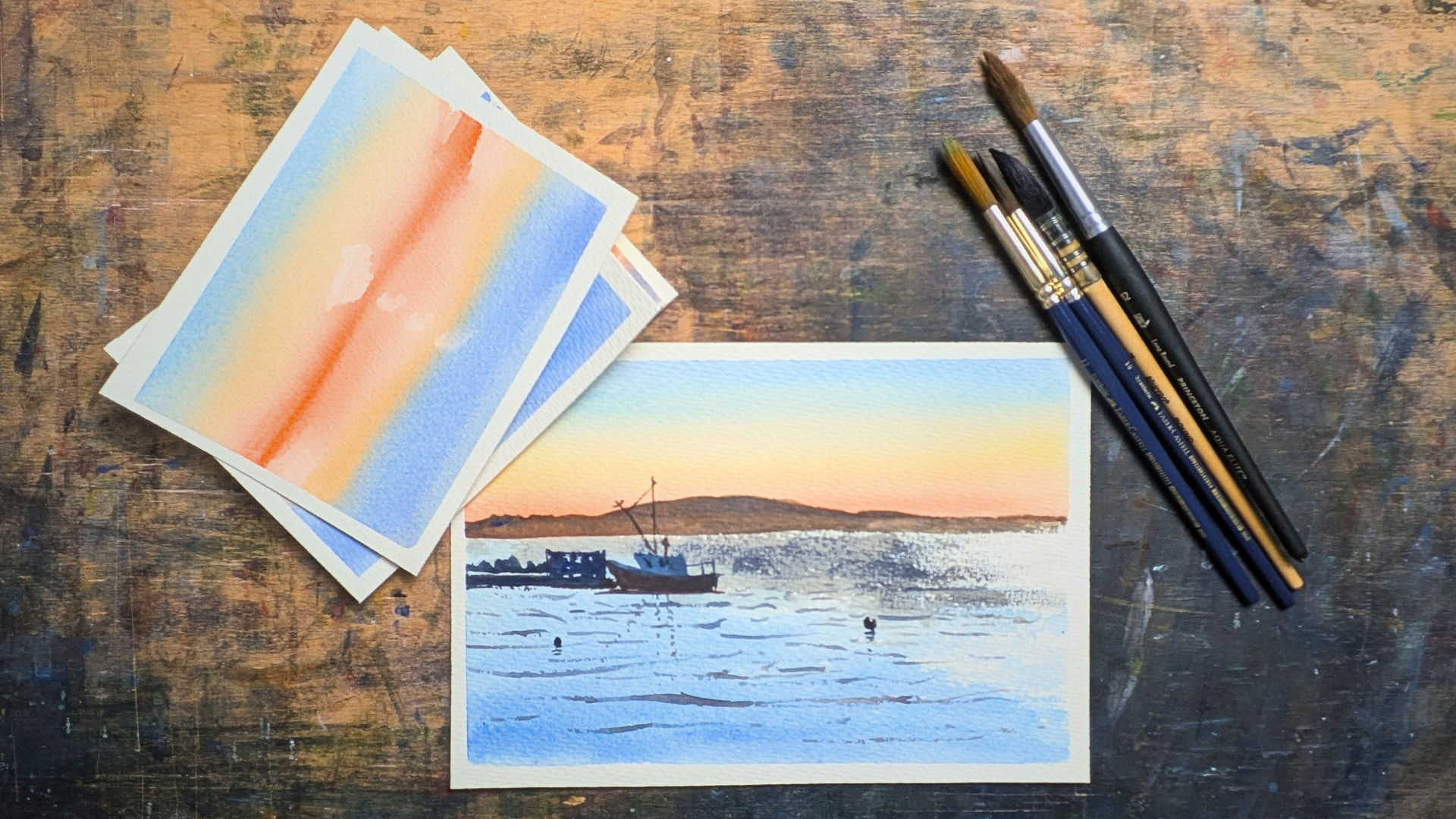
8. Project: Sky Wash: Okay, now let's apply what are the things we learned in
the previous sections, how to do flat wash, a greenwash and color
wash, we'll put together. This is a simple project, but I'm picking wash
zero for reference, and you could pick any
reference you want, but this is just to show how we could take this and
apply it on the sky, as well as in other elements in a painting to
bring it together. The first thing first, when
I analyze the reference, let's analyze the sky first
and the water differently. For the sky, you can
see that there's a little bit of
warmth at the bottom, like a little bit of
orange and at the top, there's a little bit of
green and it goes to blue. Whereas the same
thing at the bottom, if you see the water by itself, it just one wash. You
can think as a blue. And whenever you paint,
you don't have to be exactly true to
your reference. Another thing is be
confident when you paint. It's okay, whatever
you're going to get. Don't forget about the results and just go and have the fun. Let's do the sky first. I'm going to start at the bottom instead of starting at the top. Again, I'm also going to put
some yellow ocher as well, so I get a little bit of
orange as well. I like that. And you can see
that I really fast, I was able to do the
horizon really fast. I'm going to clean my brush. Now I'm going to a little
bit of this green. Again, what I said is in
the chapter, what we learn, do really fast strokes
or else you see your side of your
brush and you can gradually go up like this, what we learned in
the first chapter. I'll go to Slum blue. I'll go to bal blue at the top. You can see that we
able to replicate exactly what's in our reference. Again, I'm going to let it dry, then I'm going to come back and add the other layers on the top.
9. Project: Water Wash: I dry the paper
and this is how it looks like, let's do the water. When you see the water, there's a little bit of dry
brushing apening here. So there's a little bit of dry brush apening on the water. So we can replicate it, but I want to first
do the wash first, then we can replicate
that thing. So when I think about
the bottom of the water, I usually thinking
about sol in blue. What I'm going to do,
you can see the wash, I'm doing it really fast. I'm not even putting
in my palette I'm just taking water and
I'm just keep going it, not scared about my what I'm
going to get in my paper. But again, since I have painted watercolor
for a long time, I have a little
bit of confidence, so I'm going really fast and I go to Arizon, I'm
going to stop there. You can also blend it too.
It doesn't matter here, what I'm going to do is
I'm going to take here. I'm going to because
since I want to get this sparkle on the water, I'm going to make sure to get the texture of the
paper as well. You can see that I'm just going at dry brush technique here. I'm just going to combine it
from year to year and leave the white paper for the
sparkle on the thing. It comes here and at the bottom, it goes here and I'll
just leave a couple here and leave a couple here and leave a couple
here and that's. And you can see that now
we create the water. If you want to have some fun, you can also put some cobal blue at the bottom of the water. It creates really nice gradient, a little bit of darker value and take us into the painting. And here, we can also do something called
adding a darker value. For this one, I'm going
to use a different brush. There's also a darker
value happening here. For the darker
value, you can use born Siena or bort
amber or Ciphia. You can use either
of these colors, and I'm going to
take udubraKbblue, and you can see this is
a little bit darker. I want a texture, so that's why I'm pressing my brush
really in here. What I'm going to do is I'm
just checking where is it? A and I'll just stop here. It goes till here and since it's wet and
it's going to give this really nice
texturing look here since my paper is a rough
surface and it giving this look for me and
I'll just do this. I'll take a couple and
I'll just do this. This impression of waves
and I'll just leave it. I'm more let it dry and we'll
go on the next chapter. We'll add the background and
the rest of the elements.
10. Project: Background: Come back. In this chapter, you can see that we added
this sparkling element, the darker bit on the water and it a little bit went lighter. What you could do is you
can do the exact same step. Take some burn sienna and
lubra this neutral tin maybe maybe go like that. That's it. I want to
leave it as it is, and I don't want to overwork it. You can see that it's
just a dry brush, but it looks like a sparkle now. Now let's go and
add the background. For the background, it
just one simple shape. For that shape, I'm going to use the same thing, burn Sienna, and maybe will use
a little bit of what is it called
slum blue instead. You can also use
yellow ochre, too. This have to be a
little bit darker too. Solu blue, yellow ochre, and libra Bonsiena
and that should work. Again, when you do it and you have to do it in
one single shape. I'll just see the
shape of it and I'll make and I'll make a
line here like this. Again, there's a
little bit of glow happening on this side
because of the sunlight. What you could do is
this step you can do it and take some tissue paper
and you can just dab it. So you can see that the water is reflecting on the mountain. Again, I want to make sure
I'm capturing the mountain, making some shape like this
on my side of my brush. Again, I'm not being
true to my reference. I'm doing whatever I want.
I'm just focusing using my reference as a guide,
and I'll just do this. And here to break a couple of
spots, we'll just do this. I'll take a little bit of this French ultra blue and top of the mountain
when it's dry, we can just apply
it here like this. It gives this really
nice gradient at the bottom and
brings down for us. There you go. You can see
that in matter of seconds, we're able to create
the mountain behind it. Now I'm more little dry
and we're going to add other element like a boat
which is in the mid crown.
11. Project: Adding Final Details: Welcome to this chapter. In this chapter,
we're going to add the midground and
the boat by itself. Again, the midground and
the boat is together. What we can do is we can
separate it a little bit. Again, this is where it's amazing being an artist because
we get to do this stuff. We can move things around, whereas in photograph, you just have to capture
thing as it is. In waterclss you
are able to or in painting and you can
do whatever you want. Again, I'm not being
true to my reference. I'll change whatever I want and there's a couple of
rocks behind it. Again, I'm going to use
our first wash as eyelt on this bridge and there's some docks, which
is happening here. There's two boats. I'm
just going to do one boat. There you go. I'll
add like that. There you go. This is the thing. Now I'm going to add the boat and there's a little red in it. I'm going to take this
red on this here. I'm going to see where
this boat is going to sip. Again, I'm thinking
about the boat shape. Maybe I'll combine
the boat with dc. And there you go.
We create the boat. Now there's a ludbra
blue on the top. Let's add that I'm using neutral tint with
a ludra white in it. It goes like this. Again, I'm not worried
about what's there. I'm just painting, just capturing the shape of
the boat by itself. That's all I'm cared
about, not anything else. You can see that we cannot
create a boat already. So for the boat, there are
some details we have to add. For that, I'm going to use a
little bit of a tiny brush. And what I'm going to
do is I'll just add that and I'll add that and maybe I'll just make the board
a little bit better. I think this is a fishing boat. And there a couple of things. Again, this is not about
being doing good painting. This just for the washers, as artists, it's really hard to leave things as
it is in this thing. You can see that we
can create this. Whenever this happens, um, there's also
reflection hapscewll. So what we can do
is, I'm going to add a couple of reflections
for the boat, which is going to be sitting
in the water like that. I think that worked pretty nice. Now, there's a couple of
things happening in the waves. I'm going to add a couple
of waves, same thing. Whatever neutral tint
I have in the thing. I'm going to use my Sara my brush and I'm just
going to make some waves. And I can see that. And just keep on
adding these waves. We'll just go a
little bit faster. Again, this is just
an impression. It doesn't have to be
super accurate and I don't want this to be
a full on painting. I allow a couple more
darker waves like this. I think that's it. I'm
going to call it today. One more thing I'm going
to add is this guys, the one which is on the boat reflects on the water as well. I'll just replicate
it. I think that's it. There's also one more
thing happening here. Oh Now I'll add one more here, and I think we can
call this a day. You can see that we create
this really nice wash and then we add the flat wash and we left some white paper for the reflection of the sun. Then we added the midground, then we add the waves.
Simple as that. Whenever you paint,
make everything simple. Even when you're doing washes, make as simple as possible. I'm going to take
up the tape so you can see how the
painting looks like. There you go. This is how the
painting looks like, and it's pretty nice. When I expen my eyes, everything
works really nice on it. To recap everything,
we learn the flat wash first and you can
see that we can create evenly spaced
gradient with our wash. I also showed the
angle of the brush. The next one we learned
is gradient wash starting from darker and
slowly coming lighter. I also showed tilting
the paper as well. That also helps to create
something really nice. And the last one we
learned is the color wash. Using color wash, how we can
create gradient of a sky, you can see that
when I painted fast, the gradient looks really
nice and smoother. I also showed two
techniques how to blend two colors together. Then we did the example
of flat wash of a gradient of one of the reference I gave this
is the second one we did, and this is the last one we did with a little bit
of complex with a ubraHizon combined
everything together, and we did this painting
at this at the end.
12. Outro: Work. You made it to
end of the class. Even if your washers didn't come out perfect,
that's totally okay. Thise techniques take time and every brushstroke
is part of learning. The more you practice, the more natural it
will start to feel. Try different colors,
play with water, just enjoy the process. If you paint it along with me, even just one exercise,
I'll love to see it. Upload your work in
the pause section and share your progress. I'll guide you and provide
feedback and critics. Thanks so much for joining me, and I hope to see you
again in another class.
 Dinesh Subramanian, I love painting!!