Transcripts
1. Intro: Hello. My name is Danes. In this class, we will learn how value studies can instantly
impure your paintings. If you ever looked at
your paintings and thought it feels
flat or unfinished, the problem usually isn't your
colors. It's your values. In this class, we
will focus on values, how value can bring
your painting to life. We will start with a simple
five step value scale to see how water changes
the strength of paint. Then we'll practice applying values on basic
shapes like cube, cylinder, sphere, and cone. Because once you can paint this, you can paint almost anything. From there, we will
move to real examples. We will paint a simple pier. I'll show you how to
slowly layer it to create a three dimensional
effect just by using values to create depth. We'll also paint a simple
landscape, and finally, I'll show you how to apply a value scale to a
cityscape painting. You don't need fancy materials, just a watercolor paper and
brush and few simple paint. By end of this class,
you'll be able to look at your subject
and simplify into values and instantly improve watercolor paintings.
Let's get started.
2. 5 Step Value Scale: Before we dive into
value studies, let's start with the
basics. What is value? Value simply means how light or dark something appears
regardless of its color. It's a measure of lightness
and darkness that helps us to see shape,
form, and depth. You can think of it as the
backbone of your painting, and you can see the
value scale ranges from zero being white
and ten being dark, or sometimes people use ten being white and
zero being dark. Without the strong values, even the most beautiful
colors will look flat. Now, a value study is a simplified version
of your subject painted just in a range of
values from light to dark. We can focus on
the structure and lighting without being
distracted by color. Traditionally,
artists use shades of gray from pure white to deep black. But
here's the good news. You don't have to limit
yourself just gray. You can do value study
in any color as long as you vary it from its lightest
tint to the darkest shade. Think of it like you're watching
a black and white movie. You can still read the light, shadows and mood perfectly because value defines
form, not color. Let's do a quick exercise. I'm going to create
a five step value, and I'm going to be using
neutral tint in the first rope. Maybe I'll be using
French ultramaron blue. You can write the values from a ten step value or
eight step value. This is just a demo.
I'm going to do only a five versions,
let's get started. In order to get the lightest
value in watercolors, you have to get more
water in your brush. I'm just going to more water in your brush and
you can see that. I'm going to take a
little bit of utrotint. I'll just take some
more water and you can see that it almost
looks like decsistency. I'll do on this one, and I'll just get it off
my excess water. I'll just do this. I think I
have more water in my brush. Again, I'll try
not to be perfect. You can see that I was able to create this really nice
value of neutral tint. Let's call this value one. Before it dries out,
I'm going to focus on maybe French ultram blue. I'll just go and fill
French alterulue here. And you can see
that it's running and doing its thing, but
I'm not worried about it. I'm going to clean
my brush again. Now let's use a
differ darker color. I use bon timber. This is the color
I usually use in my classes to teach
the value studies. These cars will have the darkest
dark and lightest light, based on the amount
of water use in your brush and the pigments
you use in your brush. Now we finish the first value. Let's go to the second value, and I'm going to go a little
bit more of the pigment. And less water, and you can see how docker it is
compared to our first one, and I'll just go and feel it. If you put more and I just want to wipe it out
in your brush like this. Excess paint, I'll
just do it like this. Now you can see that I cran
the second darkest value. Now let's do the French ultramum
blue again, same thing. I'll use more pigment
and less water. Again, you can use
any brush you want. I'm using this caligraph brush. You can see that
this is a little bit darker than our first value. Some more. I'll just fill it
yours and you can see it. I'll go to the next
one, the burn tamber. Same thing. I'll use less
water, more pigment. It's all about water and pigment and that's
how you vary values. This will be quite andy
after you do this exercise. When we do the other classes, other chapters, it's going
to be easier for us. You can see that after
painting one and two, this got a little bit easier. Let's go to the next
one, and I'm going to be using more pigment
now and less water. And this is our third value. Again, I might go a little
bit darker on this one. That's why I'm just
trying to fill the shape you can see that we cannot
create a third value. Let's do the fringe
turn and blue. I should have done just
the neutro ten by itself. Then I just want to show that can also
do with other colors. The value doesn't just
applies to black and white. It applies to any colors
you can use for painting. That's why I want to
show all the colors. I'm going to wipe it and I'll go tamper you can see that
as soon as I do couple, I'm getting more
confident in my stroke. It's doing a warming
up when you go into a gym and you can see
this is our third value. Let's go to the fourth value. Again, once this dries out, this gets a little
bit lighter too. That's how watercolor works. The value goes one or
two scale lighter. That's why I picked
a five step value. And you can see that we got
a little bit darker on this. Insi french alter blue. Sometimes what happens
is, let's say you are doing a value exercise or
you are painting an object. Let's say you want to increase
the value on something. You can do that by layering. For example, if you
go and paint on top of the third value scale, the value will go a little
bit higher, darker. I can see that I was
able to do that. I think I really like the way I created the darker values
on my bone tamber. You can see that we cannot
create a nice variances. This is the last one. This one, what happens is you
don't use any water, you just use pure
pigment from this. This is mostly this value is the shadow value or the value you do with
your dry brushing. But I do have some water
in my paint itself, but still you can see that I can able to get the
value bit darker. Let's do this one. Same thing. It's almost pecking the pigment from here. Pigment
is not coming. It's dried quite a bit, so I need a lot of paint
to get the darker value. You can see that we got darker. Let's do the last bone
tamber. Yeah, there you go. This is the final value. But you can see
that just by having more pigment and less
water in your brush, we are able to get
the darker pigment, almost like a dry brush. We learned how to do this
five step value scale and you can see that we start
with the light and we slowly increase the
value of the darkness.
3. Gradient Value Scale: Last chapter, we created
a five step value scale. In this chapter, you don't need five paints to
get five values. You just need one, and
we're going to use lodo brush with water for our darkest value
to paint straight, then gradually add more water to create a swatch until
you get a light gray. Think it's like it's a coffee, espresso, Americano, flat white. You are controlling
the intensity by controlling water and that's
what we did here as well. In our last exercise, we worked on car swatches, moving from light to dark, now we are going a step further. So I'll be using just one color, creating five different values from it, from light to dark. For a little challenge,
let's do a dark to light, to darker, and light
to darker to light. Why are we doing this? Simple. These exercises will help you learn how to
control your values, to create shapes
in your painting. Making a smooth
gradient is one thing. But when you're
painting a cityscape, a landscape or any subject, you will need to shift your
values with intention. That's how you create
depth, form, and mood. Think of this as a value
training for your brush, getting ready to
shape your paintings with confidence,
let's get started. I'm way to do the same
thing here as well. I'm going to clean my
brush a little bit. And maybe let's do a neutral tint and French
Alternblue and Burns and I can. I'm going to create
let's do dark. You can see that as soon as I'm not using that much
water in my brush, this is a little bit of
water but more pigment. I want to take this
little bit lighter. And you can see that I'm using more water
in my brush now, and I want to make this
a little bit darker. What I'll do, I'll
take more pigment, I'll get rid of my excess water, I'll take my more pigment
and slowly move like this. If it's not intensity, it's not enough, you
can do this asphalt. You can just slowly
rub it like that. Again, I'm going to
lighten it like that. I'm going to darken
it like this. Maybe I'll go a
little bit darker. You can also slowly
take it up like this, and you can also mix
it here as well. You can see that we
created a darker, lighter, darker,
lighter and darker. We can also do this
opposite way too. Let's do this. I'm
going to this one. Try a lighter and darker. And I'm going to
go a little bit. Lighter? I'm going to go darker. Same thing as above. You can see that we are able to create these really nice gradients and it almost looked like
a sky and water there. You can see that it creates
blooms and stuff like that, but I'm not worried
about it because this is just a practice purpose. Nets apply a different
color to it. This time, let's
use French ultra and blue. It's the same thing. The reason we are doing this
is control the intensity. What I'll do is I'll
start with a darker, no pigment, no water in my
brush, little bit of water. And I'll just take some
more and come here. I'll go to bit darker.
Maybe I'll go darker here. I want to smooth
this transition, so I'm going to slowly
transition like that. I'll bring it here and
I'll just use lighter. And you can see that we can
add light, dark, light. Again, it's all
about pigment and water consistency and
that's why it matters. Let's do the opposite way. I'm going to do lighter first. You can see that the first one, we had a little
bit of difficulty and it gets easier and easier. I'm not worried about being, you know, scared about
going out of the lines. This is just a practice
to loosen up for our other exercise
and go doctor. Whenever you have this
sudden transition happening and go slow above, it's like you're
painting a cat and you'll get this really
nice transition and blend it like that. You can see that. Now
you can see that we can able to create gradients
of different variations. Let's do one more, the last one. The last one I'm
going to be using, maybe I'll use Cipia. CFia is another darker
color of bone tamper. But I also really like
this color and this gets really nice
darker pigments. What we'll do is we'll
start with light. And as soon as I come here,
I'm going to go darker. Maybe I'll go little darker. I'm going to clean my brush,
take some more water, and I'll just gradient
like this and go darker. There you go. Again,
to get the transition, get the excess water
and slowly blend it. Like that. There you go. Now we can see that we cannot create this really
nice transition from dark and light dark dark. Using this concept of creating values of different
variations and we're able to create
any shapes and forms and we can able to
create any objects as well.
4. Painting Primitive Shapes Using Values: Now that we practice controlling
values with gradients, let's put this skill in action. This time we'll be
using simple shapes like cubes, cylinders, sphere, and cones to see how values can turn flat shapes
into three dimensional forms. Here's why this is important. When we paint, everything we
create is technically flat. It's just a pigment on paper, but with the right use
of light and shadow, we can make it look
three dimensional. That's where the values do
all the lifting for us. I'll start with the cube. Let's see. I'll
put one cube here. Again, I'm thinking about
the planes of the cube. This is our side plane, and
this is the front plane, and this is the top plane. There's a simple cube you can see this is top plane
and this is side plane. And let's do a sphere and
sphere doesn't matter. You just have to be like that, and let's create the
light is coming from here and it'll be heading there and it will
create a shadow here. If you want to learn how to
create three dimsal forms, you can also check my other
Skillshare class as well. Let's do a cylinder. When
you think about a cylinder, it's usually rectangle, but there's an ellipse
at the top like this. At the bottom, it's like this. I'm thinking about the lighting. Let's hit the light here. We get a really nice shadow
at the back of it like this. It goes like that. Let's do one cone as well. Mine as well. Cone. Think of a both hat, and let's hit the
light reading there. For this cube, I'm
thinking the light is coming from this side,
so it's stating top. I'll use different colors to show that we can use
different values. Maybe I'll use a different
brush this time. For the cube, I'll
use maybe cifa. So the first value is this guy. This is where the
light is hitting. I don't want to keep it white, so I'm just going to fill
the shape like that. And for the side plane, maybe the top plane, I'll just vary the values
a little bit. Like that. Once I
go to this corner, it might bleed, but it's okay. This for practice.
For the shadow plane, it's going to be darker. Just by using three values, we're able to create
this flat shape into three dimensional forms
and I'll add a shadow. There's also another
way of doing this. It's a layering method. You can see that it
looks three dimensional with a nice light and shadow. I'll just put it there
and I'll put here, here, a gradient there you go. Now we're able to
create this flat shape just using three values, a light value, a midtone
value, and a dark value. Let's do the sphere. For the sphere, I'm going to be using French alternumblue. So since the light
is heating here, and I'll just leave some
white spot for the eyelids. So if you don't know
what's a form principle, again, I really recommend
going and checking out, um, my three dimensional, how to create three D forms
in water clos in my class. And I explain how the form principle works
on all the objects. And that will be
easier to understand. This is like a terminator
which kind of goes like this, which separates the light
on the shadow side. And you can see
that I'm increasing the value slowly and I'm going to more one value darker. And I'll go super dark. Almost no water in my brush. You can see that we
are able to create this really nice three
dimensional forms already. Usually the core
shadow happens here, so it belittle darker. I'm just going to add
it until it's wet. You can see that we
are able to create this really nice three
dimensional objects already. There's one thing is
missing is the shadow and I'll take a
really dark pigment, which separates the
sphere from the ground. There you go. Now you can
see that we are able to create just by using at gradients what we did in the previous class and we use the same technique
to create this. If you want, you can
also create a vignette like this and that also makes your object will pop more. Let's do the cylinder now. For the cylinder,
what color can I use? I'll use a red.
This winds are red. We are thinking that the
light is coming from here, so I'm just going to put
the shape of it here and here as it goes back, it gets darker and darker. And you can see
here. At the top, I'll combine it
like this and fill the shape with a darker pigment
what I did here as well. You can ask me
there's a white bit This is the magic
of watercoloss. I'll take this guy,
take some white paint. Not white paint, water, clean water, and I'll just
soften this edge like this. We able to create this
really nice eyelet for us at the bottom. You can see that we are
able to create this form. Still, it doesn't look
like it's rolling. What I mean by that it
doesn't roll like this, this is the cylindrical
form rolls. You will see as soon as I put something here and you can see that it rolled a
little bit better. I'll also make core shadow. There you go. Now at the cast shadow, which goes behind this guy and I'm using almost like a
dry brush technique for it. You can see that we
are able to create this really nice
cylindrical form just by using one color. Just by using three values. Let's do the cone and let's
use a different cover. I'll use burn Sienna. I like this color.
This technique I'm going to use a different way of
painting this technique. What I will do is
I'll start with a the darkest value and you can see that there's
a lot of water in my brush. I'm not able to so I'm going
to wipe my brush with a rag, then I'll take a pigment. You can see I can take a
pure pigment from here. Now, it's the same thing what
we did with other exercise. Take some water and leave a white eyelet what we did here for the sphere and the cylinder. Going to go around like this. You can see that
it's already turning and the form is going to roll. What we have to do is we have to add something dark like here. You can see that
as soon as we add the Docker value, it did. I also want to add
this terminator. I'm adding the terminator now. This is called the terminator.
It also happens here. I also happens here
and the terminator happens here as
well for the cube. There's only one thing that's
missing is the cast shadow. I'll add that. Cast shadow I have a little bit
lighter. I don't know why. Okay. And there you go. Let's say if you want
to decrease the value, you can use a clean brush and take some of the paint
like that and blend it. There you go. Now we're able to create using different values,
using different shapes.
5. Approaching An Simple Object Using Values: Paint something simple. I found this onion in my kitchen, so I took
a picture of it. Before I jump onto it, I'm going to approach this
first value study, people who are new to Was are doing this value
study for the first time. You usually sketch the
outline really light, and then you squint your eyes, looking at your rough fronts and identify where the
shadows are the darkest. That's where your
darker value goes and leave the brightest
parts untouched, and those are your eyelids. You only need three values. Check this onion. You can see the light mid tone and
dark, and that's it. It's about seeing, not guessing. This is where your painting
starts to come alive. Let's get started. I'll
just do it like this. Or composition is like that. It's almost like a
sphere and right tank. And there you go. And in waterclos we start with the light,
we slowly build it up. You can pick any color you want. It doesn't have to
be the color I'm using and make sure it can
be french alon blue Cepia, burn timber or neutro tin, something which goes darker. You can also use this
dark green as well, but I'm going to use CFIa. I'm going to layer this slowly because this will help us
in other chapters AsOll. I'll also show this
layering technique. I'm going to apply
the first wash this is our the base value, which is sitting on the
let as I'm showing in the figure right now, I'm
just painting that first. I'm getting the shape
of this really fast. It looks like a fish almost. I'm just going to do it.
There you go. Now we lay it. What you could do is here, you could wait them to dry, then you can also do wet on wet. So you can apply
something on top. Now I want to take
my clean brush. I'm going to clean my brush
with a rag I'm just going to take off the iglted
areas like this. You can see that we can create
the elated spot as well as a base value for
our overall onion. It looks flat. Now let's apply the second
value, the midton value. I use libra water happening
here on the sides and couple here and here and the mid tone
value also go here. You can see that I'm
slowly layering it, not rushing to the process. It also goes here and this valley also
goes on top like this. And you can see that
we cannot create a base value and we cannot create this.
I'm going to blend in. I'm going to take
some clean water and slowly blend in like this. There's not a sudden
transitioning happening on the onion, it creates this
arounder form for us. That's why we're
after. Now, just go. Now there's only one
thing is missing is just the docrop in the front. Just checking I'm also
making something up, there's a couple of those
bits which are folding. There's a couple of this here. Now you can see
that these veins, which is coming here and we
can also add that as well. It's a darker part
of the things. This also helps to show the shape of the awning
a little bit better. As soon as we can
add those veins, because it's showing the form
out turns and out finishes. So take some more. You can see that I didn't
wait for this to dry. I'm doing it in a one go. It's darker here, and we are doing this
darker and it's going to dry quite a bit. And you can see that
I'll just it at the floor and I'll just at the floor going
around the onion. And separating it like this. Easy simple steps. If you think your shapes in three values,
a mid tone value, a darker value, and a highlight and you're halfway there of creating a shape
looking three dimensional. There. Since there's not that much of a light direction
is going on, so that's where
there is no shadow, but the tiny shadow
is happening there. I'll use this wet on wet. What I'll do is I'll just
put it here like that. Just making up the shadow. I don't want to read that
much and there you go. Now you can see that just
by using simple shapes, we're able to create this onion and three
dimension forms. As in the beginning
of the chapter, I said, we can also
do some layering. Now we write quite a bit. If I want to create more
volume of the turns, I can also increase
the wall value by going another
layer on top of it. Just by adding another layer, you can see that, the
forms even turn even more. It's all about squinting your eyes and
checking the values, and I'm also checking my value. There's also darker value
which is happening here. I'm also adding those all the
darker values here as well. I'll soften it once
I block the values. There's also darker value here. Now I'll go here and I'll just soften the
edges like this. You can see that now we
are able to create this really nice the Anian with the three dimensional shapes
and it started looking realistic as we keep on
increasing the value. I'm just going to stop it here and if I do it even any further, I'll ruin it because this is the easiest way of controlling our values if you're starting new to WaterclssT how we can see everything shapes
and forms and values.
6. Study from A Photo: Chapter 01: The last chapter, we did this in of simple three
value studies. But this one I'm going
to show how to lay a altebra of more value
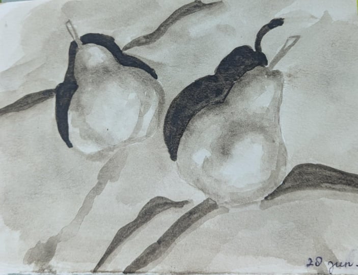
and get a realistic look. This one we're going to use
the object with the peers. There's two piers and I'm
just going to ignore one and I'm just going
to do the bottom one as I can show in the figure. I also took this
picture as well as I desaturated and you can see
that if I squint my eyes, I can see that there
is three latd areas. There's a mid tone
and there is also dark shadow and
even the cloth has a different value as well.
That's why I picked this. Let's go on block in this Again, I'm thinking this is a top part. Sense and kind of
goes like that. Checking here. There you go. What I will
do is in this drawing and I'll just add the shadows now so I know
where the shadows are going. This will act as
your map for you. But eventually, when I
paint, I don't do it. But this is just showing it. It just makes your life easier. Know where the shadows at. You can also use
Ach So our shadows. There's also the shadow which
is happening at the top, and you can also go and shade it and you can also
adch it like this. You can see that we
are able to create it. There's also the midton values. We can also add it like this. Just checking the
form how it turns. And there's also this form, which is starting If
you're new to it, that's why I'm showing it here, but I don't paint like this. There you go. Now you can see that we're able
to create this. There's also a cloth underneath and they also
have the shadows too. If you want, you can
also add that as well. Just blocking the shapes of these guys. There you. Now we created this. This time, I'm thinking
maybe I'll use, um, uh, what kind
of car we can use. We could use neutral tint. I can show the little
bit of a darkness side. I'll show how to layer it. I'll do the first wash.
And this is where our eyelid spots this helps us to see where
our eyelid sits. I'm checking, is there
any other outlets there, there there. I think this is more
than enough to create our eyelets. And that's it. Now I'll take this color. I'll just go around
and mix it like this. The dilated areas, I don't
want to leave the sharper, so I'm going to smooth it. I'm going to take a clean
brush and clean my brush, put some water here and
soft on those edges. You can see that as
soon as we soften it, it's already showing the
forms of the piers itself. There you go. Now, we're
able to create it. You can also use a tissue. I'm going to show the
tissue trick as well. So once you have it, take a clean tissue and
you can just do this. This also another way of
leaving some rods as well. I'll let it dry and we'll come
back and do the next wash.
7. Study from A Photo: Chapter 02: Back, I did dried a bit. I'm going to add the next value. So go here, take here. I'm checking, I'll just
start with the corners here. Even it goes away
from the shape, I'm not worried
about it because I know that it's going to
be darker on this side. And it gets lighter here. I'm going to take
another brush because I want to make sure I'm
getting a smoother transition. I'm going to go here,
take a clean water. Since it's a rounder shape
and it's going to be softer, there's not that
many sharp edges. Even this one is
a sharp edge too. Do this and I'll just
do this as well there. You can see that we
soft really nice. I'll do the same thing
on the top here. Take a clean brush. There you go. There's also
another darker value happens, but we'll do it at the end. I'll take a darker value
with no water in my brush. This is called the terminator, which terminates from the
light and the shadow side. That's why I'm putting it here. Since it's word, it's
bleeding and doing his thing. But don't scare about it, and I'll go here and
I'll just do this. Take the pigment a
little bit away from it. Now you can see that it
looks exactly like that. I have to soften
it even further. There you go. And there you go. I'll do it here as well, take the clean water
and blend it like this. The same thing here as well. You can use any brush, and this brush reaches a really nice flat bristle.
That's why I'm using. Don't think that you have to use a calligraphic
brush to do it. You can use any
brush to do this. There's a sharp edge as well, I'm going to leave it as it is, and it goes like
this and it turns. I'll go here, clean my brush. I'll just soften it like that. It's all about softening
and creating this shape, and that's all we're trying
to do. There you go. It's a little bit
of darker value. Prettier like that. Right there. This also have to be softer. Taking clean water
and softening it. It's all about
putting the value, softening it, putting
the value, softening it. You can see that this guy is
not giving a sharper look. What I'll do is
I'll take this and blend it this side
with an eyelet. There you go. There you go. Now you can see that we create
that really nice eyelet. There's only a couple of
things need to be done. It's here, this shape. But I'll put one
more shape here. I take some clean water. I'll take this to the lets right here and joining it here. You can see that it gives this really nice blending already. You can see right here. I'll do the exact same thing. There's also another thing which is at the bottom as well. This is a foul shape. Now you can see that we are able to add those valleys on top. Again, there's also
another valley we have to add and you will
see it in a second. There's also the top part. I'm going to add
it now. I'm going to leave some eyelets like that. There you go. Now we can see that we're able
to create the value. It looks three dimensional, but this will make more sense once we add the
value for the cloth. The value is a little bit darker compared to the peer itself. I think that works pretty nice and this also helps us to shape. This is going to
bleed, that's fine. That also looks really nice cool look and I'll
leave it as it is. I won't worry about
it. Or else I would have dried the paper, then
I would have done it. But it's okay. I'm
going to speed up the process p a
little bit faster. You can see that I went over the top part
of the peer itself. I'll show in a second why. Just filling the shape
as fast as possible. I'm checking if the value
is a little bit lighter than our pier and
that's what I wanted. Yes, I think this
works pretty nice. I'm going to do one more thing. What the trick I
showed you guys, Leaving some eyelids at the top. There you go. I think
it's pretty good. But my value is ibiker here. I'll make it ibiker
on these areas because I want to see
the separation between the peer and the cloth. That's the other way of checking your values too, if
it's right or wrong. Now it's done. I'm going to dry it, then we're
going to come back.
8. Study from A Photo: Chapter 03: So this is where you have to
ask yourself this question. Does per when I look
at my reference, when I look at my peer
after drawing it, does it look three dimensional? Does the value look close to it? If not? If it doesn't look
good, you can layer it again. That's why it's
always good to start with the lightest
lightest value, sorry, lightest tone or value and we can slowly build it
up. This value is good. I'm going here. I'm going here. I'm going here and there's also a value change
which is also at the top. Now the same thing
what we did here, take some clean water and slowly blend in
this guy like that. Same thing here as well, same thing here as well. Take a little bit of this
color and I'll just go. I'll just combine at
the top and I'll bring it slowly bring it with another valley here
and I'll end it here. This guy is softer too, and make sure to capture that. Now you can see that as soon
as we match that value, it looks three dimensional
already for us. I also bring a little bit
here and just focusing on that eyelids and take a
little bit of this value, rounding the form here
and same as here. I'll just soften it
to get the tilt. You can see that we are able to create this really nice three
dimensional form already. There's also this guy, it could be a little
bit darker and that's the same thing and
it will just blend in. Now I'm going to
add the top part of the peer which is a darker part. And I'll just go and
add it like that. We also lift some eyelids, make use of it. There you go. Now what we can do is we can add the shadows or we can add the docker
value at the top first. I'm going to add the
Docker value on the top. You can see I took more
pigment and since it's so wet, it's going to give the
really nice eyelids for us. I'll just combine it like that. And let's add the shadow. So the shadow kind
of goes like that. And I'm checking where it hits. And I'll just combine
as a one single shape. I think I went over my peers. So what I can do is I
can take a clean brush. Don't freak out or anything, clean it like that. You can also blend it as well. And you can see that
now it separates the peer from the
cloth what we added. You can see that this happened. Clean my brush. I'll
just blend it there. I also create a really nice
detail for us for our peers. Peer, not peers. There
you go. There you go. Now you can see that it's
really nice blending. Now I'll add the cloth shadow. First, I will add the
darker part like that. Checking the waviness.
Goes like that. It also frames here really nice. I like that effect. Before it dries out. I want clean water a
little bit of this. I'm going to soften
it because it will have in cloth when light it, there'll be a sharper
side and a lighter side. This creates this really nice
soft ridge for the cloth. I'll just bend it like
that. There you go. Now you can see
the cloth which is happening on the top as well. One more thing is pending
is this value of this guy, and I'll just soften
it again like that. And there you go. There's one more step
I'm going to do. This one is optional. There is some damaged mark, so I'm going to take my brush. This I'm adding it so I can
show that the shape which is turning the
pierce is turning, and that's a one leg reason. And it's enough, and that's it. I can see that we able to create a really nice peer with a
little bit of a value side. There's one thing which I'm not happy about it is this
shape at the top. I'm going to use my clean
brush and just clean it a little bit to get the shape a little
bit better and that's it. I just ruin it. I think
that there's also darker value here right here. As soon as I add it, you
can see that it frames the peer even better. I
think I'll stop it here. Now you can see that we are
able to take the values, slowly build it up, draw it, and able to create this
three dimensional look with light and shadows.
9. Simplifying A Landscape: Layering Technique: Last chapter, we learn
our first value study. In this chapter, we're going
to use the same techniques and layering and how we
can apply on a landscape. This is a simple
landscape, nothing to it, and this is just to show you how we can create depth
just by using our values. And maybe I'll dry my paint
once I do some washers, or also I'll keep trying it. I'm trying to vary the
shapes not exactly the same. Put some one here,
I'll put one here, which goes like this and one
which is picking like this. You can see that
it's a stepping. It starts from all the way at the back and
slowly coming down. You can use any colors you
want and what I will do is I will use CFA for this one. Again, you can use any
color and the first wash is just something to kill the
whiteness from the paper. There's a lot of ways to do it. I should now went over it, but since it's a value
exercise purpose, I'm showing how laying
works in waterclos. This is also really good way of learning how
watercloor works. Once I apply the wash, so we have to wait this to dry. What I'm going to do is
to speed up the process, I'm going to draw it and
we're going to come back. Now I dry the paper quite a bit and let's start
with the background. The background is the furthest. In landscape or anything
you see in reality, usually things which are
far as a liters value. The easiest way to think this is squint your eyes
when you go out. I do the first value like that and you can see that I create the first
mountain by itself. If you want to
create a foggy look, so you can take a
tissue paper trick as I showed in the beginning and you can also get rid of some of the paint like this
at the bottom. Now you can see that there's
a foggy things which is happening on the background. Next, let's go to the next mountain right
here. Same thing. I'm going to go a little bit darker and it's going to bleed, that's fine. I'll just do it. You can see that I'm doing
it in one single wash. This one, instead of creating
a fog at the bottom, I'll use more water and
I'll just blend like this. You can see that
we created a depth of lighter one and a little bit of a
darker one at the top. This way, I don't have to go
and weigh it and dry, sorry. I'll just do one of the wash
like this slowly blending. You can see that we created another darker value
from this one. Let's do the third
mountain right here, which is going to be
a little bit darker. It's going to bleed
here. That's fine. Because I just want to speed up the process and
that's why I'm not doing it. I think I'll just do this. Now it's a little bit
darker than this one. Again, same thing. Clean water. I'm just going to do this. This one, I'll dry it.
I'll show you in a second why I'm doing this mount. These three mountains, I'll
dry it and I'll come back. I can show the
layering technique. You can see that when we did the blending
with the water in it, it created this really
nice blending by itself. That's a beautiful thing about creating loss and loose edges. I'll do this one, this one, I'll just do like that. I'll create some texture. You can see that it's
darker than this one. I'll just take this guy and
I'll just blend it like this. If you leave some white
bits here and there, it looks like a snow
in as well leave it. At the bottom, I'll just use clean water and
I'll just do this. If you want to take more, take a clean brush and just
rub it off slowly. You can just bring this
down, not a bit like this. So you can see
that we can create a really nice depth of
layers of mountains. For these ones, what I'm going
to do is I'm going to dry. The reason being is I
want to get a hard edge. If I put something here, just to show an example, if I
put something here, you can see that it bleeds, but I want to create a hard
edge so we can create depth. Now I dried it, you can
see that quite a bit damp, so I can put on the
wash. Now what I can do is I can take and you can see how crisp the edges we are getting and you
can see how loose we got this and this
looks really nice. That's where I want
it, and I'll do the same thing on the
small mountain tou. I think I went a
little bit darker. It's okay. I'm just
going to do this. Same thing on here as well. Now what I will do, take this
guy and blend it like this. You know what I'm
going to do? I'm going to bring it all the way here to this
mountain, the foreground. You can see that we
can create a depth it's almost coming in
the foreground for us. I'll just do this
and there you go. I went over this
mountain nut here. But what I'll do is
I'll do the same thing, dry it, then I'll wear it. That way we can create a really
nice depth using values. Again, since it's a layer, you can also go and increase the value too, for
example, this one. This one, I want to get
this really nice edge. What I will do is
I'll go here and do this and I'll slowly
blend in like this. Brush. You can see that create
a really nice blending. It's another value
applied on top. Same thing goes on here, but
you need more water to get this crus page and you can also do it as well right
here on the top. I'm going to take a clean brush, and you can see that I'm
constantly putting more water as it goes in the background,
I'm using more water. When it comes to the foreground,
I'm using less water. That's a trick to
creating value studies. We also did it in the
last chapter two. Let me doing the
pier, there you go. I'm going to dry now and I'm
going to add the foreground. Then you will see
the depth it created using shades of lighter
value to a dry out. It's quite damp and there's
a little bit of wetness, but still I can
apply a wash on it. There's one thing if you
notice in watercolors is even though it was quite dark once we
applied the wash, but you can see that
it got lighter. The rule of thumb is even
though if you're putting a value even if you're
putting a value of eight, even if putting a
value of eight, it goes to maybe five
or four based on how much water use in your
brush and your pigment. Now let's apply the foreground. I'm going to use no pigment at all, sorry, no water at all. I'm just going to create
this really nice, um, mountains. I'll go like this. And you can see that
this mountains, what I'm adding now, it's
coming to the foreground. You can see that we are
able to create depth and distance just by using values. This is how a lot of
artists use values to create depth and distance
in their painting. That's why a lot of artists
they believe in values, they don't believe in colors. If you know how to
control your values, then you can sell this
painting to anyone. You can see that
came down. Now I'll do this one and this one, what I'll do is. Oh. You can see that it's
almost dry brush. Just adding some trees on top of these mountains and it's
going to bleed here. That's okay. That's fine. This is where I
should have dried it, then I would add it, it would
have created more depth. What I will do is to
speed up the process, I'll just finish
this side first. Then we will go and
add the other side. You can see that this mountain is closer to us
than this mountain. We are creating that
depth using values. Adding that trees. Now I'll dry because I
want to get this actually, it's quite dry, so we'll try it. It's dried quite a
bit. Yeah, it dried. Now I can add this
trees and you can see that it came close to us and it pushes everything
all the way at the back. I'll use some water and I'll just do it. Nice. Now we can see that we created these really nice mountains of creating depth and distance
just by using values. This is really important
when painting. Even if you want, you
can just go on layer it, bring this a little bit
close to this mountain. And take some clean water and it just blend in like
this and there you go. You can see that now it's
a little bit close to this mountain. There you go. You can see that came closer. If you want, you can add some
details on these mountains. Just using a brushstroke
showing the way it turns. I'm going to use more water for these details because
this is far away from us, so there will be a lot of
atmosphere in and same thing, more water here because
it's far away from us and more water here as well. This one I won't add anything. Even if you want to add, add more water and you can
keep it really subtle. Now it looks like there
is a layering happening, but once it dries out, it's going to create this really
nice texture for us. We can also create atmosphere, I'll create atmosphere here. What I mean by that is, this is called to create a
aerial perspective. This will quite come in handy. I'm going to put a value
where my silhouette. I mean, near the
background mountain and I'll slowly
create a gradient. Like this. There you go. Clean my brush, take
some more water. Slowly rub it off like this. Now we can see that we can have created another gradient at the back and we can also
create a value at the top. Sometime what happens, let's say we apply more value on the
top, take a tissue paper. Slowly rub it off. And you can see that now
we cannot create this really nice gradient
from top to bottom. Now I'm going to dry it and we'll see how the
final looks like. This is how the final
painting looks like, but you can see that we
cannot create a first wash, using just littlebraf
Cipia and creating a wash and we slowly started
from the background, adding a lighter value, then a litibra of darker
value, the third value, fourth value, fifth value, six, and vice versa. You can also see we can also add the details using
the same technique, having more pigment in my brush, less pigment, more water, more water, more
water and more water. You can see the
details there, it is there, but it is lighter. We also create
atmospheric perspective just adding gradient
from top to bottom, just by using values of wearing the darker value
to the lighter value. Now it's your turn and
take this exercise. Don't worry about
how the landscape is looking, the shape
and everything. This exercise is just to practice and applying the
values what we learned so far.
10. Bonus Chapter: Cityscape Value Study 01: Come to the bonus chapter. The last bonus chapter
I showed how to apply value studies
on a landscape. Whereas this one,
I'm going to show how to apply on a
cityscape scene. The reason being I'm
showing this is to understand how we can apply
values on different subjects. Again, I changed my
proportions and everything, as you can see in the reference, this is longer, but I tried
to fit it in a square. The reason being this kind of
exercise is just to learn, not to to create a pretty
painting or anything. You just understand the
values of whites and darks. The last one I used Cipia. Maybe this one I'll use bon timber and you can see
using bon timber here. As you can see, if
you see the cloud, even the cloud is a
little bit darker. And there's a gradient. If you skin your
eyes, if you check the reference a
little bit closely, there's a gradient which
is happening at the top. I'm just going to leave some
white bits for the lights. If you want, you can also leave some white bits for
the poles as well. Again, in watercls, these are certain techniques you can utilize just leaving
the negative shapes. That means what I'm talking
about is the lightest value. And a lot of people
don't use white paint. The traditional method of painting in waclos
is just leaving white paint for the lightest
values or the lands. I'm just going to
go here and you can see that we can create a little bit of
value on our sky. I'm also starting with the
bigger shape in my scene. Again, the biggest
shape would be always the sky in most of the instance. I know that this side is darker, so I'm just going like this. If I screen my eyes and
I'll just apply this wash, then I'll create the
gradient, the darker value. I'll just go like
that and even I'll just go here and I'll
just apply this value. Even this area is
going to be darker and I'm going to leave some white
bits for the speed sign. And you and this guy here, this is going to be
on the light side, the shadow side, sorry. I'm just going to
apply a wash here. You can see that in
a matter of second, I was able to apply
this wash all over. You can also bring this washes, I'm checking my reference. I'm constantly
checking my reference where my values are and what
kind of values are there. If I see white
bits, for example, for the window, I
left some white bits, and even for the windows here, there's libra white bits here, and the shop sign, there is a little
bit of value there. Let's leave it white. It gives a really nice contrast and I'll just leave
some like that. At the bottom, I'll just
do this for the road. Sometimes it's
really hard to judge the value without having
any value because we are constantly comparing
our values with just a white paper and
it might get tricky. That's why you
have to start with a light value and
slowly build up. If you're really confirmed
with your values, then you can go darkest
dark and lightest light. But I recommend if you're beginner and even
when I started, I slowly increase my value. This is a value I'm seeing for the sky and you
can see the sky, even it has a libra
gradient there. I want to create that
gradient at the top. I'm just going here and it goes. The gradient blends
here as well. I think this is the
greatest paper to use, but I'm not aware and you can see that I cannot create
this really nice gradient. I want to use my flat brush to blend it a little bit better. Again, I'll keep on saying this value study is just
to um learn the values, not about creating a um nice painting or
anything like that. I'll just apply some values. I also picked this subject
because it's a white wall. Even the white wall
has a little bit of value, but I'm
going to ignore it. I'm going to keep
this as a white wall. You will see the contrast which is going to give
for our painting. Whenever I see the light hitting the wood part and
I'm just going to ignore it. This is just to see where my value is going to
sit and everything. This not the end
all be all and I'll just go here and I'll
just go here as well. This is on the shadow side.
There's also the post there in as well
make this like that. You can see that just by adding
the values on everything, we create this really
nice gradient. Now also do one more
gradient for the light post. Remember, if you
remember the lessons we learned the chapter, how we can make things
three dimensional through forms through primitive shapes and
this comes in Andy. This is a cylindrical
shape. What I'm doing is I'm applying a
wash and I'm going to take some clean water and create a rounder form to get
it, and there you go. Now we can create a
rounder form for it and for the speed sign,
I'll leave it as it is. Now we can see that I'm
applying a wash now. Now I can increase the
value, decrease the value. I'm happy with my sky value. Let's start with the background. So I'm squinting my eyes. Does it look right? No,
it doesn't look right for me and everybody sees
values differently. Each person, each artist values, colors, everyone
sees differently. So you don't have to
exactly match my value. You can skin to your eyes and check the value
and match to it. That's how you develop
your own vision of your own expression as
well in your painting. If you noticed it for
a designing purpose, I also moved this window. It was like literally
intersecting this guy. I can move a little
bit this side. These are the things you
can do it in painting. That's one of the
beautiful thing about painting is just, um, you can move things around to create a really
nice composition. Whereas photographers,
they can't do it, but we can learn from
a lot of things from them as well as a
composition purpose. This they cannot do it,
but we could do it. We can also change the lighting
directions, the values. Again, this is a lubra
for Docker value as well. I'll just leave some
white space for this guy. And I'll just do this. I'll just there you go. There's also a little bit
of value inside or windows. I'll just add that as well. You can see that you don't
have to go and paint everything just a
tinge of the value. It's already started looking
three dimensional already. I'll go to the bottom part. I see a little bira of Docker
value for the bottom part. What I'll do is I'm constantly checking this guys I'll leave some white bits here. I'm also constantly thinking
about my light as well. I'm just not doing
value studies. I'm also analyzing my values as well as where the
light is coming from, where the shadows are
going and everything. And the shadows are
going inside the ear. It's going to be
darker. Again, I'll just leave it as it is worn off. You can see that in a couple of seconds or
a couple of minutes, we're able to at the value for the background store
which is at the back. Now let's focus on this guy. This guy going to
be super darker. I'm not going to paint
there because if I paint it, it's going to bleed. The windows have
a lighter value, so I'm not going to
do anything for it. I'm just going tot
this as single shape. As soon as I add this value
on this side of the building, and you will see that the pole shows the pole become lighter. And there you can see it. If you want, you can also
add the shadow as well. I'll add the shadow here and there's this part,
I will just add. And I'm thinking about
constantly about the perspective as well and how it goes and
the shadow went behind it. I went over the pole. What I'll do is I'll
just do it. It's fine. We won't tell anyone that the
shadows going in the pole. I like this way
and there you go. You can see that we create
this really nice shadow. The shadows is going this way. Meanwhile, when we are here, we'll also add the shadow
for the light pole as wow there you go. Actually, what I'll do is I'll just add the shadow like this. It creates this really nice shadow angle
for the lightbulb. This is dried quite a bit, so I can just go and increase
the value here as we warm. Now the top part and the
top part if you see, it's the same thing and making
sure to leave some eyelets for these guys. Checking. I'm treating as one single
shape, and there you go. Now we can see that
we create this. As soon as we add this value,
the background went back. That's a power of value. In the last chapter, we did the exact same thing in the
landscape on the rocks. And even it's wet on wet, now we can add a value, increase the value,
decresive value. When I say decresive value, how you could do that
is, for example, if I want to create
those windows, which has a lighter value. I'm going to take
some clean water and I'm just going to put like this. I'm just taking the
pigment from my paper. I'll just do this and
you can see that. I'll do the same
thing here as well.
11. Bonus Chapter: Cityscape Value Study 02: And we'll put some water
there and you can see that which gave some
eyelids for me, even for the windows here. I don't know where it go,
I'll just put it there and there's a couple of windows here and I'll just
put it here as well. There you go, now you can
see the windows there. Meanwhile, what I'll do is I'll go on other Darko
values in here. I'm also doing this in one go. There's no cutting or anything. The reason I'm showing
this way is showing that watercolor is really
fast to paint as well. I'll just do this
guys like this. And what I'll do is
there's a couple of this trees which is going
up. Let's add that as well. We are using only quite
a little bit of values, but you can see that
everything reads really nice. There's also this
two doors here. I'm adding that,
taking a pure pigment, not taking any water in my brush and the same
thing here as wall, I'll do the same thing
for a couple of windows. I'll do the same
thing here as well. It looks like a windows
there. There you go. For the bottom part, where
it meets the ground, I'll just do this so that we
know where the dark pots. There's another dark pot, which is trim, which is a in the buildings, and
I'll just add that. Just by adding this
and you can see that this midground building came to the foreground
and the foreground, the background went
all the way back. Now, again, we can
leave it as it is because I don't want to
ruin the background. This also creates a
really nice depth and contrast for our painting. Now let's focus on the
the shadows of the guys. I'm checking the shadows. I'm just going to it's
a lighter shadow, it's not a darker shadow
and keep that in mind. I'm checking here. And
everything goes on like that. There you go. There's
also a shadow, which is coming inside.
I'll just add that. Now I'll just add
another shadow, which is coming from here, here, here, this on
the shadow side. I'll just simply
make it like that. You can see that we can create a really nice shadow there. Even this value is a
little bit not that great. I'm just mixing it. There you go. Now you can see that I can add the
shadows for this guy. There is also one more value we have to add and once we add it, that will change everything. In these guys. I'm just adding
the top part like that. There's also a value,
which is sitting here, lighter value, and I'm
just going to add it. Using a lot of
water in my brush. I'm just combining like
that. There you go. Now we can see that it started looking I think what happened
is I made a mistake. This guy, the roof ends here
and it also goes like that. It goes behind the light
pole and stops here. And I'm just adding a
Docker value on top of it. Now you can see that I can
add a value on top of it. I'm going to show how
I added the round wet, I'm going to do the same
thing here as WOW you can see that as soon as we add
the value inside a value, just by creating on wow wet. I'll do the same thing here as WOW once we add that value
and you can see that um we can see the enhancement of three dimensional values
even more in other things. The same thing here,
bottom part of the bought the
floor and this guy, this guy like that.
There you go. You can see that we create this really nice value and
there's going to be a value. I'm going to add here
to increase the value. The value I applied car
lighter I'm just going to increase it. There you go. There is also a couple of this bushes as darker
shadow inside. I ask you go and add it. Once we add it, you can see that it separates this
value from this value. There you go. I think you can
see that I created this really nice value
studies for the cityscape. There's some things
I'm going to add now. These are the file stages, the details and everything
you can add at the end. You have to really plan your values before adding
all those details. You should ask some patience
before you do anything, and I'll just put 30. There's also this frame. I'll add it like that. I'll add a shadow
for it as well. Now I'm going to add a
couple of the darker values. That means the shadows,
which I can apply now. You can see that as
soon as we add it, even this started, the lighting and shadows start
appearing on our scenes. Again, keep it really
simple don't overdo it, especially if you
do the background. It says convenience here. I'll just put convenience
and market like that. There's also Darker value
that's going inside the market, I guess, and I'll
add it like that. I'll add one here as well. There's two entrance
to this market. There'll be a shadow
from the board, which is here as well. And I'll add something
at the bottom. I'll just put a one more value on the windows here just
to show the difference, and there's also something at the top. I'll add that as well. Now you can also add
another value within a value as soon as you
add it and you can see that the more ships started
appearing on our scene. You can see that I'm only
doing a little bit yet our scene started looking
three dimensional already. I think if you want, let's increase one more
value on the top, just to show the roof has a darker value
than the bottom one. I just want to show this
how this sits on top of it. I'm going to do a
couple of things here and I'm going
to put a line here so I know that where
the road goes as well. And a couple of trees here, and maybe a couple
of strokes here. There's also some things
happening on the white wall. What I'm going to do
is I'm going to create the texture like that. And like that. It's not like a one
straight value and I can take some tissue paper
and create the texture. Now we can see that we create
this really nice gradient. There's one more
thing I'm going to add and this one
you can skip it, and this is the file stage of
any painting I wait for it just to add the details of it. But this one, you want to add it, you
don't have to add it. I just it's up to
artists preference. I'm just showing which side is the darker side
and the lighter side. I'll just put one
year like that. Maybe I'll increase
the value here. There you go. You can see that now it goes
all the way in. You can make this dit
just by squinting your eyes. I think
I'll stop here. Maybe I'll do one more detail just to create this
really nice composition of just to show that it
takes us into the painting. What I'm talking about
is just the wires. I'll add one more wire. There you go, and
I'll just add one more. It's becoming thick. It's usually be a
little bit thinner, but we won't tell
anyone there you go. Then now you have it. Now you can see that we apply the values on a
cityscape as well. Now we have all the
tools and go on tryout and use the
magic of value studies. In the next tutorial,
I'll show how to use some light and shadows
in watercours.
12. Bonus Chapter: Landscape Value Study 01: So welcome to the bonus
chapter, and this chapter, I'll be showing how we can apply the values on the
landscape which I have given in
the class section. Again, you can see that the sketch is really, really simple. The reason being I kept
it really simple is this is just for study purpose and not to worry
about anything else. Again, what color we can use? I will use maybe burnt amber
this time instead of CFIa. It's like a similar color, it's a little bit more brownish
and you can see it here. And I'm just going
to bring it in. First, I'll start with
the lattice wash. When I squint my eyes,
this is really important when you're painting
in watercolor is squinting your
eyes quite often. This gives and
simplifies everything. The litrus value which is
happening at the bottom, and as we did in the
landscape exercise. I'm just applying a simple
wash just all over it. This is the lruse
wash I'm seeing from the sky I took CFA by mistake
and I'll just do that. You can see that I
instantly did this. I'm going to slowly increase
my gradient like that. You can see that you
can also go from top to bottom and it's up to you. I'll just keep building it up. Less water more pigment and I'll give more
pigment at the top. I want to create the gradient
so I'm taking more pigment. I'll just slowly bring
it down until it gets lighter the value
we have at the bottom. Again, if you want to take out values at the bottom, again, I show a trick take a clean
brush and slowly rub it off. This also another
way of blending too, make sure you're using
a good paper if you use a crappy paper and the
paint will come right off. I'm also going to be
painting a little bit faster because now you should be comfortable of
creating a value by itself. Again, this looks really dark, but it will get
lighter. I know that. There are also a couple
of skies at the bottom. I'll take my tissue paper and I'll just create some
eyelids and there you go. There's my cloud and
I'll just do this. Again, I'm not being neat and just doing
what I want to do. There you go. Now we create these clouds and it's also a little bit of
darker value and I just apply and wherever it
is here. I like that. This gives a really
nice blending for the cloud. Same
thing here as well. I'll just put some here. Now we can see that we can create this really nice cloud and just take tissue paper,
and that's about it. Maybe I'll take some more here. And you can see
that we can create the sky as well as the thing
which is at the bottom. Now it's a little bit wet, so I'm going to
dry it, then we're going to apply the
wash on top of it. Now you can see that we create this really nice sky
with simple steps. For these ones, for
the clouds here, I'm just going to
mark couple here and there and that's it.
That's our cloud. I'll start with C. If
you skin to your eyes, there's a little bit
of a darker tone which is happening
here and I'll just create I just checking. Even if it goes in our rock
I'm not worried about, because the reason being is
the rocks going to be darker. Now, as we did in the previous techniques
in the previous lesson, the landscape, I'm just going
to create this gradient. I'm going to take some more
water and less pigment. I'll just come here and
it stops here like that. I'll leave some white
space for the people here. Actually, it goes all the here
and it comes here as well, and it goes this mat. I know that value
is darker here. This is another way I know where the rock is going to sit. I'll just go here,
and that's it. I'll also bring this
guy all the way here. Now you can see that we created
the value for the river. By the way, this
picture was taken and I took this picture
in Portal Rocks, which is in Nova Scotia, Canada. This is done. Now I'm going to apply a base wash for the rocks. Here a couple more pT one. Keep on going to CFA
for some reason. I'll just go and create
the shape of this rock. We know that the reason I'm being doing this
is so I know where exactly this rock is going to
sit. This is a base value. Again, the first
time when you try it or you're going to try it, it's going to be a
little bit harder, but it's okay because the
first time when I tried it, it was quite harder for me. But the more you do it, it
gets easier and easier. But at the bottom, I'm going
to leave some contrast, so I'm going to put
some more water. I'm going to increase the
contrast at the bottom. What I mean by that
is I'm going to enhance a light a little bit darker lighter at the bottom. I'll just blend it like this. Now I let it dry, now
I can go to this guy. If you see the tree there
and it's Cipia If you see, I'll see on the right hand side of the midground, and
there's a tree there. I'm just going to make
some shapes with my brush. Again, I'm not
trying to be neat. This is just for study and
thinking about how we can simplify the values and how this will be useful
for our painting. There's a couple of things
which is happening. I'm just going to even
break it further. And it's darker at the bottom. It's going to be
darker at the bottom. What I will do is, I'll
leave some shapes like that. This also able to
frame our rock. It's quite neat.
I'm just going to break a little bit like
that and lay on it. It's going to be pure
pigment at the bottom, no water in our brush. You can see that we created these trees and this mountain together as one single shape, it's in the shadow, but
we'll add the shadow later. Now it's dry and I'll focus
on the top part of the trees. Again, same simple strokes, not to fuss about anything. I'm also painting a
little bit faster, but I'm constantly looking at my reference and squinting
my eyes as well. There you go. I'm just
going to do that. There's also a little tree here, which is hanging here. I'll just add that as well. It's quite nice in this
place and you can kayak. The water level goes
till this part at night. It's interesting place. There's also a
darker value there, so I'm going to add
it at the bottom. You can go darker than this, and this is the
darkest it can go. You have to play
with the values, how much darker you can go,
the lighter and darker. Same thing here as well. Now we can create
the trees as well as the trees on top of the rock. Now what we're going to create is the shadow
of the rocks. The shadow, it goes like
this. I'm going to blend in.
13. Bonus Chapter: Landscape Value Study 02: Go here. I just go here. There you go. We're
almost there. I'm just blocking in
the shape of this rock. Usually in rocks, it's
usually the arch edges, not soft edges because of the shape of the
rocks by itself. I'm just going to
add a couple more, the darker shape here. I'm going to add the darker
valleys here as well, since it's wet and wet. There's also a couple
of docker values. I think by mistake,
I took see maybe, no, it's okay, there you go. I'm adding the
Docker values here. As soon as we add the shadow for this guy and you will see the light appearing
on our scene. I'm improvising it a little bit and the shadow goes there. This all on the shadow side. What I'll do is I will add a Darker value here as
well at the bottom, and this will frame
the contrast even more because that's
a value there and I'll just go and layer on top. You can see that
were able to create this really nice lighting
shadow really fast. And I just a couple more. At the bottom part, there's
a lot of this seaweed, which is settles at the
bottom and let's add that. This is really nice to
look at the texture on it. And you can see that it can
create texture like that. There's also this shape which is happening.
I'm adding that. There you go. The, the things which are at the bottom
is a darker value, and I'll add that as well. You can see that now we
created the rock as well as the shape of the rocks,
the light and shadow. There's only one thing bending is what is called the shadow. Once we add the shadow, and you will see the
people there as well. There's also a
couple more values, which is happening
all the way at the back on the s.
Let's add that to. This guy and this
guy, there you go. Couple more things
which is happening behind them, and I'll add that. You can see that already
this old things, the old scene is coming alive. I'll add a couple more here and a couple more
here. There you go. Just to break up the shape. One thing I'm going to do now is just adding the shadow
and this called a day. Just by creating the value, you can see that how easily
we can create a painting. This is on the shadow side. I'll just add a shadow here. There's a little gap which is happening here. There you go. There's also this shadow which is happening
here behind this guy. This is a little bit darker
and you can see that there and there's a shadow
in the foreground. It's getting closer, but I
want to create some drama, so I'm bringing it all
the way close to me. Think about if you're using a lot of values and c in it, this will
look beautiful. What I will do is, I'll create one more shadow
going like this. There. Now you can see that it creates this
really nice gradient. Another thing if you notice, the sky is reflecting
literally here. What we could do that is, I'm going to take tissue paper. I'm going to see where
that is happening. I'm going to create
the sky like that. Now you can see that it
has a lighter value. Now to break it even further, we can just make some marks
so that it is reflecting, but there's also some
values in it, too. And there's also
a little probado. Now we capture the gestures
of our landscape in here and this is where the three dimensional
effect take place. What I mean by that is
when you squint your eyes and check your reference and you can check the values
align or not. For example, the
value doesn't align. There can be one more layering I could do on the rock itself. Again, this is where
artistic vision comes to place because in
order to create a contrast, we can leave the rock as it is. But if you want to match
exactly to the reference, you can go on layer
it and create this really nice
dimensions to our rock. I'm just going over it. Now, after this layering, if you check your
reference and this looks closer to our reference. This is how we can
adjust your values. The other thing I notice
is these people there, their value got lighter, so I can go here and fix it. You can see that these
are things we can do. There's also darker value, which is happening
at the bottom of this rock as well and
now at that as well. Even when I screen my eyes, I'm not happy with
this value here. I can go and layer
one more value or create a texture on top
of it to give that look. As soon as we add this
and you can see that it's almost looking this value
is closer to our reference. This is how we can layer it, squint your eyes, and
check your reference. If you keep on doing this, something magic will happen
is your painting will start look appearing three dimensed even here, I'm just
going to add some here. I'll just do here
and couple here. You can see that just by adding these details,
everything comes alive. Now it's your turn, take
my reference or take your own reference and try to play the concepts of what
we learn in this chapter.
14. Outro: Well, then, you just learned one of watercolor's biggest
secrets values. By practicing with light
mitons and shadows, you have built the foundation for all your future paintings. For your final project, paint something personal in three to five values and share
it in the class gallery. I would love to
see your work and give some feedback
and critics on it. If you enjoy this class, leave a review and
follow me year on Skillshare for more
watercolor lessons and tips. Thank you so much for
painting with me. I can't wait to see
what you paint next. Until then, I'll see
you in the next one.
 Dinesh Subramanian, I love painting!!