Transcripts
1. Welcome to Contemporary Acrylics: Malcolm Dewey, a full time artist, are painting various media, and you may have seen one or two of my other courses already. This lesson about contemporary acrylic painting is an exciting departure from the typical representational critic painting. Contemporary acrylic painting is all about expressive color, stylized shapes, flatter mess shapes, off color and really using references, or the natural world as simply a god to amore, expressive and a vibrant result. If you're looking for something exciting, something you can experiment with and something that you may even want it turning to other forms of art by digitizing the paintings, then starting with the contemporary approach to critics, really open up a lot of avenues for you. But this is aimed at beginners, but you learn a lot from these lessons as well. A lot about how to use a brush, how to use a painting now on how to use Barbara color as well. And I just simply fire scene into good, strong shapes. So have a go and learn something new about control for acrylic painting on, then try them out for yourself.
2. Introduction to the Course: welcome. Do it. I'm a full time artist. Andare painting oils, acrylics, watercolors and pastels. I went to tell me a little bit about this particular lesson, and it's all about from temporary a critic painting. This is an extension off the major critics for beginners course that I have available. So if you want to explore this direction off contemporary critic painting, maybe take a look at the other courses. Well, acrylic painting for beginners to give you a good foundation in color and value on the more representational kind of painting in this. Listen, I'm good to be exploring the concept off style izing the scene or style izing the image, adding more vibrant color and flatter color. So we are looking at a more graphic type off painting was sort of following in the footsteps off. People like to lose the trick from the Impressionist days through to more modern pop art and adding a bit of twist to that thought characteristics am I going to be looking at in contemporary critic painting? Well, it's taking away some of the fine detail that you're going to find in a typical representational fine art. The shading off form in various ways of direct, indirect and reflected light. Instead, the colors are thicker, more vibrant, also somewhat flattened. So as we have seen in abstract painting, for instance, the shapes are extremely flattened and we're almost working with through dimensions with the contemporary critics. I'm still working with the three dimensional space, so they're stole things like aerial perspective. But I am style izing the shapes a lot more, flattening the shapes instead off getting involved with a lot of minute color temperature issues and things like that. The end result is a vibrant scene, a vibrant painting that you could turn into other forms of art as well. You could scan the painting, make it into a really great poster. Perhaps postcards was well covers for magazine. Things like that, there are a lot. There's a lot of scope with contemporary click painting to move into other areas. You can add other elements to the painting or media as well. For instance, collage painting over parts of that leading others. So through all that sort of thing. It's an extremely broad concept and allows for a lot off creative, uh fought, and you can head in different directions but in this course I'm going to focus on acrylics . I'm looked really looking at the beginner who is looking for some easy projects to try out and then work from there. So try out what you see in these lessons. Get a feel ful, the almost plastic quality off acrylics, the pliable nature of it, the thick, vibrant color that you can use and who knows where it's going to take you. But I know the end result is going to be exciting, fun and vibrant, and you really will get so much enjoyment off making paintings like this.
3. Materials: Let's have a look at some of the materials I'm using. And these crueler brushes my dollar Ronnie are excellent while painting knife as we'll see in the range off colors that you'll see me used throughout the lessons. Mostly warm and cool of all the primaries and then burnt sienna and yellow Oka painting surfaces can be called paper panels, canvas anything like that. Critics will work just fine on, and I like your I'm using Matte board, which is a thick card, and I use a few coats of just over it and get the or brushes are mostly long flats and full birds with around in there just for convenience. A good amount of water with a couple off water containers to keep those brushes as clean as possible and some tissue paper to dry excess water. Trust your painting life that pencil and you're good to go
4. Technique Examples: before we start the painting demonstrations that's ever look at the idea off turning a subject into contemporary acrylic painting. There are some typical steps or important steps that you need to take to transform a scene into more contemporary look. It involves, firstly, a type off stylization off the subject, a simplification off the shapes and, in most cases, Onda heightening off the color relationships a sort of more saturated, more colorful appearance, somewhat flatter color but more dramatic. And if you take this general steps, there's General three steps. You can transform a scene into a typical traditional representational painting and make it more contemporary. But let's have a look at a few classic examples going back into history and then into more modern examples, ones that you be quite familiar with. And then we'll show you how we're going to take a reference scene and give it a twist. I have that this picture from the early 19 hundreds, and it's a picture from, or photograph off a scene in the Milan Drew Rouge in Paris, that famous entertainment venue off suspect repute, but quite famous nevertheless, and especially for our Impressionist artists. So a famous artist who editor Very modern spin onto depicting these scenes was, of course, Henry Lee to lose the trick. So years of photograph and then let's have a look at one of his paintings. Now you can see from this painting how he has kind of stylized the figures almost well, one could say even a vague suggestion off Egyptian profile. But look at the heightened color that he's chosen those Red Sox WAAS tights or whatever. They were quite amazing. And then this figure off the man standing there, joining in very almost caricature ish. So he is. He's taken a lot of the details, simplified it then he low trick was famous for his personal. So let's have a look at how the scene is transformed once again into this person. Much more stylized, flatter color. Look at the dark settle rates in the background. All of those people turned into that cellar it, and there's this strange God strange man with it, very recognisable silhouette and your is in the foreground and there's the dancer probably turned around, and there's another view of her kicking away, still wearing her rids tights. And that's how a scene like that from a realistic representational photograph has Bean simply fired and we arrive at this very contemporary poster, and I think for its time it must have been really modern but still highly effective. Even today, the trick is used these principles, and you can follow a similar process of simplification, stylization and heightening off color and flattening of color. To get a more modern and contemporary look now is a picture off the most one of the most recognizable screen goddesses off the 20th century. Mel Arraignment Monroe Which artists comes to mind to having turned this iconic image into pop art? A classic image off pop art off course? Um, Andy Worrell. One of the famous images that he's created, and he has taken a simplification off the portrait and using very bold dog Outlands. Bold flat color turned it almost into what you what could pass for a comic strip exaggerated color, that pink face, the mask, aura, etcetera and, of course, the turquoise green in the background. But you could create that same effect. Using acrylic paint is a photograph, very sort of bland looking photograph off part of Hollywood. This is an area called Mulholland Drive And if you're looking at this and you're thinking, what could you possibly do with an image like this? Well, if you were David Hockney, you'd come up with something like this. The famous serious off paintings that he did off the road to the studio along Mulholland Drive and you can see how he has taken and stylized this whole piece of landscape and brought in bright color. He has simply taken parts off the I'm seen these houses. There's trees, telephone poles. There's, of course, the road itself, but snaking and winding road that is simply fired. But using all of these elements off strong color shape, simplified, um, elements, putting them all together in an an arrangement that has created it. An iconic painting, one that is very famous. So it involves looking at a scene and imagining it in a contemporary format. Using color expressively, maybe on a hot day, the landscape can be turned from that yellow OK into a hot pink color. To really a century ate the emotional content off that scene, or the shadows that are cool. Turn that into a really heightened state off cool color, using right cobalt blue and then shapes over dot stabs lines, cross hatching various things like that, or small brush strokes off a sort of a different color in value. Light against dark. I talk against line or color temperature, warm against cool or even using complementary colors like rids against greens. As you can see Hockney's painting the blues against oranges and then violets and yellows with those two complementary colors pilots yellow football make a big impact as well.
5. Technique Preparation: Now I'm going. Teoh show you the reference that I'm going to use to illustrate some of these techniques have been talking about, and you'll see me try and turn this reference into something a bit more contemporary, but more fun and colorful. It's a great reference for a traditional representational painting, and I have done that with this painting before. But now I want to use the critics and painted in more modern looking, more expressive style. So I'm going to just show you the approach. I'm gonna take the process or line of thinking to get this started, and then we're going to see it done in the critics for real. And maybe you can adopt a summer top off approach. It all starts with seeing the potential off the scene whatever way you look at it, whether in your mind's eye or when you presented with a subject in life form, you got it, start interpreting it and turning it into something different black. We looked at those examples in the previous video, so number one is I'm going to start looking at shapes. The painting presents itself with a certain number off shapes, especially if you squint a little. Just close your eyes, but the shapes become more simply fired already so I can start sort of mapping out prominent shapes just by the degree of light or dark sort of focal area is definitely going to be this beautiful band of light coming across and turning into the so golden yellow on moral is transforming alone there. Then I got the sort of greenish blue cross looks cold on. That sort of makes me think of bright greens and expressive colors like that. We got the road because we got this figure that we can use on. We got these of background covers over there. Now you have taken the scene and we've simplified it into a number of shapes. 123456789 Heavy nine shapes on DNA. Now I can start. If I was going to stop painting it, I pick up the brush and start looking at colors on, for instance, the focal area. We could start painting that, you know, that could be a What would Andy Worrell dear? I get out not stealer paint, and we can start painting that and I ask bright yellow sort of a dark yellow uh, Yuh, we got this whole section we can work with. So imagine picking up your acrylic paint and big brush and you just start getting these beautiful colors master in like this, you can, of course, go over them and give them. But more definition. You might want to transform this cross into something brighter or colorful. You could cred ate it if you wanted to. Things like that. So you're getting immediately a much more contemporary look. Maybe that distant light on some hills or mountains there you could bring in a lot. I think. Color um, bring that to him. Such a starting there. Things like that. And as you can see, the the painting is starting to transform some aerial perspective in the back there. Put that in and so on. And this is how returned the painting into something different. Something exciting, mass cooler pinks for the road on. That's how you can go through it. Now you. So these are just the way to simply fire scene and now have a look. It our took this reference and turned it into something but more exciting with a acrylic paint
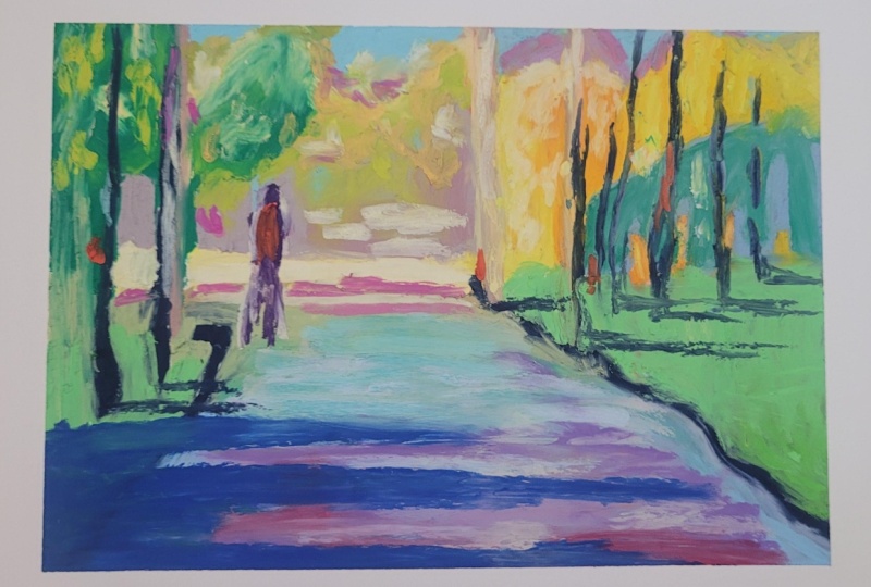
6. Contemporary lane: let's apply the techniques to this reference out of gotcha. As you can see, a traditional approach could be used, but we're going to try something a little different. So first off getting the horizon line and some off the big shapes. The main shapes offer this subject. Just using a pencil on some primed matte board. Just use ordinary Jess. A primer on this board and what I'm looking for is lines off energy verticals, horizontal Z. I'm not under spent too much time in doing a refined drawing. I'm looking for the main shapes, Latin, dark as well, and things like diagonal lines, vertical and horizontal lines. Things like that give a lot of energy, especially diagonal. So try and get as many of those working as possible. And I'm using the Wagnalls and zigzags and things like that, or to bring us to the focal point, then grabbing a big brush, says a size 10 synthetic brush. Andi getting in the sky color, just using some scarred blue and then with the yellows and oranges, preparing for the focal area. I want to get that established pretty quickly now. Although I'm using flat colors, I do layer them and build up interest that way. Yeah. So the highlight for this bunch of trees very simply stated, that will develop somewhat throughout the painting, but nevertheless clearly and simply stated light and dark, warm and cool. Still using a large brush on now using a size eight long, flat brush, which will be the brush I use for most off the painting. Except for some very small details. Try and stick with the large brush. So wherever I see highlights will brought cover in the reference, are trying to put that down in a simple statement off flat color. Some of the aero perspective Nam using blue Eliza in crimson and what to make a sort of cool grave but still colorful. It's quite a bit of that Eliza run crimson coming through there. Why should say magenta as well with the critics will be using magenta, mostly just getting a block off cool color for the shadows established in those trees, bringing in some green and brock in the wrist off the trees. Very simply, I have obviously speeded up this video because it's more about applying the techniques off flat color, big shapes somewhat stylized, so I'm not looking for those individual trees. I'm looking for mass shapes. A clump of trees becomes one big mess shape. So much like you building this up with a large jigsaw puzzle. Pieces. Very simple. Jake Soul. A few nice. I think it's off paint coming in the just using the painting knife for but more convenience on. Just get a bit more lights coloring. There it's Orange is just a bit too dark for the focal area, so I will Latin it up with layers. The layers are increasing the opaque, so it may start off with a transparent layer. But then I do ADM. Or Whiten, make it more opaque and go over as I'm doing here with these trees as well. I'll bring in some strong dark verticals with some ultra marine and magenta, also ultra Marine and a little bit off been sienna. We'll have a similar creative, similar dark, just loosely stated telephone poles is while giving them with more structure suggestion off trees, mostly to just break up the light. Those yellow but so light color put some darks across it. Nice bit of contrast verticals against horizontal Z, creating some balance, but also some energy good strong lines. Diagnose leading into the painting road can be pretty boring if I just do it one flat color . So there will be it. Several colors, but only generally in the cool sort of shaded palette. Off color, a little bit warmer in the full ground. Some of that Eliza in just mixing it in becoming Purple Year or their or violet, my son thick on that first off light across the road. So nice, brighter green. So pretty cool. But right here in value mass. Energetic color. I'm just letting the reference, painting or reference photo suggest things to me, but I have a picture in my mind of what I want. So if I see a cool green in the reference, I'm gonna make it a a more vibrant green in the painting figure as well. But of a highlight on the figure lending some scale and life on interest and now, with a smaller brush just getting in a bit off thick color urine, their suggestions marks points of interest breaking up some flat areas, but more but more highlights on that focal point as thick blobs off color with acrylic good thick amount of paint really brings out the vibrancy, so it doesn't all have to be flat. I think in our strong shadow across the foreground, very loosely stated, helps to take the I in and adds a bit of interest as well. So that's about it. Get the tape off and then I'll have a look at it and see. Funny to add any little bits, as I did your added last red accent note on the figure and this pink line to just carry that idea through in a few dots of radio and there and there it is, all right.
7. Autumn Tree Introduction: in this demonstration, I'm going to show you how to do in acrylic painting in a more contemporary star focusing on more abstract graphic elements off the subject and strong bright color that's going to be a painting off a tree with lots off fantastic or sport, um, color, but from a different perspective. So we're gonna be viewing the tree from below, looking up at the canopy of leaves. And you may have seen paintings like this before, and I thought, be quite nice to do it as a bonus project, as it were, and you can have a go at its quite easy to do. Um, I think the end result is really pleasing. Andi, Uh, well, look really good. Perhaps framed up in a modern contemporary frame as well. Wonderful. Give a lovely punch off color wherever you hang this painting. So I hope you enjoy the listen and then please have a go at it yourself. Onda, Feel free to share a photo off your finished planting with me. Enjoy it
8. Acrylic Autumn Tree Part 1: but as you can see the improvised reference, and I'm just doing a rough sketch in my sketchbook in its very simple composition. And there's no riel difficult teen working it out. But just getting sort of the mind focused on what I'm looking for and now transposing it to a larger card on painting on a Jessa primed Matt board. And it's important to get the tapering perspective quite a dramatic to get that impression over a tall tree roughly where I'm gonna be putting branches, the bronzes will look fairly dark against the sky, so on trying to keep them sort of pointing upwards, remembering our tree does grow and the branches tend to go upwards as well. And sort of concentric rings around the trunk kind of helps with the illusion off the tapering height so the rings will get closer as they move up. Little cues like that hope to create the illusion off depth and space, and now, more or less than where the canopy of leaves are going to be going, Uh, so you can see the colors I'm using pretty much the same pellet off acrylic color and a Siri's off. Russia's synthetic critic. Brushes or just synthetic brushes are best using a bit of the lot Scott Blue to likely. True in the main composition that is the tree trunk, mouth, bit of ultra Marine and burnt Sienna. Where I'm going do the branches. These are really a guide. Of course. You can depart from this, but it's all part of a process off having the whole composition sort of simple in your mind . Get these things, don't and then you get a feel for the entire painting was circles. That's probably some sort of aspen tree or popular tree. And just getting those markings in due to the sort of a graphic nature of the acrylic painting so fairly deliberate outlines. Mostly milk over anyway. The brushes generally for this painting, I'm using large Russia's So Yeah, starting the block in with some yellow and red Andi. Using a number 10 flat synthetic brush, this person is actually made by Dollar Ronnie in the crueler range off brushes, and I find them excellent for acrylic painting that unused bristle for acrylics because that correct well to being put in water. The's synthetic brushes really do the job says you can see roughing at him. And now coming in with a deeper orange, as I say, always bulled up the layers, especially in acrylics. The critics were really come to the in the urn through building up layers and at this stage , keeping the white paint out off this color. The pick white layers will come in a bit later, over with the tree trunk. I'm putting a bit of white in there and so roughly blocking things in also getting in our dear of the direction off the light. So the cool color on the left, which will be the shadow of side of the trunk, just bring a little bit off scar blew into that orange mix, just knocks it right back, and you can really see the sort of three dimensional form off the tree trunk already happening. And I'll just work this on bulled up the layers as we go. This tree trunk is quite important, of course. The whole perspective off the tree depends on on the shape. This is sort of, ah, reddish violet, bringing some more yellow into it to warm up the sunny side of the tree, once again getting the painting a bit thicker where the light is. That's very important, but the shadow areas can remain fairly thumbed with the paint. But in the light science, get him nice, thick paint, and that creates a contrast, a swell to emphasize light. Always keep light in mind. So as you can see, these in pester layers of thick paint layered on top of each other really do pop kind of standard for us, where is the shadow side remains fairly.
9. Autumn Tree Part 2: now to start the sky color. I'm using the scar blue lot, a bit of titanium white mixed in, and I will just sit up a processing off, laying this in and stand back a bit from time time. Have a look and see where I want to put in some scar holes through the leaves. The bottom parts just block those in as you go, adding a little ultra marine blue full, the skulls towards the top. And that is for two reasons. One scar holes can't team to be a slightly darker, and then the other is. I sort of grid ated blue from me, lighter blue, the bottom of the painting on a slightly darker as reaches the top once again to also perhaps also ate the sense off aerial perspective that this is the blocking, so no need to be too precious about it. Just get the color in se. I'm just softening Oppa's edges of the tree trunk little at the same time and now back into the canopy off the leaves, and I'm going to be building up some layers, also just sitting out a pattern. Basically, I'm trying to find a pattern that I'm happy with because what I'm working on as a reference for ITER is very much a loose guard line was. Painting is somewhat a stylized version off what's in that reference. So I will see some orange leaves in the reference now bumped them up to a reddish orange for the painting and just a sort of a century rating or pushing the color a little more. What's the bringing in some smaller shapes? Variety of shape, size and color is important. Smaller shapes just to suggest the a variety of leaves smaller leaves around the rear off the tree. It's a, after all, a three dimensional shape, so it's very much a case of experimenting. You put down something. Stand back, have look. Is it looking interesting? Well, that's a good sign that it should remain verities if not if it's also the weight off color and shape, he said, balanced with the other side of the tree left and right, etcetera. Little things like that, you kind of just know if it feels right, you got to trust your gut instinct on it. Are you happy with the look of it? I was also not spending a lot off time. Contemplating This is simple compositions, so I find if I wait along to too much, I tend to just lose the spontaneity over it. So with leaves especially, I want that spontaneity to come through around the itches. Those will be lighter, making the edges but softer as well. So light of value color along the edges of the leaves. And that mimics the real life situation, Of course, were light is filtering through the leaves on the edges. Now back into the tree trunk holding of those layers. We'll also be developing, but of the texture off the tree trunk. So the warm color on the right and side as we look at it, and a few Maurin pester strokes. For those little highlights with the critics, it's difficult to make colors too bright because they do dry out a little dollar. So don't worry about going a bit too far. We can always bring these colors out of it more as well. Once the paintings dry and we can put occurred of varnish on it, some retouch varnish or something suitable to bring the Leicester those acrylic colors back to life. But as I'm painting I try and keep the killer as punchy as possible. The contrast between warm and cool really important for the tree trunk, and I'm going to mix up a bit off balance, you know, with ultra marine blue and start with a bit of texture detail just to these concentric rings around the tree trunk and the other little marks. And but some pieces that make the tree trunk look a bit more authentic. Some colors dark, some colors more transparent, just a variety off. What's of line? That's just a bit too strong, So just suffering it up, painting it on very loosely. I don't want us to look back. It's been printed uniformly. It's got to be haphazard and a bit more off a realistic feel to it on the line, a bit cooler with a little bit of blue mixed into the brown on the shadow side of the tree . Or so the shapes a little more diffused and softer just to a century, the roundness off the tree trunk. So that's it for this stage. When we compliant, press on and finish it in the next stage,
10. Autumn Tree Part 3 : right on to the final stage on this will be refining most of the shapes and also giving more intensity to the color. So this means more layers. Let's just getting the blocking off the blue this term just make that more intense. So a couple layers extra have very loosely mixed this blue, but off the yellows or the warm colors, the tree trunk coming into a bit of titanium white. I'm not trying to make it perfectly flat. Bit of ultra marine blue just in those sections out of coming through the leaves near the top, slightly darker for scar whole effect notices on putting it on quite thick glass. Look how the intensity of the color is increased, just part putting layers off critics. That's one thing that a lot of beginners forget to do with the critics is be generous with the paint. You really can't go wrong with using thick acrylic paint, and it doesn't crack when it tries. So no real risk. They either. Just get it on and you want intense color. Critics are grateful in pastor or even using a painting knife. You can really butter alone a little bit lighter as we head down, breaking up a few large shapes of orange that could just do with a scar whole year or there . Uh, okay. Now back into the oranges and reds. They also need more layers. So towards the middle of thes leaf shapes and they'll be more intense, orangey reds. And then I will lighten it up as it as the color moves to the edge off the leaf ships. So I'm thinking more off mass shapes than trying to paint individual leaves. That's not the object of at all. It's mass shapes imagining, looking up at the vast expense of leaves to squint your eyes a little, and they will merge into these sort of mass shapes. The smaller shapes will be slightly lighter, so but more yellow and the edges even lighter store. Uh, and as you start building up the layers and grow dating the color, it just starts coming together a little more from what was a very loose and erratic blocking in starts to take shape. So I suppose persistence once again is necessary. Uh huh. And you know, you can just see this process off, lightening up the color on the edges, making it look translucent or sort of light coming through all to sort of create more of an illusion off light or the effect of light. And you can do this in oils or any color medium and sort of in between orange. That dark rate was just a bit too much for that smallest, and are the similar process on the left kind of ignored the left side of. But so I need to catch up there And, of course, the brilliant reds and oranges against the blue. Just those ages here and there soften them up just about reducing the value. Lightning up the value off the color. Those interests just softening up using a light failure. Let's contrast with sky and your edges look more natural and more vibrant. A few little dots and dashes to suggest little leaves might be a few leaves falling to the ground. It is, after all, autumn. No, I'm getting some. It could call these highlights a few very light yellow dots and marks all over the painting , creating a sort of sparkling effect. Try not to overdo it, but Tim to always put in a few too many. So who can resist. It's like, uh, on. Of course, if you go too far, you've got to come back in and just get one or two of those mid orange or light colors in place on just catch of light here and there on a leaf. I think they leaves now coming together. But as a tries on what touch up? Little year over there, I feel there's a bit too much taken up too much sky needed. Just open the skull, but I also noticed these dried and are looking a little dark. So go in. You're in there. Okay, now an important stage. I'm getting a smaller brush out, using a round brush on and getting in the branches. Notice that just twist the brush in my fingers and littered sort of pull it across and let the shapes happen naturally on. Then they do look more natural, just letting look brush, roll along on make a line starting at the base of the trunk. But thicker Onda just leading the are mostly upwards, as one would expect. The bronze is great towards the sky a few year on there on and a few little touch ups, so we're pretty much come to the and well. So I think, usually son off painting and then find something else to fiddle with. Just a few more little highlights. Get a bit more sparkle going going to any home? Uh, and a few little dashes of warm yellow moonlight Euler get some sparkle to the tree trunk. What about a bit of a halo effect? Perhaps just a bit two yellow. Just go over that, softening it up a little. That's a bit better. So as you can see just by following this process, persisting and especially putting in layers and really getting that acrylic paint to sing with strong color that is really the secret. It's not just one layer. It is 34 maybe five layers here or there. And then the whole painting pulls together, and Waas gets that lovely, intense color you want from acrylics. Just a few random little shapes, and now the tape. Often, let's have a look at it with the little white frame. I'm quite happy with the painting. I enjoyed it. That was no real pressure fun painting to do, but I think effective now it's your turn. So
11. Beach Scene Part 1: I've done some preliminary drawings in my sketchbook, and then, starting with the over a salon, I start sketching out roughly the composition. As you can see from the reference photo, I've used a compass it off to references one for a sky and one for the beach and using it to inspire a composition. I will depart from it. To some extent, it is simply a God, and I'm not going to follow it slavishly. It's just to help me get a composition in mind, which more, mostly, is going to be about a sweeping lines off the beach into the middle distance. Perhaps a couple of figures in the focal position. It typical colors that I've been using so far, all in acrylics. And once the composition is done on, jump right in with some scar blue on a bit of ultra Marine and with a big number Tim Um, synthetic acrylic painting brush gets stuck in with blocking in the sky but darker blue towards the top. As you know, by now, trying cred ate the sky slightly from lighter near the horizon to dark and the others a meth off the sky. But because this is a more contemporary Stan. I'm not going to work the details too much, Sticking to pretty much of flat layout off paint as much acrylics as you can get onto the brush as possible and just smoosh it down on Get It in. The acrylics is all about layers well, as most of my painting approaches. But critics especially don't skimp on the paint coming down to the horizon, lightning up the color with a bit of titanium white and just a little touch of Iloka to warm it up. Slide greenish terms, which is just the light from the land reflecting back up into the sky. So that's the scar pretty much blocked in, and now, with some yellow and titanium white getting in the bold cloud formation and the edge off the clock getting the sunlight. But of course, some also enjoying the contrast between the womb yellow paint and the cool blue sky. That really does pop nicely, and I'm keeping the edges fairly hard in keeping with this a more modern approach. Big brush marks just pulling it in and laying it down. You're amusing. A number eight long, flat brush. It's really beautiful brushed paint with these pressures are actually about dollar Ronnie. On the crueler rain's off brushes so very much a star last sky as you can see buttering in some thick paint. And you know, with this approach, you you put the paint down, stand back, have a look and decide. Do you need to add anything or not? And we'll carry on with finishing the sky in the next edition.
12. Beach Scene Part 2: but starting off part two with the completion off the blocking off the main cloud, I'm adding a little bit off scar blue and a touch of magenta to get the sort of the typical dark middle part or shaded part off the cloud in place, bring in some titanium white and blending it in just a little straight on the painting panel. It's to get a little bit off variety, but more magenta in there for the darkest part. A few little sparkle, but I think the space just needs a little bit off. Well, what would you call it, but of spark, So a few highlights thrown in off in pesto. Stand back, take a look and put in where you believe it should go. The distant dunes off the speech scape. It was pretty much a bit off scar blue, ultra marine titanium white little touches off yellow in there for the greener part closest to us, which I'm painting in now and then I'm just gonna push the distant point away, but of aerial perspective, so lightning the value of the bit off white. In there there is a touch of magenta, adding a slight violet shade to it, the foreground doing getting a bit mawr yellow and green. That's better yellow with the scar blue quite a soft green. I don't want anything to, um, dark the right now suggestions off the distant Deering's while the What y tissue lor that I'm using her looks quite warm. It actually is pretty cool. That's just relative to those blues. But as we go into distance once again but more blue just to cool that don So the distant part of the beach. Kulish. What? And then the warm yellow coming in closer to us, and I'm using plenty off paint. You can see nice and thick on this brush and pushing it in but cooler towards the sea. Suggestion off the sand, maybe being a bit wit on just merging it off into the distance. Now they see once again sort of a starting off with flat shape and using thick paint right from the start. What should normal, which would not be my approach inner sort of final oil painting. But for this style of painting, I get in with a thick paint right away Rookie move for a more flatter and vibrant color shape, just varying the value a little, bringing Atlanta into the foreground
13. Beach Scene Part 3: I'm going to bring in the painting knife and get some nice thick in pastor shapes for the breaking waves, suggesting the firm quite star last. Um, and it's just too create the impression, but more information coming into this quite lord space here. So Reina bit mawr paint slightly darkened with ultra Marine warming up the white with a little touch of yellow. Arco. Uh, and we just, as a said, suggesting the breaking waves but thicker with the waves, are breaking and thinner for the tail. There's some rocks in the distance, actually, quite a lot of rocks. In the reference photo, I'm going to start off with some burnt sienna and the door say, gives a good, nice stark contrast plot against talk, as you can see in the reference, quite a big stretch off rocks exposed. Andi. Um, I'm going to contrast that with some a lot reflecting into the water back into the beach touch of red and yellow in the titanium white to get a warmer color. Last thick brush strokes. You can see using the large brush to its maximum, and these brush strokes also contribute to the curving lines, which support all composition and take the eye into the painting. So im already looking at this square where I've got to burn CNN. They're numb story to regret that, but back into the dunes with some shadows or some blue violet and also bringing some of that in into the full ground to suggest shadow against the rocks. But off highlighted some high key greenish yellow where the sun is striking the dune grass Very simplified, very star last small texture, I think in the foreground already do like the painting knife to bring in good, thick and juicy texture. And this painting is really now about the color color and waiting. Uh, you can see that I got rid of that burnt Sienna. Unfortunately, my camera also stopped. I had to, um, show you know exactly how went over it with this sort of pinkish yellow paint very thick, just buttering it on and then going over it with a few highlights to break up that experience of color. But just mix in some titanium. What a bit of red and yellow and you can see already. Heaven held back with the imp Astoria, a bit off variety in the background with some Kulish blue. What? Just getting rid of this hard color, just reducing it a bit. My could read a little bit more realistic as water coming through the rocks. A few little have details, suggestions or footprints. I think this also needs a bit off, boosting up to get that strong light or contrast. Smooth it off a little with the brush and we pretty much getting to the end of this painting something to add a little bit of life on character to it, I think. Andi, I would just get a bit more that in there now with the rigger brush, too little figures just suggested to add that touch of life and scale and interest, and then I'll call it today. Overall, my head, my troubles with this painting. But in the end, I think it's quite a pleasing little painting and some good punch. So I think so. Try this are try out similar things. Getting lots a pained color. Vibrant paint effects are too difficult to do. Just try them out and see how you go
14. Conclusion: Now it's your turn to try and create your own contemporary critic painting. I hope this introduction to this concept has inspired you and given you a few ideas. Way to look at a few things but differently. Come up with new ideas and a different angle on more traditional subjects. Have ago. Try your own painting picker a topic and just go for it with some nice, vibrant acrylic paint, big shapes, big brushstrokes, lots of paint and please feel free to share your projects and add them to the course. And I will love to have a look and give you my comments as well. So go for it. Create your new contemporary paintings and I hope you have fun doing it. Thanks for joining me on this course. We'll see you in the next one soon.
 Malcolm Dewey, Artist and Author