Transcripts
1. Introduction: Creating unique illustrations,
using a variety of references can help spark your
imagination for your art. Hi, and welcome to a new class. I'm Eva, and I'm a
full time illustrator. In this class, we will
look at a variety of references to help you come
up with new drawing ideas. We will also practice and do quite a few sketches
before creating more defined layout and add beautiful colors
together step by step. I will also share with
you tips to speed up your process when drawing a meadow with lots of
grass and flowers. In addition to this, I share
with you tips on drawing a bike before we draw a
girl and the dog together. I will also share
tips on how to adjust the proportions of your
character if you need to. Even if you are a beginner
and you to procreate. I will take you step by
step through the process. I hope when you follow
and watch this class, you will feel super happy about what you created and
you will feel like, oh, I can't wait to share my
illustration with others. When you are sharing
it on Instagram, please make sure that you
take me in the image, not only in the description, because that way I can
see your illustration. And maybe you'll see it in
one of the next videos. Like these amazing
illustrations made by wonderful creative people
who watch my classes. So if you don't know yet, you can find even more drawing
tutorials and classes, they are procreate
and other tutorials. And I have more than
30 classes there, there is a variety
from beginner level to more advanced levels and you can also find
different topics. So without further ado, let's start and see
you in the class.
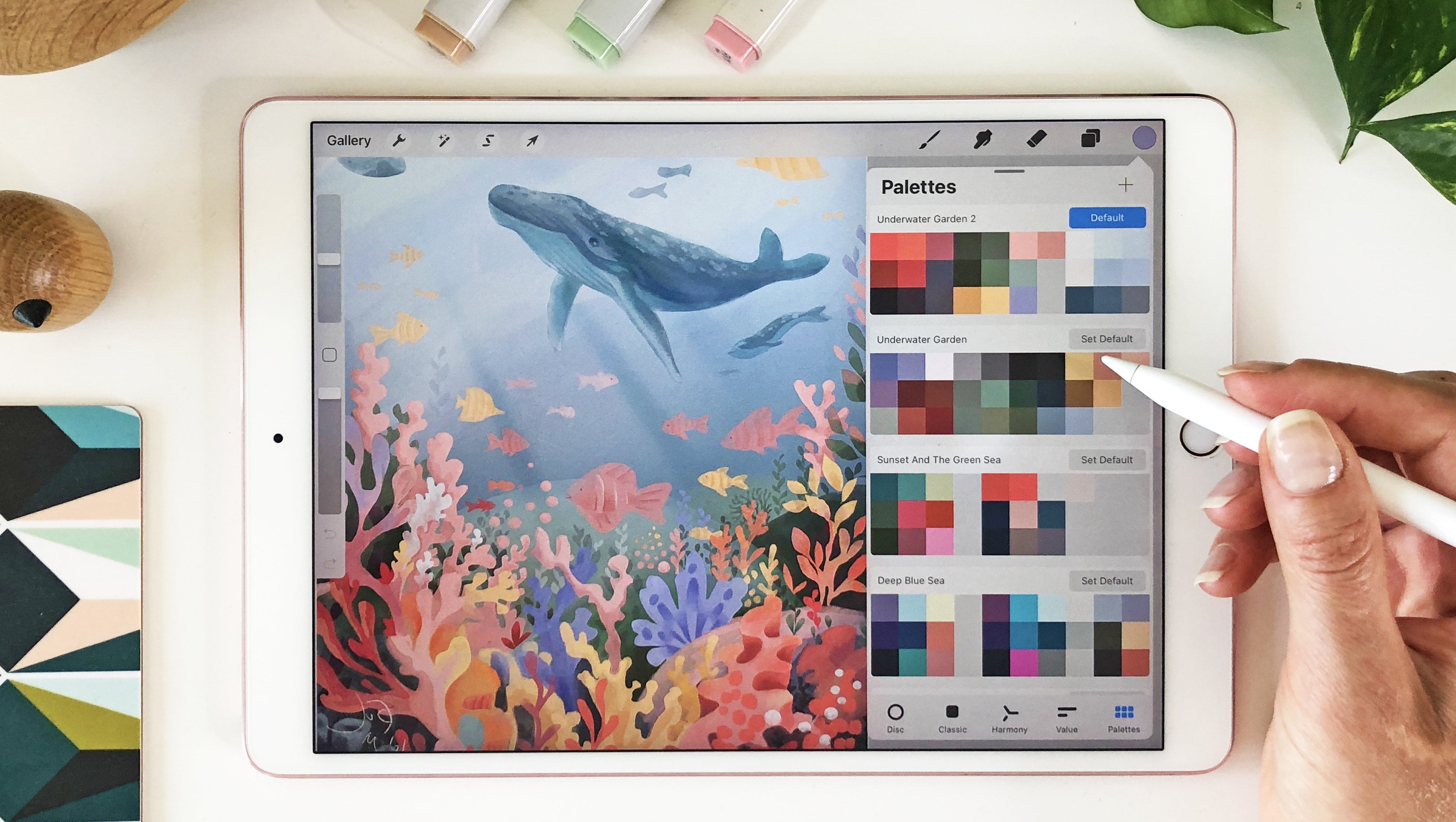
2. Resources and canvas setup: For this illustration. The canvas size is 4,500 by
3,000 pixels and 300 DPI. Like with other classes, I also prepared Freebies as a special bonus
for this class. They are not necessary
to do the project, but if you want some
bonus stuff to try, I prepare the color
palette so you can create the illustration with
the same colors as I do. I also prepared a rough
sketch so you don't have to create everything
completely from scratch and blank paper. You can also download
the freebie brush set and you can find
all the information in the class description. We will hang out
together for a while. So if you want,
bring some water, make some tea, maybe
a different drink, or prepare a snack. I usually have a coffee
or water nearby. I find it important
to stay hydrated, so at least get some water. When you are ready,
let's get started.
3. Initial Idea - Creating a rough sketch from your inspiration: All right, we have the canvas, but let's start at looking
at some references. Before doing the rough sketch, let me open Pinterest
here on the side. I wanted to show you this reference because
this was one of the first references that I saw which inspired me
for this illustration. I wanted to do with ocean and maybe the sparkles and maybe something here
in the foreground. Let me go to the layers and
I will create a new layer. Or you can sketch on this one. We can delete this one and
basically sketch on this. I will also change color of the background For
this exercise, I also created a color
palette for you, as with the other classes. But first I will
start with something, Beijing for this first
rough sketch exercise. But I will move the
color somewhere to very desaturated color
for this sketch part. But of course, you can do
any color for this part. Maybe let's make it
a little bit less saturated from the brushes. I will take the
expressive pencil brush, but you can go to any
drawing brushes, excuse me. Actually, sketching brushes
are better for this. I would suggest maybe
six B pencil or you can take something staying
in sketching brushes. And six pencil, I think
is the best because it's just for the exercise or I
actually like also HB pencil. But let me just go
for this one because this brush helps me to create
more expressive strokes. If you want to basically practice with some
other brushes, yeah, you can explore these. For this sketch part, I will take black color
or this very dark purple. Let me test it out. Okay, I think this
is quite good, and I can reduce the
opacity of this brush. I can also reduce the canvas
so I can see, where am I? I will just create this
first loose sketch. I can see there is sky
and water, basically. This is the first idea. And maybe basically
like a ground here and there will be some
ocean with these sparkles. Okay? This is one of the other
references that I found. Let me make it bigger so
you can see it better. I really like how this water
kind of sparkles here. You know, it's like
quite nice inspiration, I think, for our illustration. So we can basically
take a mental note, or you can just write it down, that the sparkles,
spark sparkles. And also the sparkles show
in different clusters. So they are not in same
distances from each other, but they are maybe more of
them together in one spot. Let me just play it
again so we can see it. They are in one spot, like curing more
and then they are less of them in the other
spots, how pretty there is. All right, Let me stop this. Sparkles sparkles in clusters. When we will be
drawing, This is just for the mental node. Okay? And then okay, let's go back. Okay, and this is another
reference image which I found. I think it would be
super nice to actually have maybe a bike
here so I can set. Let me go back to the
other brush which I like. I thought it would be pretty nice to have
basically the ocean, exactly how we sketched it. Here, here is the ground, so we have the ocean
with the sparkle, the same idea there. Then we would have maybe a bike. Here is just a very rough
random idea for the bike. As you can see, there is a road and then there is grass here. I thought like, okay, that would be cool to have a
road and maybe some grass. I also quite like the
idea of the tree here. Maybe I can add a tree
somewhere around here. These parts of the image
are not so interesting. Let me show you
another reference. Okay, here is another reference. What I really like about this
one is also the color of the bike and also the
basket I was thinking like. Okay. That would be actually quite nice to have
a basket here. Maybe flowers. We can maybe have flowers
here in the foreground. Maybe whatever flowers you like. I'm not sure if I like
these tulips actually here, but maybe this can work. There is also grass
in this part. I can add some of these
grassy areas here. Okay. And here is another
reference which I quite like because there is just
a bit of the tree here, so there is no tree trunk. So I can actually make this part a little
bit of like thinner and not so overgrown and I'm not sure if I want to add
clouds in the background. Maybe it would be too busy. Maybe we can add like
birds or something there. But what I also really like on this reference are
the very tall grass, whatever plants or
whatever there is, the wild field plants, maybe I can have bigger plans
here in the foreground. These are some of
the main references which I wanted to work with. We will do some
warm up exercises for parts of this illustration. We will also look at
some other references. These are just the
first initial idea. I will close this part. What I can do now, I will take the selection, I will take the rectangle. I will this sketch and
I will duplicate it. I will just put it here on the side and maybe make
it a little bit bigger. And I will reduce the opacity
of this one because I want to redraw some of these part B and I will
sketch on a separate layer. I will just make the brush
a little bit bigger. Let me make this bigger
so you can see it. Let's see, 9% Okay. Composition wise, I think the horizon line can
work quite nicely here. Then I think the ground can be a little bit higher
somewhere here. Let me reduce this
other sketch even more. Okay, I think this can work. Then we talked about some of these bigger leafy
shapes or wild plants. This would be, I think, nice. We will design them more. But this is just like
very rough sketch. I can make these edges more straight so we can use it
for our cleaner version. All right, and then the
tree I think would be nice if maybe something like this we will have the openings in the tree
to have more light there. Then we can have some of these smaller bushes like we saw in the
taller grass there. The bike would be probably
if it is smaller. Okay. So something like this. We will practice drawing bike in one of the
upcoming lessons, but I guess this is something. Yeah, it looks like bike. Okay, let me give
it another try. So it looks a little
bit more like a bike. I'm making these wheels of the bike a little bit more tilted so there is a
sense of movement. Okay, And then me, I'm not drawing
the character yet because I can find
references for it later. Okay, this is the
idea for the bike. The path can be a
little bit more narrow. I would say something like this. Maybe the bike can
be even smaller. It doesn't take such a big
part of the illustration. Okay. I think resizing at
this stage is still okay because it's a rough sketch and it doesn't have to be
perfect. All right? And then the sparkles there
will be somewhere here. And the character will be sitting on the bike
here with some hair. And then we will redefine
it a little bit later. What else for this rough sketch? All right, I think this is
enough for this rough sketch. You can of course, also
download this rough sketch, which you can find
the link to it in the resources if
you want to have the same starting point as I'm having for
this illustration. Okay, now let's move
on to the next part.
4. Warm-up sketches: drawing the flowers from references: All right, now let's start
with some warm up sketches. As we have already,
the rough sketch, I will bring back the
Pinterest references. I think we can start with drawing some of the
flowers because that's easier way to warm up rather than
drawing characters. I will be sketching
again with this brush, but you can take any
brush for this sketching. I am using this darker base just to create these
rough sketches. I don't want to be too
precious about these sketches, really don't worry
about the shapes because these are just
for random ideas. I'm sketching this flower
here, it's like tall, and the leaves are a little bit more rugged looking,
not too detailed. Then I can see there are
smaller flowers around. Maybe I can sketch
something like this. They have different height. This one has also some
petals which are smaller. Then if I look at some of
these small other ones, they have the
smaller round heads. But they are not
like round round, but bit more flat. Then I can see also that on this reference there
are very thin, I don't even know what it is, but probably old or new
flowers or maybe a long grass, maybe something like this. This is too detailed. But we can build the field with different shapes
because as you can see also on this reference, there are different shapes of flowers and different
sizes on the field. Let me go to a
different reference. Okay, here we have
another reference. I can make all of these
flowers a little bit smaller then move on here. What I like on this one is that we have more lines here then the has the shape on the top
and then it just goes down. Then again, there are smaller parts here
of different leaves. Then this flower is
more like this shape. They are also tilted
in different ways. I can see this one is
tilted to the right, and then there is another
one, just quite small. Okay. I think this is enough
so I can make this one smaller as well. All right. Here is another
reference from this one. I quite like this flower. Let me sketch the rough
shapes because we are not drawing like precise
botanical shapes right now. And these are just
for the ideas. I will bring back some
of these references when we want to add
details later on. I also like these ones
because they are quite round. I think that's pretty nice. And they have shorter stems Also there are these
interesting shapes. I don't know the yellow flower, but it can be also green. If we draw it, maybe it can
look something like this. Almost like a fern. I think
there is fern here as well. Then you can create some of these leafy shapes
similar to this. There is also daisy here, a lot of smaller lines. All right, let me make this reference a
little bit smaller. Okay, so we have the
rough sketches for the flower ideas which we
can use in the foreground. And now let's go for
another practice, warm up in the next part.
5. Warm-up sketches: drawing a girl with a bike from references: Okay, next, let's practice
sketching the character. Again, I want to keep
it a very rough just as a warm up exercise and observing the shapes and
not focusing on details. And that's why the
bigger brush size helps me to keep that in mind
and not focus on details. I can just create
very simple shapes, not focusing on action lines and perfect anatomy and
perfect body shapes, but just the idea of
the girl and the bike. I can always move
around some parts. It really doesn't
have to be perfect. Just an idea. You can draw the feet or you don't have
to. This is the bike. Of course, she has
better walking pose, but this is just to
explore if I actually want to draw this
pose pose or not. For example, what you can do, you can always chop
parts and tell them it fits the pose
a little bit better. If I want to have
a shorter skirt, I can always move it
and re draw the pose. We would have the feet here. Obviously, the seat of the bike is little
bit closer to her, it's not so big. Then
she has the head. All right, so this would be very rough sketch if you want to actually redraw
the sketch later on, I will show you that in the later lessons where we
will redefine the sketch. Again, just a rough sketch. Just we can choose from the
ideas for the characters. Okay, let's look at
other reference. Okay, now we have
a different pose. This is not very sideways view, so let's just do our best and
maybe something like this. And then trying to
recreate the pose from sideway view or
seeing it from the side. She has both feet on the pedals, but as I see already now, this post might not
be the best because it's not very clearly
visible where the feet are. But other than that, I
like that she has a dress, you can play around
different outfits and really creating proper
shapes and everything. It's very hard to
keep it rough because I'm already like I
should fix this part, I should fix this part and make it look proper
and redefine it. But again, try to keep it very rough and simple
even though it's quite hard to keep it
this way because I'm like the sketches anyway. Okay, let's move on to
the next reference. Okay, here is another one. What I like on this one is
that she has this torso kind of moved to the back and the
arms are quite stretched. And a lot of these
references have heads, so maybe you can draw a
head on your character. This one already has these
flowers in the basket, I think, which is super nice. She has this one leg here
and then on the pedal, then we have the wheels. It's connecting here. Okay? The set basically, she would need to go
a little bit higher. Okay. Something like this because the seat
is aligned here. Okay. Maybe it doesn't fit the mood which we wanted
to have with the ocean. Plus also I think the tilt of the torso is maybe a little bit too much, maybe
something like this. Plus she has the leg on the ground which
doesn't really fit. Or maybe she does because she is maybe like stopping
to see the view. You can really decide if
you want a pose like this, I will make this one smaller. I can make actually
all of them smaller. We have space for more poses. Okay, this pose is quite nice because we can
see both feet quite clearly. Maybe this leg is too short. Maybe we can outstretch this other one, maybe
a little bit more. Okay, this is too much and it's also behind the other leg. She also have quite
stretched arms, but at the same time she
looks quite relaxed. We have the bike handles beat. The shape of the
bike is quite nice. So let's make the wheels. And then, as with
the other reference, I can already think about
these baskets to add. Then I also quite like
the shape of this bike. Okay. And this leg needs to be bigger relative to
distance to this bike. Okay. I would need to make the head smaller, because somehow I make them
always a little bit too big, so they look more
cartoony and cute. But I think so far, I like this pose the most. Okay, here is another pose which I can maybe fit somewhere. Let me see. I can put
it somewhere here. Okay, then maybe you can draw the character
that it's like standing with the big
flower arrangement there. Again, with the
head and the bike. This bike has these like straight lines connecting
the shapes of the bike. And I think I like
the curved ones which we looked at before. Okay, so this is the rough
sketch for this one. As I mentioned, I think I
like this idea the most. I will take the reference
what we looked at before, and I will redefine
this one later. But when I looked at some
of the other references, there were also
dogs in the basket. So let's do some warm up
sketches for that one as well. And really don't worry about the roughness of your
sketches because they can really look also stiff as the first
sketches usually are. And then it gets a
little bit better. And then you will like some of the sketches more
than the others, but really don't go to details. Don't fix them right
away because these are just the ideas
to help you decide.
6. Warm-up sketches: drawing a dog in a basket from references: Okay, now I will practice
sketching some of the dogs. For example, here,
it's hard to see, but I can zoom in
on this reference. But the dog is quite small, we have quite big basket. Then the dog has this
more square shape of the head and quite small
snout and bigger ears. Then it's sticking out from the basket that g we will have the other
ear somewhere here. Basket, again, quite
a rough sketch. Let's just move it to
the side and I will open another one Here we have
another reference here, the dog is more frontal view, but we can make it work
with this basket I guess. But I don't think I
would use this type of basket because
it's not so cozy as like Baker basket with
the brown warm colors. Then we have a different
dog face shape. He has this fluffy ears. Then the body shape
we can see through the basket here
is the nose here. To redefine the shape here, I think that would be quite nice to do on a separate layer, but we can make
another class just about sketching dogs and
make it look perfect. From this sketch. We
can't really tell the shape of the dog
for this exploration, I think that's enough just
to see the silhouette and decide if we like this type of dog or it doesn't work
for our illustration. This shape of the dog wouldn't really fit for
this illustration, but I think it's good to do it. Okay, staying on the same layer. And I will create
another sketch. All right, for this one, I think this dog from the
side view, is quite cute. And I think that would work much better for
our illustration. But this dog is still
rotated towards us, which maybe it's not the best. But what I like about this poll is that he
has the poll outside. Maybe I can maybe
implement that. And also that his
ear is sticking out. I think that can be quite nice. Then he has these spots, which is pretty cool. The top of the head
is quite flat, then the rest of the body
is following the shape. And then we would
have this cute shape on the top of his back
and also on the face. Maybe this can be one of the dog poses that I will do
for the illustration. Here is another
reference which I quite like because even though this
dog is not in the basket, but I like his open mouth, which is quite nice and
the tongue sticking out. Also, his ear is quite
visible in the silhouette. And then you can add a basket and maybe make the dog
actually a little bit smaller. Because obviously this huge do would not fit into the basket. But maybe you can make
him smaller and maybe use this type of Pow sticking
out from the basket. I think that can be cute. Combining these two references, I think that's pretty
nice and maybe making his snout a little bit longer with the free
form selection tool. Okay, I think something
like this can work. Okay, let's move this guy. So we have space. Okay, then we have
this cute corgi, which I couldn't resist to draw the corgi because
they are just so cute. This shape almost
looks like a cat. That the cats have smaller
noses compared to dogs. Oh my gosh, this
looks quite creepy. Okay, let's not focus
on the face with this big brush because
that's a more difficult, we would need to make the
face a little bit chunkier. We would have the smaller feet, but I think this would be ult the basket and I think the silhouette would not be
very readable for this one. Even though Corgis are
like super, super cute. This ear is much
smaller, not like a cat. Then you have the bigger
dog nose and smaller eyes. We can work on the dog drawing
class in some other time, but we'll have this basket on the bicycle and then we
have the handles here. It can work if you really
work with the colors. The silhouette is
not very clear, but otherwise, yeah, can work. I think Corgi has a
better silhouette maybe than the other fluffy
dog which we did before. I'll just move it here. Let's make another one. Let's this one. What I like also
about this reference is that the basket is
a little bit tilted, which is quite nice and
it has texture the top. Maybe you want to
design your basket in this way because you can
see bigger part of the dog. I quite like the
spots on this and the ear is quite big
and he's looking down. It's this recognizable
shape of a dog, even from the distance. Then I can add the
markings on the face. If I draw the dog, we will have these spots, the ear, and then you can create these patches and make the snout maybe a
little bit thinner. Okay. I think I can combine some of these dogs
into one illustration. I like the tongue sticking out the leg and maybe
some of the spots, so Perfect, we have
another warm up exercise, and now let's move
on to the next part.
7. Let's combine the sketches: Put all the warm-up sketches and inspiration into one illustration idea: Now I can combine some of my rough sketches into more
clean up illustration. But not overly clean because we will be redefining
everything more with color. We will not create
precise line work here. Let's turn on the sketch
that we worked on before. Here are some of the sketches. I can merge these layers now. I think I'm pretty
happy with them. I can duplicate the layer
so I can see it better. Then I can merge these layers. Now I can use only this one. I can duplicate it again, so I can keep this one
in case I need it. Now with rectangle
selection tool, I can delete these two with
three fingers swipe down. You can cut or delete. I can make this sketch
bigger to fill the canvas. It's like approximately
something like this. All right. Now, actually thinking about it, I need to reduce the sketch
because I want to paste some of my other sketches on top of it so I can see it
a little bit better. Now, I can turn on some of these flowers
that we sketched. I will change the blending
mode to multiply. I will duplicate
this layer again, so we can see merge these two. I can, I need to switch to the freehand selection
tool for references. I can resize these just
to have them here. They feed the illustration. Okay, so size and reposition
some of my references. They are here in the
foreground and I can use them as a reference when
I'm drawing in color. Now let's bring in some
of these characters. As I was saying, I need to disable this one so I can
see it a little bit better. Change this to multiply, I think this pose
works the best. I will take the
selection tool again, cut this one out, cut and paste, and hide these other ones, change to multiply again, if it works okay here. Perfect. Okay, I think this works nicely. Then we also had the dog. Let's hide this one for
a second. From the dogs. I will use this, maybe add the ear from this one. Cut and paste, I can
also duplicate the ear, or you can just draw it so it doesn't have to be
exactly the same here. I will duplicate and paste it. On this one, I can
merge these two layers, hide the other one
set to multiply. I can duplicate it in case I want to use it in the bigger size,
but probably not. I can scale it down,
flip it horizontal. Here I have the character. I can move the dog
a little bit here. And from the character
I can erase the basket. Then we had the flowers perfect. Now I will draw some lines on separate layer for
some of these references. Because when adding color, it would be difficult for me to see through a full silhouette. It's easier to have
lines as a reference. Let me show you that
part in the next lesson.
8. Let's redefine our illustration sketch: Redefining the rough concept sketch: Okay, now let's
redefine the sketch a little bit more before
going to the next part. I will create a
new layer on top, then change the color
to something dark. Then from brushes, you can choose something
which is more opaque, maybe H, B pencil. You can continue on
the separate layer, and then you can
reduce the opacity of the layers below
by clicking on the M for multiply
and then reducing the opacity to see
the sketch below, I need to reduce the opacity here so we can
see everything better. I will also reduce
the opacity of the flowers, also the dog. Then I can sketch on this layer. I will set that layer
to multiply as well. Check the size for my brush, I think this is fine. Then I can zoom in and bring
back Pinterest references. You can choose any other
references that you like. As you see, I have this
reference in other direction. What I can do, I can go to Canvas and I can flip the canvas horizontal and use this
reference for my illustration. This character has a little bit straight back or more
straight that I would want, but what I like is the
shape of the arm or like the placement that it has the bend here. I'm going for the
simplified shapes. Doesn't have to be anatomically
perfect or anything. I also like the
shape of the hand. Then it's going on
top of the handlebar, keeping it more like a mitten. There is the shape of the hand, but the character will
be quite far away. You don't have to worry
about exact shape. Then I can draw the second
hand in similar position here. Then we will have the
handlebars going down. I will look at some of the other bike references
for this part, or you can use actually
this bike reference, which is not that bad. I can actually draw
maybe this part. As I can see, I need to move everything
a little bit higher. I wanted to do the wheels
a little bit tilted because I want the
character to go forward and indicate
this movement. But of course, you can make
the wheels more precise. Rounded wheels. I'm not sure if I like this
shape part of the bike, but this lower part
is quite nice. I can always redraw that part. Then we have the seat, the legs. I think I will use a
different reference, something like this, and then, oops, I need to take
the dark color. All right, let's go look
at other reference. Okay, on this reference, I like that the legs, one is more straight in the foreground and another
one is in the background. I will use that for
this illustration. I can even outstretch the leg more so just to exaggerate
the simple shapes, I like the pants on
this character as well, and this curve on the shirt. And this one has
more curved back, which I like the character
is more tilted forward. Then we can add short
sleeves, I think. Okay, and the shoe. All right, I think this is
enough from this reference. Okay, now I have
this bike reference. I will flip the canvas back. I can use this one
for a reference. I can draw the head for
the character as well. And it doesn't
have to be, again, just perfect head
because we will redefine it later on when
we will add color. I think I will add tail
maybe for the character, it's moving in the wind,
something like this. I don't have the reference
for that right now, but you can also
watch my hair drawing class if you want to explore drawing hair more
in the simplified shapes. Okay, I think this is enough
for the head shape here. Now let's redefine
the bike shape. I will change this one. I think it's a little bit nicer when the bike is more straight, especially in this part. But maybe there is like
this little curve. Then we will have a curve here, then it's connected here, it will be recognizable
as a bike. When you add wheels, you don't have to worry
that much about it. We just need the petals. Then we need this part
and how it's connected. Then the placement
for the basket seat. And then it's like straight,
also connected here. Then this one has
this connector here. Maybe a light. Okay, Probably the light doesn't fit there. Then we will add the
basket with the do, it needs to be attached here somehow and another basket here. And what I also like
on this reference is that maybe we can
create like shorter pens and we can see how
it looks in color and make sure that the
wheels of the bike are approximately aligned so
they are in the same height. And what I also really like
on this bike is that it has the black tires and then it has also the white tire
in the middle. Now let's look at the dogs. I will flip the canvas
horizontal Again, make the brush a
little bit smaller. I will just redefine the
dog a little bit more. Maybe the tongue
can be also here, but I think, yeah, this is pretty cute. Or I can make him
like more excited, that, oops, I changed the color. The tongue would be
here on the side. Whatever you like more. Then I have the chest here and the pow what
we sketched before. And then we can add the color perf and I can hide the references. And now I can just redefine some of these
flowers a little bit more. Okay, I redefined the
sketch a little bit more, and in the next lesson, I will start adding in color based on the composition
that we just created.
9. Let's add color to the water and the sky: Coloring the water and the sky: All right. Now let's
do the coloring. You can duplicate the whole
canvas video sketches, so you have a back up. And when you are ready, you can merge the other layers. I can have all of
these merged together. The light brown stuff
is on one layer, and then I will have the light
sketch on the other layer. This one will be also multiply, I can keep it in case
I want to have it. Then I merge the two, I can delete this one. And then I will draw on the
layers below the sketch. I can group these two
and call this sketch. I think actually,
I need to reduce the opacity of this
one even more. We are able to see
the colors better. Now I can go to the new layer. For the coloring brushes, I will be using this
brush number eight. Mostly with some texture which behaves more
like watery gash. In that case, if you want to
create something similar, you can use your own
brushes that you like. Or you can go to painting folder and you
can take for example, gh brush or you can go
to the drawing folder. Then you, let's see, This brush is also quite
nice with nice texture. Okay, now I will go back to
this brush number eight. Then from the colors, I will first start with
this lighter blue tone. We will start building colors from the background
to the foreground. I will take the selection tool,
rectangle selection tool. I will create
selection for the sky. Then I can paint the
sky behind the tree. I need to adjust the brush size. Let's see, around 24% is good. I will create brush strokes
from left to right. Then I will take this
lighter blue and draw more strokes under
this darker blue. Then I will take
the lightest blue. Then I will sample some of these colors when they are
meeting in the middle. And I will blend them a
little bit more together. Perfect. Now I will go to adjustments and I will find goals and blur.
I will blur this. Let's see, I think
7% works quite well. Now I will create a new layer, go to selection tool and take the Knangel
selection tool again. Now go to colors. I will take the darkest blue here and continue
with the same brush. I will adjust the brush size to around 25% I will paint these brush strokes
similar how we painted the sky. Now I will go to colors again, and I will take this
lighter blue tone and I will paint in the middle. Then I will go to colors again. I will take this
lighter blue tone, which is more in
turquoise section. I will paint here on the
side little bit also here. I will make the brush
a little bit smaller, then go to the colors and I will make it a little
bit more saturated. I will paint over in some
areas one more time. Then go to the colors again. Let's take this lighter
blue which is here, and I will paint in
this middle part. Then go to the colors again, and I will darken one part here, which is here on the top, near the horizon, and
also in this part. Now go to the Gs blur again, let's blur this
part out as well. I think 5% works well here. Now go to the layers
and create new layer. Go to the colors and
take the lighter blue again and paint in
this middle part. Now I can make the
brush a little bit bigger as well Perfect. And now go to the
adjustments and sell Motion Blur and
slide from left to right. All right. Then go to the adjustments again
and select Go Simpler. And let's see, I think
4% works nicely. All right, let's color the
green parts in the next video.
10. Let's add color to the greenery: Coloring the green areas: Okay, now let's paint the
greenery and the path. Go to the layers. Let's
create a new layer. Now go to the colors
from the colors. First, select this
dark green tone, but not the darkest. Then I will make the brush around 20% and I will paint
over this frontal green part. And I'm creating
these random shapes. Then I will make the brush
a little bit smaller and I will go over some
areas one more time. Then I will go to
the colors again. And I will take this
lighter green and paint over some areas again. Then go to the colors and take
this lighter green again, paint over some parts. Then go to the colors again, and take the
lightest green paint over some of the other parts which you maybe haven't
painted in yet. Now go to the colors again
and take the darkest green and paint over some
smaller areas as well. Now I will reduce the opacity
and paint over some areas. One more time, I will sample some of these
transitional colors, Make the brush even smaller. And paint in some
areas one more time. Make the opacity a little bit bigger perfect. Now go to the colors. Take the mid green
tone and we can paint some of the
greenery here for the bushes and behind the bike. Then make the brush
a little bit bigger. When creating the bushes, you can use the rounded
motion strokes, or rounded strokes. And the same goes also
on the other side. Then go to the colors and
take the darker green and let's create
more color variety at the bottom of these bushes. Now go to the colors again
and take this lighter green. Then we can add some of
that green there too. Then take also the
lighter green, the same as we did here
on the foreground. And let's add that
lighter green there too. Here you can create these
stabby or dotted motion, still like circular, but lifting the pen a
little bit more. I will go and take the mid green again and paint over some areas. Then sample the darker green
paint in some other spots. Then I will take a smudge tool. For the smudge, you can use
any brush that you like. It can be as this
brush or the quash. Basically, just choose where
whichever brush you like. I will my smug brush and I will make the brush
a little bit smaller. I will smudge some
of these areas, but not all of them
because I want to keep some of the
textures and shapes. Then I will smash some of
the grass texture perfect. Now let's add the path
on a separate layer. I'll create a new layer. And I will move this layer
under the greenery layer. From the colors, I will take
this lighter base color. I will go back to the
brushes and still keep the same brush as
I used for everything. Then I can color in the path perfect. I think this works. And now we can create
the three on the top. Go to the layers and create
a new layer for the three. Now go to the colors. Let's start with this one. I will create similar
rounded shapes like we did on the
bushes next to the path. Then go to the colors again. Take this darker green, make the brush a
little bit smaller, and create smaller shapes. Then go to the colors again. And now take the darkest green, and I will add some of that
green here in the corner. Then I will sample some
of these greens here from the bushes and paint over, adding back some of the
darker green again. Now I will take a little
bit of this sky color, make the brush smaller, and I will create these
gaps in the tree, so you can imagine that the
light is poking through. Then I will add some
of these leaves here, maybe falling from the tree. Maybe add some loose
shapes here on the edges. For that, we can add some lighter leaves
as well on the edges. And I will add a
few lighter spots here on the shape,
which is darker. All right, now let's move
on to the next part.
11. Let's draw some grass: Drawing grass on the meadow: Now let's add grass because that's also
quite fun thing to do. But it can be very complex
and it can take a long time. I'm also working
on a grass brush, which I hopefully will
be able to share soon. But for now, let me show you a different technique
which saves you some time where you don't have to draw each grass blade. Let's create a new layer. I will use the same
brush as I used before, but I will make it a
little bit smaller. Let's see if 2% will work. I will start here on the side. I will sample the color here and see how big are
the brush blades. I think this can work. I can create few brush strokes
creating the grass blades. Then I will sample another color here and create few more
of these grass blades. Then I will sample another color and create
a few more of these. I will sample one more and
add more of these blades. I will also add a little
bit of these darker ones, this mid green tone. All right, I have a
sample of the grass here. Now I can go to the
layers and I can duplicate and move
it to the side. And then I can
duplicate this layer more times and distribute
it around canvas. So let's do that. You can flip some
of them horizontal. They are not the same when you are running
out of the layers. You can merge them keeping
one layer separately. And then I can
duplicate this layer. I will merge these
layers together and I will duplicate
the first one again. Then you can also make
some of these a little bit bigger and a little bit taller. All right. Now I
can merge most of the grass together and I will
keep one layer separately. Now I can paint over some
of these grass blades. I will create a little
bit more variety. I will, I will sample some of these shades which
are already there, and I can paint some of
these grass blades back in. All right. Now I will go to the smash tool and
I will smash some of the areas perfect. And now we can move
to the next part.
12. Let's draw some flowers: Draw flowers and more plants in the meadow: Okay, now let's create
the foreground flowers. I will go to the layers
and create a new layer. Go to the same brush as
I was using until now. And take the darkest
green color and follow the shapes which we
created in the sketch level for the flowers. I will
choose the yellow color, and you can choose, of course, any color that you like. Then I will sample the
color from the sketch, and I will add some of the darker color in the
middle of the flower. I will continue creating
more flowers here. You can alternate the colors. For example, I can take
the white for this flower and go back to the yellow
color for the other flowers. Then I can also take that purple color and
add flowers in purple. The same as we were
looking at in a Francis. Perfect. Now, when you're done, you can create another layer. We will duplicate this layer in case we need some
of these flowers. Then I will hide the
duplicated layer. I will copy this layer again. I will make it a
little bit smaller. I will move some of it
in front of the bushes. We can have some of
those flowers there too. Then I will duplicate
it one more time and move it to the side. They overlap a little bit
and I can make it smaller. Let's see, maybe something
like this perfect. Then I can merge them. I will delete some
shapes from there. It's not exactly the same. I will make some of
these flowers even smaller with the free hand selection tool,
it's a little bit better. And then I will draw
in some of the shapes. I can make some of
these flowers here too. Then I will add some of
these white flowers. And then I will
add grass as well. Just in this part, I'll make the brush a
little bit smaller. And also some grass blades in this darker color just
for the variety there. Perfect. Now we can
check if we are on a correct layer and then I
can duplicate this layer. I can move it to
this side as well. I think maybe I can flip
it and see how that fits. I think that can fit perfect. I will delete these flowers, or maybe I don't
have to delete them. Maybe I can move them to the
side and make them smaller. I think this can work. Then I will draw some of
these grass blades here too, to balance it out. Maybe I can add few of
these white flowers. All right, I think this works. And now we can move
on to the next part.
13. Let's draw the bike: Adding colors and details to the bike: All right, now we have quite a lot of detail
already which is great. Now I can merge these
background flowers together. They are here, these two layers. And I want to keep
the foreground flowers on a separate layer. And now we can color
in the character. I will color in the character behind the grass
blades which are. Let me see. I think it's part of the grass. Yeah, we need a character behind below the
layer with the grass. I will create a new layer. I will go to the colors. Of course, you can color in
the character with the colors that you like based on the
references that we looked at. For example, I like the
bike color in yellow. Flowers in yellow
colors, not flowers. I like the bike in yellow
or blue was nice also. Turquoise is pretty blue will not work here because
we have blue background. Then also we already
have yellow here. Maybe this type of
darker purple can work. Or we can alternate
this darker purple into something different, maybe red or pink. I was already thinking
about these colors. I obviously created the
color palette for you, as in the previous classes. At the end, I decided to go for a pink color for the bike. I will start with the
pink color for the bike, and then I will add
colors for the character. I will start painting
on this layer. You can test out the
brush size and just feeling the shapes that
you already created, you can reduce the sketch. You can see the shapes that you are drawing
a little bit better. I don't think we need this part of the
sketch anymore so we can hide it so we can see
the other shapes better. Okay, we are here, I can, to be more precise about
the shapes of the bike and for the wheels, let's
create a separate layer. Click on the sign and move the layer behind the
frame of the bike. Based on the references
that we looked at, some of the bikes had these
black and white tires, which I think is quite
nice combination. Let's do that. I also
mentioned that I want the wheels to be a little bit squished and not very round. Also, I'm trying to make
imperfections on these wheels, so they are not perfect
geometrical shapes because I think it adds a little bit of the charm
to the illustration. Then I will make the
brush smaller to indicate the middle
of the bike wheel. All right, when you're
happy with the wheel, you can duplicate the layer
and move it to the side. Just make sure that the
wheels are approximately in the same height and align with
the structure of the bike. Then you can also
flip horizontal, first vertical and
then horizontal. The wheels are a
little bit different. Then here I will
delete a little bit of this white part and
add here to the side. When I'm happy with them, I can merge the layers. Then I can add the set in
the basket on the bike. For that, I will take
this darker beige, brown. I will make the brush
also a little bit bigger. I will paint in the basket. When I'm looking at this color, I think we can make it a
little bit less saturated. Will go to the color palette. I will less saturated, I will add it to
the color palette. It's similar but a
little bit different. I will paint over this basket. Then I will add the set. Then I will add also
the frontal basket. Then add this pink
part for the bike. Then I will sample the color, and I will make it a little bit darker and I will put it
also on the color pallet. Then I will make the brush
a little bit smaller. I will draw a few lines
on these baskets. Now I can add the
flowers to the baskets. For that, I will create a
new layer behind the bike. Go to the cal pallets and take the mid green and create leaves. And these longer plants, similar to the references
that we looked at, I will do the same here. You can add any flowers
that you like. Here. I'm thinking about
some big tall plants. You can think of any flowers
or plants that you like. Maybe this girl
is traveling with peonies or any other
flowers that you like. Then I will take the
lighter green and then I will add few
leaves in that color too. And then I will take
the lightest color and add a few of those, and also the darkest color. All right. And we can also add
some of the florals there. And I can add also
some in red color. All right. Now let's move on to the character and the dog.
14. Let's draw the girl: Adding colors and details to the girl on the bike: All right. Now let's call
in the girl and the dog. I will create a new layer. We need to create new
layer above the bicycle. From the colors, I will
choose these lighter tones, so they stand out
against the water. Or you can choose darker tones. The skin and the hair still
stands out against the water. Just be careful not to use the same color range
as the water will go. For first coloring the pants, I will select this blue color. I will make the brush small, 1% I will color in the pants. Let's see. Maybe
actually 2% it's better. I'll just color
in the character. Now for the T shirt, I think I can take
this red color, which would work
nicely with the pens, and I will color in the shirt. Then I will add the shadow
with the darker red. I will add the shadow here at the bottom in the
fold a little bit. And then on the bottom part of the sleeve and front
of the T shirt. Perfect. Now I will
color in the arms and then I can add color
to the face as well. Then I need to add some shadows. So I will take a little
bit darker color to add the shadow at the bottom of
her face and on the neck, also here on the arms. For this part, I need
to make it smaller. I need to probably create a
different color on the bike. I will go back to
the bike shape here, I will actually add this brown because I think this works
better for the handlebars, the darker color
from the basket, and add that to the handlebar, and also here as
a shadow perfect. Now going back to the character, I will paint the hair
with this darker brown. If you want a refresher
about painting hair, you can always go
back to the class about painting hair that I
have in the teacher's profile. You can just go to the teacher's profile
to find that class. As you can see, I made a mistake coloring
on the bike layer. If you make that mistake, you can just select the area, cut and paste, bring
it to the character, and then you can
merge the layers. Now I will go to the colors. And I will take
this lighter brown and I will create a few
highlights on the hair. Then I will go back to this darker brown and I will
also create a few shadows. Then I can also add the hair
band in this purple color, which we have in the flowers, maybe a little bit brighter. Then we can also add the face. Zoom in on the face. For that, I will create a new layer and see
if I can do it with this brush or I can take
smaller brush maybe. Let's see, I think
this brush can work. You can work with six B
pencil or a monoline brush. For this part, I will take
black color for the eye, I will for the mouth. And because the character
is quite far away, I will not go in
detail for the face. I can create a nose
bit more pronounced. I can add an eyebrow inside of the ear and
maybe bottom of the nose. I think the eye can
be a little bit lower and a little
bit more tilted, but as you can see, it's getting more pixilated when you tilt it. I need to draw it again. If I want to have it
a little bit more in a different position,
I think this is fine. And then I will adjust
the hair a little bit more with this brown color. Okay. I will add a fringe, and then I can merge the
face and the head together and throw a darker shadow under the chin so we can see
it a little bit better. All right. I think this is fine. And we can move on to the next part if you want
to work on the face, for example, you
can add more hair. The fringe is quite bigger. That's also nice. But for this purpose, as the character
is quite far away, I think this works nicely. Oh, we forgot the shoe. Let's draw the shoe. I think the shoe can
be in red color. Pedal of the bike may be white from the top and black
from the bottom. And then we can add a gray
middle part for the chain. We can add that gray also to
the middle of the wheels, but that's on the
separate layer. Let's do that now. We can move on to color the dog.
15. Let's draw the dog: Adding colors and details to the dog in the basket: All right. Now let's
color in the dog. To do that, I will
create a new layer. Actually, maybe it can be. No, because we need to have the dog under the basket
shape and behind the flowers. So we have to have it
on a separate layer. Now, I will go back to
the brush that we have before and I will take the white color and I
will color in the dog. Then I will go back to the
colors and I will take the black color and I will
color in the ear of the dog. I think his paw, maybe it can be like this grayish paw and
then he has these spots, Then his nose can be black
as well for the eye. I need sharp brush before then. I can add few. Going back to the texture brush, I can take the gray color and I can create a
spot on his back. Maybe one smaller spot here. Maybe I can make the
ear little bit bigger. Then I need to add the tongue. I think the pink is
quite good for that. I need to take a little bit darker pink to add shadow in
his mouth as well. Let's go back to the
sharper brush again. You can use HB pencil for
this one or monoline brush. Then with the darker color, you can add the lips for the dog and maybe some teeth as well. Then you can add
this cute eyebrow. And I go back to other
brush and let's add color on the dog as well. Perfect.
16. Let's adjust the proportions: Adjusting the proportions of the girl: Now you can turn on the, oops, not the drawing guide, but reference to see how the character looks from
the distance the leg. It's hard to read because
of the shorter pens, even though I think
they're cool. But I think I will make the
leg a little bit longer. To do that, I will
go to the character, go to the selection tool, go to the freehand
selection tool, select the pens, and
go to the free form, and I will stretch the pens. Then I will go to
Warp to adjust. Perfect. And then I will go to the adjustments and
I will find liquefy. I will the leg a
little bit more. I can make it smaller. Perfect. I think this
works so much better. And then I can add a little bit of the
shadow there as well. And then you can add also le
of the detail on the genes. All right. Perfect. Okay, I also think that I can make the head of the
character a little bit smaller. It's on one layer, but this is up to
you and your style. But I think for me here it
would work a little bit nicer. If the head is smaller, I will select the
go to the arrow. And with the free form, I'll make the head smaller. I can check on the reference, maybe not as much, maybe something
like this, perfect. And then I can adjust
the hair band with a war for the neck. I can do
a paint over there. I can also paint over the edges of the hair band. And maybe it can have like this little bow. Maybe that's too much. Okay, I think this is fine. And now we can move
on to the next part.
17. Let's draw the water reflections: Adding water reflections and sparkles to the water: All right, now let's add
some sparkles to the water. I need to zoom out to the layers to
create the layer here. We need a layer above
this lighter layer. And create a new layer
with the plus sign. I will keep the same
brush. Go to the white. I will create few shapes
in the background. We will create similar approach like we did with the grass. Now I will duplicate
this layer with uniform. I will erase few shapes we don't have the same
combination here. Then I will merge these two
layers and duplicate again. Then I will make them also
smaller erase few from those, I will duplicate
the layer again, flip horizontal. Then I will merge
all of these layers. I will select some parts and
I will duplicate it again, and continue duplicating these sparkles
around the canvas. Then you can make
some of them bigger, merge the layers if
you have too many. And then you can select
and duplicate again. All right, I can
merge all of them together and set the
layer to screen. Then I can duplicate
the layer so they are a little bit
stronger in opacity. Then I can merge these
layers together, go to adjustment, and
go to motion blur. And blur them slightly. I think 14% works well. Then I will create
another layer and paint over a few shapes
with more opacity. Okay? And then I will set
this layer to screen as well, and I will merge it together. Then for extra thing, you can create new
layer and we can create this sparkle effect. You can draw this type of
sparkles in some areas. You can create something like
that with the new layer, I can create actual
sparkle with the star set. If you have this set, you can
just add few of these stars there just to create
this extra glow. But of course this is optional. You don't have to
create these stars. You can also draw them
by hand if you want. You can alternate the size. I think here I will delete
a little bit from the shape here because it was two round
and the same goes here. But other than that, the sparkles on the sea are
quite nice. That's great. And now we can add a
little bit more of the texture on the path and the birds and
some of the flowers.
18. Let's draw some textures: Adding textures to the path and the grass field: All right, now let's add
the birds to the sky. We need a new layer for that and I think we can
add it above the sky. I need to go back to
the original brush. I think I will keep
the same brush as I was working
with the whole time. I will take a gray color. I will add the gray here
to the color palette. I will draw birds like
suggestion of the bird. Of course, not
realistic birds because they're stylized and in
the distance as well. But you can create more
realistic shapes if you want to. But I think for this purpose, I think these shapes
work quite well. I think I can
reduce the opacity. They are not so
strong in the shape. Maybe I can add a little bit
of suggestion of clouds. I will create a new
layer for that. With the same brush, I will take this lighter color from the horizon and with
the circular movements. With the bigger brush, I will create these
type of shapes. Then I will take the color
and make it slightly lighter and some
shading like that too. Okay. I can reduce the
opacity of this little bit. I think I can make the sky
a little bit darker here. All right, I think
that's enough. Now go to the layers and create a new
layer above the path. And select Clipping
Mask from the textures. You can take some of
the texture brushes, for example this one. Or you can go to the free brush set that
I prepared for you. From that one you can take
the sponge brush dry, which is like a dry sponge, and we can create some texture
on the path with that one. For that, I will take
this light base, I will add a little bit
of texture with that one. Then we can add some
darker spots as well. For example, with
this darker base, then you can take
the sparkle grain. Or you can take some
of these brushes from the grain set and add few of these darker
grains with the darker spots. Or you can also draw them
by hand if you want to. Then I will take
the darkest color and add few spots
with that color. I will go to the
layer with greens, then I will switch back to the basic brush that we
were using the whole time. I will draw a little
bit darker shades around the path so I can
sample the color from here. I need to make the
brush smaller, then I can add a little
bit of the brown. Maybe I can take it from here and add some of
that brown here too. We can add the shadow, we need to take
slightly darker color and just draw the shadow
under the character. Perfect, I think this
is enough now create a new layer and we can add a little bit darker
spots on top of the grass. You can take this brush
from my free brush set, or you can take some of these noise brushes that I
have in the noise brush set. You can also draw this part with a soft airbrush so it
doesn't have to be textured. Now I will take
this darker green. I will draw on the bottom
part of the grass. Then I will create a new
layer above this grass layer. I will make the brush
a little bit bigger. I will paint a little
bit on top of the grass. I will reduce the opacity. I will set it to darker color. I think I can reduce
the opacity even more. I will create similar
layer like that. One more time, I will
set this to multiply. I think I will reduce the
opacity of this one as well, the one we created
under the grass. It's not so strong. I think that works quite nicely.
19. Let's add the last details: Adding the last details to the illustration: Okay, now we can add a few small flowers
on top of the grass, so you can create new layer. Go to the basic and with the same colors
that we had before. I can add few smaller flowers. And then I can add few
of them above the grass. So I can go here. I can add few of the
red ones as well. All right. I think that's
enough of the flowers. And now find the layer with
the foreground flowers. We have the copy in case
we need to use it again. But now you can go
to adjustments. And you can select
the motion blur. And we can blur the
flowers a little bit. Maybe 17 is too much, let's see. Maybe 10% Then I can go to the Gs blur and
blur it one more time. Perfect. Then I can also go to the tree, we have to find the tree. We can blur that one a
little bit with go sin blur for that one, I think 3% is quite nice. Then I can go to smart blur. A little bit of the edges. You can imagine that we are
focusing on the character. I can blur some of
these flowers as well, so I need to find
the correct layer. All right, perfect. I think this works a
together quite well. I think the colors work nicely. I hope that you
enjoy this process. I can't wait to see your
take on this illustration.
20. What to draw next?: How did it go? I can't wait to see all your
awesome artwork. Please share your drawings
and illustrations, also the work in
progress if you want. In the project section, if you want to expand on the knowledge you
learned in this class. You can watch my other
classes about characters, also about colors called color palette and color
and light master class. Visit my teacher
profile to find them. If you would like me to share
your projects on Instagram, please take me in the
Instagram stories in the post and post description so I can help you and your art to be
discovered by more people. Thank you so much for watching
and I hope that you share your illustration project with others and see you in
the next class. Bye.
 Iva Mikles, Illustrator | Top Teacher | Art Side of Life