Transcripts
1. What you will learn in this course: This question here was voted on by my skin tone
coloring students. I asked you guys what you
want to learn next and something like 90% of you
voted on how to color here. So here we are. If you didn't yet take
the skin tone scores, consider it after
completing this one. After all, the models will
be working on here we will have faeces that will
also need coloring. And speaking of all
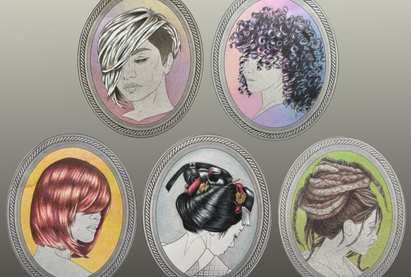
models, of course, as always, I've drawn pages, especially for the course
for us to play with. Now, here is a Pandora's
box of a topic. There are as many
hair color variation, styles and textures as there are people
walking the earth. Covering all of them in one
course would take a lifetime, but covering them
all in one courses. And the point is, the goal of my lessons is not to
hold your hand forever. It's to arm you with enough
tools to set you loose into the world and apply my technique to other
art by other artists. For us to practice as many cool colors and
effects as possible. I've come up with some
very unique characters and color combinations. Together. We'll do platinum
blonde, Cherry Bomb, Raven black with highlights, black silk and honey brown. And the textures will
range from silky, smooth and straight all the
way to tingle dreadlocks. We'll talk about
cheating technique and color selection and also using the background
color to our advantage.
2. PLAY TIME 1 (platinum blonde): Before we move on, I want to play a game, a color matching game. These are the colors that I used for my platinum blonde effect. But before I reveal the
actual color names, I want you to match what you see using the tools that you have. This is a very
important and very effective exercise
and letting go of that reliance on pencil names that so
many of us suffer from. Try to match what you see. What is this color
look like to you? Is it gray? Is it brown? Is it both? You have a pencil that looks like that in your collection. Try a bunch until you find one that actually looks
close enough. And if you don't
have a specific one, tried to combine a few colors
to get to this effect. Go ahead and match all
the colors samples here and set those
pencils aside. You'll need them for class. And don't worry if
your matches an odd 100% exact, they can't be, by definition, you're
a different person, you have a different hand
and different tools. And you'll be working
in photographing your work in different light. Just get as close as you can. And when you're ready,
I'll see you in class.
3. French grey (platinum blonde): We'll begin our platinum
blonde model with French gray, 70% french, great to be exact. The percentage here is
indicating how a darker gray is, 70% being the darkest and
10% being the latest. There are no hundred and 0% because that would
just be black and white. This is a very attractive color and very difficult to describe. So what exactly is French gray? Is it really gray? Is it really French? Yes, it is. In fact, both. The
term comes from 19th century French
wallpaper designs. But is it cool
gray or warm gray? And then we'll really
have a whole range of cool grays and a matching range of warm greens in
the Prismacolor set. Why do we also need
a French gray? Well, it's kind of
both ambiguously gray because the
name is based on his style and mood
of a wallpaper type, not just one particular die. You will find that some paint
and pencil brands offer French grace that look
almost bluish or violet, while others offer rather
coffee inspired browns. To me, Prismacolor
French grades are very attractive and kind
of all over the place. The 20% one feels
like a cool lavender, while the 70% has more
coffee tends to it. If you don't have French grace, you probably picked a grayish
brown or combination of lavender brown and gray
to match the first color. Once you teach the
conversion charts, you start to see color. To truly see it, color is more than just numbers. We feel it in our hearts. That's why art speaks to us. Go with what you feel. Pick a nice soft, mouseY brown color
and start shading. Now, what are the areas that I'm shading and how
am I picking them? Ultimately, I want her roots to be a bit darker than
the rest of her hair. She's not a natural
platinum blonde. So I'm adding the
French gray shading to the parts of her hair that
are cut freely short. These parts right here
revealing the roots and also very lightly to these areas here to act as actual shadows. I can to suggest
which areas will be ultimately darker with
my drawing lines. You'll notice that
in my line art, remember to work at your
own pace and work gently. Don't press your pencil into
the paper to create pigment. Glide on the surface
over and over, led the pigment
buildup naturally. This way, we'll be able to add many more layers without
hurting the page. If you see that you're changing
the texture of the page, that the areas you are coloring. Obviously flat and shiny. You're using way
too much pressure. On the other hand, if you can barely see any pigment at all. And it just kinda looks like there's powder on
top of the page. You're not using
enough pressure. Getting the right pencil
pressure is a skill that takes time and
practice to master. Don't worry if you're not
sure about yours yet, you'll get a feel for it. Just remember, build
up your colors layer after layer,
not with pressure. Glide and glide and glide
like you're stroking a cat. And the color will be
smooth and beautiful. So go ahead and get your
coloring to this point using 70% French gray or
your equivalent of it. And when you're ready, I'll see you in the next lesson.
4. Cool grey and sepia (platinum blonde): Our second color on this page
is 50 per cent cool gray. Quite a difference, right? Who said that gray is just gray. There is a rich range
of tints and shades of gray and they can be
either cool or warm. French, apparently, this one
is quite obviously cool. It looks like polished aluminum, while the French gray
is clearly more earthy, greens are great tools
in your arsenal. Do not neglect them. Like I said, I don't
care which brand of pencils you use.
That doesn't matter. But what I want
you to have to be a professional colorist
is a variety of options. Make sure you have a lot
of different pencils. Using different
pressure variation on your black pencil to create gray effects is not a good hack. Don't make a habit of it. Pick the colors that are
right for the job and apply them all with equal
amount of pressure. Notice where I'm applying this new color and what it's doing to the first
layer of shading. I'm going over everything that I already colored with
my French gray, but I'm trailing it all further
into the uncolored areas. And amazing things
immediately begin to happen. The new color is changing
the underlying color, giving it more body. Together these two
tones of gray look quite silvery and metallic even. It's exactly the look
we're going for with this platinum blonde gray
pencils are crazy fun. You can achieve a lot of
cool effects like these. Play with them. Take a piece of scrap paper and experiment with different
grades in your collection, which combinations of
grays appeal to you? It's all very personal. Your platinum blonde may have darker roots or moist,
silvery undertone. And it's all correct. There is no wrong
way to do this. Your way is the right way as long as you are
happy with the result. Now, notice also
the direction of my shading because this is more or less straight hair
with clearly defined strands. I'm following the
direction of the hair. I'm never coloring
across or in circles. Hair is very textured. We can use our actual pencil
strokes to our advantage. Pencil shading kinda naturally
creates the hair effect. This is starting
to look very cool. Let's add some
stronger contrast, but that will need
a dark brown color. Notice how I pick my colors. I test them on
scrap paper first. And only what I like, what I see do I bother
to look at the name? Actually, in real life when I make art for myself
or for a client, I never even look at
the names at all. I want you to get in the
habit of doing this as well. Trust your eyes and your gut. We're looking for a
very dark brown color. This one happens
to appeal to me. It happens to be called sepia. Now, let's talk a bit about
color and pencil names. They're not always accurate and quite often are misleading. Prismacolor tends
to be mostly on point with their
names, but not always. This is not what I would
call savvier at all. Yeah, it's kind of in the Brown family, so
technically qualifies. But Scipio was an
actual natural pigment and it came from, wait for it. Squeezing cuttlefish. Yep. Back in ancient Greece and all through the
Italian Renaissance, artists and architects use cuttlefish juice
as drafting egg. And it was quite
distinctly reddish brown. Later in the Victorian era. Pretty much anything in the
reddish brown, basic brown, and even green Brown family was lumped
into this category. And today there is
no one sepia color. It's just vaguely the color
of a brown faded photo. You'll run into this, you'll get sepia
pencils that look like chestnut or burn or
even olive green. This is why you
can't rely on names. The point here isn't for the third color to
be called Scipio. The point is to build
up your layers of lighter and darker grays and browns to start creating
the illusion of volume.
5. How blonde is your blonde (platinum blonde): Alright, now we have the roots and the
shadows established, and we left plenty
of uncolored areas. Let's add some actual
colored pigment. We want her hair to
be very pale blonde. So I'm going with a
color called creep. Once again, pay attention
to the direction of my pencil strokes and
also to how far I reach into the already
established colors were not coloring a mosaic where every pixel
is a new color. Instead, we're approaching
this as one would a painting, layer after layer with
overlaps of color. It's the overlap
that makes things ultimately look more
realistic and professional. Now, I'm also using the gray of the paper
to my advantage here. I could have primed this
area to be colored with white charcoal or a white
pencil before starting, or even used white paper. But I'm intentionally using
the gray of the paper as my undertone for this
particular color and adding lighter
colors on top. On white paper or over a primer. This cream color would
look a bit yellowish, which may be a cool look if
that's what you're going for. But I already decided that
this girl's hair will be kinda metallic and silvery
blond, not yellow blonde. This cream over the gray of the paper creates a
beautiful effect. Once again, I'm
layering over my grays and covering more and
more of the blank areas. But I'm still leaving some room for the
lightest highlights, which will of course
be pure white. Now, this is where a brand
preference comes into play. Again, I've played with a lot of white pencils and the
Prismacolor white is by far my favorite. It's just so strong
and it layers really nicely over the
already established colors. This is actually one
of the reasons though, like prisoners for
hair effects so much. Yes. I can hear some
of you asking already. You can mix brands. I do it all the time. If you're working with layers
and want to use one of the Prismacolor whites,
that's perfectly fine. Again, play with what you have. Some people genuinely don't like prisma colors and find them
difficult to work with. And others swear by it. Try different things,
find what works for you. But all the while keeping
the final outcome in mind. What do we want to achieve here? We want silky, shiny, very lightly colored here
with a darker undertone. If your brand of
pencils works better, if you start with lighter colors and then
add the darker shadows. Try them. But regardless, always layer and blend. These color transitions
need to be super smooth.
6. A touch of drama (platinum blonde): These colors look great, very soft, very realistic. If you want to stop here,
that's perfectly fine. But me, I like to make things
a touch more theatrical, just a bit exaggerated. That's just my style. So I will enhance
both the lavender and the yellowish stones
with a stronger color. Let's see what happens. For lavender. I chose this parma violet. Black widows have some
gorgeous Violet's as well. Tulip being my
absolute favorite. Be careful with this
color, however, we don't want her hair
to be actually purple. So very gentle strokes just glide on the
surface of the paper, following all the same rules
that we've already learned with the direction of the hair and over the established colors. I know it looks overwhelmingly purple and you're
probably going, what are you doing? Bear with me. It will all
come together in the end. One thing to keep in mind when coloring is that
the intensity of a color is only perceived by contrast to
what's next to it. On a plain white page, this color is
overwhelmingly purple. On this gray paper, it looks like a soft light like, but later when we add a
bright violet background, well, let's not get
too carried away. So I'm enhancing
the grayish areas with this new lavender
color and I'm enhancing the
yellowish areas with yellow, actual bright yellow. This is the part of the
process where you get to make your own
artistic decisions. Look at reference photography. Decide on the look you're going for and adjust accordingly. Perhaps you want to skip
the yellow and keep only the cool metallic
tones, That's totally fine. Or on the other hand, if you want this to be a
more traditional blonde, take it easy on a
gray and purple and go with soft brown instead, and then yellow and white. But this time around,
follow along with me. Try my colors and
my method first. Then on your next run, start making adjustments and push yourself further
with different effects.
7. Adding shine (platinum blonde): Making hair look like
it's actually silky and shiny is one of my
favorite effects. If you've taken my
crystal scores, you already know that we get the shine effect by
establishing high contrast. Contrast is the difference
of two extremes. This is a low contrast image. While this is high contrast. The ultimate and high
contrast is black and white. In order for the
lightest parts of the hair to look even lighter, we need to make the
darkest part darker. I'm using solid black for this. I like to leave blank to the very end, but
for two reasons. One, the most attractive
version of black happens when it's applied
over several layers of color. The undertones give
that Blackmore body. It looks more real. To introducing black
early may lead to unwanted smudging and
unwanted color distortions. Work with all the colors first, enhance some areas
with black later. Notice that I'm not adding
a lot of black either, just to the areas that
are already the darkest. And it immediately makes
a huge difference. Now let's enhance
the lightest parts. Remember when we were
playing with a white pencil, sometimes that
effect works really well and sometimes it doesn't. It all depends on your
paper, your pencils, the pressure was which
you apply your pigment, the amount and the other
pencils that you used, blah, blah, blah, blah, blah. The point is maybe your
white highlights are not coming out as well as
you want them to worry, not white gel pen to the rescue. This is one of my
favorite effects. It takes a bit of
practice though. I highly recommend
that you give this a shot on some
scrap paper first. Given that this is
always the final effect, it's also kinda nerve-racking. What if it ruins everything?
Here's the trick. Whatever brand of
white gel pen you use, the principle is the same. Add one or two small marks and immediately smudge
them with a Q-tip. Make sure to literally not press the Q-tip into
the paper though. Imagine that you are brushing
an eyelash of your cheek. That low pressure, the cotton of the Q tip will get
the job done on its own. Just very lightly swish. And immediately you get a proper shine effect will be using this trick a
lot in this course, especially with straight hair. So do take the time
to practice it. Of course, remember
to always apply the white gel effect with the direction of
the hair as well. So cool. But we're not done yet. There's one final and possibly the most important
thing yet left to do.
8. The magic of contrast (platinum blonde): We talked a little bit
about contrast already. Black and white images being the highest contrast and gray scale images
being low contrast. But contrast applies to more
than just black and white. It applies to
everything actually, it's just the measure of how similar or different things are. We even use the term contrast to describe ideas and beliefs. E.g. my dog believes that he protects the house that
we all live in as a pack. By contrast, my cat beliefs that he allows us all
to live in his castle. The same way the concept of
contrast applies to colors. We've just taken the coloring
of a very pale silvery hair colored over pale gray paper and added lilac and
yellow tones to it. It suddenly started to look a bit more like a comic
book illustration. It's bright and vivid a
bit over the top even. But look what happens when we add a bright
purple background. Suddenly the whole head
of hair looks more delicate and obviously
platinum blonde. This is the magic of coloring. It's about the whole
presentation and how colors interact with
each other on the page. Throughout this course,
I will talk a lot about backgrounds and how to use
them to our advantage. How do you decide which color to go with for the background? Anyway? I like to refer to complimentary colors when picking backgrounds. On the color wheel, the colors directly opposite each other are
complimentary colors. They're called that because they literally complement each other. And it's not just something
that some artists decided on eons ago
and it's stuck. It will never change. They literally
compliment each other. They make each other stronger, and they're each
other's goofed colors. When you look at a red shape for a few seconds and then
that object is taken away. The afterimage will be
the shape of the object, but it will also appear green. This is especially fun to
do with glowing objects. Yellow and violet happened
to be complimentary colors. It's no accident that I chose them for my
platinum blonde effects. I use them to my
advantage twice. The first time when
I chose to introduce light violet and light yellow
to the hair highlights. And the second time,
when I chose to make the background bright purple
with a touch of warm yellow. Purple is an obvious
choice for background here because it complements
the yellow and the hair. While making the
purple on the hair appear quite gray.
All of a sudden. It's amazing how you can change just the perception
of color with, without actually
changing the color. Could we use any other
background color? What if purple wasn't available or made any sense for the
page that she's actually on. What if there's a
landscape behind her or a bookshelf or something, certainly other colors can work. If you had to pick a
different color to frame her, I would say darkness matters
more than color here. She's a blonde. The way to enhance it is to put her on a darker background. If it has to be dark green
or brown or even read, so be it, it can
still look amazing. What I would avoid
is adding more of the same colors in the same
intensity all over the page. Your characters
should stand out. They can be darker than the background or lighter
than the background. That's a good use of contrast. Fun, right? Go ahead and
play with this page. Post your colorings, send me private messages if
you need guidance. And when you're ready, we'll move on to cherry red.
9. Lesson 1 HOMEWORK: Congratulations, you've
completed the first of five hair colors in this
course, the Platinum Blonde. I hope you've been following
along with me and have a complete coloring for your
platinum blonde assignment, please submit a finished
coloring of this model. It can match my colors exactly, or it can be used version of blonde hair with your
choice of a background. Either way, I'd love to see it.
10. Priming (cherry bomb): I hope you had fun
with platinum blonde. Let's switch gears. This is Cherry Bomb. Her hair is flawlessly straight, shiny, and of
course, bright red. This is a playground
for a colorist. I intentionally designed
these models in such a way that we can practice not
only different hair colors, but also textures, styles, and ways of coloring. Let me show you how I
use primate and why. My absolute favorite or
tool is white charcoal. It's bordering on addiction. Actually, I use white charcoal a lot when working with colored
pencils on toned paper. If you've taken any other
one of my courses already, you already know all about
this stuff and how to use it if you're
new to my teaching, however, here's
what this stuff is. White charcoal is
a synthetic bland of chalk binder and theory does. It's not in any way
related to real charcoal. It's just a name that stuck. Doesn't behave like
charcoal either or like pastels or like
traditional chalk. It behaves very much
like a colored pencil, but a little bit more powdery and a lot
stronger and pigment. It comes in this stick form
and in regular pencil form. But it's the same stuff
regardless which form you choose. I prefer the stick form and the brand that I get
is generals brand. When getting white charcoal, it's important to
get something that's actually called white charcoal, not white pencil,
not white pastel, and not white chalk. White charcoal. It's important because
like I mentioned, it's a whole different
chemical formula. The only acceptable
substitute for this stuff for our purposes would be a
Prismacolor white pencil, but that's gonna get pretty
costly, pretty quick. To prime this head of hair, I'm using white charcoal just
as it would have pencil, following the direction of the hair strands and already establishing the
lightest highlights. I'm covering all of the
hair with white charcoal. Once everything is
nicely covered, I take a Q-tip and gently, very gently smooth
out the pigment. That locks the pigment
into the page. Now it won't smudge
powder or crumble. And we have a nice
smooth white base. Now, why do we do this at all when working on toned paper, no matter how vivid
your pencils are, the colors will get
slightly muted. This actually work to our advantage when we did
the platinum blonde hair. But here, I don't
want my colors to be diluted at all. See
the difference. It's slight, but it's important. So why not work on white
paper to begin with? You can, That's one
option for sure. But with an already
toned background, the bright colors and the
white highlights will look just that much more
striking by contrast. It's just a more
professional look. Plus, we get to choose
which elements of the color and get to be
primed and enhanced. For instance, I may not prime
her skin and end at all, making only the hair really stand out with
saturation of colors.
11. PLAY TIME 2 (cherry bomb): Before we move on to
color on this one, I want you to take some
time and play with priming. Grab your white charcoal and
practice shading with it, and then smoothing out the
shaded area with acute tip. Here are a few things
to keep in mind. When shading with
white charcoal. Treat it as you would a pencil, not like an actual
black charcoal stick. Meaning you can just
roughly apply some pigment shaped squiggles and
then smudge them and expect it to be a soft,
smooth, shaded surface. It does not work that
way with this stuff. You need to take care to shade systematically and thoroughly. Don't rely on the
Q-tip for blending. The Q-tip should be
an afterthought. It's only there to get rid of the powder and to log
the pigment in nicely. Remember to use
the Q-tip gently. Don't actually rub the pigment
into the paper for other, brush the colored areas
that you would brush a cat. Softly. Practice this and when you're ready with this head
of hair primed, we'll move on to adding
our colors together.
12. Undercoat (cherry bomb): Now that it's all primed,
let's add some color. I'm starting with
a Sienna brown. And let me show you the
difference between this color tested over a prime area
versus overgrazed paper. It's not a huge difference. Prismacolor is a very
high-quality pencils with very vibrant colors. And yet the over the white charcoal version
is somehow cleaner. This is my undercoat color. It looks very much
like chestnuts over. There isn't one correct
color for the job. Play with what you have
and what you like. Go through your collection
of brown colors and find a strong, not very dark brown, but that's a little bit
on the reddish side. That's all there is to picking colors. Don't overthink it. Keep adding stroke after
stroke of this color. Remember, very low pressure, rather more layers, always with the
direction of the hair. Notice that I'm leaving
the latest ports on colored or barely colored. These will be the
light reflections, the shine of the hair. Of course, I suggested
the lighter and the darker areas for you
with my drawing lines. My next color is dark brown. It's actually called dark brown. Nothing tricky here. Big the darkest brown you have. Remember what we talked
about when we talked about contrast for that child
to be even shinier, we need a second darker color. I'm only adding it
to the areas that are already shaping
up to be the darkest. It's a small detail, but it will go a long way. This is an excellent start. We can take this in
many directions. Now, this is a great
base for brown hair, any kind of brown here. And of course, for all the
possible shades of red.
13. Chchcherry bomb! (cherry bomb): Now for the real fun stuff, this is where the primer
will really shine. This is poppy red. Pick the brightest
most of noxious red. You have a neon red. Even would look very cool here. Go crazy and look at our sample. It's on lighter and
brighter colors that the primer really
shows its value. Look how much more vibrant this poppy red is
overweight charcoal. Huge difference. Now we just add this
color all over, leaving just a small
area for the future, shine uncolored, but
pretty much all over. Notice that I'm coloring over everything that's
already colored. Always building up my layers. Therefore, strengthening
my pigment. No. And speaking of
strengthening color, Let's add some
more red in there. Again, look at the
difference between the red or white charcoal and read over just the
gray of the paper. I just can't get enough of it. It's a great strategy to use on gemstones and
crystals as well. Imagine you have a coloring
page where your character is wearing jewels or
it's a steam punk page and there's magical
crystals coming out of your character or out of
the machinery next to them. The way to make those
crystal standout is to color everything on gray paper
and prime only the stones. And if the two types
of red point enough, this orange should leave
no doubt in your mind about the effectiveness of
white charcoal as a primer. I'm just going to let this
color speak for itself.
14. Shine (cherry bomb): Okay, read was a blast and this hair is most definitely
already silky and smooth. But now let's make it shiny. I'm using the Prismacolor
white pencil to blend my highlights and to add
little strands here and there. This isn't pure white, not overall the colors that we've already established,
but that's okay. We don't want it to
be pure white yet. What we want is a little
bit more definition, a little bit more detail. Since we're going
for shine here, how do we make things
look more shiny? If you answered by
increasing the contrast, you are absolutely correct. Adding pure black to
the darkest parts of the hair will increase
the illusion of shine. And now for my final trick, the true white highlights. These are the areas that
are actually reflecting light because the
hair is so shiny. For this, I will need
a white gel pen. There's so many brands of
white gel pens out there. I can't tell you
which one to buy. I use Posca lot. I recently switched to this one. Honestly, they all work
some better than others. Try different ones, see
which ones work for you. And make sure to test this
effect on scrap paper first, that little color tests
simple page that we've been creating along the way is a
great test or for your pins. This takes some getting
used to the ideas to get just a few marks down
and then to smudge them very quickly with a Q-tip before the ink had
a chance to dry. Always mark and smudge with
the direction of the Shine, which in this case is also
the direction of the hair. I know it's a bit scary, which is why you should
practice on scrap paper.
15. "Socially complementary" (cherry bomb): I'm super happy with how
this is turning out. There's one last
thing left to do, and that's the background. We talked about
backgrounds already a little bit in the previous
lesson on blonde hair. I explained complimentary colors and how to use them
to our advantage. But it doesn't have to be
a complimentary color. Let me show you how
else we can pick a fun background that will
bring out the hair color. The complimentary
color to red is green. Green would certainly work. Here is a background. Any kind of green, hunter green, emerald green salad green,
lime green chartreuse. But I think we can do
something even stronger. Some colors are
complimentary by reputation. They're not technically across from each other on
the color wheel, nor are they each other's
after images in our retina. But they are socially accepted
to look good together, like purple and blue, green and yellow, or
orange and yellow. These are usually
colors that are actually near each other
on the color wheel. And they look great together
because of that proximity, upright tangerine will make
this red really pop and keep everything in
the same truthful sunshine color scheme
at the same time. Again, this doesn't mean that every time you call a red head, you need to place her
on a yellow background. She can be anywhere. Maybe there's a dark, stormy sky behind her.
It doesn't matter. It all depends on the composition and the
mood you're going for. But you have to make a decision. Do you want this hair to
stand out on the page? I do. I wanted it up
seemingly read and remember. So I chose the brightest, happiest color I could
imagine to bring that up. And this one less
bid on backgrounds. I like to always introduce
even the slightest gradient. Instead of using
just one flat color. That's just an artist habit. My characters rarely have solid flat backgrounds here
as well as on the last piece, there's a slight
change in color from the bottom of the
page to the top. It just makes things a little bit more interesting
and dynamic. Go ahead and spend some quality
time with your red head. And when you're ready, we'll move on to shiny
black curls together.
16. Lesson 2 HOMEWORK: Two out of five,
You're getting there. I hope you had fun
with Cherry Bomb. Your assignment for this
character is to submit a complete coloring of this redhead with your
choice of a background. I can't wait to see
what you create.
17. Dark primer (raven black): In our previous
lesson on red hair, we practiced the priming method
that uses white charcoal, but primer isn't
white by definition. It's just the primary layer of colors that everything
else goes on top of. Here. We're coloring here
that will ultimately be black with some highlights,
but mostly black. Now, black hair
is pretty tricky. Eating that it's easy
because it's just black. I mean, how hard can that be? But Flack is in
fact the one kind of hair that colorists
struggle with the most, that end curly hair. Which is why I decided
to combine the two. There are a few reasons why black hair is tricky
with pencils. One reason is that once
everything is painted black, a lot of the definition
on the drawing is lost, which sometimes is
okay or even desired. But in case of this very
detailed curly hair, we want to keep as much
of the shape of the cross as possible while
keeping the hair block. Another reason is how
black looks on paper. We talked a lot about
layering already. Most colorists don't player. They just pick a pencil that
seems like a good match for the final color and go
with that one layer done. It's not really enough though. If you just shade all of this
with a single black pencil, there will be a lot of texture on the page showing
through the black will look kinda like a kid's doodle and that's when things
just kinda fall apart. Will priming this head of
hair with a nice solid brown. To prevent that from happening, we will build up
several layers of natural and unnatural colors
before we even get to black. In fact, for our
amazing black hair, we won't even use a black
pencil until the very end. Again, good art is not
made by quality tools. It's made by qualified artists. A prismacolor black is a
fantastic high-quality tool, but applied directly
to this page, it will fail to create a beautiful shiny
black head of hair. The trick is in
how you get there, which is why I'm here
to show you the way. Go ahead and prime
everything that will be here with really any shade of brown. Don't worry about
shadows and highlights. Just call it everything
in this flat sheet. And when that's
done, we'll move on with more colors and
more definition. Hi. Okay. Hi.
18. Purple (raven black): I'm really into
purple these days. So I decided to give
this models and purple highlights in addition to making her hair look
shiny and black. Now we work in the
details around the curls. I'm applying this dark purple
color to the areas that appear to be deeper
into the curls, leaving the curls themselves
in the foreground, lighter. And now I want to
add some vibrance. Pick a color that
makes you happy. Really. This isn't a formula. This is just what looks
attractive to you. Me, I take this gorgeous lilac, is I apply it over
my dark purple. Really cool blending
effects start to happen. This genuinely makes
me happy to look at. Okay, hi. And for some minor
shiny effects, as well as additional
blending on the purple tones. I'm adding just a
touch of cool blue. This was a little sidetrack
or the purple highlights. You can skip this
step if you want. You can just make it
shiny black hair. I find it fun to do more than
just a single color though, you may have noticed that I'm really into color
and highlights.
19. PLAY TIME 3 (raven black): I dare you to try different color highlights
in addition to purple. Start a separate coloring
of the same page and pick a totally different
color for your highlights. Maybe pink or mint
green or baby blue. Go crazy.
20. Adding blue (raven black): Now that I got those
highlights out of my system, I can start building up
that black hair effect. And we start with blue. This is going to be
Raven black hair. So a touch of blue iridescence
is always a cool effect. The blue that I picked is on the indigo side, like navy blue. And I'm coloring over
pretty much everything, but not in a single flat sheet like we did with
the primer color. This time, I went
definition in detail. Curls. Take a lot of
time and care to color. Don't rush this. Good art takes time. You should take
the time to pause the lessons and color
at your own speed. As long as it takes. Put some music on a movie that
you already know in Lake. Just relax and set our landfill
long stretch of coloring. Notice once again, I'm
adding more pigment to the parts of the
hair that look like they're deeper in there, leaving the protruding
curls a little bit lighter. I'm also leaving my purple
highlights mostly alone. But with some spill. You decide how much purple
you want her hair to keep and how much will
ultimately be black. Hello. Once everything is nicely
colored with blue, I'm just adding hue, pale blue, Shane
effects here and there. That doesn't seem to be that
significant of a change. So let's just add
pure white as well.
21. When to add black (raven black): Let's take the purple
can be a bit stronger. That's better. Okay? Okay, now onto actual black, I'm adding black in gradient
transitions and pretty much filling in everything between the really
obvious curls. This creates an
illusion of volume. Now a lot of the drawing
details will get lost here. And that's okay. That's
actually desired. When we're dealing with really
dark hair in real life. We don't actually
see all the detail. We just see this
Keep of dark hair. Here. We're not losing so much detail that we can't see the general
shape of the curls. The area that is here on this drawing doesn't
look flat and shapeless. We took care to
build up the volume and shape it without previous
colors and highlights. So if all that
remains from the curl is just a couple of
highlights, that's fine. That's actually what we want. And because of all the layers of colors that we've built up, adding black is now effortless. You don't need to apply any
pressure at all to the page. Just gently shade in the
dark areas. It's like magic. Okay. Okay. All right.
22. Fineliner detail (raven black): Now, if you're really
into fine detail, you're going to love
this next part. Grab a fine liner or a very
sharp tip black marker, and start adding
little hair strokes to the parts that you
want to be truly black. You can also use this fine line into outline some of the curls. So even to add new
ones if you want. This step achieves two things. It enhances the contrast
by introducing true black, and it allows us to
sharpen details. Okay, now for the extra chain effect, Let's add some white highlights
with the white gel pen. Just a few, literally, don't overdo this part. We don't want to go adding these little highlights
all over the place. Just a few little curl.
23. Final presentation (raven black): And now, of course,
onto the background. Let's do a color we haven't
used for background yet. Obviously, we can't go dark because then it will be
difficult to see her hair. We want a light and
cheerful color here. Lemon yellow would
look great, baby blue. But I always liked the
combination of black and pink. It's one of my favorites. So I'm going with peachy pink. As always, I introduce a very gentle color gradient to the background just to
keep things interesting. And it's done. Go ahead and play with this really awesome
hair color effect. And when you're ready, we'll do another block will work on
this geisha style together.
24. Lesson 3 HOMEWORK: Three out of five,
you're on a roll. This was probably the most
involved coloring so far. Take your time with it. Pick your colors, play
with those curls. And when you're ready, submit either a coloring of this
model that matches mine, or if you took the
side mission earlier, aversion with
different highlights. I can't wait to see it.
25. Cool primer (black silk): In our last lesson
on curly black hair, we primed the area
to be colored with brown and purple here, even though the hair will
ultimately also be black. Let's start with something
cool and silvery. Like this cool gray.
Cool in both senses, it's actually 50% cool gray. This models here is very
straight and very shiny. My cherry bombs here it was
in the red head section. Our approach to coloring it
will be very similar as well. However, unlike Cherry Bomb, this girl doesn't have
brightly colored hair. Therefore, there are no colors that we need to exaggerate. Therefore, no primer is needed. We still need to build
up the layers to create beautiful full solid
black effects though. Of course, priming
is still an option. For instance, if you
prefer to prime the areas that will be the shiniest
part of the hair right now. Instead of adding them later on, there's nothing wrong with that. You can prime those parts
with white charcoal. There's just no point in
priming the whole head. There's more than one
way to skin a cat. They say, some buddy says, I don't know anyone who
says that actually, but there's more than
one way to color here.
26. Black as night (black silk): For truly strong black effect. Later on, I am now
priming all of these areas that will be
dark with strong blue. But unlike with our
previous model here, none of the blue will
be visible in the end. Its only purpose is to build up body for that solid black
that's coming next. And I'm using this
blue quite generously, covering pretty much
everything except the few areas that I know
will be the shine effects. And how do I know
which areas those are? It's always have suggested them with my drawing
lines for you. But you can also look at
reference photography and place your highlights
anywhere you want. You don't have to
follow my lines. They're just there to guide you. Were dealing with straight
and shiny here again, there is no reason not to use pencil shading
lines to our advantage. Hello. Once we have a nice
strong layer of blue down and we can
add actual black. All the same principles apply. Very low pressure. Follow the hair lines, buildup, smooth color gradients. If you're following
my lessons in order, you already have plenty
of practice with this. Should be a walk in the park. Never grind to pigment in. I know it's tempting
especially with black. Just glide. Remember, good art takes time.
27. Silky smooth (black silk): I'm only halfway
through this coloring, but the black is
already complete. What's left to do? The shine? They shine on this hair is almost
its own character. I want to really show off
silky smooth hair on this one. So now's a great time to
use what we call blender pencils to connect the black
areas with a blank areas. Blend your pencils are not
actually anything special. You won't find them in a separate section
in your art store. A blender pencil
is what I call any pencil that I used to
blend two colors together. For instance, here, I'm
using a light gray to blend the areas where the black
effects kind of fade out. And it immediately
looks amazing. This effect right here is the main reason I like prisma
colors for hair coloring. They just have the
coolest blender pencils. Not all brands will allow
colors to work this way. Lighter on top of darker. So play with the pencils you
have and see what works.
28. High contrast (black silk): I like this silky
smooth looks so much. I'm going to take it a step
further with pure white. Now, that's really cool. Let's take it even further. The transition areas from
black to white look amazing, but they can be
even more dynamic. I'm going with my dark, warm gray now to build
up even more body here. Remember, professional coloring
is pretty much painting, just painting with pencils. Several overlayed colors need to come together to create
a believable color. That's the real secret.
29. Pen work (black silk): In all right. Hi.
30. Decorations (black silk): To wrap things up, I just need to complete the little decorations
in her hair. And of course the backdrop. I'm just going to
let my coloring on the ornaments and stuff play out because this lesson is on here and not
on here ornaments. So just watch and enjoy. And I'll see you for the background. All right. Hi.
31. Background (black silk): For the background, I
went with something like white silver to really
bring out the black. My first stop was red, but I put so many red details
in the hair ornaments. More red would just be overkill. I did want to stay true to the proper classic
Japanese color scheme. So something along
the lines of white, black, and red fit nicely. Go ahead and play
with this page. This is one of my favorites. I can't wait to see
what you do with it. When you're ready. We'll do something on the
extreme opposite of this. Hello, cool.
32. Lesson 4 HOMEWORK: Four out of five, you are still here. I guess I'm doing
something right. For this chapter, please submit your coloring of the
geisha hairstyle in shiny black with the background and the hair declarations
and everything. Pick your own
colors for the hair declarations and the background.
33. Not all hair shines (honey brown): So far we've covered blond, red and black hair and messy straight and curly styles and all very silky and shiny. Well we haven't done yet
is brown and none shiny. Dreadlocks are the
perfect example of hair that's not silky smooth and won't have that same shine effects that we've already been practicing. I am most definitely not going to go with white
primer for this one, since I want this hair to
be as dull as possible. Here, I'm not bringing out any vibrant colors,
the exact opposite. In fact, here, the gray of the paper will work
greatly in my favor. Starting with a dark brown, I'm also approaching
the application of color very differently. Remember how I always had you worked with
the direction of the hair will here we don't
really have a direction. It's literally all tangled and Matt it and it's like
a sponge texture. So that's literally how we move without pencil
on the paper as well. I'm changing the direction
of my strokes all the time. And I'm trying to add
as much randomness and do dullness as possible.
Did you catch that? Yeah. Do dullness and
making that a term. It applies here. But it's
not just a free for all. Just because we're
not dealing with orderly and slick hair doesn't mean that we get
to be messy in our work. We are after
organized chaos here. I'm taking great care to
color everything thoroughly and also to establish
my shadow so that the whole head of hair
looks three-dimensional. Take your time with this. This firstly of color took me about 20 min and I work
fast, really fast. If it takes an hour, so be it. Hello.
34. Brown (honey brown): Now this lesson is not
only on dreadlocks, It's also in brown
hair in general. So let's talk about my
brown color selection. We've already done a
layer of basic brown. And now I'm introducing
light amber. Brown hair is a ton of fun
to color it because there's just so many shades and variations of Brown's
to play with. You can control how
warm or reddish or golden or dark or
light or consistent. You want your brand to be simply with how much of
which color you add. It would take me
years to demonstrate every single possible shade of brown on every single
possible here to here. So again, please practice along with me on
these five models. Follow my steps and my colors, but take notes along
the way and apply what you've learned here
to other possibilities. After completing this course, you should be able
to take this model and give her shiny blue hair. Even though we didn't
specifically cover that. Here, I'm adding light umber
over the first layer of brown using the same rough
sketchy shading technique. I'm not adding it evenly. I want this mess of hair
to be a bit patchy. Some of the locks will be slightly different in
color than the others. So let's continue building up
different shades of brown. I'm intentionally
covering a whole range of brown's here for variation. Starting with a kind
of dull brown and now introducing warmer and
brighter variance. This burnt ocher is very
much on the red side. My original version of
this was actually more towards greenish and
mustard type browns. Now I'm thinking I'll add
more reddish tones to the hair and compensate for my green craving
with the background.
35. Reason to the madness (honey brown): Brown is looking good and already at the logs is
starting to take shape. But we can make them look
even more three-dimensional. Time to add the highlights
and kinda tidy everything up while keeping it looking messy if that
makes any sense. These highlights will be quite different from what
we've been doing so far. This here isn't shiny
like the others. So it's important to make
the lighter areas look muddy and messy, sponge-like. I pick this ginger root
color from my highlights. Another cool trick here, which is kind of a hack, but it often works really well, is to use an eraser to add
the little highlights. You will get the same kind of muted Maria effects for the
lighter areas. Get to try. This is great. You can leave it at
this if you want. But if you want an even more messy
and wavy texture to this hair, 20% fringe grade. With this 20 per
cent French gray, I'm free handing these
totally tangled lines all over. Now, ISS. And I decide that I want just a bit more color
variation here. This part is, it's all
about personal decisions. You may wish to add green here, or even gray or more
brown or nothing at all. Mia, I just felt like a touch
of sunshine will look nice. Finally, I want to show off the structure of this
hair a bit more. There's a lot going on here. Lots of locks piled
on top of other logs. It's like a tower or a
nest or spool of cable. So preceding whatever
this is that she has on top of her
head as a single object. I'm adding dark
shadows using solid black to show off the areas
that are deeper in there. Hello, hello. Hello.
36. Green craving and HOMEWORK (honey brown): Now it's time to get that green
craving out of my system. I was dead set on something
being green around here. And since I didn't end up
using green in the hair, I'm taking it out on
the background now. What other backgrounds would
look nice here and lie. Led me know in a private message are posted in the Q&A section. I'd love to hear your ideas. As always, a little bit of color gradient variation in the background, and we're done. I'm really happy with
how this turned out. All by pages down. Great job. Please submit your coloring of the muted brown here for this assignment. But don't run off yet. Make sure to watch the
last video. Trust me.
37. CONGRATULATIONS! and a gift: Congratulations, you've completed the
hair coloring course. I am so glad to see you all the way here in
the final chapter. Did you know that statistically most students taking
any course on any topic at all only ever get about 20 per cent in the material
before they give up. The fact that he made it
all the way through is a huge achievement and
I'm really proud of you. And to thank you for
sticking with it. I want to give you a gift. This drawing of policies
yours to play with. I hope you are Game
of Thrones fan. But even if you are not, this head of hair is a perfect playground for any
color or color combination. The idea behind
all of my courses isn't just to share
color along with you, is to arm you with enough tools so that you can go out into the coloring world and apply
my technique to other pages. Time to take those
training wheels off. Let this be your first
unassisted coloring of hair. Take what I taught
you and apply it to this page with your own flair. You can follow a
reference images to color her hair as
it was in the film. Kind of a silvery blonde. You can go way off
script and make it shiny black or cherry red or
even rainbow colored. Remember that the background
is a powerful tool as well. Use it to enhance the
hair color by contrast. And of course, I would love
to see what you come up with. So please do send me photos of your policy or post them
in the Q&A section. I hope you enjoyed this
course and learned a lot. Please keep practicing. Coloring. Just five pages
will not make you an expert. I can only take you so far. Now it's up to you to
keep practicing and applying these tricks to
other pages by other artists. Thank you again for your time, your dedication, your progress. Have fun and color,
color, color. I hope to see you
in another course. Bye.
 Lisa Mitrokhin, Live life in full color.