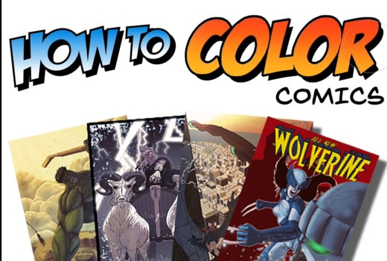
Transcripts
1. SS Introduction: So you want to learn
how to color comics, say, well, this is
the course for you. Whether it's the old classic
look that you're going for or the new modern
high gloss finish. I will teach you how to
color comics like a pro. I'm Ed for Chuck and I'm a professional comic
book colorist. And in this course, I'm going
to teach you all the stages from a to Z of how to
color your comic book. We start off with understanding
how different line work can be worked into
a coloring project, whether it's pencils,
inks, or digital links. Then we get into understanding
how to do flattening. Those are the flat
colors as well, is I take a lot of
time explaining different lighting
concepts because really, lighting is one of
the fundamentals for understanding how to color. After that, we get into
different shading techniques, from cell shading to smudge two gradients all the way into a more digital
painterly effect. We also get into some
special effects from burn and dodge tools to color overlays, and
even texturing. This course is primarily
done digitally. I'm using Clip Studio Paint, but you can use
Photoshop or Procreate, or almost any other
digital art program. Heck, I actually think this, of course, would be useful
for somebody working. Traditionally. There's a lot of great
fundamentals in it. So are you ready to learn some tips and
tricks from a pro? Some little trade secrets? Well, why don't you
join me and jump on in. And let's get
coloring comic books.
2. SS Getting Started Formatting Lineart: Okay guys, Are we ready? Are we ready to get
coloring comics? Well, unfortunately, we're not going to
start with coloring. We're going to start
with the Lionheart. No, I'm not going to teach
you how to draw comics. That's not what this is about, but it's about
understanding lines first and then how we're going
to be able to color them. This is really important because knowing what to do
when you're handed a piece of paper with some drawing on it or
something I got and how to make it pop is what
this course is all about. So this changes according
to how things were drawn. We've got a lot of
different targets, some stuff off to the side
here we've got pencils, nib pens, big pens, brush pens. And all of these might change
or frustrate a colorist. We're gonna get into that
and into how we might change and adjust our techniques a little bit according
to how things are drawn. But let's start with this. Let's, let's just say on a piece of paper or on a sketchpad or sketchbook
or something like that. You've got a drawing and you
want to color it digitally. You want to bring it into
Photoshop, Clip Studio, Paint, procreate, or any other
program that you're using. How do you do that? Well, the easiest way, the best way would
be to skimped. Hopefully you've got
an amazing scanner and you can just lay
the drawing down, scan it at a high resolution, pull that image out and bring it into your drawing photo editing, program and stuff, right? If you can't, if you
don't have a scanner. The next one that I
do not recommend, but it's possible
to use your phone. Please. Go to camera. Please think of this
as a last resort because the quality of
what you're going to get over there is going to
be probably more frustrating than just redrawing it in a drawing program
or whatever, right? So take that image, scan it at a higher resolution, and see what you come up with. See, see the quality that
you can pull out of them, the best quality that you can. I'm going to show you
some differences as we go on how it looks, scanning drawings versus
inked versus digital inks. And you can see how
working digitally in most of this progress will make things heck of a lot easier. But if you don't, there's
still workarounds. There are still lots
of ways to do it. Again, get yourself a scanner or if you're getting drawings sent to you as
a colorist or whatever, make sure they are scanned at 600 DPI, something like that, something really
high-quality that brings you the best workable,
raw product. You need something that
you can work with. And once you've gotten as
much data as possible, then you can bring it
into your photo editing. Or you're drawing software
and start to adjust levels. And that's what I'm going
to teach you how to do now. Okay. In front of me here, I've got a lot of
different samples to show you from some
artists, friends of mine. This was a contest that
are random, Spider-Man. So you're gonna see the same
script done out a few times. And this is from Mike van or a good buddy of
mine, great artist. But as you can see, he submitted some
pretty rough pencils. These are still sketch. They're really tough, really
tough to deal with, right? Like there's a lot
going on with this. This is not the roughest
pencils you could deal with, but they're also
not the cleanest. You can see a lot of
unfinished lines going on. Unfinished character
work and stuff, right? But he's an amazing artist. It looks great. Great approach to the script. Just realized that this, as a colorist, might take some work, you
might have to get into it. And I'm going to show
you how to get into it. A little bit cleaner lines
would be this submission. Right? You can see how the lines are. Still pencil ish, right? You can still see some
some roughness in them. But they are cleaner, easier to deal with. Even cleaner still would be this submission
of inked work. You can see how there is a lot cleaner lines
here, a lot easier. To deal with. And especially once
we get into how to select lines and all
that kind of stuff, you're going to see why
this gets even more and more important than the sample
that we can be working on. From my buddy Dominic Here. Lot of great lines
going on here, a lot of great things
going on here, right, but great submission. But also you can see
how as we get in here, it's going to be there's
no sketching left. There's very few of these little tails
and stuff like that. This is gonna be something
nice and clean the color. So not from worst but
from rough to clean. We want clean. We want preferably clean to color with the
cleaner, the better. It just eases us. He's been harping in trying to figure out how to
split into this, where to start that
kind of stuff. So first thing we
can look at here is how to clean up a
scan a little bit. Once we've got this rough scan, depending on the
program you're using. I'm using Clip Studio
Paint right now, but Photoshop, all of them
have something similar. You want to go into some
type of tonal correction. Maybe even brightness
contrast or level correction. I prefer levels, right? And what we can do
is start to adjust. So you're going to see how
that made it worse, right. So I don't I don't want that
I want to back that away. I cleaned it up a little bit. Maybe darken the lines but lighten that up and
just play with it. You play with these levels. Sometimes you could
use a bit of a curve. Alright? So I want to, this is
taking up the mids. So I think I want to backup
the mids as much as I can. It seems darken up the lines. Here we go, But now I'm
starting to lose the lineup. Alright, so I want to back
up just a little bit. And that's a little
cleaner, right? I don't necessarily love it. I might go in and for example, I might go in and clean some
of this up if I want to, if this is really bugging me, right, I can come in here. And this is where it
gets really tedious. And that's why if you're
not doing your own stuff, you have really good
communication with the line artist of what
their expectation is, right? Do they expect really? Are they going to give
you something really mucky that you
have to deal with? Or are they gonna give
you something clean? That's easy to just touch up? Coloring at this stage is the cleanup duty of dealing with the
pencils and stuff. This is this can be you can
see how tedious this can be, like coming in here,
cleaning all this up. Now you might not want to, you might not want to clean this up. You might want to keep this kind of authentic or
whatever it is, right? You know, you a little bit of that sketchiness field to it. It's up to you. And
that's something. Again, if, if the line artist
is somebody that's not you, then that's something
to discuss. Okay. So you can
see how this got cleaned up and you can see the original the cleaned up scan and you can punch it even more. You can sit there
and play with it for hours and really punch,
punch, punch it. I could maybe even go on top of this at another layer
and I can multiply it, back it out and see, you know, there's a lot of things
that I can play with here. Trying to adjust and
say, Okay, well, I want to eliminate the, a lot of the gray tones, the sketchiness as much
as I prefer, right? Or as much as I prefer
discussing with the artist. But still keep keep
the quality going. Yeah. The original, which is I would
almost describe as dirty. It's a dirty sketch. Write. Little bit cleaned
up, and you can spend how much time you want
to spend cleaning this up. Like he could really take hours. I don't like spending
a lot of time, so I do my line work digitally so that I don't
have to spend all this time. It's really up to you. It's up to you how
much time you want to invest, adjusting the levels? Yeah, that's all
I'm going to say on this level adjustment. Okay, so the next thing I'm going to talk about
a little bit here is getting rid of the blue line. Now, when I do sketch
on paper and stuff, what I do a lot of is
blue lines sketches. And a lot of the paper that
you're gonna be working on can be BlueLine already. The bordering and all
that kind of stuff to shimmy you away from the
edges will be blue line. So if we look at this, maybe this was a cheap
printout, right? But like there's a lot of BlueLine boards
that actually have, that are already
blue lined in it. It formats it for you
for print and I'll, and I'll show you
this later when we're formatting a little bit, right? That we've got all this
blue line on here. Blue lines are awesome. I like I said, I love
sketching with it and stuff. But then when we scan it in, we're dealing with that
blue line ugliness, right? So how do we get rid of it? Well, it depends on the
program you're using. So I'm going to teach you
a few different ways. Me using Clip Studio Paint. And that's my primary. I love it because it's
inexpensive and no subscription. If you can buy it for like on deep deal for like 20 bucks
or something like that. 30 bucks. And you've got it. It's an awesome drawing
coloring program. But I'm not advertising
for Clip Studio Paint. I use Photoshop for years. I really love Photoshop. I just don't love
Adobe's pain model. Okay, So in Clip Studio Paint, what we can do is we
go with two Edit, Tonal Correction, tone curve. So remember, I'm
aiming to get rid of this oldest blue stuff, like all the blue border
outline stuff again, right, so I'm gonna
come down here, go read, and then grab this and drag it all the way up the left-hand corner,
drag it all the way. Okay. I'm not loving it so far. They come down and go green
and do the exact same thing. Okay. Now that that's, that's
not looking pretty at all. Not at all. But
that's where I'm at. I'm all yellow. I'm going to come back down to tonal correction,
hue saturation. And I'm going to bring the
saturation all the way to the left. There we go. Okay, so now what does,
what does that do? Is it got rid of all that
cyan blue line, right? And made me great great homes. Maybe two gray actually, depending on how I'm working. I actually like working
in not stark inks. I like this kind of gray. But for a lot of people, maybe they want to punch it. So what I would do is
come over back into here Tonal Correction
and go to Levels. Where am I here? Level correction. And then I can start
to adjust from there. I can bump it up and
just nudge it a little bit wherever my comfort zone is. And right there is my cleaned up getting rid of the BlueLine
in Clip Studio Paint. Okay. If you're gonna do
it in Photoshop, the process is really
actually simpler. I think for shops got a
simpler process in this image, the drop-down image mode, and make sure you're in RGB. Okay, That's, that's the first
key for Photoshop, right? Then you go back up into image, dropped down to adjustments. And then the cyan, you'll, you'll see a little window pop
up and you just kinda pull that slider not to the edge
because whites it all out, but backing away from
that a little bit. And that'll get rid of
all that blue for you. And it's really that easy.
That's how easy it is. If you're working in
something other than Clip Studio Paint or Photoshop, maybe Procreate sketchbook
or whatever. Google it. Honestly YouTube will teach you for like there's a 100
different programs out there. So I'm not going to teach
you a 100 different ways, but they've all got this
kind of adjustment where you can back out the blue
sketch, the blue line. Okay? So like I said, what I recommend is first thing when
you scan something in, scan it in at a high-quality, clean it up and adjustments in the levels than if there's
blue line, drop it out. And then you've got a clean version that you're
ready to call her. Okay, guys, let's take
a look what's next? Okay, so next up is dealing
with difference of lines. I've got a few
samples up here of semi inked with pencils, anti-aliasing, all
this different stuff. And this is, if we
zoom into these, you can see how, how this might change when
we start to color it, how this might look. Okay, so we're, we're looking at the difference in
line quality here. You can see how pixelated it is. This is anti-alias, this is getting into smooth,
smooth lines. We're dealing with a mock
pencil here and stuff I got. So now when we start using selection tools and
selection tools and fill tools with coloring
are really important. We're going to see that. Sometimes this doesn't
really work very well. I just used a magic wand and I selected around the circles. So let's just zoom in. And we can see how when
it comes to the pencil, they're still gonna
be this whiteness, this white border area where it bounces back and
forth just a little bit, right where it's not so clear. That selection can
get a little rough. Some of, some of the pencil line is outside,
this is selection. Some of it's inside
the selection, some of the white is inside,
some of it's outside. And it can get a
little bit sketchy. My dad joke for the day. But when we get into things like getting more of a vector image and
getting rid of that. Look at how precise that is. That's an ugly jotted line, but selecting it is easy. Okay, So I'm going
to do a fill here. Let's see. I'm going to
just fill with my bucket. And we can see so we can
see how the cleaner, the line, the cleaner
this fill is, right? Maybe. Alright. So we can
see how there's, it is exact that fill is exactly touching
the line, right? But as we move over to the
different types of lines, we can see how sometimes
it's a little unclear. Oh jeez, yeah. Here it gets, you know, there's white speckles
in there, right? This can get, No,
No one's not bad. That was a digital free handing. From a distance. It's not bad. But as we zoom up close,
it's a little ugly. So keep in mind that when you're dealing with
different types of linework, you might have to draw
in some of the fill. You might have to get in
here and the hand fill it. If you want. Certain types of things, certain types of quality
of filling that right. Pencils, coloring pencils
is gonna be tough. I'll teach you different
selection modes and all that kinda stuff
for coloring pencils. I'm just trying
to really prepare you that when you're bringing in different types of
line art into coloring, the type of liner, the quality of line art, the quality of the
scan, all that. It's so, so important, right? Either frustrate you,
make life easy for you. Okay, so let's talk about
setting up a file a little bit. So I'm gonna go file new. And I've got presets
all in here. Some of the presets
that I want you to really take a look at here. The basic ones are
just the measurements. This one I've got set in inches, seven inches by 10.5 for height. This is because I have been
using problem as a printer. Problems accompany in
the US for printing. And so a lot of my clients
use them, I recommend them. They go to Sublime and this
is their page requirements. I've already looked at
their measurements, and these are the measurements. And I've looked at the border measurements,
they're bleed measurements. We will discuss that in
just a little bit here. Now, when it comes to
resolution in color, you can have different
types of colors, but 350, I think, is a minimum, a
minimum for coloring. Okay? You can punch hire four hundred, five hundred, six hundred. But realize the higher
you punch on this, the more you're going to bog
down your computing system. If you've got a brand new
top-of-the-line computer, you can chug through a lot. If your computer is
a little bit older, I realized that high
resolution and digital paints, different painting and
coloring techniques might really chugging
slow down your system. So you got to experiment
and find out. Just understand that when
you go into low resolution, it can look really ugly, okay, Be very careful
dropping below 300. You don't want the
little 300 for print. And if people are
coloring things, often they want it for print. I'm going to set up this
comic and we'll just say color, color one. Here we go. Now, we've got
a bit of a border here. These are bleeds, right? So when I'm importing
the scan line art, I've got to realize that this edge can be
trimmed off in print. And I don't want to
have anything vital on that extreme edge that can definitely I don't
want anything out there. I can color into it and that's fine depending
on the format, the format of the piece
of art or whatever. But realize that anything on that little outer portion
could easily be gone. Okay. So let's say I want to bring this one that I've
already cleaned up from Dominic, right. So I'm going to select all
and I'm going to copy it. And I'm going to bring
it over into here. Paste it in. It's not size, right? So I'm going to transform and bring it into the sizing
and format that I want. Let's see, I start
to bring it in, okay, my width,
everything looks good. Now, now that I've got it in this dimension, what do I want? I've gotta be careful
that I haven't quite expanded it on this side. Right? Do I want all of these lines going
bleeding all the way off? Yes, I think that's the way
the artist wanted it, right? I gotta be careful
with this bag though. So let's see if I can nudge
this just a little over. And that bag might get clipped off when it's
when it goes to print. Anything else? Nope, this looks pretty good. Do I liked the bottom
and top ratio? Maybe I might bring it
up just a little bit. And that looks like everything
will be within the print. The bag is my only worry, but I can't really
do much on that. That's the artist's choice
to breed so close to it. Hopefully an artist knows and understands the trim
line on a print. Okay, so this looks pretty good. There I go. This is now ready
to start coloring. Except for one thing. If I start coloring, I'm just going to be
coloring over it. So here's where I want you
to first start setting up. Once you've got your
format of the page. Once you've got the linework imported in and it's all set. I'm gonna go to that
line work layer off to the side here. And I'm going to
set it to Multiply. Now, why is that? Because multiply, whether
it's in Photoshop, Clip Studio Paint or
anything, shows darks. But everything white or
light becomes transparent. Somehow. Watch this. Let's
say that same thing. Now. I can start to color this. Right here, is where the
digital coloring magic begins.
3. SS Flats: Hey guys, we're back
and in this unit we're going to talk about
flats flooding. What does that mean? Well, that basically
means laying down flat, solid colors that have no gradient rendering to
them or anything, right? So in the old days, that was how comic
books were colored. There, there wasn't
a lot of ability to print with a lot of
variation of color. So it's nice and flat. Made it simple. I'm going to show you how to
do that because it's really, it really is the first stage
and learning how to color. So we'll get into it. We've already talked about
formatting the page. You should be good on that. Setting up the file so that you're ready to step
into this step. So let's get to it. Okay Guys, I've got that sample page that we've already adjusted right
in front of me here, right, this nice
Spider-Man by Dominic. And we can take a look at, we've got a whole bunch
of things going on here. Just so you know, these
these little blue lines here are not on the actual
document themselves. Those are on the file. So that helps me just keep a gauge of that bleed
area, that trim area. But it won't go into the print. Okay, so we want to lay down
these flat colors, right? What does that mean? What
does that going to look like? Well, I'll tell you
what, if I just take a big selection tool here and bring it over
this box, right? And let's say do a light blue. That's what it might look like. That's nice and flat. That's nice and simple, but that's not exactly what
we're going for here. We're going to get a lot
more detail going on. Just to be clear
though, on the Layers. And remember, I taught
you how to set this up, but I want to refresh. I've got my lines. So I'm going to label this
off to the side and put it as lines set to multiply. So what this means
again, as a refresher, multiply means
that the darkness, the dark parts of this, show anything that's
white or light. I can draw underneath it. So think about that. I've got this layer sitting
here of my drawing, right? And it's like an animation cell. When we use Photoshop in
these types of things, that when we color or do
things underneath it, they'll show through whatever
areas that are allowed. This line art, it will
always stay on top, but anything underneath, all of this will be
showing underneath. Okay. So that's, that's what's
happening here with this. I know sometimes it's
hard to wrap your mind around what these layers, how they act and everything. But as we work through
these programs, it'll get a lot
more comfortable. Okay, so I've got
this line layer, but I want to color it
underneath the layer underneath, I'm just going to
label as flats. Nice and easy. Part of me does this, this is what I like to do
sometimes is come in and fill this entire frame, this and just say, okay, well, that's my starting point
right in and do it that way. And you can see I'm fudge,
they're a little bit. There we go. And that kind of it's
a nice starting point. So I know it's all kind of blocked out and
everything like that. I can do that, but that's
not what I'm gonna do here. Instead, what I'm gonna
do is show you some of the tools for filling and
see which one works for you. Again, I'm working in
Clip Studio Paint, but a lot of programs, their sensitivity for
this and your flow, how you work change
a little bit. So I'm gonna give
you a few options here and see what works for you. One option is to go
to the line layer, take something like this
magic wand tool, and select. So now I've selected
everything in her face. Like I can even zoom
in a little bit. Let's see if I zoom in. I selected her face. You can see how it's selected. All that white. That's interface, right? See how it cuts off
around the year here. Those, those pixels are
a little close together, so it didn't like
to extend that. So if I want to, I can press Shift and I'm going
to add to my selection, I can start to add in here. Notice how even in these
small little areas, and I'm going to
zoom in even more. It's missing gaps. And this is your
nemesis as a colorist, is where you might miss
these things, right? So this is one technique. It's the magic wand technique. And let's say let's pick her skin tone.
That's good enough. I'm going to come down to flats and I'm going to fill that. And now we can see, okay, that's not bad. It looks like it did
pretty well, right? It's missing a couple of points. So if I want to, I
could come in with like A pen and just touch up these few points
and it's missing. That's one technique, the
Magic Wand technique. You will see. And you can adjust your magic wand to its
sensitivity just a little bit. You can say, Okay,
well have it less sensitive or more sensitive. So the amount of pixels that expands or contracts
from can be adjusted. You can go over here in
the magic wand tools that depends on your
program settings. And for this one
it says close gap. The area scaling I can, I can adjust for that, right. So it kinda, when
I select an area, it can pump it a
little bit or it can contract a little bit
depending on your style. So that's something
to play around if you want to use the magic wand to use this as doing your flats. Something happens
though when you're using the magic wand and most of these Phil tools is
when we take away the lines. We've got this, we've got a lack of color, flat
underneath that. If you're working
on an inked page, especially digital
inks and stuff, right? And you're going to
just use those inks as they are without any type of adjustment to lines
or color holds. Talk about that later. This is absolutely fine because what's it
going to look like? Yes, it looks good. But if you want to do
different styles of coloring, this might not work for you. This type of thing might
not work for you. Okay? So instead of doing this
magic wand select tool, I'm going to back out of it. There we go, back
all the way up. And I'm going to start over. Another one to use
is a Lasso Tool. This one gets a little crisper, but it takes a little bit
more of a steady hand. So if you're using,
actually I've seen really good colors. Do this with a mouse, but
depends on your style. What you do is select
around the area, drawing around the area that
you're going to be coloring. Okay. So I go around the
area like this, come around the chin and I'm basically almost
redrawing this, right? I'll come around here. Let's say I get a little bit like on a
little bit messed up. What I can do is just bring
it up to that meeting point. Press usually it's a Shift key or something depending
on, again, the program. And what this does
is now it's going to add to the selection. So I can just start to add to
it and can make that loop. Now I've encompassed everything
in there and then I can come to that way. I don't have to be
bouncing between my lines and my flats. Right? I can fill. So what does that do them? Well, it actually filled it. This is a better
way to do flats. This is probably the best way. It's a little bit more tedious. And if your work, but if you're working on your own project and you know how you're going
to handle line art. You can get away with the fills, filling a bucket fills
and that magic one film. But if you're doing work for
somebody else and you don't know how the end
product might be, like if you're just doing flats
and that's your only job. This is the way to do it. Okay. So we'll come back the lines. So I've got this
nice filled face. It works. Another technique. So, so far we've
done Magic Wand. This one is lasso tool. Another technique
is the bucket fit. Now the bucket fill. Again, you've got adjustments off to the side that you
can use for this, right? I've seen some programs
are really bad with bucket fills the whole it's
like a paint bucket. What you're doing with this
paint bucket is pouring it. Pouring it so that it
fills into these lines. You're just kinda pouring it in. And depending on the program, There's depends on your
bucket sensitivity, right? So sometimes some programs
I pour it in and awesome. It spreads out it,
it pixelate this way and it makes a square that way or something like that. Clip Studio Paint is
really good for this. So I'll show you what I do. I go to the line, my line art layer, and I hit a little
thing up here. And this is called, well, I call it my lighthouse, but it's actually setting
as a reference layer. So now when I go back to flats, anytime I'm doing
any action on flats, what flats actually
looked like at this point is just
an empty layer. Alright? With so far what I felt. But what I want my computer to recognize is I want to
work on my flat layer, but reference my line layer. So I'm going to take
this bucket, boom, boom, boom, boom, boom, boom. You can see how Gs that. I got a little bit easy, right? Like really easy. It's even easier.
Let's say I'm going to do Miles, skin tone. Kind of bump them. Maybe they're boom,
boom, boom, like that. Watch this. If I press down with my bucket, drag it and fill it. And it just kinda
especially like, let's say I'm
building back here. I don't know. Let's
go with gray. If I want to fill it, I can just start dragging
it around and starting to fill everything that I go over, cross over our class so that, that bucket drag and fill, especially in Clip Studio Paint, is really good for just
dragging it across the image. And especially if you've got a lot of little sketch lines are smaller lines and it will
just fill all those slots. But again, the bucket fill
is my cheap way of doing it. What's going to happen
when I back out? This is going to look like that. If I'm working on
these ink lines and this is all I'm doing. No problem. But if I was doing something funky with those
lines later and stuff I get and I want to select off of this if I want to use my color. And we'll get into
this as I get into shading and highlights and
the pole, that kind of stuff. This is not the
professional way to flat. I kinda want to
emphasize that, right? Okay, So two main
fast techniques. The using the auto select like a magic wand and using
the bucket fill. Fast, furious. For me, the bucket fill wins every day, especially
in this program. For doing it proper. Use your Lasso. Occasionally
you might have to come in. And this happens right? Take a pen or
something like that. Color. Color select. You see what I did there? I grabbed a little stopper. The diver selected that
color and got in there. And then I'm just going to use my marker to kinda fill in. Because like I said, I'm, I'm kinda got these gaps here that I don't necessarily
want, right. So I'm gonna come in here, fill it on up, and clean it up. If you do the lasso, you
don't have to do this. If it's really clean line work, you have to do it even less sketchy and all
that kind of stuff. It's going to take you hours. So just keep that in mind, that look in here it even. So what's happened here? I'm going to back that
out a little bit. You can see how
this line work is not actually using a
heavy full thick ink. It's a little transparent there. So what happened
was if I start to color underneath it
with these flats, how they should be.
It becomes darker. Like I said, for the most part, with the ink that I'm
working at right now, this type of image from this resolution
wouldn't eat it, right? So this is what I
want you to do. I'm going to send you this page. And I want you to go in
and start to flat it. You can use markers, like you could color
it and if you want, you can use the bucket. I want you to use them all. I want you to get in
there and really take a look at which technique
works best for you. See which program you're using and say, okay,
you know what? I love? The bucket. It's just, it's
so fast, it's so furious. That's going to work
exactly for me. Okay? That's what I want you to do, is use all of these. Actually, I'm going
to go and just choose whatever colors
like you can look up character model
sheets for these guys. This is spider Gwen
and Spider-Man, Miles Morales, one frame and just ON Rhino
down at the bottom. And I want you to
fill this flats. Only. The only part that might
be tough for you is, how are you going to
do this background? Check this out, fill it
like that, right. Come on. I got is it Is it
that do I want to put a what do I want
to put back there? I'm going to leave that
choice for you right now. Filling this big empty space
behind the panels here. How do I want to
do that for now? Just pick a flat color. We'll deal with it later in different effects and all
this kind of stuff, right? But for now, pick whatever flat color you want
back here, It's up to you. Okay, so that's your
assignment for, so far for this unit
is to flap this. And it's going to take
your wow, like honestly, for me, I'm a little fast. I think something
like this takes me probably about 2030
minutes to flat this page. It's got some details to it
and stuff like that right? After it's flatted. This is how it should look. It should be really
simple, right? I've even seen flat pages
where the colors are all wrong because they didn't
know the colors, right? They send it out to a
colorist up a flatter. And they just picked, pick
pink, purple, orange, enough colors to separate
all the oldest selections. And then the professional
colorist comes in and starts to fill in and polish it and all
that kind of stuff, right? So that's the assignment
for this unit, flat and E flat, this page. It's not always fun. But it's got to be done.
4. SS Lighting Basics: Hey guys and welcome to this
first unit on lighting. I know it's kinda
strange to start it off with a bit
of a head shot, but it will make sense
as we go along here, I want to talk to
you about how we can look at lighting and look at the objects around us to help us understand better so that we can learn how to render better. Okay, so first off, I'm going to grab
an everyday object. Not so everyday, but kind
of everyday stuff, right? It's a lacrosse ball,
white, simple, plain. And already you can
probably notice something. I've got one major
light source. I'm back. You can see a
glaring off my head. You can see it glaring
off the ball right? Now if I kill the lights
in here too much, it's gonna be really
hard to see anything. But why don't I try that? Oh, now it's just a monitor. But now I'm going to show
you that I got my phone out. I'm going to show you how
I can move it all around. You can see how if
I get further away, it kinda dissipates
a little bit. As I get closer, it
gets a lot harder. So watch this cut line, the division between the
light and the shadow, right? As it gets closer, it
gets far more intense. And as it moves away, it fades quite a lot. Right? So what I want you to
be able to do is save this video and reference
it back when you're doing exercises later
about lighting, okay, under lit and all over. This video is going to help
him more than you expect, because we're gonna be talking about lighting objects from a lot of different
angles. From behind. Look at that rim right? From in front, from up top, and from even underneath. Spooky. The key point I really
want you to understand is that objects like this. You've got around the house, whether it's a lacrosse ball
or whatever it is, right? You've got access to it. So I want you to be able to
think that you can use it to understand how lighting works.
Let's get into the unit. Okay guys. So let's get
into this a little bit. We're going to do some
different examples of when it comes to lighting. Just lighting some basic shapes and see how it flows, right? Let's see. I'm going
to pick something darkish color that we can
kinda feels a little darker. Start to color some stuff in. So well, actually, let's,
let's flip this a little bit. And let's say my light. I like to decide this first. Where's my light coming from? Why don't we pick
something simple? The left, okay? So the light's coming off
from the left side here. Alright? So if the light's coming
off from the left, we can see that it's coming
in this direction, right? Let's, let's, let's say it's a big light source
off to the side here. And it's all coming this way. Okay, If that's coming this
way, how does that play out? That means it's
going to hit here. It's going to hit here. And it's probably going to hit somewhere along here, right? What does that also
mean for where it's not going to hit not going
to hit on this side. It's not going to
hit on this side. It's not going to hit
on this side. Okay. So I know that seems
really elementary, but bear with me. I think it's worth really
looking at a lot of shapes and figuring out where would
like touch and where would. All right. So we're going to look
at this and not only is it going to hit on
the sphere here, right? But when it hits spheres, it kinda hits circular, right? And depending how close
this light source is, it can be a very hard
and definitive line or it can kinda blur
as it goes out. And again, this will kinda, like I said, either blur, Let's see if I can
smudge this out so it looks like it's, there we go. We can do it this way. If we want to cheat
just a little bit. For these curved surfaces, we can have some
kinda smudge effect. We have this cylinder here and then we have the
shade on the back end of it. And of course this
line, this cut line, because it's a rounded curve, would generally kinda
blurry a little bit. Alright? Okay. But what happens
when it's a solid line? The light wouldn't
be touching here. It might touch a little
bit just on the edge here. You might get some
highlighting on the edge here. Okay? And it might, depending on
how high it's coming from, it might come a little bit here. And you might get this
kind of almost like a gradient effect with shade coming from the
backend here, right? And then that's
where you might have it kinda blending out. Okay? So even on a flat surface, you can have light
as it fades out into the into the shade. Alright. Okay. What else goes on though? Well, we've got this, this ball is going
to cast some sites, some type of shadow. Here. I'm using a select tool, but I'm just being lazy, right? The ball is going to cast some
type of cast shadow here. So I can fill that if I want. This cube is probably if it's all the light's
coming from up this way, It's probably going
to cost something along these lines
down here, right? So we've got the shadow, the shade that's on the object, and then we've got
this cast shadow. Why don't we come down? So what I'm hoping is that you're practicing
along with me. Now there's different
ways you can practice. You can grab just a pencil. And that's what we're gonna
do for this next one. Imagine we've just got a pencil. I'm going to select
the pencil tool and I'm going to make it big because it's
going to take me awhile. And I'm going to once again
choose a light source. But this time I want
the light source to come from this way. And you know what, it's going
to splay out a little bit. So it's, it's coming
from one light up here. Well, how would I
do that pencil? If the light's coming here, chances are, it's
gonna be down here. It's coming up here. The top here is gonna be lit. Maybe. It's going to come and start to come down the cylinder this way. And then if it's coming
down again here, depending how far this
is ahead of this, there actually might be a bit
of a cast shadow on there. Depending from the cylinder. Definitely this one's going
to be all black dope. But it depends on might be
a little corner down here, might be a little
corner over here. Then if I really want to, can, you know, here's going to be that cache shadow from the bowl. Here is gonna be the cast
shadow from the square. And here's going to
be that cache shadow from the cylinder, right? And like I said,
it already kinda cast it up here a little bit. Alright, cool. I'm hoping once again, you're practicing along with me and this is
really what it is, is just trying to
get used to how light might fall on
different shapes. As we go through this course, it's going to get
harder and harder. So I know this seems
really elementary, really simple to start, but
that's where it should be. It should be elementary
and simple to start. You guys should be just
doing something basic, just practicing, even
holding objects, like I've shown
you in the video. Just object in your
head and rolling it around in front of the light. Now what if I bring the
light little bit closer? Really close, right? So it's going to be, let's say it's kinda, kinda making this 3D
here, kinda behind here. It's gonna be beady-eyed. So that means the light is
going to touch on here, touch on here, touch on here, and it might sneak through
and just touch on there. You understand like the light
is going to touch, touch, touch is going to touch
all these things that might come in-between
these two objects seems like there's
a bit of a gap. I might just kinda touch
on this stuff, right? So where's the cast shadow then, or where's the shade? Well, it's gonna be all
back in here for sure. We know this one's
a for sure, right? We know back here is a for sure. Alright. We know back here, somewhere back here
is also for sure. It's below here. So this one's going to
be for sure here too. Because it's behind this
object, behind the square, then we know that this
is going to be colored in up top here though it looks
like it's slightly above. So it might or might not. It might just be
touching on there. Cool. And then we've got the
cast shadows back in here. But it's going to be a little short because it's
coming this way. So it might, might come
to sway like cast shadows coming back here
from the sphere. And then this one
might carry through and then we wouldn't see
it on the other side here, might carry this way, but it depends, or
it might actually fold just slightly
onto the sphere. Right? Okay guys. This was simple
shapes and simple lighting. Just one light source
on simple shapes. And I know you're
thinking that was simple. And that's the point. I want to start you off easy. But as we go through this
lighting series of units, you're going to find
it's gonna get more and more complicated
as we add to it. So start here, maybe print off a few copies of this and
play with it yourself. Move the light source around. If you've got similar
objects at home, place them in front of you
and see how they react to different angles and
intensity of the light. But for now, just stick
to one light source. And let's get it done.
5. SS Lighting Basics Part 2: Hey guys, we're back with
another unit on lighting. Listen, I know this
is seeming simple, but it's about to get
more complex now, right now, this is practice. But as we move forward, you're going to see how this practice will
help you really understand how to
render for comic books. In front of me, I've got an egg both on the screen
and in-person. And I've set it up so that I
can can I have my light from my phone changing
and around the egg. So I've got a freehand and
I'm just adjusting to it. This is something that
you could do at home. I think something with a very
simple object, set it up, even if it's an egg,
and just find a way to light it and move that light around so that
you're practicing. The first one we're gonna do is let's go straight up on top. So if the light source is
coming straight up on top, that means the
shade is down here. And then shade is a
little bit harsh there. That's a little bit better.
That's what I want. The shape looks like this as I'm looking at my little reference
off to the side here. Okay? What if we move it off to the left than the shade moves
off to the left, right. And you can see how it curves with the shape of the
object in this case. And if I move it
left forward than the shade kinda just
comes around that side. Light source up
top light source. Kinda left. Light source forward left. Why don't we keep
moving it around. If I move it straight
in front of us, you'll just see a little bit
of shade on the sides there. Because that light source is basically where the viewer is. Now listen, I'm hoping that
you're following along. I don't care how you're
following along. Meaning, if you wanna
do crosshatching or whatever style rendering
you're working on right now, whether it's markers
or ink or whatever, that's totally up to you. So you're rendering of this
lighting is your choice. Right now. I just want you practicing. One thing you could
practice to that I really enjoy is kind of a
subtracting method. You can shade in, again, whether whatever method
you want and then erase. So where do we want this? Let's go with light source
down. Lower, right? The light source is
here and it spreads. And I find this easier because especially
with curved shapes, it seems to flow a
little bit better as I, as I take away things, right? So let's do that for a couple. Let's fill it on in. And where do we want this? How about top center? So I'm going to start
here and I just start fanning out from there. Right? There we go. Cool. And like I said before, my little face video, that when the light
source is super close, super close to the, to the object, you'll get
a much harder line, right? And you can soften, adjust
a little bit if you want. But you'll see how
it's much harder line as the light source
comes closer to it. As the light source
gets further away, then you get this really, I'm gonna see if I can
you get this really soft. Oh, that's not working. But I think you get the point. You get this really
soft feel to it and maybe all mashed
up a little bit. There, there we go. So here's an example. Oh, that's even
better. I like that. Here's an example. Left one is when
the light source is really close to our object. This middle one is more when the light
source is far away. So that's the shading edge. Gets a lot softer, right? Guys? This is what I want you doing. I want you just playing around finding the style
that you like to deal with, whatever style rendering it is. And then practicing
on these eggs, finding a light source where it would hit the
object, hits right here. This is very light,
light source and then maybe it starts to spread
just a little bit, right? Spreads out and out and
wraps itself on that shape. Okay guys, So what you
should be doing is having your worksheets
printed out, maybe print out a bunch of them, and just work these light
sources pen at all around. It used to it from a bunch of different angles and get used to this single source of light. Because once you master this, and I don't think it'll
take you very long. Then you're gonna go on to
more difficult shapes and objects and more difficult
lighting approaches. So get this down,
get it down quick. And then let's move on.
6. SS Lighting Advanced: Okay guys, we're back and you're already bored with
simple lighting and simple objects, right? I know, I know. It's simple. It's easy when you really
have to have that down before you move on. So we're going to keep with
that same pattern right now, doing a simple one light source. But this time a little bit
more complex of a shape. And what do I have
in front of me? Well, as you can
see, faces, right? Some, some classic busts. Not those types of busts. Of what we're gonna
do here is just do some basic shading and see where the light would fall from different
lighting approaches. It's always good to practice on faces because we got a lot
of shapes going on at faces. We've got the nose jutting
out, often casts a shadow. We've got some
sunken eye pockets. Obviously the
outline of the jaw, all of these things are really important when
factoring it, right? The first one we're
gonna look at here is a bit of an ambient light, just it's kind of all around. And you see this when
people are outside, mostly, there's kinda just
light everywhere, right? It's just a general
light source that is not harsh, hard,
and one-directional. So what you'll see with this is see if I can get this
working a little bit. There we go. You'll see just
a little bit under the jaw. You will see a little bit in the cheekbone lining. This section here, for example. You'll see just a
little bit maybe in the eye, under the brow. And then you'll see, you
know, as it flows and hangs into the hair and stuff like everybody's got a
different hairstyle, right? So that's not that important, but you'll see just a
little bit and then behind in the back
there and stuff, right. Let's see if that makes sense. Okay. So you'll see those main areas. And of course you can come in, clean it up a little bit. The one thing that I like to do, especially when I'm shading, sorry, I forgot the nose, just a little bit
under the nose. One thing I'd like
to do, especially when shading is making
sure that like, let's say for example, I have, I can actually
go over the entire eye. And it gives us this
kind of form, right? And then as I erase away, there's still that form
there, right? Okay. There we go. Nice and simple. You can come in a little
bit more and get some grooves going on in the year or something
like that. Right. But this isn't really that complex of a lighting situation. That's just this general that's kinda why I picked
it to start. Okay. So we've got that. Let's go down to another one. Let's go to the
three-quarter side. So let's say it's forward
to our left a little bit. You can do one of a few things. Remember how it
was talking about, like kinda just
shading everything in. Then subtracting if you
want. Why don't we do that? Okay? So we'll shade
everything in and then just start subtracting
if the lights here, then we know that it's
going to be coming here. It's coming from this side. Pretty much. Most of
the left side is gonna get some lighting to it, right? Okay. We're going to have
to get smaller here. The bridge of the
nose is gonna be lit. The lips, the chin. Maybe some of the
hair here, right? Maybe depending on the
cheek shape, could be here. You know what, I erased a little bit too much on the nose there. But the cheek has got some their worlds above the brow a little
bit more and might touch the hair just a
little bit on this side. Alright? So you're imagining where all the light is going to touch as it's coming
from this forward left. Okay. It might come, like I said, loop it into lips here
and stuff and the nose. And of course, like
I said before, you can come in and do
the eyes a little bit. Alright. Okay. So that's forward left,
that kinda three-quarter. What's another one? Straight above? Do we want to subtract? I
kinda like subtracting. You know, I mean,
I think for me, subtracting is one of
the easiest methods. So if you're on, if you're
working traditionally and you've got pencil, paper, that kind of stuff,
shaded lightly, and then come with the eraser
and just start going at it. So if it's coming from above
here, I want the top down. So might as well start
with the top here. Do the hair up top, right? As it touches all of
these very cool curls and locks that that's the right. It's going to come not directly on the forehead
because there's gonna be a little bit of a cast shadow from the, these locks, right? So there's gonna be that. Then it's going to
come into the brow. We've got the brow
they're going on, right? We've got coming down into the nose and maybe just a little bit up
into the brow here. We've got the cheeks. So it's good to know the planes
of the face here, right? And this is, this is
good practice for that. Actually. We've got the cheeks, we've got this part of the mouth and
there's gonna be a little, little bit of a cast from the we've got the top
of the chin here. And depending on the
size of the jaw, it could be like a manly
jaw type of thing, right? What you can do actually is
once you've got this all in, you can start to
blend a little bit, smooth it out a little bit. How do you blend traditionally, wall depends what medium
you're working with. You'll learn this
in the other units that sometimes you don't. A light hatch might
do it for you. Sometimes bunched up piece of paper or your
finger might smudge. And again, it depends
what kind of medium. So looking at this, I
think I want to have the nose cast a little bit
more of a shadow here. Little bit of light in the eyes. And then where's all
this going to fall? I'm going to show you
with my select tool if I'm looking at
how the head is, that means that
this is going to be covered by the chimp, right? So what I might do instead would be something along these lines. Just to show you
what's going on here. There we go. So you can see how this
hanging cast shadow comes down from the face. You can make it
longer if you want. If you want to cast it down just a little bit
more or something, it could be hanging
further down. You could do a little bit of a highlight sometimes
on the side here. But that is top-down
for the lighting. I really hope you're
practicing along with me. Alright. Let's see. If we've got a
top-down. Bottom-up. This time we will
start with just this. And that means we're kind of
going the opposite, right? So we're going to have
shading in here, right? Shading all in the back here where the light
might not touch. Maybe shading on the
the top of the brow, shading on the top of the chin, shading and where the collarbone
casts a bit of a shadow. And shading on the back here. Something along these lines. Okay, and then what
we can do is come in and clean it up. It's
probably no shading there. But you know what? There would be shading right
above this lip here, right? Maybe above the eye as well. Slightly there. Okay. And then you
can come in and whatever tool you're
using, you know, start to clean up
the parts that where you think the light would
be touching the leg would be touching the hair
that overhangs here, right? The light would be touching
the bottom parts of the eye. Light would be touching the
bottom part of this nose, the bottom part of this lip. Maybe down in here, the light would also
be touching, right? So what this is, is
just getting used to the form of the face. The light might be touching
a little bit on the cheek, depending how soft
we want to make these cheeks and
everything, right. A bit of a brown. Alright, cool. Maybe in the eyebrow here. This is something that you kinda keep working back and
forth and just saying, well, does it look how I
want it to look right? Does it give the effect? Maybe if it's too harsh, I want to blend it out a
little bit or something. Maybe it's too, too harsh
or too light of an effect. Maybe I want it softer. I want it harder. You can come in with a
harder pencil or something. This is something you
can experiment with. Lot last one, why don't we
practice with this one? And you know what, I'm just
going to fill it on in here. There we go. I'm going
to subtract, right? We're going to use that
subtraction method. And let's say it's from behind. So that means the light
is coming from behind. It's going to touch
all the things that might be somewhat impacted. It's a very strong
light from behind. Okay. So you can have a bit of the
cheek getting hit, right? Maybe up into here or even it's, it's a really powerful
light coming from behind. So it's wrapping on the sides
here just a little bit. The neck. There we go. But you'll see that
through the face. That light doesn't
really touch much. It might touch a little bit
on the neck. And there we go. Okay guys. So
looking at this now, they're starting
to look more like three-dimensional forms
instead of just flat, right? Understanding
lighting gives form. That's the whole thing. That's what this entire
course is about. Rendering will give form to whatever it is
you're working on it. If you're rendering a correctly, then that form
becomes believable. You start doing it correctly
and everybody is like, Oh yeah, that looks
exactly how I expected. That's actually something now. Okay. Think about that before you
get into rendering though, before you get into the
techniques that are coming, understand this lighting and lighting will definitely help you make it more believable. So the first one,
we've got this kind of ambient light, right? Second one, we've
got front, our left. Third one, we've got what
does that look like? An overhead right. Fourth one down.
As we come down, we've got the bottom lid, right. Then the last one here, bottom left, is actually
lit from behind. All of these are ones that
you should be practicing. And if anything, I would
print out the sheet a couple of times and just work that that light source from different angles.
One light source. That's all we've got, but now we've got a more complex
shape to play with. So print this out,
keep working it. And when you're done, when
you think you're ready. Let's go on to the next unit.
7. SS Lighting Advanced Part 2: Okay guys, we're back with another lighting
rendering unit for you. And this one's a big one. So who better to have a big unit width then the
big man himself, the Hulk. We're gonna take a look at
this little hole combust and do a whole bunch
of things with it. Okay? Lighting. Of course, we're not going
to be drawing on this. We're gonna be lighting it. I'm going to use a few
different techniques. Nothing new stuff
we've already covered, but now we've got a
more dynamic figure. And so it's gonna be kind of a more complex
situation going on here. I'm gonna do kind of like that Phil and take
away technique. That's kinda my preference. So I just filled it
with the whole shape. Normally what I would
do is just say, okay, well, you know what, I've got? I'm going to use a
lighter brush here. I've got light coming
in from the forward, forward, our left, right. So what would I do? I would just start shading or
lightening it up. Right. You don't like the
light is all coming. And if I wanted to, I can kinda
come a bit bigger, right? Lights coming on this side. Alright. Maybe on the top
here along the rim. There should be a bicep there, but that doesn't
really count, right? So, you know, that would be
one way and I could even get more detailed into the face. I could drop down
the size of this and kinda cheekbone
at a bit of that. But some highlights
in the hair, right? So that's how I've been
teaching you, you know, that one light source
from one direction. But when we switch it up,
That's what we're here for. We're going to have
two light sources. One is gonna be forward left, one is going to be
forward, right? And they're the same color. So we're adding a second
light source in here. And we're just gonna
kinda follow that same pattern and just
a little bit, right? And there we go. This almost as resembling
like a backlight. Now we, we kinda talked about that a little bit lit
from behind type of thing. But it's not. We're actually got to actual different light
sources coming in. We've got forward left,
and forward right. And we can play with that
a lot and see how it, how it feels and stuff. And there we go. You can put a little
highlights in here. Sometimes we might catch. Okay, so nice and simple. Two light sources. Let's see what happens when we fill this guy in
again with shade. And I know you're thinking
you'd like, Okay, I get it to light sources. Let me guess he's gonna
do three nu naught. Let's do it this way. Let's say one light
source is above, right? So it's touching
everything up here. Got his hair. Got a
bit of the brow here. Alright. Bridge of the nose. Maybe tuck the chin, some of the cheek,
that type of thing. Alright. Got the top of the PEC, maybe a little bit
of the AB here, maybe a little bit on the stone. That's one light source, right? We're gonna do a
second light source. Let me do green from down below. So the second light source
might be down in here. It's down here. Right. And then lights under
the under group, right? Lights under here. Lights under the abs. Slightly. Alright. Maybe even we can
come in and put a little rim under
his jaw, on his lip. Maybe the nose, maybe a
little bit in the eye. Right. There we go. So that's a second light source. We've got the blue
coming from up top. We've got the green
coming from below. Now the question is, why would we have a second
light source, right? Like, where does this
usually come from? Sometimes it's an artificial
light that can happen. That's actually pretty common, especially we go into a
building or something, there could be multiple
light sources. It can definitely
happen that way. They can be different
colors sometimes. But another time, it's actually
not what you think it is. It's gonna be something
called Bounce. Let's do this again. We'll do the same thing and I'll make it a
little bit simpler. The light source, the
primary sun is up above. So this primary sons,
nice and simple. It's coming from up above. But that's sun, that
directional sun coming from up above hits
whatever's down here. Actually, I'm going
to do this for us. Let's see if I just
had a cool idea. No, you're not
probably going to like it that much, but that's okay. Let's say that this
pedestal that he's sitting on is this ugly. Whatever off pink
purple color, right? So you sitting on this
pink purple color, we've got light coming down. It's kind of an off
yellowish white. What happens? What happens
when there's light? Hits here and bounces back up. Well this is what happens. You get this reflection off of that and the light will
be called bounce lighting. We'll catch in a rim these
things down here. Okay. So what do you wanna do? Sometimes you could do it
in a bit of a gradient. You can do it a bit of a
soft brush here or whatever. And you'll find that this
makes a lot more sense. So this light is coming down. It hits whatever
surface you're on. A, bounces up just, just a bit. Obviously I'm not
being careful here, but you get the point that
it will bounce up and hit whatever shapes and forms
would be down there, right. So that's a bit of a bounce
light, bounce light, bouncing off a surface and grabbing the color
of the surface. That's what often happens. So you don't notice it
always in the daytime if you're walking down
the sidewalk because the light is off white, the sidewalks off white and everything just kinda
gets off white. But you'll really
notice it if you're standing over something
very special. So let's do this again. And let's go with It's
kinda off sunshine. One brush. The light's coming from above. Nice and simple. The light's coming from above, but he's standing in water. So what happens then? Well, just as you would expect, It's this blue type of thing. And sometimes you could
do it running like this. Sometimes you could
do more of a, just a general
gradient that starts harsh down here and kinda
filters up here, Right? Okay. You can have it. Blue is a harsher one. The glow and the glow just
kinda barely touches by the time it gets near
the top or something. Something along these lines. And then, you know, it depends on what
you're doing with it. But like if it's water, you can have this kind
of swirl effect, right? That the water has a bit of a pattern to it
or something, right? You can do that kind of thing if you're working digitally. If not, it's a
little tedious to do it your own way, right? But it can be done. Okay, so that's another
way of doing it, right? That you have this bounce light, bouncing off whatever
surface it is, liquid or solid and coming up and you can see it kinda
dancing around on the figure. Okay. Let's see. I keep using this nice
gray to colour in. And I think it's good if we keep practicing
different lighting. Look at the colors
that we can use here. What happens when we have
more of an orange-ish red and we can get a little
bit more into it, right? It's coming from this side. One thing you can notice
is laying can fade out and it can get a lot harsher as it
comes closer to the light. It comes as it gets really
close to that light source. Just as we talked about all
light sources, it gets a lot, lot harder, harsher, more
defined, the colors stronger. And depends how you what
you've got going on. Do you have do you have
markers you're using? Can you smudge with
it? Can you blend? Are you using digital
or digital process? There's a lot of
things that you could do to blend this out. Okay? So play with different colors. Obviously, we're looking at this and we're
thinking, oh well, the sun's touching or some
kind of maybe a sunset. Something pretty harsh
for this lighting that has this impact
and where would it touch wood it touch the neck, touch the chin here, but maybe touch this
other brow wouldn't do little highlights
and in the face. And then, like I said,
if you've got something, you can come in and
smudge just a little bit, maybe that gives the
desired effect of what you're looking for, right? Another thing that
can happen sometimes is the light source is
not off the figure, but instead on the figure. So again, I'm going with
my base shade here. And you can do it
any way you want. I'm just for simplicity sake. And the light source. Let's go with blue here. The light source is the eye. Let's say he's got these electric eyes or
something, right? And they're shooting
all over the place. There's electricity,
There's sparks. And obviously I will take more time with
this or whatever, but we can do it for. Teaching sacred something
along these lines. Then this is the one light
source, or we can have two. Why don't we go
with this? This is the one light source, right? And so what happens? Well, things become lighter
around that source. And even more so as
you get closer to it, it could get really light. Then what happens is
everything that that would kind of touch gets lit up. Everything that though that
would come close to touching, would just be again
touched by that light. The shadow would be maybe
harsher down here, right? But pay attention to
what's causing that light. Maybe some little highlights
up in the hair somewhere. That can be you can add
that up in the hair. You put some definition
in the nose, the lip, the chin, that type of thing. Right? So the light source doesn't always have to be
off the figure. The light source can be on the figure coming
from the figure, whether it's like
Iron Man's Chest, something along
those lines, right? And of course you could add
a secondary light source. You can add whatever.
Just keep in mind that it can come straight from
something on that figure. Alright, what else
do we got here? I'm going to come in and shade. Sometimes what you can do just as you're
starting to figure, and especially if you're using pencils and stuff like that, is you're going
to have no color. I've been playing a
lot with color here to show you guys
something, right? So I'm going to color
pick this and you can see where it is off to the
bottom left-hand side. And all I'm gonna do is
move that up a little bit. And let's see, where
should we have the light source here?
Let's go with left. I like left of diseases. So the light source
is going to be here. And I can just kinda almost
make it simple like this. The light sources from the left. And now I'm going
to keep bouncing back and forth and say, well, let's see, make it darker on this side. There we go. He making a darker. There we go. Right? And I'm just going to
build up the tonal values. And like I said, you could
do this with markers, with pencils, whatever you're working in it, if you're working in
a very similar range of it's just one
monotone color, right? You can bounce back
and forth between this and kinda do that way. Alright, come all the way
down to almost black. And just keep working
that tonal value. And maybe for example, I'm doing a little trick here. That's digital, but I'm
selecting this tool. And then I'm going
to come and fill this in as if it's a cast
shadow off this head, right? And then if I wanted to, I can come and blend it out
just a little bit. Depending on how close you
want that shadow to be. Realistic, right? So that's, that's one way
of doing it is just using just one color and just running the spectrum on
the tonal value of it. You can see we've got
lots of options here. A lot of things that
we can do here and that's for better or worse. You know, we, we can
play around with it. Sometimes you can
get really funky. And let's say for an example, let's say I add
this green in here. Green is coming from this side. Now I'm going to, this is
a purely digital trick. But you can kind of replicate it in traditional
ways, sometimes with, with markers or
pencil crowns each, each rendering
technique is going to have its own little
tricks to it, right? Or each rendering approach. So we'll see what happens here is what I'm
doing is creating a layer, filling it with black and then switching it to something
like color dodge. And then coming over this again and you can see how it
burns it out, right. This is obviously
using harsh whites, something along those lines, but you can really catch almost a liquid
field to it, right? To the highlights. So I know when I use markers, I use a gel pen or white gel pen to give this liquify type
of feeling, right? So imagine if you laid
down some light color and then you liquefy a
white gel on top of it. That's a similar effect that you can be
doing here, right? There's a lot of cool
things you can be doing. One more thing that I'm
going to show you guys. Just as we wrap up here. Is it Listen you
we could go over lighting schemes again
and again and again. You know, for at nauseum
paper thing, right? Like there's so many
lighting approaches. I've taught you two
different ones. Oh, you know what last
one I want to teach you here is a more of a rim light. This one is, let's
say once again, we've got a normal
light that's coming in from the left, right. So I kinda highlight or erase some points and
stuff I got most of it's coming in from the left and
maybe even come over here and put a little bit of darkness into this side that's
coming from the right. It's really dark on
this side, right? The head casts and stuff, right. But let's say there's
a really harsh, harsh light on the other side. So what I can do is just use a very small thin line and
do a bit of a rim here. Do not call this a rim job. This is just a rim lighting. Okay. So it would just kinda almost like a backlight
or something. It would just touch
on certain points. If anything, sometimes it
just covers the outline of of the, of the character. It doesn't always,
always come in here. It depends this as this
section is optional and stuff, but a lot of times it'll
just run the outside of it, giving an almost a halo effect, but with an actual lighting
scheme behind it, right? Okay guys, if we look at
all of these approaches, you can see that we can have the same color twice from two different light
sources, but same color. We can switch it up and have two different sources,
different colors, right? We can have a bit of a
bounce light reflecting off of a surface and then
carrying that color up. We can have that same thing with something like water or fire. It's gonna have this kinda
moving effect to it, right? We can start to play
with the intensity of the light as it gets closer to the object or to the
subject we're lighting. We can have throw the
lighting on top of the subject and have a
rating radiating outwards. We can play with
tonal values a lot. That's another approach. We can start to liquefy and
use really harsh highlights. And that also has a
pretty cool effect. Very wet looking. Then
we can use a rim light. Again. Photography is really
where it's at, studying photography and all
the different approaches to lighting. It's mind-blowing. It's awesome. And this are nine examples
that'll help you in trying to understand how you're
going to approach your rendering for whatever
subjects you're working on. I hope this helped
guys. This is a really, I don't know, There's
tons of valuing here. And I'm going to include this worksheet so that
you can practice. I want you to print it
out maybe a few times. And just first-time you just
get used to the forms of the Hulk folding over the muscles and that kinda
thing of lighting and stuff. Maybe try it once with
just one light source. Try the whole sheet again with two light sources and
moving them all around. And then try it again
with a bunch of different effects and see
how it works for you. And see what kind of knowledge
you pull after that. Because I guarantee
if you get this down when you're working
on your bigger pieces. It's gonna be kinda
mind-blowing, fun with it guys.
8. SS Lighting Texture and Tones: Okay guys, we're back
talking a little bit more about lighting, actually, a lot more, but
especially how lighting is impacted by Textures. Okay, you can see we've got a whole bunch of stuff
in front of us here. I divided it up into different panels for us
for a little bit of ease, but it's still going
to take us a little bit to get through this unit. So if you have to break
it up a little bit, I've got nine panels here. And if you want to
take a break after each, that's no problem. I'll also attach this printed out or rather for a printout. And then you can follow
along if you'd like. Okay, it'll make more
sense once we get into it. We can see panel one is wood, penalty was concrete, brick, some foliage, some leaves. Then we've got some snazzy
latex here, some metal. This is leather or my leg
if I don't use moisturizer. Sorry, that's my one debt
joke of the day, right? We've got some lighter tone skin and some
darker tones skins. And I've included all these
kind of for reasons, right? So the first thing
I kinda advisers, sometimes we get
thrown by colors. Colors can throw us off
when we're trying to understand how light
impacts things. And I get it because we've
already talked about how colors can be added to a rim light or
something like that. And it's awesome. It's fun to play with colors. But one of the best
things to do is attack. And by just the tonal value, if you can get just
the values down, then the colors can come after. So why don't we take
a look at this. Let's come up here
and we'll take a look at the woodwind first. Zoom in a little bit. And what do we see? Well, let's see. I'm going to say, You know what? I could cheat. I can cheat and say on right here I'm
going to color pick. And I'm going to
say you can see off to the side of the screen
just a little bit. It's in close to white, but not quite rapid
too much here. I've set up this panel here, just something that we
could work on together. So if I want to, I could I could do is one of a few things
I can come in here and start to draw in the
individuals or even bigger and just color it in with a white and then come in with
something dark, right? Like let's see if I might
come something like that. I can come in and start
to extend it down. You can see how like if I
come over to few times, it starts to match
that color a bit, I can come in and start to use a little bit of
texturing that I want. Sometimes it's spotted,
sometimes it's more of a shade. If I keep doing this. Eventually, what it's going
to start to look like is I've got would get these wood grains and paneling
coming down here. You can change up and have
some light gray come down. And so what, what this
exercise is trying to do is help you to follow the
patterns that you see. Just understanding
the tonal value, it's important to get that
tonal value down, right? So as we back out a little bit, this is what I want you to do, is to try to see if
you could copy this. Now how you want to
do it is up to you. My personal suggestion
is just pencil. Pencil. You've got a great range of tonal value you can do it with. But if you're not
comfortable with pencil, if you'd prefer ink, Let's
see what you got, right. Okay. So we're
gonna come over to the next one that's concrete. And again, I'm going to color
pick and I'm going to say, okay, well, here's my off-white. I might grab, depending
what you're using as your resource, like
your material. Look at how that just
blend it in, right? So I've got this, but
then what happens? I'm just doing this
little corner here because I know you guys. When you're following along, you could do pretty much as much as you want or as
little as you want. Well, I've got these specs
going on here, right? So I've got these dark
specks, irregular shaped. Alright, so I'm going
to grab all the way down here and a black and do some irregular ones here and kinda see if
I can get them in. Then I might come into a lighter one and just start to do some of this patterning. We can see these dots going on. We can see them starting
to carry over n, right? We can see how they sometimes trace and almost squiggly line. You can see some little hooks. You can drop the value
down just a little bit. And I'm going to say, when you're working digitally, there are some cheats on this. There's gonna be some ways
to make it easier on you. There are certain
brushes you can download depending on the
program you're using. I didn't wanna do that on here because the lesson I'm
showing you is not how to to just do these
little specs. That's not the lesson here. I hope I'm not trying to
give you that lesson here. I hope what I'm saying
showing you here is that you want to try to understand how to mimic some type of texture using understanding what is
going on with the light. So what do we think
is happening with this when we talk
about the lighting, how it's impacting here, chances are the light is hitting these high points in
this group for an example. And these low points, these little points here,
well what are they? This is where the light isn't hitting or there's
some texturing and some coloring
in there, right? Okay. That's good to understand. So let's say we start
to shift the light. We start to shift it. And let's say there's
some highlight of a secondary light source and it's only touching
the ridges of things. We can have it touching just
a little bit of the ridge of each each high point
of this, right? And it's not showing up really well there
maybe I should go with more of a orange or something
just to kinda show you. So maybe it's only going to
touch this much, alright. It's just going to touch along
the ridges of each hybrid. Okay. There you go. Alright, let's keep
going on brick. Bricks it interesting. So
what are we going to do? I'll do a color pick for
something in the middle here. Try and middle for an example. See if that helps at all. Just kinda color it in. If you're using traditional
stuff, traditional medium, you can start to color
lighter, little bit harsher. Here's the brick. This
one is formed this way. And then what happens? There's some patterning
going on here. This is where the light
is coming in here, right? So there's some
patterns going on. We can see that below it. There's some darkness, right? We can see how that brick
starts to outline down here. And then there might
be some texturing, some more highs going
on, coming down. And this really is just about
working in the textures. Feeling comfortable with it, seeing if you like how it feels, if it's looking
the way you want, you can you can do this by, if you haven't got a pencil, by the pressure you're using, you can do it by
if you've got a, like a lighter pencil,
like even a white. I know that crayon packs comes with whites that we never seem to use that much, right? There's a lot of ways
you can get away with starting to add
color to things, or rather the tonal value, starting to really mess with it. Here we go. So what you would do is just start to work these patterns. You can imagine maybe there's another brick somewhere in here. And then you can start to kinda build it up on the top with a light's
hitting a little bit. And as you zoom out, it starts
to look like that brick. So this is a nice exercise for
you to keep on rolling on. This one is gonna be tougher. What would we do? Honestly,
what I would probably do is maybe I would pick
low kinda coloring. Then pick, there seems to
be about four values here. There's this one. And maybe I would
come in and start to do some of these
these types of values. And of course, depending on how much time you want
to spend on it, you could spend a lot of
time and maybe get into it that there's a dozen different
values or something. Then we pick a lighter
one here. Maybe there. We can see how the
shapes might take form. Alright? Maybe looking
at it and saying, well, if the light sources
coming in from top-right, then that's where that's where I know a lot of that light is
going to touch the leaf. For an example. Might do a couple of
highlights there. And then maybe grabbed
this last one. What we could do with
this one is kind of run a rim just as if the lights just barely
touching it, right? And that starts to give it
that three-dimensional form. Cool foliage. This is something that I'm kinda practicing
along with you. I hope you've got your sheet out and I hope you're
playing with it. That with whatever
medium you're doing, you're kinda messing around
a little bit, right? This one should be fun. Usually what I
like to do is I go dark on this sort of thing. Alright, let's bring it on down. And that's looking mighty ugly. But then there's gonna be this light gray
going on here, right? Here we go. Seems to be coming
on the top here. Two seems to be coming
in on that one. And what you can
do, it's not here, but what I like to see
is a much smaller, let's say it starts around here and go even
smaller than that. And higher than that. See, we can go something
like this, right? And you can depending
on what you're doing. Like I sometimes use
a liquid gel, right? If you're looking to smudge, you can add some extra
white in there and then just kinda drag
it along, right? But what you're doing is
basically looking at, okay, the light is coming
from a certain direction. It's hitting in one area. And that's gonna be
the high, right? That's gonna be the super high. We've talked about this. But because this is
such a dark surface, that high gets really
concentrated into a thin band. And it only highlights on these these little ridges that tend to happen
and stuff, right? Okay. So we can, you can see
how that works with, with all these highs, right? It's very wet looking. And digitally, a
lot of people will use a finger,
fingertips smudge tool. Let's see if this can come in
with a smudge. Look, right? You could do this actually with your fingertips
depending on the medium. And so you can come in
and some white and then kinda come and smudge it out and it looks all that
liquidy look, right? Okay. So this is highly
dependent on the medium. But really the fundamental is the same that you
really want to focus on. Where's the light touching? Where isn't it touching? And how can I get from a to B, you know, the, the tonal value, how can I drag it along from
the darkest of the value to lightest and doesn't make any sense according to where the light source
is coming from. K, This one's tough because usually what we do is we
use some tricks for it. What I usually do when I'm doing this kind
of brushed metal. What I usually do is I'm I'm working digitally
most of the time, right? So what I'll do is
something like I'll grab an airbrush and I'll
go really light. That's too much. Let's see. More like this. I will go something like this. You can see these white
speck starting to come. Let's see if I zoom
in. If it makes a little bit more sense, right? Then I'll do that same type of smudge thing that we
were talking earlier. And I'll kinda just drag
them out. Sometimes. It can be more I
punch it forward. Let's see. The more I punch it forward
and I can just smudge it. Alright, I can start to
drag it out and stuff. Another one. Let's
see if I blend it. I can fingertip this
and drag it, right? And so you start to get this, you work up and down
from there, right? That I'm not sure, sure if it's showing up on
the screen really well. But you can kind of
have these dark specks, have very light specs. You can concentrate them
a little bit more in a very specific row. Right? That type of thing. And then like I said, you start to drag it out and
you get that brushed metal. Look. The point is sometimes what you
might wanna do is overall through
the whole thing, you might want to add another kinda overlay of
where the light might hit. And so you can have almost
as cross-section of light that's swirling
over it as we still got this overall thing going on. So it might be darker down
here, darker down here, and then this band of
light going across it. As you can see, you can see how these band of lights
are here, right? It's goes from light to dark to light to dark
to light to dark. And so you can kinda
mess with that. This is really dependent
on the medium. If it's a pencil you're using,
it's tedious digitally. As I showed you. I can just come in
and do the specs and then drag them all out. Right. Okay. Let's go on to the next one. My dry skin. Again, you can sometimes get a lot of brushes that do this. I actually enjoy this. There's a few ways
to approach this. Well, you can do is like
once again, pick the low, come in, fill it up, and then get, get
even more detailed. Start to draw each
individual type of line. Let's say I was going to do
this and I've come in here. And what do I do? I just kinda continue this in. I come in and I
start adding all of these snaky patterns of veins and stuff like that.
They're actually nothing. Sorry. This is just a close-up
tracking of the leather skin. And so you can kinda do this. I've done it. When I
was doing animal skin, I would come in and have a bunch of
flow going through it. I remember doing a rhino and
then what was worked out really well is
this cross-section hatching and stuff, right? So what you can do on this is do it almost looks like this funky
mountain range right now. Then you can go darker on it. Kinda trace under
it a little bit. Maybe with a smaller one. Give a little bit of a trace under give it some volume there. So it looks like it's sitting on something
a little bit more. You can even add other
ones in behind right? Then. So what are these? These are raised
and lower parts. And what does that mean? That means the rays parts are having light touch them, right? So that means you can
see how this goes from light to medium to
dark to really dark, right? So we can go even
smaller here. And on. This light part is just touching where the
light would be hitting it. You can keep doing these cracks
to your heart's content. This is extremely tedious. Generally speaking, I
don't think you'd ever do like a character sheet with
something like this on here. But you never know if
you want to render some type of animal texture
or something like that. And you've got a couple
of days on your hands, then this might be the
way to do it, right? You can add, you can do it sometimes by just
like look how long. This is a light color. But I'm just lightly
touching it and texturing it, coming over it. Just going with the sweep of
how the texture might look. You can get away with
this a lot with pencil because pencil pressure
is key, right? So you can come in and
do that type of thing. Okay? So like I said, you can either use
a kind of a cross texturing that I've used
for animals before. Or you can get even more
tedious and just go in and do every single one and
snake it all out until it looks exactly
how you want it to look. This one is interesting. We've got two different
skin tones here. Very clearly, if I
color pick this one. Let's, let's actually pick a dark spot, not super shadowed. Well, why don't we go,
Let's go with medium. So there's her
medium. We can see if I try to plot this
in, this is her medium. That's actually pretty
dark. Let's try again. Yeah, that's probably
close to her medium. This is her medium. This is her dark. And then where's her light lightest maybe up on the cheek catching all
that light. Right. Okay. Does that look about right? Now What percent of this
face falls into dark? Geez. Maybe just under the chin here. Little bit by the AI,
little bit by the mouth, tucked behind the ears. That's about it. Even the cleavage
isn't that dark room. Okay. Let's go over here
just a little bit. And we said we wanted
to medium first. Medium is somewhere around here. Surprising No one that the medium is a
little darker here, alright, fair bit darker. The dark. We can kind of go
back here. Maybe. The dark is quite dark. And where's the light? Light might be. I don't want to go
into her eyes. So I think this reflection here, reflection on the
cheek usually. Right. And there we go. Okay. So what does this tell us? Tells us something that
everybody already knows. Different ethnicities have different tonal values
for their skin. It's nothing shocking,
nothing at all. But what is important
is that you understand where this person, where you can use a tonal values to color and match them, right? So if I come down here
and I'm trying to work this chest a little bit. Let's see if I bump it
just a little bit more. I can kinda try to
lighten this chest here. Okay, so I'm gonna come in here and I might bump
it down a little bit. Here's a bit of a
shade coming in. Right? So, you know, like hurt, her skin tone is going to be
a majority in this spectrum, in the lighter
spectrum, whereas it, I come down and
i'm, I'm working on this girl's tones here. I'm going to come
into the shoulder. Do that. Come on this side
over and that's even darker. Maybe it helps to pick, but I'm just kinda picking
to save time here. If it's really you doing it, you're gonna be
experimenting a lot more. So I'm gonna come in
here and then you know, what I'm gonna do
is shave at all or shaded all the way across. And I'll come down, pick this kinda mid and
come up with it. And those are the tones, right? So same kind of thing. It's not the face,
it's a little bit off. We could see that, again,
surprising nobody, that the caucasian
girl on the left, scarlet JO, she's got lighter skin and the lovely lady on the right has darker skin. The one thing that
I would advise, we're not talking
about texturing right now for skin texture. What I do with skin
texture sometimes is kinda what I did before. I use a bit of an
airbrush, but again, it depends on what you want to use or what
medium you're using. Sometimes I'll come in and just do a little
bit of texturing. So it can be a little
bit of texturing here, and I'm gonna come up here. And a little bit more
texturing in here. Then all even come and
just was too much. Might come and just
smudge it a little bit. Our skin has pores, right? So what you might wanna do is
just texture a little bit, smudge it out just a
little bit so that the skin has some type
of feeling to it. Like same thing if
we were over here, you can see how this has this stipple like the skin pattern to
it and stuff, right? So what would you do? You can come and kind of start to add in a bit of
texturing here. Okay, and then
maybe just lightly, if you're working with pencil, I use my finger to swatch it out just
a little bit, right? So this would be
something that you could work on again
and again and again and try to find the
pattern that you want for the level of detail that you want when it comes to rendering. Okay, So this is a
rendering, of course. In this section we're
mainly talking about light. So with the wood, with
a lot of these we talked about not
just the patterns, but where the light
might touch the pattern, touching the pattern of the
wood on the highest ridges, touching the pattern
of the leaves and the leaves that reach out for the Sun type of thing or the light or whatever
with the brick. If the light is
coming from above, then the top of the brick is going to
have more light to hit the bottom of the
rubric is going to cast that shadow with a latex. Where's the directional
light coming from? And if you can, depending on the medium, give it that
liquefied form as it, as it wraps a little bit on that rubber latex brush metal. Even though the brush metal
has that streakiness to it, it can still carry highlights, highs and lows through it. All right. When
it comes to skin, whether it's leather,
animal skin, Rhino or whatever or human. You want to have a bit
of texturing to it. Hopefully not too much if
it's a live human, right? But you want to pay attention to those tonal values
and stuff, right? Then after you get that all in, this is just tonal values. Then you add in color. Okay guys, I really hope this
unit was interesting for you that it's something that
you can practice along, whether you're practicing
on the sheet that I'm providing or whether you're practicing on some of
your own sheets, right? That you can really
experiment and say, well, when light is hitting
light, what's the reaction? When shadow is hitting light? How far does it go? When light is hitting dark? What's the reaction? How
much does it spread? How sharp is this line? How sharp is this line
here on the latex? And when dark, when the cattle or when the
cast shadows and all that. How much does that
spread as well? I think this is a great thing to experiment because
let's say you've got a hero that
has, I don't know. The left side of them is a black super suit and the right-side of them
is a light super suit. Well, how would you go
about thinking that? How would you approach it? The light's going to hit it. But how that clothing I'll
let costume reacts to it, is going to be totally
different, right? That white latex is not going to have a
heavy shadow on it. That black, the dark part will. But in turn, also, the light latex is
going to be all whited out when it comes to
any light hitting it. But the dark side might just
catch it in a few areas. So hopefully as this
course goes on, you get a lot of practice. A lot of different ways
of grabbing onto how light hits a form and how you
decide to render it, right? This particular unit here was
to talk about how it might hit different textures and how you can express that
in that tonal value. Okay guys, this was a good one, and I hope you'll
learn tons from it. And I hope you keep practicing.
9. SS Cell Shading: Hey guys, we're back and
this time we're gonna get into shading, particularly
cell shading. Okay, so what does that mean? Well, the term comes from animation cells
because this was a very easy way to shade
those animations cells. If you guys, we've already
talked about this a little bit when it comes
to layering and stuff. I got we've got certain layers when we talk about graphics
programs like this, whether it's Photoshop
or anything else. Where you can imagine. Maybe you want to imagine
like a flat base right now, Here's your flat base, right? And then you could
put a transparent layer over top of it. A transparent layer that
reminds you of those old, old overhead projectors or something back in
school nowadays, I don't know if the kids
have them, but some of you might remember this
when you can draw, is draw on that
transparent layer. So everything
that's not drawn on or colored or whatever
can be seen through. Right? If you color the whole thing, well then that's now
a solid layer, right? So think of your base layer. The base background is
this solid layer, right? Then anything we're
putting on top, we're going to just maybe color this one section or do this
one thing to it, right? Okay. So right now we've already
got flats done, right? I showed you how to color the flats of a comic book
page, okay, flattening. And then we went through a lot about different
approaches to lighting. So we're gonna take those flats, take what we learned
in lighting, and now put it together in
our first cell shade video. So literally that cell shading, but we're actually going
to be shading here. Let's jump in and see if
it makes sense to you. Okay, so I've got the
flats in front of me. And on the side here you can see I've got the
layer that says flats. What I'm gonna do is
create a new layer. So I can just create
a new layer, right? Once I've got this new layer, There's a few things
I can do with it. What I can do here
is what I like to do here is actually lock this
layer to the layer below. I've got, I'm going
to type into it. I'm going to just say shade one. That's really easy to help me organize what I'm doing here. So I've got this
shade one and it's just sitting above
my flats right now. Right? I can keep it there
and that's fine. And you don't really have
to do what I'm about to do. But what I sometimes
like to do is clip it to the layer below. This gets a little
funky and in how I'm, what I'm doing and
stuff like that. But I'm gonna come
over here and in Clip Studio Paint It's
clipped to the layer below. Whether it's Photoshop or
whatever you wanna do, You can search how to clip it. What does clipping do? Well, in this case, it doesn't matter because the
flats or an entire layer, if I put green below it, you can see that it doesn't shine through
anywhere or anything. Okay. So with with the flat tell they are remember how I
talked about just being a flat layer, right? What if I only
wanted two thirds of that layer to be
my background and then I'm making it for
t-shirts or something again. And I want to keep this
transparent will now this layer that I just clipped to it, it doesn't clip to
this entire thing. It just clips to the part that I covered in colors
below or whatever. Okay? So you're going to have to wrap your mind around about how these layers stack
on each other. You'll get it the more
we get into this. Okay, so now I've got shade one, I've got the layer set. I'm going to start shading. I'm gonna come up
here and especially look at this first
panel on base. A lot of my shading off
for this first panel. Okay, so I'm looking at this first panel
and I'm thinking, okay, I colored in the
flats and I did a good job. And it looks like the
colors that I want. His skin tone is where I wanted. Everything looks good. Good to go. I'm
ready to add shades. Mi well, I'm going to pick
according to this first panel. This first panel is
outside New York City. I'm looking at the
skies kinda blew. The ambient light is
going to be a blue hue. So I'm going to pick
in the side here. Here's blue. But I wanted to add a darker bit of that because it's a shape. So it's gonna be a
little bit darker. So I'm going to take this blue and run it somewhere in
the middle of the blue. And that's where my
blue is gonna be. This is going to be
my primary color. Off the left here, blue, this kind of shade blue. And then off to the
right is gonna be white. And I'll explain
this in a second. So I'm going to take
this entire page and select it so you can do it. I got a little hot
key going onto that. I've selected everything or
you can just hit Edit Select, and now I've got
the entire page. I'm going to fill it
all with this blue. Okay. So I've filled it all
with this blue shade and right now, everything
looks horrible. It looks even worse
than we expected. I messed up. Look at this, you know what this should show you if I
did my flats correctly, it should show,
everything in this blue. Should show. Let's see if I can pronounce it. It's not a shirt, shorts or should show. So it should show
everything in blue. But as I pan down, I can see how I missed a
few pieces here, right? Anything that's
white ain't right. Racial thing. So what I've gotta do is
take a few minutes and make sure that I go
through and touch this up. So we're going to pause
this for a quick second. I'm gonna come in here, touch up a few things
and make sure that this is a solid color. Okay. Give me a second. Okay. So I went in and I
cleaned up those flats. This is one of the
issues when I'm doing flats under some different
types of lines, right? Like we've talked
about this before, a digital lines versus
scanned in lines. They don't always get so clear. So I tried to do it
quick and I caught me, but now it's looking
pretty good. So if I come into this first
section here, like I said, I'm going to use this
as my color and say, okay, well, it's kind
of bluish tinge, right? So I'm gonna go in
the shade layer and I'm going to look at
this first thing and say, okay, well, where's
the light coming from? Well, it's datetime,
so I'm going to put the light up above, right? And what I do for
cell shading is this, take my magic wand tool. It looks like a
little lasso, right? Oh, actually, sorry,
I take the lasso tool and I'm just going to draw along the line of where the top of the figure
the light would hit. And I'm going to
start to move in and take in mind some of the
stylistic lines of the hair. For example, I'm kinda following some of these
lines a little bit. I'm gonna kinda follow
this and select it. So that's maybe where the light my head at first
and now I'm going to press the ad to adding
to the selection. So I'm going to, in this particular program
is the shift key. And I'm going to keep adding
and I'm just going to start drawing in here of where
I think this light, it's, it's, it's
a daytime light. So it's gonna be kinda
all over here, right? So it's gonna be like that now. So look, it's got her
top of her head, right. So what am I gonna do? I'm gonna fill that with white. There we go. That doesn't look
all that exciting, right? So I've got that
filled with white. I'm going to come below and start to do her
face and the face. I'm just going to keep
it almost entirely. As in the lights
touching it almost all except for where the
hair maybe falls over. And I might do that. So now I've got this heavy light source
coming from above. I might come in here,
clean it up a little bit. You can use if you want to, you can use the pen tool and just kinda come in
and draw the shading. You could draw the
light source or not. I use the lasso lasso
tool because it can do a large area
at a time, right? I like that selection of if I'm light is coming down
on something, right? But if I want to come in and
just kinda clean things up, I might use a pen tool and just kinda smooth things
over a little bit. And now that I'm in
here, I'm kinda like, Okay, well I'm going
to come in and do some details in this ear. And now, if I was to say, well, that's the face, that's that's the head. I've now highlighted the head. But what does it look like? Does it really look like
anything right now? Not really. It just looks like
there's white. Sorry. There's white and there's this kind of greenish
blue, right? That I've got going on. This looks like nothing
right now, right? I go in and make sure
I start to shade where the light might not
be getting into. Right. Okay. So that's the face. I can do more details if I want, come in and get rid of this. If I want here. Smooth it
out a little bit here. If I want to, I can get, give her a little bit more
of a shade in the nodes, have a dropped
down a little bit. It depends on how long I want
to work this form, right? Like do I really, how much details I want
to go into here? But like I said, this doesn't look like
anything right now. This just looks like I've kinda got a little bit of a piecemeal thing
going on here for, for white and blue. This is where the magic comes in when it comes to shading. In all of these programs, they all have layer adjustments. You can start to change how the layers interact
with each other. So I'm gonna come
over to the layer, drop-down that layer type, pull up the menu
and go multiply. Now you can see
what multiply does. It means everything white
becomes transparent. So in the multiply function,
multiply, color, burn, darken, linear burn, everything white
becomes transparent. You can see it. It's kinda cool. Anything that's not white. Now I can show this is
really good for shading. So I'm going to
have it on multiply here and back it away. And now you can see how that's how we would
start to shade, right? So what I'm gonna do is
I'm going to start to do all like the sun would
come and touch her here. We'll touch on the burger. Touch on this finger,
touch on this finger. Touch the paper, touch the
top of the chest there. Touch that shoulder and
come over into here. So that sun might come there, maybe come on the shoulder or collarbone, top of this shirt. Again, that hot dog here. On the top of that finger. Maybe some of the folds on here. You can do these folds. I'm just thinking
where the light is, light is coming down. I want
the light to come down. It's downward. I'm
going to start to fill. So I'm going through this figure and I'm just gonna be like selecting where I think if the light is
coming from the top, where that light is going to touch. So
it's good to touch. Maybe a band down
the arm, right? Definitely the top of this hand but the knuckles here maybe probably the top of this arm
and this arm a little bit. Alright. Anything that's coming down on. There we go. Maybe it's actually probably touching some of her
chest underneath here. So in some of the shirt, maybe it doesn't just here. We can see how light
filters down, right? And maybe even gives a little
bit of a streak right. Here we go. So check this out. This is how easily
we shade Glenn. We actually don't shave
her so much as put the light on her
where we're kinda shade everything in that
we're dropping light on it. But there's a problem. Are her head cast
a bit of a shadow. So what I often like to do is
take that same magic wand. Can it come where I
think her head would go. And sometimes you can add hair into the mix or
something like that. And there were head
kind of dropping this drop shadow down on. If I hang over, you
can see that shadow. So I do that for Gwen. I'm gonna come over to do
the same thing from miles. I'm going to come
onto his shirt here. Tracing about where
the top of everything might be touched by light. I'm kind of just having
fun with it here. I'm just like, okay, well, I'll do that drop
shadow thing later. I'll do that on his neck
and everything later. Right. So I'm just going
to say, okay, well, the lights all touching, all of this is
dropping down on him. When we get city lights in the middle of the
day, pretty much. It's everywhere. You
can't escape the light. There's, we'll get
into this as we go through this page
and panel even more. But there's so much
light during the day that you really not going
to have a heavy contrast, dark shade anywhere,
anything, right? So we'll be adding tons a
light onto miles here as well. Maybe I'll come in here and
do some of the wrinkly bands. We go. You can see how now. So I've got the shade set at 32, I can darken it or lighten it. It shows how much of a contrast
there is during the day. There really isn't that
much of a contrast. So again, the
light's coming down. I'm going to do almost
his entire face. I kinda like to do the
entire face and then come in and do a little bit of details around the
ears or something. Then what I do is come in and do shading with my
pen a little bit. Like under the brow here, there might be a little bit of shading from that
around the eye. You want to give some
roundness to the eye. Under his nose. Here, under the lip. This shows often
the size of things, the amount of shade that's cast. We'll show how kinda big thing. So if he's got a bigger lip, it's going to cast
more shade or shadow. So this looks
pretty good so far. I might put a little bit
in that crease there. And now what I'll do
is I'll come down and his head is tilted
off to the side here. So I'll just kinda roll
with what I think would be the drop shadow
from his head there. So if we back out, we can see how these
two are now shaded. If it's a high contrast, like it's dark and there's
only certain amount of light. Well then we punch it harder and there's the highs
and lows, right? But in the city during the day, maybe I put it at around. 20% opacity. And that's, that's how easily we can go through the layer. How we can view
through the layer in this kinda gives the vibe of what I'm going
through, right? Okay, so what I'm
gonna do is go through this entire page and really just start dropping
light. Let there be light. Put it all over these
guys and just say, okay, well this is it, these
background characters. You don't have to
be as discerning, as careful as whatever as the
main characters and stuff. You still following
the basic principle that if you choose
a light source, be consistent with
that choice, right? Like you always want
to be consistent in light source choice. But overall, I think that you
don't have to stress too, too much on on background
characters and stuff. Okay. So this is me slowly
filling things in, showing where the light would fall on somebody's background characters and you know what? Especially I think
we don't always want to show too much
detail on these guys, the background because we don't want too much attention
brought to them. The more attention, the more
detail we show in shading, the more detail is given to
those characters, right? So you can go out and render
the entire page if you want, you can really go in depth, showing exactly every bar, every, every little bush, every little, little
thing, how it's, how it's highlighted and
shaded and all that. And if you want to like I'm doing here, it might look good. But it might be too
much. It really loses it because that's
not really the focus. The focus in this particular
panel are these two, right? My advice would be kinda choose what you're
doing and why, right? You know, like, where
are you putting that light energy into your artistic energy
into it as well, right? Does it have to be
in certain places? And this is where you could
use the Fill button to or fill bucket and fill
some things, right? That first panel. All of a sudden, that's
exactly what we want to give enough detail to these
background guys, right? Like you can see
there's light, right? But the main focus
right now is this. This is what I want you to do. I want you to do
this entire page and you'll see this is
what it looks like, right? You're going to shade it. That is, fill the entire
thing with the shade, and then go and drop the
light source all over it. Now, generally speaking, on a city street in
the middle of the day, the light source is going
to be straight above you. Maybe you want to mix it up. What if there's an explosion? That center point
of the explosion might be your light
source, right? You can have it blowing
out from there. And that can be
pretty cool, right? So there is some leeway in this assignment
for you to mix it up and move the light
source around a little bit. But do it consciously, right? If you're moving
it from up above, which is our main
light source here. Why? Why are you choosing that maybe that big action
explosion and you want to move it light
source in the middle and then everything else on
the outside is shaded. Cool. But make that a
conscious choice. Okay? So this is shade
shading layer one. With a sell sheet approach. We fill it, we start to
etch away from using light. And then we reduce the opacity to a daytime level
of maybe 20 to 30%, then we get something
that is exactly what we want. Let's see what you got.
10. SS Cell Shading Part 2: Okay guys, that first shading attempt to kinda
took a while right leg. It takes a while to work
your way through the page. You can see now that
I've got the entire page done shaded with a consistent
light source, right? I'm done. I'm done
shading me. Depends. This is the cool
thing about coloring. Is that at each stage you
choose and say, Is that enough? Have I done enough? Have I accomplished what
I wanted to accomplish? I'm going to show you
as we continue through this course how to keep
doing more and more. So you could stop now
and just say, Hey, I colored this common page
and it's good enough for, for certain levels of print and stuff like that. I
think you're good to go. But what I'm going to show you, this is just a little tidbit, but as we go through, you'll see there's
more units, right? So what you can do if you want
is add more shade layers. Remember how I did shade one? Well, let's make it
two, see what happens. So I'm going to create
shade to clip it to that mask or limited layer
below and call it SHA-2. Now, what has shaped what
I'm going to stick with the same blue hue, right? I'm just going to come here. I'm just going to
say, You know what, I really like, how this looks. I like everything about it. But what I'm gonna do is I
want a little bit more shadow, actually, just below the chin on both of these characters. And this depends on how the
artists have been inking. You can see this, sorry, just dropped a little bit of ink on it already and stuff, right. So maybe I want it there. Maybe I want it here. Just to give a little
bit more depth. The artist has already
done it in lines, but just in case they haven't. Well, this is one way to
do it and come in and add just that extra
little bit of depth. Okay, so now I've got this, I'm going to fill it, but wait, that's the weird blue. Why why is it
feeling weird blue? Because I didn't change it
over to the multiply layer. And I can back out away.
So I get back in to about, let's say somewhere
around there, 30%. You could see how something like this and give it a
little bit more. Now I've got two different
layers of depth to this light. Right? Back away a little bit. You can see how without,
with, without width. Now, you can go through the entire piece and
add like shade one, SHA-2, SHA-3, and really keep
layering the depth, right? This is just for cell
shading technique, right? So you can have these
layers of cell shading. When we start getting into
learning how to blend shading, you don't
need to do this. You're going to show the depth of the shade
in a blending technique. Yet, right now, this
was shade number two. And just an easy way to add
just another layer of depth. You're shading technique,
nice and easy. You don't have to
do it, but if you want to, is there for you. Hope that helped a little bit.
11. SS Highlights and Whites: Okay guys, so far
we did the flats, We've done some shading, maybe added some few layers
to shading if you liked. But now we're gonna do
something called highlights. And this, again, as we take each of these
steps, this is a choice. Maybe you're like, You
know what you've done. Or you're like, I want to flesh this out
a little bit more, highlighting, we'll flesh
that out a little bit more. So remember when we thought
about our light source, like right here, I'm getting
blasted by these lights. It's nighttime and
everything, right? But when we're walking
a city street at night, most of the ambient lighting is coming from above
and around, right. So it's going to come
down on that person. So if we're going to
have any highlights, we can have them
come from the top. I'm going to show you two
types of highlighting. One, just being a normal
technique, right? The cell shading technique, and then using whites after
that and see how that looks. Okay, so I'm gonna
make a new layer. And I'm going to lock it
into the layer below. And I'm going to pick our
number one favorite panel here. And I'm just going
to say, Okay, well, I've got these guides and I'm going to
focus on these guys. I don't like throwing highlights into the
background much. This is a choice. We chose blue. Remember we have this
blue as a shade, right? So we're gonna go with
that blue, the light blue, and because it's
kinda coming from the sky and it's
a light blue sky. And we're going to bump it. Instead of shading. We're going to bump it into
something very light base. So instead of something
very dark for shading, we're going to go very
light for highlights, okay, so near white or a bluish white or
something, right? And what we're gonna do is
let's say I zoom in here. What I can do is maybe think of, well, where's that
light going to touch? Maybe here, maybe on the lips, maybe a little bit up
here in the forehead. Right? Something
like this may be in your maybe in the hair. I might have an error here. It depends. Highlighting works really well in reflective surfaces
and stuff, right? So skin you would see, look at the lighting bouncing off knee
here and stuff like that. But do you see how
shiny it is there? Less shiny up my fabric. Certain materials bounced light and certain materials
absorb light, right? And so like a skin or latex really balances
that light ribbon. So we'll get into
that a little bit. But I might come here
and I might hotdog. Hotdog probably grabs the light more than the, the
buttons, right? So what I'll do is I'll fill
this with that light blue. And now it looks absolutely
ridiculous, right? This is not what I want. This is looking
really ridiculous. Instead of coming and change the layer two in this darken, multiply color,
burn, linear burn, these shading type of
layer adjustments, we're gonna go into lightened screen color, dodge and gloves. So I'm going to go into screen
and then back this away. And you can see how
this might be used in just I liked, right? So what this looks good on
sometimes is hair highlights. The reflection in the hair. A little bit on the nose here, a little bit in the cheek, the eyes and stuff right. There we go. So if I want to
punch it up a little bit, I can punch it even more
depending on how high. It's sometimes works better
on certain skin tones, right? For certain materials. Maybe I want to put
it on the chest here. Maybe put a little put a little wiggle in it
to begin it, right? I'll put it on his fingers here. Darker skin tones can often
catch this even more. Right? There we go. You can see
how cool that is, right? Okay. So what you can do is, I really don't
like this up here. I'm going to actually get rid of it. I don't like that at all. Doesn't doesn't do well up
in his forehead right there. Alright. So you can go through
and just kinda add these little highlights. A little bit here and there. Just a little bit on his chin, maybe a little bit on the
cheek to kinda cute, right? To test that light. Get on the nose. Usually the nose catches it more especially
coming from above. Right? Sometimes on the brow. And like I said, if I want to, I can do the hair. Now right now, these
highlights aren't really showing much because, well, to be frank, it's a daytime scene and it's a soft light
that's over everything. Right. So if I wanted to bump the shading and then
bump the highlights, you can see how the contrast
can get really punchy sometimes when a very special kind of get
them right here. A very dramatic mood. Well, you could have under, under lit highlights and
it gives that a *****. Like that can be
kinda cool, right? That's not what I'm going
for here because this is. Street scene. So I'm going to back back mine. I didn't label it here. I like to label my layers one. So this is going to
be highlights one and I'm going to back
this shade down, back to around 25 or
something, right? So highlights, I think
around 1213, the opacity. Okay, so that's how that looks using a screen layer and you
can use like a different, different types of
layer adjustments to see if it's working
the way you want, you know, where I would
put those highlights more so is the rhino his his his rhinos XOs skin
might be a little bit more reflective and might show these highlights the way that I want them to a little bit. I would use
highlights sparingly. You don't want to have them
all over figures and stuff. It just, it can be a
little bit too much. So that just brings
another layer of depth. Every time we add a layer
of gradient of tonal value, we're adding a
layer of depth into the characterization
of our drawing, right? Okay, so I've got this, this is one way of highlighting. I'm going to put another
one in here that I'm going to just combine
in this unit here. What I'm gonna do
something different. I'm going to put it
above the line layer and I'm going to call it white. I'm putting it above
the line layer for a reason because often I want it to go above the lines where this is
going to show the most. I loved. This is in the eyes. So I'm gonna take white, pure white and my
little marker and just draw two dots over
his eyes, right? Maybe I could put that in his nose and maybe a little bit on the lip there
and stuff, right. I would use this sparingly because it can be
a little bit much, but especially on
glossy surfaces like looking even in
my eyes right now, you can see how it's all. It's catching those
lights, right? So maybe on the lips, the lips can get
a little glossy. The nose, the eyes. That would really work. So if I'm coming down here, I can go where I
highlighted and put put little little white ticks or something like
that, right? Okay. It can be a little bit
too much sometimes. So be careful with it.
You want to use it? Like I said, pretty sparingly. Yeah, I'm just kinda drop in
these whites a little bit. It again depends on the fabric, the material that we're, we're coloring over latex. You're gonna put white
squiggles everywhere, right? You know, like in something rubbery or
something like that. Here. I can even do it here. Maybe she's this her tights. It might be that
type of materials. So I might put some type of white squiggle here,
something like that. Something like that,
right? And that adds just this little bit of cool factor into a
little bit of punch. Again, every time we're
shading and rendering here, we're creating this variation in tonal value that brings more
depth into the character, more depth into our heart rate. And so adding highlights. I should have put
one on the cheek here where she's munching away. That's that's what
we're hunting for here. Even on the fingernails if I want, they can be a bit shiny. Too much of it though. It looks like they just
came out of water. I'm going to say this
on Miles, his face. I think it's too much. It punches a little
bit too hard, little bit too much. In his eyes, it's fine, but on his face it just
punches too much on hers. The contrast isn't as strong
with the lighter skin tones. So I think I'll leave
it there, right? Like I said, for me, one of the key places is
putting it in the eyes like just having this reflection
on the glossier. Okay, so that's highlights. We can see it on the
rhino, especially. It adds another layer. If we're gonna do
just highlights in like screen mode or
something like that. It adds another tonal
layer to it, right? So it brightens things
up, lifts things up. If we want from where the
light sources coming. Then in addition to that, if you want to just Given
an extra little punch, you use whites because when you see the whites
and somebody eyes, I don't know if you
don't know anything, it just makes it
look more realistic. Let's try to think
as I'm funny there. It didn't fly. I get it. But I think it looks
really good on this. Just don't overdo it. That's my one
morning with whites and guys. That's
your assignment. I want you to take
the shade layer at the new layer of highlights to it and start adding some
of those highlights to it. This one's really easy, and this is again where
it gets pretty fun. Have fun with it.
12. SS Dodge and Burn: I'm going to jump on above our highlight layer that we've got somewhere
in here, right? And put another high too. Okay? So this is where it
gets a little strange. Instead of filling the entire
thing with that dark color, we're going to fill the
entire page with black. The entire page
is done in black. You can see it's back out,
It's totally blackened. The ink layers are, the lines
are sitting on top of it. So because there's was pencils, you could see that a little bit. But overall, it's
all blacked out. Now I'm going to switch
this to color dodge. And now it's absolutely you can see all the
way through, right? No problems in that. Sorry, I wanted to get rid of that gradient that
we end them for. Okay, so what does this do? What does this color dodge do? What I'm going to come
over here and pick a very light color
and you know what, maybe I'm going to play off
it as red that's coming off of this a little
bit and pick like this, this reddish that's
coming off the lights. And what color dodge
does is basically fuel. I like to turn burden and dodge because it's
so harsh and brutal. I'm going to grab a very
soft airbrush right now and kinda put it in here. You can see how it highlights in a bit of an
airbrushing way, right? It's got this way that
it's almost like burning itself into the whatever
colors or below. So if I wanted to, I could bump this a little bit bigger and have a
blending up here. These, these lights, maybe I'm gonna give them a bit of
a kiloliter and stuff. And they're just giving this his face a little
bit extra there. Right. So let's see if it's
maybe coming on her foot. I don't think I'll see
much because of that. That red on red. But this might work a
little bit. There we go. And you can see this is
what I call it a burn, that harsh, almost fluorescent
burn between these colors. It's one of these layer options that some of the layer options are very smooth and blending. Others are quite stark, right? And you can play with them
all as you're gonna jump, jump around on them and stuff. But as you can see, it
gives a cool effect. More so than just airbrushing
that color on top. Having that color dodge effect gives this extra
little punch to it. And this is where
you can use it for. Like for example, if
a character has got like electric glowing hands, that's where you bring something
like this and all of a sudden you start
burning around it. You start dodging all around
it and stuff like that. And you're gonna get
that, that electricity to pop and really glow, right? So that's the way you
can look at it as like that glow effect
or something, right? And that's what we're
looking at here, is it's got that
fluorescent glow effect. So as I keep going through here, I can just kinda like put it on. You can see even
how it lays down. It doesn't lay down evenly. It kind of builds on itself
just a little bit. All right. There we go. Yeah, very
cool effect, right? And if you want to,
you can lighten it up. Go a little bit more white in there. There we go. It really gives
that stark contrast that we've been
talking about, right? Maybe that's okay,
that's kinda cool. This is all just
experimentation. That's what coloring
is a bonus to see. Well, what looks good, what do I like on this? How does this look for what
I'm trying to achieve? The color dodge, the burn
that dodge the highlight. These tools and stuff like that. The glow might be something
that you need to know, maybe not on this
page in particular, I'm kinda like just
really pushing the limits of this police
light a little bit. And that's okay. But like I said, imagine you're
coloring a page where there's fire or lightening
or something and you need to have
that magical glow coming off of it, right? That power coming off from it. Using this Dodge Tool by filling with all black
than picking a light, very light white ish color. And using that, you get
a really cool effect. Okay guys, I hope
this helps you. And as always, this is
one of the projects. Get in there and start dodging things and see what
it looks like to you. If you'd like it, throw
it on the rhino, dodge, a whole bunch of stuff all
over him and just say, Hey, that was too much for
that. That was perfect.
13. SS Using Gradients: Okay guys, we're
back and I've got another shading
technique for you here. This time, we're going to
use a bit of a gradient. Okay? So what does a gradient? Well, basically, I think my kid uses the word on break
or something like that. It basically goes from one tonal value to another or
one color value to another. So imagine it just automatically blends that value into
the next for you. A lot of these programs have gradients kinda
programmed into them. Presets on them, or you
can design them yourself. But I think that they can be used for shading
in certain ways. So let's jump in, check it out. And then hopefully what this
does is kinda just like what I'm trying to do is really just throw tools into your tool belt, weapons into your
arsenal, right? So that when you encounter a
project to coloring project, you're like, Yeah,
this gradient tool, I'm going to use that
and that's gonna do it exactly the effect I want, because there's no set line of how you have to do something. It's just kinda here's no color and here's
a finished piece. And however you
want to get there, it's up to you and the
tools in your belt. So let's check it out. Remember how I said,
I like to keep the original shade just in
case I want to do something. Well, this is one
of those reasons that I might keep
something like that. Alright. So what I'm gonna do on this is showing you what it originally looked like. Do
you remember this? It was the white and it was
the shade color, right? In this particular instance, I went with a dark
bluish thing, right? Okay, and then white.
Now, let's say what I want to do is select
this area or something. It's a good one. Where am I looking here? Yeah, I could do it here,
doesn't really matter. I'm going to select
this guy here. I can select the white,
whatever I want to do. It doesn't really work as
well on panels as far as I'm concerned because
there's too much going on. But I love it in pin-ups, but I'm still going
to do it here. So I'm going to select this. I'm going to come into the next, the next layer, right? I'm just going to back out here. You can see I've got the
shade selected here, right? Okay, so this is all the
shades selected in this panel. And what I'm gonna do on this
next layer, take that away. On this next layer, I am
going to do this gradient. I'm just going to lay it
down from dark to light. Can you see how that works? It went from dark to light, now carried into the other panels and maybe
that's not what I wanna do on my de-select them
later or something, right. But from dark to light, I'm just looking at this panel here. That looks kinda cool, right? Let's see if I take that away. Throw it into multiply.
And there we go. So down here is going to be darker than what's
up here, right? The buildings are very light, but as things moved
down a little bit, they get darker and I can even
bump it a little bit more. And you can see the
contrast there. Alright, let's go back
to what it looked like just in the
normal viewpoint. From this dark to light. I'm going to do
that again and just put it maybe in the middle here, from dark to light,
they're there. That's that harsher
contrast, right? Oh, no. What I wanna do
is go back and re-select. Sorry, I want to select and reselect that because I just
want that shade in there. So I don't want to be doing this over top of the sky that
has no shade to it, right? So I'm gonna do a
tighter gradient here and just have
that tight line there. What do you, what do you think? Do I want to maybe up here? Yeah, that looks good. Okay. So here's this dark dark, dark down below and then up in the buildings and appear
as a lot lighter. De-select that, switched
over to multiply. And that gives a kind of
cool vibe. With this. I would break it into
different panels and go through the panels
and do it that way. So for example, what I might do is coming here and
select this panel. So I would come from here,
select, Select, select, and kinda go through what the edges of
this panel might be. Another way to do this
would be to select a panel. I can go through and just kinda run the
edges of this panel. I'm just gonna do it really
quickly for you guys here. With this kind of
straight select. Tool. So I've got that right. And if I want within this, I'm going to take that
away for a second, make a new layer just because
I like to keep it clean. And let's say I drop that
same gradient there. Okay? So I've got this
gradient here, right? And that shows from
dark to light, the light sources above. I kinda like how this
looks right now. This is nice this way, right? But then what do I do? If do I just throw
it on to multiply? Okay, Well, that kind of works, but it doesn't really give any form to the figures at all. Like it doesn't show
the drop shadow under the chin or
anything like that. It just it just a
gradient, right? What I would do then is
come to my shade layer, my original shade layer. Select all the white. I would select all the white
that is not shaded, right? Come back up to this
and fill it with white. Now I achieved kinda the same
thing as like down here, as dark as it comes up here, the shading is much lighter. Using a gradient
is a great tool to bring a nice smooth depth
in your shading technique. So if we look at
any light source, like I said, the
simple way to do it would be just
the cell shaded. It. Here's light, Here's dark. But then we start to,
we can either choose to blend it and smudge it out, or we can put it over a bit of a gradient that it smooths from complete white
to complete darken. But there's a lot of that
transition in there. I like this as a technique
in different ways in panels. It's tough because you've got foreground, mid
ground background. You've got a lot of
things going on. You could do this, for example, if you just wanna do
the sky, I want to, for example, come,
come back and just, just select the sky back here. And then maybe I want to
throw a gradient on it. For some particular reason. Maybe, maybe that I think it looks good with
just that gradient. There is a storm brewing in the background or something
like that, right? That is a great way
to use a gradient. You can see how that just change the mood of
that page, right? All of a sudden, there's a storm in the background and
it's coming for you. So use gradients but realize
if you're going to use it, for example, on a
multiply layer, well, what happens, the dark part
of that gradient tonal value, that color will punch
and hold and shade. If you're using a white, well, it's going
to be see-through. So you can use these gradients
as that shading tool. I hope this makes sense. It's just like I said, it's another tool in
your tool belt that you can use some times as
a technique and shading.
14. SS The Smudge: Hey guys, we're back. And I'm going to show
you in this unit how to do a little bit of
smudge technique. Okay, so what does this
mean, this much technique? Well, usually when we're doing this cell shaded shading or rendering or
coloring approach, it's a very hard line. Right here is we draw it in whether it's with a pen or with a selection
tool or whatever. And here's that line, right? Like it's, it's, it's
very strict, right? Here's the part that's shaded here is the part that's light. The light's coming from here. Right? And so there's the white part, especially when we do it on multiply layer, it
becomes transparent. And then there's the
shaded part, right? And that line is extremely fine. Especially if we're
using that lasso select or something
like that, right? But what if we don't like that? Sometimes for logo design
or animation looks, That's great, right? But what if we want to move
in a more realistic style? Well, the first step in that
is using the smudge tool. And I'm going to show
you how to do that. Let's get into it. I've got my, my piece here and I've got all these shade layers off to
the side, right? I'm gonna go ahead and turn off the white, the highlights, the shade number two and go back to our original
shade number one. What I'm gonna do here is I'm
just going to duplicate it. I want to have two of these
shade layers because I, I'm gonna do this
technique on here, but I actually don't want it. I just want to do it
to show you it, right? So I'm going to punch it
up just a little bit. Let's call it right there. 35 or so. Then show you why we might
do something like this. Okay? So when light comes
down on an object, and as it's especially a cast
shadow from that object, the closer to that object, the cast shadow is the
more defined the line. And as it starts to disappear
off into the distance, that's shadow becomes a
little bit more fuzzy. So imagine if you
will like a tower or building or something
like that in the Sun beaming down
from this angle. And as it hits the
shadow right coming off of that building right
there, It's quite defined. But as it starts to
travel away from the building and
it just broadens out onto the street and
everything like that. It gets softer and softer. So how can we show that, that little bit of realism
when we're rendering, right? Well, I'm using this copy
layer of the shading, right? And I'm going to come
in and I'm going to use a smudge tool. Let's see. Pause. Now in Clip Studio Paint, the blending or smudging
tool has a lot of varieties. I remember what I was
using Photoshop before. It was just a simple smudge. Right? Like you
just smudge things. Now. You can do like
kind of an airbrush, kind of fade and blend. You can do thumb, you can do kind of a watercolor, especially in Clip Studio Paint. It's really great for that.
So I'm just gonna go with a simple blur and maybe make my brush a
little bit smaller here. Looking at this here, we've got, let's say the shadows come, not say it is coming
off of this arm here. Well, as I move it away
from there, it softens up. Look at that before and I'm
just going to back away. It's nice and hard, right? But as it moves away, and especially out here, softens, Look at that level
of realism that you get, you get that nice curvature
over, over the arm there. Let's see what else might
we want to do this? On the neck here? It can get a little bit softer, not everything,
especially on faces. This is when we talk about
coloring faces and everything. We don't want a lot of
harsh lines on faces. We want things smoothed out. And that looks maybe right on that sharp
point of the nose. But then under the nose
starts to blend a little bit. Maybe here and under
the ear here, right? We can blend it out and
you could see how that then starts to be a little
bit more realistic, right? Where it's another good
face we've got here. So we can start to
blend it in here. There we go. This is that first step. Into a sort of painted
and painterly look. Where instead of, we've got two basic tonal values of
shade, not shade, right? We can see. Now we've got this nice gradient
effect going on, right? Where it's a lot softer, where it needs to be. Especially on skin. Sometimes we want
that to be a little bit smoother so it's not making her look
extra harsh for him. Okay, so how do we do this? Well, like I said, what you do if this is the
technique you want to use, you don't have to duplicate the layer or anything like that. All you have to do
is start smudging. You lay down your cell
shades, just like we've done. Go on in and just start
smoothing it out, start blending it out
just a little bit. Alright? I personally like to, even if I'm if this is my plan, I like to duplicate it and then just hide that
original cell shape layer. You never know. Once in a
while I come back to it and there's something
I want to reference off of it or something. So I'd like to keep it around. And as you can see, it gives
a nicer, smoother look. And if that's what
you're going for, if that's the rendering style, if that's the coloring
style you want, then that's the coloring style yet this is what
you're making up. So here's that. That's cast shadow
from the head. But maybe it's gonna be a little weak up where the
light is hitting. It, then gets a little
dark where it's really cast down, fades off. It fades off as we start
to get away from it, just a little bit, starts to become just a
little bit lighter. So this smudge technique is
one way you can do this. Fake painterly style. Okay? Lay down your cell sheets, then smudge it out as it gets away from a
source a little bit. And it gives this nice, more realistic rendering style. Guys, I hope this little
trick helped you out. And once again, you've
got it in front of you. You've got this file,
you've got this sheet. I include it with you, right? With this unit and stuff, right? So you take what's
already been done, all this work, just start to smudge it and practice
a little bit and see, is this the look
you're going for, even if it's not the look you're going for on this
particular project, it might be the look for
the next project, right? So get this technique down
and then move on to the next.
15. SS Skin: Hey guys, I want to
jump into here a little bit and give you a little tip when it comes
to coloring humans skin, you know, it's really
easy to just color, pick, and choose one color
and the entire skin is that. And that's your character. And when it comes to simple drawings and
simple rendering, you've got the right
of it that you don't want to spend
a lot of time. You pick a skin tone. And that stays true
to the character. But when you're starting to get into more detailed rendering, then you've got to understand that there's more
details to it, right? There's a lot more going on. As we look at my
skin tones here, like I've been scanning. So like here, I don't know if you could
seem like very much, but here is darker than
under the arm, right? And of course that plays true for other ethnicities as well. If you look at
somebody who's black, it's going to be dark on this
side of the hand and much, much, much lighter on the pump. Getting deeper into skin tones are coloring skin and stuff. There is it can get
really, really deep. And this is where you
get to the the classics, like getting into
how good it was. They had rendered skin over. As long as we've been doing art. There's a lot of
techniques here. But what I want to show you is just two simple ones that I think can bring you
from 0 to like, wow, okay, that really punches in a very
short amount of time. So the first one I
want to talk about is temperature.
Temperature on the body. And as a man, I don't know a lot about this, but almost every woman knows about makeup and
temperature and all that. So let's jump in and see if I can fumble my way through
this first section. When we're looking
at temperature on a body and on a
face in particular, we can see a few things
that stand out to me. Here is a thermal
scan of a gentleman. And we can see that around the nose and through the cheeks. It's hot. As we get towards the ear. It cools off, the
hair cools off. If I'm gonna be doing something using this
temperature knowledge, It's gonna be around the nodes, especially in a little bit around the cheek and
the eye sockets. I can even go one
further and look at the overall human body and realized that the temperature
around the chest, the head, and the sometimes in the crotch
area can get very hot. Right? But as we move towards
the extremities, they cool off quite a lot of the scan was a short
down towards the feet. It's cooled off, the
hands are cooled off, and any larger fat
deposits also cool off. So the bump, It is cool. And if there is a
bit of a belly, that's cool too. And
we kinda know this. I'm not teaching you anything
you don't already know. Like, you know that fat gets cold and we know that we blush, we get My get flush in
this area and stuff. But we forget that
when we're doing art. So let's say we're getting into this piece and I'm gonna go right
above my flats here. Have this layer and
I'm going to call it details are actually know
what I'm going to say skin. Skin one. Okay. So this is skin one. If I can go and color
pick her skin and say, okay, well, this is her skin. What I'm going to come off of that skin tone and
heated up a little bit. So I'm gonna put a bit
of orange there, right? And what did we say that
the nose was quite orange then there's a little bit in the cheek and the
eye socket, right? Okay. Now, this looks
ridiculously clownish, right? And what if I, I don't
know if it'll work as well for miles, but we could try that. We'll put it around his nose a little bit and then just a little
bit in the cheeks. Right now it looks
ridiculous, right? Right now it looks
like somebody clown. What if I just fade
it back? There we go. What does that thirty-four
percent opacity. Maybe I could know
somewhere around there. Now. That just brought
a little bit of extra life to their
face from without. Okay, it's nice. It's good. It's cartoonish, right? To a little bit life-like. If I look at Miles is face especially having
just that little bit there. Now what if we want
to do the opposite? And cool, right? So what am I doing? I'm going to use a bit of blue just on the
outside of things. Just a little bit here and just cool it off
just a little bit. And see if that what that does. I come back that away. I wanted around 25 or 30. We adjust it. But yeah, what
does that do? Now? It makes it a lot
more realistic. Now when I'm looking
at Miles is face here, was his ears are just
suddenly cooler. Isn't this region is
just a little warmer? And that is what makes your coloring become
much more realistic. I might put a little bit
of heat down in her chest. Alright. And now all of a sudden, she starts to look a
little bit more realistic, right? What do we think? Sometimes we can like
it, sometimes we can't. We don't rather
because it depends on the nature of the line art, the page that I'm
trying to convey. It works. Sometimes it doesn't work. Other times, not
because of the tech, not because of the
principle behind it. The principle of sound. Skin moves blood, there's
blood on the surface and it shows in different
areas better, right? That principals doesn't go away. But how it applies to your piece might work better certain times
and other times. Okay? So this is one technique is
adding understanding the, the temperatures of the
human body and skin, right? So again, we look
at the scans here. The nose in particular
gets hot and the cheeks and the face overall. The chest up here and everything by the
collarbone gets hot. But anything away from this
course starts to cool. And any large fat deposits,
they're also pretty cool. Okay, so we've got that right. Another skin technique
that I'm going to just put above this skin too, is let's see if I want to
actually select her skin here, just so I'm working on. Okay, there we go. I've went
down to the flats and I I selected I picked
from that skin tone. And so now I'm just
going to be working on her skin here, right? So I'm gonna go
back to skin too. And you know, there's a
couple of things I could do. I could our skin is not
portable, mine's not perfect. But we can start
to add in things like freckles if we want. We can add like this. Sometimes coming
in with airbrush. And instead of being
a smooth airbrushed, you can start to do
some type of spattered. That's too much. Let's see if
I make that a bit smaller. That's too small. The particle size,
That's what I wanted. So right now, this looks
pretty ridiculous, right? Um, I've added too
much, and actually, I want to reduce this even more and maybe put it up there. There we go. Okay, so what, I'm going to redo this and just put a little
bit of this in here, a little bit of this in here. There we go. Now,
at full opacity, it looks too much, but
if I back it away, now, what does that look like? Well, that looks like skin. Skin isn't perfect. Skin has texture to it. So you can use whether you
want to draw every single dot, or you can use an air
brush with a bit of a speckled spatter effect
or something like that. And you could do it in a color, you could do it in whites. It really play around with it. Let's go back here and select it and see if I want to do
that in white and see how, what kind of effect
that might be. Yeah, just starts to give just that little bit
of texture to it. Right? And that's what if
I do it from miles? Let's see. Well, I'm not going to use
the same the same color. So I'm going to pick miles is color and maybe go
just a tad darker. And now I've added just a
bit of skin texturing to it. Right? And does that not look, it's, let's see if I zoom in. It just gives that extra bit of realism to these characters. We started coloring
and shading and stuff, and whether it was flats and
it looked flattened symbol. Then we added one cell shade
layer and started to look, oh, there's a little
bit of form to this. That first layer of shades started to give
a little bit of form. And then we start blending it
and doing different things. And each stage that we go through as just a
little bit more detail. This is just another choice
of adding more detail. The choice is yours. Do you want to spend
time rendering out everybody's skin tones and
temperatures and all that. I don't know. It's up to you. But now you know
how. And really, that's what this course
is about, right? So guys, this is your exercise. Find different ways to
add in temperature. Like I said, I used like
kind of a warm and a cold and then backed
it away or texture. Sometimes it could be dots
and it would be freckles, it could be little
scratches, whatever it is. But start to add details
and then play with it. That's your assignment. Your assignment is to add
some skin details. Have fun.
16. SS Painterly: Okay guys, this is big. Go where to start
talking about this. You know, we've seen the
progression of coloring, how we went from just
the line art to flats. And then through the
different levels of cell shading and blending
and all those kind of stuff. And we've gotten to
a pretty good stage. I liked this stage. This is where I normally bring
my comic books to write. The workflow that
I've shown you can help you come to this
stage pretty darn quickly. We can see how the flats are the most tedious part
of this journey, right? Like they are tough at times, frustrating, especially if you
wanna do them really well. Selecting them really well. Well. The rest of this was easy. But now I'm about to make
it hard again for you. We are going to talk about
how to digitally paint. In some ways. This takes everything you've
already learned and thrown out the window, then reach back, rabbit, pull it back in and try
to make something up. I know you're confused
because this is confusing. Just like if you've
ever tried to paint, whether it's watercolor, acrylic soils, whatever it is, there are certain techniques
that you have to learn. You've already
understood because of the foundation
that we're laying in this course about how different layers interact
and all this type of stuff, and how we want to have
lighting correctly and stuff. So you've got some pretty
good fundamentals now, right? But how would we apply digital painting to
something like this? Well, let's jump in and
see how this would work. Okay, so I've got my page setup here and I really
liked how this look, this is normally
how I do a page, but I'm gonna get rid of it all. This is not what I want. I'm getting rid of my whites, I'm getting rid of my shading. I'm gonna get rid
of my skin tones, everything and you just
go back to my flats. I'm going to create a new
layer above my flats. I'm gonna come over to Miles. And I'm going to select Miles, his skin tone on the flats. And I'm gonna go to this new
layer and call it paint. Now, this can be done about a dozen different ways and similar to how
we've talked about it, we can start to throw
layer effects and stuff, but I'm just gonna
go with what I know. The simplest one. Here's I'm gonna
do a color pick. So I'm going to
pick his skin tone. I'm gonna go a little
bit darker than that. I'm going to grab
an airbrush and start should grab the
right airbrush and start just shading around slowly building it, right? Okay. This is hard to see, so I might even do
a little bit more. And let's see, dropped
down to 25 air we go. Okay, so I'm going to start
to slowly move this in. Maybe drop this to a 15 pixel, come below his nose. And I'm just going
to be basically painting with an
airbrush, right? I'm just going to be smoothing it all in maybe a little bit. Under the brow here
in the ears probably. I understand what I'm
doing here because of, you know, we've already
talked about, um, where the light sources, so that's what I'm working on. You can see how this is
starting to render out, right? So I'm going to color
pick and come up here and maybe do a
little bit lighter. And think that, you know, there's there's some light touching this part of his head. There's light coming down. He's got this nice little nose. There's some light touching
here on his cheeks. Maybe the lips good to
get a little bit lighter. And I'm adjusting. I'm constantly adjusting
the size of my brush here. A little bit on the nostrils, they're right up
in the ear here. I might even go just
a little bit higher, a little bit lighter. I'm starting to really push
some of these values, right? And there we go. You can see, and if I ever
feel it's gone too far, what I can do is just
grab my blending brush. Remember we had that
and just kinda start smoothing things out a little bit like some
of these lines on his nose seem a little
bit harsh to me, right? So I can start to blend
them just a little bit. This is how you start
to do digital painting. Basically coming
in and working it. Working those tonal
values, right? And like I said, you already
know the light source. We've already discussed it. So you're good for it. Alright, here we go. Look at how long this is taking. And then if I want
to, I can start to add just really lightly. I can come in here and reduce
my density of the brush and add a little bit of that
redness into here, right? A little bit in his cheeks. What do we think? Does this start to look, take away
the selection tool. You can see how this now starts to take on a lot of form, right? And like I said,
I can come in and blend it out if I'm feeling it's a little bit too
harsh in some areas, it doesn't really have a
harsh bridge to his nose. So it's gonna be a little
bit smoother there, right? A little bit smoother over top. What I can do is
keep working this. I'm going to re-select
that just because I like to keep it consistent. Come in here. Maybe you put an even lighter
bit. Little bit, right? And if I want to, I can
actually come in here and his lips are
gonna be just have a little bit of a
darker red to them, right, but not too much. So I'm going to come back and smooth that out
just a little bit. And this is where you get all your applying all
those techniques you've already learned, right? What do we think? This? Again? This is a skill. I want to put a
little bit of red coming from down here, right? This is a skill
that you learn as you start to understand tonal values and
all these things. So now that I've got this, this, this basic foundation here, I can come in and start blending it out a
little bit, right? If I take away the lines and see how ugly this looks,
sometimes it looks great. You can see, wow, I really built this upright. And what I wanna do if I, if I really want to do
a full painterly thing, is I would actually
use their lines as a reference and then
paint without them there. Do I mean, like I would,
what I would do is maybe coming to my line's
layer back in a way, back way my lines
layer and just keep working on it so that the
lines are just kind of there. And I would just keep
working, working, working. And then what do I do? Well, then I start to
add in things like my skin texture and some of the highlights and
those types of things. I might even come in and
put it on my whites. You can still do all those techniques that
we talked about before. When it comes to a comic page, this style of rendering
is extremely tedious. It's hard, it's, it's fun. I love it. But look at how much work that took compared to
cell shading, right? No, I can even come in
even further and I'm gonna do say I want to select his eyes a little bit here
just to show you even like how much work it takes
on just the eyes. So I'm going to bring
this a little off and just even the eyes to come in and give them just a little
bit of form to them, right? It can take a long time just to give some roundness
to the shape of the eyes. Alright. So what
was I doing here? We'll have is eye
color like this. But then what do I want to do? Maybe I could come in here and really in a
small defined way, start to put in some of
these details of the eye. Right? Again, look at how long
something like this takes. It looks magical
when you look at it. Like here's flat. Here is this painterly style. But think of how long
that's going to take over this entire page or even
just this one figure. Miles looks really defined. It looks like a painted
image sitting here. And when it's just flat, right? Which style do you want to
carry forward on your project? I'll say this when
it comes to doing covers or pin-ups or
something like that. As you can see in some
of these examples. Painterly is a beautiful
looking technique. I really enjoy it. I have fun with it. You can get
hyper-realistic with it. It's, it's awesome. But for a comic page, this would take way too
much the amount of back and forth and color picking and just the constant
rolling with it. Just it's too much considering that you have to do
everything on this page, even if you just
do one character or the main characters
in this rendering. So it is still going to
add a lot of time to your work flow. Keep it in mind. Do it if you need to, you know, especially if you wanna do it
for whatever project it is. And keep in mind all the lessons that
we learned from lighting and so far
and so far, right. But honestly for a page,
I don't recommend it. It's just too much. It looks beautiful when
you finally work it out, as we can see in some of
the examples I've provided. But it's just, it's a
lot a lot of work. Okay. So I like especially
as a colorist, I like a short workflow. And that's why I'm discouraging
you so much from this. But I really shouldn't
be because it's a beautiful technique and it
can really make a page pop. Let's say if you want
to choose this and you choose one character, and this one character is
the star of your comic book. And that one character is like Adam hue is just
beautifully rendered. And that's your choice, right? Go for it. It's cool. But just I don't know how I can emphasize this
enough. Fair warning. If you try to do an
entire book like this, it's going to destroy
you. It's gonna take you. That's a, that's a
year-long project or something like that, right? So learn it, learn how to do it. And so this is your
assignment here. Render just the two
characters in this top path. Just see how long it takes from, from smoothing and picking him, picking their skin tones and the heat and then
texturing and again, smoothing it out and
then adding highlights. And just, it's like
you're working. You're not worried about all the layer effects or anything. You're just working on
that one oil canvas. Heck, you can even like I've
seen guys do it this way, is they take let's see, they take a color and they
take more like an oil brush. Let's see if I can
get an oil brush that's the right size here. They take an oil brush
and they just start, you know, punch it even more. There we go. They start doing something
like this, right? Just blocking it in. Here's, here's the block. They start blocking in it. Okay, here's, here's the
block of doing it this way. Then they'll go to a smudge
tool and for example, use a fingertip
thing or something and then start to smooth it out. So setting the tonal value
of where things should go and then smoothing it
according to need be, right. And you can get kind of
a cool effect on this. This, this often looks
like it's a bit of, Oh, I can try different
smoothing effects here. It can look like it's been
painted or something, right? You can see how
it's smudged out. And you can drag things
out almost as if you're smudging them with some
type of real tool, right? Do it. That's your assignment. However you wanna
do it, whether you want to color, pick and, and airbrush it, or
whether you want to block it out and then smooth it out
and stuff, I get it. It's up to you. I want you to do this for
these two fingers. That's the assignment.
Then don't do it. That's not your assignment. Do it for a pinup later or something like that,
that's all good. But for now, just stick to even just these two faces and see how it works
for you and say, Okay, well, now I
know how to do it. That is another tool that I've got and I'll use it when I need to use it and
have fun with it guys.
17. SS Textures: Okay guys, In this
unit we're going to talk a little bit
about textures. There's two ways to do it. The easy way and a hard way. I do not do it the hard way. I do it the easy way. The
hard way is to actually go in and do your pattern scratching
and everything by hand. Sometimes that is
not always our way. It could be a quick way
because you've just got a little scratch cat
scratch on the metal. And I gave enough of a vibe
that you wanted it to do. For example, that's a sheet
metal or something, right? You just want a few
scratches on it? Well, most of the time, the easy way is to steal it. Google is your friend
or whatever browser, search engine you
use or whatever. So what I did just now is I
searched grunge textures. And you can search whatever
textures you're looking for, concrete textures,
stone textures, brick textures, whatever it is, pull up some images, grab them and pull them
into your program. And then this is what we do. So I come in here. I've got this basic
grunge texture, right? I'm going to select all of it, copy it, and I'm going to
come into our sample file. Where am I going to put this? Where do I want to put this? I think I want to put
it here on this wall. I don't really want
texture there, but I'm trying to show
you what I'm doing here. So see this wall
going back here. That's where I'm
going to drop that. So I'm going to
paste it in here. Pause. Once I've got it in here, I'm gonna kinda made me back
away just a little bit, just so I can see
what's going on here. I'm going to transform
it and bring it on down to somewhere that it
would fit on this wall. You can see how I've
got it on the wall. I've got it overlaid
right there. We're just kinda faded back a little bit right now I'm gonna get rid of it for
a quick second here. And I'm gonna go back into
my lines and I'm going to select this wall. I'm going to select all of this wall as it
carries down here. So see how I've got
that selection. I'm going to go
up to the grunge. I'm going to invert
the selection. So I've now selected, not that. I'm on this grunge layer, and
I'm going to de-select it. Now I've got grunge here. You can see I just kinda took away everything
that's not the wall. And I've just got
the wall there. But that wall is I don't
want it to be white. I like the texture, but I don't want that, right. That's not what I'm looking for. So remember, what
do we do when we've got white that we
want to disappear? Multiply or some
function of multiply, darken something like that. So there we go. I just
threw it on multiply, and that just gave
me some texture. And let's see, darken.
What does that look like? I sometimes fool around with it. Now. Barely see anything
there that doesn't work. Color burn. It's not bad actually. Maybe I'll back it away
just a little bit. Now, you know what? I'm going to go back
to that multiply. And that was the one I want. So now I've got
texture on that wall. You can do the same thing
if you want to come down and put it
on the road here, the sidewalks, buildings, skin, would whatever you want it. The only thing I would advise
is when you're grabbing these images often at these samples and
stuff I get a texture. Sometimes. Be careful there can be watermarks and you want to watch out for
that a little bit. But really, that's
how quick that was. Like I said, the harder way
is to draw it out by hand, but there's also
a trick to that. Sometimes what you could do, depending on the
program you're using. Procreate Photoshop,
all of them. You could download brushes. These brushes can be grunge
brushes or texture brushes. I've got a whole
bunch of them here. What I do instead is just select that road and just
draw a little hatches, draw little things in this, the brushes are designed
to kinda randomly draw lines depending on the texture and
everything, right? So that's a bit of a cop-out, but none of this as a capo, I'm going to check
myself in saying that, that all of these are just
a means to an end and the end is coming with the final colored product
that you want, right? So how are we going
to get there? Whether it's grabbing a
texture from the Internet, whether it's creating
a brush yourself, or whether it's hatching
in a few lines yourself, whatever it is, do it. It doesn't matter as long
as you get the work done. So that's your assignment. For this one. Choose something on this page or your own piece,
whatever it is. And throw some texture audit
your choice of texture. Do you want it to be
kind of grungy concrete, a type of brick? Do you want it to be something
metallic like sheet metal, you know, some some
scratch metal. If you want it to be
maybe on the skin, maybe you found a
great skin texture that you want to lay
on one of their faces. Just see how it looks. Whatever it is. That's your assignment.
Bring some texture into this piece and
have fun with it.
18. SS Rim Light: Okay guys, we've talked a
little bit about adding different lighting effects into a panel or something, right? We've got some burn and
dodge things going on, a little bit of gradient
work and stuff. Sometimes it's
very clear here as a primary light source
and they won't do this. Here's a secondary
light source, right? Like there's a bunch of different things that
can happen here, right? As we're playing with light. Sometimes it can be backlit. Actually, I think I
might do that really know. See if this is stronger. If the lights behind me, you know, what does
that look like? How does that maybe that
light is not strong enough, but there you go, you
can start to see a bit of a riming effect, right? There's a lot of
different things that happen when we start to
play with light, right? So I want to show
you another one in addition to what I've
already shown you tons. And I'll show you
another little trick you can use for lighting
that I like. It's, it's it's used
quite a lot, right? Okay, So this, I
made a layer above our lines and I'm going
to call it the rim light. Okay, So what I'm gonna do is I remember I added this
red in here, right? Pretending. I'm thinking maybe the police car crashed after, after them or something, right? So what I'm gonna
do is I'm going to, I can either select it or I can. There's a few things
I can do here. I don't always have
to do it this way, but this is the particular
way I'm doing it right now. I'm going to select this right? I'm going to grab a red. And I'm going to grab
a very small airbrush. Read. Smaller brush, ten, not, let's go 20 and just kinda
run a line through here. Okay? So what is this doing now, as I'm starting to I'm giving
it a bit of a rim light. You know, I'm I'm
showing that in these things that would be touching just just how I did
that with my hair there. That these lines that would
be maybe coming in contact with the light source
that's down below. I can do this for each one
of these lines, right? I can have that they're
quick little streak. And this gives it a, I find the selection tool
combined with the air brush, gives it more of the
effect that I'm looking for if I just did the
airbrush on itself, what I want is this
one harsh line and then a fade
after that, right? So you can see
what's going on here that if I did it with just this, it's not
harsh enough, right? That's not what I want. What I want is that one
harsh line that fades off, like fades off as it's
going that way, right. You can see how if I want
to backup this rim light, how that might give
us a certain punch. So I've already got this one warm little gradient
going on below it. And then I add a rim
light to it, right? This, this effect
can be really cool. If you want a
backlight something or have a secondary light
source or whatever. I really love rim lighting, especially like for
certain powers, right? To be able to show that this red special effect or whatever is lining
the character. So what do you want to do is
like if the hand is here, then everything that that
would just kinda come in visual contact with it
might have that red, that red line going along it. That's what's going on here. This rim light. This is your
assignment. You guys can work it if you want. You could work at here as
as I've got it because of the police cruiser. If you want to put
it somewhere else, you're welcome to put
it somewhere else. It's up to you. It doesn't matter to me. I just want you to
practice with a rim light. So what is the rim light? Basically following
the outline rim of a character with
the selection tool with some sort of selection. And then using the airbrush to punch that in there, right? Okay, guys, that's your
assignment for this, I think you can have some, some fun with it. I like it down here
because like I said, already established
lists lighting, but who knows you might be doing something different with your
lighting and stuff, right? Maybe you didn't do
it the way I did it. Right. And that's okay. Like I said, I kinda
figured that this thing blew by them and maybe
it crashed behind them. And now the police lights are kind of giving this
vibe going off here. Do what you like. That's the easy type of
teacher in that way. If you've already got something
different than you are, like, I want them grim
like to be over there. Cool. Do It. Doesn't matter to me. I just want you to practice
a rim light somehow, even if it's just like the
lighting off of what is this P4 panel for and you
want to practice it there. You didn't add the glows
in whatever it is. Don't care. Rim Something, rim
the back of Rhino or something and there's an explosion or
fire behind them. I don't care, but just do
that nice selection with a little airbrush gradient on it and see how well
you can push it. Play with it, have fun with it. But do it.
19. SS Lighting Overlay: Okay guys, In this
unit we're going to talk about a little bit
of a lighting overlay. So what we're gonna do
is in how I use it, is I always call it an
atmospheric lighting, right? Sometimes we have
this direct lighting that we can see as we can see the lighting here and here and sliding
off to the side right. Then sometimes there's just this general lighting
that's around. Right? And it can be directional
or just kinda vague. I think when it comes to
coloring and comic books, this is something that's
very much overlooked. And it's really simple and
it looks great in pin-ups. People do it all the
time, but they do do it in panel work. Okay, so let's take a
quick jump in and I'm going to show you this
just a little quick trick for this kind of ambient
overlay lighting. That's what I call it. I don't know if
that makes sense. Right? Okay, So what I'm
gonna do is on top of my lines layer and make a new layer and
call it lighting. Vague. I know, but that'll work. Then I'm going to come
to this first panel. And maybe I'll just do a quick square selection on the interior of
this panel, right? Okay, so I've got this, I've got this nice selection. I'm going to pick
blue because blue is the overall lighting. I can do one of a few things. I can grab an airbrush here
and get it really big. And just kinda start
streaking down. And you see what I'm doing. I'm kinda doing it
over top of the, over top of the lines. And what that does is it fades
out some of these lines. Now, sometimes I might
want to do that. Sometimes I might
not want to do that. It really depends, right? The back this away just
because I like to get a bigger, bigger picture of it. Right? So let's go 400. I'm just kinda, kinda,
that's too much. See that double stroke didn't
do what I wanted to do. Alright. I wanna kinda just punch some of this into
the background. Here we go. What this does is just
kinda fade some of this, some of the line work back
a little bit and give us a little bit of more punch to the characters
in the foreground. I could do it
another way though. We've already
talked about adding gradients to things right? There we go. Let's see. I'm going to like this in the
front, somewhere like that. So what I'm gonna do is foreground to transparent and
just kinda work this way. I could do that if I want
and then back it away. It might give that
same kind of effect. I don't like how it's impacted
impacting his hair there. So I'm going to back that
out and I'm gonna go back with my original
lines and just kinda know it's too
much as if the light, the lights kinda coming down
from above, right? Okay. You can see how this
would work really well. In the lighting of a room. You've got you've already
gotten your cell shade, you got this, but then
you want to have, let's say this red
overhead light just misting down on
the characters, right? And let's see if we come down
here to the bottom panel. And we could do something
like that down here. And I'm just going to
do a big select here and change it to a read because we've got these red
lights and it's kind of a, a red light vibrate. And we're gonna go
back to here and just kinda do this, right? And what I can do then is
just kind of back it out. And it's just kinda
got that little, little bit of maybe
that's too much, just gives a little bit
of atmosphere, right? So it doesn't have to be full on full opacity
or anything like that. Opacity, opacity. But it has to just, you can use it to just
give a vibe on it. Just a little bit
of lighting that's just kinda hovering around. So much. So sometimes we focus on so
many direct lightings like, okay, here's another
way to do it. Direct light, for example, here to here, to here
to here to here. There is a spotlight and read probably
shouldn't been there. It's coming in like an aliens
abducting this guy, right? And sometimes that works
actually that might work from whatever we're
doing, a spotlights, doing whatever it is it's doing, and we end up having this, this harsh cut effect
like a very strong lane. Overall though that's not what I'm trying to
get at with this. What I'm trying to
get at is just say, here's a little bit of the
for lack of a better word. The Moon lighting,
mood, mood lighting. There you go. Try to be seductive. It didn't work. That's what she said. So you could see how
just that little bit down at the bottom here added a bit of
mood there, right? Just this little bit at the top. Just gave that the buildings punch them just a
little bit in the back. And that's all this is, this kinda slight
atmospheric lighting. That'll just punch 5%, 10 percent, just move
things just a little bit. And it's just another
tool you have. Okay, So this is
another exercise. If you want to look through
it or looked through another piece you're doing
and say, You know what? I could see myself adding just a little bit of
lighting over top the lines to manipulate what
punches and what softens. Hopefully this helped you
and hopefully use it.
20. SS Color Overlay: Okay guys, here's
another little technique for setting the mood of a piece. Color, overlaying a
color on a panel. Now, you gotta figure
what does color do? Well, we've colored, so you're saying I colored.
I know what color does. No, no, no, no. What if everything in that panel just had a nice blue hue on it? What's the blue gonna do? What does blue due to cooling? The calming, right? It kinda Melos things. What about read something hot? Alright, if you put this sheet onto a panel, how
does that feel? Well, let's check it out. So we're going to
experiment with this a little bit and
we might not keep it, but it's sometimes good
to look and just say, I like it or I don't. Alright? Okay, so once again, we're
gonna go above the line layer. And I'm just going
to call this color. This is a color overlay
that we're gonna do. And I'm gonna do the exact
same thing I did before. I'm going to make a
selection and I'm using this first panel
as our demo panel. It can be any panel you
want or any piece you want. Really, it's not about this page as well, learning techniques. Okay, So I've got this blue
and I'm going to stick it somewhere on the more
saturated and the blue. And I'm going to have Phil, well, now I've got blue. Lose everywhere. I'm going to take this layer and
do one of two things. One, I could either bump up
the opacity all the way down. And that gives us certain
vibe like look at that. Okay, So that's a
little bit of warmth. And now I just
removed that warmth. It's a cool panel. I don't mean cool. Cool, cool like cold, right? Or there's another
way to do this. Bump it back up and use this
color, this color layer. And I can move it down
from there too, right? So if I want to come
to see 20 or so, and so I can take that
out or put it in. And now that I've got it there,
I'm like, You know what? I'm going to bump
it up to about 25. That seems like a lot. But I'm gonna go edit tonal correction
and hue saturation. Okay, Now listen, it might be a little bit different with
whatever system you're using, but adjusting the hue is what
you're hunting for, right? So right now I've got this blue. What if I move it into
more of a purple? Gives a kinda cool
vibe to it, right? Like that purple. Okay. There's more of a red. Definitely more of a
warm look at how warm it is and how what did
that do to that panel? It brought that
panel ahead of P2. That warmth on that
panel brought it ahead. If I go back to here, now that panel
punches back, right, I can even see it in the
screen that I'm teaching here. That panel got moved
backwards, right, as it should be because
it's p1, depend on one. So it was moved back. Right. But I want to punch it
for whatever reason. And I just brought that
panel to the foreground. That panel just move
forward on me. Right? Now I'm starting to
get into the yellow is a little bit into the greens. It might be a mood thing. I don't know. I don't know
if I want that really green. And then back into the blues. I don't know if I'm going
to keep it that blue there. I'm just going to keep
that blue there for right now and see
how I feel about it. I'll go okay. So I'm
going to keep that blue. I'm going to back away and
just look at this page. But what does that do? Looking
at P1 here, panel one, with that blue, I've now
set it way behind p2. Alright, now listen, I'm doing this for a
comic book page, but you could do it in a
pinup or anything like that. You can set the background in a cooler color and the foreground in a warmer
color and be able to just, just by district,
not saturation, not tonal value,
not anything else. Just by these color overlays. You can move something into the background and something
into the foreground. This is a very powerful
tool that a lot of colic, comic colorist use at
the professional level. Another one that I might
use here is this yellow. I might color over with
yellow just a little bit. Let's see if I want to. And what this can do. This yellow is
sometimes give it a retro a bit of a retro
feel to it and stuff. I got it right. So if I'm doing like yellow, maybe even a little bit
orange-ish or something. It gives me that aged look. Sometimes I can have
that age look of a Western or something like
that, something from history. So let's say I'm doing a comic
book with some flashbacks. My comic books is
colored normally. But the historical
flashbacks all have a certain hue overlay on, right? Like I said, you
could either use this color or you can just go buy a normal thing
and look at that, that yellowish color
overlay here would be great for like a historical flashback
of something, right? So color overlays are a really
powerful tool in sorting out what you want to bring forward and back
and separating panels. So sometimes what's
nice is when you have a page break and then you starts telling a new story. Like a good writer
will give you that. I've seen a few writers
as like mid page, new new chapter or section
shift environment. And this is how you
could do that shift. You can shift it from this previous one was
using this color overlay. They don't have to be harsh.
It can be really light. Like I said, I'm, I'm running at around 20% of
opacity here, right? And this next one can be a
different color overlay. And what that does is it helps shift the brain just
when I'm looking here. You subconsciously or
shifting things, right? So guys, a color overlay, whether you do it using the
color layer modifier, right? Or whether you do it as just
reducing the opacity on it. You can get some very
cool effects with this. And think of it as a
storytelling tool. There's your protein.
21. SS Line Color Hold: Hey guys, I got another
unit here for you. This time we're
going to talk about color holds,
especially on lines. Okay, so what is this? Well, there's a few ways to go about this or go
about the thinking of this. But basically, it means using something other than
a black for your line. Why would we do this? Well, we're going to see once we get into IT stuff, right? But how do we do it? First off, that's kinda lucky,
and that's why we're here. One way is when I'm drawing
in the piece digitally, usually I use, unless
I'm sketching, I might do a blue line
sketch or someone got right, but usually I use a
dark gray or black. So that's what I'm kinda
got on the screen here. And this one I'm going to
show you to start with. Once we've got this
dark gray or black, it looks like a regular
ink drawing like this. It looks semiconductor or partially inked or
whatever and penciled. But there's something
to be said about how dark lines sit over
top of colors. Sometimes remember,
we're inserting colors often below
the line layer. Once in a while,
we'll put them above the whites or something
like that, right? But most of the time when
we're coloring digitally, we're throwing that top
layer onto multiply, right? You know, that
line layer, right? And then all the
colors, the flats, the shades, the highlights, everything is being stacked below it and they
come under, right? So with that black layer
on top, black ink, right? Depending how we're doing it. If it's black, it usually stays black even on multiply,
especially what did I say? Like black stays white
becomes transparent. But in this case, we're
going to look at what if I change the color
of my line art. Now when I, in the
early units of this, I showed you how to do
adjustments on that. So when you scan a
document and remember I showed you how to adjust it. And you could do the los que
sliders and stuff like that. And everything gets
back in to 11, actually importing line
art and stuff, right? So you know how to
do it that way. But another way I'm
going to show you here is what if your
lines are digital? So why don't we jump on in all, take a little stab
at this and show you some different ways that you might want to
get it looking. Okay. So here I've got a
commission that I did a little while back
for armed guy. Right. And you can see
I've got the lines set right now to normal. That means actually because
I sketched this digitally, all that white is
still transparent. I'll go way down and
I'll turn on the flats. And we can see how
the line work. If I'm going to zoom
in a little bit, still looks black is great, is what I originally
did it, right? And that looks kind
of cool because if I, I've colored this before, so when I start to add all
these different things to it, It's got a funky
look to it, right? Okay. But I want to back all this
shading away and stuff. Just looking at these flats. Now if I come up
to the line layer, I'm going to select it. All right, so I've got
a hot key here that I select and I'm going to fill, but I want to fill with
something different. I can fill with
kind of a bit of a purple or something right there. Now because these
lines are normal, this looks kind of weird, right? Like I'll zoom in a little
bit to show you this. Actually kinda looks funky, looks futuristic, but that
might not be what I want. So what I'll do is I'll
set this to multiply. And do you see how, if we come in even closer? How with gray below it? This pinkish purple state, pinkish purple, but with
greenish blue below it. It changed, right? And with blue, and with all
these different colors, it took on different
hues, right? So this is one way to
do a color hold on. A quick way to do a
color hold on a piece. Okay. Is by filling this
whole color it. Another way to do it with one. So I can, for example, let's see, I'm gonna kinda play with this here
just a little bit more. Why don't I fill with a semi skin tone just so we can get a better feel of what
this looks like here. We can see how this
looks on skin. Skin looks okay, but what
if I want to adjust it? So I'll go Edit. Tonal Correction. And I'm gonna go
with some type of Q. So you've got to find
whatever program you're using where
the qs ad, right? And I can start to bring
it into red, orange. You can see how the line arts, changing colors a
little bit green, greener, getting into
a greenish blue. Greenish blue
getting into a blue, more of a purple, red. What I kinda liked on
the skin was was orange. That actually looks
pretty good, right? So that's one way to do it is just all the layers
are all the colors. Rather, the entire line
work one color, right? Then when it's set
on multiply it, it'll have a certain reaction with the color that's below it. And like I said, though, it will react differently to
different colors below it, it depends on, is that the
desired effect you want. Another way to do this is
to go in and let's see. Let's say, I don't like
how this looks here. I don't like how this
looks around the metal. What I can do is come in
here and maybe choose a gray and actually do it by hand. I can come in here and all of because what I've done now
is I've set this line layer, probably should've
told you this earlier. I've set this one line layer so that it's locked
on transparency. That means I can color onto it. And all it will do is color. What's there? It will not color outside
the lines type of thing. What are my lines again? These are my lines, right? So it won't, you can
see what I did here. I kinda went to him and
colored this gray, right? So I can come in here. Color this gray here. And you see how like
even though I go here, it's not going into
the rest of it. If your program, Clip Studio
Paint is great for this, but most programs have
this type of thing. You can lock the
transparency on a layer, and that means you're
only going to be coloring what you've
got on that layer. And this is a really handy tool to get used to in your
digital coloring. Come up here. It looks a little bit
better if I do it this way. And then I can come back
and take a look at it when when everything
is underneath, right? So especially like these eyes, maybe I want these eyes to
be have a red line here, a bit of a red line here. What's already read. That's why it's not really
showing up that much. Maybe I want more of a purple. See if that punches. Because I'm looking to see
if I can get this hunching just a little bit more
underneath, right? Maybe I want this scar
to punch just a little bit more and so I can
color the lines around it. What does this do?
Why would we do it? Honestly, for me, this can give a more
animated feel to it. The black inks often look
more like a comic book. Because comic books
traditionally had a heavy inking to them, right? If we look at the page that we were looking
at originally, right? It's got inks, It's got
darkness to it, right? But when we start to do
this and we start to use different colors
for our line art. It can have a great impact. Like I said, using a hand instead of it
being all black and doubt will instead now I can use a skin tone to
outline it, right? And that can sometimes give
a very different effect. It can look a little bit
more painterly sometimes, or a little bit more
like an animation. So I wanted you
guys to understand that this is called a line hold or color
line hold or whatever. So what you do is you
have your line layer. If you drew it on the, on a tablet or
something like that, like it's a digital
line work and stuff. I get digital inks
or digital lines. All you have to do is lock
that transparency on it. And then you can either fill
with one color or start to mix and match color
where you want to it will, to match the underlying flats. I'd like to do it after flats. Actually, just to
be clear on this, I'd like to do it after flats because then I'd like to see
what it's sitting on top of. The other way to do it is what
was described in unit one. Going into when you
scan your original, you scan it in, you're doing
adjustments to remove. Remember how I taught you how to remove the the
blue lines and all that and we can drop all these sliders and
everything, right? Go back to that. And you know, once
you've got that, you remember how to do that. Do you remember how we
had it like the little everything all the links for red and then they were yellow
and all that kind of stuff. Well, you can adjust that. You're going to just add in
the hues and then color it. That's your assignment. I want you to do, whether
it's your own lines. Do a color hold on
some type of lines. So I'm, I don't want to set up the
color hold for you, right? That kind of defeats
it. So you can grab the lines that we've already
got scanned in here. There's a document
that's there for you already and that'll work, right? Like I said, it's in unit one, so it's already there for
you grab those lines and instead of readjusting back
to black or back to gray, keep it in that color
or keep it in a color. And then see what you
can do with it, right? Or grab your own lines
and do a color hold. Okay. I'd really like to you to
play with this a little bit because it's a great skill
to have in your tool chest. And if anything, send it to me. I want to see what
it looks like. Okay, so that's your
assignment for this unit. A color hold on lines.
Have fun with the guys.
22. SS Aging Paper: Hey guys, I'm back and I've got another
unit here for you. This time we're going to talk about making a comic
kinda looking vintage. Write those. I got a big comic
book collection or my shoulder this way in
all the boxes and stuff. And when you pull up those books from the seventies
and eighties and stuff, they've got a certain
look to the pages, especially now that
they've aged, right? There's a certain very, we'll look to that. Part of that is
how your coloring, for example, when
you're coloring, get to the flats layer. Stop. That's the first one. If you want to really
have this look, that's not what
we're gonna do here, but you can get to the
plus layer and then stop. And then do what we're
about to do here. Okay, so let's take
a look at how to do this aged type of look, right? First thing is you have
your page and like I said, if this was truly
going for that age, look, I wouldn't have
all these highlights. I wouldn't have all this
blending and stuff like that. So we can just kinda
take care of that. Actually, you know
what, I think about it? I think I'm just gonna
do that over this, over the flat sheet because that's going to make a
lot more sense here. So I'm going to drag
the violin here, and I'm going to work
on that page instead. Okay, So this is
over a flat sheet and this will give that
more of that look right? Next up, what we're
gonna do is we're going to go on the Internet
and search for like old paper or old paper texture or old paper examples are aged
paper, something like that. So what I did was I grabbed
this one off the internet. It's a pretty good resolution. It looked pretty decent. So I'm going to select it, copy it, and then bring it
on over on top of here. So I'm going to paste it
here and kinda transform it and drag it on over the papers
so it's the right size. If I do this correctly. Bigger. Just making sure
that I don't have any white spots on
the edge there. And now it looks like
an old piece paper. If accomplished what we
set out to do, right? No. So on this piece of paper here, this in my layers, I'm going to make a
few copies of it just because I like to
have that going on. Right. And you'll see why, because we're going to do
a few different things to these, to these layers. So this first one, what
I wanna do is come in to edit tonal correction,
go brightness contrast. So I'm going to bump that
up just a little bit. So it looks something like
this somewhere on that. So it's kinda little
bit blown out, right? Okay. That's quite ugly. And I can't see
anything underneath. You. Remember how
multiply will let white be transparent while
where he's got some white here so we can check
it on multiply. But that's not really what
I'm exactly looking for. What I'm gonna do is go to play around with
it and do darken. Oh yeah, that's what
I want because I want some of this still
in the white, right? I want some of this
showing through. But obviously this
is way too punchy. So I'm going to bring
it back to maybe about 25%, somewhere in there. Like I'm just kinda
gauging it according to my eye, how it's
looking on screen now, I want to see some
texturing going on, right, But not, not too much. Okay. So next one. What am I going to do
here? Well, I'm going to keep this as normal. But I'm going to back
it all the way back, maybe around 15% or something. So what that's gonna do is it's going to soften
everything right now. It's, it's, it's, the opacity
is almost see-through, like I've got to 16%, so it's 84% see-through. But what that does is it adds a little bit of yellow
over everything and maybe I can play with that a
little bit more if I want. Alright. Okay. Next layer, I'm going to go
to edit tonal correction, brightness contrast and
do that same thing. I want to blow
that contrast out. Alright, well, I'm gonna do
something different here. I'm gonna go again Tonal
Correction and then dropped down to hue
and saturation. And wherever your
saturation window is, I want you to get rid of it. So now this becomes
black and white, right? You can see it,
it's a grayscale. You know what, I might even
punch this a little bit more. Do it again. Tonal correction, brightness contrast, and push
that contrast even more. Do that once more. I'm going to come back
Tonal Correction. Take the hue, I want
it, black and white. Okay, now, now this is something that
might look good on Multiply. Did look at for a second. But now I can back that out to around eight or
something like that. You can see how it just adds a little extra punch to
things, right? Okay. So you're just doing this
in little subtle layers, trying to get this age look and you can adjust it
only really like it. A 2% adjustment might be exactly what you need
sometimes, right? Okay, So this is looking good. What I'm going to do though,
is I'm going to select all. And I'm going to fill
it on a new layer. I'm going to fill it on
a new layer, all orange. Because when paper ages it often goes and this orange
direction, right? And so I'm going
to drop this back. And once again, this has
this age look to it. It's, it's, the opacity
is at 15% right now. And that might be
giving that aged paper look that I like. That's looking quite good. I like how it looks so far. Maybe one more thing
that I could do, There's a few things
you could do. You could start to add grunge textures and stuff like that, but sometimes it can punch a
little bit too hard, right? Even this down here. What I might do, for example, is I feel like this is punching a little
too hard down here. Might come in and just erase
it just a little bit there. That's not exactly
I don't want it too much and I'm just playing
with that darkened layer. There's just a few spots on it that are maybe a little
bit too dark for me. All right. Not too bad, but I want
it I want it stained but not drawing my eye, right? Okay, so on this on
this last layer, what I wanna do is take
my airbrush and do it kind of like you can do this a few ways depending
on the brushes you have. You can do a soft soft
airbrush and then kinda do a splatter dispersal so that it's more of
a particle thing. Depending on, again, it's really good to get used to a lot of different brushes and play with all the brushes you've got. An air brush is great, but
we don't want this smooth. What we want is to distribute droplets or particles or
some type of texture. So what I've got here is a
brush called tone scraping. But like I said, you can do
depending if it's Photoshop, depending if you've imported
brushes or whatever, you can do quite a lot with it. So here I'm gonna go
with a brush that's like a 500 and just start. I'm going to bump that
up just a little bit. And let's see if I can show
you what's happening here. Can push the particle
size to two and you can see how I'm dropping all this
texture all over, right? You can see these little dots that I'm
dropping everywhere. They're really
hard to see unless I zoom in and now you
would see them there, all these dots and
there's all this texture. So I'm going to keep doing
that through the whole page. Dropping this texture
over things and stuff, or drop in texture. Dropping texture. And that's fine. So I've got some
texture over this page. And now what I wanna do
is switch it to multiply. So is this the look that I want? No, that's a little
bit too harsh. You can see these
droplets here are, are good but they're too harsh. I want to back them away. So there's texture there, but I don't want it
to distract again. So all this is doing
is suddenly adding H. That's the point of
this whole thing, is to just suddenly add age
to a piece of paper, right? Like I said, to review, we've got flats only. Then adding on various
layers of an age paper, playing with the opacity of it, playing with the layer settings and seeing how that works right? Then going in and adding
a little color overlay. And then on top of that, a little bit of texturing. These are things we've learned
in previous units, right? And then what do we have? We've got a page, kinda looks like it's
from the eighties. And this can be worked and
worked and worked again. So you can spend
a lot time on it and come up with the
perfect look that you want. Here's a few tools for you just to help you achieve whatever
it is you going for. Hope this helped guys.
23. SS Exporting and Review: Okay guys, I realized as I get
to the end of this course, I'm a bit of a jerk
because I was, I'm going to teach
you how to save it and export a file here, right? But what I should have been
telling you is at the end of each unit or the
end of each section or end of 30 minutes
or whatever it is. Save, save, save a lot. Save often have the
command S or whatever it is hotkey that you've got going on and reach over and do it. I don't like to have
an auto programmed in because sometimes messes with
my flow and stuff, right? But almost every 30
minutes or something, I'm just like bang,
bang, bang, bang, hit my hotkeys, saving files because losing 30 minutes
of work, 20 minutes. Okay. I can handle that. Losing three hours or eight
hours of a coloring job. No, I give up. It's too much. So there's my first lesson. That's my last lesson that should have been
my first lesson, is safe, save and save often. The throne that in
earlier, sorry guys. Hopefully you didn't messier. Looking at my page now, I'm really happy
with how it looks. It's got the vibe that I want. Everything is really cool, so I'm going to
export it. We won't. He talked about setting
up file sizes and stuff at the beginning
of everything when we're scanning it all. So I know that I've got a lot of information here and
then I can export it in however much information I need because I've
already created it in that information. So when it comes to this, I'll have to do is go File
Export and dropped down. And it's got different
type of file formats. Jpeg is my standard for flat images that
export with right. Bnp and PNG I find
are both really good if I have a
transparent Us section that remains in this image. So let's say I'm doing
a t-shirt design and I've got a logo, but the rest of it
is transparent. Well, the BMP or PNG, I usually use a PNG
for that, okay, and I export that,
and that carries that transparency into
the exported file. If I have a transparency and I tried to export it as a JPEG, no, fill it in as
white, it won't work. Tiff. And then we get into Photoshop and all those kind of stuff. If I'm exporting it, that
it maintains its layers. So if I've got a
client that's still wants their layers, hopefully, you are labeling them as
I've done here, right? So they're just random. Layer one, layer
two, layer three. You've got like flats
and highlights and shades and all that so that maybe your client
wants to adjust, but this is ways to export. So I'm going to just go
with a JPEG right now. I'm exporting it
as a basic file. I'm gonna go color
sample file final. And, um, JPEG itself, right? I'm going to save it. It comes here and it asks me, do I want a 100% of the quality
that I was working with? Sometimes, no, let's
say I want to send off something small to a client
that's not really a small, but they're not able to print. I might send it at 5%
or 10% or something. Now, don't look at it
and that'll be fine. But they can't carry
it to a printer. They don't get that
version until I get paid. As an example, right? So you can play with
this a little bit with the exporting
quality, right? And the ratios and all
that kind of stuff. Okay, so I'm gonna
hit Okay, there, it gives me a little
preview and I've now saved. This changes a little bit for whatever program you're using, whether it's Photoshop
and Procreate, whatever it is, it
changes sometimes. But the key point is choosing which file extension or which file type your
exporting that. In my opinion, it's best
to kind of establish that ahead of time of what
the expectation is needed. If the client says, Hey, I need it in this file format, you better be prepared that you can export and that
file format, okay? So just make sure that that's a comfortable option
for you guys. This is also a little
bit of review. I want to remind you
what we covered. We talked a lot about
importing an image, cleaning up scans, or the difference between
digital inking versus like working with pencils and all that
kinda stuff, right? It can, all of it can be
managed by a good colorist. It's just how much of a pain
in the it is for you. Cool. Then we got into
working with flats, laying down a flats,
different techniques in it. Easy to cheat, fill
buckets versus selection tools and
really laying it out. Professional, flatter. We'll do it really well for you. I've seen flatter. It's just like knocking
out the park, right? Then we got into a
lot of a lighting, understanding all the concepts of primary and secondary bounds, rim, all this thing for lighting off a different textures
and stuff, right? And that, that foundation, that rendering and lighting foundation cherries you into
starting to sell shade. Understanding shading, right? Then understanding how to
play with that shading. Is it a hard line?
Do we smudge it? Do we softened it?
Do we airbrushing? Do we, do we use it more of
a painterly style, right? Then what we can
do is start to add different effects onto
a layer overlays, color overlays, burn and dodge and all these types of texturing and
stuff I got right. I've taught you about
20 different techniques here on how to
approach coloring. But everyone's got their
own way of doing it. It's up to you to find your your groove of
what feels comfortable, what workflow feels
comfortable for you. All I did was put tools
in your tool belt. Okay, So now you know
how to do these things. Now you choose maybe your
own way of doing it, right? And now what do you want
to achieve with it? I've given you tons
of assignments here. You can use some of the
files that I've attached or just a working file that
you've got yourself, right? I hope you do these assignments. There's no way for me
to check, but I really appreciate when you
send them to me. When you send and say, Hey, I'm kind of confused by this
or something like that. Send in any of that stuff. I love looking at the
assignments guys. I also love if you
really appreciate this course throwing
in a review, it helps. Like all these
reviews and stuff. I get the feedback whether it's on the site that
you bought it on, or whether it's anywhere else, Facebook or whatever,
if you like. This course of this
course helps you. And I know it did legit. I know this course
brought to you from a to Z and
coloring comics, right? Then if you'd like it,
please let me know. I really appreciate it. I appreciate the feedback. And that brings me to
my next point is if you do have something like
a question or whatever, you're like, Hey, I really
want to know how to do this. Message me, asked me, right? And i've, I update my
courses all the time. I put new units in, all
that kind of stuff. And if you've got
a cool question that isn't answered
in this course, we'll be answering it for you. Whether I do it in
a little bit of a text note for you or something or sometimes
I'm just like, You know what perfect question I'm going to throw
in a new unit. Okay, guys, this was
a lot of fun for me as a professional colorist. I This is my jam, this is my zone. I get into it really easy. There's some, some
nitty-gritty grinding parts and then there's some really fun effects parts and
stuff like that. And I hope you can appreciate
that whole process to bring you to a fully
rendered comic book page. Hope you had fun with the guys, and I'll see you in
the next course.
24. Coloring Thank You: Okay guys, that was cool. The totally remastered how to color comics
digitally course. Looking at all those steps, that can be a little confusing. But if you follow me
from a through Z, you should be on the
right path for it. Tell you what
though, if there was something that you felt that I skipped or something or
maybe you didn't explain it well enough. You
got a few options. I had a young one. Go back and review. Maybe
you missed the step. Sometimes that review helps answer your questions for you. But if it doesn't
shoot me a message, leave a comment and I'll pipe in and just
give you a little, little easy answer for it. That's probably what
you're needing, right? But tell you what. If you need something
more than that? If you need something that
a little bit more in-depth, like, you really have
a good question here. I'm going to create
a new unit for you because chances are, if you've got this question. Other students have
this question too. I love creating new
content for my courses. Heck, I love creating
tons of courses. If you look on this site, There's like 20 something other
courses I've got for you. Once you're done This one, I think you are if
you're watching this, jump on into the next course and put those
skills to the test. Also, I'm going to say, if you did enjoy this course, it helps me tons. If you leave a review, if you give me that
thumbs up and just tell me I'm doing the right
thing for you here. Creating content, helping
you learn, right? Because I'll tell you
what. It's fun for me. And I'm hoping it's
fun for you too.
 Ed Foychuk, Making Learning Simple