Holly Christmas Card | Gouache Watercolor or Acrylic | Holly Tomas Art | Skillshare

Playback Speed


1.0x


  • 0.5x
  • 0.75x
  • 1x (Normal)
  • 1.25x
  • 1.5x
  • 1.75x
  • 2x

Holly Christmas Card | Gouache Watercolor or Acrylic

teacher avatar Holly Tomas Art, Watercolour | Gouache | Mixed Media | Scotland

Watch this class and thousands more

Get unlimited access to every class
Taught by industry leaders & working professionals
Topics include illustration, design, photography, and more

Watch this class and thousands more

Get unlimited access to every class
Taught by industry leaders & working professionals
Topics include illustration, design, photography, and more

Lessons in This Class

    • 1.

      Welcome!

      1:22

    • 2.

      Sketching Out & Painting Our Leaves

      4:17

    • 3.

      Holly Berries & Leaf Details

      3:22

    • 4.

      Painting Our Background

      3:24

    • 5.

      Finishing Touches

      3:06

  • --
  • Beginner level
  • Intermediate level
  • Advanced level
  • All levels

Community Generated

The level is determined by a majority opinion of students who have reviewed this class. The teacher's recommendation is shown until at least 5 student responses are collected.

40

Students

6

Projects

About This Class

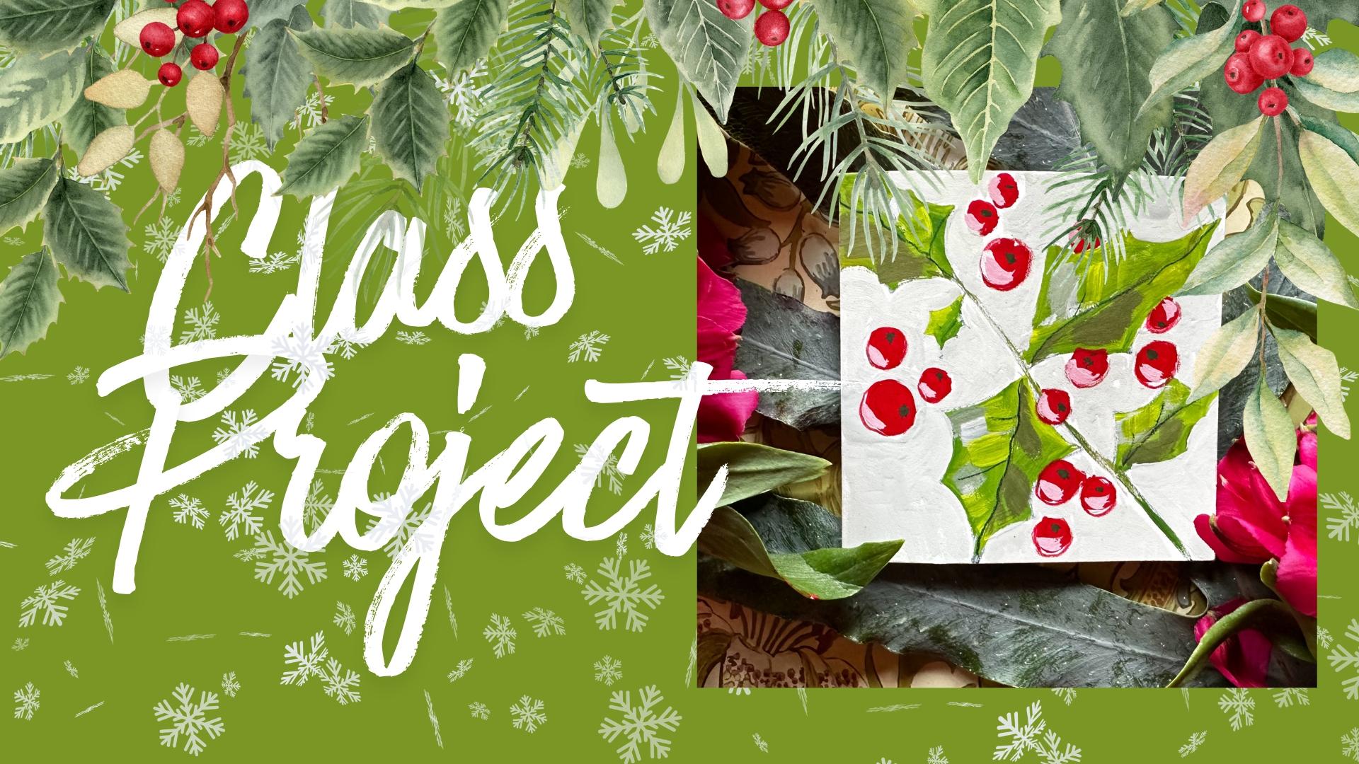
Welcome, everyone! Make your favourite comforting drink, grab a comfortable seat, and let's paint!

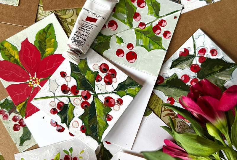
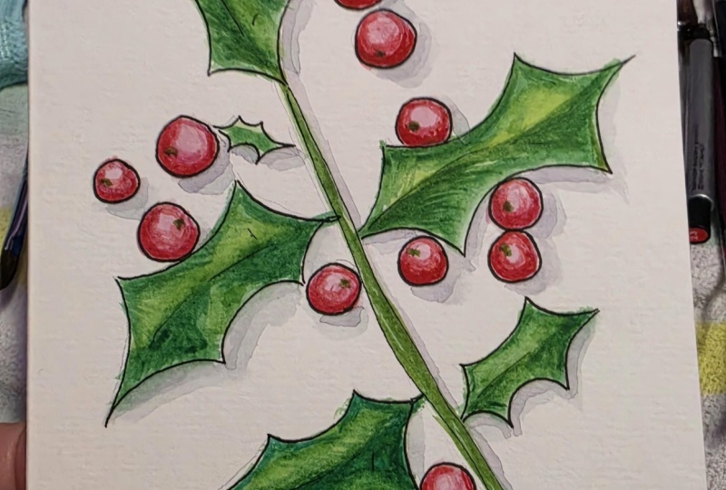
Today, we are going to dive into the festive spirit by painting a classic Holly Christmas card. Whether you are making this for a loved one or keeping it to decorate your own home, there is something incredibly special about a handmade holiday card.

🎨 

  • Skill Level: All levels welcome! No prior painting experience is required. we are going to break this down step-by-step, from from creating Sap Green leaves to adding vibrant, glossy pops of red for the berries.
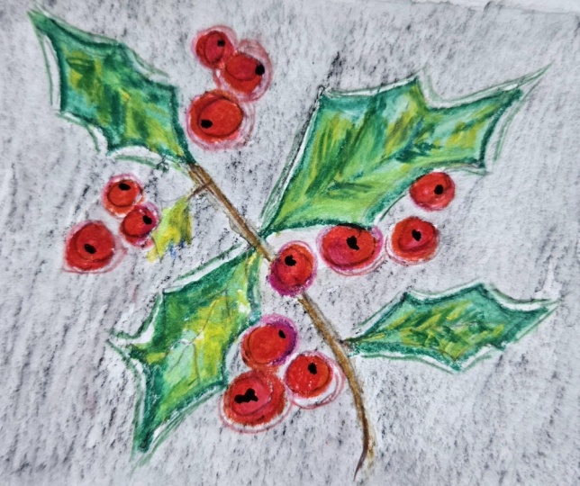
  • Resources: I've attached a pdf and jpeg outline of our Holly study, so that you can jump straight in.
  • Duration: 15 minutes of guided instruction and hands-on painting time.

🎄 What You'll Learn

  • Brushwork Basics: Master the specific strokes needed to create sketchy, loose Holly leaves and vibrant berries
  • Colour Mixing: Learn how to blend rich holiday greens, deep crimsons and accent colours. We're mixing mix partially on the brush so that we avoid flat, rigidly blended colours.
  • Creating an easy 3D effect by adding shadow and light to our leaves & berries
  • Composition & Layout: Discover how to balance your design on card stock, for a slightly quirky textural interpretation of Holly.

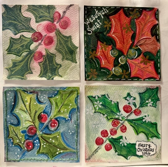
 👩‍🎨  Don't forget, if you wish, you can share your project in our Projects & Resources area! Skillshare has a lovely thriving community where students support each other, and share tips. So, don't be afraid to share. And of course, I'm at hand should you have any questions 😊

So... take a deep breath, let go of any pre-holiday stress, and let's do this!
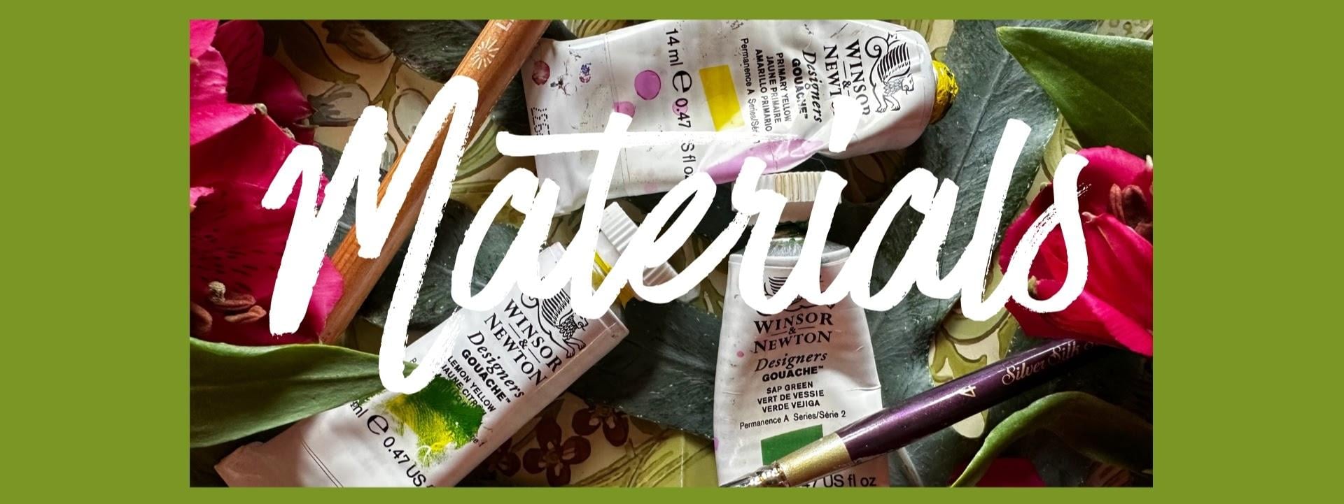
Blank cards (I used 3inch by 3 inch cards) or your favourite art paper. Blank Cards

Sap Green (I used Winsor & Newton throughout)

Spectrum Red

Primary Yellow Deep

Black

White

Size 4 flat brush

Size 0 detail brush

Green pencil (I used Caran D'ache Dark Sap Green)

Red Pencil (I used Caran D'ache Permanent Red, )

Meet Your Teacher
Teacher Profile Image

Holly Tomas Art

Watercolour | Gouache | Mixed Media | Scotland

Teacher

Hello, I'm Holly :O) I am so happy to have you here!

I'm a Skillshare Teacher, recently selected for the Skillshare Rising Teacher's Programme. I paint flowers and leaves for the most part, particularly wildflowers, as I am surrounded by so much inspiration, living, as I do, in rural Scotland.

I love exploring new techniques, and I'm very keen on finding brush strokes and media which make painting just that little bit less challenging for us, whilst gently broadening our knowledge.... I always say 'easy but effective' is the way forward! My classes are mostly watercolour and gouache, but I also delve into mixed media & leaf printing.

I have a humble little mission statement :0) .... 3 facets which are really important to me, when I am considering cla... See full profile

Level: Beginner

Class Ratings

Expectations Met?
    Exceeded!
  • 0%
  • Yes
  • 0%
  • Somewhat
  • 0%
  • Not really
  • 0%

Why Join Skillshare?

Take award-winning Skillshare Original Classes

Each class has short lessons, hands-on projects

Your membership supports Skillshare teachers

Learn From Anywhere

Take classes on the go with the Skillshare app. Stream or download to watch on the plane, the subway, or wherever you learn best.

Transcripts

1. Welcome!: Welcome to this winter holiday Christmas card series. Make your favorite comforting drink, grab a comfortable seat, and let's paint. Today, we're going to dive into the festive spirit by painting a classic holly design. Whether you're making this for a loved one or keeping it to decorate your own home, there's something incredibly special about a handmade holiday card. We're going to break this down step by step from creating sap green leaves to adding vibrant glossy pops of red for the berries. I've attached a PDF and jpeg outline for our holly study so that you can jump straight in. This is purposefully a short form class so that you can fit this around your busy schedule or health needs. If you'd like to share your project, you can head over to our projects and resources area, and on the right, you'll see submit project. Subtitles are available under each lesson, and there's also a full transcript of the class. So take a deep breath, let go of any pre holiday stress, and let's do this. 2. Sketching Out & Painting Our Leaves : So I'm going to start by getting my blank card out. Or you could use your favorite watercolor paper and cut it down to size and use it as a card topper. So let's put some sap green spectrum red and white down. And I've just got Karen dash, deep sap pencil here. It's the luminous range. Any pencil will be fine. And I'm following a design here that I did myself the other day. I quite like the composition. So let's just roughly sketch out our leaves. And just to remind you, there's a PDF and a JPEG file with the outline to our Holly study. I wanted to do a little random leaf there. And let's place our berries. We can be quite sketchy at this point because a lot of this is going to be covered over because we're going to be painting our background. Maybe a couple poking out from behind a leaf. Maybe one up here. Big one there just to end with. And then I'm putting down some primary yellow. And it's quite a cool yellow, and I'm mixing that with the sap green. And I've got my size four flat brush. Just using the edge there for the more detailed areas. Black brush is really handy actually for things like this. It can create really crisp edges. And you can use it on its side like this for more detailed lines, and especially when we get to our background. And it can be really sketchy 'cause I thought it might be quite nice to have a few brush strokes showing. And what we're doing there is mixing partially on the brush. So we've got little hints of yellow and green together, not fully mixed before they hit the page. That just adds to both the texture and the sketchy quality. Bit more yellow. And I'm just moving between those two colors. Keeps it nice and fresh. Let's do our little one here. Almost done. Nice. 3. Holly Berries & Leaf Details: Moving over to our berries, and I'm using Spectrum Red, but you could just choose your favorite red. And I am sticking with my flat brush, but you could go in with a small round brush for this. I'm not being too precious about them because we're going to be doing our background, and we can shape them as we go along. I have a little one there poking out from the leaf. And then our last one here. Already looks really lovely. Let's mix a green. We can mix ultramarine blue, white, and the green that you're using. I'm looking for kind of a neutral green leaning further towards the cool. And then you sing a flat brush, you get these lovely, choppy brush marks, which I really love. And these are minimal strokes. We're keeping with that loose, very fresh, very quick style. Now let's mix a darker green, and the easiest way to do that is to mix it with its complimentary color, which is the red, of course. A flat brush is also really good for making lines. And then we'll just pull out some shading from the center line. Let's mix a nice springy green now, so go back to the mix of primer yellow and sap green. And let's just tap in a little bit of brighter green. I'm not too fussy about the placement. All that we're going to do is just concentrate on having half of the leaf, a little darker green, and the other half lighter. Now, I've gone down to a very small detail brush here to do our little baby leaf. This is a size two Princeton round brush, and I'm going to stick with this brush to do my stem. 4. Painting Our Background: So I'm just going to flip my palette paper over. So we have white, and I'm going to mix the tint with our three primaries. So I have my primary yellow, ultramarine, and spectrum red. A little bit of green because why not? A little bit of everything that you're using in a painting can bring a feeling of cohesion, so it's always a good idea. I'm getting there, you can decide whether you want it to be a warm, creamy color, so you would use more red, a cooler gray color. You would use more ultramarine or you can lean towards the yellow to mix a buttery tint. And then I'm working quickly because I don't want to get too neat with this. I know you have this amazing ability and patience to do really detailed work. I have had to adapt my painting a little bit just because I have quite a lot of pain and stiffness in my fingers. So I tend to work quite quickly, and in this particular card, I wanted to bring a sketchy feel. So kind of like a painterly effect. And again, if you're doing backgrounds, a flat brush like this, a small one is really handy. Adding a background, in this case, takes away that kind of darkness that we would have with just the white showing through. And using this particular tint keeps it very delicate and light filled where tiny specks of the white paper behind show through. I'm in a very happy place just now. I love the winter holidays. And I'm just leaving the stem showing there, so I'm trying to be careful not to go over that. And I have been moving my card around because it is a little bit fiddly. I really love this dove gray. Good job I've got that filmed because I can recreate it. I've gone down to my size two Princeton round brush again, just so I can carve out these berries a little bit more. I think I love doing backgrounds like this so much because there's not a lot of thought. You know what you're doing, you know, where the color is needed, and it's just very relaxing. 5. Finishing Touches: So let's try our painting at this stage. Or you could take a break and come back to it after 10 minutes or so. And I'm using a carindache red pencil here. Again, I don't want this to be perfect, so I quite like the fact that it can go out beyond the edge of the berry. Again, it adds to that sketchy feel. And then let's mix a highlight. I have some Spectrum red and a lot of white. I just want to see. It's a bit of light, I think, so I'm gonna add some more red. Just have a play around until you have a tint that you're happy with. And then, these are just tiny sea curves or even just little dots. It suddenly makes them beautifully three d. You can decide also where you want your buried, whether you want it over a leaf or under. So mixing some black and primy yellow, and that will mix a lovely deep green. That's one of my favorite ways of mixing green. And we're just tapping in these little black dots. And suddenly they have come alive. I love that. Going in again with a dark green pencil, at this stage, it would be so easy to overdo it and do lots of details. But because we want to keep with that fresh sketchy quality, let's just add a few lines here and there. And I'm going to stop there. Thanks so much for sharing your time with me. Look out for our next project, which is going to be Poinsetia Bye for now.