Transcripts
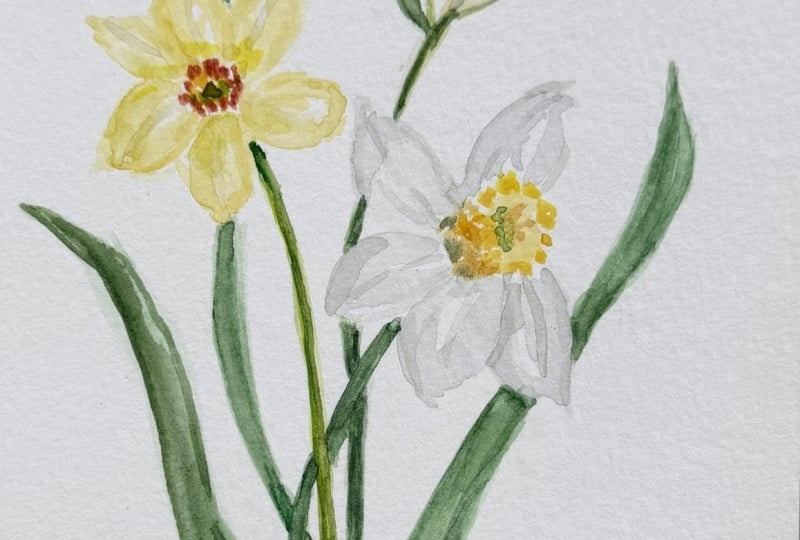
1. Happy Watercolor Daffodils - Intro: Hi and welcome to happy watercolor daffodils by the book with sweet seasons art. I think daffodils are the
most cheerful flower. And I looked through a bunch
of vintage art books to get some inspiration for
our class today. This is a great
class for beginner or intermediate
watercolor painters. And I know we're gonna
have a great time today. Your project will be to paint
your own daffodil bouquet, just like the one we're
going to practice together or switch it up
and paint it your own way. Either way, I'm so excited that you're here
to paint with me today. I can't wait to
see your projects. Let's jump right to supplies
and get started painting.
2. Happy Watercolor Daffodils - Supplies: Really quickly before
we start today, let's just review our supplies. We need a 140 pound cold
press water color paper. That's a 100% cotton
any kind will do. This is a scratch sheet. It's the back of another
one that I'm going to use just for our quick practice. I like to use watercolor block, but you can just use sheets. That's fine too. We need some brushes. These are from the
pigeon letters. I have a big fat
one here is the 16. I have a 62. And that's because we have some small detail
to-do and some big fat leaves will need
water and paper towel. You can see I've already
used this one quite a bit. Obviously we need paints. This is my very messy palette, but I'm gonna show
you the paints that we're going to use today. In our greens,
we'll use a green, gold, a sap green. Probably just those two. We will use some indigo blue. You'll want some indigo. I love the granulation
of that indigo. This is a Davies gray. We'll use some of that
for the white petals. We will also use some lemon yellow and some
Winsor yellow deep. Those will be our yellows
for our petals and centers. I'll also use a little cadmium
orange and burnt orange. That's for that really bold
center of the daffodil. We'll use a little bit for that. I'm pretty sure those are
the only paints will use. I'll put up a paint
supply list as well. So you can see that
in the projects. I thought we'd use
some inspiration. This is a buy the book class. So I have a couple
of books that had some daffodils which I
also did not realize are called narcissists
or there are also narcissist that are very
similar. Sorry for all that. This is a really lovely photo so I can get it so
it doesn't have any shine on it for you. Sorry, with the lighting,
It's a little rough. But I love this photo because it shows the big beautiful leaves, the thick beautiful leaves. It shows very distinctly the centers and then the
shapes of the petals, which are really pretty like to sort of see shapes coming together and
we'll practice those. And this also has
the leaves going up behind and we'll do a
little bit of that as well. It shows a really thick stem. So that's really pretty
inspiration photo I found the one I'm going
to keep next to us today from this book called
treasures of botanical art. This is by the folks at the Q, the royal cubic
technical gardens. I love this book has
a lot of lovely, really lovely florals in it, but this is the one
that caught my eye. I'm gonna set it off
to the side here so we can look at it
while we paint. I liked this, a photo of this drawing
specifically because it shows both the white petals with a yellow center and then the yellow petals
with the orange center. And it even shows sort
of a budding flower. And again, it shows the pretty different
tones of the stems. You can see there's a lot of
blue in that center stem. And then some green, gold and lighter greens and
the other ones. So those are our supplies. I'll keep our inspiration
right here next to us. So you didn't have to
go searching for one. And we'll get
started on painting a lovely little
daffodil bouquet.
3. Happy Watercolor Daffodils - Practice: I wanted to start with
a super quick practice. We will really be jumping
almost straight into painting. But I did want to
take the back of this sheet and practice
just two things. One is the centers when we
do the centers and again, more loosely interpreting this, we are going to be doing Ziggy zigzaggy lines,
if that makes sense. I wanted to practice
just getting a bit of pigment on the
end of your brush, a decent amount of water and really just practice
these centers. We're going to keep
it really loose. That's kind of what it would
look like on this one. If we had something like this, then we might fill it in fill it in with yellow or something once it was a little
drier, I guess. If we have one that's
straight on or we have one that's at an angle. Let's see him do an orange. We'll do it like this. Then. Maybe you're going to see
the side the barrel of it. I guess maybe I don't
know what it's called. Then the other thing
I wanted to practice was just doing a few petals. I like a mix of lemon yellow and Winsor yellow
deep for the petals. They're kind of lemony
but not entirely, so I don't like it
to be totally lemon. I feel like that can get
very fluorescent almost. I wanted to practice
some petals. So on this one for instance, the petals might come off and I'm gonna put
some water on there. Like that. It's sort of like backward
C loops, Forward. See, that's really how
we're going to do them. These aren't overly pointed. Maybe we want to keep them a
little flatter at the end. I like if they touch actually into the the rest of the
flower because this, like I said, is a very
loose interpretation. I was just going to practice. And I like when there's some
white left in the center, because if you can see there, it's not just all filled in and perfectly one solid color. We can even add a little
color to the edges. Or if we want to
down the center. I think the contrast
looks really nice. We can even go in and do a pedal that's mostly water like this. Then go back and
add more detail. For instance, with, with paint. I just wanted to practice the little center
part a little and the petals a little with you to get a sense for
how that would, would look and how we might make the center
of something like that. Remember that you
can always pick up pigment with a dry brush. If you clean your brush off, you can pick pigment up. And then you can add something
different back on these, I'm going to leave a
lot of whitespace to, I feel like that keeps it loose and it keeps it dimensional. And so you see like here
where we have our zigzag top, I've left the barrel not
completely attached. I think that shows you more
of the separation of the two. That's enough practice. And now I want to jump
into doing, I think, maybe a three daffodil bouquet. Let's go and do that.
4. Happy Watercolor Daffodils - Flowers: All right, So I think on this
we will do three flowers. It's just a nice way to do it. I think maybe we'll start with our lemony yellow one up here. And I'd like to do the
very bright center first. Then we'll do the petals once
that's a little bit dry. So it's just a zigzag. It's easier to add
than to take away. So I like to just go in
and touch really lightly. That's very, very light and I think I'm just gonna leave
that for one minute. I want to add yellow in
the center and I want to attach all of our
beautiful paddles, but right now it will
just bleed away. If we do that, let's go over
here and start this one. And I think we can do it, do it like that. I really loved the yellow ones, but let's try one
that white as well. I'm going to do
pretty lemony yellow. Let's go ahead and do the
zigzags of this one. Like that. I think that works. Now on this one, you see somewhat of the
barrel coming back. So we might, we might add
in a little bit of that. I'm going to use a little
winter yellow deep just to make it a little bit
of a different tone. We don't see a lot of it. We see a little sort
of coming back. Again. This is a loose interpretation. We're not trying to make it. This is beautiful botanical art, but it's very accurate and
we're not going to be that accurate because we're
doing loose florals. I'm going to pick up, you see some of that
green is hanging out there to pick up a
little green gold, water it down a lot. And I'm just going to
touch right along here. Then we start our petals. We're going to pick
some of that up. This one is still drying,
so I'm gonna start the petals on this one
before we finish the center. Let's say lots of water
on your brush to start, we can always add more paint, but it's harder to pick it up once it's down on the paper. So get your gray, your Davies gray and
water it down a lot. Then we're just going to take some petals off the
backside of this. You don't think I'm going to
bring them out of the front, but well, let's just
see how it goes. I'm going to take one
and bring it off here. See that already has
a lot of pigment. So see how I'm
just going to move a C-shape and a C-shape. This petal comes off
a little forward, so I might bring it out
a little like this. Just so it curls around. That makes sense. And then I'm going
to bring it down and touch it to the green because I want those bleeds,
I want that. Look. Let's do our next one. Let's go off the back a little here with our C shapes again, if you get a lot of
pigment like that, just get your brush
with a lot of water and come back in
with a lot of water. Wanted to just bring it
down here into the greens. I'm touch it with
little green gold because I like how that looks. The petals there. I think that's pretty,
these are gonna be very hard to see without
much pigment in them. So let's see how
that had some gray at the tip where the
petal was folded. I'm gonna go ahead and add that. All right, let's
do another petal. Again, lots of water, not too much pigment. It's bring it out. Just gonna
do light strokes like this. Keep it very loose. Let's get a little more
green and bring that in. I love that. Maybe touch it with
the little gray at the edge and bring
it down just two. You can see there. If you look at this
quite a bit of gray to make a white paddle, we all know that's white, but there's quite a
bit of gray to it. Let's keep moving around our flower and we'll see
this one, this coming down. And it's a little bit
tucked behind so we could bring it like that. Then fill in with
some water here. We can go back and add some
dimension to these as we go. I'm going to attach
this again with the green and see those
bleeds are coming. I really loved those. And we'll make sure
you guys can see this. Let me try to put this at
a little bit of an angle. I'd like to do maybe
one more petal here. I'm going to bring
one more petal off the front here like this. Like this petal. He's gonna come out like this. This petal is behind this one, so we can make that edge darker. And then this petal is going
to be behind this one. We can lighten this edge
and darken that one. Now we'll have to come
in and do a little clean up here with our center. But honestly,
that's kind of fun. Ladder stem back here and that
one will be kind of neat. This makes it a little wonky, but I love it. What I want to do in
this tool right now is clean up this area a little bit. It's a little more yellow. Make that a little bolder. Then I also want to go in here, add a little more
yellow to the inside. That's coming out like that. That's pretty. Then I'm going to go
ahead and put some of the green in the center. This is going to be
mostly green gold. I am going to darken
it slightly with sap green because I want
there to be dimension. I want it to look
like it's the inside. Might even put just a tinge, just a tinge of the Indigo. A little goes a very long
way with the indigo. You've got to be a little
careful with that, but let's go ahead
and dash that in. See how it's right up
against that ruffle. Hospital call them ruffles. I don't want to blend
it in that way, but I want to bring
it out this way. I think that looks pretty yeah. I think that looks pretty good. Again, it's pretty loose. Bring the barrel out
a little on the sides here where it would come out
and flare out like this. Little darker, give it
a little more contrast. There we go. We'll add
his stem in a minute. Let's go back to
our first daffodil. On this daffodil,
and you can see the center has a lot of
lovely yellow in it. I do want to bring this in a little bit to the
center as well. Probably go in and put a little of the green in there too. At some point, you'll see I'm blending it a little
bit with water with the edge of our orange ruffle just because
I want there to be sort of a gradient. I'm kinda pulling
down from that. Let's start off on this side and they'll really be the
same shape as these. And we can leave the whitespace
like we did on these. But these will be a
lemony yellow with a little bit of Winsor yellow D, which is a modem just
like we practiced. Leaving some white space. The edge isn't exactly pointed like we might
do with a leaf. Let's do another one. Let's do this one coming
out this way a little. I think that looks pretty great. I'm going to do one over here. I'm gonna start off
mostly with, with water. Then we're going to
add in the pigment. Remember that the paint will
go only where the water is. So wherever you put water down, That's where when you
touch it, it will flow. For this C right there
I touched a dry spot, but there it's wet. I want to keep a lot of
dimension in these flowers. They don't want them
all to be this sort of plain, flat yellow. When you do a wet on wet
technique like that, you get a little more
dimension in the petal. I see it's lighter in the
middle and darker at the edges. The other way to do that
is get a dry, clean brush. You can pick pigment up, see that out of the center. You can pick pigment up. Or you could go back in and get a little paint
and touch your edges. The center like this, which I think is
really always nice. It gives the impression that
the center is sunken in, like a flower would be. A couple of different
ways to do. The petals. Will do one over here. Maybe this one is a little
bit behind the other one. So it comes out like this. All right, I'm going to try
to squeeze in two more. You can basically see about
six petals on that flower. So I'm going to try to
stick with that generally. I'm going to go in
wet on wet over here and we're gonna get very
close to our other flower, but that's totally fine. These are very close
together here as well. It makes for a nice composition. Now I'm just adding a little
pigment along the inside. Just to keep everything
a little interesting. What do you think? I like the shape? The darker pigment
here and along here. Maybe the last thing we'll do
is one up here that's sort of maybe a little bit
of a hybrid of the two. We'll do a little bit of a bud. Then we're going to
start adding in stems and more centered
detail as we go. If you look at this bed, it's gonna be a lot
of gray water down. We'll do at kind of an angle. It's kind of a wide pedal. Goes to a rounded top. If you look at, has
a pretty good vein in the center of
the gray going up. And it also comes
down into some green. Add a little bit of the green there because that'll
be at the stem. Then there are some
other petals going off a little on the side here. Almost to look like really. I'm just looking so we have our big large petal then
we have one to the side. You can even fan
it out a little. Then let's get a little
that green gold. We're all this kind
of goes down in to a stem curve like that
and it'll be like that, it'll hide down behind that. Also a good bit of
yellow on that, but I am going to
bring that yellow up along the side of this
one, curve it around. There's a little
at the base here. I think this is really more of just that lemony yellow that we can darken a little bit with some of the
Winsor yellow deep. Maybe like that. Again, just sort of a loose interpretation of
what that looks like. Again, there's a good
bit of gray in it, so we do need to make sure
it has some dimension to it. We can't be afraid to put a little bit of
pigment in there. Otherwise, it just really
disappears right onto our page. Now I look at this and I
looked at all the dimension on these petals and I think
these came a little flat. I also want to go in here with
a little bit of the gray. And I want to add
in a little bit of shadowing right here on this petal because it's
tucked behind that one. I think the add some
dimension to it. Let's see. Maybe also on this side
of that petal because it's tucked behind this one. To not be afraid to
give it that shadow. So now you can see how nicely it looks like this
is tucked behind. Then really lightly
with maybe a two is to get a little wet gray. And let's just really
gently add some sketchy. See the lines. Just some sketchy. We don't need a lot. Just a few lines here. Maybe along the edge. If it's too much, you can
gently brush over it, but I feel like that add
something nice to the daffodil, needs a little bit. You see this one with
the shading in here, has the shading up here. We'll soften that. But then we can add just
a few lines going up. And that was a little
aggressive hormone. Take that back with some water.
That's the beauty of it. You can always do that. Take some of those lines up. Along the edge of the petal, fills out the shape a little. I'm going to go around and
do that to these petals. We can even do a little
bit of dimension over here with a little bit
of the darker yellow. Honestly, if you look at it, it's almost like it's
got a little of the gray in it. When
you look at that. I'm going to take a
pretty light hand on this because I don't want to
take an overwhelming let's quickly add the
center of this one. I'm just going to get
some of that green gold. And then I am going to add the sap green into
it with again, a little bit of the
indigo to darken it. Let's just go in and add that right along the
back side of this. I'm just gonna give
it a little texture. Now let's jump to
the next section and get some stems on these flowers.
5. Happy Watercolor Daffodils - Stems + Leaves: All right, So now
it's time to put stems on these and
I'm gonna start with a stem for this one
because I think it's gonna be the stem
that's in the front. You can't see where
it attaches to the back of the flower, but we can sketch it. I have a six here,
sketch it lightly. The inside going down. See this one has
a lot of indigo. I'm making one dark thin line. The reason I'm doing that is because you can
always make it fatter, but it's harder to
skinny up a stem. Once it's Giant. Then I'm gonna go and get
just water on my brush. I'm gonna come down
the back side. Too much water. It takes them off. I'm
just going to come down the back side of the stem and touch the back part of the color to create
somewhat of a gradient. Now that can be hard to see. But this stem you can see it's darker on the edges and
it's lighter in the center. And so you don't want it to
be perfectly all one shade. I'd like to darken one side
of my stem and paint it in and then come back and do
water down the other side. Then if you come back on this inside part with
a little more color, you're going to
get a great bleed and a really cool
look to your stem. I think it doesn't have to be perfectly
smooth and straight. Now where it meets the flower, it would be darker
because it's shaded. It's behind this petal. So that's gonna be darker. That's a lovely, to
me, a lovely stem. It needs more though. We need some leaves and then
we're gonna come in and do this stem behind
and this stem behind. But if we take care of this guy first and we're going to do some nice big fat
leaves and they're going to have a
good bit of indigo. Yes, some of the green goal, but also a good bit of indigo. When we do these leaves, I'm gonna do the first
one pretty well as well. This is the motion. It's touch lightly, push down and curve
and let up at the end. I'll show you what
I'm talking about. Let me put it here. That's where this guy's
going. Just a bit. I want it pretty wet so that
it flows across the page. It doesn't always work, but
let's try a little dab. Then we push down. I'm not, I'm not, I'm
gonna have water here. Come push down. We have our big, big brush, and then
we're going to let up. Now we've come to the petal. So I got to stop because what I want to do is then continue
it up and let up at the end. Alright, so not perfect,
but that's okay. Here's what we're gonna do. We're gonna get our six and
some dark, darker pigment. We're going to put some
dark pigment here and dark pigment here and
maybe along the back side. And we're going to bring
this baby right through as if it had come right
up the other side. So see how it's got all
this movement to it. Because we twisted and
turned as we came through. I really like that
and then we make this dark because it's
behind this petal. Let's take a look and
see what do we think. Dark down here and a
little up at this curve. I liked that leaf. Let's do another one. That's a little bit
even darker than that. Going back this
way, up this way. Even amount a little bit. It Let's make sure
I've got enough water hopefully this time. Again, trying to drag your
hand through your wet leaf. I should've done this one. This 1 first but more
at an upward angle. Touch it down here. Down push nope, didn't
get it wet enough. And finish. Let me try that again. Down. Push, finish. Okay, so fun. That worked a little better. I'm going to add a
little more green gold. I feel like he's
getting really flat. So I'm going to fill in a
lot of this in where I had. And try brush, especially here. Then up. Let's darken, darken. Here. We may go in and add some more texture and more
color to that as we go. This is still wet so
we can still darken. So they would come
in at the base. We do want to just make him a
little lighter right there. Then this curves in and
that curves down, right. So this is a little bit where
the light would hit him. There. That's fun. I think we should go
ahead and put a stem for this guy coming down as well. Again, let's sketch it in. Basically, I think the stem
would come right off of this petal and it would go here and down through there. Now technically he's
not part of the stem, but we could this guy, but we could end him there if we wanted to or we could bring
it all the way through. It's whatever we want to do. But now we have an
edge so we can, we can go ahead and
make a little more. We try to think
about how it would flow right through here. Get a little darker where
it meets this stem, it's behind the shadow and then darker where it goes down here. But let's go ahead.
I'm using a two on this because I want
to be pretty precise. Let's go ahead and
add some water. A little water here. Just to make this stem a
little more interesting. Curve all the way in, I guess. I don't know. All right, So this and
this this is our made-up, this is our pass-through. We want that to really show. That's where those two went
behind and this is where it goes into the flour. Going to thicken this
up, down here a little, I think. Smooth it out. I like to kind of
make that precise because I really like
how it looks when it looks like it's going behind. We go. All right, now he
has his stem too, and we have to do a stem
for this guy as well. Don't forget that while
your leaves are wet, you can add shading
and shadow to them. I did not quite mean to
add that much. Indigo. Okay, we got to figure out
where this stems going. I'm gonna get the two again. I'm gonna get a good bit of
green goals and all that. I think the way this is coming, it's kind of a straighter stem. It's coming down. I'm going to sketch
really lightly. It's coming down here. It's kind of a straight stem. Think it's something like that. We can do the same thing. We get some water. We already have somewhat
of a stem going on there. Get some water and just pull
out a little of that color. Try not to get it on
the petals themselves. Then we'll do the same trick. Where we put a little more dark, dark here behind and it's dark where it goes
down into the base. Si it's hitting this cool dark. They're getting a little see if I can pick up a
little of that pigment. Got to drop, just wipe it away. I'm going to take it like that. Then sometimes it helps
us to step back and look at it from a distance
for a minute to see. Does that look good?
Does that look right? I think for now we'll leave it. I still feel like we need
another leaf in here. It's gonna be really
tricky now to place it because we have our
stems and our flowers. We're going to be
a little careful. We're going to sketch
a leaf up to here. I think it sounds
risky, doesn't it? I think we can do it. All right. We'll take some light pigment. Will figure out that
that leaf came. I got an idea if that leaf
came off of this stem. So this guy, he's got a leaf. If it came off right here. And it went up like this. All right, Well, we've
committed now, haven't we? It's going to come off this
guy touching to this stem. And it's going to go,
and it's gonna go fat, then it's going to go smooth. What we have is it's more
of a side of the leaf, actually kinda like it. I'm
kind of glad we did it. Worth the risk. I'm gonna get a good
bit of indigo because this leaf is now
at the very back, very back of this piece. And attaches here. We want to make that look right. Coming off this guy. Off the back side basically. Then it's gonna come
up here and it's literally coming
right out of the top. Awesome. That's fun. Yeah, I feel like it
balances it out some. But this has gotta
be a lot darker. To get the feeling of how far
behind this flower it is. We really need to darken this. And it needs to go with
the edge of the flower. We may have to come back and
hit this with color a few times just to make
it make it work. What do you guys think? How are we doing? Do we want to touch it anymore? Do we want to leave at do we
want to add any more green? There's a part of me that wants to green this guy up, up here. I don't know. The touching too much disease is a real thing in watercolor. I have it. No, I think we might
be good to go guys. Again, this has to be dark. It's going to feel like maybe
it's too much contrast, but we really want that
yellow flower to pop. Gonna touch up the stem
a little bit here. Alright, and then I'm
going to just make, darken this area up a little to want to make sure we have
the dimension that we want. Yes, this is loose, but it is still trying to show you where things
fall. On the page. We're in the bouquet. You get it on there. Then you feather it out with water because you don't want
your super hard line there. Well, I think we're about done, so let's wrap it up in the next section with
some final thoughts.
6. Happy Watercolor Daffodils - Final Thoughts: Okay guys, I think
we've done it. I think we've finished off
our daffodils for the day. I really hope that you have had fun painting daffodils
with me today. I hope your daffodils are cheerful and brighten
up your day. Please post your projects
to the projects page. I would love to see
them and give feedback. I would love for you to leave a review for my class
if you have time. And I just so appreciate you showing up to
paint with me today. I hope you'll share your
projects on Instagram and tag me so I can store them and
share them with the world. Thanks again, and I
hope you'll paint with me again by the book.
 Sweetseasonsart Cris, Let's think Spring with some happy flowers!