Transcripts
1. Intro: Hello, Skillshare students. Welcome to another urban
sketching project. Now, this is an advanced lesson, which is to say
that you will need basic knowledge or
experience with urban sketching in
order to follow along. So in this lesson, I'm going
to teach you how to sketch this detailed street scene of Hanoi or quarter
using mixed media. More specifically,
using pen, ink, watercolor and acryl markers. This lesson, I will show
you how to frame the scene so that whatever you're drawing can feel
the pitch properly. I will show you how
to create a line art and talk about how you can use your artistic license
to change things up, to add details or
to remove details. Next we paint with watercolor using wet on wet techniques. There will be some
tips on how you can mix colors using a
limited color palette. And finally, we will
add some details using the acrylate markers
just to make the scene look more
lively, more engaging. At the end of the lesson, I hope you will
be able to create a beautiful sketch that you can be satisfied
with and be proud of.
2. Tools Needed: Take a look at the tools
we'll need for this lesson. I'm using 100% cotton
watercolor paper with co press texture. You will need a paper
towel for sobbing, water or for cleaning. You will also need some
tape so that you can tap up the edges so that you
can get sharp edges. And I'm using scotch mat tape. Now, if the tape you're
using is too sticky, you can stick this on your
shirt a few times before you stick it on the paper so that
when you remove the tape, you will not tear the paper. For the watercolor
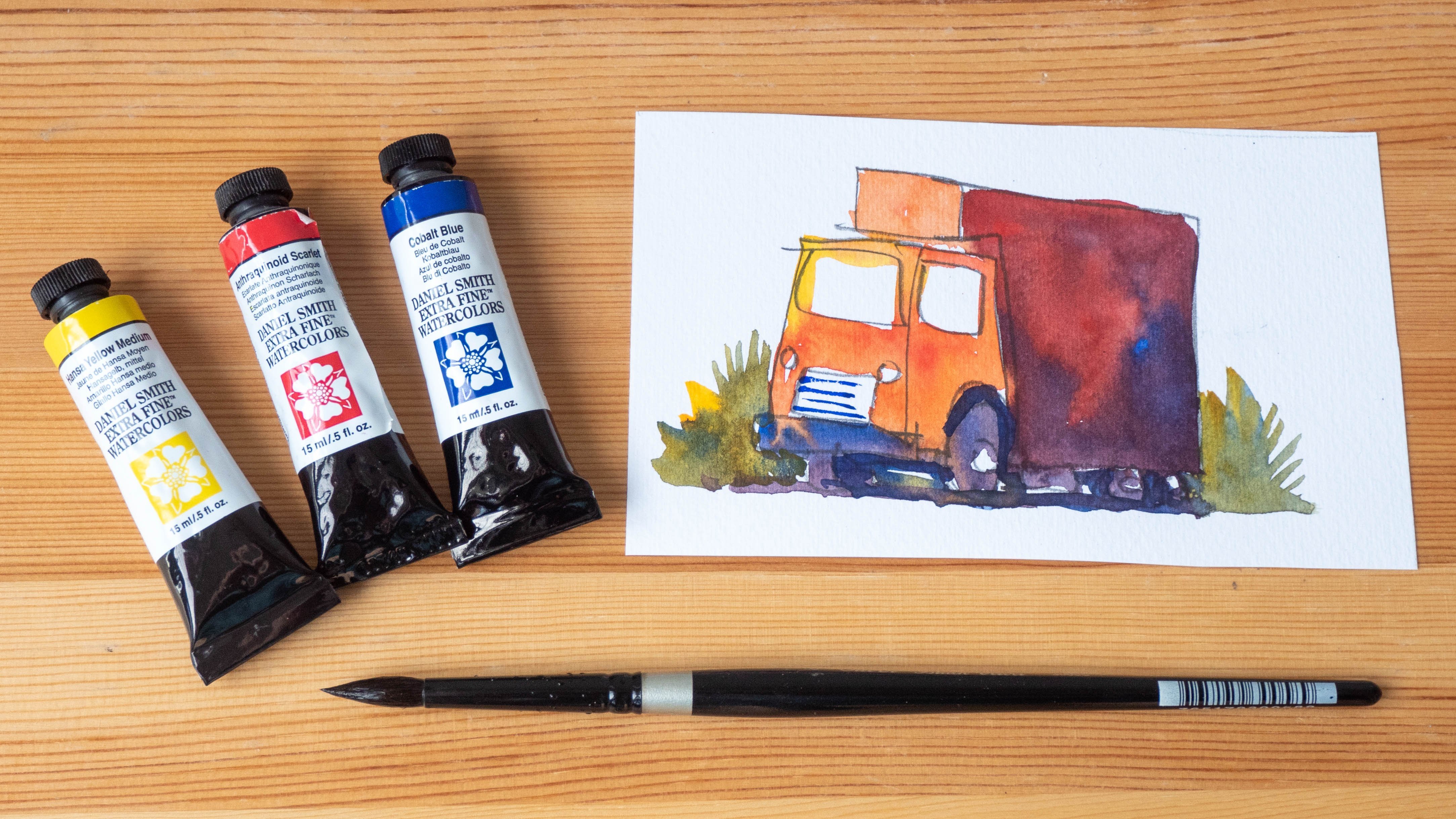
that I'm using, I have a warm and cool version
of the primary colors. So this is cool, yellow, warm yellow, warm red, cool red. Cool blue, warm blue. This is thalo blue. This is ultramarine. I also need yellow ochre, which is a very useful color. A pencil is needed for creating drafting lines and an eraser for erasing the pencil lines. Spray bottle for the watercolor, porcelain mixing palette. For drawing, I'm using this
sailor fountain pen with a Zoom nip that can let me
draw thin and thick lines, and the ink inside the
pen is sketch ink, which is waterproof when dry. For the brushes, I have
a size six sable brush, size eight, synthetic
sable brush. This is for painting
larger areas. This is for painting details. And this mop brush, silver black velvet for painting large areas
for wetting the paper. Posca markers for adding
details on top of watercolor. So these are using opaque inks, and I have the fine tip, and this is the ultra fine tip, which is more useful
for drawing lines.
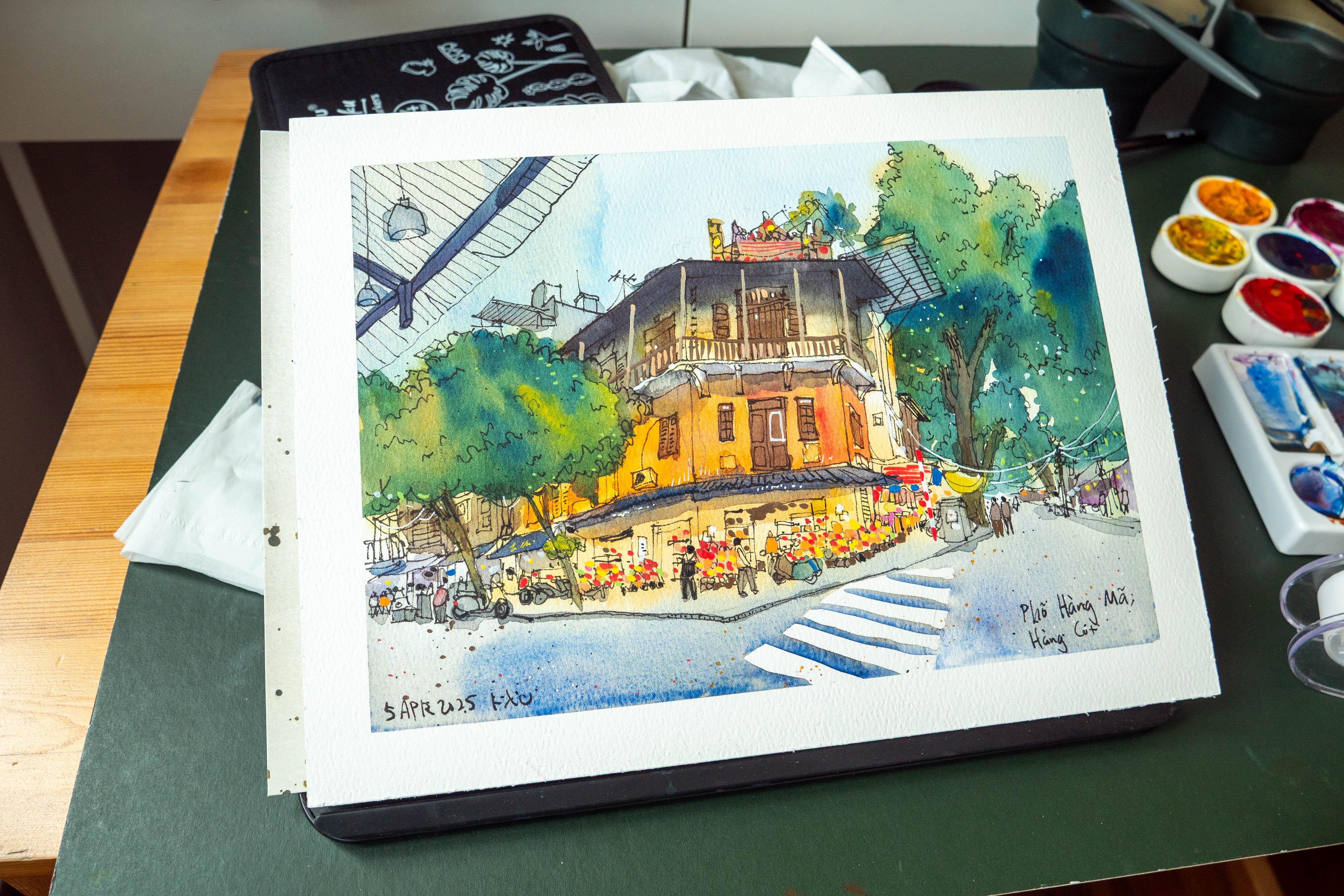
3. Analysing the scene: Take a look at the reference
photo we will be using. So I found this
photo on Pintres. This is one of the intersections
in Old quarter in Hanoi, if I am not wrong, and I've traveled
to Hanoi before, and you can sketch at every cross junction
because all the buildings, they look really interesting. And this particular one
is quite beautiful. I have actually
saved a few photos. Let me just show
you just go back. Yeah. So these are
the different photos of the same building that
I have found on Pintres. So one thing you have to
know if you are drawing from reference photo is other people may also draw from
the reference photo. H, let's have a look at this. Let's zoom in. This photo
is kind of low rest, and I can see some
camera distortion. I'm going to draw a white scene. So this photo is cropped in, so it's difficult for me to see or draw what's
outside of the scene. So that's one difference or challenge when it comes to
drawing from reference photo. You can only work with
the reference material. But if you're
drawing on location, you can look left, look right, and just expand your
scene if necessary. Let me choose a photo
that has a wider scene. And I can see that all
these photos were taken at different periods in time. So the shops on the ground
level, for example, this one, this one is selling, I think Chinese
New Year goodies, and there are a
lot of boxes here, red lanterns, but
this one has a cafe, so I'm not sure which
is the more recent one. Okay, this was taken in 2019. And note that the
place is Hanoi, but they did not write
the actual location. I have went to went ahead on Google Maps to
find the actual building, and let's turn around. And it's actually this building. You can see this
building is yellow. This is the roof there. And, so we can see some of the paint
work that has faded off. So this is actually
the building, but it doesn't look as good
compared to the photo here, which has more texture
and more just life in it. Yeah. Anyway, when it comes
to watercolor painting, you can always use
your artistic license to add more details
or remove details. And in this case,
I may actually add some details or just some
details so that it's not 100% mirror image of the photo. Oh, as I flip over
to Google Maps, I can see that there are
actually overhanging cables. There is one really
big one here. And these are all the
cables going down. I'm just not sure why
it's not shown here. So that cable pole
should be here. So I'm not sure if this is
a new photo or old photo. Anyway, after you sketch, make sure or even
before you sketch, make sure you write the name, remember the name of the place. So sometimes before sketching, I would take a photo of the
street sign just to make sure that I do not forget
to write the name later, or if I forget to
write the name later, I have a photo of the
street name to write. This scene was taken probably during the
evening time, I guess. So we have lights
on the first floor. And we can see the sky,
which is lit, it's blue. It's not cloudy, but there
are no cast shadows. So without cast shadows, it's a bit difficult to paint. But the nice thing
about this scene is you can see the physical form of
the building quite clearly. So without the cast shadows, you can still make up the
physical form quite easily. We have a zebra crossing, a pedestrian crossing here, which I'm going to
leave in white. So I'm going to try and plan
how I'm going to draw later. Some of the lights here will be drawn with opaque markers. This scene is a bit interesting in the sense that there are no overhanging cables, which is weird because in Hanoi, there are actually many
overhanging cables, but not for this
particular street here. I love the trees. We have one tree in front
of the building, one tree behind of the building. We have some details
here, and this is a three floor shop house. We see some perspective. This line here is quite step. This line here is
about 45 degrees. We see the awning here in front. There are a lot of details, so I may want to use
my pencil to mark out the perspective
and composition first, just to make sure I can fit
everything onto the scene. And I can see more trees
in the background, and they become
small and small as they go into the background. We will also need to add some people standing around
so that we can get a sense of how big the building is
compared to the people that are standing in the scene, there is a motorbike here
parked in front of the shop, which is actually quite common. Um, this is probably owned by
the owner because, I mean, I don't think any stranger would want to park a motorbike right in front of the entrance of
another shop just like this. And it seems like this
shop is selling flowers, and this seems like a
pretty modern shop, as in, I can see the
lighting in the shop is, wow, very bright hoops. It's very bright and they
are selling containers, I think, perfumes or
some not perfumes. Something that's related to
flowers. I'm pretty sure. Anyway, the decorations
inside the shop, they look very neat. Everything is very neat and tidy compared to the rest of Hanoi, which is usually
a bit more messy. Yeah, so I like this scene. And I like this little
white frame here. So later I will paint the door here in brown and draw the white frame
with opaque mangers. Okay, so let's get started.
4. Creating a draft: Going to have the building here taking up this much space. So let me just maybe put
a few quick lines down. So this angle is much steeper. I am not going to draw too hot with the pencil because
I'm going to erase it. So this is a three
story building. Now, as we are on the
ground level looking up, we will be able to
see the underside of the roof here just a bit. This pathway is angled slightly, and we need to
divide the building into three sections
one, two, three. We have the awning in front, and I'm going to
place that here. We have the walking pathway, the door to the shop. We have let's see. This is almost horizontal, but the line here is
tilting down slightly. And this is actually
going to tilt up like this because
of perspective. We have a tree here. Let's just draw the
boundary of the tree. So if I'm drawing on location, I may not want to have hoops. I realized that maybe I should have drawn
this a bit bigger. Definitely should have
drawn this a bit bigger so that I can fill up
more of the space. So let me just increase
the height here slightly, but make sure to
leave some space for the thing at the top. So if you increase the height, you have to divide the
sections, again, hoops. So this would be okay, this will come down like this. Okay, this is a bit messy. By the way, I'm using coal
pressed watercolor paper. Because this scene, it seems like deserves a
bit more texture. Yeah, I need to make
this a bit wider. Oops. Yeah. If I'm brought my location
for complicated scenes, I will, in this case, this is quite challenging,
so I am very likely to use pencil first just to
mark up the composition. But if I do not have the time, then yeah, maybe I will
go straight with ink. We can see the balcony of
what's this third floor, underside of the balcony, we should be able to see the underside of
the ceiling here, but it's too dark, so we can't actually see that. We have a ceiling
coming out here another extension
that comes out here. Okay. The building seems to
end here below the extension. We have a big tree behind, and I can make the tree even bigger going outside
of the frame. Just just to have
something that, you know, go outside of the frame to suggest
that it's bigger. Okay, this side here is
a bit more challenging. This angle is not as steep
as I thought it would be. We have a tree here. Remember this line, it's tilted because the
perspective is going this way and we have
another tree here. We have some people standing
here, more trees here. Should I place this? No? Let's put the
walking pathway here and we have some
zebra crossings here. One of the zebra stripes
will be will start here, so it will be one, two, three, four, like that. Make sure you get the
You know what you can actually draw the
perspective line for the zebra crossing. See how it see how it becomes smaller as it
goes to the distance. Okay, here the line. I think it looks okay. Yeah. Later, I'm not sure
whether I will want to erase the pencil lines. I probably may because it
looks quite messy right now. Once you apply watercolor
over the pencil lines, you will not be able to
erase the pencil lines. So that's something you
have to take note of. But sometimes after you paint watercolor on top
of the pencils, you won't even see
the pencils anymore. Okay, here. For the left side of the scene, I probably will have to, you know, use my
artistic license to add some shops there. As I mentioned earlier,
this is not going to be 100% mirror image of the scene. I mean, add some shops here or there or
remove some people. Okay, we have a nice sky here.
5. Inking (part 1): While sketching, I
will try to avoid drawing things that will be drawn with opaque
markers later, such as the beams on
the third floor and the frames or the
handles for the balcony. Okay, so let's maybe
start here at the top. I need to measure the angle to make sure the angle is correct. I'm using a sailor
fountain pen with Zoom nip The angle of this
roof is not horizontal, it's actually tilted
slightly down like this. Wow, I have to zoom
into the photo. Otherwise I can't see. Comes out slightly here, comes
down like this. We have some details at the top. So I'm using press paper, copres watercolor paper, and I am not sketching
inside a sketchbook. It will be faster for me
to sketch inside a scheduo because the scheduo is
going to be smaller. This paper is nine by
12 ", if I'm not wrong. I actually have the intention to sell some of my, you know, sketches just to get some money to pay for the
mortgage of my new place. And if I sketch inside a sketchbook, I won't
be able to do so. I just have some random squiggly sketches
here at the top, just to suggest the details. Not draw the details,
suggest the details. It's a bit difficult
to see what's happening here actually. Let me just zoom in
and have a look. Yeah, there are actually a few. I think there's a wire
frame behind like this. Yeah. Now, the nice thing
about this pen is I can draw with thin lines, and there are some
plants over there. Next, let's draw the
second floor, the balcony. While drawing, make sure
these are three equal parts. So I've actually drawn
the balcony too high, so let me just move
this down slightly. This will be the top
of the balcony and then the second level
of the balcony. Make sure it aligns
to the top here. Always use alignment
when you're drawing. And it's actually
quite difficult for me to draw this because the camera is like just
right in front of me. Okay, so later we will draw the structure that is holding that is supporting the balcony. Let's draw this down slightly, and we have the trees here. The leaves, I like the trees because when the trees
block the building behind, you don't have to
draw the details for the buildings behind. So let's just draw
the trees first. I'm going to have
a little details. You see, if I draw the tree
like this with big curves, it's not going to look right, so you have to draw
the little details. Yeah. Because the trees are made up of little
details like the leaves, so you have to draw
the leaves small. Yeah, we kind of have
big curves like this. It's going to look a bit weird. That's something I figure out. Well, I'll figure out with urban sketching because I realized after a while that, why do my trees look weird? Because they look too stylize. This is just too stylize. I'm gonna have the branch here. Sorry, the tree trunk here. I'll try not to have the
tree trunk vertical, have it tilted so that you
can see some character. If it's too vertical, it's
going to be too well stiff. Okay, we can have some
leaves here as well. Okay, This is nice. Let's maybe draw a line here. This will go down and we
have the awning here. The awning is
actually quite thin. Yeah, so when you're
drawing this line, make sure it aligns to the top. So this point here,
it does not go all the way to the end here. It does not go all the way here. It stops here because this
is where the wall will turn. So we have this. This is where the
wall will turn. And we have, let's
see, the awning here, which will go to the
right side like this, and it will end here
directly below here. And since we are not exactly following the reference photo, you can make slight
changes here and there. It doesn't hops.
See this line here, it should be straight, but
it's not mistake there. So what was I saying? Yeah. So since we are not really following the
reference photo exactly, you can make some
adjustments to, like, how your trees look. You can make adjustments
to the details. But generally speaking, the main shape of the building should
still be recognizable. People are not going to care
whether or not there is an extra motorbike park
here or what shop is there, but the main building should
still be recognizable. Let me just place one line here for the shelter of
this building at the top. It really helps to not think too much
when you are drawing. That way, when you're
drawing, for example, a line, you're just
drawing the line. You're not drawing a building. So after you draw several lines, the building will
appear by itself. If you think that you
are drawing a building, then your brain may tell you that a building should look like should
look a certain way, and that's going to interfere
with how you are drawing. Yeah, so when you're drawing, just try and just focus
on drawing what you see, not what you think you see or not draw from home or memory. Okay, we have let's you know, I was actually thinking of
zooming in with my finger, but this is paper. Okay, so we have one, two, three, and four. We have, let's draw the
bottom of the balcony here. And we have this little support. Well, here. Okay. I think it
looks all right. We have a little
support here as well. Now, to help you divide
the sections equally, you can use pencil mark out the four equidistance if
they are equidistance. In this case, I'm going to
mark out the bottom here, one, one, two, three, and four. This will help me draw
the support oops, mistake there,
support more easily. Yeah, there is a mistake there. Okay. If I'm drawing on location, I will definitely be a lot looser and your art will
show your sketch will show. But I'm drawing from
reference photo at home. I don't I find that my
sketches look a bit more stiffer when
I draw at home. Okay. We have a window here. I'm just trying to
minimize the details, adding some little
details here like the air conditioning unit.
6. Inking (part 2): You're drawing windows,
try to, you know, align the windows and the doors relative to the
shape that the window is in so that you can draw the window at the
correct size and also make sure you align the
top of the windows correctly and align the pillars correctly from top to down. And if there are
windows at the top, make sure they align properly. So this is a small
relatively speaking window compared to the bigger
window at the top. Okay, we have this. Now, if you're drawing on
a small piece of paper, you may not be able to have or you may not be able
to include all the details. So if you feel like you're not sure whether to
include the details, you can actually
just leave them out. Okay. This is the top part where
it's kind of difficult to see because everything
here at the top is going to be in black. It's too dark. Let's draw
the side balcony here. And we have the
support structure. And we can see a roof sorry, not a roof, a window here. Make sure the angle of the
window is angled properly. The top of the window
will be steeper. The bottom of the
window will not be as steep because of perspective. Sometimes the difference
between angles is very minimal.
It's very subtle. Now, if you manage to find the vanishing
point before you start, you can actually just
draw the angles to the vanishing point
and that will actually help you a
lot with accuracy. So here I'm actually just
drawing from observation. Okay, so I think the main
structure is almost done. There is this. Okay. Yeah. So I don't have to follow exactly the reference photo. So this actually
gives me a lot of leeway to make some adjustments. And since you guys
have not even seen this building in real life, or even if you have
seen this building in real life, but the thing is, as you've seen earlier, um, buildings can change. The exterior can change, the shops can change, the decoration can change, the paint work can change.
Everything can change. So even if you
mess up something, it doesn't really matter. Okay. We have a tree, let's draw a big,
big shelter here. Yeah, depending on which
pen you are using. Okay, this line is
actually quite step. It's steeper than
the pencil line that I was using earlier. Depending on which
pen you are using, you may be able to apply more pressure to
get thicker lines. If you need the thicker
lines, for example, I may need thicker
lines for the frame, the metal frame beneath. And we have, Wow, this is difficult
because I cannot see clearly how this structure
is looking like. Okay, I think this
looks all right. We have a tree here. I'm using a lot of ink, which is to say that later, I have to make
sure the ink dries properly before I erase. Sometimes I like to place
dots by the side of the tree. The dots can
represent the leaves, the small leaves or they
can represent insects. In which case, they
suggest activity. Yeah. Sometimes I may join
the lines together. Sometimes I may
have broken lines. It really depends on your style. And you don't have
to follow my style. You can just draw however
you decide to draw. We have sorry, a branch here, and we have another branch here. So I'm trying to draw the tree trunk or the branch relative to
this structure here. So when you're drawing,
always try to, you know, draw things that are relative to things that have
already been drawn. That is how you can draw create a sketch with
the correct proportion. So always be comparing
when you are drawing. This line is going to
overlap the branch behind so that you can get
this overlapping effect. This will go to the side
slightly, come up slightly. I don't have to follow the
follow the exact photo. It seems like there is a
bit more extension here. There's a roof that
comes out here. If you cannot see the
roof that comes out here, it doesn't matter because
this is actually part of the I'll consider this to be part of the
background already. So if the details
are wrong here, it doesn't matter as much. The most important thing is
the shape of the building. It has to be recognizable. A sketch like this is
probably going to take me 2 hours to
sketch on location. Yeah. If I'm sketching in an A
five size sketchbook, yeah. So it'll be about 1.5
hours to 2 hours. This is actually quite
a detailed sketch. Okay, we have the trees here. Is there a flag
there? I'm not sure. Anyway, I can use
the opaque marker to add the flag there if
there is a flag there. But the street seems
to be quite quiet. I don't see many
moving vehicles, but if you are in Hanoi,
you will know that the streets there are
always very noisy. There are always motorbikes
zooming in and out. So if you're drawing by
the side of the street, be careful of your safety and also be careful of
snatch thieves. Not that I have personally
encountered any, but, uh, just be careful or be
careful of pick pockets. So try to keep your
belongings in your bag. Zipped up. Actually, even if your belongings
are zipped up, some of the pickpockets
would just, like, unzip. Yeah. I have friends who
were pickpocket before. I think I lost a kindle once, like a kindle in my in my
back. Sad to say that. I was sketching in Barcelona. So I was oops this line, as you can
see, it's not straight. I was sketching in Barcelona. I have the kindle in my back,
which is on the ground. And there is this kid who I was seated on a
chair, a public bench, if I remember correctly, or
was it my own portable chair. Anyway, the kid sneaked up from the back and open the zip. Yeah, probably opened the zip and then took out the kindle, which is an inexpensive tablet
at the time, thankfully. Um, yeah, so I lost
the kindle while sketching because
of pick pockets. Okay. Here, I actually
feel like swimming in, but well, I can't. So I'm just going to be a bit more careful
when drawing people. Yeah. So when drawing people, just, you know,
just draw slowly. If people are walking, try to remember their walking
posture or, you know, just draw people who are just standing there draw
stationery people, as long as you have
some people in the scene, that's good enough. So this shop here at the bottom is actually
selling flowers. We have a door here, line the dog to the bottom of the window, centralize the door. Otherwise, it's
going to look weird. So this is a door, which means people are
going to walk out, so do not block the entrance
of the door with things. Uh, so at this stage, believe it or not, the
sketch is almost complete. We have a person seated here. Yeah, we have another door here. I try to draw the top of the door with
the correct perspective. We have remember the metal
frames for the shelves. I can see a little
bit of the interior. Maybe I'll draw that as well. There are some flowers or
actually many flowers. Okay, this part is the
part where it's kind of difficult to sketch because
of all the little details.
7. Inking (part 3): There are actually several
motorbikes parked here. People in Hanoi like to
park their motorbikes, you know, just by the pavement. So let's draw a few motorbikes. Oh, these are
difficult to sketch because the details from the
photos are kind of small, so it's difficult for me to
see the details properly. Yeah. So I may have to use my artistic license to design
some of the motorbikes. Oh, make sure the ink is dry before you have your
hand over the ink. Otherwise, it's going
to smudge the ink. We have a person here. We have a bike that is on the
road behind the pavement. When drawing motorbikes,
it really helps to just draw the lines
that you see. As I mentioned
earlier, do not think about don't think of
drawing a motorbike. Just draw the lines
that you see. Yeah, place the
lines where you see. There is this person
that is walking to the left side of the scene, which means he's walking
out of the scene. So in this case, I will
want the person to, you know, walk into
the scene instead. We have legs here like that. Okay, this seems
fine. Let's have a little wheel here at the back. Yeah. Depending on how
thick your line is, you may or may not be
able to draw the details. So if you cannot
draw the details, just skip the details. Here I'm going to
add some awning. This is where I actually
cannot see much of the photos. So I will use my artistic
license to add the buildings. Actually, all you
need to do is make sure the windows that you add have the
correct perspective. That is the most basic
thing you can do. Let's have a shop sign here, maybe another window
here that is covered. Okay, see this angle here. This is horizontal. It's wrong. It should be tilted at an angle. Yeah. So these are some
of the things that can happen when you are drawing. In this case, maybe I
can have this as a line. Yeah. But once the
angle is horizontal, it's going to look a bit weird because the perspective is off. Okay. Here, maybe I
can have a balcony. Yeah. So now, this is correct. This angle is tilted down. Another thing to note is as you draw the details that are
further and further away, the windows should be
further and further away. Okay, we have okay,
let's add some, you know, electric
boxes, some rubbish. Oh, maybe a rubbish bin here. Sometimes there are
rubbish bins by the side. And so these are the
different awnings separated. So in between the awnings
would be the pillar. So make sure you
draw the pillar. I can have more people behind. Just make sure you
draw the pillars to separate the buildings. Sometimes I like to put
little pieces of paper on the pillar just to remind me that those are actually pillers. Okay, so remember earlier, we have the bike
that is actually parked in front of the pavement. So let's draw this line
behind the wheel of the bike. So these are the little
details that will make your sketch look
more believable. And here, I'm not sure
what shop this is. I'm just going to, you
know, draw people crowd. Maybe this is a busy street. Maybe there are many shops here, so maybe how we can
have more people just walking on the street. And for people in
the background, you don't have to
add much details. So here, same thing. These
are two separate awnings. So just have the pillar go down. Sometimes there are trees that will be between the awning. So I can say that because that's just based
on what I see in real life. So as you sketch more
often on location, you will get all these
things that you can remember and you can use that to add more details
to your scene, which will really help make your scene look more believable. Okay. This awning is
actually have some detail. So it's not perfectly straight. So let me just add some
little jack details there. Before you start a sketch, it would be good to know
exactly how much time you have to sketch so that you can, well, complete your sketch. If you are sketching
during the evening time, it will be good to know
when the sun will set so that you know how much time you have left before
there is no more light. While I was in Barcelona
like many years ago, more than ten years ago, it was during summer, if
I remember correctly, during the urban
sketches symposium. So the day there
was really long. Even at 8:00 P.M. 9:00 P.M. The sun was still up. So it's very easy to
lose track of time. And I was just sketching, like, non stop, and I didn't even
realize that I was so tired. And when I got
back to the hotel, I just, like, crashed. So during that trip, I learned that I will set an
alarm just to make sure that I stop drawing just so that
I can have enough rest. Otherwise, when there is light, I will always feel
like I should, you know, go out and
sketch something. Okay, so this window or door, make sure you get the
perspective right. Make sure the angle is right. The angle is very important. The angle, this angle
should be in between these two angles. Yeah. So if the angle is
wrong slightly, it's gonna look weird. Sometimes it really
helps to draw slow because the
slower you draw, the well, less
mistakes you make. And with drawing with ink, you can't correct our mistakes. So it's good to
draw a bit slower. Just enjoy the drawing process. Draw a bit slower if you
have the time to draw slow. Okay, I made some mistakes here. The windows should be drawn
bigger, but it's okay. Maybe I can add an
extra line here. We have a motorbike
that's parked here. Let's draw the shop first. Sorry, the door for the shop. So the left edge of the door aligns to the left edge of the
window at the top. And the right edge aligns
to the window here, right edge of the
window here at the top. And we have the potted plants
and flowers at the bottom. For details that you
want to stand out, just draw them with
thicker lines, but not too thick because
they will really stand out. We have a bike here. That's the mirror for
the bike, by the way. Okay, I find this bike
difficult to draw, so I'm just going to
use my own technique, the tip that I
recommend you earlier, don't draw the bike. Draw the lines that you see. Okay, so this looks
This t looks okay. Some of the potter plants, the pots they don't
look squarish enough because I lost
concentration over there. So just try and draw slowly. If you're drawing. Sometimes
it helps to not know, not think about what
you're drawing. Like, if you're
drawing a cupboard, don't think of yourself
drawing a cupboard, but sometimes it would help
to know what you're drawing. Like if you're
drawing a cupboard, make sure there is
enough space on the shelves for things. There is a shopkeeper inside, but it's blocked by the It's
blocked by all the details. So I may just want to, you know, just draw a person
here like this. Yeah, that should
be good enough. And I'm going to
draw some squares to suggest paper pasted on
the side of the wall, or they could be posters, or they could be signs telling you how much
the flowers are.
8. Inking (part 4): So sometimes you have to not
just draw from observation, but you also have to
design the scene. We have a power box here. Oh, you know what? Let
me just draw the curb. Okay. The curb here
will go up here. Like this. Let's have some
thickness to the curb. Okay. The curb will come here. We have an electric box here, and the electric box has many pieces of
paper pasted on it. You may not need to draw the paper with ink
because you can use white pen or some opaque markers to add those paper or
pasted bills up there. There are several
motorbikes parked behind, so let's just draw the bikes. It may be tempting to
not draw the bikes, and you can certainly
do so, I mean, sometimes you may want to
challenge yourself just to see how far you can push yourself when
it comes to drawing. Okay, we have the This is the line where
the door will turn. I can see I can see there is
this door here with rings. Okay. The other shop
seems to be selling, I'm not sure what clothes,
if I'm not wrong. Yeah. So some of the
clothes are hanged on the on the well on
the cable up there. Some of the clothes
are hanged here. Here, yeah. We let me just draw
another bike here. See if you have drawn
motorbikes frequently, you can actually draw a
motorbike from your memory. But I find motorbikes
quite chaenging to draw, sometimes I will just
avoid drawing them. Yeah, so now let's
draw some more people. This photo, if I'm not wrong was taken with the
photographer standing. So the camera or the lens is at the eye
level of all these people. So the horizon should cross
the head of all the people. So if you're drawing
a person here, make sure the head
is on the eye level. Yeah. Let me move the reference
photo to the side. So if you're drawing a
person standing here, for example, make sure the
hat is at the eye level. I should have added, you know, like the
horizontal line, it will be very useful to add that horizontal
horizon line so that you know what's the horizon so that you can draw people more accurately at the correct size. Okay, so for the right
side of the scene, this is where I have
to, you know, again, use my artistic license to
fetch things to add things. The vanishing point seems to be around, let's see where is it? The vanion point seems to be around here somewhere. Did I? Okay. I thought I drew
a straight line here, but this is actually
the tree trunk. The vanishing point, try to find a vanishing point using the diagonal lines
of the building. It's somewhere around
here. Now that we know the vanishing
point is around here, we can actually draw. Let me just place a dot Yeah. So now that we know the
fashion point is here, we can actually just draw some buildings here
to the fashion point. We can also draw an awning. So this is where I'm
just adding some stuff. I'm also going to
add a tree here. Yeah, add trees so that you don't have to figure out how to draw the buildings. That's a very quick tip
that I have for you. If you don't know how
to draw the buildings, just add plants at
trees by the side. I'm going to add
more people as well. So this is the site where it's, where the details are not exact. Okay. Uh, maybe at the
end of the street, we can have some shops
as well. Me trees. I'm just going to place
a little dots here, some texture, more clothes here. Oh, I did not draw this. Almost forgot to draw this. We have I think there are some decorations here
with some woods. So I'm just going
to suggest that. I don't see that here
on the right side. Now for the windows, again, try to align this window
to the bottom window. Or you can draw the
top window first and align to the bottom. So this door has to be aligned
to the bottom, as well. Wow, there are it's difficult for me to
see whether this is a door or is this a window? It's probably a door. I think I can see a
ladder that is put here just on the beside the
balcony, beside the railing. Okay, now it looks like
there are vertical bars. Um, these are
actually not windows, but these are wooden structures, but I'm just going to, you know, suggest some details. Here, as well, there's a
little square up here. I think there is
this window here. But even if there is no window, you can still draw a
window because you don't have to follow exactly
the reference photo. Okay, let's draw a
little window here. Probably a window
for the toilet. Maybe maybe this is
not a toilet because I can see windows in front
facing the street. This is just a side
window for ventilation. Um, okay. I think this is this
sketch is almost done. I may want to put some
dots on the ground. Just to suggest a detail, maybe fallen leaves, dirt,
dust, rocks, pebbles. The awning here are
they are a bit off. They don't look right. Okay. There is actually
this structure. Oops. There's actually this structure here
from the awning of the shop that is probably where the
photographer is standing at. So I'm not sure if I should
draw that structure. Maybe I can draw that
structure. Maybe I can. So it's basically an awning. Let's draw the metal frame
for the structure first. The metal frame looks like this. Okay. And the metal
frame looks like this. Mm. Um, I think this is okay. Actually, it should
be smaller than this. And we have some
what's this lights. Yeah. So this will actually create some
foreground element. I can have another light
here, a smaller light. And now I can draw the awning. So I'm going to draw the shape. This awning is a bit, so there are some cuts, some tear wear and tear. And now I can draw the line for the awning using
very thin lines. I'm holding the pen almost vertically to draw the thin line or you can turn the
fountain pen to the other side to draw to
help you draw the thin lines. So this will create texture, and you can see the lights
overlapping the awning. Yeah, so try to draw slowly. You can see some of my lines actually overlap onto the lamp. That is a mistake. So try to draw slowly so
that you make less ups, so that you make less mistakes. And it would be good to, in
this case, connect the lines. So make sure there
are no gaps so that there is clarity in your sketch. Okay, I may want to add another window,
sorry, ceiling here. Add some little dots beside the, you know, trees, maybe add
another tree line here. Just to suggest more
detail with the tree. This part here, Oh, yeah, let's have the tree
go all the way down. Okay. Let's see what
else I have missed out. Mm Maybe I want to add an antenna line here,
satellite line, even though it's not there
because it helps to break up the shape and I can
add some cables that. I think it looks good. Uh,
maybe another line here. There are many plants
here, actually. So let's draw some
plants. So dots. We have all the cables. Yeah. Oh, you know what? Maybe we can add
some cable lines. Maybe we can add one
cable line here. Yeah, so the cable line
will look like this. Yeah. So this is, uh, I think this looks better. Okay. And now I will wait for this to dry before I erase
the pencil lines.
9. Adding watercolour: I have to pause this video for a while to let you
guys know that I have accidentally deleted
the first stage of the watercolor process. So now I'm trying to replicate
what happened earlier. So basically, I'm
using big brush, this brush for the paper, but on this smaller paper, I'm using a smaller mop brush. I wet the paper, keeping in mind the areas that
are supposed to be white. More specifically, the
pedestrian crossing at the bottom that is
supposed to be white. So just wet your paper
sufficiently with a big brush, making sure that the ink has dried before you
apply the water. So here you can see the
ink is not dry yet. So make sure the ink is
dry before you apply the water and make sure you do not cover the pedestrian
crossing at the bottom. Next, you just apply some th blue or ultramarine
at the top, like this. Just have the colors blend down. It will be good to have the
paper tilted at an angle, and then wash your brush, put some yellow ochre on
the third floor like this. And next, add some warm
yellow for the second floor. Now, if you have
excess water here, you can pick up the excess water using the wet tower like that. For the last floor there, just add some yellow like this. And for the root, we will mix it with
ultramarine and magenta. You can mix it in the
porcelain palette, or you can have it mix on the
watercolor paper like this. Yeah. So make sure the
pedestrian crossing is there. Oops, yeah. Yeah. Just like that. And you can also
add some yellow to the sky here because I mean, to the leaves or trees there because later we
will be painting the trees with yellow
and pale blue. So you can actually
wet the areas first. Yeah. So this is how I
would use wet on wet for the first wash.
Let's paint again. So I just realized that my
pedestrian crossing lines are actually at the wrong angle. They should be more
horizontal anyway, we I just leave this as it is. So I'm going to start by
painting with yellow ochre. Let's make some
yellow ochre here. Just to paint the area
here. Make it darker. I may want to have
orange just to intensify some of
the color here. Yeah. This looks better
with additional orange. So this painting process is
going to be going to take quite long because there
is so much to paint. You can also charge
in some color when the wash is still wet. To get that just
to make the wash look more interesting.
Oops, whoops. It's okay to have
the Oopsy moments. The sketch does not
need to be perfect. Okay, yeah. Just make sure that
the first wash is dry before you paint
the second wash. Otherwise, the
colours will blend and it's going to
look like weird. We will have yellow occur here. For the bottom part, we can maybe paint
the trees now. Let's have yellow.
I know there are artists who would have
a sequence to painting. Yeah, I don't really
have a sequence, which is probably why sometimes I may forget about
certain things to paint. Okay. Having a large brush is useful when painting
well, large areas. Okay, we have the tree here. Try to paint everything
with one continuous, how should I say, wet surface. Try not to, you know, go in and keep dabbing onto the paint. This way your sketch will look, how should I say, more solid. I fits an accurate description. Yeah. So when your
watch is still wet, continue with your brush. Sorry, continue, continue
with your brush work. So that the pain can look continuous rather
than look patchy. Okay. If you look at the
reference photo, you will realize that actually you can see the sky
through the leaves. Yeah. But it's okay here. I'm going to have hoops. I actually painted over the sky accidentally, unfortunately. Let's just leave some sky
here and maybe some here. Yeah, we need to see
some of the sky. So maybe not try not to paint over too much of the leaves. This is where I have to
be a bit more careful. Yeah. So when you see all these
little white pockets of light, it makes the sketch look more interesting rather
than this whole shape, which is a solid green. Okay. Next up. Let's see what we can do. We can actually paint
the shadow areas. We can paint the
darker areas here, but this part is still wet, so we shall leave
it as it is first. I'm going to try and mix ultramarine with
this agenda with some yellow to get a darker
color for the beam here. Okay, this looks okay. Yep. I think it looks fine. Some of the shops here. Oh, I can use this to
paint the awning as well, which are quite dark. This awning here is quite dark. Yep. Oops, you can see
the colour actually blend upwards because the
orange is not dry yet. Sometimes I'm just
quite impatient. Let me just add a bit more blue. Yeah. Sometimes I'm
quite impatient. So it's good to, you know, wait wait for the pin
to dry if you can. I'm going to have some
orange for the branch. Maybe add some ultramarine
to make it darker. So when you use a
limited color palette, it's just easier to mix it's easier to get the colours to
look more harmonious. Here as well here I
probably should use thalo blue because I use
palo blue for the leaves. Okay, it doesn't matter
I'm not very particular. This looks a bit too greenish. So maybe palo blue, maybe add a bit of warm red
just to make it darker. Yep. N some root
to make a docker. We can have some
colors here as well. So details here. The motorbikes are black. So we can use warm red and
pillow blue for the black. Well, this is where
I may want to switch over to the smaller brush. Maybe some of the
shops are dark. We can use this to
add shadows here. Okay. This part here is
dark, actually very dark. So dark that I will
probably want to add more paint. Yep. For this part, I'm going to
dilute the paint slightly. I'm going to wash the brush so that this can
fit down smoothly. And this top part certainly
needs to be much darker. This is palo blue
and a warm red. Okay, we can use this to
paint the bottom here. Just to get some shed
going on beneath. Um, I can draw some of the details later
with the opaque markers. Actually, I need to draw
some of the details with opaque markers so
that looks nicer. Okay, so now I'm
actually just adding some spots of colors. Paint the details
for people that are standing around red. Let's have some depths
of red here for the flowers. Flowers here. Let's pick up or
watch this area here. Let's have a neutralized
gray up here. So for that, let's try
magenta and ultramarine, which will give us a purple, and then we add some yellow. This, I think it looks okay. It's not exactly purple, but actually doesn't
really matter. Okay. And we can have some green up there as well because
of the plants. Oops, too much Theo blue. Tao blue is a very strong color. So be careful when you're
using a Theo blue. Okay. We have the darker areas here. For the darker areas,
I'm mostly using a warm red together
with thalo blue, just to get the darker colors. Another way is to
use ultramarine mixed with magenta,
mixed with yellow, and just increase ultramarine so that you can
get darker colors. This is the curb. We have the what's this the
electric box by the side? Okay. Believe it or not, the sketch is almost complete. We need to make that bit darker. This is going to
be a bit darker. Here a bit. Okay. What's that? The doll. Yeah, the doll
is going to be brown, a dark brown, so
let's have orange. So this is orange, warm red and yellow blue. Yeah, so this is the dark brown. When you're using a
limited colour palette, mixing colors is actually easier because you can only choose from the
colors that you have. So this is warm red, pale blue, and the warm yellow. Earlier I mentioned that
I will be drawing the railing with opaque marker. I may even draw some power
lines with the opaque markers. Okay. The thing with some sketches is they can take a bit of time to paint because they
are quite detailed. Yeah, because if you
draw a lot of details, then you will have to paint, like, a lot of details. So this tree trunk
actually dried quite well. Earlier on, I thought
it was going to look like quite bad, but
now it looks fine. Right under the tree trunk, it will be much darker. We can have this brow, as well, let me just
dab some colors here. It doesn't really matter. As long as the main shape
is looking fine, it's fine. Okay. Maybe we can have some
additional details for people. This bike is actually blue. This part here
needs to be darker, so let's use one red again with ito blue just to get that. Is this dry yet, make
sure it's dry so they can paint a solid black over it. Yeah, so this will give
you that extra contrast. I may want to wash the brush
slightly just so that I can feather this slightly. Maybe paint over this area, make it darker and
this area here. Which has to be darker. Okay. I think this sketch
is mostly done. So now we just
need to, you know, use the use the what's that? Use the opaque markers
to add some details, but make sure you have
all this dry first. I may want to, you know,
fit this out a bit more.
10. Adding marker details: We can add the details
with the opaque markers. Earlier, I showed
you Posca markers, which has only eight
colors here in this set. I also happen to have
this O huh markers. These are acre markers, and there are more colors. And I want to have I want
to use a brown color, which is not available here, so let me just use
the brown here. So it's actually quite useful, very useful to have
opaque markers around. I love to use opaque markers
for my watercolor sketches. When you uncap,
make sure you uncap slowly so that if there
is any excess ink, the ink will not
splatter when you uncap, which can happen sometimes. Okay, so let's maybe draw
some rail links here. I'm going to task on a
small area here first. So I'm just using the brush
tip to draw thin lines. This is opaque, so it will
go over the black ink lines. Is this obvious? Okay, once the brown ink goes over the lighter
areas, it's more obvious. If you look at the
reference foto, you can see this part here
is actually kind of light, but mine is much darker. Okay, for this part here, I'm going to use
another color later. I'm going to try a
lighter color here. Yeah, this is much better because we can see the contrast. If I use brown, we are not going
to see anything. So when you are
sketching, try to, you know, think about contrast. For example, here in
this darker area, I should not be using
the darker brown. Having this light brown
here will be more useful. And I can have this
beam or pole here, go all the way down. Maybe another one
there. One here that goes over the door. Go on top of the railing. This one here will be over the window on
top of the railing. This one here will be here. Here you can see if
I add the details with light against
this light value, it's not going to show up well. This is where having the
darker brown may be useful. Here we don't see any
much difference because the colors this is not a saturated color and when
painted over neutral color, it's not going to look obvious. So we can switch to a
more saturated color just to create an
extra contrast, just to, you know,
add some details. For the areas here, they are quite colorful, so I have prepared
a lot more colors. So we have orange. I'm just going to paint like depths of colors here and there. These are for the flowers. There are some wildflowers
here in the shop as well. I will try not to paint over the black lines that represent,
you know, what's that? The shelving, switch
over to the red. Now, you will have to
choose colors that work well with your watercolor. Not all colors will work
well with watercolor. Okay, we have lighter yellow. This is not obvious. So when we have this color
over the light yellow, we actually don't
see anything at all. I want to use this red
to draw the lines here. Okay. This is too thick for me, but I'm just going to
leave this as it is. Let's have some
brown from earlier. Maybe we can have
some darker brown for the potted plants. What's this magenta? This color is quite
unnatural because we don't usually see this color
in the real world, so I'm not going
to use too much of this because that color is
too vibrant, too unnatural. I can use the black to maybe paint the head
of all these people. And also use the black to add certain areas that are
supposed to be darker. We can have some
lights here here. This is the extra fine or
ultra fine Posca marker for drawing this you can
use white jaw pen as well. A white jaw pen is also opaque. I can add details
here on the awning. I can also use this to
create some textured lines. Maybe use this to add some little dots for the sky where I can see
through to the sky. Let me add a bit
more detail here. So this is the advantage
of the ultra fine marker. You can draw thin
lines like this. And this is where
I should have used the ultra thin line
instead of the brush tip. And now I can use the white to paint some of the posters
or the paper that's pasted onto the wall and maybe
use this white to paint some of the white
back this area looks white. Just note that this is opaque. Yeah, we can use this to pint of the white areas here as well. Have some lights that are white. Here. I feel like maybe you need some depths of colors
in the background, little depths of colours. Oops. Be careful of ink like this. I'll try to clean this off. I feel like I should
add more shells. Yeah. So it's better to draw
all the ink lines before you paint with watercolor because now when you add
the ink over watercolor, it's not going to look as good. Yeah, the ink will somehow
become thicker as you draw, but I do need to add
some more details here. Yeah, definitely need
some more details here. We can have some thin
mines like this. There is actually
a road sign here with alternate red
and white patterns. I'm going to draw with my
white opaque marker here. If this is not opaqu enough, you will have to go
over it a second time. This seems to be white enough, and now we need to wait for this to dry before we apply the red. Meanwhile, I will want
to add some blue. I can see some blue signs here. This blue is actually
too saturated, so colors in the real
world aren't so saturated, so just be careful when you're using really saturated colors. So if you're using
saturated colors, try not to, you know, use too much saturated colors. Okay, I need to paint
the windows here brown, so I need to use warm yellow, warm red and palo blue
to get that warm brown. This looks better now. Oops. This should
be orange as well. Let me just clean this up. That's why it useful to
have the paper towel. So I wonder why I did not
paint this orange earlier. Let me use this to
add more details. This is brown. I use this to dab on
the ground as well just to create some texture. But try not to use
too much of this. There should be
some green there, yellow green, which I did not
paint earlier. Okay. Yeah. Looks better now. I can use red to add
more details here. Yeah. This, any color that you use from the opaque
marker should be used carefully because those
colors are really vibrant. But these, as you can see, are really useful for
adding details just to make your sketch
look way more lively. So make sure the red is a turnt. Like this looks fine. We need another blue
here for the sign board, and when it's dry, we can use
white letter over the blue. Meanwhile, let's use
this white fine point to draw some power lines. See how it stands out
against the tree. We can actually add more power lines because if you have been to
Hano you will know that there are so
many power lines. I want to use the white to
add some lines as well. Some of the line sorry, some of the lines can
represent lights. Some of the lines white lines
can represent power lines. Should I have a dark
brown here in the shop? I think it looks fine. Looks fine. Oh, I think I need
some, like, bright yellow. Yeah, the bright yellow
certainly works. Really makes the sketch
look more likely now. And maybe some green. So just very light
green for some of the plants because flowers usually have leaves.
Yeah, not too much. Now, this green is
not going to be the same green as the tree. So be careful when you're using this to touch
up the trees. I'm just going to use
this very sparingly. So I'm going to
have parallel lines here because I don't want to paint watercolor
over this anymore. This will be darker. You can use opaque
marker as well. I'm just using ink here. Some of the trees, I'm
going to make it darker for the area that's near
just below the leaves. And throw in some red, perhaps. Oops. This is not the correct
red. This is a brush tip. I should use a fine point. Yeah, just to make the ground look a bit more interesting. You can also use
this to not this. Let me switch to a yellow. I want to use this yellow
to add some words here. And the white that
I had earlier here. Okay, so I think this
sketch is pretty much done. All you need to do is just to make your sketch
look more likely, you just have to
add some texture. You can add some details
with the opaque markers or just add some textures with Uh, the What? Opiu markers. And don't forget to write
the name of the place. So this is the completed sketch, which I thought was
going to turn out bad, but now after adding the
details, it looks fine. Let's add some lights
in her rooms and use this to have the more
obvious railings. Oh, if you do not have the
ultra fine point markers to add the little dots, you can have some paint
on your brush and just the splatter the paint
on the paper this way. And this also looks
more natural. This is the completed sketch. I hope you guys like it. I actually thought of
adding a power pole here, even though there
is no power pole here so that I can have overlapping cables in
front of the building, which I think is going to make the sketch look more
three dimensional. But I think it looks
fine as it is.
11. Outro: We are at the end of the lesson. I hope you have created
something that you like, and do share with
me your sketches because I would love to
have a look at them. And before you go, I
just want to say that if you want to learn more
about urban sketching, do check out my other courses online and also on
my YouTube channel. Thanks for watching.
See you guys in the next course. Bye.
 Teoh Yi Chie, Sketcher, watercolour lover