Transcripts
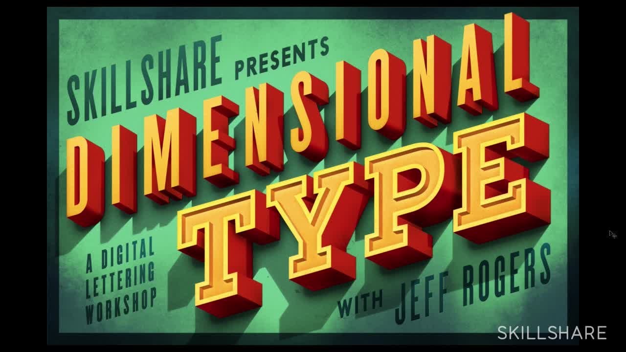
1. Trailer: This class is going to be awesome, it's going to change your life for forever. Let's see, what do I say? Do you like tempography, you like painting? Let's join the two together, see what happens. I don't know. You might be the next genius of the world and I'll show you how to do it. I'll always be the top genius, you can be the next level genius. Hey there, my name's Jeff Rogers and I have a new Skillshare class available and it's all about painting dimensional type. We are going to have a lot of fun and we're going to paint a lot, we're going to mix some type, we're going to look at some references and we're going to experiment, use our mistakes to make a piece better, so, I'll be taking you through some steps to create a piece, like this one. So, join me at skillshare.com and let's make some work.
2. Welcome: Hi there. My name is Jeff Rogers. Thank you for signing up for this class. I think it'll be fun. Basically, what we're going to do here is focus on dimensional typography. I do this a lot myself. It's a big influence of mine. I mean, it's a very narrow thing to talk about but within that, I want to talk about painting and as it relates to typography and specifically dimensional type. With that said, I just want to say that I've developed, over the years, ways of doing things that are my own. So, there's techniques, and ideas, and materials that you could spend a lifetime studying those things, and learning about those. But I'll show you what I like and I've learned, which is experimental and discovering things as I go. Some things might not be technically correct or something. But I'd encourage you with that to just take what I say and use it and build on it, and go and explore as many different things, ways of creating images as you can, and build your own toolbox of those things. One idea I want to stress and talk about is this idea that my high school art teacher told me many years ago, which is the idea of the happy mistake. We'd be sitting there, creating this artwork and a smudge would ruin some line that we just made or coffee would spill on the painting or something like that. That probably didn't it didn't happen in high school, but we'd get distressed about it and say, "It's ruined all my work," and she would come in and say, "No, use it. This is good. The smudge can turn into something new and interesting. So, find out a way to use it to make the piece better and different than what it would have been." So, that has stuck with me from everything to making work, to ways I can make work, and just trying new things, and not being afraid to venture into that unknown territory. Just for example, so I order a lot of books on Amazon. When you get those boxes, the books are wrapped in plastic and there's a piece of cardboard. I always take that piece of cardboard out because it's like this nice flat little shape. I always think, "It's such a shame to throw this away, it's like the perfect little surface". So, one time I just grabbed it and I had some paint markers and just made this. I mean, it's just a stupid piece of cardboard and it was fun. Cardboard is definitely not the optimum art surface, but it's like whatever works. So that was fun. But the other thing about the happy mistake is sometimes it doesn't work. So, it takes this level of courage to go in and try something because it could just utterly fail, which is part of the excitement of it. Another example is trying to find a surface for a project that had to do in a pinch and you had to scan it. So, I was looking for something that was a certain size. I looked in the closet and there was a wooden box from IKEA that hadn't been put together yet. So, I put it together after but I used these panels to paint this piece and scan it and stitch it together and Photoshop rather than using a traditional canvas or something. This is just all I had laying around, and this piece got printed in all kinds of magazines and stuff. I don't know, it's part of using that process and the new environments and materials that causes a piece to just look a certain way. I think just venturing into that territory is important, and it's something that I try to do almost on purpose sometimes. Yes, so, we're just going to be talking about some different materials, techniques, as it relates to painting and typography. Hope you enjoy it and let's get started.
3. Influences and Inspiration: All right, so I want to talk about a little bit of these influences that inform some of the way that I approach my work stylistically, specifically the dimensional type work. So, I grew up painting and my grandmother taught me how to paint, and so, I painted my whole life and when I got to college we used to start looking at art history and introduced to many different styles and painters and to that sort of really stuck out to me where for the post-impressionist painters Cezzane and and the Farveism movement and Andre Doraine and some of those guys. But the reason that I really fell in love with this work was I think watching my grandmother paint, I was always just really interested in the, I guess the process of building up color and building these layers and just watching her put on layer by layer. I just fell in love with that process and with these painters that I was seeing when you look at the work. If you look at some of these paintings by Cezanne you can just see his brushstrokes and as you look at it you can almost see him putting those strokes on which is very interesting to me. Also the farvers this use this crazy bold color and at the time they were, the word favs means wild beasts. They had this gallery show and there was an art critic who came in and saw it and it's like you're wild beasts amongst these more subdued styles of art because of these crazy bold color and the way that they were applying their brushstrokes. Also, they were leaving areas open to see the underpinnings of their painting. So, in certain areas you can see where they put some blue down and over that to build up a tree or a bridge or something. They would put a different color instead of totally painting over that under painted color, they would leave that showing and in that way you can see the process and see how the paint was built up. So, that was just amazing to me so I almost have the nostalgia subconsciously maybe I just snatched onto that. The other thing that was really interesting to me that informs my style now which at the time we didn't give a thought, but studying the paintings of the Renaissance before they knew about two point perspective, things like that, they would just look at landscapes and buildings or buildings mainly and make up their own perspective from the way that it looked or the composition. So, the perspective is all whacky and off and it's just amazing, makes a scene sort of a dream almost looks like sort of transcends into this other reality. So, in my dimensional type you see that there's a lot of angles that don't really make sense, but they're not following a true perspective and I think from that work it seemed that people were just using their imagination or their eye to come up with the different angles for the buildings and stuff. There's just always really interesting to me. As I started studying more and getting to do more work at Spaak, I was doing theatre posters and doing this big bold type, this really started getting into a signage especially here in New York. So, I would go and look at all these old neon signs and bulb signs and just love the way that all the textures, they were almost like paintings themselves. I did some research in Vegas, there's a place called, it's now called the Neon Graveyard. No, no it's now called the Neon Museum, it used to be called The Graveyard. It's where all the great old signs, bulb neon signs from Vegas go to die. They used to just be this big field and they turned it into a basically an art museum now. It's like a museum of typography. These signs are just out in the elements, you don't see him during the day, totally out of context and they're almost like big paintings. They're deteriorating these textures and colors are just amazing to walk through and stand next to a 20 foot tall letter and see how it was made and that's just amazing. So, I try to incorporate love for signs and that type of thing is really interesting also to me. Then I came across this book called Store Front which in New York, you can go walk around any neighborhood and see these great old signs, well, somebody noticed that too and they did this book called Store Front and you can get this, Amazon or something and I would recommend it because to me it's like a book about typography. It's like to be sold in the graphic design section at Barnes and Noble or something because it's like it's really about type to me. There's these great examples. You can walk down the street, but this has all these signs divided by neighborhoods. So you can really see where where these things live. So there's these great maps and you can see, tells you where all these signs really are. So they're all in the same ways are deteriorating in the sun and the weather and things like missing letters and this great, great stuff that just happens naturally in the way that the paint starts to fade. That really, I try to capture that in some way I work the way that things are sort of naturally deteriorate and fade and the idea of the happy mistake too is like you look at something like this with this L has the faces is missing and you can see this bold underneath. It's like why not use that in a piece when recreating a piece of type news that idea because that was a mistake. But it's beautiful. Another book that's great is this book ABZ. I just call it the ABZ book. Just full of this great type that there specifically, there's these examples of this old dimensional lettering here. Like this, that's all painted and it's perfect, but printed on the page and being these specimens, they have this certain texture to them and just this one was so good. You can see the shadow, It's just very graphic, but realistic at the same time. Those painters were doing sort of realism, but it was in their own way. This is the same idea which is great, but. Then Steve Heller and Louise Fili came up this shadow type book recently and my mind was blown when this came up because this is like of all collections of this stuff on my own and now it's like everything is just in here. If you want a great, great reference for all things dimensional type, this is it. They did amazing job collecting this stuff and it's all like every page you just drooling over this stuff. It's so good. There's just an endless well of inspiration. So anyway, those are some things that I really like, and yeah. So, keep digging and start collecting some of the stuff for yourself.
4. Paints: All right. So, what I want to do now is talk about the materials that you'll need specifically for this lesson, but also give you an overview of what's out there. It'll be overwhelming to walk into an art store not knowing where to start. Some of you might know or have some favorite types of paints or brands that you already like, which is great. I'm going to show you what I use and what I know, since we're building that knowledge and hopefully that will be helpful. So, anyway, there's all kinds of different paints traditionally for a painting and art making out in a gallery traditional sense. There's acrylic paint and there's oil paints. There's all kinds of different paints outside of that for various uses. Obviously, sign painters use this sort of enamel. This one shop is probably the most popular, and things like this poster color, or there's all kinds of different kinds of paints. There's also these great paint markers that usually many graffiti artists use to the face, property and whatnot. I use them for projects, for making typography. So, they usually will have these at your local art store, but I love these two because there's all kinds of different, it's like paint and a brush combined in the form of a pin. Like this one is super thick and wide. You can get a great broad stroke. This one's just basically like a sponge with paint coming out of it. Again, these are more for like the large-scale work, which I use them for, like if I needed to fill in a letter of black, this is what I would use. It's a little faster than a brush, but then it gets way down to these or even these tiny little ballpoint tips, so you can get a lot of control and they're really, really fun to play with. But, what we're going to use is acrylic paint. The reason is because, I mainly use acrylic paint in my work because it's just a lot easier to manage. Also, usually, these projects are quick turnaround and acrylic paint being a classic water-based paint cleans up really well. It also dries super duper fast, which is great for deadlines. So, the difference between acrylic and an oil paint is that oil, obviously, it's an oil-based paint that dries super slow, but it's also got a lot of chemicals, the mediums that you need to use are not, instead of water that you use with acrylics, you use linseed oil, and you use turpentine, and these sort of chemicals. The advantage to oils though is that, it's a totally different feel. If you try to mix two colors with acrylics, it's going to feel totally different than mixing two colors with oils. You'll just have to experiment with that and go get some oil colors and mess with it because they are super fine. Just make sure you're in a ventilated room, you're at breeding fumes, and try not to get stuff all over your hands. So, we're going to focus on these acrylic paints and when you're walking to the art store, if you hadn't painted before or it's been awhile or whatever, for this lesson, I think you can just use this brand, this Liquitex brand called the "Basics." They're super cheap and they work great. I like this brand a lot. There's other more expensive brands and the paint just feels a little different. It's a little nicer. It blends a little better, but for these purposes and the work that we're going to do here, this brand is great. I like these sizes. There's all kinds of different sizes. There's these big tubes and barrel full. You can get like a gallon of paint if you want to but that's going to be a little pricey. You're going to want to get a lot of different colors eventually. But, for this class, I would encourage for you to just get them bare minimum. You want to do with the primary colors, blue, red, and yellow, and also black and white. Those specific hues that you want for red, it's cadmium red medium and it's just a good solid red. There's all kinds of different hues. There's tons of different kinds of reds, tons of different kinds of blues et cetera. But I would start with this cadmium red medium. There's light, which is great. It starts to get more orange. Yellow, there's a lot of different yellows. Just get like a standard yellow. This is primary yellow. There's a medium yellow. They range from light to dark. Just get a nice medium yellow. Cobalt blue is a nice blue to start with, and there's phthalo blue and all kinds of different blues. But, cobalt is a great starter. From these three colors, you should be able to mix pretty much any color that you want. I would also grab a black. There's all kinds of different blacks. This is deep black. It doesn't really matter. You can see and experiment with different blacks you want later on. Then, this is just white, but it comes like this too. But I always get a humongous container of white because it goes so fast. We use a lot of white or I use a lot of white. Painters use lot of white, I think. If you wanted to get something else and keep collecting those colors and having more, I would go with your browns and I would get these specific four brown tones, raw sienna and burnt sienna, and then burnt umber and raw umber. These four browns, you just really can make your colors more sophisticated with these browns and just get a really nice, especially, if you're just using these three colors and you just add in a little bit of these brown's, it really changes the palette a lot. It makes it more sophisticated, and we can talk about these specific use and what they do as we start painting. Yeah. So, I think that's it for the paints. We're going to talk about painting surfaces, and papers, and that's what's up next.
5. Painting Surfaces: All right. So now, I want to talk about palettes and paper surfaces or painting surfaces, not just paper, a lot of different kinds of things. But anyway, for palettes, there's a few different things you can use to actually squeeze your paint out onto and mix. So, the thing the way we think about as far as a palette is, you want to have as much room to mix colors as possible. So, you want to see, but if you go too big, it's like you can't put on the table you're working on. So as big as you can go with a palette, the better, I think. Because if you have the space, then you will mix more colors. But if you don't, then you just won't mix the colors, and the colors won't be as rich and varied. And you won't be able to experiment with different colors. It's a lot of times the colors won't work, and so you might have to wipe it off or start a new color or whatever. So, there's things like this, that I think, a lot of maybe more water color people use this or but for me, these kind of don't really work. The problem is, you have this area to mix colors, which is like nothing. I would stay away from this, because if we're going to something like this, you might as well use like a paper plate or something. Which is sometimes I'll use, if I just need like one color. Another option is a piece of glass, and disregard the R. This, you can just go to a glass shop and have them cut you a scrap of glass and sand the edges down, so you don't cut yourself. But, you basically can just squeeze the paint out in here and scrape it off the glass when you're done. And this still, this is like borderline too small for me because by the time your paints get out, there's only just a little bit of room to paint. So, kind of the same with these, which like I said before, the acrylics, they dry really fast. So, they made these kinds of palettes with this lid. So, if you're working on a piece over the course of a day, you don't want to waste your paints. Because sometimes, I'll squeeze a bunch of paint out, and then I'll come back next day they're all just dried blobs. And, I have to just basically, all that paint is useless. So with these, it has a little sponge and this special paper that you wet. You got everything nice and wet, and it keeps the paints wet as you work. And then at the end of the day, you can close this lid up and keep everything nice and wet. But again, a little small, I think. So, what I really like the best is this palette paper. But, it's sort of this waxy or this waxy finish. And, what's great about this is, you can get these really big. This is like a pretty comfortable side, but they make them even bigger. And what you can do, is when you're done, you just pull this off and throw it away. There's the cleanup, this is like nothing which if I can save myself in time with clean up, that is okay by me. So this is what I like. If you're at the store, and you just want to get a palette and it's nice and cheap for a pad of this stuff. And, this is what I would do. So as far as surfaces, when you sit down and you want to paint something, kind of the rule is you have to remember you're working with water and these wet materials. So, if you try to sit down and just grab a sheet of copy paper, like newsprint or something that you would maybe draw on, it's totally not going to work. If you try it, the paper is going to buckle and bend and just be kind of unusable, especially if you want to show it. But, if you want to scan it even, it's going to be useless because it's going to ripple. And so, the key to the surface is the thickness that will hold the water and absorb it, and not bend. So, I think the thinnest you can probably go, is something like this, this Bristol board. And I use this a lot, especially if I'm painting different pieces that I'm going to stitch together. It's really easy to scan. You can cut the pieces up. For example, I had this piece to do a while back, and this is all on Bristol. So you can see, I cut it up and then scan each piece. And then, I can manipulate and change sizes around easily. Plus again, I got this cool feel with everything being separate pieces, that it kind of took on another sort of personality, being built like that. It is kind of interesting. But the thing with this, with the Bristol board, is it's good for small stuff, not big thick washes of color or paint; but, it is useful. There is another piece of some Bristol, for like a T-shirt design, for Nike. This, I knew was going to be just a couple of layers a quick thing. The paper's not buckling. I can scan it easily. Same thing with this, little more surface coverage. And there is a little bit of paper, a bend in the paper, but it held up really nicely, and it totally works. I scanned it in. I patch this into a piece that we needed to change the number. So, I had to go in separately and do this, and then photoshop it into the final painting. So, the other thing that you can use is this stuff. Another type of paper is called canvas paper and painters kind of use this as almost like a painting sketchbook or a sketch pad. And they'll do, you can practice your painting here because you're not going to show this in a gallery or something, but this has a sort of a tooth to it, that is sort of like canvas. I mean, hard to see but, so it's got this sort of texture to it. This is great too, because it's got a coating, finishing on here where the the paper is not going to bend and buckle. I love this for, if I'm going to scan something too, I can cut it up if need be. So, this pieces on canvas paper. And I knew something that I have to consider with a surface is, how I'm going to reproduce it if I'm going to photograph it or scan it. I'm going to scan it, sort of like the example with the box. I had this tiny scanner that time, so I had to find something that I could put on the scanner. And, this is great because you can put it on the scanner, put it this way and scan; and then put it this way, and then stitch it together. That's another thing to try. If you wanted to practice and just do a bunch, I would go with the paper route, probably because paper route, I don't know, you can just put a lot of paint, make a lot of paintings and it's cheap. If you wanted to do something more permanent or try some different surfaces; there's these pre-made and these are nice and great for scanning. They are pre-made boards and pre-gessoed and we'll go over gessoing in a minute. But, there's smooth ones and ones with like a canvas sort of texture. And they're just really thick. They're kind of expensive. If you want to do a bunch, which I'd recommend just do a bunch, but if you wanted to start, these are great. And, an example of that is this little piece is like on the same size as this guy, and so, that's one piece I did. I tend to do every painting on something different every time. And, if I happened like I showed you before, the Amazon cart, kept this one from an Amazon shipment. Or like, using a piece of chipboard or something. But it's because it's thick, I know it will hold the paint and more buckles. So, sometimes I'll just use like this, little looks like we're inside of the book for like the title page, this piece. And, this is like the back of a Bristol pad. So, just it was here and it was blank and so I painted on it. And it's like, you never know, I don't know. It's like going back to happy mistake thing. It's like use something non-traditional or something that you think might not work. Or it's like, "Oh, I've never used this before, this might work." But then, it's like you do it and like, "Look you get this kind of cool edge". To where the paper was bound, and that's kind of cool. Now, if you scanned that and kept that, I don't know. That's like something that happened that wasn't intentional. That's like, because you sort of went out and tried something that happened. And there's another piece that's done on just like a piece of, oh, here's a painting of Michael Jordan. Get it. This is his mustache and cheek. Anyways, this is just something laying around. And, this is for the New York Times. Small enough to scan. Again, you get this kind of cool edge which ended up staying in in the piece. The last thing is what I prefer, is just a piece of masonite. What I do is I go to Home Depot and they've got these pieces of board that are pre-cut. You can also ask them to cut them for free. Cut them down to whatever size that you need. This one was a scrap of some other size, but I keep it because you can definitely paint on this and I'll be painting on this size for the demonstration. But, there's sort of like these pre-made ones. I mean, it's exactly the same material, but this is so cheap. And, you can just go get this from Home Depot. It's great. It comes in all different thicknesses. I liked the really thin ones because then, you can stack them and store them. And like this, this piece was done on a piece of this masonite. One thing that I don't have here is just a traditional canvas. And, I rarely paint on canvas because they're really thick and they have the wooden frame. And, they're just kind of like I have so many paintings, it's hard to keep them. And, I live in New York and there's no space. So, I like this thickness more than like this thickness. And, I also like the smooth texture where I can put some paint on here and create my own texture for the painting. So, I would start with something like a Bristol board paper for this exercise or something like this masonite. So, those are some different surfaces and palettes that you can use for this or anything. But again, feel free to experiment with those services. Just make sure that the only rule is, don't paint on something that can't hold the water of the paint. So yeah, that's it. And so, next we're going to talk about brushes, and that's going to be exciting.
6. Brushes: So, I want to talk about brushes. A brush is a tool that puts paint on a picture, that's the long and short of it. Big fat brushes make big marks and little tiny brushes make little tiny marks. It's pretty simple. To go a little deeper, these are the kind of brushes that I like for different things. So, these big old house brushes, again, Home Depot, used for painting the old house are great for things like gessoing a canvas and putting an underpainting wash on a canvas, and that's what I use. You don't need anything fancy for that. The only thing is with these brushes, I would go on a little higher end of the house paint brush spectrum. There's ones that are $0.99 and then there's ones that are like eight bucks. I would go for the more expensive ones, because what you'll do is when you start painting and putting it in some gesso on your paper, on your board or what have you, the cheaper the brush the more bristles will fall out onto your surface, which is highly annoying because you've got to dig them out. But sometimes having mistake, maybe you just leave them in and it becomes like a little texture element in the piece. I would just leave it in, but I don't particularly like too many bristles hanging around. The other thing is having a palette knife. Palette knife is for mixing paints on your palette. They come in all shapes and sizes, but it's up to you what you like. Again, real painters have different uses for these. Some people paint with these and make these beautiful paintings by just painting with and mixing with a palette knife. But, what I use them for is mixing paint on a palette, and I'll show you that later. Basically, you don't have to get a really expensive palette knife, but I would get one. There's plastic ones that work fine. I would get one though because you don't want to mix too much with your brush, because then your colors become muddy and it's better to do your mixing with a palette knife. I'll show you this, but you can mix and then wipe the knife off and it's clean and you can mix some more. Again, there's actual real artists or painters who will buy specific brushes for very specific things. I have just a bunch of brushes, some I inherited from my grandmother, some that I've bought over the years. I typically like the longer handle because of just the control that I can get and different strokes I can get from holding it in the back or holding it in the front. You don't ever want to hold it like you hold a pencil. That's like the only sort of rule. I guess you can, but I would not, because you have this way of holding and writing with a pencil that's so locked into your mind, into your muscle memory that you're just going to do the same sort of marks and strokes if you hold it like a pencil. So, hold your brush in a different way. It loosens up your hand. Try changing hands even sometimes. You just get different marks, different strokes, different folks, you get it. So, there's these round brushes that I like to use, and the smaller ones, I like to use for things like outlining. If I want to get like a detail or something, and when we start painting, you'll see that. These may be for her big fills or something. Oh, this is another round brush mainly for filling in. To get lines and corners, I like these flat brushes, even better, these angled brushes. You can see these two have a little bit of an angle to them when they're loaded up with paint. This angle part, you can just get a really nice edge or you'll get a lot of control with that, if you're wanting to get a tight corner like the inside of a cave or something. I love these kinds, and just the flat. So, these are what I mostly use are the flat and angle flat brushes. Then, when you go to the store deciding what brush to use, I might start with something like that, but I would get a varying array of sizes, like these two sizes are pretty good. It's like inch or something and then just get something smaller because you want to be putting in some details. And this flatter brush. You don't have to get those brushes that are so expensive, but again, it's like a bristle thing. Some of the bristles have, like this one is really, it's firm thick bristles and just gets a different effect. It doesn't hold as much paint and you can do get some different effects with that type of brush. So, it's up to you what kind of brush you want to get. Like I said, stick with these flat ones for lettering and for what we're going to be doing. But yes, it's definitely an investment. Then again, there's all kinds of different brushes. There's these sign painting brushes that are so crazy super tall bristle, but with that type of paint that the sign painters use, you just get this incredible amount of control. Anyway, really fun to play with all kinds of different brushes. So, yes, I think that's about all we need to know about the materials. I really want to get cracking and start painting, and I hope that you do too. Yes.
7. Sketching: All right. So, let's get into this. So, what we are going to be doing is creating a simple word. We're going to think about how we want that word to be designed, and then proceed with just designing it, drawing it, thinking about it. I think you can, after doing this more simple approach, you can expand on these techniques on your own, and build, and make things more complex if you want to. So, I wanted to just do a single word. So, I have this panel, this size. I just want to do the work open. Thought it might be fun to have an open-closed sign. So, thinking about this, it's like, "Well, how do I want this to look?" I know it's going to be a three dimensional painting or the type is going to be three dimensional. So, I might look at something like the storefront book for inspiration on how I might actually create these letters. So, I've turned to this image of this barbershop storefront. Because the shape is similar, I love this border and the way that the type is wonky. I just loved that the P is like falling off, and that's something that you could totally steel or use or something, and something like this to make your work a little bit more interesting. Use those happy mistakes that you find in the world and when you go around and see like rust dripping off the end of a letter or something, that's something that you can pull and use as an element of interest. I love this. So, I'd start by just trying to sketch out some ideas. So, I'd sketch out the rough shape of this board. I want to have room for this border. Another something else you have to consider with dimensional type is the way that your letters are spaced, because you're going to have that added element of the sides in that. So, it's going to thicken up your letter. So, you can't just smash your letters together. So, you have to think about the shape and also the cast shadow if you want to use that and how that's all going to fit in the space. So, I'd start out with just these four letters really rough. Maybe I want to look at this and it's like how there's so much space and leisure, kind of small and they're off centered. So, I might do that, make them more like that. So it's kind of draw out the skeleton, the rough composition of what you want. So, it looks pretty good. So, then I fill in the shapes. It like those squarish forms of those letters too. So, I'm going to try to keep that. Maybe the end is like falling like that P. That's cool. That could be a little taller. That's cool. So, I don't want to have like those lines in the background like that, and then the decorative outline maybe. So, maybe start there so your adding your dimension. So, here you see that the angle is coming down this way. The photographer was just a little bit over here, well, over here right in the middle so the perspective lines are going to be coming like this. I always like to just pick one direction though sometimes, listen to one direction. But I'd like to pick one direction sometimes. It's like that bad perspective thing that I was referencing earlier. It's like if I was standing here, the perspective would be going in like this. What if they all just went the same direction? So, I'll draw those sides on roughly. It's like the more that you look at actual examples of of this type, the more that your mind and your muscles remember what those angles are and how to draw those from memory. But I would definitely recommend looking at a lot of samples, examples on out in the world and in books and stuff. So, maybe it's like that. Since these angles are coming this way, it might be cool to have a shadow coming this way. So, it's like if you imagine this light coming, the sun coming down this way, the shadow would be cast like this. Again, you just look at stuff. Shadows always come from where the letter is meeting the wall. So, it wouldn't come from this top of this E, because that's out from the wall. It would come from where this E hits the wall back. It's behind that. So, it'd be something like that, and you could fill in that shadow to see that inside of the O would be dark, just real rough. What's going to happen with your piece is going to happen as you're working on it, as you're building up those layers of paint, and the color and the shapes and everything will come out. So, this part, you don't have to really get super intricate and detailed, at least I don't. So, I think that's pretty good. Of course, the lights coming this way the other thing to think about is your values. The front will be probably a flatish the color, and then the bottoms will be darker because the light is coming in. So, the bottom would be in shadow and the sides will be a little bit lighter. Inside this O will be the same thing. On the bottom of the P, and then this curve and this, on curves, it's already gray lights upwards. So, the bottoms are all dark. The sides are a little darker. So, it can almost be like light is value depending on what the color is. Light is value, second lightest, and then third lightest. The shadow is just depending on what the background is. So, I'm going to do this. So, I think I'm going to do maybe something like that. So, the next thing we're going to do is take this and then since we know what size this is, we're going to prepare this panel to start to accept some paint. We're going to just be like, "Alright, you, it's time to get some paint on you." That's what we're going to do next.
8. Preparing to Paint: All right. So, the first thing we need to do to get the surface ready for paint is to put what's called gesso on it. Basically, it's just a thick white paint almost that seals the surface and doesn't allow the paint to absorb into whatever you're painting on. So, it's really important for canvas, it's that cloth material. If you just paint it right on the canvas, the color and the ink would just sink right into the canvas, which sometimes could be cool. I always like to just put gesso on especially if it's something really absorbent like a cardboard, or a chipboard, or something. For Bristol, you don't really have to do that, and then the canvas paper is already treated, so you don't have to put gesso on that either. So, you can get gesso at your local artist by store or on the Internet, and it's just that sometimes they use just matte white house paint, too. If I've got that around, I'm not the best because long term, you want your paintings to last, and I don't know what that would do in 20 years with things that started cracking and peeling. But basically, you just need to make sure it's mixed up, I just shook this heavily. So, it's nice and mixed, and then take a big thick brush, like this house paint brush, and just start slapping the stuff on. It's really thick and it takes a while to dry. So, if you're going to start a painting, I would suggest doing this the night before, or else just plan on waiting for like an hour or something for it to dry. So, the idea is just to cover this whole panel and make it as smooth as you can. A lot of people like to make this really smooth and sanded down, and so the surface is just like pristinely smooth and there's no brushstrokes or anything. That supports from what I've said, probably guess that I don't like that. I like to have some texture and some brushstrokes. Sometimes I'll just, on purpose, do this stuff where there's just a lot of texture. But for this, I think, actually, we're going to have some lines that go vertically like this. So, whenever I do this, and then you get some great texture that's already starting from the get-go. So, you do that and then you want to immediately wash your brush, just wash these brushes with soap and water and just make sure all the paints out of it, or else you have to throw your brush away, which isn't good. Save some money, people. Come on. After this dries, which I'm going to put this here, I did one yesterday. So, it's like one of those cooking shows where they make the cake and then it's magically done. So, voila, my dried gesso. So, what you want to do now is put an underpainting on this, and all that basically is just a wash in color that you have underneath your painting before you start putting paint on. Because if you just started putting paint on white, then that layering effect doesn't quite work. It's like if you put a color on here, all you're going to see from under that is white. But if you have like a bright color, that really affects you're painting differently. All right. So, once the gesso has dried, we're going to put what we call a underpainting or undercoat on. Basically, what that is it's just a wash of color. Some people have different approaches to the underpainting, so people like to relate it. They have an idea of what the color scheme of their piece is going to be and all related to that, like it's going to be like a bluish tone, though, make the wash blue. I always like to use orange or some sort of bright color because I love when those colors pop back in and how they make other colors that I put on top look. For me, it's all about the layering and seeing how many interesting color combinations you can make within the piece. So, basically, what I do is take the silk cup, and I always just use this for my underpainting so it's very orange, and I put this cadmium orange hue, and then just a little bit of rust thing in it just to make it like a little bit more sophisticated. I feel like using browns is always the way they like sophisticate the color a little bit. Then, I'll put this little bit of this medium yellow in. I don't like really mix it up into a solid color because I want a little bit of variation within this wash. So, and a lot of water, actually, is the other part. You want to be very washy. Then, you just start slapping this stuff on. I love this part of the painting because it's like you don't really have to think about anything, you're just painting. It's really fun. This is especially fun when it's a humongous canvas or something, and you just get the go for it and just cover the thing with paint. So, this is like really watery, so you see it's sort of. You can go like less watery or more. It doesn't matter as long as you get much color as a foundation. So, I'm just going to do this quick. So, we're going to let this dry, and then you're going to come back and put the sketch on. Basically, work out the composition lightly in pencil, we would do that next.
9. Sketching the Painting: All right. So, after your surface is dry, you're going to want to sketch the design very lightly on here. So, you'll have a guide creating a paint by number if you will, and I would. So, I'm looking at my sketch here from before. So, I'm using a really light pencil. I would say, a 2H or a 4H or something, so it's pretty light. Because if it's too dark and you start painting, it'll smear, and make this black smudge, and you don't want that. I'm just going to lightly sketch in this, well, just over the border. Let's map this out, already got that line there, and then O is about right there. Again, you want to be super light, so in case you need to go back over it. I always do this like there's certainly a few different ways that you can transfer your art on here. You can use a carbon paper if you want to be super precise about it and just trace that on. I like to eyeball it because then it takes on it's own thing and becomes you're looking at it based on the actual piece. So, you can make those adjustments on the fly. So, I'm just going to draw this guy. That's a little too far away from here. I'm going to scoot this over just a little bit. I want a little too dark. All right. So, fast-forwarding a little bit. Sometimes no, all the time, it takes a while to get your sketch laid out on the surface. This again, this pencil is a little bit too dark, but I just want you to be able to see what's going on. So, I had this eraser here and probably erased it five times trying to get these shapes blocked out the way that I want. So, once you get to about this point, it can still be pretty rough as you can see, but just to let you know where this angle, and look, I forgot the inside of the O. So, let's put that in. Excellent. So, we do that and we'll start blocking in the shapes with paint. All right.
10. Palette Building: All right. So before we can start putting paint on this, we got to build our palette. So, the easiest way to do this, I think the most efficient way to do it, is to you're going to want to put the paint on the very outside of the palettes. You can have all the middle two mix. You want a lot of space, as much space as you can get, but also you want to squeeze out a lot of paint because if you just squeeze out a little bit of paint, then you're only just going to use a little bit of paint. So try to just get a lot of paint out there. Because the more that's out there, the more you're going to just use it naturally when you get in the process of painting. So, like I said, I always get like huge container of white because it always runs out. So, I'm going to get my palette knife and just put this in the top corner. I always get like a ton of white. So, I have this palette knife here ready because we will mix with this guy. Then, a rag that you can just wipe this thing off with. Then, so a lot of white in the corner, and then black next to it. Like I said, you want to get your primary colors. So, yellow. I always get a little yellow too because that goes pretty fast. Red, and blue. I'm going to squeeze more paint out here too, so it's good to keep things spread out like this as you mix, your palette's going to get pretty messy. So, yours should look like this if you're starting with these colors which is great. I like to have a few more colors out here, so I'm just going to get these out here. Got a lighter blue. This is just light blue. Feral blue which when you mix, I love feral blue, and you mix with white, it just like makes this really cool blue color. A crimson which is sort of a purply red. Then, an orange. But a lot of painters never like to use orange because orange is the easiest color to make with red and yellow. But call me lazy, I like my options. Here's a medium yellow that I'll squeezed in between here. I like my favorite yellow. For some reason, my favorite color ever is like is this yellow ochre. I usually would put it up here, but there is no room for some now. Do a no-no, and put it down here. I also love the, I don't know, it's just like a sophisticated, warm color. It looks great when you mix it with stuff. Then, the browns. Raw sienna. Burnt sienna. So, the burnt and the raw. Burnt is more of a red tone, and the raw is more of a cool tone. So, you can see when I start mixing. So here's a raw amber, so that'll be like the cool amber. The burnt amber is the more of warm amber. All right. So, we got our colors out here, we're going to start mixing and start putting some paint on this painting now.
11. Beginning to Paint: What we want to do now is just block in these different shapes. Like I was saying before there's specific shapes that you have to think about and it is very sort of paint by number way to approach this, because you're dealing with these planes that make up the letters. So, you have the top, the face and then the sides which is this side and the bottom side, and then the shadow and the background, and then I have this decorative element this border. So, for this stage, it's like underpainting number two. It really doesn't matter, to me at least, it doesn't matter exactly what the colors are going to be, you want to just fill in these colors think about value and getting some differences with the planes but don't think about it too much at this point. I always like to keep this still pretty bright, but we'll see what happens when we get into it. The other thing is you never want to use colors that are just right out of the tube. That's a painting no-no number one. So, say if I want to fill in this top with red, I don't want to just grab the red, so I'll grab some red until I make it more sophisticated or different. Now out of the tube I'm going to add something else, obviously white would be like somewhere I'd go first, but that's going to turn this into pink which I don't want pink, I just want a deep red. So, I'll grab some of this brown here and that's the burnt sienna I believe. See that changes the character of this. So, I want it to be like a little, maybe a little brighter, so I'll grab some. That's another no-no is just grabbing paint with your brush like this because it gets muddy. We should use the knife, but we will later when we're trying to be more specific with our colors. This is getting pretty dark. So, we're going to move over here and grab some. I want it to be light. Grab too little too much brown. It's really just kind of like getting the color. I just want a bright reddish orange color, but it doesn't matter. Okay, how about that? I've got this big, well, I guess medium flat brush I'm using because that's about the width of the shapes that I've drawn out. Like I kind of just lightly block these in and it's just really quick this part and that will, because the painting you'll build it general too specific. So, this part is just blocking in the shape. It's like kind of an extension of the sketch. So, I like that. See how quickly this right here just like it fills up, that's why you want enough area. So I'm just going to wipe that off. Then the side maybe I'll do like a really light blue that might be kind of cool. Normally, again later on when you're being more specific about your color, you want to get a new brush or wash your brush out so your paints don't mix. I'm notoriously bad about doing that but it's just me. So, I'll grab some, blue, this might need a nice contrast to that brownie red is just like super bright blue, so that when they sit next to each other so that blue are warm and cool contrast color theory thing. So, you're just defining this shape really loosely based on your sketch, because later on we're going to come in and I'm just going to get more and more tight as you start to build it. Then maybe because this, the bottoms are going to be a different color, I might add a little bit of just to make them darker, maybe like this brown. So, you're getting a different color down here and this doesn't matter it's like sometimes I'd pick just a wacky color so they know that it will show through in an interesting way. Actually why don't I do that? Like, why don't I just pick like, I don't know let's go crazy. Let's get some good black or not, that there, was really rough. So, I like this how this is starting in this blue right here. So almost just cut that off I like that color, just going to leave that. So, you have these things this thing and this isn't really straight, but you're starting to define these areas, right? I'm going to do the background maybe I think I want to do this white based on the reference. So, thinking about what was going to show through there, I think I'm going to do another red. So, this turned out orangey brown. So, maybe I'll just grab a bunch of this red and since my brush had some color on it, kind of counts as a mix and went out, let's grab some like make it a little pink and maybe some yellow, will grab my favorite color. This is like weird pink color and then you can find this, its really loose. This is what you call the paintings ugly stage. Every painting goes through it. As a designer you probably understand that through the process, things are going to not look great, that's the point where the art director, creative director comes up buying your shoulder and looks at your work and you're like, "No, I'm working on it. Figuring it out." So, I'm going to finish this other part this underpainting and when we come back I'm just going to keep building up the layers of paint.
12. Building Layers: All right. So, as you can see, this is looking pretty terrible, which is excellent. Basically, I've just blocked out the different dimensional planes with various colors. Now, I just did the the O, an example. I did the face, and then the blue, and then the black. Normally, just to show you sort of the process on how loose you can be, but normally, you want to work the whole painting as you go and not just focuse on one area. So, I would normally done, pick this color for the O, and then go on to the P, the E, the N, then pick the blue and keep doing that color throughout with the black and so on and then the background. So, the whole thing is being worked and you want to keep that in mind as you go forward. So, what we'll do next is just keep putting another layer on and we're going to define these edges or just a little bit more, but it's going to be another layer of color that will show up as an underpinning. So, for me, it's always not so rigid. I don't have an idea even right now what those colors are going to be. I'm just going to kind of pick some colors based on experience, based on the practice things I've learned by doing it. So, for example, if this is an orange, I might pick something that's complementary. Switch it up and make this blue and then make this warm color so you're kind of making those interesting color combinations and choices. But I think, as we move forward, I'm looking at this great reference that I had and I'm getting panel of my book, but I love this sign and this painting is based on this piece of reference. I love how these red letters have faded over the years and trying to get that sort of faded pink sort of red color with the white and then the blue sort of faded blue border. So I think I want to end up here. I might not. Something else might happen but this is what I'm shooting for. But putting these colors on isn't going to happen until maybe the third or fourth or fifth layer. We're just going to keep building up the painting, keep defining the edges. The other thing to keep in mind as you're building up these layers is you want to have a lot of different brushes on hand. It's like best practice to when you change colors, change brush, change brushes because these strokes, you don't want all of the whole painting to be made by the same brush. It's more interesting that there's different styles of brush stroke like different widths. But at this point, you want it to be pretty precise about it. So already I like the fact that I put that dark color there because it's sort of creating almost an outline. Defining that is going to make that letter more legible actually. I leave some of that outline. So, I'm going to finish. I'm going to put this color even though it might not work and I might change it again, just going to keep going and work the whole painting. So if I start with this letter, I'm gonna go ahead and do all the letters this way. All right. So I'm just finishing up some of these last-minute details. That would have been a very long video just sitting here painting this, but I basically just finalized the colors, mixed the base on the reference that I had. As you can see, some of these background colors are starting to peek through. So I left some of these edges like the yellow on the E here and this red line. So I think that makes a little bit more interesting. You see all these colors are emerging from the more sophisticated sort of final colors. So, I kind of like to do is go and sometimes this work ends up ring very bright and colorful but, for this one I wanted to kind of use this reference for color and yeah so the other thing to keep in mind is if you noticed I painted in the white background last and that's really helpful because you can really define your lines and your letters, like if there was a blobby sort of wine on the eve or something, you can just cut it right off with the background and sort of cut into it. It also is interesting when the paint is actually you can tell that it was painted last but it's in the background, so you get this kind of cool foreground, background thing going. But basically I'm just finishing up some I'm going to put like a shadow behind this little border. So, doing that but, so anyway there's not really a secret to win is the work finished, it's kind of it's finished when you say it's finished and there's always the fear of over-working a piece or are under working a piece so it's just up to you to as you're working on it. Again, just let the piece talk to you and tell you when it's done. I can't paint and talk at the same time so, I don't even know what I just said but so, the other thing to think about and as you're wrapping this up is how you're going to, if it's just going to hang on a wall then you're kind of done. But, think about scanning it or photographing it, those things we are not going to go in that's a whole another lesson I think but this size wouldn't fit on my scanner, so I probably have to photograph it and get some help with that. For me from a licensed photographer. Do they license photographers? I don't know. So I'm just going to finish up these last lines and hopefully that gives you a good amount of information so that you can go and start experimenting and make your own piece or pieces and maybe start that journey of just getting your hands dirty with paint, I love that, I love having paint on my hands and because we feel like I've accomplished something. All right so I'm going to finish up these last little details and hopefully that gives you a lot of good information to go on your own, get your hands covered in paint and start making some stuff, and can't wait to see what you all kind of come up with. These ideas and these tools lend themselves to so much interpretation, there's just sort of a million ways that you can do it. So, I'm just really excited to see what's going to happen with with your work. So yeah. Get to it.
13. More Creative Classes on Skillshare: [MUSIC]
 Jeff Rogers, Lettersmith