Transcripts
1. Welcome: Hi and welcome to my class. I'm Kelly Spencer. I'm Militia in an Illustrator and Wellington, New Zealand. I've been freelancing in this field deceiving years. Now my clients include based DeVos and musicians and publishes and breweries and people getting married and people starting small businesses, all of the wonderful things. So for this project, we're going to make a small hand painted sign, but you can hang out the front of your house with your house number on it. I'll tell you, through my proceeds, from beginning to finish, I'll take you through all of the materials that we're gonna need. There will be a variety of different options for different budgets in different availabilities, depending on where you alone. And I consumed you in the direction of some really inspirational with pages and books that you can hopefully find in your local library.
2. Research: which is a really important part of my process. While a lot of it can be found online, the library also has hates to offer. This one's quite amazing. It shows a sample from a bunch of different Leader is globally. I specifically love the style of these guys. History signs. I think they're based in the States. That book is called Drawing Type Minutes by Alex Box. Another great One is new Ornamental Type by Stephen Hella He seems to have made a few in this Siri's. He really explores different applications of type in different materials. What you can use to create with number one source of inspiration for May is this movie sign painters. This was made a couple of years ago. They do interviews with sign pages around the world, and it's really visually beautiful. There's a lot of imagery showing what people are creating and have bean creating in the past. You're able to watch the trailer on this site, and you can also download the movie for a pretty small. A simple Google search will bring up all sorts of awesome results. You can get a good idea of what traditional sign painting is all about what people are doing around the world once again. 00 look who it is. You could have a look at my website, Kelly Spin said. Don't code or indeed, check out what I've been up to over the years. Specifically in the way of littering. I upload most of the work that I do into the section. Most of this work is hand created, but occasionally I work digitally as well. And I've begun a project recently where I am illustrating the alphabet onto a selection of different objects. It's being somewhat on pours lightly. As I've been struggling to find the time I've made a few block posts. Also on examples of sign painting at in the world. These photos were all taken on a trip to India. I was completely enamored with the style of this I'm painting. I also have another block post about sign painting examples found in Spain. Hopefully, that gives you a few ideas on where to find inspiration. You can always hit out onto the streets of your town and see if you can find local examples of sign painting, maybe even upload them into the project gallery
3. Materials: here. Well, the materials that we're gonna need for the class you can use blank paper inside escapes about. Another option is to use road paper, which can be really helpful for getting in line straight. This is that pace of wood. Nothing fancy just to pay supply, which I've saying that the ages off very small. So we're not gonna take up too much time with the project. The role f beginning straight lines and working out spacing between numbers. Jar of water to wash up fresh is in the paint brushes is a few options here. Some of these and nylon. He had brushes such as this one. Some of these are made out of animal here. I really don't mind which one I use. A lot of people will use the animal here once because they are of a higher quality. I've teamed not to enjoy buying things made out of animal here. So these gets from friends up to you. Couple of pencils. I like to use the mechanical pizza because they need to go blunt. If you don't have one, you probably go to Pienza shot rubber. Probably gonna makes in the States great news. masking type. This is too tight ab drawing onto our wood panel when we begin transferring the dry interruptions. This stuff is really amazing. It's also really expensive. I use it when I'm doing traditional sign painting, but you don't have to go that fat This stuff. This comes from the local point storm when you would buy the paint, paint your house with this. Is it New Zealand brand? I'm not sure if you have ever sees just a good did this Memphis and costs about $5 for a little pop.
4. Sketching the design: all right. Now that we've done every six, we can begin working on a design. Let's get started. I've been at your scrapbook or a sketchbook, Or lay out your piece of paper and let your place of work on top now get paint. So am I gonna trace around the outside so that we know the exact sizing of our wood block? I would now take out the roulette in Max imagines so that I don't have my numbers. Strict ing too close to the edge of that would block just sitting nicely in the center. These are just a guideline. I'm not measuring them. I'm just using my eye to start with. I will just rough out the numbers. Just is really basic line work. Can see how I'm allowing the top in the bottom ages of these threes to touch those imagines so that I know that they're going to be this pretty similar size as close as possible to each other. So now that I've gotto that line work light out, I'm gonna start thickening up The strokes could see I've got some nice, thick down strokes on both of grace. Those circles will get rubbed out later on. They just to give me a guideline. I'm going to get them both looking ISS similar to each other as possible. I could have cheated here and just drawn 13 and interest to the other. But for the sake of this project may as well make it as human as possible. Once I've got all the line work sketched up, I'll go Big Rob at some of the missy lines and tidy up the existing ones so that I've got a clear guide of where I'm going to be painting. - Everybody loves a drop shadow. So I'm just copying the shapes of the little forms and dropping it slightly downwards into the lift of every leader. This is something that you could better at with practice. You are also welcome to use a ruler. Two methods, 45 degree angles from the sides of the leaders. Sometimes I would do that. If I want to be more precious about it, this drop shadow will be painted in a slightly darker color. Then what? The background is to give the illusion of the leaders popping up from the wood block. Next it I'm gonna like a another piece of paper on top of that one and trace out my line so that I've got a tidy a guide. For when it comes to tracing this onto the wood block before painting, this may look like a steady hand at times. Believe me, it's not always the case. Okay, so there's that line work.
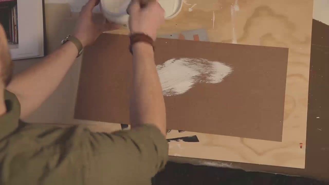
5. Transferring the artwork: So the next step is to transfer that beautiful drawing that you've created onto your would block. Now, if you had some common paper, you'd be able to lay their underneath your sketch and on top of the wood block to trace it through. I do have some around, but I actually prefer to use this method where I scribbled on the back off my drawing with a lead pencil. And it has exactly the same effect, plus carbon paper. Teens did not show through on some painted surfaces. No scribble in both directions just to make sure it's completely covered. And then I'm going to get a good doc line shone through when I try so onto my wood. So I put just drawing to the side and grab your piece of wood in some paint and we're going Teoh, do the background color onto I would block. This is the acrylic paint that I mentioned earlier. Nice, insipid grain, My houses grain. Not this grain, but at least you won't be able to miss it. This is not the based paint brush for the job. If you have a bigger paintbrush, I recommend using it. Oh, look, a bit a paintbrush. Great idea. You probably need two coats of your background color, so I let the 1st 1 dry before applying the 2nd 1 Once I've finished tidying this up, I'm going to see the decide to drive for at least an hour with acrylic paint. Maybe more, depending on what the temperature is, where you are needs to be really dry. And if your hands look like this, then you are doing it right. Try some time so the woods will dry. Now it's gonna take that drawing out of my sketchbook just to make it a little bit easier and laying on top of my blocks. Now, I've got a few guidelines in the corners there that you might be able to see to make sure that I line it up straight. Hold it down firmly and stop chasing on top with European. So as you trace, that led from the other side of the paper is going to transfer onto the wood. Do you see how that showing for And then you go? Your drawings that transferred onto you would and you're ready to start painting
6. Painting: Hey, guys. So you've got your drawing or transferred onto your would block the lines and nice and clean and shop, and you know where you're going to start applying the paint. I'm going to start with the drop shadow got another grain, which is slightly darker than my original grain, and I've got my favorite paintbrush. Some people call this a rigger or a Lina. If you've gone whole hog, you might have a pin starting brush. This one's just a relatively cheek brush, but it's got a nice long bristles, and we've been together a long time, following the curves that I have drawn off my drop shadow. I'm gonna stop selling that and doesn't matter that I'm going into the area, which will later be the front color cause it's gonna get covered over. What is important is that I stick to the external lines off where this drop shadow is hitting the light grain. The beauty of these brushes, that's that you could do quite long flowing strokes and the fancy a paint that I mentioned earlier is really beautiful for this because it's designed to do this kind of work. It will stay quite wit and give you a really good flow and you can do very long lines. It's very satisfying. But But the purpose of this project, we're just using acrylic and its toe, Justus. Good. Okay, we're done now, just that to sit that aside to drive for a little while before we can go on and do the top coat. So I'm now going to fill in the insides of these numbers. I've got some purple paint, which is what I'm going to use for this Pat and I'm going to paint inside these sections here. Using the same brush is I was using for the drop shadow again using long rounded strokes so as to achieve quite a flat look with my paint. I'm not going to put you through watching the entire process because I think you get the point. You can see I go back over and fleshing out any streaks that appear while I'm painting. As I read the layers the starts to build up quite a textured look and I like to try and keep it looking quite flat. So I just go through and Fillon well of that space make sure you cover up the edges where the drop shadow hits the edge of the purple and onwards to the A. This is the main reason why I need a sign. At the front of my house is the several houses that Levin number 33. Oh, good. Mixed up. I'm gonna do an outline. I have mixed up some of this pink colored paint and I'm gonna use a slightly thinner brush . Work your paintbrush into the paint so that you get a nice point on the end. You do this boat, rolling it through the pain, and then you may need to remove a little bit of the exists onto a piece of paper. So again, with the long, smooth strokes, this takes practice, and I definitely don't consider myself to have mastered it. Continue on with your outline. You probably need to rotate your would block as you move, which makes it easier to excess those corners. I love that pink against the purple. Doesn't it look great when I'm painting this fast? Well, uh, from now I'm going pretty free range, making decisions on what I think it needs next. So I've gone to another shade of pink, and I'm gonna add some embellishments in the center of the threes. Load up your paint brush with quite a lot of pain and starting at the middle drag align along through the center of the curve, ending at a fine point. Do that in both directions. This is filling in any of my thicket down strokes on the characters. So having a look at my pace now, I'm feeling pretty good about it. But I'm not quite happy with the way that the threes air sitting on top of the drop shadow . I don't feel like they're popping out far enough from the background. So what I'm gonna do is I'm gonna pick up that background color again on an even skinny a brush. I think this is a size double zero and drag really thin line between my at line and my drop shadow. See how the lighter color is creating some contrast between the pink in the drop shadow. It just gives those characters a bit of extra bang. Awesome. I'm gonna cool that a day
7. Finished!: thanks so much for attending this class by now. You should have yourself a nice little signed to hang out the front of your house so that your friends come over. You know where you live. You can now don't have a look at my class project page. Have a look through the legs that I've shared. There's a few Resource is in there off website and also some images off my Frances. I'd really love to see your work feel breeder uploaded into the project gallery As you go, I will try to come along and answer any questions that come up. Thanks again.
 Kelly Spencer, Letterer, illustrator, muralist