Transcripts
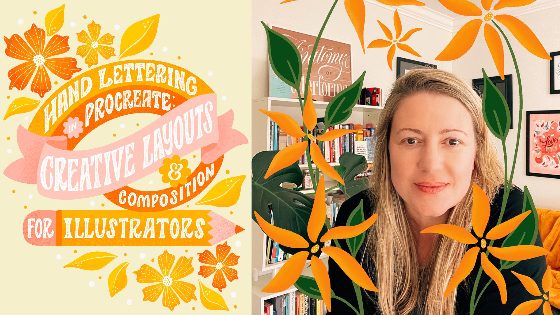
1. Introduction: Are you an artist
wanting to take your compositions and hand
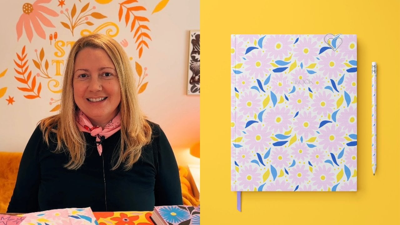
lettering to the next level, then you're in the right place. Hi, my name is Heather Mueller. I'm an illustrator and hand
lettering artists living in the San Francisco Bay area over the past seven years or so, I've developed my style
as an illustrator. My work has an organic
flow to it with lots of movement and pops
of color and texture. This gives my work a very
energetic and vibrant feel. Curiosity, mother nature and the seasons of life
inform my work. In this class, I'll show
you easy ways to approach layout and composition that will bring your artwork to life. We will create a piece
of hand lettering with supporting
motifs in Procreate, using simple layout techniques and guides to help with
the placement and flow. Throughout the class, we'll cover the fundamentals
of hand lettering, the importance of
considering mood and style in the early
stages of your artwork, the basics of layout
and composition, how to create supporting
motifs for your artwork. And the full lettering
design workflow from sketching to choosing colors and adding depth with textures. If you're just starting out
in digital illustration and hand lettering and have trouble with layout
and composition. Then this is the class for you. I will cover the basic
skills needed to create beautiful lettering
compositions using layouts as a foundation. The skills you learn
in this class can be applied to digital
illustrations, paintings, drawings,
and even murals. If you're already familiar
with hand lettering, the tips and tricks
in this class, we will take your work
to the next level. A strong layout is the backbone of a compelling illustration
or hand-lettering piece. Getting creative with our
layout and composition in the planning phase will ensure a beautiful lettering
piece every time. Are you ready to get started? If so, I'll see you in class
2. Class Project: For the class project, we'll be creating
an illustration with a hand lettered phrase. I will cover Hierarchy,
balanced and style. And we will go over
layout and composition. We will choose different
lettering styles and go over ways to incorporate the lettering into
the illustration in a meaningful
and cohesive way. I chose to teach this
topic because when I first began learning hand
lettering and illustration, I really struggled with
layout and composition. This class will give you the resources to create
compelling compositions. Moving forward, you can find several layouts to start from
in the Resources section, but I encourage you
to push herself and tries to come up with some
creative layouts of your own. I will be looking for Balance
in your composition and hand lettering and a cohesive
style throughout your work, there should be a
strong message, as well as a consistent
color palette and textures if you
choose to add them. Posterior progress. The Project Gallery of the class for feedback along the way. Feel free to ask questions in the Discussions
section of the class. Create a quiet, comfortable
space for yourself to create. You may want to print out the Resources Guide I've
provided beforehand. If you've got
everything ready to go, then let's jump right in
3. Terminology & Lettering Guides: In this section we will
familiarize ourselves with Lettering terminology
so that we're speaking the same language
when talking about letters. We will cover the parts
of the letter forms. Sarah vs. San Serif letters, contrast, stress,
width, and weight. We will also go over the difference between
hand lettering, calligraphy and typography and do a quick overview of
how to draw Guides. Legibility is the quality of the letters being
clear enough to read. In hand lettering. We can push the limits
of our letter forms a lot because it's a
lot of PFK-1 to do. But we always want people to be able to read our
message as well. So just something
to look out for. We use overshoot
to compensate for the optical illusion that happens with curved
letter forms. Letters like 0 and S need to come up just
pass the x-height. And just pass the cap height. And just below the baseline
just a little bit. This is where the
overshoot happens to compensate for
our eyes seeing these letters as a little bit smaller than the rest when
sitting next to each other. This is a testament to the
fact that as designers, we don't always need to make everything
mathematically perfect. Use your design is to
critique your work and make sure everything is
looking cohesive and balanced. Now we're going to go over
the anatomy of letter forms. I've made this handy graphic, labeling some of the
more important parts of the letter forms. Let's go over them. The counter is the inside of a closed letter
forms such as the 0. An open counter is the inside
of an open letter form, such as an M and N. And actually there's a little bit of overshoot with the N as well. This comes down just
a little bit past the baseline because this
section of the N is pointed. It often looks weird. If it's sitting right
on the baseline, it looks a little bit weird. So that's why we
add a little bit of overshoot there
for that as well. Ascenders or the stroke
that come up from lowercase letters such as the D. And they come up
to the cap height. Descenders are the
strokes that come down off of lowercase
letters such as the P. The bowl is this
curved section that comes off of rounded
letter forms like the P. The D would be another
instance of that, as well as the lowercase
double story a. The dot of the eye in the
J is called a tittle. This little section
that comes off of the lowercase double
storage V is called an ear. And the rounded section
that comes off of the stroke of the M and the
N is called a shoulder. These up and down strokes
at the capital letters, such as LR and H are the stems. And the cross of the H
is called a crossbar. This little section that
comes up and around off the lowercase script
Y is called a tail. To set up Lettering Guides, you will draw a line
for the baseline. This is the baseline that
all the letters sit on. The x-height, which is the height of
the lowercase letters. The cap height, the height
of the capital letters. You can use a ruler or the grid tool and
Procreate to help you with straight baselines
and freehand draw the baselines that have a
curved or undulating shape. So for instance, in this piece, I've already got my sketch
here and I've already drawn some guidelines for the
shape of the letter forms. I'm gonna go with a
curved shape here and this little
banner shape here. I'm going to go ahead
and draw in my x-height. And the x-height is usually
not quite centered, but just a little
bit above center. And then if you don't
want your letters to sit right on this, this is actually going
to be a colored banner. So sometimes I'll
actually draw in another baseline and
another cap height if I don't want the letters
to go all the way to the top. So it would look
something like that. Now we're gonna go over Sara versus san-serif letter forms Serifs are the little
feet on some letters, such as here in
the M and the end. Sans means without. So sans serif means
letters without feet. Letters with serifs are
called Sarah letter forms. Let's look at some examples
of the different types of Sarah Jessica
hashes in progress. But we have bracketed
Sarah did down slab or Egyptian and
tuscan bifurcated. These are just some
of the types of serifs you can add to
your letter forms. Contrast is the
difference between the thick and thin parts
of a letter forms stroke, and creates the angle of
stress within a type design. So this shows high contrast where the strokes are really
thick and really thin. Contrast where the strokes
are thick and thin. And low contrast
where there's not very much difference between the thick and thin parts
of the letter form. Stress is the thickening
of curved strokes and the angle of this thickening in relationship to the vertical
axis of the letter. So here we have diagonal stress, vertical stress, and
horizontal stress. Width is how wide
the letters are, and wait refers to how thick the strokes
of the letters are. This is important
for legibility. Here we have thick versus
thin and wide versus narrow. Hand lettering is The
Art of illustrating or drawing letters,
words and phrases. And it's a great way
to add personality and a handmade feel to book covers, greeting cards, magazines,
websites, and even murals. It's become very popular over the last ten years
and for good reason. These are some examples of hand lettering by some
of my favorite artists. Calligraphy is produced
through writing with different types of writing utensils such as pens and nibs. Modern calligraphy
is a newer version and is usually done
using brush pens. Typography is the style, arrangement or appearance
of typeset matter. Typefaces are used in graphic design, bookmaking,
an advertising. Typesetting is The Art
of arranging type for print in books,
magazines, and brochures. To recap, Lettering terminology is important to understand, so we can talk
about letter forms using the same
language. We covered. The parts of the letter forms. Sarah versus sans-serif
letters contrast, stress, width, and weight. We talked about how
hand lettering, calligraphy and typography are
different from each other. And we learned how
to drop Guides. Be able to choose a lettering Style and Mood for our project. In the next lesson, I'm excited to see you there
4. Lettering Style & Mood: In this section, we will be covering lettering
Style, and Mood. We will be considering style, which includes being consistent
with design decisions. We will consider lettering
style from the very beginning. And the Art of mixing
lettering with illustration. This style of your piece is not just about the
style of lettering. All aspects of your
artwork should maintain the same style throughout to
achieve our harmonious look, including layout and motifs. If you are going
for a vintage look, you would not only
want to choose a vintage lettering style, but you would also want to
choose a layout that has a vintage feel by looking
at labels from that period. As an example, the
motifs you choose, what also be determined
by the theme you choose. We're going to start
off by looking at some lettering styles. We have inscriptional, black
letter, Modern Slab Serif, old-style, chancery, italic,
fat face, iconic, Latin. Reverse contrast, casual script, brush Script, brush,
Roman, Tuscan. This has those little
Tuscan serifs, miscellaneous sans
serifs, and round hand. I also wanted to touch on color, which is really the
most important factor when you're doing
hand lettering, letters are
essentially defined by black shapes or strokes and white shapes as
the counter forms. But when one is changed, the other is also affected. So what we're talking
about here is a balanced between positive space, which is your actual
letters themselves, and the negative space that's
around your lettering. So volume spacing, contrast, and proportion are all super important when you're
learning hand lettering. And when you're
talking about volume, we're looking at these
overall area of an object. So here he's showing you can
use these little dots to make sure that the volume of all your thick parts of your
letter forms are the same. And I actually use this tip, It's a really good tip. In Procreate, you can
just draw a circle and on one layer and just
copy and paste it and then just put them over your letter forms to check that. Another great book with lots of different vintage
hand lettering styles is this vintage hand
lettering book by Lisa Quine. And she actually shows you how to draw some of
these letter forms. This one is old money, basic Roman type, a style
with a rich history. And then last but not least, she shows this Art
Nouveau style lettering. Art Nouveau lettering is
one of my favorite styles. I actually have quite a few
pieces drawn in this style. As you can see, she's also
drawn a lot of florals, lot of organic shapes during
the Art Nouveau period. This was characteristic. All of these organic
flowing forms and flourishes and florals, we're all part of
that Art Movement. Another Art Nouveau book is this treasury of authentic
Art Nouveau alphabets. I've used this as a reference
book for quite a few of my Art Nouveau pieces. And this, this just shows some
Art Nouveau style layouts. As you can see, this fluid style was very prominent at the time. You can find all of these. I'm showing you these examples in books because I actually have quite a few reference
books in my library. But if you don't, you can just go to
Pinterest and you can type in Art Nouveau lettering and a ton of this
stuff will come up. So don't worry,
if you don't have your own library
of references yet, then on my best tips are
to look at lots of Art. The more the better
go to museums, find lettering out and about, and cities and towns on signage. Check out books
from the library, search online or on Pinterest. And you'll start to
notice the kind of styles and layouts
that you're drawn to. You can start from there. Style should be cohesive
within your project. So find out which lettering styles and
layouts you're drawn to. And then we'll go from there. Once you're done doing that, we'll move on to the next
lesson. We'll see you there
5. Composition: Hierarchy & Balance: In this lesson, we
will be going over the key components of composition,
Hierarchy and Balance. The goal of this
lesson is to have a better understanding
of their role. Hierarchy imbalance
play in creating an engaging composition
and how to achieve legible hierarchy imbalance
in your own layout. What is Hierarchy? Typographical
hierarchy expresses an organizational
system for content, emphasizing words you
want to highlight and diminishing others
that are not as important. By placing emphasis on certain
words within a phrase, it becomes more legible and easier for the viewer to read. Here are some examples of
work that shows this concept. So as you can see in this
piece by Lauren Holm, Art and hearts are a little bit bigger and a little bit
brighter with the red color. Seeing that this, in
this particular quote, making ART and breaking hearts, you want the emphasis to
be on ART and hearts. In this example by Marco Bayes, woman's part of the
layout is a heart. And you can see the hierarchy here where there is
love, there is life. Love in life are a little
bit bigger because those are the words that he wanted to
emphasize in this phrase. Here's another good one. Bye know via Jonathan, what would life be if we had no courage to attempt anything. So in this example, no courage and attempt
are all kind of bigger. Because that's the
focus of the phrase. The best hierarchy is achieved using an approach
that is legible and the viewer doesn't
even notice that certain words are being
emphasized or diminished. You want to make sure
you're hierarchy is subtle enough that it doesn't hit
the viewer over the head, but intentional enough that the reader understands
the phrase. Next, we'll talk about Balance. Our eyes love to look at a balanced arrangement
of lines and shapes. We create balanced
within a piece by making sure the weight
of the lettering versus the weight of the negative space around the lettering or even as well as the
supporting motifs. So here are some examples by Jessica Harish wanted to show. As you can see her layout. She's actually used
some lines for her layout for to
hold the words. So like these banners and
everything is equally weighted. She's emphasizing certain
words within the phrase. Yet the use of space is equally weighted within the positive
and negative space. And then again in
this piece here, you can tell she's, she's actually using the light
bulbs to show inspiration. And that says Your, my. And then inside each light bulb There's a little letter
as the filament. It says, it spells
out inspiration. So just an example
of how you can use layout and illustration to
also convey your message. Pro tip is to turn
your work upside down. It may sound funny, but our eyes will spot
the inconsistencies more easily when we're not trying
to read the lettering. So next time you're
you have your, Your Sketch or something, you can just flip
it upside down. And usually you'll
be able to see where you need to move elements or change letter forms so that everything is
more equally weighted. So to recap, hierarchy within
your lettering should make your message legible and your letters should have
even color or even wait. The motifs you choose
should support the lettering and an
aesthetically pleasing way, making sure there is an
even overall use of space. Your overall theme and
message should be equally supported in both your lettering
and surrounding motifs. So to start to get an
idea of, of this concept, you might want to start
brainstorming your Project. Start to get an idea
of what you might want to create for your project. And look at the layouts
I provided or sketch a couple of new ones just
for Fun on your own. In the next session, we will
begin to make a plan for our framework and brainstorm
ideas for our class project. I'm excited to see their
6. Planning Matters: Planning and ideation are
integral parts of art-making. In this section, we will
go over ways to generate ideas and narrow down our
quote, concept and style. This is a process
that designers and illustrators use to really
hone in on the message, style and the piece as a whole. This is the portion of the
class where everything will start to take shape,
should be exciting. Go ahead and take out a piece of paper and create a list of as many words you can think of pertaining to your
project and ideas. These are not only phrase ideas, but ideas of the store you want to tell and the
mood of your piece. You may want to write
descriptive words of how you want the viewer to feel
when they see your work. Just let the words flow. This is a brain dump and it's a very powerful way
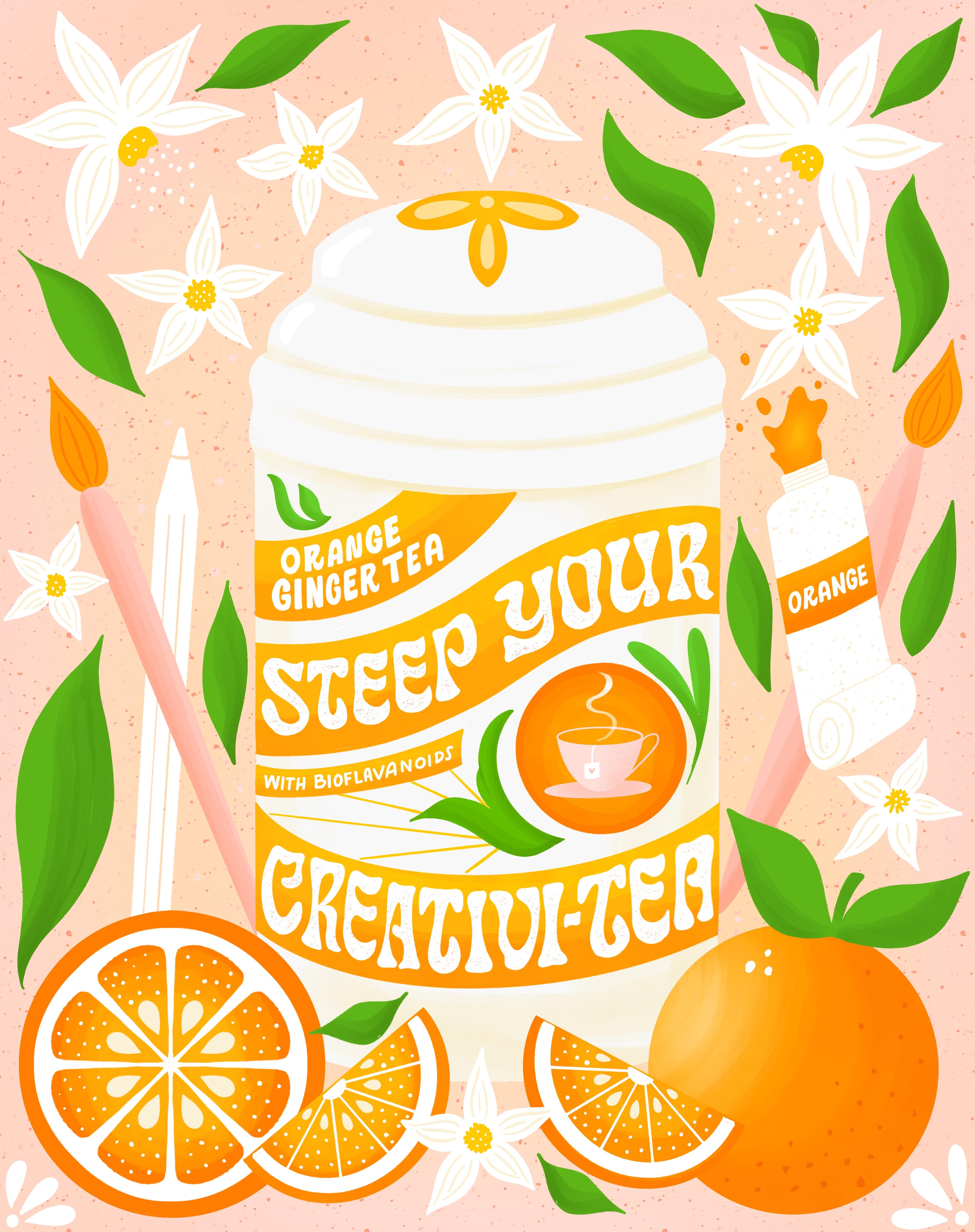
to generate ideas. I know that I wanna do. I want to do something vintage. I'd like to do possibly
a vintage label. So I'm going to write label. I also like my main
overarching messages. I want to be creativity and I think I wanna do
something with possibly T, because I've been
drinking a lot of tea lately and I feel like
it's really good for you. It's healing and it also
helps with creativity. So there's a tie in
here between these two, these two main, main concepts. There's different
kinds of T. So we can go Barry T, there's chamomile. Then as far as creativity
goes, Procreate pencil. Then for our vintage label work. And I want to try to
think of the layout. So I'm thinking I took a look on my Pinterest board
that I had that I created. And there are a lot of cool like T containers and old FMRA. So we could possibly
use the T container as sort of an illustrative
layout and then have the
lettering be part of the label that's on
the TI container. So that's what I'm thinking. But let's, let's open it up to see what other ideas
we can generate. So now it's time to kinda
come up with a phrase that I can use from this list. So I'm thinking I
want to use a pun. I think I'm gonna go with drink your creative T as my phrase. Then for my motifs, you can also make a word list for your different phrases
that you might use. Well, I had an idea of
what I wanted to do before starting this
video for my motifs, I'm going to use the T
canister and oranges, maybe Ginger and
then maybe some. To tie in this
creativity portion. I'm going to add in some
sort of Art supplies. Then I'm hoping from that, then my audience are, my viewer is going to feel
these kinds of things, inspiration and
curiosity, wonder magic when they look at
the piece, the Mood. This piece is vintage,
inspirational. And I'm going to put sunny, because when I think
I've citrus fruits, I think of sunshine makes me feel happy now that you have
your ideas narrowed down, let's move on to the next
session where we will consider a Color palette
for your artwork. See you and the next lesson.
7. Creating a Color Palette: In this lesson, we're
going to go over a couple of different ways
to create color palettes. Now that you have your
ideas narrow down and you are still
in ideation mode. You should find Color Palette creating comes naturally to you. You already have an idea
of the mood you want to create based on
your chosen ideas. Color has the power
to change our mood. Cool colors such
as blues, greens, and purples tend to work best
for creating calming vibes. Whereas warm colors tend to work best for creating a sense
of cheer or brightness. Sometimes it can be a nice
surprise to see color used in an ordinary way. Just make sure if you do this, that it's intentional and make sense for your piece of artwork. One phone way to create
a Color palette is to search color palettes on
Pinterest or the web. You can quickly and easily import these colors
into Procreate. Let me show you how you're
going to open Procreate. We're going to open Safari
or whatever browser you use. Let's search for color palettes. You go to images.
This is going to bring up a bunch
of color palettes. Can just scroll around
and find when you like. And then you go over
here into Procreate, tap on the color that
brings up your palettes. And then I'm just
going to click on the image and hold
and drag it over. And that's going to generate
a Color palette for me. It doesn't always
do it just right, like this color here
didn't get included. So I'm just gonna go
here and delete that. And try again. Pretty really earthy. There you have it,
It's that easy. Another great way to
create a Color palette is to pull colors from a photo. You can choose a photo that
you've taken yourself, or you can just choose
one right off of Safari and I'll show you
how to do that as well. If you don't like a Color, you can always adjust it by
going into the color wheel and adding white to make
a tint of that color. Let me show you how to do that. So I'm going to click, put the plus button to
create a new palette. Then I'm just gonna go in and this color palette here
is pretty saturated. So I'd like to make this a
little bit less saturated. So I'm gonna go to my color
wheel and take that purple. I'm just going to drag
it towards white and create a nice
lavender lilac color. In a sense, I'm creating
a Color Palette From the colors that
I just imported. Maybe a blue, lavender. Let's grab this pink. As you can see, this can be
pretty FUN and relaxing. Can be just as much
FUN as making ART. So someday, when you're, when you have some extra time, you can play around with this. You're welcome to play
around with it now and you can create your
own color palette, or you can use the
color palettes. One of the color
palettes I provided in the Resources section has you can see creating color palettes be almost as fast
as creating ART. The more color
palettes you create, the more you will
start to understand and find colors that you
like to use together. Often, artists choose
one color palette to stick with for awhile
in order to create a series of work that
is more cohesive aesthetically in
their portfolios. And on their Instagram feeds. Feel free to use the color
palettes I provided in the Resources section
or create your own. Hopefully you've had FUN creating some color
palettes in this lesson
8. Layout Types & Lettering Guides: In this lesson, I
will share with you examples of some of the
different kinds of Layouts I've used in my workflow
and how you can drag guides for your lettering
and motif placement based on these layouts, we can use a framework to
organize our lettering and motifs into a
balanced composition. In this sense, we
have a formula that works every time
which is exciting. It may just take some
trial and error moving things around,
changing scale, etc. to get it just right. So this is the vintage layout. I've actually
created this layout for project that I did in 2018. It was a passion
project all about different recipes for
at-home wellness. It was an apothecaries project. So I've provided these layouts
in your Resources section. So you can use one of
these if you wish, or you can create your own. I'll just quickly show you the artwork that
went along with it. This was foreign atomic
oat milk organic bath, basically a milk bath. Next we have the angled layout. This is a really good one for
beginners because you just have for parallel diagonal
lines moving upward. And then you can fill
in down here with your motifs and
around the edges, if there's room,
can see it in use. Here we have this symmetrical
layout and these are FUN because I like to use
the drawing guides. So if you go to the wrench icon and then Canvas drawing guide, edit drawing guide, you
choose the symmetry tool. Then you can draw in
guidelines for your lettering. And then as you can
see in this one, I've placed circles for where
I want to have my motifs. And this should be about this size that the
motif should be. So that I know
exactly where I want to place my motif and
how big it should be. That was the artwork
for that one, where there's a
woman, There's magic. The last layout is this
shape slap layout. You can use this one to
layout your lettering. For this one, it was for a recipe that I did for
another passion project. It was all recipes
for cocktails. And so this was for the
simple syrup recipe, holiday honey spice
syrup recipe. So as you can see, these
layouts really help you with placement of your
lettering and you're motifs. Feel free to use one of these
or create some of your own. Using guides and
grids is essential to the composition and layout
portion of your lettering. When you're first starting out, it's easiest to use a
layout that already exists and drop in your
lettering and motifs. As you get better at it, you can start to create
some new ones of your own. How Fun with this
well balanced artwork grows out of planning
and using a structure to build our illustrations
from the ground at use this lesson to inform your decisions when
structuring your layout. By the end of this lesson, you should have chosen
it layout structure that works well for your
phrase and motifs. If you're ready, let's move
on to the next lesson, where we will finalize
the planning process
9. Setting Parameters: Setting Parameters
for your artwork is a great way to set
yourself up for success. When we give ourselves
restrictions on color, imagery, brushes, etcetera, it only
makes our lives easier. If we had all the freedoms
and a blank page, the Project would become too daunting with too many choices. It can be extremely useful to plan out your color palette, motifs, message, and wording
before we begin drawing. Another reason I love
setting Parameters is that by using
certain brushes, Texture styles, and
color palettes, your work will have a unique
artistic style or voice. It's something artists
are always searching for, but takes lots and lots of practice and
art-making to achieve. Let's set some parameters
for our artwork together. We've done a lot of the work already in our ideation phase. So all of this
work has paid off. And now we have our
message or quote. By now you should
have an idea of your motifs and your Mood. Hopefully you've
chosen a color palette that goes well for your design. And we already have our
overarching message. In the last lesson, we picked out a layout for mine. I'm gonna do vintage. The only thing we need to
pick out now is our brush. Our brushes are Texture style
and our lettering style. This is something I would
like you to go ahead and do after this video, is do some research on what kind of lettering
styles you want to work with. And then we'll go over some
brush styles right now. I have my own brushes
that I work with. But I wanted to show you
some really good ones, some really good brushes that
are native to procreate. The first one is the studio pen. The next one is dry ink. And this is a great
Texture Brush. You could do your whole piece with just these two brushes. I would recommend
using the studio pen for drawing your shapes. And then using the
Dry Ink brush. When we get to the
texture section. Okay, the next one is
driven snow under elements. And this is also another
great Texture Brush. And this one is
pressure sensitive. So these are a few
native Procreate brushes that you can work
with for your project. I'm gonna go ahead and use the brushes that I usually use, which are the Shout Bam brushes. I use the ripple iser. This is a textured brush. As you can see, it has this little texture on the outside of the
line. I really love it. And then I use some
other brushes, some True Grit brushes for
my shading and highlights. You're welcome news as
to if you have them. If not, I would just stick with these three native brushes. And then the only
other thing I would like you to do is go over your Lettering Styles and choose one or two styles to
work with for your project. The lettering should
sit easily within the composition and
look effortless. Let's look at the piece as
a whole from the beginning, rather than creating the
lettering and thinking of the motifs surrounding
designs as an afterthought. In this way, our
whole design will be richer and flow with ease. Setting restrictions
for ourselves as artists is a good way
to eliminate doubts, difficulty choosing
color, confusion during the creation process and will
give us a clear direction. I can't wait to jump
into the next lesson. We'll, we're actually going
to start drawing. See there
10. Creating Thumbnail Sketches: This lesson we will create
our thumbnail sketches. You've done a lot of work so far and now we finally get to draw thumbnail drawings
are small Sketches. The reason artists use thumbnail sketches is
to get the layout and basic wording and sizing figured out before working
in a larger format. It saves time and energy
to draw small at first. From here we will choose one of our thumbnail sketches to draft a larger sketch and
then refine it. I usually start out analog
with paper and pencil. For the sake of this class, I'm gonna go ahead and
work in Procreate. If you do work analog, you can use the
Scanner Pro app for scanning in your sketches
drawn with pencil and paper. From there you can save
your artwork to photos and then import them into
the Procreate app later, always be sure to
draw your thumbnails proportionately to the size you want your final artwork to be, either square or portrait. Portrait size is four to
five ratio for Instagram. So here are some sketches
I've created already. This was for a
different project. And as you can see, this is actually
similar to the one. It's the same as
the layout I gave you in the Resources section. And then here's another example. I've already gone
ahead and drawn in some basic shapes
for the T canisters. I also decided I went back
to the ideation phase. A lot of times this will happen. I started to think
about it again. And I said, Drink, your creativity, kinda
sounds weird, right? You drink tea, but you don't
drink your creativity. So I changed the first word to Spark, spark your creativity. So I could have gone either way, we could have gone
with maybe Matt alike, a book of matches or the TI. But since I've already done
the ideation for the T, I'm just gonna stick with that. So there's a lot of
ways we could do this. I'm thinking I drew this little tea kettle
with a little cups. That can be one option
for the layout to do, something like let's
make that lower. Then we can have, we could do creativity
just straight across here. Okay, so that could
be one option. I can't draw our little oranges, maybe an orange slice right
here and some flowers. This is just to get the
idea for the layout so you don't need to be too
precious at this stage. And then for this one, I actually went to use the
container for the lettering. I kinda wanna do that
guide for the lettering. I like doing these little
kind of wavy banner. This process just kinda
gets your ideas flowing. And usually by the end, I have at least one that I
really like that I can move forward with as
far as the layout. So like I said, you're welcome to use one
of the layouts that I've provided for you in
the Resources section. But this is also a
great way and I just wanted to show you that
this is a way that I often will play and discover
different layout styles. And then we just
pick one from here to refine and make larger. So to recap, thumbnails are small drawings to help
us finalize our layout. We will refine these later, so don't worry about
being super neat. Just get your ideas out. If you have more than
four ideas, that's great. You can do as many thumbnail
sketches as you like. If you've got your thumbnail
sketches finished. Then let's move on
to the next section, choosing one thumbnail sketch to work from and
refining Your Sketch
11. Refining Your Sketch: In this lesson, we
will be choosing a thumbnail sketch to
move forward with. For the final artwork, you should have one thumbnail
that stands out with a more balanced composition or one that you're
more drawn to. We will use that Sketch moving
forward to refine an ink. If you have questions or need
feedback, please reach out. What I've done here is I just went to my
thumbnail sketches. I copied this layer. I opened a new document that
the size I want to work at. Then I just resized the
thumbnail sketch to be larger, the one that I decided
I'm going to use. And I've made a
couple of changes. I thought about things again. And I'm not really
liking this lettering. So I, or the phrase rather. So instead of spark
your creativity, I forgot to add the pun
in here, like I had. I had decided I was going to
do spark your creativity. The T is gonna be a pen and
I forgot to add that in, so that was a mistake. And then I also did some
more thinking about it. And I thought I could
strengthen the pun even further by changing spark to steep, because you steep tea. So it would say steep
your creativity. So I went ahead and change that. Here's the next phase
of revisions I did. You can see I just cleaned
up the original sketch and then I went even
further in and refined, refining the sketch even more. I changed the phrase to
say steep your creativity. I added some little
extra details like with bio flavonoids. And then the name of the T, the orange ginger tea. I changed the pink color to orange because I
think I'm gonna, I'm gonna use the color
palette that I'm going to use, has orange in it, and also we have
these oranges here. So I think that'll flow nicely. So now I would like to go
ahead and go in and change, refining the lettering
style and add, wait, I was originally
thinking I might go with an Art Nouveau lettering style I thought would
work well for this, but I think I'm
gonna give this one. I'd try this psychedelic style. So we'll see how it goes. And I'll show you how
I'm gonna do that. I'm gonna go ahead and save
this layer and duplicate it in case I mess up and I
want to come back to it. And then I'm just gonna go
in and draw my letter forms. And I'm thinking I might need
a little bit more space. So I'm just gonna make
this a little bit smaller. And that also gives up
more space within that, within the Banner as well. I'm going to do the same thing, just doesn't have to be perfect. This is still the
sketching phase. This one I create a little
bit more room for myself. And I think I might even go in and move some
of these letters around. Let's try that. So
for this see it's, you can see it's like
kind of wavy and funky. So let's see how it I'm not copying this exactly. Creating my own version of it. When you go from a typeface. Another artist
created this set of letter forms so
you don't want to copy exactly, just want to Create, use it as inspiration and create
your own unique version. Now I'm just drawing
with the six B pencil, which is native to procreate. And I'm having to
create more space for myself as I go along in my lettering because
I didn't really leave enough space initially. And that's something I
still have a hard time with even after all these years. So when you're sketching, you may want to
leave more space for yourself for the lettering
in between the letters. And I'm just adding weight
to these letter forms. Although the shapes are a little different than my
initial skeleton. So when that happens, you can just almost even erase the skeleton and sort
of drawing a new one. That makes more sense. This is a really wavy
lettering styles. So the reason I'm filling in my letter forms, it does take more time. But the reason I do this is because when it's in
solid black and white, you're able to spot a little inconsistencies
and the lettering. And it'll help you to fix it before you go to
the inking phase. Okay. I think for these, I'm just going to
leave those for now because when I
go into ink them, I'm just going to keep
them as a sans serif. I can just fill in at that time. So I think this
looks pretty good. One way to critique your work is by actually turning
it upside down. Because our eyes
tend to want to read the lettering when we
have it right-side-up. So if you turn it upside down, you're able to see the
little inconsistencies. And I can actually see
that this is pushed over a little bit too far to
move the whole thing over. And it will ensure
that when you go into Inking and adding textures, that you're going to have a
beautiful piece afterwards, if you make sure to make all
the changes in this phase, you're pretty much set and then it makes the other
part Marfan as well. It generally redraw and refined
my sketch on a new layer, but I always save my original
sketch in case I want to go back and make changes
to my design. If you have Your Sketch
refined and ready to go, then let's move on to inking in the next lesson. See you there.
12. Inking: Now that we have our sketch, we can ink are artwork and black to make sure everything
is equally weighted. Pick a brush to use, such as the mono line brush, which will give you
nice crisp lines and let you easily
fill in with black. We will draw everything in black first and then add color
in the next lesson. It depends on the piece, but I typically use
a lot of layers. I generally create a new layer
for each shape, word, etc. especially if I know I want
to add shading to it later. I've gone ahead and
copied my sketch over. I'm just going to erase these because I know
I have a duplicate. Then I'm going to
turn down my opacity. I like to use the
Shout Bam brush, so rebel iser O2 brush. But you're welcome to use
either the inking brush, the studio pen, or
the mono line brush, which is under calligraphy. Or whatever brushes you usually use are
fine for this too. So we're on a brand new layer. And I'm actually going to use the symmetry tool to help
me draw the canister. I like to draw with the curves. So if you can tell the
curve is going this way. So my hand also goes that way. If I tried to draw this
curve going this way, I'd actually have to
move my hand a lot more. So you always want to go
with the flow of the curve, will get a lot nicer lines. I think that's the only part
that's actually symmetrical. So I'm going to
turn that off and turn it off on my layer as well. Then the same with this line. I'm going to turn the canvas
so I can draw this line. Nice sweeping motion. And think I'm actually
a draw these banners on a different layer because they may want to change
the color of them later. So all the banners on one layer. Then I'll draw these. Actually, I'm going to draw
that circle on this layer. I'm going to draw this
saucer underneath. Because I think I'm
going to want to add some shading to that later. I can always add
that steam later. We're gonna move on
to the lettering. This brush, the shop RAM brush. It has texture to it. So sometimes it
has little holes. And so it won't fill
all the way right away, which can be a little
bit frustrating, but I think it's
worth it for the, I like the texture
that it provides. Actually Sometimes I change the
shape of my lettering just slightly to fit better. During this process. I'm gonna go back into my
sketch here because I'm noticing that the space between the lettering and the
top of the banner here is a little bit less
than it is here. So I'm gonna go ahead
and change that. And I'm gonna, I'm going to actually make these a
little bit smaller to, again, because I want there to be a bigger space
between these two words. You want to make sure you have. It depends. Sometimes you
can use the free form. Depending on the style of
letter forms you're using. This is a very organic shapes. So sometimes I'll
use a free form, but the uniform will keep
it nice and justified. That way it, There's a nice There's plenty of
letter spacing there. Make sure I'm on the right
layer and bright brush. When I first started
in Procreate, I was so such a perfectionist. I would really just make
everything perfect. And over time. And I've been drawing
and procreate for about six years now. You kinda, you realize
the lettering, it doesn't have to be exactly perfect as long as the
proportions are correct. But I was spending so
much time on every piece. And you really do get quicker. Over time. They
learn little tricks. Now I love it when my
lettering has like little texture to it,
little inconsistencies. I think hand lettering has that quality and has a very
organic hand-drawn feel. And if you make it perfect, it loses that feeling. Okay. So for the flowers, what I usually do is I draw
the petals on one layer. So all the flower petals. Before I draw flowers, I always look the flower up
to see what it looks like. I like to draw flowers
that look realistic. Unless I'm drawing
meetup flowers, then that's a different story. But usually these are supposed
to be orange blossoms. So I wanted them to look
somewhat realistic. They have this little sick, a little cut right here. Sort of like a daffodil, but not as big. Then all the little
stamens come out there. Making sure to
close all my shapes here so that they fill
with color nicely. Then on the next layer
I'm going to draw all of the leaves. Leaves. So we talked about
closing your shapes. You can see that
that happened to me several times in this process where it filled the whole page. So just want to make sure
to be aware of that. The mono line brush is the
easiest to use for that. And you can play with the streamline setting
on the mono line brush. The higher the
streamline setting, the smoother it will be. When I first started
drawing and procreate. This was the only brush I
used to create my artwork. As I got better
using layer masks and other coloring techniques. Only then did I begin to explore brushes
with more texture. And now I mostly use
Texture brush brushes. I use the brushes from Shout Bam and True Grit Texture Supply. And we also covered the angle of the artwork and the angle of the curve going
with your hand. You want to definitely make sure you're on the
correct layer. Because if you start drawing on the wrong layer and you want
to separate it out later, you either have to delete
the layer and redraw it or copy and paste
and then erase. It's a pain. So make sure you're
on the right layer. We talked about creating
layers for each shape. And if you run out of layers, then you can just
duplicate your file, rename it version two, and then I'll go
ahead and flatten layers I'm finished with and
create more layers as I go. Procreate only has
a certain amount of layers depending on which iPad version you have
and how big your file is. I hope this lesson helps you get your artwork inked with
little to no issues. Inking in black helps
you to pinpoint mistakes and correct them
before moving onto color. Now that we have our
sketch inked in black, Let's move on and add
color and the next lesson. Excited to see you there.
13. Adding Color: Now that we have our
artwork inked in black, it's time to color our artwork. I'll be using one of the
keller palettes that I've provided for you in
the Resources section. I already have an idea of
what I'm going to do here. This is the color palette
I'm going to use. Here it is. I'm going to set
as default color palette. And then I'm going to
add my background color, which I know I want to
be this light pink. And I know I want the oranges to be this
bright orange color. For the canister. I
actually have a canister of T and it has this really
nice red orange color. I think I want to duplicate that same color for my canister. So I'm gonna go to
the color wheel and move my move it
towards the red. And I'm actually really not
liking that canister color, but I'm going to
wait until I have more things colored
in to see what might. As you can see it.
Great. It takes on a whole new life
once you add color. Where do you think
should I have this via Procreate pencil or a regular pencil paintbrush? I'm gonna do the
same as realized. It's actually not
behind you orange. So I want it to be behind. When you're coloring
with the Texture brush, it actually adds a
little bit of texture. So sometimes they actually
like to go ahead and color in. So as a good idea to
name your layers, I did not do that here. And so now I'm
having a hard time finding where things are. I feel like these oranges
are maybe too bright. I think I'm going to
make these tips of the paintbrush orange also just because I want to keep
the colors consistent. Like that Brown was drying
too much attention. As you practice
the different ways of adding color and Procreate, you will become familiar with which one
works best for you. It just takes time to
learn which way it feels more comfortable
to you and your process. Some of the ways
that you can add color or the drag
and drop method, which is what I used
for most of this. You can add clipping masks, reference layers using
the selection tool or you can also use Alpha Lock, will go over that
and another class. Avoid using too many
colors in the same piece. You can start by using a
limited color palette, or one of the color
palettes I've provided for you in
the Resources section. I hope you've enjoyed
learning some of the ways you can add color in
the Procreate app. Now that we've added
color to our piece, let's move on to adding
depth and texture. In the next lesson,
I'll see you there.
14. Adding Depth & Texture: Welcome back. In this lesson, we will go over
adding texture and dimension to our work by
using clipping masks. I'll also be adding some little details to
this drawing as well. I'm running pretty
low on layers, so I'm gonna go ahead and
get rid of my sketch. Before I do that, I already have it saved
and another file. And before I do that, I want to go ahead and add
some yellow to these flowers. Some little dots. I'm gonna
go ahead and do that. Now. We're just gonna be
adding detail to this image. I'm trying to
decide if I want to do this can and treatment. I think I actually
liked that better. Let's go ahead and do
that second treatment. I like the hood a
little bit better. I'm just using the same brush, that Texture brush that I
use a red blazer to do this. Okay, and then all I'm
thinking about it, I'm going to add the
steam to the cup of tea. There we go. Like
that a lot better. So I know that I like the
white flowers with the yellow. So I'm gonna go ahead and
combine these layers to give myself some more space because those are
basically done. Then I'm going to add in
this element that I actually drew recently for another
drawing for this orange. And I drew this in another drawing with
the symmetry tool. So I'm just going
to drop that in, make it a little bit bigger. And then I want to
make sure that that is right on top of
the orange shape, so that it's behind
this slice of orange. Then to that, I'm
gonna go ahead and add some little dots, but I'm on the wrong brush now. I'm gonna go back to
my Shout Bam brush. I love so much. I'm just going to add in. I'm going to add in
some little dots here. When I do these dots, I like to make some
bigger, some smaller. You think it really
adds dimension. Nice little detail
to the orange slice. I want to add some shading and highlights to
this orange slice. But I'm going to do
it behind the orange. I'm going to add a layer
underneath the white part. And to do this, I'm going to use this
lighter orange color. And I'm going to grab my
under the painting brush. Brushes. I'm going to
choose the Salamanca brush. And I'm just going to go in and add a little
highlight to it. So it looks Sun kissed. And then in the very
center I'm going to use a super light yellow. That looks pretty
good with that. Orange is finished. Turn off my sketch for a second. And I know that I can
go ahead then and merge these layers together
since that's finished and that'll give me some
extra layers to work with. Then I'm going to do the
same thing to this orange. I'm actually going to add some darker orange down here and then a lighter
orange up at the top. Because for this image, I'm placing my light source and the upper left-hand corner. So everything that
I sort of shade or highlight is gonna
be based on that, on that imaginary light source. Then use a clipping
mask for this. To add my textures. I'm going to grab
this bright orange. Then always when you're
working with curves, you want to make sure again that your hand is
going with the curve. Just going to make this
a little bit bigger. Then I'm going to use
the lighter color And then I'm going to add
actually a little bit of white. That looks pretty good. And then I'm going to add some darker orange
dots to the orange. Then I'm going to
use the same thing for the orange slice. And then we're going
to add shading to the leaves. Clipping mask. Here, just clipping it to the, this layer with
the leaves on it. Then I'm going to use the same brush and I'm gonna
go on with this darker green and just add some shading. So fill light sources
coming from this direction. Then I'm going to add,
I'm going to shade, that's going to shade
the underneath side. Now we're gonna do
the same thing for this nice greenery parts
within the container. For this paint tube, I'm going to add a little bit of a tan color that I used earlier. And I'm going to
add some highlights to this orange banner and
also the orange paint. This is looking pretty good. I think there's just a
couple more details. I want to add the lettering. I want to add some
texture to it. Let me go find my
lettering layer. And there's a couple of
different ways you can do this. You can actually either use a texture brush to erase
inside the letters bore. You can add the layer with the same colors,
the background. I'm gonna do that
because if I add the other layer and they
end up not liking it, then I can still go
back and change. It. Almost makes, make
it look like it's old. And that's kinda the
vintage feel are going for. I'm not super stoked on this shading and highlight
layer on the canisters. I'm just going to tone it down
so that it's more subtle. Then the last step, I'm going to add
some subtle texture to the very background. This pink, like a darker
pink than the background. I'm actually going to
add a darker pink to. Now that we've added texture and dimension to our work,
we're all finished. Don't forget to
share your work with the class in the student
projects section. I can't wait to see
what you created. I hope you've enjoyed
learning how to add depth and texture
to your work. The final details really add a lot of personality
to your work. And this is where you
will start to see a style emerge that
is all your own. So please feel free to discover and try new and
different brushes. I'll see you in the next lesson.
15. Exporting & Post-Processing: I'm going to show you in
this lesson how to export your work so that it
can be used for prints, products, cards,
fabric, etcetera. The possibilities are endless. So let's dive in. Usually for Instagram, I'll do a JPEG and say you
just go to the wrench icon. Right here, you have all these different ways
that you can export. And tiff is usually
what I use for print. And PNG is also just a
really nice clean file. You can also use
PNG for Instagram. There's JPEG. Jpeg is
good for Instagram. I rarely use PDF unless
it's like a document. Then PSD is actually
a Photoshop document. So if you are going
to take your artwork and bring it into Photoshop, you could further add
more textures there. You could add lots of different things
in Photoshop as well. Or Procreate is
the other option. Then for animation. These are for
animation down here. Yeah, I've already exported
this to my photos. I usually just do a PNG or JPEG. I export it to my phone. And then I put it in my photos. I wanted to go over quickly. I made a few changes
to this design. As you can see, this is
what it was like before. This is why it's always good
to go back in and just like sleep on it for a
night or just close your iPad and come back
to it later that evening. And lo and behold, you will find things
that you want to change almost every time. So for this, I was, I like this piece. I think it's pretty good, but it could be
improved a lot of ways. I ended up changing the
color of the container. And then I think when I was
adding weight to my letters, I may have erased some of
my skeleton letter forms. And they, these kind
of skewed to the left. So I went in and I changed that. I changed the color of the leaves to be like
a brighter green. Then I went in and I added
details to the little flowers. So this is the new piece in, as you can see, it
just is brighter, I think because of the
brightness of the leaves. I've fixed the lettering. I went and added more weight to these letters as well. In here. I added little white dots in
the center of the flowers, like this little highlight here, and change the color
of the banners. This section added
some highlights and some dimension
here on the jar. Then I also flipped the paintbrush to say that
because they were both facing the same direction and I wanted to
open up the drawing so I flipped this so that the paint brushes
are going outwards. It feel like that invites
the viewer into the image. I think that's about it. Then I wanted to show you
this is an optional step. But occasionally
not all the time, but sometimes I'll take my work into a photo processing app. This is VSCO. And I'll go ahead and import. Well, let's just
work with this one. I'll go ahead and import my
work and hit Edit image. And it'll bring
up these presets. You can kinda click around. And these just these, these can be quite
drastic sometimes. So you have to be
really careful. I kinda like this one. But then you can change the
colors around a little bit, or you can even do
black and white. You can also add green, which is sometimes what I add. Add a little bit of grain As you can see, us
without the grain, it just adds, it
adds texture to it. So I've actually added green
to quite a few of my pieces. I feel like it's just another
way to add more texture, more brightness, or just a way to sort of differentiate your
work from other artists. Like if I always use
green in my work, then people can tell that it's my work and things like that. So this is obviously and totally optional
step in the process. And a lot of times I
don't even do this, but I just wanted
to tell you guys about it in case
you want to try it. It is FUN to play with. And you don't have to use VSCO. You can use Snapseed
or any other. You can use Photoshop, you can use any other
photo processing app. And it's just sort of
PFK-1 to play with. But like I said, you have to be careful
because it can really change. Like let me show you. Go really crazy one. No, it's not that crazy, but as you can tell, I mean, that's just
like really muted. Will just go with that one. But you have to be careful, don't don't change
it to drastically. And always make sure you save an original copy of
your artwork in case you decide you don't like it
and you wanna go back to it. So that's basically it. And I wanted to also
touch on if you're exporting your work for
a specific printer. Usually on their website, they will have an area
that has printer specs, which just means you can go
to their website and find out exactly what file types
they accept for printing. So companies like Spoonflower
society, six, Sticker, Mule like sticker
printing companies, they all have their
own printer specs that you will want to use
and follow those directions. You'll just go to your file and export accordingly depending on where you're gonna be
printing and that's about it. Have found with this, you can get some
pretty neat results with this Post-Processing step. But of course it's
absolutely not necessary. Alright, I will see you
in the next lesson.
16. Your Lettering Everywhere!: My journey with hand
lettering started in 2017 when I first began doing hand
lettering regularly and started to post
my work to Instagram. Posting your work to social media platform is a great way to hold
yourself accountable. At first, I was
posting my work from my sketchbook with
pencil, pens, and paper. Soon I discovered the Procreate
app and I was hooked. I drew every night for an
hour and posted what I made. I took several hand
lettering courses, a bunch of workshops
and Skillshare classes, and slowly improved my
hand lettering and learned how to use Procreate
Skillshare classes, just like this one, are a great place to start. I've now been posting my work to Instagram for about seven years. I've grown my
audience to over 12 K. It takes a lot
of consistency, posting several times a week, posting stories daily, and changing with the
platform as it grows. But most of my client work
has come from Instagram. It's a wonderful marketing tool. I started out as a
graphic designer, so I already had a website, but my website has changed and grown with me over the years. A website, great way to show your professionalism and your
work in an organized way. Especially if you want to pursue hand lettering and
illustration as a career. This is my website or
I showcase my work. I actually haven't updated
this and quite some time, so that's on my list. I just wanted to tell you
to trust the process. Progress happens
slowly over time. The more work you make. Them were ideas you will have in the better
you will become. Follow your intuition
and keep at it. You've got this. These are just some
of the areas you can focus your attention
as an artist. Build in our portfolio for
gaining clients or website. Brand collaborations
and partnerships. Art Licensing, print on-demand, create your own products
and open a shop. Surface pattern design,
illustration for editorial. Create and publish
your own book or Xen. Passion Projects, series
of work and collections. Advertising, mural painting and drawing
challenges on Instagram. Try things out. You
can always pivot. My advice is to stick
to something for at least three to six months
to give it a solid try. And if you change your mind, you can focus on something else. Just try not to do
everything all at once. It will be overwhelming. Take it one step at a time and
have patients try to avoid shiny object syndrome by setting your focus and goals for the
year and sticking to them. There are so many ways to get your work out there
in the world, such as Social Media, Art Licensing, products,
client work and more. I hope you find what calls to you and spread your
wings and your magic
17. Conclusion: Congratulations on
finishing the class. I hope you enjoyed the process and learn something
new along the way. Please share a bit of what you learned with me by
writing a review. We covered a lot in this class. The anatomy of letter
forms and terminology, lettering styles and Mood,
Hierarchy and Balance, ideation and worthless,
creating a Color Palette, setting Parameters, and finalizing your
artistic approach. Different types of layouts. Using thumbnail drawings to
discover your best layout. Refining Your Sketch, Inking and adding
color and texture, using clipping masks to
add depth and texture. How to export and
save your work. Discovering different ways to share your work with the world. The layout is the foundation on which everything
else is built. So it makes sense to take a little bit more
time in this part of the creation phase to make sure it's exactly the
way you want it to look. I can't wait to see
what you create it. Please share your work in the Project Gallery
section of the class. I hope you will post your
work on Instagram to. If you do, please tag me so
that I can find and share your work at Heather's
lettering and use the hashtag, creative layouts with heather. I'm going to recommend one
last book before you go. Big Magic by Liz Gilbert
was the book that first got me started on
a regular Art Practice. So if you haven't read it, please read it and its entirety. It's so good until next time. Thank you so much for taking
my course and happy creating
 Heather Mueller, Illustrator & Designer